DIY It / Avocado Dyed Fabric Garland
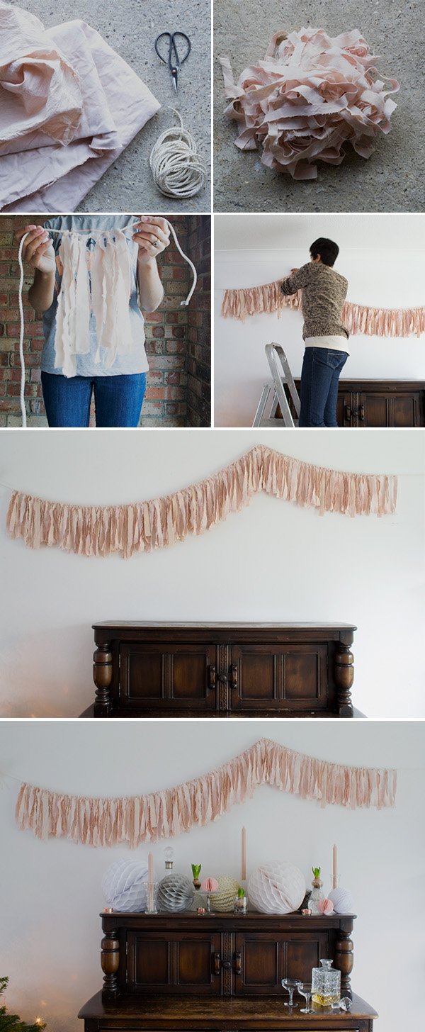 Ever since I saw this image from Vtwonen doing the rounds on Pinterest I've been desperate to recreate that garland in my home. Sure, I'm lacking the Georgian proportions and beautifully weathered wall, but you work with what you've got, right?Then I found a beautifully dyed blush cotton fabric (yep-on Pinterest again!) which was done using avocado pits and I just had to give it a try. I love the magic results that can come from dyeing with natural ingredients and have tried turmeric with wool before with some success. But who knew avocados could be responsible for that colour?! So out came my scraps of natural cotton and white canvas, 3 avocado pits and the biggest pan I could find. Eight hours later, I had 3 metres of the most gorgeous, subtle pink to work with and I turned it into this fabric garland to dress our dining space over Christmas. "Lahd a mercy!"If you'd like to experiment with other natural colours, my Dyes & Pigments board is full of ideas to inspire. Now let's get to it...You Will Need -3 metres of untreated or white cotton and/or canvas. Note that man made fibres don't take dye very well. If you want a longer garland, just dye more fabric.3 whole avocado pits - This was perfect for the amount of fabric I had and if you add more the colour will be more intense.4 metres of thin rope - I used a silky kind from a haberdashery and you'll need an extra metre on top of your desired length to allow you to tie it.Make sure your fabric is clean before you dye. I washed mine without detergent on a rinse cycle and put it straight in.✚ Bring a large pan of water to the boil and add your clean avocado pits to it. Leave them to boil for a few minutes, then turn the heat down to a gentle simmer with the lid on for an hour or until the water has reached the shade of pink you're happy with.✚ Remove the avocado pits, turn off the water and carefully submerge your fabric replacing the lid. Leave it for a good eight hours to steep.✚ When you're quite positively beaming with happiness at that soft pink (and only then) take out the fabric, rinse off the excess dye and hang it out to dry.✚ When the fabric is completely dry, roughly iron it out. You'll want to keep that rumpled effect but will need it straightened out a little.✚ Making a snip into the fabric as you go, tear it into rough 2-3cm wide strips. Canvas won't rip so scissors will do. They want to be around 57cm long.✚ Double up each strip, loop the fabric over the rope and pull the two lengths through, pulling tight. Continue until all your strips are tied.✚ Hang your garland and trim any strips that are too long, although you want it to look quite natural.Quick Note: I didn't use a mordant or fixer in this dye as I won't be washing it, but there are recipes available that can advise on this.Are you as crazy in love with this as I am? I mean...yyeeeeeah!! If you're still stuck for festive decor ideas, check back on Monday and I'll show you how to style up a sideboard or shelf as I did in this 'after' shot.Happy weekend!
Inspiration For Christmas / A Winter Moodboard
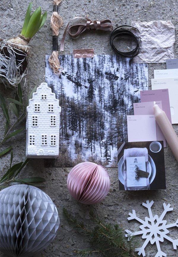 With Christmas just around the corner, I have a winter inspired moodboard to share with you today. For whatever reason this year, I've left Christmas to the very last minute-my shopping is still to be finished and the cupboards are as of yet bare, but I have at least thought about decor for the festive season. As long as it looks good, who needs food, right? Ha! I find that inspiration is more likely to strike when you're short of time or need a quick solution and this is definitely one of those situations.
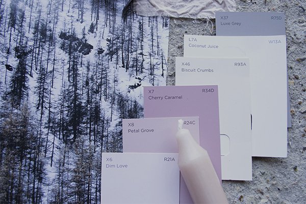
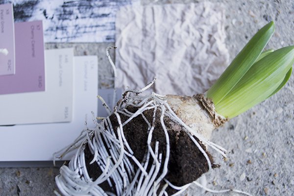
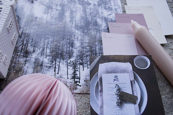 To tie in with our living space I've picked out a muted palette of light grey, soft pink, ivory and white with a smattering of copper to give it some lift. I'm not so much into bright colour these days, so this is a compromise. Still, they have a cool tone to them but still feel warm, don't you think? Hyacinth bulbs also play a part this year as you saw in my cosy and green bedroom, so I've also had it in mind to display some alongside candles in cut glass vases. More on that soon...The tree went up on Sunday and we decorated it with minimal fuss, just lights and a few wood and metal baubles - in fact it was a wise move as Tabitha is very keen on taking off the baubles to play with. I feel like I spend all day telling her "no" and discovering copper stars hidden under things! When I come down in the morning, the first thing I smell now is that fir tree, takes me right back to my childhood, such an evocative scent...Check back on Friday as I have the-most-beautiful DIY garland to share with you. I can't wait for you to see it!So tell me, what are your plans for Christmas this year?
Urban Jungle Bloggers / Cosy & Green Bedroom
 Hey, how's things? Work and home life have been pretty full on lately-I blinked and November was gone, which explains my tardy contribution to last month's Urban Jungle Bloggers topic, 'a cosy and green bedroom'. So today, I'm sharing a corner of our bedroom with you. In fact, I used this post as impetus to give the walls a refresh-they were Magnolia a couple of weeks ago. Just a simple lick of paint has given our room a lift and makes the most of the wonderful light we get throughout the day.
 I was thrilled when I saw that the topic was all about cosying our rooms for winter; this is my favourite time of year for snuggling under favourite blankets, layering up with jumpers and watching the world from a window.
 The wooden wall hooks are a recent DIY that I'll be sharing with you soon and the 'Kiss Kiss' banner looks quite at home there, don't you think?
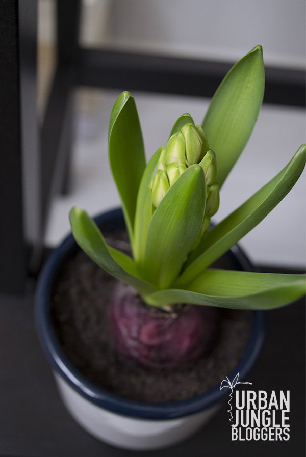
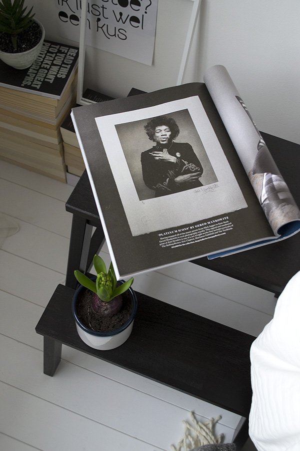
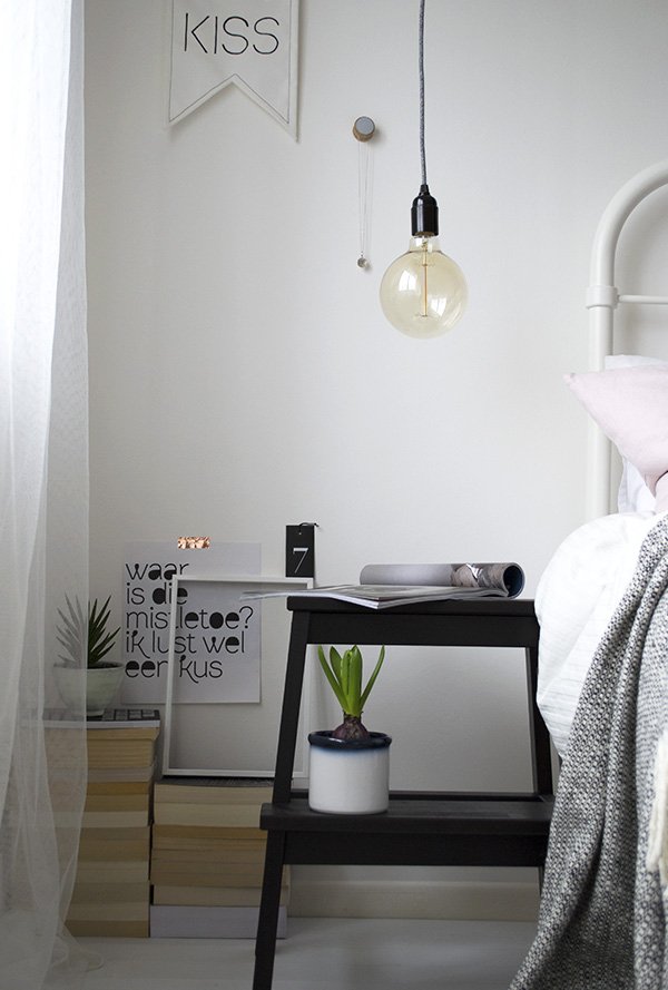 Bulbs have become my newest obsession-both plants and lights! I found the ombre blue rimmed pot in a charity shop for peanuts and love how it looks against that deep purple hyacinth bulb. I'm buying up more this week to put into clear jars-they don't need soil to grow in as they have everything they need inside the bulb. The spiky succulent on top of the books was a recent score from Ikea which sits well inside a soft green glazed terracotta bowl from Serax.The beautiful hanging bedside bulbs were a result of my pure hatred of the insipid ceiling light that we never use anyway, so we sourced the materials and made our own. The fabric cable is aptly named 'Old Grey Jumper'. Could I love it any more?!
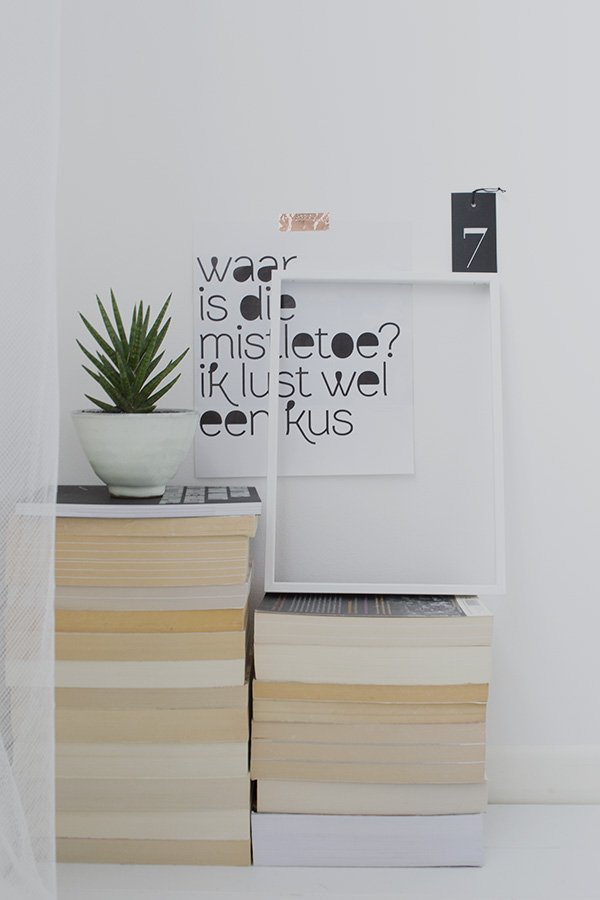 Hope you enjoyed my little tour and keep your eyes peeled on Wednesday when I share Christmas inspiration and how I'll be styling our home for the festive season.Do you have any rituals to ready your bedroom for winter?
Styling & photography © Tiffany Grant-Riley
The Cut #03 / Ceramics To Covet For Christmas
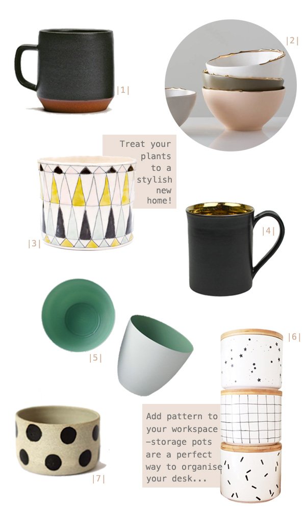
|1| Large 'Ash' coffee mug, Mazama |2| Flawed gold plated bowls, Studiomake at Gretel Home |3| Pyramid planter, LEIF |4| Bronze Glaze ceramic tea mug, Nôm Living |5| Mint porcelain tea light holder, Future and Found |6| Bamboo lidded storage jars, oh ho rachio! |7| Eclipse vessel, Takeawei Studio at Great.ly
This week's 'The Cut' was a complete no-brainer. With a burgeoning collection of ceramics at home (most of them home to a variety of plants) it made sense to put together a Christmas gift guide of personal favourites. Not an easy task given the choice out there!I try to buy my pots and mugs from small, independent designer-makers; the materials and craftmanship are all together a much higher quality. I love the rough feel of a hand thrown, stoneware mug like this from Mazama and the perfectly imperfect gold edges of Studiomake's plated bowls-isn't that muted colour palette just to die for?!Find a little of the unexpected inside Nom Living's bronze glazed mug (imagine sipping a rich hot chocolate from that!) or a splash of fresh mint from Future and Found's porcelain tea light holders. A small succulent would look very at home in one of those too.Speaking of planters, how could anyone resist the bold patterned Pyramid planter, an exclusive from LEIF or the spotty Eclipse vessel from my Great.ly boutique? Throw out those plastic pots and give them something worth to growing into.I nearly tripped over my tongue when designer-maker Oh No Rachio! tweeted a photo of her new collection of bamboo lidded storage pots last week. So popular were the first batch that she sold out and had to order more in, so get in there quick if you want to be in time for Christmas! Choose from three designs; grid, confetti or constellation and then use them in your workspace to store all those runaway bits of stationery. My absolute must have from the whole lot.Are you a crazy ceramics nut like me? What's taken your fancy?
An Artful Style #03 / Crisp Sheets & Botanical Prints
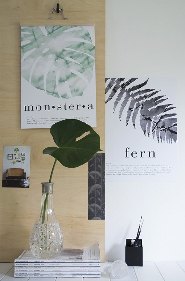 Instagram isn't just a great way to find inspiring photography, I think it's a brilliant tool for finding independent artists and designers. In fact, this is exactly how I found today's designer. Doing a search (I was looking for botanical prints) will often throw up some gems, and Crisp Sheets most definitely falls into that category.Dutch brand Crisp Sheets was founded at the beginning of the year by Lara Jans, who noticed a lack of good quality bedding with a modern design that didn't break the bank. As only the best of ideas come about through problem-solving, Lara embarked on a journey to design and produce her own which inevitably began to spill into art prints. Her background in visual merchandising plays a large part in Crisp Sheets's signature style, with strong botanical motifs, bold graphic type and geometric shapes. Each piece also has its own dictionary definition. Nice touch.What I particularly love about Lara's designs is that they feature hand painted watercolour elements and that soft aquarelle lends itself beautifully to the plant prints. You may have spotted two in my own living space-I have the Monstera and Fern prints which I absolutely adore and look brilliant framed in black or hung from a simple IKEA trouser hanger as they are at the moment.I'm expecting big things for Crisp Sheets in 2015, and as her pieces can already be found in design stores and boutiques worldwide, I can't wait to see what she's got up her sleeve next...
Photography & styling © Tiffany Grant-Riley
The Cut #02 / Tactile Textiles For Christmas

|1| Oyoy Fluffy Grey/Black Cushion, Skandivis |2| House of Rym 'Go Undercover' blanket grey, Starling Store |3| Grey Gradient Wool Rug, French Connection |4| Birch cushion, Fine Little Day |5| Tweed Emphasize Charcoal grey throw, Mourne Textiles |6| Bordered Round Jute rug, West Elm |7| Jamba cushion, Joss & Main |8| Melin Tregwynt Knot Blanket, Starling Store
Today's Christmas gift guide was such a joy to put together- every single item is top of my homeware must haves. Sigh. Aren't they all just so gorgeous?If there's one thing I absolutely cannot get enough of, it's textiles. They really make a home and, if like me you're renting, it's one of the easiest ways to make a place feel like your own. One of the things I loved doing whilst we settled in here was living in the house and getting to know the space for a while, making plans for where I'd like to put rugs, runners, throws etc and keeping my eyes open for the perfect design along the way.My choices are full of texture; from handwoven wool and jute, to the geometric shapes and birch tree bark, but they're also in keeping with my love of black, white and grey. Quite restful, don't you think? I've added in a touch of soft pink and mustard yellow too to see how it might look as I'm toying with the idea of bringing in soft pink to soften out the monochrome a little. The house is slowly starting to take shape, but I'd love all one or two of these pieces to make it feel complete. You never know...
Two Birthdays, Two Cakes, One Week
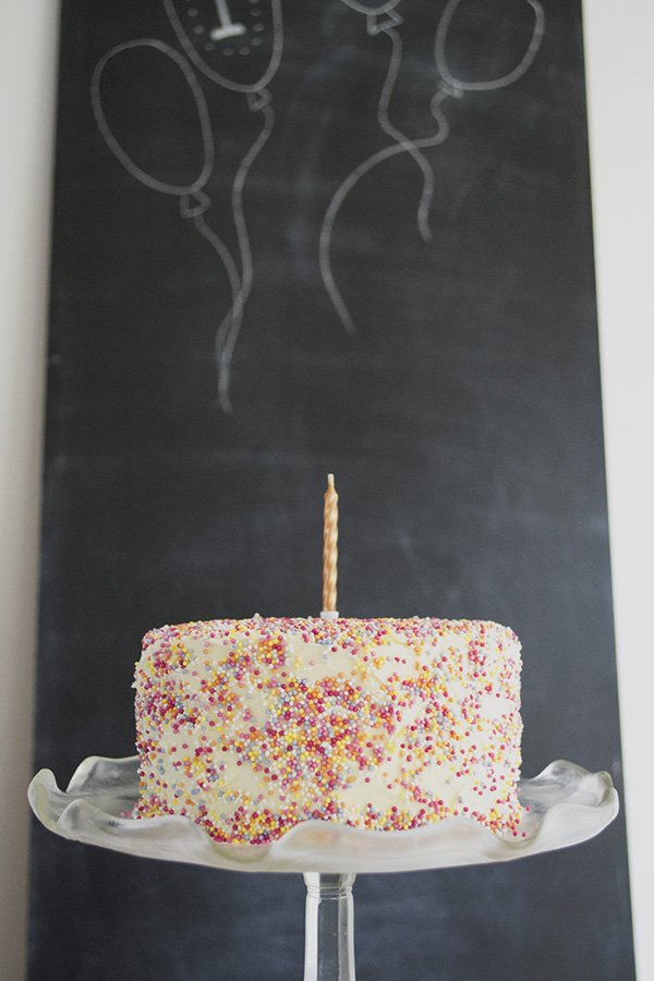 Wow. Is it really almost December now? You know, I've had these photos to share with you since the end of September, but I guess life gets in the way sometimes!
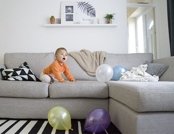 I don't often share much of my home life here, I tend to use Instagram for that on the odd occasion, but I'd had it in mind to share a few photos from my children's birthdays. Although there's almost three years between them, there's only one week separating their celebrations and this year I had my first taste of what it was going to be like for the next...however many years. Let's say it's going be interesting!
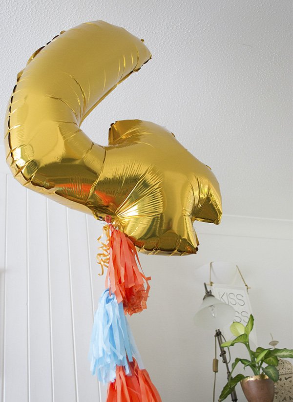
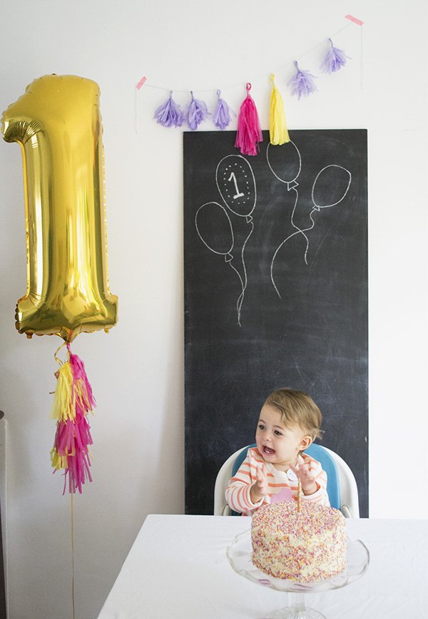 We decided on the no fuss approach this year, so I kept decor to a minimum with small balloons to kick around on the floor. I also made simple tissue paper tassel garlands and attached them to giant number balloons. Yes, they both had to have one, or else there'd be trouble!
 This is Miss Twitchit's first birthday cake, I loved baking the coloured layers, although I think I got more enjoyment out of it than they did! Found a couple of those sprinkles in my ear a few days later too...
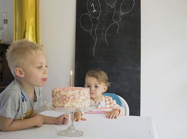
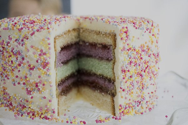
 As requested-a Dolly Mixture cake with chocolate sponge for my grown up boy. Look at him with his crazy hair. I mixed sprinkles into the icing for a little crunch and he absolutely loved it. We all did.Goodness knows what I'll have to pull out of the bag next year. Joint parties will be the ultimate no-no until they're in their late teens, I'm sure. Honestly, what were we thinking?! ;)
The Cut #01 / 6 Must Have Prints For Christmas
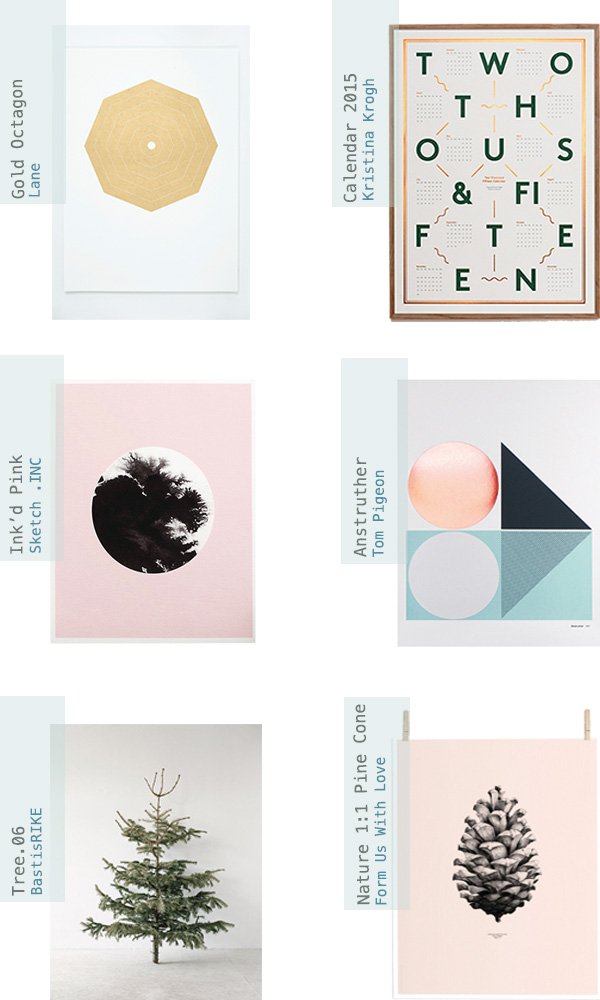 Hello! I have a new series for you today called The Cut, where I feature the most desirable items of home ware and lifestyle that I come across on my travels. Sure, it's not a new concept, but I think you'll really love my picks and maybe even find a little inspiration for your own home.It's that time of year again where we're turning our thoughts to Christmas, compiling ideas and planning if we're ahead of the game, panicking if not! Have you started yet? I most definitely haven't, but I have at least done a little research to give me a head start. I find categorising gift guides to suit all types an impossible task, so this year I've focused only on decor for the home that I'd absolutely love to receive for mine.My 6 must-have prints are, I believe, some of the most perfect examples of graphic art just begging to be framed and displayed in pride of place...✚ Copenhagen based graphic designer Kristina Krogh's 2015 Calendar is a brilliant combination of dark green typography and embossed copper foil. Useful and beautiful. Drawn to cold and warm raw materials, her work often features marble, plywood and cork to produce fascinating, textural art.✚ I love the impact of geometric shapes within the home, particularly three-dimensional forms cast in marble and concrete; the hand-pulled Gold Octagon by Lane would compliment a grouping of these as a vignette leant on a shallow shelf, don't you think?✚ A popular design from my 'Artful Walls' Great.ly boutique is British designer Sketch .Inc's 'Ink'd Pink', using a bleed of black ink as its focal point-perfect for my workspace to pick out the black accessories.✚ Current key trend (not that I care to follow too much) copper is showing no signs of fading. I love what designers Kirsty and Pete of Tom Pigeon have created in their Anstruther print with the metallic foil circle, charcoal grey and spearmint colour combo. With the right balance of feminine and masculine elements, this is a his 'n' her's pleaser for sure.✚ Inspired by nature's offerings at this time of year, I'm desperate for the rose pink and black pine cone designed by Form Us With Love, particularly as I'm starting to bring in touches of soft pink into our living space to warm it up a little. The photographic print of the fir tree by BastisRIKE would look wonderful styled as part of a minimal Christmas setting too; I'm even considering a "naked" tree this year, save for maybe the lights, although I'm not sure my son would be so impressed!Keep your eyes peeled for my next instalment, I'm talking textiles! So tell me, which of these prints is calling out to you?
PINspired Spaces To Work & Create
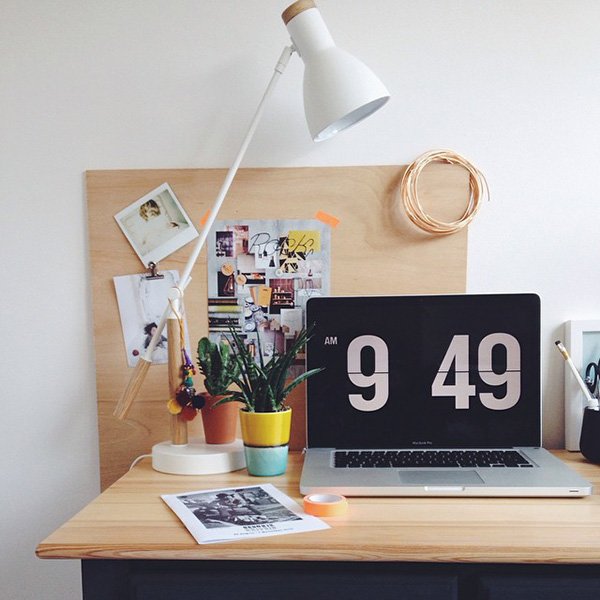
Over the past few months I've been researching and mood boarding ideas for my workspace re-design. Well, I say re-design, there was actually no design to it at all until recently. My 'Studio & Office' Pinterest board has been a fantastic point of reference for me as I've reached each point in my decorative process. From deciding where I should position my desk, how I want the room to function, to shelving, art and styling inspiration, it's been an invaluable tool and one I use on a daily basis.
This room reflects my style which has certainly matured over the years, particularly since I started working as a freelance stylist. You get to experience the work of some incredible designers and architects and want to find ways to bring some of those elements into your own home, or at least I do. Not one to follow trends, rather to create a home that reflects our own personal style as well as function, I'm keen to live in crisp white spaces with touches of black, greenery and natural materials and finishes.
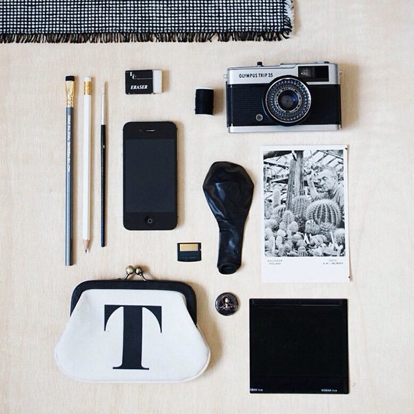
Before I reveal my new workspace to you, I wanted to share some of the imagery and ideas that have inspired me along with tips to create a room that works for you...
Paint It White
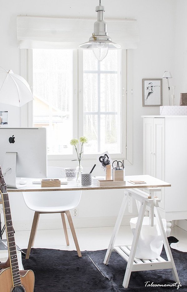 I realise that black and inky blues are fighting back against the swathe of Scandi white walls, but you can't beat a bright, white canvas for clearing your head and kick starting those ideas. Painting out the wishy-washy Magnolia walls was the very first thing I did. Look at this gorgeous space-it's fresh and drenched in light. The walls provide an ideal base for moodboarding or a gallery wall.
Clean & Spacious
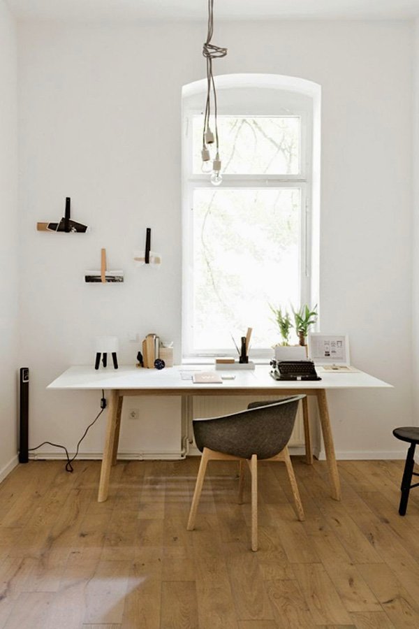
Although we're not all blessed with generous, high ceilings like this room, there are simple methods to keep it looking spacious. I can't work in clutter. Ok, that's a lie. I often do because I'm awful at being tidy, but I can't stand to look at it. By keeping accessories to a minimum and utilising your walls, it encourages you to keep your space in check, and you know what they say; "tidy desk, tidy mind..."
Clever Storage
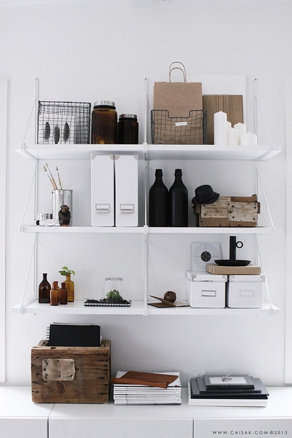
...which brings me onto storage. Do not attempt to buy any storage until you exactly what it is you need. For example, I'm desperate for a set of one of those vintage artist's flat drawers to keep sheets of paper and card in, but A: I have no space for such a thing and B: I don't work with large sheets of paper. Nice idea, but not for me. However, I do need small boxes to store and organise receipts, magazine boxes and plenty of pots for stationery. Use your space for a while until you work out what's missing and take it from there.
Go Au Naturale
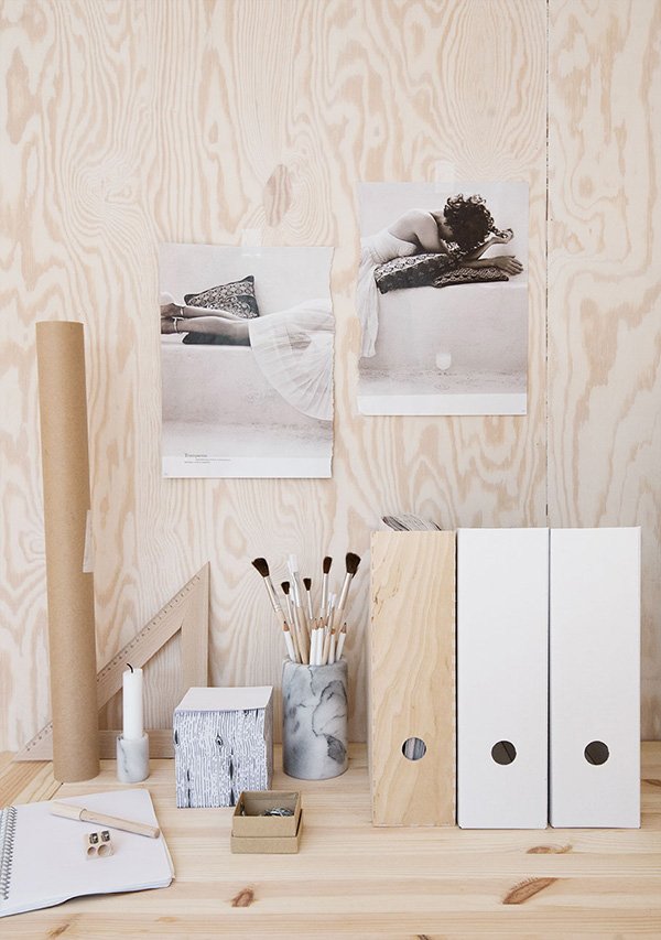
I love using natural materials in my home, the less treatment the better. Plywood is an absolute favourite, any wood with a pale appearance and strong grain running through it. The same goes for ceramics, stone and polished metal. My workspace is full of these elements and they work well in a minimal setting, particularly if, like me, you prefer minimal style.
Hope this post has got those creative cogs turning. Planning an office revamp of your own? Check out my Pinterest boards for plenty of stylish inspiration...
Accessories To Liven Up My Workspace
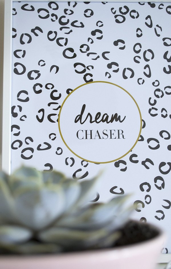 So I've been working away, most of the time very sporadically, on giving my workspace a re-design and new sense of purpose. Very little had changed since I first moved in the furniture 18 months ago and it was becoming a drag to work in. Tired of staring at four bland, utterly uninspiring Magnolia walls (what is it with landlords and that colour?!) I threw down my laptop in a dramatic act of defiance (I didn't really) and vowed to make it the one room in the house I really wanted to spend time in. A place for me.I'm very nearly ready to share it with you now. Last weekend Rob dutifully put up the shelves and I'm spending time slowly rediscovering pieces I already have as well as some of the new to bring the whole look together. Following my recent post, 'Decorating With Plants', and with a healthy population of green friends growing like triffids downstairs, I realised what was missing was the presence of plants to give my workspace a lift-it's pretty boxy and needed some softening. I find the majority of my plants in Homebase-they always have a brilliant selection of succulents (the mini pots are my weakness) and with a few left needing repotting on the kitchen windowsill, I hit the store running. With an impatient one year old in my trolley it had to be a dash and, 30 minutes later, we emerged with a jungle, pots and a few accessories.
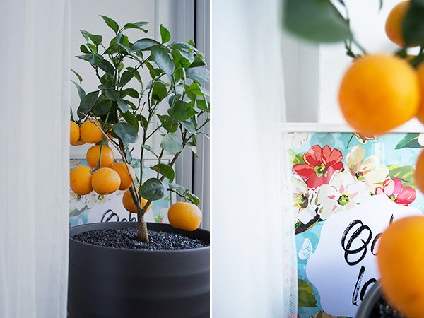 Billie the citrus tree (I name my plants you know) has been desperately seeking a bigger pot of her own since I acquired her in the summer and in her new black pot, her "strange fruit" pop vibrantly against the black. Behind her sits one of my favourite floral graphic prints from my 'Artful Walls' Great.ly boutique, by Becky Lord Designs. Earlier in the year she sent me a beautiful selection for my new space and sitting proudly in sleek, white metal frames, I love their splashes of colour. Just a little bit of 'girly' to soften up the bright white.
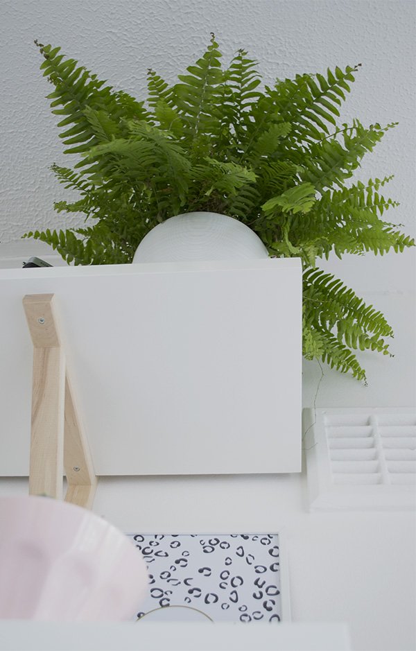 The fern was a compromise, I'd hoped to find something to trail softly over the edges of the shelves, but in the absence of anything I felt its shape would be perfect in drawing the eye up and giving the room a sense of height. I love how it explodes out its white pot.
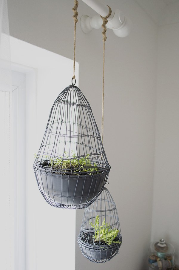 Remember these amazing wire cloches I picked up from my local Oxfam? Well, I thought I'd try planting them with some Sedum which is really an outdoor rockery plant, but I think they'll do well hanging in the window and will start to trail out as they grow. I even managed to macrame the twine at the top, I've not done that since primary school!
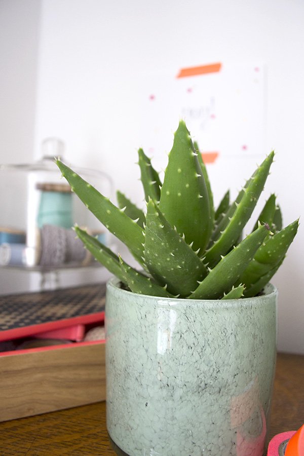
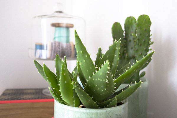 I'm always on the look out for new and interesting way to house my plants; the pots for the cacti are actually candle holders but I couldn't resist the marbled effect of that soft green, handblown glass. Aren't they beautiful? Using coloured glass votives is a great way to tie in with your colour scheme and add a little of the unexpected. The wooden Taoka box with black graphic print and coral inside is a new home for my tapes and trinkets, as most of the decor in here is black and white, I enjoy that vibrant pop of colour.
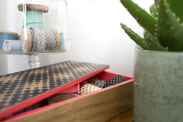 Despite taking three months to reach the end of this project, I feel as though I've really accomplished something in this room and over-come the hurdle of renting. I thought I'd be stuck in decor limbo here, but I've changed the things I can, brought in some beautiful decor and the results are amazing. Can't wait for the big reveal!This post is in collaboration with Homebase.
Photography & styling © Tiffany Grant-Riley
Love It | Ederle Lifestyle
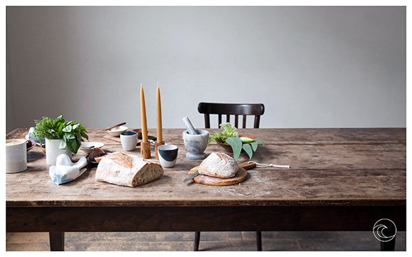 And stretch. Good morning. I thought it would be a great way to wake up today with a beautiful new find of mine, online lifestyle store Ederle. Founded by designer Joanne Heckadon, the inaugural collection is inspired by deep blue waters and soft crystal sands, named after Gertrude Ederle, the first woman to swim the English Channel in 1926. The styling is calm and thoughtful, don't you think?Frequently these days, I find myself editing out the clutter in our home in favour of a more simplistic, pared-back feel. I crave open space, room to think, room to breathe and to enjoy the pieces of decor that we've chosen carefully. This is very much Ederle's ethos; to design handcrafted pieces created from traditional methods and materials, made to treasure.
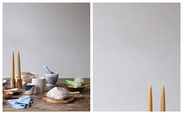
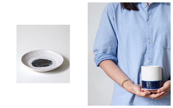
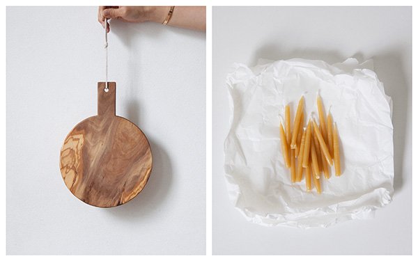
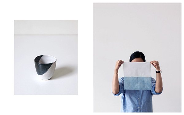 The beauty is in the simplicity.
Photography © Ederle 2014
Urban Jungle Bloggers | Decorating With Plants
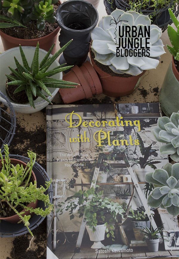 Wow, what a week. Having spent the majority of it in the grips of the worst virus known to man, sucking the life out of all but one of us (Tabby came out of it unscathed) I was so very grateful to have enough energy to spend time doing a little gentle planting and reviewing this beautiful book, 'Decorating With Plants' (The Art Of Using Plants To Transform Your Home) by Satoshi Kawamoto. I'm excited to share my first post as part of the Urban Jungle Bloggers community as well, although I've been a member for months, I always forget to take part! I was so excited when Igor and Judith launched the community as it coincided with the beginnings of my own little urban jungle which is ever multiplying and filling the house with lush, green life...
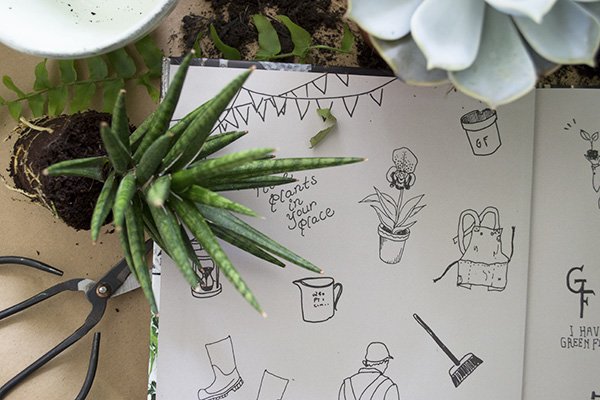 Sometimes I pick up a book and feel the amount of love and attention that's gone into it, and this is such a book. Never mind that it's full to the brim of the most enviably beautiful houseplants, enough to give you a case of the green-eye (see what I did there?) it's styled to perfection without losing touch with reality. Sure, interior style books can make great coffee table decor but they're not always so easy to translate into our every day reality. Tokyo based garden and interior stylist Satoshi invites us into his incredible single-storey home and to feel inspired to rework some of his ideas into our own in a relaxed and lived-in way. He's not a fan of uniformity and every surface, corner and wall has been styled into a botanical wonderland.
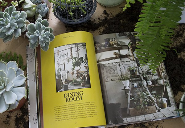 Taking us on a guided tour through each room in his home, he talks through the process of transforming each space, from the renovations, through to the finishing touches. I instantly fell in love with his dining room which houses a step ladder to display his antique pots and flea market finds and aged tin panels on the wall. His bathroom houses huge branches of dried eucalyptus which must smell incredible in a hot shower, and his bedroom has an old American feel to it, with bunting across the ceiling and an old iron framed bed. Satoshi has a real knack for finding beauty in the unexpected, his home is a treasure trove of the reclaimed and re-loved and plants are at the very heart of it.
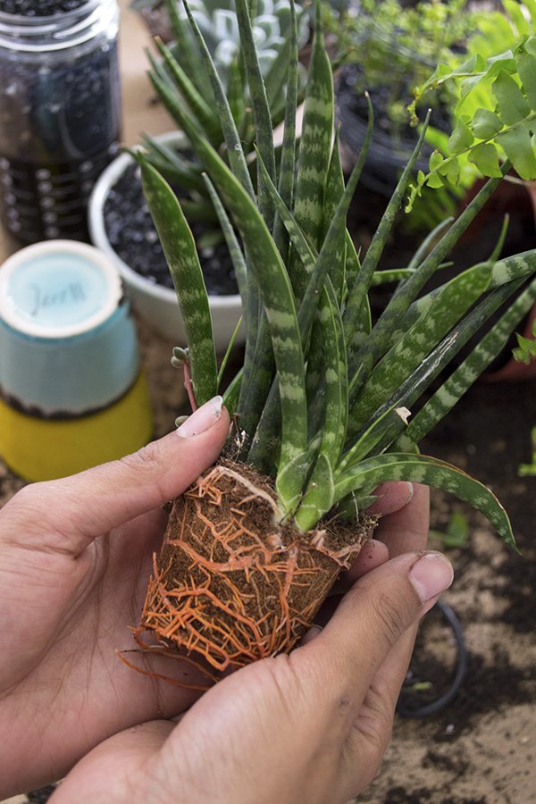
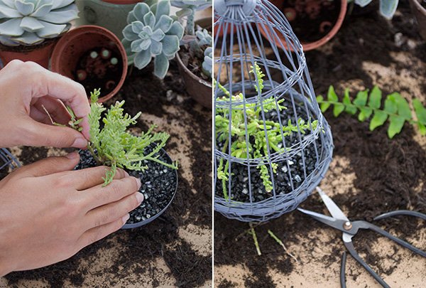 These wire cloches were a charity shop
 steal find that have sat waiting in my garage for months, so it was high time to put them to use and plant them up. I plan to hang them in my office window where they'll get plenty of gentle winter light. Whilst hanging plants inside is something I've yet to try, having seen Satoshi putting it into practice, I'm hoping these babies will happily grow through the grids and gently trail.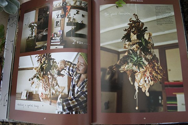
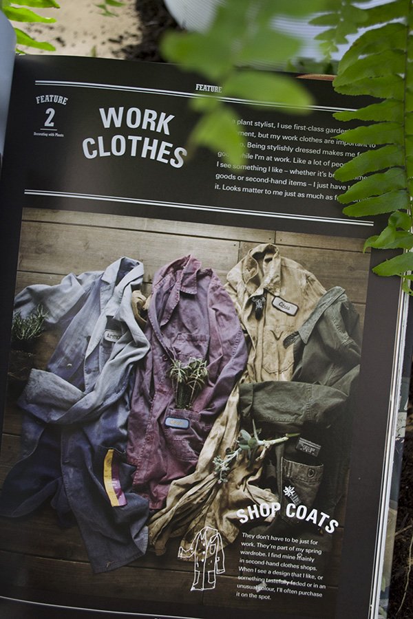 Satoshi highlights work wear as an integral part of who he is and how it influences his style. He looks so cool in his work coat and apron (top tip: he makes his own from old linens as good work aprons are hard to find) and often combines one with a jacket for a night out.
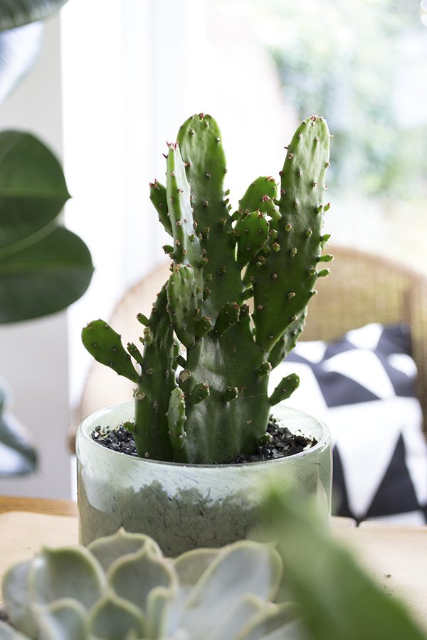
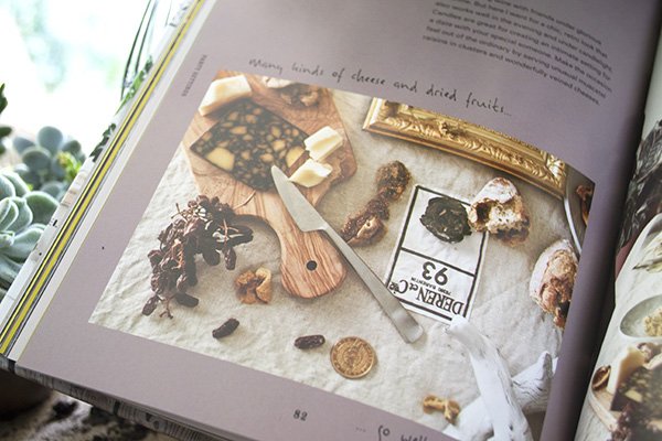
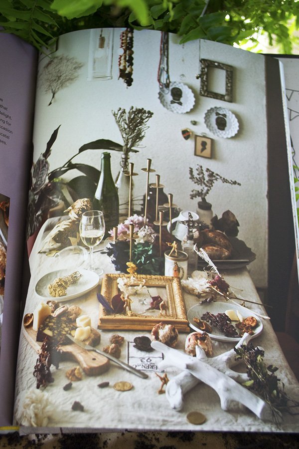 The real gem of the book though, is the wide variety of creative projects there are to try. From a wire succulent chandelier, how to style a corner of your home in three ways, working with dried flower displays, to table top styling, such as this cheese and wine party (above). It looks like something right out of Narnia, don't you think?
 The book reflects Satoshi's life's work wonderfully, he is clearly a man who embodies his calling for plants every day. He lives and breathes it and I urge you do to the same, however small you start out. Trust me, a life with plants is so rewarding.Thank you to Jacqui Small Publishing for sharing another beautiful book with me. The book was published on 16th October so go out, get a copy and be inspired to plant!
Photography & Styling by Tiffany Grant-Riley
An Epic West Elm Styling Challenge
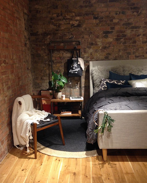 What a weekend! This Saturday I took part in an epic styling challenge at London's West Elm, hosted by Igor and Judith of the Urban Jungle Bloggers and home sharing community AtMine, both of which I'm very proud to be part of.With a strong and talented group of blogger friends and stylists alike, we were each assigned a section of the store and given free rein to style up a storm. With Lucy Gough and Annie Kruse on my team, what else were we going to do?
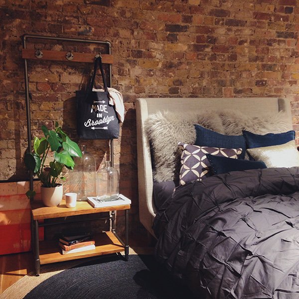 Our look was a moody, cosy, Scandi style industrial bedroom and the brick wall set it all off beautifully. Using a combination of grey and charcoal, we added depth with some on-trend midnight blue and a splash of red. Playing around with layered textures in the bedding and pillows, we completed our set with the slate jute rug and that incredibly beautiful John Vogel chair.
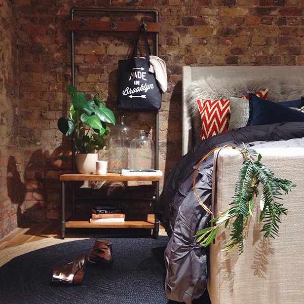 And here is our final set-up which you can see at West Elm's Tottenham Court Rd store all this week. Love what you see? Please take a moment and vote for our photo here on Instagram because, well, it's a competition!
The Bicycle Florist & A Dalston Warehouse Home
 Earlier this year I discovered Petalon, run by Dalston based florist Florence Kennedy alongside her urban bicycle manufacturer husband James of Kennedy City Bicycles. The Petalon premise is simple-each week she designs two bouquets depending on what she's drawn to at the flower market, sells each bunch for a flat £25 (£40 for a bigger bunch) and donates £1 of each sale to bee charity Capital Bee. Oh, and they deliver straight to you across the whole of London on just two wheels. Brilliant.Me being me, I jumped on her with plans to meet up and take some shots of her workspace as soon as was humanly possible, but with one thing and another (the couple getting married for one!) it took months for us to get our acts together, until one gloriously sunny afternoon in August I made it to a stunning former warehouse in Dalston. What a space. Oh, and did I mention how absolutely fecking gorgeous they both are? I mean...
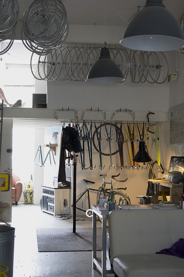 We cross paths at the door and Florence invites me in as she packs the delivery bike with the last orders of the day; an explosion of purple country blooms wrapped in the signature Petalon black and white striped paper. Walking in from an anteroom filled with buckets of stems I find James at his desk finishing up the route for the afternoon's deliveries, surrounded by his custom bike frames, tires and tools of his trade. It took me back to visits to the bike shop as a kid, picking out my next ride and the smell of brand new rubber and leather.
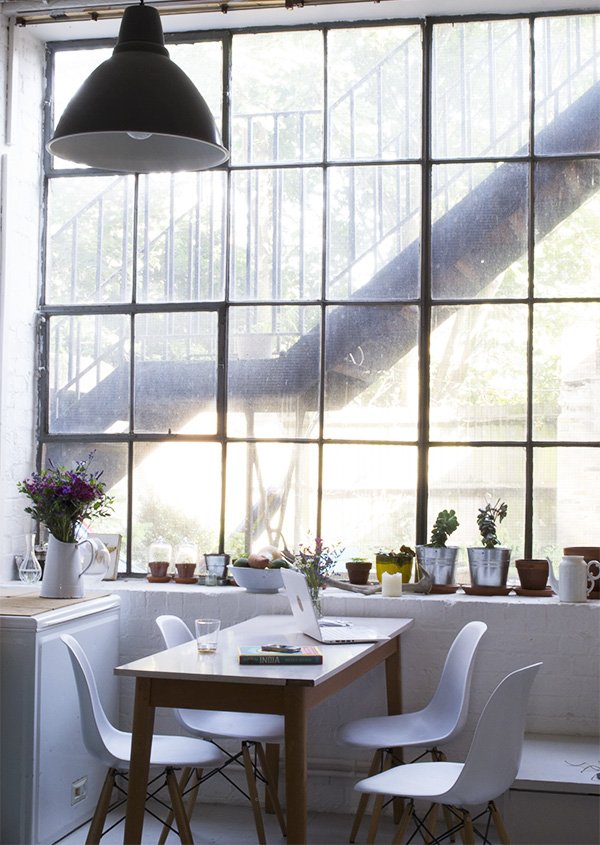 Florence comes back inside to see James off with a few instructions, and then we're on our own to chat whilst I snap away with my camera. My angle for the feature was to focus mainly on Petalon and Florence's passion for flowers, but as I look around I see there's a lot more to it than just a combined workspace-there's a small kitchen area, a comfy couch and collections of succulents thriving on the windowsill. This is their home too.
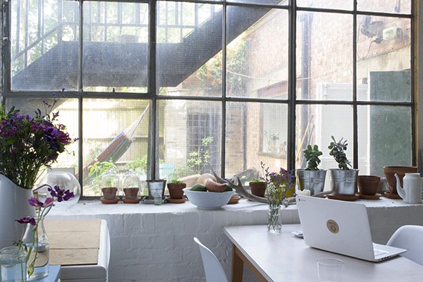 The Kennedys are taking the idea of working from home and fully embracing it with their Great Dane and giant teddy bear, Huxley, who I meet dozing out in the courtyard garden. He's quite disinterested in me and the neighbours are about to begin a yoga class. Every inch of their warehouse unit is working hard to function as a duel purpose space. Just above James' workshop on a mezzanine floor is their bedroom where a leather lounge chair sits bathed in light from a full height metal framed window and the open-plan kitchen and living areas are zoned out with furniture as opposed to solid walls. The bare bones of this building are unabashedly on display; from the brick walls painted a bright white and original metal panelled windows to the concrete flooring. It is perfectly imperfect, rough around the edges and beautiful with it.
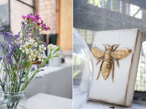
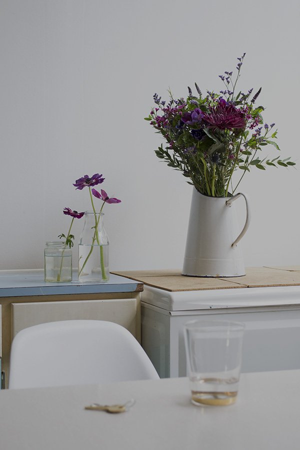 Just a short time ago, Florence was feeling unfulfilled at a desk job. Coming home every evening to seeing how happy James was in following his passion for bikes, she decided she needed something to focus her attentions, a small scale project that she could manage. After a disappointing experience ordering flowers for a colleague she almost stumbled into floristry as she began to think up ways to make choosing and ordering flowers more enjoyable, with stylish, simpler choices. And thus, Petalon was born. With her freeform style and natural ability to select beautiful varieties and colour-ways, she's clearly found her calling in life.
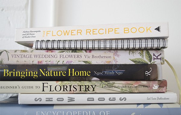
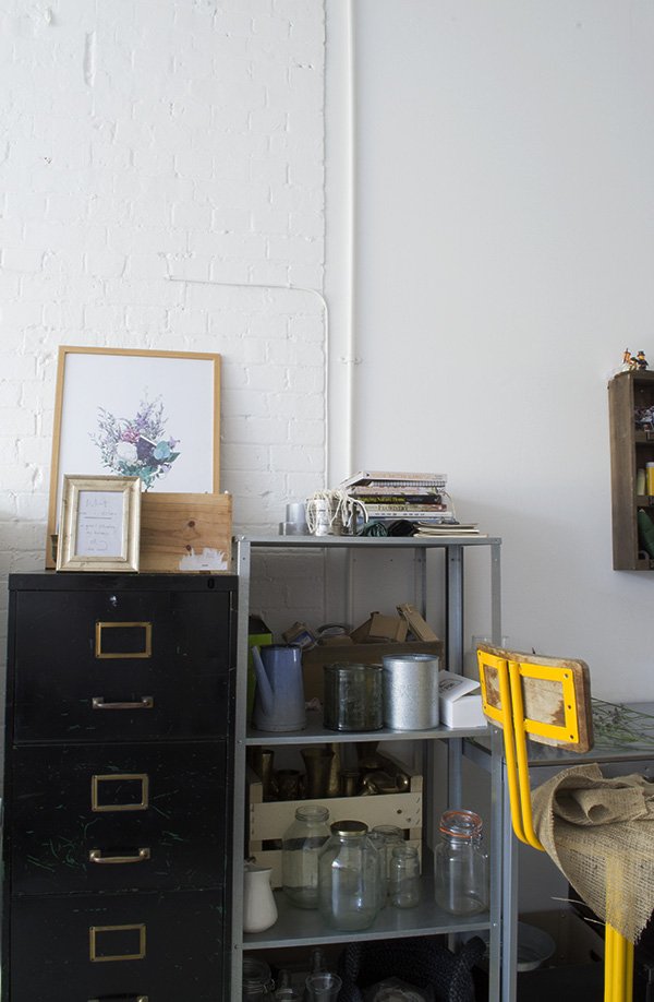
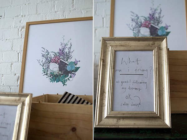 Have you spotted the ThoseWho-Petalon print I blogged a few months back? Mine is just waiting to go up in our living space now!
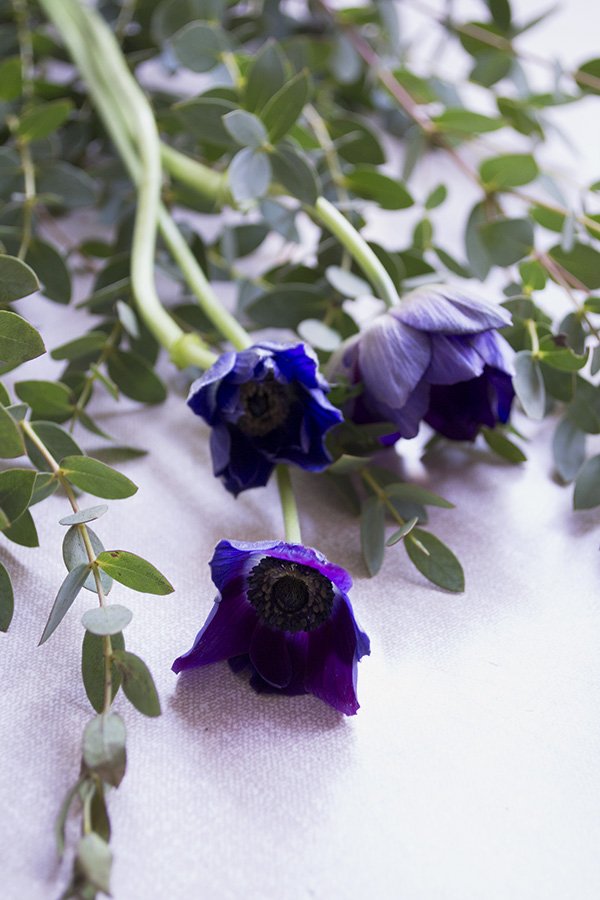
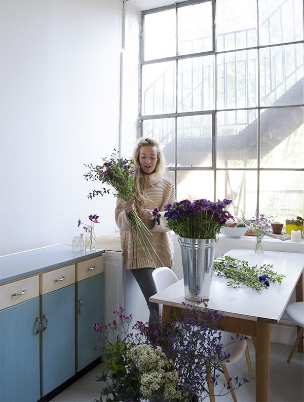 We get on to talking about favourite flowers (hers are anemones-a girl after my own heart) floristry courses and future plans for an organic flower farm. I suggest she show me how to pull together a quick arrangement. Out come two metal buckets packed with wax flower, statice, flowering mint, thistle, anemone and giant chrysanthemum. She talks me through it...
 1. Start by choosing a hero flower on which to build your bouquet-she picks out a deep, wine coloured chrysanthemum.2. Begin adding in texture; here she adds some flowering mint and eucalyptus leaves.
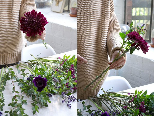 3. Rotate the stems as you go, overlapping them in the direction you turn to allow a more even look.4. Add in some of the smaller blooms such as the anemones, wax flower and statice, always rotating as you go.
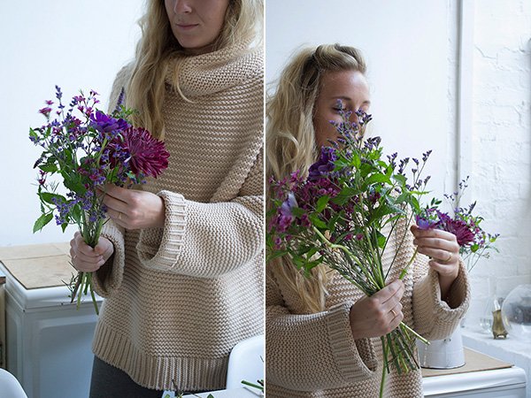 When you're happy with it, hold it securely with one hand and wrap it with twine to hold it in shape, then it's ready to pop into a vase or give away.
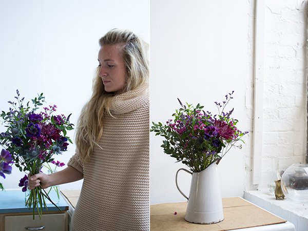 I love the home that Florence, James and Huxley have created for themselves here; from the little nick-nacks they've picked up on their travels, the Indian cookbooks and reclaimed vintage furniture to living amongst their working lives. It all flows.
 Thank you for having me. X
The SMUG Shelfie Blogger's Breakfast
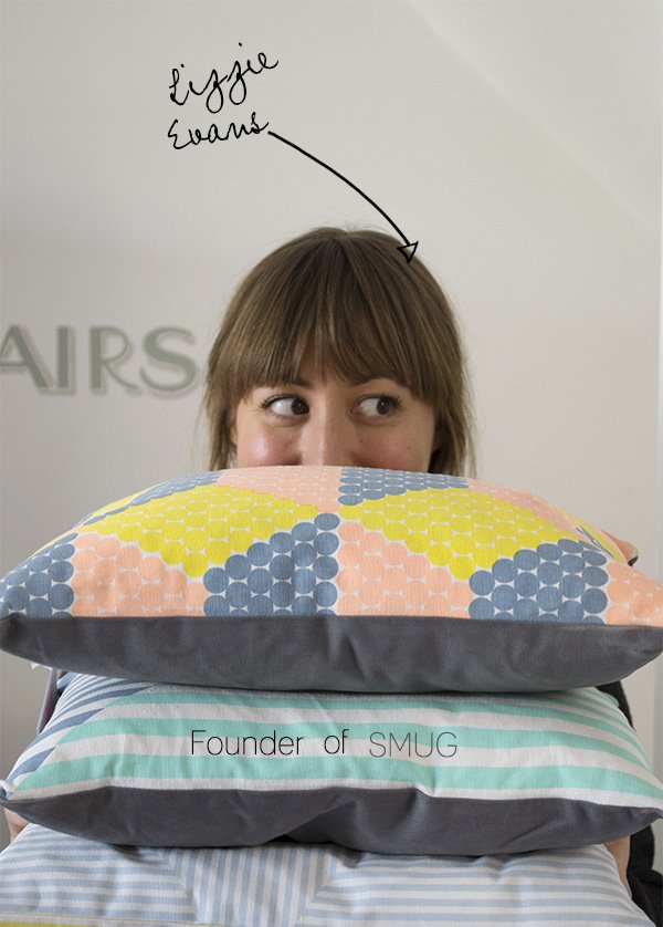
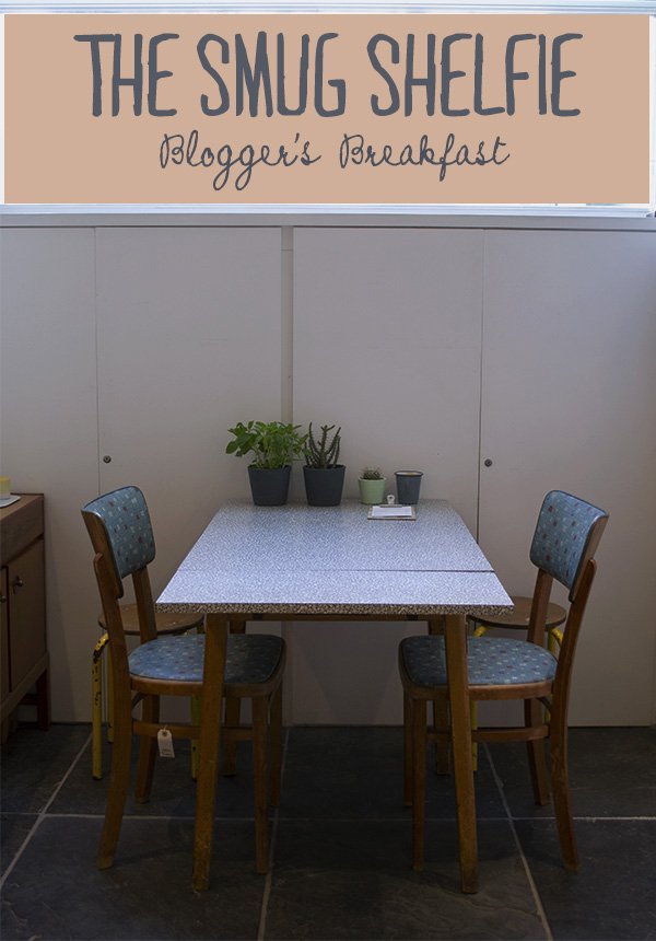 Last Sunday I headed out nice and early to co-host a blogger's breakfast at SMUG in Islington's Camden Passage. Founded and lovingly run by interiors and graphic designer Lizzie Evans, this bright and quirky shop is home to some of the most beautifully designed pieces of homeware known to man. You have it on my authority. No mass produced copycats here, all of Lizzie's products have been created by independent designers, set in a space that feels like a home.
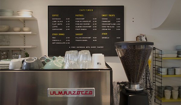
 With the recently opened SMUG Cafe downstairs, Lizzie was keen to get the word out, so earlier this summer we got together with Amy Silvester of RumourPR to hatch a plan to collaborate on an event. We left feeling excited about hosting a 'SMUG Shelfie Breakfast' in which we invited some of our favourite bloggers to enjoy the new cafe space and spend a morning styling up a shelf using their most coveted pieces in the shop. Complete with delicious pastries, fresh juice, coffee and vibrant flowers courtesy of HipHop & Bloom the scene was set. They came. They curated and, with me on hand to offer up some styling wisdom, they displayed (see what I did there?) Come, have a look around and see what we got up to...
Definition of 'Shelfie' -
A play on the word 'selfie', in which one takes a photographic portrait of oneself, in this instance, one creates a look using objects carefully displayed on a shelf and takes a photograph of it.
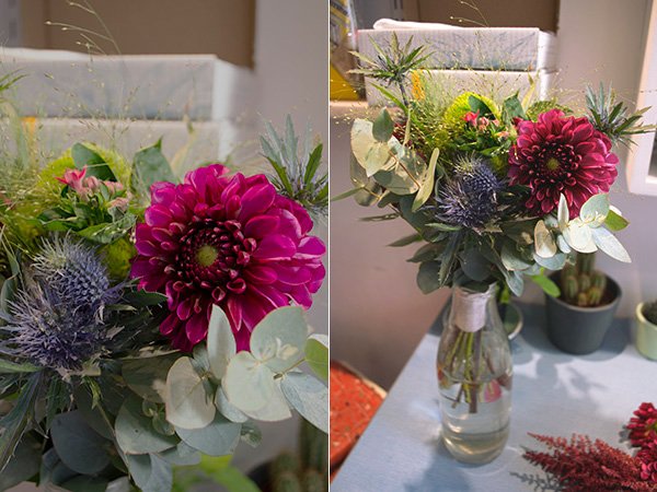
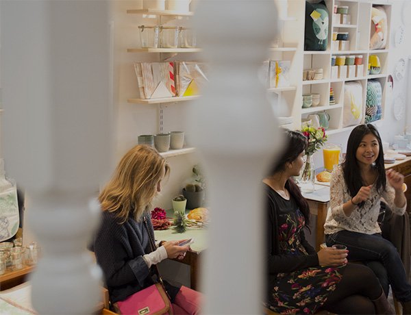
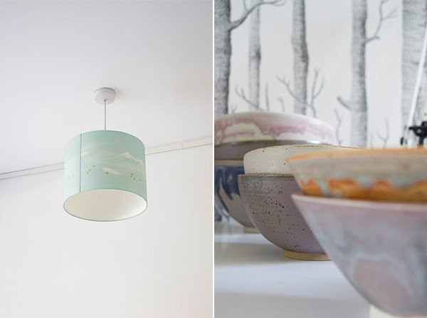
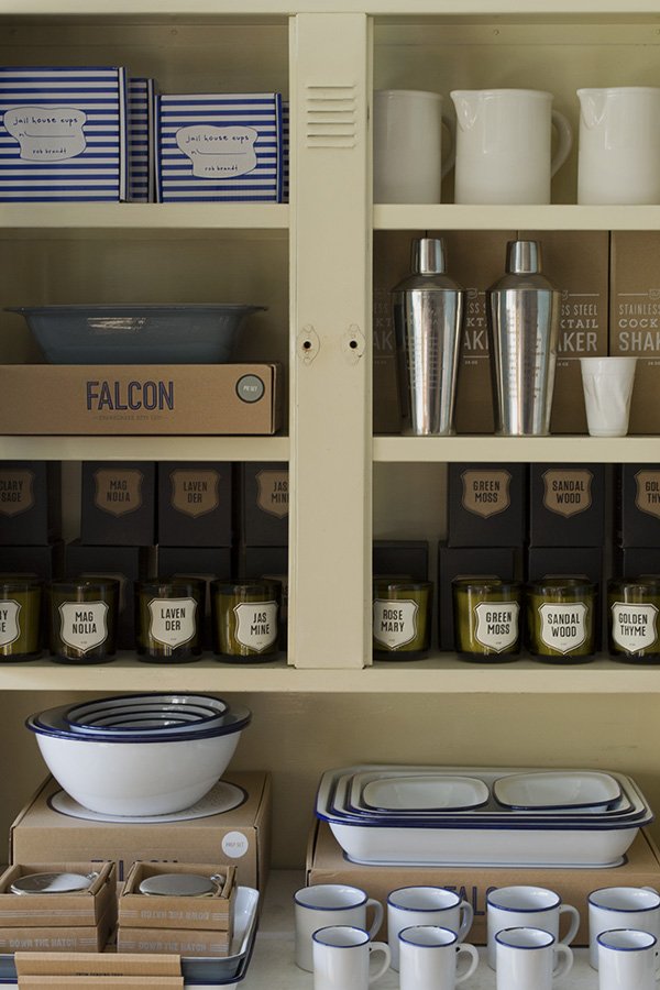
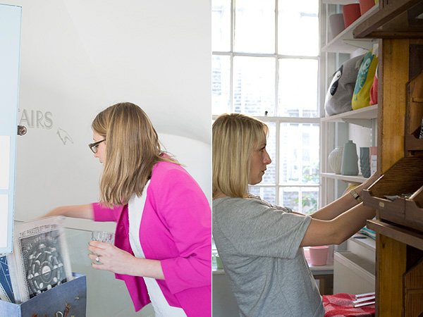 And here are a few of my favourites. I'd love to have included them all but as I've gone nuts with the photos you can find more from the #smugshelfie event on the Facebook page.
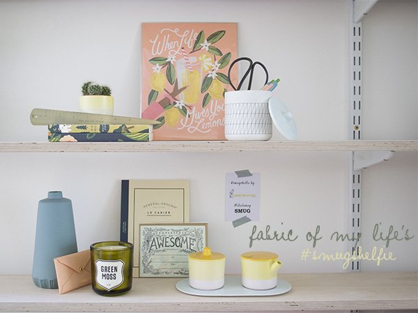 Fabric of my life's Kate Baxter picked out a mouth-watering citrus inspired colour-way, featuring Rifle Co. stationery, Scholten and Baijings ceramics and Lenneke Wispelwey's Long John vase. I love to see plants used anywhere in the home, so the little cactus was a welcome addition.
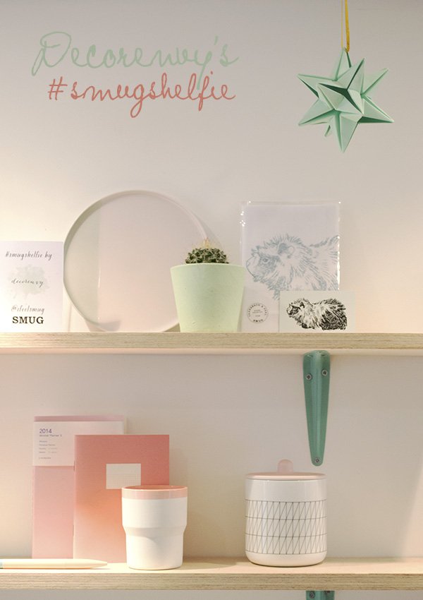 Decorenvy's Lucy Meek chose a look that reflected the style of her blog, with mint green and soft pinks. I love the use of Origami Est's star hanging from the ceiling (a SMUG exclusive for Christmas!) and the nod towards SMUG's guinea pig mascot in the form of a tea towel designed exclusively by queens of the animal motif, Thornback & Peel.
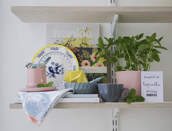 It was a particularly special morning as I finally got to meet my virtual friend Sarah-Louise Kimmer of LapinBlu, although imagine my shame when I introduced myself to her and realised for that split second I didn't know who she was! I hope she'll forgive me though, because her 'Slow Sunday Morning' vignette really won over my heart. Using her favourite magazines Frankie and Kinfolk to add both height and a backdrop, Sarah built on her look with Thornback and Peel linens, and the beautiful geometric form of Lenneke Wispelwey's ceramic bowl in which sat one of Origami Est's Christmas origami baubles (a very clever connection in shape there). Like my own shelf which I styled for the invitation, she picked a subtle bird motif with Louise Wilkinson's bird side plate and added in the scent of a mint plant from one of the cafe tables out in the courtyard. A perfect setting for a lazy Sunday, don't you think?
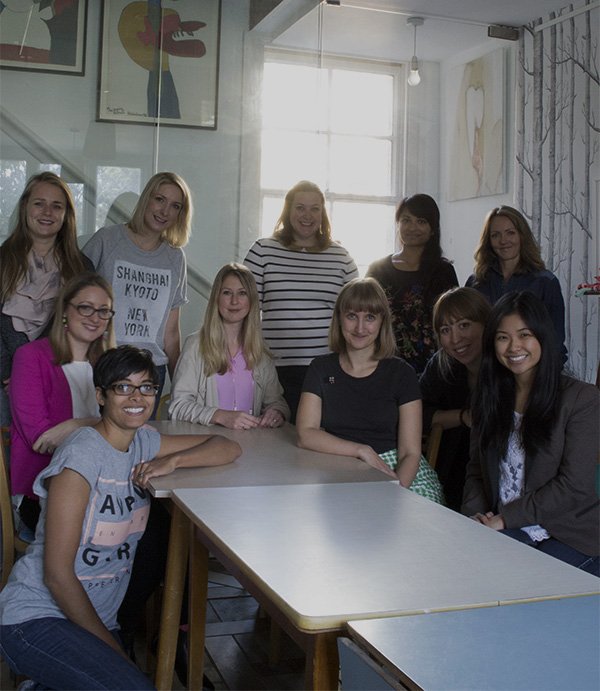 And here we all are for your viewing pleasure, a fabulous group of fresh faced, creative ladies at the end of our morning. Thank you so much for coming along, jumping in feet first and having some fun and to Manolya for plying us with freshly squeezed orange juice, flaky pastries and great coffee all morning!(Clockwise) Me, Lotts - Lotts & Lots, Lucy - Decorenvy, Kate - fabric of my life, Lori - Wild & Grizzly, Ruth (with the best sparkly collared top ever!) The Planned Adventure, Amy - RumourPR and Daisy Fay, Sammi - Made By Molu, Lizzie Evans - SMUG, Sarah Louise - LapinBlu and Josephine - Courage and Dash.Props to you all.If you're on Twitter or Instagram you can find more gorgeous photos from our morning using #smugshelfie.
A Coffee Table Beauty / Modern Country
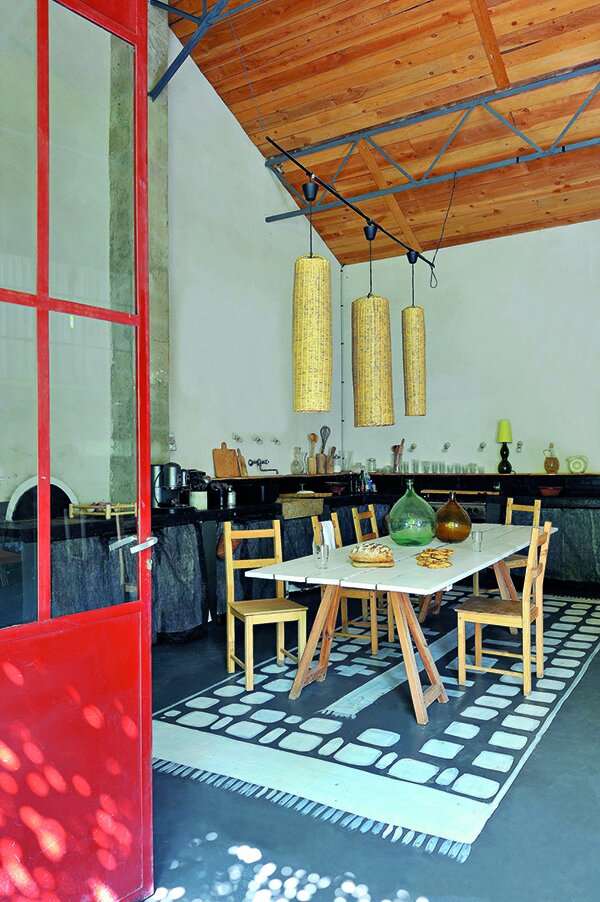 It's almost the weekend and this week, aside from recovering from a two day shoot, I've been busy reviewing a beautiful new title from Jacqui Small Publishing, my go-to guys for serious interior style books. This is one for the coffee table. 'Modern Country - Inspiring interiors for contemporary living' by journalist Caroline Clifton-Mogg is wholeheartedly a breath of fresh air. Finally someone has taken the outdated country look and shown me something I can get onboard with. No chintz or dodgy 90s pine. Nope. This is contemporary country style, and it's raw and sexy, focusing on pared back interiors highlighting the beauty of the materials used, from traditional exposed wood and stonework, to modern concrete, metals and glass. Modern country style encompasses the idea of exposing the raw materials used in the renovation process, like for example the concrete flooring in the shot above where the owner has painted on a patterned rug to anchor the table. The overall aesthetic is uncluttered and beautiful in its simplicity and I love that. In fact, I loved it so much, I made a video. Take a look...Caroline explores the look in four chapters; from Architectural Styles, Materials and Finishes, Country Locations and Country Living, with a liberal smattering of stunning images from French interiors publication Côté Sud, Côté Est and Côté Ouest. Each case study illustrates how the owner drew inspiration from their surroundings for the traditional aspect of country style, but also pulled elements from contemporary construction methods and materials, not directly associated with country living.
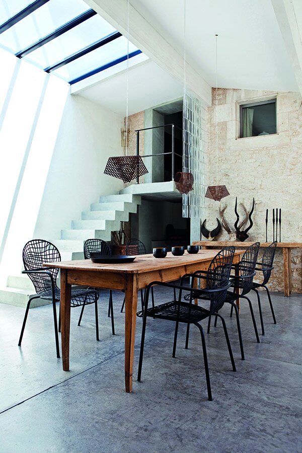 I'm going to spend the weekend planning my imaginary Tuscan farmhouse. Polished concrete flooring? Yes please!So what did you think of my little video? If I've sparked your interest, you might want to take up on the reader offer too:
Reader Offer! To order Modern Country at the discounted price of £24.00 including p&p* (RRP£30.00), telephone 01903 828503 or email mailorders@lbsltd.co.uk and quote the offer code APG217.
*UK ONLY - Please add £2.50 if ordering from overseas.
Monochrome Scandi Style / Copenhagen Collection
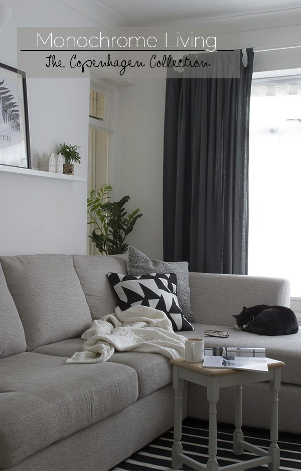 Shut the front door! This is the first time I've properly shared a corner of my home since this blog post last year. You might need to sit down. Are you ready?Our living space has been much neglected in the 18 months we've been renting this house. I started out with the best of intentions, aiming for a clean and fresh monochromatic scheme, it suits this mid-century house so perfectly and would make the most of the beautiful light we get, sitting at the top of a valley. I bought two sets of basic cotton tabbed curtains to cover the giant front window, joined, hemmed and dyed them, painted the walls white and ordered our sofa. Then I got distracted and bought a rug which went completely against the grain, and suddenly I was adding in a mish-mash of cushions which, although they looked great on their own, as a collection, they just didn't work. Completely lost, I went off to focus on my office (more of that to come).
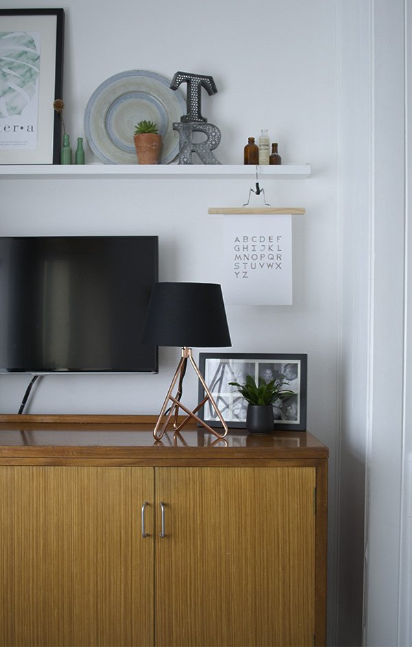 So when John Lewis got in touch about their new Copenhagen Collection and would I like to try some of the pieces, I jumped on it as a chance to turn our living space around. The collection oozes monochrome Scandi style, focused on texture- natural wood, wool, cool marble and metal, and you don't need to change your entire look to enjoy it either. It's the perfect time for an update, now Autumn is well and truly upon us, and I relish our evenings cuddled up amongst the cushions and blankets. After playing around and editing out a few bits and pieces, it looked like a completely different space and with very minimal effort. Even Rob was enthusiastic about my choice of cushions, which is highly unusual for him and said it suddenly looked very homely. I win.
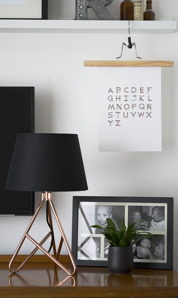 I'm not a fan of televisions, in fact, if we didn't have children, I'd scrap it all together, but for now we're stuck with it, so I'm always looking for ways to blend it in a little more. I love the shape of this copper based Albus Twisted Table Lamp with black shade, I've teamed it up with a black framed photo, typographic print designed by my brother and a botanical print on the shelf above to draw attention away from the TV. The little birds nest fern sits in a hand thrown black pot from Tunisia. I'm addicted to buying plants.
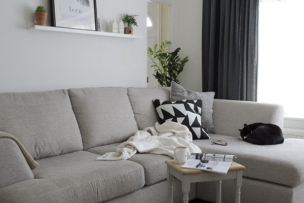
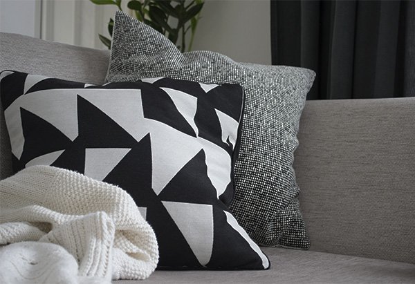 Our sofa is looking a little on the sparse side now I've taken the away the offending cushions, but the Chevron and Copenhagen designs have given it a much stronger look. I brought the knitted cotton blanket, originally meant to be a large bedspread, out of storage. It was knitted by my mum who abandoned it years ago and left it gathering dust on a shelf in her living room, so I rescued it. Looks so at home there, don't you think? This corner of the sofa becomes Reuben's during the day when he's a little sleepy after nursery and he loves to snuggle up under the blanket with a warm milk.
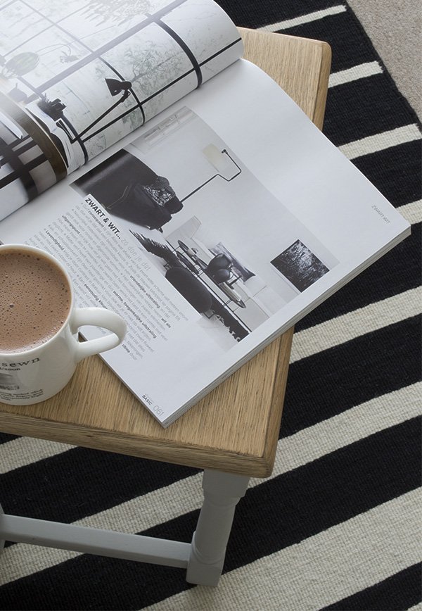 My favourite piece of all has to be the bold striped, hand woven Listrado rug. I used this as my "jumping off point" and built on that. Our carpets are horrendous and 'Mr Malawi' (our landlord) refuses to replace them, despite the balding underlay, frayed spots and the occasional screw hiding underneath (I kid you not) so rugs are my go-to piece to give the floors a lift and zone the important areas. The little table is one of three that Rob picked up years ago in a charity shop. They didn't look anything like that when he bought them, but they've been given a new lease of life as a recent DIY project and I can now look at them again. I'll be sharing that with you in a short while, keep those eyes peeled.
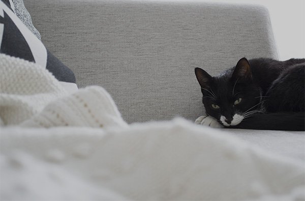
 The next step will be to warm up the look with some soft pink cushions, a colour that gels really well with Winter Scandi style, a few more copper accessories, maybe even add in some sequins, because I love a little sparkle.So what do you think of monochrome Scandi style? Mosey loves it, don't you?
*This is a collaborative post.
A Stylish Find / Future and Found, Tufnell Park
 Future and Found is, if you'll excuse my dodgy pun, a seriously stylish find. A sweet discovery I made on a home shoot for LivingETC some months ago now (we had these deceptively delicate coffee pots on loan) I made it my mission to get to the shop in Tufnell Park and meet its founder Andrea Bates. Having recently moved, the shop is now settling in to its new location; a former factory complete with original metal framed windows, industrial brickwork and concrete flooring. Designed in a way that allows each carefully selected piece to shine without the feeling of clutter, the space is small and perfectly formed. I love that, by way of connecting with its name, you have to discover the shop for yourself, starting with a short walk through a covered walk through to a courtyard, where Andrea and her "right hand gal" Grace Poulter curate the space with outdoor decor, depending on the season.
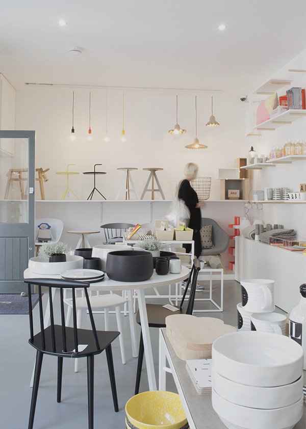
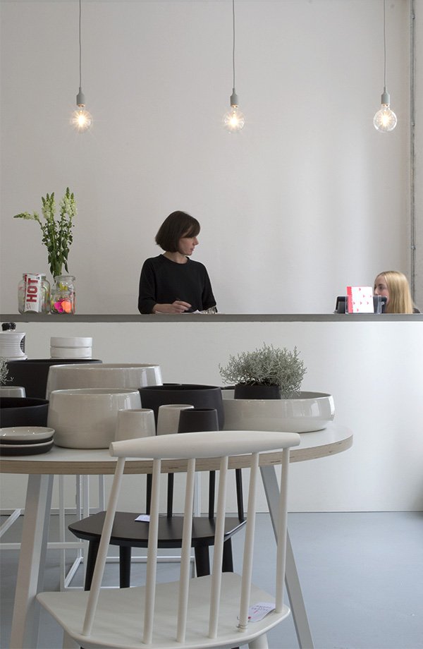 With a former career as a buyer for Heals and, more recently, Jamie Oliver, it's clear that Andrea's experience has influenced her choices in creating the Future and Found brand. Her Scandinavian aesthetic is crisp, clean and functional with a focus on hand-crafted, design-led pieces, grounded in a monochromatic scheme but given a lift with pops of neon. The shelving scheme was a custom design where the struts have been secured into the wall plaster-a stylish idea for open shelving in a kitchen or living space, don't you think?
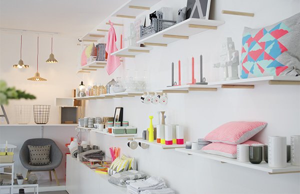 Amongst the future design classics from the likes of HAY, and Muuto are emerging British designers, including Kangan Arora, and ByAlex. With the London Design Festival now in full swing, Andrea and Grace will be on the look-out for new products from promising designers to bring back to the shop. She tells me that unlike large department stores where the time from sourcing and buying a product to getting them onto the shelves can take months, as a smaller set-up, Future and Found can discover pieces and make them available much faster, a freedom she very much enjoys.
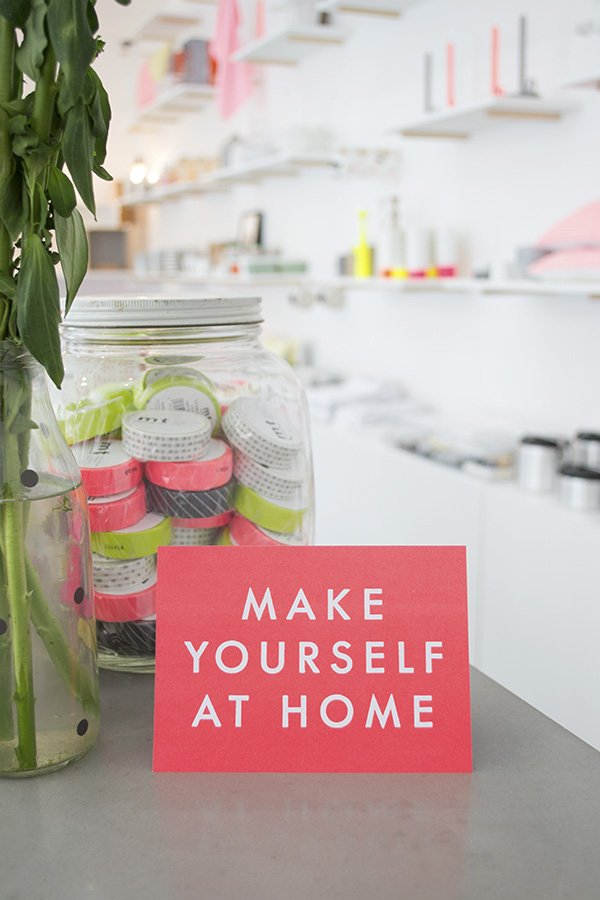
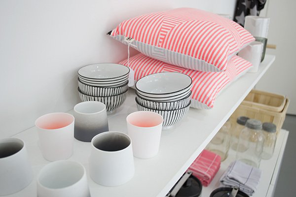
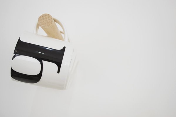
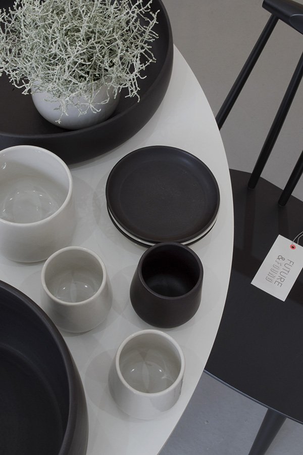 I couldn't take my eyes off these beautiful, handmade ceramics by Bel Art Creation based in Tunisia. Having recently re-styled our living space with a strong, monochromatic feel (more on that very soon!) it's a look I can't take my eyes off. Working with so much colour as I do, and wary of the trends that come and go, I feel more and more drawn to the simplicity of black and white.
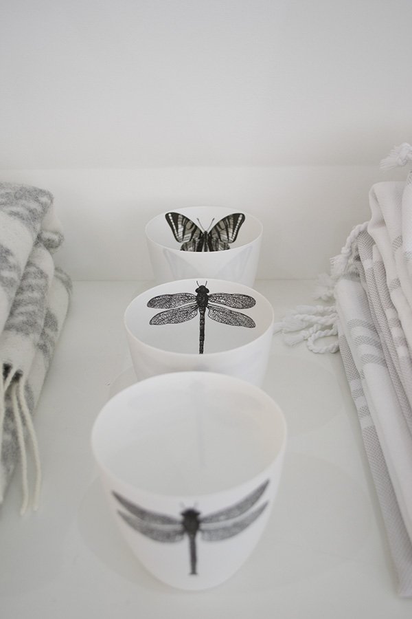 So many beautiful, covetable pieces for the home. Thanks for having me girls!
Beautiful Details From The Home Of Charles Darwin
One of my favourite pastimes is getting lost within the old walls of an historical house or home, imagining the former owners going about their daily lives and, just for a few moments, imaging that I too lived there. I've been doing it since early childhood and we encourage our two children, about to turn one and four within two weeks of each other, to do the same. It's magical, don't you think?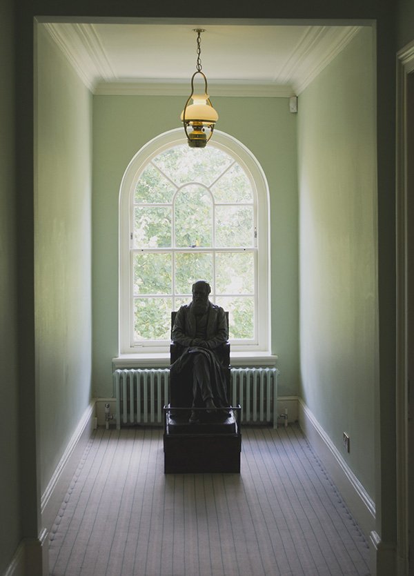 Last weekend we made a break for freedom with the kids to Down House, the home of Charles Darwin, not far from us in Kent. I love this house for the way that Darwin used it as an integral part of his life's work-from studying his own family, his years of relentless research and cataloguing in his beautiful study, to the gardens, greenhouse, fields and beyond. It was a house to be lived in. So I captured some of my favourite details from inside the house to share with you. I took so many of the gardens as well but thought I should keep it sweet for the purpose of your sanity. Ha!
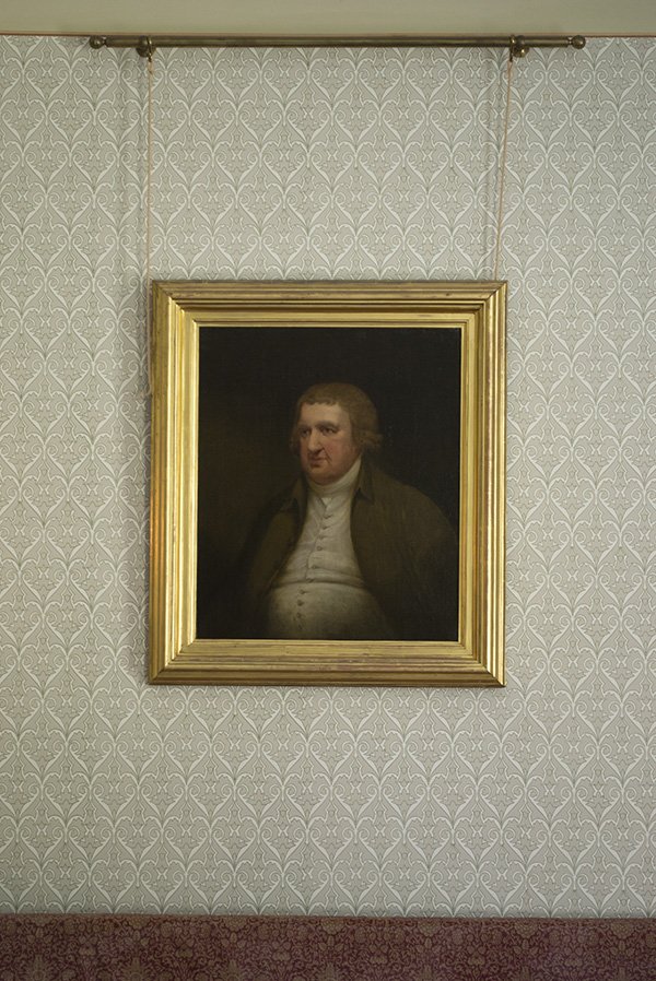
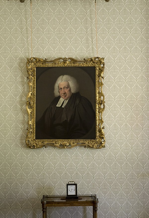 If you read my recent post about styling oil portraits in your home, you'll understand why I loved these two portly gentlemen hanging with an air of self importance in the dining room. And if I'd bothered to wander around like a numpty with an electronic guide in my ear I could've told you who they were. Sorry.
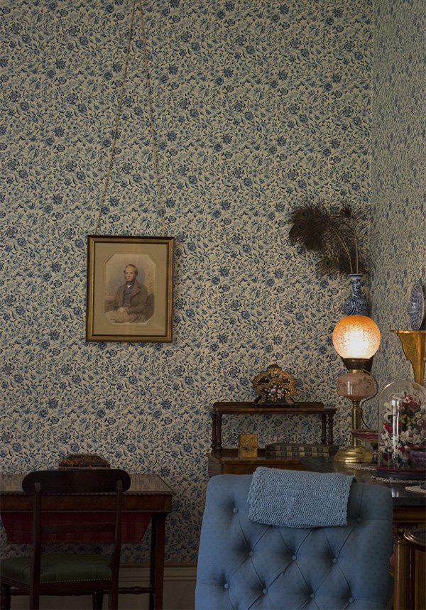 The living room or parlour. Glorious wall to wall blue floral paper, dark wood furniture key to the Victorian era and touches of blue crockery and seating to tie it all in. I think the peacock feathers make it.
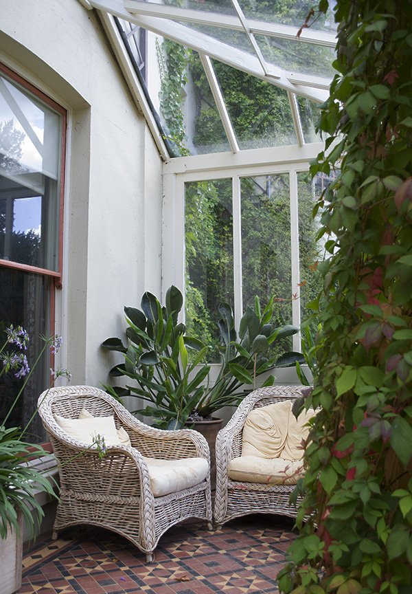 Couldn't resist adding in this shot of the conservatory, with its wicker seating, lush tropical planting and mosaic tile flooring. Oh, and the coral pink window frames. I'd be content to potter around here once or twice a day, tending to my plants and soaking up the warm sun. Wouldn't you?
A Look I Love / Oil Portraits & Pared Back Interiors
I've had a certain look in my head for some weeks now and I just can't shake it. Wouldn't like to call it a trend as such because it has such a history and a timeless quality, but of late it's been difficult to ignore it popping up all over Pinterest and a few of my favourite blogs. It started like this. Some time ago I was having my usual charity shop snoop when I almost fell over this oil portrait of a Georgian woman in a powder blue dress in a gilt frame. She was in a slight state of undress, her hair falling loosely about her shoulders, a knowing glint in her eye. And suddenly my mind was in over-drive - "should I buy this?" "how can I make it work in our home?" "maybe for the bedroom?" but on closer inspection, although the frame was a very good quality, there just wasn't enough texture on the canvas for it to be genuine. A canvas print perhaps? So I left her there. Stupid, stupid girl.Back home I set to searching for interiors with oil portraits on Pinterest, found three of my favourite examples and decided to decipher how to style and make the look work so that the next time I went back for her, I'd be armed with ideas and could defend my actions when Rob called me a crazy loon for bringing home such a massive, slightly bizarre piece of decor.
Take Two
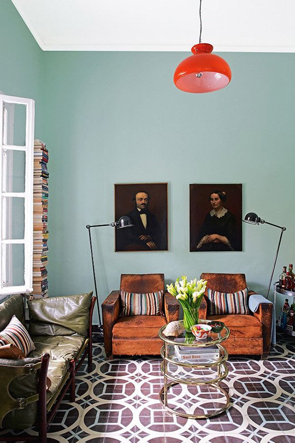 The Look - Lived-in flea market style mixed with Mid-Century Modern design classics. This 1930s bungalow in Marrakech has a costal vibe and follows a palette of blues and oranges throughout the house with feature geometric tiled flooring.Why It Works - The portraits sit together alone as a pair anchored above the two worn leather chairs and two retro floor lamps on either side. Nice bit of mirroring there. The deeper tones of the paintings tie in with the darker areas on the chairs and the tiled flooring. Against that calming, classic blue green and that pop of orange in the light shade, they're picked out as a feature.
Connect The Stripes
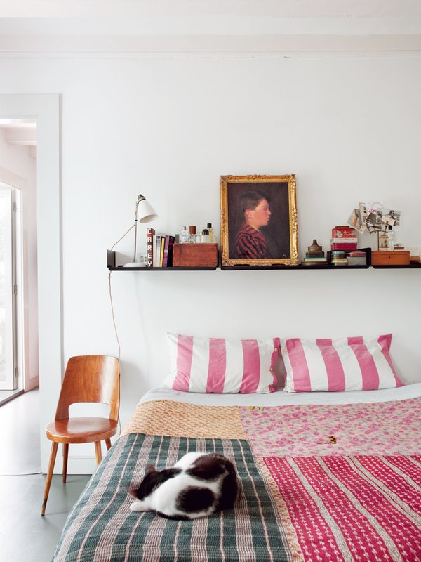 The Look - White walls drenched in light, polished concrete flooring, eclectic treasures and textiles. A simplistic look for a renovated apartment in Barcelona.Why It Works - Sitting just off-centre on those black floating shelves, the portrait becomes a focal point in its gold frame but also blends as part of the overall look amongst some treasured finds and souvenirs. I love that they connected the stripes in the boy's blazer to that of the mis-matched patchwork quilt. A clever way to anchor the art to the decor in the room.
Moody Hues
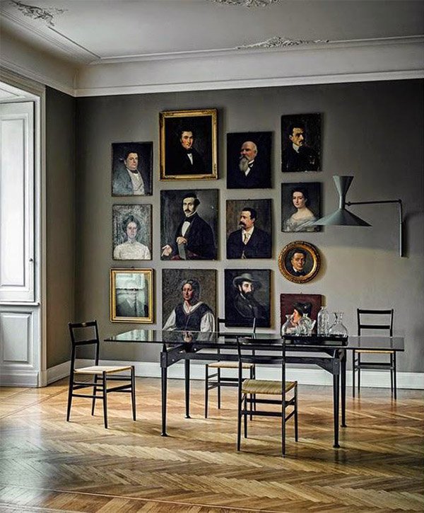 The Look - Classic, minimal, almost austere. High quality finishes and furniture, with polished parquet flooring, heritage grey walls, and detailing around the windows and ceiling.Why It Works - All the portraits grouped within this scene are dark and moody, but there are lighter tones of grey and off-white in some of the women's gowns which connect to the grey of the walls. You'll notice that whilst there is a small selection of portraits hung in gilt frames, the rest are in a modest black or perhaps not at all. This salon style gallery wall is anchored by that beautiful, sleek, black dining table and chairs and I love that they've been positioned almost to the skirting board.
How To Make It Work For You
1. Connect - The key to getting this look right is to connect your art to your decor in a way that makes it a feature but also blends it to look like a natural part of your surroundings. I mention "anchoring" several times here, it's a fundamental rule in styling, in this case it means that you always connect your art with a piece of furniture (like the chairs in the first example) or perhaps with the soft furnishings like the stripes in the second).2. Keep It Simple - Don't be tempted to clutter it up with other pieces unless, like the third look, they connect to each other. Keep it minimal.3. Consider Your Display - Experiment with the way you display your art-if it's big enough try leaning it against the wall on the floor. Think about the frames you choose-will they all be in the same style? Perhaps you'll use a mixture of two colours in different styles to mix it up a bit?4. A Complimentary Backdrop - Stick to block colour on your wall that works with your art as heavily patterned wallpaper can make your portraits look old-fashioned and a little twee-you can never go wrong with fresh white walls in my book although a dark grey, almost black would be stunning in the right setting.I did go back for my Georgian lady, twice. The second time I got scared and changed my mind. Again. The third time, I went with the absolute intention of buying her. She had gone.So tell me, are you loving this look as much as me? Or are you one step ahead and already have a few portraits up in your home?