An Artful Style #4 / Studio Esinam Architectural Prints
Back in high school I learnt a little about technical drawings and elevations and it fascinated me - from all the intricate details that go into designing architectural elevations down to the complete joy of using the drawing table.When I first discovered Studio Esinam, a creative design studio based in Stockholm, I was really exciting to see how they'd taken technical elevations of some of the world's most famous landmarks and brought them into a home environment. Founded in 2013 by art director and architect duo Josefine Lilljegren and Sebastian Gokah, Studio Esinam looks to explore architecture from a fresh perspective, presenting familiar historical buildings that we have all in some way connected with in a new light, focusing on the structure and components that make them what they are. Beautiful, don't you think? 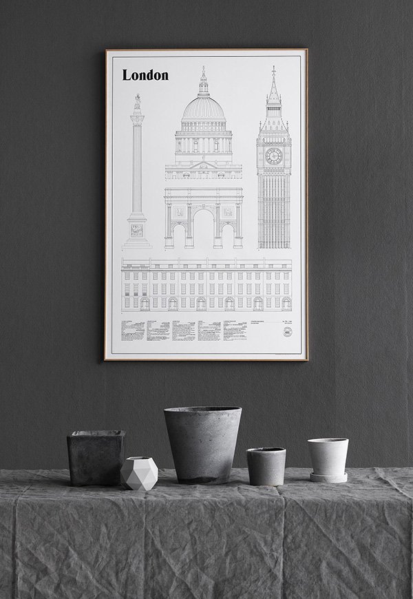
"To us architecture is so much more than visual, it's the smell of the bakery shop on
the corner, the feeling of a handle when entering a building, the sound of cars or birds
forming the backdrop of a scene. It's the memories and emotions that a place can
preserve for decades and bring to life in a second, the calming experience of the
places and spaces we already love as well as finding new ones to explore."
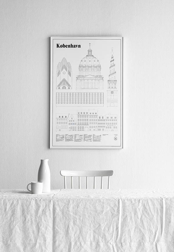 Prints like these really deserve some wall space to breathe and I love how Josefine and Sebastian have chosen to style their detailed line drawings in clean, monochromatic settings. Recently added to the collection are København and the much anticipated London (they're not fans of The Shard), both of which are limited edition. If you're inspired by these prints then you really must take a look at their Instagram which shares an insight into their creative process and how they view their surroundings (which just makes me long to explore Sweden!) lots of white, grey scale and negative space. Perfection.
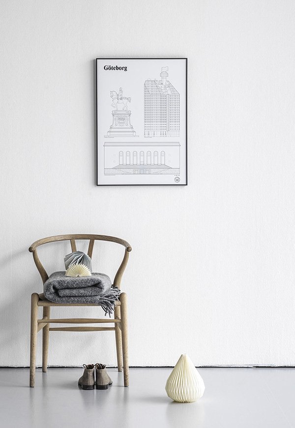
Photography © Studio Esinam
DIY Pine Desk Revamp
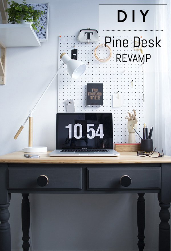 So today I thought I'd share a DIY with you to show how I transformed my old pine desk from the unloved, not-so-stylish specimen it was into the focal piece it is now. I've done a few DIY furniture projects in the past with varying degrees of success (don't ask me about the white and gold glitter bedside table. Please) But my style and tastes have done a fair bit of growing and maturing since then and I was ready to approach this one very differently, like it truly mattered. Honestly, when I started decorating my workspace my initial plan was to ditch the desk completely in favour of trestles with a baltic ply top to stretch across a full wall. But then the only trestles I could find were far too wide and as this room is only 2m x 2m...you get the picture. After a
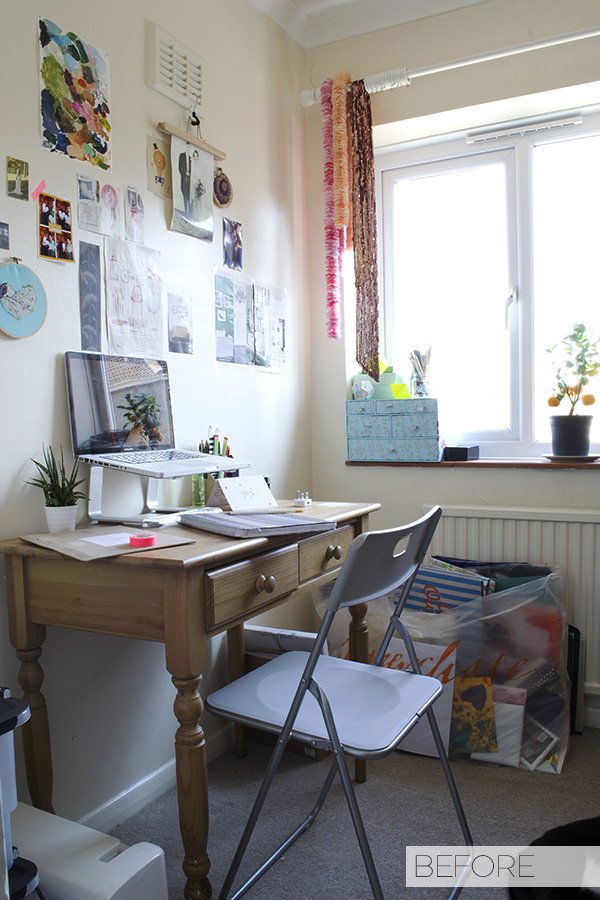
 long short sulk, I put the trestles, the plywood and the hairpin legs to one side and looked at it objectively. The desk just needed some love...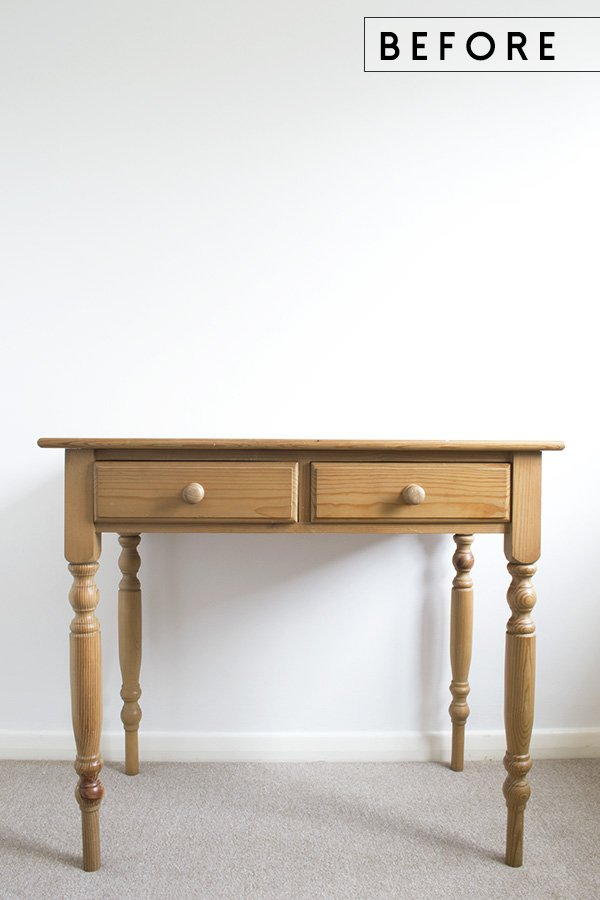 Here's how it started out. Sure, the shape is a little out-dated and most definitely well loved (I used to paint on the top-can you tell?!) but I thought with a little work it could actually become a real show-stopper.
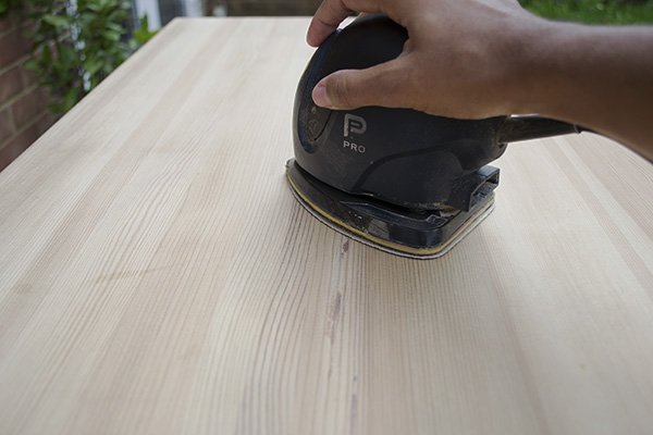
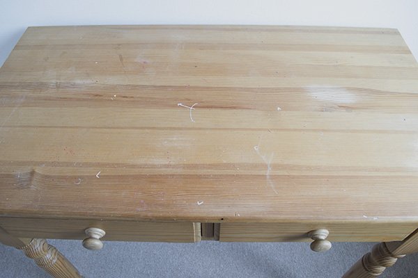 An afternoon outside with the sander lifted off the nasty flecks of paint and orange stain and left a beautiful pale grain that I wanted to keep.
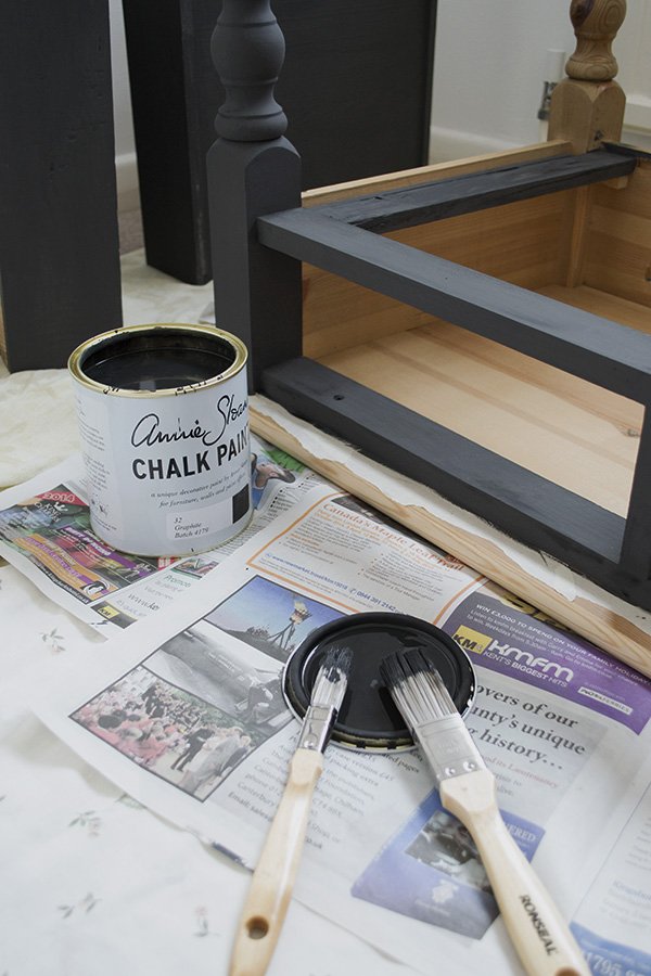
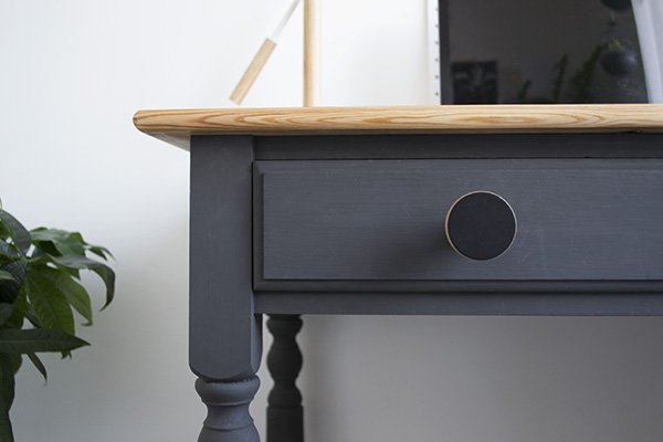
 Next up, I painted the base and drawers in Annie Sloan's Graphite which I watered down slightly to give a smoother finish (it dries quite quickly so you have to work fast). It's a beautiful, matt, not-quite-black and I chose not to wax it to keep a flat finish. Tip: if you want to go for a matt look, make sure you don't skip on quality with your brushes as the paint will pick up on that. After two coats the top was ready to wax.
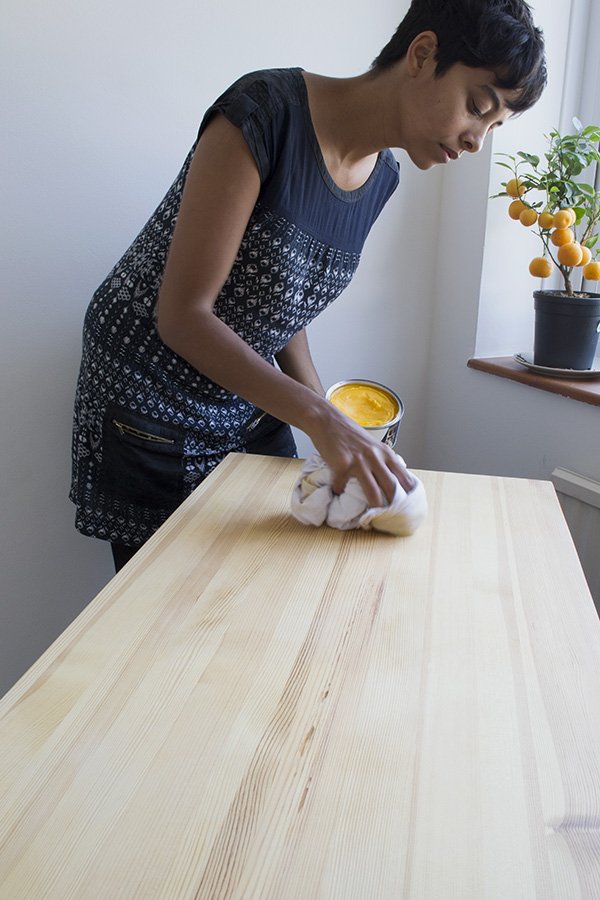
 I used a couple of coats of Liberon Black Bison clear wax to preserve the pale surface with a lint free cloth (yes, it's massive). The wax smelt amazing but more importantly it didn't add any shine to the top or affect the colour of the pine.
 The biggest game changer was the beautiful plywood knobs which came from Chocolate Creative - I had to get some plywood in there somewhere, right? I love that they're big and tactile and the grain in the centres picks up the top of the desk. Here's the finished article...
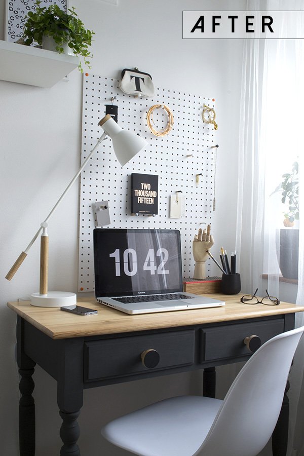 I should just take a minute to thank my brilliant father-in-law Bob The Builder (yes, his name is Bob and he is a retired builder) who was on hand over email to help me when I freaked out over which wax to use, how to use it etc. He really is a fountain of (almost all) knowledge.Do you have an old piece of pine furniture knocking around that could benefit from a little love? You might be surprised with the results...
How To Survive An Identity Crisis And Own It
 Have you been through an identity crisis? I'm not just talking about the full-on "who am I?!" meltdown, it could just be that you've lost what you thought was your signature style. Or perhaps for whatever reason your priorities have suddenly shifted but you can't put your finger on what works for you anymore. This is a subject I've been dealing with on and off for the best part of four years which, funnily enough coincided with when I became a mum for the first time. The first few months of constant feeding, nappies, all-nighters and establishing new routines as a family of three were enough of distraction, until the dust settled and I was quite suddenly faced with the stark reality of losing track of who I thought I was. I felt like an impostor in my own home. I couldn't wear the style I used to love anymore because my body shape had changed and clothes shopping became a nightmare of fitting room disappointments. It happened again when we moved two years ago and our new home was nothing at all like what we'd come from - none of the furniture worked in the new space which at the time was the antithesis of our ideal home and I struggled to feel like I belonged here. Then our daughter was born five months later and in the midst of all this, I left an established career as a wedding planner that I was comfortable in and knew well for one in editorial styling that I didn't know at all. It was back to square one all over again and as my work really does define who I am as a person, so I felt completely cast adrift. Are you still with me?If you're nodding frantically at the screen but still at a loss as to how to reconnect with yourself, here's how I worked my way out of it...
✚ Recognise It & Own It
Understand that this is just a transitional stage; it's not forever, so rather than wallowing under the duvet, choose to be proactive and accept it - it's happening so learn to use it as an opportunity to grow. Don't get me wrong, there were far too many days to count on both hands when I'd rather crawl under a rock than engage with myself or my family and I'd focus on everything I didn't like about myself, the house, my work-whatever. But that's counter-productive and actually really quite damaging. In the end, I had to learn to be honest with myself and my family and admit that I felt lost. Once I'd taken that first step, I could give myself over to it and buckle up for the ride.
✚ Explore
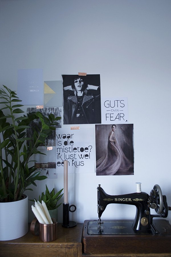
This is the best part! Allow yourself to experience something completely new and out of your comfort zone. In my case it was landing that first assisting job, swallowing those nerves and jumping with both feet into an unfamiliar situation, guts over fear. Just that one day opened up many more amazing opportunities which in turn exposed me to new people with very different styles from my own and suddenly I wasn't such a blank canvas anymore. When I've felt stuck in the past, I've used Pinterest to spark some inspiration and I have a beautiful blank wall in my workspace to moodboard any images I come across in print that catch my eye. Learn to be a little risky and buy those leather trousers. Put yourself out there in a different social scene or switch up your reading list. At this stage, it's not important to have a goal, just open up some creative conversation. You might discover a side of yourself you never knew existed.
✚ Take Your Time
It's a well known fact that I am the world's most impatient person. I want everything yesterday, so going through such a slow and tentative process as this was hard for me. So hard! You might find yourself grasping at things for a while to try and find a new sense of normality, to find where it is that this new version of you might belong but try not to focus on it too much. Over-thinking can be exhausting! Keep in mind that you'll always be a work in progress. I don't think anyone is truly ever 100% happy with themselves as there is always room to learn, grow and improve. It's quite fascinating to watch this as a visual, stylistic process unfolding on my Instagram, if you scroll back to the beginning and compare then with now. So much has changed! As a personal process this is going to take time and things won't change over night, so remember to go easy and take it slowly.
✚ Let Go
Don't hold on to things just because you loved them once. If it's not working for you now, then move on. This applies to the circles you socialise in as well as what you choose to surround yourself with at home. Do these people have a positive influence on you? Do they inspire or support you? Perhaps they hold you back or inhibit you in some way? Whilst it's not always possible to make clean breaks, you can be proactive in reaching out and making connections with a new set of friends. Blogging has been a wonderful way for me to nurture new friendships with people with a shared interest, just proving how important it is to explore even if it is from the comfort of your own home.I'm a lot less sentimental than I used to be and whilst there's certain possessions of mine that I will hang on to, I can be detached enough to get rid of it if it's standing in my way. You'd be shocked to see the amount of "stuff" I have cleaned out in the past few years on my quest for clarity, I've been single handedly keeping our local charity shops open for months! But trust me, you won't miss any of it once it's gone. Keeping mountains of clothes I used to look good in in the hope that they might still work a few years down the line was just counterproductive. So I eBayed all of my vintage dresses, donated my collection of T-Bars and put the proceeds towards some wall art for the house instead. There's something to be said for the "tidy home, tidy mind" way of life and we are firm believers. When you've got the head space to welcome in the new you'll find the whole transition so much easier.
✚ Find What Makes You Happy
It took me a year to realise that my career was actually making me really unhappy and resentful. After six years of putting my all into running my business it hit me that I just wasn't invested in weddings anymore. I could plan a wedding with my eyes closed but I'd lost the love for it and would often bring home my frustrations. If I didn't care then I needed to get out of it before it started to affect my work. So I did and wow was it scary. Yet here I am, a few years down the line settled in a career that is absolutely right for me, because I changed as a person.It's ok to be selfish sometimes - I had to remind myself of that when we went away for 24 hours to celebrate our ten year anniversary (the first time we'd been away alone in years). The sky didn't cave in while we were gone and the kids barely noticed we'd left. So take yourself out for that coffee on your own and read that magazine you've been meaning to, sign up for the online course you've had bookmarked for ages. Find what makes you happy and the rest will take care of itself.So tell me - this is you right now? Or perhaps you've come out at the other side? Either way, I'd love to hear from you...
Sunday Styling at Do South Shop
 A few Sundays ago I found myself heading out on a beautiful spring morning to Do South Shop for breakfast and a spot of styling with some blogger friends of mine. With an eclectic mix of retro, contemporary Scandinavian and ethnic home decor, Do South can be found in the Crystal Palace Triangle with one of the best views of London on its doorstep. I arrive to a scene of organised chaos-the shop has been deliberately rearranged into four designated areas for each of us to transform, with friends Annie Kruise of Style Juicer and Sarah Louise Kimmer (Lapin Blu) having a catch-up on an achingly beautiful oatmeal tweed sofa. Breakfast is an indulgent selection of pastries and brownies from Blackbird Bakery which we pick at as we take in our surroundings. I have my eye on a corner sofa and wonder if I'll get to play with it later.
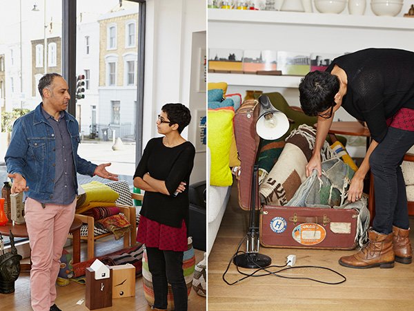 Opened in March 2011 by artist and musician Freddie Oke on his return from living out in Melbourne, the shop reflects his unique perspective on interior style; the furniture he selects speaks to him as would a piece of music. And as music plays such a huge part within my own family it's so refreshing to hear the two married in that way...particularly as I have a penchant for naming my plants after musicians! Everything here connects beautifully in a way that perhaps you thought they wouldn't; from the brightly beaded African masks and wooden skinny man statues, mid-century arm chairs and clean lined HAY DLM tables. A keen traveller, it's almost deliberate that Freddie wants the Do South experience to feel like exploring new territories. Essentially, he chooses what makes him happy and it totally works.When I'm styling on the day job I'm used to having the pressure of time, be it on a location booked by the hour or in someone's own home where they'll want it back at the end of the day, so it was a welcome change to have a little time to play with no preconceived ideas as to what my plan would be. With the four locations folded up onto little bits of paper to be drawn from a pot, I was first up. The sofa was mine.
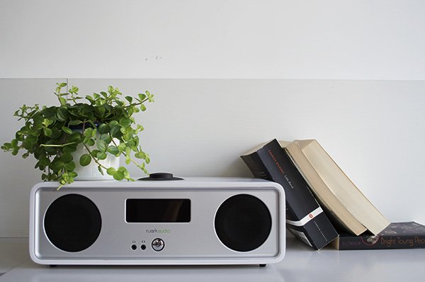
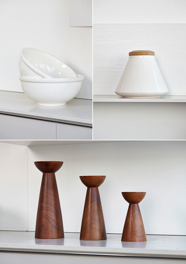
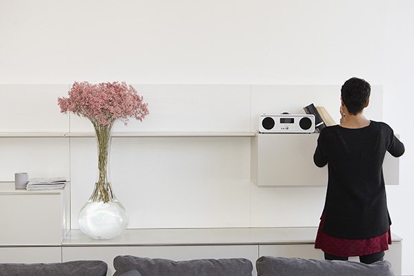
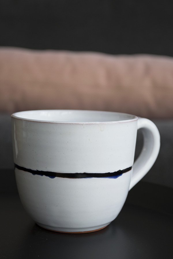 You know me by now - I like to keep things simple. The feeling of allowing a space to breathe is very important to me, so whilst it may seem tempting to want to fill out the entire shelving unit that came with my sofa setting, the real skill is in knowing when to stop. The very first piece I chose was actually the tall vase of pink gypsophila (who knew it came in that pink?!) which I then used as a subtle colour story, picking it out in the HAY dot cushions and copper candlestick holder to compliment. I liked that the wall unit could also be used to store and display tableware as well as the obligatory collection of books and magazines and loved the clean, white ceramics. Not wanting to make the space feel too stark, I added in the wooden candle trio and tall vintage floor lamp to warm it up. Now if I could just lift the whole set-up out and into my place I would be happy. So happy.
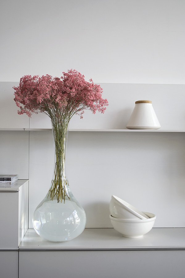 And here is my finished shot, beautifully captured by interiors photographer Kristy Noble. What do you think?
 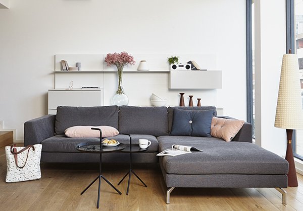 Corner sofa, OSCAR | Coffee tables, HAY DLM | Dot cushions, HAY | Vintage Candle Trio | Radio, Ruark R2i
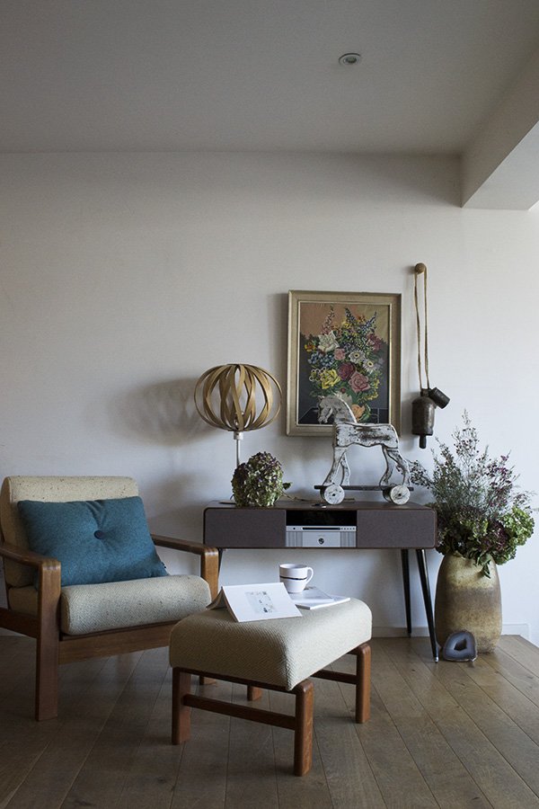 Sarah-Louise created a space, starting with the Ruark R7 sound system, which was just so completely 'her'. As an avid collector of chairs it was a no-brainer that she'd choose that beautiful oatmeal armchair and footstool. I love the depth of colour she's woven in, from the teal Dot cushion and two-tone hydrandeas in the urn, pulling your eye up to the vintage painting on the wall. Looks like a dreamy slow Sunday, don't you think?
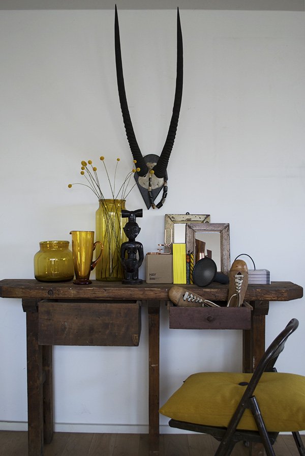 Annie shares an aesthetic much like mine in that she doesn't really go for colour in a big way, so she surprised us all when she pulled this mustard yellow scheme out of the bag with the console table as her jumping off point. The touches of black in the statue and antelope horns still give the look a contemporary edge and I love how she used a pair of vintage shoes to make it look lived in.
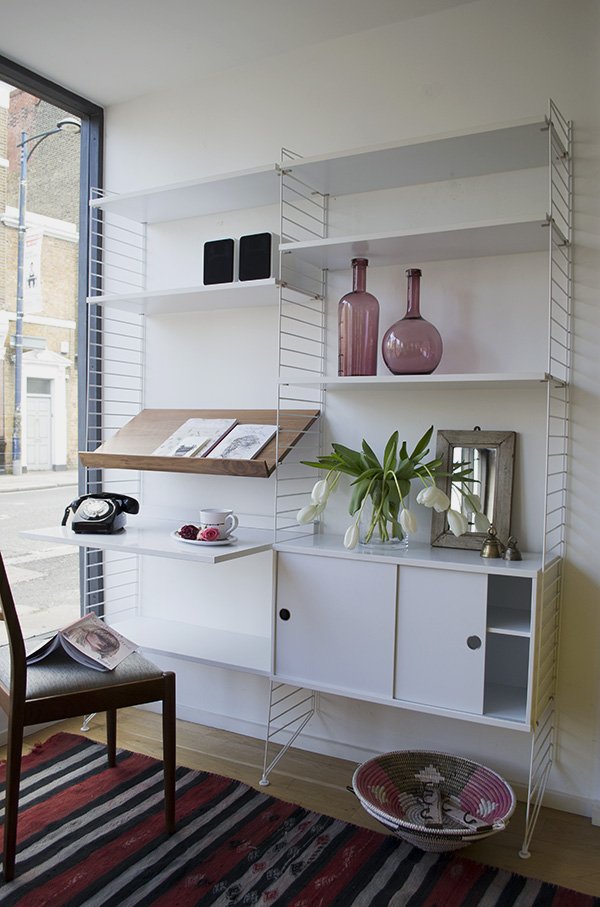 Cate St Hill chose a personal favourite of hers, the String shelving system. A Scandinavian design classic, the clean white lines provided an ideal backdrop for Cate to make it feel a little more homely. With a red, black and pink colour palette, this space is a place to work and relax and I love the characterful details in the silver bells, African baskets and mirror.
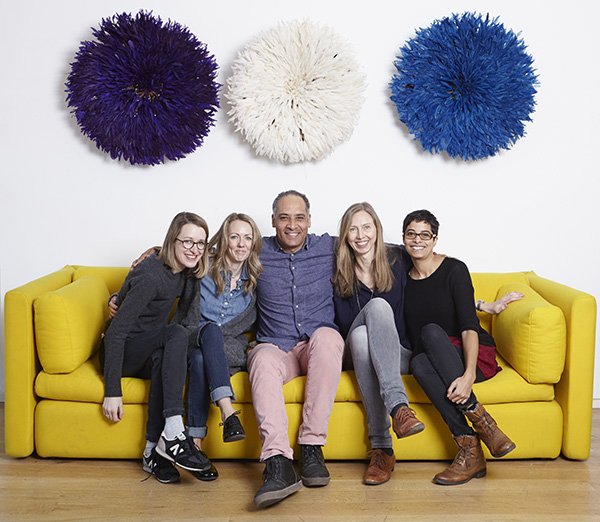 And here we all are with Freddie doing our best to "look natural". Thank you to Freddie and his team for organising such a fantastic morning for us - I look forward to seeing more from Do South very soon and urge you to make the trip and see it all for yourself too.
Photography © Tiffany Grant-Riley unless otherwise stated.
Black Wall Tunnel Vision
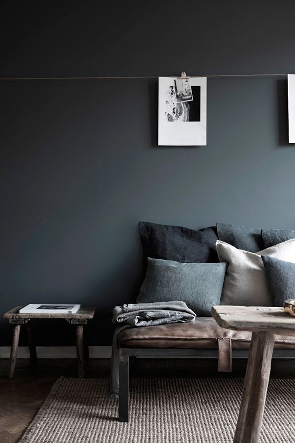 With my recent home project complete and a few weeks of not thinking about decorating behind me (are you kidding? It's all I thought about!) I've been turning my focus to 'The Black Wall'. On most occasions as I've sat down on our sofa and faced the wall the TV is mounted on, I've pretty much in one way or another wanted to take a sledge hammer to it. I can't stand looking at the television in all its blaring 32" glory, or the notion that most households must by default angle all their living room furniture at it - there's no hiding it for us. I stuck a RIBBA picture shelf above it when we first put it up and found a beautiful mid-century sideboard to anchor it with to try and lessen the impact but nope, I still hate it. So I decided to be bold and thought about ways in which I could better integrate the TV so that it looked more intentional. Paint it black, I thought! Hold on a second - don't freak out.Here's why it'll work without it looking like a 90s feature wall...✚ Our living space is full of natural light with white walls so the one I'm painting in black won't upset the balance. As ours is next to a huge window it'll add its own dimension to the room.✚ The sideboard under the TV has a warm teak stain which will stand out against the black.✚ It's the perfect backdrop for a gallery wall.✚ The black furniture and accessories we already have in the room will pick up against it perfectly.✚ A black wall with a black television means I won't notice it quite so much any more. I win.Now I'm seriously lusting after black walls and so this week I set to sourcing tester pots to help decide. The current runners are Little Greene and Farrow & Ball with newcomers Valspar for comparison. If you check out my Instagram you'll be able to see little snippets before I share the before & after.So what do you think? Tempted to take a walk over to the dark side or too nervous? Don't be! You might find my Black Walls Pinterest board a useful starting point...
Image: Hans Blomquist
This Is Jane, My Mother
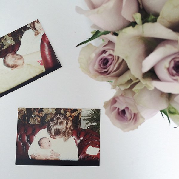 With Mother's Day fast approaching and as I'm trying to share a little more of "me" with you all, I wanted to tell you about my amazing mother, Jane. An inspirational teacher of some seventeen years, long distance runner in her mid-50s and with an impeccable sense of style, I'm proud of the journey she's taken since becoming a mother some (eh hem) 31 years ago...We were an interesting statistic. Not completely rare by the early 90s but certainly not common either. We ticked all the boxes required for an unusual family unit- the single parent mother to three mixed race children and living in a sleepy Suffolk town, boy did we stick out! We don't really look like siblings and we were most definitely a talking point amongst the locals for some time as they gossiped and debated our parentage - even now people still say to me "you don't look like your mum". How she managed to keep her cool I do not know; as if trying her hardest to raise us well on her own wasn't enough but we can laugh about some of those situations now, it was all a bit The League Of Gentlemen, if you know what I mean!She grew up a "latch key" kid, whereby my grandparents, both out at work or otherwise occupied would leave them all to their own devices (and there are some hilarious stories to be heard about that). They were an RAF family and moved about a lot. Mum didn't make a lot of friends as a child and got used to not settling for too long. Perhaps that's why, when she had us it was so important for her to create a permanent and secure home environment, particularly as a single parent. Mum helped to shape how important home is for my own family now. Home for us was a very small two-up/two down Victorian terrace. It wasn't anything like what my friend's grew up in but we loved it nevertheless. I shared a room with her until I was fourteen with my younger brother and sister in the other. We didn't have much, so she made the best of what she could. She made curtains, hung her own shelves, painted and wallpapered and still found time to knit us the odd jumper or sew a new dress for summer.
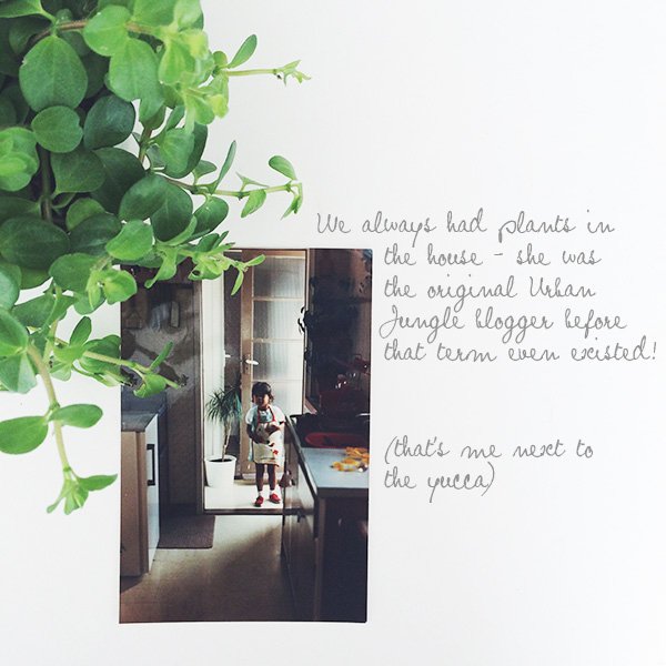 Looking back over some of my old childhood photographs, I spotted plants in most of them, so I know where I got my love of urban jungles from! She is without doubt predominantly responsible for my deep love of interior style today, proving that a beautiful home can be made from a small budget. The art college graduate never completely left her in her creative endeavours to encourage us to explore and make. We were allowed to make a mess, build dens in the wood, spend all afternoon baking or whatever it was that had our attention at the time (I used to enjoy sucking lemons. No. Really). She taught us to laugh (mostly at each other) and not to take ourselves too seriously. She introduced us to Stevie Wonder, Ella Fitzgerald and Marvin Gaye and didn't mind when I chose to belt out The Prodigy through the house. If there was something we wanted to achieve, she encouraged us to go out and get it. I'm extremely thankful to her for putting so much of her life on hold to give us the best she could, especially now that I have children of my own and am lucky to have my career with the support of my husband, Rob.
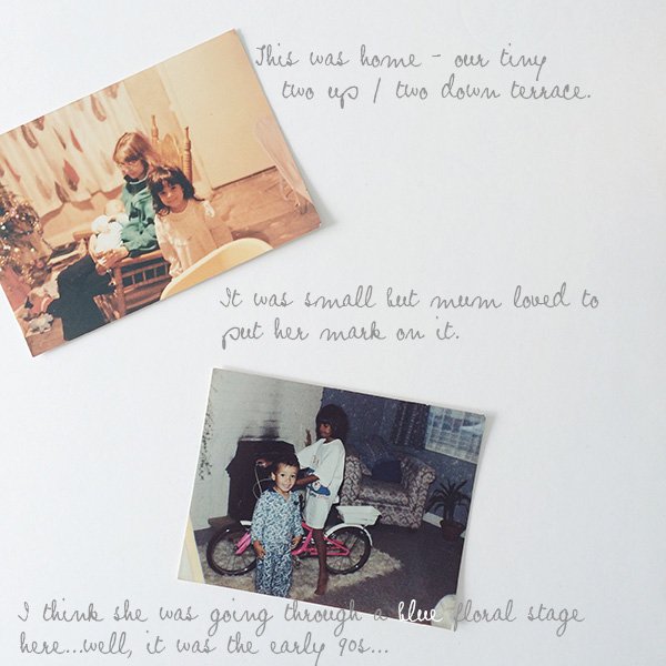 Mum has always had a 'feel the fear and do it anyway' kind of attitude towards life, even though I'm sure she'd play it down. She learned to drive in her late 30s, studied hard to become a primary school teacher and most recently ran the Brighton Half Marathon in just over 2 hours. Nothing short of brilliant and proof that it doesn't matter where you come from, you can do it when you set your mind to it.Thank you Mummy. X
In My Shoes / A Weekend In My mahabis
 I live my life in slippers. They're waiting for me the second I step through the door, ready to warm my feet. You can hear me coming, shuffling across the carpet or the lino in the kitchen. It's a bad habit I know, I really should learn to pick up my feet. But for all my love of cosy footwear, I've always had one major gripe. Well, two, actually. When things get a little crazy here (which with two children is inevitable) and I need to nip out in the garden or stick the rubbish out I find myself wearing them to save time which eventually ruins the soles. And then there's the damp - I mean the sweaty damp that builds up because your feet warm up but the fabric doesn't breathe. It's gross but don't pretend you don't know what I'm talking about. So I go through a lot of pairs and quite frankly, I'm sick of it.All that changed when at the start of the year I discovered amazing new slipper brand mahabis on Twitter and stopped in my tracks. I instantly fell for the simple, clean lines and minimal aesthetic (finally - design led footwear for lounging!) but the real clincher was that they came with detachable soles so that you can continue to wear them outside. They were as they described "down time redefined". Needless to say, I wasted no time in contacting them to test drive a pair, find out about the brand and I loved them so much that I agreed to become an ambassador - frumpy slippers these ain't! So, in the theme of lounging in time for the weekend, here's what last week's rainy weekend looked like...
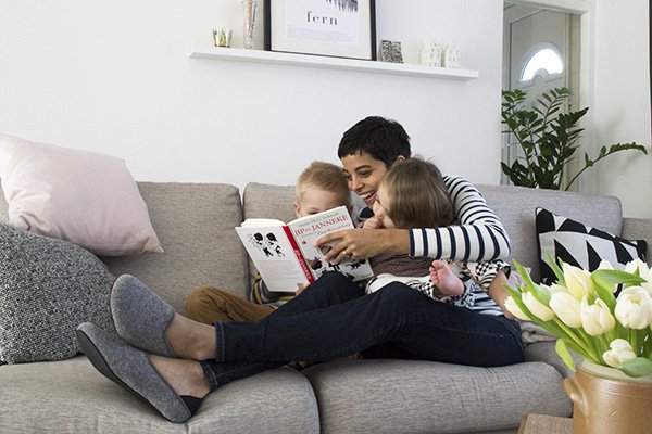
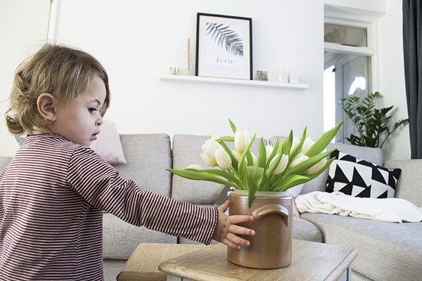
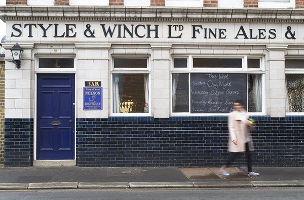 Look! Here I am, outside. In my slippers. The detachable, Italian made tpu sole slips over and clips on in seconds and there's even a customisable element, whereby you can choose from a handful of coloured soles against a Larvik light grey felt slipper like mine or the darker grey. Inside you're cocooned in soft sheep's wool which moulds itself to your foot and over the course of the day I managed to run and drive with these, barely noticing I wasn't in my usual choice of boots. Amazing, right?
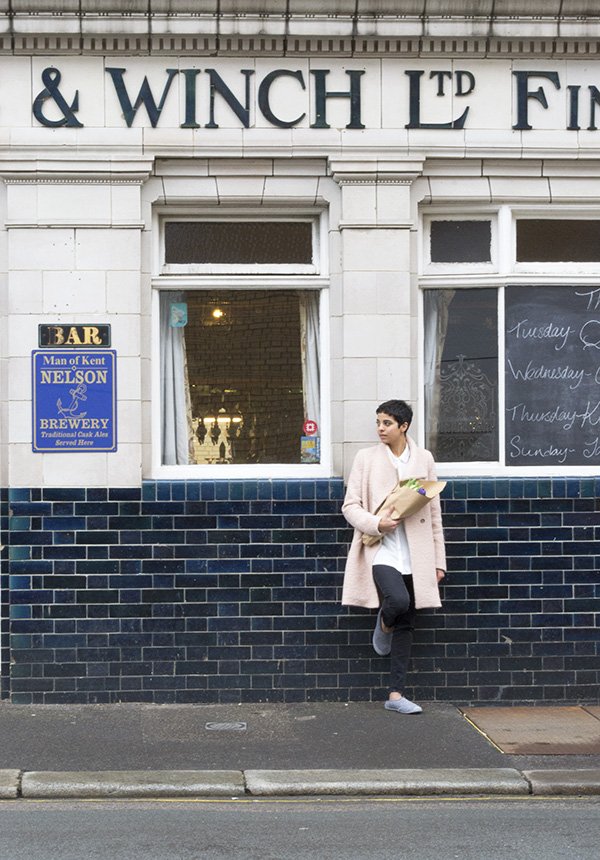
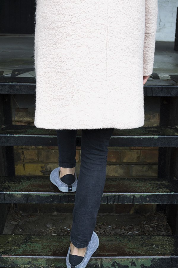

 I can't wait to see what's next for mahabis if this is how they introduce themselves. I'll stop waxing lyrical now and let you be the judge but I think I can finally stop the search for the perfect slipper, because I've found it.*In collaboration with affiliate partners Mahabis.
Photography & styling © Tiffany Grant-Riley & Megan Grant
A Stylish Find / Appointed - Desktop Accessories
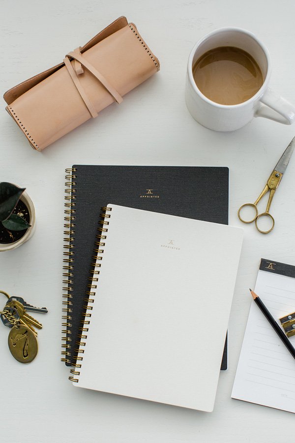 If my all-encompassing obsession with workspaces is anything to go by, you won't be surprised by my reaction to discovering new luxury desktop accessory brand Appointed. My eyes pretty much fell out of my head. A new enterprise by DC based graphic designer Suann Song of SIMPLESONG Design and already a year into the making, Appointed officially launched its Kickstarter campaign yesterday. As a huge fan of Suann and her team's work (you might recognise the beautiful stationery from this Sunday Suppers event) the new collection does not disappoint. Minimal in style and with a practical, beautiful and handmade ethos as its heart, this new line of work tools "makes utility look luxurious" and came into fruition after unsuccessful attempts to find well made, gender-neutral desktop products within the US. Aren't they utterly beautiful?
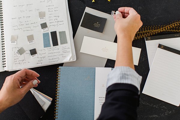
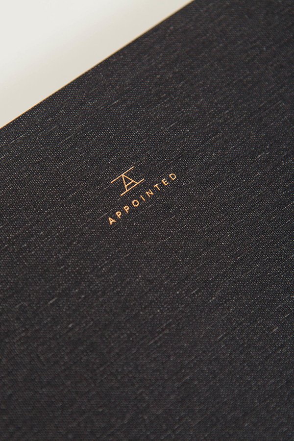 At the centre of the collection is a notebook and workbook available in either plain or gridded perforated sheets, bound with brass coils with foil embossed cloth or textured stock covers. Shall I keep going? Also available are planners and calendars for 2016, brass rulers and memo pads which will be rolled out in time for the launch of their online store later this summer. For more details or to join me in pledging support to get this exquisite new line off the ground take a look at the Appointed Kickstarter page.
Photography © Kate Headley Photography
My Workspace Reveal / The Befores & Afters
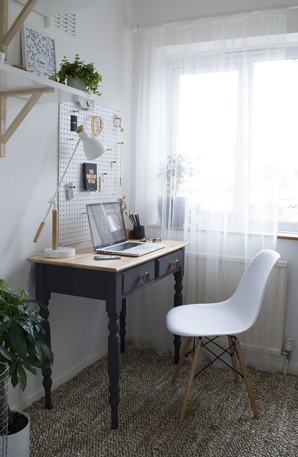
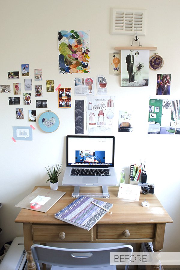
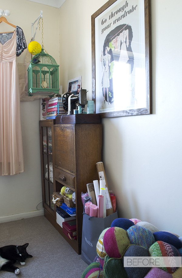
Today is a milestone - I'm excited (and relieved) to finally reveal my new-look workspace to you. We've been here for almost two years now and when I moved into this room it was a sort of shove everything in situation whilst I figured out what to do with it. I set up a desk, stuck some bits on the wall and put up with it as a sort of craft room. And then last August I decided in a fit of frustration that it wasn't working for me and it had to change. Storage was pretty sparse, there was no sense of my style which had changed so much since we'd moved and I didn't feel inspired to work in it, so for the next six months I launched into turning it into the best room in the house. Yes. For a space that's only 2m squared that's a ridiculously long time but hey, Rome wasn't built in a day, right? And it's good to slowly introduce my home to you, particularly as I'm usually quite guarded on that side of things. I feel self-conscious about it in a lot of ways, much of that comes from spending too much time picking over the bits of the house I can't stand or can't change, but that's all part of the joys of renting. Anyway, come and have a look!
Given the size of the room and my penchant for bright white spaces, it was a no-brainer to paint out the cream with a brilliant white, introduce pale, untreated wood to compliment and a touch of black to set it all off. You can take a look at my inspiration on this Pinterest post and see how useful my Studio & Office board became in the process as my point of reference.
Flooring was a real issue for me and it took months to find the perfect rug. I don't have the glorious luxury of wooden flooring anymore so I kind of just wanted to forget that this carpet existed and find a rug large enough to cover the width of the wall that came out far enough beyond my desk. Try finding one that size within budget! My first attempt was a diamond Berber which seemed great in my head, but in situ just fought with the black desk and took all the focus away from the room down onto the floor. A minor panic ensued (my good friend at LapinBlu can vouch for that as I drilled her for advice) and by the end of the day had returned it and ordered another. I'd come to the conclusion that a textured, patterned rug was just wrong for this space and so Zara Home saved the day with a classic handwoven jute number instead. It was a bit more of an investment than planned but I love the surprisingly soft (for jute) texture under foot and that it adds to the space without distraction. Nervously I waited as Mosey sauntered in to inspect it and I thought he'd take to it as his scratch pad but I'm not sure he's even noticed it, so long as he can lounge underneath the radiator!
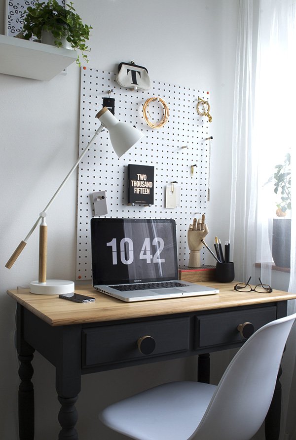 I'd planned to get a new desk in baltic ply on trestles encouraged by the guys at Hopper + Space, but when I couldn't find trestles small enough without taking up half the width of the room I had to be realistic and decided to update my existing one. My sister had given it to me after she'd decided she didn't want it anymore (thanks Meg) but as I thought it was out-dated and worn out in its current state it had to become a statement piece. I'll be posting a DIY piece on the desk later next week to show you how I did it, but in short, I sanded down the layers of stain on the surface to lighten the tone of the wood, gave it a coat of clear wax, chalk painted the base and changed the drawer knobs which are made from ply by Chocolate Creative. They're so sexy!
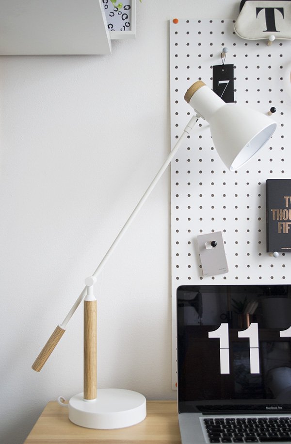
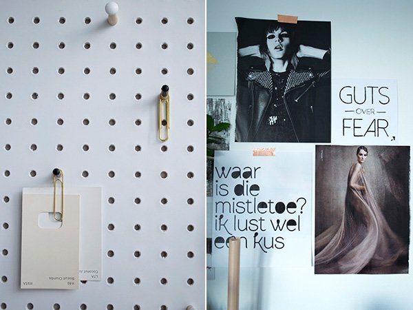
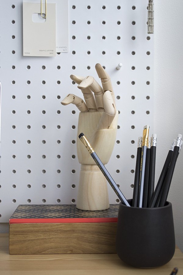 I've tried to eliminate the desk clutter and keep the surface as clear as possible with the white PegBoard from Block.The pegs arrived with coloured tips so I painted them out in black and white. I love that I can switch up the display whenever the urge strikes. The simple white desk lamp was a birthday present from my mum, the 'Cohen' by MADE.COM. Sheeeeeesh that lamp. It's just so elegant, don't you think?
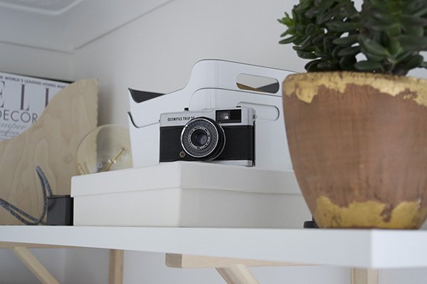
 Storage was a huge issue before I put in the shelving which I found in IKEA after quite a lot of searching and deliberating. I wanted to stick with the combination of white and untreated wood to compliment the rest of the look and I loved the mix and match shelving at IKEA. I used to store most things into plastic crates which I hated looking at, so I sorted through the paints and other pieces that weren't an every day necessity and moved them to the garage instead. Initially I'd had it in mind for three levels but it actually wasn't necessary once I'd got them into place, so the third will probably go into Tabitha's room when I get round to it. Now I use a mixture of desk drawers, shelving and my 1920s bureau behind it which is a much better solution.
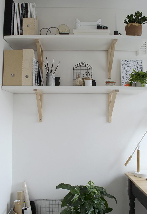
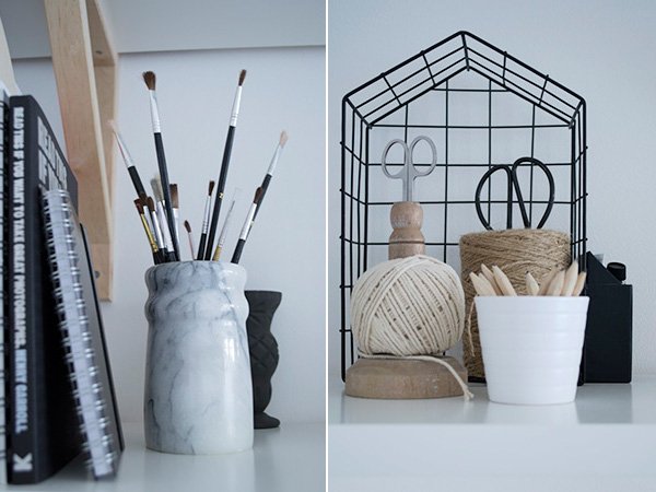
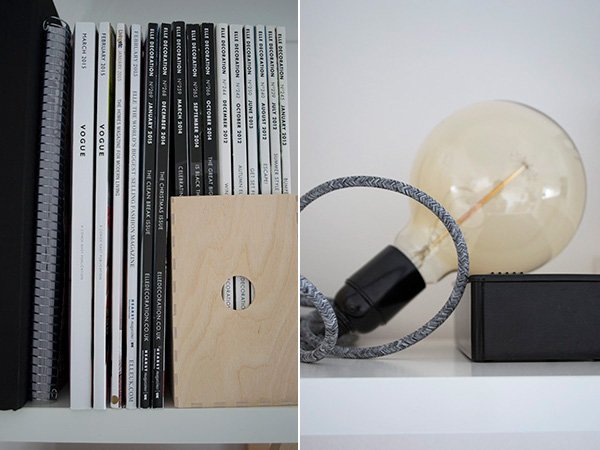
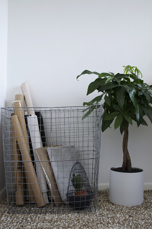 Let me just take a minute to talk about this basket. Oh wow, this basket. I saw it way back last summer when I'd popped into West Elm for a quick meeting and had to have it. Given the amount of prints, random rolls of paper and packaging I seem to collect (I hate throwing paper out) it made sense to store them all in something extremely stylish. Before I was just using a bag (see below) but the wire basket is a far better option and doesn't take up too much space either. Win.
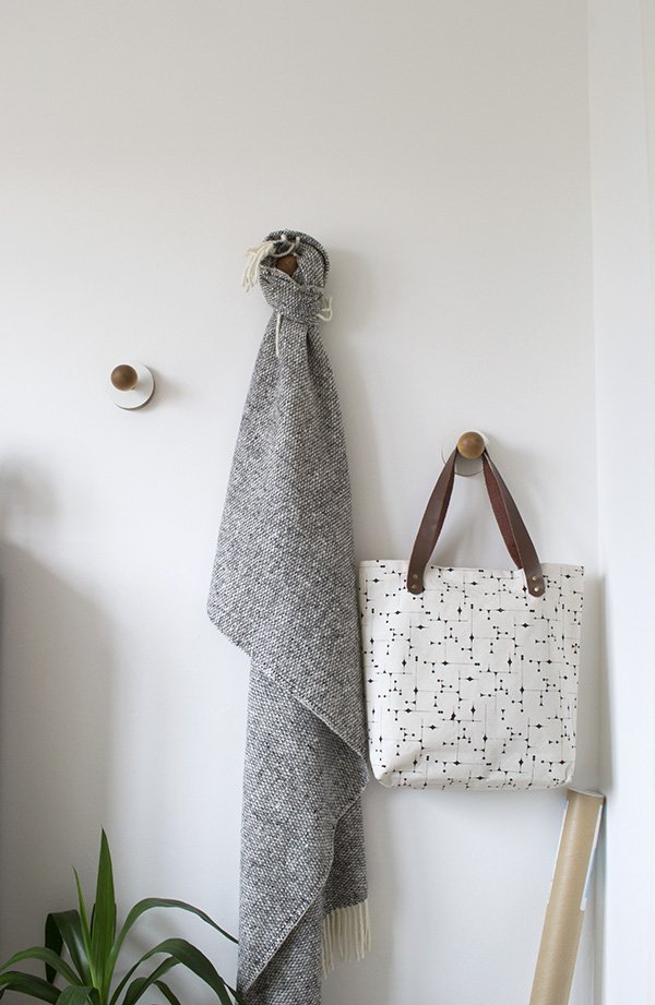 As floor space is at a premium in here, I was keen to source some wall hooks to keep things like my camera bag and tripod out of the way but also have somewhere that I could hang prints as I find them. When I had an email from designer Nikki Kreis to introduce her beautiful, minimal homeware collection, I called off the search when I found these beauties. With a layered plywood plate and smooth birch ball, they're so tactile and instantly become an extension of the wall.
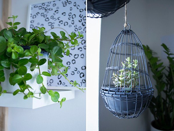
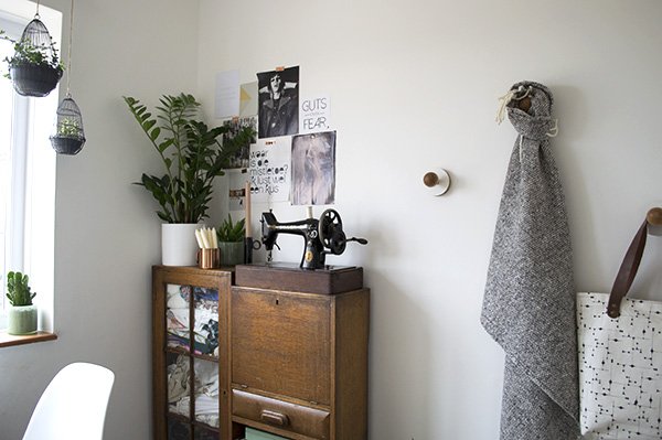 Of course, it wouldn't feel complete without the presence of plants - you might have noticed that I'm a little obsessed? The hanging wire cloche planters in the window were found as a set of three in my local Oxfam which stocks discontinued Zara Home decor. Not sure if that's where they originally came from but either way I wasn't hanging around (excuse the pun) and snapped them up for a bargainous £6.99. The first plants I tried inside them were a bit of trial and error and didn't take too kindly to the bright light and heat from the radiator, so I switched to these two succulents which will spread and trail. So far, so good.
 Phew. So there we have it. One workspace, pretty much complete. Sure, it'll adapt over time and I plan to bring in some prints at a later stage just as soon as I can decide on what but for now, it's done. This is absolutely my favourite room in the house now. The kids come and hang out before bedtime in here too and I just love working with fresh walls to play with and a clean, bright space. What do you think?
Photography & Styling by Tiffany Grant-Riley
'Brilliant White' paint, Crown | Jute rug, Zara Home | Shelves 'EKBY JÄRPEN' & 'EKBY VALTER' brackets in birch, IKEA | White PegBoard, Block® | White & natural oak 'Cohen' table lamp, MADE.com | 'LILL' net curtain, IKEA | Wire mesh hamper, West Elm | Black chalk paint in 'Graphite', Annie Sloane | Black plywood drawer knobs, Chocolate Creative | Plywood & birch wall hooks, Kreisdesign
A Coastal Retreat / The Printworks Hastings
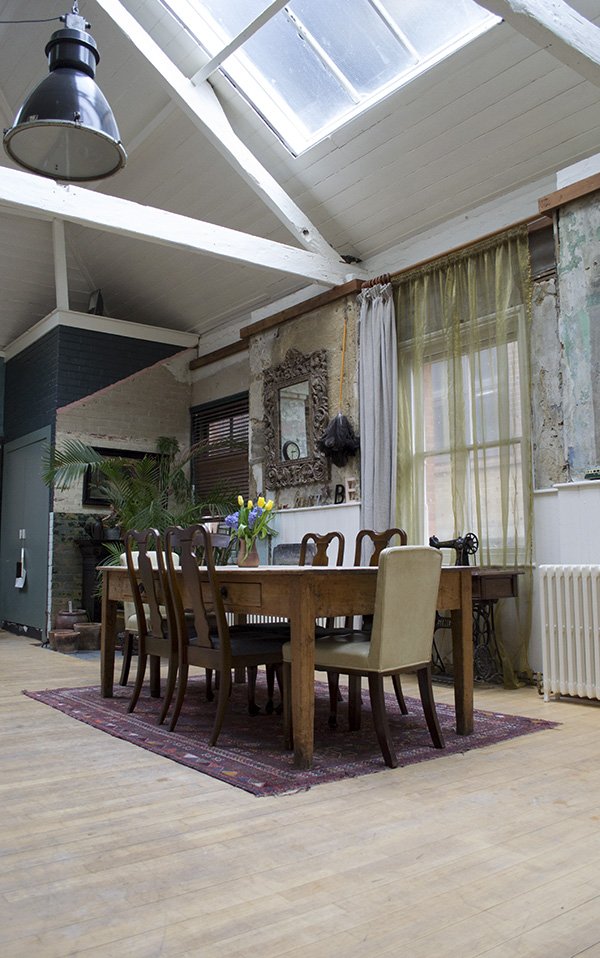 We ran away to Hastings for 24 hours on Sunday. Just the two of us, celebrating ten years together and leaving the kids in the capable hands of my mum and sister. Having spent numerous months trying to find time to get away, me being pernickety about the style of accommodation (it's an occupational hazard) and realising that Paris might just have to wait until next year, we settled on staying close by. Then I fell in love with an incredible space in Hastings just off the seafront. We spent Sunday to Monday indulging in copious amounts of rich food, luxuriating in deep baths and lounging in robes. Bliss...
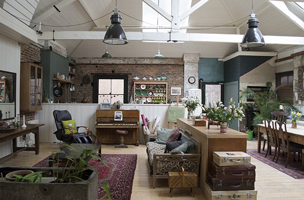 I make no apology for the following bombardment of photos-this place was insanely beautiful. I mean. Insane. Be prepared for this Grade II gem of a building with its stripped back interiors, industrial/eclectic style and wall-to-wall vintage furniture. Situated over two floors of the former offices of the St Leonards & Hastings Gazette, The Printworks is lovingly run by Lorna Lloyd, a ceramicist and photographer and her husband and film editor Bryan Dyke. At the bottom of the building, their son Ed runs homeware and pick 'n' mix lighting store Dyke & Dean and above that are artists studios. It's a place of real creativity and family endeavour.
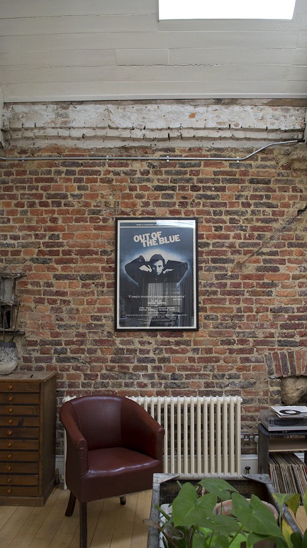
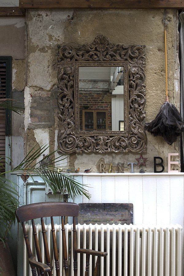 The B&B currently hosts two rooms at the top of the building-The Gutenburg which is a small double room with bathroom on a landing and The Caxton, a large suite with private bathroom which is where we stayed. The photos I'm sharing today are of the shared dining room which is the first floor you encounter when you arrive at the B&B. It's thought that this space was offices before it became a storage area for the newspaper. Aren't the exposed walls stunning? If only they could talk...
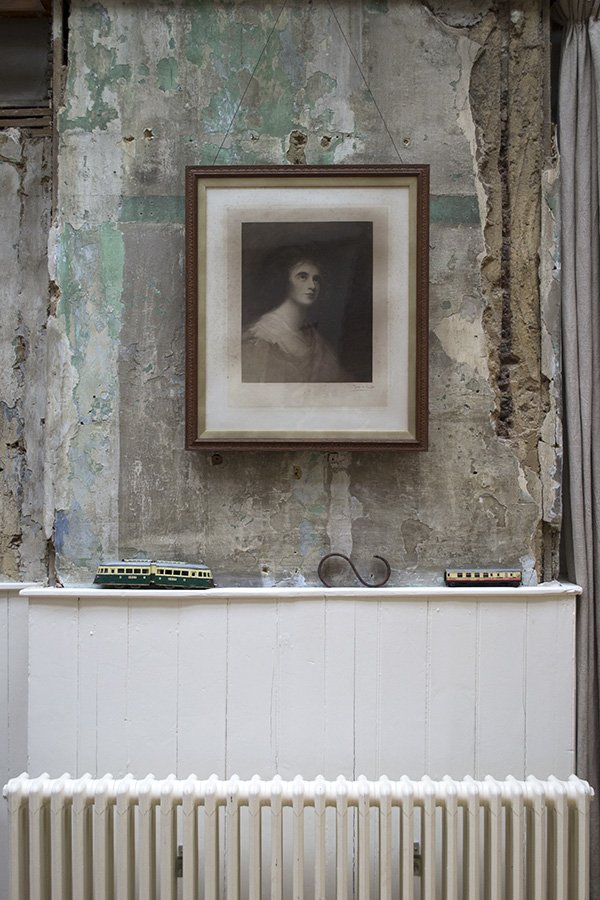
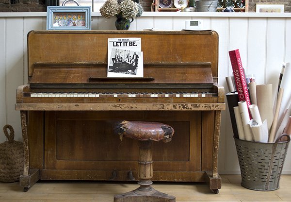
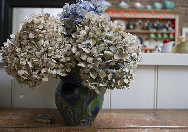
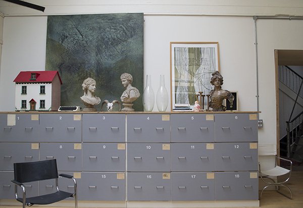
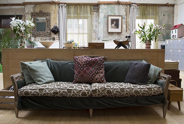 Lorna has collected the majority of the furniture over the years, some from the numerous antique shops in Hastings Old Town, others have more of a story. The sofa was given by a friend who had it shipped back from New York but couldn't fit it into her home and the two banks of grey storage units came from Central Television and housed the Crossroads costumes. I can just about remember Crossroads! What we loved most about being here was feeling completely at home and free to explore.
Follow Our Steps In Hastings
Eat: For a laid back, buzzing atmosphere, try Dragon Bar. The food is great and plentiful. Oh and the Havana Mojitos are dangerous...Stay: The Printworks of course-where else?!Explore: Hastings Old Town for antique and curiosity shops-my favourite was Butlers Emporium. Take a wander on the seafront and find your way down to the Jerwood Gallery, the Net Huts, Cliff railway and the Fishermen's Museum.We had a really special time here together, just us on our own, no "mummy, I want..." or tantrums or rushing around. A little space and time to think always does the world of good and I couldn't think of a better place than here to do that, could you?
Getting Plastered With Rooms Made For You
 Ha. The title got your attention didn't it? Well, to some extent I did indeed get plastered - last Wednesday on the 34th floor of The Shard no less, but not in the alcoholic sense. I was there to work. Come on, how unprofessional would that be?I digress. I'd been invited along with a group of fantastic bloggers by Rooms Made For You, a new brand by kings of plaster and construction British Gypsum, to road test some of their incredible new products for the home. And let me tell you - they are actually incredible. Game changers in fact.
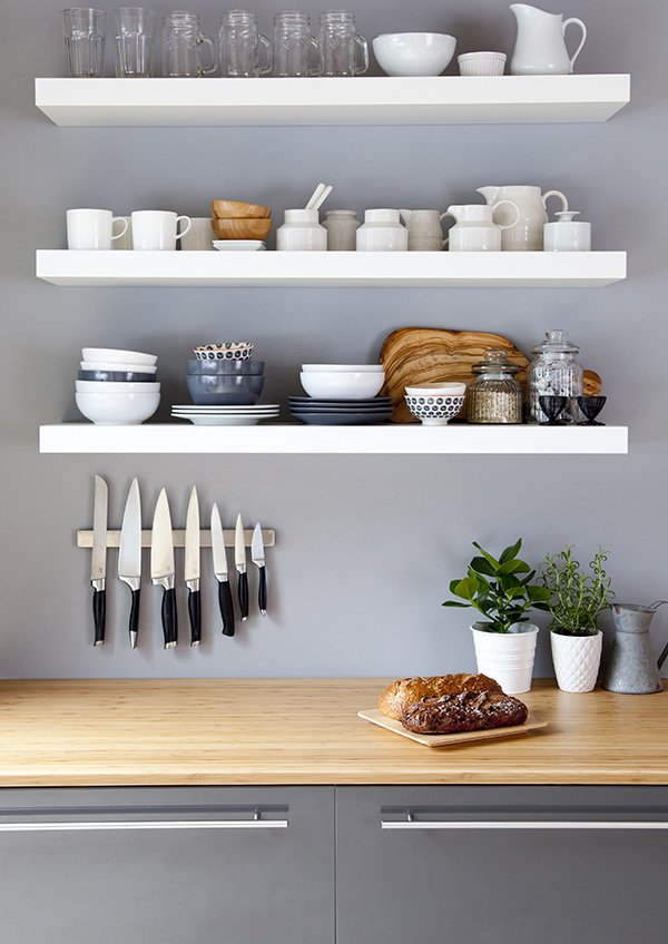 Breaking down the boundaries of standard plaster board and walls that won't take weight of your shelves without a million plugs, the Lifestyle Wall revolutionises the way we use our homes. Allowing you to screw straight into the wall with complete ease without the need for fixings (we had a little timed competition with some screws to test it out) it's seriously strong stuff. I think it may even save a few marriages. The kitchen above, styled by interior designer Becky Clarke sees it in action. Clever, no?
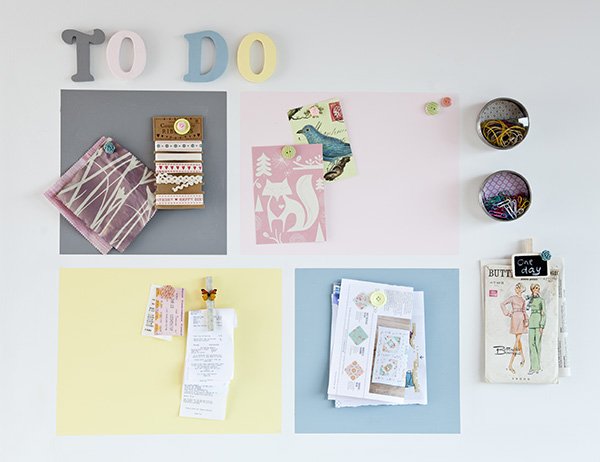 Although we're committed to renting for now until we're ready to buy again, I'm keeping an eye on the features I'd love to have in our home one day and the Magnetic Plaster is one of them. Ideal for kids rooms, office spaces, kitchens-you name it, the plaster goes on in the same way as standard but contains a form of volcanic rock which attracts magnets. Imagine being able to hang pictures without going into the wall at all, organise the family's activities in a fun way in the kitchen or have an entire wall dedicated to play in the kids room.The last product that I wish we'd had in our old home (an Edwardian terrace with beautiful-but-noisy wooden floors) was the Silent Floor. The new 'Quiet Mark' certified insulation essentially goes into your ceiling to block out any noise from travelling through. Perfect if you have kids and teens in the house - we've woken the children up laughing too loudly at the telly before now too.I think these guys are about to change the way we use our homes for the better-in fact I'm surprised it hasn't happened a lot earlier. Already being tested in new builds across the country, it's exciting to see that this might soon become the new standard. Why would you want to bother with the constraints of decorating when these completely free up your creativity? I'd love to hear your thoughts...Thank you to Rooms Made For You for hosting a wonderful morning and to the Shangri-la Hotel for looking after us so well-the views really are breath-taking.In association with Rooms Made For You.
Pinch•Toys | Natural Toys For Stylish Kids
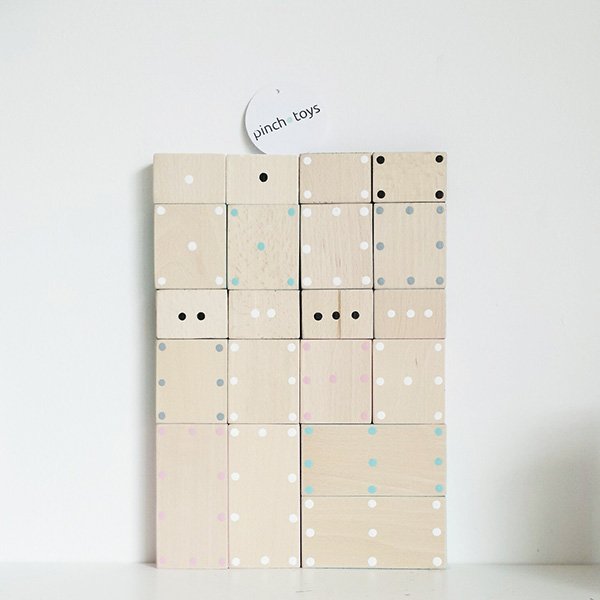 When we moved into our current home and our daughter joined our family, we made a conscious decision to curb the mountain of plastic toys that were taking over our living space. Of course, this isn't entirely realistic, given that children love nosy, brightly coloured gimmicky things and friends and family will inevitably gift them from time to time. Rather, we wanted to be a little more in control of the amount of plastic. They never last, do they? Thanks to the independent movement right now, there are some amazing designers producing handcrafted toys for design conscious parents that are most importantly fun and tactile for kids. Pinch•Toys are my most recent discovery-aren't they sweet?!
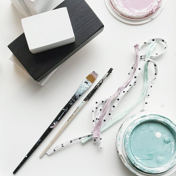 Inspired by Nordic, minimal style, Pinch•Toys is run by two friends from Croatia who hand produce natural toys that are fun and aesthetically pleasing too. Like me, Maja was tired of plastic and was disappointed at the lack of well designed toys for kids, so during her maternity leave she began making a few pieces with her daughter (six) for the new baby. As she shared her creations on Instagram, she began to attract some attention and before long everyone wanted a Pinch•Toy accessory for their nursery (I've got my eye on the Dominos and Triangles!)"Inspired by kids and minimal, nordic design that I like so much, we decided to make a multipurpose toy. Something would improve cognitive skills but at the same time would fit perfectly into any space."
 The next logical step was to use child friendly materials such as wood, eco paint, cotton and felt in simple, bold pattern with a dash of pastel (Maja's favourite colour combination). Friend and sewing fanatic Sanja came onboard and as they shared a similar style they decided to create the Oscar and Wanda pillow fish. I love that Pinch has grown from friendship, love and the desire to create beautiful things. And gosh, they are beautiful.
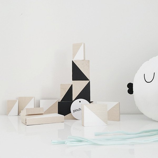
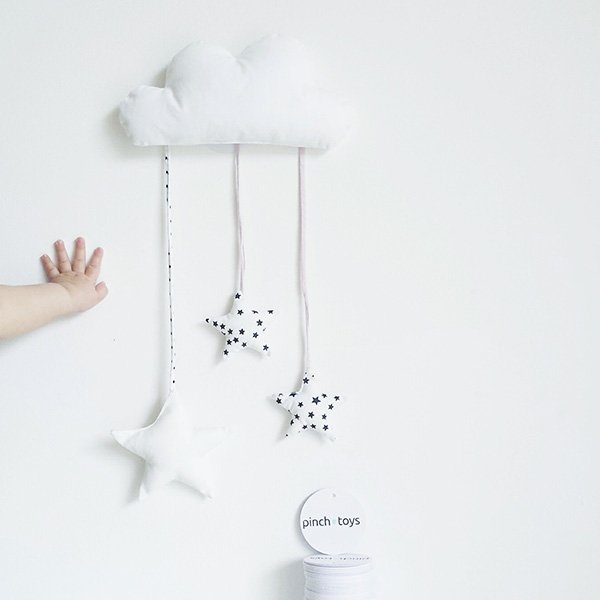 I will definitely keep these in mind when I start pulling ideas together for Tabitha's room later in the year! She's old enough for her own space now and, as the spare room is hardly used it makes sense that it becomes hers. So excited to get started!
Six Minimal Bags For The Every Day
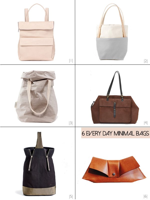 You can't go wrong with the clean, crisp style of a minimal bag and I love how accessorising one with an outfit can really enhance a look without fuss and frills. Choose traditional leather and suede for a classic, professional look, or dress it down with canvas and the new kid on the block, uashmama-a strong, washable paper like fabric. I've picked six of my absolute favourites to compliment your every day, be it work or play. Apparently I like to rhyme too.|1| The colour of the moment, soft pink is running it in the colour stakes and I can't get enough of it. Combine it with a traditional leather backpack and you've brought a whole new edge to laid back style. Take it to work and make them jealous. Verity backpack in nude, Whistles.|2| Yield-Design Co is a San Francisco based independent design house creating some of the most beautiful homewares and accessories I've ever seen come out of Etsy. Fact. Their 2015 edition Tokyo Tote in stone combines a duck canvas bucket bag with natural leather straps and I want it all.|3| I thought you might be wondering about this one, yet another genius invention by the Italians-is there nothing they can't put their hands to? Uashmama (pronounced "wash mama") is produced in Tuscany and is actually a paper fibre that is so strong it can be washed and still holds its shape. With its utility style canvas straps and rollable top, it's the ultimate in sustainable chic. You can get yours at The Future Kept.|4| Olive Cooper London bags are genius. Founder and designer Olivia Martyn realised that a one-size-fits all professional work bag just doesn't fly when you're heading out for drinks afterwards and came up with the two in one bag allowing you to up and downside with simple attachments. I'll take the Argyll in Nubuck, please.|5| A recent addition to my Great.ly store (check out the new Minimal Style collection) I picked out the Ashton backpack-tote as an ideal day out with the kids accessory. As I'm still in the midst of needing a nappy bag this is a much more stylish option, looks great in black canvas and I can wear it as a backpack or tote. I think Rob wouldn't even mind carrying this one. Win.|6| I love everything about Wealdhandmade's aesthetic-the geometric, origami inspired shapes to her clutches are a dream come true. Sarah designs and hand produces all her bags from her seaside home which are inspired by memories of school and given a very grown up, modern twist. Isn't Nellie so very beautiful?
Love It / FAYCE Textiles & Embroidered Relics
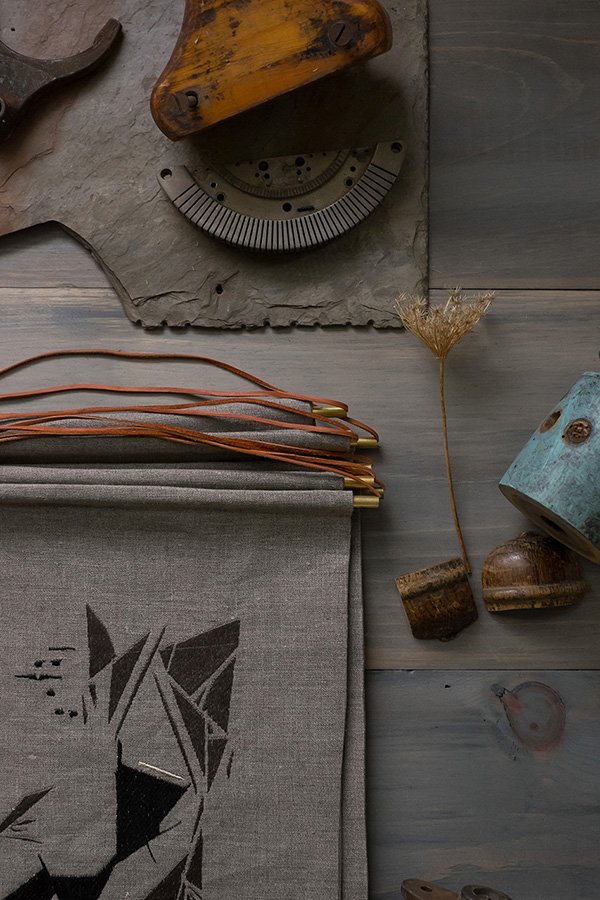 I often talk about Instagram as being an amazing platform for discovering designer-makers and gaining an insight into their creative processes. This absolutely rings true of my latest find, FAYCE textiles, an incredible company created by former illustrator Kim Rosen in New England. After a decade producing illustrations for clients in editorial, advertising and products she felt drawn to the world of textile design and boldly took the plunge launching her own collection. I instantly fell in love with 'RELIC', which draws inspiration from architectural artifacts, formations in nature and elements of vintage textiles. There was something about seeing the use of contemporary geometric lines come to life in a traditional form of needle work that grabbed my attention and got me imagining how utterly perfect they'd look on my sofa. I can never have enough cushions.
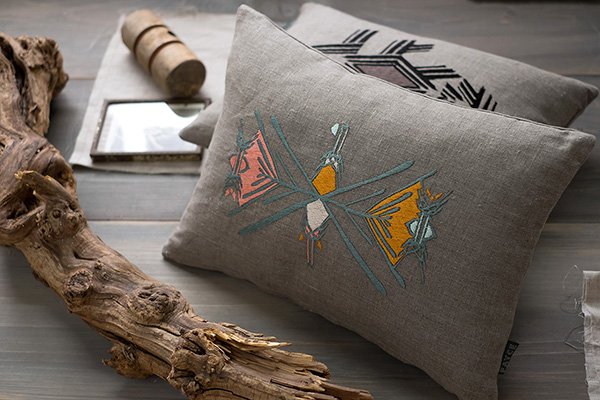
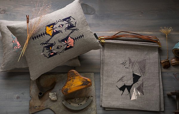 I love the combination of the muted grey and monochrome with pops of bright yellow, pink and teal. Kim achieves her striking designs using a combination of hand drawn and digital techniques before embroidering onto 100% linen, transforming them into cushions and wall hangings. There's something quite raw, almost Native American about them, don't you think?"My love of patterns and textiles runs deep. Since my days at the Fashion Institute of Technology, where I studied Advertising Design, I was surrounded by amazing textile designers and I learned to incorporate the main elements and principles of Design into all my artistic endeavours. Whether working in graphic design, illustration or textile design- line, composition, colour, texture and shape are always constant. This new Embroidered line combines these design elements that I love. I looked to vintage textiles, architecture, family heirlooms and nature for inspiration and the hand drawn embroidered designs were a natural and instinctual addition to the FAYCE brand." - Kim Rosen.
 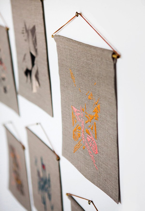 Kim's work is inspiring me to bust out my needles and flosses and start embroidering again. Could be a new trend alongside woven wall hangings?
Photography © Chattman Photography
Urban Jungle Bloggers / Coffee & Plants
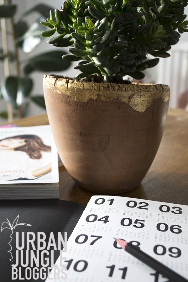 My latest Urban Jungle Bloggers post is actually a week early for once (!) and this month it's all about coffee and plants. This little beauty has just moved into my office, but for the purpose of the post I'm photographing it downstairs in our dining space. It's a variety of Crassula (money plant) that I picked up from Ikea, the leaves grow like tubes until they unfurl, quite amazing to watch. The moment I found the terracotta pot that it sits in in my local florist, I'm pretty sure I almost swallowed my tongue. That delicate gold leaf detailing-oh my! I bought two on the spot and gave one to my mother, so now we both have one each in our homes. Anyway-coffee- Would you like to join us?
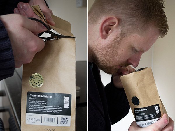
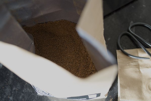
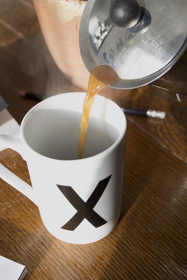
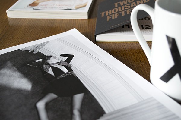
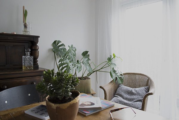 Lunch is the best time of day in our house-we both work from home although I juggle mine around the children, so we all come together for something to eat and to talk about the day so far after Reuben comes back from nursery. Although it has it's ups and downs, this is definitely the best thing about being freelance-enjoying time with family at home when you choose. Especially when there's magazines to catch up on. If there's time then Rob will make us a "proper coffee" in the stove top percolator (I suck at it) and I think he really enjoy the ritual, so this time I thought I'd pop out to my local coffee bar and pick up a bag of Origin's Fazenda Mariano to try. So good.
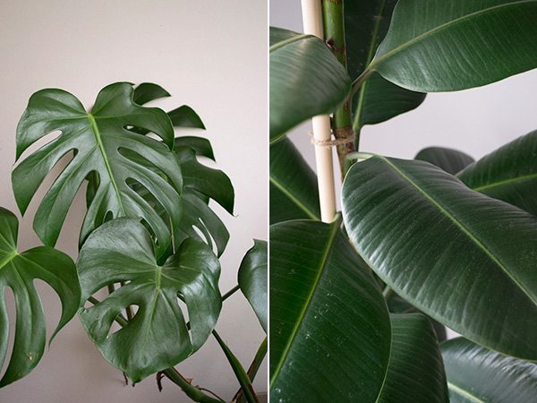 We enjoy a lot of light in this part of the house which makes it an ideal position for my monstera and rubber plants. They were "rescued" from supermarkets some six months ago and have grown from scrawny little weeds into absolute giants. I love them like my own children...well, near enough...
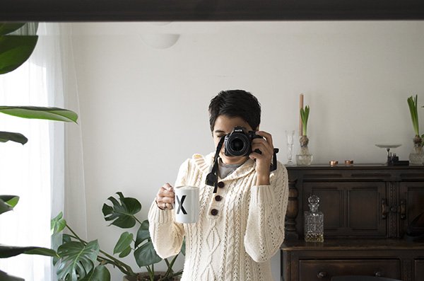 Thanks for joining me today! I've put together a little coffee shopping guide for the weekend, you know, in case you want to get in on some too...
Shopping Guide For The Caffeine Crazed!
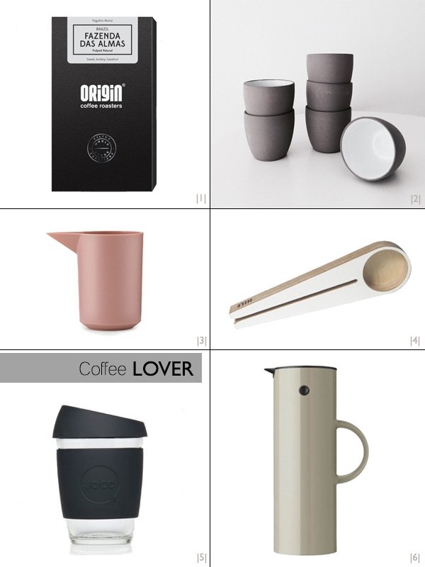 |1| Aside from their eye pleasing, monochrome branding (I'm a sucker for good branding) I love Origin's coffee and enjoy a cup at my favourite coffee bar when I'm in town running errands. They're a small roastery based down in Cornwall and keep the environment at the forefront of their ethos. This box of Fazenda Das Almas offers a sweet silky cup with notes of buttery hazelnut. Yes please.|2| I have a slight problem with espresso cups. I own far too many but I don't actually drink espresso. That said, it doesn't mean they don't have other uses, like looking so incredibly beautiful stacked up on a shelf for me to look at or as a vessel for a sweet little posy of herbs on a windowsill. Serax always kill it with their ceramics. Always. Thanks for stocking these little bad boys, Studio NL!|3| Designers from my favourite Danish lifestyle brand Normann Copenhagen have just released an achingly gorgeous new collection of jugs and flasks under the name of Geo. This is minimal design at its best, with a matt finish on the outside and glossy inner its clean design would look right at home here on my table. Please.|4| Made in Finland from birchwood ply, I think the Kapu coffee scoop by HILE is possibly the most beautiful scoop of any kind that I've ever seen. It's not just a scoop either, that cheeky little notch down the middle lets you clamp your bag of coffee shut when you've finished to keep it extra fresh.|5| Ever mindful of the amount of waste that's created every time we (or I) buy a coffee (most of the cups can't be and aren't recycled) I'm considering keeping a Joco cup in my bag to give to the barista when I grab my next fix. It's reusable, comes with a heat protector and it's so very sexy in clear glass and black. Comes in other colours too but, hey, black is a style classic.|6| A minimalist design classic from the late 1970s, the Stelton vaccum jug is a prime example of function and form working together. With eleven colours to choose from, I had a hard time making my mind up, but settled on Milano Sand-if this colour can stand the test of time as a trench coat then it'll be an enduring classic from which to serve my coffee.
Photography & styling © Tiffany Grant-Riley
Style It / Leather Trousers Three Ways
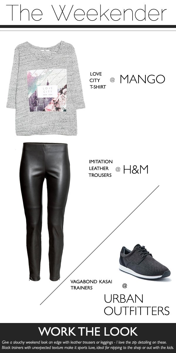
You might be surprised to see a fashion post here today. Yep. I know. 2014 was somewhat thin on the ground when it came to lifestyle here on Curate & Display and 2015 is all about making up for that. In line with my mantra for the year 'Guts Over Fear', I'm kicking the week off in style, showing you three ways to wear a pair of leather look trousers. Recently (and somewhat nervously) I invested in a pair and, tired of my post-baby, playing-it-safe wardrobe I decided to start dressing the way I wanted to rather than how as a mother I thought I ought to. The last four years have been a daunting process of finding a new self and style, coinciding with having my children. I changed in every sense. I completely lost who I was for some time. I closed my business because it wasn't "me" anymore. I lived in the slouchiest, please-don't-notice-me clothes and I put that side of me away to focus on a new career. Now that the kids are nearly 18 months and 4 I feel absolutely ready to get something back for me. Eeesh. That was totally cheesy.Anyway, I digress. Back to the trousers. I love them! They look great with virtually everything and they're easy to wear. No idea why I was so worried about it! Shall we take a look..?
'Love City' Graphic Tee / Mango | Woven Vagabond 'Kasai' trainers / Urban Outfitters
When I'm doing the day-to-day stuff I love to wear basics and can take a boring sports look and ramp it up a gear with an oversized graphic tee (an absolute must have) and a pair of black, textured trainers. It's a comfy but stylish look which is ideal for busy mornings juggling breakfasts, nappies and finding the shoes under the sofa.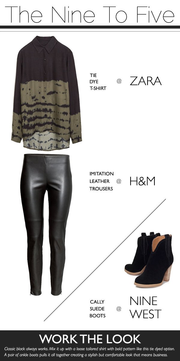
Tie dye t-shirt / Zara | Cally Ankle Boots / Nine West
Black is just the best. Give me a black shirt and I'm a friend for life. I've chosen this one with tie dyed pattern as it's loose and drapes well, but still has a tailored feel to it. I can do up the top button or undo a couple depending on how I'm feeling and it's easy to move in when I'm working a shoot or heading out to a meeting. I live in boots with chunky heels, I'd wear them all year round if I could! They give an added feeling of height but without breaking my ankles. If you can't run in them, don't wear them.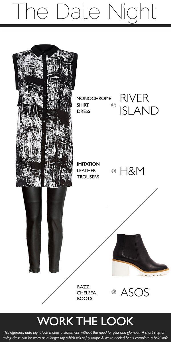
Monochrome Shirt Dress / River Island | Razz Chelsea Ankle Boots / ASOS
For this casual date-night look I've paired the trousers with a sleeveless monochrome shirt dress. I'm not one for tiny skirts and skyscraper heels anymore and I prefer to wear simple pieces of jewellery than the bling I used to enjoy in my teens, so this outfit works well. Again, I've chosen a trusty pair of boots but this time with a white sole and heel to make more of a statement. Although it's still quite low key, by wearing it with a smoky eye and nude lippy it adds a little drama.So there we have it-three ways to style a pair of leather look trousers. I hope they've given you some inspiration if you're thinking of adding a pair to your wardrobe.What do you think of my choices?
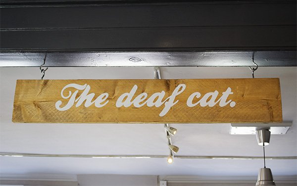
A Stylish Find / The Deaf Cat Coffee Bar, Rochester
 Today's 'A Stylish Find' isn't a new one for me at all, but if you're new to my home town of Rochester and fancy exploring, then this is for you. Our beautifully preserved, historic high street made famous predominantly by Charles Dickens is not short of places to kick back with a coffee, but The Deaf Cat is the place I choose to spend my time in.
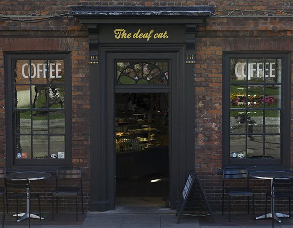 Opened five years ago by former graphic designer Kevan Middleton, The Deaf Cat (so named after Charles Dickens's favourite pet) sits boldly inside a Grade II listed building which was once a home. With a red brick and matt black facade, worn original floorboards and tonal greys on the walls, it sets itself apart from the twee tea rooms from the off. As a functioning gallery, The Deaf Cat supports local artists who can display and sell their work. The art changes on a regular basis - including the wall murals, there's always something new to look at. You might even spot local artist Billy Chyldish who regularly pops down on his scooter. I really ought to say hello sometime...
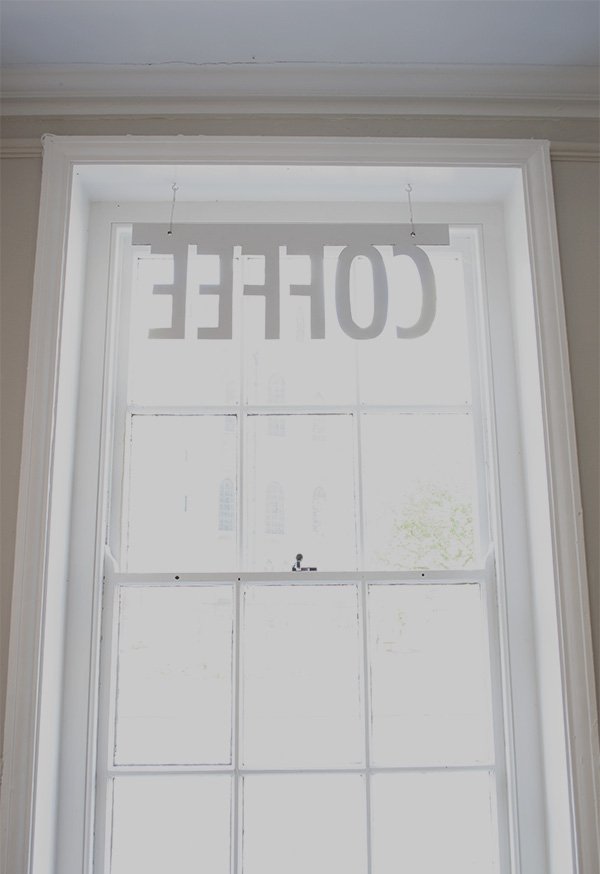 When I have a rare moment on my own or even with the kids in tow, it's a home from home. A newbie to the wonderful realms of coffee drinking (I had a caffeine intolerance for the best part of thirteen years) I cut my teeth in here. I love the atmosphere; from the heady aroma of roasted coffee beans and frothy hot milk, to the indie/alternative music, there's always a good energy which is why it's so popular within the creative community. Oh and Reuben says "he loves the cookies and orange juice"-his favourites.
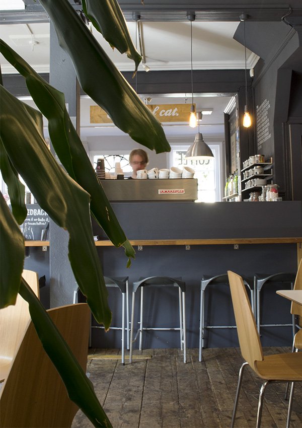
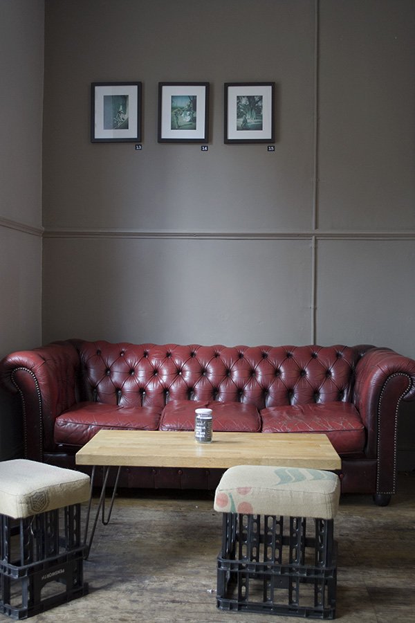 The mix of industrial and retro works so well in this space, from the well worn Chesterfield sofa and cosy seating, vintage church chairs and pendant lamps, it's unpretentiously, effortlessly stylish. With the recent opening of a branch of Costa's just a few doors down there was quite understandably a lot of unease about the effect it would have on the established cafes, but loyal customers (me included) keep coming back to show their support.
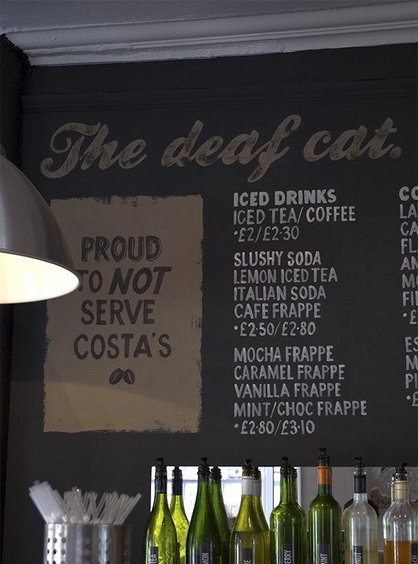
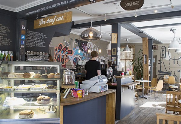 Of course, it wouldn't be the place it is without the quality of the coffee and a group of very welcoming baristas who know how to make the perfect cup. The bean of choice here is Origin, a small company in Cornwall using their own environmentally friendly coffee roaster. Coffee with a conscience. Their branding is pretty sexy too. Obviously.
 If nothing else entices you to Rochester I hope this will. I'm planning an Instagram tour later on this spring and we will most definitely be making a pit-stop here for a break from snapping. Would you like to join me? Watch this space for news.Thanks again to manager Matt and owner Kevan for letting me hang out and shoot for a couple of hours. See you soon!
Guts Over Fear / Resolutions & Goals In 2015
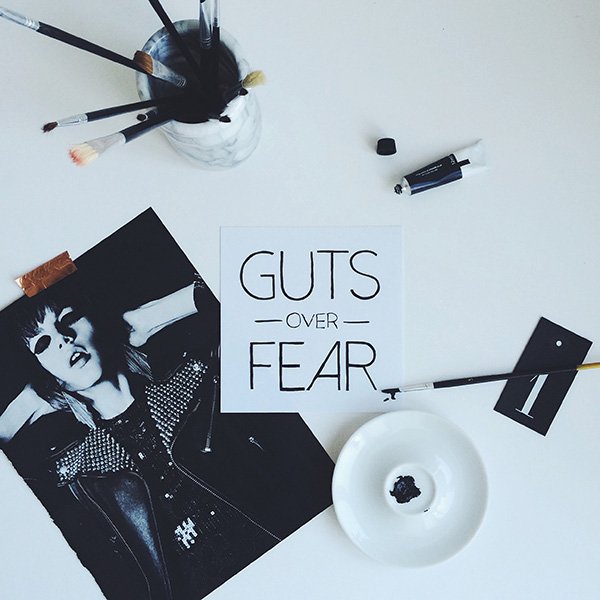
Resolutions. Do you bother making them? I can't remember the last time I stuck to any-they're loaded with hidden pressure and that feeling of letting yourself down when you break them just isn't worth that massive tub of ice cream you eat to make yourself feel better. I'm not talking from personal experience...of course... so I prefer to keep a word or phrase in mind for the year. My buzz word in 2014 was 'grow' and it turned out to be a year of learning and progression, just small scale things but they made a huge difference. By nature I'm not a fan of the baby step approach-I prefer to run before I can walk and I'm not the most patient of people, but the past year has taught me to slow down and appreciate taking small steps to achieve the bigger picture. Just what exactly that is as yet is still unclear, but I'm happy to relinquish some of the control and see where things take me.
I started writing Curate & Display in February-my 3rd blog since I started in 2007 and in the ten months I've been writing its brought about some incredible opportunities, new friendships, new clients and given me confidence to get back into working as a stylist again now that my children are that little bit less dependent on me. The house is slowly coming together bit by bit and even though it's not ours, it feels very much like home and I relish the challenge of giving the remaining rooms a refresh.
So what's my phrase for 2015? Guts over fear. It's punchy, to the point and it means business. It's ridiculous when you consider all the opportunities you let pass by listening to those quiet whispers telling you not to-don't you agreed? I've let the doubt take over on more than one occasion, whether it's the quality of my work, stepping outside of my comfort zone with my wardrobe or deciding whether or not to approach someone I admire to collaborate with. Not any more. This year is about having the confidence to make things happen. Stand up and be counted. I just hope I can still look you in the eye and say I stuck with it at the end of the year!
Pep talk over! I'd love to hear your thoughts on resolutions. Do you have plans for the coming year or are you rolling with it?
Photography & styling © Tiffany Grant-Riley
Spiced Hot Chocolate & Those Copper Mugs
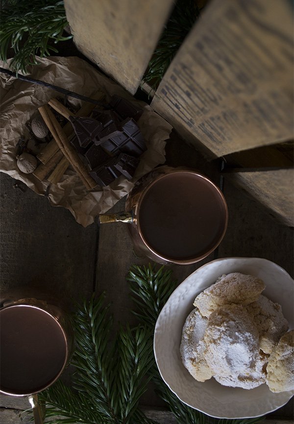 I'm not one for posting recipes here, as a rule I leave that to the foodies and food stylists among us, but today I'm making an exception because, well, I have these beautiful new copper mugs and they were crying out for their own mini-shoot! Yes, I'm still head-over heels for copper and can't wait to put these beauties to good use imagining the variation of flowers I can style them up with-who says a mug can't be a vase?Anyway, with Christmas over and New Year looming, I had planned to write a gorgeously moreish cocktail based on Horchata and using Amaretto as the base, but as with some creative journeys, this one decided that it wasn't right. As I was about to throw the towel in I remembered a recipe for a spiced hot chocolate that I threw together a few years ago and how in the midst of the seasonal chaos I'd forgotten to make any thus far. This recipe is fast becoming a tradition in our house at this time of year, along with the Italian ricciarelli biscuits which are possibly the most incredible biscuits you will ever taste. Check out Twelve by Tessa Kiros for the full recipe and please, please do.
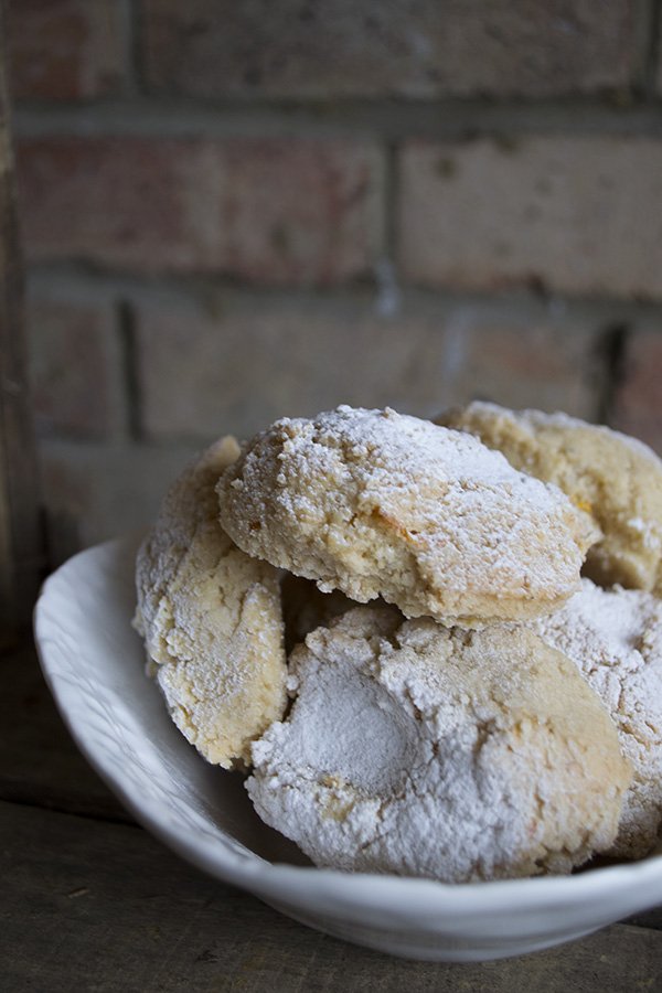 This is a recipe for the sweet toothed chocolate lover, for moments when only an intense chocolate hit will do. It's a rich, thick hot chocolate with a comforting base of warm winter spices and made with dark chocolate with 85% cocoa solids so it's not sickly sweet but you won't be wanting more than one cup at a time. Share with friends and savour it.
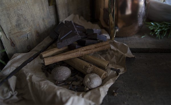 Serves 4 generouslyIngredients1000ml whole milk200g 85% dark chocolate (I use Green & Black's)100g light brown sugar1 vanilla pod sliced down the middle1 stick of cinnamon3 clovesA good grating of nutmeg (to taste)A pinch of saltA pinch of dried chilli flakes
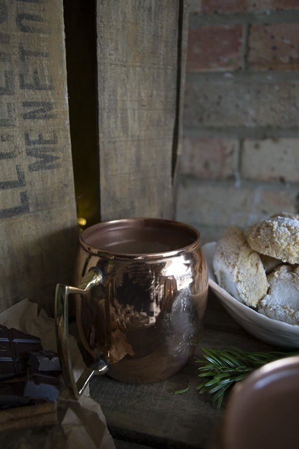 Method✚ Add the milk, sugar and spices to a pan and simmer on a gentle heat for twenty minutes, stirring occasionally until the sugar has dissolved. Taste to check that the flavour of the spices has come through (continue for a further five to ten if you'd like it stronger).✚ Strain the milk through a sieve to remove the spices and return to the pan on a medium heat.✚ Break the chocolate into chunks, add it to the warm milk and stir gently with a whisk until the chocolate has completely melted and the mixture has thickened.✚ Ladle into a mug, beaker or bucket, snuggle under a blanket and enjoy.A very happy New Year to you! Thank you for following, reading, commenting, liking-whatever, 2014 was a pretty amazing first year for Curate & Display blog and I can't wait to see what's around the corner in 2015. Thanks for listening and see you on the other side! xThis post is in collaboration with Mia Fleur who kindly sent the two copper mugs as a gift. Photography & styling © Tiffany Grant-Riley
Style It / Soft & Romantic Winter Decor
 Yikes - just three more sleeps until Christmas Day - are you just about ready? I find it really funny that even though I'd got myself into gear enough with the decor to come up with this DIY garland, nothing else was even close to getting done. Occupational hazard maybe? Needless to say, we pulled our collective fingers out over the weekend and got through a mountain of 'to-dos'. Yep. We owned it. Food, gifts, the lot. Phew.
 I've been thinking about creating more 'how to style' posts recently. Day to day I don't really think about how I style my work as I just do it, but there are a few guidelines that are worth remembering - would you like me to write more for you?Just for fun, today I'm sharing how to put this look together. Don't panic if you feel that there isn't time now, this isn't just a Christmas look as you can change up the colours throughout the year. You can recreate the look with or without the garland using a shelf, sideboard or even as a table runner (imagine that dressing a table for a New Year's Eve dinner!) I digress...You Will NeedPaper honeycomb balls in a variety of sizes - I chose white, ivory, grey and soft pinkCut glass vases - you can pick these up in a charity shop for peanuts and come in handy for all sorts of projectsHyacinth bulbs or similarSoft pink tall candlesSmall glass votives lined with copper tape
 ✚ Start with arranging the honeycomb balls. You'll need to layer them up slightly if you've enough depth to work with, so that you have some of the middling and smaller sizes towards the front, larger to the back. Cluster them a little so they're not uniform.✚ Introduce your candles. I put mine into a variety of cut glass vases as the glass will pick up the light from the candles and kick out an added glow onto your wall - just beautiful. Play around with height, for example if there's an obvious space that needs something tall and there's a vase that fits, use it. Same applies if there's a shorter vase and a gap at the front. Step back, tweak, step back and tweak some more.✚ Next up, add in your bulbs. I've displayed mine in a mixture of short glass vases and a tumbler for variation in height. See how I've arranged the short one towards the front and the taller further to the back?✚ Add a little interest. I wasn't happy with that little pink ball on it's own at the front, so I put it on top of a little pressed glass cake stand and added in another pink ball to the right. Also towards the back you might spot a glass decanter with silver cuff that I thought would do well to reflect the candlelight.✚ Finally, I placed at the front three small tea light votives that I'd covered with a strip of copper tape each. I liked the way they picked out the soft pink in the candles and garland.Here's a few top tips worth remembering:Odd numbers look better. It's difficult to explain why, but they do - 3 candles, 3 vases, 3 tea lights • Layer up, don't just put things side by side, try in front, behind or stacked on top • Introduce height but allow each object to relate to each other (so nothing too tall that disconnects from the others) • Work with triangles. It sounds odd but objects look more pleasing to the eye when they relate to each other via a triangle. I've used the candles to instigate this and pulled the eye across to the paper balls and down to the votives. See?I hope you found this useful enough to inspire your own styling at home? It was fun to pull an image apart step-by-step and analyse it for a change!I'm signing off for the Christmas holidays now but will be back soon with a rich and gorgeous recipe for hot chocolate before the year is out. Have a wonderful time! x
