The New House / Before Tour
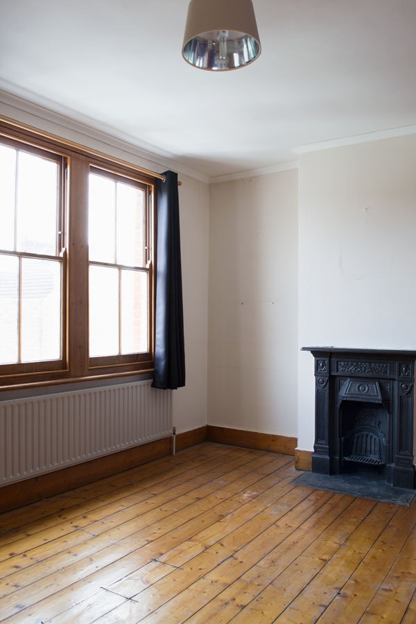
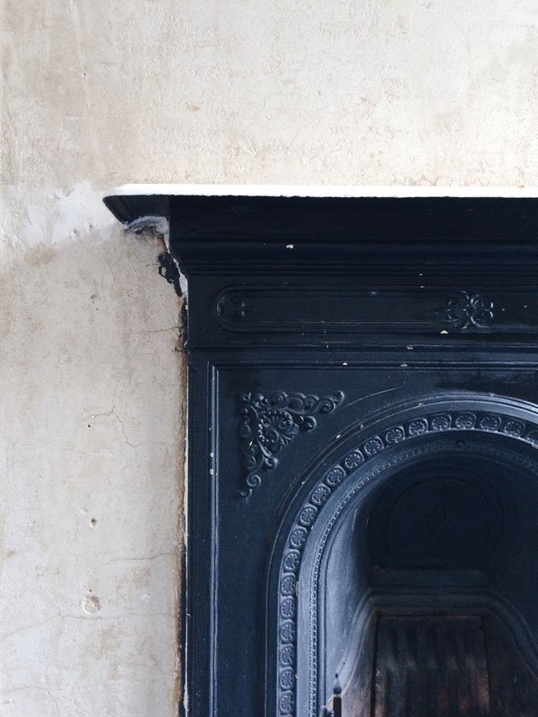 So I have some news. It's been the hardest thing to keep under wraps these past few months with a few ups and downs and a lot of nail biting, but now we're out of the woods I can say...we have a house! And breathe...We were first to see it when it came onto the market back in June, first to put in an offer straight after the viewing, have it accepted and then rejected a week later, only to be offered it back another four weeks on from that. Emotional roller-coaster is a complete understatement, but it was worth it, because this was the only place that ticked 99.9% of the boxes, and we have some interesting requirements with us both working from home. And the crazy number of large plants we have. Oh, and the children and cat, of course.The house is a beautiful late Victorian build with three bedrooms just up the road from where we are now, in Chatham. Thankfully, as far as the nasty historical interior updates go, this house has narrowly escaped most of them. Beyond the 70s foam coving in the upstairs rooms and gloss painted anaglypta wallpaper in the hallway, we are relieved that most of the pinewood flooring has been restored along with some of the sash windows. That said, where would the fun be in writing an interior design blog if I didn't say that we're staring down the barrel of a lot of decorating. Come on now. Earlier last week I went up to the house to take a few shots and strip walls. Would you like a tour?
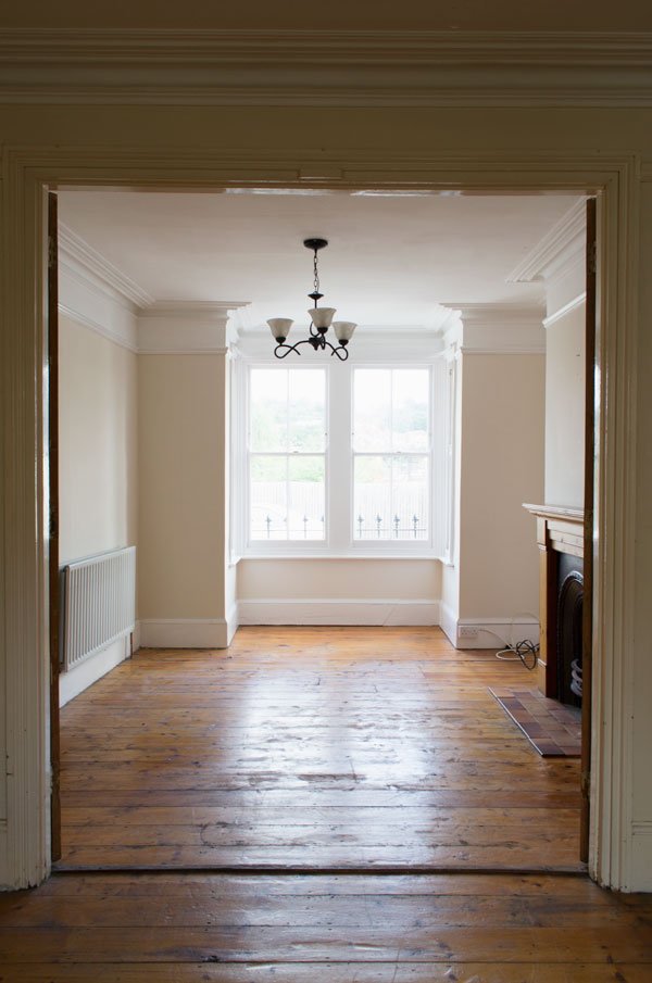 I absolutely love this space, the front of the house gets a lot of light although it gets gradually moodier the further in you go. It'll take some getting used to from where we're living now and I'm not sure white is going to work quite so well in every room, but that's part of the fun, right?
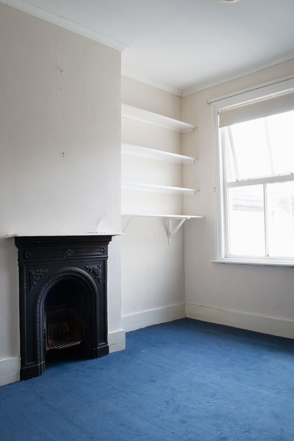
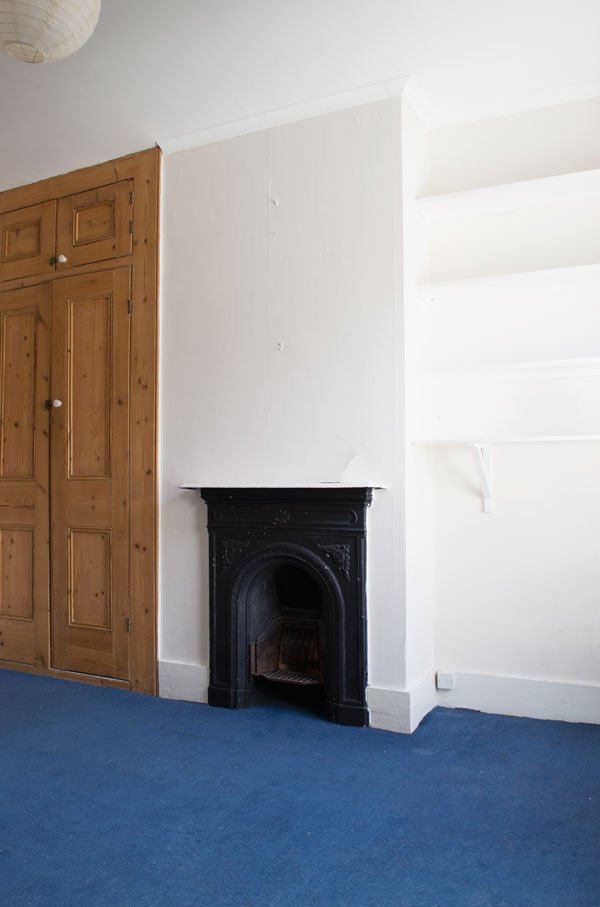
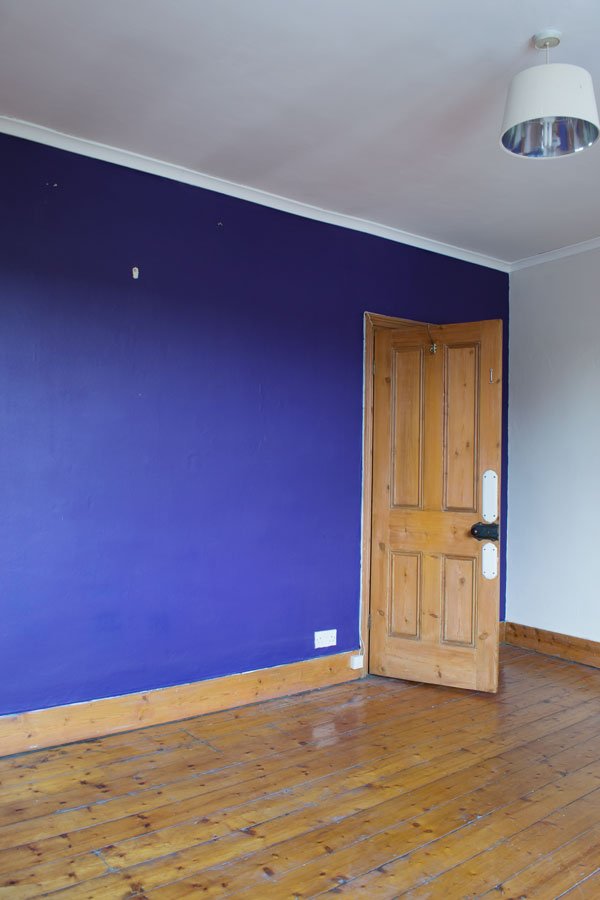
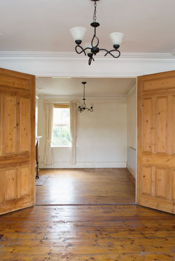 We're moving in at the end of October but aside from the kids room and maybe ours and Rob's office room (not pictured), not much else is going to be done until then. You don't realise how much time things take until you move in and really look and we want to live in the house for a while so we can decide how we want to use each room. Eventually, we're going to sand back the floors again, stain them with a white oil to give them a paler look and seal them with a semi-matt wax. A mammoth job, but I'm happy to do it.So for now I'm focusing mainly on this room which will be the children's. I've since stripped the wallpaper off and removed the coving and shelving ready for re-skimming in a couple of weeks. The carpet will come up, floors sanded back and painted.
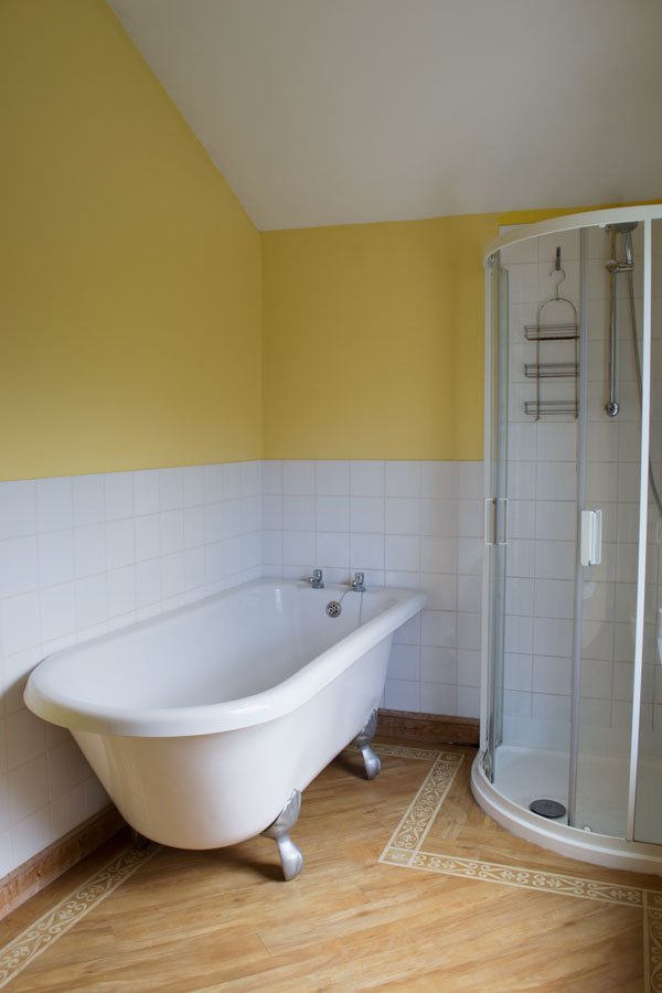
 In keeping with the bright colour theme, the bathroom is yellow. Eeeesh. We're definitely keeping the bath (painting the feet black) but we'd like to change the floor and other units as they have a traditional Victorian feel.
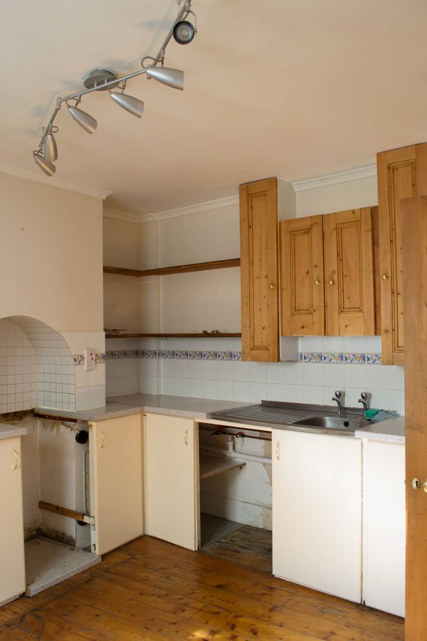
 At the end of the hallway is the kitchen which has a sweet window looking into the yard. And eventually we'll completely rip out the units and plan the layout from scratch, although we love the old open shelving in the corner. It looks like those cupboard doors above the sink were repurposed from something else in the house, no idea what but the previous owner said they'd been here a very long time.
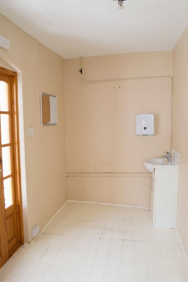 This room is what will be my workspace. Yes, there's a sink in it and a naff cupboard which houses the boiler. I think there were plans to convert it into a downstairs toilet but never happened. The floor is sloping and needs levelling. As I don't think I can remove those pipes, I'm considering covering them with a false plywood wall so they can still be accessed if need be. And maybe soft grey walls? Stay with me on this one. Through that orange pine door (not staying) is the sun room. The floor will also need to be replaced along with the windows, but it's not top of the list right now. Eventually I'd love a real urban jungle in there to sit with and look out onto the garden. When we get round to it.
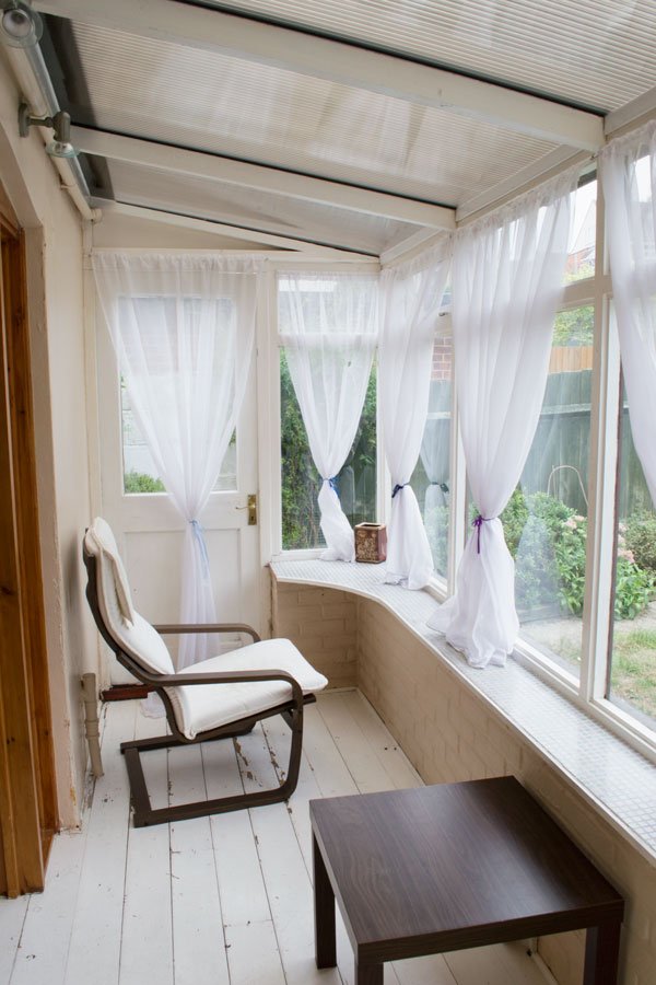 So there we have it. Heaps of potential and heaps of work. Looking forward to sharing our journey of renovation, decoration and DIYs with you and all those in-depth conversations over paint. I'm not even kidding...Follow our progress using #TheChathamHouse on Instagram and follow Stories for regular updates. You can also see how we're gathering ideas and inspiration on The Chatham House Pinterest board...Photography © Tiffany Grant-Riley
Function+Form 03 / Dean Street Cafe
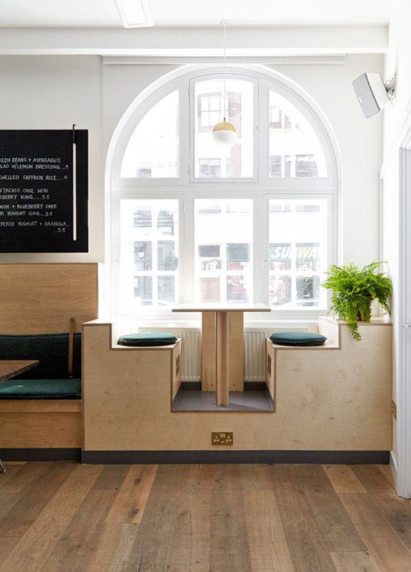 Fresh from our latest Function+Form breakfast gathering on Saturday, I wanted to share the beautiful soon-to-launch Dean Street Cafe, where we hosted our end of summer event.Aside from improving the way that we feel in our homes, design also imparts positive experiences where we work and this is certainly true of Dean Street, a new venture to be run by staff and trainees at youth homelessness charity, Centrepoint. A former church space of historical importance - it was first designed by Sir Christopher Wren in 1686, the space has been given a new lease of life by multidisciplinary designer Nina Woodcroft of Nina&Co. You might recognise her name if you saw this ceramics post earlier in the year. As soon as we saw the space and learned more about the plans the charity has for it, we knew we had to tell our community and spread the word.
 We were very fortunate in that Nina could join us, flying in from her home in Amsterdam to tell us about her own journey into interior and product design, sharing with us some of the process of transforming a space with such difficult constraints. As John Raynham, head of enterprise at Centrepoint went on to tell us, the space will be used by the charity as a training space for young people coming from difficult backgrounds, learning new skills and rebuilding their lives. Then at weekends, the building transforms into a working cafe in which, guided by venue manager and chef Dean Masters, these same young people with an interest in hospitality can learn an NVQ as well as barista skills offered by their coffee partner Kimbo.
 With such a rigid brief, Nina created a flexible, homely space, using sustainable birch plywood storage painted in a soothing green and hand mixed locally. The integrated pegboard comes with removable pegs to store and display items easily. What was a small kitchenette on the right has been opened up giving it a double aspect, meaning one side can be used for takeaway drinks and the other open for service to the cafe. The kitchen also includes reversible menu boards which can be turned around to close off the kitchen when not in use, with all furniture neatly stored away for training sessions during the week. Perhaps the focal point of the room, the small window seats were borne from discovering a rather difficult steel strut which couldn't be removed. Instead, Nina used it to their advantage, designing the built in seating which was raised up to window height, allowing those at street level to see that the space was a functioning cafe. Such a clever idea.
 We loved how much of the materials used in the design were sourced locally too - from the upholstered bench cushions made by The Hackney Draper, second hand seating and bespoke lighting made in the UK, all finished off with a little soft planting.Our third since we launched last year, Function+Form is fast becoming a way for us all to slow down and reconnect over good conversation and food. Our partners, Luminary Bakery who are another of Nina's social enterprise design projects, support women to raise themselves up from difficult circumstances, teaching them entrepreneurial skills through their bakery in Stoke Newington. The bakery delivered us some of the most beautiful apple and brown butter flapjacks we'd ever tasted, as well as flourless brownies and cookies. Alongside fresh fruits, pastries and granola provided by chef Dean, we also got to experience a more mindful approach to fresh juice thanks to East London Juice Co, based in the Ace Hotel, Shoreditch.We can't wait for the cafe to officially open to the public later next month and wish them all the very best. Make sure you pop in to show your support if you're ever in Soho at the weekend!With special thanks to our sponsors Centrepoint, in particular head of enterprise John Raynham and venue manager and chef Dean Masters, as well as our partners Luminary Bakery and East London Juice Co. If you are interested in joining our interiors and design community, get in touch: hello@wearefunctionandform.com
Photography with thanks © Anna Stathaki
Autumn Fair Gift + Home Trade Show
 The first post of September and this my favourite month, feeling that subtle change in the air as it starts to get cooler, crisper and the nights draw in. If you're looking for interior styling inspiration to welcome the coming season then Autumn Fair, a gift and home trade show held at the NEC Birmingham is a must. The show is the largest trade event in the UK, and the ideal place to find inspiration and trend knowledge.For anyone with a shop or retail business, the show offers a choice of over 1,400 exhibitors across 12 sectors including Contemporary Gift & Living, The Light Show and The Summerhouse for the latest in contemporary and more traditional design. Expect to see the new season's collections in textiles, homeware, stationery and gifts. Naturally, I've got my eye on Danish brands Hübsch, Nordlux and IB Laursen as well as the new on my radar By-Boo from the Netherlands.
 The show also provides free expert advice, including a program of engaging seminars covering trends, SEO and a must-see keynote from Jo Malone MBE as she discusses her Brand Building Journey. Book a one-to-one Meet The Expert appointment for a more detailed look into your business or if working with social media influencers is your focus, don't miss fellow bloggers Jen Stanbrook of Love Chic Living and Kate Watson-Smyth of Mad About The House.
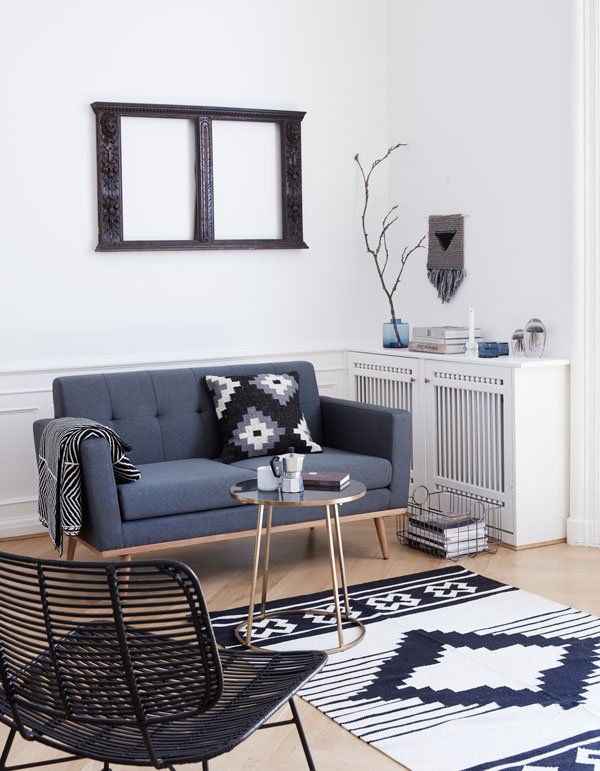 Even though I can't attend this year, I couldn't resist pulling together a few Autumn ready designs from the exhibitors that caught my eye.
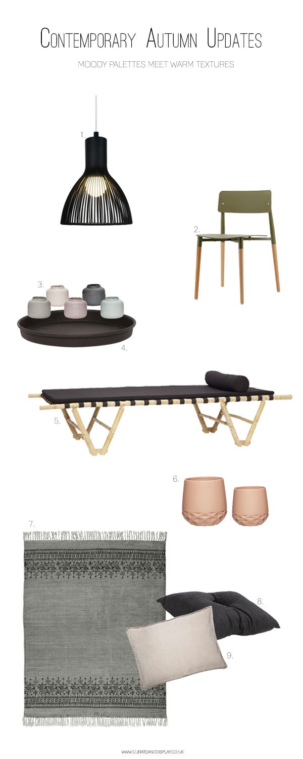
|1| EMITION lightshade in black, Nordlux |2| Botanical green chair, By-Boo Furniture |3| Muted pastel vases, Hübsch |4| Black candle tray, IB Laursen |5| Day bed in black, Hübsch |6| Coral pink geometric pots, Hübsch |7| Black and grey woven cotton rug, IB Laursen |8| Anita wool cushion, Shepherd of Sweden |9| Sand velvet cushion, IB Laursen
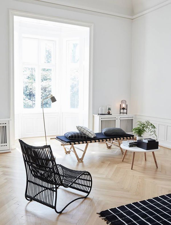
Moody colours can find their way into your home this season regardless of whether your walls are pale or inky. The key to getting it right is in blending textures. Think warm woods such as rattan, bamboo or cane combined with black (check out the light by Nordlux), deep greens and rich blues in textiles or on your walls. Day beds like the one above by Hübsch are very on-trend, as well as the once more traditional rattan chairs being produced in more contemporary shapes. Introduce chunky wool, velvets (choose pale pinks or sandy tones to offset the darker colours) and heavy linen curtains for simple luxury. Group collections of candles on metal trays for en-masse comfort, or combine a group of muted vases on your dining table with a few sprigs of winter herbs.Feeling ready now?Autumn Fair is held at the Birmingham NEC from 4 -7 September. To book tickets or for further information, head over to http://www.autumnfair.com.
This post is in collaboration with Autumn Fair.
Spanish Design / Shaping Light With Marset
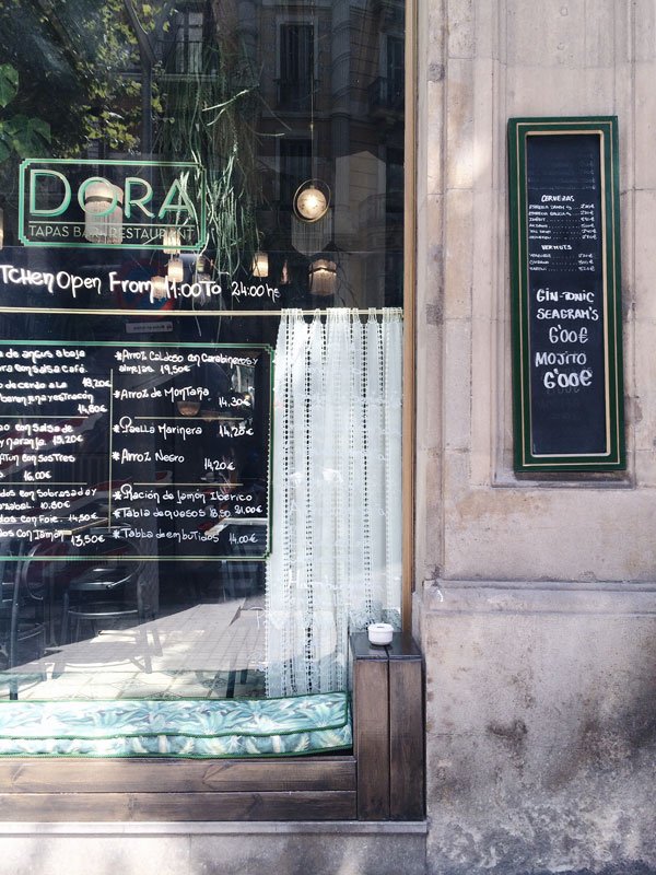
 After a restful morning at the hotel and exploring the city, our first afternoon in Barcelona found us wandering away from the main streets into the quiet oasis of a courtyard; here we met with Marset, exploring their lighting showroom over lunch. The first of many lunches, we were welcomed with chilled gazpacho, salty-sweet jamón and platefuls of paella. The Spanish know how to lunch, am I right?
 Although very much a Spanish company, founded by the family in the 1940s as casters of metal before focusing on lighting in the 1960s, Marset collaborates with new and more established designers internationally.What struck me most is the variety in their design - there isn't any one signature style here as such. Mid-century inspired pieces sit next to the futuristic, ceramics against woods and metal; but you can see how one design informs the next.They recognise the importance of simplicity, functionality and the character given to a space created through the diffusion of light. It isn't so much the light itself but the shadows that give atmosphere to a room. When you understand how you want a space to feel, how you will use that room, then you build upon the depth, colour, shape of shadow and manipulate it with light. Each piece within the Marset collection has its own experience to share.
 I loved the minimalist design of the Ginger collection, made from a combination of pressed wood, paper and resin. It gives off a soft, intimate light which filters through the wood.

 The geometric, ceramic 'Scotch Club' bowls give directional light - ideal for a dining room.

 My favourite design? The Pleat Box collection, a result of Marset's first collaboration with ceramist and designer Xavier Mañosa (above). Stay tuned for an insight into how these shades are produced next during our visit to Xavier's atelier in the outskirts of Barcelona. It's about to get a whole lot hotter and dustier!Photography © Tiffany Grant-Riley
The Lights Are Green For VIPP
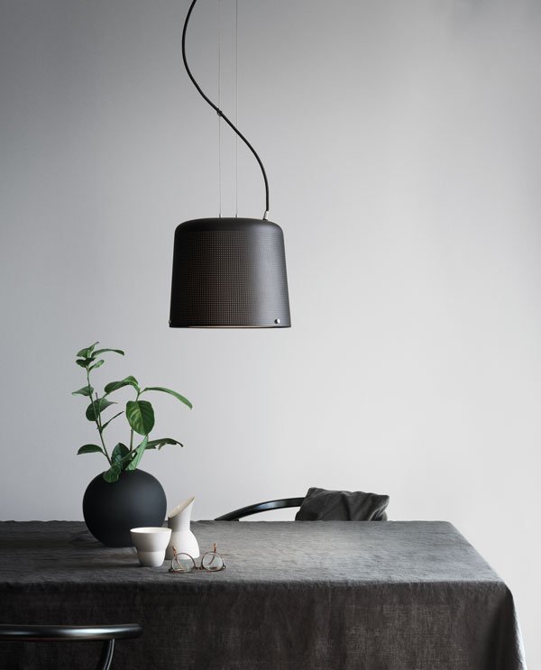 They may be better known for their iconic pedal bin or kitchen and bathroom accessories, but always at the forefront of classic minimalist design and after 75 years as a household name, Vipp have launched their first lighting collection. And you need to see it, because - Vipp! I'd been wondering if lighting might be their next move and I'm far from disappointed with the results. Beautiful. The new collection consists of five strong pieces; the floor and table lamp, ceiling pendant, wall lamp and the small wall spot (see below). Take a look and tell me what you think...
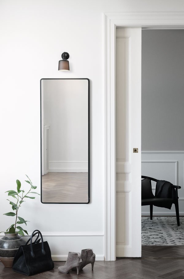 Staying true to their industrial roots, these lights are designed with longevity in mind, using longer lasting LED technology, allowing easy replacement of the bulb without having to replace the whole fixture. Nothing is throw-away here. I can see this series becoming another Vipp classic, with their perforated, powder coated aluminium shades which allow a gentle hint of light through around the edges as well as from the source. They're adjustable, flexible, made to last.
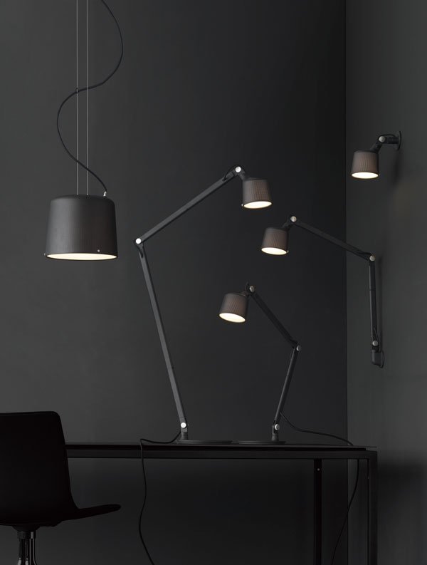 [pullquote width="300" float="none"]We make only one kind of each product so you're not going to see a new collection of Vipp lamps next year. For once you have the essence of good light, what more is there to achieve with a lamp?[/pullquote]-Kasper Egelund, CEO HOS Vipp
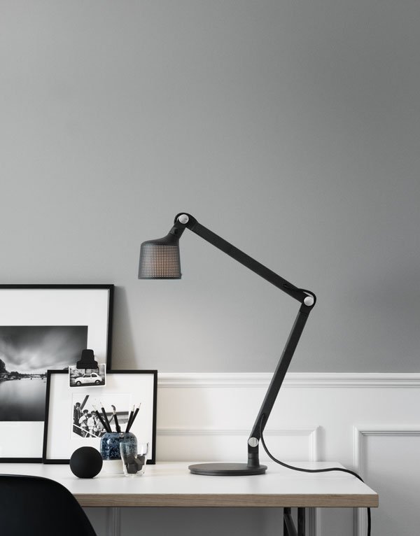
Photography courtesy of Vipp.
A Place To Stay / Hotel Alexandra Barcelona
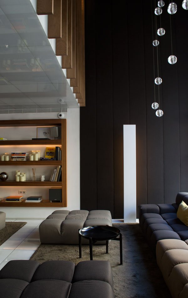 Barcelona and all it's magic seems like a world away now, so I can't wait to relive the Sunny Design Days tour again with you, kicking off with the place we called home for three days - the Alexandra Barcelona Hotel. A boutique hotel with an avant garde, contemporary style, this is a hotel for design lovers, showcasing the best names in Spanish design in an environment that feels like home. Found in Paseo de Gracia, bustling shopping district of Eixample and a stones throw from Gaudi's Casa Batlló and La Pedrera, you couldn't be in a more prominent place to explore the city and immerse yourself in local culture.
 Inside an historic 19th century building, the Alexandra is carving out a name as the hotel of Spanish design, slowing working its way through each space, updating and renovating weaving in pieces created by the best Spanish names. Starting with the recently opened charcuterie and bar on the ground floor and more intimate gastronomic brasserie upstairs, restaurant Solomillo puts a modern twist on traditional Spanish cuisine. Designed by Barcelona based architects Borrell Jover who also redesigned the pool terrace and several of the bedrooms inside the hotel, the charcuterie and brasserie (not pictured) create an intimate backdrop in which to sample a beautiful selection of cooked and cured meats, local cheeses and other fresh from the market produce.
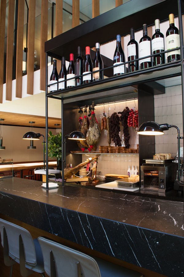 Over two wonderful dinners at the restaurant with Borrell and Jover, they explained how they carefully selected each element for a timeless, contemporary feel; from the 7,300 "meaty" coloured glazed tiles, the Cosentino marble table tops, rugs by Nanimarquina, lighting by Marset and Santa & Cole and Expormim rattan Huma chairs. Phew! I'll introduce you to these names very soon-you. will. LOVE.
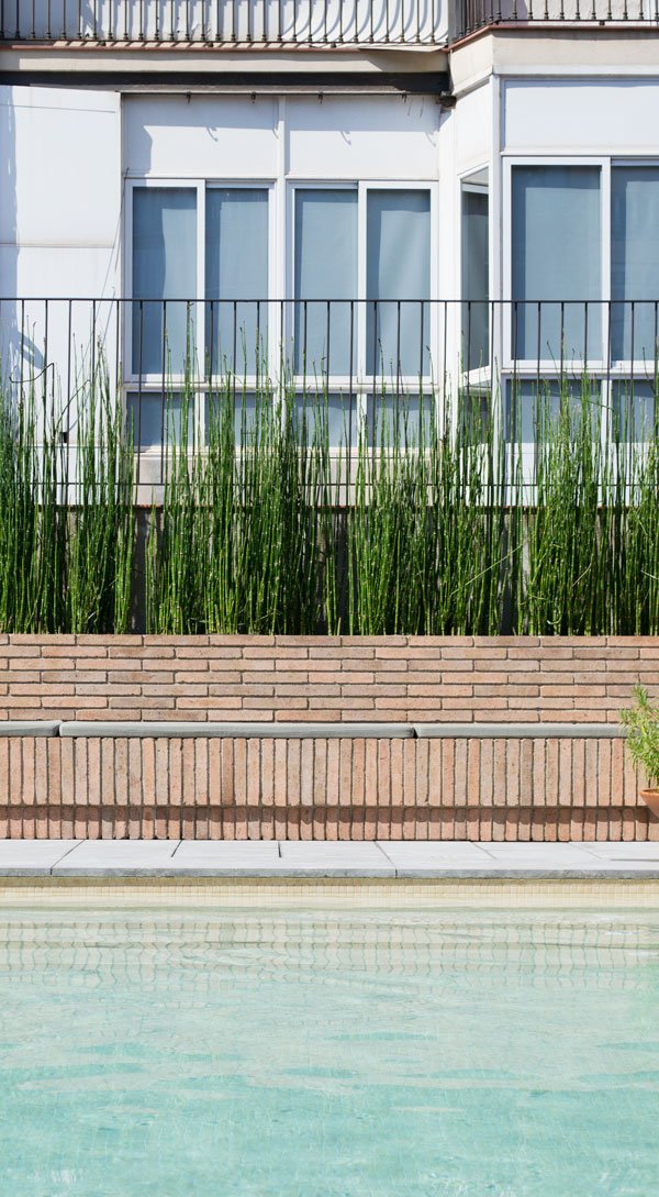
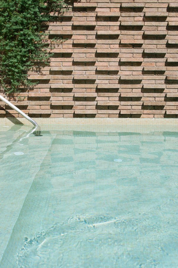
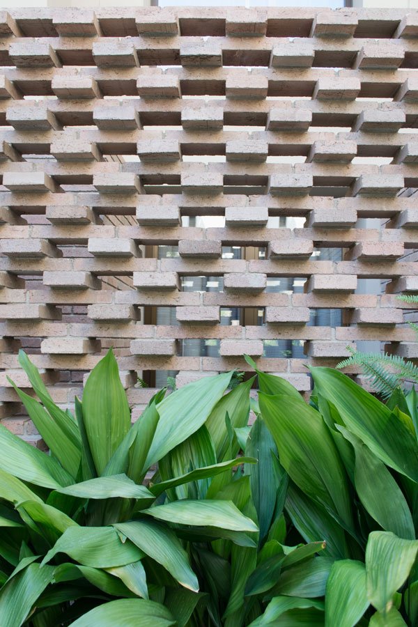
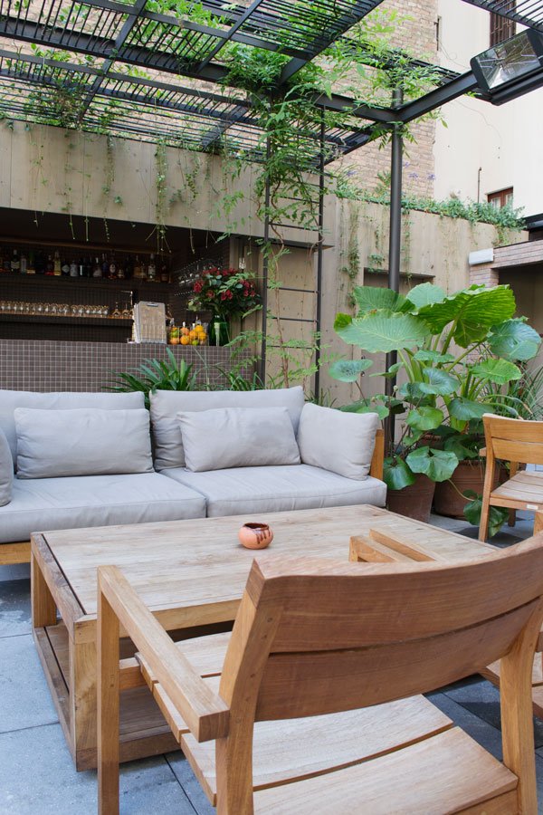
 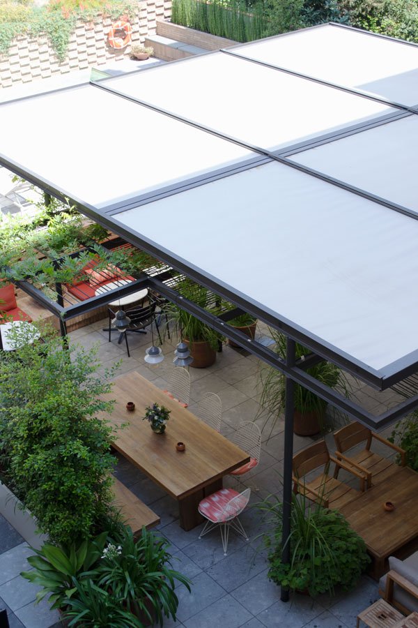 Outside, a luxury outdoor urban jungle awaits on the pool terrace. Using a series of layers to provide screening, this green oasis is divided up into two main areas-the bar and lounge and pool. Taking direction from the yellow bricks of the structure next door to the hotel, Borrell and Jover incorporated this into the terrace to blend into its surroundings, using brick to separate the ground floor rooms with a screen and lush planting, a bank of brick seating to separate the pool and then just beyond the pool, an organic vegetable and wild flower garden to screen the roof of an unsightly former cinema. The garden also provides produce for the hotel.
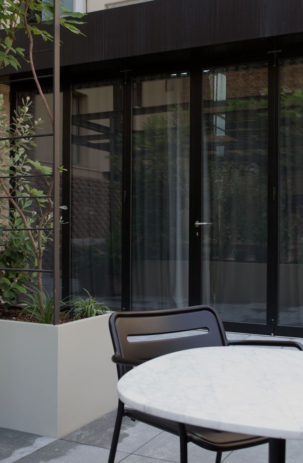
 A glimpse into my room - overlooking the quiet terrace and tucked away from the city streets. With such a
 punishing busy schedule, I relished the secluded cocoon of this space with its warm, earthy Spanish tones, parquet flooring and concrete bathroom. When can I come back??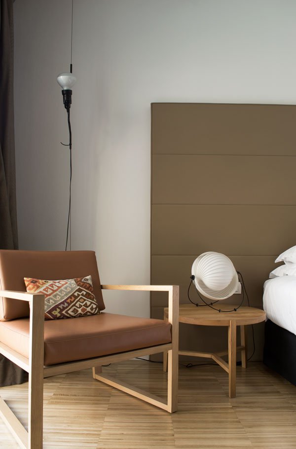
Photography © Tiffany Grant-Riley.
Sunny Design Days / A Very Special Spanish Tour
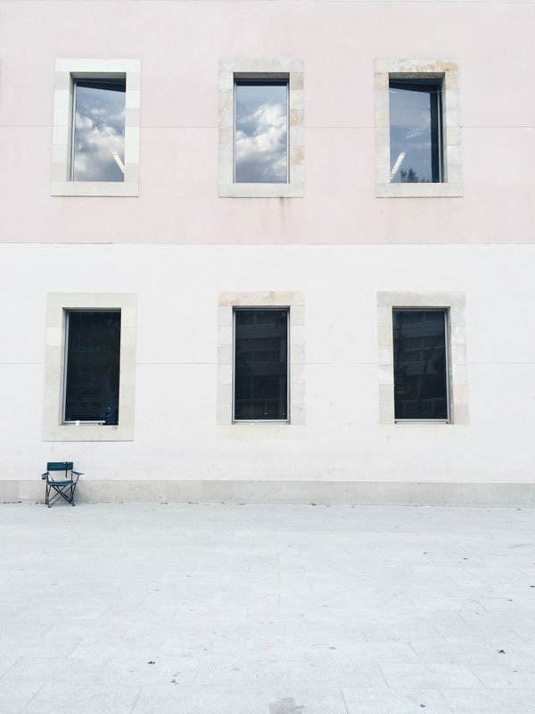 I don't want to get all Elizabeth Gilbert on you, but sometimes the universe has a way of finding us out, sending what we need at just the right time. A few months back, I was in the car with my husband, most likely off to get his phone screen fixed (again) and I was feeling a really low. Out of nowhere I'd said "I really need to get away, say... to Barcelona...on a design tour-that would be incredible." Three hours later, I had an invitation from RED, the Association of Spanish Design Companies, inviting me to join their five day Sunny Design Days tour with eight other bloggers and journalists. Starting in Barcelona, we would visit studios and showrooms of some of the most renowned Spanish design brands, moving on to Valencia and finally Madrid, sampling some of the best Spanish hospitality around. Well, of course I burst into tears. Are you kidding me???!! And, if you've been watching my Instagram (check out #sunnydesigndays) you'll have no doubts at all that I jumped into that offer with both feet and all my heart and now here I am, back with a camera full of beautiful photos, new friends and a head filled with Spanish design.
 Over the coming weeks (because there is just so much to show you) I'll be sharing studio and showroom tours, collections from new designers, snapshots from a favourite hotel and perhaps a few interviews thrown into the mix.Check back in on Friday to explore our first stop - the Alexandra Hilton Hotel in Barcelona...iPhoneography © Tiffany Grant-Riley
Kovac Family / L25 Lamp Giveaway
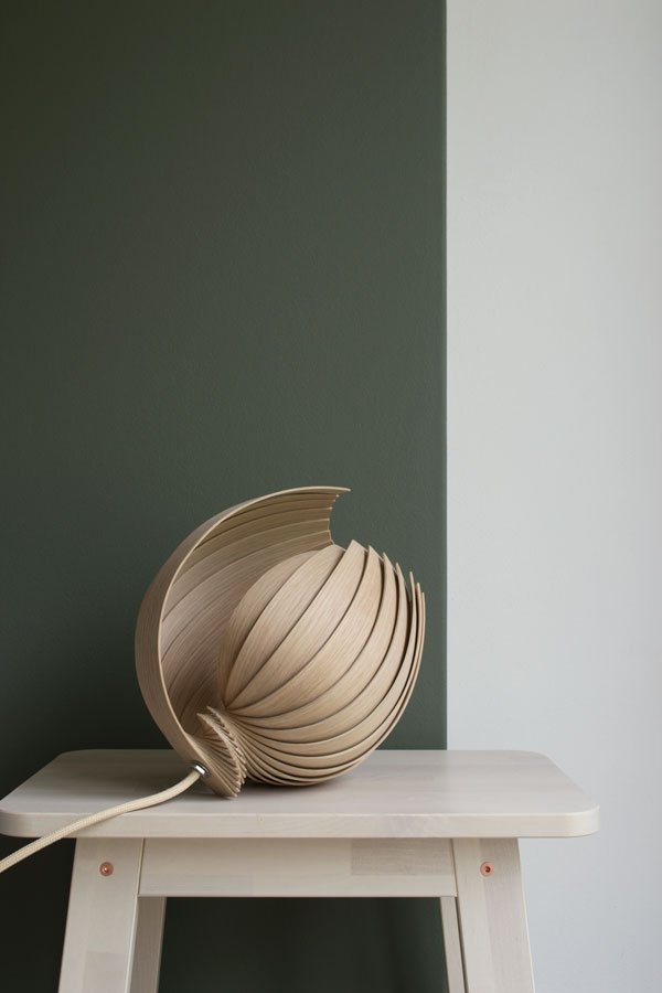 I'm back in the land of the living having stepped off my Spanish cloud at the weekend - last week I was away on a design tour, stopping off in Barcelona, Valencia and Madrid. If you've been following on Instagram you'll have had a little taste of what I got up to, but there will be more to come here on the blog over the coming weeks.For now, back to Scandinavian design and the organic shape of this, the L25 Lamp, so named because of the 25 pieces of oak its made from. Isn't it beautiful? Understated and quiet, but with a lot to say. Designed by Stockholm based design studio, Kovac Family, this lamp is locally produced, constructed from FSC sustainable oak and comes flatpacked for you to fold out yourself. You know how much I love design with a conscience and all the more so here as Kovac Family put proceeds from each lamp sale towards their biomimetic light project which aims to find new, eco-friendly solutions to help in designing and producing lighting by emulating nature itself.
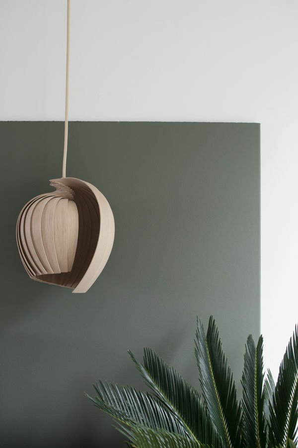
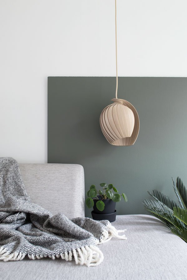 And because I knew you'd love it as much as I do, I've teamed up with Kovac Family with an Instagram giveaway. If you'd like to be in with a chance to win your own L25 Lamp in oak, here's what you need to do:• Switch over to Instagram and follow @kovac_family and @curatedisplay.• Find the giveaway post on my feed, leave a comment telling us where you'd like to hang your lamp and tag in a friend you think would like to enter too. Easy.The competition will run from Friday 22nd July and closes August 1st at midnight GMT. Entrants must live within Europe and the winner will be chosen at random by number generator. Good luck!
  I'm also taking over Stylist Magazine's Instagram account today as part of their #FridayFeast series, so do follow along for my take on interiors and a little taste of Spanish design! Photography & Styling © Tiffany Grant-Riley
Bright Creative Renter Friendly Kids Room Decor
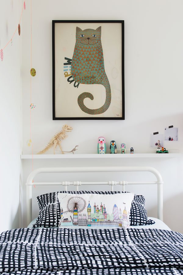 I'm hoping today's post will fill you with inspiration if you're looking for some creative renter friendly ideas for kids rooms. Given that it's newly decorated and I haven't as yet shown you the reveal, here's the kids room which is shared by my five year old son and two year old daughter. It's ok, I asked their permission and they were totally fine with me sharing it.In my usual fashion, it's taken me months to get this room finished! I've had some of the decor in my possession for almost three years since moving here so typically some items have been discontinued and I don't actually have any before shots, but if I tell you 'Magnolia' walls, grey carpet and not much else, you get the gist!The biggest stumbling block in putting their room together has been the standard restrictions of living in a rented property. There are the things we definitely can't change like the flooring or anything structural, so we focused on what we could. Luckily our landlord is pretty hands-off and we're allowed to put screws into the walls and paint, so I was more or less free to create a room that was bright and colourful (for once) without too many stumbling blocks.Here are some useful tips to get you started...
Be Clever With Colour
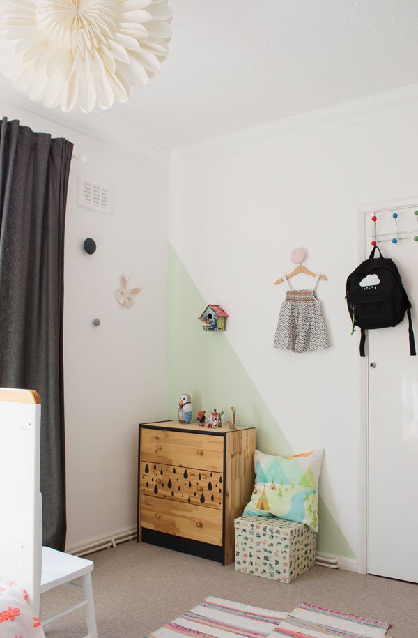
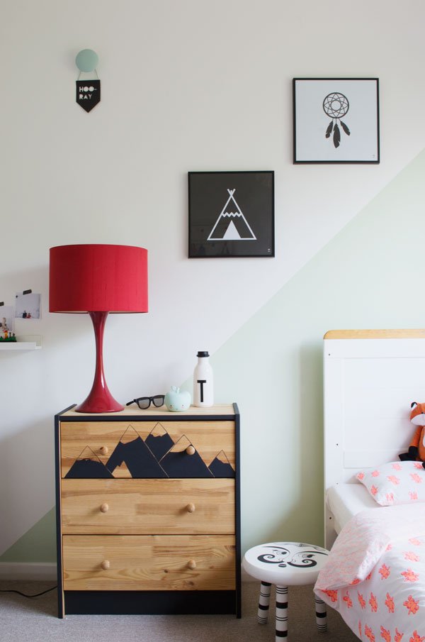
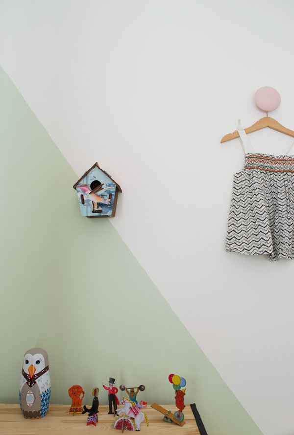
We're lucky in that this room gets a lot of light during the day, so I started with a clean base of white on which to build up the colour. If you're able to use coloured paints on the wall, think beyond the fully painted block wall and introduce shape instead. Using Frog Tape, I marked out and taped the angle before applying the paint with a roller in two coats. In doing this I've zoned the bedroom without any physical dividers - see how the angled touch of soft green on the wall cleverly separates my daughter's side from my son's?As a temporary alternative, try hanging colourful garlands like these by Engel or think about using wall hooks - a functional piece for hanging up clothes and other bits and pieces that look fun too. I've installed five matt coloured porcelain wall hooks made by Danish ceramicist Anne Black, in fact I loved the green design so much that it inspired the accent colour for the whole room.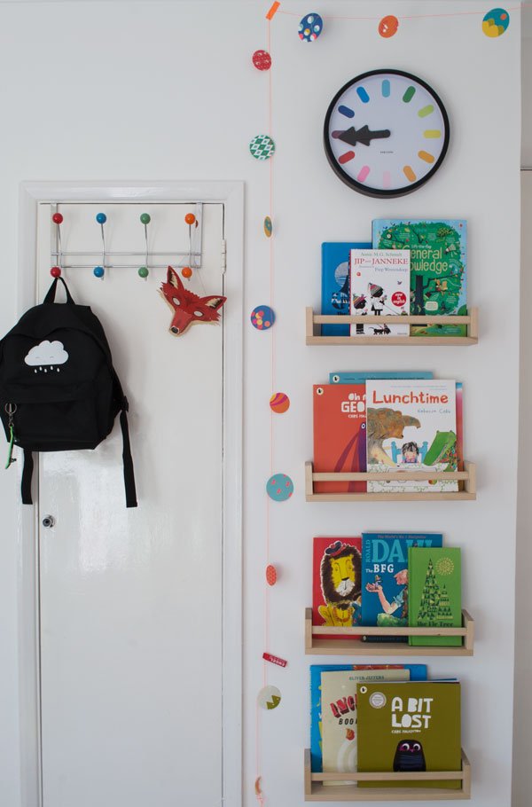
Customize + DIY
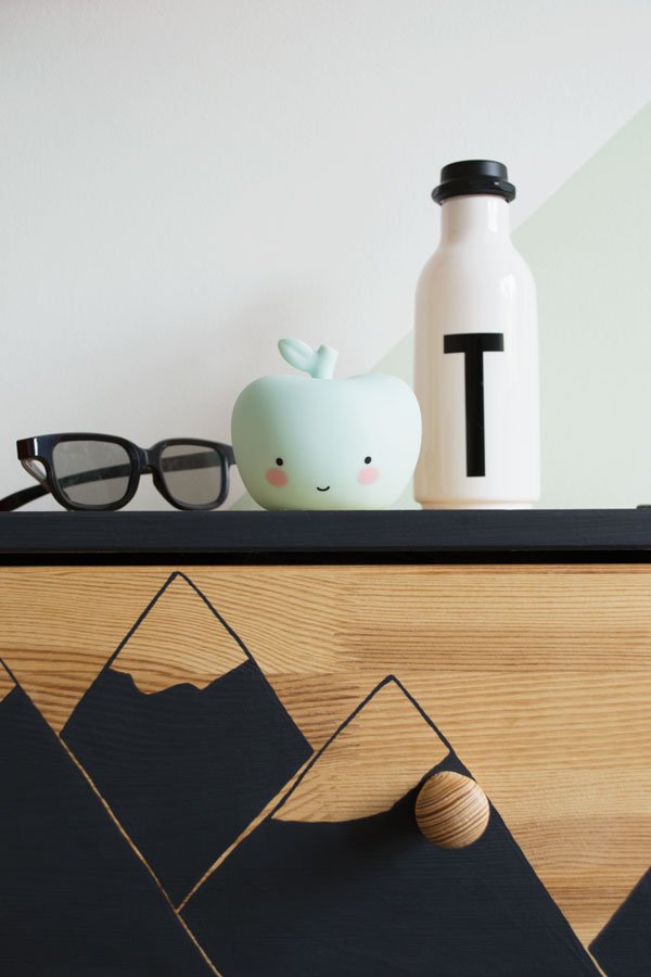
Choose pieces of furniture that you can customise with a key colour or pattern to hold the look together. I love the raw plywood look, so plumped for two IKEA Rast chests of drawers that I painted with a black trim and simple design on one drawer. Pinterest has tonnes of Rast drawer tutorials if you're stuck for inspiration too.The rag rug was a brilliant find (I'll tell you where from next) but if you wanted to create something similar, try stitching three inexpensive runner rugs together. A large rug or collection of several layered up will break up any boring carpet - I love the shots of woven orange from the rug that are picked out in the organic cotton bedding by Lulu & Nat, my daughter loves the neon bunny rabbits!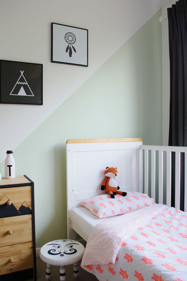
Shop Savvy Accessories
The accessories are really what makes a room if you're limited with what you can do with it. Don't overlook charity shops when you're shopping for kids decor. The absolute star buy in this whole room is the rag rug, which was ex-Zara Home display, discovered in my local Oxfam in Rochester, was £200.00 and I got it for £20. And the little black and white footstool by my daughter's cot bed, which I think is a handmade piece was just £10. Not bad eh?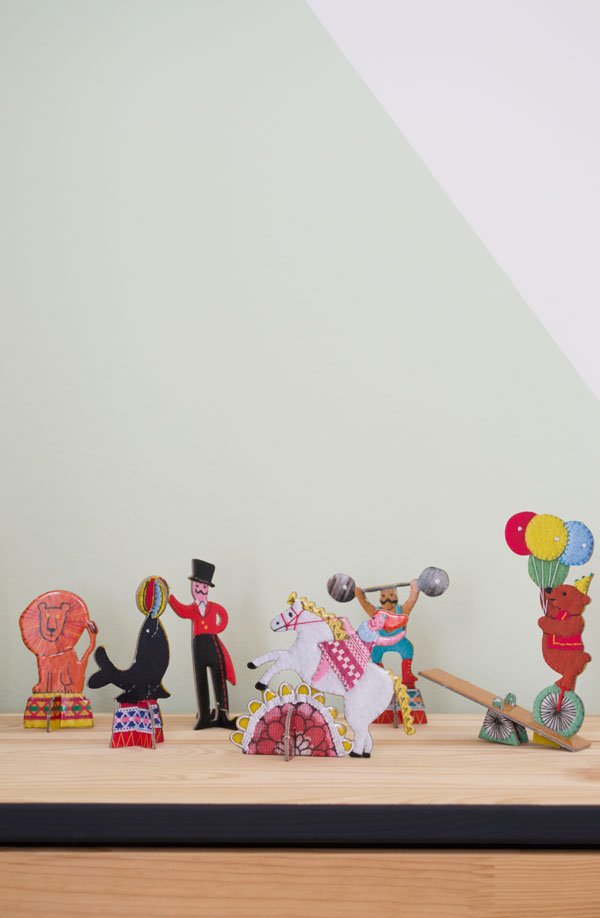
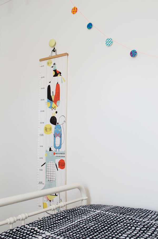
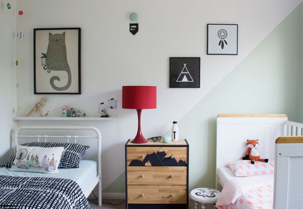 No need to say that they both absolutely love spending time in here together now, although bedtime usually take hours as they're far too excited to sleep!Looking for more kids room decor ideas? Try my Pinterest board which helped inspire this look. And I'd love to hear your thoughts, particularly if you're renting too and found this helpful?Shop The Look:Wall paint: 'Swan Dance', Valspar | Wall prints: Cat by Michelle Carslund from Mini-Mi Rochester, Tipi and Dreamcatcher poster by Wild Boys & Girls | Storage: Rast chest of drawers, IKEA, Book shelves (spice racks) , IKEA | Wall chart: Corby Tindersticks, Amara | Superliving DK Nesting Dolls bird family, The Kid Who | Metal Bed: Livy Home at Tesco Direct | Bedding: Black and white grid bedding, IKEA |
Photography & Styling © Tiffany Grant-Riley
With thanks to Lulu & Nat for the gift of the Neon Bunny Rabbit bedding.
Thoughts + Tips | Every Day Slow Living
 I honestly feel like a complete hypocrite for writing this post as an advocate of Slow Living, when life has been anything but slow of late. I've been so wrapped up in to-do lists, the day to day stuff life kicks up and focusing all our attention on the children that I've completely forgotten to look after myself. So when Bloomon, a rather wonderful flower delivery company sending blooms through the post asked if they could send me a bouquet, an Instax camera and a notebook in exchange for switching off from all distractions for the day I took them up on their offer straight away.From 6am to 8pm I went about my day without any of the background noises I usually live with from day to day-that includes the radio, internet, laptop and TV and swapped it all for a notebook, a pencil and my thoughts.
 My initial reaction was to inform friends and family that they wouldn't be able to get hold of me (panic!!) and to plan every minute of the day so that it was spent doing something constructive. Ok, I was offline but I could still paint that chest of drawers...But then that defeats the object of switching off, doesn't it.Instead, I spent the day as I always do, with my little daughter, although this time without putting in a couple of hours work in the morning while she slept and rushing around while she occupied herself. This time we had proper conversations, we played with the camera (she's never seen anything like it!) and we laughed. A lot. I spent a little time arranging these beautiful flowers and photographing them too, a bouquet peppered with some very unusual grasses and blooms, free-form sculptural shapes and texture.We took a walk into town to meet a friend at our favourite cafe in Rochester, The Deaf Cat and over my choc-chip frappe I got thinking about the last time I truly "switched off". I went back as far as when I got my first mobile phone - it was 1999 and I was 15. Now, my phone, my work, my everyday thoughts are stuck in "what's next?" mode. I can be available to everyone at all times. Who really wants that?At the end of the day, feeling far more refreshed, I put together some of my own tips for every day slow living which I hope you'll find useful in helping you feel more present. They're easy to work into your day and you can introduce them as and when you're ready to...
Cut Out The Unnecessary
What I love about minimalism beyond interiors is how it focuses your mind on what is actually important and necessary to day to day living and what is just excess noise and stress. These are the expectations we project onto ourselves, the pressures we think we ought to feel and carry with us to make it feel like we're achieving something, but the feeling of accomplishment doesn't need to go hand in hand with stress. Instead, ask yourself these questions:• Is this a priority or can I put it aside for later / leave it all together?• What could I be doing instead that will benefit me at this particular moment? (yes-that includes resting).
Let Go Of Control
We all need to feel in control, it's what helps to give us a sense of balance. I think it's a pot-kettle situation for me as I'm most definitely a control freak and can't stand the thought of certain outcomes being out of my reach. But we can't control everything all of the time; to use photography as an analogy, I use my iPhone and DSLR because I know how to get them to work for me and anything that isn't quite up to scratch can be edited afterwards so I'm completely happy with any images before I publish them. Not with the Instax. Wow-I'd not realised how stressful I'd find using it, no matter how I set up the shot, it would always come out completely wrong. In my opinion. But in this instance, it's not about perfection, it's about the process, the experience. So instead, I decided to just go with it and whatever came out of the camera was what I got.
Switch Off Regularly
It doesn't matter how much time you can devote to taking time out-it might be an afternoon once a fortnight or once a month, but remember to actively switch off regularly. When was the last time you sat outside somewhere and just listened? No phone, no conversations, just focusing on what you hear. Or find another activity - walking, cooking, reading to take yourself out of that space for a while. Focusing your mind on one thing (like a form of meditation) is an easy way to calm your thoughts and teaches you to learn to be in the moment. Anything else can wait.
Do With Intention
If you're making time to relax and slow down then do it with intention. Say to yourself that you'll be taking this time to read, bake, go for coffee-whatever, and then do just that. Don't get part way through and half-heartedly start checking your emails or catching up on a little work. It can wait. And the same applies for working-if you've decided to work, then get it finished before you start scrolling through Netflix or checking your Facebook.
Find A Ritual
Look for something you enjoy that you can do every day to help slow down. In my case, it's making a stove-top coffee in the morning, but it's not so much the drinking it as it is the act of building it. Grinding up the beans, boiling the kettle, packing the grounds, warming the milk. I stop to notice each element as I go, the smells, the sounds. Each of these little actions gives me time to wake up, think my thoughts and be still before my day starts. What's your ritual? 
 These are just a few of my go-to tips for Slow Living, small but most definitely significant. What do you do to slow down?[line]
Bloomon is a flower subscription service with a difference-sending unique bouquets full of fresh blooms direct from the grower to you as and when you choose. Pretty darn lovely, right?
Photography & Styling © Tiffany Grant-Riley
•• This is a sponsored post in collaboration with Bloomon.
Stand-out Walls | Front Studio for Engblad & Co
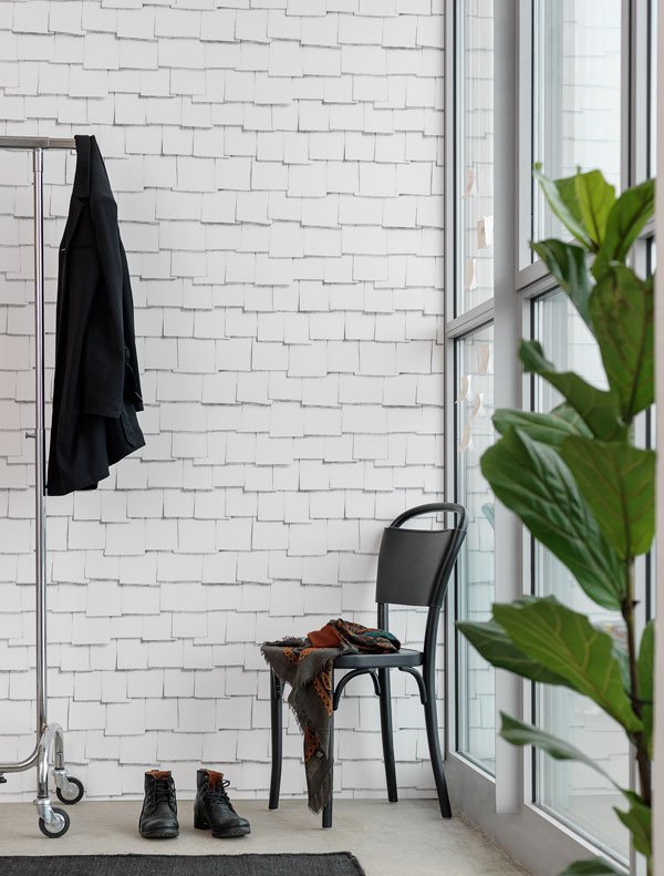 Environmentally friendly wallpaper brand Engblad & Co has recently launched a new collaboration with Swedish design trio Front and I think I may have had my head turned by it. Maybe it's time to rethink papered walls?Experimenting with folding and cutting paper, Front created nine designs which introduce a subtle illusion of texture into all white rooms. Printed using water-based inks on sustainable paper, the collection follows three dimensional forms and shadows. I love the depth that Front have managed to recreate, don't you?
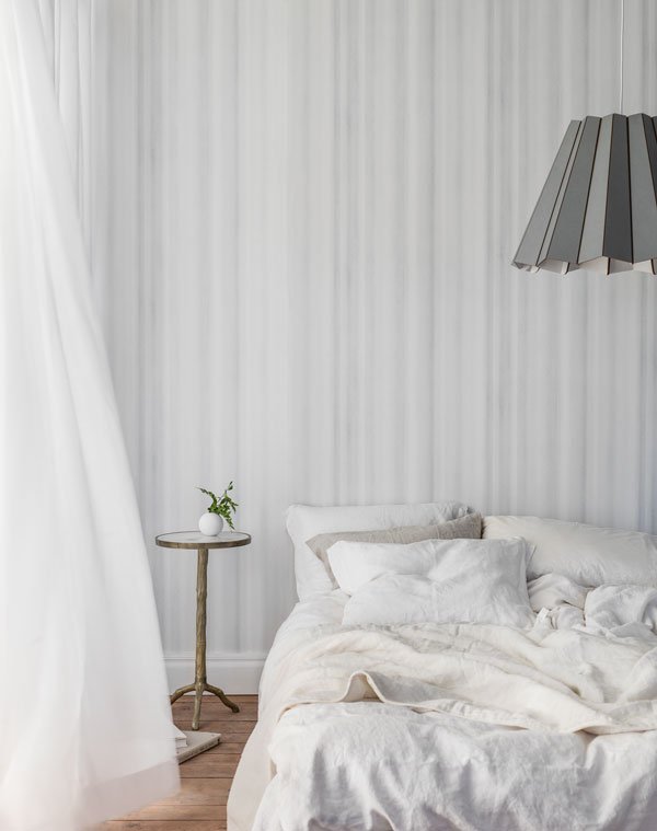
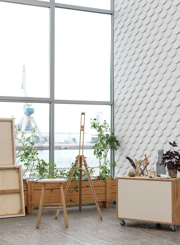
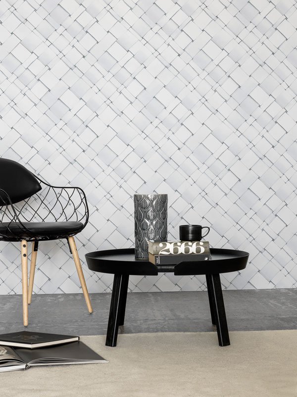 To see the collection yourself, you can order samples directly from Engblad & Co and find a full list of stockists here.
Photography courtesy of ECO.
Arne Jacobsen Flowers | Summer Workspace
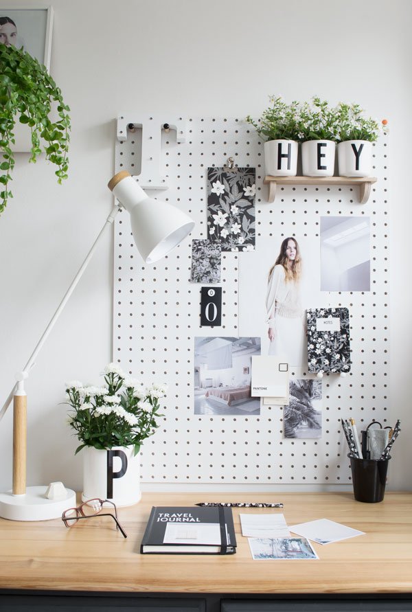 Summer might be having a laugh at us all from behind a cloud of rain (welcome to British summertime) but it hasn't stopped me making an effort to bring a little into my workspace.Known for his rich contribution to the world of Danish design and architecture, Arne Jacobsen paved the way for bold, graphic style, particularly in his monochrome typography created in 1937 and now popularised by Danish company Design Letters & Friends. You will no doubt recognise his alphabet collection, but perhaps you're not so familiar, maybe even surprised to see a softer side to his work. Inspired by wildflower meadows, his sketches and watercolours produced while in exile to Sweden during WWII informed what is the new vintage flowers anemone collection. The soft, freeform black, white and grey floral motif has given my pegboard a new dimension which I've worked into a summer inspired moodboard.
 My brilliant pegboard shelf is currently home to three sunny melamine letter cups spilling with tiny white flowering Bacopa, a sweet little nod towards the floral stationery and voluminous porcelain pot of white Asters on my desk.
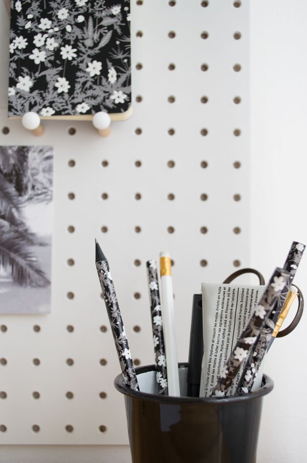
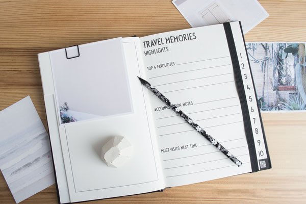 In a bid to be a little more "offline" this summer, I'm hoping these fresh new notebooks will help keep me focused. I miss scrapbooking the way I did before Pinterest and there's nothing better than a blank page to fill you with optimism, am I right? This Travel Journal will also be joining me on a design tour to Spain next month-I can't wait to share more of that with you soon, but in the meantime I'm filling it with Instagram photos from last year's wanderings.
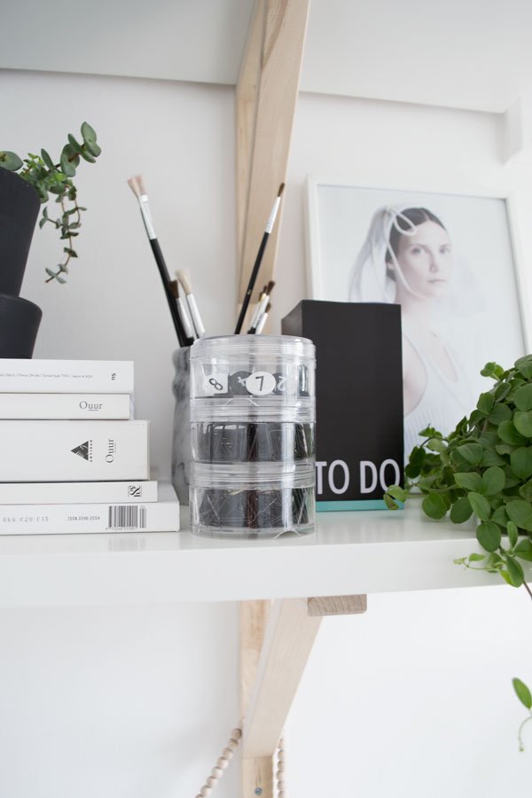
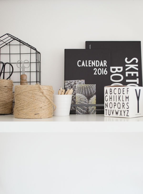
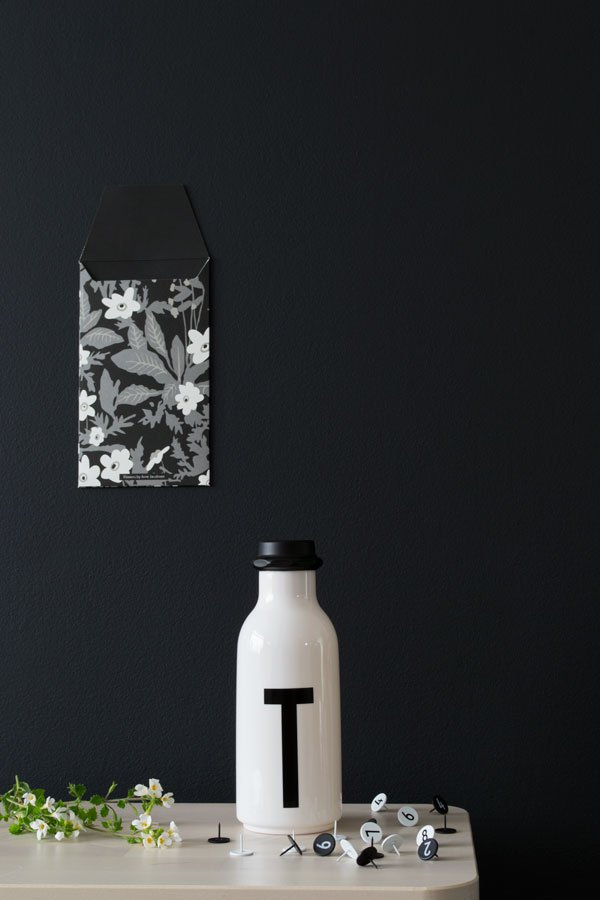
 So hello from my summer inspired workspace! What do you think of the new Design Letters collection?
Photography & Styling © Tiffany Grant-Riley
**This is a sponsored post in collaboration with Design Letters & Friends.
Essentials For New Nordic Kitchen Style
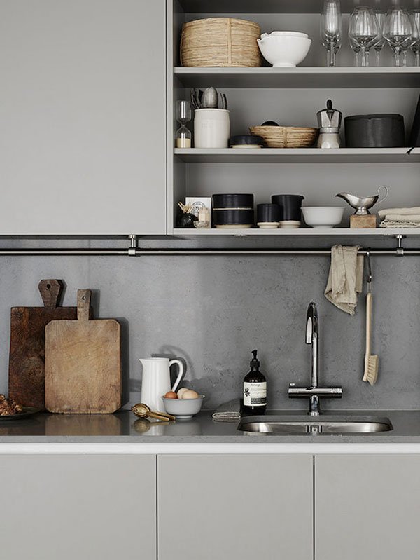 [This Nordic kitchen essentials post include affiliate links.]If there's one thing that frustrates me about renting on a daily basis, it's looking at the unreleased potential in our kitchen. I spend a good portion of each day in it and yet, I'm unable to give it a major new look. I really do daydream about ripping out the cupboards, fitting concrete work tops, matt black taps and open shelving. Does this sound like you?Yes, I'm that sad. So, settling instead for the easy to add, inter-changeable details, I've dissected some of my favourite kitchen looks in New Nordic style in the hopes that it'll inspire you, particularly if you're in the same predicament as me. This style is all about enjoying the simplicity of the space, choosing and using well designed accessories that stand the test of time in both function and aesthetic. It's about a muted colour palette, natural materials that don't impact the environment, contrasting textures.Don't assume that white is right. New Nordic isn't just about monochrome, why not explore blush and nude, dark greens or soft grey (as above) used in the cupboards which holds together tonally through the granite countertop and splashback, through to the details of the warm, worn wooden chopping boards, touches of black stoneware and woven baskets on the recessed open shelves.
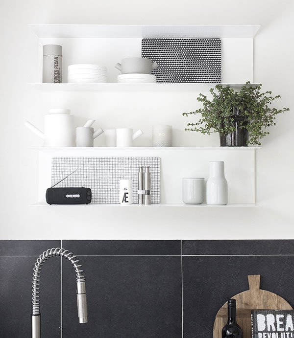 Pay attention to the shelving that you choose as its as much a feature of the space as the pieces you display and use daily. Use an all-in-one design which blends into the wall to feature every day collections in similar tones (see above) or find a style which both compliments the setting but provides an unobtrusive contrast. These stainless steel, professional kitchen shelves bring in a metallic element in high shine alongside the white metro tiles but the warm herringbone flooring stops it feeling clinical and cold. The glasses look fantastic on display here and the wall-mounted Anglepoise lamp supplies directional lighting over the worktop.
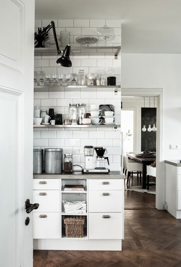 Organise your kitchen according to how you use it - if you always have stove top coffee in the mornings, reserve an area for all your bits and pieces; the coffee beans, the scoop, your favourite mugs. Pay attention to the accessories you use from the strainer to the brewer, the scoop, the beakers. It's about simple shapes and high quality materials. Trust me, incorporating well designed details into your daily coffee rituals just lifts the whole experience.
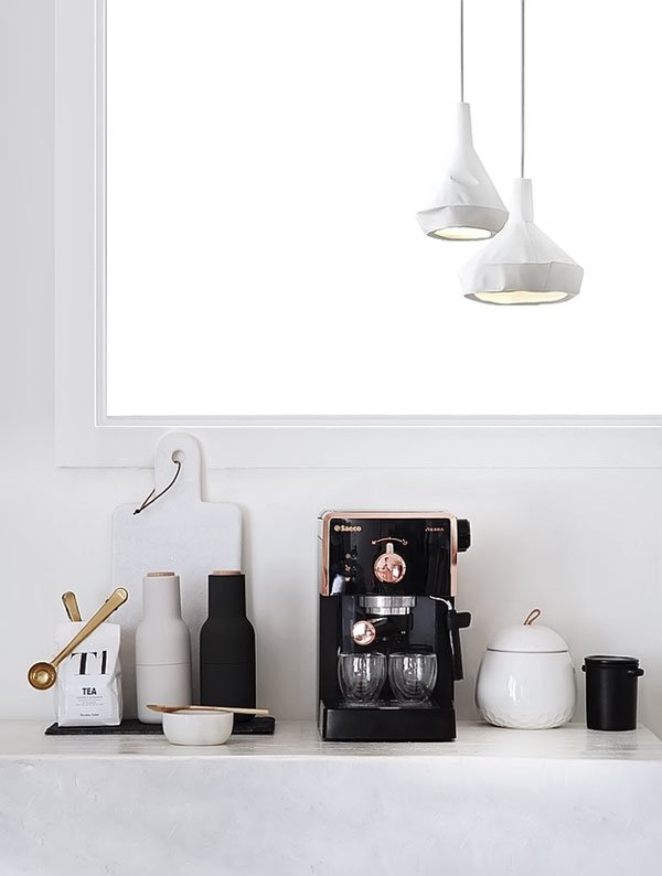 For an extra shot of inspiration, my shopping page of New Nordic kitchen essentials will set you off in the right direction. Remember to stick with simple shapes, natural materials such as glass, wood, cork and choose tactile, every day accessories. Stack up and layer, play with muted colours and enjoy the quiet simplicity...
 SHOP THE COLLECTIONDRINK / Sinnerlig glass bottles, IKEA | Jono Smart matt black ceramic cup + rest, The Future Kept | Iittala grey smoked glass tumbler, Finnish Design Shop (Affiliate link) | Nobel Design stacking cups, ShedquartersEAT / Viktigt stacking plates, IKEA | Cutipol stainless steel and black resin flatware, Amara (Affiliate link) | Teak cereal bowl, The Conran Shop | Biodegradable bamboo plates, The Conran ShopBREW / Kinto glass coffee pot, SCP | Mette Duedahl Push coffee press, Muuto | Nambu cast iron kettle, Native & Co | Emma electric kettle, Stelton at SkandiumSERVE / Georg Jensen Alfredo salad servers, Heal's (Affiliate link) | Round cutting board, Twelvedots | HAY Field rounded bread board, Really Well Made | Black stoneware pitcher, Another CountrySTORE / Forminimal Jars, Clippings | Woven wire basket, SCP | Menu Norm cork and stoneware container, Nest | Dania black storage crate, Skagerak
An Interview With Caroline Gomez
 Let me take a moment to introduce you to one of my design heroes - I know you will love her if you don't already. Say hello to Caroline Gomez. I can't tell you how or when it was that I found her work, but it was a moment of "ohhhh, she really gets it". From the smooth, organic shapes she creates in her tablewares, the natural materials she loves to work with to the achingly beautiful photography and art direction she produces for her 'Destination' travel books, she is always on point. And she works out of her home studio in Bordeaux whilst spinning the plates of motherhood which as you know will only earn her more brownie points from me.Much of Caroline's work gives me the feeling of carefree summer days, the moment just before the sun dips below the horizon, balmy evening air and the warmth in the pavement walking barefoot with wanderlust, just because. And her latest tableware collection, Lena, is no exception as she tells me in this gorgeous interview...
• Hello Caroline! Introduce us to the new Lena collection - what inspired the organic shapes? Do you collaborate with other artisans to create your pieces?
The Lena collection is about summer days. I wanted a convivial collection for the family with organic shapes and powdery colours. I pictured myself on holidays, trying to feel the overwhelming impression of summer heat, sitting at a large table in the shade of a tree and then I asked myself: which pieces of tableware would I like to see on it? The jug reminds me of my holidays at my grandparents’ in the country and the two bowls have different volumes and work with all kinds of summer tables. Once I figured out the shapes, I spent several months researching with the help of the ceramist I work with before I ended with this specific smooth texture, which reminds me of the way our suntanned skin feels in the summer.
• Your ceramics seem to revolve around a similar muted colour palette - is this a deliberate choice? What influences that?
I like to combine simple designs and delicate colours so they can match any style of home whatever the colour palette. I like to imagine versatile objects that can easily find their place at home.
• I love your travel books for their minimal, graphic style and their off-the-beaten-track perspective. What’s your process in terms of researching, exploring and shooting the locations?
Choosing and researching for each location takes about one year. I never look at the existing guides so I can keep a fresh eye on the city. I try and get in touch with local artists and artisans and exchange with them about my project. In fact, for my two latest books, I also interviewed them so I can fully share my encounters with the readers.
• You work from home, how do you separate your work from family life particularly as the main living area of your home is open plan? How do you relax/slow down when you need to?
Yes, I have a small office and studio at home, separated from the other rooms. My home is suffused with light and it is very pleasant to live and work there. It’s also very convenient and I try and spend as much time as possible with my daughter. I can take her and collect her from school every day. I am glad that I can glean all these sweet family moments. Even though these days my work takes more and more time and space and I’d really need a bigger studio! When we need to relax, we drive either to the nearby ocean coast or countryside and take a break from the frantic pace of city life.
• How do you combine colour with minimal style at home? Are there any particular rules or advice that you would recommend to achieve this look?
First I painted it all white and then I added touches of colours depending on the room fitting. The idea is to bring rhythm and create different atmospheres. Colours cover the walls either totally or partially so they may underline or complete the architecture of the place. I like colours to subtly delineate volumes and shapes.
• We’re seeing a more mindful move toward raw and natural materials and production methods within design - do you think this will become more permanent in future?
I find that going for mindful production methods and working only with natural materials is the best solution for the future. I like to think that my objects get better and nobler with time and remain of use generation after generation, thus respecting the environment.
• Which designers and brands influence and inspire you and your work?
Designers such as Finn Juha, Lucie Rie, Hans Wegner created timeless pieces that are still influencing to this day. But now I find that the approach and energy of people as different as Katie Lockhart, Olivier Gustav, Taylor Brûlé, Giada Forte or All the way to Paris are fascinating and full of resources! Their worlds and personalities are an inspiration to me.
•••
Explore Caroline's new titles 'Barcelone' and 'French California' and check out the other editions in the shop...
Photography © Caroline Gomez
Dream Decor / New Book Inspiration by Will Taylor
 If you're a real coffee table book addict, love interior design but lack the confidence to translate your style into your own home, then 'Dream Decor', the second book by international interiors writer and blogger Will Taylor couldn't have arrived at a better time.Promising guidance and inspiration for 'styling a cool, creative and comfortable home, wherever you live' Will takes us through the fundamentals of interior design in the first half of the book with his bright and vibrant signature style, breaking down each element into texture, colour, pattern, furnishings and styling details. With achingly cool interiors oozing from every page, Will takes us through the design process, encouraging us to draw inspiration wherever we are using his own travel photos as the jumping off point. I have serious wanderlust right now.
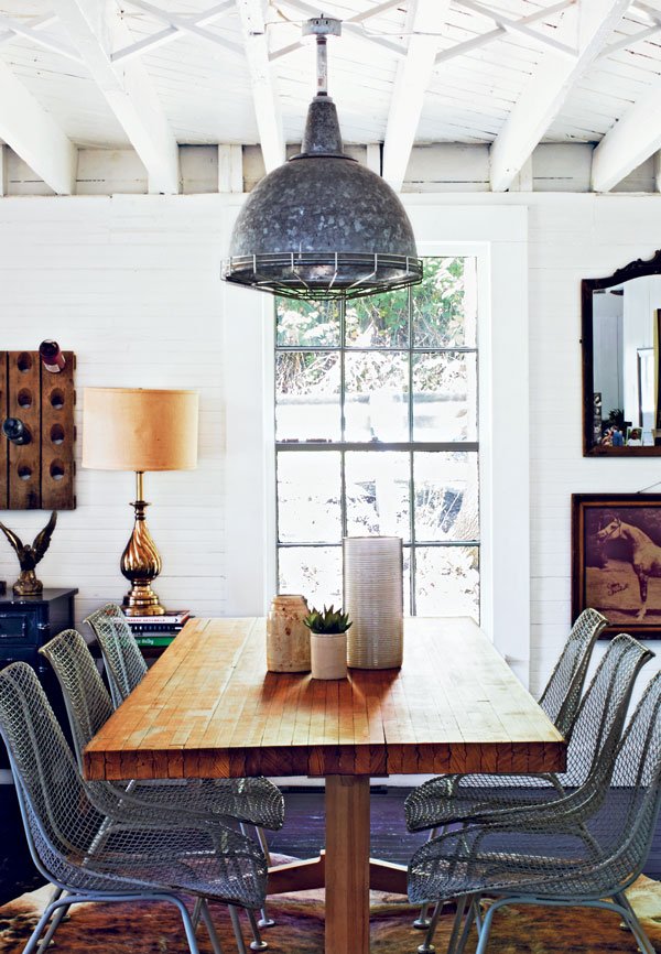
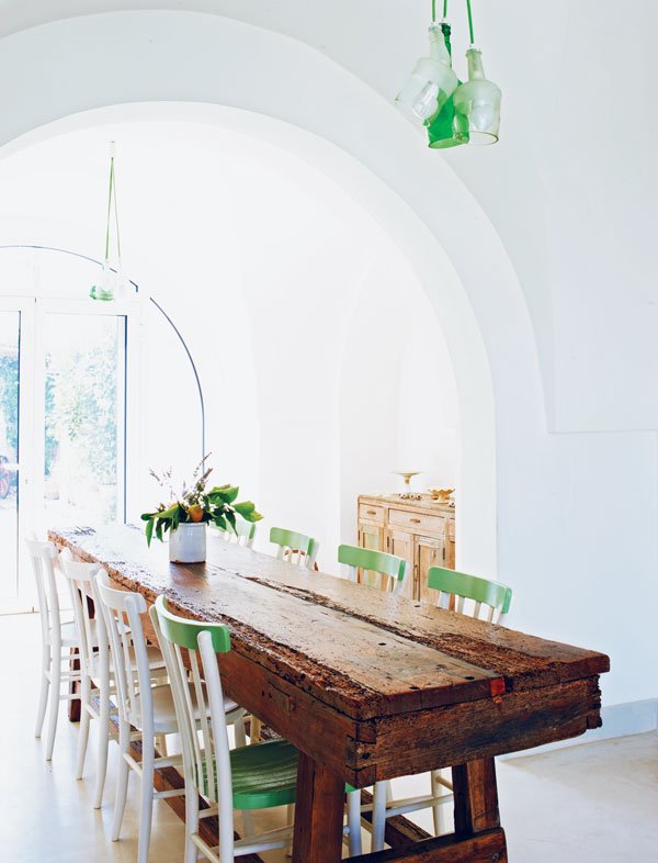 In the second half, Will takes us on a tour of an eclectic selection of homes from around the world beginning each style with a key word recipe to keep you on track. A real favourite of mine featured in 'Italian Rustic' is the home of architect Raffaele Centonze in Puglia (see their light drenched dining room above) with its polished quartz concrete floor, sweeping high ceilings combined with rustic furniture.I loved seeing inside the homes that were more minimalist, quieter on the colour front but no less lacking in style and impact. This industrial light fitting ties in beautifully with the mesh dining chairs inside a renovated schoolhouse in Pittsburg and the reclaimed dining table gives it a warm, homely feel.Whether you're renting and looking for easy to achieve updates or something more radical, Dream Decor gives you the tools to put your ideas into action, whatever you've got to work with. Nice job Will!
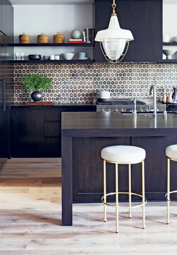
Dream Decor: Styling A Cool, Creative And Comfortable Home, Wherever You Live by Will Taylor, photography by Andrew Boyd, is out 17th May. Published by Jacqui Small (£25). The book is available to pre-order on Amazon now and more information can be found here.
GIVEAWAY / Seven Boot Lane Footwear
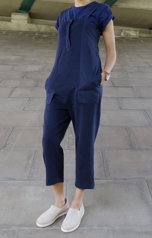
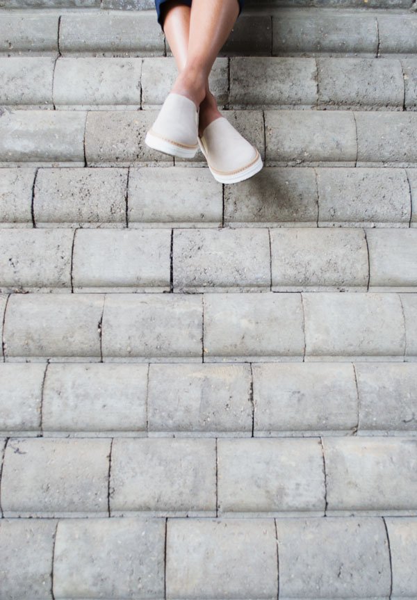 I've been desperately trying to track down a jumpsuit that works for me for my capsule wardrobe ages-for whatever reason thus far it's always come down to a 'close but no cigar' situation which leaves me frustratedly cursing the changing room mirrors, pulling the curtains off the rails as I leave in a huff of defeat. Then I found this one in minutes, with two children in tow (they happen to be mine) who for once actually let me try it on without remarking on my pants or bottom. In my signature blue. With a dropped crotch and pockets. And I don't look like a try-hard 30 something in it, especially with a pair of sports luxe style Flame trainers from independent women's footwear brand Seven Boot Lane - loving the 'sand suede' colour and patent leather detail at the back. Low key, simple style is my bag.
 I first discovered them on StylonNylon's IG feed when she was styling their A/W '15 campaign and fell for their well considered designs and attention to detail. More than anything, it's the choice of transitional footwear that really got my attention-these days, if what I'm wearing can't go from home/work to evening quickly then it just doesn't get worn. Founded in 2012 in Somerset, Seven Boot Lane work with a family run shoe manufacturers in Elche, Spain using locally sourced materials - fashion with a conscience.Now, I don't just want to keep these all to myself, so we've teamed up over on Instagram to give away a pair of shoes of your choosing from across the whole collection. Could be a pair everyday sneaks like mine or maybe plan ahead with boots for autumn/winter. So take a good look at the new collection (check out these pink sandals) open up your IG and read on...

 To Enter:• Find and like my @curatedisplay footwear post with @sevenbootlane.• Leave a comment, tagging a friend.• Follow @sevenbootlane.Easy peasy. Giveaway closes at midnight 14.05.16. Entrants must be UK only residents and the winner will be chosen at random from a number generator on 16.05.16. Prize subject to availability.Good Luck!
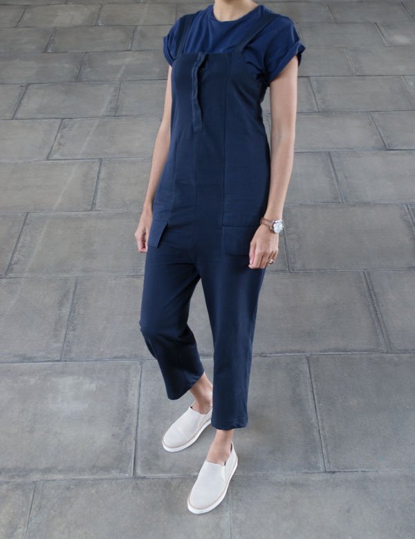 [line]JUMPSUIT - ZaraBLUE POCKET 'T' - AsosWATCH - 'Stark' by FarerTRAINERS - 'Flame' - Seven Boot Lane
Photography © Tiffany Grant-Riley with thanks to my sister Megan for hanging out with me "under the bridge downtown."
• Thank you to Seven Boot Lane for the gift of the shoes. Happy feet.
Home Tour / Spitalfields Georgian Townhouse
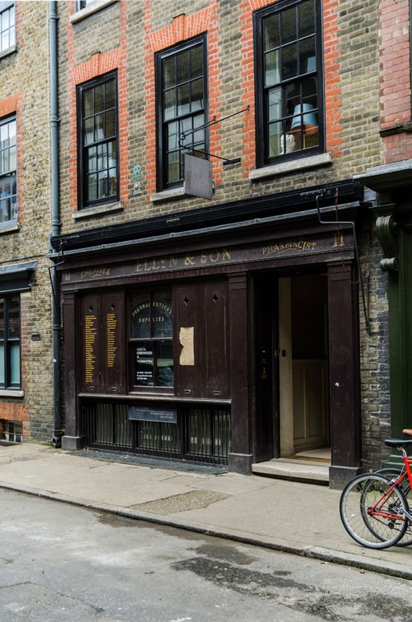 If you've ever had the joy of leisurely wandering the streets of Spitalfields, you will without a doubt have found yourself on Princelet Street. A street like no other for its rich history, it looks virtually untouched and although I've been lucky enough to experience a shoot inside one of these locations, I still none-the-less have that strong yearning to explore further. So, we were pretty excited when our sponsors Houzz suggested that for our most recent Function+Form gathering we meet with award winning architect Chris Dyson to tour his Georgian townhouse on that very street.Home to both his studio and a ground floor art gallery, Chris and his family have found a way to use this four storey townhouse for work and pleasure. In 2005 the family bought the property in a state far removed from its original style, a hotchpotch of mid 19th century additions, it had gone from a three window wide frontage as shown by many of the other original buildings to two. With a three hundred year history in a location made famous by the Huguenot weavers and their exquisite cloth, Chris wanted to return the house to its former glory which included some rather extreme renovations including removing the facade to reinstate the three windows width, installing pine panelling to the interiors painted in classic Farrow & Ball soft green throughout and lime washing the floorboards.
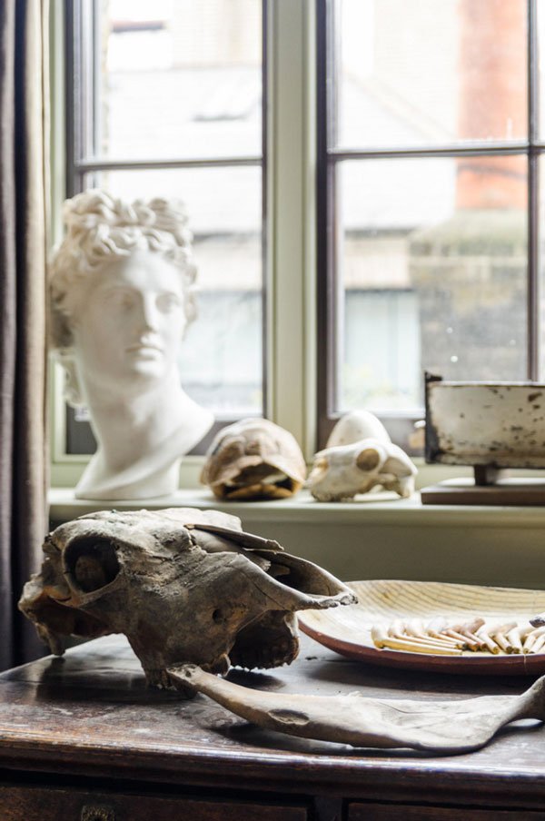 Following the renovations and on going excavations (Chris is extending downwards to create a flat for his daughter) their home now houses many finds discovered within the foundations including the skulls of two dray horses and an array of clay pipes. The living rooms also doubled up as another gallery space and the collection of carefully chosen antiques combined with more contemporary furniture gave the space a lived in, family feel.
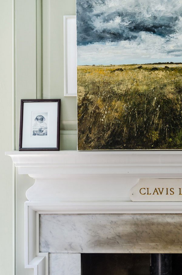

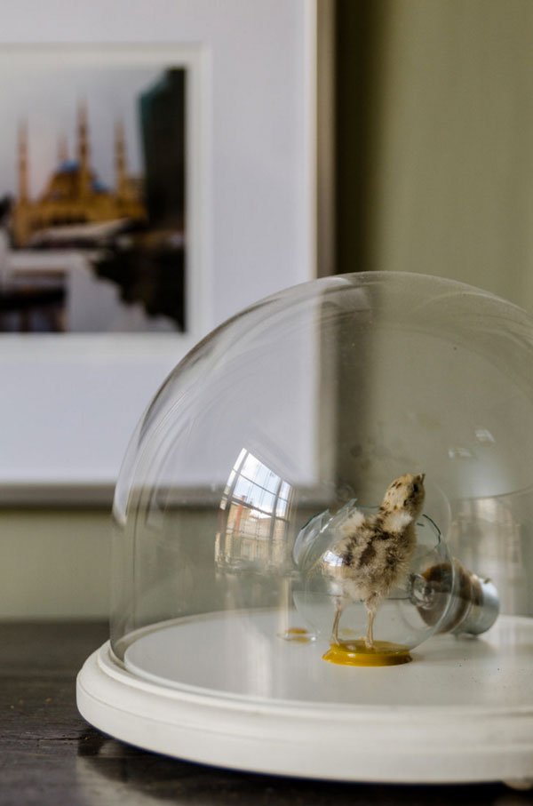
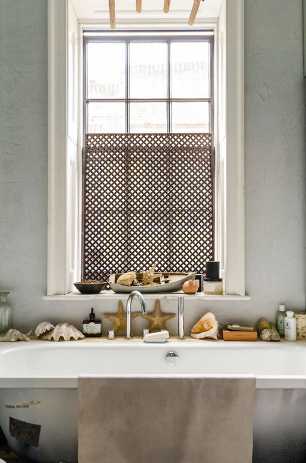 Whilst the majority of the houses in the Spitalfield area would have included a weavers loft to make the most of the light to work during the day, Chris's home didn't have one as it belonged to a clergyman. In keeping with many of the houses on Princelet Street, he designed a loft kitchen space and terrace using more contemporary materials, but blending beautifully with the history of the old house.
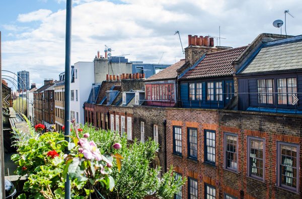
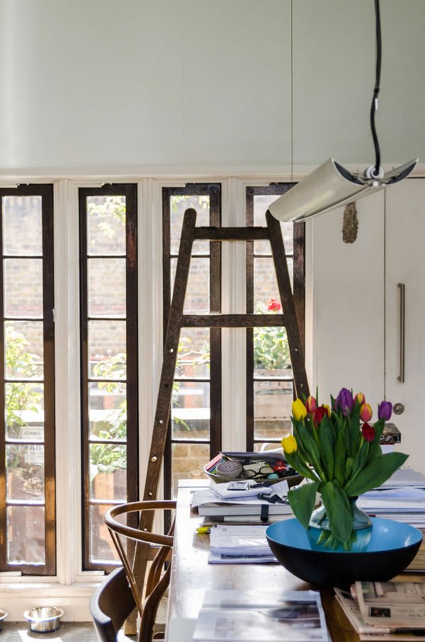 The house was a real calm oasis away from the bustle of the streets below, filled with a warm light. We drank in the views across the rooftops (see the other weavers lofts across the road?) and felt extremely lucky to have toured such a stunning home.
 To see more perspectives from our Function+Form house tours, use #houzztourlive and #wearefunctionandform on Instagram and Twitter, or to join our growing community, contact us here.Photography © Amelia Hallsworth Photography courtesy of Houzz UK.
Monochrome Hackney Loft Conversion
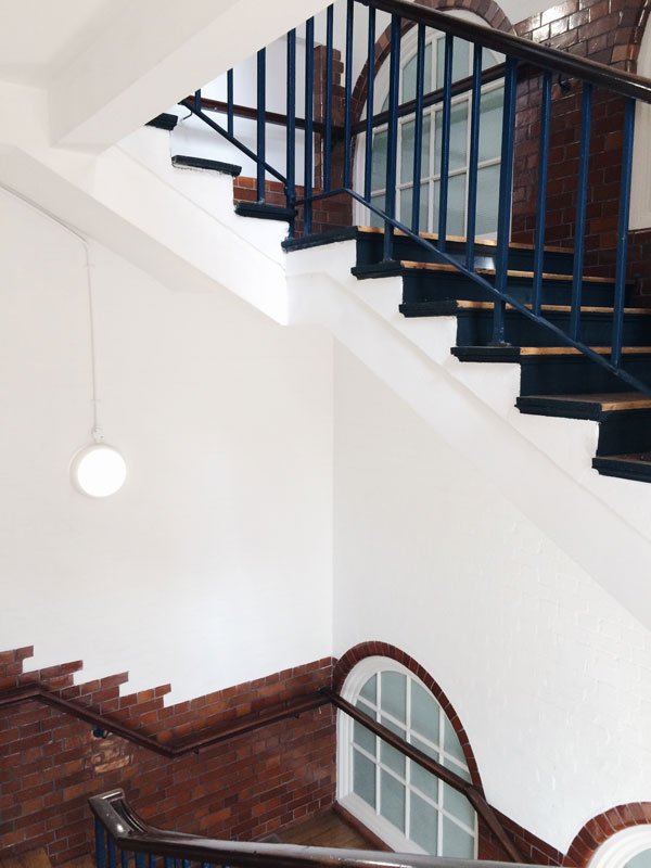 I think I've just about come down from my cloud following our second Function+Form gathering with our sponsors Houzz UK, who gained a very special group of us exclusive access to two East London homes. Houzz is an ingenious home renovation site offering real interior inspiration and advice from all kinds of professionals from architects, builders, painter-decorators, you name it. Although they're known for their virtual home tours, we all agreed it would be an even better idea to take it offline and into real life for our next event.So let me show you around interior designer Laura Lakin's monochrome schoolhouse apartment in Hackney. Walking through the entrance was like heading back to school, the bell ringing somewhere down the long, cavernous hallway, echoes bouncing off the polished brick walls. Let me tell you, the entire group gasped when we came in. Heaven.
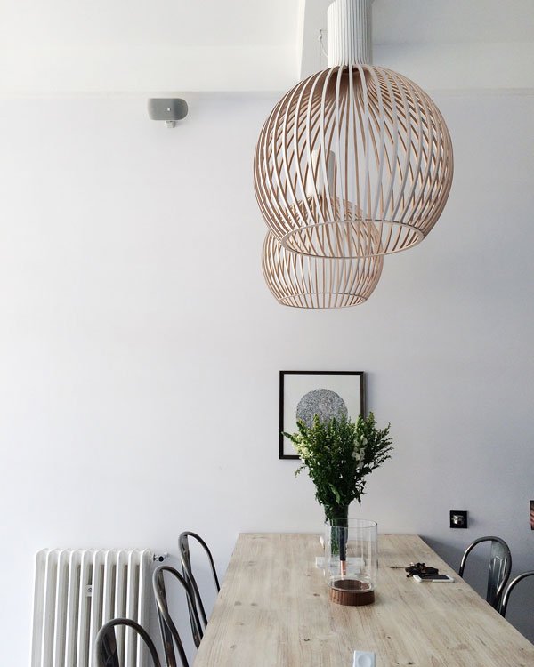
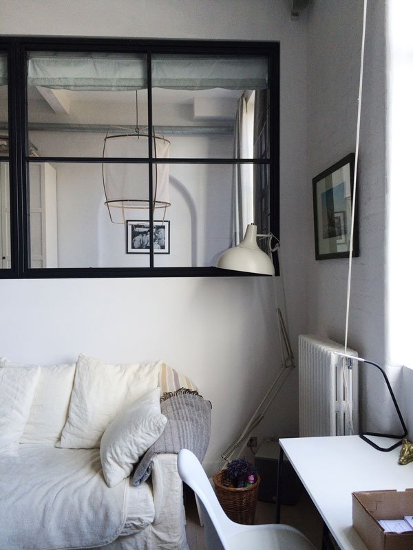
 Laura's clever take on small space open plan living left us all with a head full of ideas. When she first bought the apartment it had a rather awkward configuration, including a curved wall of glass bricks (very 90s) and although she was tempted to go completely open plan, knowing she was going to be living with a friend pushed her to be a little more creative in zoning the spaces. On an already raised section of the living area, she used internal steel windows to create a second bedroom, giving privacy yet still maintaining that feeling of open space by connecting to the living area. So, so clever.
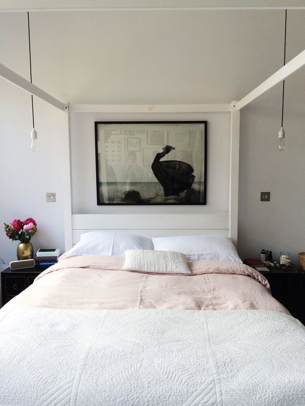
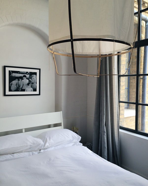 Heavily inspired by Scandinavian design and with her art collection an important part of her home, Laura kept to a clean, monochrome palette to act as a backdrop, giving her the freedom to change her displays over time. The white, minimal space gives way to showcasing the best features of the building and its industrial history. Just look at her bedroom, with its white four poster bed, not at all imposing, drawing attention to the height of the room and industrial windows. To the right the space is divided between an en-suite monochrome marble bathroom and floor to ceiling wardrobe storage. Compact but still spacious.
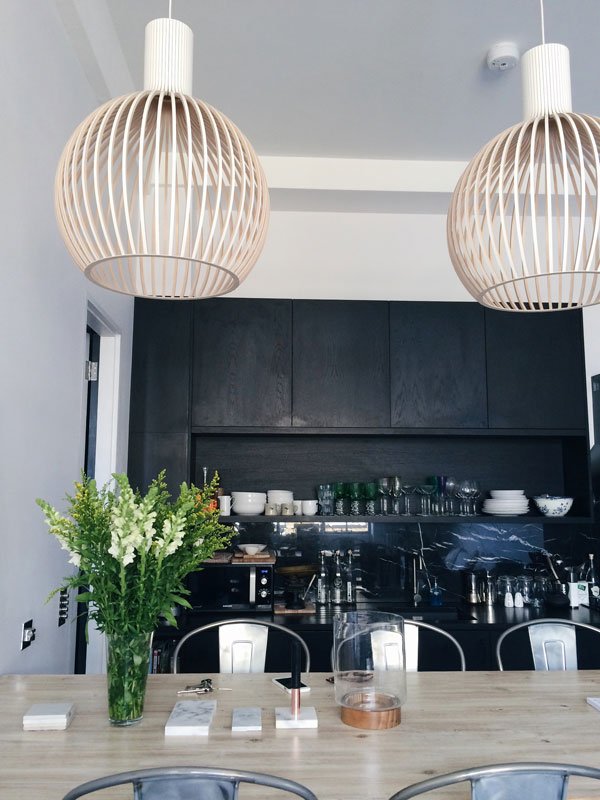
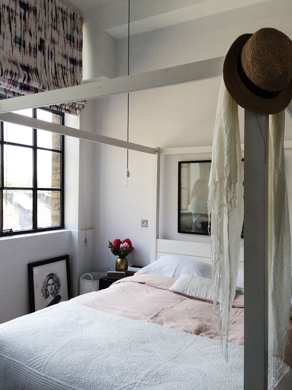 There is so much to love about this home, mostly how well thought out it was, highlighting as always that the fundamental part of creating any home, whatever your budget, is paying attention to your needs above aesthetic. Although who am I kidding-I'm already trying to work out where I could fit those Octo 4240 lights...Stay tuned for Monday's house tour, where we explored the 300 year old Spitalfields home of award winning architect Chris Dyson. You need to see this.If you'd like to be first to the table for our next Function+Form gathering and join our design community, email us here.
iPhone Photography © Tiffany Grant-Riley
Milan Interior Highlights / Design With The Unknown
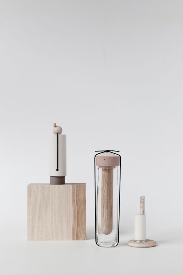
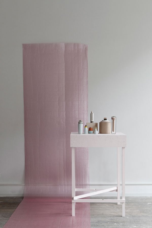 In my last remote feature from the Salone del Mobile, I wanted to share a collaboration between designers Studio Oink and artist Aimee Bollu - Design With The Unknown. Comprised of a series of unrecognisable objects, the collection was created using found, collected and traded objects consumed by the other designer before transforming it into a new form and each injecting their own aesthetic. Neither side met in person during the process, communicating only through social media using the unknown to guide their choices. It's quite incredible to see how each piece sits seamlessly alongside another.Aimee's work by nature is rooted in collecting and gathering things discarded or forgotten by others, creating new narratives for the pieces she transforms. She uses techniques such as mould making, turning and slip casting combined with candy colours to bring about a fresh perspective and I love the personality she has brought to the Design With The Unknown collection.The materials assemble, stack and connect in a mixture of wood, porcelain, plastic and sponge. Despite their having no function, there's so much I love about this collaboration; the sculptural shapes, the muted colour palette, the surprise of the two sides reflecting each others thoughts and ideas so well. I can spot a few pieces I'd be more than happy to have in my home too...
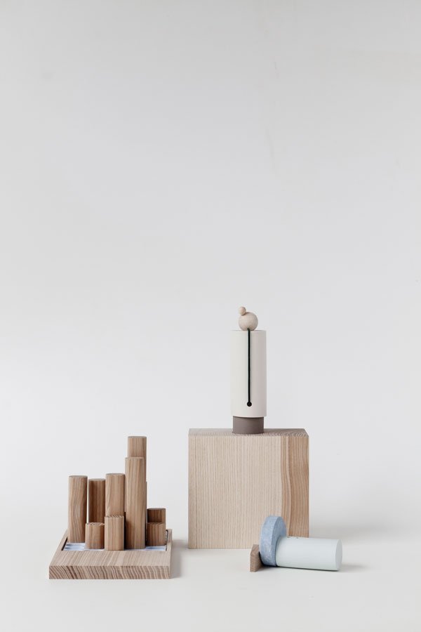
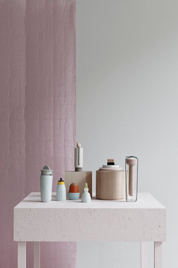
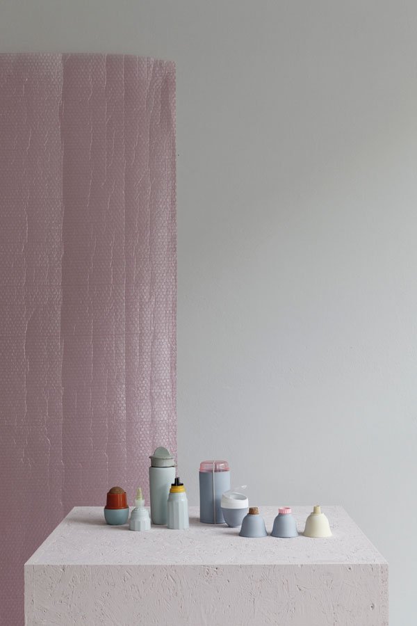 If you'd like to see more of Studio Oink's interior design or styling projects - peaceful and minimal in style, take a look at their enviable portfolio...
Photography © Studio Oink
Milan Interior Highlights / HAY Palissade Collection
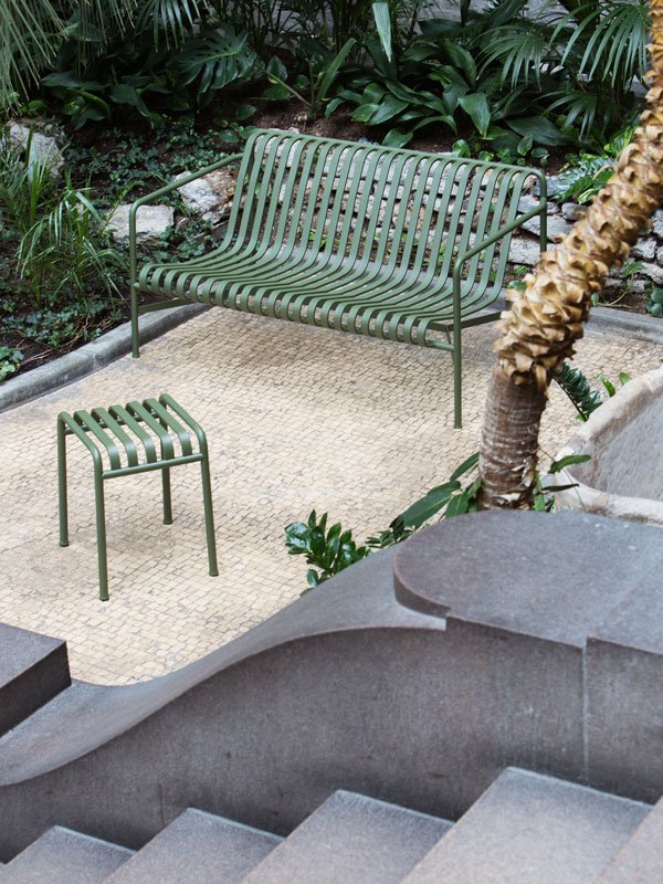
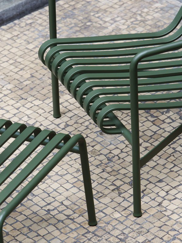
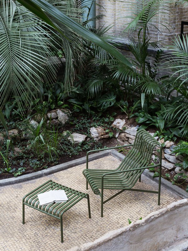 In today's highlight from the Salone del Mobile, I'm falling over myself to get my hands on the latest collection from HAY. I've noticed a real shift in the attention paid to outdoor furniture this year, no doubt inspired by the launch of the Palissade Collection, a collaboration between brothers Ronan and Erwan Bouroullec and HAY. Sticking closely to their commitment to produce good design made accessible for a larger audience, the new collection features thirteen different pieces to suit a variety of needs and spaces. Instantly drawn to the olive green colour (it also comes in an anthracite and light grey) I love their curved, slatted surfaces, giving a feeling of space which combined with the outdoors blends beautifully, designed to suit natural and urban landscapes alike. Made from powder-coated steel, Palissade includes a sofa, lounge chairs, tables, benches and stools, and in true HAY style looks set to become a design classic in the years to come...
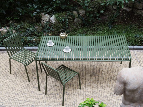
"Since the beginning, it was very clear to me that this collection, these pieces, needed to have a particular aspect, something you could trust. The weight is part of this fact that you could trust a piece like this, you let it in your garden, outside for all the years, you do not care to treat it in a fragile way. For me, these are the types of pieces that stay for a while, and that maybe you would repaint after ten or twenty years."
- Ronan Bouroullec.
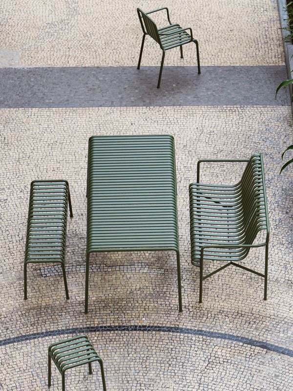 From a contemporary perspective, I could really see this collection working in a courtyard space, with matt black painted walls or fencing and structural grasses and palms. Wouldn't that be something?
