Minimalist Blue Kitchen Inspiration | Get The Look
 Got any kitchen decorating plans on the horizon for the new year? Because I've got some gorgeously minimal blue kitchen inspiration for your delectation today. Can you guess where I'm going with this? As I'm a glutton for punishment, I decided it was a great idea to embark on a full-blown kitchen project before Christmas. Simply put, I walked in one morning for the onslaught of the usual breakfast rush and decided I couldn't live with it as it was another moment. Big extension plans aside, we'll not be doing anything major with it for a few years and I was just tired of how "vanilla" it was. Cream everywhere. Nothing to connect it. And it was gloomy, not in a moody, atmospheric way, it was just flat and dark.
What's The Plan?
There's little point in us ripping out units, chipping off the tiles and replastering walls when we ultimately plan to knock the room through to the garden, so let's say this is more of a kitchen face-lift than full-on reconstructive surgery. This project is more about the details. We have non-standard DIY units (surprise, surprise) so they're being painted and given new custom handles. The patterned yellow and blue tiles we have running across the middle of our white tiles will be painted out in white tile paint. The bright orange stained floor will be sanded back and limewashed for a brighter feel and to bring out the grain in the wood and the rest of the walls will have a lick of white paint. An epic challenge for a short project, I've been knee-deep in painting, sanding floors (thank you Rob) and planning how best to make the most of the limited worktop space we have. Although my kitchen is relatively small (approx 12m2) I have been heavily pregnant in a galley kitchen with no more than a meter's width to manoeuvre in, so I can tell you now - this is huge in comparison!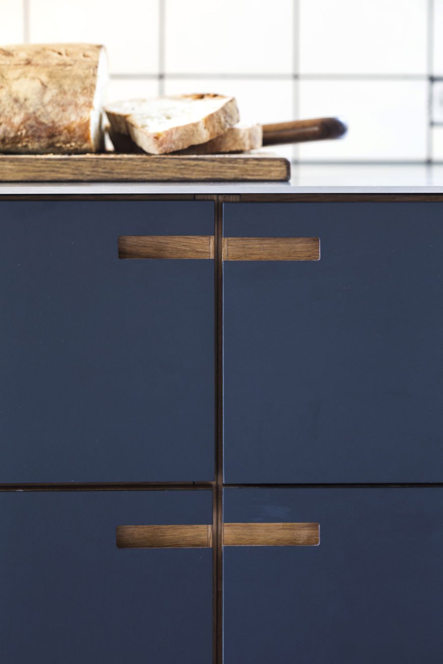 TIP: If you have standard Metod and Faktum IKEA units, certain companies produce beautiful, bespoke fronts for a more considered design. Try these British designers, Reform and &Shufl for more information.Why blue? Well, I wanted to breathe new life into the Edwardian bones of our home, giving our quirky kitchen a contemporary aesthetic. It's soothing, comforting and an all-round perfect colour for a room you spend a lot of time in. I wanted to make use of the low light in the room and really go to town with a deep colour. As we both wear a lot of blue and we've already used a lighter shade of it in the kids' room, having blue kitchen units was a no-brainer. Have you noticed how blue makes wood sing? Whether you prefer dark or light grain, it never fails to look sophisticated against it, whatever shade you pick. We eventually settled on Hick's Blue by Little Greene Paint. It's a beautiful, deep shade that changes with the quality of light throughout the day.
So, how do you make a blue kitchen work for you?
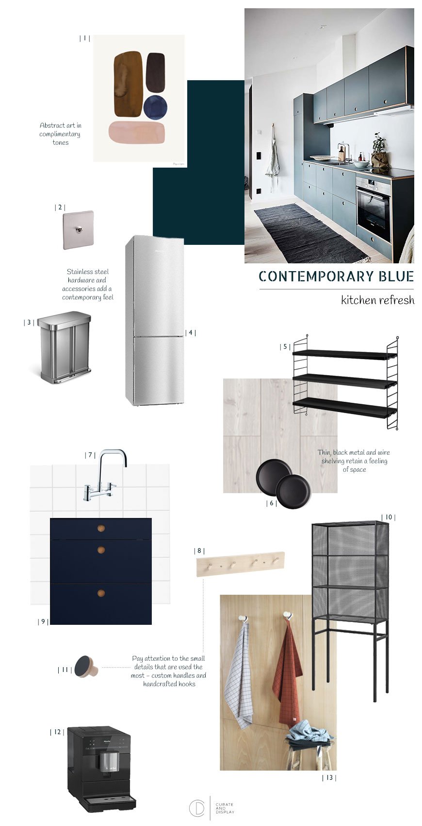
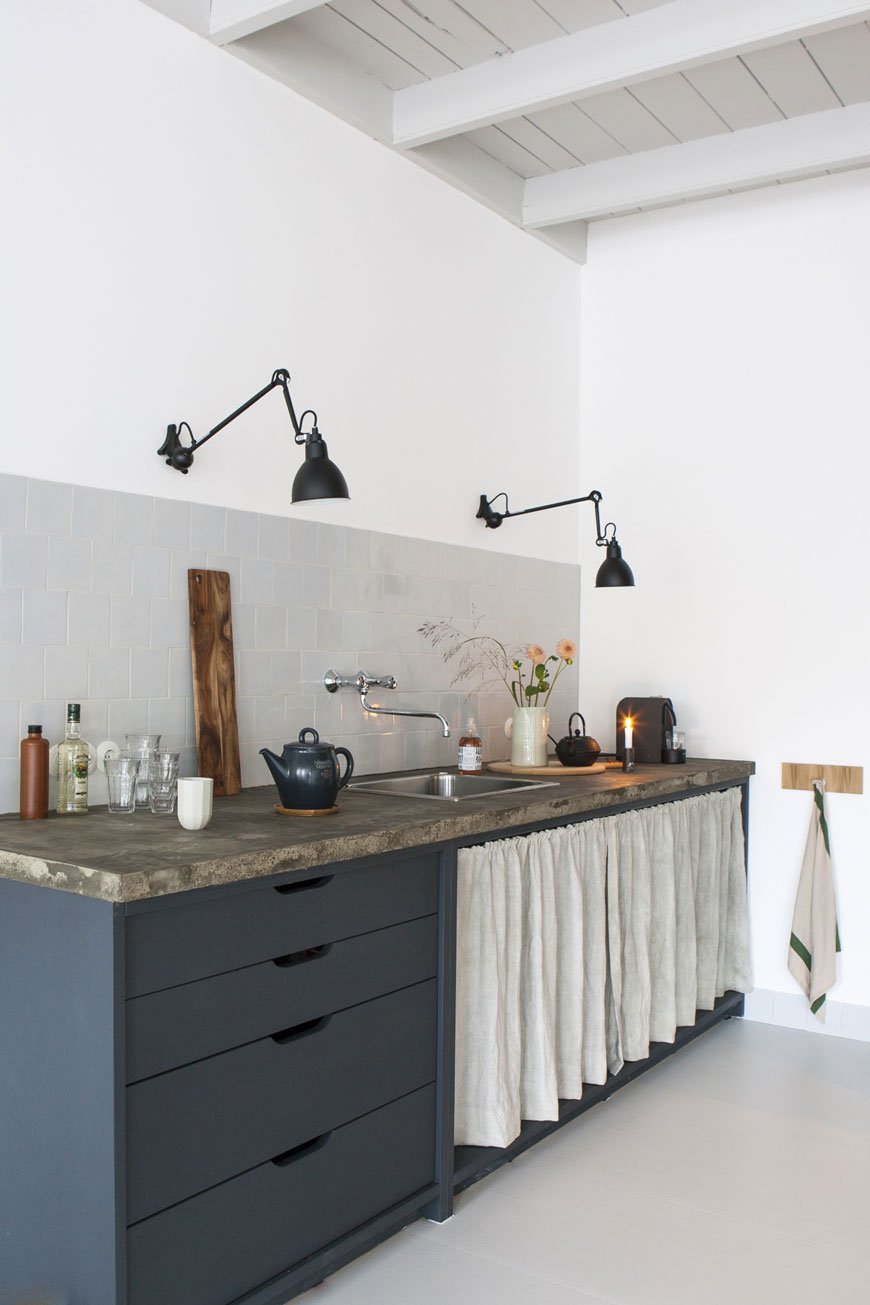
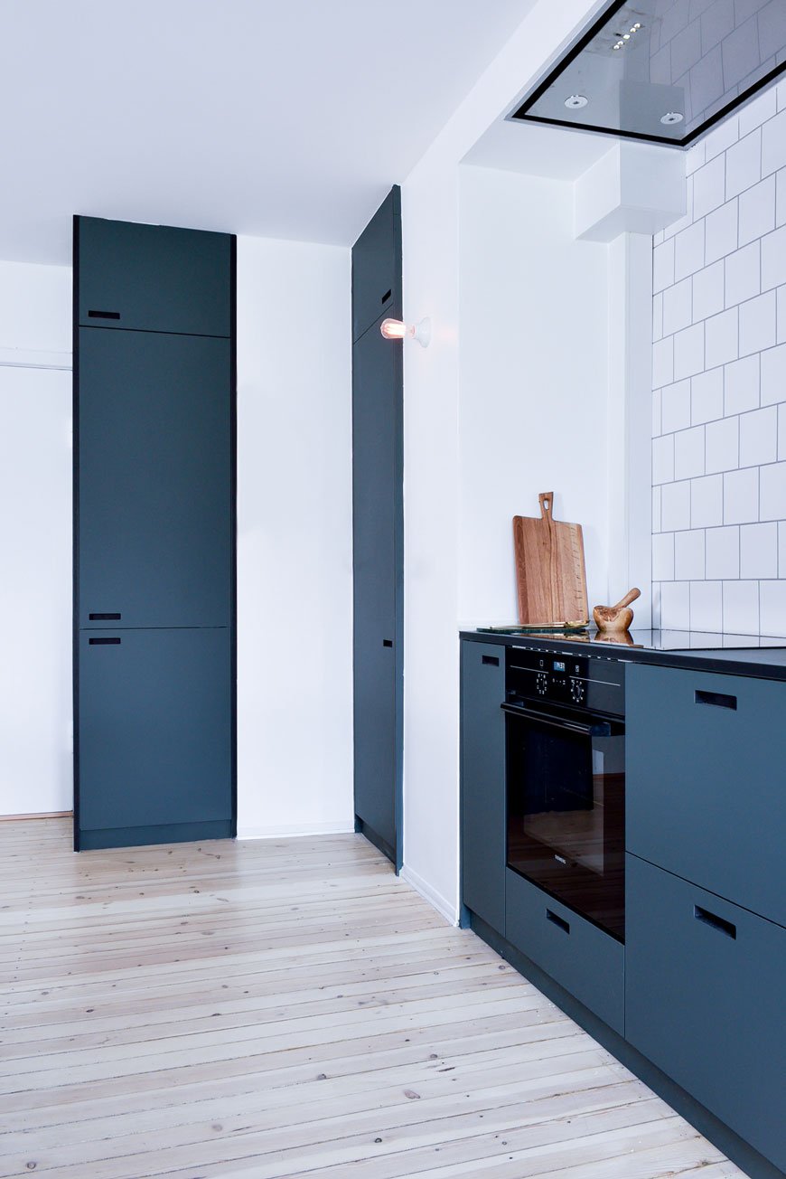
The tone of blue you choose will depend entirely on the light your kitchen gets and how it changes throughout the day. A shade somewhere in the mid to dark tones works well in contemporary spaces, particularly with a touch of grey or black in them. Experiment by painting several options on large pieces of paper (lining paper is great for this) and moving them around throughout the day. If your kitchen is a dark room, don't be afraid to embrace it with a darker blue, but if using it everywhere is too much, I would recommend using it on the units themselves as an instant contemporary update. You can continue the blue across one wall if you want to add extra impact - I'll be doing this behind our open shelving which makes some of the more unsightly units next to it blend in.Choose flush handles for a clean, minimalist aesthetic or look for something in plywood if cutting holes isn't an option. Using white on the walls works well to provide a contrast against the blue, but you can also mix in pale greys as shown in the tiles in the first image. Plaster pink and nude tones will give blue units a warmer feel if you want a softer look.Black taps are all the rage now, but for a timeless appeal, stainless steel is always a winner. Extend from your taps out to your hardware - plugs and sockets in brushed or polished chrome. You can also convert two kitchen taps to one mixer using a bridge tap. Appliances look spot on in chrome too.Got wooden flooring? Get sanding and staining. It's a messy process but I can promise you it's so worth it. Osmo has a brilliant range of floor oils and waxes - I recommend looking at the white and grey tones which will still show the grain once you've treated the planks. Alternatively, look at a good quality laminate in a light shade.Accessorise with a mix of matt black tableware and glass jars for dry goods. Choose graphic print textiles such as tea towels and aprons in lighter blues and warm terracotta for contrast (see my moodboard for examples).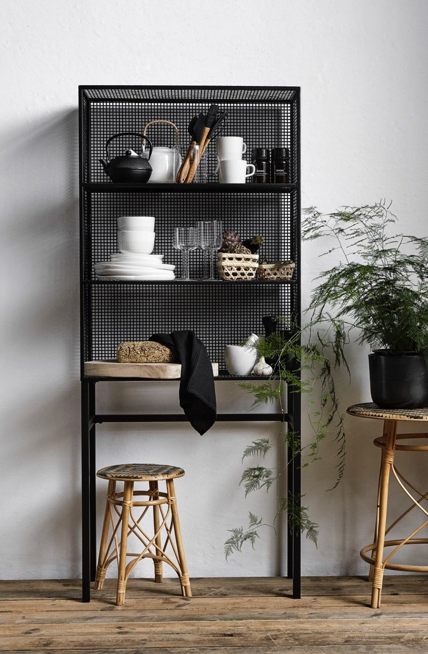 Use a mix of open and closed storage and display the items you use most on the shelves. I'll be using black ash shelving from String and a freestanding black mesh unit with narrow legs to free up some worktop and still retain a feeling of space.TIP: Go through all your cupboards and recycle or donate anything you don't need before you plan your shelving and storage. Clutter free is the golden rule here. Anything you display must be done so intentionally, the idea being that you use these items on a daily basis. Anything else used less can be tidied away in the cupboard.
The Inspiration
Here's how I'm pulling together the design for our blue kitchen. What do you think?