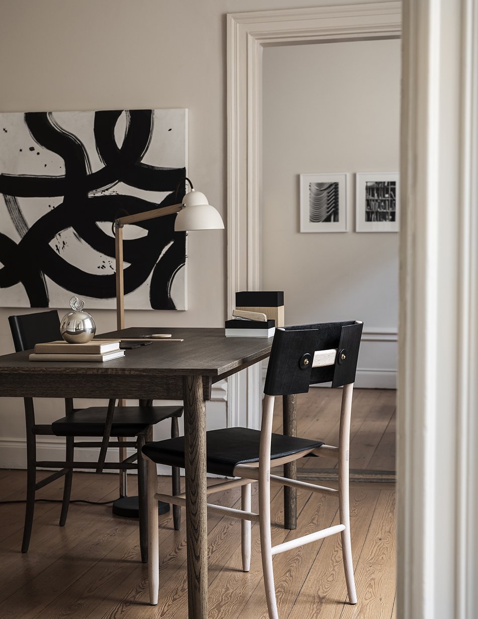
Frits Henningsen’s FH38 Windsor Chair in a light and breezy corner
Discover the understated simplicity and elegance of Frits Henningsen’s FH38 Windsor chair, designed in 1938 and revived by Carl Hansen & Søn.
[AD - paid partnership with Carl Hansen & Søn]
This corner of our bedroom is forever changing and since we decorated and lived with it for a few years, we’ve come to realise that storage is still somewhat lacking. To that end, sometimes it gets relegated to a dumping ground and others it's more considered and organised! In the not-too-distant future, we hope to give it an update with a built-in wardrobe system.
However, this summer we had the pleasure of sharing our room with the reissued FH38 Windsor Chair. Designed by Danish architect and cabinetmaker Frits Henningsen in 1938, the chair was in constant production with Carl Hansen & Søn until 2003. It’s now back with subtle adjustments to suit modern living. This includes the option to customise with a leather seat cushion, offering a more comfy twist on a classic Windsor chair in soaped FSC-certified oak.
Who Was Frits Henningsen?
One of the most influential movers and shakers of the Danish Golden Age of design, Frits Henningsen’s perfectionist approach to furniture design looked to the past to create functional, modern pieces with soft curves and a timeless expression.
Born in 1889, Henningsen began his career in 1911 as an apprentice in Copenhagen with one of the most renowned cabinetmakers of his time, I.P Mørck. After completing his training, he travelled Europe and was taken by a variety of historical design idioms in Germany, France and England. He opened his own store in Copenhagen in 1915. Aesthetically, Henningsen was heavily influenced by Rococo and 17th-century English furniture, bringing his minimalist Scandinavian expression to more traditional designs.
The original Windsor chair first appeared in England around the 16th century and were manufactured in High Wycombe, once a thriving area for the British furniture industry. Today, Carl Hansen & Søn continue to produce this modern interpretation.
The FH38 is a typical ‘sack-back’ Windsor design that places it somewhere between a lounge chair and a dining chair, though I’ve been using it for reading and journaling in the mornings.
I love how the warmth of the oak harmonises with the soft beige in our bedroom - I am, as always, a complete sucker for tone-on-tone styling.
As a cabinetmaker, Henningsen’s Windsor chair design features a range of demanding carpentry techniques that demonstrate just how skilled Carl Hansen & Søn’s craftsmen are. A carved seat welcomes more modern proportions and the 14 spindles at the back require no glue but a series of tightenings that provide the gentle sloping back.
It’s almost impossible not to want to run your hands along the steam-bent armrests that join to an organic, smooth tip. These are achieved by sanding by hand using what’s been called the “feel test”, meaning every chair is slightly different based on the craftsman finishing each armrest.
Discover the understated simplicity of the FH38 Windsor chair, available through Carl Hansen & Søn Flagship Stores or your nearest dealer.
Styling & photography © Tiffany Grant-Riley
The Vega Chair - A Vilhelm Lauritzen Design For Modern Living
[AD - paid partnership with Carl Hansen & Søn]
For the past 67 years, a Danish design classic has been hiding in plain sight, familiar only to those who interact with it on a daily basis. I’m talking about the VLA26T Vega chair, designed in 1956 by Danish architect Vilhelm Lauritzen specifically for use inside Copenhagen’s Folket’s Hus. As a sign of good design, it quietly supported the day-to-day running of the building, brought out for various occasions and then stacked away until the next time…
From People’s House to People’s Homes
Built in 1956, the Folket’s Hus (the people’s house) is now a listed, much-loved historic building that is part of the fabric of Copenhagen’s modern history. Created by Lauritzen as a meeting house for the labour movement, it has witnessed countless generations of gatherings, parties and occasions.
The original Vega chair (left) juxtaposes the new.
Original Vilhelm Lauritzen lighting inside the VEGA concert hall.
In 1994 the building was protected and relaunched in 1996 as the VEGA concert hall, now home to a mix of intimate and large-scale concert spaces. A functionalist masterpiece, every inch of this building, from the exquisite panelled walls and modernist chandeliers, to the door handles and chairs, were all designed by Lauritzen himself.
The Vega Stacking Modern Chair
And it’s the Vega chair that’s being given a new chapter by Carl Hansen & Søn in collaboration with Vilhelm Lauritzen Architects. Used exclusively inside the concert hall since 1956, the VLA26T is now available for use in our homes.
It would be easy to overlook this chair for its simplistic qualities but it stands as a testament to Lauritzen’s legacy that the original designs are still in use today. Its light-weight, curved oak veneer shell and slender black steel legs give it an understated poise that makes it an ideal choice as a modern dining chair. The wooden feet are a touch that I can’t seem to take my eyes off. Often a forgotten detail when it comes to chair design, they seem to be a Lauritzen signature (just take a look at his Monarch chair).
It took the team two years to re-develop the Vega chair you see today. Headed up by Anne Møller Sørensen, slight adjustments were made to accommodate modern proportions, including the underside and leg angles to make it easier to stack. Parts are easy to replace should the need arise, too.
The Vega also comes in an upholstered variation with a seat and back pad. But for me, it’s all about the classic oak which shows off the beauty in the grain and plays off the light in my studio.
Discover more variations of the VL26 and find your local flagship store or stockist online with Carl Hansen & Søn.
Styling and Photography © Tiffany Grant-Riley
The Making of The Wishbone Chair - Factory Tour
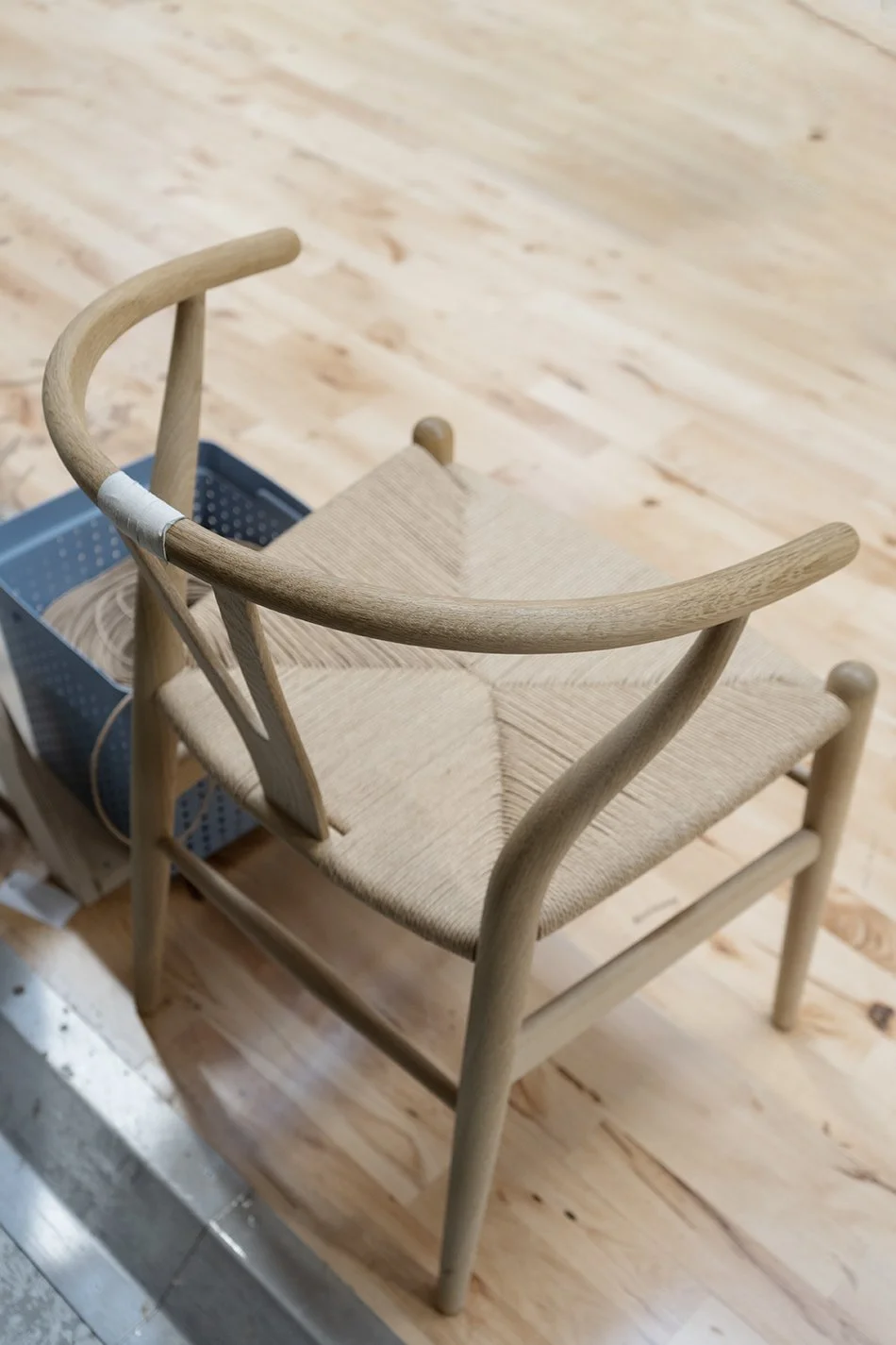
The CH24 Wishbone chair in oak awaits its paper cord seat on the factory floor at the Carl Hansen & Søn factory in Gelsted, Denmark.
[AD - this post is in partnership with Carl Hansen & Søn as part of their Wishbone chair 2022 press tour]
Fewer things get me more excited than a furniture factory tour. The offer to take a peek behind the curtain surrounded by the fragrant smell of warm cut wood and the white noise of industrial scale machinery is too good to pass up. Diamonds don't impress me, darling.
On an early morning in October, I found myself coach-bound for the island of Funen, a two hour drive from Copenhagen and headed to Carl Hansen & Søn's headquarters in Gelsted. This landmark tour for like-minded interiors bloggers would give us behind-the-scenes insight into the making of the iconic and original Wishbone chair. Often poorly imitated, never matched in quality.
Woodworking tools of the trade inside the Carl Hansen & Søn factory headquarters.
A make-shift chair that didn't make the grade is used on the factory floor.
Stack of oak Wishbone chairs await their backrest and arm rests on the factory floor in Denmark.
Over 100 Years of Considered Craftsmanship
In the years I've worked with Carl Hansen & Søn, I've learned a great deal about their approach to sourcing sustainable materials, important to the continuation of their high level of craftsmanship. Traditional wood-crafting and weaving techniques are still used today. There are no short-cuts or cost-saving cheap materials to ensure each design leaving the factory will last a lifetime.
Where it all begins - the workshop master for the Wishbone chair displays all the pieces that make up this modernist chair.
What started life in 1908 as a small furniture workshop by founder Carl Hansen evolved into a third generation family run business that begin nurturing the work of pioneering modernist designers in 1949. One such designer, Hans J. Wegner, was discovered by Hansen's son Holger who took an instant liking to his collection, including the now world-renowned Wishbone chair.
The rest, as they say, is history and 70 years later this modernist chair is still in production, making it their most popular design to this day. You'll spot it in restaurants, hotels and homes (including my own) just quietly minding its own as the most iconic Danish design chair in history.
The Making of The Wishbone Chair
The iconic Wishbone chair back rest lying in neat stacks ready for construction inside the Carl Hansen & Søn factory.
You'd be forgiven for assuming that most of their furniture is entirely machine manufactured, but there are experienced human hands on every touch-point of the making of this chair. From the initial cutting and carving, to sanding, gluing and weaving, every piece is finished with exacting standards.
And the reason to invest in original design is evident in the beauty of the details and true craftsmanship. Did you know there are over 100 steps that go into building one Wishbone chair? It felt like such an absolute privilege to be allowed to explore each step in the process, including being let loose on some of the machinery. I wasn't offered the job.
Beautifully sanded chair legs ready to become part of the frame of the iconic CH24 chair by Hans J. Wegner.
Wegner's Danish Modern chair consists of 14 components and a team of craftsmen assigned to focus on a particular stage. Each piece is still made by hand more or less in the same way it was intended when the chair was first launched. It features that iconic wishbone shaped back rest which slots into a single steam-bent curved arm running around the back.
Steam-bend arm rests made inside the factory in Denmark, neatly stacked and ready for the next stage.
Gluing the components of the CH24 chair, piece by piece, on a work bench inside the Carl Hansen & Søn factory.
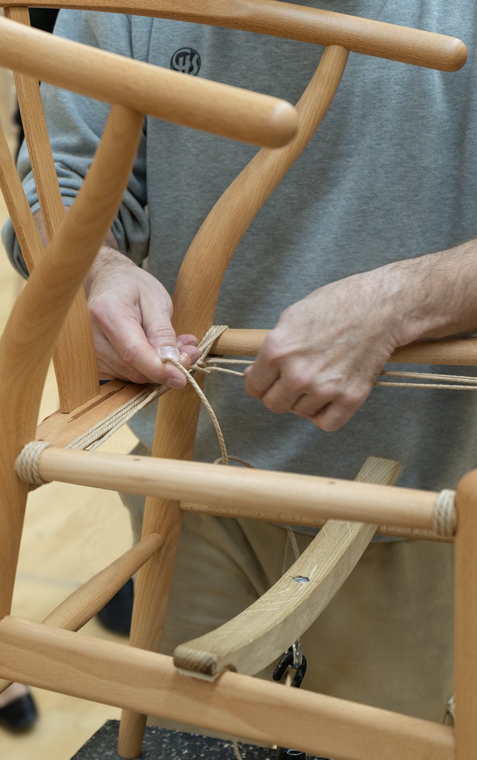
Perhaps the most mesmerising part of the tour was arriving at the weaver's workshop where 125 m of natural paper cord is expertly woven into a strong, durable seat. Danish paper cord really came into its own in the 1940s and well into the modernist era as a durable alternative to straw or rattan.
And it's all in the tension, paying attention to those exacting right-angles, passing the cord over the sides of the frame and back under. The result gives you that 'X' shape in the centre.
Weaving the iconic Wishbone chair seat with 125m of natural paper cord.
If you manage to pass four weeks worth of training, it should take approx. 1 hour to weave the signature seat and you could see how easy it was to find a rhythm once you were in the zone. I tried to take in the exact method, watching our guide demonstrate how to achieve those perfect right angles...but who was I kidding?
Reels of natural paper cord made to weave iconic Danish design chairs wait on shelves inside the Carl Hansen & Søn factory.
A close-up of weaving the Wishbone paper cord seat onto the chair.
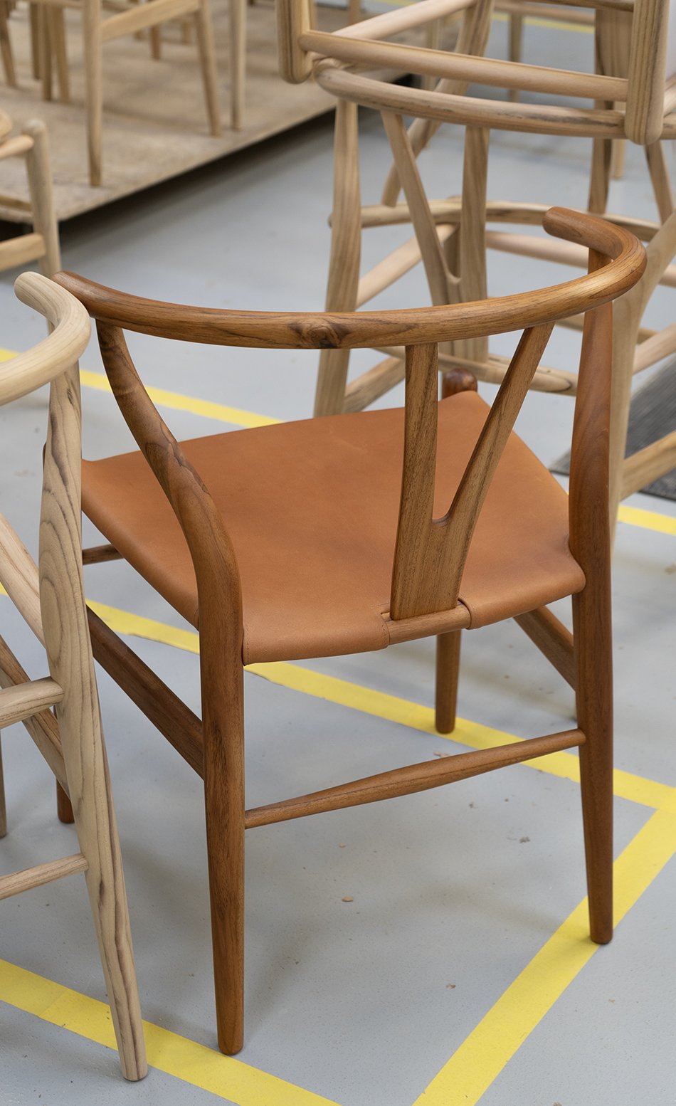
Two finished Wishbone modern chairs in oak and mahogany inside the Gelsted factory in Denmark.
The finished Wishbone chair in a beautiful natural oak frame waiting on the factory floor.
Sustainable Danish Furniture
It stands as a testament to CEO and Hansen's grandson Knud Erik Hansen and the team that the majority of furniture in their collection is still made by hand in Denmark. It carries all the hallmarks of a small family business despite its world famous reputation and I love it for that reason.
Other pieces are taken on by their factory in Vietnam, run by Knud Erik's son and fourth in the generation, Mark Nam Hansen. The location is entirely self-contained with its own sawmill and workshops. This hands-on approach maintains high quality control and a sustainable supply chain.
All wood used in production is FSC certified, sourced from responsibly managed forests. Waste products such as leather and wood off-cuts are re-purposed as part of their accessories collection and I was amazed to discover the Gelsted factory has its own power plant. Using waste by-product from wood shavings, it heats not only the factory but up to 400 houses in the local vicinity of Gelsted.
I'd say that's a heritage worth continuing, wouldn't you?
Photography © Tiffany Grant-Riley
Earthy and Sculptural Ceramic Lighting by In Common With and Danny Kaplan
Seneca Table Lamp | Photo © Sarah Elliott
We're going to pretend we're in ultra-cool Brooklyn today, exploring the work of collaborative design studio In Common With and their new collection of handmade ceramic lighting. And they're so completely and utterly gorgeous, it hurts.
Known for paring beauty with simplicity (if it's not so completely obvious from these beautiful lifestyle shots) founders Nick Ozemba and Felicia Hung have come together with fellow Brooklynite and ceramic artist, Danny Kaplan. The result is the Terra Collection, combining minimal, contemporary forms with a handmade aesthetic. Strong, elegant lines and simplistic sculptural curves are off-set with raw texture and smooth brass finishings. This unusual ceramic lighting collection encapsulates the intersection between the ancient and modern.
Paloma pendant lamp in anthracite and Helena floor lamp in stone | Photo © William Jess Laird.
A collaboration with ceramicist Danny Kaplan, the Terra series reflects our studios’ shared commitment to pairing beauty with utility; tradition with innovation; Danny’s organic forms with our signature systems-driven simplicity.
In Common With
Terra ranges from the totemic Helena floor lamp (3ft high) to statement pendant lamps like Paloma and Augustus, meant to draw in conversations over the dining table and wall sconces for more intimate spaces within the home. The lamps' tactile qualities are owing to a stoneware clay with high levels of grog and grit Kaplan's studio use to give a rougher, rustic texture called 'tooth'. Inside a pre-war former bottling factory, his team of artisans use a variety of different techniques to build the lights depending on the design, including wheel-throwing, slab and coil building.
Earthy ceramic lighting - Augustus surface mount in Chestnut and Helena table lamp | Photo © William Jess Laird.
Photo © William Jess Laird
Together, we experimented with structure and scale to create pieces that embody an ongoing dialogue between artist and material. Our goal: to make the connection between clay and light appear innate, as effortless as friendly conversation.
In Common With
Chunky and minimal - the Simon surface mount | Photo © William Jess Laird
A mix of slab-built and hand-thrown - Augustus pendant lamp | Photo © William Jess Laird
Gorgeous in Ivy green - Augustus ceramic lighting | Photo © William Jess Laird
And did I mention In Common With's Handmade collection is equally beautiful? True to their name, it features collaborative lighting projects with glassblowers, metal workers and engineers around the world coming together to create striking, contemporary lights for the most discerning design lovers.
Plico Chair - Foldable Lounging by Carl Hansen & Son
[AD - this post is a paid advertisement as part of my on-going partnership with Carl Hansen & Søn]
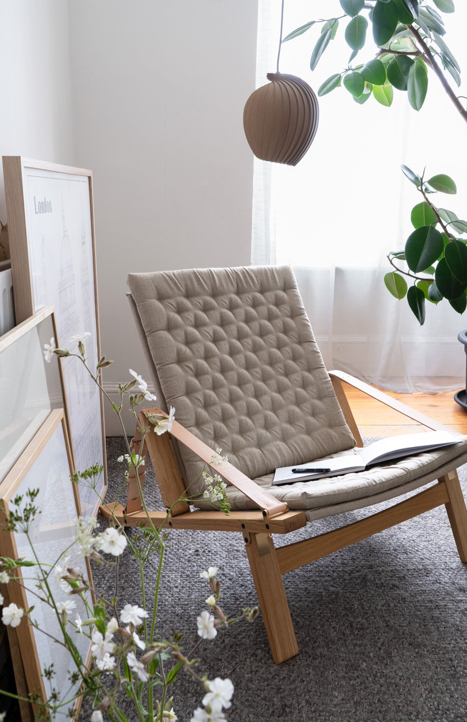
I'm almost ashamed to say that I've had this beautiful Carl Hansen & Søn lounge chair folded away in its box for a few months. In my defence, it goes to show how well this foldable lounge chair tucks away that made me forget it was even there. Please forgive me. Because no one should put this baby in the corner, even if it was designed with space saving in mind...
Meet the FK11 Plico by Fabricius & Kastholm
A statement chair for modern living, the FK11 Plico was first presented to the world in 1964 by Danish design duo Preben Fabricius and Jørgen Kastholm. Taking its name from the Latin word 'plico' - to fold, the chair can be folded up when it's not being used. But whereas some flat-pack style furniture fall flat (excuse the pun) the Plico holds on to its elegant, Nordic aesthetic. Not surprising that Carl Hansen & Søn won a BoBedre award last year with it when it became the newest addition to their collection of Danish design classics.
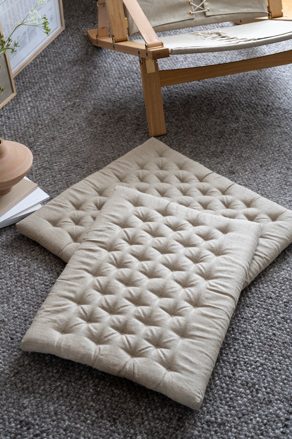
Can we talk about that utterly gorgeous quilted linen canvas seat against that oak frame?
A foldable statement chair with Nordic charm - Carl Hansen & Søn's award-winning Plico, designed as a space-saving lounge chair.
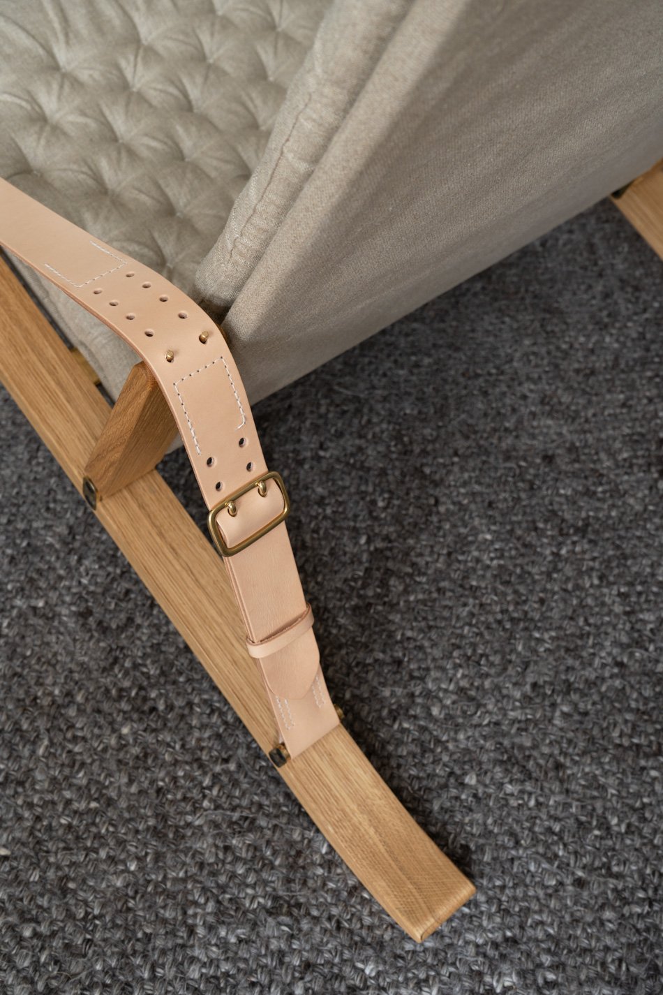
Each detail reveals itself to you as you unfold it. And I found something new with every shot I took. From the brass hinged front leg secured with brass bolts under the seat, the gentle curve in the oak legs where they touch the floor, to the stitched saddle leather arm rests. It's just an exquisite piece of design.
It's rare to find this level of versatility in a lounge chair. Or at least, I think it is. Firstly, it's a testament to Fabricius & Kastholm's foresight to design a chair that doesn't have to be there all the time. You know, a lounge chair is a pretty hefty commitment up there with your sofa. And when the way we use our homes changes as we grow, having the flexibility to just fold this one away takes away some of that weight.
Secondly - I love to see the mechanism out on show. To see how the oak frame pivots inside visible brass fittings when you tilt the adjustable rest back into position. It looks like it belongs here in my living room and I honestly wish it was staying. This is a sit back with a good book kinda chair - supportive but totally loungable. In other words, style doesn't trump the function here, my friends.
If you loved the Plico chair but want to check out another Carl Hansen & Søn design classic, might I point you in the direction of the CH07 Shell Chair?
Prices start from £1,900. Check your local stockist for more information.
Product photography & styling © Tiffany Grant-Riley.
New Product Photography E-Book For Beginners
Learn how to take better product images with A Beginner's Guide to Product Photography e-book written by stylists and product photographers Tiffany Grant-Riley and Hege Morris.
2022 has been a pretty scary year for me so far - putting myself out there. I started making a few changes to the way I run Curate And Display as I introduced my new product photography and styling services for independent brands from my home studio. As part of that, I've collaborated with my wonderful friend and fellow stylist-photographer Hege Morris to write this e-book - A Beginner's Guide To Product Photography.
We always wanted to run a studio together but, given that she's in Glasgow and I'm in Kent, the distance kinda makes that impossible. So the next best thing was to collaborate on this book, which we've written with love to help small creative businesses and new e-commerce owners (think Etsy shops) style and shoot their own products.
"We know how hard it is to be everything in your business, so we hope our guide will go some way to lifting the myth of creating simple, beautiful product photography that boosts your sales and your confidence."
Learn How To Elevate Your Brand Visuals
We see so many small brands failing at the first hurdle with their brand imagery - they have such beautiful products, made and chosen with love and carrying stories that the right person would love to find a place for in their home. But then the images just don't connect. And when potential customers arriving to your online shop take a split second to decide whether or not to linger, making the right first impression really does count!
We've designed this 40 page e-book to be a gentle introduction to product photography and styling composition, full of actionable tips you can apply to whatever space you have, whether you're shooting with a DSLR, mirrorless camera or camera phone. We've packed it with simple tips and workbook templates to make it a fun and stress-free experience.
All you need is a sturdy surface, a window and a camera to start!
The E-Book Covers
• What makes good product photography
• Building a useful DIY photography tool kit to help you set up your own 'home studio'
• Using natural light to take beautiful lifestyle product photography
• How to create your own brand guidelines to inform a visual identity your brand will be known for
• How to use the right props to bring life to your images
• The basics of photography composition to ensure your product is always the hero of every shot
• How to edit your photos and which apps to use.
+ more...
The book is now available to download on Etsy.
The RF200 Minimal Table Lamp From Carl Hansen
[Advertisement - this feature is part of my on-going paid partnership with Carl Hansen & Søn]
Recently, Carl Hansen & Søn expanded their collection of Danish lighting to include a new minimal table lamp. Created by the award-winning Danish designer Rikke Frost, the RF200 Petal Lamp is her second commission for Carl Hansen & Søn, joining her Sideways sofa which launched last year. And it became indispensable, bringing a cosy atmosphere into our home as we saw out the last days of low winter light.
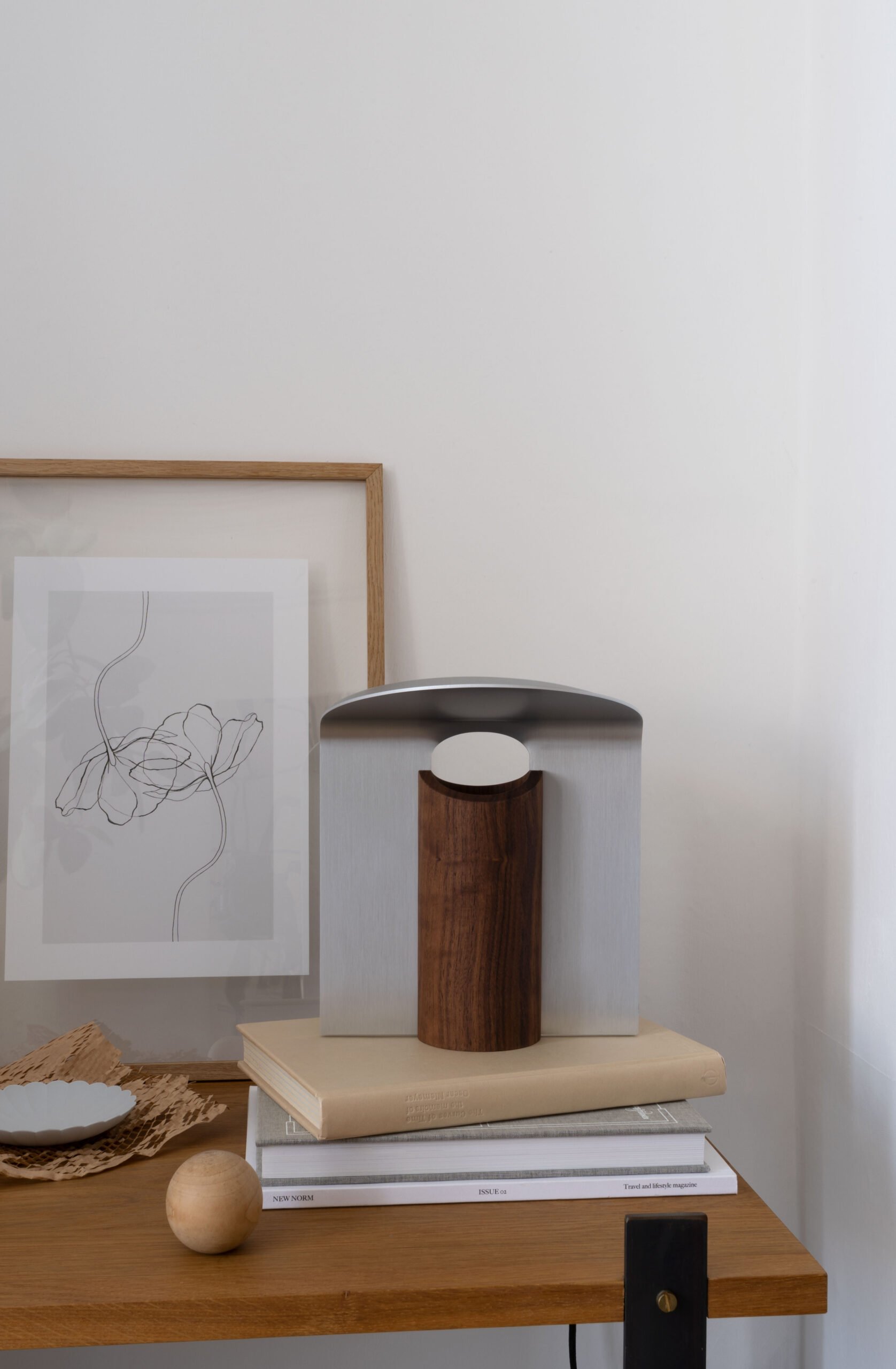
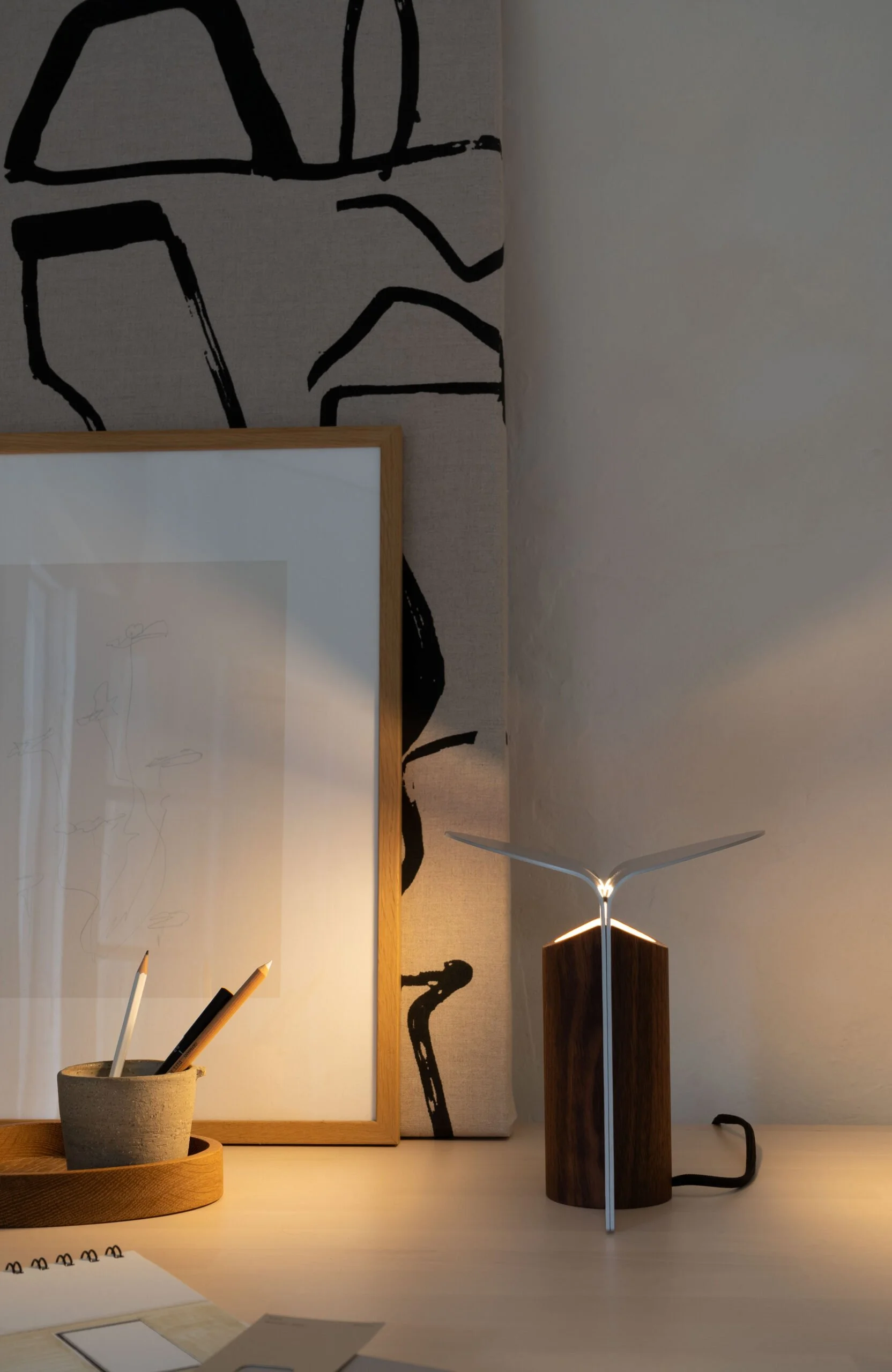
Surprisingly compact, the RF200 lamp has sculptural aesthetic, comprising of a warm wood base and metal shade made from two architectural metal leaves that slide into grooves down the side of the base. Off, it's a piece of art in its own right. When it's turned on it emits a beautiful, soft glow reflected from the underside of the shade and back down. Just perfect for simple, ambient light where space is at a premium.
Frost drew inspiration from nature for the lamp's design, taking the trunk and crown of a tree as a starting point, creating a design that feels organic in nature, touching on classic Danish design yet with a contemporary feel. I love that the grain of the wood is allowed to come through, contrasting against the cool expression of the metal.
"I was also inspired by big architectural arches and columns, and I was fascinated by the interplay of light through an arch and a curve. The result is a lamp that creates cosy mood lighting, because it illuminates upwards and disperses light downwards through the shades in a circular area.”
- Rikke Frost
A Versatile Design
I really enjoy the versatility of this lamp. It has the ability to enhance any space in the house in a completely understated way. Lightweight and small enough to sit on a windowsill, shelf or a side table, it's a reliable piece that creates cosy mood lighting without shouting about it.
The Petal lamp's wooden base and metal reflectors also come in a total of nine variations - from oiled oak and brushed brass, black oak and brushed aluminium to the one I've borrowed here in walnut and white aluminium. It's rare to find a flexible design like this that has the ability to blend into or contrast with your existing interior scheme.
If you love the Petal, you might like to check out the other variations of this Nordic minimal table lamp or take a look at the Carl Hansen M0320 lamp that I styled alongside the table bench.
Prices start from around £240 - check here to find a stockist near you.
Product Styling & Photography © Tiffany Grant-Riley / Curate And Display
Calming Neutral Home in a Stockholm Ceramics Factory
Warm wood and artisanal design inside this neutral home in Gustavsberg Stockholm.
I'm always fascinated to see how residential homes work within the context of industrial architecture. This minimal neutral home scheme had me scrambling to pick up jaw up off the floor. A home that very quietly sings the praises of well crafted design and vintage treasures. High ceilings? Tick. Concrete beams and architectural features? Tick? Large windows. Yes ma'am. It has the lot.
The building is part of a former porcelain factory in the area of Gustavsberg in Stockholm. The original site was built in 1826 but was extended in the 1930s during renowned ceramics designer Stig Lindberg's time with the company. After changing hands in the 1980s, the building has since been divided into individual homes, each with a view across the harbour.
The open plan kitchen-diner has been styled with tonal creams and whites, set off with a dark smoked oak kitchen from Birch and Wood. I love how it looks against the lighter wood floor and the warm oak dining table and chairs. An oversized Japanese paper globe lantern gives the dining area an artisanal, Japandi aesthetic, connecting with the vintage woven baskets hung on the wall and other handcrafted ceramics. I'd love to sit here and watch the light move around the harbour, wouldn't you?
A cosy seating area styled with chunky and curvy cream sofas and a bouclé lounge chair.
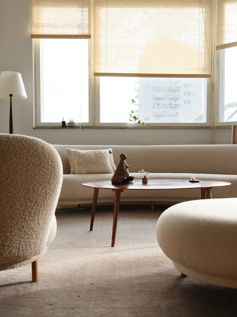
But of course, I couldn't possibly ignore this beaaaaaautiful lounge area, styled with a collection of curvy cream sofas and the most exquisite teddy bouclé lounge chair. Organic shapes are echoed in a simple mid-century coffee table with a curved wood top and it's actually refreshing to see a real life television (it's always the first thing to hide when you're shooting someone's home!)
It took me some time to find the name of this sculptural chair hanging out in the hallway, it looks so much like a piece of art! But, with the help of knowledgable friend, we discovered it was designed by French design house 'Mustache'. Inspired by Bauhaus design and continuous lines, The Bold Chair is designed as just two pieces of tubular metal moulded together.
A cosy bed awaits in this warm bedroom with a calm and neutral aesthetic. I love the beautiful cream bedspread hand-stitched in blue. The two vintage wood chairs acting as bedside tables help keep the room feel soft against the sweeping industrial concrete ceiling beams. A perfect balance.
Photography by Jockeono with styling by Thomas Lingsell, with thanks to Historiske Hem.
[AD] A Narrow Backyard Dry Garden - The Reveal
[Advertisement] This post in partnership with Hayloft includes product provided by a number of additional brands for the purpose of this post.*
To say it has taken forever to complete this transformation would be an understatement - who knew British summer time could be so full of rain?! I’ve had to get used to abandoning painting and planting at the sight of foreboding clouds. Let's just say interiors are far easier to predict! But I digress. Our DIY dry garden project is finished, complete with a mini seating area, freshly painted white walls and repurposed raised bed with young drought-loving plants.
If you saw my plans for this eco-friendly small garden design, you'll see how I wanted to give this narrow backyard some real purpose. I wanted to create a haven for bees and birds with contrasting leaf shapes and texture. And taking into account my not-so-professional gardening skills, the aim was to find a happy medium somewhere between Beth Chatto’s Essex dry garden with minimal watering and the dreamy swathes of Oudolf Field in Somerset. I hear you laughing at my lofty plans, but stay with me...
Right Plant, Right Place.
In stepped the brilliant team at Hayloft to help me choose the right plants from their online garden nursery. Their site was a life saver in lockdown when garden centres were closed! Started in 1993 from her kitchen table in Worcestershire, founder Yvonne grew a successful mail order plant business alongside her friend Harriet whilst raising their children. Today, Hayloft’s female strong horticultural team specialises in a huge range of quirky and unusual plants grown on site. Most of Hayloft's plants are delivered as plugs or young plants in recyclable packaging, meaning they'll grow into your desired space gradually. And frankly, I love the journey of watching something I’ve nurtured grow over time.
The bed I've used is made from repurposed railway sleepers and sits in a South-West facing part along the side of the house. It gets full sun for the best part of the day and is well-sheltered, making it the perfect spot for sun worshiping, drought loving plants. These will thrive on very little water and love a light, well draining soil. Once settled, I won’t be watering this border much at all, save for rainfall and they'll spread fairly quickly with a good metre or so of height. Imagine if you will (for now) tall spires of flowers for bees and sculptural seed heads to continue visual interest into winter. And of course, we picked out white flowering plants to connect with the main part of the garden:
Acanthus Spinosus
Echinops ‘Arctic Glow’
Penstemon ‘White Bedder’
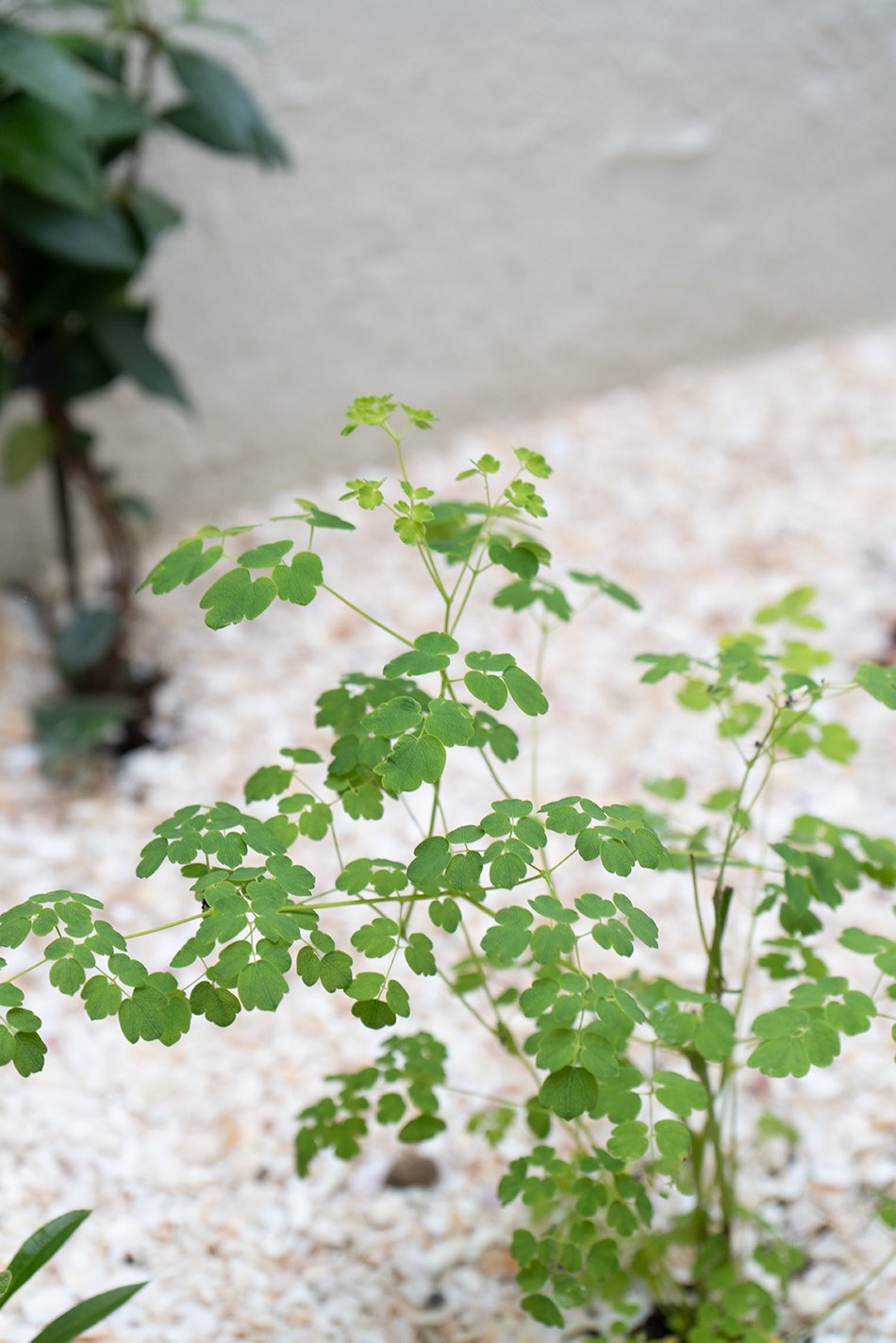
Thalictrum Splendide White
Pennisetum ‘Advena Sky Rocket’
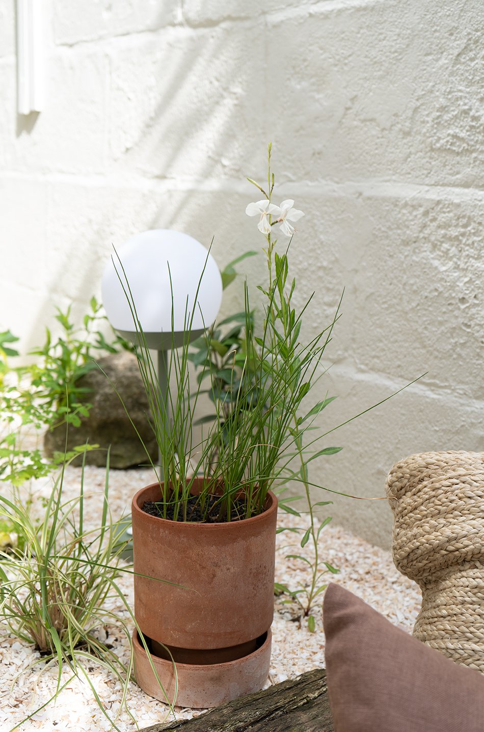
Gaura ‘White Dove’
Geranium Plenum Album
Agapanthus ‘Albus’
Our Narrow Backyard Dry Garden
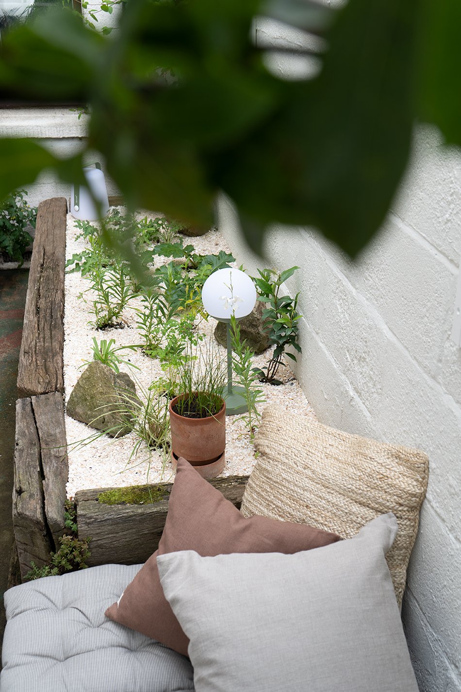
And here it is - the finished look! No more stacks of pots or tarp covered bikes. Instead, a cozy outdoor nook to enjoy in the warmer months and a much better view from the kitchen window!
I stitched together four striped cotton seat pads from H&M Home to create a larger French mattress cushion as the square deck was quite awkward to buy anything ready made. Natural linen and jute cushions bring everything back to nature and it's wonderful to be able to take a break here just stepping out of my studio door.
A stack of washed linen cushions in natural tones from Linen Tales on top of a braided jute cushion from Original Home.
You might have noticed that instead of gravel (great for locking moisture into the soil and popular with gravel gardens) I've used crushed shells for mulch. Shell on Earth are a brilliant company from Wales making use of a by-product of the seafood processing industry. It doesn't smell or attract flies and even keeps the slugs and snails away. I also mixed crushed shells into the bed before planting with some extra compost and course sand for free draining soil.
I've reused the large rocks that were here previously which I think look better as additional landscaping against the shingle. And as the planting has already had time to settle in, they've grown considerably from when they arrived as plugs. We kept the honeysuckle as we love the smell when it blooms in summer and it also provides some screening from the neighbours. Once the jasmine is a little taller, I'll train it up towards the trellis and keep everything crossed for some seriously heady scent!
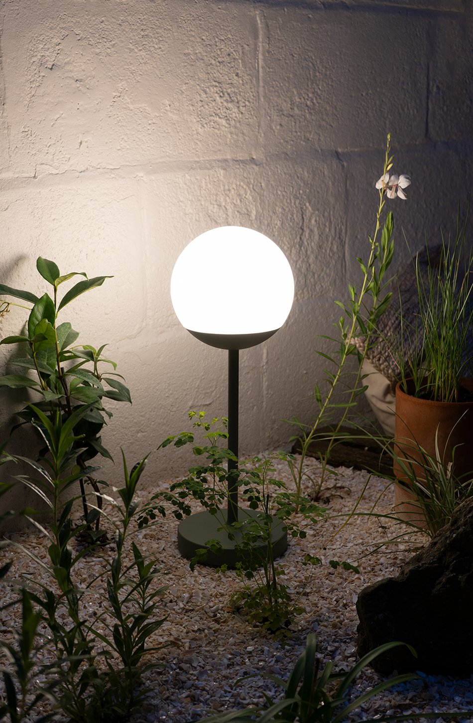
Portable outdoor lights by Fermob in 'cactus green' give us extra time to enjoy the garden at night and I love the warm and cosy feel they bring. Whilst some of our neighbours have really gone to town on garden lights, I'm aware of the detrimental effects they can have on local wildlife, so the fact we can bring them indoors with us when we're done feels like the better option.
Can't wait to see how this garden grows and changes over the years - I'll have to post an update next spring!
Concrete block walls painted in Sandtex Ultra Smooth Masonry paint in 'Chalk Hill', Wickes.
Grid trellis, Wickes, painted with Cuprinol 'Garden Shades' in Daisy White.
Striped beige cotton seat pads (sewn to make a larger square) H&M Home.
White flowering hardy perennials as listed above, provided by Hayloft.*
Shell on Earth crushed shell mulch.
Braided jute cushion, Original Home at Heal’s.*
Washed linen cushion covers in ‘natural’ and ‘nutmeg’, Linen Tales.*
Soft beige linen waffle throw, Linen Tales.*
‘Hoff’ pot by Berg, The Future Kept (with Cotton Tail grass from Hayloft)
Fermob Mooon table lamp, at Heal’s*
Fermob Balad portable lamp, at Heal’s*
*these items are pr products.
Photography & styling © Tiffany Grant-Riley
[AD] My Plans For A Small Dry Garden With Hayloft
Purple-grey allium seed heads in Beth Chatto's garden in Essex.
I’ve been so inspired by Beth Chatto’s Dry Garden and the work of Dutch garden designer Piet Outdoulf for such a long time. In fact, I'm obsessed. If you’ve ever had the absolute joy of visiting Beth’s garden at her home in Essex or Oudolf Field at Hauser and Wirth in Somerset, you’ll recognise natural, freeform planting packed full of texture and visual interest. I love these gardens for their effortless look, that you more or less leave the plants to themselves aside from a little maintenance. And I know, technically there's a lot more to it, but aesthetically, we're going for unmanicured and natural.
Beth’s dry garden still hasn’t been watered since it was planted some thirty years ago with drought-tolerant plants surviving entirely on rainfall. And with the current strain on the environment, we're going to see a lot more of this style of gardening in the future. Low-water gardening is entirely possible with the right plan in place. And I’m giving it a go in a smaller part of our garden which is in dire need of transformation...
Where The New Garden's Going...
We have a raised bed made from old railway sleepers outside our kitchen window that I knew would be the perfect border to plant up a small dry garden. It has a sweet little deck beside it perfect for a small seating area. Best of all, I can watch it change throughout the seasons through the window.
Whilst this south-west facing spot gets loads of sun and light during the day it has definitely seen better days as you can see from the ‘before’ photos. It never had much in the way of any intentional planting, bar what previous owners had left and I bunged in when we first moved in. The only thing vaguely happy here is the honeysuckle which we'll keep for the bees.
Hayloft - Rare, Unusual and Exciting Plants
Working with the brilliant all-female team of horticulturalists at Hayloft, purveyors of rare, unusual and exciting plants, I’ve planned out how I’ll transform this neglected border into a self-sufficient garden with drought-tolerant hardy perennials and grasses. Their online nursery is full of quirky and unusual plants to choose from and with their help, I've picked out a strong team of low-water, gravel garden plants. I'm thinking lots of height, texture and movement with seed heads to feed the birds in winter. Take a look at the moodboard for some of the options we've settled on planting...
Penstemon White Bedder, Hayloft.
Echinops Arctic Glow, Hayloft.
Natural cotton seat pads, The White Company.
Hoff pot by Berg, The Future Kept.
Fermob Balad portable lamp, Heal's.
Braised jute cushion, Original Home at Heal's.
Striped cotton seat cushion, H&M Home.
Crushed whelk shells, Shell On Earth.
Fermob Mooon table lamp, Heal's.
Pennisetum Advena Sky Rocket grasses, Hayloft.
Check back next week for the full reveal and keep your eye on IG stories for my step-by-step journey!
Photography © Tiffany Grant-Riley.
An Effortless Nordic Summer Picnic Edit
Relax in style with a simple Nordic summer picnic in your own back garden.
**This post contains affiliate links which means I may earn a commission if you make a purchase using my links. These are clearly marked as ** and were chosen purely because I love and use these brands myself.
Summer is the only time of year where eating alfresco feels completely effortless. At least, in my opinion. The back door is open all day, the BBQ rolled out ready to go at a moment's notice - it's easy to whip something up and head out with the picnic rug. But the thing I love most about picnicking is the freedom it brings you to go wherever you want. Pitch up at the beach, a secluded spot in a cool forest or the local park. You can even pick up what you fancy along the way to save time, just sling it in your basket. And my Nordic summer picnic edit is packed full of functional, minimalist accessories to take picnic hosting up a notch.
Let's Go Outside
I like to mix up glasses and ceramic dinnerware with more practical items to make the experience feel more personal. Think simple Scandinavian aesthetics, mixed with reusable and natural materials.
We've got stackable stainless steel and bamboo lunch boxes, ideal for storing mini salads or dips. And I love the stackable cutlery sets I found in classic Nordic colours. Call we untraditional but I've vetoed the somewhat cumbersome picnic basket and gone for a large basket tote instead and there's a seriously stylish cool bag to keep your refreshments chilled by my favourite Nordic food brand, Nicolas Vahé. But just because it's a picnic, it doesn't mean you have to use a rug. I much prefer rolling out a couple of light cotton throws that we can use later as a blanket if the weather turns chilly and I've got you covered on the portable BBQ front if you fancy a cookout, too.
You provide a delicious menu, I'll provide you with the look.
The Basket Room Gua tote bag, Oliver Bonas. £85.
HAY Picnic Container Tiffin Box, Trouva. £39.**
LEON Bamboo Lunch Pot, John Lewis. £10.
Recycled Glass Tumbler, Graham & Green. £9.95.
Rosendahl portable outdoor lamp, Connnox. £60.50.
Yumi Wooden Salad Servers, Oyoy at Trouva. £23.**
Smorgasbord Modern Scandinavian Recipes, Waterstones. £18.99.
Natural Cotton Throw, Anza. £49.**
Organic cotton seat cushion, ARKET. £19.**
Set of three travel cutlery by Koziol, Anthropologie. £10.**
Stainless Steel Reusable Bottle, Frank Green. £29.99.
Mi Square Gingko Pocket Speaker, Not On The High Street. £49.
Portable BBQ Bucket, Olivia's. £49.00**
Wooden Serving Bowls and Tray, H&M. £19.99.
Nicolas Vahé Cool Bag, Trouva. £15.**
Photography © Tiffany Grant-Riley featuring the 2020 collection of summer picnic accessories from Urbanara.
An Island Retreat at the Modern Rustic Vipp Farmhouse
A sanctuary of neutral interiors - inside one of the three bedrooms at the Vipp farmhouse.
When I think of Nordic summertime, I bring to mind the craggy coastline of the small islands surrounding Denmark, of wooden jetties and dappled sunlight filtering through dense forest. A two-hour drive from Copenhagen and located on the island of Lolland is the new Vipp Farmhouse, the 4th hotel destination from the heritage brand that brought us the original pedal bin.
“During lock-down we have rediscovered nature and the charm of the Danish countryside, and now we share it with you. Vipp’s fourth hotel destination offers a convenient escape to nature. A taste of farm life, where the cow has already been milked”.
Jette Egelund, 2nd generation Vipp owner.
Dating back to 1775, this traditional Danish thatched roof farmhouse was once home to a gardener on the surrounding Søllestedgaard estate. But whilst its whitewashed walls echo back to its farming roots, the interior is, as expected from Vipp, a lesson in Scandinavian minimalism. For those looking for a farm stay experience nestled in an untouched forest, this is for you. A modern-rustic bucolic dream awaits furnished by Vipp, including the modular V1 kitchen in soft grey, Chimney sofas and black wall lamps.
Interior design Julie Cloos Mølgaard demonstrates a careful balance of contemporary interiors that are sympathetic to the historic architectural features of the Farmhouse. I love the way the warmth of the restored beams and wood floors contrast against cool white walls, stainless steel and black metal. There's a place for everything with ample space for relaxation, interspersed with framed prints of the surrounding countryside and artful curiosities.
And food-loving tourists are drawn to Lolland, the fourth largest island of the Danish archipelago and just a stone's throw from the German coastline. The island's rich, fertile land makes for ideal growing conditions for apples, cherries and sugar beet. Guests can swing by the newly opened Michelin star restaurant 'Pomle Nakke' on neighbouring Falster and can expect to enjoy local produce from the island to cook at their leisure. What I wouldn't give for a week's stay here - I think I'd be floating on air every day...
If you'd like to find out more about the Vipp Farmhouse and experience a taste of Nordic summer, book your stay here.
Photography © Anders Schønnemann
Kaski Linen Lounge Chair Inspired by The Finnish Countryside

Get ready to be transported to the 19th Century Finnish countryside today folks. Ok, so aesthetically it's a very contemporary piece but it's inspired by traditional 19th-century craft techniques. The new Kaski linen lounge chair designed by Joanna Laajisto for the Finnish design house Made By Choice draws on the use of traditional tools to create simple, robust furniture.
Believe it or not, when it comes to lounge chairs in Finland, there aren't many options unless you're looking for a classic design. And the Kaski was originally designed for the national retail brand Nanso's before it was put into production by Made By Choice.
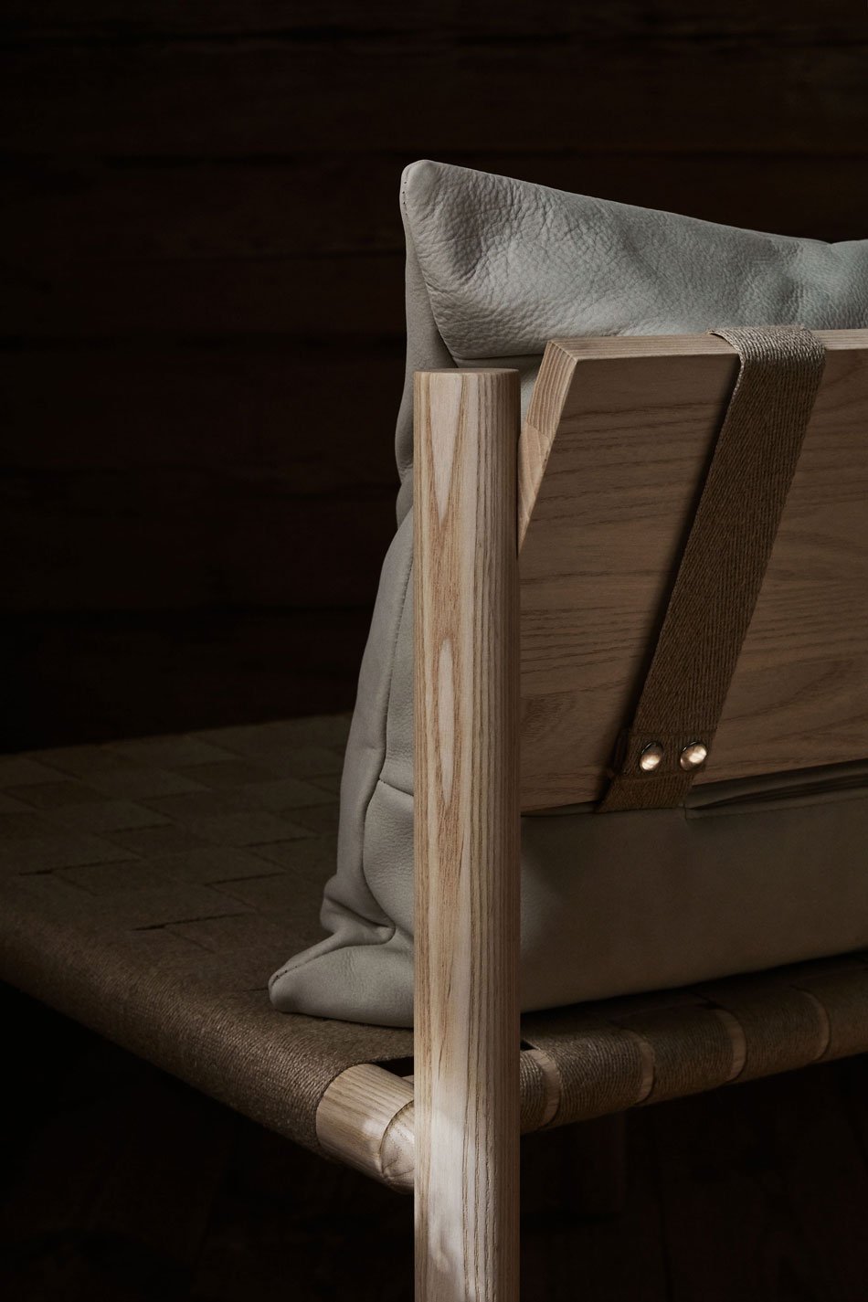
Everything was self-made in the 19th-century countryside, from tools to tableware to furniture. Materials and handicraft skills were highly regarded.
Joanna Laajisto - designer.
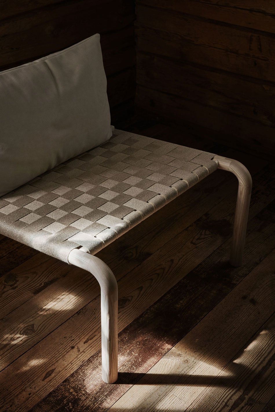
As with everything produced by the Made By Choice team, this chair is a thing of beauty. Known for their use of bold shape and sweeping curves, the Kaski doesn't lose any of that, yet it feels a little different from the rest of the collection. It speaks of Nordic craft, of slowness.
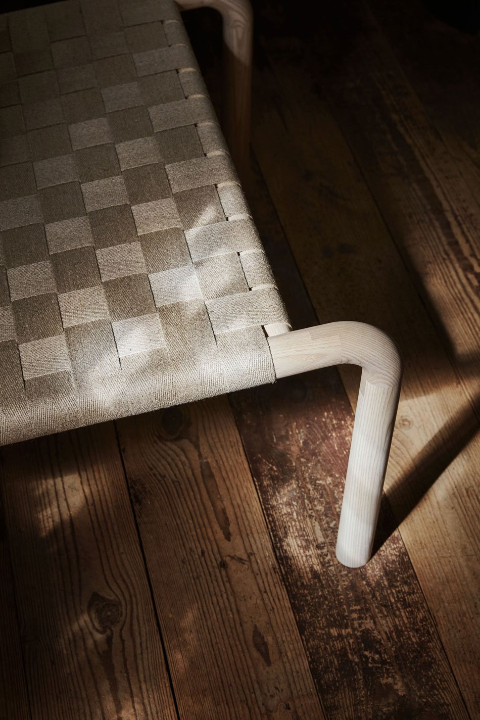
Its silhouette carries a lightness and elegance into a Scandinavian inspired home. The epitome of simplistic, minimalist style, it's all in the details. From the light ash frame connecting with a curve to the leg with an exquisite hidden join, to the braided natural linen seat. And I love its woven seat - you can see the quality of the linen and it comes with its own craft story knowing that it was made by hand. A gentle tilt to the backrest invites space for a buttery nubuck leather cushion strapped at the back which, as Laasjisto says, adds an element of luxury to balance out the minimalistic design.
So I think I may have just written a love letter to a chair. But you can see why, can't you..?

House of Grey X Bauwerk Limewash Paint

In a design match made in heaven, London based interior design studio House of Grey has just announced 'Visual Silence', a collection of limewash paints with Bauwerk Colour. Fans of limewashed walls, you will not be disappointed.
Headed by founder Louisa Grey, the studio is known for its pioneering approach to salutogenic design, meaning health and wellbeing is at the forefront of their process. Guided entirely by using only natural cradle-to-cradle materials, the studio seek to create grounded spaces that support human health and the environment. Known for their healing, sustainable interiors, House of Grey are the one UK studio who always come to mind when I think of calming, minimal and artisanal design. Joining together with Bauwerk whose natural, no VOC lime paints have already garnered world wide acclaim is a no-brainer. Lovers of House of Grey's minimal aesthetic can now bring some of that style into their own home.

The 'Visual Silence' collection is a palette of eight muted, earthy colours designed to bring a sense of clarity and harmony to any space. At the deeper end there's 'Nurture', a dark green that encourages deep relaxation as well as the smokier 'Cleanse' green for healing. At the paler end of the palette, there's 'Retreat', a chalky alternative to white and 'Balance', a deep neutral with a hint of taupe. I love the way the light refracts against the pigment and texture on the walls in these beautiful shots.


To discover more about this wonderful, natural paint, take a look at 'How To Decorate with Limewash Paint' as I take you through how I painted my studio it step-by-step.
The House of Grey limewash paint is available directly from Bauwerk where you can order samples, brushes and ready-mixed paint directly.

Photography by Michael Sinclair
Typology Minimal Skincare for The Body

[Advertisement - Typology sent me these samples with no obligation to share content, but quite frankly, they're so good that I had to.]
If you're new this minimal skincare brand, may I suggest that you get on it immediately? This Parisian-made, all natural and achingly stylish collection for both face and body. Not only does it make an understated impression on your bedside table and your bank account but works a treat on your skin, too.
And it's not surprising how quickly Typology burst onto the scene in 2019 as the latest creation of the founder of MADE.COM, Ning Li. Though not the first minimal skincare brand to make waves, Typology moves away from chemical loaded formulas and dubious ingredients, focusing on a handful of all-organic, active ingredients. It's a refreshing back-to-basics, cruelty-free approach, sent out in 100% sustainable packaging. In fact, some of it has just graced my compost bin.

The range has grown considerably since I dipped my toes in and bought my first product (the Radiance Night serum, if you're interested). I've been road testing the new line of skin scrubs which launched this spring.
I'll admit that I'm not used to exfoliating on dry skin. And I know that's a thing - I remember the dry brushing craze in the 2000s. But both the Regenerating Face Scrub and Nourishing Body Scrub require you to work the almond kernel based gel into clean dry skin first. Far easier to do on your face that your entire body but we're nit-picking here. What's brilliant about them is the gel works into an oil once rubbed into your skin, transforming into a milky lotion when you add water ready to rinse. And as someone with very dry cheeks and an oily T-zone, finding products that work on both levels is tricky. These are wonderful. No dry, taught skin. It's gentle, moisturising and a joy to use. They smell good enough to eat. Though don't. And even Rob agreed with me and his go-to is to shampoo his face. Really.
It's worth taking the Skincare Test on the site if you'd like to dig a little deeper and try a few products. And if you have your own favourites - I'd love to hear what you're using too.


Styling and photography © Tiffany Grant-Riley.
1616 Arita Japan TY Palace Collection
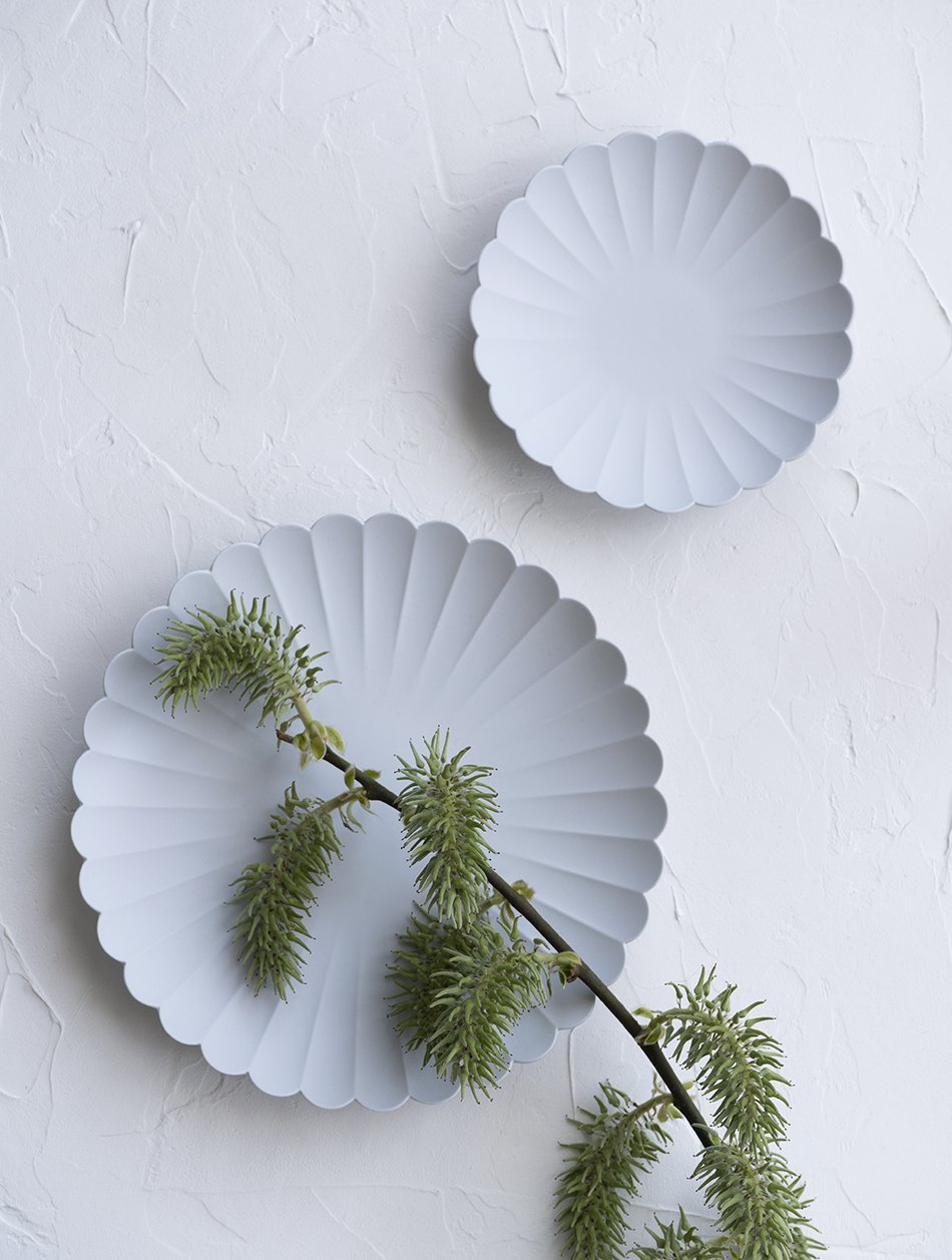
Two unglazed porcelain Arita 1616 Japan plates from the TY Standard collection on a textured backdrop.
Delicate yet deceptively strong - the 1616 Arita Japan 'Palace' plates.
I have some wonderful friends in my life. Having had my eyes on these delicate porcelain plates for a long time, would you believe a friend of mine living in Copenhagen sent me two as a surprise.
As an absolute sucker for pottery, the bisque stage of the ceramic process is my absolute favourite. Before it touches the glaze. When the first firing of the clay is done and it has that raw, alabaster-perfect look to it. Of course, bisque is useless if you actually want to use it, but when I find a collection of ceramics that has the look and can also be used, I need it in my life.
'TY Palace' plates designed by Teruhiro Yanagihara for Arita 1616 Japan minimally styled on a textured table top.
About 1616 Arita Japan
Japan has a long history of porcelain production originally introduced by Korea in 1616. Known as 'Aritayaki', a kind of Japanese pottery, it takes its name from the town of Arita, found on the southern Japanese island of Kyushu. High-density clay is created from crushed stone specific to the area, giving it heat and stain-resistant qualities. Production continues today, manufactured by Momota Touen and led by creative director and designer Teruhiro Yanagihara.
Bringing a fresh outlook to the brand, Yanagihara's 2016 'TY Standard' collection combines traditional Japanese craft and contemporary aesthetics. And the scalloped edge TY Palace plates were among the first to be used in the Tokyo Palace Hotel. Elegant, minimalist and functional, they are absolute perfection. Their pleasing symmetry and smooth, unglazed shapes inspired me to shoot them against this textured backdrop. I love the contrast between the two.
Beautiful soft grey porcelain plates made in Japan, minimally styled on a textured surface.
The underside of the TY Palace plate, made from porcelain in Arita, Japan.
A Japanese style table set with a soft grey porcelain 1616 Arita Japan TY Palace plate.
Will I be letting anyone else use them? Hell no. Are they microwave and dishwasher safe? Hell yes.
Styling and photography © Tiffany Grant-Riley.
And Other Things #1
In the spirit of trying something new, it’s the start of a new series today - And Other Things. I was sitting in the sunroom on Saturday afternoon and thought that I needed somewhere to get my thoughts down, somewhere to share what I’ve been up to during the week.
So here it is.
How have you been? I’ve been feeling cast adrift lately and I’m struggling to stay afloat. Clutching on to any sense of normality. School is back, which has been just what the kids needed, to have their routine back. But I’m still not there yet in getting back to work. It’s quiet and so I’m embracing that and enjoying the slower pace while I figure out where the gears are.
I’m going stir crazy for spring.
Every morning, I’m out in the garden in tatty slippers and whatever bobbled and misshapen jumper I’ve managed to throw on from a heap on the floor. Desperately willing the tiniest buds to grow just that little bit faster. And they are, slowly. Already the sanguisboras have four or five feathery leaves to show for themselves. I divided their root balls just as they showed signs of life and replanted the other half on the other side of the lawn. Same with the astrantias, whose little white pincushion flowers keep going all summer. The bananas are unwrapped from their recycled duvet beds I used to protect them over winter and are starting to push forth freshly coiled leaves. And I’m mourning the loss of one of the first banana trees I had - it flowered and fruited last summer and it was, as I later discovered, its swan song. But there will always be more pups emerging from the soil, so there’ll be a jungle yet.
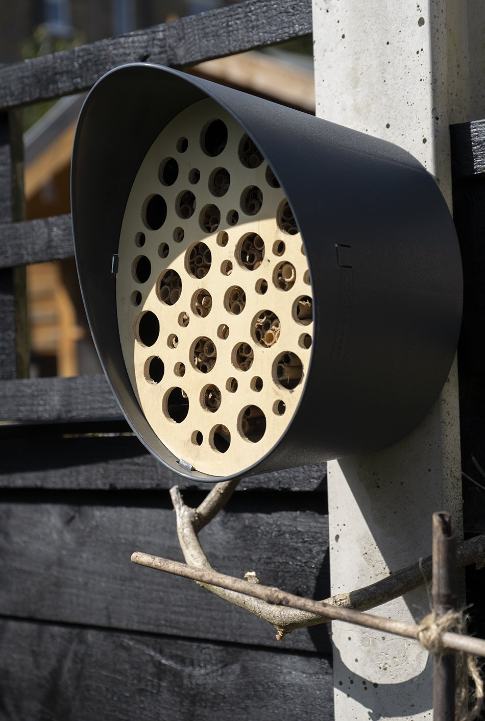
A swanky new bee hotel is up on the fence post facing South, ready to host any solitary bees and pollinators that come its way. Of course I picked the most architectural one I could find, made by Dutch garden brand Capi. It’s all completely biodegradable and easy to take apart during winter when it's time to overwinter any of its residents.
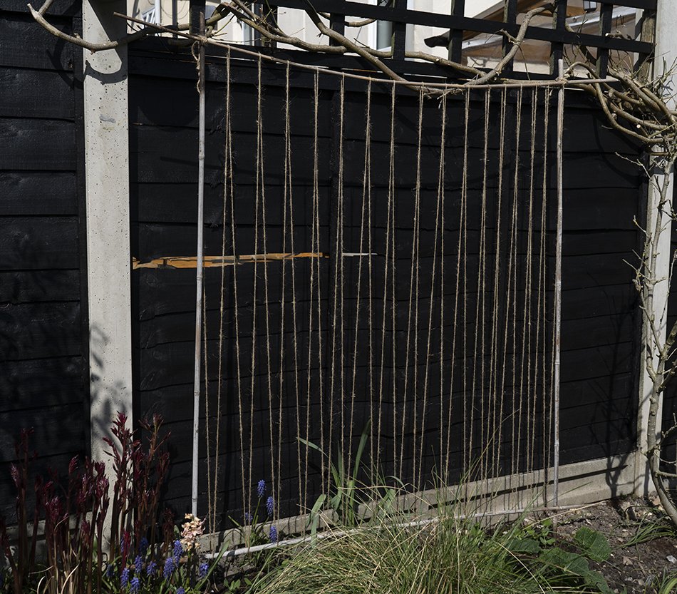
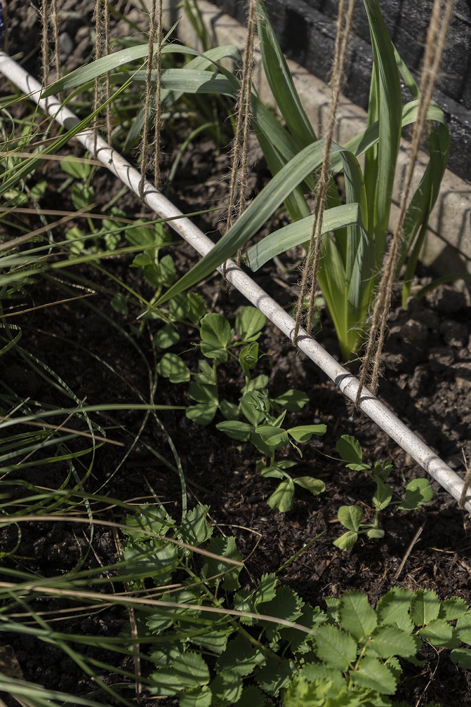
Below that I made a make-shift pea frame from bamboo and twine, ready for the sugar snap pea seedlings to race to the top. I’m hoping there’ll be enough flowering plants here over summer to encourage the bees to nest.
Good Habits, Learning Danish
Do you Duolingo? I think I’ve been using it on and off with minimal success since 2015 but for the past 46 days I’ve been doing an hour of Danish every day and I love it. I think my foundation in German really helped my understanding of it with lots of similarities but it’s very strange to begin with, when you realise just how many consonants are swallowed! Still, I’m determined to have a basic understanding of it so I can put it to good use when we’re allowed to travel again. Even if the Danish all speak English and put us to shame.
Jodie’s New Book
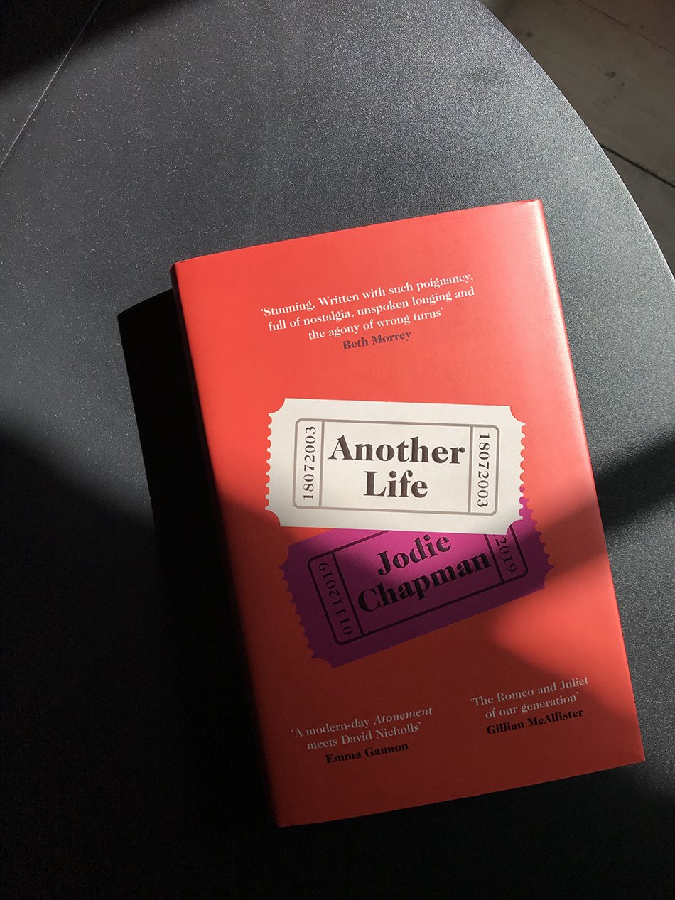
So my friend Jodie Chapman (and now celebrated published author) wrote an actual book. My copy arrived this morning and I'm wishing away my current read so I can get to it! The last time I went to visit her before the madness of covid, she was working on her second novel from her beautiful office. In fact, I think she's just completed her third! This one is called ‘Another Life’ and has been described as a modern day Romeo & Juliet / Atonement style tragic love story. She’s probably one of the coolest people I know so, you know, buy it now.
Quiet Beaches and Contemporary Architecture
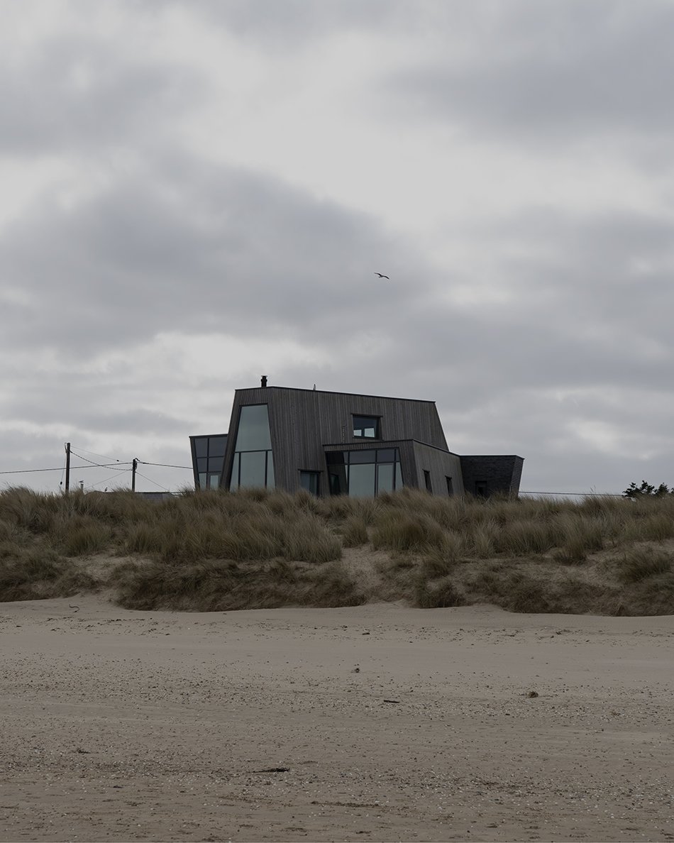
You can find some of the best examples of contemporary architecture on the Kent stretch of coastline. I almost don’t want to tell you about this beach because it’s so wonderfully quiet. Greatstone. We drove down here last weekend with the kids, knowing it’d be deserted.
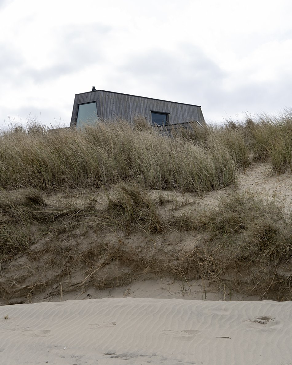
There are windswept grassy dunes, shells scattered like jewels on the shoreline and the sand is the finest I’ve ever felt. And then, this house. Clad in larch, just like the house I plan to build in my imagination, complete with sky gazing windows. If you fancy a nose inside it, it was for sale with The Modern House.
And other things:
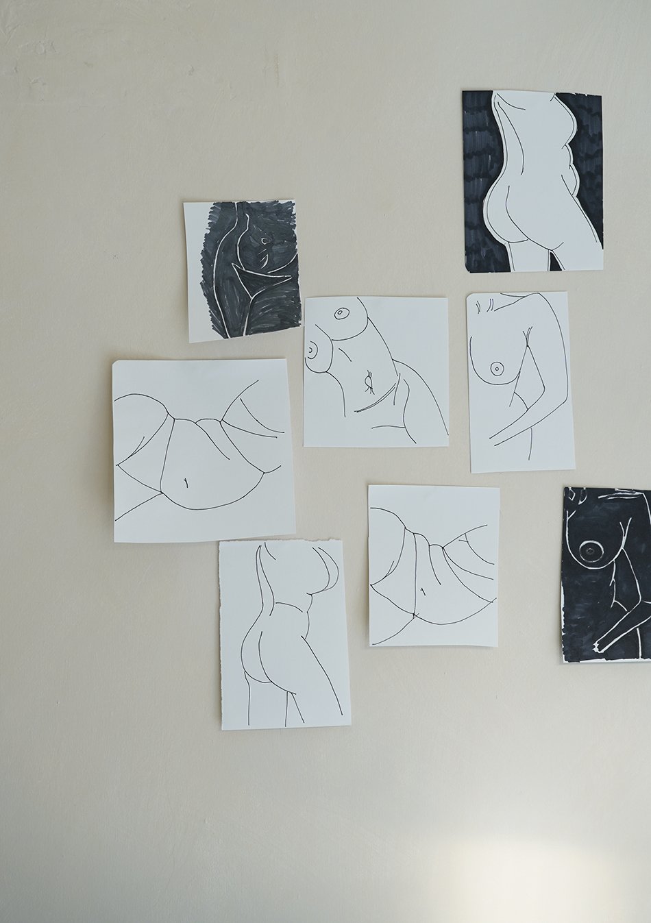
I took an online drawing class with artist Lakshmi and LOVED it.
Chadwick Boseman’s performance in Ma Rainey’s Black Bottom will make your heart hurt. Watch on Netflix.
GABA’s meditation podcast is completely bonkers but utterly brilliant. It mixes poetry with music, storytelling and cultural soundbites to create a totally new experience.
Determined to discover more about my ancestry, genealogist Paul Crooks has been helping me delve deeper into my Guyanese heritage through his online seminars.
Catch you later,
Tiff x
4 Summer Flowering Bulbs to Plant in Spring
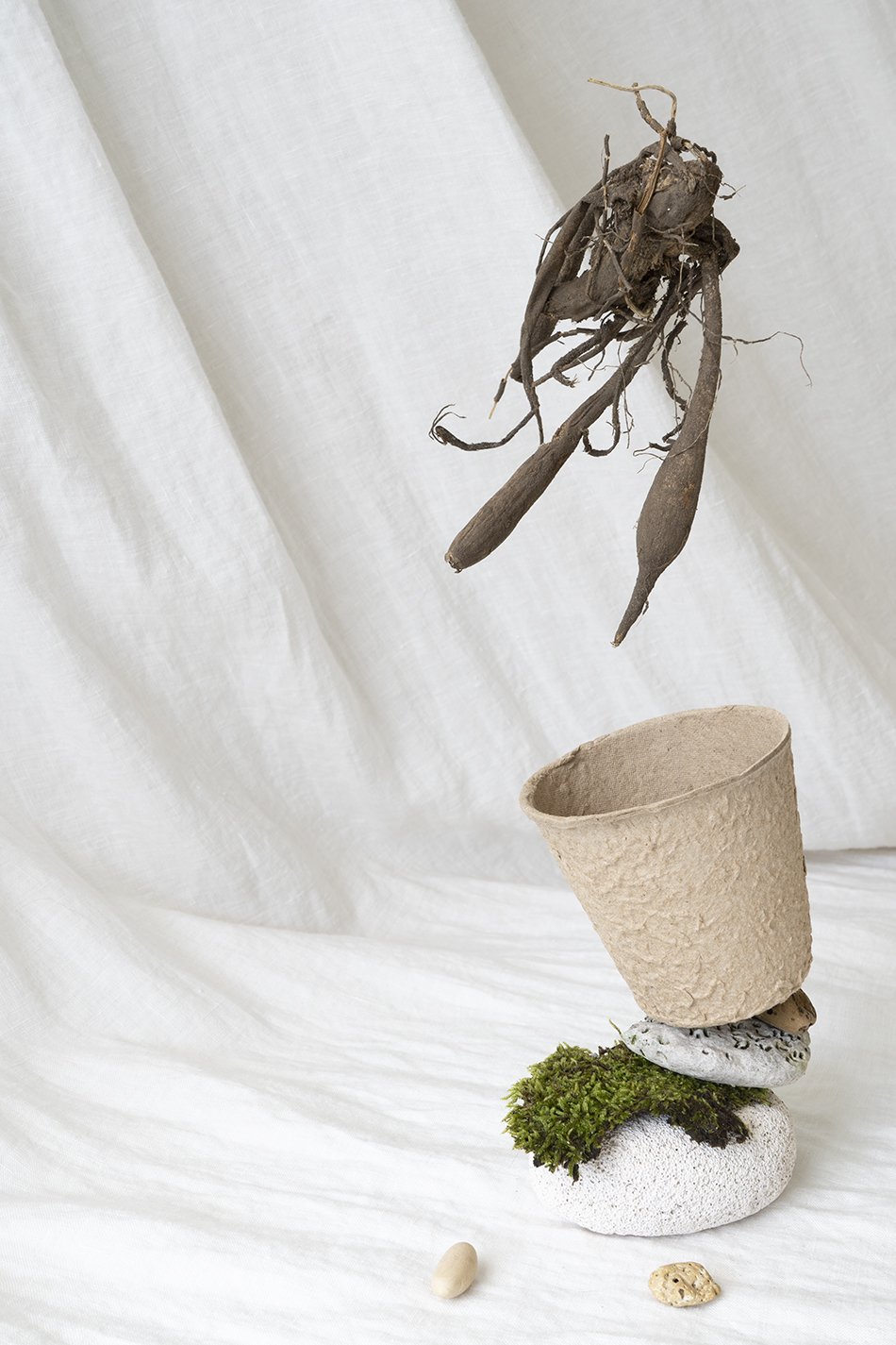
A dahlia tuber, one of the best summer flowering bulbs to plant in spring and perfect for cut flowers.
Throw caution to the wind and fill your garden with these summer flowering bulbs.
I was far too late for sowing early spring blooms last autumn so this week I've been busy planting out summer flowering bulbs in the garden. I'm determined to have a fully flowering white garden all through summer this year. I want it packed to the brim so I can come in from the garden, arms laden with cut flowers to dot about the house in vases. Well, that's the plan anyway.
My favourite kind of gardening is the type where you plant it, leave it and it does all the work for you. Bulbs are brilliant for that. This weird and wonderful wurzely world lies dormant until you give them the right conditions at the right time to thrive. All that energy stored inside, waiting. And then suddenly, shoots appear up from the ground in clumps. Forgotten flowers!
I bought a basic pack of 25 white flowering bulbs from the garden centre and thought I'd share how easy it is to grow them. They will thrive in most soil types and are just as happy in containers, too...
Plant dahlias for all-summer-long blooms
A dahlia tuber suspended above a fibre plant pot balanced on pebbles and moss.
Huge billowy blooms grow from strange, gnarly tubers - the dahlia.
Technically, dahlias aren't a bulb as such, in fact they're a tuber. But given that they're the queens of the summer flower bed, I could hardly leave them out. With some varieties growing flowers the size of dinner plates, the range of colours is huge and make for romantic, billowy cut flowers.
Dahlias are prolific flowerers once they get going in early summer. And they just reward you with more when you cut them regularly. Don't be tempted to plant these out in the garden until April when any danger of frosts has passed. In the meantime, you can pot the tubers in a pot of peat-free compost and keep them moist somewhere cool indoors. I've potted up a cream-blush 'Cafe Au Lait' and white 'Snowstorm' variety in the sunroom and by April they'll be a bushy enough to transplant into the border.
HOW TO PLANT - Start them off in a pot of compost indoors on a windowsill or greenhouse. Plant with the tubers facing down and the old stem poking just above the surface. Keep them moist and plant out in a sun drenched spot with well drained soil when frosts have passed.
TIP - Did you know that dahlia petals are edible? They look so beautiful sprinkled over a summer salad.
Gladioli bring height into the border
A minimally styled image of Gladioli bulbs emerging from soil from twisted silver wire.
Tall and tropical - the Gladioli
If you're looking to bring height into your border then Gladioli are the answer. Their tall flowering spikes will keep you company from May - August and their tropical appeal owes to the fact they're native to South Africa and the Mediterranean.
HOW TO PLANT - Choose a sheltered spot in full sun with moist, well draining soil. Plant the corms 4" deep and 4" apart. Stake them once established for support.
TIP - Stagger your planting over several weeks rather than all at once to extend the flowering period through into early autumn.
A gladioli bulb is one of the best summer flowering bulbs to plant in spring, sitting on a mound of compost.
Grow Ranunculus and Anemones for cut flowers
Summer flowering bulbs of anemones and ranunculus soaking in a bowl of water.
Wrinkled buttons of anemones and claw-like ranunculus.
Flowering from May - June and one of the more expensive flowers to buy from the florist, I try to grow ranunculus and anemones to give me a decent supply to satisfy my cravings. These really are the jewels of the garden border, it's hard to believe such beauties can grow from these wrinkled, alien-like corms.
HOW TO PLANT - Find a spot in full sun or partial shade in well drained soil (they hate wet roots). Space them at 2" intervals approximately 2-3" deep. Place the ranunculus with their claw-like roots facing down. For anemones, check the variety before planting - I sowed these ones on their sides.
TIP - Ranunculus and anemone corms benefit greatly from a 2-4 hr pre-soak in water before planting them out. This rehydrates them (in fact, you can watch them plump out) and gives them a better chance of germination.
Anemone and ranunuclus corms soaking in a white bowl of water ready to be planted in spring.
Styling & photography © Tiffany Grant-Riley
House of Gärsnäs Apartment at Stockholm Design Week
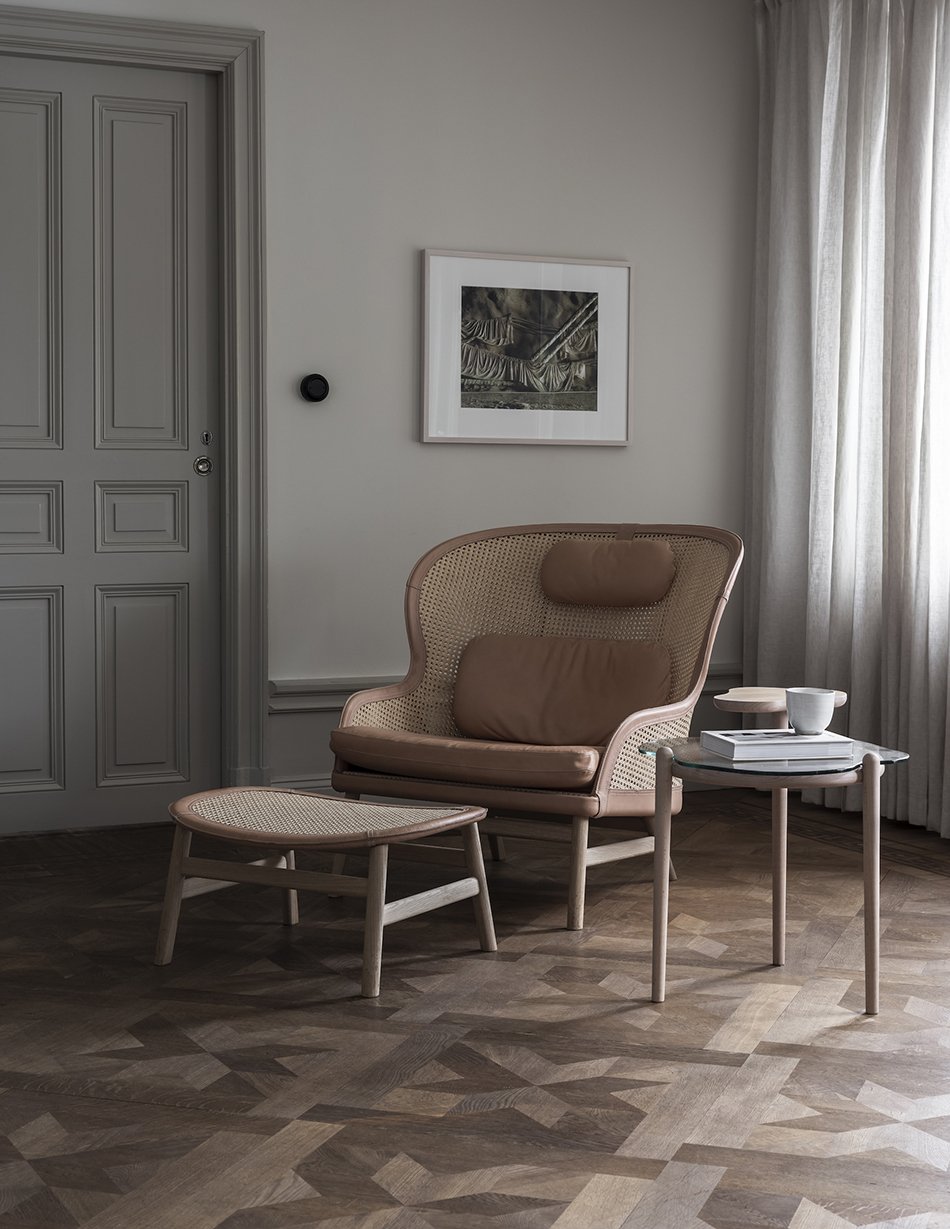
Gärsnäs, one of Sweden's oldest furniture brands has just launched a new showroom at Stockholm Design Week. Based in Skåne, it has been leading the way with sustainable furniture in its family run workshop since 1893.
A history spanning 128 years has created an archive of striking Scandinavian classics lead by well-known designer and owner Åke Axelsson and Anna and Dag Klockby. Known more for furnishing public spaces, the brand now longs to reach a wider audience to see its furniture in private homes. I'd welcome any of their designs in a heart beat.
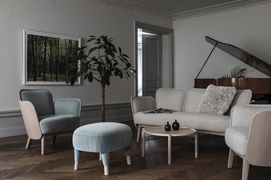
Curated by designer Nina Jobs, Gärsnäs marks a new chapter with a more relaxed and informal way to view their most iconic designs.
The collection is styled as they would be in a home setting inside a 17th century apartment in the Old Town district of Stockholm. And with views across to Skeppsholmen island, 'House of Gärnäs' is everything you would imagine a modern Scandinavian home to be.
In times when more and more people work from home, home environments are facing an interesting development. How should our homes change? What should happen to traditional spaces and apartment plans? What should be attractive in a few years?
Gärsnäs
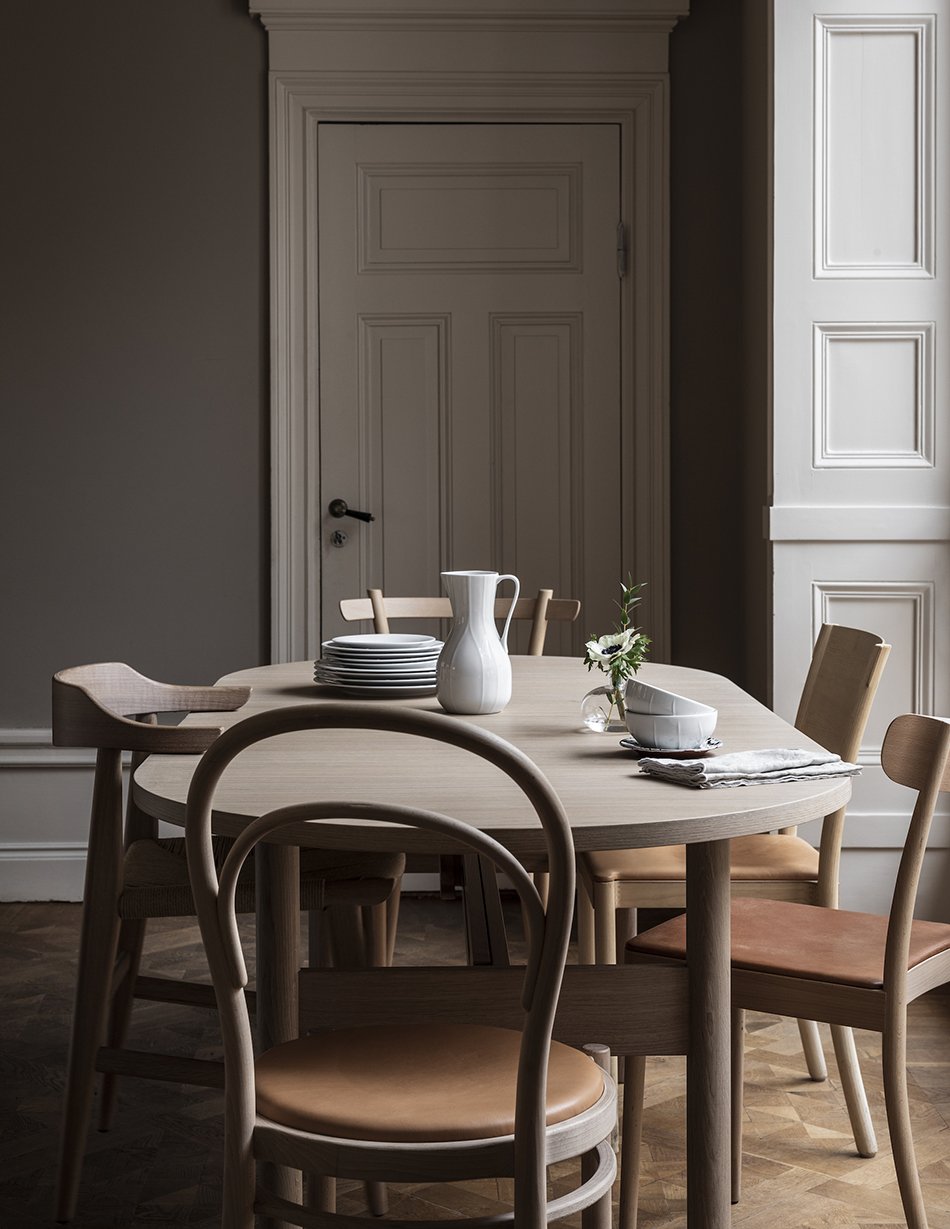
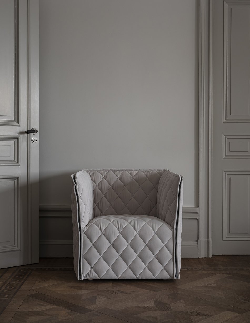
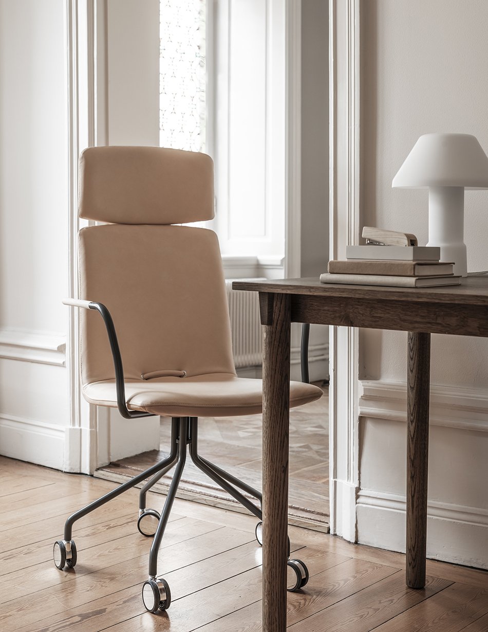
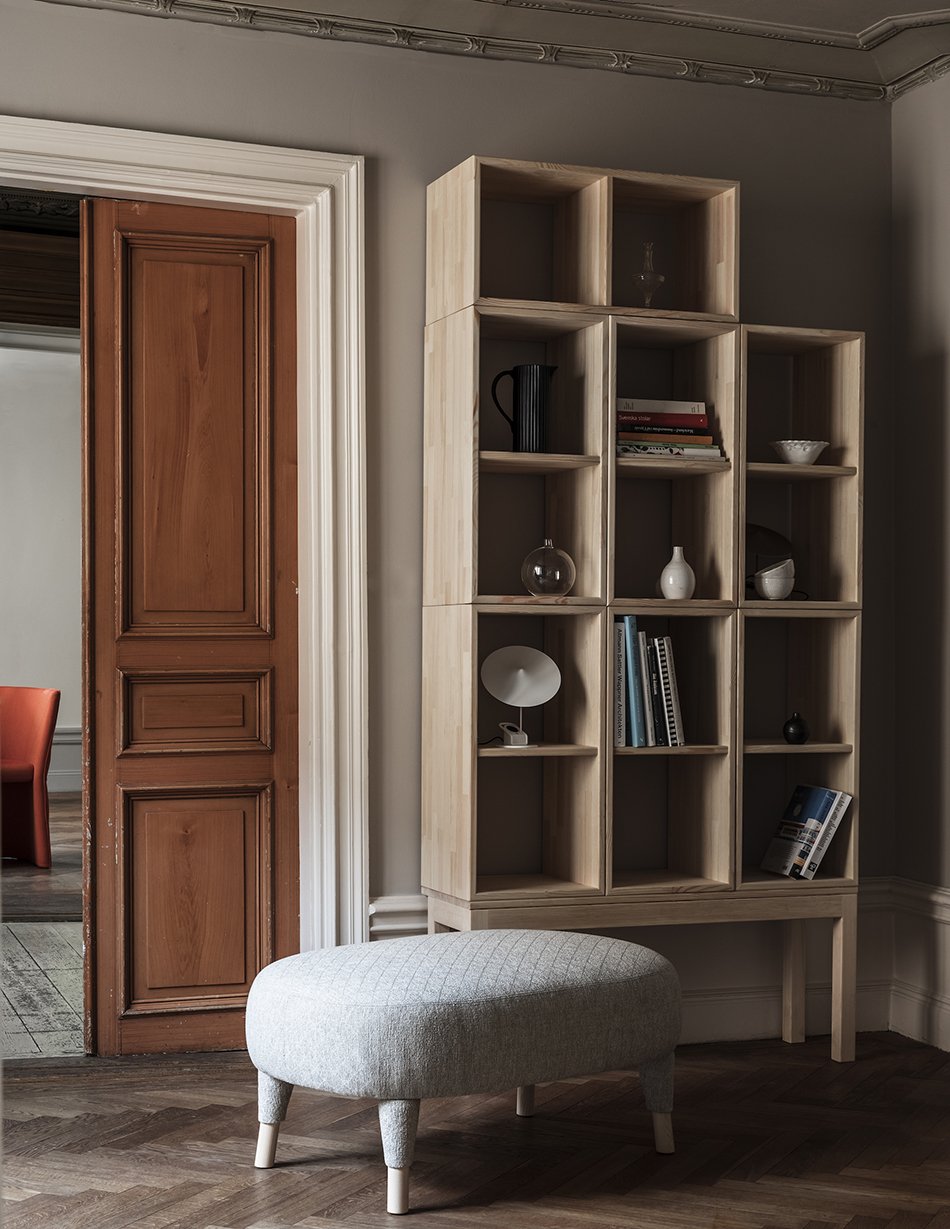
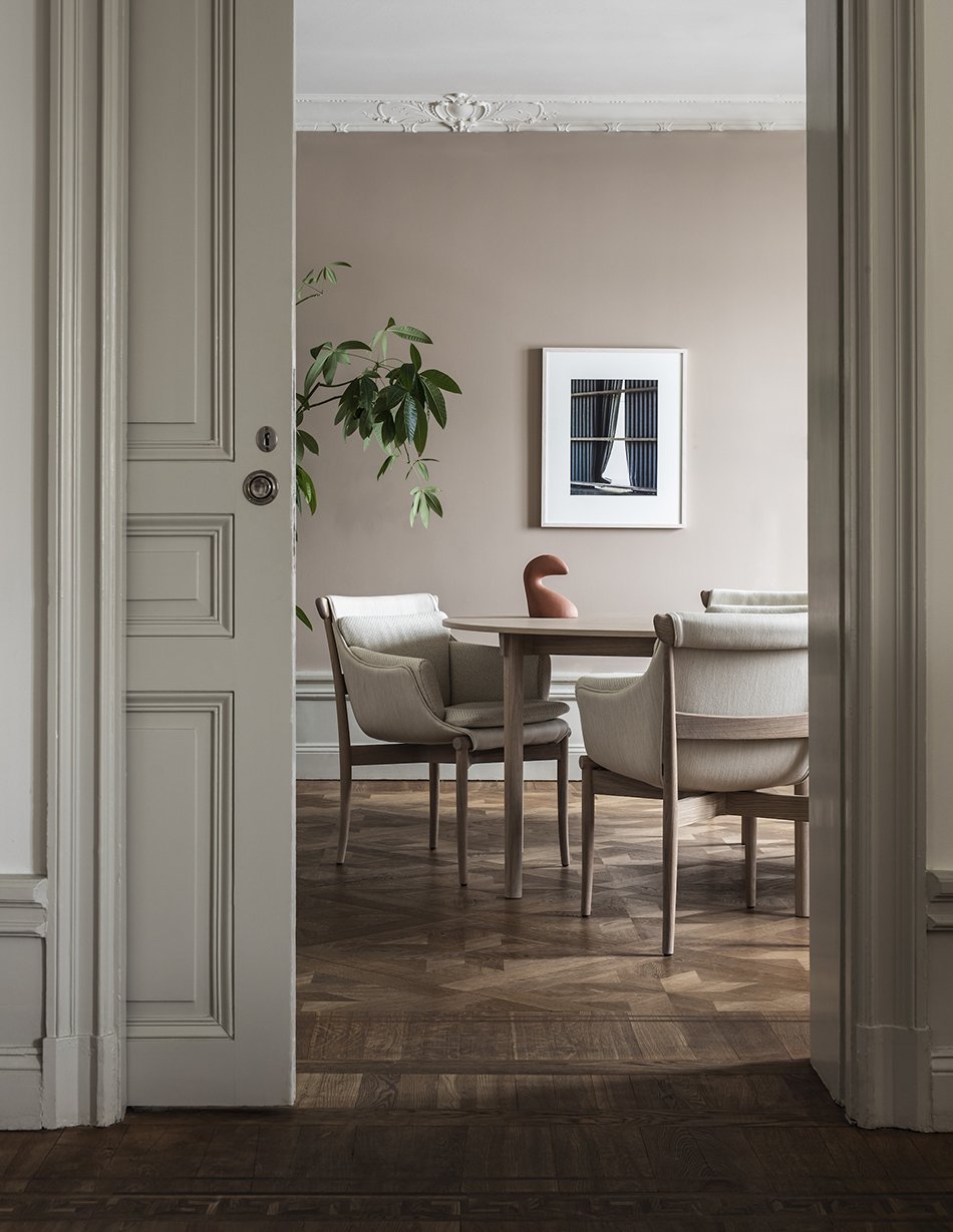
Baroque architecture reveals sweeping high ceilings with intricate cornicing and panelling. Moving through the apartment, each room is painted in tonal, neutral shades of eggshell, putty and chalk, creating a warm and minimal style that's elegant and harmonious. It's the perfect canvas for some of the most beautiful examples of Scandinavian furniture that I have ever seen.
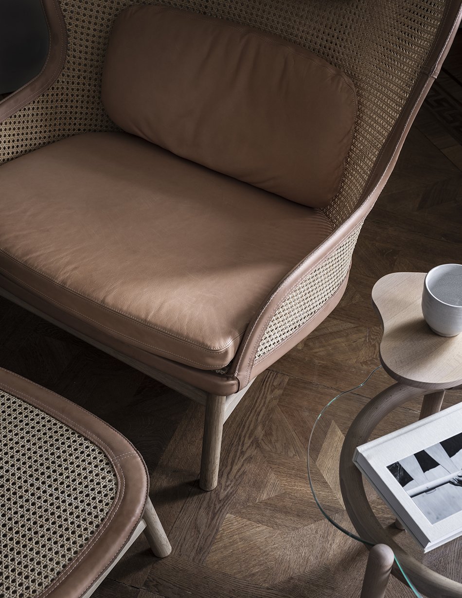
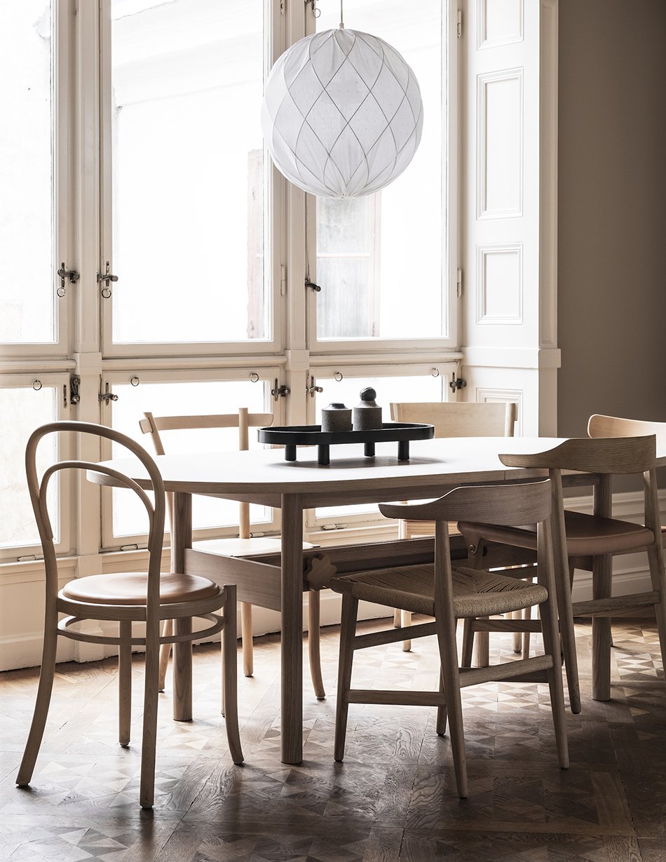
The collection spans earlier classics such as Åke Axelsson's 'Linnea', a modern take on the Thonet chair to the contemporary Bleck sofa, inspired by the back of a canvas frame, designed by TAF.
And the company continues its pledge towards sustainable production. Not only does it take back older pieces for renovation but is committed to being completely circular and carbon neutral by 2030.
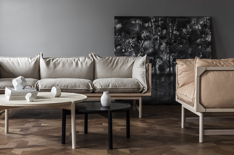
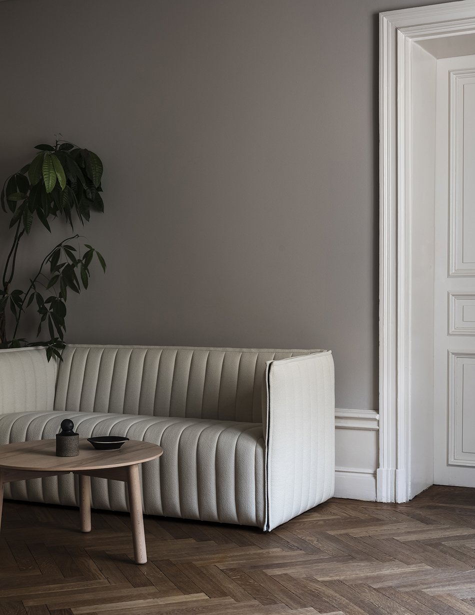

Visit by appointment only: Skeppsbron 30, 111 30 Stockholm, Sweden.
Photography © Mike Karlsson Lundgren, styling by Nina Jobs.
Stockholm Loft Apartment with Grey Accents
This Stockholm loft apartment with grey accents is full of gorgeous details. Its left me longing for some design-filled solo escapism, though you can't stay here unless you plan on buying it.
This is a great example of how to decorate an older property without losing its character. Supported by a contemporary, minimal interior, it holds on to its rustic period features. Painting the walls with a neutral colour paint and just a small selection of framed art allow the bare bones of the building to shine through.
Built in 1930s, this open plan apartment enjoys lofty ceilings highlighted by black wooden beams. The rough plaster walls painted in grey limewash give it a wabi-sabi feel, contrasting against contemporary and modernist classics. You can only imagine the views across the city from up here.
The apartment has been furnished with a grey linen sofa. Pale wood legs lift it off the floor and continue the flow of space throughout the room. A deep pile grey rug and polished concrete coffee table zones the living room area with a wide view into the dining area and kitchen beyond. I also love how it contrasts against the warm wood floors.
The rattan lounge chair, cosy cushions, and large potted houseplants soften any hard edges. And if those rubber trees are anything like the one in my living room, they'll flourish under those skylights. Notice how the owners have continued touches of black in the Wishbone dining chairs? They cleverly connect with the exposed beams and tie the whole apartment together.
I really had to search to track down this shell shaped lamp but I discovered it's a piece called 'Tropez' by Swedish lighting brand Globen. The shade is made from unbleached papier mache with a wooden base and I love its wabi-sabi aesthetic.
You might want to check out my edit of Japandi style lights if you love the look of this one, too.
Photography courtesy of Wrede.se



















![[AD] A Narrow Backyard Dry Garden - The Reveal](https://images.squarespace-cdn.com/content/v1/63c93d56b8f27c4ca17f2ed3/1683896604707-1ZH4SZRP21CNSOX1SWX7/planting_small_raised_bed_dry_garden_hayloft_curate_and_display_10.jpg)





![[AD] My Plans For A Small Dry Garden With Hayloft](https://images.squarespace-cdn.com/content/v1/63c93d56b8f27c4ca17f2ed3/1683897145743-KLXICATQZADM36WN1Y00/small_raised_bed_dry_garden_inspiration_moodboard-1.jpg)


