Sunday Styling at Do South Shop
 A few Sundays ago I found myself heading out on a beautiful spring morning to Do South Shop for breakfast and a spot of styling with some blogger friends of mine. With an eclectic mix of retro, contemporary Scandinavian and ethnic home decor, Do South can be found in the Crystal Palace Triangle with one of the best views of London on its doorstep. I arrive to a scene of organised chaos-the shop has been deliberately rearranged into four designated areas for each of us to transform, with friends Annie Kruise of Style Juicer and Sarah Louise Kimmer (Lapin Blu) having a catch-up on an achingly beautiful oatmeal tweed sofa. Breakfast is an indulgent selection of pastries and brownies from Blackbird Bakery which we pick at as we take in our surroundings. I have my eye on a corner sofa and wonder if I'll get to play with it later.
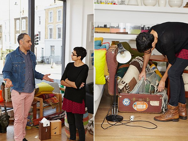 Opened in March 2011 by artist and musician Freddie Oke on his return from living out in Melbourne, the shop reflects his unique perspective on interior style; the furniture he selects speaks to him as would a piece of music. And as music plays such a huge part within my own family it's so refreshing to hear the two married in that way...particularly as I have a penchant for naming my plants after musicians! Everything here connects beautifully in a way that perhaps you thought they wouldn't; from the brightly beaded African masks and wooden skinny man statues, mid-century arm chairs and clean lined HAY DLM tables. A keen traveller, it's almost deliberate that Freddie wants the Do South experience to feel like exploring new territories. Essentially, he chooses what makes him happy and it totally works.When I'm styling on the day job I'm used to having the pressure of time, be it on a location booked by the hour or in someone's own home where they'll want it back at the end of the day, so it was a welcome change to have a little time to play with no preconceived ideas as to what my plan would be. With the four locations folded up onto little bits of paper to be drawn from a pot, I was first up. The sofa was mine.
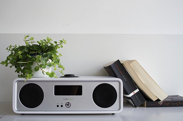
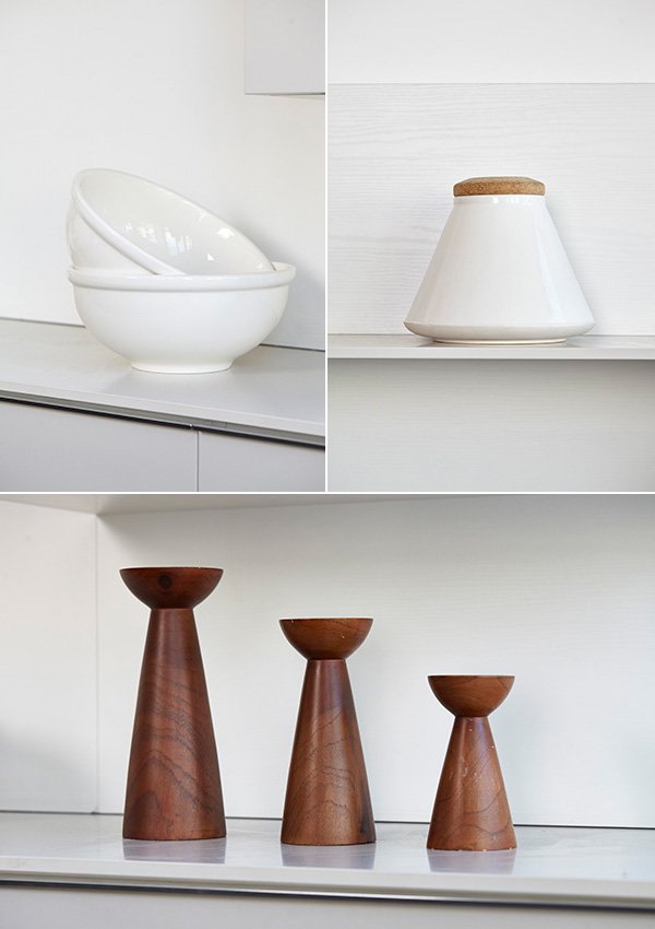
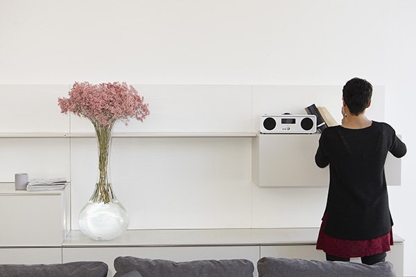
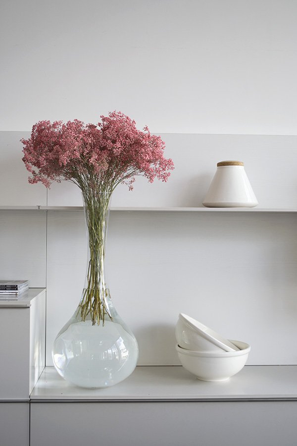
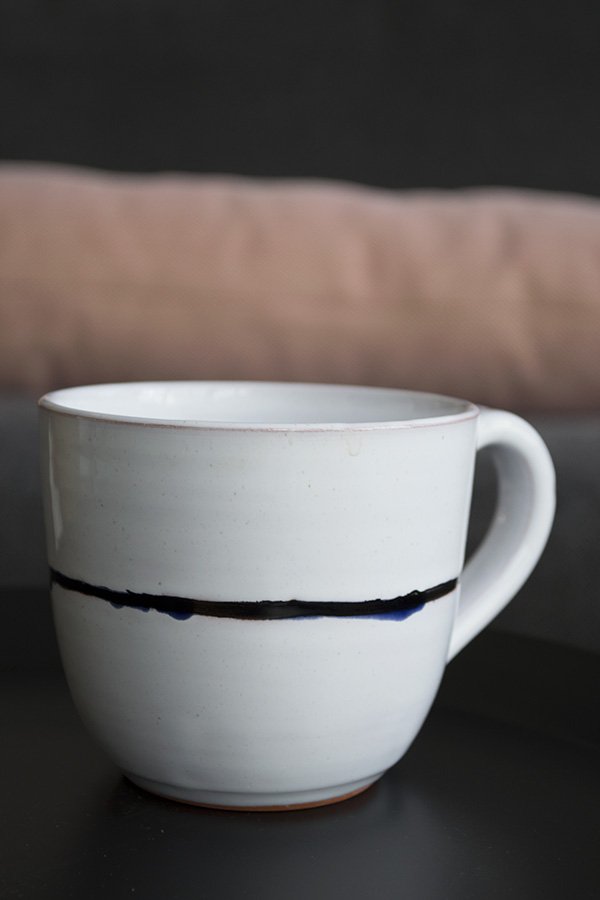 You know me by now - I like to keep things simple. The feeling of allowing a space to breathe is very important to me, so whilst it may seem tempting to want to fill out the entire shelving unit that came with my sofa setting, the real skill is in knowing when to stop. The very first piece I chose was actually the tall vase of pink gypsophila (who knew it came in that pink?!) which I then used as a subtle colour story, picking it out in the HAY dot cushions and copper candlestick holder to compliment. I liked that the wall unit could also be used to store and display tableware as well as the obligatory collection of books and magazines and loved the clean, white ceramics. Not wanting to make the space feel too stark, I added in the wooden candle trio and tall vintage floor lamp to warm it up. Now if I could just lift the whole set-up out and into my place I would be happy. So happy.
 And here is my finished shot, beautifully captured by interiors photographer Kristy Noble. What do you think?
 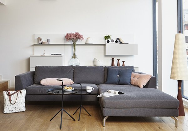 Corner sofa, OSCAR | Coffee tables, HAY DLM | Dot cushions, HAY | Vintage Candle Trio | Radio, Ruark R2i
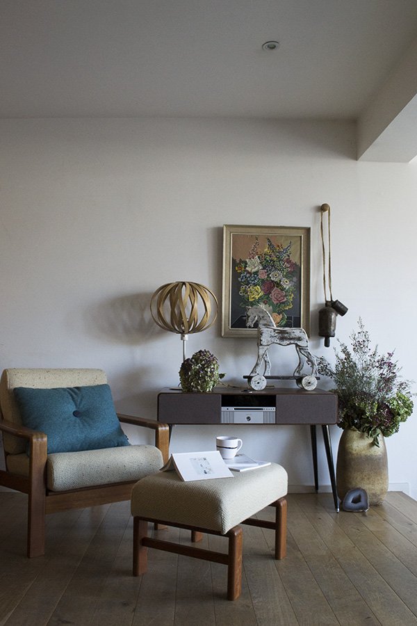 Sarah-Louise created a space, starting with the Ruark R7 sound system, which was just so completely 'her'. As an avid collector of chairs it was a no-brainer that she'd choose that beautiful oatmeal armchair and footstool. I love the depth of colour she's woven in, from the teal Dot cushion and two-tone hydrandeas in the urn, pulling your eye up to the vintage painting on the wall. Looks like a dreamy slow Sunday, don't you think?
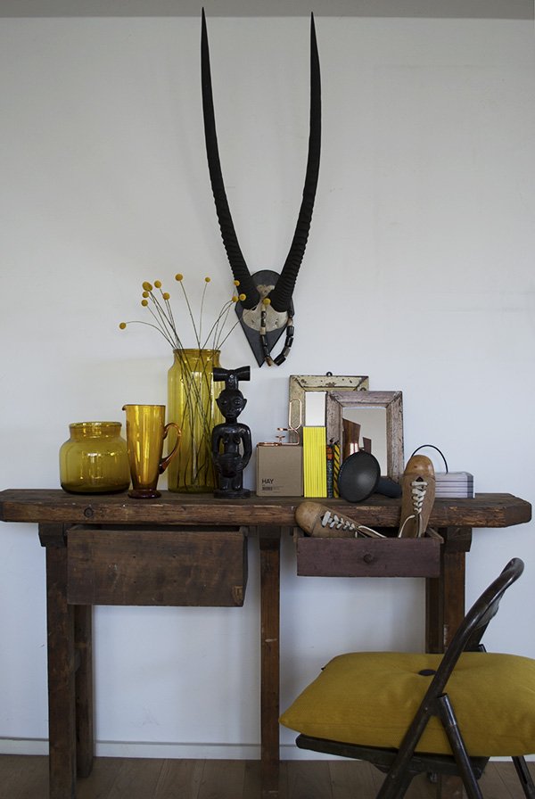 Annie shares an aesthetic much like mine in that she doesn't really go for colour in a big way, so she surprised us all when she pulled this mustard yellow scheme out of the bag with the console table as her jumping off point. The touches of black in the statue and antelope horns still give the look a contemporary edge and I love how she used a pair of vintage shoes to make it look lived in.
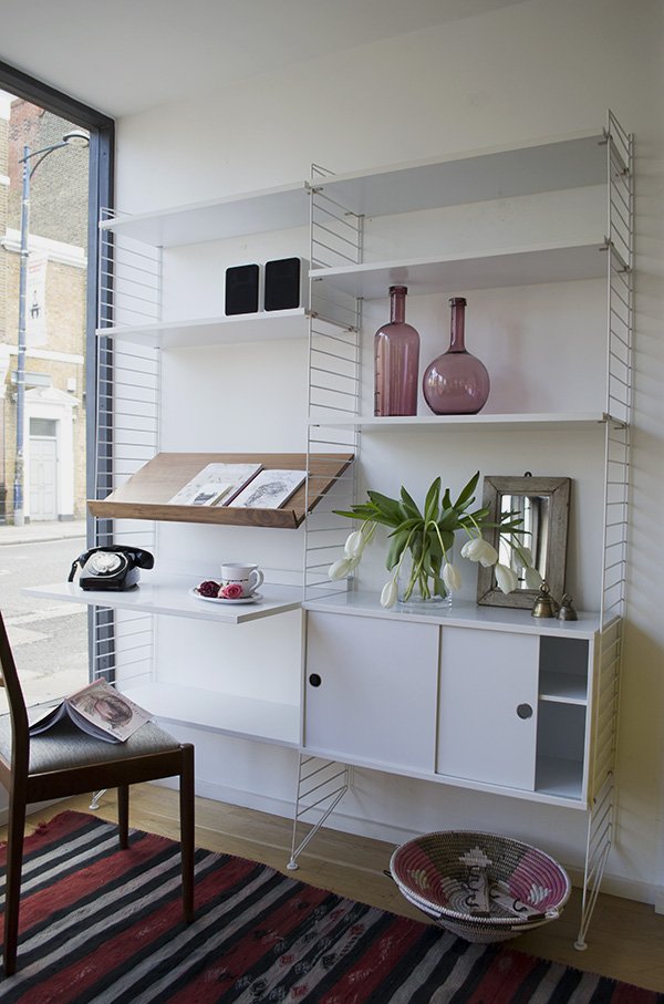 Cate St Hill chose a personal favourite of hers, the String shelving system. A Scandinavian design classic, the clean white lines provided an ideal backdrop for Cate to make it feel a little more homely. With a red, black and pink colour palette, this space is a place to work and relax and I love the characterful details in the silver bells, African baskets and mirror.
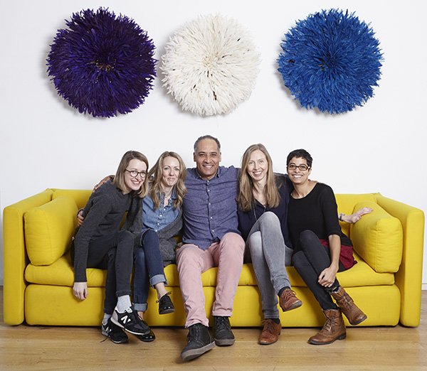 And here we all are with Freddie doing our best to "look natural". Thank you to Freddie and his team for organising such a fantastic morning for us - I look forward to seeing more from Do South very soon and urge you to make the trip and see it all for yourself too.