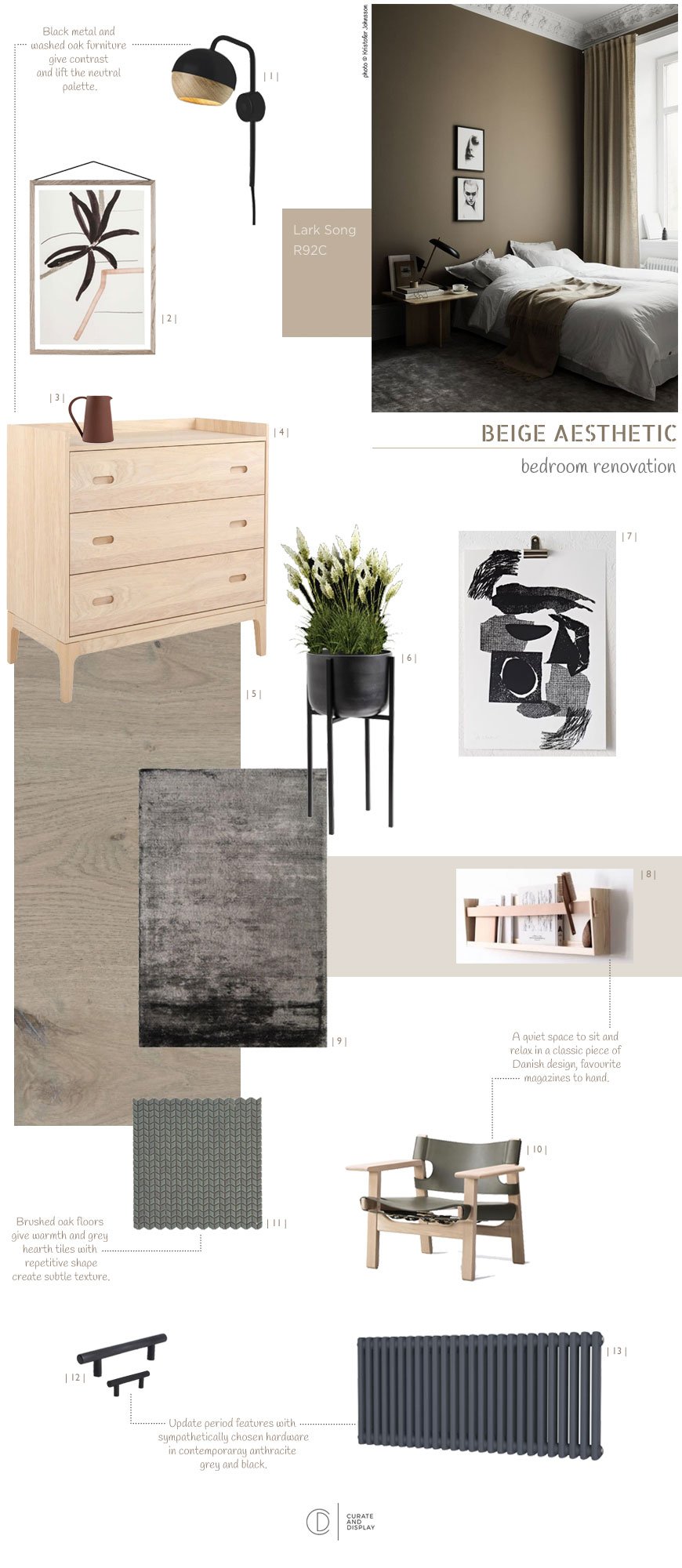
[AD] Nordic Luxe Beige Bedroom Inspiration
 [AD] This is a paid partnership in which various products have been gifted*. Neutral interiors get a really bad rap as boring and unimaginative. The thing is though, there's just as much skill that goes into making neutrals work as there is for playing with bold colour. As the renovation work draws to a close on our current project, I'm sharing my latest mood boards, talking you through the inspiration behind our Nordic luxe beige bedroom. You'll find tips and tricks on how to lift a beige scheme and turn it into anything but boring.
The Brief
We wanted the bedroom to have a design hotel feel to it. A sanctuary to escape to with a focus on high-quality, luxury materials whilst remaining faithful to the period features of the house. If there's one thing I've learnt from the many hotel stays I've experienced over the years, it's the attention to the absolute essentials that matter. It's a feel of a soft rug underfoot, well-chosen lighting and the way the room has been designed to enhance sleep and relaxation. I've also been so inspired by what the likes of Menu, Fredericia and Muuto have been doing as brands that I wanted to recreate the minimal luxe look in our room.It was important that the bedroom connected with the rest of the house so I wanted to continue the thread of high contrasting tones (in this case black and grey) with pale wood and abstract art. The room needed to be minimally styled for it to be a restful space in which to wind down.
Choosing The Right Shade
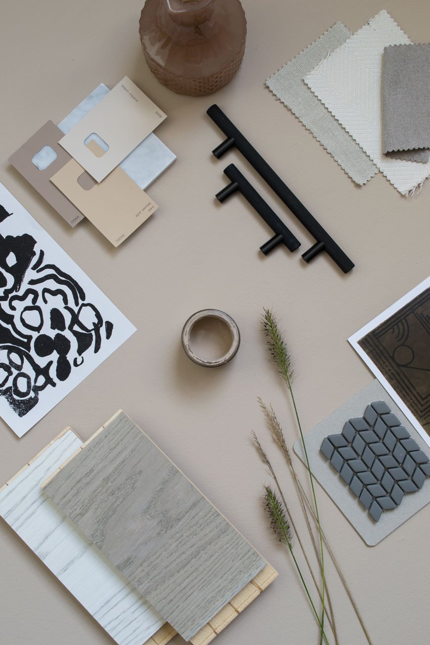
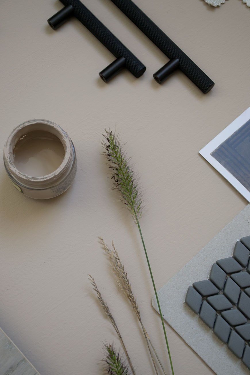
Our bedroom is north facing and the light has a cool quality to it at certain times of the day so anything with blue undertones was out of the question. If you have the same problem, choosing a colour with warm undertones of red or yellow might help.Letting go of the plaster walls was a difficult decision (and so many of you echoed those sentiments on Instagram) but it was time for a solid colour, something just as soothing but warmer. Finding the right shade of beige took some doing - I went through so many samples I almost couldn't see it anymore. And then Valspar pulled it out the bag. Hello, the aptly named 'Lark Song'. I'm hoping you can see the red undertones from the shots I took below?Having chosen the colour, I wanted to continue it into the woodwork too, using satin paint in the same shade for a subtle sheen on the skirting, doors and around the window. This will give the bedroom a contemporary update and bring out the contrast between matt and sheen.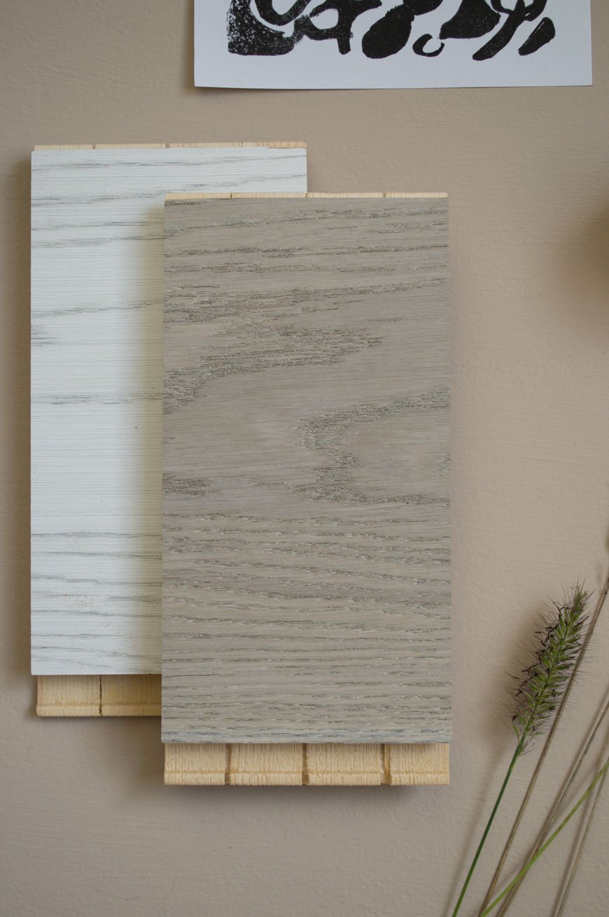
The Floor
This was the first room we've done in the house where we decided to put a new floor down. Although the original floorboards are in good condition, they make the room feel cold in the winter months and the idea of sanding and staining them filled us both with dread. Great in the kitchen, not in here. So a few months ago I spent a very easy hour at Havwoods, comparing their engineered wood flooring samples and looking for something with a washed, grey tone. I eventually arrived at Shadow Grey, a real oak design from the Karelia range which has been brushed and stained with an oil finish. These boards work on a click system and I'll be able to share the installation with you once the floor has gone down next week.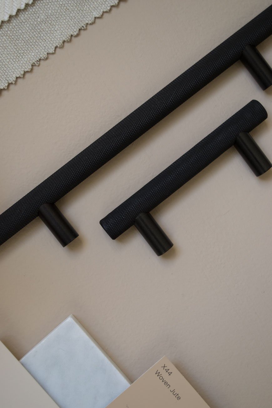
Natural Elements
I'm going to highlight the tonal relationships between the beige walls, grey floor and light oak furniture. There'll be a small reading nook in the corner where my desk used to be, with SSM's ash and leather 'Shelf90' for a collection of reads and Fredericia's 60 Years Special Edition Spanish chair. The olive green leather is to die for. I literally can't wait to pull this corner together! The mix of smooth leather, light wood and linen on the bed itself will create a harmonious feeling, to feel easy on the eye.Of course, no room in our house would feel right without some element of planting, so I'll be using a mix of dried and potted grasses to style with. I'm obsessed with grasses and have been growing several varieties in our garden the past year.
High Contrast and Tactile Finishes
It's so easy to make a beige bedroom scheme feel flat if you ignore the contrasting elements. I'm talking about the darker shades that give it depth. In the kitchen I used dark blue and black with white, in here I'm continuing the black. I've picked out knurled, black metal cupboard door handles which echo the style of the ones we used in the kids' room. Against the beige doors, they'll ready pop. We'll also be tiling the hearth plate in a matt glass mosaic design which gives a level of tactility without the need for colour. The grey in the tiles will pick up against the anthracite grey column radiator which we've chosen to compliment the age of the house.A deep pile rug in Graphite draws on the design hotel feel we wanted and abstract art continues the thread from the sunroom and kitchen. Remember, texture is key. Whether it's polished marble or metal, sheepskin or woven fabrics. Mix up the texture and you'll add depth and interest to a neutral design scheme.We're so nearly there now. The next couple of weeks is going to be a mad dash to the finish line but it'll be worth the wait to show you the transformation!