Minimal Spring Style with Georg Jensen's Bloom Botanica Collection
[Advertisement - this Bloom Botanica feature is a paid partnership in collaboration with Georg Jensen].
I took these shots of Georg Jensen's Bloom Botanica collection before this seismic shift in our lives occurred. The idea that I could drive out to my favourite florist, The Floral Madam in Faversham, and come home with a wrap of delicate spring blooms now seems a total luxury.
I think about how fortunate we are to have the internet in these times, to stay connected, support each other and feel inspired and hopeful. And though it may be difficult to pick up a simple bunch of flowers now, it is just as important to have something beautiful to look while we're safe at home.
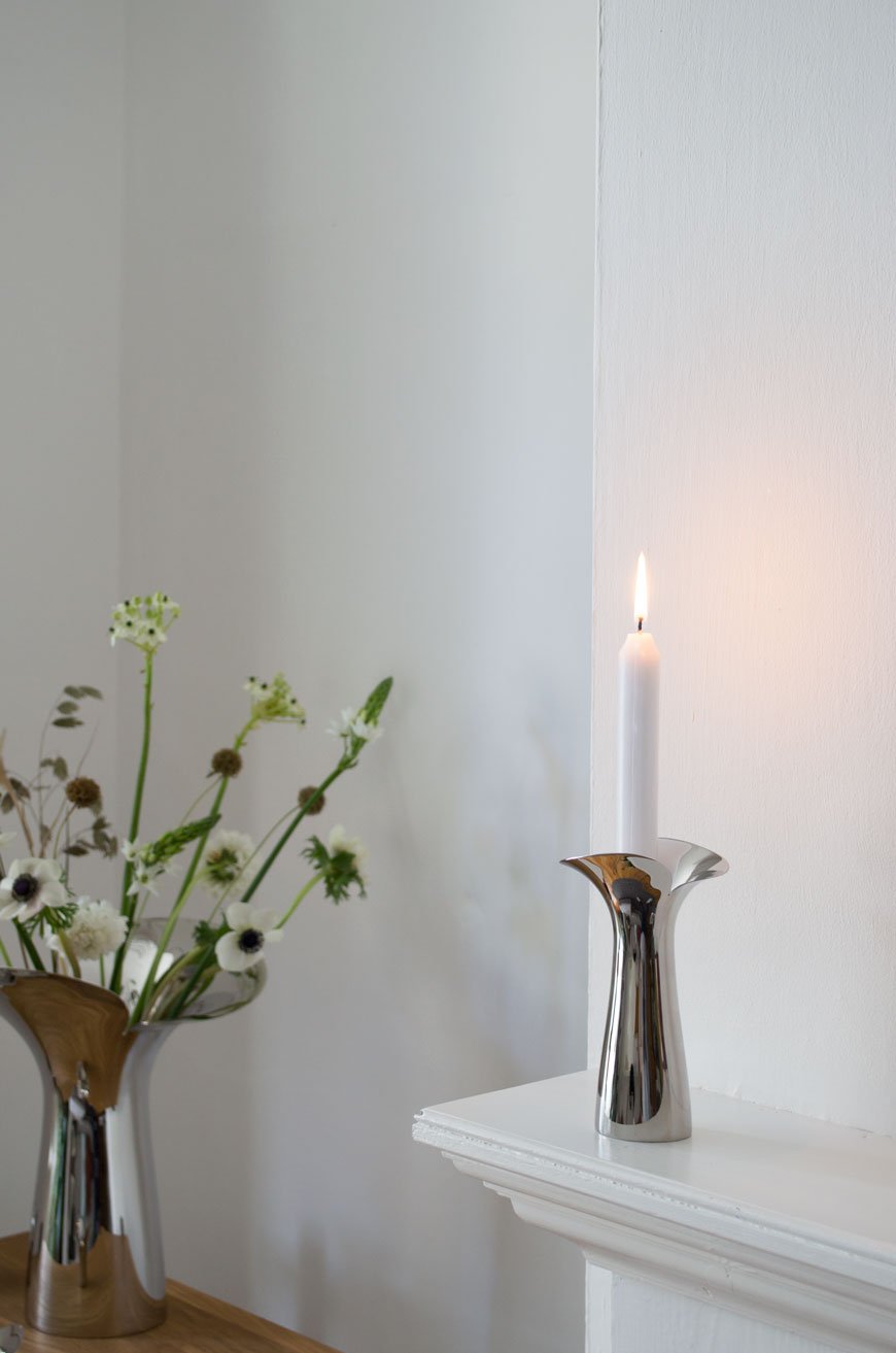
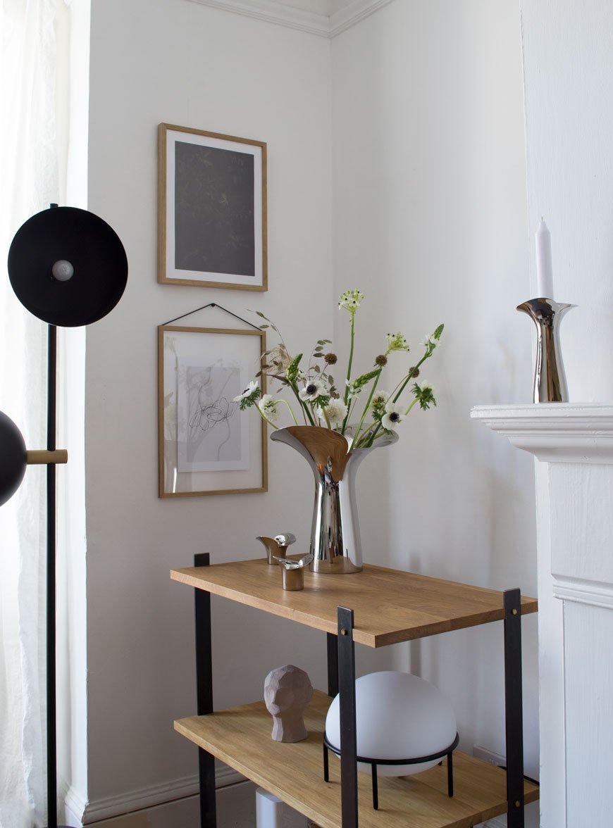
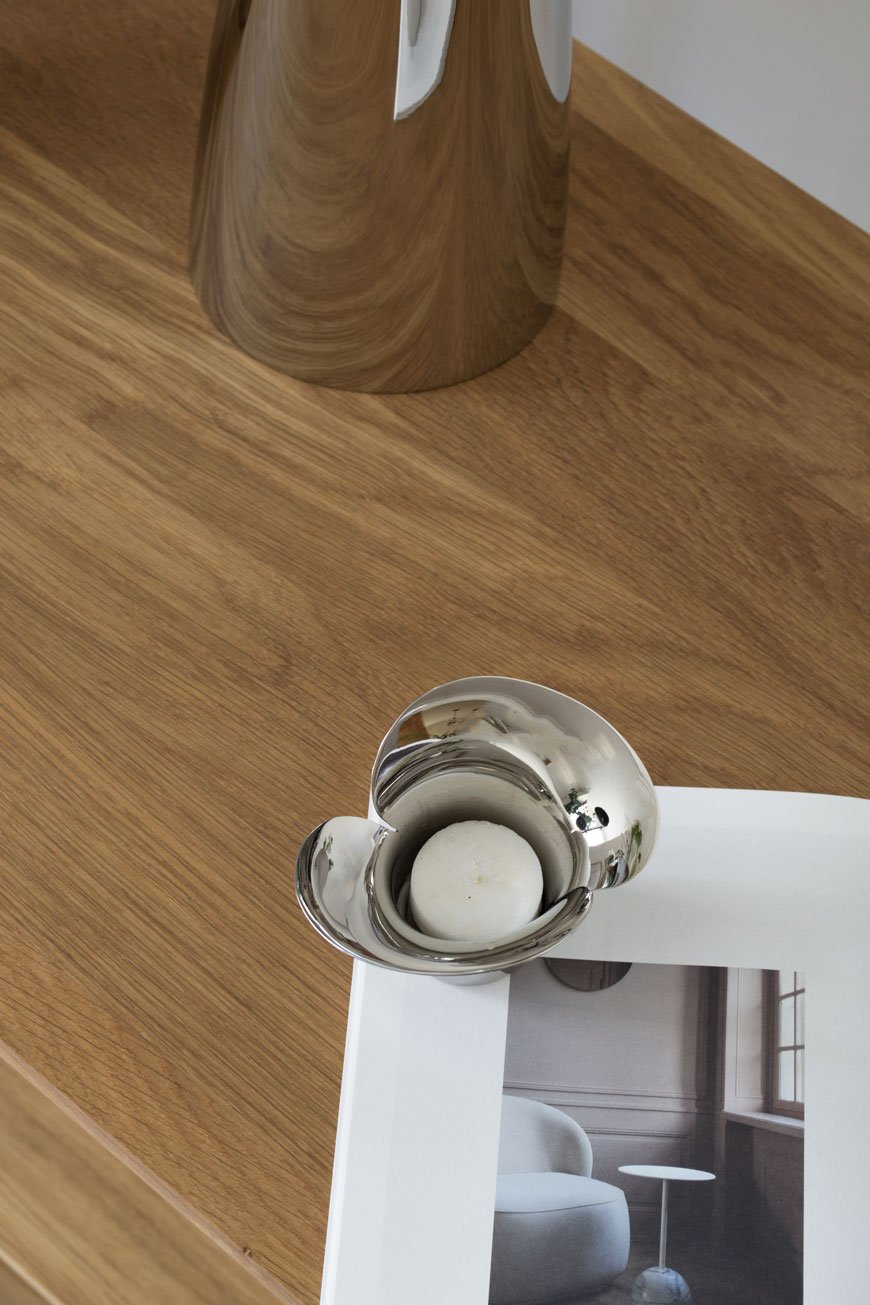
This spring, Georg Jensen launched Bloom Botanica in celebration of the 20th anniversary of its award-winning Bloom collection (it earned itself a place at MOMA). The new iteration designed by Helle Damkjær is an extension of vases and candle holders to complement the original tableware.

Known for her sculptural, organic approach to contemporary shapes, the collection is influenced by the optimism of spring. Fluid edges of polished stainless steel represent unfurling petals, mimicking a flower in bud opening for the first time.
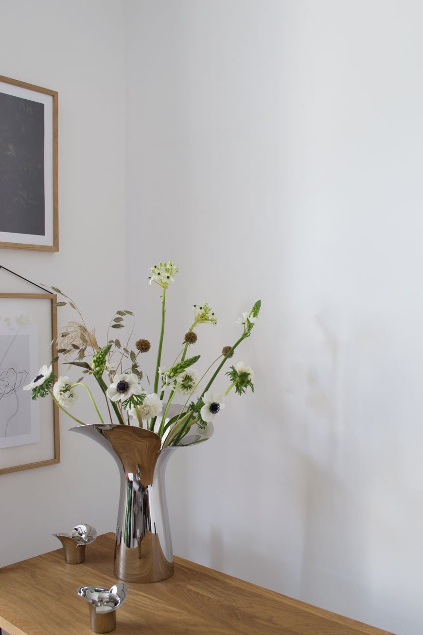
I could only choose my absolute favourite white spring flowers to accompany such a poetic piece. Aren't they beautiful? Elegant stems of white Anemone and Scabiosa sit with tall candle-like Ornithogalum. I added textural tufts of Calamagrostis from my own garden, with quaking grass and Scabiosa Stellata.
And the results are quiet and calming in my living room. This is the kind of collection that doesn't need to be styled with flowers to earn its keep as stand-alone sculptural art. That a hard and industrial material as stainless steel can be made to appear soft and tactile can only be a result of the way Damkjæer moulds her designs first with clay.

The Bloom Botanica Collection
Vases come in small, medium and large priced at £60, £100 and £160 respectively.
Set of two candleholders, £120.
Set two of tealight candleholders, £60.

If you love this post, you might like to explore more from the Georg Jensen collection in my home.
Photography and styling by Tiffany Grant-Riley.
How To Research The History of Your House From Home
If you're looking for a project to immerse yourself in whilst staying safe at home, you might want to look into how to research the history of your house. It's a great way to feel more connected to it, a part of its story. If you've ever wondered when that extension was added on at the back or who left that newspaper from 1952 in your loft, now's the time to get digging!
Of course, the real draw is in discovering the stories of the people who lived in your house before you. One of the things I loved doing purely for myself last year was falling down a rabbit hole of (entirely legal) historical espionage. As a self-confessed social history nut, it gave me immense satisfaction to peel back 116 years of our home's past.
When we first got the documents to the house, all that was included was the original title deeds, documenting the sale of the land to a local builder from the previous owner who was, at the time, the first Mayor of Chatham, a Mr George Winch. Nothing more. By comparison, my next-door neighbour has the name of every single previous owner from the time theirs was built.
Beyond that, there were so many questions - who were 'A' and 'M', who repeatedly scratched their initials into the brickwork around our front door and bedroom floorboards? Was the back of the house original? Has the layout changed at all? Some of the things I discovered were surprising, some of them deeply sad and perhaps one day I'll share them here.
For now, though, here's how you can start your journey and unlock your house's history online...

Dig Out Your Title Deeds
I was fully expecting copies of beautifully handwritten and typed paperwork going back all the way to 1904 when we bought our home. But no. Frustratingly, it isn't a legal requirement to have historical documentation of all the deeds to your house on file. Generally, what's important is the very first transaction and beyond that, other copies and documents kept by previous owners may be lost.
If you only have the original title deeds, they'll tell you the names of the first and subsequent owner was which will give you what you need to research them further.
Study Any Architectural Features
Whilst you might not be able to pinpoint an exact period of time, are there any architectural clues that can help to date your house? Ours was listed as 1930s by a very unexperienced estate agent, given that the square bay window and original front door and sash windows were clearly early Edwardian. They obviously didn't see me coming.
Find Local Historical Societies
Local history groups are a brilliant way to gather a broader view of your area's social history. As are Facebook groups. They'll be able to tell you all about local industries, the general day to day lives of residents and some members may even have personal memories of your street.
How To Research Previous Residents
Check Census Records
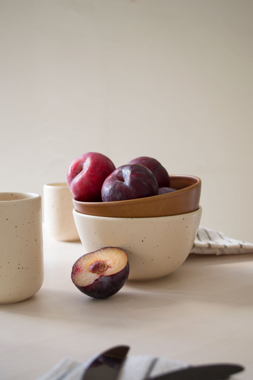
Census records are a brilliant snapshot into the lives of previous residents as they detail every family member in the household, from their full name to age and occupation. My searches revealed a husband and wife with two daughters were the first to live in the house after it was built. The father worked as a carpenter at the Chatham Dockyard, his eldest daughter was a school teacher at aged 16 and his youngest was an apprentice draper.
Current UK records are available up to 1911 and go back every ten years up to 1841.
As census records are only released 100 years from when they were first taken, meaning records for 1921 won't be available until 2022.
Note - there were no census records during WW2.
Electoral Registers
If you come unstuck with the census, it's worth trying electoral registers which began in 1832. These detail anyone of voting age within the property. Over time, you can track the movements of residents who come and go, building a bigger picture of the story of your house.
Births, Marriages and Deaths
Once you have a few names to go on with, you can look at birth, marriage and death records.
Most genealogy sites allow you to search a few years around a date if you're unsure of the exact one and using the person's full name (maybe with a few variations) should uncover documents you can view online. Further investigation will kick up all sorts, like the name of a spouse, subsequent children, occupations and deaths in the family. Eventually, you should have enough to sketch out a rough family tree.
Documents You Can Access After Lockdown.
Some things just can't be found online as you'll need to go in person to view them. When it comes to genealogy, nothing beats the excitement of a trip to the local archives. Your local archives will have a variety of documents and newspapers on microfiche film to view and purchase copies of.
Ordnance survey maps - ask permission from your local council or archives for copies of maps of your street and the surrounding wider area over a period of time. You'll be able to visualise exactly how your area has developed and spot when your property started to appear on maps.
Local newspapers - in some cases, members of your household may have been reported in local papers. If they have any records pertaining to court orders, debts or were prominent in their community, it's worth spending a few hours viewing copies of newspapers which have been copied onto microfiche film.
Original photographs - these are a fantastic window into the past. Your local archives may have images taken from your neighbourhood which will piece together how it looked at the time your house was built up to the present day. These are generally quite rare though, so don't set your hopes too high.
Building plans and submissions - ask your archives centre if they can search for blueprints and building applications attached to your address. In some cases, there may be originals that you can view in person that illustrate how the house was built along with materials used. Additional applications will also help you piece together how the house evolved over the years.
Useful Resources:
Photography © Tiffany Grant-Riley.
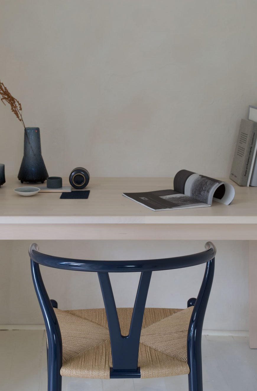
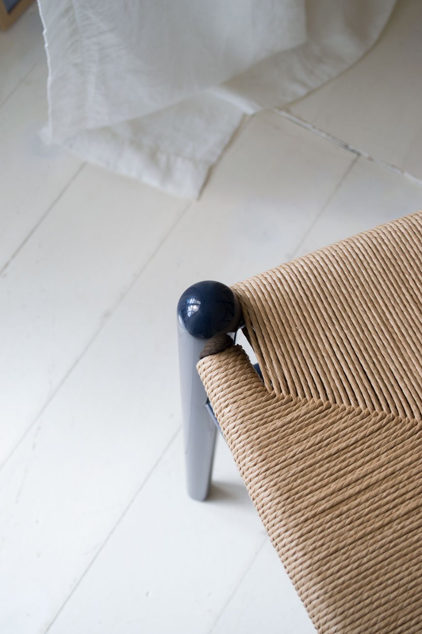
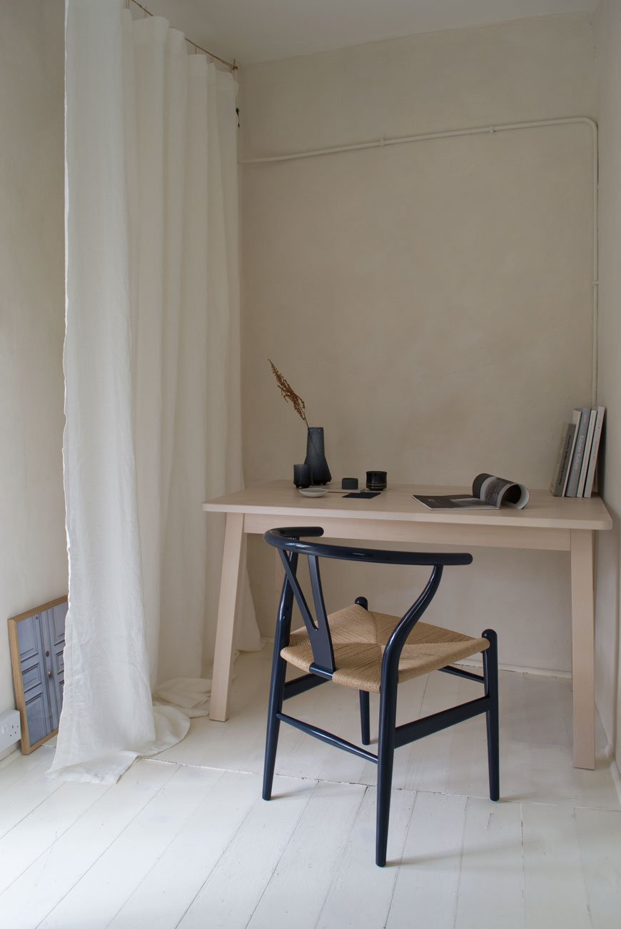
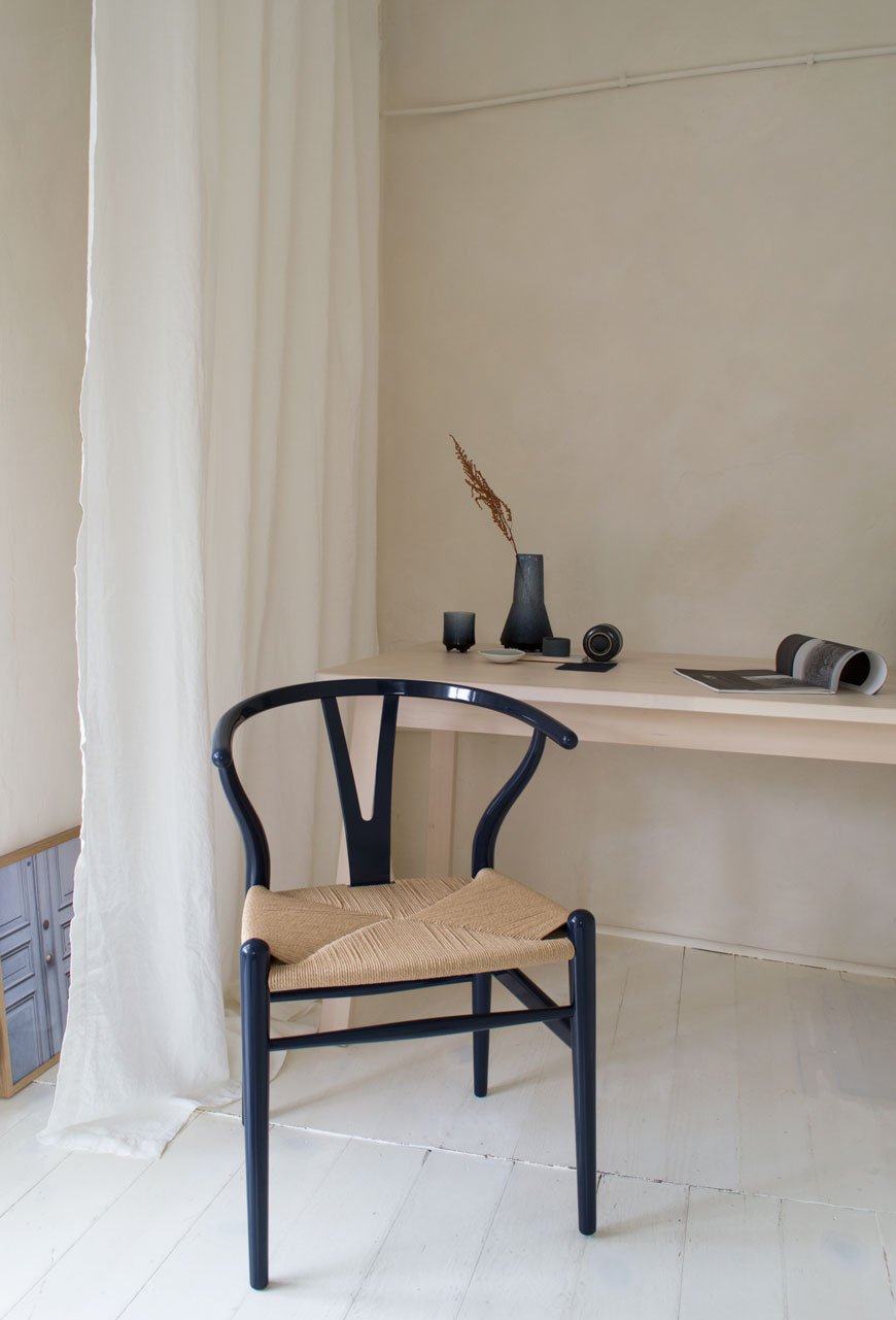
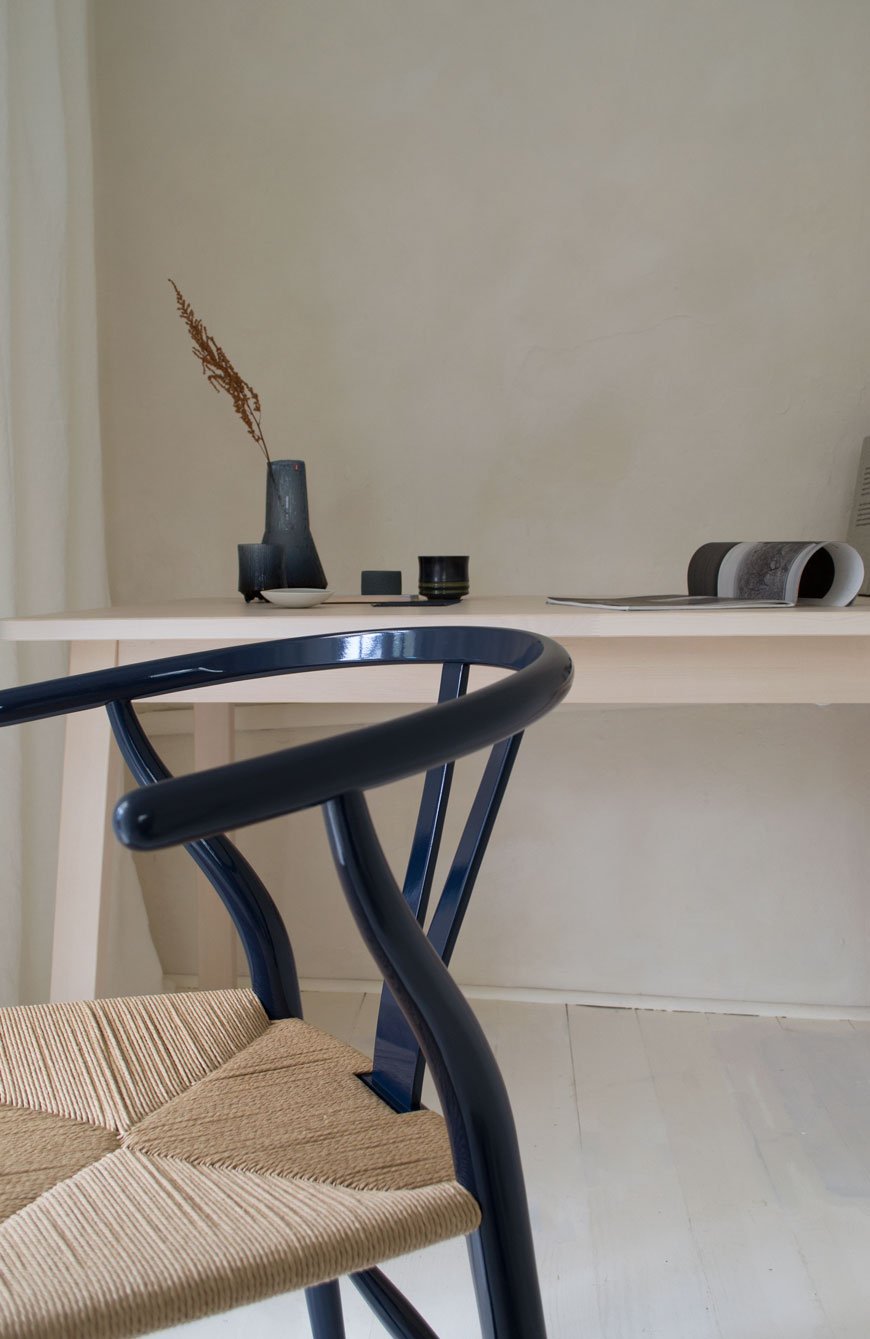
[AD] CH24 Wishbone Chair in 2020 Limited Edition Navy Blue
[Advertisement - this is a paid partnership with Carl Hansen & Søn]
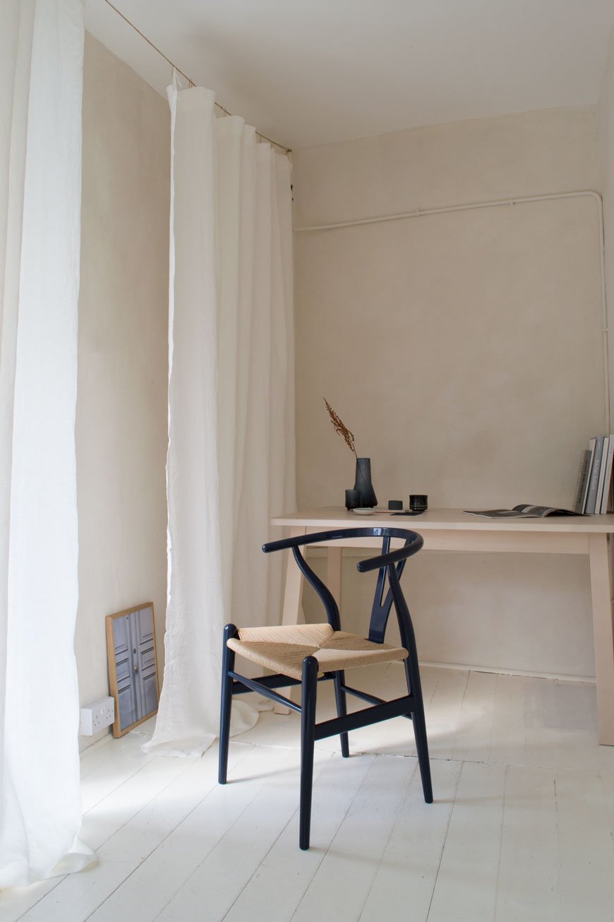
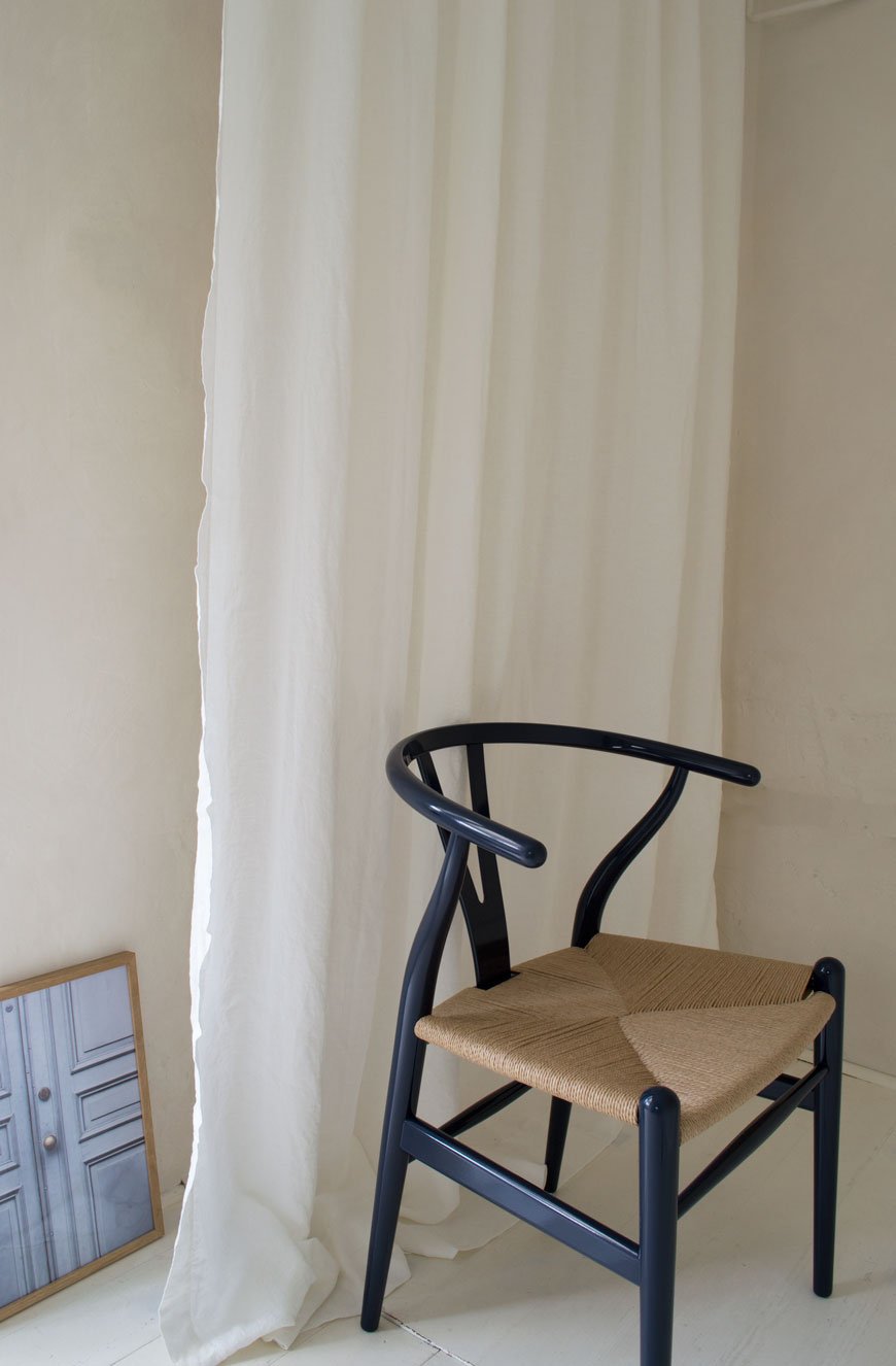
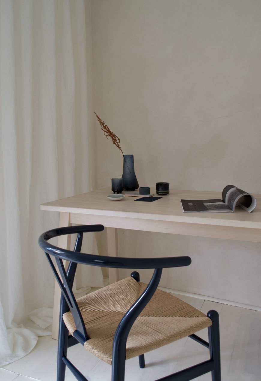
Without realising, blue has slowly become a key colour in our home - I find it so soothing and meditative to be around. So when I saw that the newest edition of the CH24 Wishbone chair was to have a navy blue update, I couldn't imagine a more perfect colour for one of Scandinavia's best-loved designs.
Originally designed by Hans J. Wegner in 1949 for Carl Hansen & Søn, the CH24 Wishbone chair has been in constant production since 1950. A universal favourite, chances are you'll recognise its iconic shape even if you don't know it by name. As one out of nearly 500 creations over Wegner's lifetime, its distinctly recognisable 'wishbone' shaped back has become a hallmark example of Danish modernist design. I adore it.
On the 106th anniversary of the Wegner's birth, as they do every year, Carl Hansen & Søn have released another birthday edition.
For 2020, my design heroine Ilse Crawford and her London-based practice StudioIlse were given the honour of the collaboration. The result is a high gloss navy blue lacquer frame with its traditional woven paper cord seat, drawing on Wegner's long time fascination with Asian craft and culture.
"The blue refers to the color, which has been so much a part of Chinese culture: from the blue and white china that obsessed the world for so many centuries, to the dark blue of indigo textiles, while the high gloss finish references the traditional Chinese lacquer finish."
Ilse Crawford, StudioIlse
The Wishbone chair stands as a symbol of Wegner's respect for the purity of wood and its simplistic nature. I love the contrast between the seat, woven from 395 feet of paper cord, and its inky blue frame. It's such an expressive piece for furniture which has the ability to change its tone throughout the day depending on where in the house it sits.
And at a time where the minimal world of Nordic design is blending with Japanese cultural identity, it represents our need for comfort, craftsmanship and longevity in our homes.
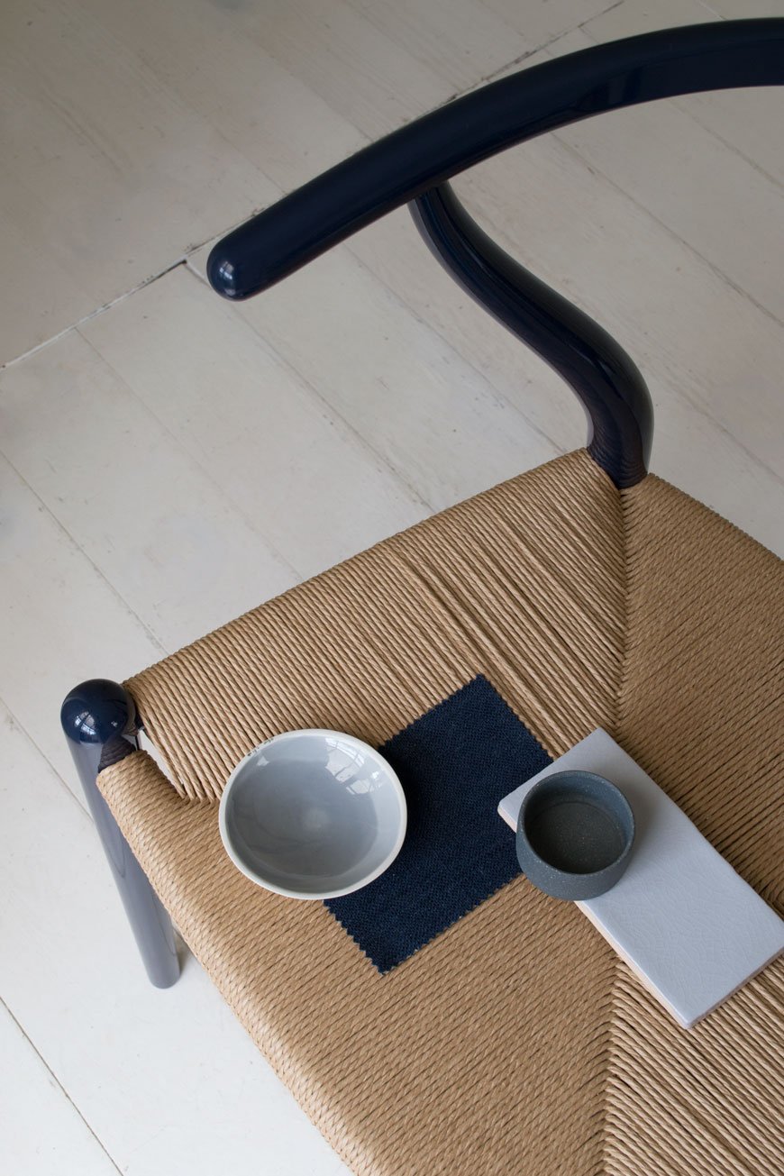
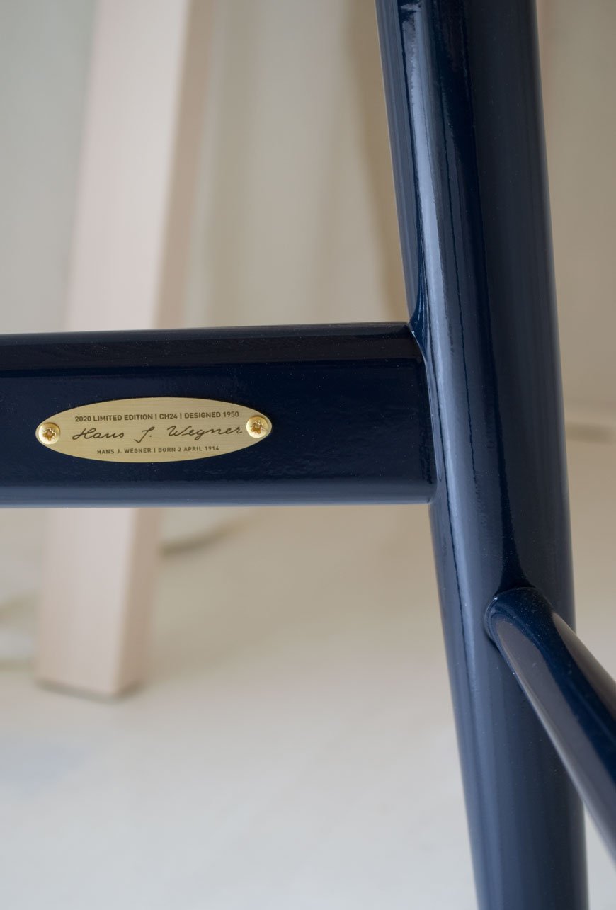
The navy blue CH24 Wishbone chair is available to purchase from 2nd to 30th of April. It and comes with a small engraved brass plate featuring Hans J. Wegner's signature and date of birth and certification of authenticity.
Photography and styling by Tiffany Grant-Riley.
[AD] Heal's Sustainable Edit Brings Spring with LSA Canopy Collection
[Advertisement - select pieces from the LSA Canopy collection have been gifted by Heal's as part of their 'Recycle Remade' campaign.]
In the last week, I've noticed the garden start to come out of hibernation. That subtle glimpse of the promise of spring. And goodness knows we are READY for it. YES! So when my good friends at Heal's asked if I'd like to style select pieces from the LSA Canopy collection as part of their 2020 Sustainable Edit, it was an easy yes.

This year more than ever, Heal's are carrying the responsibility towards caring for the environment by championing products that are produced with recycled materials. Launching their full Sustainable Edit in March, their 'Recycle Remade' homeware range features the iF Design Award 2019 winning LSA Canopy collection.
Known for their glassware LSA have designed this collection in collaboration with the Eden Project, centred around the concept of propagation and hydration. Made from 100% recycled glass and sustainable cork, Canopy has a really fine feel to it. The glass is quite thin with occasional air bubbles, adding to the wabi-sabi, recycled appeal. Featuring low and tall vases and bulb planters, self-watering planters and terrariums, Canopy encourages the use of self-sufficient gardening, perfect for bringing nature into the home.
Canopy Vase / Bulb Planter, from £18.00
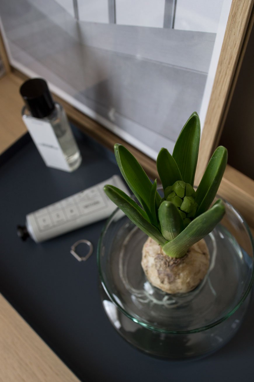
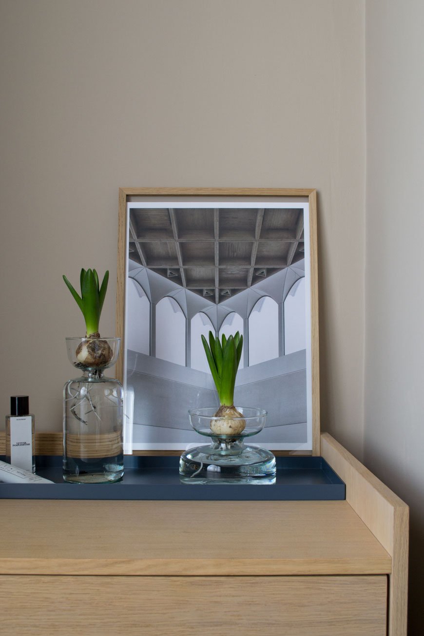
It's impossible to resist the heady fragrance of Hyacinths this time of year. I like to keep a potted cluster of bulbs in the house when I remember to pick some up from the garden centre. I've styled a couple of bulbs on our Morten chest of drawers in our bedroom (also from Heal's) which will bloom white in a few days. You can leave most of the soil around the root ball if you like but I've rinsed most of it away, threading the longers roots into the bottom of the vase.
Canopy Self-Watering Planter, from £36.00
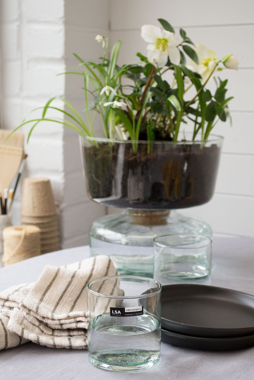
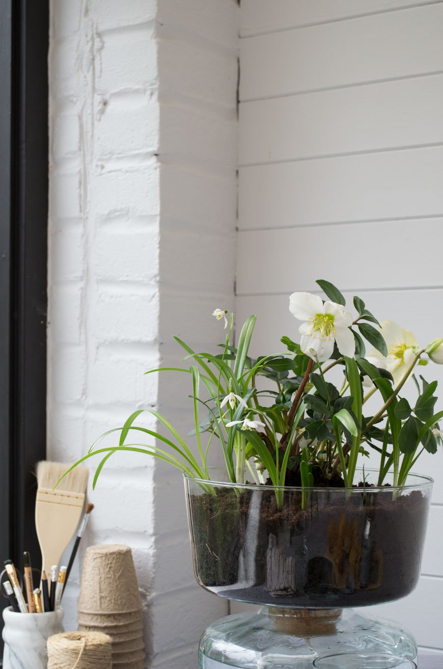
Another spring favourite of mine is the evergreen Hellebore or 'Christmas rose'. It has a long flowering period over winter, brightening up the border when other flowering plants are dormant. I've got them in the sunroom now, sitting in the self-watering planter. A clever hydration system made of two parts, a piece of rope connects the soil-filled planter on top to the water well beneath allowing the plant to draw up moisture as it needs it.
Every part of this collection has been considered, right down to the minimal packaging, made from recycled card and printed with organic vegetable ink.
Canopy Closed Garden, £40.00
Inspired by the shape of the Biomes at the Eden Project, I used the Closed Garden to create a humid space for small spider plants and maidenhair ferns. Using a thin layer of gravel for drainage, I added a layer of sphagnum moss to help retain moisture before topping it with a good layer of houseplant compost. Once I'd pruned and planted everything in, a good spritz of water before closing the lid would provide the plants with the right level of humidity, light and temperature in their final spot in the sunroom. I'm excited to see them thrive in the coming months!
Photography and Styling © Tiffany Grant-Riley.
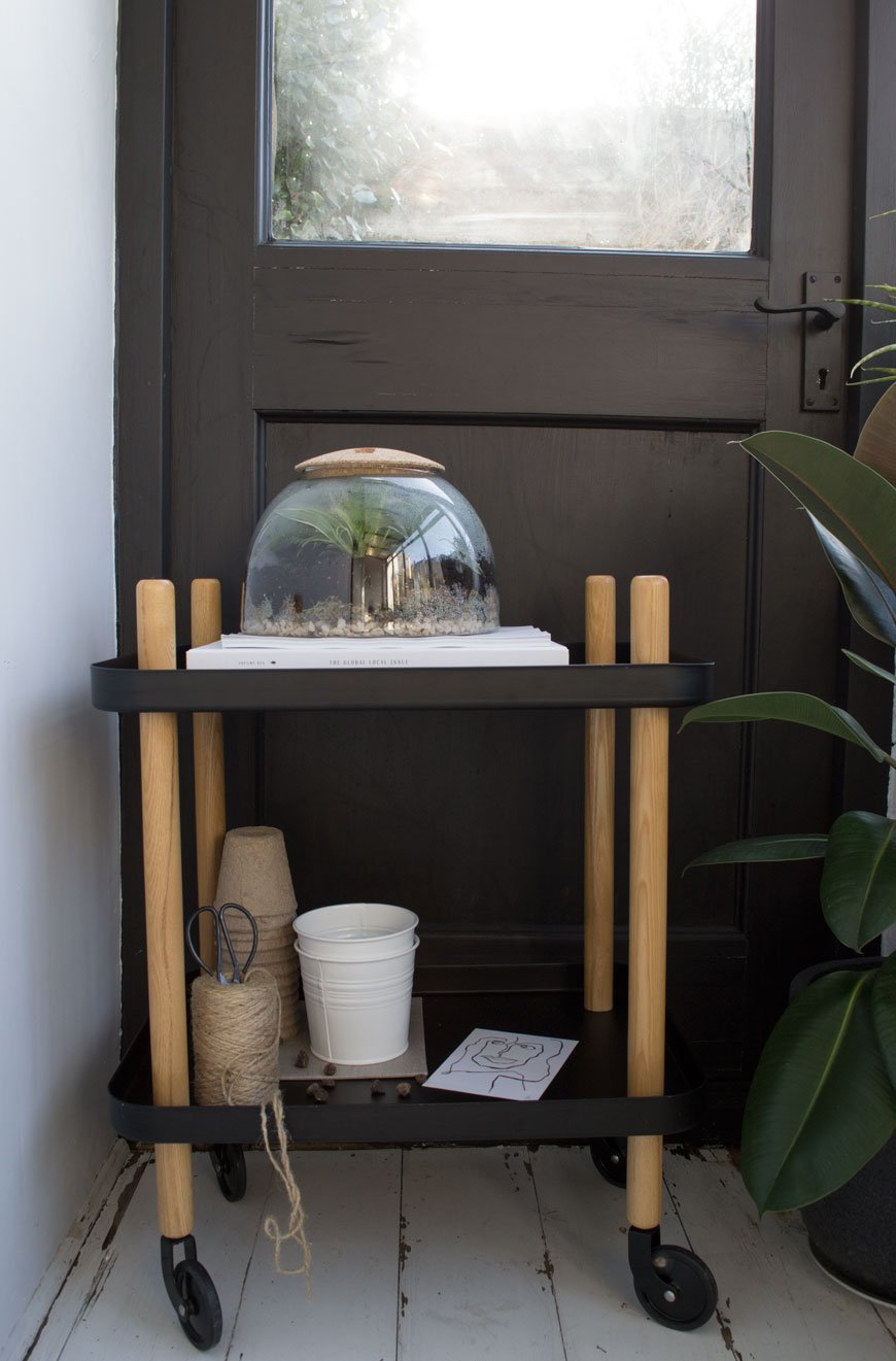
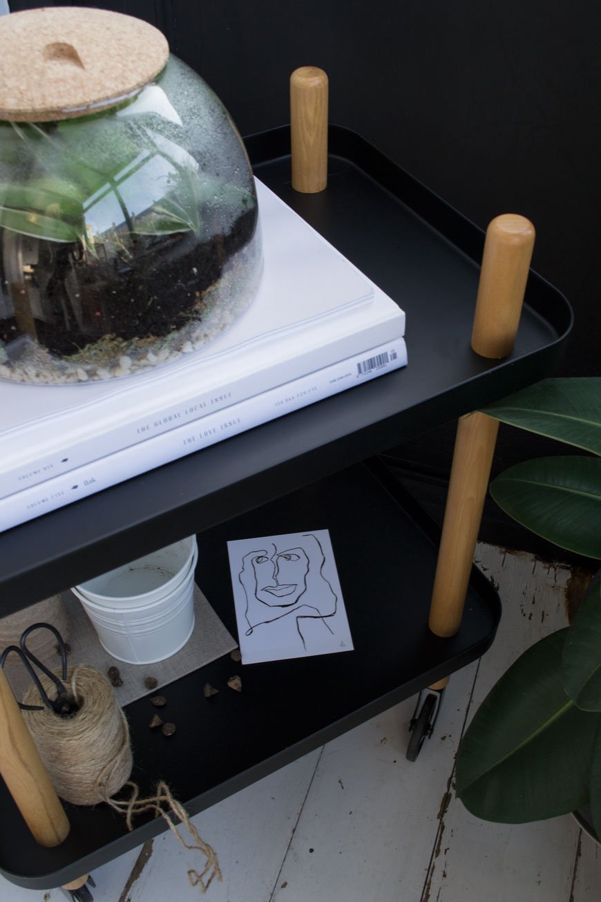
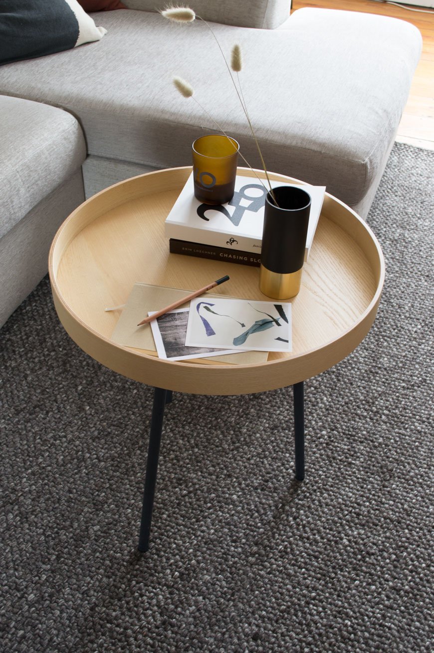
[AD] Architectural KG1 Bookshelf | Circular Design From ENKL
[Advertisement - this post includes gifted product from Enkl, Woud, Cooee Design and Massa Design Studio*, chosen by me and lovingly used in my home.]
During my visit to 3 Days of Design in Copenhagen earlier this year, I was lucky enough to meet ENKL, a new sustainable furniture brand whose DNA is built on a circular design model. Their collection of raw and functional pieces combine traditional craftsmanship with a minimal aesthetic.
Who Is ENKL and What Is Circular Design?
Based in Aarhus, ENKL was founded by Kristian Gatten and Lasse Tamberg in 2016. With backgrounds in architecture and carpentry, the friends began designing a capsule collection that would by-pass the traditional "take-make-dispose" production model, exploring ways in which materials could be utilised over and over again. You can see the architectural influences in the structure of ENKL's designs. What I love most is that all the joints, nuts and bolts are clearly visible. Honest and open design with nothing to hide. Each piece of furniture has been designed for easy disassembly so that if and when a piece reaches the end of its life, all the components can be separated, reused and recycled.
To help reduce waste and pollution, production is kept as local as possible with steel and brass elements made in Galten and Lystrup. Oak is sourced from the Czech Republic by a family-run carpentry business and finished at their studio in Denmark.
Enkl also offer to buy back their designs at 10% of the sales price in order to return their materials back into the production cycle. Over time they plan to add to their collection with designs made from the newly recycled materials. How's that for dedication?
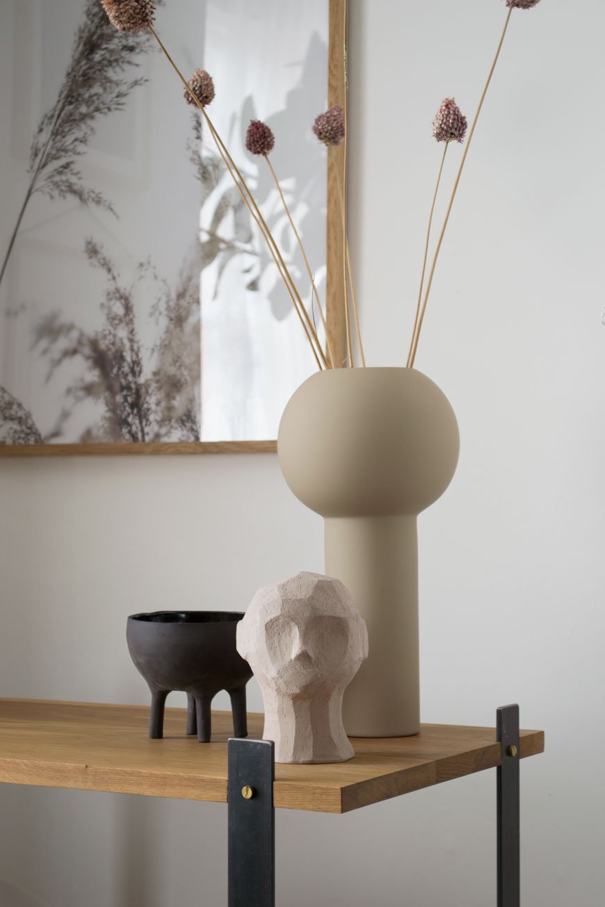
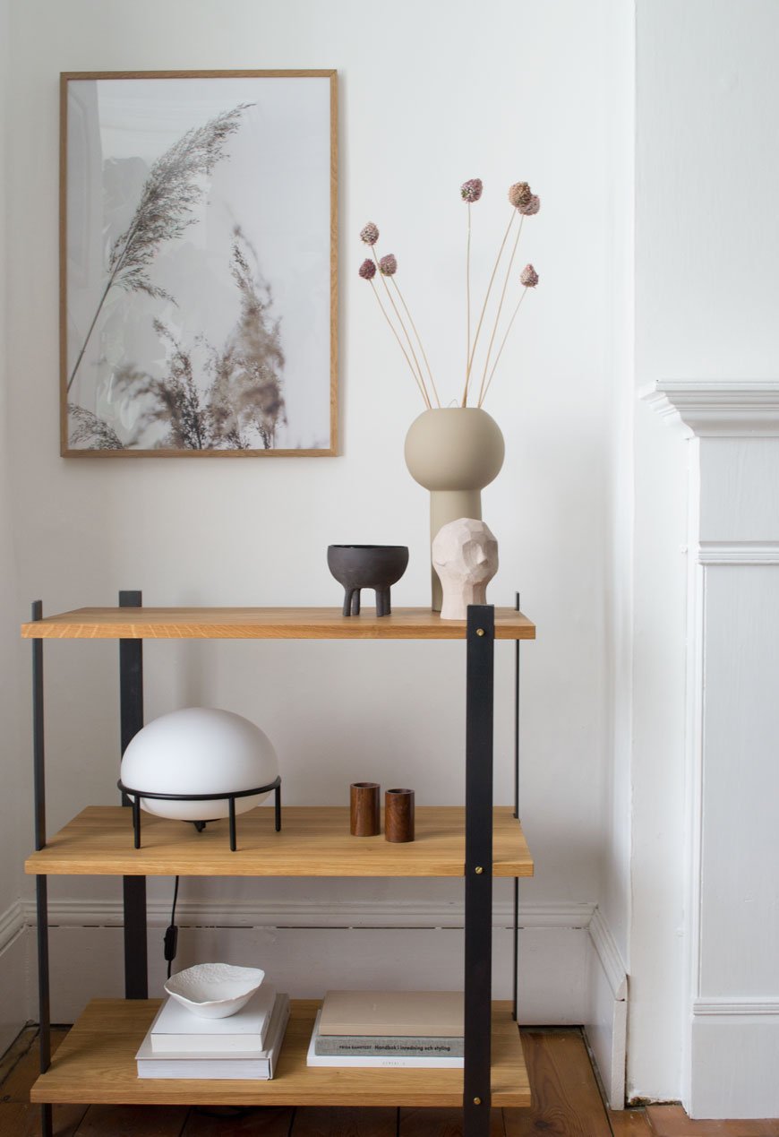
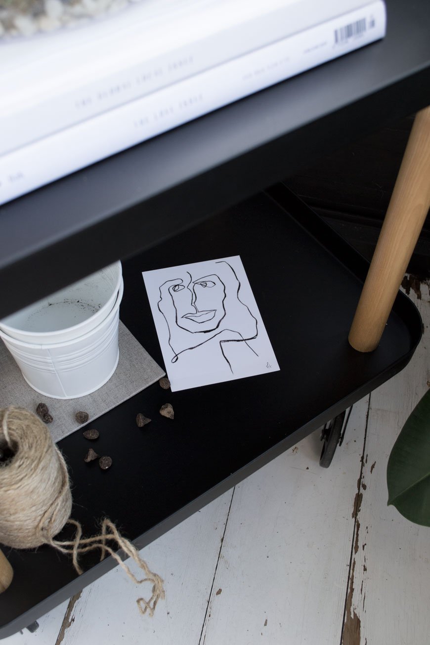
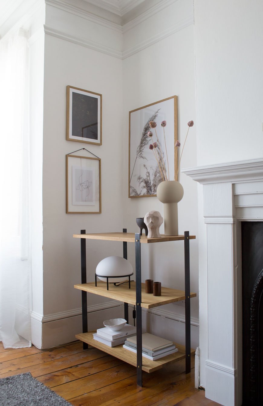
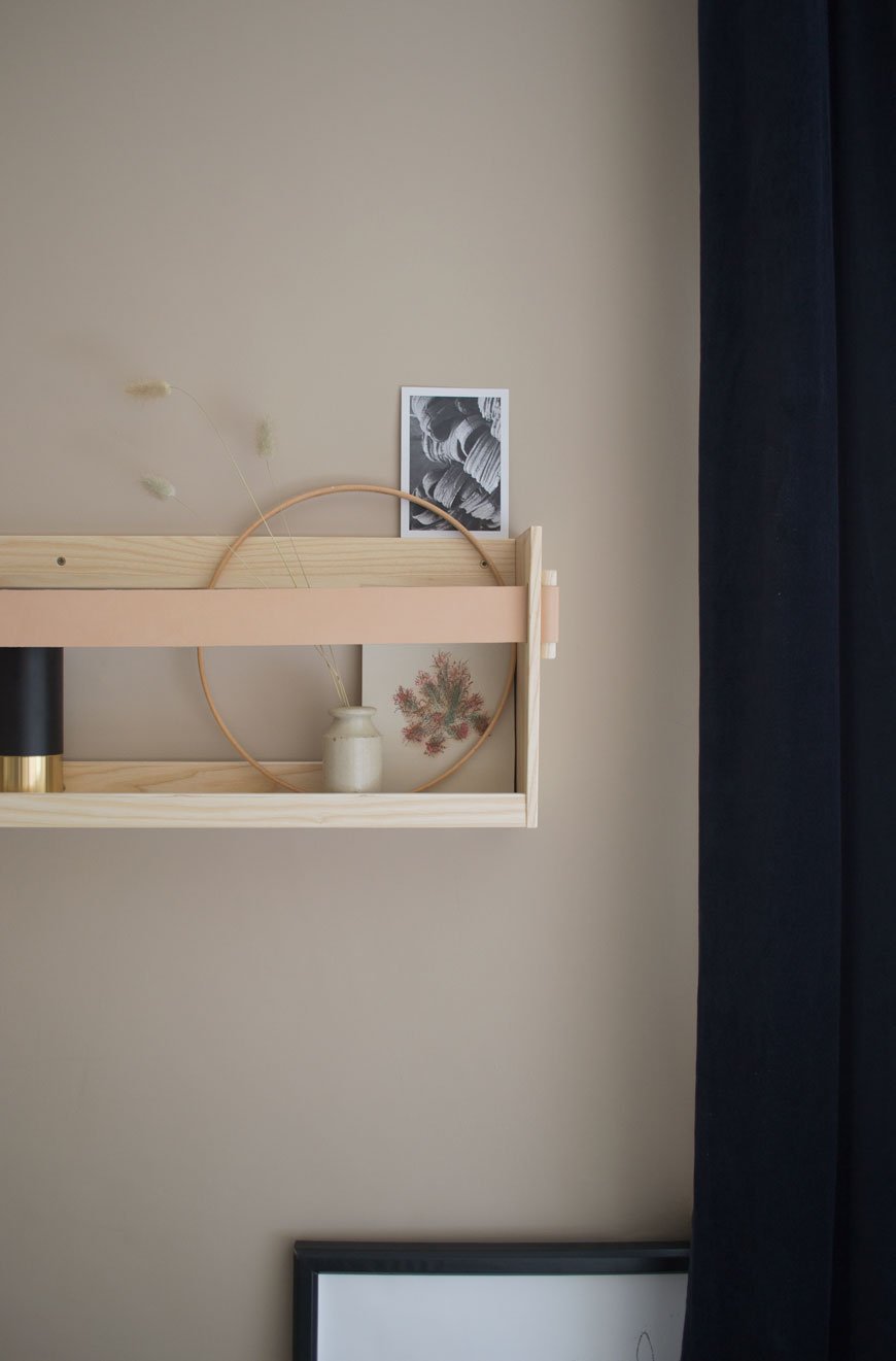
The KG1 Bookshelf
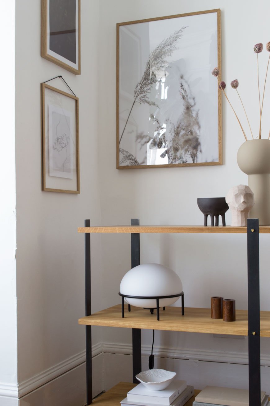
In my eyes, the real stand-out piece from the collection is the KG1 bookshelf. So much so that it now has pride of place in our living room. Although I have absolutely zero intention of recycling it, ever, its environmentally conscious, circular design was a huge plus. I want to continue to make conscious choices as to what I bring into my home and its impact on the environment, so choosing brands who share those values is important. Constructed from three solid oiled oak shelves, its held in a delicate balance with four flat steel legs. I love how its industrial appearance compliments the Edwardian features in this room.

The beauty is in the details - from the brass screws to the highly unusual beeswax finish on the steel which both intensifies the black of the metal and prevents corrosion over time. It smells wonderful up close, a mix of beeswax and linseed oil.
Styled with a few select treasures, the muted, sandy tones add warmth to this corner, elevated with a touch of black. Among them is the Olufemi sculpture from the new collaboration between artist Kristiina Haataja and Cooee Design. Haataja calls her unique approach to sculpting 'Ancient Cubism', combining ancient Greek sculpture with Post Modern Cubist form. I find it soothing to look at, the way the shadows form in the furrows of the concrete.
The little black Elephant pot was an Etsy find, all the way from Israel and made by Massa Design Studio. I love the contrast between the raw stoneware on the outside and glazed interior. See how its shape echoes the Pump lamp? Designed by Kutarq Studio for Woud, the soft light through its opal glass shade gives the impression of lifting off and levitating on its thin metal frame.


I’ve since dried the deep pink alliums that were growing happily in pots at the front of our house and they've taken on a much softer blush now. Their little bulbous heads are a sweet memory leftover from summer, bobbing around in their vase.
I'll be sharing tips on drying and styling flowers next month - I've grown loads! In the meantime, I'm off to the London Design Festival this week to see if I can't discover another design gem. Watch this space...

*Gifted items - KG1 Bookshelf, Enkl | Pump table lamp, Woud | Olufemi sculpture and Pillar vase in 'Sand', Cooee Design | Elephant pot, Massa Design Studio.
Styling and photography © Tiffany Grant-Riley.
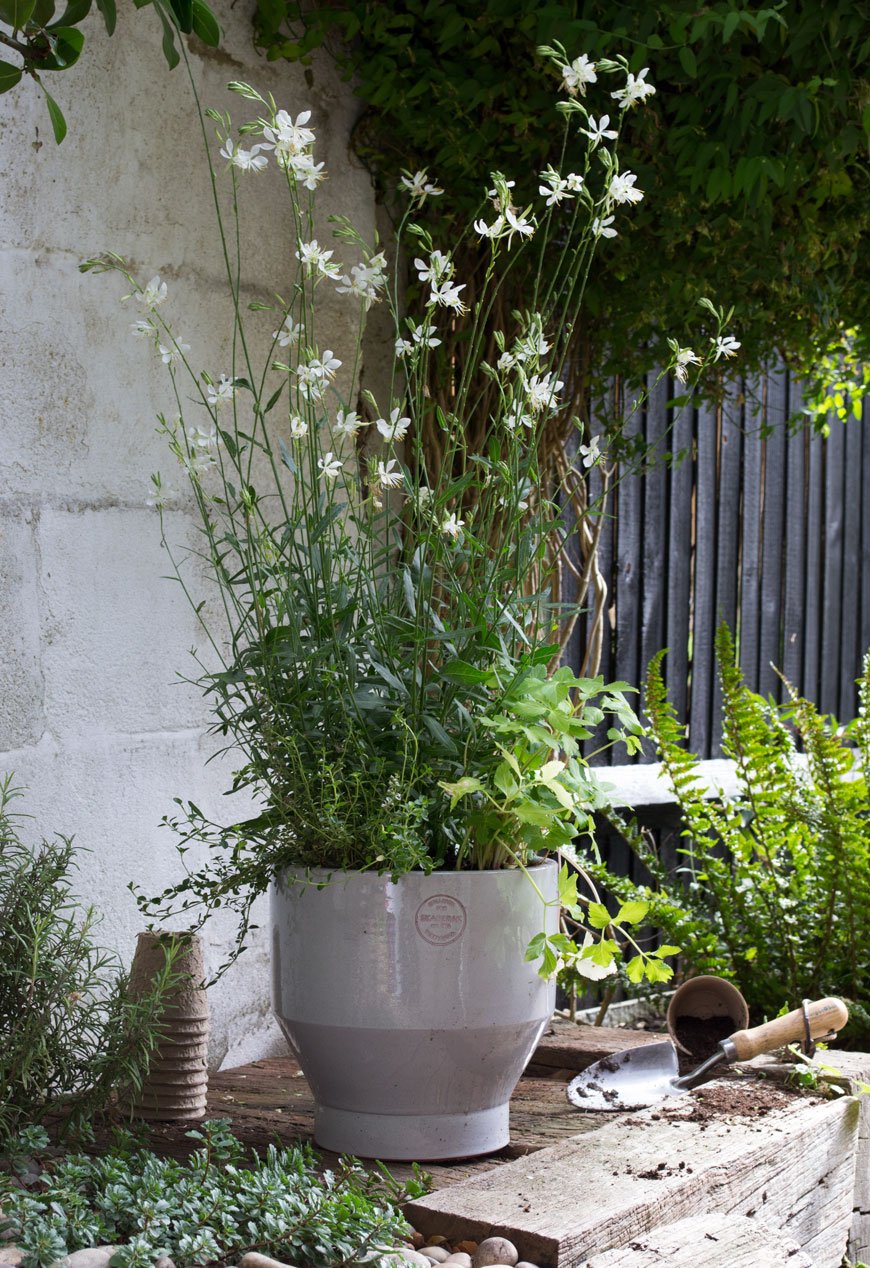
[AD] How To Make The Garden An Extension Of Your Home
*This post includes gifted product in collaboration with Skagerak Denmark.
I absolutely love this time of year, when the boundaries between our home and the garden become blurred. Even as we move away from summer now and can feel the seasons beginning to change again, the back door is always open and the garden feels more like a cosy outdoor living space.
As a sort of final salute to the balmy summer months, I'm sharing what I've learned so far about making the garden feel like an extension of your home. It's simple, easy things that can be applied to any space no matter the size or orientation.

Connect The Boundaries
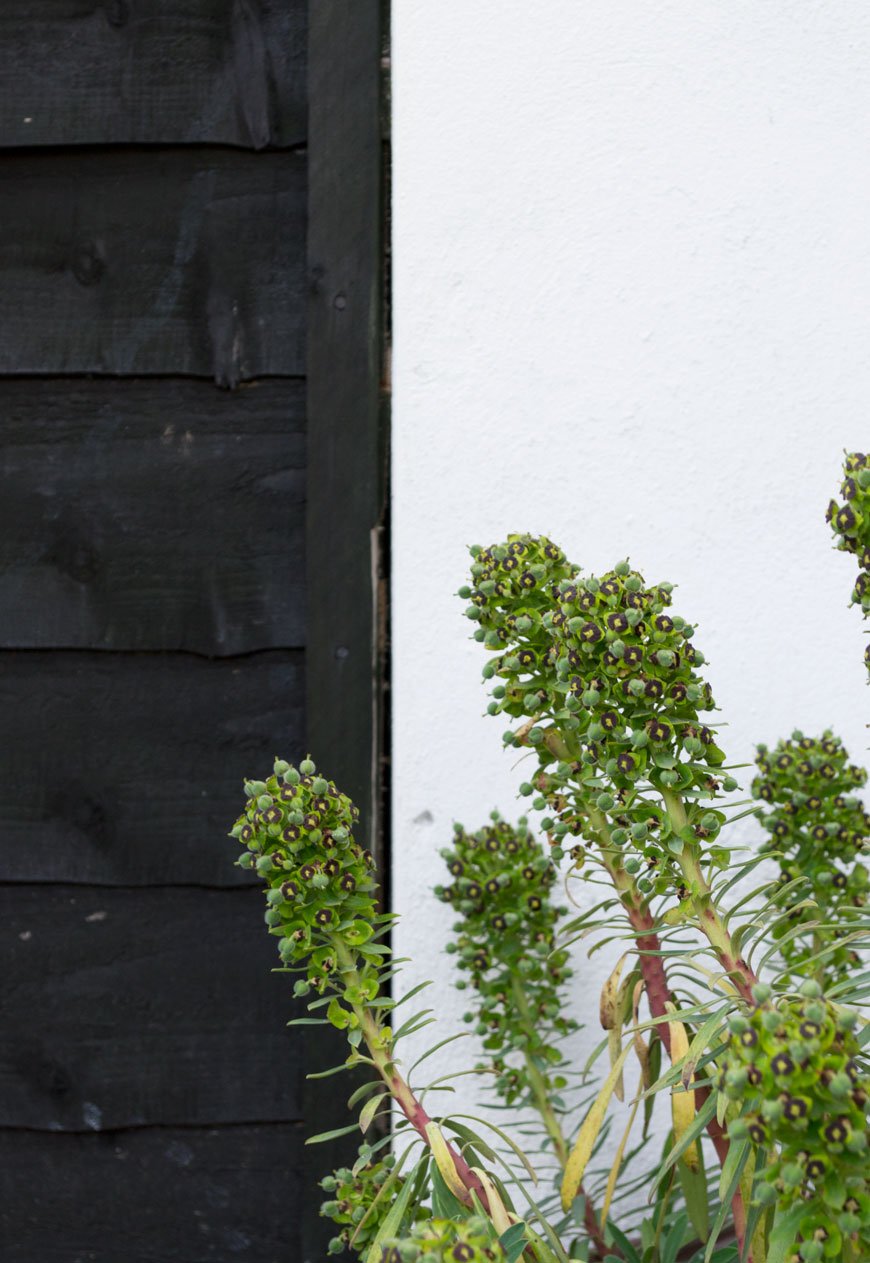
Start with the garden in the same way you would the inside of your home and look at the bare bones. Before you think about plants, consider refreshing the surrounding boundaries, be it wood or metal fencing, brick or concrete walls. Replace any tatty areas if you can. Decide if you want to make an architectural feature of that wall or if you want to tone down the appearance of your fencing.
I'm a huge advocate of the transformative qualities of paint and I personally think black, an anthracite grey or a soft white work wonders as a way to zone and define your garden. You'll see I've carried the black through from the sunroom windows into the garden this way (I used Ronseal Duck's Back in Black). Although at first it might look dominating, black is actually brilliant for making boring fencing look less imposing. Once you add in planting, they'll slowly blend in.
Repeat Similar Colours Through Plants and Accessories
A clever way to strengthen the connection between house and garden is to continue your colour palette from indoors. Pick out similar shades and tones that you've used for your interiors and echo them in your plants, pots and accessories. This way, the boundaries between the two spaces are blurred and as a result, feel better connected when you look out of the window.

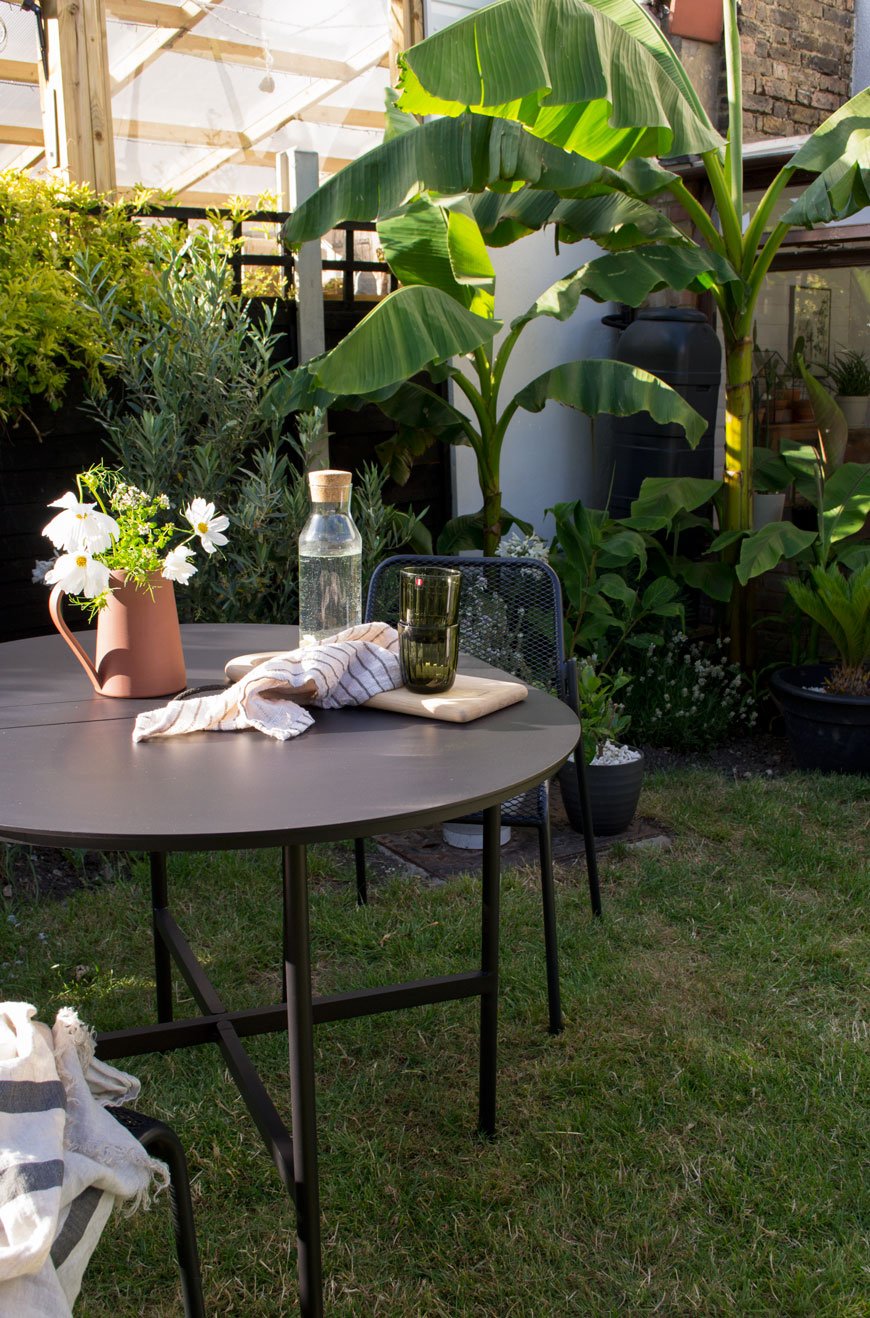
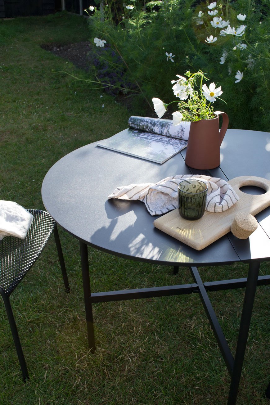
Our own home is fairly muted as colour goes but black features regularly as a contrast. I choose white flowering plants and touches of sepia and beige in a variety of ornamental grasses. I mix terracotta and grey pots to break up some of the black. These really stand out against the fencing which in turn create contrast and visual interest.

Scale and Texture
When an interior feels too flat it's probably because it's lacking the texture to give it depth. Remember that spending time in the garden is an experience for the sense - make your plants tactile, introduce scent and don't forget plants that will pick up the breeze for soothing sounds.
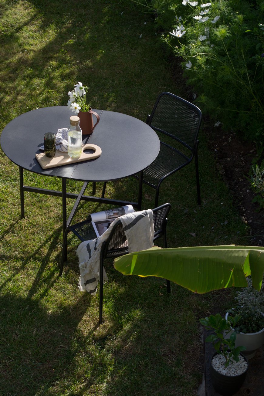
Choose a strong mix of large and small scale planting. Don't be afraid to try large-leaved plants such as fig, Musa Basjoo bananas and the prehistoric Gunnera against frondy, smaller foliage like grasses and bamboo.
If you're sticking to a minimal gardening scheme, be bold and go for one or two giant pots - I love the patina of corten steel pots, for example.
Play with different tones in foliage if colour isn't your thing, planting darkest greens against silvery whites.
Create Space For Relaxation
Our habits naturally change in summer when we finally have the freedom to spend more time out in the garden. We might decide to have our coffee outside in the early morning sun instead of on the sofa. An off-the-cuff dinner can be cooked alfresco and enjoyed well into the evening. Make your garden feel more inviting with outdoor furniture that compliments your tastes indoors.

Before you start looking, think first how you want to use your garden. Do you want a permanent seating or dining area? Do you need space-saving furniture you can quickly fold away on your balcony? Once you've found the purpose, look to your furniture indoors to find a style that echos it.
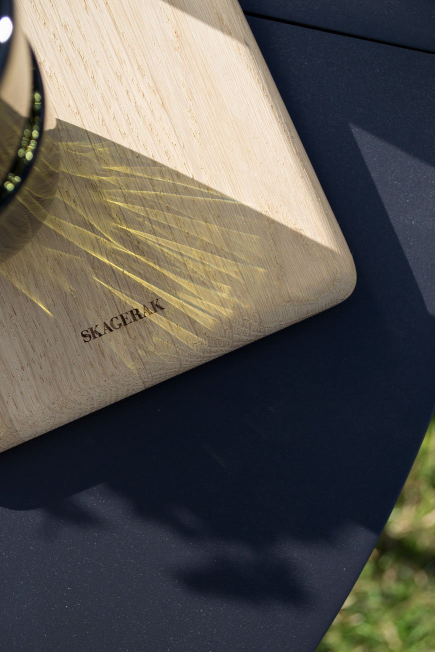
As we use the garden as a family, sharing some of it with a not-so-attractive trampoline (!) we needed something functional that could be folded and stacked away to accommodate water fights, camping in the garden and the like. The Picnic table, designed by Herman Studio for Skagerak is perfect for that purpose. Based on a classic folding leaf table, it's made in a lightweight aluminium with a carry handle on top to move it as you wish. Stools from the same collection stack easily and look great indoors too when we need a few extra seats around the dining table. Designed by Mia Lagerman, the stackable Mira chairs (set to be a future Skagerak classic if you ask me) throw down stark and striking shadows through steel mesh seats.


Layer The Light
Whether you use it to extend the amount of time you spend in the garden or simply to view it better from indoors, ambient lighting is essential. Outdoor lighting shows the garden from a completely different perspective at night and changes the way you experience it. Solar string lights are an update on a classic and you don't need to wire them into the mains to enjoy the warm glow in the evening.

You can also use light to accentuate architectural details in your garden. Try solar spots dotted into your border to show off the shape of taller plants or bring a tree to life at night with subtle fairy lights. It can be a clever tool to show how to navigate through the garden at night, lighting your journey along the path to a lounge area as the destination. For more directional light when you're round the table together, use lanterns.
Grow Your Own
If you've yet to try growing your own, I highly recommend it. For one, the relaxation you get from sowing and nurturing plants is enough, but nothing beats the feeling of cooking and eating what you've grown. Using produce directly from the garden encourages you to head outside everyone once in a while and stay connected to the garden as it changes through the seasons.
You don't need huge amounts of space. A group of pots and a stretch of wall or trellis will allow you to grow vertically - great if you have a balcony. Pick easy to grow varieties of tomatoes, courgettes and berries to cultivate your own kitchen garden. Having a few well-stocked pots of herbs to hand by the back door is brilliant when you need a few sprigs for dinner too.

There we have it - how to make the garden feel more like an extension of your home. Summer may be a little long in the tooth now, but these tips will give you a strong foundation to help you bring your indoor and outdoor spaces together, whatever the season.
Photography and Styling © Tiffany Grant-Riley
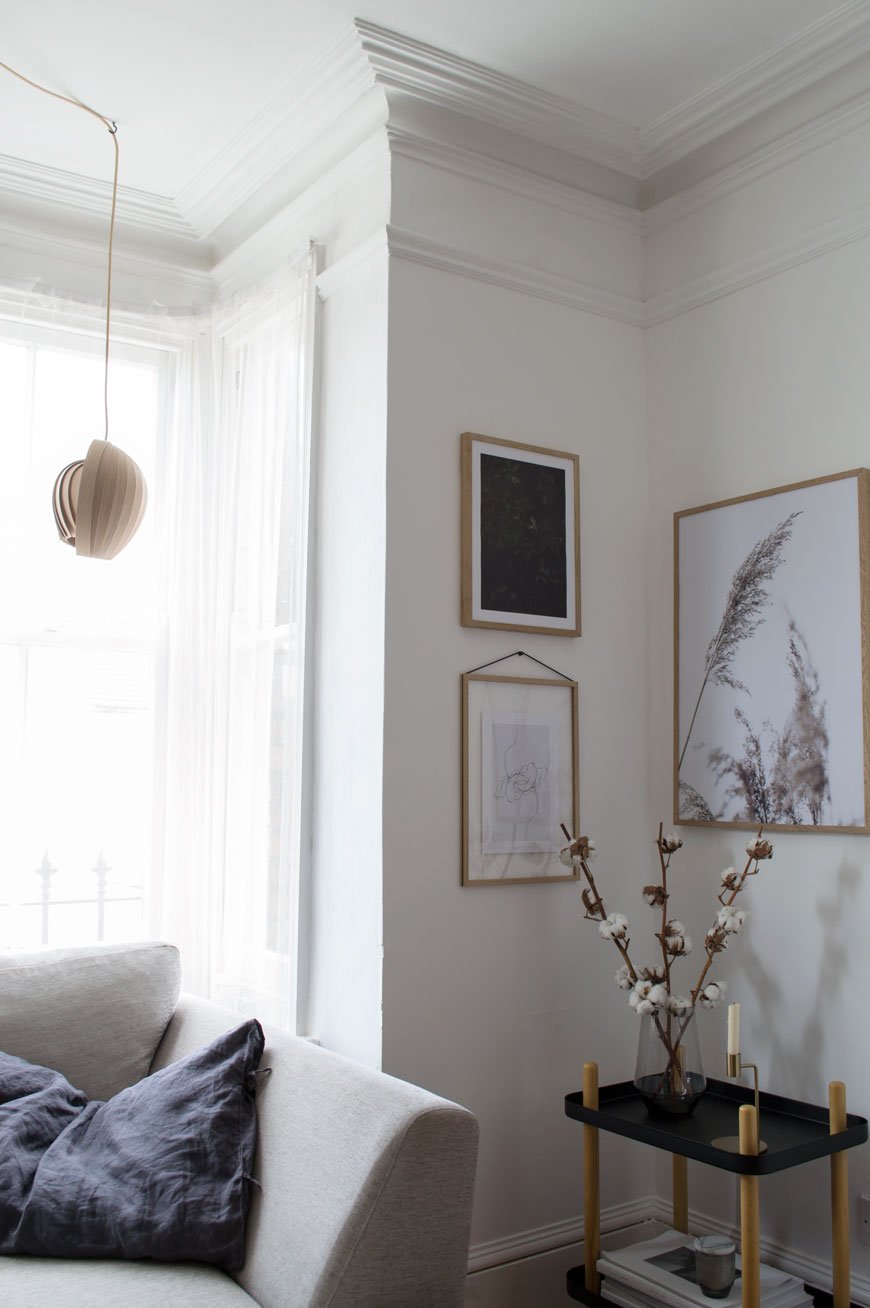
Spring Details In My Black and White Garden
 I don't share enough of our black and white garden here - strange considering I'm almost more invested in it than our home renovations!After days of on-off torrential rain, there came a break on Friday. Enough to see the light pick up the intense new-green in the leaves and watch beads of water balance precariously on petals. Quick off the mark to grab my camera, I shot some details before the weather changed direction again.

 I didn't quite finish painting the fences last year, so I've been cracking on at any available opportunity. They were originally a scruffy green so I chose black to make them almost disappear. I've used Ronseal's Duck's Back and 5L tins are about £10 from B&Q at the moment. The black gives the plants a more contemporary backdrop as they change throughout the year. Far more striking, don't you think?The current layout is very typical of a terraced garden - think long stretch of lawn and borders around the edge. Nothing wrong with that, but you know me, I like to mix it up. Eventually, I'm envisaging a mostly white garden with a mix of prairie and tropical planting. A total oxymoron, I know, but I just love a lush mix of large scale, architectural foliage mixed in with delicate flowers and wispy grasses. I'm hugely inspired by Beth Chatto's dry garden which was created entirely from drought loving plants. Really worth a visit. I also really fell in love with the LAND collaboration at London Design Week last year. Ultimately, the plan is to reduce the amount of lawn, get in some hard landscaping and break up the linear, traditional layout.We've no plans for any major groundwork this year as the hallway is literally sucking the lives out of us but I'd love to know if you'd like to see more from our garden later in the year? Are you taking on any major gardening projects?

Photography © Tiffany Grant-Riley.
[AD] Frequency Collection Designed by Kelly Wearstler for Georg Jensen
[AD - this is a paid partnership with Georg Jensen. Product featured here was loaned for the purpose of this post.]
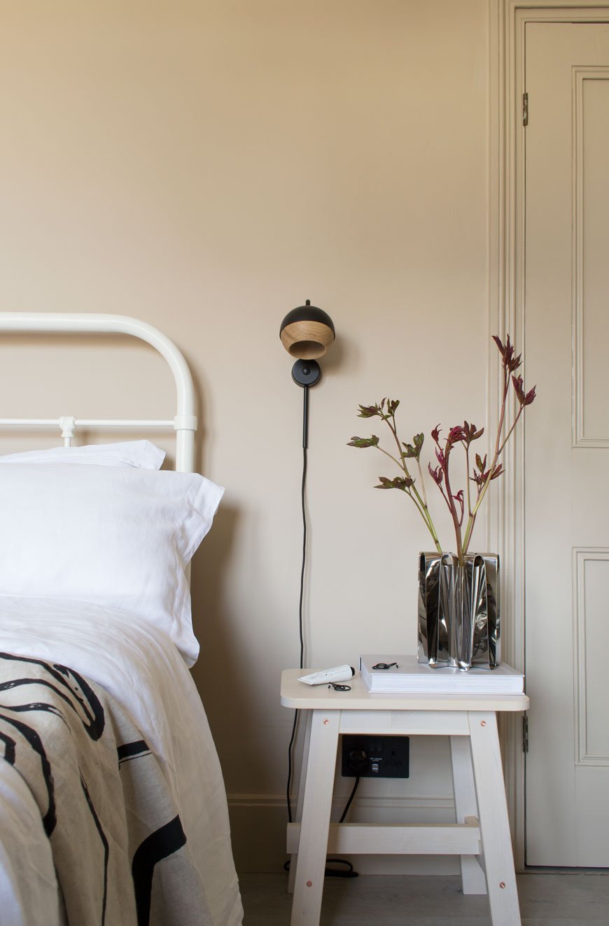
These first few days of Spring have without a doubt given us all a boost here at home. We've sorted through the clutter of winter and freshened up our tired looking living room. It's been wonderful to watch the quality of light change as shadowy corners disappear and there are moments when sitting in the warm sun in the garden are almost within grasp. Almost. This week, I've had the pleasure of styling a brand new collection from Danish silversmiths Georg Jensen. With over 100 years of design history, the brand continues its signature style of simplistic, organic forms, collaborating with innovative designers who understand its Danish sensibilities.
Frequency Vase
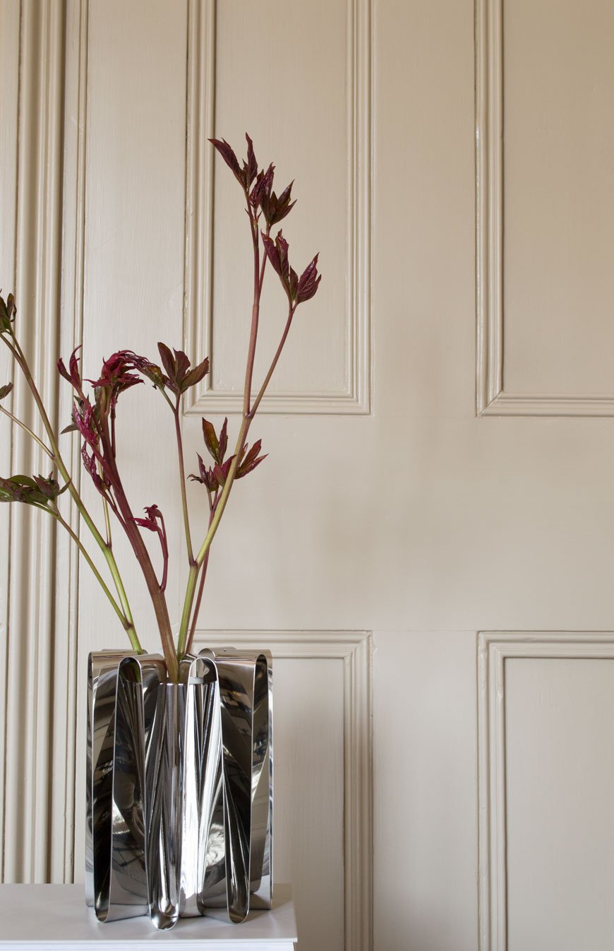 Handcrafted in striking stainless steel, the new Frequency collection is the result of a collaboration with world-renowned American designer Kelly Wearstler. Known for her exploration of colour, pattern and making vintage look contemporary, Kelly's work is so distinctive that you recognise it instantly. This collection is different for its pared-back, minimal feel which fits so well in my home. I've chosen three of six pieces using foliage and blooms from my garden to illustrate their dramatic, sculptural presence. I think the collection beautifully combines Kelly's contemporary Californian style with Georg Jensen's Scandinavian heritage.
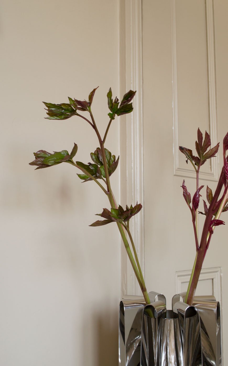 Inspired by her home on Malibu beach, the steel waves evoke a sense of fluidity, balance and energy. Each piece changes its appearance according to the nuances of the light. The undulating waves picking up the soft mid-morning sun in the bedroom, bouncing it back onto the walls. Living close to the river here, (though Medway is definitely not L.A!) I can understand why Kelly's work is often informed by nature. Here, I've picked new shoots from a Sarah Bernhardt peony, whose deep red stems unfurl into vibrant green leaves. Aren't they striking?
Frequency Centrepiece
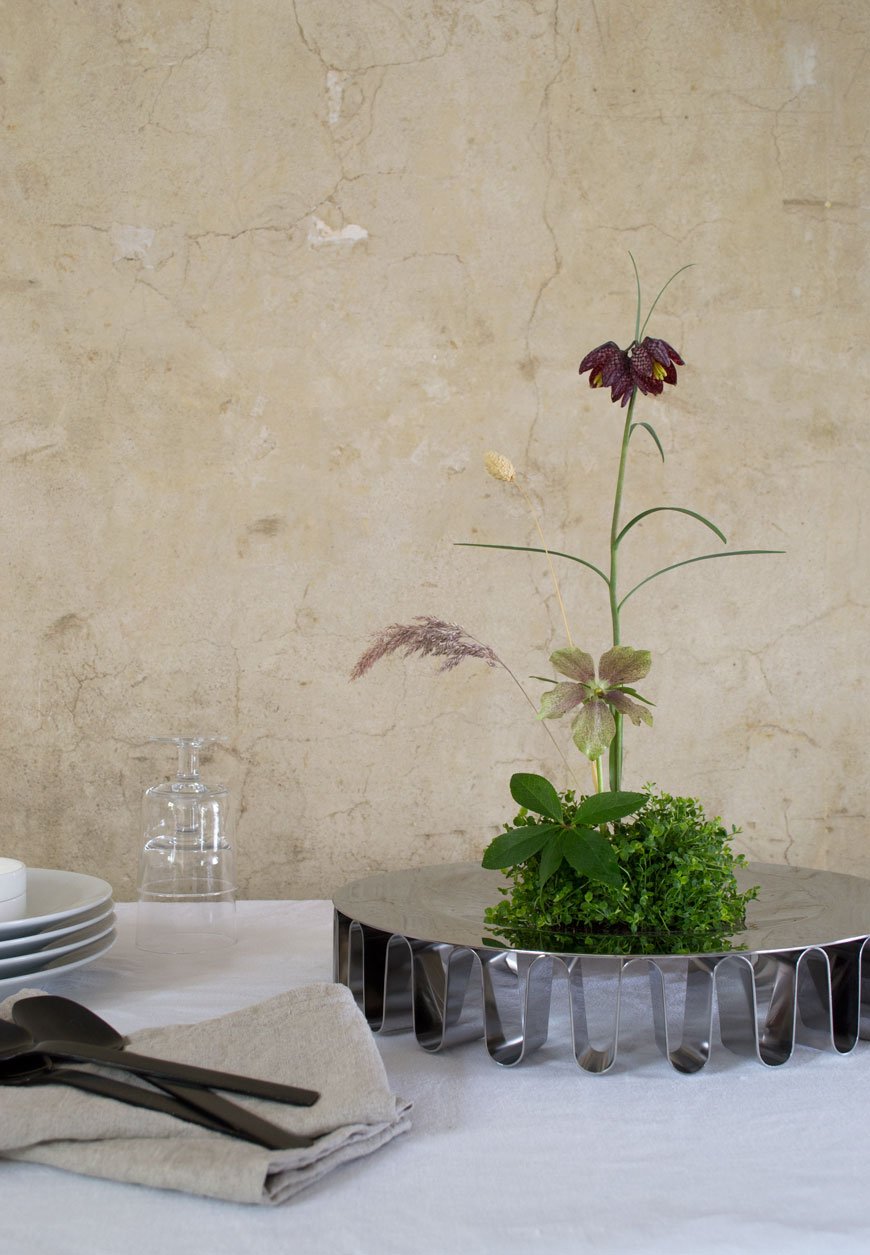 Capturing the collection was no mean feat - the highly polished steel reflects back every surface, which I very much welcome in our dining room which, despite its south-facing aspect gets the least amount of light. I loved creating this ikebana arrangement with the Frequency Centrepiece, using select spring flowers and foliage from my garden. The contrast of the smooth surface of the bowl against the cracked plaster walls added texture to the scene. Its delicate, ribbon-like waves give the surface the appearance of floating. As a versatile design, the Centrepiece could also be used for fruit or to display treasures.
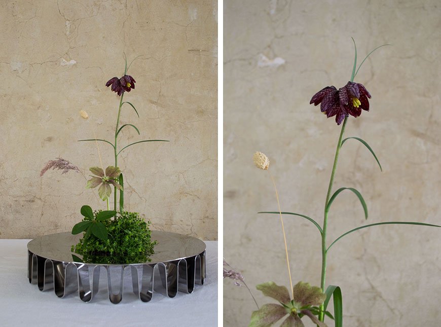
Frequency Hurricane
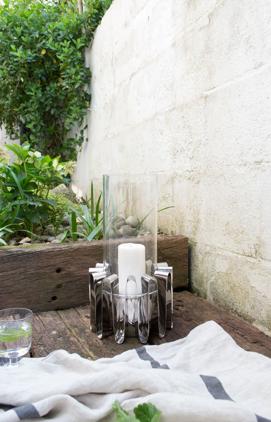
There is an energy in the silhouettes, a vibrant movement that comes to life through the beautiful folds in the steel. Each design is like a sculptural conductor of this energy.- Designer Kelly Wearstler.
 A little premature on my part, but these images speak of warmer days to come. There's a small yard space opposite my kitchen with a little deck made from reclaimed railway sleepers. After 4pm it becomes a real sun trap and you'll often find me here within shouting distance of the back door. A linen towel doubles up as a picnic blanket and there's time to sit and watch the evening to draw in, Hurricane lantern lit and something cool to drink in hand. It's not quite California, but it'll do.
 The Frequency Collection is available instore and online at www.georgjensen.com.
Photography and Styling © Tiffany Grant-Riley.
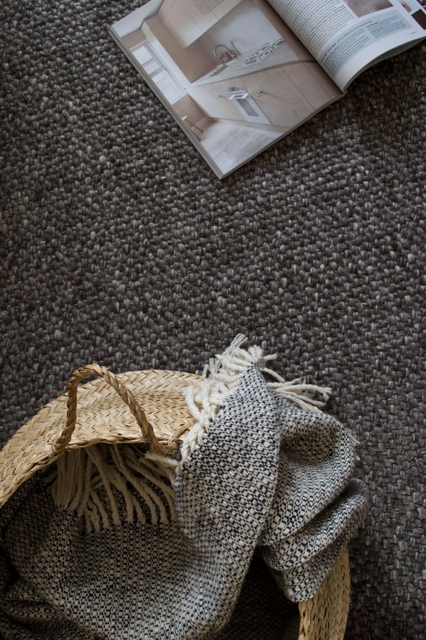
[AD] A Timeless Rug In A Scandi-Style Living Room With Habitat
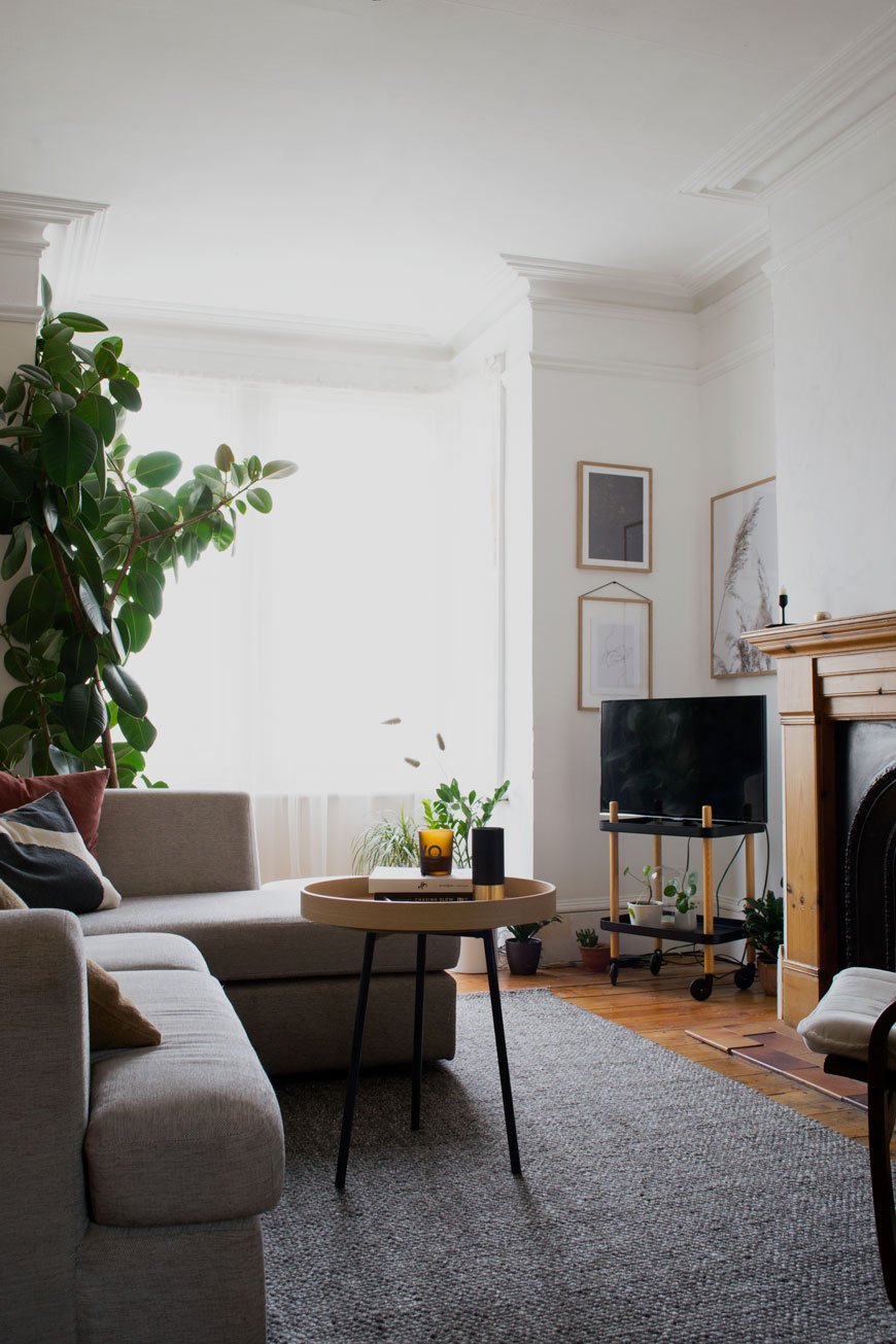 This post is an advertisement in partnership with Habitat. I've been looking for a simple and timeless rug for our living room since, well, I had to throw the old one out. The last one broke me. Really. I saved hard for the most beautiful woven jute rug that I used to have in my home workspace in Rochester but when we moved into 'The Chatham House' it ended up in the living room. No longer in the safe confines of my workspace, it was subjected to all sorts of spills (milk included) and other child-related detritus so that in the end, I had to give up and say goodbye. I couldn't take picking bits of grape and pizza out of it any longer.Finding a more family-friendly alternative hasn't been an easy task but since our living room has needed pepping up for a while, I asked Habitat to help me find a solution. Because their selection of rugs is on-point. Always. With the living room currently boasting someone else's decorative choices albeit on the neutral side, ultimately, this rug would have to shoulder the job of carrying the room through this in-between stage before we renovate it. Quite a heavy task for an accessory but as I can't stand the amount of bright orange pine there is in here I knew a large scale rug would help defuse it a little.
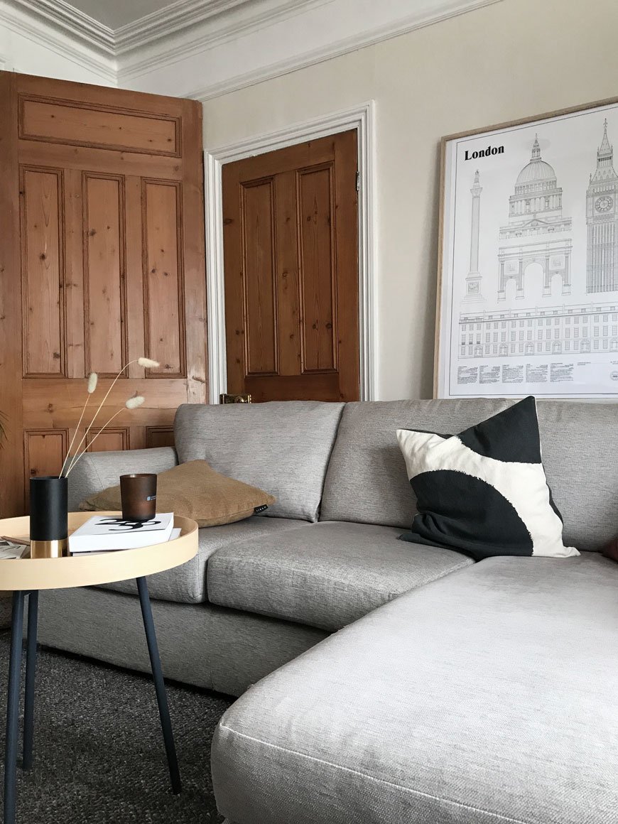
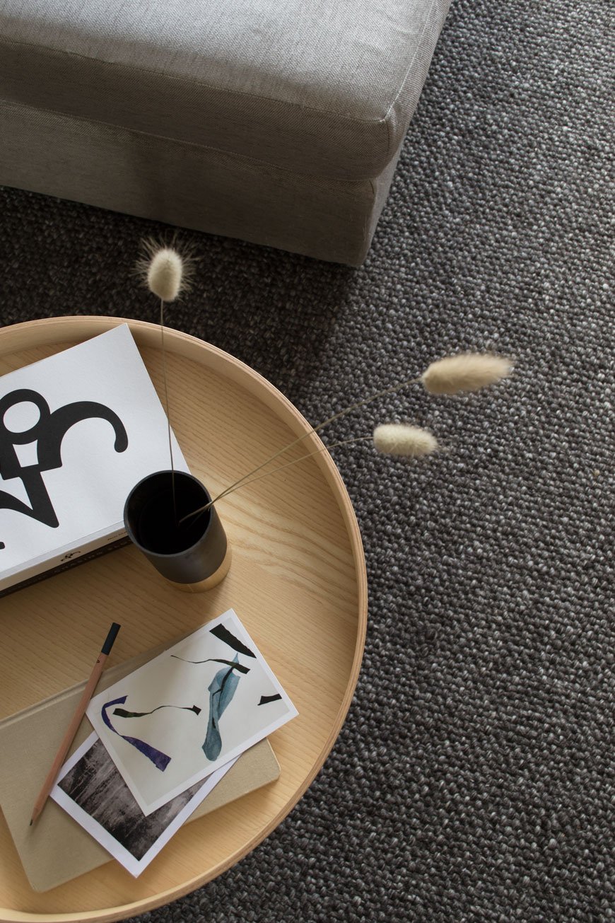 Enter 'Roderick' (incidentally sharing the same name as my step-dad). He's a smart, stylish Scandinavian. Just enough texture without trapping crumbs and dust, dark enough to hide any potential spills (we have a not-on-the-rug policy now though) and he's a handwoven, wool design which feels soft underfoot. It's quite a large piece at 170x240cm and the deep grey is a warm base against our light grey corner sofa, drawing your eye away from the orange pine floor. I think I love this room 100% more than I did without it. Choosing the right rug for the right space can be a hefty investment so I always recommend to look for something neutral that will compliment any interior. Here are a few points to consider:• Upscale your floor. Here's the thing. Small rugs in small rooms make the room look smaller. Go for as big a rug as you can afford and see the difference it makes to the feel of the room. It will open it up. Promise.• It's all in the placement. The general rule of thumb in the living room is to have the front legs of your sofa and armchair(s) on and the back legs off the rug but that depends largely on the size and set-up you have. This guide from A Pair & A Spare is pretty brilliant. It also helps to mark out the size of the rug on the floor with masking tape first to give you a visual aid - I did this to check the 'Roderick' was large enough for our living room.• Fabric and weave. Thicker piled rugs like the Berber style and anything with a highly textured weave will need more maintenance. This might include brushing it out to stop the strands and tassels from matting. In which case, these styles are better in low traffic areas. Flat woven, cotton rugs are better suited to heavy traffic areas as they're generally easier clean.• Shape. Remember to pick a style that fits with the shape of your room. I prefer rectangular rugs for ease of use (most of us have rooms this shape anyway) however a large, round rug can work well when the room is large enough - usually in a dining space with a round table. Referring to the placement guide (above) will give you an idea of how the right shape works.• Stick to neutrals. A good quality rug, chosen well, will last. Find something in a muted colour palette that complements the room whether you have dark or light walls. Neutral doesn't mean boring either - don't be afraid to go for pattern, look for tone on tone designs or a raised, tufted weave against a flat base for interesting textures that draw the eye.I've picked out 10 timeless rugs from the Habitat collection to suit any Scandi-style interior. There's a good mix of highly textural Berber styles for a laid-back Bohemian look (hello Benson and Tallulah) and good solid earners like Hurley with a sturdy leather and jute weave. I do have a soft spot for Alexander though, love the gridded jute. Quite the statement. What's catching your eye?
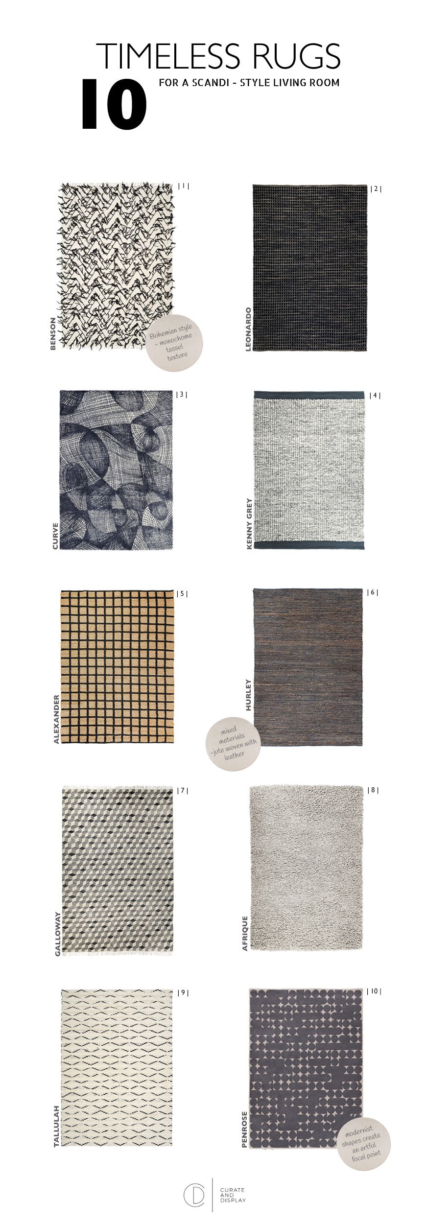
Photography © Tiffany Grant-Riley
6 Things I've Learnt About Slow Decorating
You know, it’s interesting how many readers and friends imagine us to be all done and dusted with our renovation project. Whatever happened to doing things slowly? Perceptions of the online world I’ve detailed here may well have filled in the gaps so you think that we’ve called in a skilled team of contractors and a massive budget to do the lot in one go. But. The fact remains, we’re a family of five (cat included) living on a modest income without the means (or desire) to move out for works to be done. Although it has crossed my mind on many occasion. Believe it or not, for the most part, we actually enjoy DIY and want to give ‘The Chatham House’ as we call it, the very best we can, respecting its history and in making it our home.
If I'm honest, this house we’ve called home for two years now was not initially on the cards for us. The initial plan was to look at buying a stop-gap to turn around within a year or two and move on. BUT then we found this one. And suddenly we were looking at staying put and pouring everything we had into it. A total curveball. With only three or four previous owners, we've been spoilt with a lot of original features. Along with that we also inherited a whole heap of bodge jobs that need picking apart. Buying a doer-upper has meant re-evaluating and taking a few deep breaths at the thought of all that plastering. It’s also slowed down the whole renovation/decoration process, which, as the least impatient human on this planet was no easy pill to swallow. This sounds like you too, right? What I will say is having that time on your hands is actually a massive gift. Here’s what I’ve learnt about slow decorating so far...
You Will Change Your Mind. A lot.
The most popular question I’m asked time and time again is “what advice would you give new homeowners?" Don’t act on impulse. Please. Do not pick up a paint chart, paintbrush or box of tiles until you’ve really spent some time in the house. Instead, wait. It’s boring, yes, frustrating, hell yes, but I can guarantee you’ll thank yourself in the long run. You might just save yourself from a rash decision or two. An example? We've lived with half raspberry pink, half gloss white anaglypta walls in our hallway for TWO YEARS. Why? Good question. Well, it's a very dark space so for one, I needed time to see how the light behaved at different times throughout the year to determine the right colour palette to use. I'm still not sure whether we ought to replace the ceiling lights with wall lights and we need to decide on how we're treating the stairs. Stripping it when we moved in would've meant living with some very crumbly old walls for quite so time which, in an already cold and drafty space wouldn't be the most sensible move. I've been such a good girl!
Useful pointers to consider before you start decorating:• Trends move quickly. Whatever you love now might not be top of your list in a year's time.• How will you use each room? Be realistic here - if you like the idea of a home office but know you'll end up at the dining table/sofa then use it as a guest room instead.• What works well for you now and what doesn't? Do you need to rethink storage? Do you need to update the heating and windows if it's a little on the draughty side?• Choose colour carefully. Paint looks completely different in a room depending on the time of day and which way it's facing, e.g. North facing light will be bluer and cool whilst South facing is warmer and most consistent during the main part of the day. Our bedroom faces North-East so I chose a warm beige paint to counteract the cold light and it reacts beautifully as the sun rises across one wall.• How do you want your home to feel and where will you start the process? You need to consider how you'll make the rest of the house connect with that room and feel like a coherent space.
Tackle One Project At A Time.
Renovating is stressful, there's no doubt about it. Even if you've got somewhere else to live while work is going on, you still have to relocate and manage the project in the meantime. Tackling one room/project at a time will minimise the upheaval and stress and give you the headspace to give it your full focus. When you've ticked that off, move on to the next room.
Establish A Strong Foundation.
Unless you're moving into a new build it's likely there's groundwork to do. I like to call them the boring necessities, things like:• Structural works - knocking through / relocating walls.• Rewiring and plumbing.• Plasterwork.• Replacing or strengthening floorboards. We did this in the bathroom just before Christmas when we realised our shower had completely rotted the joists underneath!Some pretty important jobs. These should come top of your list, ahead of the cosmetic stuff to avoid the unfortunate need to start from scratch.
Live In The Now
Holding onto those big “one day” plans are completely valid. We'd like to extend the kitchen and create another room in the loft at some point, but not for a few years yet. Don't feel that you can't make changes to make it your own in the meantime. That's why we decided to do a kitchen refresh so we could fully utilise the existing space and enjoy it for the time being. And honestly, crappy cupboard planning aside (thanks previous owners) I love it so much that I'd be quite happy if that extension didn't happen. Almost.
Is It Really You? Think It Through.
Take time when you're designing each room and don't be too quick to hop onto trends. It's great to draw inspiration from Pinterest, Instagram and glossy mags as a starting point. Step away before anxiety hits though. It's worth knowing that those images are shot for editorial purposes as an aspirational piece. I know because I've styled homes for magazines. I do it myself when I shoot - in reality, nobody wants to see the mess, they want to see something they can aspire to. You see the carefully considered image but what you don't see is what's going on behind the scenes, where we've moved other bits of furniture out of shot, rolled up a rug, decluttered those shelves.So be honest with yourself and create a space that speaks volumes about you. Revisit places you love and draw inspiration from them. Collect images that you connect with. Experiment with textures and materials. Can you see the furniture you already own working within your plans?
Agree Before You Start.
This one's for me really, because my default is to steam ahead without letting Rob in on the full picture. Yep, I hold my hands up. But then, he's the cautious one and I'm the reactive one...most of the time...and that's why we work. Plan as much as you can to the most minute of detail. Of course, leave some room for a little artistic license but I'm talking about agreeing on the work you'll be doing yourselves (and who) what you need to outsource and choosing the scheme together. Set out a clear timescale and try to stick to it as best you can. I'm going to try and detail this with you when we start the hallway later this month.
Enjoy The Journey
When you've stopped arguing, remember to enjoy the process. Every little change you make brings you a step closer to your vision. I'll never forget how different our bedroom and kitchen felt when we got rid of the orange pine floor. A new lease of life! There may be unforeseen circumstances along the way that need your attention (referring back to those foundation points) but with patience and focus you'll create a space you can be really proud of and pick up new skills along the way.
Photography © Tiffany Grant-Riley featuring #TheChathamHouse.
[AD] Styling My Home For Winter with NABO
 This is a paid partnership in collaboration with NABO.
This time of year, whilst I’m nowhere near ready to mention the Christmas, I do like to acknowledge winter and bring some seasonal touches into our home. It’s all about wanting to feel warm, cosy and cocooned this time of year. Candles aside, what other things can you do to celebrate winter in your home? I’ve teamed up with Danish lifestyle shop Nabo to share some inspiration.
Danish for 'neighbour', NABO was launched by visual artist Christina Thaisen in 2017 from her home, a former jam factory, in London. Hailing from the city of Copenhagen with design in her blood, Christina has created an online shop for beautifully crafted Danish homeware with a personal story.
We don’t follow fashion or the latest trends but source products that are timeless, functional and long-lasting.'Things' cannot create a home. It’s the connection you have to what you surround yourself with that creates a feeling of belonging, of home. Therefore, we think it’s important to tell the story behind the products and brands we stock for you to make that connection and to help create homes that are more meaningful.
Showcasing new designers and functional pieces meant for daily use, Christina often makes journeys back to Copenhagen to add to her carefully curated collection. I've found it almost impossible to choose favourites but I've highlighted some of the most beautiful examples used in my own home.
We always make an effort for slow family breakfasts at the weekend which are usually a mix of pastries, cereal and fruit (the kids love a variety to pick at). The tableware obsessive in me was instantly drawn to ceramist Mette Duedahl's collection of ceramics. The oatmeal and earth tones instantly warm up the table for breakfast alongside my slubby Khadi napkins. Simple touches can make such a difference. I brought home some fiery branches foraged from a morning walk to bring a sense of occasion to the table. The rusty toned leaves and deep red berries really draw out the organic fleckles in the large Tina Marie vase.

If you switch your duvet for a heavier tog come winter, you might like to dry a darker shade of bedding too. Nothing beats freshly laundered sheets for ramping up the cosy factor and the olive green cotton Tekla bedding has added depth of colour in our bedroom. I love how it looks against the beige walls. We've even tried sleeping the Scandinavian way with a set each so we don't have to play tug of war with the covers!

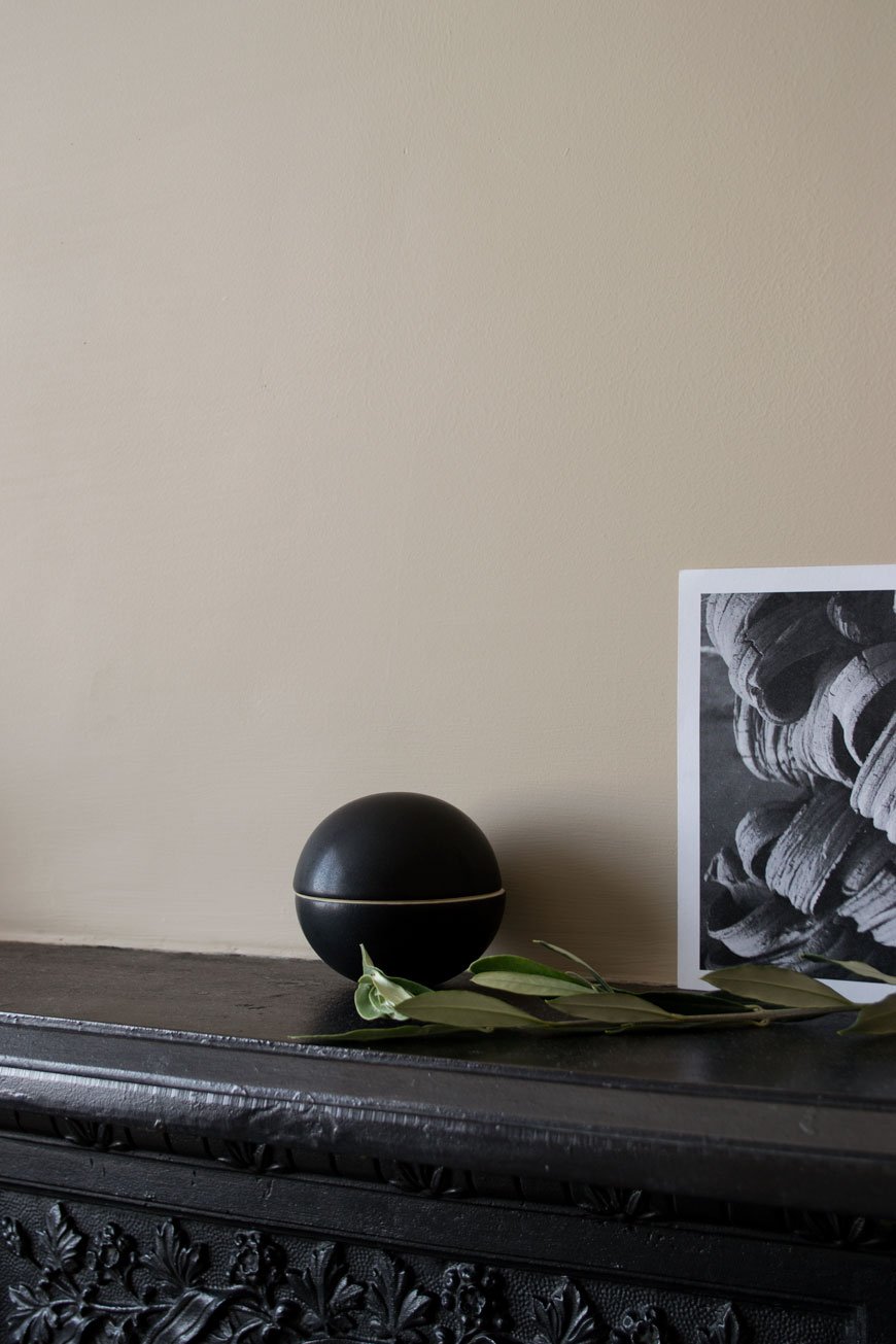
A stand-out piece from NABO’s collection is the striking black bonbonnière pot by Uh La La. A sculptural piece in its own right, it's perfect for stashing nibbles or small pieces of jewellery. This is a piece that would look great styled on a mantlepiece or living room shelves alongside other select treasures.
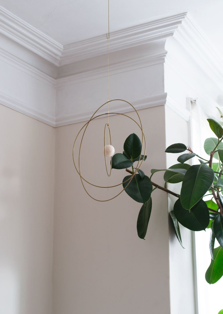
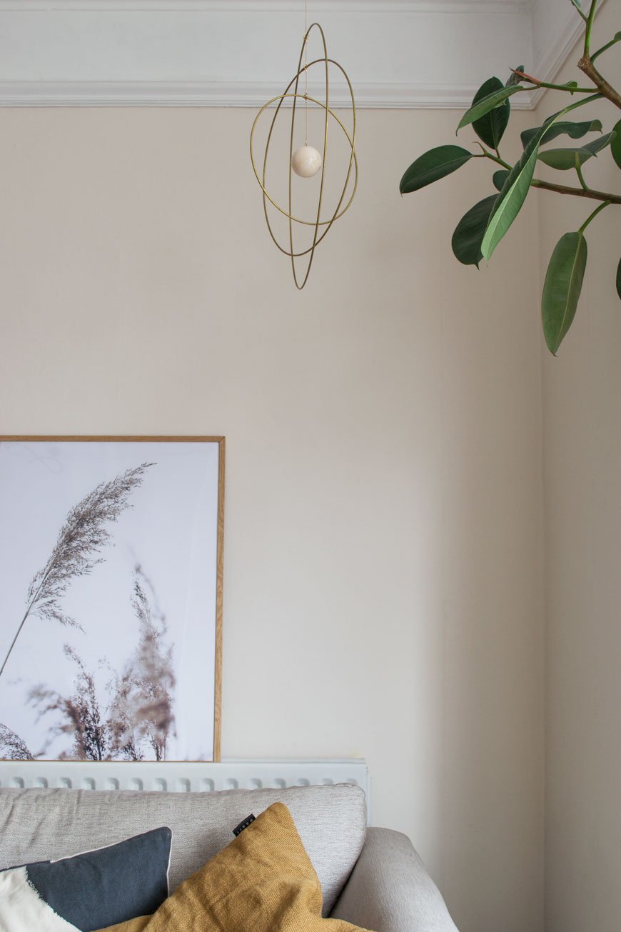
We've not done a great deal to the living room since moving in, there's seems little point until we begin work next year. It can feel a little cold with its north-facing light but our rubber tree Marvin definitely helps to soften the edges. I've added some spice toned cushions to help warm it up and there are brass candle holders by the fireplace. One thing I've really taken to this year is mobiles for grown-up spaces. I'm seeing them everywhere. Hung above a sideboard or in our case, just behind the sofa, they add visual interest as a piece of sculptural art. When we have candles lit in the evening, the light flickers off the warm brass rings of the Galaxy Globe which are centred by the white marble ball.
 My office has had a serious winter sort-out following a busy few months. With tote bags and mounds of press material, decluttering my desk has worked wonders for keeping a clear head - do you find the same? Kicking off the New Year with a fresh diary or journal makes all the difference to your organisational skills too. I don't like using an online diary, although I share one with Rob, I find things go in better if I've written them down. If you're into your stationery like me, you'll appreciate the quality of NOTEM Studio's journals. A solid and reliable piece of paper kit, they're made from Scandinavian paper and covered in woven cloth, of course.
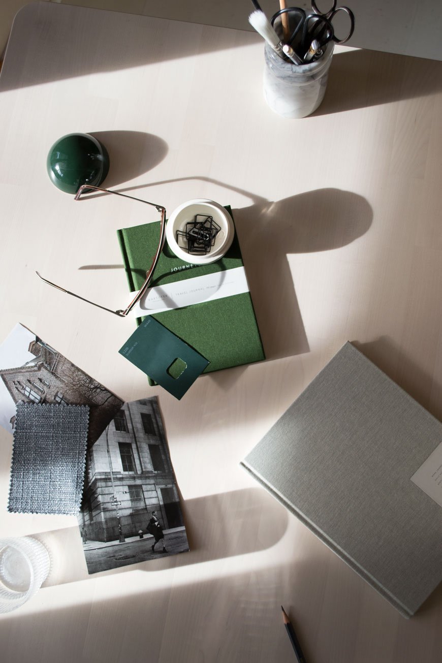

 Love what you see? You can enjoy a 20% discount with NABO across the entire collection using CURATEDISPLAY20 when you check out. Valid until 20th December 2018.
Photography & Styling © Tiffany Grant-Riley
[AD] Our Nordic Luxe Beige Bedroom Before and After
 This post includes gifted product.** Well, that's quite a mouthful. A Nordic luxe beige bedroom. I was beginning to think this day would never come. Two years ago when we moved in, I couldn't see this past the Prince-inspired purple feature wall and peeling wallpaper. And I'm a big Prince fan. But here we are. Back with another before and after. Prepare to witness the fruits of our blood, sweat and tears, of which there have been plenty of each!
How The Bedroom Looked Before
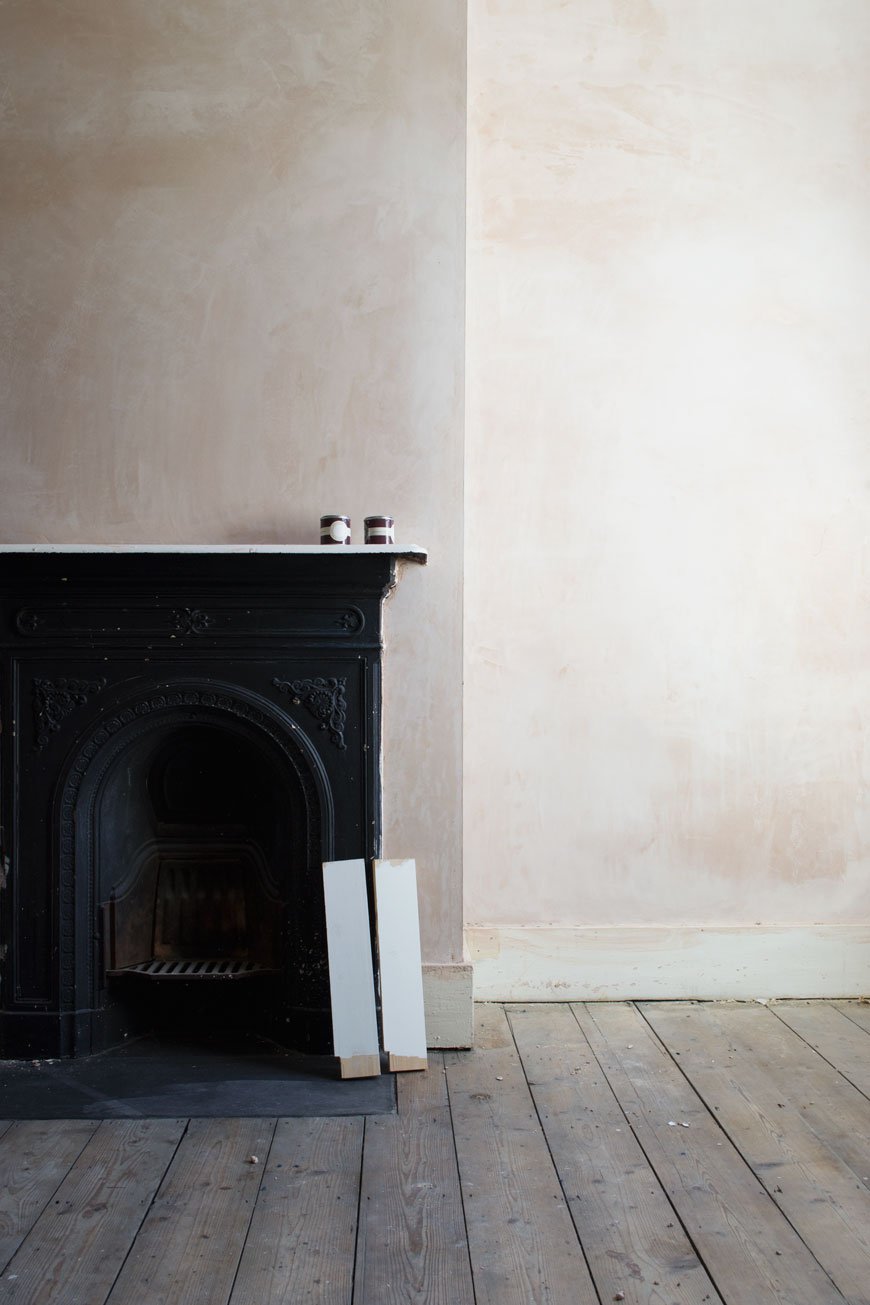
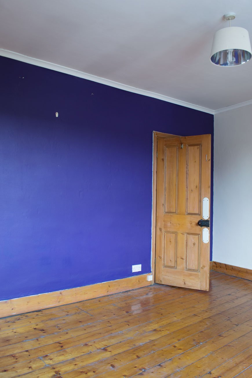 My advice to you? Always be suspicious of papered walls in old houses. It is trying to trick you into thinking "nothing to see here!" Our bedroom couldn't even be bothered to hide the fact that most of the plaster beneath had blown. And good luck trying to actually remove that wallpaper, my goodness. I've no idea what was used to fix it to the wall but I don't think it was your bog standard paste! You can see more of what lurked behind the paper and the freshly plastered walls here. Oh and how you loved those plaster walls. I know you'd prefer that we left them like that, but we wanted the room to feel finished.
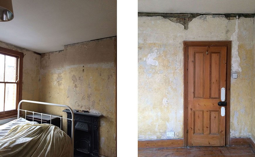 The journey from start to finish has been quite a lengthy one which in all honesty, I'm thankful for. It gave us the time to better understand how the north facing light moved throughout the day and made choosing the colour a lot easier. It gave us time to realise that we needed to put a new floor down, as much as we loved the baseboards, sanding and staining wasn't going to be an option this time. Ultimately, it gave us time to understand how we used the room, how we wanted it to work for us and how we wanted it to feel.
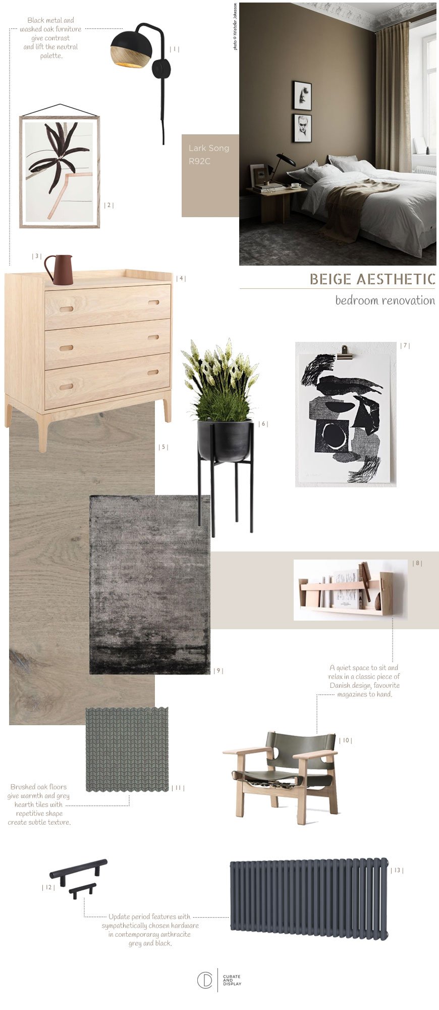 The full design post demonstrates how we arrived at warm beige and how I pulled together the look inspired by past stays in design hotels. The most important part of the whole design is that the room felt like a sanctuary. I wanted it to feel minimal with a Nordic luxe look, drawing on high-quality materials, including the Havwoods oak flooring, black metal hardware and additional furniture. There would be contrasting textures of velvet, linen, metal details and warm wood.
How The Bedroom Looks Now
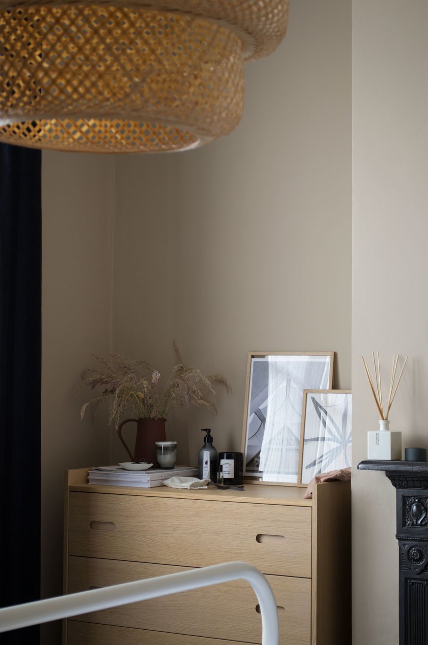
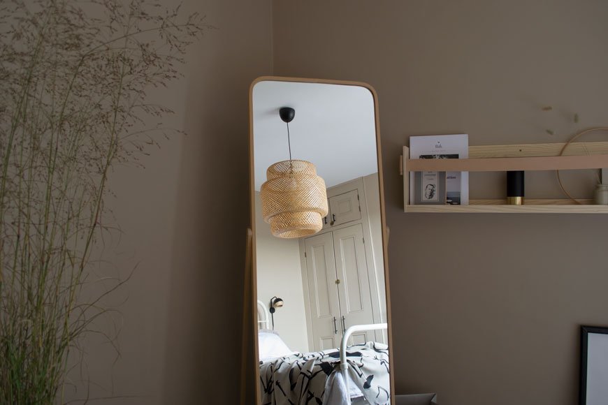
 Our journey towards the finish line began in summer, using our plastered walls as our starting point.Work included:• Laying a new engineered oak floor.• Tiling the hearth plate.• Polishing the fireplace.• Painting the walls and woodwork.• Replacing the radiator for a Victorian column style.• Replacing hardware including sockets, switch and cupboard handles.We used the same shade of beige, Lark Song by Valspar, across all the walls and woodwork for a contemporary tone-on-tone effect. It's amazing to see how much the colour changes depending on the light - sometimes appearing almost plaster pink, other times with slight green undertones. It has the ability to glow when the sun hits the corner with the mirror in the early morning and feels warm and moody in the evenings.
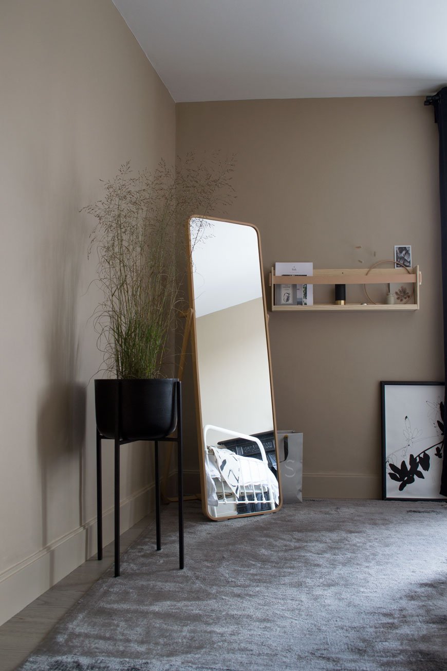
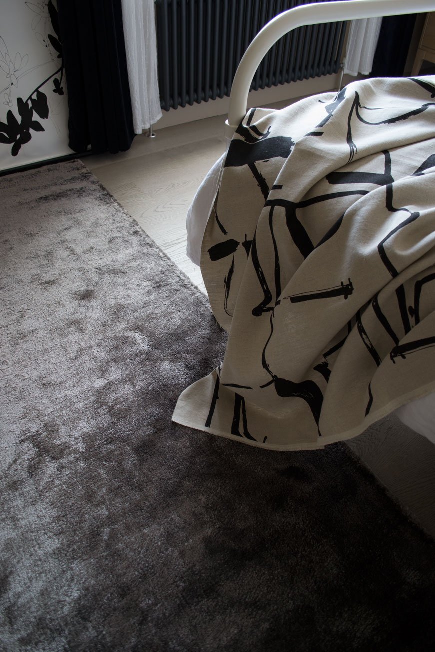
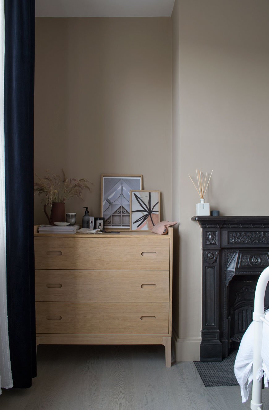 I picked out furniture and accessories with similar warm tones to lift the wall colour, starting with the Sinnerlig bamboo lamp shade that we got last year, tying it in with oak picture frames on top of the chest of drawers. Continuing with tonal furniture, we kept the floor length IKEA mirror and I chose the Shelf90 in ash and leather, designed by SSM and handmade by their studio in Sweden. It's been on my list for such a long time and is the perfect size for a select number of books and our mini speaker. This part of the room will really come into its own as a reading corner when we eventually find a suitable chair for it. No, I didn't get to keep The Spanish Chair.Somehow we instinctively choose furniture with skinny legs which actually give the illusion of space by allowing the floor to be seen underneath. Our hospital-style metal bed has been with us for a few years, a John Lewis design no longer sold, but we still love it. A new of mine is the black metal planter from Cox & Cox which in which I planted grasses instead of my usual houseplant.Given that I tend to lean towards jute woven rugs, I surprised myself in choosing this 'Dolce' charcoal grey viscose rug from the Houseology Collection. It feels super silky underfoot and ties in with luxury hotel style. It also bounces the light as you can see from the photos and connects tonally with the oak flooring, provided by Havwoods. If you read the installation post, you'll know how much of a difference the new floor has made to the room. In fact, the overall look wouldn't work without it there to pull it together. It feels so much warmer and quieter too, which means no more avoiding those squeaky floorboards in the night.
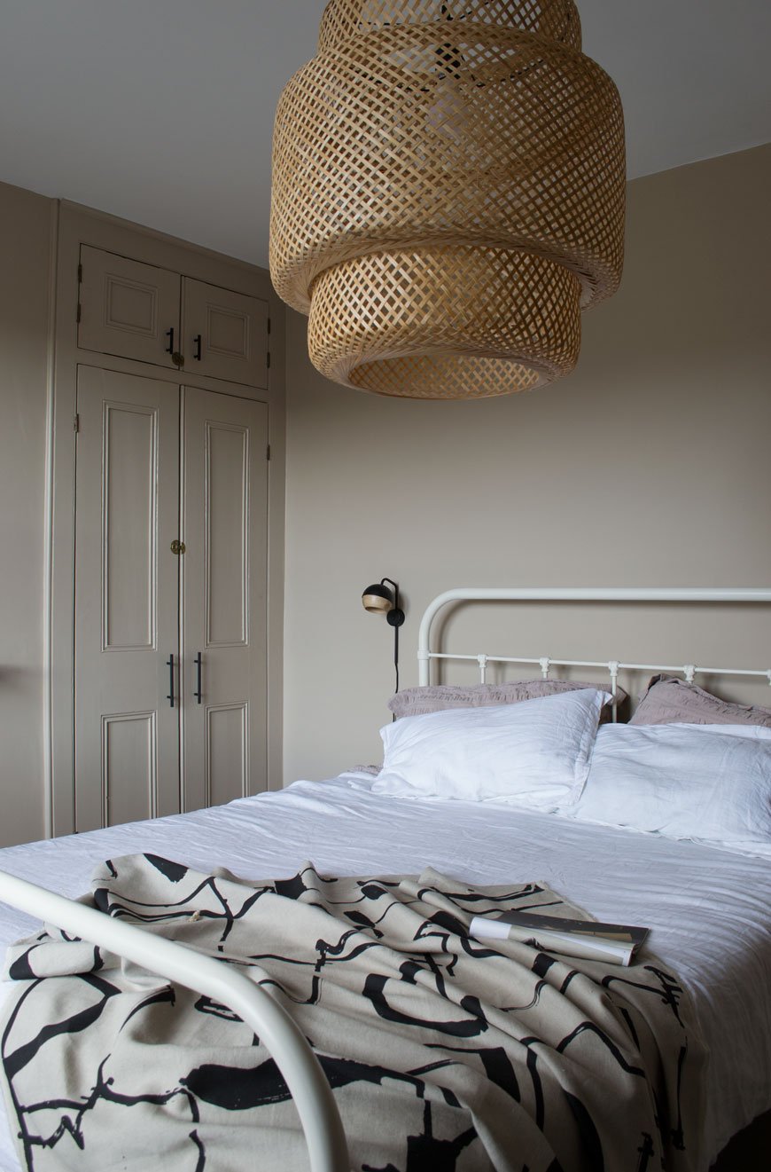
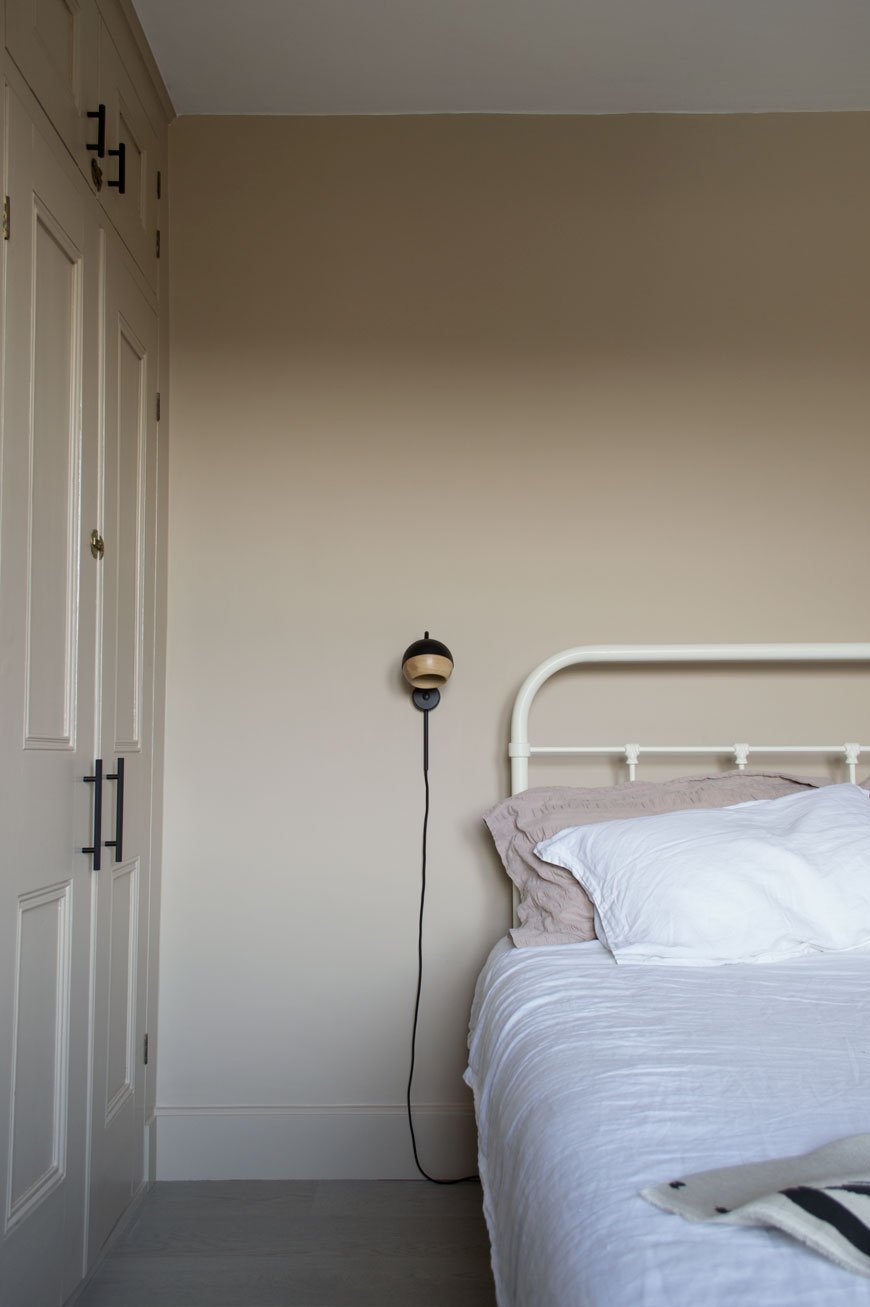 The wall lamps are designed by Pederjessen for Mater, who I featured recently for their sustainable Danish design. The black Ray lamps are a nifty piece of design. Did you know that the oak part of the shade is held with magnets allowing you to pivot and direct the light? Did you notice something missing? Yes, bedside tables. A previous attempted failed but ultimately, I'll be adding discrete and narrow bedside ledges which will sit below the lamps, painted into the wall.
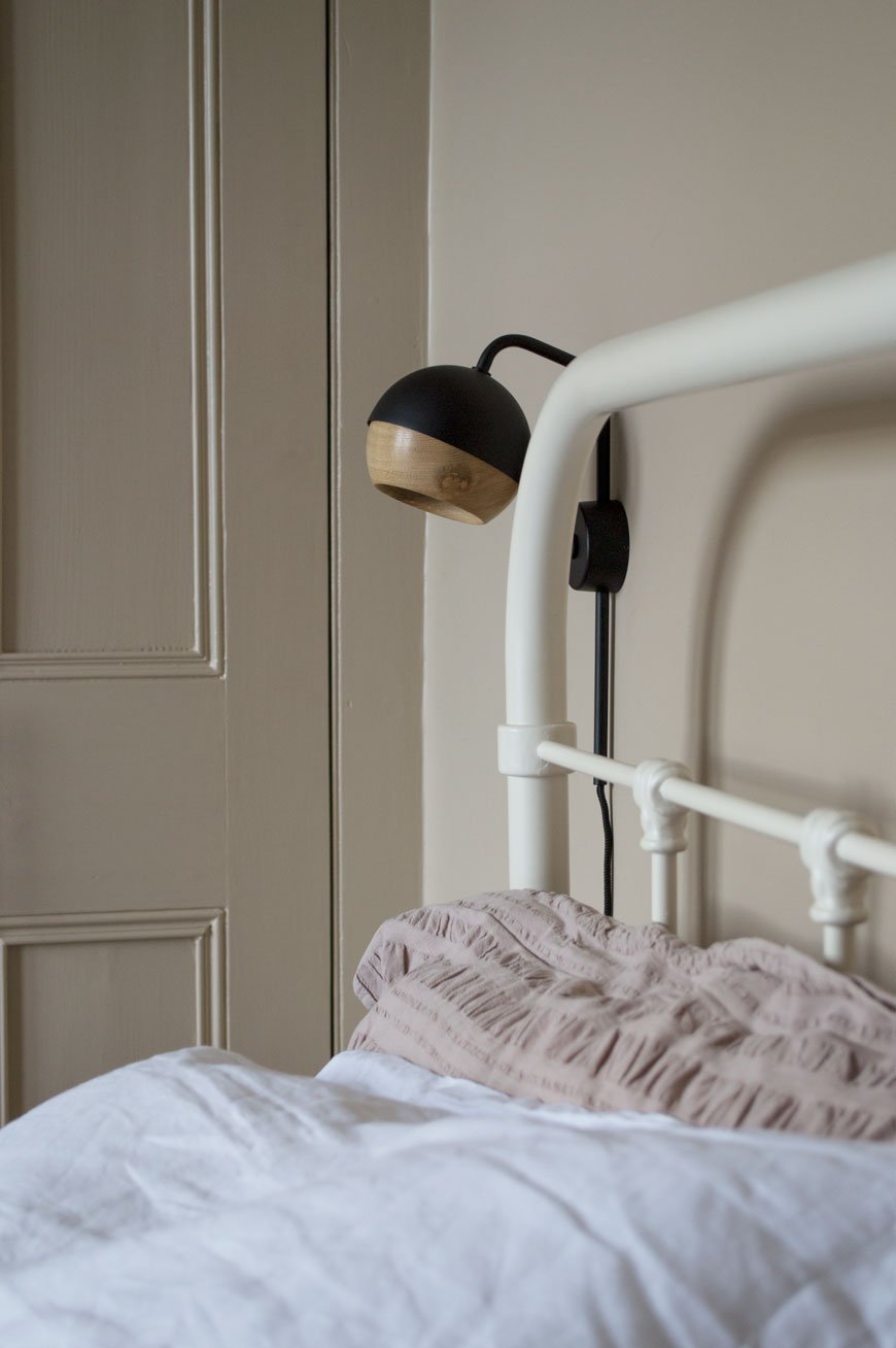
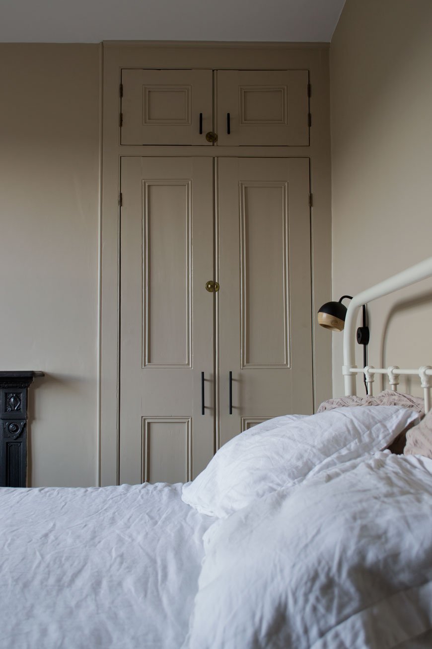
Of course, a home is never truly finished and we’ve left space for this room to grow. Much of the practical work has been Rob’s baby. He’s done an incredible job and is putting the finishing touches to tiling the hearth plate (hence why you haven’t seen much of it). I’ve left space for a large round mirror to hang above the chest of drawers and there's bedsides and a reading chair to sort. For now, though, we can finally see out the winter in a warm and inviting bedroom that we can’t wait to spend time in.
On Pinterest? Check out my beige and greige interiors board for more inspiration or #TheChathamHouse on social to follow our renovation journey.
Beige paint - 'Lark Song' by Valspar in matt for walls and satin for wood and metal.Engineered oak flooring - Shadow Grey 188 from the Havwoods Karelia range.**Black metal sockets and vintage toggle switch - Dowsing & Reynolds.Knurled Skyscraper cupboard handles - Dowsing & Reynolds**Bamboo Sinnerlig lamp - IKEA.Black Ray wall lamps - Mater.**Black metal planter - Cox & Cox.**Oak picture frames - Cox & Cox.**Shelf90 in ash and leather - SSM**Charcoal grey 'Dolce' Rug - Houseology.**Morten oak chest of drawers - Heal's.**Anthracite grey column radiator - Trade Radiators.'Monolith' printed cotton fabric - Laura Slater.
Photography & styling © Tiffany Grant-Riley
[AD] Fredericia Celebrate 60 Years of The Spanish Chair
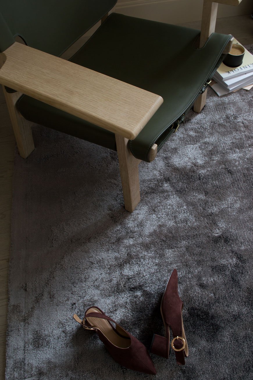
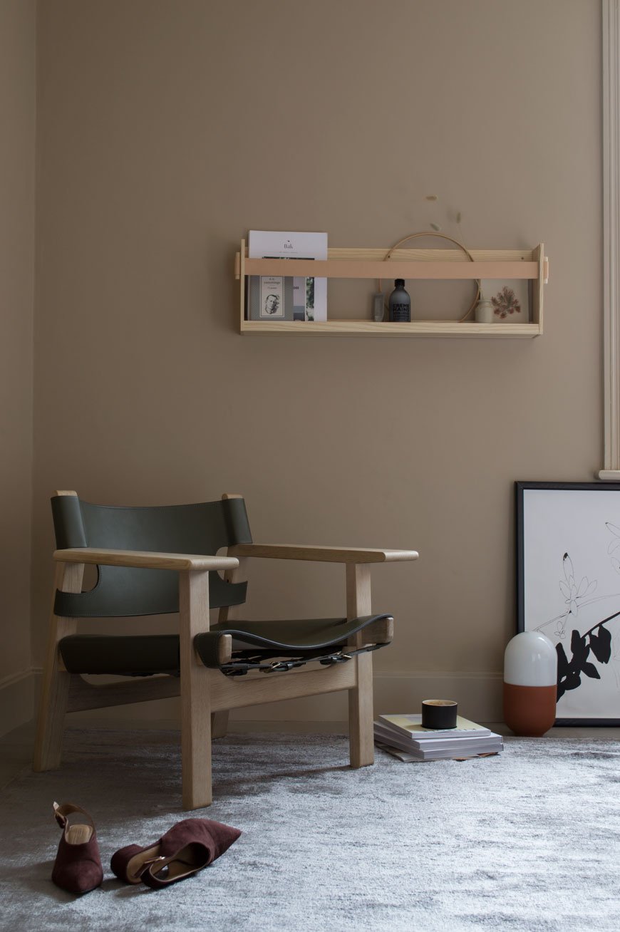 This is a paid partnership with Fredericia. I first made an acquaintance with this beautiful chair two years ago when I was introduced to Fredericia at the London Design Festival. Inviting me to experience their collection for myself, I was somewhat spoilt for choice. They took one look at me and said "that one - that's the chair for you". It was The Spanish Chair, a modernist classic launched in 1958 by Børge Mogensen.It is a dream to sit in. Despite its upright position, I promise you, it's just perfect for kicking off your shoes and losing yourself in a good read. It creaks as it adjusts to your shifting weight, with arms just right for your mug of coffee, a notepad. It's been staying in our unfinished bedroom and I've had the pure, unadulterated pleasure of styling and living with it for the past few weeks.
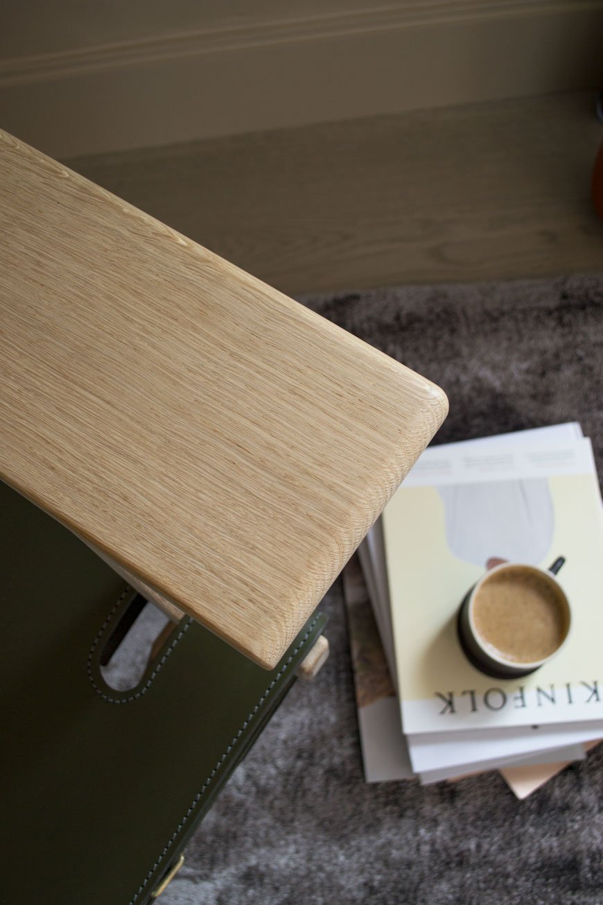
Who Are Fredericia?
Named after a small industrial town in Denmark, the Fredericia design house was founded in 1911 operating as a chair factory. During its first twenty years of production, the factory concentrated on upholstery, later becoming the first licenser of Thonet in Scandinavia. Family owned to this day, its humble beginnings and near bankruptcy would see it become a forerunner of Danish Modernism.In 1955, the factory was acquired by CEO and architect Andreas Graversen who brought in close friend and designer Børge Mogensen to turn it around. Over the next twenty years, Mogensen would go on to design a string of Danish modern classics, including his first - the No.1 Sofa whose shape would arguably become the most emulated silhouette for furniture in modern design. His style was described by Graversen as "unpretentious, pure and honest". His ethos was to create pieces that would blend seamlessly into the every day, interested in the functionality and simplicity of it over the short term trend. Today, Fredericia is home to some of the most revered designers of our time, including Cecilie Manz, Gamfratesi and our very own Jasper Morrison. Building on a proud heritage, Fredericia continues to create the modern originals of tomorrow. Their designs show the high level of craftsmanship, long-lasting integrity and of course, the quintessentially Danish aesthetic for which they're known.
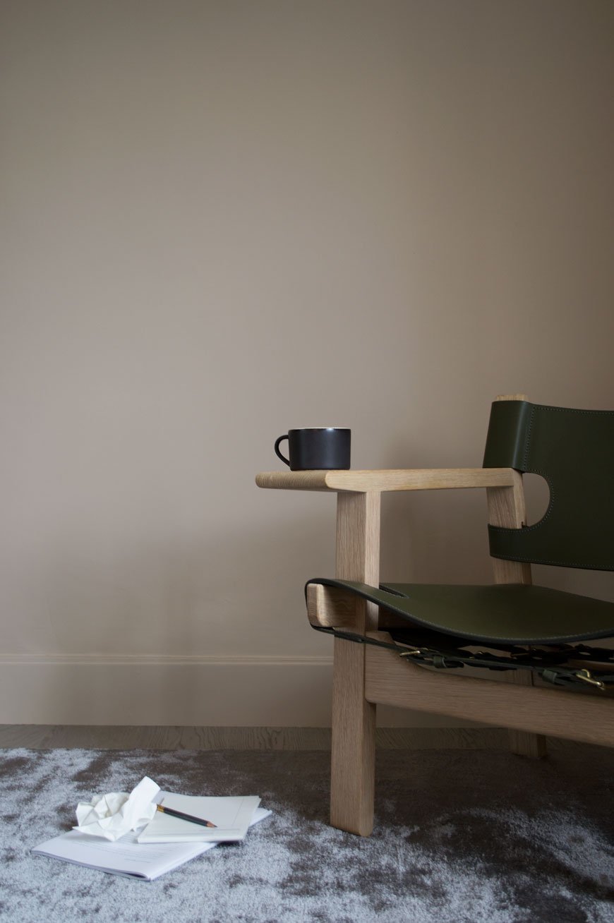
The Spanish Chair
On a journey through Spain, Mogensen noticed a chair with wide arm-rests, a style common in parts influenced by Islamic culture. This sparked an internal based on functionality, a clean aesthetic and unassuming, rustic materials that would ultimately become The Spanish Chair.Manufactured by Fredericia to his exacting standard, the chair's geometric frame ensures greater stability. Whereas flat sawn wood has a tendency to split, the stronger quartersawn oak frame shows the almost straight stripes of grain that run through the wood. Vegetable tanned saddle leather becomes the backrest and seat, a Medieval Spanish methodology of furniture construction that would inspire Mogensen throughout his career. One can just imagine the beautiful patina that would develop in the leather over time. Brass buckles underneath tighten the leather as it softens and the wide armrests are intended to be used as a ledge for a cup or book, doing away with the table and opening up space. As this year marks the 60th anniversary of The Spanish Chair, Fredericia has produced a limited edition in one of Mogensen's most loved shades sourced from his archive. Olive Green. Undoubtedly a popular colour in Mid-Century design, the chair is a symbol of the longevity and enduring nature of Fredericia's rich design heritage. Available until December 31st 2018.
Photography & styling © Tiffany Grant-Riley
[AD] Our New Engineered Oak Floor in the Bedroom
 This is a paid partnership with Havwoods. Have you noticed our plaster pink bedroom walls have been replaced with a cocooning beige? There's also a sophisticated, engineered oak floor down too! Yes, the floorers came last week to lay our Havwoods planks and I'm in love with how different it makes the room feel. I know what you're going to say. Why didn't we sand and stain the original floors then? Good question. I remember being on a shoot a few years back and the assistant stylist told me the best thing she ever did in their Victorian home was to put wood flooring over the top of the original. It made such a difference to the warmth of the house, she said. As a restoration purist, I was a little horrified. Why would you cover up such a beautiful piece of history?!
 Now I get it. Firstly, what we've been calling the original floor was only ever meant to be a base for the now long gone floor at the time to sit on top of. A subfloor. That explains the gaps under the skirting which show where that floor would've been. And it's draughty. Having been through the very messy, time-consuming process of finishing the kitchen floor ourselves, we just wanted the job done and with a much warmer finish.
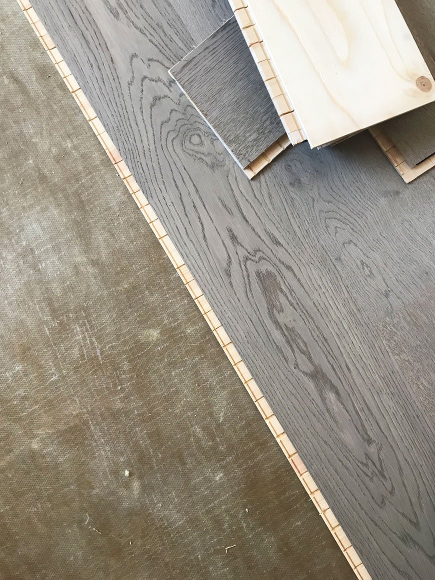
Why Choose An Engineered Oak Floor Over Laminate
In all honesty, I'm not a fan of laminate flooring. It's a throwback from the 90s when everyone had that blonde wood effect planking that bubbled and marked really easily. There's no doubt that laminate has come a long way since then and with better printing technologies it's difficult to spot the difference now. Here's the thing though. Laminate is typically made from a composition of melamine resin and fibre board topped with a printed, laminated image to look like wood, but wood it is not. It's not remotely eco-friendly and has a lifespan of around 20 years. Although it's possible to replace planks if they need repair, you can't refinish them if they need maintenance.There's a new level of upheaval and added cost with a solid wood floor, so in an effort to stick with ethical products and honour the age of the house, an engineered oak flooring felt like a good compromise. It's important to us that we know the provenance of what we have in our home and all Havwoods products are traceable and certified. Unlike laminate, it's all wood. It can last a lifetime and will take sanding and refinishing several times if necessary. Each plank is completely different too; the oak on our floor has a beautiful wavy grain with a smattering of 'pips and burrs'. It has a wonderful texture under foot and frankly, there's no competition.
Decisions, Decisions and The Karelia Range
Earlier in the year, I visited the Havwoods showroom in Clerkenwell. A treasure trove full to the brim of floor samples, from solid parquet and reclaimed planks to HDF Composite, it's easy to feel overwhelmed.TIP: My advice would be to have some understanding of the look and feel you're aiming for to help narrow it down, even if all you can say is you want the floor to look warm, classic farmhouse.Going in with a contemporary, Nordic look in mind with a touch of grey, it was almost a gut feeling when I was shown Shadow Grey (188) from the Karelia range. This collection is a click system, made from European oak, with a 3.5mm lamella (that's the oak top) and a double base layer of Finnish spruce. The square edge on the planks gives the floor a contemporary luxe feel - however other designs in the Karelia range have a bevelled edge.I took a couple of different samples home just for comparison, but not surprisingly having let it sit in the room for a few days we were unanimously for the Shadow Grey. Yes, it was pretty hard to imagine a whole floor from one sample piece, but the lifestyle images from The Wood Book helped piece it together.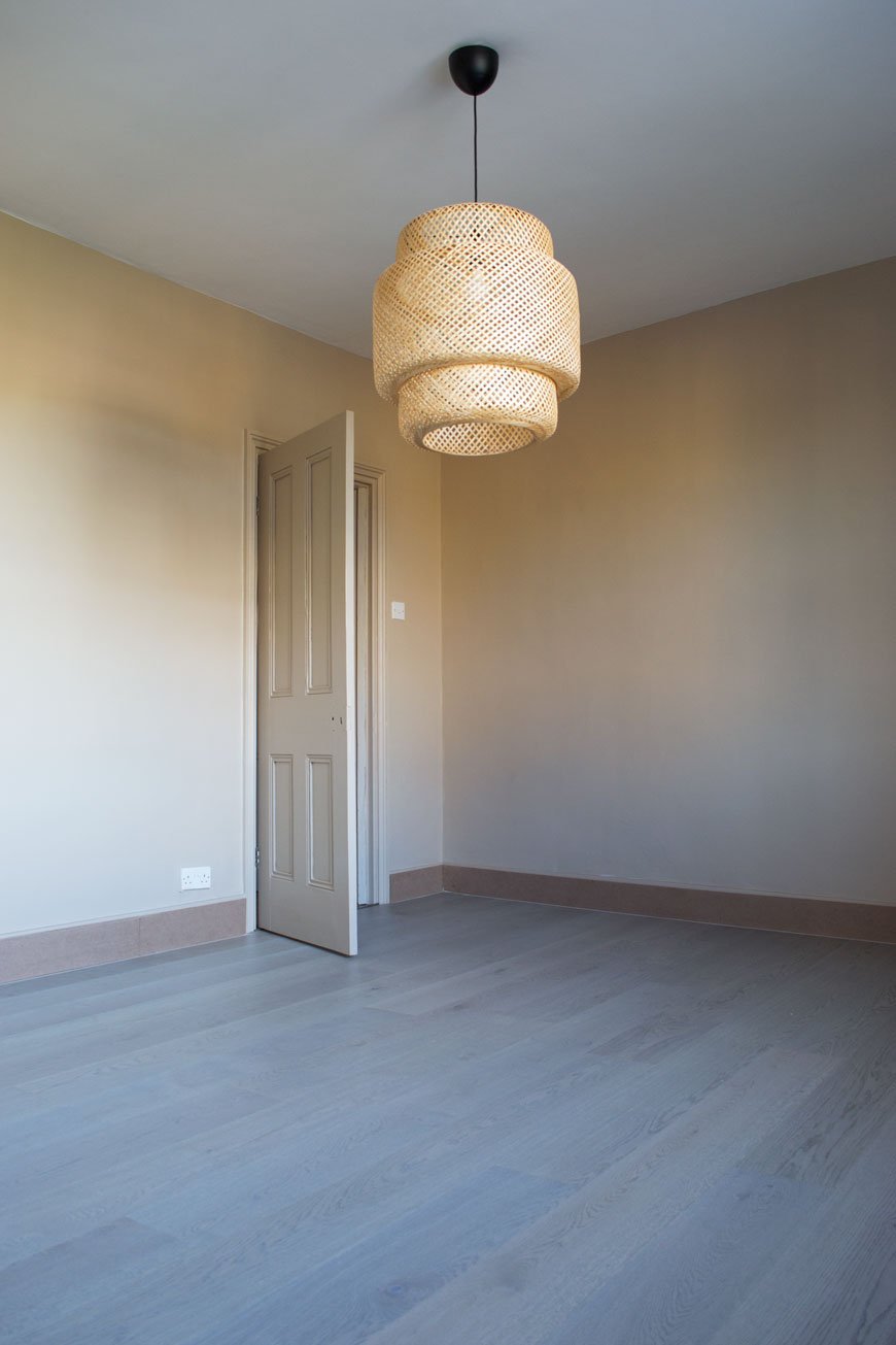
Floating vs. Gluing Installation
You've got two choices when you're laying an engineered floor - glueing it down to the underlay or floating it on top. There are pros and cons for both but ultimately we decided to float it which will allow the wood to breathe and move without fighting against glue. This does mean there's an element of bounce to the floor but I prefer knowing it has room to shift without buckling.
Skirting Options
Normally when you have a new floor fitted the existing boards are removed, but in this case, having already plastered the walls we didn't want to open a new can of worms. In older properties, the skirting can be cut into to fit in the new floor underneath, but I wasn't keen on that for the same reason. We didn't like scotia or other more decorative trimmings, so the floorers suggested adding an MDF skirting on top of the old ones (which we'd already painted, gah!). Slightly lower than the old boards, when painted they'd look a little more ornate but you'd never tell the difference. Needless to say, we went with that.TIP: Make sure you use a paint that's suitable for MDF as it absorbs a lot. We used a primer first before going on with our Valspar colour.Now we're into the final week of finishing the snag list, hanging lights, screwing in handles and all the small details before it'll be ready to move into properly. Can't wait to show you the full transformation!
Photography © Tiffany Grant-Riley
[AD] Nordic Luxe Beige Bedroom Inspiration
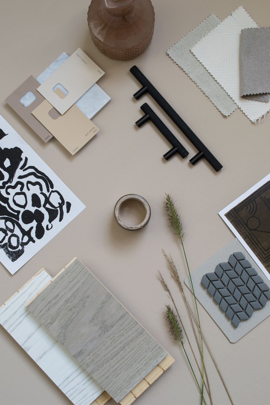 [AD] This is a paid partnership in which various products have been gifted*. Neutral interiors get a really bad rap as boring and unimaginative. The thing is though, there's just as much skill that goes into making neutrals work as there is for playing with bold colour. As the renovation work draws to a close on our current project, I'm sharing my latest mood boards, talking you through the inspiration behind our Nordic luxe beige bedroom. You'll find tips and tricks on how to lift a beige scheme and turn it into anything but boring.
The Brief
We wanted the bedroom to have a design hotel feel to it. A sanctuary to escape to with a focus on high-quality, luxury materials whilst remaining faithful to the period features of the house. If there's one thing I've learnt from the many hotel stays I've experienced over the years, it's the attention to the absolute essentials that matter. It's a feel of a soft rug underfoot, well-chosen lighting and the way the room has been designed to enhance sleep and relaxation. I've also been so inspired by what the likes of Menu, Fredericia and Muuto have been doing as brands that I wanted to recreate the minimal luxe look in our room.It was important that the bedroom connected with the rest of the house so I wanted to continue the thread of high contrasting tones (in this case black and grey) with pale wood and abstract art. The room needed to be minimally styled for it to be a restful space in which to wind down.
Choosing The Right Shade
Our bedroom is north facing and the light has a cool quality to it at certain times of the day so anything with blue undertones was out of the question. If you have the same problem, choosing a colour with warm undertones of red or yellow might help.Letting go of the plaster walls was a difficult decision (and so many of you echoed those sentiments on Instagram) but it was time for a solid colour, something just as soothing but warmer. Finding the right shade of beige took some doing - I went through so many samples I almost couldn't see it anymore. And then Valspar pulled it out the bag. Hello, the aptly named 'Lark Song'. I'm hoping you can see the red undertones from the shots I took below?Having chosen the colour, I wanted to continue it into the woodwork too, using satin paint in the same shade for a subtle sheen on the skirting, doors and around the window. This will give the bedroom a contemporary update and bring out the contrast between matt and sheen.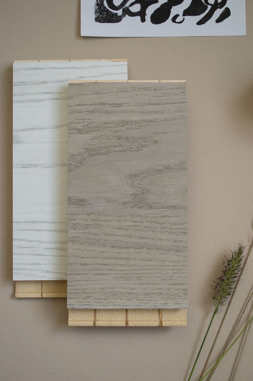
The Floor
This was the first room we've done in the house where we decided to put a new floor down. Although the original floorboards are in good condition, they make the room feel cold in the winter months and the idea of sanding and staining them filled us both with dread. Great in the kitchen, not in here. So a few months ago I spent a very easy hour at Havwoods, comparing their engineered wood flooring samples and looking for something with a washed, grey tone. I eventually arrived at Shadow Grey, a real oak design from the Karelia range which has been brushed and stained with an oil finish. These boards work on a click system and I'll be able to share the installation with you once the floor has gone down next week.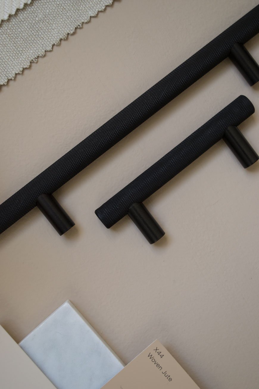
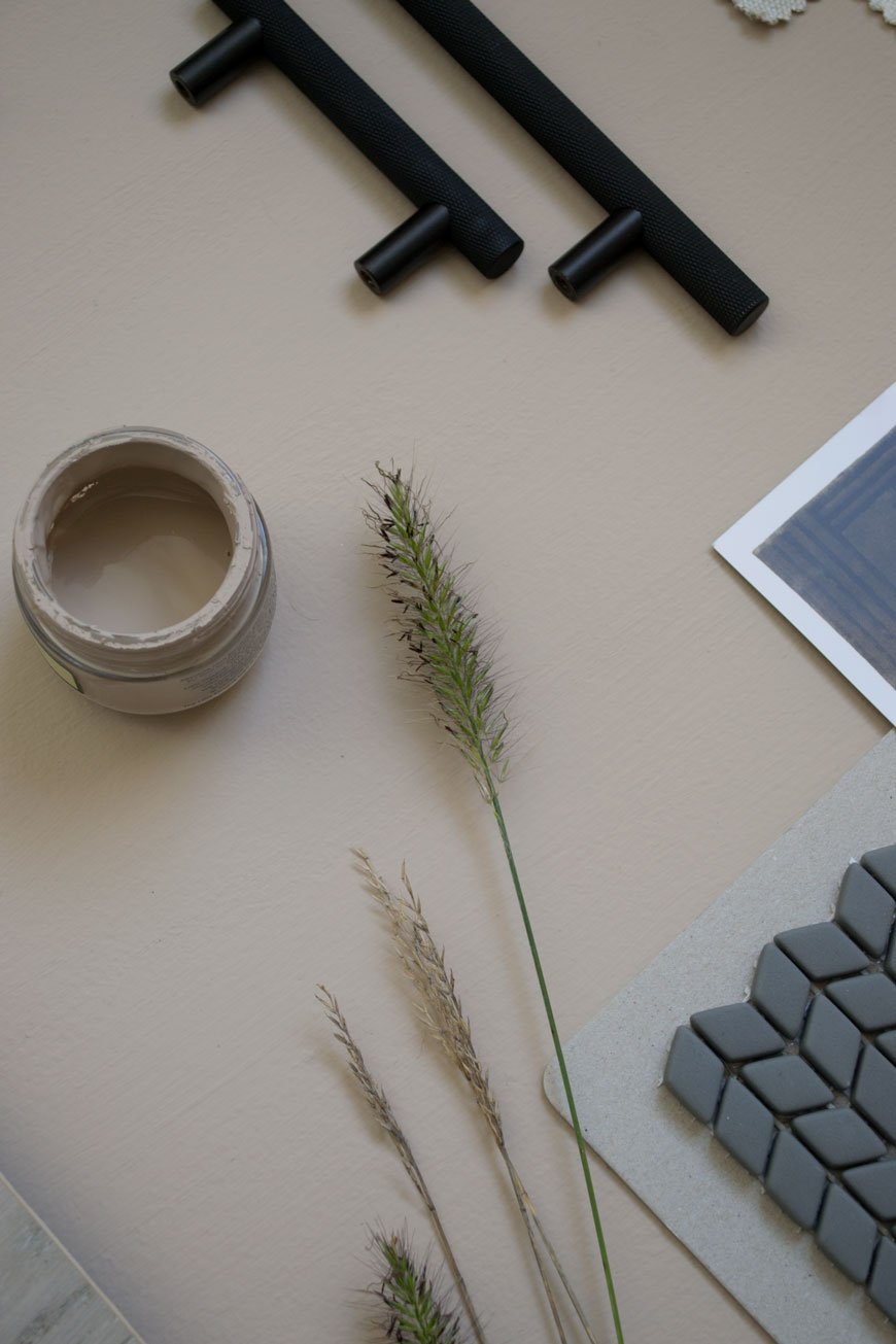
Natural Elements
I'm going to highlight the tonal relationships between the beige walls, grey floor and light oak furniture. There'll be a small reading nook in the corner where my desk used to be, with SSM's ash and leather 'Shelf90' for a collection of reads and Fredericia's 60 Years Special Edition Spanish chair. The olive green leather is to die for. I literally can't wait to pull this corner together! The mix of smooth leather, light wood and linen on the bed itself will create a harmonious feeling, to feel easy on the eye.Of course, no room in our house would feel right without some element of planting, so I'll be using a mix of dried and potted grasses to style with. I'm obsessed with grasses and have been growing several varieties in our garden the past year.
High Contrast and Tactile Finishes
It's so easy to make a beige bedroom scheme feel flat if you ignore the contrasting elements. I'm talking about the darker shades that give it depth. In the kitchen I used dark blue and black with white, in here I'm continuing the black. I've picked out knurled, black metal cupboard door handles which echo the style of the ones we used in the kids' room. Against the beige doors, they'll ready pop. We'll also be tiling the hearth plate in a matt glass mosaic design which gives a level of tactility without the need for colour. The grey in the tiles will pick up against the anthracite grey column radiator which we've chosen to compliment the age of the house.A deep pile rug in Graphite draws on the design hotel feel we wanted and abstract art continues the thread from the sunroom and kitchen. Remember, texture is key. Whether it's polished marble or metal, sheepskin or woven fabrics. Mix up the texture and you'll add depth and interest to a neutral design scheme.We're so nearly there now. The next couple of weeks is going to be a mad dash to the finish line but it'll be worth the wait to show you the transformation!
| 1 | Ray black wall lamp, Mater* | 2 | Oak frame, Cox & Cox* | 3 | Terracotta pitcher, Another Country | 4 | Morten oak chest of drawers, Heal's | 5 | Shadow Grey engineered oak flooring, Havwoods* | 6 | Black standing planter, Cox & Cox* | 7 | 'Collage' screen print, Laura Slater | 8 | Ash and leather 'Shelf 90', SSM* | 9 | Dolce rug in Graphite, Houseology* | 10 | Spanish Chair 60 Years Special Edition, Fredericia* | 11 | Confiserie Fogg mosaic hearth tiles, Claybrook | 12 | Skyscraper knurled handles, Dowsing & Reynolds* | 13 | Grey column radiator Anthracite, Trade Radiators.
Photography & styling © Tiffany Grant-Riley
[AD] Bedroommood Crisp Cotton Sheets
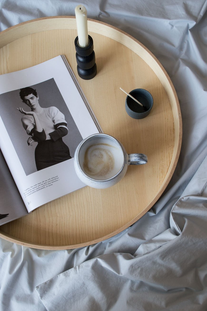 This is a paid partnership in collaboration with Bedroommood. I love September. It feels far more like the beginning of New Year than January. Maybe it's the fact that school starts back or it's the London Design Festival this month, but either way, it feels like a month full of possibilities. Know what I mean?How was your summer? I spent mine enjoying a slower pace, finding inspiration in the garden. And running around with the children - can't slow down too much! The bedroom already looks like a hotel room following its fresh coat of paint - Rob spent a few days on it while we gave him some space up in Suffolk. I can't wait to share it with you in October!In anticipation of the colder months, I've swapped out the linen bedding in favour of crisp cotton sheets from Bedroommood. Made by a small team in Lithuania, the founders find little luxuries in the fabric they've chosen. Championing Oeko-Tex® certified Egyptian cotton (which means its grown and processed with no nasties) it's woven with a minimum of 300 thread count, meaning it's a softer, stronger quality than average.Designed with a minimalistic approach in collaboration with designer Vida Vyšniauskienė, the collection sticks to a palette of blues, greys and white with the option of matt percale or sateen for a slight sheen.
We believe in simple things. We are fans of minimalism. We wanted colours that would gently embrace you and will not disturb you on your way towards the state of ideal sleep.
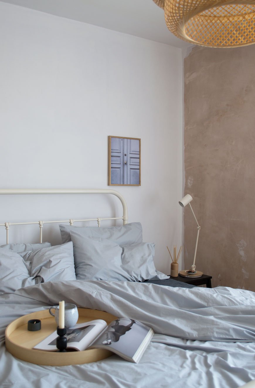
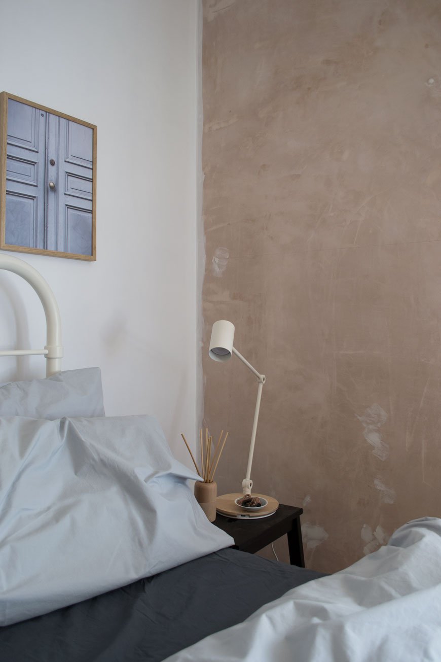 As I'm pulling inspiration from some of my favourite hotel experiences for the bedroom, the best place to start is with the bedding. I'm naturally drawn to contrasting tones in our home so I've paired light grey with a charcoal grey percale sheet which looks striking against the new beige walls. I love the crisp rustle of the duvet, the casual, stonewashed feel and the bonus of not needing to iron them. In fact, as far as cotton sheets go, these are superior. An easy way to update your room without going to the trouble of a complete makeover.
 Having washed and used them several times since they arrived, the quality holds beautifully. The fitted sheet comes with a well thought out 'long side' label so you don't have to guess when you're making the bed up. Over the summer we had had cat-sitting guests use them in our guest room while we were away and they mentioned how lovely they were to sleep in. Bring on autumn. *To try out the benefits of cotton sheets yourself, take 20% off at Bedroommood with the code TIFFANY20, valid until Sept 30th 2018.
Photography and styling © Tiffany Grant-Riley
[AD] Minimalist Art By Desenio In Our Edwardian Living Room
 This is a paid partnership in collaboration with Desenio. Got a bit of a rare insight into our living room for you today, you know I like to do the before and after features in one hit but I thought I'd be brave and show how it is now. The walls and ceilings in here are in real need of replastering, the floors staining, new mantlepieces. The list is endless. See? I'm already making excuses! But it has beautiful bones so until we arrive at that point I've given the walls a fresh lick of white paint for a crisper look. Wall art is a quick and easy way to update a room without going all out, so I've chosen three new minimalist art prints from Desenio.
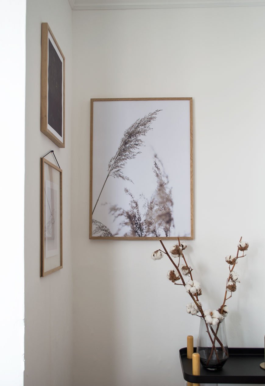 There are two places I buy affordable art from when I can't stretch to buy directly from the artist (which to be honest has only happened once!) and Desenio is one of them. When you want to find an unusual piece that can't be found everywhere else, you'd be hard pushed not to find it here. A Swedish company with a passion for Scandinavian design, its ethos is that stylish wall art should be affordable to everyone. Prints start from £2.95 and there's a very useful Inspiration page which, if you're stuck on what to choose and how to hang it, has readily grouped collections you can purchase as a set. Be prepared to fall down a rabbit hole where the choice is concerned though...
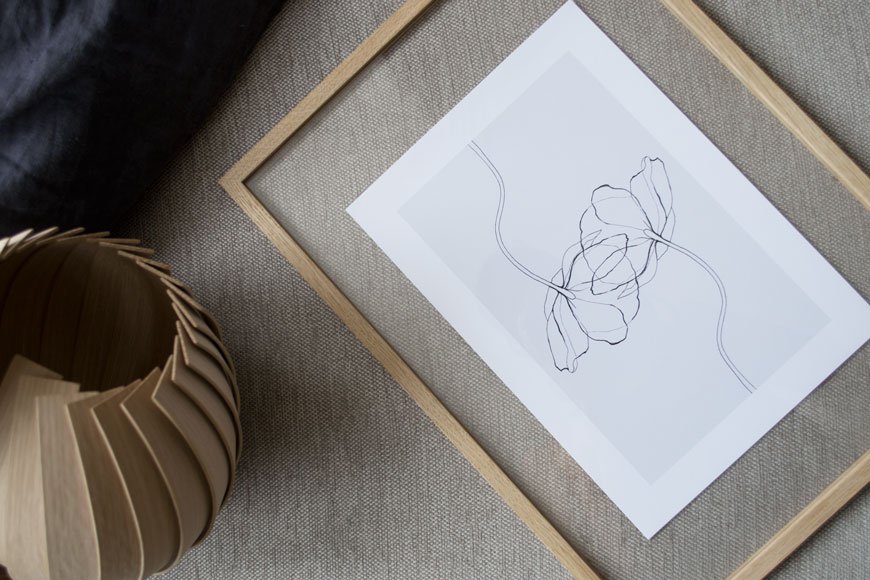 To take some of the indecision out of the equation I focused on a subject. I'd always planned to hang a collection of botanical prints in this corner leaving the rest of the walls clear and chose a muted colour palette of grey, beige and deep green. I want to look at quiet, thoughtful art when I'm home, compositions with simple line drawings, photographs capturing movement through leaves, something with space to breathe. The three I've chosen sum that up perfectly, don't you think?Hanging the Grass poster closer to the corner connects them when you're sitting on the sofa opposite. I've seen some thought-provoking examples of art hung in corners or at the edge of a wall together rather than the centre and I think it really works. I've also been wanting to try the Moebe transparent frame for ages; the design is clever in its simplicity and allows you to frame flat laid collections as well as prints whilst being able to see the wall behind. The entire frame is made from four grooved sides that hold the two acrylic glass sheets with the tension of a rubber band from which you hang it.
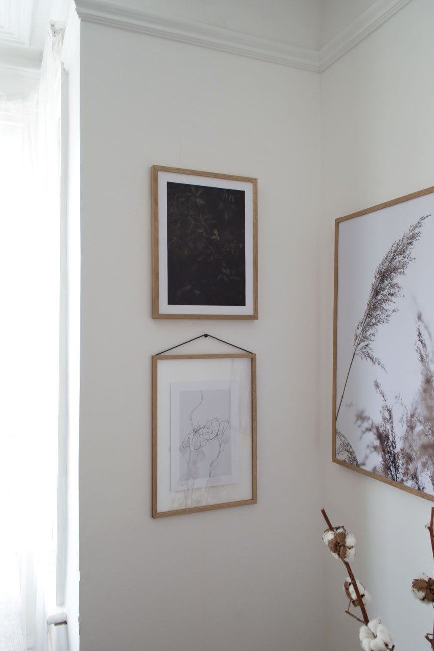
TOP TIP : A good tip for styling a gallery wall is to use the same type of frame, so your collection has a coherent look regardless of the art you have on display. Desenio offer simple designs in black, white and metal frames - I chose warm oak to counteract the north facing light. I love the soothing, natural effect it has in the room now, having some well-considered art up makes the space feel much warmer.
Now's a good time to find some minimalist art for your walls - there's a 25% discount code* 'curatedisplay' valid on posters between June 5th and June 7th 2018 (*except on frames and on handpicked-/collaboration posters).

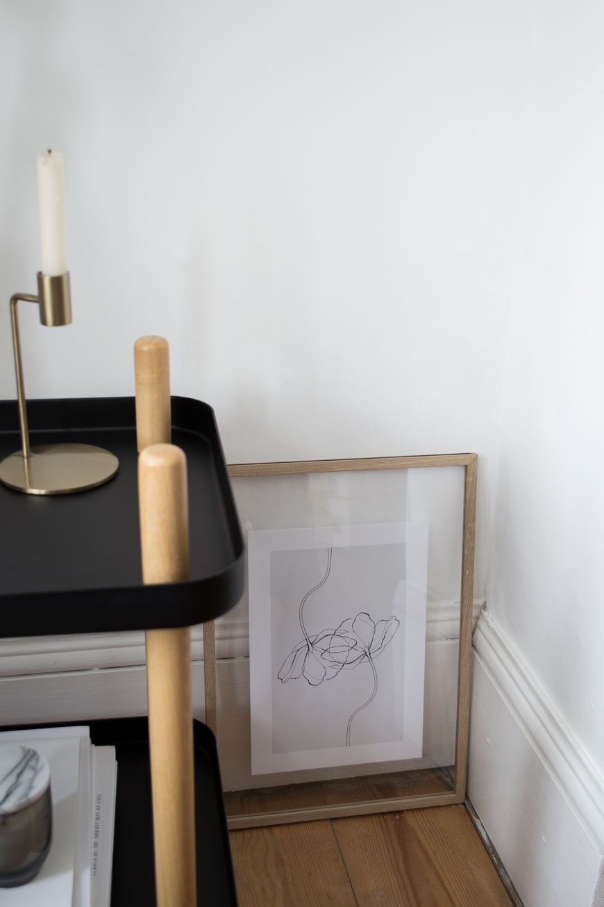
Photography & Styling © Tiffany Grant-Riley

Swedish Linens Sheets For Clean Conscience Sleep
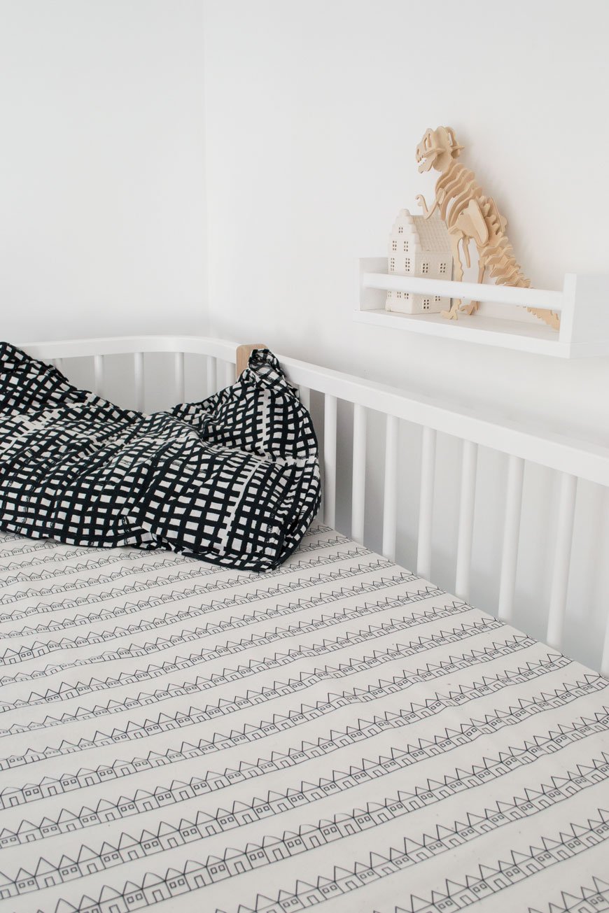
Whilst my two were away at their Grandparents over Easter, I took the opportunity to attack their room. You know, all the usual boring things you want to do when they’re here but find impossible - sorting through mountains of toys, cleaning snot marks off the wall, a really thorough vacuuming...
I've not bought any new bedding since we finished their bedroom as for the most part I don't want mountains of spares piling up in the airing cupboard. Ultimately though, we're making a conscious effort to use only what we need opting for slow fashion over the mass produced. When I got an email from Swedish textile designer Hannah Johnsén to tell me about her new venture, it was like hearing from a kindred spirit and I had to tell you about it.
After studying in London, she began her journey designing knitwear but as a mother of two, it became more important to her to create a cosy environment for her family. With good quality sleep as her focus - and let's face it we all feel better for some decent sleep, she designed a collection of 100% organic percale sheets, made in Portugal with GOTS certified, ethically produced cotton. With every stage of the process scrutinised, all sheets are digitally printed, meaning less water usage and free of plastic packaging. Add to that a fun and playful collection of bold, graphic prints and Swedish Linens was born.
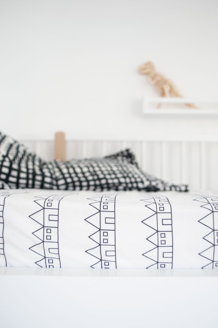
You can see how Hannah's Scandinavian roots have influenced her collection, particularly Lindbacken, named after a town close to her home of Uppsala with its rows of houses. My daughter made a beeline for the Minty Blue Penguins and she loves to count them at bedtime...which is more interesting than sheep I suppose!
Sizes range from crib, single to double meaning they’re not just for kids in case you were wondering and I’m told a king size option will be available later in the year.
For an exclusive 15% discount, use the code curatedisplay15 at the checkout until 2nd May 2018. 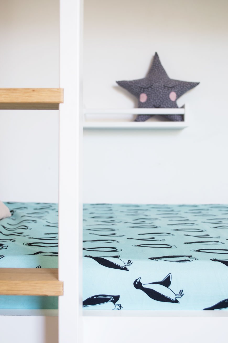
Photography & styling © Tiffany Grant-Riley
* Swedish Linens kindly gifted two sheets for the purpose of this post.
Our Nordic Blue Kitchen Before and After Reveal
 [AD] I never learn. Why is it, that every time I embark on another room project, I think for some reason that it'll take no time at all? Don't get me wrong, I'm not naive, I know that something done well takes all the time it needs, but still. Our blue kitchen refresh was definitely one of those. I mean, look at it. It needed it. Aside from looking like the 90s had well and truly moved in and never left, its mishmash of badly considered DIY meant that it didn't work in any capacity. Ok, so we didn't have epic Grand Designs extensions planned at this moment in time and 90% of the work was cosmetic, but it was still going to be a hard slog.
Here's what we weren't going to change:
• Plastering the walls• Anything structural. So knocking through walls was out.• Cupboard units and worktop. It all had to stay.• Replacing tiles, flooring, sink unit or radiator.Everything else was fair game. If you saw my blue kitchen inspiration post, you'll have got a sense of our plans and how the overall space would eventually look.There's lots to appreciate about this room though. It has plenty of charm in its proportions. One feature I love is the arch in the chimney breast, a nod to where the original stove would've once stood. It makes for a natural focal point. Unfortunately, it also means that due to the way the previous owners built in the cupboards, we could only fit the smallest oven available into it.
The Before
 The room is naturally quite dark as the window faces out to a small piece of yard and across to the neighbours. With that in mind, I didn't want to go all out trying to make it look brighter with white paint, only for it to look cold and flat. Instead, I decided to embrace it, bringing in my favourite shade of blue. I wear it all the time and it seems to be a colour we're both naturally drawn to, especially looking at some of the existing pieces we already had in the kitchen.
 The biggest issue space wise was that although it actually looks spacious, there's very little worktop space for food prep. Cooking has been, up to this point, a literal juggling act. With that in mind, it was important to re-think where certain appliances went, how to use the dead space and free-up some of that worktop. There are also no drawers in the cupboards and the shelves have strange proportions, meaning we needed to make better use of open storage too.
 The floor would also be getting a new finish, with a heavy duty sanding and whitewash stain to lift the light in the room. I couldn't wait to try out OSMO's wax products having heard so many great things about them - and say goodbye to that orange varnish!
The After
 And here we are. It's like a different room, isn't it?The first thing I did was remove the door to pull in as much light from the hallway as possible. It also meant we could easily access the worktop and cupboards usually obscured behind it. One of which is Moesy's food cupboard, which he now camps outside and scratches his claws down all day. Which is nice.
 Those very homemade cupboard doors got several coats of Hick's Blue by Little Greene Paint, along with the wall that houses the open shelving. Those somewhat random over-sink cupboards now look less so, thanks to the blue paint which pulls them into the wall. I didn't want them to be a distraction, but now I love to see the details on the fronts which seem to have been repurposed from an old door. I used Flat Oil Eggshell on the cupboards for a matt finish. It took several layers to get them as brush stroke free as possible, thinning the paint a little, laying them flat and using a super soft brush.The light picks up some of the brushwork, but on the whole, it's hard to spot.All the every day essentials we use are always to hand now - on the open shelves, a free-standing wire unit or wall mounted. Every available space has been utilised and the cupboards sorted and clutter-free. I can't tell you how easy it is to cook here now there's free worktop. The microwave moved into the useless space in the corner too and now all available space is used with intention.Did you spot that we changed the taps too? Turns out that few places make contemporary style bridge taps (for converting two tap sinks into one) so choices were limited. Thankfully I found one I liked from Wickes and our brilliant lady plumber Beth (shout out!) who lives around the corner switched them over for us pronto.
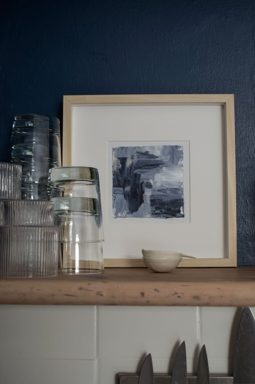
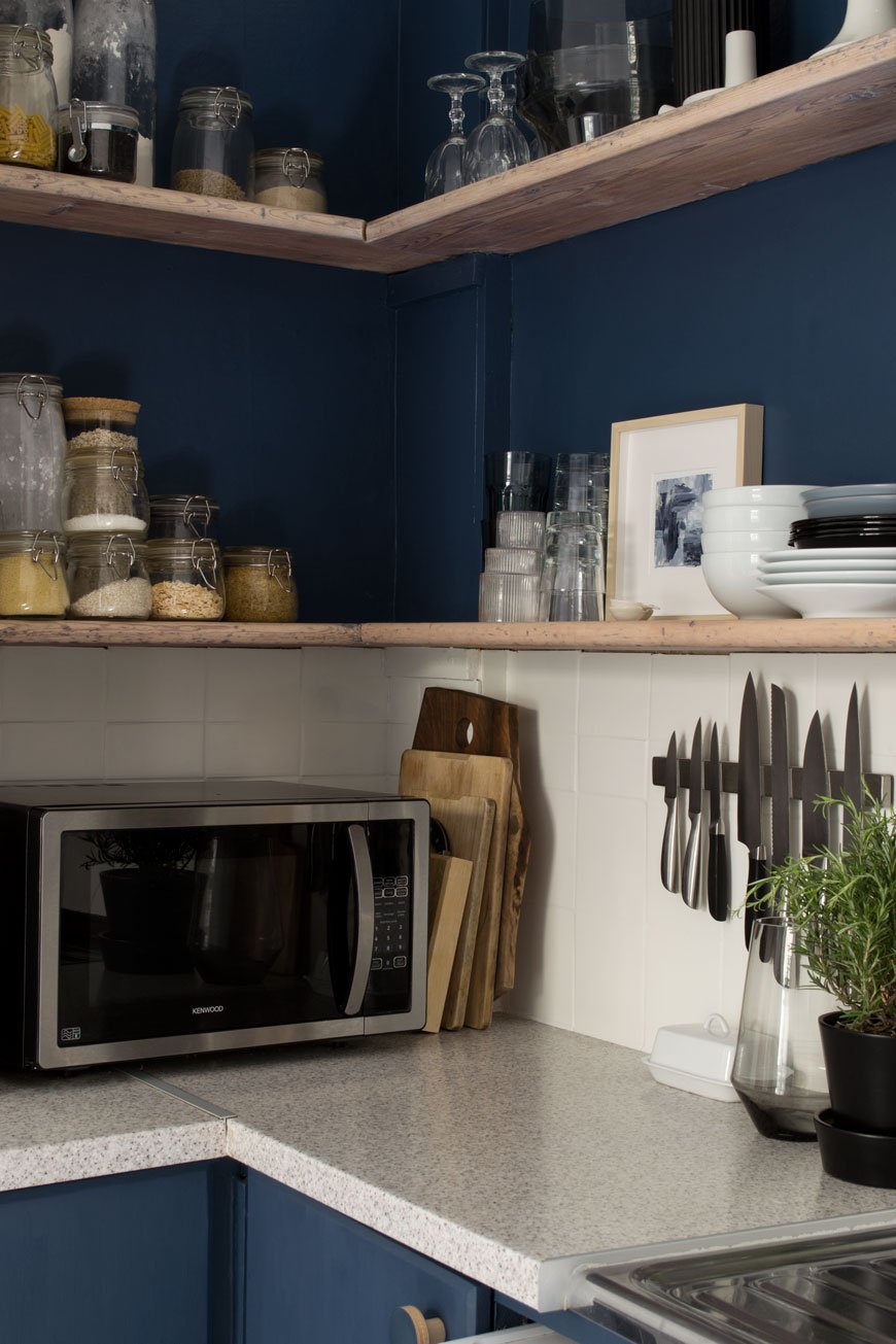
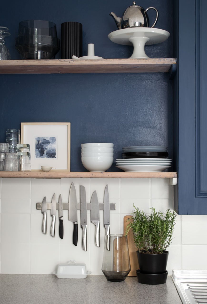
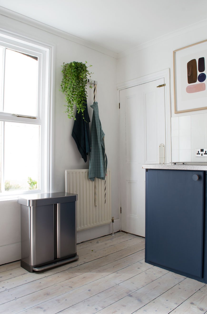
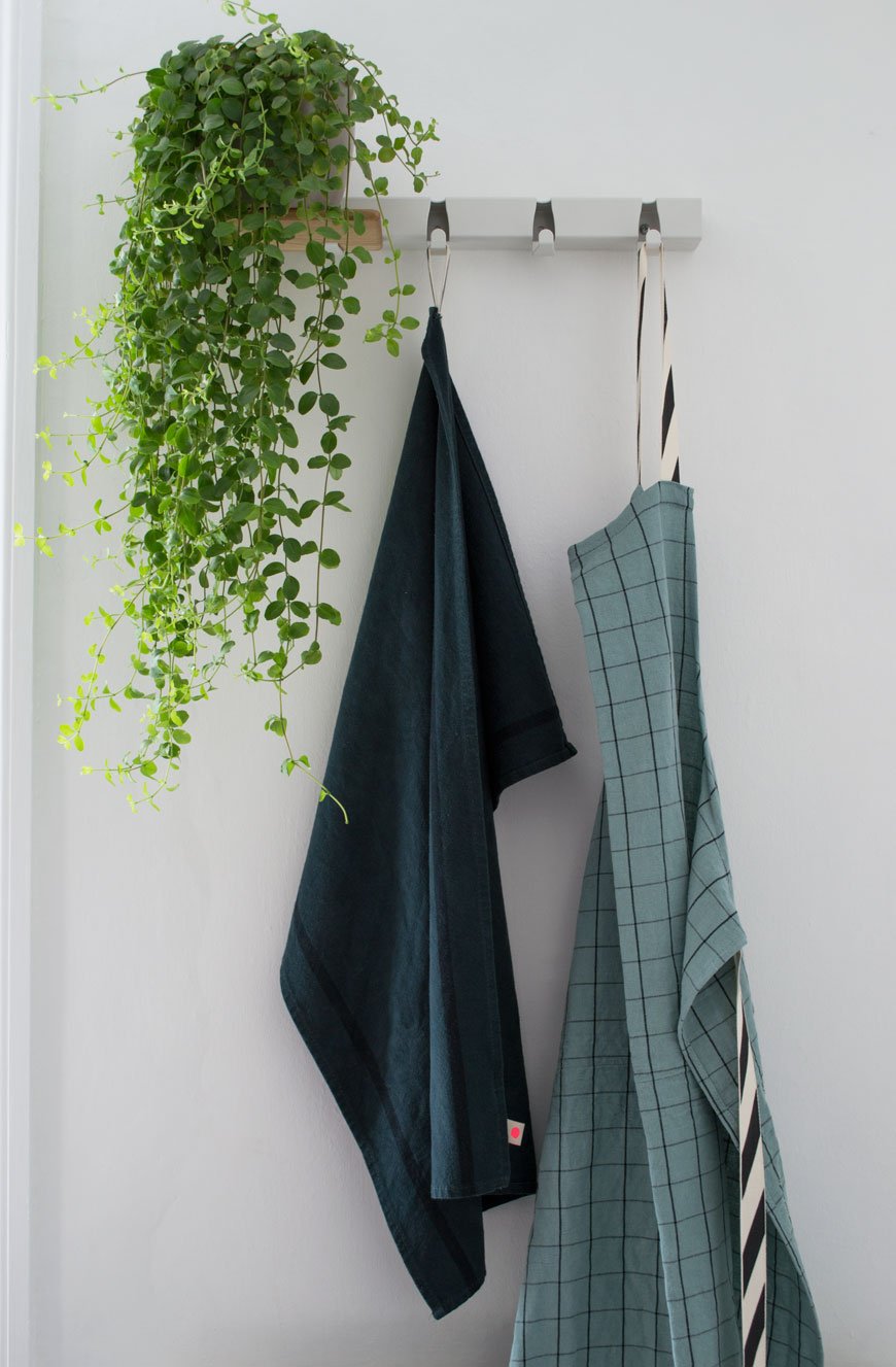 I came across an amazing Dutch design company called Vijf5 (that's five in Dutch) last year at the London Design Festival and their 'Coatrack by the meter' turned out to be the perfect piece to hang linens just behind the kitchen door. It also has an optional oak shelf which slots onto the existing hooks, so you can store mugs or as I've done, a much-loved plant.
 The cupboard handles are a plywood design by Chocolate Creative, the same company who made the door handles in the kids' room. They did an absolutely brilliant job on colour matching them for me, sending three variations to get as close to Hick's Blue as possible. I love the minimal, contemporary lift they give the space with very little effort.The dirty cream walls got an update too with a lick of heritage white, Shirting, from Little Greene Paint, along with the ceiling. An instant lift.Our fifteen year old fridge which was on the fritz got a stainless steel upgrade too. I'm still not used to having so much space and technology at my fingertips, but the fact it takes up less floor space and makes the room look taller is a bonus in itself. The kids can't slam the doors or forget to shut them anymore as it alerts us with a polite beep, and there's literally space for everything. Everything, I tell you.
For Coffee Lovers
 We wanted to make room for a dedicated space to make coffee, seeing as its such an important part of our post-school-run mornings. With everything to hand, from a collection of favourite mugs on the new String Pocket shelves and fresh beans ready for grinding, we upgraded our analogue stove-top to a Rolls-Royce coffee maker. Don't get me wrong, there's always a time and a place for good old-fashioned stove top coffee, but this beauty is game-changing for the time short and hello - hot and frothy milk, should you wish.
 I hope our blue kitchen refresh has demonstrated that small changes can make a huge difference to the feel of a room, whether you decide to paint or upgrade the cupboard fronts, door furniture, walls or appliances. By shifting your perspective away from the things you can't change on to what you can you'll see how much difference they can make. Big change doesn't have to factor in large remodels, so this room is safe. For now...Check out my tips on how to update a tired kitchen on Miele's DerKern. • This post contains brand partnerships. White walls - Shirting Absolute Matt Emulsion, Little Greene Paint.*Blue paint - Hick's Blue in Intelligent Eggshell on the walls and Flat Oil Eggshell on cupboards, Little Greene Paint. *Whitewash floor stain - Wood Wax Finish 3111 White and Poly Oil 3040 White, OSMO UK.*Plywood cupboard handles, Chocolate Creative.Seattle bridge mixer tap, Wickes.Black ash String Pocket shelves, Skandium.*Rhonda black wire rack, Out There Interiors.*Black and stainless steel countertop coffee machine CM 5300, Miele.*Stainless steel fridge-freezer, Miele.*Electrical stainless steel sockets and toggle light switch, Dowsing & Reynolds.White ceiling spots, IKEA.Stainless steel dual compartment recycling bin, Superhuman.Kitchen linens, from the Oscar and Suzette collection, La Cerise Sur Le Gateau.White 'Coatrack by the meter' with oak shelf, designed by Vijf5.
Photography & styling © Tiffany Grant-Riley
Want to see more of our home renovation projects? Follow #TheChathamHouse on Instagram for all updates...
How To Style Wire Shelves In Your Kitchen and 15 Everyday Open Shelf Essentials
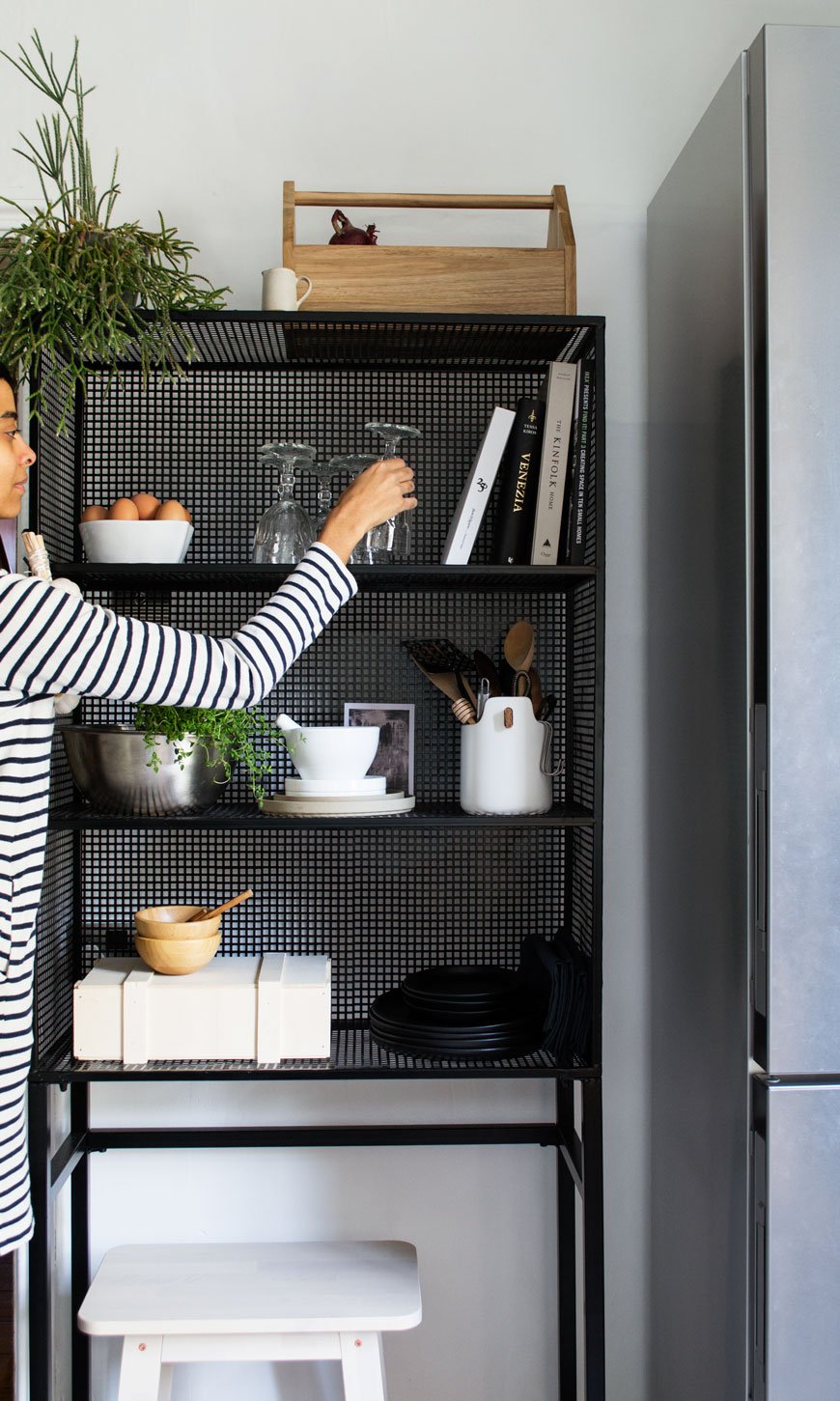 [Sponsored content]. Ok, I promise. This is the LAST post before the big kitchen reveal. For REAL. There have been a few delays, waiting on some furniture and having some hardware changed, now it's ready to go and I really can't wait to show you. It's a different room. But first...If you've got a kitchen with awkward dead space, then this is for you. No matter the size of the kitchen you have, it makes all the difference to utilise every inch you have available. Freestanding units are an ideal option when nothing else will do, particularly if you're renting and want to bring some personality into your kitchen. What's great about them, is that as they have a wire structure and you can still see through to the walls around it, it gives the illusion of space. Which is what you need when it's at a premium.That said, having open wire shelves means that everything you put on it is on display. So how can you style it to look effortless, tidy and still work for you at the same time? I've come up with two ways to achieve open shelf style, using the Rhonda wire display rack from Out There Interiors. The wider of two designs, it fits perfectly into what was an unused space and has helped make our kitchen work harder for us. Here's how...
Look No.1
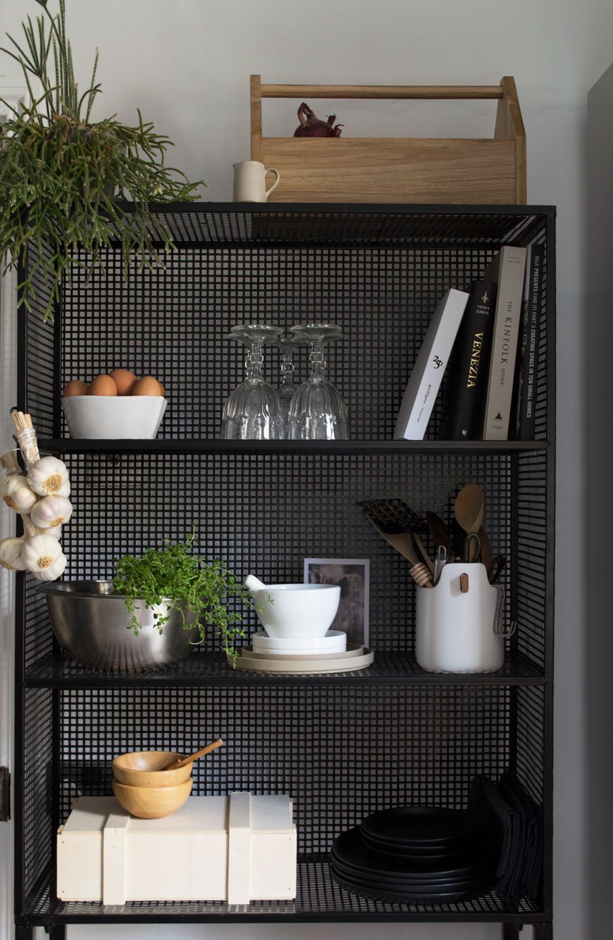 Firstly, cut the crap. By that I mean filter out all the "stuff" you don't use and spend forever climbing over to get to the things that you do. I would advise that you have a good sort out anyway and make sure you have only the items you use every day or every few months. Once you know what your go-to pieces are, you'll rotate them regularly enough that they won't gather dust and you're getting the best out of what you have.• Keep utensils in a large pot like the one I used from Eva Solo (with a nifty carry handle).• Tidy away spices in an easy access box, I reused a Christmas hamper box for mine.• Stack dinner plates. I use plain black or white as any food looks great with a monochrome backdrop to sit on. Napkins can be wedged alongside them or folded on top.• A bottle box can be repurposed for storing vegetables that don't need to be refrigerated, keeping them out of the way on the top shelf.• If your unit has space underneath, use it for a small stool. Not only is it useful for a when you have company in the kitchen but it's always at hand when you need something on a higher shelf.• Rotate your cookbooks, leaving a selection of favourites for quick reference.• Keep a selection of glasses to hand. Having wine or water glasses within easy reach makes all the difference. Just make sure they're in good condition, otherwise, store the least used away. We keep all the bright, plastic kids' plates and cups in a cupboard they can reach so we don't have to look at them!
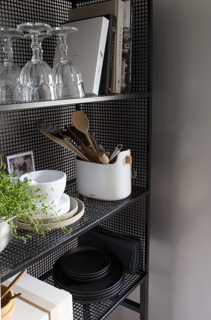
Look No.2
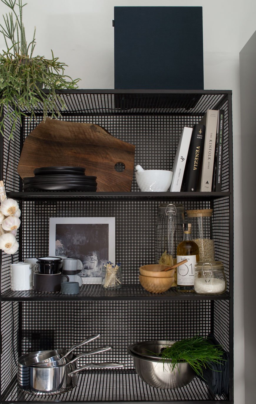 • Create a tea and coffee station with mugs, tea and coffee to hand in simple glass jars. You can also store your cutlery in a large pot or tin to free up drawer space for other less attractive items.• Store smaller appliances such as the toaster, juicer or sound system (as I have here) on the top or bottom levels, freeing up valuable worktop space. Pans and mixing bowls can also find a home here.• Keep your cooking oils and other food essentials close to hand - think salt and pepper, decant oils into glass bottles, jars of cereal for breakfast etc.• Stack your chopping boards but be careful to make sure they lean securely if you're not laying them flat.• If you use fresh herbs frequently in your cooking, this is an ideal place to store them in pots or with a small dish underneath for watering.
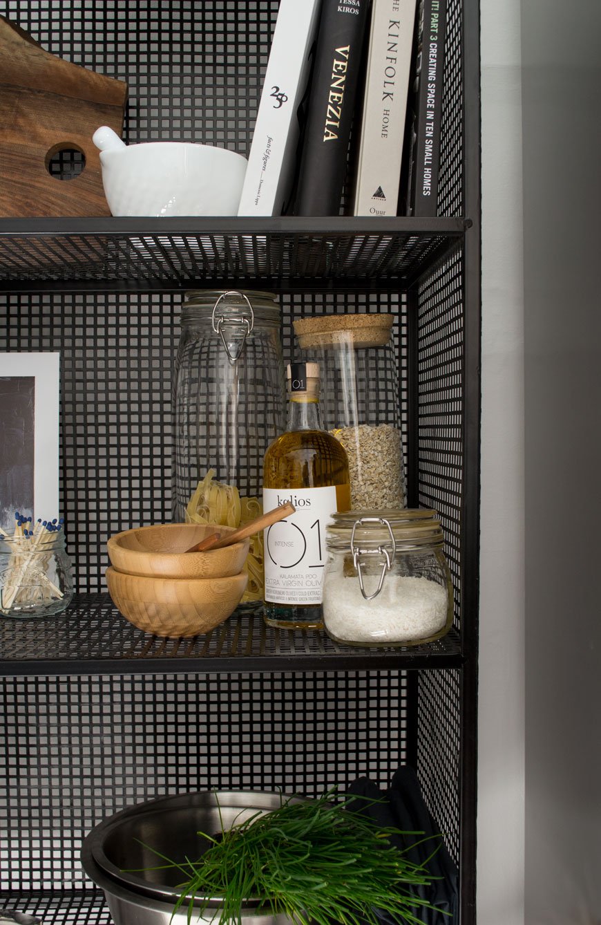

Finding Everyday Accessories For Those Open Shelves
Good looking essentials shouldn't cost the earth but they do need to be durable. This carefully curated edit will give you plenty of food for thought. Stick with a muted palette of white or black as a base, mixing in neutral tones, clear glass, wood and stainless steel for a timeless appeal. You're welcome...
| 1 | Clear glasses, IKEA 365+ | 2 | Elzora and Courbe grey dinner plates, both Habitat | 3 | Freight HHG black steel tray, Trouva | 4 | Save-It wooden boxes, Rig-Tig | 5 | Lastu birch boxes, Verso Design | 6 | White mugs, Made.com | 7 | Hario enamel coffee kettle, Arket | 8 | Dark grey bowls, Granit | 9 | LSA bread bin and bread board, Amara | 10 | Stainless steel mixing bowl, Arket | 11 | Skagerak soft board, Skandium | 12 | Slate blue linen napkin, The Conran Shop | 13 | Chopping boards with ceramic plate, Golden Biscotti | 14 | Grey stoneware jug, H&M | 15 | Glass jar, H&M.
*Written in collaboration with Out There Interiors, who gifted me the wire unit for the purpose of this post. Photography & Styling © Tiffany Grant-Riley