Our Nordic Blue Kitchen Before and After Reveal
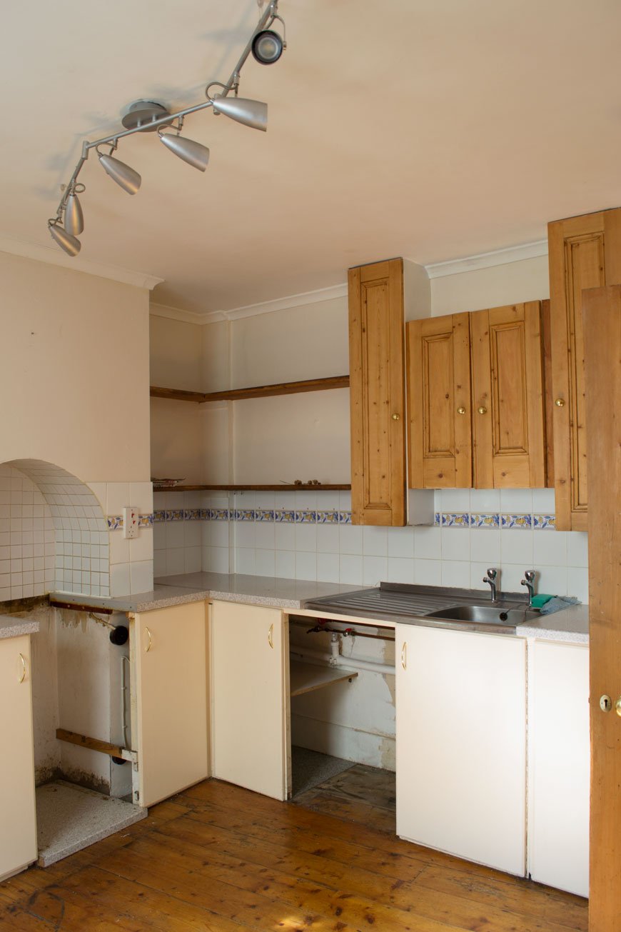 [AD] I never learn. Why is it, that every time I embark on another room project, I think for some reason that it'll take no time at all? Don't get me wrong, I'm not naive, I know that something done well takes all the time it needs, but still. Our blue kitchen refresh was definitely one of those. I mean, look at it. It needed it. Aside from looking like the 90s had well and truly moved in and never left, its mishmash of badly considered DIY meant that it didn't work in any capacity. Ok, so we didn't have epic Grand Designs extensions planned at this moment in time and 90% of the work was cosmetic, but it was still going to be a hard slog.
Here's what we weren't going to change:
• Plastering the walls• Anything structural. So knocking through walls was out.• Cupboard units and worktop. It all had to stay.• Replacing tiles, flooring, sink unit or radiator.Everything else was fair game. If you saw my blue kitchen inspiration post, you'll have got a sense of our plans and how the overall space would eventually look.There's lots to appreciate about this room though. It has plenty of charm in its proportions. One feature I love is the arch in the chimney breast, a nod to where the original stove would've once stood. It makes for a natural focal point. Unfortunately, it also means that due to the way the previous owners built in the cupboards, we could only fit the smallest oven available into it.
The Before
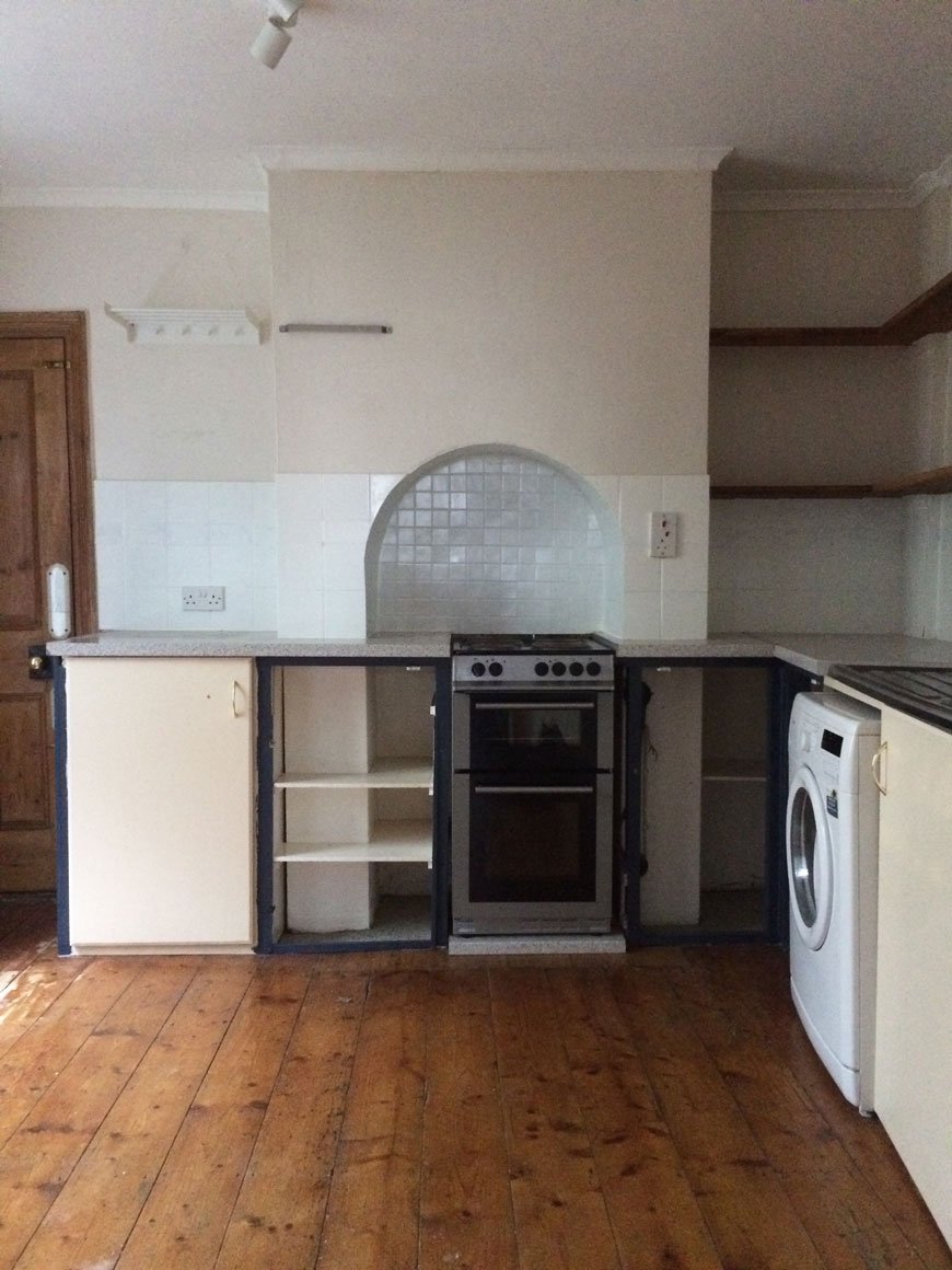 The room is naturally quite dark as the window faces out to a small piece of yard and across to the neighbours. With that in mind, I didn't want to go all out trying to make it look brighter with white paint, only for it to look cold and flat. Instead, I decided to embrace it, bringing in my favourite shade of blue. I wear it all the time and it seems to be a colour we're both naturally drawn to, especially looking at some of the existing pieces we already had in the kitchen.
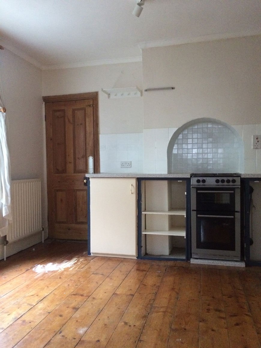 The biggest issue space wise was that although it actually looks spacious, there's very little worktop space for food prep. Cooking has been, up to this point, a literal juggling act. With that in mind, it was important to re-think where certain appliances went, how to use the dead space and free-up some of that worktop. There are also no drawers in the cupboards and the shelves have strange proportions, meaning we needed to make better use of open storage too.
 The floor would also be getting a new finish, with a heavy duty sanding and whitewash stain to lift the light in the room. I couldn't wait to try out OSMO's wax products having heard so many great things about them - and say goodbye to that orange varnish!
The After
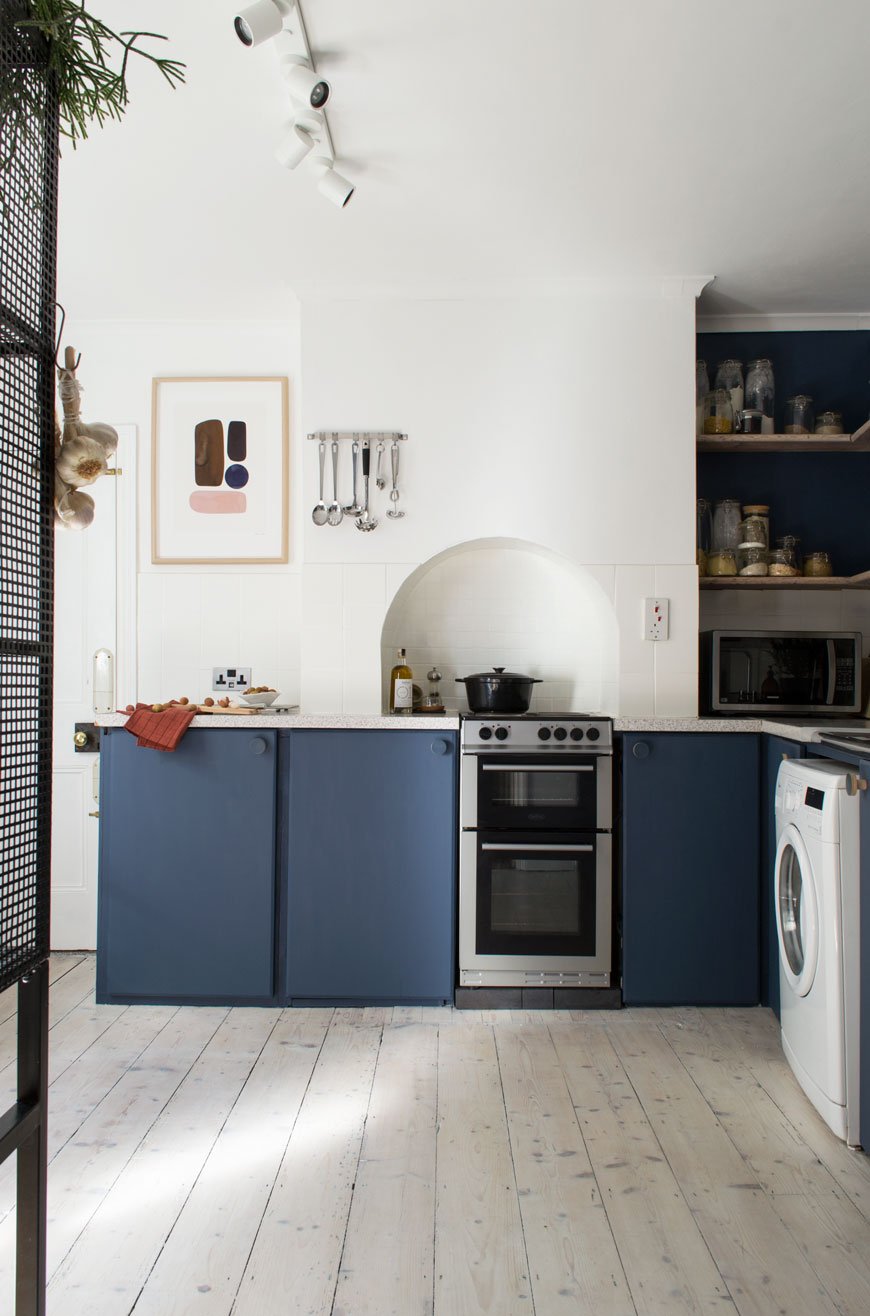 And here we are. It's like a different room, isn't it?The first thing I did was remove the door to pull in as much light from the hallway as possible. It also meant we could easily access the worktop and cupboards usually obscured behind it. One of which is Moesy's food cupboard, which he now camps outside and scratches his claws down all day. Which is nice.
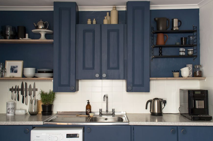 Those very homemade cupboard doors got several coats of Hick's Blue by Little Greene Paint, along with the wall that houses the open shelving. Those somewhat random over-sink cupboards now look less so, thanks to the blue paint which pulls them into the wall. I didn't want them to be a distraction, but now I love to see the details on the fronts which seem to have been repurposed from an old door. I used Flat Oil Eggshell on the cupboards for a matt finish. It took several layers to get them as brush stroke free as possible, thinning the paint a little, laying them flat and using a super soft brush.The light picks up some of the brushwork, but on the whole, it's hard to spot.All the every day essentials we use are always to hand now - on the open shelves, a free-standing wire unit or wall mounted. Every available space has been utilised and the cupboards sorted and clutter-free. I can't tell you how easy it is to cook here now there's free worktop. The microwave moved into the useless space in the corner too and now all available space is used with intention.Did you spot that we changed the taps too? Turns out that few places make contemporary style bridge taps (for converting two tap sinks into one) so choices were limited. Thankfully I found one I liked from Wickes and our brilliant lady plumber Beth (shout out!) who lives around the corner switched them over for us pronto.
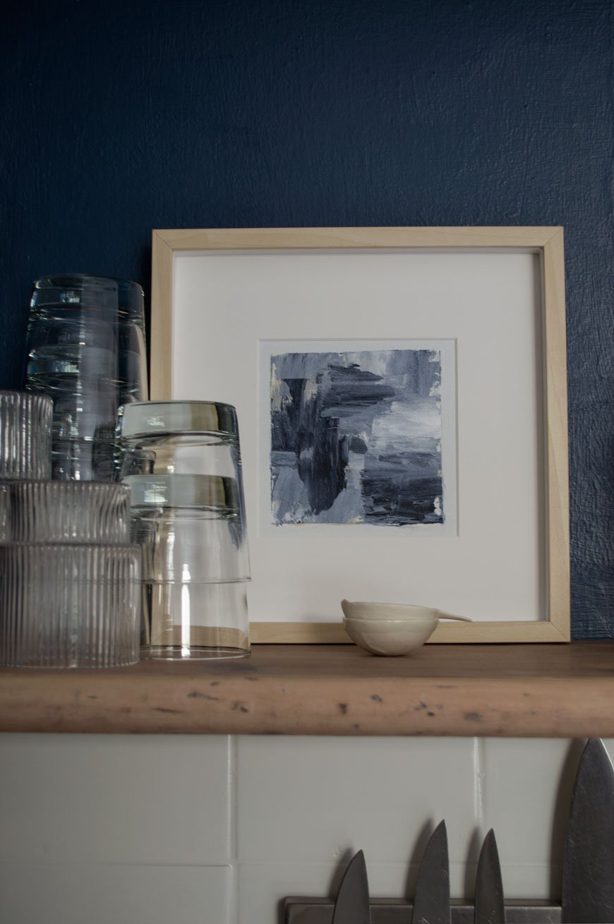
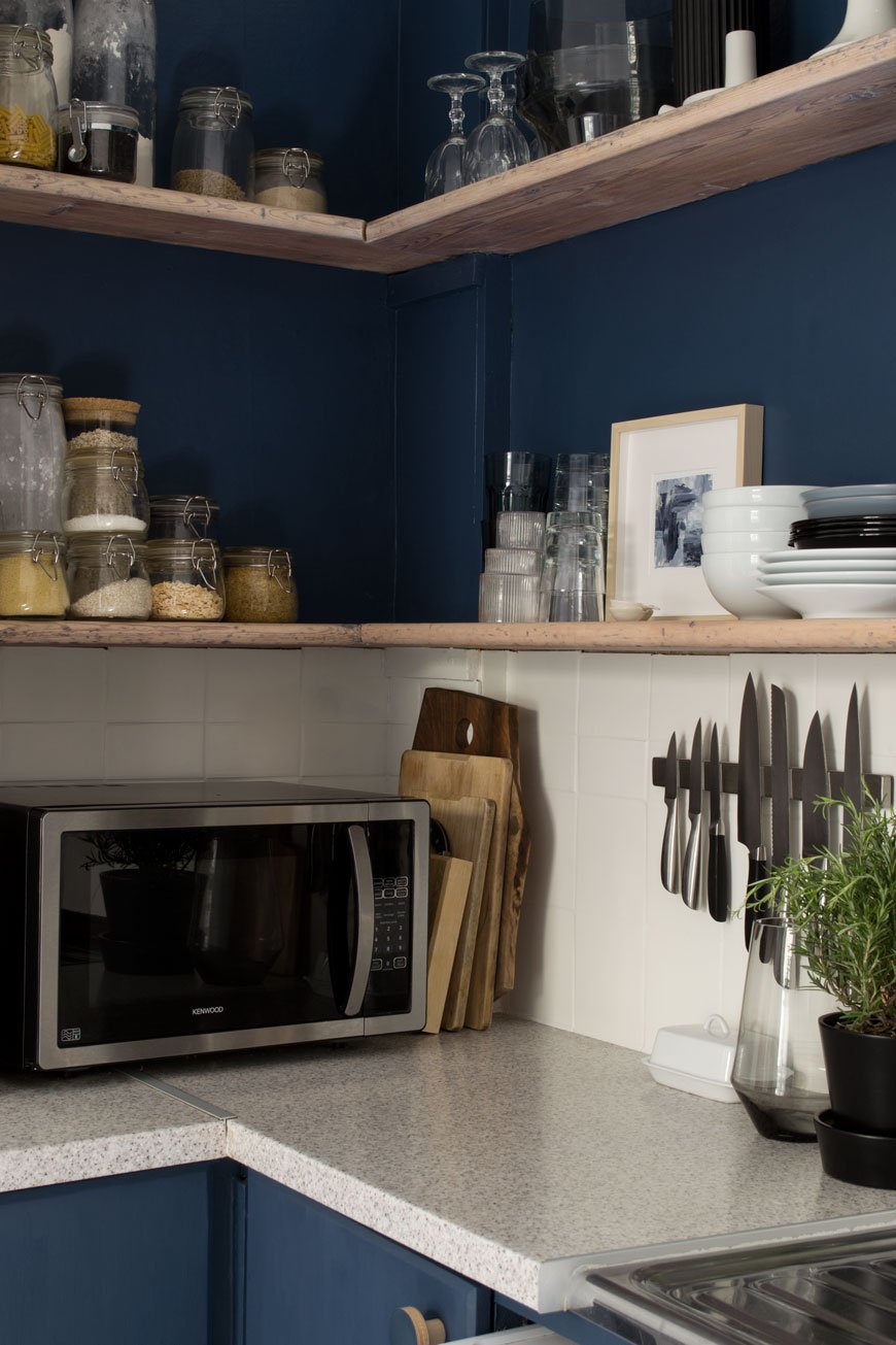
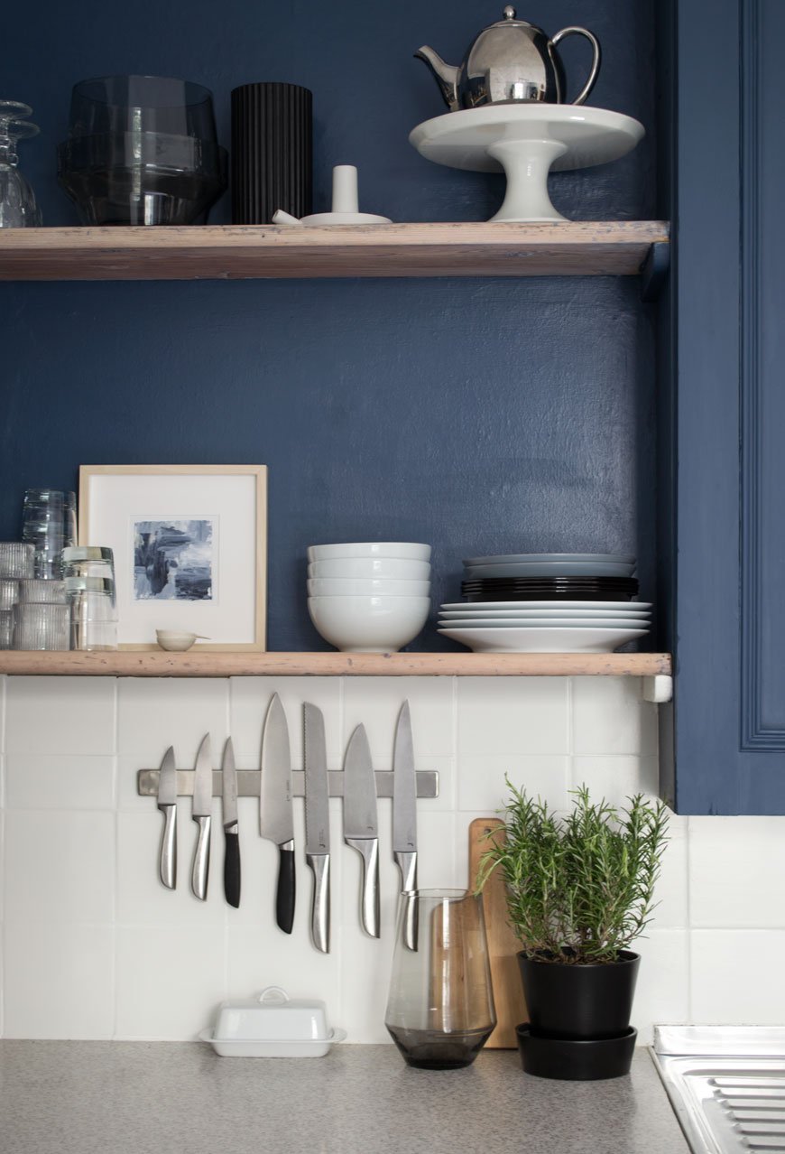
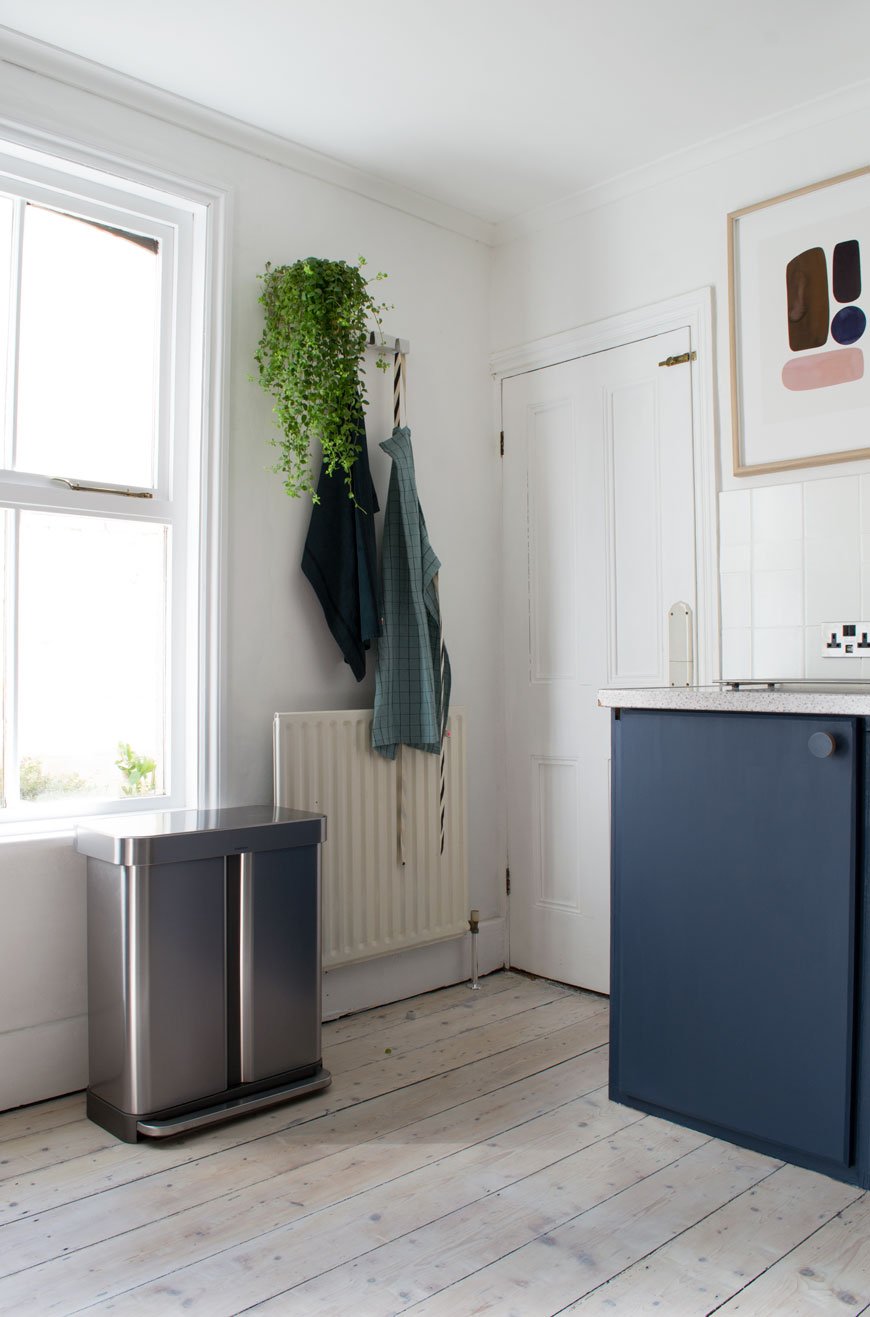
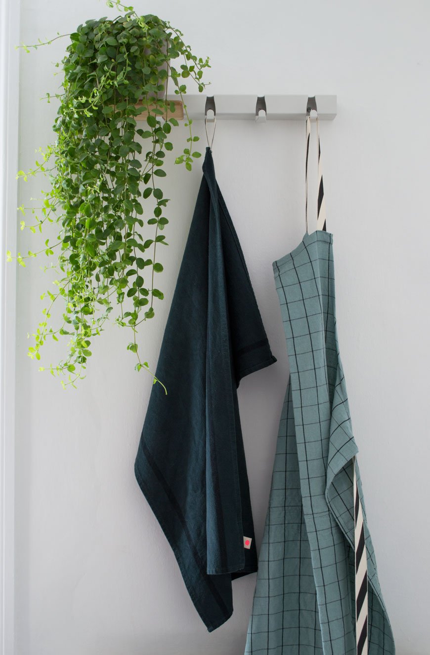 I came across an amazing Dutch design company called Vijf5 (that's five in Dutch) last year at the London Design Festival and their 'Coatrack by the meter' turned out to be the perfect piece to hang linens just behind the kitchen door. It also has an optional oak shelf which slots onto the existing hooks, so you can store mugs or as I've done, a much-loved plant.
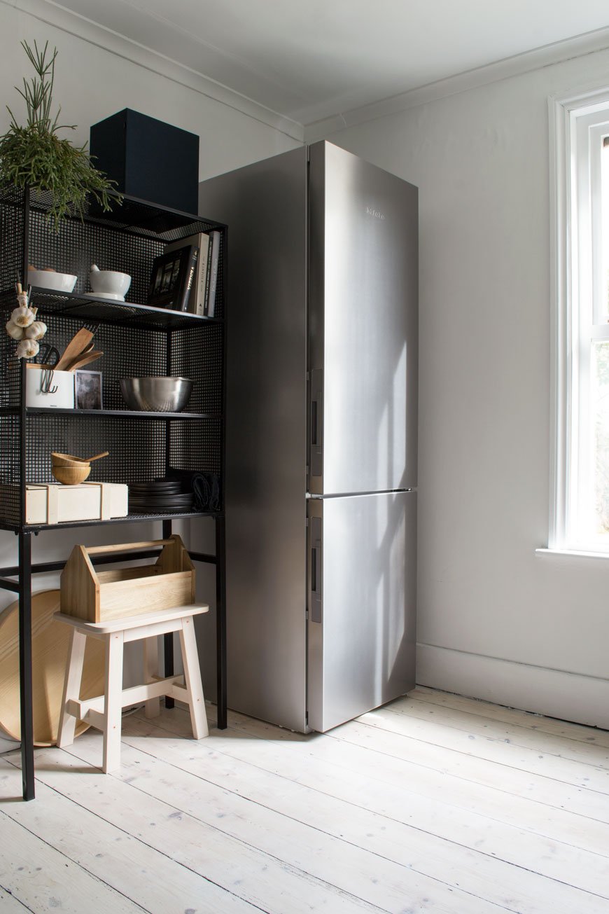
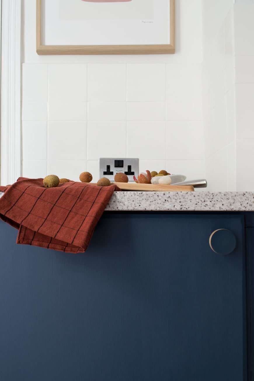 The cupboard handles are a plywood design by Chocolate Creative, the same company who made the door handles in the kids' room. They did an absolutely brilliant job on colour matching them for me, sending three variations to get as close to Hick's Blue as possible. I love the minimal, contemporary lift they give the space with very little effort.The dirty cream walls got an update too with a lick of heritage white, Shirting, from Little Greene Paint, along with the ceiling. An instant lift.Our fifteen year old fridge which was on the fritz got a stainless steel upgrade too. I'm still not used to having so much space and technology at my fingertips, but the fact it takes up less floor space and makes the room look taller is a bonus in itself. The kids can't slam the doors or forget to shut them anymore as it alerts us with a polite beep, and there's literally space for everything. Everything, I tell you.
For Coffee Lovers
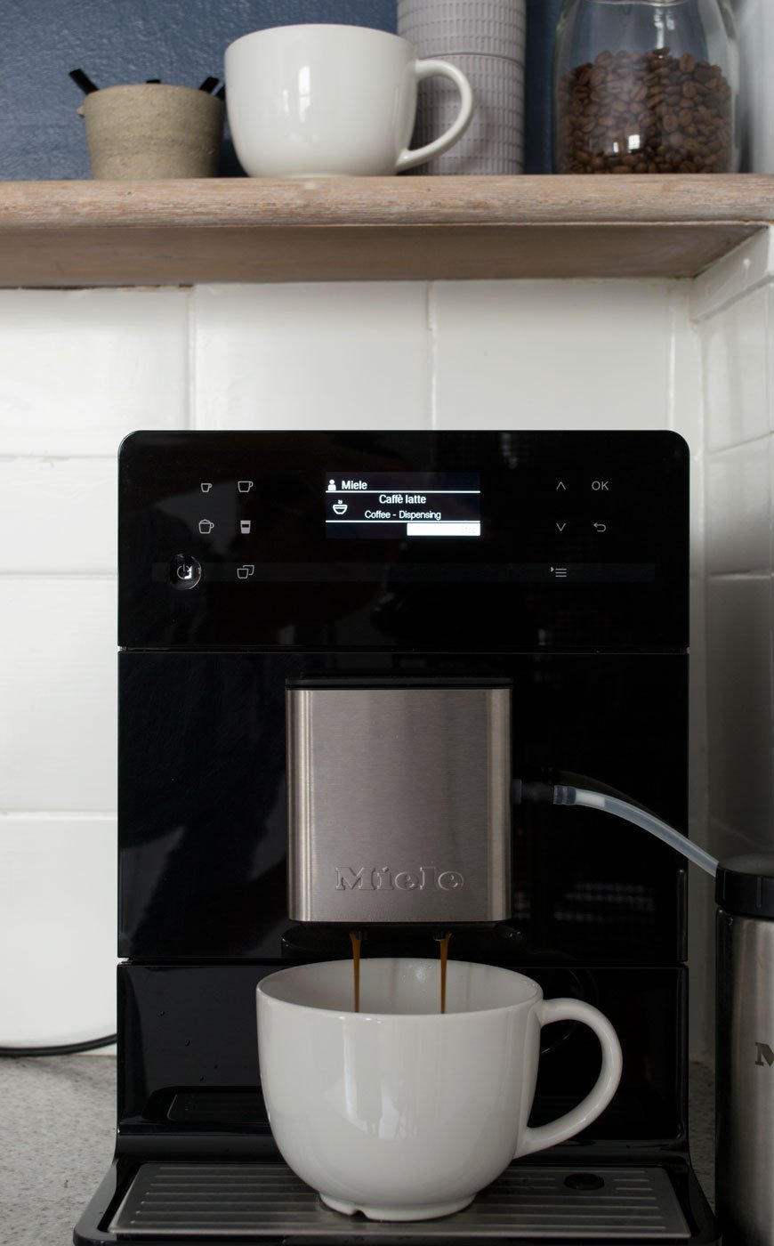
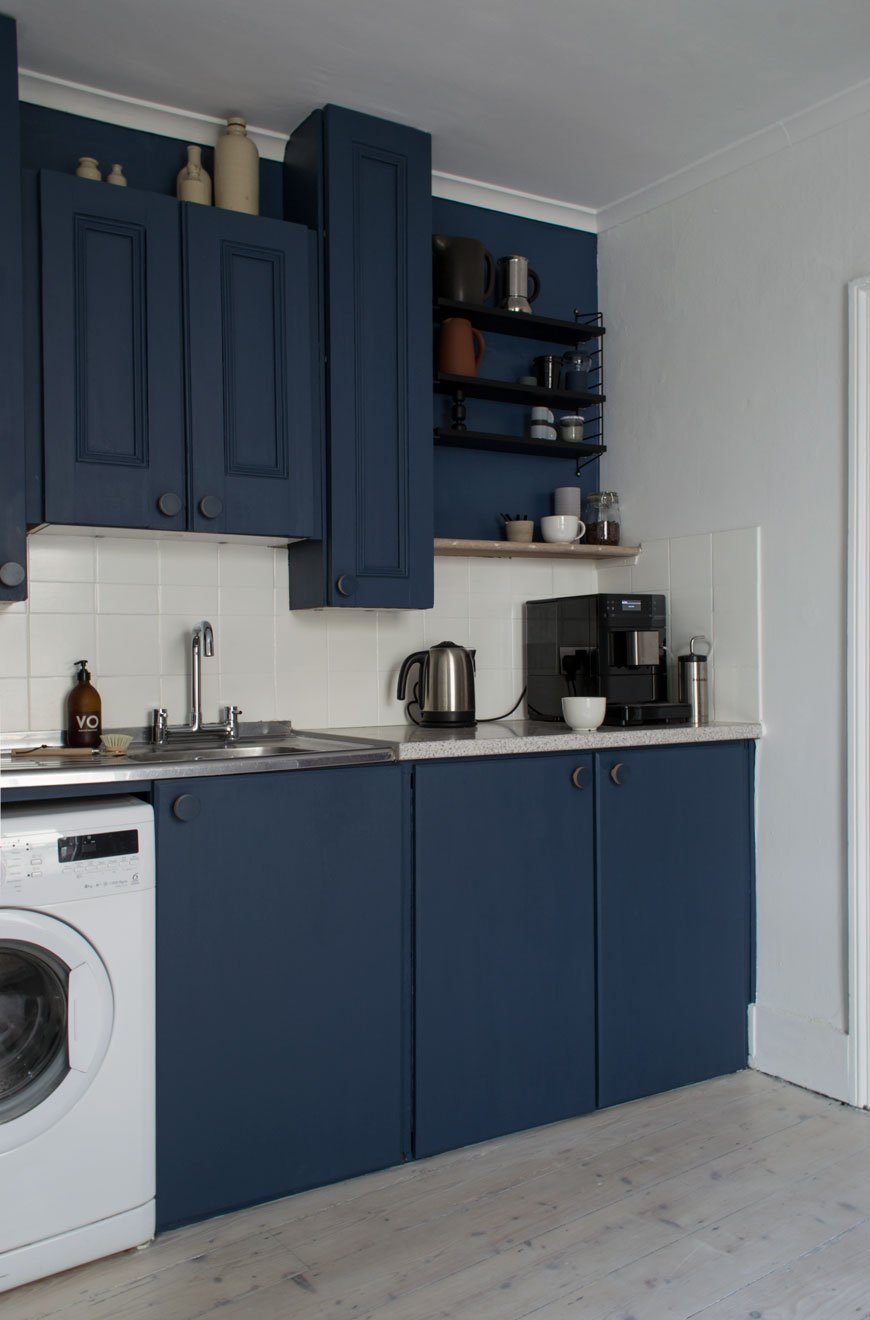 We wanted to make room for a dedicated space to make coffee, seeing as its such an important part of our post-school-run mornings. With everything to hand, from a collection of favourite mugs on the new String Pocket shelves and fresh beans ready for grinding, we upgraded our analogue stove-top to a Rolls-Royce coffee maker. Don't get me wrong, there's always a time and a place for good old-fashioned stove top coffee, but this beauty is game-changing for the time short and hello - hot and frothy milk, should you wish.
 I hope our blue kitchen refresh has demonstrated that small changes can make a huge difference to the feel of a room, whether you decide to paint or upgrade the cupboard fronts, door furniture, walls or appliances. By shifting your perspective away from the things you can't change on to what you can you'll see how much difference they can make. Big change doesn't have to factor in large remodels, so this room is safe. For now...Check out my tips on how to update a tired kitchen on Miele's DerKern. • This post contains brand partnerships. White walls - Shirting Absolute Matt Emulsion, Little Greene Paint.*Blue paint - Hick's Blue in Intelligent Eggshell on the walls and Flat Oil Eggshell on cupboards, Little Greene Paint. *Whitewash floor stain - Wood Wax Finish 3111 White and Poly Oil 3040 White, OSMO UK.*Plywood cupboard handles, Chocolate Creative.Seattle bridge mixer tap, Wickes.Black ash String Pocket shelves, Skandium.*Rhonda black wire rack, Out There Interiors.*Black and stainless steel countertop coffee machine CM 5300, Miele.*Stainless steel fridge-freezer, Miele.*Electrical stainless steel sockets and toggle light switch, Dowsing & Reynolds.White ceiling spots, IKEA.Stainless steel dual compartment recycling bin, Superhuman.Kitchen linens, from the Oscar and Suzette collection, La Cerise Sur Le Gateau.White 'Coatrack by the meter' with oak shelf, designed by Vijf5.
Photography & styling © Tiffany Grant-Riley
Want to see more of our home renovation projects? Follow #TheChathamHouse on Instagram for all updates...