Heal's British Designers And The Time I Styled A Window
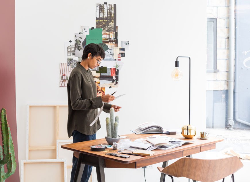 Taking a moment to stop and celebrate certain moments in life isn't something I do often. As my own worst critic and, to quote the Foo Fighters, I'm more of a "done, on to the next one" person. But here it is. I designed and styled a window scheme for Heal's. Now that's a moment! Four years ago when I decided to move into styling for interiors, I had no idea that I'd wind up here. But enough emotional waffle, if you didn't see this post, here's why I was asked in the first place...Over a period of 200 years, Heal's has made a name for itself as an innovative family brand. Elevating new and emerging designers and design movements alike through its Heal's Discovers program, it has long been ahead of its time. This August, the stores are gearing up to celebrate Heal's British Designers, highlighting their talented, influential roster of UK designers. As part of this campaign, I was approached along with journalist and interiors writer Kate Watson-Smyth to curate and style a window at their Queen's store in Westbourne Grove. Our choices were to instil the best of British design Heal's has to offer, injecting our own style into the process.
The Design Process
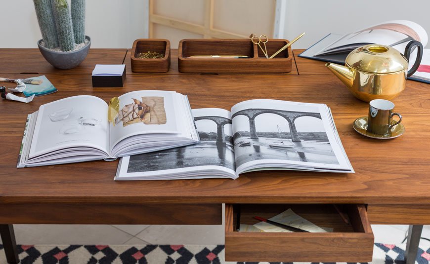
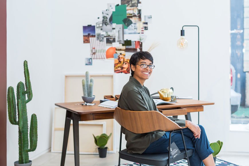
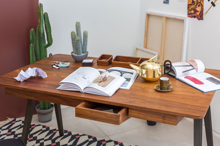
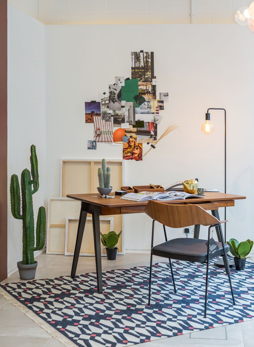
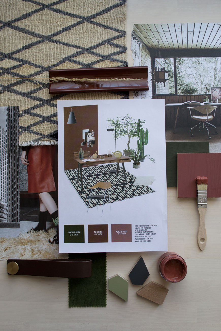 So here's my original concept. I started with the Orson desk by Matthew Hilton as my jumping off point. I was drawn to its shape, a clever mix of Mid-century meets contemporary. It has a beautifully crafted dark walnut top with three compartments, angled drawers at the front and sturdy black cast iron legs. There really couldn't have been a better companion for it than the iconic Robin Day 675 chair, reimagined by Case. This piece was pioneering for its time as Day discovered a new way to mould the chair back with ply in a single curve. And I'm not kidding when I say it's incredibly comfortable too. So a workspace it had to be. I imagined a creative of some sorts working here - maybe a designer, architect, artist?
Supporting Acts
I've been loving working with richer colours of late and I wanted a bit of a departure from my usual pale palette. In keeping with British products, I chose Little Greene paint to bring some life into the space with a deep earthy shade called Callaghan for the main wall and Invisible Green to go on the right. To introduce texture, a flat woven geometric rug with warm copper accents would tie in with the earthy walls. As desk space is key for productivity, I wanted to keep it as clear as possible, so I used the Junction black floor lamp to avoid using a table lamp. It fits well with the contemporary-modern look, don't you think? Of course, no Heal's room set is complete without a little something from one of the most iconic designers of our time. Although he might be better known for his lighting, I chose Tom Dixon brass accessories, using the metallics as a contrast to the darker elements.As much as I wanted to, I couldn't expect the Heal's staff to care for real plants over the next month, so instead I chose the next best thing. Have you seen Abigail Ahern's faux plants? They're really very convincing - this from a plant lover. If you want to check them out rather than take my word for it, head to the Tottenham Court Road store.It's a warm room, still quite minimalist in style with plenty of breathing space and greenery.As you'll see, technical sketches are not my forte, so we asked 3D design pro Anita Brown to create something with a little more finesse.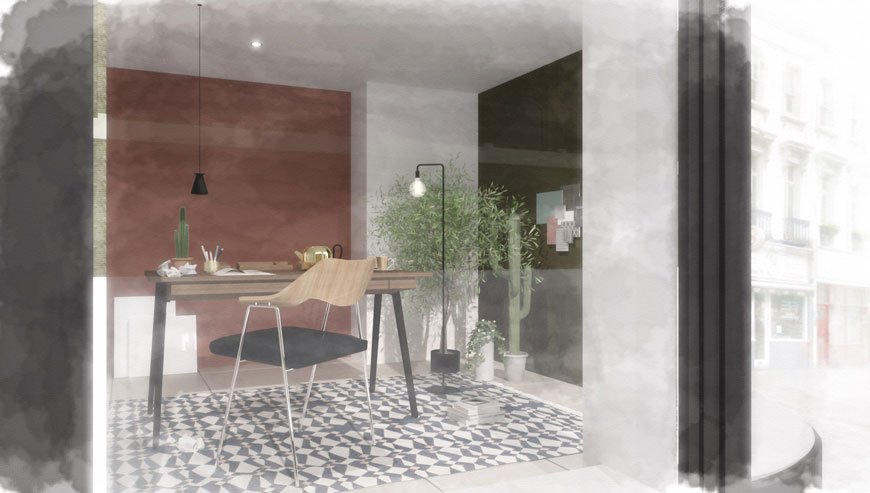
Bringing The Design To Life
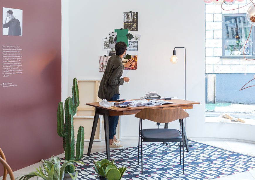 As happens in the process of designing, some things have to adapt to change. You'll see that I wasn't allowed the green wall in the end and with the awkward curve of my window and two large lighting installations to contend with, we needed to find another angle. Actually though, if I'm honest, I think I prefer it. It looks more open and the white wall draws your attention to the moodboard from the other side of the store. I'd happily sit down here to work every day!
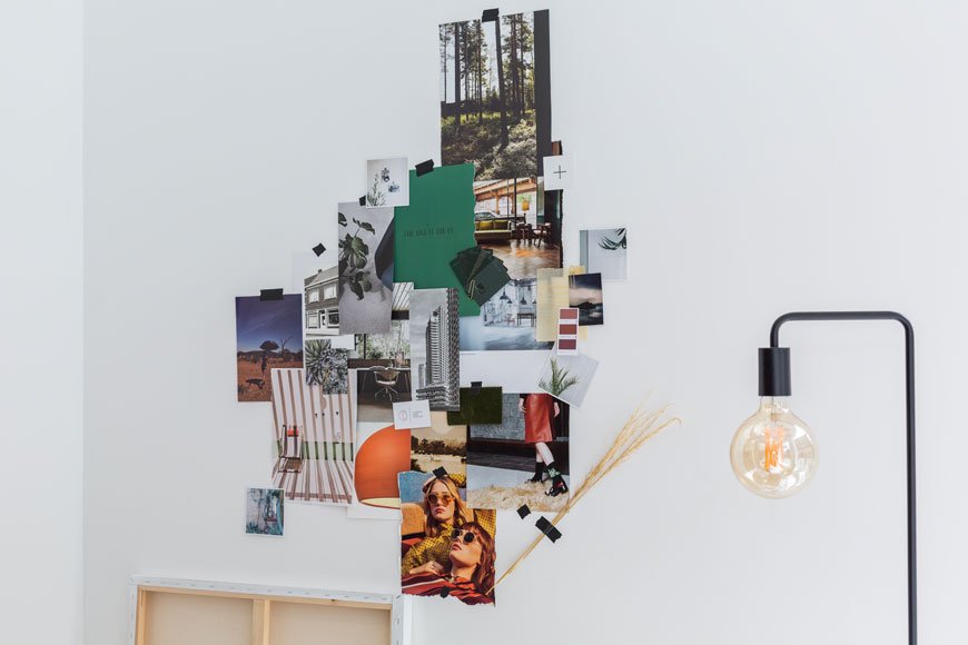

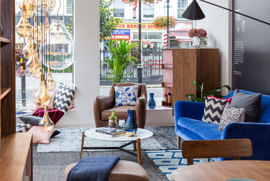
 On the other side of the store, Kate set the scene with rich jewel tones and relaxation. Starting with the blue velvet Russell Pinch Wallis sofa, she ramped up the texture with layered rugs, dark leather and marble. Oh, and you need to check out the amazing pink drinks cabinet she used - see more on her journey here.
 Well, huge thanks to Heal's - it was an absolute honour. You can explore our windows in store until August 31st, so please do stop by and immerse yourself for a while. Let us know if you made it with #HealsBritishDesigners.*This post was written in collaboration with Heal's.