The Making of The Wishbone Chair - Factory Tour
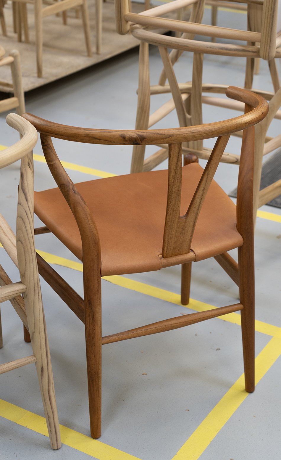
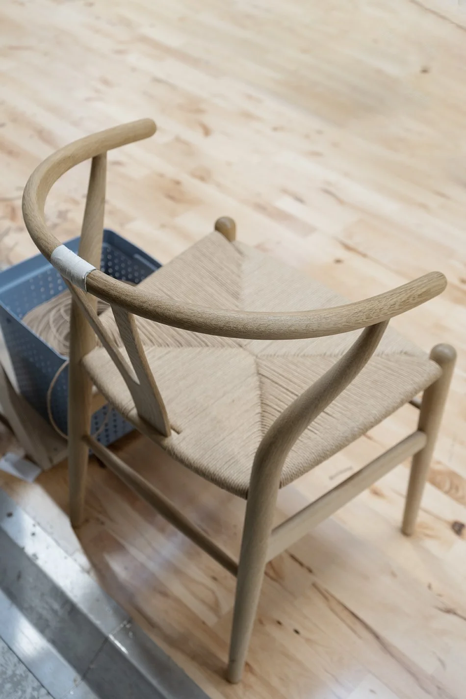
The CH24 Wishbone chair in oak awaits its paper cord seat on the factory floor at the Carl Hansen & Søn factory in Gelsted, Denmark.
[AD - this post is in partnership with Carl Hansen & Søn as part of their Wishbone chair 2022 press tour]
Fewer things get me more excited than a furniture factory tour. The offer to take a peek behind the curtain surrounded by the fragrant smell of warm cut wood and the white noise of industrial scale machinery is too good to pass up. Diamonds don't impress me, darling.
On an early morning in October, I found myself coach-bound for the island of Funen, a two hour drive from Copenhagen and headed to Carl Hansen & Søn's headquarters in Gelsted. This landmark tour for like-minded interiors bloggers would give us behind-the-scenes insight into the making of the iconic and original Wishbone chair. Often poorly imitated, never matched in quality.
Woodworking tools of the trade inside the Carl Hansen & Søn factory headquarters.
A make-shift chair that didn't make the grade is used on the factory floor.
Stack of oak Wishbone chairs await their backrest and arm rests on the factory floor in Denmark.
Over 100 Years of Considered Craftsmanship
In the years I've worked with Carl Hansen & Søn, I've learned a great deal about their approach to sourcing sustainable materials, important to the continuation of their high level of craftsmanship. Traditional wood-crafting and weaving techniques are still used today. There are no short-cuts or cost-saving cheap materials to ensure each design leaving the factory will last a lifetime.
Where it all begins - the workshop master for the Wishbone chair displays all the pieces that make up this modernist chair.
What started life in 1908 as a small furniture workshop by founder Carl Hansen evolved into a third generation family run business that begin nurturing the work of pioneering modernist designers in 1949. One such designer, Hans J. Wegner, was discovered by Hansen's son Holger who took an instant liking to his collection, including the now world-renowned Wishbone chair.
The rest, as they say, is history and 70 years later this modernist chair is still in production, making it their most popular design to this day. You'll spot it in restaurants, hotels and homes (including my own) just quietly minding its own as the most iconic Danish design chair in history.
The Making of The Wishbone Chair
The iconic Wishbone chair back rest lying in neat stacks ready for construction inside the Carl Hansen & Søn factory.
You'd be forgiven for assuming that most of their furniture is entirely machine manufactured, but there are experienced human hands on every touch-point of the making of this chair. From the initial cutting and carving, to sanding, gluing and weaving, every piece is finished with exacting standards.
And the reason to invest in original design is evident in the beauty of the details and true craftsmanship. Did you know there are over 100 steps that go into building one Wishbone chair? It felt like such an absolute privilege to be allowed to explore each step in the process, including being let loose on some of the machinery. I wasn't offered the job.
Beautifully sanded chair legs ready to become part of the frame of the iconic CH24 chair by Hans J. Wegner.
Wegner's Danish Modern chair consists of 14 components and a team of craftsmen assigned to focus on a particular stage. Each piece is still made by hand more or less in the same way it was intended when the chair was first launched. It features that iconic wishbone shaped back rest which slots into a single steam-bent curved arm running around the back.
Steam-bend arm rests made inside the factory in Denmark, neatly stacked and ready for the next stage.
Gluing the components of the CH24 chair, piece by piece, on a work bench inside the Carl Hansen & Søn factory.
Perhaps the most mesmerising part of the tour was arriving at the weaver's workshop where 125 m of natural paper cord is expertly woven into a strong, durable seat. Danish paper cord really came into its own in the 1940s and well into the modernist era as a durable alternative to straw or rattan.
And it's all in the tension, paying attention to those exacting right-angles, passing the cord over the sides of the frame and back under. The result gives you that 'X' shape in the centre.
Weaving the iconic Wishbone chair seat with 125m of natural paper cord.
If you manage to pass four weeks worth of training, it should take approx. 1 hour to weave the signature seat and you could see how easy it was to find a rhythm once you were in the zone. I tried to take in the exact method, watching our guide demonstrate how to achieve those perfect right angles...but who was I kidding?
Reels of natural paper cord made to weave iconic Danish design chairs wait on shelves inside the Carl Hansen & Søn factory.
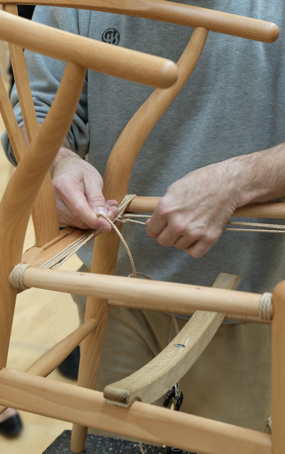
A close-up of weaving the Wishbone paper cord seat onto the chair.
Two finished Wishbone modern chairs in oak and mahogany inside the Gelsted factory in Denmark.
The finished Wishbone chair in a beautiful natural oak frame waiting on the factory floor.
Sustainable Danish Furniture
It stands as a testament to CEO and Hansen's grandson Knud Erik Hansen and the team that the majority of furniture in their collection is still made by hand in Denmark. It carries all the hallmarks of a small family business despite its world famous reputation and I love it for that reason.
Other pieces are taken on by their factory in Vietnam, run by Knud Erik's son and fourth in the generation, Mark Nam Hansen. The location is entirely self-contained with its own sawmill and workshops. This hands-on approach maintains high quality control and a sustainable supply chain.
All wood used in production is FSC certified, sourced from responsibly managed forests. Waste products such as leather and wood off-cuts are re-purposed as part of their accessories collection and I was amazed to discover the Gelsted factory has its own power plant. Using waste by-product from wood shavings, it heats not only the factory but up to 400 houses in the local vicinity of Gelsted.
I'd say that's a heritage worth continuing, wouldn't you?
Photography © Tiffany Grant-Riley
Earthy and Sculptural Ceramic Lighting by In Common With and Danny Kaplan
Seneca Table Lamp | Photo © Sarah Elliott
We're going to pretend we're in ultra-cool Brooklyn today, exploring the work of collaborative design studio In Common With and their new collection of handmade ceramic lighting. And they're so completely and utterly gorgeous, it hurts.
Known for paring beauty with simplicity (if it's not so completely obvious from these beautiful lifestyle shots) founders Nick Ozemba and Felicia Hung have come together with fellow Brooklynite and ceramic artist, Danny Kaplan. The result is the Terra Collection, combining minimal, contemporary forms with a handmade aesthetic. Strong, elegant lines and simplistic sculptural curves are off-set with raw texture and smooth brass finishings. This unusual ceramic lighting collection encapsulates the intersection between the ancient and modern.
Paloma pendant lamp in anthracite and Helena floor lamp in stone | Photo © William Jess Laird.
A collaboration with ceramicist Danny Kaplan, the Terra series reflects our studios’ shared commitment to pairing beauty with utility; tradition with innovation; Danny’s organic forms with our signature systems-driven simplicity.
In Common With
Terra ranges from the totemic Helena floor lamp (3ft high) to statement pendant lamps like Paloma and Augustus, meant to draw in conversations over the dining table and wall sconces for more intimate spaces within the home. The lamps' tactile qualities are owing to a stoneware clay with high levels of grog and grit Kaplan's studio use to give a rougher, rustic texture called 'tooth'. Inside a pre-war former bottling factory, his team of artisans use a variety of different techniques to build the lights depending on the design, including wheel-throwing, slab and coil building.
Earthy ceramic lighting - Augustus surface mount in Chestnut and Helena table lamp | Photo © William Jess Laird.
Photo © William Jess Laird
Together, we experimented with structure and scale to create pieces that embody an ongoing dialogue between artist and material. Our goal: to make the connection between clay and light appear innate, as effortless as friendly conversation.
In Common With
Chunky and minimal - the Simon surface mount | Photo © William Jess Laird
A mix of slab-built and hand-thrown - Augustus pendant lamp | Photo © William Jess Laird
Gorgeous in Ivy green - Augustus ceramic lighting | Photo © William Jess Laird
And did I mention In Common With's Handmade collection is equally beautiful? True to their name, it features collaborative lighting projects with glassblowers, metal workers and engineers around the world coming together to create striking, contemporary lights for the most discerning design lovers.
Plico Chair - Foldable Lounging by Carl Hansen & Son
[AD - this post is a paid advertisement as part of my on-going partnership with Carl Hansen & Søn]
I'm almost ashamed to say that I've had this beautiful Carl Hansen & Søn lounge chair folded away in its box for a few months. In my defence, it goes to show how well this foldable lounge chair tucks away that made me forget it was even there. Please forgive me. Because no one should put this baby in the corner, even if it was designed with space saving in mind...
Meet the FK11 Plico by Fabricius & Kastholm
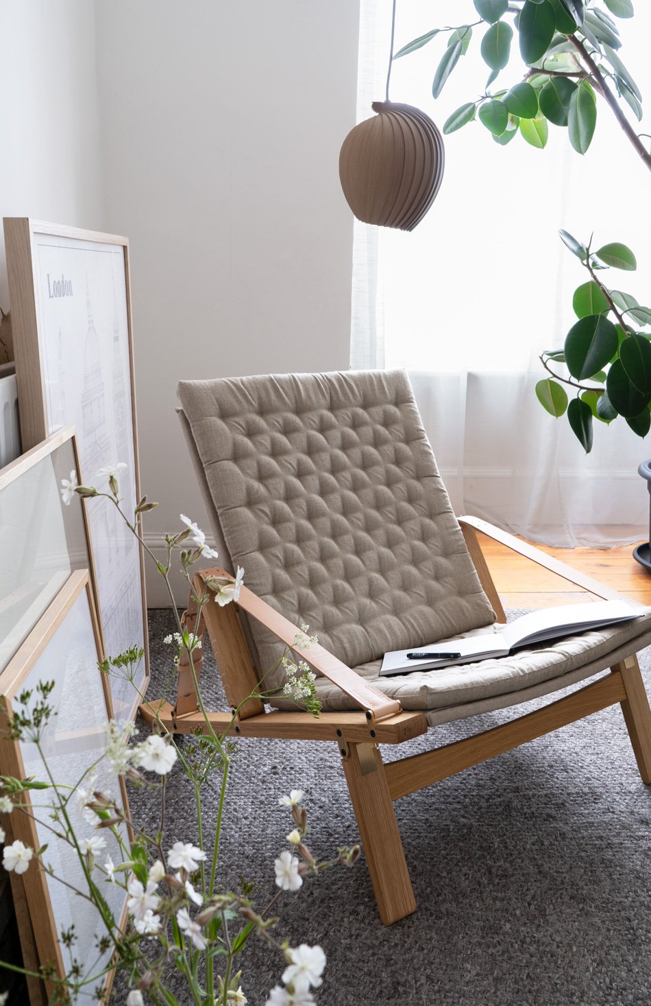
A statement chair for modern living, the FK11 Plico was first presented to the world in 1964 by Danish design duo Preben Fabricius and Jørgen Kastholm. Taking its name from the Latin word 'plico' - to fold, the chair can be folded up when it's not being used. But whereas some flat-pack style furniture fall flat (excuse the pun) the Plico holds on to its elegant, Nordic aesthetic. Not surprising that Carl Hansen & Søn won a BoBedre award last year with it when it became the newest addition to their collection of Danish design classics.
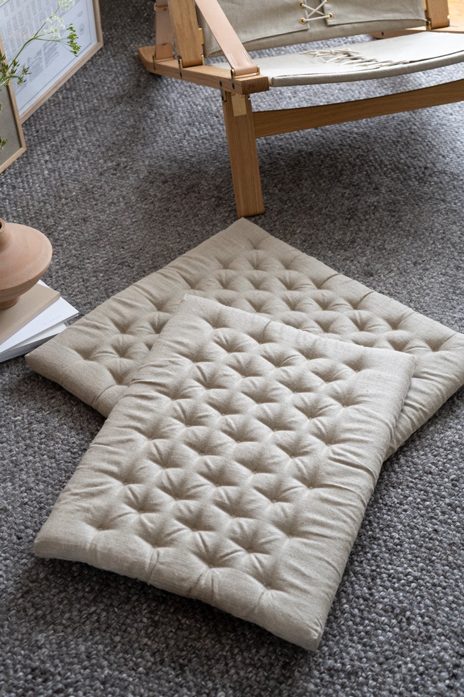
Can we talk about that utterly gorgeous quilted linen canvas seat against that oak frame?
A foldable statement chair with Nordic charm - Carl Hansen & Søn's award-winning Plico, designed as a space-saving lounge chair.
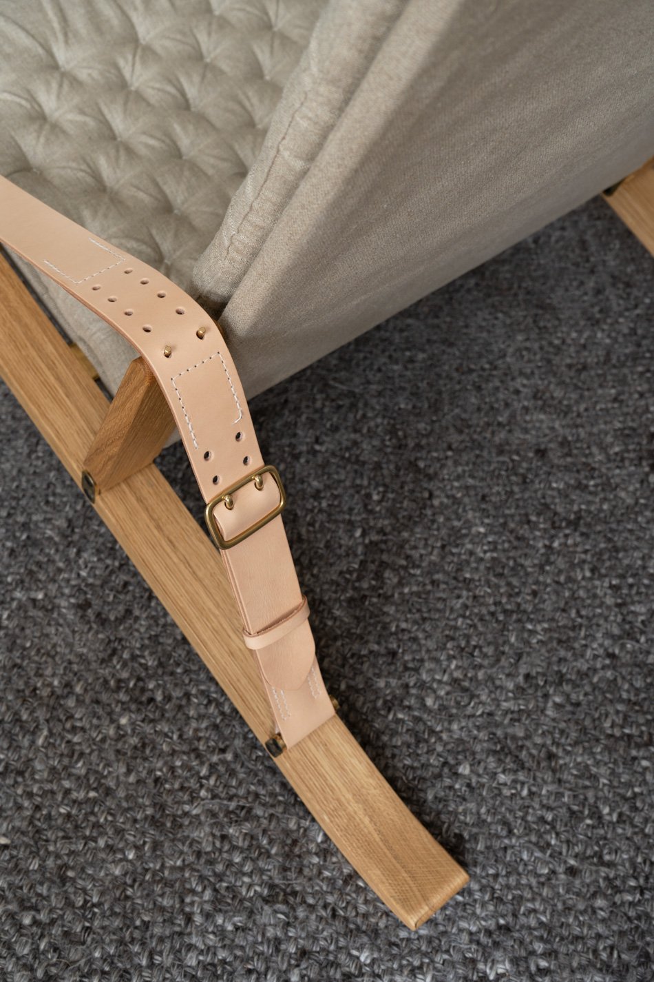
Each detail reveals itself to you as you unfold it. And I found something new with every shot I took. From the brass hinged front leg secured with brass bolts under the seat, the gentle curve in the oak legs where they touch the floor, to the stitched saddle leather arm rests. It's just an exquisite piece of design.
It's rare to find this level of versatility in a lounge chair. Or at least, I think it is. Firstly, it's a testament to Fabricius & Kastholm's foresight to design a chair that doesn't have to be there all the time. You know, a lounge chair is a pretty hefty commitment up there with your sofa. And when the way we use our homes changes as we grow, having the flexibility to just fold this one away takes away some of that weight.
Secondly - I love to see the mechanism out on show. To see how the oak frame pivots inside visible brass fittings when you tilt the adjustable rest back into position. It looks like it belongs here in my living room and I honestly wish it was staying. This is a sit back with a good book kinda chair - supportive but totally loungable. In other words, style doesn't trump the function here, my friends.
If you loved the Plico chair but want to check out another Carl Hansen & Søn design classic, might I point you in the direction of the CH07 Shell Chair?
Prices start from £1,900. Check your local stockist for more information.
Product photography & styling © Tiffany Grant-Riley.
The RF200 Minimal Table Lamp From Carl Hansen
[Advertisement - this feature is part of my on-going paid partnership with Carl Hansen & Søn]
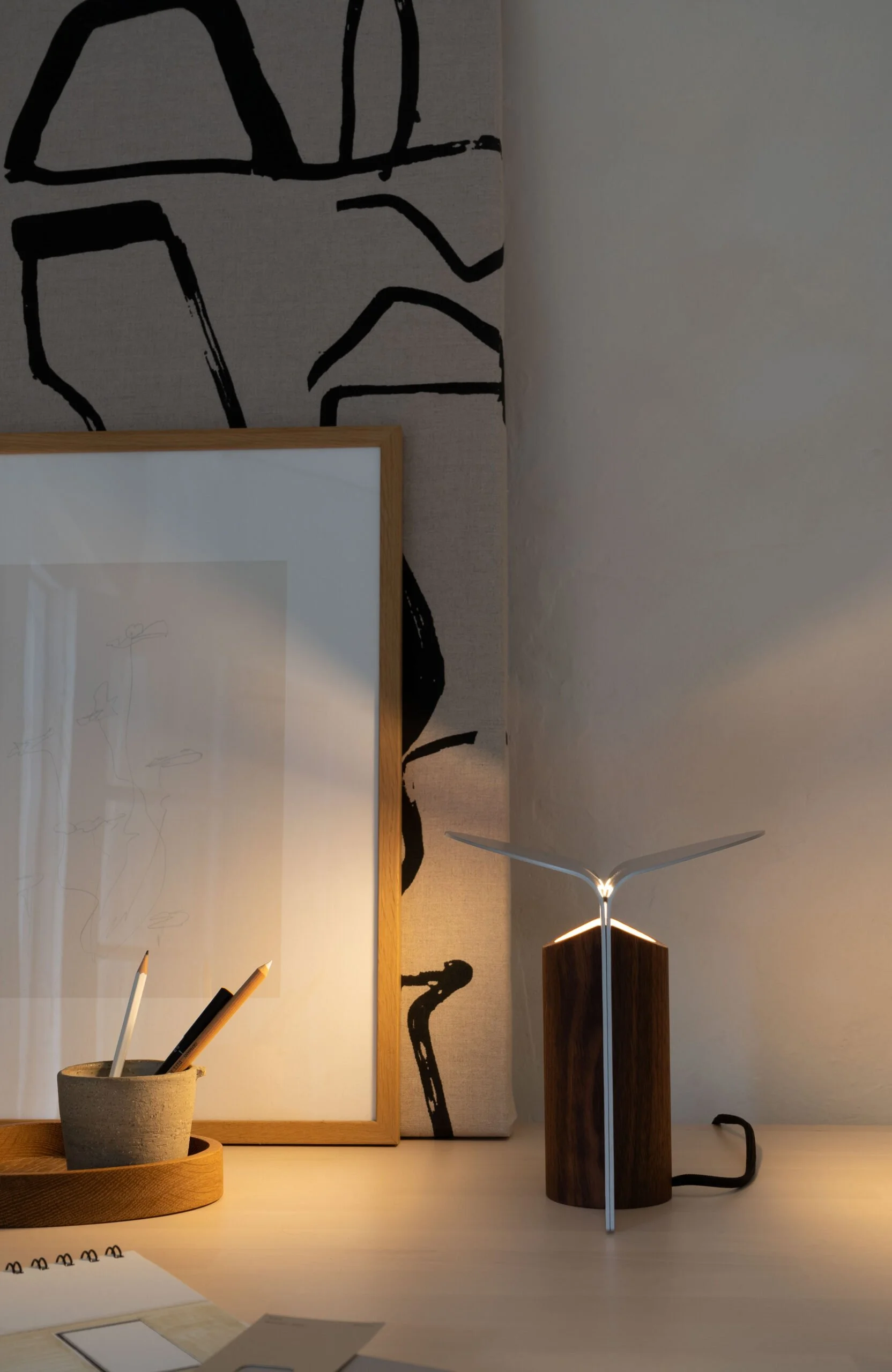
Recently, Carl Hansen & Søn expanded their collection of Danish lighting to include a new minimal table lamp. Created by the award-winning Danish designer Rikke Frost, the RF200 Petal Lamp is her second commission for Carl Hansen & Søn, joining her Sideways sofa which launched last year. And it became indispensable, bringing a cosy atmosphere into our home as we saw out the last days of low winter light.
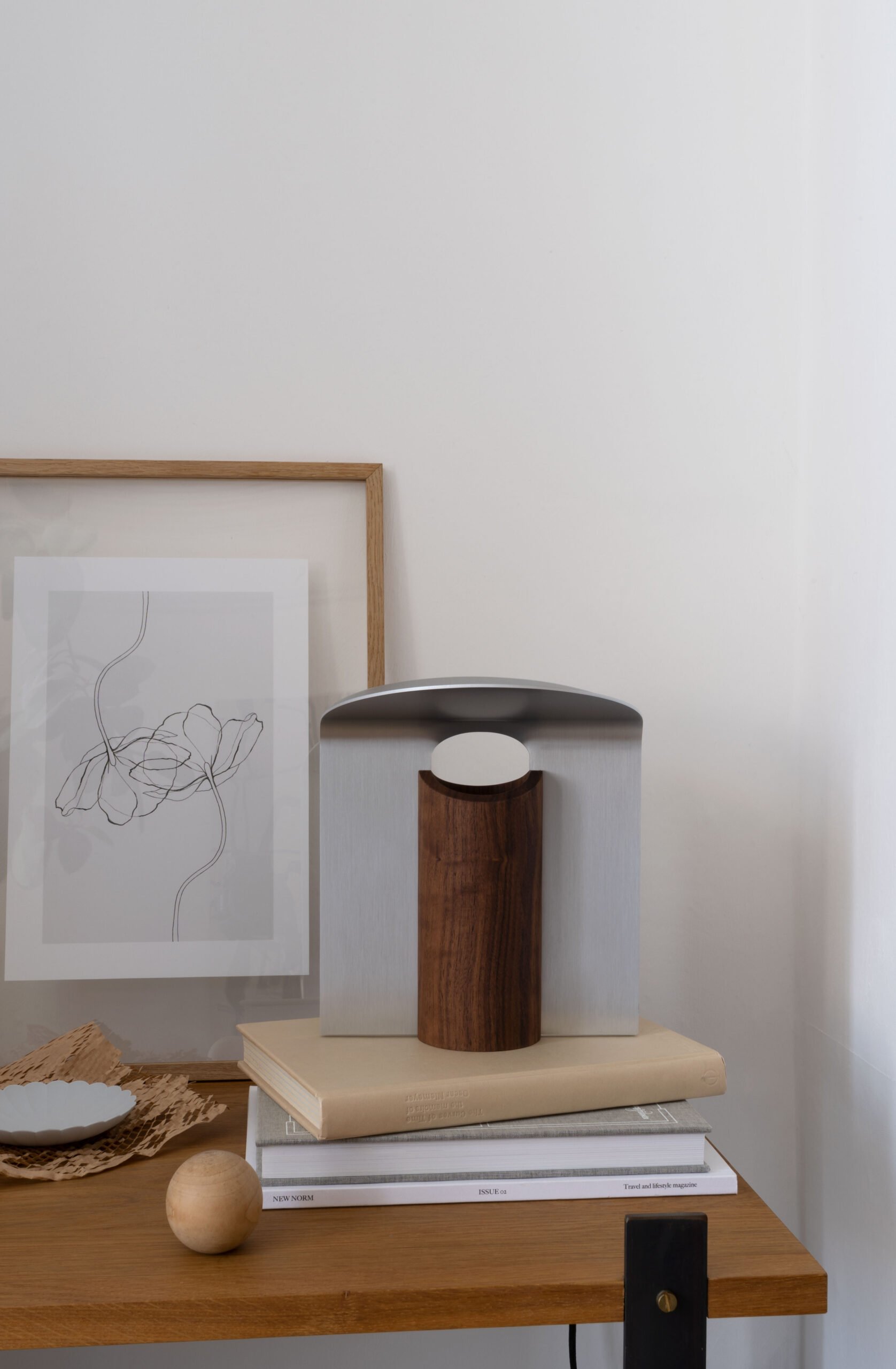
Surprisingly compact, the RF200 lamp has sculptural aesthetic, comprising of a warm wood base and metal shade made from two architectural metal leaves that slide into grooves down the side of the base. Off, it's a piece of art in its own right. When it's turned on it emits a beautiful, soft glow reflected from the underside of the shade and back down. Just perfect for simple, ambient light where space is at a premium.
Frost drew inspiration from nature for the lamp's design, taking the trunk and crown of a tree as a starting point, creating a design that feels organic in nature, touching on classic Danish design yet with a contemporary feel. I love that the grain of the wood is allowed to come through, contrasting against the cool expression of the metal.
"I was also inspired by big architectural arches and columns, and I was fascinated by the interplay of light through an arch and a curve. The result is a lamp that creates cosy mood lighting, because it illuminates upwards and disperses light downwards through the shades in a circular area.”
- Rikke Frost
A Versatile Design
I really enjoy the versatility of this lamp. It has the ability to enhance any space in the house in a completely understated way. Lightweight and small enough to sit on a windowsill, shelf or a side table, it's a reliable piece that creates cosy mood lighting without shouting about it.
The Petal lamp's wooden base and metal reflectors also come in a total of nine variations - from oiled oak and brushed brass, black oak and brushed aluminium to the one I've borrowed here in walnut and white aluminium. It's rare to find a flexible design like this that has the ability to blend into or contrast with your existing interior scheme.
If you love the Petal, you might like to check out the other variations of this Nordic minimal table lamp or take a look at the Carl Hansen M0320 lamp that I styled alongside the table bench.
Prices start from around £240 - check here to find a stockist near you.
Product Styling & Photography © Tiffany Grant-Riley / Curate And Display
1616 Arita Japan TY Palace Collection
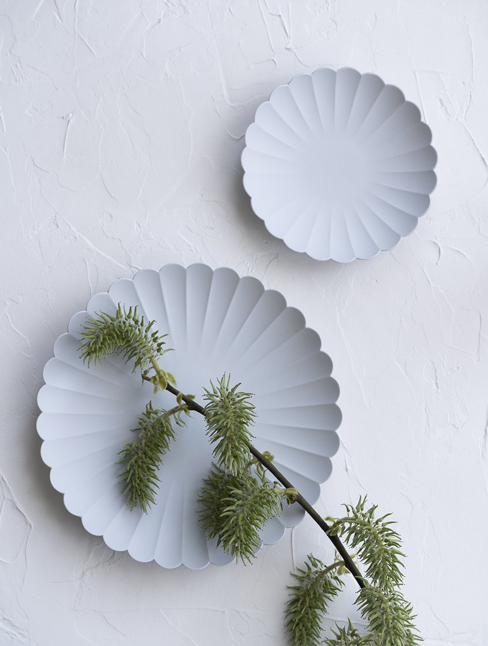
Two unglazed porcelain Arita 1616 Japan plates from the TY Standard collection on a textured backdrop.
Delicate yet deceptively strong - the 1616 Arita Japan 'Palace' plates.
I have some wonderful friends in my life. Having had my eyes on these delicate porcelain plates for a long time, would you believe a friend of mine living in Copenhagen sent me two as a surprise.
As an absolute sucker for pottery, the bisque stage of the ceramic process is my absolute favourite. Before it touches the glaze. When the first firing of the clay is done and it has that raw, alabaster-perfect look to it. Of course, bisque is useless if you actually want to use it, but when I find a collection of ceramics that has the look and can also be used, I need it in my life.
'TY Palace' plates designed by Teruhiro Yanagihara for Arita 1616 Japan minimally styled on a textured table top.
About 1616 Arita Japan
Japan has a long history of porcelain production originally introduced by Korea in 1616. Known as 'Aritayaki', a kind of Japanese pottery, it takes its name from the town of Arita, found on the southern Japanese island of Kyushu. High-density clay is created from crushed stone specific to the area, giving it heat and stain-resistant qualities. Production continues today, manufactured by Momota Touen and led by creative director and designer Teruhiro Yanagihara.
Bringing a fresh outlook to the brand, Yanagihara's 2016 'TY Standard' collection combines traditional Japanese craft and contemporary aesthetics. And the scalloped edge TY Palace plates were among the first to be used in the Tokyo Palace Hotel. Elegant, minimalist and functional, they are absolute perfection. Their pleasing symmetry and smooth, unglazed shapes inspired me to shoot them against this textured backdrop. I love the contrast between the two.
Beautiful soft grey porcelain plates made in Japan, minimally styled on a textured surface.
The underside of the TY Palace plate, made from porcelain in Arita, Japan.
A Japanese style table set with a soft grey porcelain 1616 Arita Japan TY Palace plate.
Will I be letting anyone else use them? Hell no. Are they microwave and dishwasher safe? Hell yes.
Styling and photography © Tiffany Grant-Riley.
11 Best Japandi Style Lights
&Tradition's elegant interpretation of Japandi style lights. The Formakami lamp collection, designed by Jaime Hayon.
It would be easy to take the ubiquitous paper lampshade for granted. They’re everywhere - a part of modern culture. Inspired by centuries old Chinese and Japanese ‘Chochin’ lanterns and now mass produced cheaply by brands like IKEA, they’ve been a mainstay of modern interiors for years. But it was the work of sculptor and designer Isamu Noguchi that catapulted this unassuming classic into mid-century homes.
In 1951, Noguchi was invited by the mayor of Gifu, home to the Ozeki lantern factory, to breathe new life into this ancient craft. The result was the distinctive (but often imitated) ‘Akari’ collection. Combining electricity with the traditional bamboo frame and washi paper skin, he transformed the lantern. Their soft glowing ambiance feels instantly homely and there’s something ethereal about the way the light plays with the thinness of the paper. They are functional works of art.
Ethereal hand-pleated paper lamps designed by Le Klint, the 75th Anniversary model 375.
Where Japan Meets Scandinavia
Our innate need to create a home that feels safe, warm and harmonious has seen the rise of a kind of soft minimalism. We seek comfort in neutral interiors in soft beige and earthy clay tones. We want our furniture not only to reflect our personality but to bring about a tactile connection with natural materials; rattan, wood, paper, linen and so on.
Trend forecasters have coined the slightly cringy phrase ‘Japanordic’ or ‘Japandi’ to describe the fusion between Japanese and Scandinavian design, but essentially, these two cultures find common ground through simple, considered design and quality materials. Nordic brands are translating the look of traditional Japanese papercraft techniques into contemporary design statements where new iterations include opaline glass.
Copenhagen design studio New Works imitates the ridges of a paper lantern with opaline glass for a soft, diffused glow.
A modern-rustic Scandinavian dining room with a Japanese twist - the Bidar paper pendant from House Doctor.
A classic paper pendant in a Scandi style white dining room demonstrates how Japandi style lighting creates a simple yet calming effect at home.
A contemporary approach to Asian paper lanterns - the Formakami collection by &Tradition.
Create Cosy Ambience with Japandi Style Lights.
If you’d like to incorporate this look into your own home, my edit of Japandi Style Lights picks out options across a range of budgets. From sculptural over-the-dining-table conversation starters to the more subtle bedside lamps.
1. Hashira floor lamp, Audo Copenhagen | 2. Gatto table lamp, FLOS | 3. HAY rice paper lampshade | 4. Formakami JH3 Lamp, &Tradition | 5. New Works lantern globe lamp| 6. Fritz Hansen Lullaby | 7. Risbyn paper lamp, IKEA | 8. 375 table lamp, Le Klint | 9. Bidar paper lampshade, House Doctor | 10. Akari A10 floor lamp, Vitra | 11. Bamboo pendant light, H&M Home.
10 Best Sculptural Candles
Sculptural Candles by US brand The Floral Society.
Whether you choose to light them or leave them on display (and the jury's out for me) there's no denying the visual appeal of sculptural candles.
Yes, the humble candle has under-gone quite the transformation. Perhaps as a result of our spending more time at home, this essential part of setting the mood is pulling out all the stops.
What started as an array of coloured tapers which could be carefully matched to any shade of tablecloth or dish has now worked turned its focus to shape. Candles are now art, working their way into our homes as the perfect double-duty styling prop for coffee tables, shelves and of course, the dining table. You can't but help wax lyrical about them. Yes, I really did say that.
A collection of warm spice and grey coloured arching sculptural candles from the Bend and Fungi collection at Broste Copenhagen.
From twisted wax tapers, mould poured shapes and lathe sculpted architectural forms, our tables and mantlepieces have never seen so much fanfare. And whilst some are definitely a luxury statement, they're an undeniably gorgeous piece to treat yourself to.
Here's my edit of ten of the best sculptural candles to get you started...
White coconut scented soy wax 'Knot' candle, designed by Korean design studio Honey Flamingo. £42.00, Alkemi Store. *
Organic soy wax and beeswax blend Andrej Urem candle. £39.00, COS.
Lex Pott Twist candle. £24.00, Kin Home.
Broste Copenhagen two wick 'Bend' candle in grey. £30.00, Wild Swans at Trouva.
Green/black Totem candle designed by Grain. From £14.50, A New Tribe.
Soft white Tallow candle by Ontwerpduo. £18.00, Inside Store.
Ivory Templo candle sculpture by Barcelona based brand Octaevo. £28.00, La Gent.
Set of two Maison Balzac Volute candles in Sable. £15.00, La Gent.
Goober candle by Areaware. £27.00, Selfridges.
Molecule sculptural candle by Andrej Urem. £45.00, Monologue London.
Which leaves the question - which one's for you?
[AD] New Bernadotte Collection Pieces - Nordic Entertaining by Georg Jensen
[AD - Bernadotte collection in paid partnership with Georg Jensen.]
New additions have been added to Georg Jensen’s iconic Bernadotte collection for Autumn 2020 and I couldn’t love them more.
Elements of dark, smoked oak lend a warm and sophisticated appeal to these contemporary iterations inspired by the work of Swedish designer Sigvard Bernadotte (b 1907 - d 2002).
His original and first collection for Georg Jensen was groundbreaking in its aesthetic. Championing early Scandinavian Functionalism, the Bernadotte collection echoes bold and graphic Art Deco lines and feminine curves. Using grids as a motif across the silverware, this would be his first collaboration, launched in mid-1930s.
Lovers of simple Scandinavian design have been coveting these timeless pieces for generations, now produced in favour of a mirror polish stainless steel.
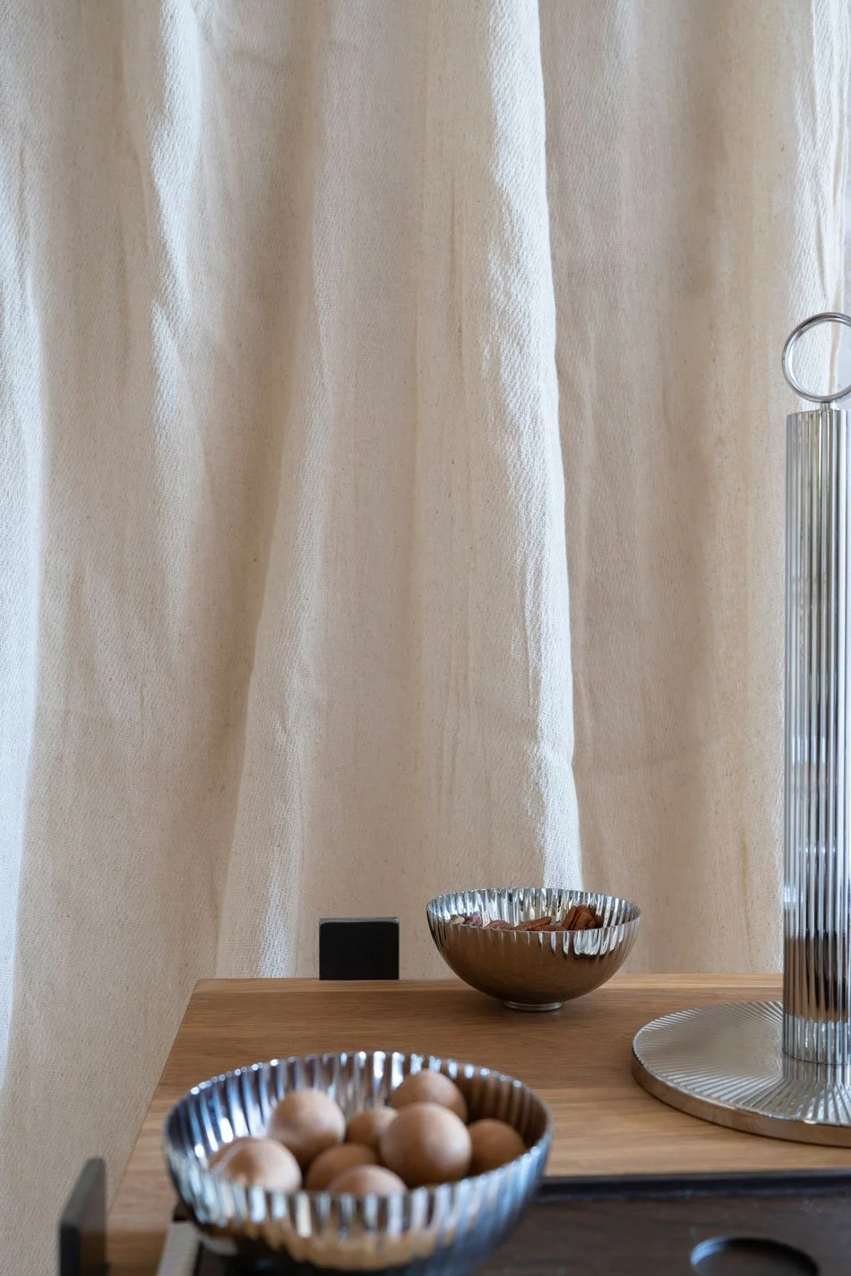
"The new additions include a stainless steel pitcher, which mirrors the collection's existing thermal jug, as well as an elegant paper-towel holder.
Three of the new products combine stainless steel with a dark, smoked oak, creating a strong and sophisticated contrast. These dynamic new pieces include a lacquered oak serving tray with steel handles; a serving bowl set with three small steel vessels presented on a wooden tray; and salad servers with intricately grooved, wooden handles that reinforce Georg Jensen's unparalleled commitment to quality craftsmanship."
Georg Jensen
The addition of a lacquered oak tray makes laid back entertaining at home easy and elegant. Grooved edging continues in the handles and the contrast of light and dark epitomises the Scandinavian home interior. I love how grown-up and refined it feels to use, elevating impromptu everyday moments.
Sweet little bowls nestled on a scaled-down version of the tray can be used for guest to help themselves to small snacks. Not that we’ve had many opportunities for guests from far-flung fields of late. But having a supply of my favourite flavour of Lakrids (Christmas Butter Cookie) pecans and coconut truffles at arm’s reach is always a comfort.
Discover the collection at all Georg Jensen stores and online.
Photography and styling © Tiffany Grant-Riley
Nordic Garden Style For Balconies and Indoors
How to bring Nordic garden style into your home when outdoor space isn't an option, with modern, sculptural pots and planters.
No garden space? No problem! Bring Nordic garden style into your home instead...
If lockdown is currently driving you stir-crazy, you'll know how much escaping outside is a total lifesaver. Just a few minutes of warm sun on your face and a gulp of fresh air makes all the difference to your mood.
Over the past month or so, our garden has stepped up to play an integral part of our day to day lives. Whereas before it was somewhere to do a spot of weeding and hang out the washing, now it's where I come to sit and be with the birds in the morning. It's a makeshift playing green for cobbled together P.E sessions for the kids. We watch the minibeasts hiding under rocks and leaves and share socially distanced conversations with neighbours over the fence.
Understandably, not everyone has access to a back garden but that doesn't mean you can't enjoy a sense of the outdoors. Even from indoors. If your options are limited - perhaps you have a bijou (or sizeable) balcony or a corner of your home, let me paint you a picture and show you what you could have with a little imagination.
How To Create A Nordic Balcony Garden
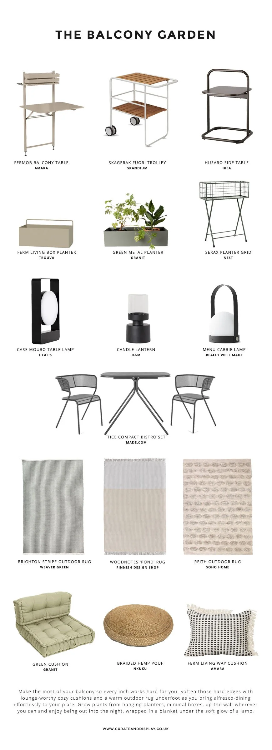
The key to a Nordic-style balcony is to keep it simple, clean and contemporary. Stick to a muted colour palette - think black, grey, muddy greens, beige, and terracotta. Soften a boxy space with outdoor rugs, large cushions and planting.
Before you order any plants, check your balcony's climate. Is it mostly shady? Windy? Or does it get a huge amount of sun during the day? Pick your planting according to the conditions you have. Introduce a potted olive or fruit tree to add height if you can, with plants such as grasses, Fatsia Japonica and white blooms lending an architectural, contemporary feel.
Maximise all the available space and tailor it towards how you plan to use it. Don't just think conventionally with floor space but utilise the edges of the railings and the walls behind if you can. Hang and wall mount planters and grow vertically. Choose space-saving, multi-functional pieces that offer space for entertaining as well as potted plants. A favourite is the Fermob balcony table. Attaching to balcony railings, it's an ideal table for two with a sweet little planter on top. Consider the evenings too, when you'll likely need some soft lighting and a couple of warm blankets to see you through.
A Nordic garden style shopping page featuring the best contemporary Scandinavian furniture for small balcony spaces.
The black metal Mira chair designed for Skagerak, brings contemporary, Nordic style into our garden with modern shape and interesting shadow play.
How To Bring Nordic Garden Style Indoors
There's no greater way to calm your mind than tending to your plants at home. A little spritz here, a feed and prune there. Suddenly it's been half an hour and you're already feeling much lighter. Grow yourself an indoor garden space to escape to whenever you need a breather.
Don't ask me the science behind it, but somehow, tall, large scale plants such as the parlour palm or rubber tree give the illusion of more space and height. Their lush appearance is instantly calming and in the right pot will create a real statement. You could also try an olive tree for a more rustic Scandinavian look.
Windowsills are brilliant for smaller potted plants, propagating cuttings and herbs. Plant them up in individual, sculptural pots for a modern Scandinavian look and experiment with clear glass to show off their root systems.
Mini table-top terrarium gardens will give you a biophilic fix and clever self-growing herb gardens take the worry out of gardening for those with less time. Tools can be stylish too - I'm a sucker for a well-designed watering can with my favourite being the black iron can from Toast.
For the less green-fingered, ever-popular dried grasses and seedheads are easy to find online and look striking in a large black pot or vase. I love the way they add texture and interest into a room. And of course, a selection of soothing botanical art prints.
A Nordic garden style shopping page featuring botanical books and prints as well as modern, sculptural planters, vases and mini gardens.
For more Nordic garden style inspiration, check out Outdoor Furniture for a Modern Scandi Garden and my 'Out In The Garden' Pinterest board.
Images styled by Tiffany Grant-Riley.
Minimal Spring Style with Georg Jensen's Bloom Botanica Collection
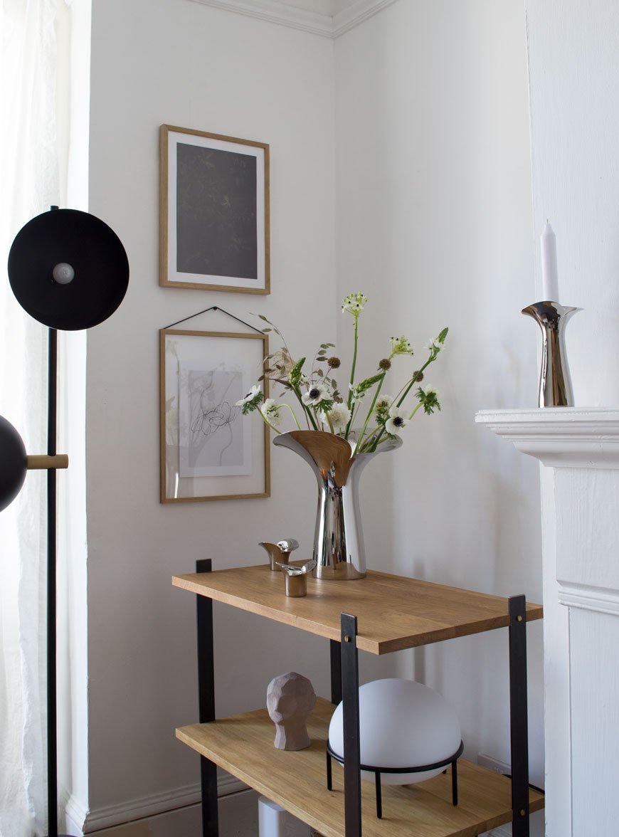
[Advertisement - this Bloom Botanica feature is a paid partnership in collaboration with Georg Jensen].
I took these shots of Georg Jensen's Bloom Botanica collection before this seismic shift in our lives occurred. The idea that I could drive out to my favourite florist, The Floral Madam in Faversham, and come home with a wrap of delicate spring blooms now seems a total luxury.
I think about how fortunate we are to have the internet in these times, to stay connected, support each other and feel inspired and hopeful. And though it may be difficult to pick up a simple bunch of flowers now, it is just as important to have something beautiful to look while we're safe at home.
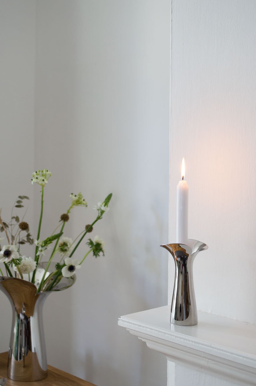
This spring, Georg Jensen launched Bloom Botanica in celebration of the 20th anniversary of its award-winning Bloom collection (it earned itself a place at MOMA). The new iteration designed by Helle Damkjær is an extension of vases and candle holders to complement the original tableware.
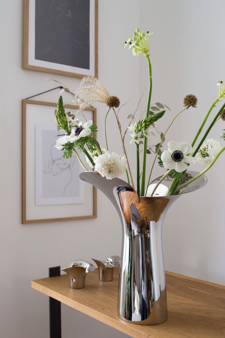
Known for her sculptural, organic approach to contemporary shapes, the collection is influenced by the optimism of spring. Fluid edges of polished stainless steel represent unfurling petals, mimicking a flower in bud opening for the first time.
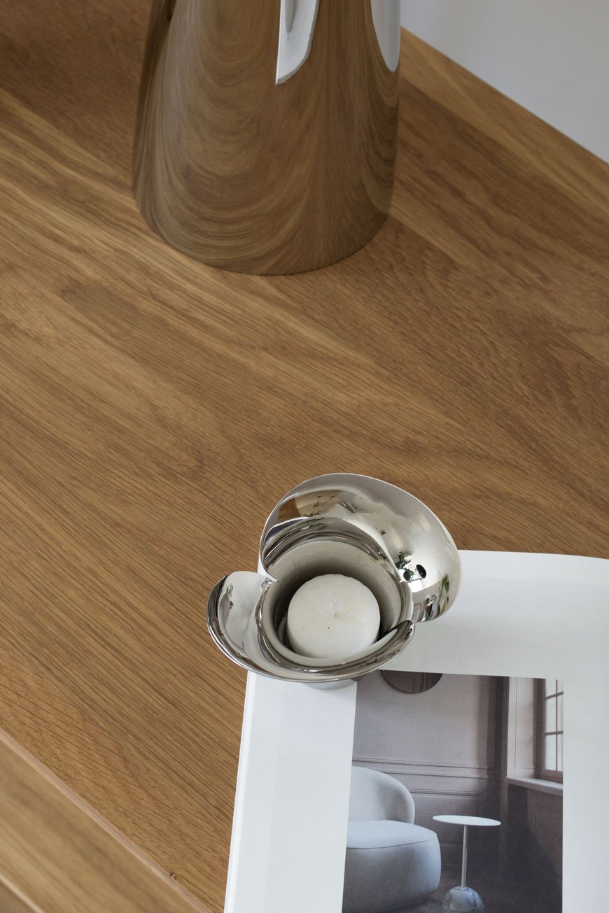
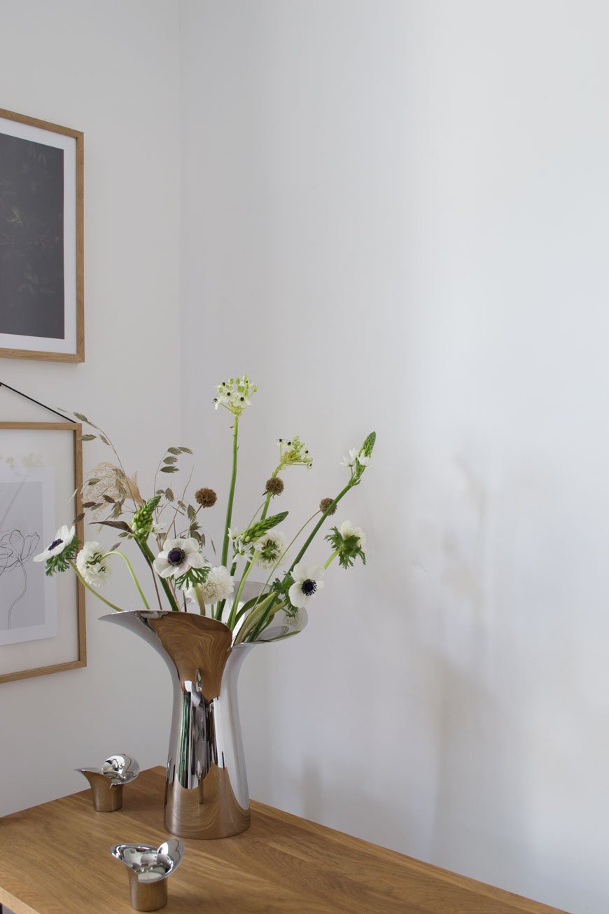
I could only choose my absolute favourite white spring flowers to accompany such a poetic piece. Aren't they beautiful? Elegant stems of white Anemone and Scabiosa sit with tall candle-like Ornithogalum. I added textural tufts of Calamagrostis from my own garden, with quaking grass and Scabiosa Stellata.
And the results are quiet and calming in my living room. This is the kind of collection that doesn't need to be styled with flowers to earn its keep as stand-alone sculptural art. That a hard and industrial material as stainless steel can be made to appear soft and tactile can only be a result of the way Damkjæer moulds her designs first with clay.
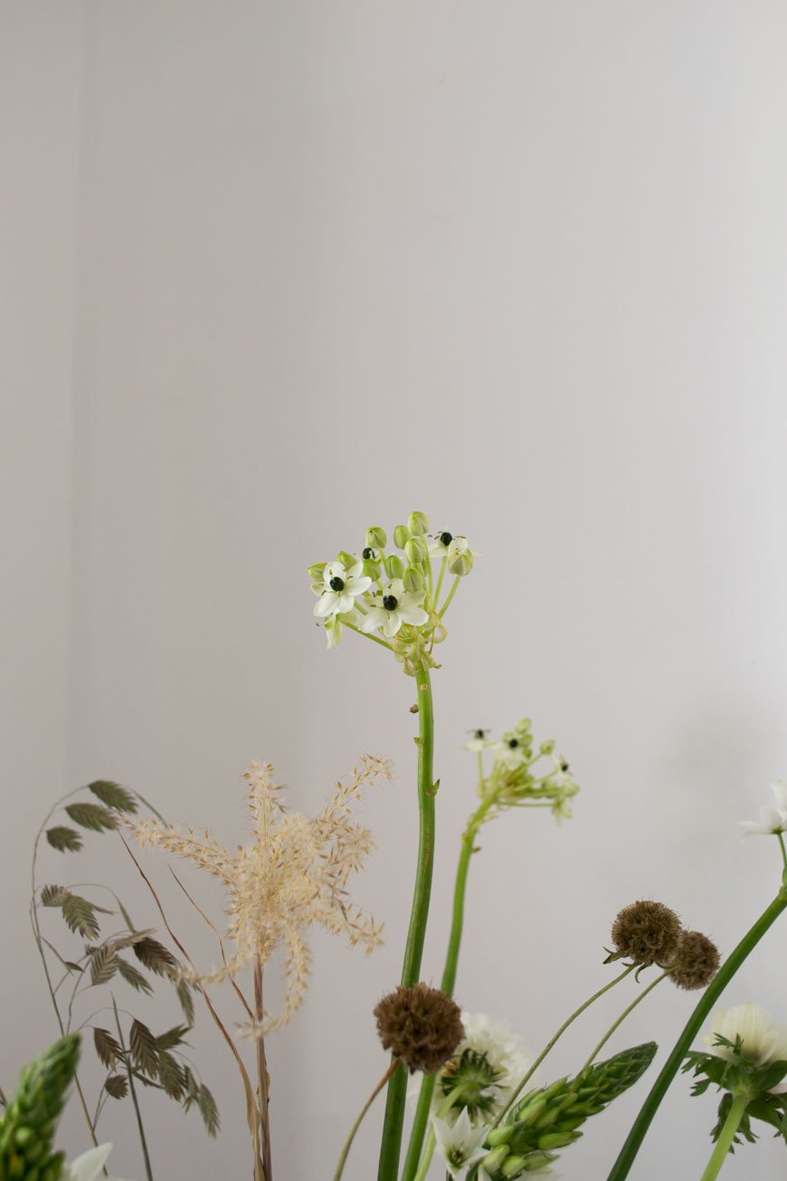
The Bloom Botanica Collection
Vases come in small, medium and large priced at £60, £100 and £160 respectively.
Set of two candleholders, £120.
Set two of tealight candleholders, £60.
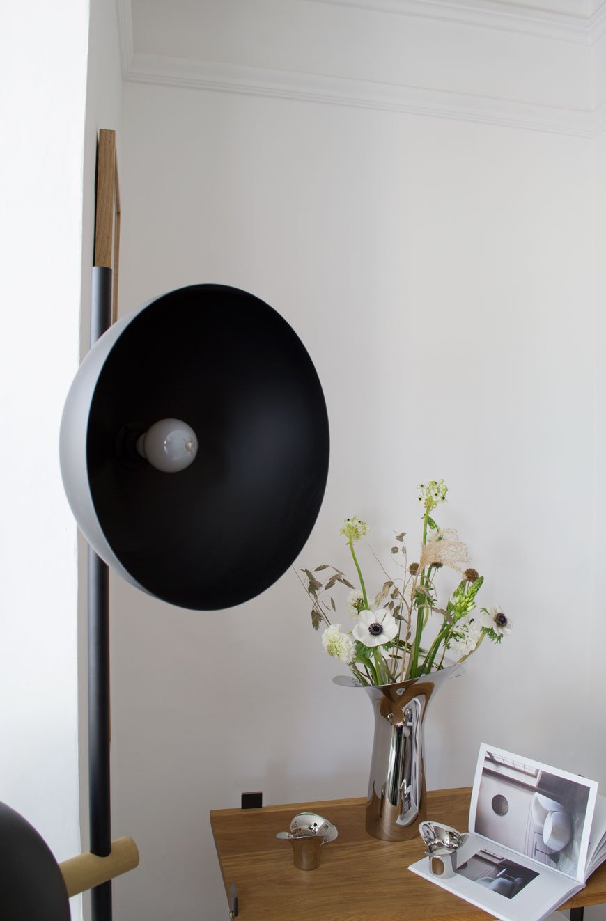
If you love this post, you might like to explore more from the Georg Jensen collection in my home.
Photography and styling by Tiffany Grant-Riley.
[AD] CH24 Wishbone Chair in 2020 Limited Edition Navy Blue
[Advertisement - this is a paid partnership with Carl Hansen & Søn]
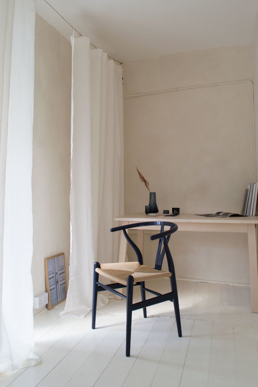
Without realising, blue has slowly become a key colour in our home - I find it so soothing and meditative to be around. So when I saw that the newest edition of the CH24 Wishbone chair was to have a navy blue update, I couldn't imagine a more perfect colour for one of Scandinavia's best-loved designs.
Originally designed by Hans J. Wegner in 1949 for Carl Hansen & Søn, the CH24 Wishbone chair has been in constant production since 1950. A universal favourite, chances are you'll recognise its iconic shape even if you don't know it by name. As one out of nearly 500 creations over Wegner's lifetime, its distinctly recognisable 'wishbone' shaped back has become a hallmark example of Danish modernist design. I adore it.
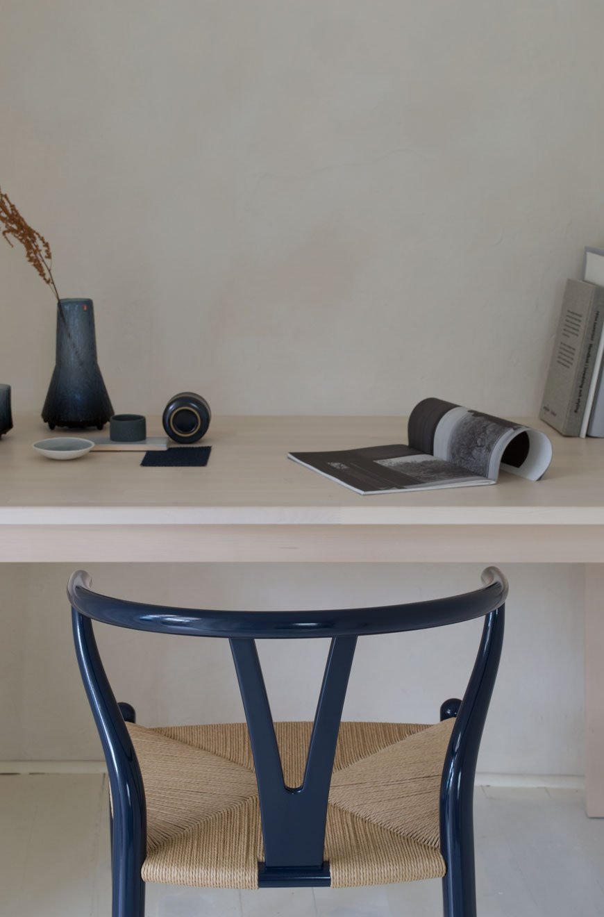
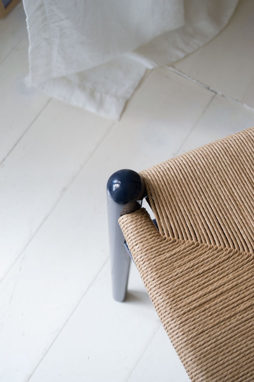
On the 106th anniversary of the Wegner's birth, as they do every year, Carl Hansen & Søn have released another birthday edition.
For 2020, my design heroine Ilse Crawford and her London-based practice StudioIlse were given the honour of the collaboration. The result is a high gloss navy blue lacquer frame with its traditional woven paper cord seat, drawing on Wegner's long time fascination with Asian craft and culture.
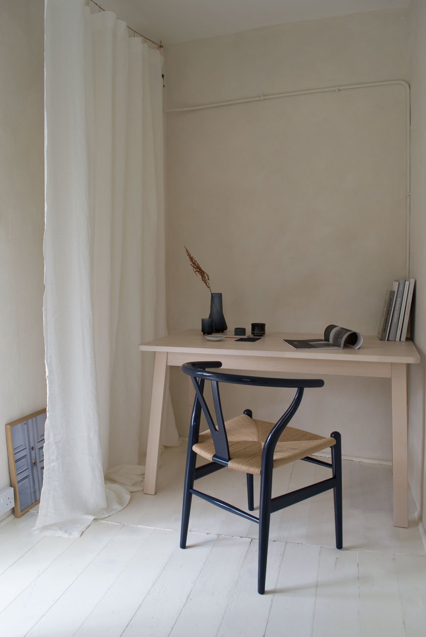
"The blue refers to the color, which has been so much a part of Chinese culture: from the blue and white china that obsessed the world for so many centuries, to the dark blue of indigo textiles, while the high gloss finish references the traditional Chinese lacquer finish."
Ilse Crawford, StudioIlse
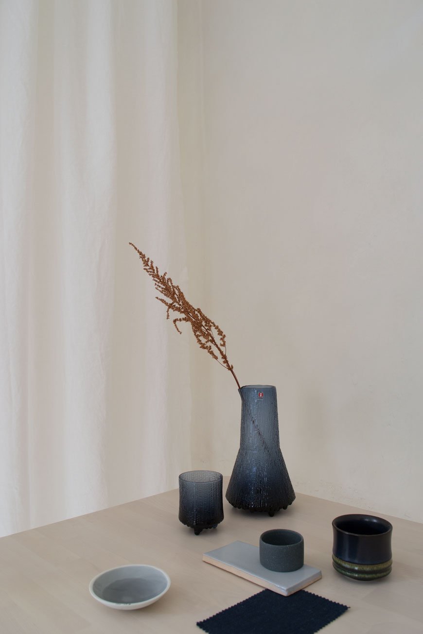
The Wishbone chair stands as a symbol of Wegner's respect for the purity of wood and its simplistic nature. I love the contrast between the seat, woven from 395 feet of paper cord, and its inky blue frame. It's such an expressive piece for furniture which has the ability to change its tone throughout the day depending on where in the house it sits.
And at a time where the minimal world of Nordic design is blending with Japanese cultural identity, it represents our need for comfort, craftsmanship and longevity in our homes.
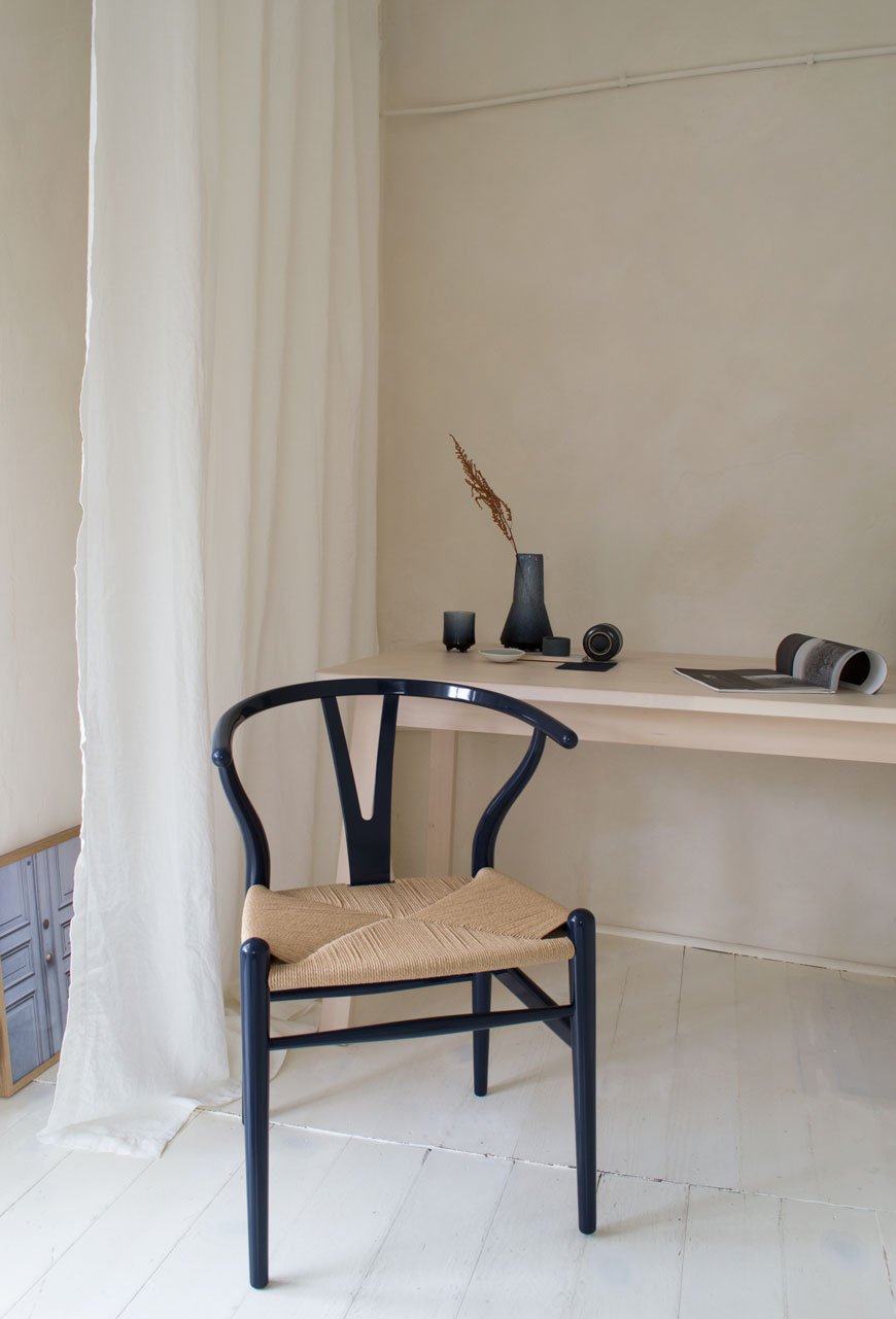
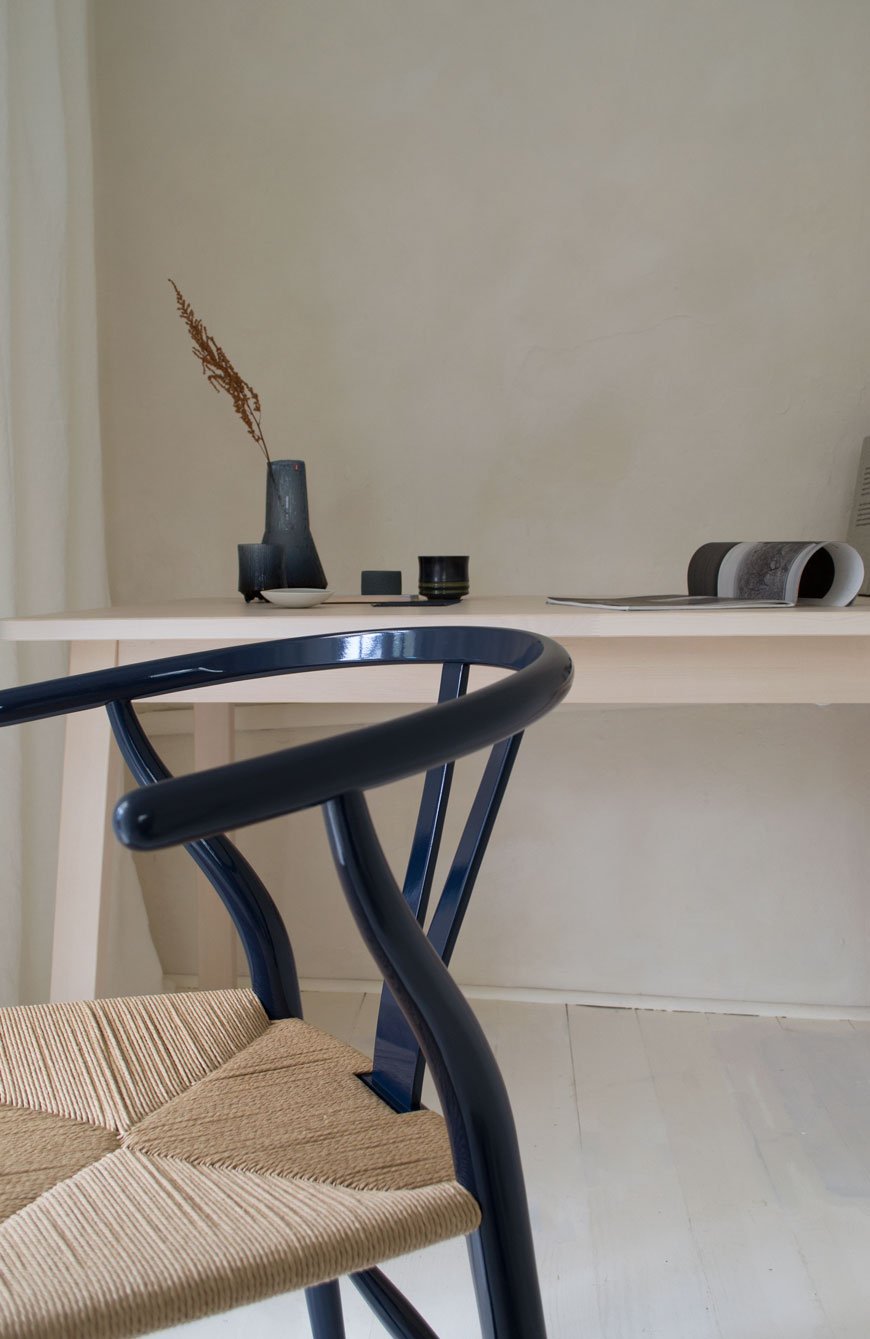
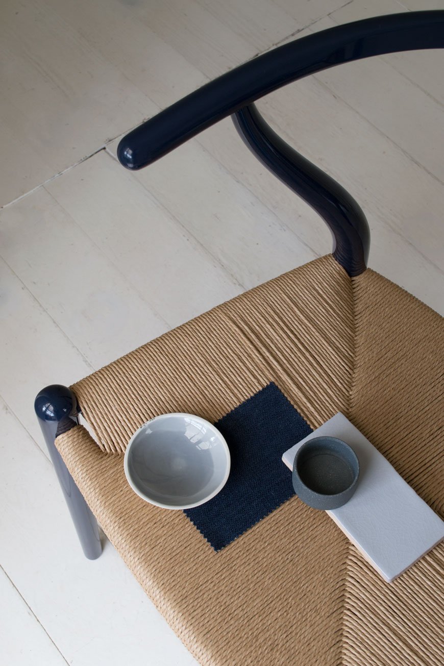
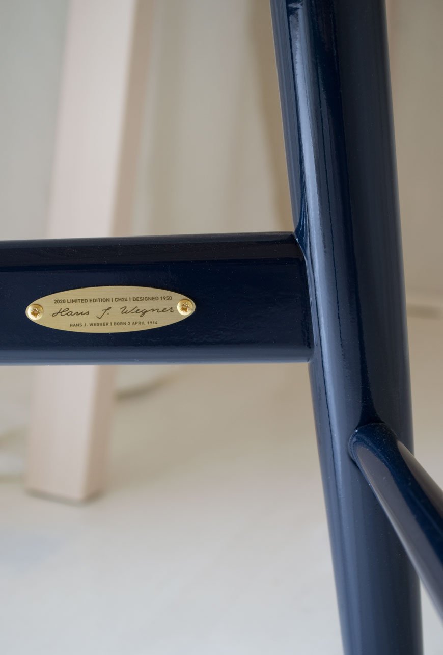
The navy blue CH24 Wishbone chair is available to purchase from 2nd to 30th of April. It and comes with a small engraved brass plate featuring Hans J. Wegner's signature and date of birth and certification of authenticity.
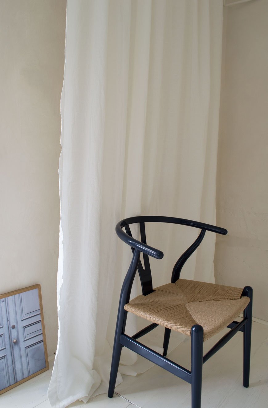
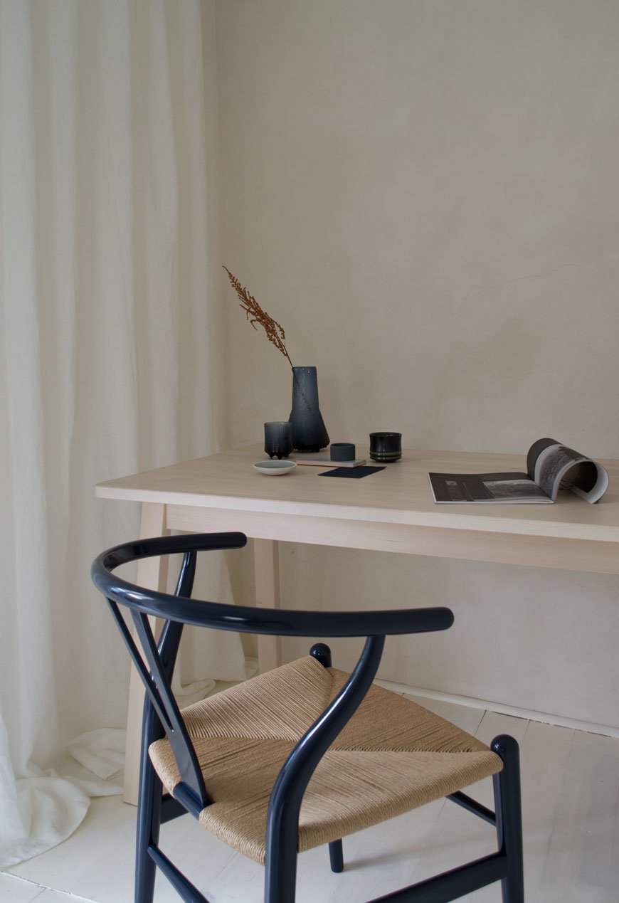
Photography and styling by Tiffany Grant-Riley.
Laurie Poast Atelier Minimal Sculptural Ceramics
I have some utterly beautiful work to share with you today by American-Scandinavian ceramist Laurie Poast. It's been impossible to keep my eyes off her collection of minimal, sculptural ceramics ever since I first saw her work on Vogesparis.
Now based in Bergen, Norway, Laurie grew up in Wisconsin. Her father is a master Luthier, maker of Norwegian Hardanger fiddles, so it's inevitable that a deep connection to craftsmanship would influence her.
With a collection spanning sculptural art, bowls and vases and hardware for interiors, it's almost impossible not to want to reach out and touch, such is the tactile, smooth quality of the objects she makes.
Laurie's work is intrinsically organic, from the silky, raw matt ceramics she casts her shapes in, to the earthy and natural tones they take on. Rich autumnal inspired colour palettes connect to nature whilst chalky textured black and porcelain white looks to a more contemporary aesthetic. With an approach to curate moments of pleasure, calm and delight, her pieces take on a life of their own in the way they play with light, casting deeply textured shadows between the ripples, curves and architectural scoops.
If you're looking for a select pieces of art to adorn a shelf at home, the Laurie Poast Atelier collection is an easy choice to make.
As a self-confessed lover of ceramics, there isn't one piece I wouldn't love to own, though a personal favourite are the Valet bowls (below). Useful objects of beauty and completely stunning on their own. The urge to sit and stroke them all day might prove too much!
Follow Laurie's Instagram for more of her delicate work.
Photography courtesy of Laurie Poast Atelier, with thanks.
[AD] Heal's Sustainable Edit Brings Spring with LSA Canopy Collection
[Advertisement - select pieces from the LSA Canopy collection have been gifted by Heal's as part of their 'Recycle Remade' campaign.]
In the last week, I've noticed the garden start to come out of hibernation. That subtle glimpse of the promise of spring. And goodness knows we are READY for it. YES! So when my good friends at Heal's asked if I'd like to style select pieces from the LSA Canopy collection as part of their 2020 Sustainable Edit, it was an easy yes.
This year more than ever, Heal's are carrying the responsibility towards caring for the environment by championing products that are produced with recycled materials. Launching their full Sustainable Edit in March, their 'Recycle Remade' homeware range features the iF Design Award 2019 winning LSA Canopy collection.
Known for their glassware LSA have designed this collection in collaboration with the Eden Project, centred around the concept of propagation and hydration. Made from 100% recycled glass and sustainable cork, Canopy has a really fine feel to it. The glass is quite thin with occasional air bubbles, adding to the wabi-sabi, recycled appeal. Featuring low and tall vases and bulb planters, self-watering planters and terrariums, Canopy encourages the use of self-sufficient gardening, perfect for bringing nature into the home.
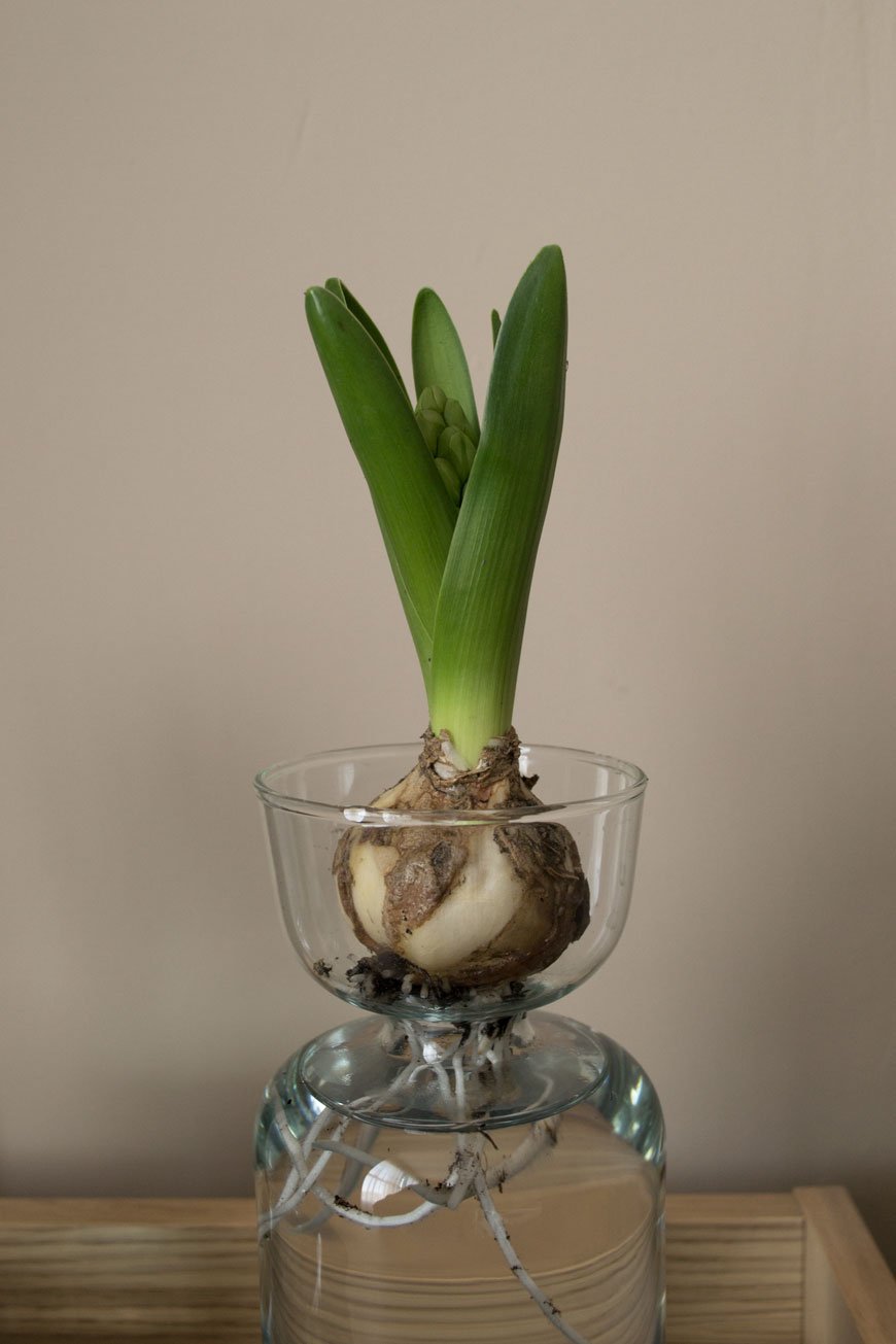
Canopy Vase / Bulb Planter, from £18.00
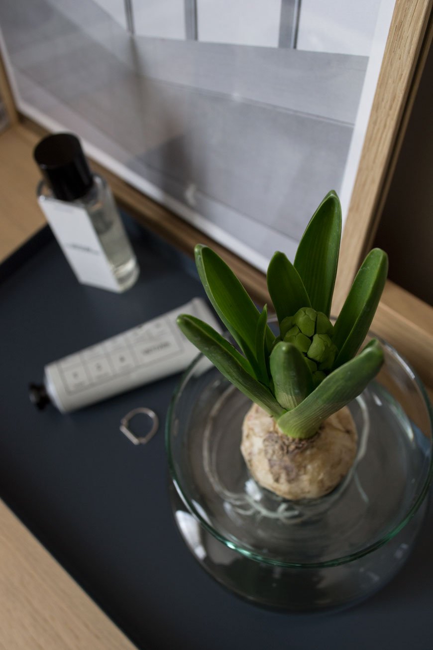
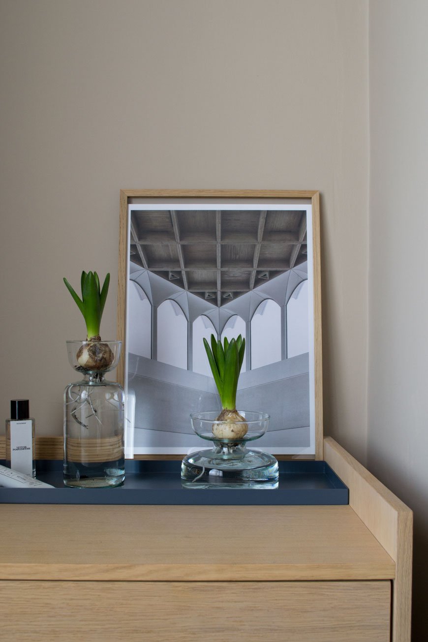
It's impossible to resist the heady fragrance of Hyacinths this time of year. I like to keep a potted cluster of bulbs in the house when I remember to pick some up from the garden centre. I've styled a couple of bulbs on our Morten chest of drawers in our bedroom (also from Heal's) which will bloom white in a few days. You can leave most of the soil around the root ball if you like but I've rinsed most of it away, threading the longers roots into the bottom of the vase.
Canopy Self-Watering Planter, from £36.00
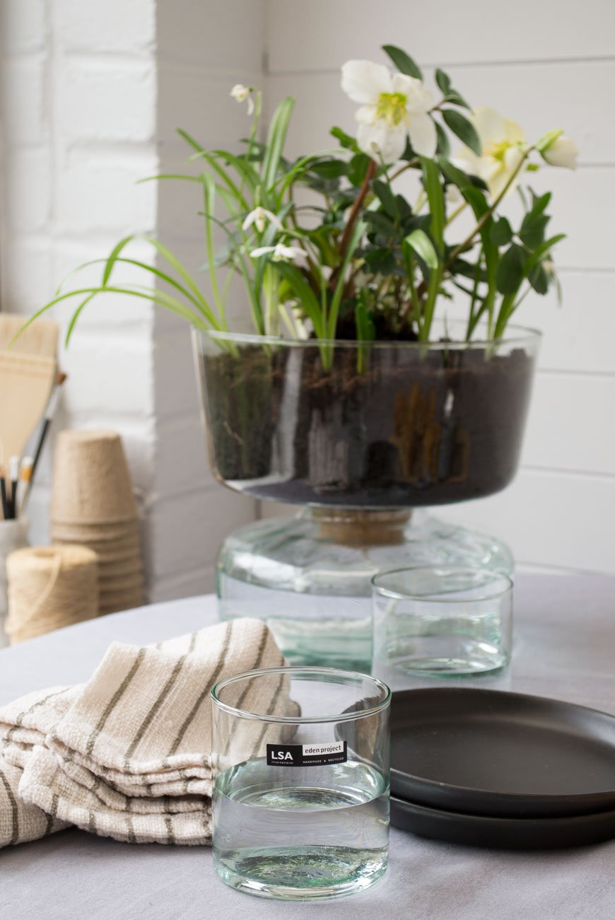
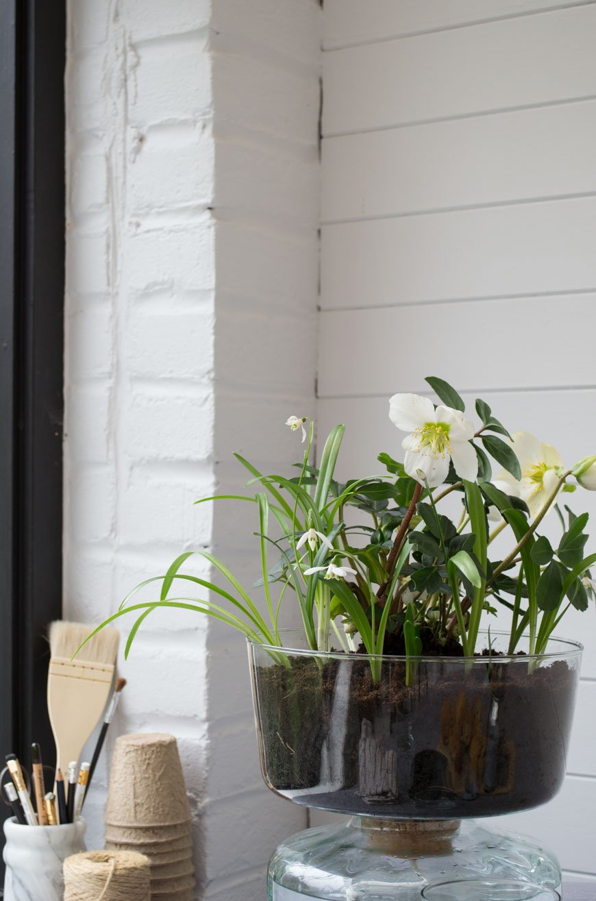
Another spring favourite of mine is the evergreen Hellebore or 'Christmas rose'. It has a long flowering period over winter, brightening up the border when other flowering plants are dormant. I've got them in the sunroom now, sitting in the self-watering planter. A clever hydration system made of two parts, a piece of rope connects the soil-filled planter on top to the water well beneath allowing the plant to draw up moisture as it needs it.
Every part of this collection has been considered, right down to the minimal packaging, made from recycled card and printed with organic vegetable ink.
Canopy Closed Garden, £40.00
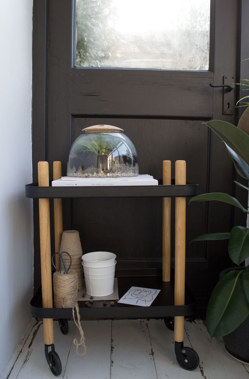
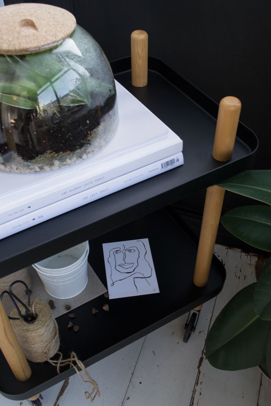
Inspired by the shape of the Biomes at the Eden Project, I used the Closed Garden to create a humid space for small spider plants and maidenhair ferns. Using a thin layer of gravel for drainage, I added a layer of sphagnum moss to help retain moisture before topping it with a good layer of houseplant compost. Once I'd pruned and planted everything in, a good spritz of water before closing the lid would provide the plants with the right level of humidity, light and temperature in their final spot in the sunroom. I'm excited to see them thrive in the coming months!
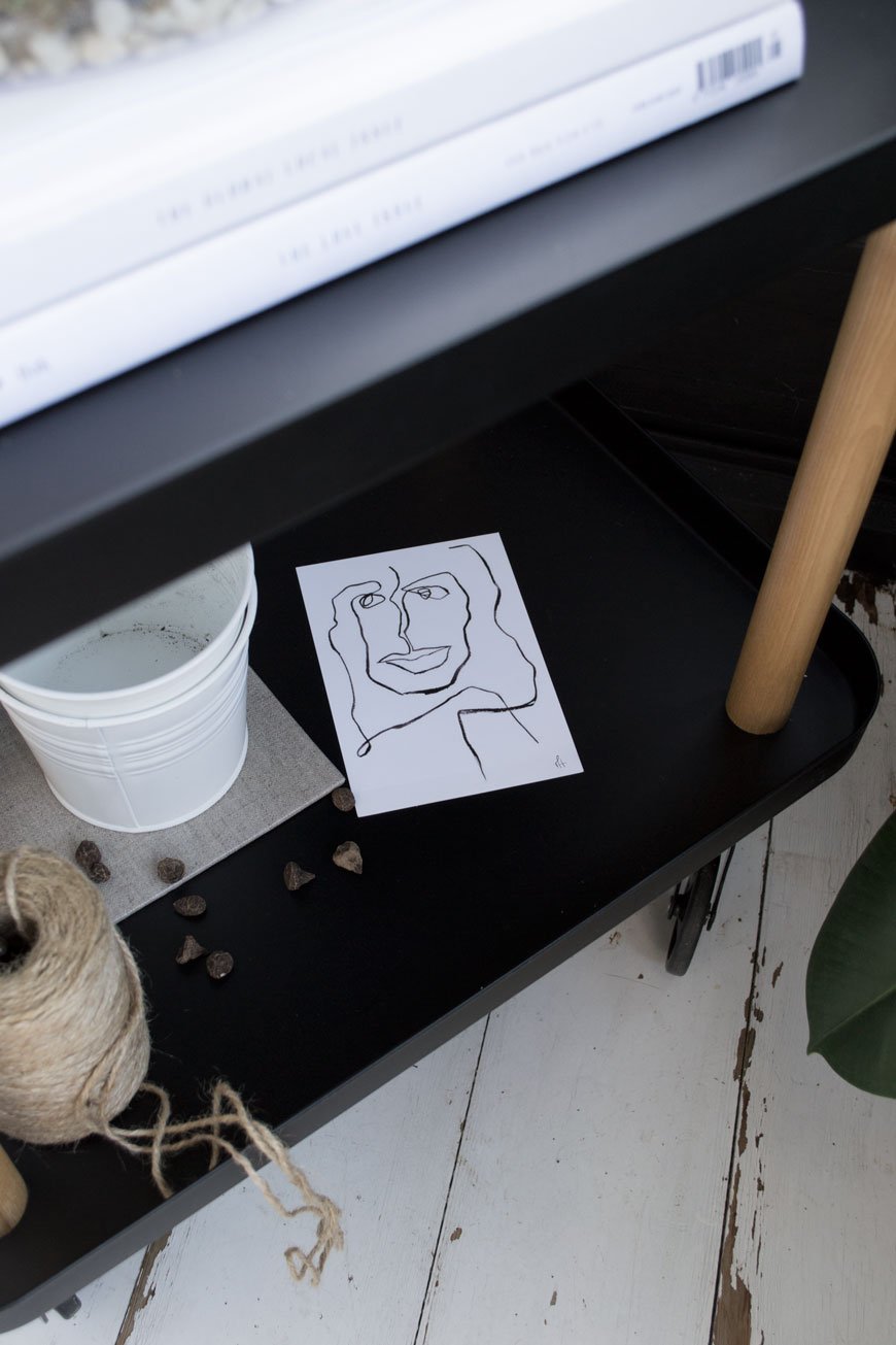
Photography and Styling © Tiffany Grant-Riley.
Swedish Island Living In An Architect Designed Family Home
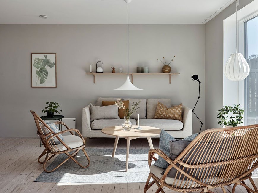
Glancing out the window at my rain and wind lashed garden, I'm already thinking ahead to spring and its promise of warm sun. For now, images of this light-filled Swedish villa are just as good a substitute.
And there's so much inspiration to take away from this architect-designed family home. Nestled into the rugged landscape on the island of Brännö in the southern Gothenburg Archipelago, its Gotland pine-clad structure is a lesson in open plan living done well. It makes the most of every square inch, crucial when you're planning your own extension or complete new build.
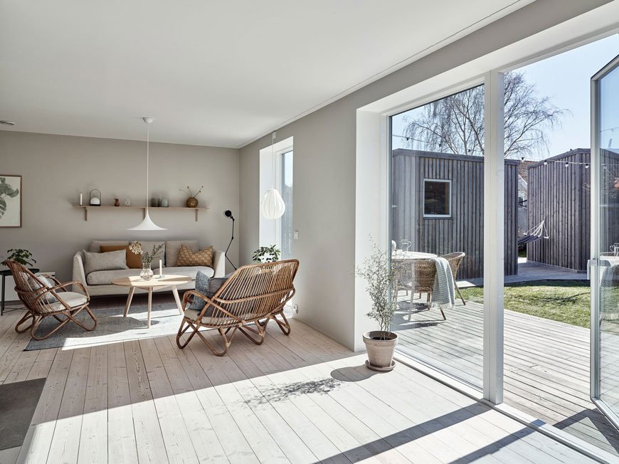
Built-in an L-shape to protect against the wind, this home looks out across the water and garden dotted with lilac, apple and cherry trees. Just a stone's throw from the city by boat, there are no cars allowed on Bränno. The pace of life is altogether slower here, connected to the rhythm of the island's diverse surroundings of meadow, forest and beach. What blissful seclusion.
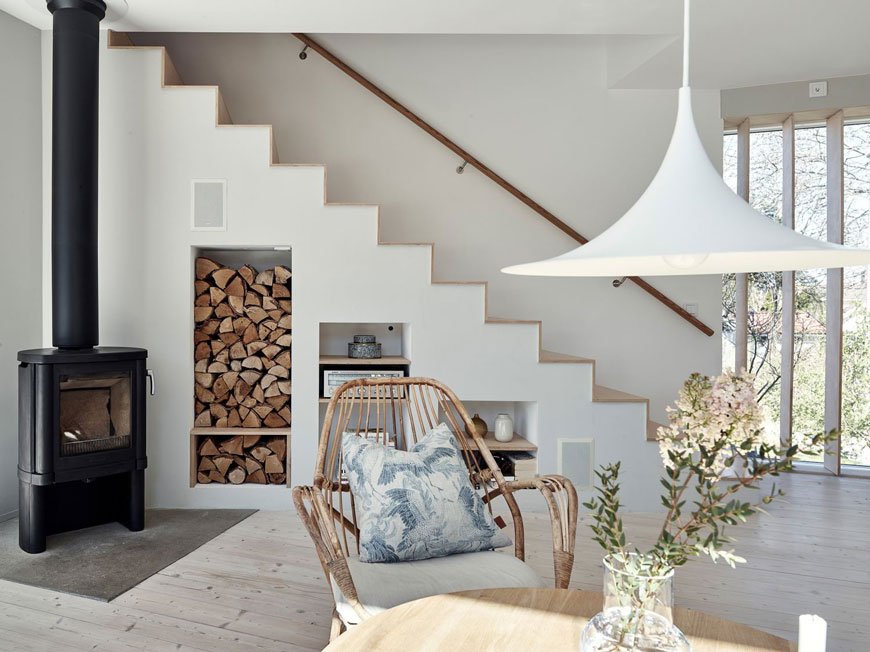
Inside, the interiors connect beautifully to the garden. Light spills into the open plan living spaces through ceiling to floor windows. You're always in touch with the heather covered rocks and the view across the water. Tinted and white oiled pine boards run across both floors, continuing a sense of space and the soft grey walls help tone down the direct sunlight.
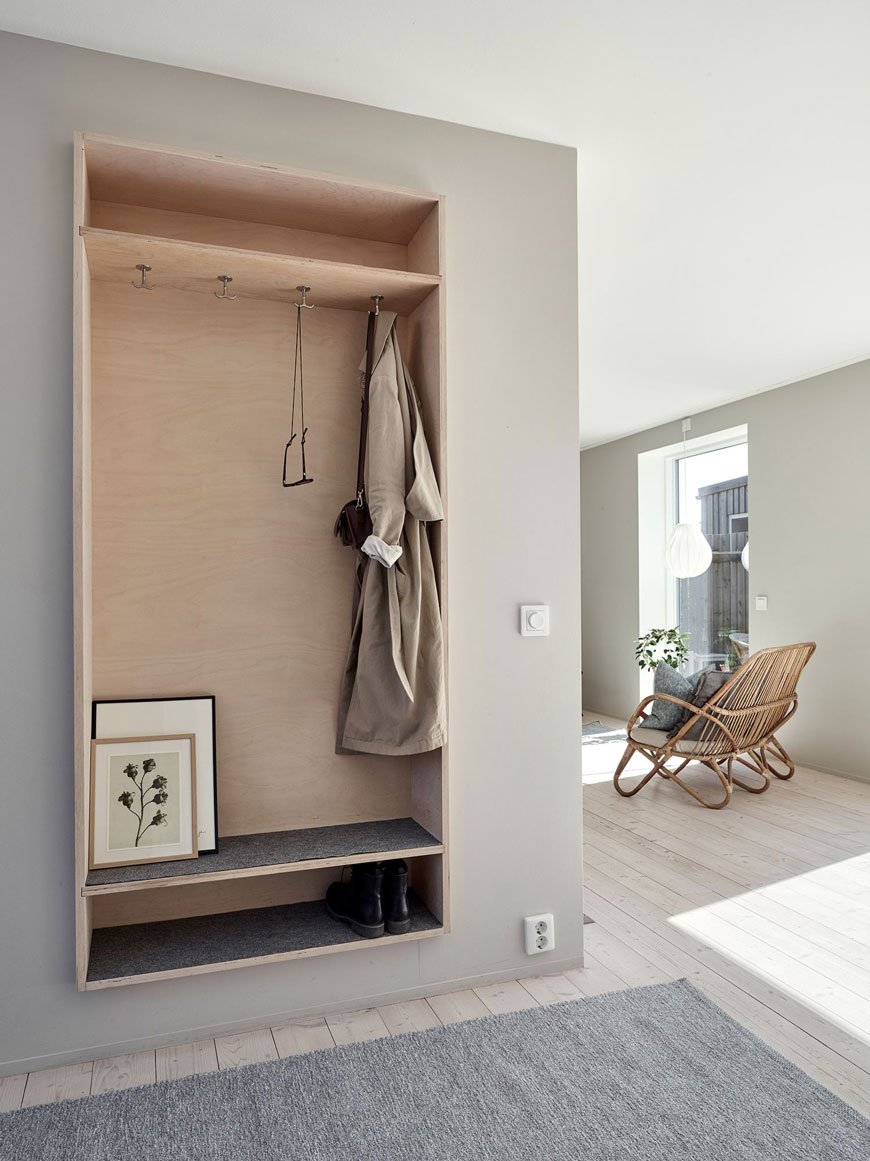
I love this simple open plywood cupboard that cleverly zones the entryway. Wall mounting it off the floor maintains a feeling of space and gives this area functionality.
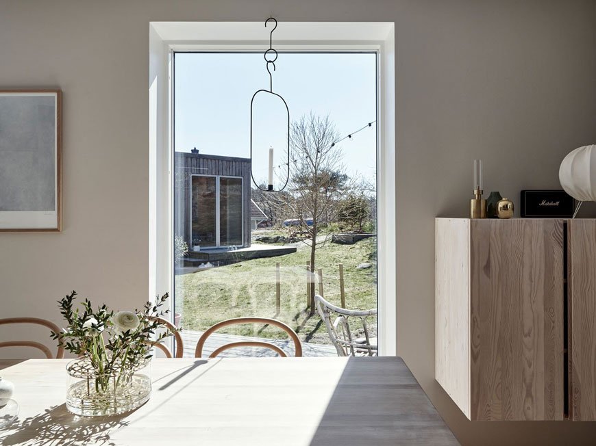
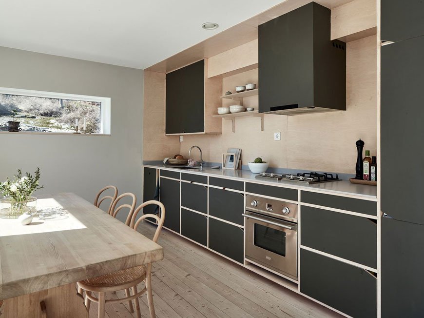
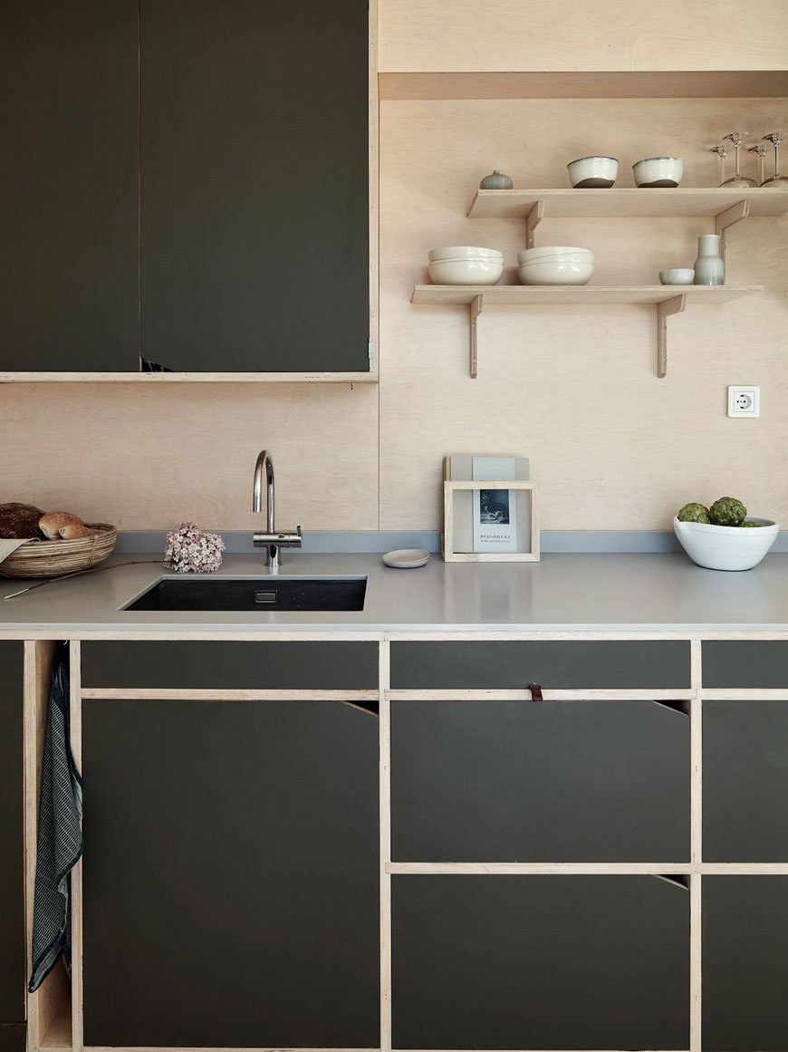
The kitchen is wonderful. Oh, the kitchen. Set across one wall it's typically Scandinavian, doubling up as a dining space with a warm wooden table and classic cane bentwood chairs in the centre. Built from humble plywood, as you'll see much of the upper floor is too, the cupboards have been painted dark green with notches cut out for minimal door pulls. Small, open and perfectly formed.
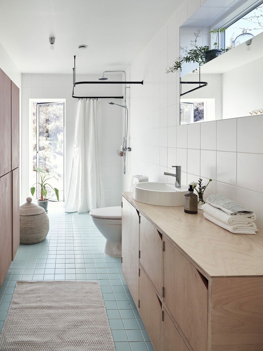
Square turquoise floor tiles add a subtle splash of colour in the bathroom. So as not to interrupt the space with a solid shower unit, the owners have used a simple black hanging rail to zone the shower area with recessed drainage under the floor. Plywood continues in the cupboard storage with the vanity matching the same style doors as the kitchen.
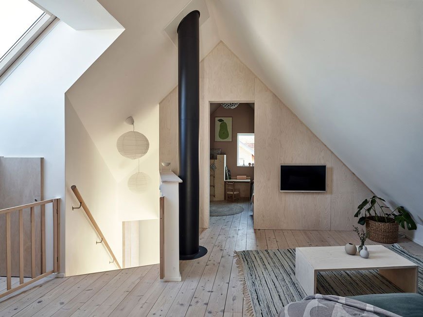
Upstairs, the master bedroom and kids' room peel off from a cosy snug where the use of plywood continues on two sides of the room, marking the shape of the roof.
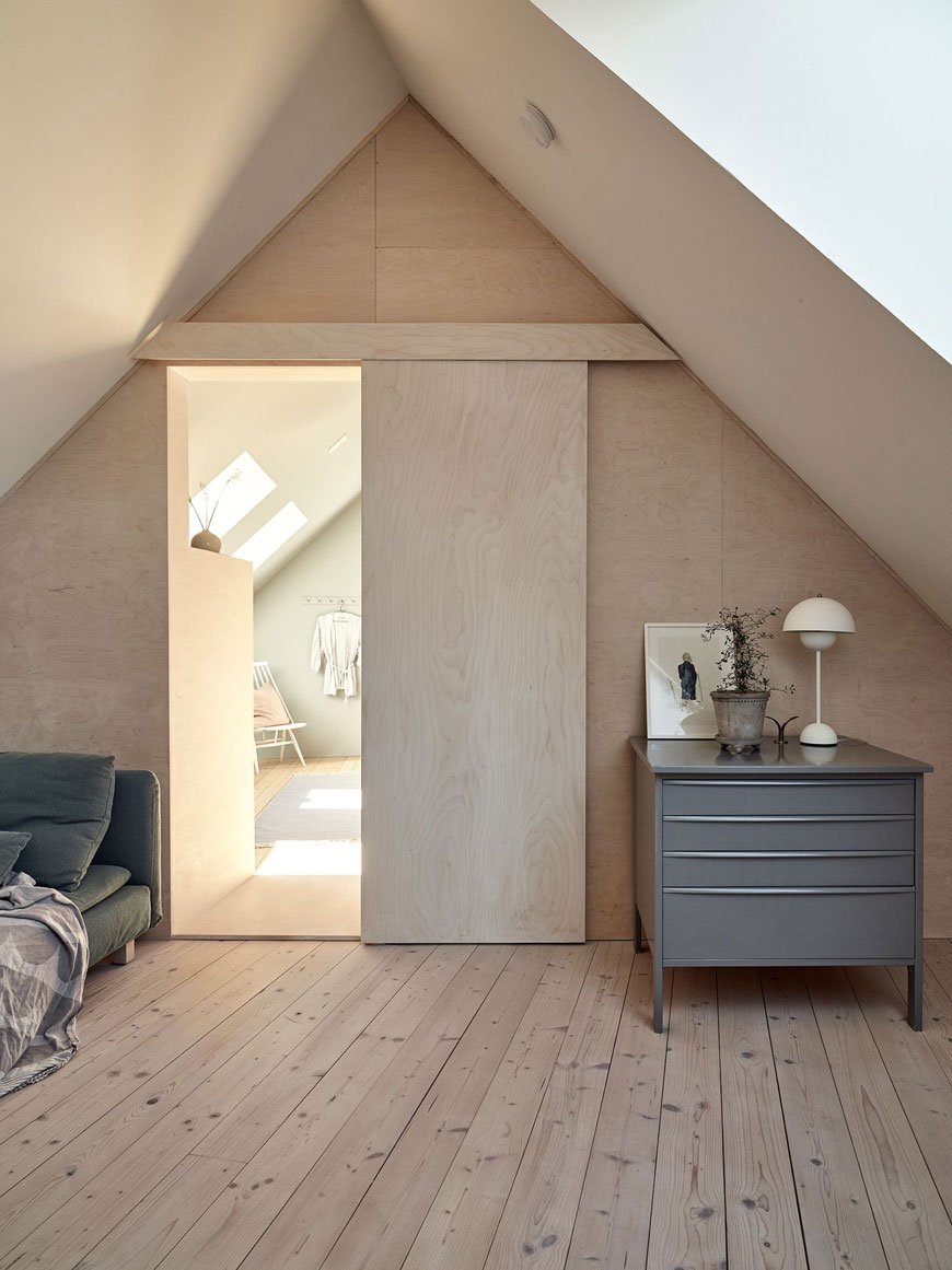
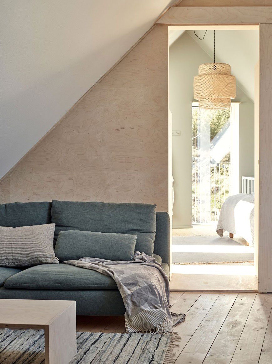
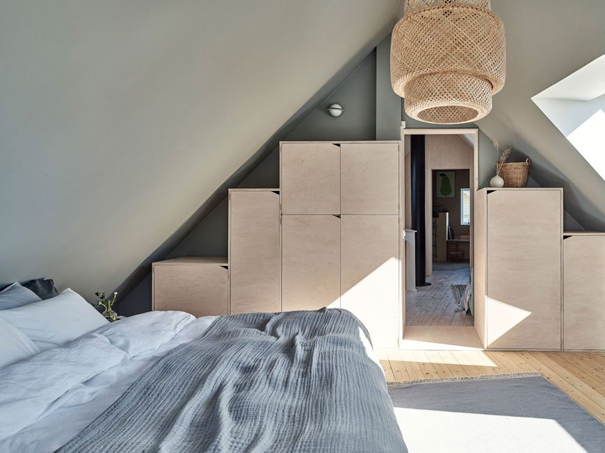
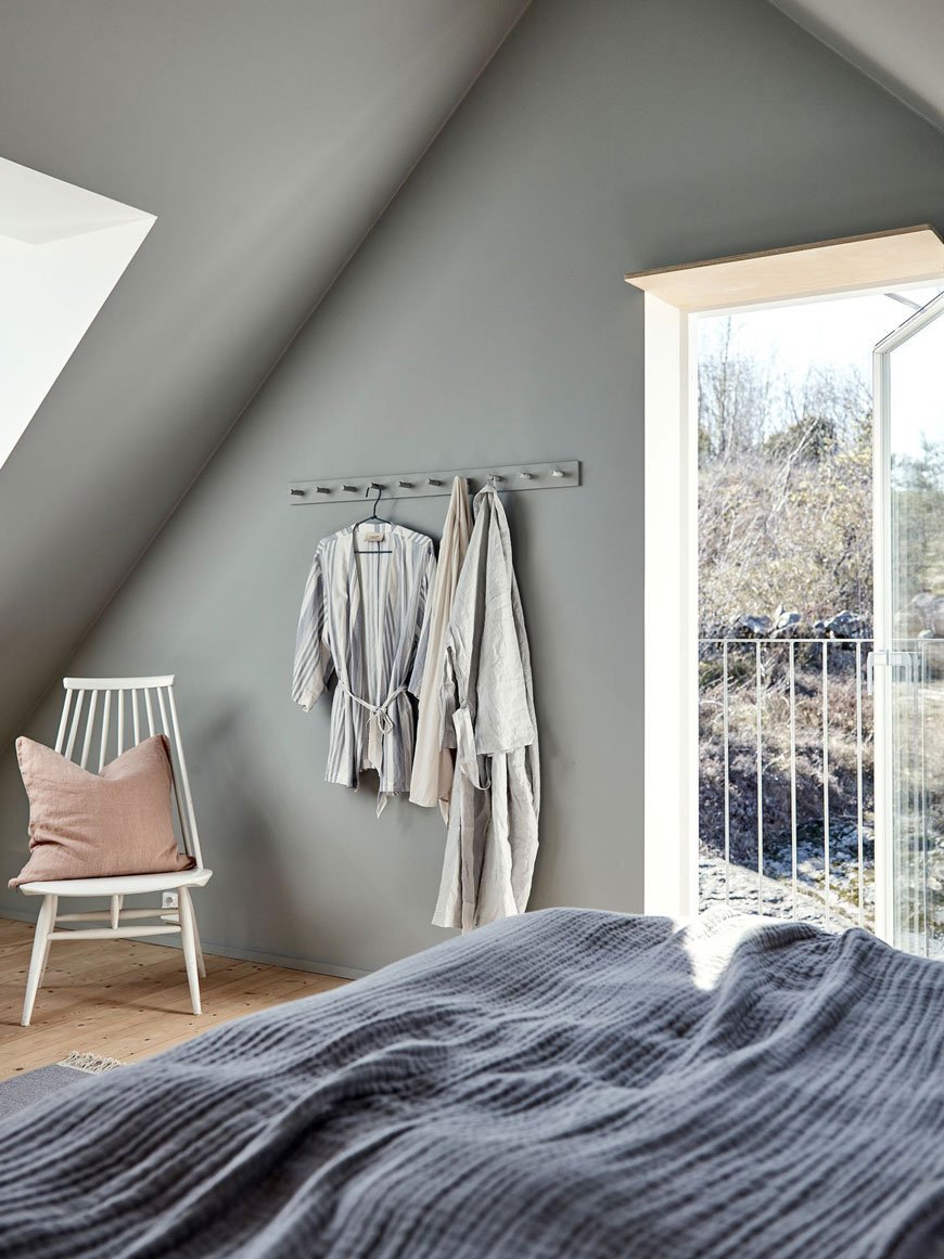
The master bedroom, painted in a soothing shade of Pale Linden by Jotun Lady is bathed in warm light via skylight windows and a glass door, leading out onto a balcony. The owners have tried to retain as much floor space as possible with built-in plywood storage tapering up into the eaves of the roof space.
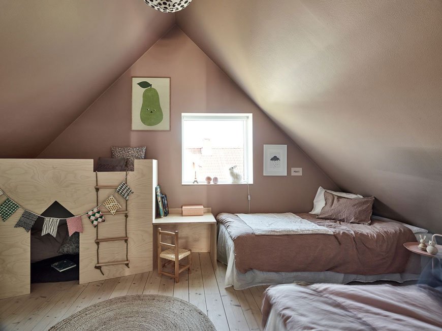
This sweet and soothing kids room has been painted on both and walls and ceiling in Jotun Lady Senses. I love how cosy it feels in here with the built-in playhouse and desk making the most of the light from the window above. Most of all, it's been decorated in a way that's easy to adapt as the kids grow older.
Photography courtesy of Kvarteret Mäkleri.
[AD] The Helix Collection - A New Modern Classic From Georg Jensen
[AD - the Helix collection is a paid partnership with Georg Jensen]
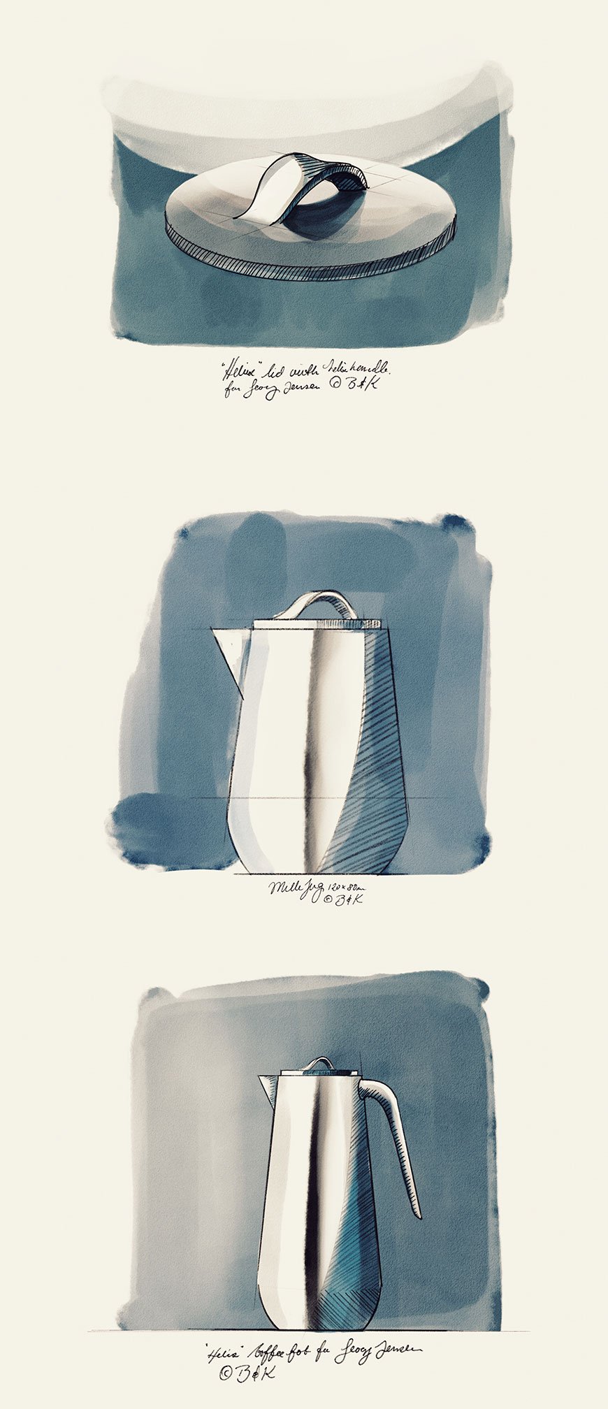
There's a new kid on the block from Danish silverware giants Georg Jensen. The Helix collection, a contemporary design from Stockholm based duo Bernadotte & Kylberg already has all the hallmarks of a modern classic. In fact, it sits so well within the Georg Jensen story that I'm surprised it wasn't created 50 years earlier.
And yet, Bernadotte & Kylberg were adamant not to be overly influenced by what has gone before. Mindful of Georg Jensen's heritage, the duo were keen to bring new perspectives into the design process, ultimately creating a characteristically functional and elegant collection. Defined by simplistic twists set onto the lids, the helix shape (the Greek translation of 'spiral') becomes part of its function.
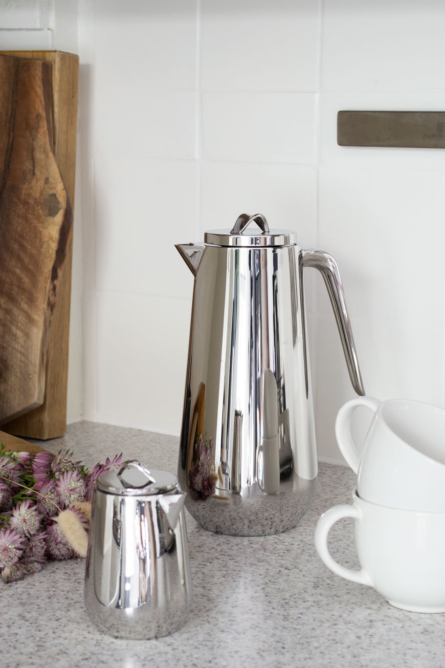
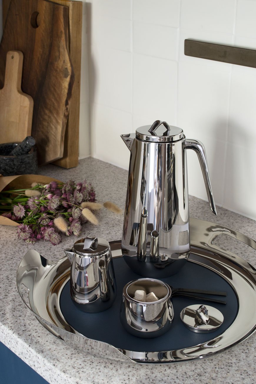
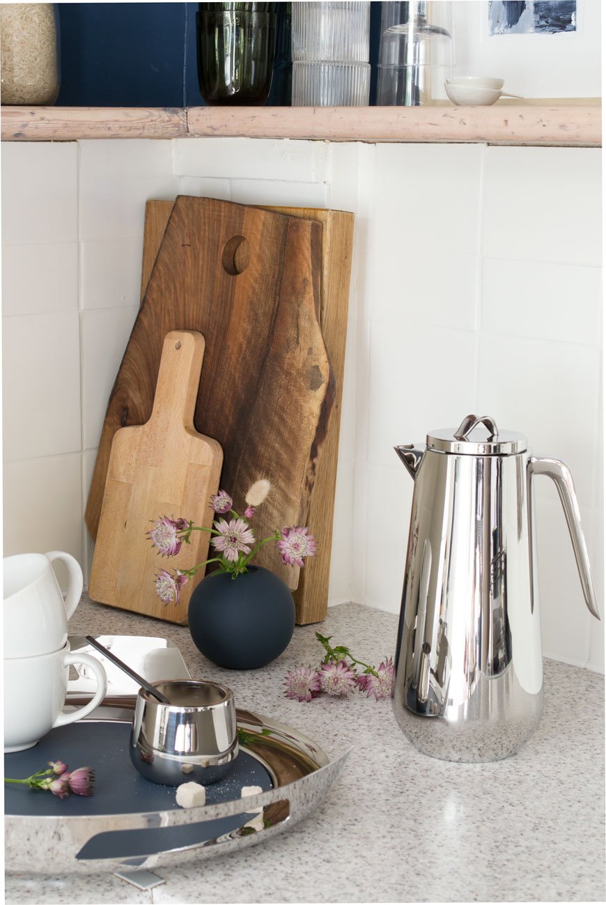
Carrying forward the centuries-old ritual of enjoying tea and coffee, the five-piece stainless steel tea and coffee service set, consists of a Thermos coffee jug, insulated teapot, sugar or bonbonniere pot and milk jug. Tied together with a sculptural serving tray, a deep blue leather mat on the base keeps everything from slipping, protecting the steel beneath.
I've continued the blue thread which runs throughout Georg Jensen's identity into my own kitchen. You can imagine how much I loved that the leather mat matched the blue cabinets so perfectly!
Made from highly polished stainless steel, their sleek shapes reflect a rare glimpse of autumnal sunshine bursting through the window.
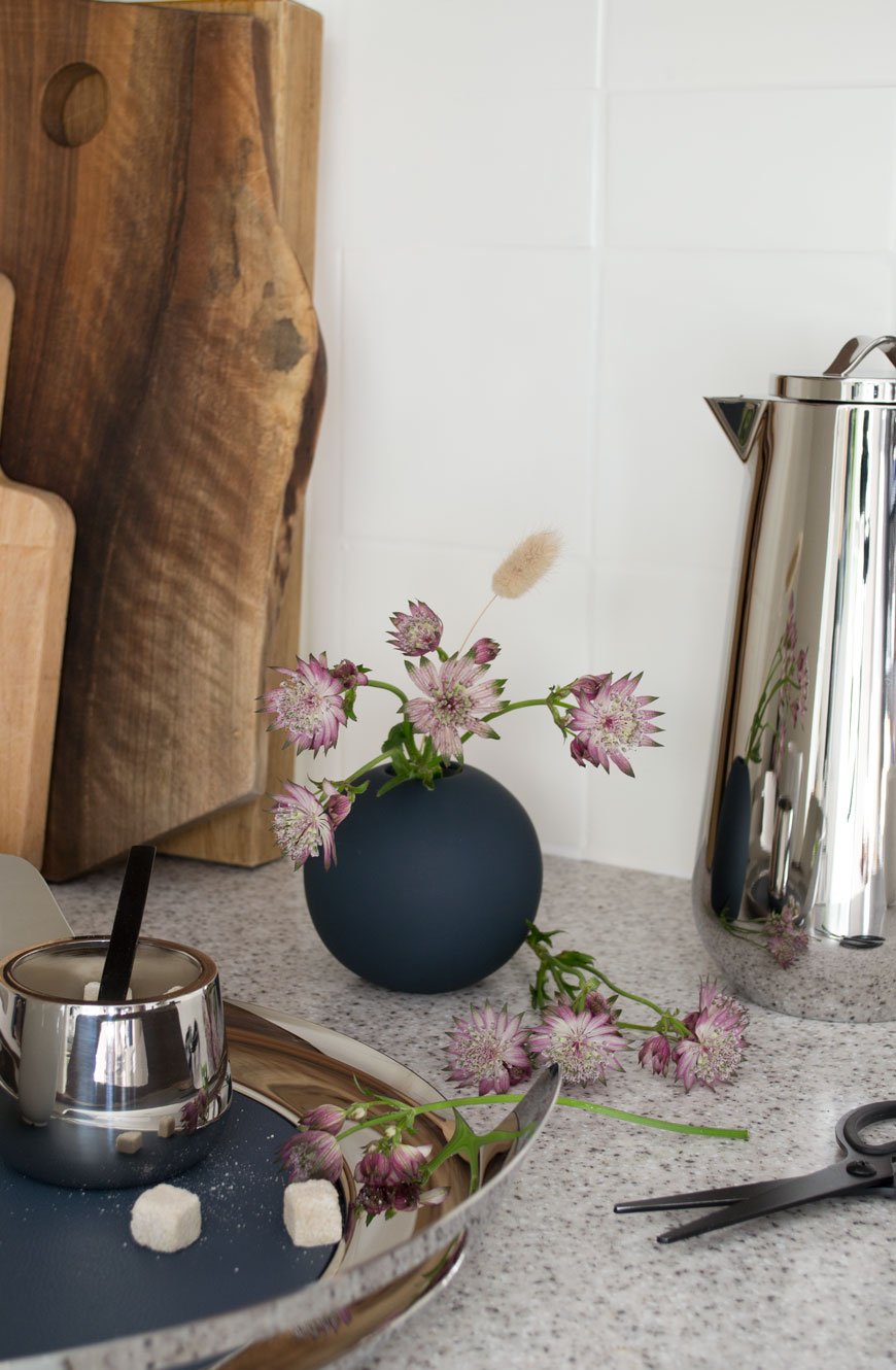
It's a real pleasure to use this set and taking your time is all part of the experience. From the sculptural handle in the Thermo Jug to the twist of the lid on the Milk Jug, you can appreciate the craftsmanship that's gone into each piece.
Although its contemporary, industrial aesthetic is enough to earn its keep, the Helix collection has been designed with function in mind. The coffee thermo keeps fluids hot or cold for up to six hours and the spout never drips after pouring.
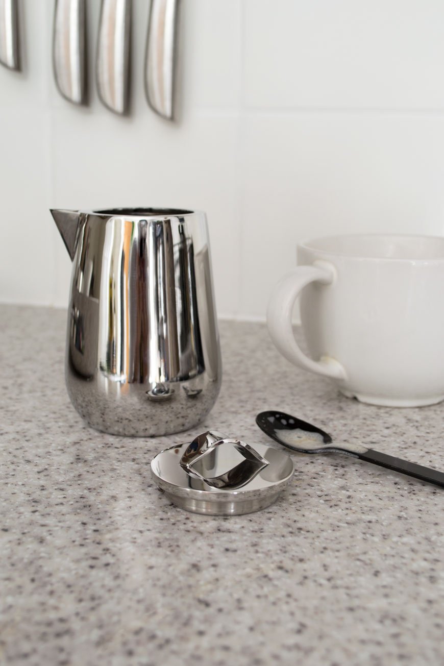
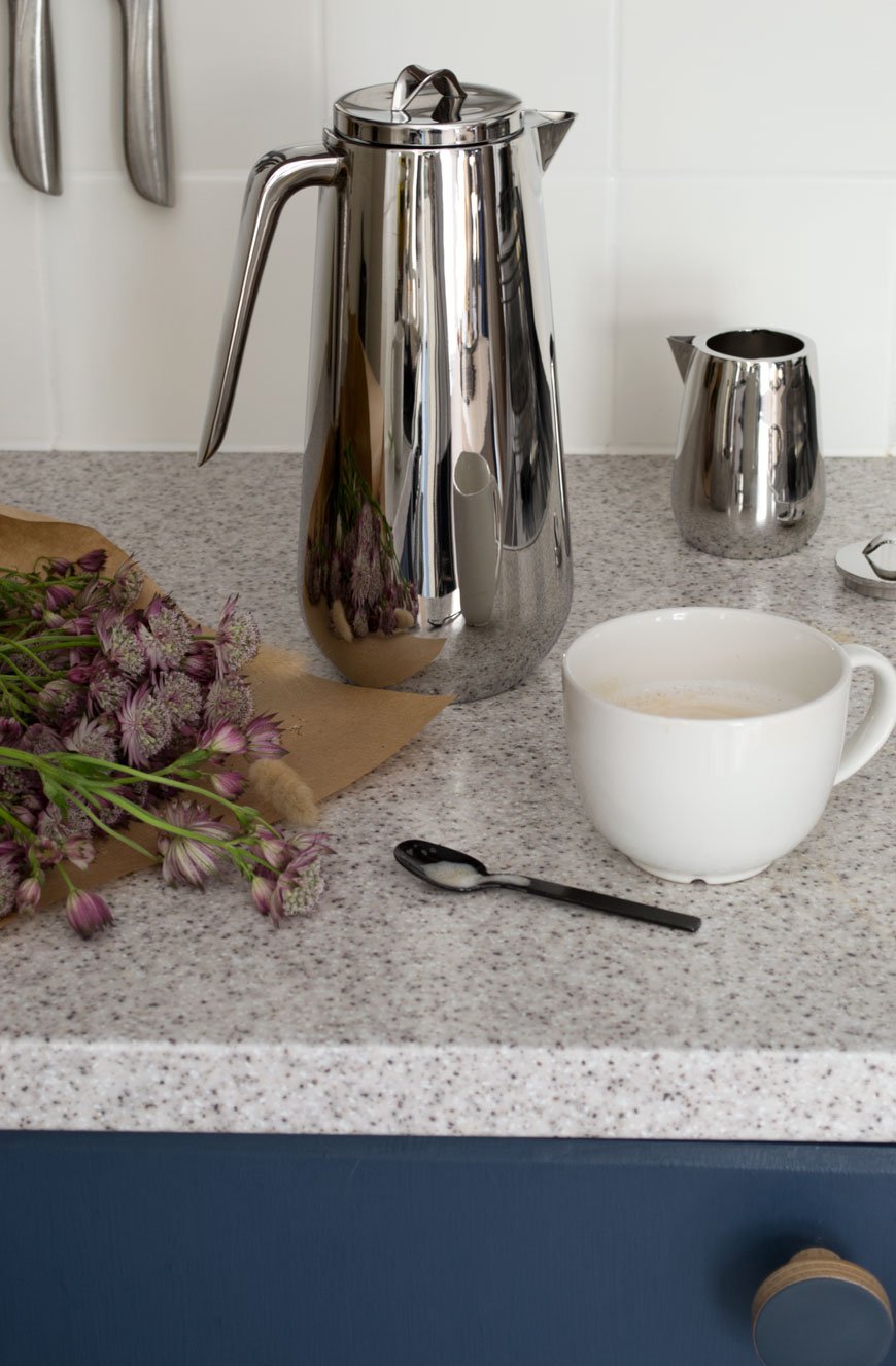
Thermo Jug, £170 | Helix Tray, £160 | Milk Jug, £60 |Bonbonniere, £50.
If you love the Helix collection, you might like the simplicity of the Bernadotte collection too, also designed for Georg Jensen.
Photography and styling © Tiffany Grant-Riley.
[AD] Update And Elevate Your Dining Space with Pepper Sq
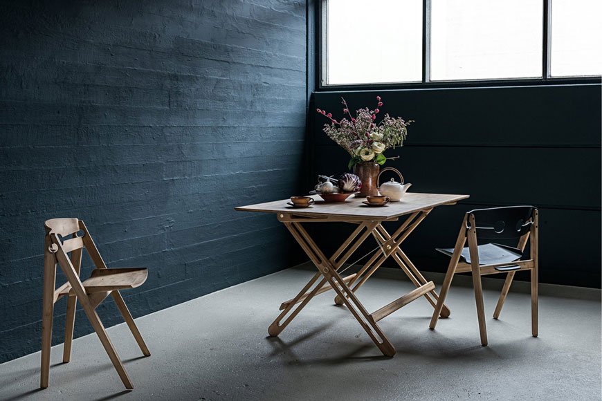
[Advertisement - this is a paid partnership with Pepper Sq.]
Sourcing the right furniture for your home takes time, especially when you're pulling elements from several different places. Which is why I'm introducing Pepper Sq today. A new homeware brand with a difference, their clever 'Spacemaking' tool takes some of the time and decision making out of the equation. It follows three simple steps:
1. Discover - Browse their impressive collection of room designs, compare styles and find your favourite.
2. Design - Customise your favourite room designs, check dimensions, match colours, choose patterns or find alternatives.
3. Enjoy - Turn that space into a thriving reality. Click and buy - you'll soon enjoy your new room design.
Grouping together a series of looks for each room of the house, furniture can be bought as a whole collection or edited accordingly before you buy. The best part of that is having a visual reference so you can imagine how it might look in your own home.
With this in mind, Pepper Sq invited me to share some advice on how to design a dining room using pieces from their collection.
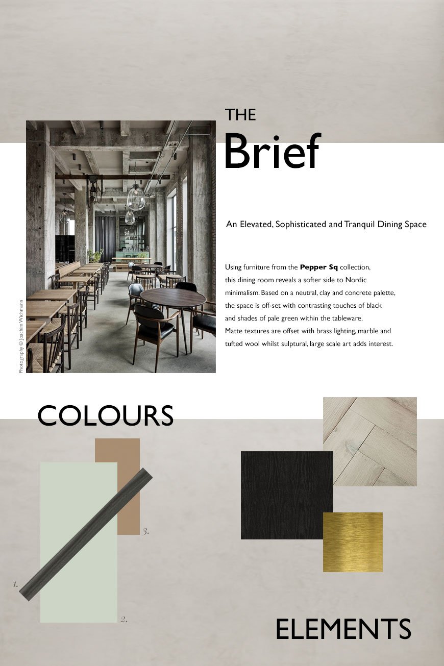
The Brief - An Elevated, Sophisticated and Tranquil Dining Space
My initial thought was, what does a dining space look like today? I use the word 'space' intentionally, as in recent years, the traditional dining room has taken a back seat in favour of open plan kitchen/diners. It seems our kitchens have become the room that we naturally gravitate to as a social space, so the rising trend in kitchen living spaces shows just how much entertaining has become a part of our culture.
There's definitely still something to be said for a separate dining room though. And with some consideration, it can become a room for every day, not just shut away for special occasions...
With the topic of sustainability and the environment high on the agenda, many of us are looking inwards and homewards for comfort as an antidote to all the uncertainty. I wanted to create a welcoming, sophisticated and calming space with Nordic influences. Drawing on 'Tranquil Dawn', the Dulux 2020 colour of the year for its soothing influence as a new neutral, the scheme includes touches of pale green accessories against mid-grey limewashed walls and warm, parquet wood flooring.
There is brass detailing running through the lighting and tableware to warm up the colder tones in the limewashed walls. And I've used black as a welcome contrast to a rather tonal palette with black oak furniture.
Ultimately, I wanted to create an elevated space that makes using it every day feel special.
Inspiration
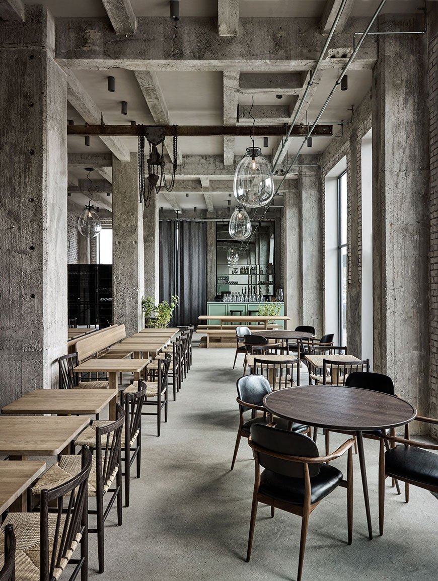
I pulled inspiration from the work of Copenhagen based studio Space Copenhagen. If you saw my stay at The Stratford hotel, their latest project, you'll know I was bowled over by the Brasserie. Set against a backdrop of soft, sand toned, textural lime painted walls, classic black bentwood chairs and brass detailing, it was the epitome of Nordic sophistication.
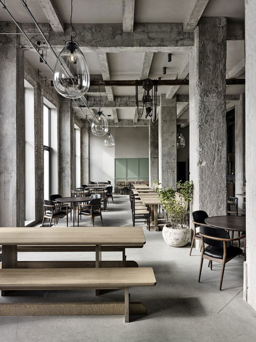
Diving deeper into their portfolio, I came across Restaurant 108 in Copenhagen, the sister to the legendary NOMA. The interior has retained its industrial concrete shell but introduces a softer side with seafoam green panelling on the bar and other parts of the restaurant. Although the exposed structure of the building appears very much essentialist in the way it has been designed, it is warmed by bespoke oak dining tables, curved back black leather chairs and potted plants.
The Finished Look
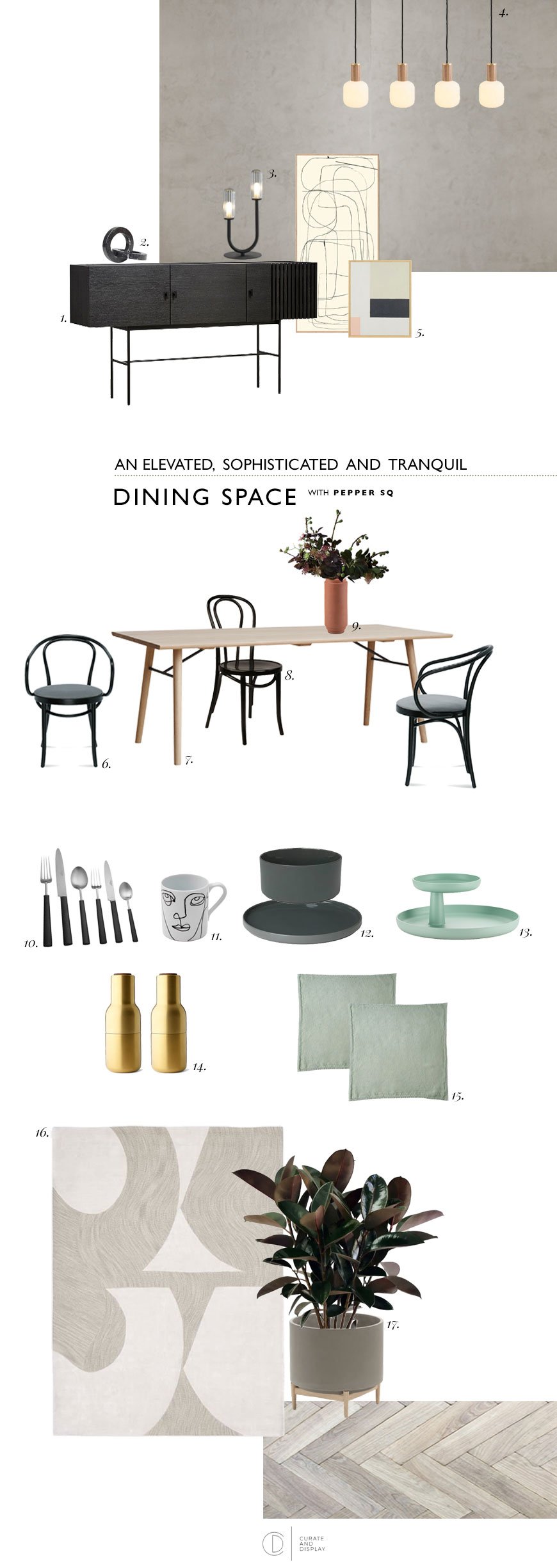
|1| Array sideboard, Pepper Sq |2|Marble Circles, Kristina Dam |3| Flora black table lamp, Pepper Sq |4| Oblo bulbs with oak and brass knuckle pendants|5| Abstract BYC Design & Tom Pigeon prints, Opumo |6|Berlin armchair, Pepper Sq |7| Alley oak dining table, Pepper Sq |8|Antwerp bentwood dining chair, Pepper Sq |9|Skagerak Edge vase, Finnish Design Shop |10| Ebony cutlery, The Conran Shop | 11 |Linea face mug, The Conran Shop |12|Agave green ceramics, Blomus |13| Rotary Tray, Vitra |14| Menu brass Bottle Grinders, Really Well Made |15| Mint linen napkins, The Conran Shop |16| Bold cut-out rug, West Elm |17|Florian concrete planter, La Redoute.
How To Choose The Right Dining Table
The dining table you choose will depend on the proportions of the space you have. If you have a fairly traditional, narrow room (like mine) then a rectangular table will be your best bet. I've picked the Alley table in light oak and brought in those touches of black I mentioned in the metal supports underneath. When you have a little more freedom of space or a squarer room then a round design would work well, providing you have enough space to walk around it with chairs in situ. It's also worth considering how many you need to seat at mealtimes. If you entertain a fair bit, an extending table affords you extra space at short notice.
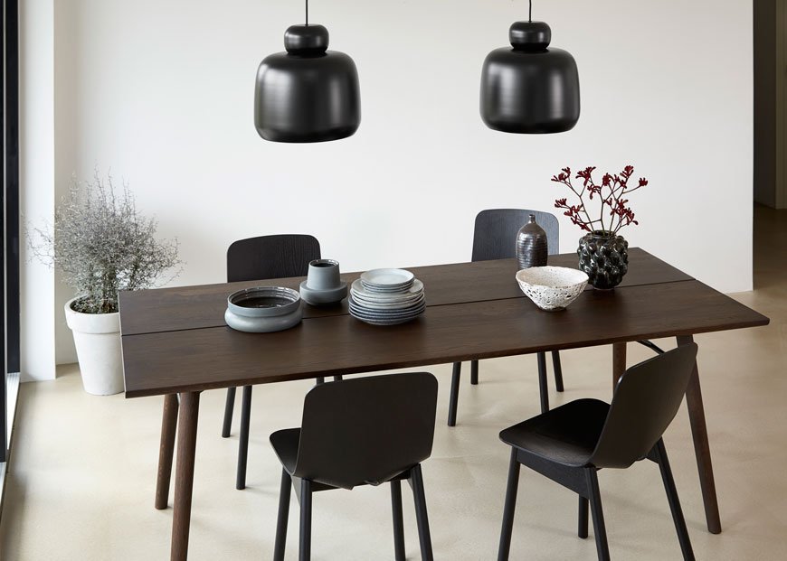
I love the timelessness of a bentwood chair, with a history that spans from the 19th Century, they're an enduring classic. I've mixed the Berlin armchair at either end of the table with a black Antwerp for a less matchy but still coherent look. Don't feel obliged to match all your chairs but choose a colour or material that ties them together.
Light Up The Table and The Room
Creating the right atmosphere with lighting is really important - you want the room to invite conversation. For above your table, find lighting that echos its shape. For example, a rectangular or linea grouping of pendants better suits a long table. Look at the direction the lights are facing in too and how it will affect the way the light falls onto the table or ceiling. Shades made from an opaque or smoked glass or wood veneer will give an altogether softer and warmer feel, which I love. Oblo LED bulbs paired with oak and brass knuckle pendants allow you to build your own statement lighting with diffused opaline glass.
Don't forget the rest of the room too. Table and floor lamps are just as important for providing ambient light, particularly if you don't like to use an overhead light in the dining room. The Flora table lamp has a sculptural style that just needs to be displayed alongside some art.
To Rug or Not To Rug?
Here's where I sit on the fence. I love to see a rug in a dining room when it's the right size. It helps to anchor and zone the space, particularly if you have an open kitchen/diner. A round dining table looks better with a round rug, likewise if you have a rectangular one. For a balanced look, ideally, the rug should be approx 24" to 28" wider than your dining table all the way around.
On the other hand? Having a young family means not having nice things. Ever. Believe me, I know how quickly that beautiful, hand-tufted 100% wool rug will end up caked in spaghetti and tomato sauce. If you have to have something, go for a flatweave that's easier to clean, or veto it entirely. If you don't want to forego the rug, try using one in conjunction with a sideboard instead so that it sits halfway underneath.
Why you need storage in your dining room
Sideboards and cupboards work really hard in a dining room, streamlining your view from clutter. Use one to free up extra space in the kitchen by storing the items you don't use every day along with other essentials like cutlery, cookbooks and table linens. I wouldn't be without ours, as it stores all the above as well as the kids' art supplies.
The minimal, clean lines of the black oak Array sideboard tie in beautifully with my moodboard, combining function with a striking, geometric form.
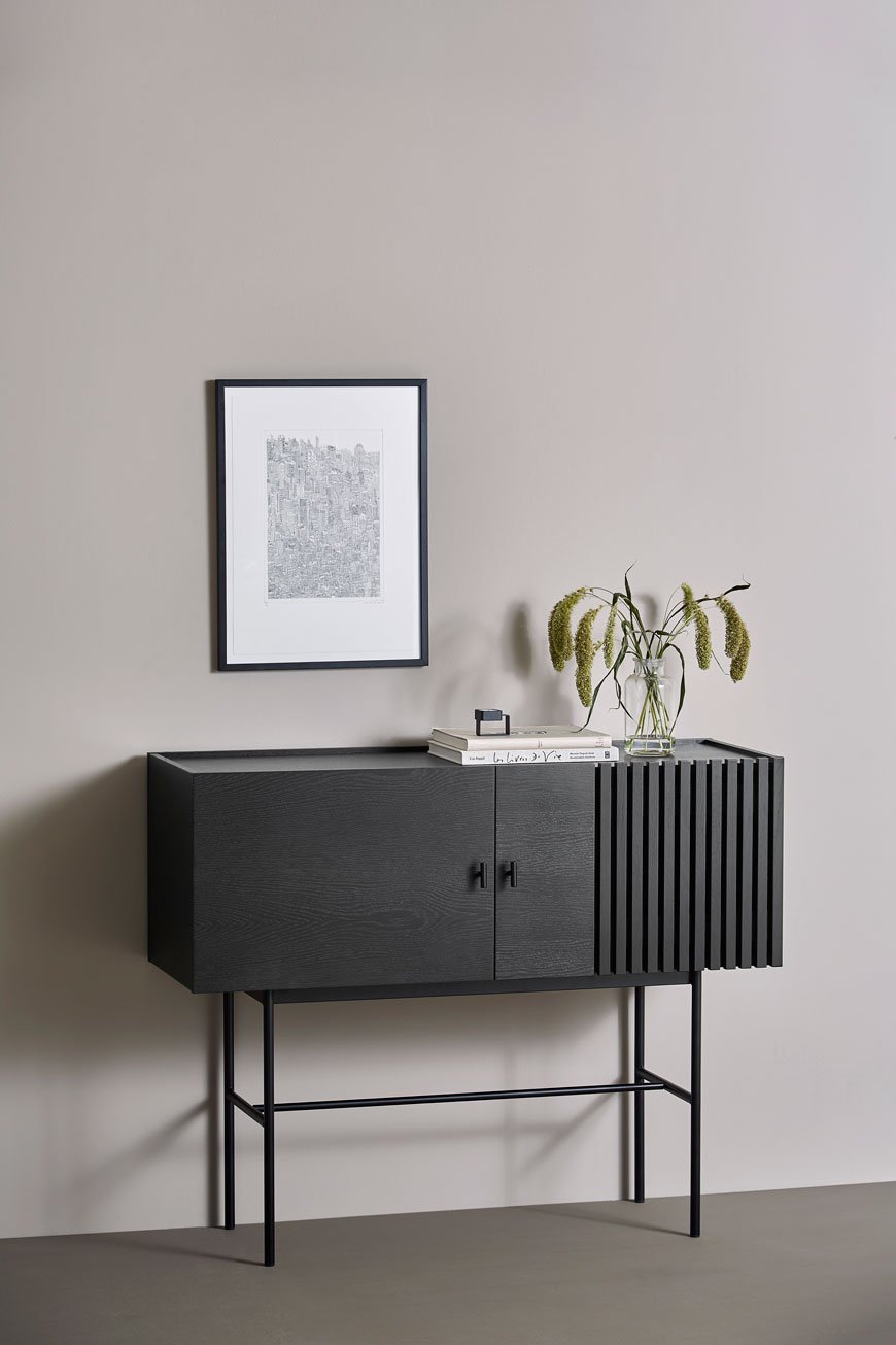
So there we have it, a few solid tips to help you update and elevate your dining room, with the help of the #peppersq #spacemaking tool for inspiration. I really can't wait to start renovating ours now...
[AD] Architectural KG1 Bookshelf | Circular Design From ENKL
[Advertisement - this post includes gifted product from Enkl, Woud, Cooee Design and Massa Design Studio*, chosen by me and lovingly used in my home.]
During my visit to 3 Days of Design in Copenhagen earlier this year, I was lucky enough to meet ENKL, a new sustainable furniture brand whose DNA is built on a circular design model. Their collection of raw and functional pieces combine traditional craftsmanship with a minimal aesthetic.
Who Is ENKL and What Is Circular Design?
Based in Aarhus, ENKL was founded by Kristian Gatten and Lasse Tamberg in 2016. With backgrounds in architecture and carpentry, the friends began designing a capsule collection that would by-pass the traditional "take-make-dispose" production model, exploring ways in which materials could be utilised over and over again. You can see the architectural influences in the structure of ENKL's designs. What I love most is that all the joints, nuts and bolts are clearly visible. Honest and open design with nothing to hide. Each piece of furniture has been designed for easy disassembly so that if and when a piece reaches the end of its life, all the components can be separated, reused and recycled.
To help reduce waste and pollution, production is kept as local as possible with steel and brass elements made in Galten and Lystrup. Oak is sourced from the Czech Republic by a family-run carpentry business and finished at their studio in Denmark.
Enkl also offer to buy back their designs at 10% of the sales price in order to return their materials back into the production cycle. Over time they plan to add to their collection with designs made from the newly recycled materials. How's that for dedication?
The KG1 Bookshelf
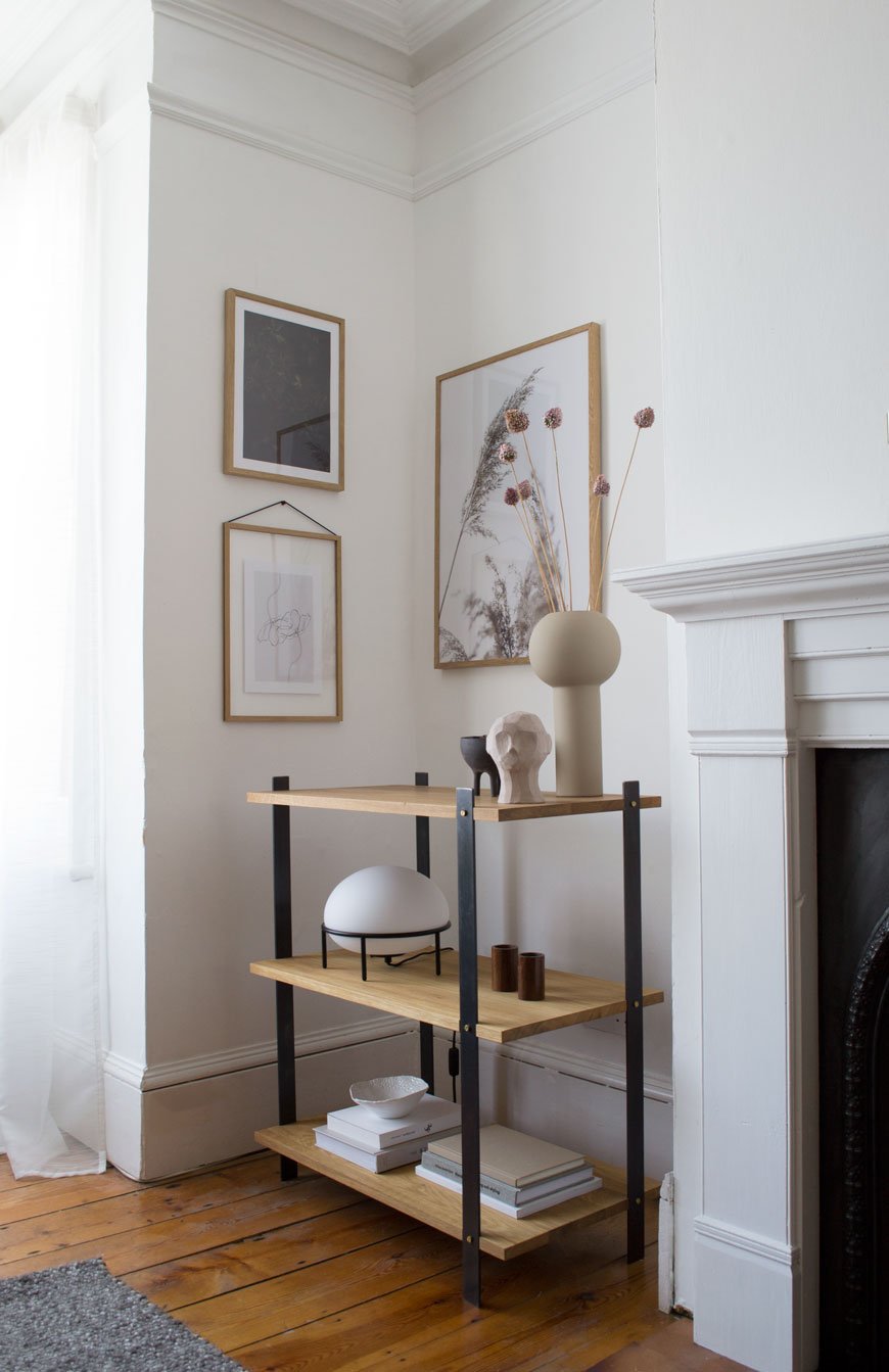
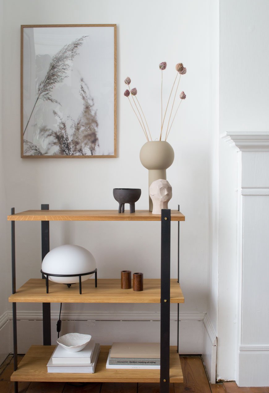
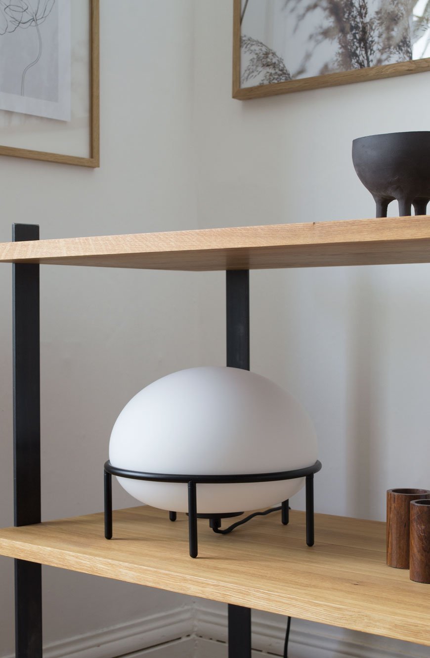
In my eyes, the real stand-out piece from the collection is the KG1 bookshelf. So much so that it now has pride of place in our living room. Although I have absolutely zero intention of recycling it, ever, its environmentally conscious, circular design was a huge plus. I want to continue to make conscious choices as to what I bring into my home and its impact on the environment, so choosing brands who share those values is important. Constructed from three solid oiled oak shelves, its held in a delicate balance with four flat steel legs. I love how its industrial appearance compliments the Edwardian features in this room.
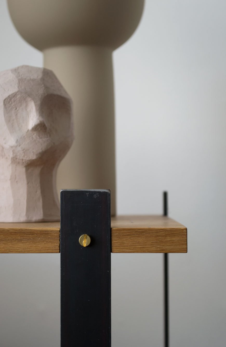
The beauty is in the details - from the brass screws to the highly unusual beeswax finish on the steel which both intensifies the black of the metal and prevents corrosion over time. It smells wonderful up close, a mix of beeswax and linseed oil.
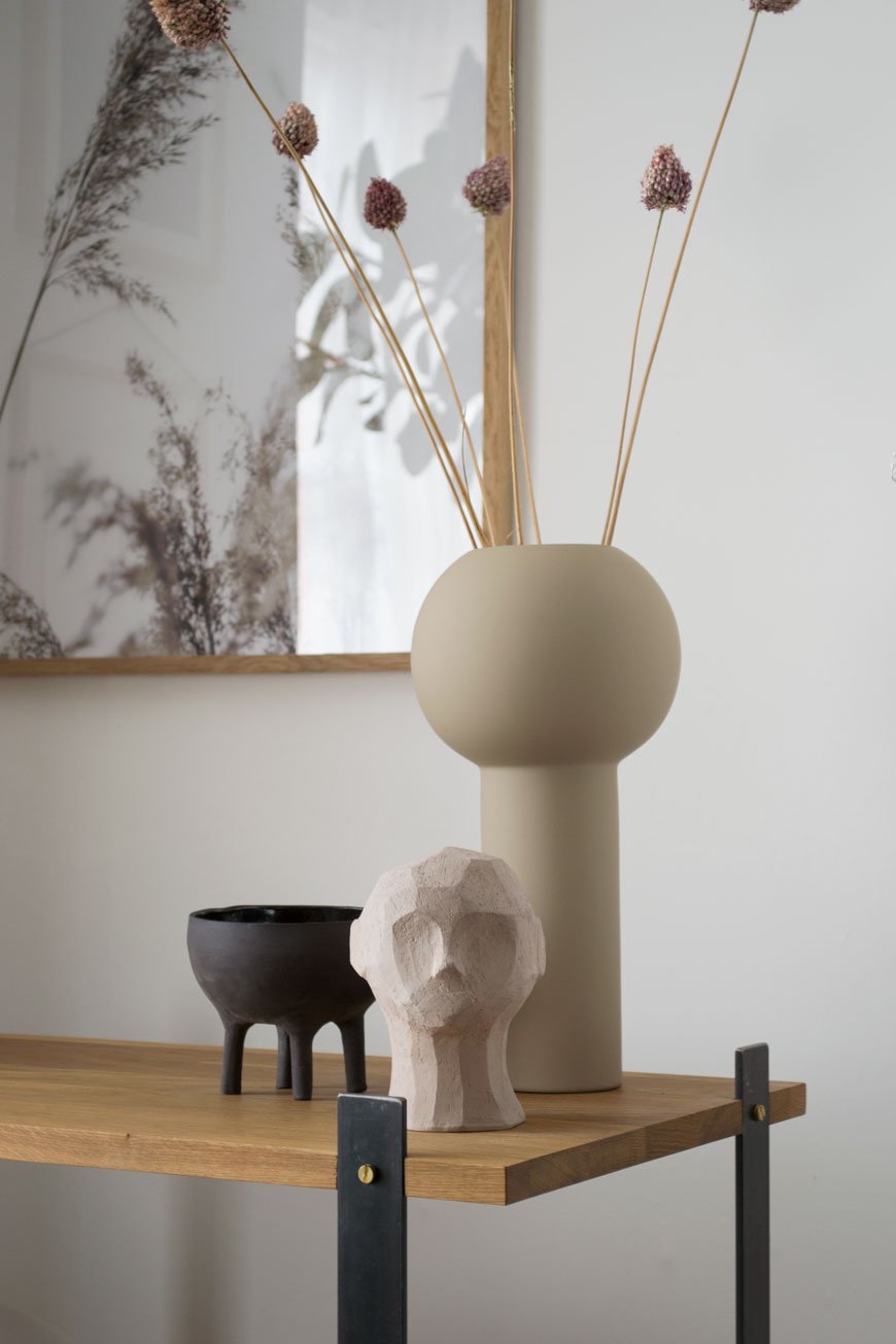
Styled with a few select treasures, the muted, sandy tones add warmth to this corner, elevated with a touch of black. Among them is the Olufemi sculpture from the new collaboration between artist Kristiina Haataja and Cooee Design. Haataja calls her unique approach to sculpting 'Ancient Cubism', combining ancient Greek sculpture with Post Modern Cubist form. I find it soothing to look at, the way the shadows form in the furrows of the concrete.
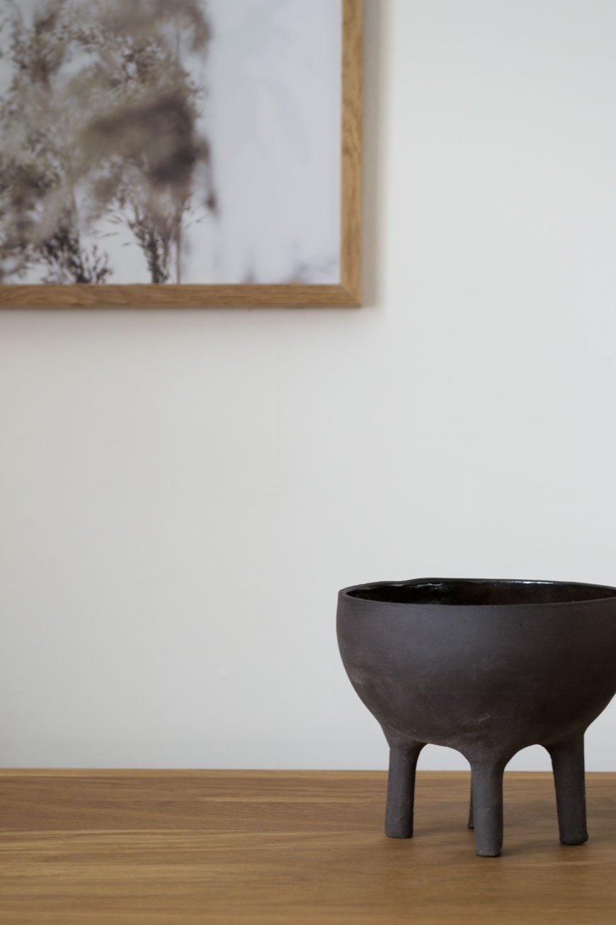
The little black Elephant pot was an Etsy find, all the way from Israel and made by Massa Design Studio. I love the contrast between the raw stoneware on the outside and glazed interior. See how its shape echoes the Pump lamp? Designed by Kutarq Studio for Woud, the soft light through its opal glass shade gives the impression of lifting off and levitating on its thin metal frame.
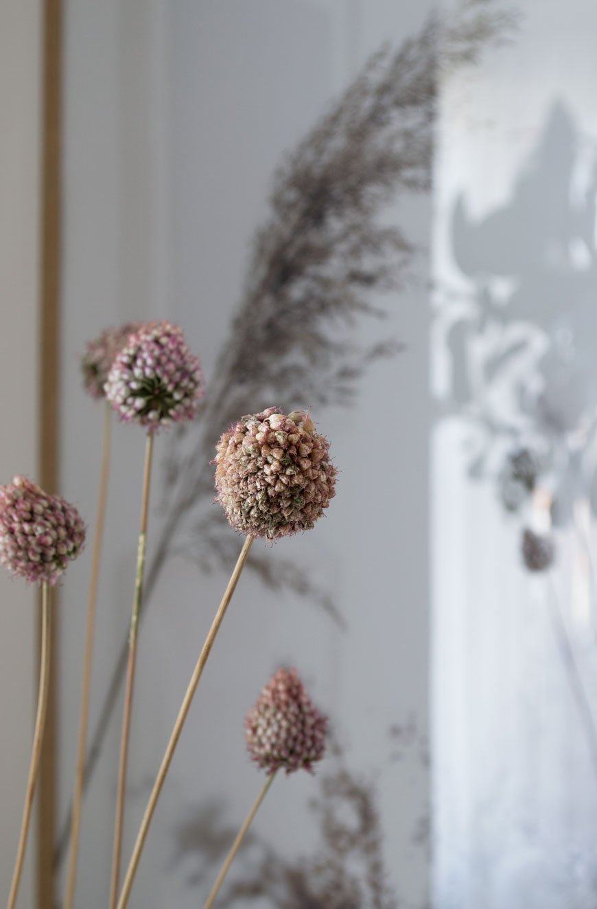
I’ve since dried the deep pink alliums that were growing happily in pots at the front of our house and they've taken on a much softer blush now. Their little bulbous heads are a sweet memory leftover from summer, bobbing around in their vase.
I'll be sharing tips on drying and styling flowers next month - I've grown loads! In the meantime, I'm off to the London Design Festival this week to see if I can't discover another design gem. Watch this space...
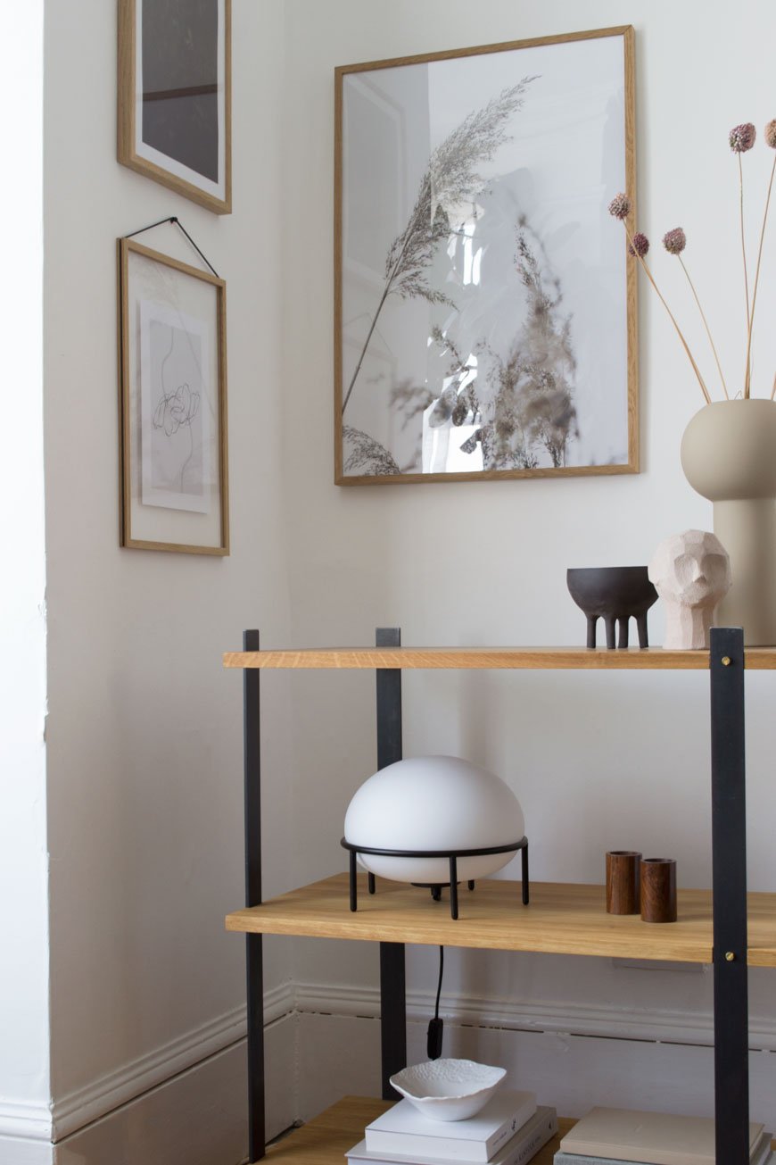
*Gifted items - KG1 Bookshelf, Enkl | Pump table lamp, Woud | Olufemi sculpture and Pillar vase in 'Sand', Cooee Design | Elephant pot, Massa Design Studio.
Styling and photography © Tiffany Grant-Riley.
Blooc Build Sustainable Living Housing Projects in Sweden
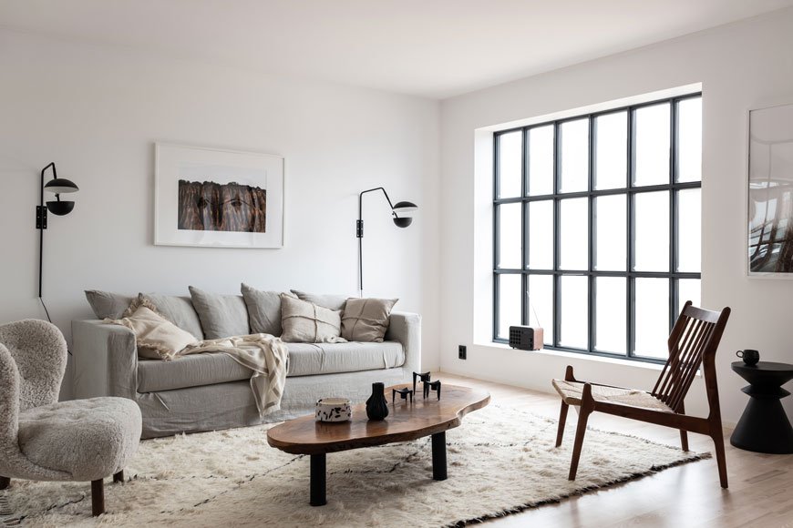
Taking these gorgeously styled images at face value, it'd be easy to get carried away with the aesthetics. I know I was when I discovered Blooc, a housing project company based in Sweden. It was the light-filled interiors carefully styled with Nordic design and custom details that caught my eye. Oh to have those steel warehouse style windows!
What sets them apart from other new builds though, is that these homes are designed for sustainable living from the ground up.
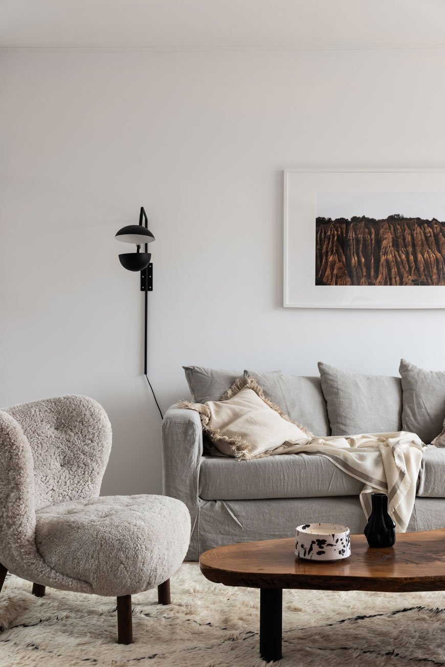
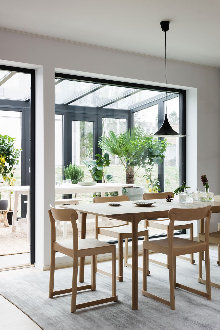
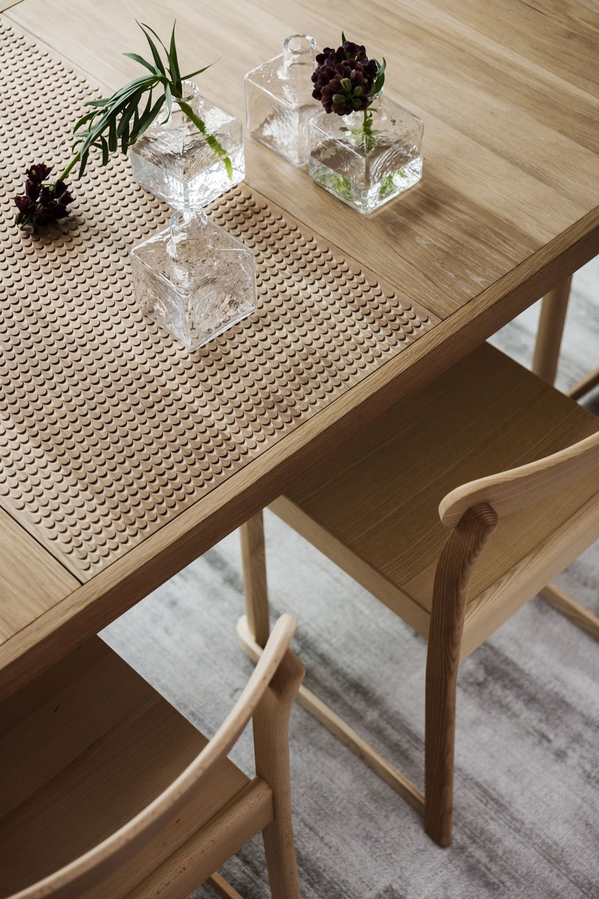
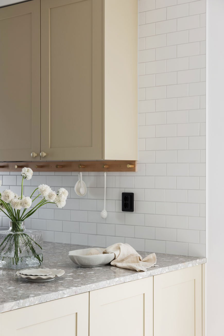
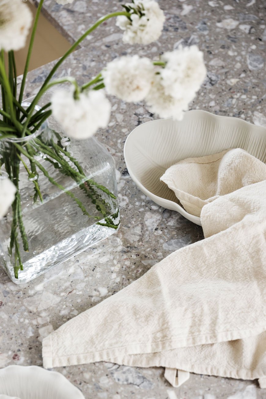
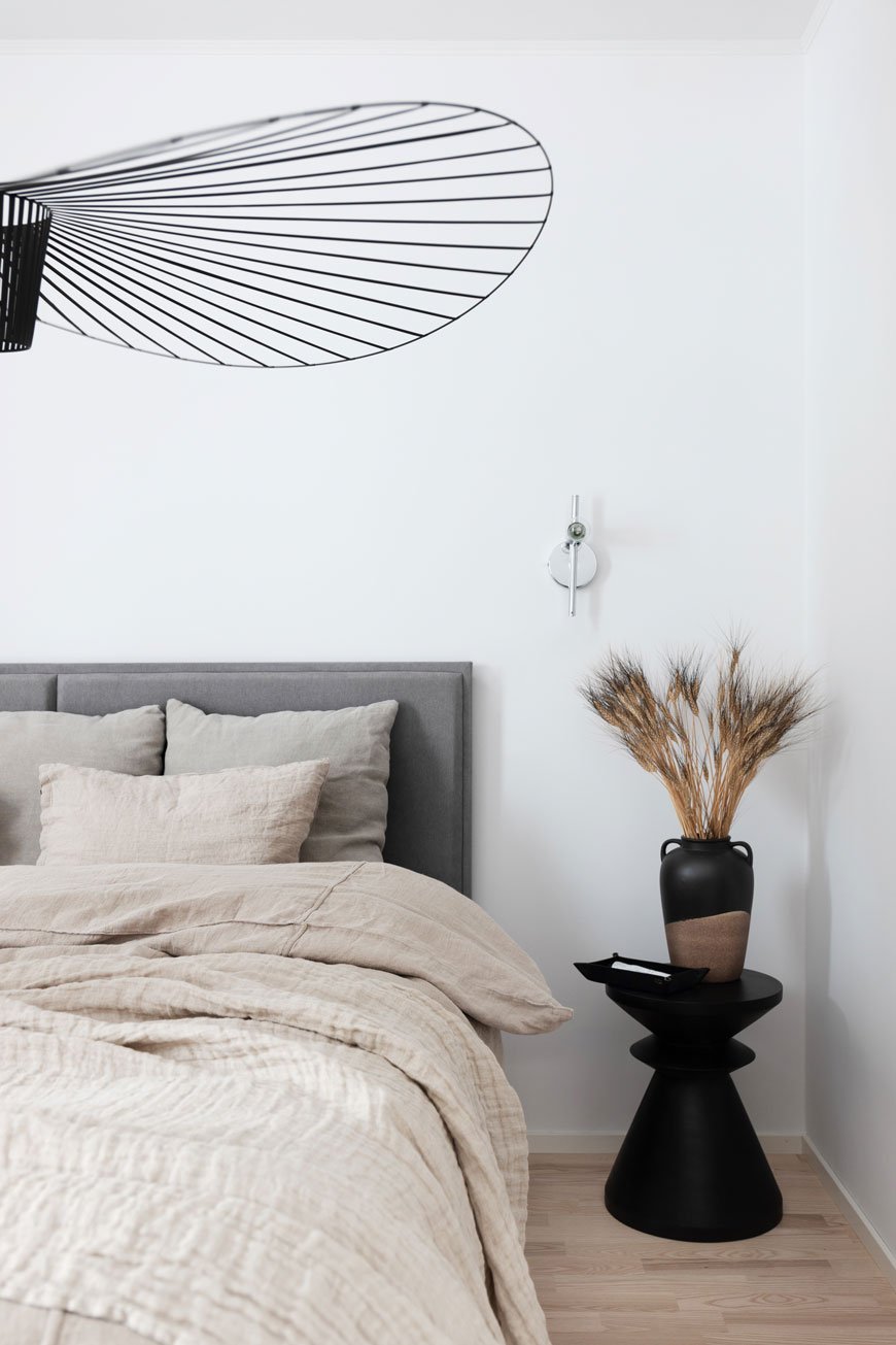
Launched in 2011, these architect-designed homes offer the best of contemporary city style, creating idyllic new garden communities out in the Swedish suburbs. The new Parkhausen development of semi-detached four bedroom homes is just 10 minutes from Väsby, featuring a muddy green wood-clad exterior. The airy, open-plan style interior is divided by floor to ceiling steel framed glass partitions, a clever way to continue the flow through individual spaces. A classic Scandinavian neutral colour palette runs throughout, from the soft grey linen sofa, textured Berber rugs, light oak furniture and wood floors. But I fell really hard for the garden room with its lush tropical plants, bringing biophilic design into the home and connecting you to nature.
Modern Sustainable Living
According to recent reports in Sweden, only 4% of buyers have the desire or time to renovate, hardly surprising given the time, upheaval and costs that go into one. Anyone who has taken on a renovation project, however rewarding the outcome, will have wished at some point that they'd bought a new property instead. It has definitely crossed my mind a few times as we've uncovered leaks in the bathroom and faced the joyful task of replastering 100 year old walls!
All Blooc's homes are built using sustainable timber and other materials carrying the Swan label, the official sustainability ecolabel for Nordic products. Surrounded by nature, each build is well insulated and fitted out with new energy-efficient appliances to reduce its impact on the environment over time.
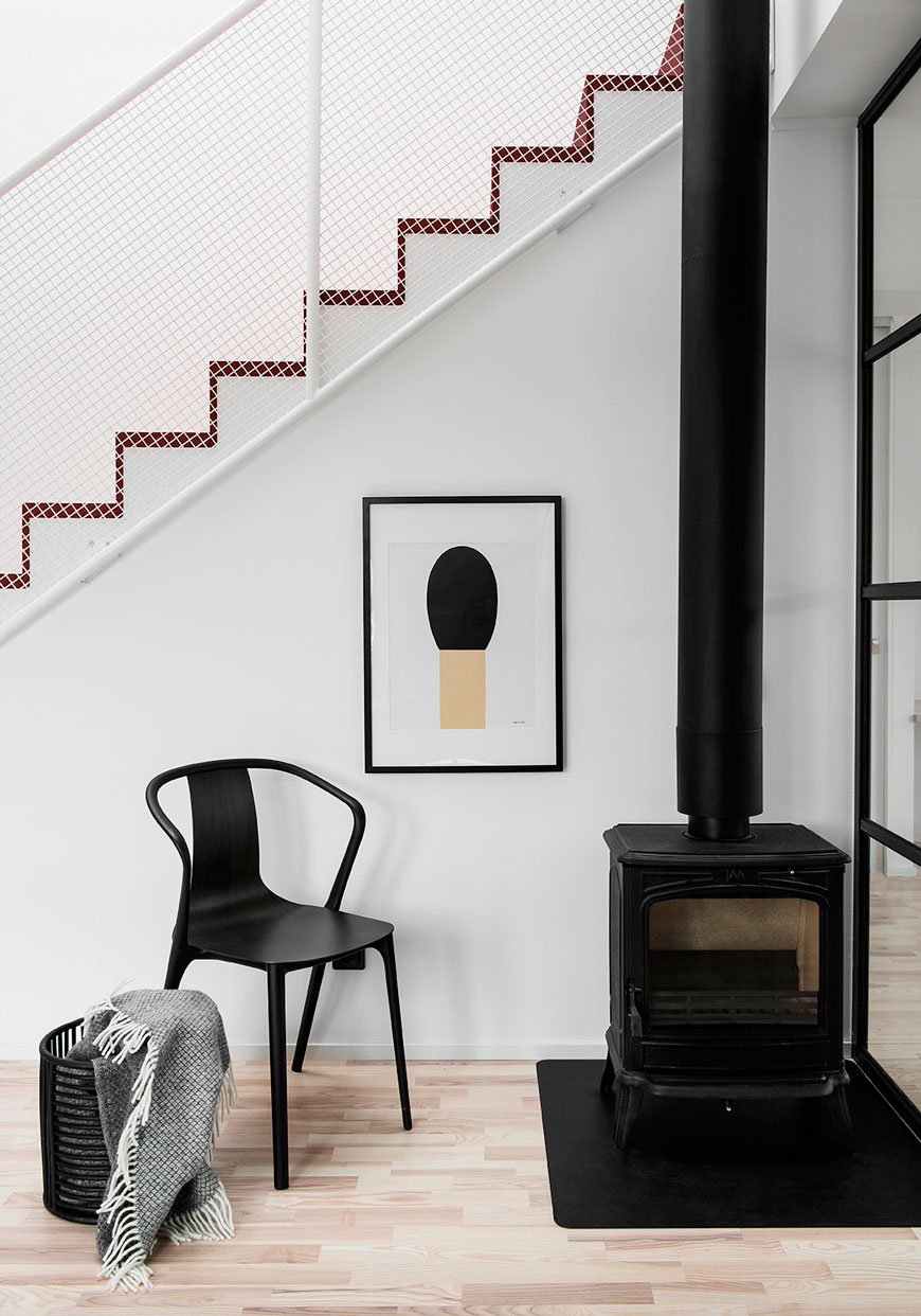
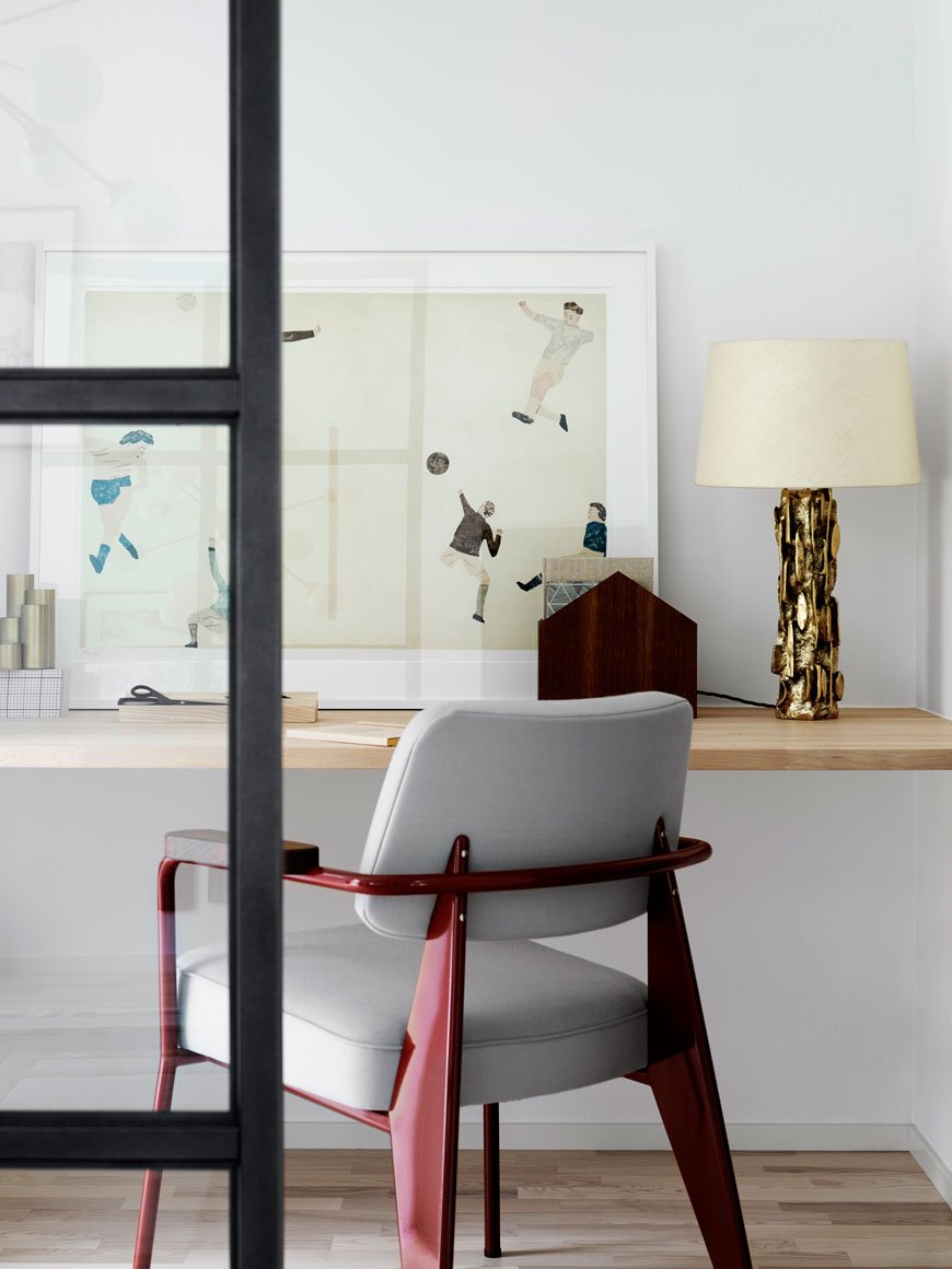
Blooc Objects
I was impressed to see that Blooc has its own collection of finishes and details exclusive to their homes. 'Blooc Objects' includes custom mirrors, kitchen cabinetry, bathrooms, handles and lighting used solely in their projects. They also produce a palette of contemporary colours that run through each project and gives it its own sense of identity - see how that muddy green from the exterior is carried into the bathroom cabinetry.
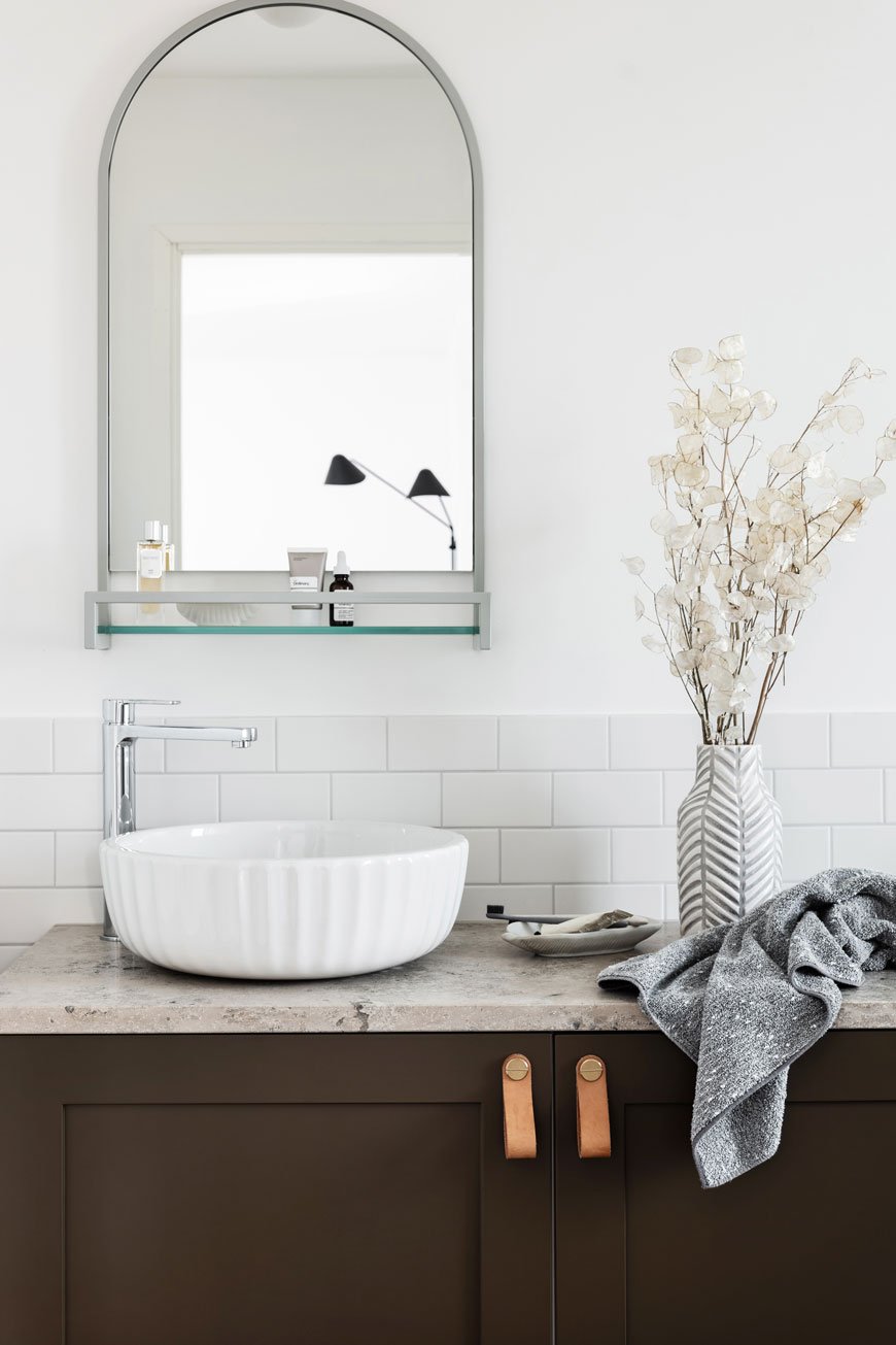
I would love to see more well-considered projects like these popping up in the UK, taking not only contemporary living into consideration, but fully sustainable practices too. What do you think - could you see yourself living here?
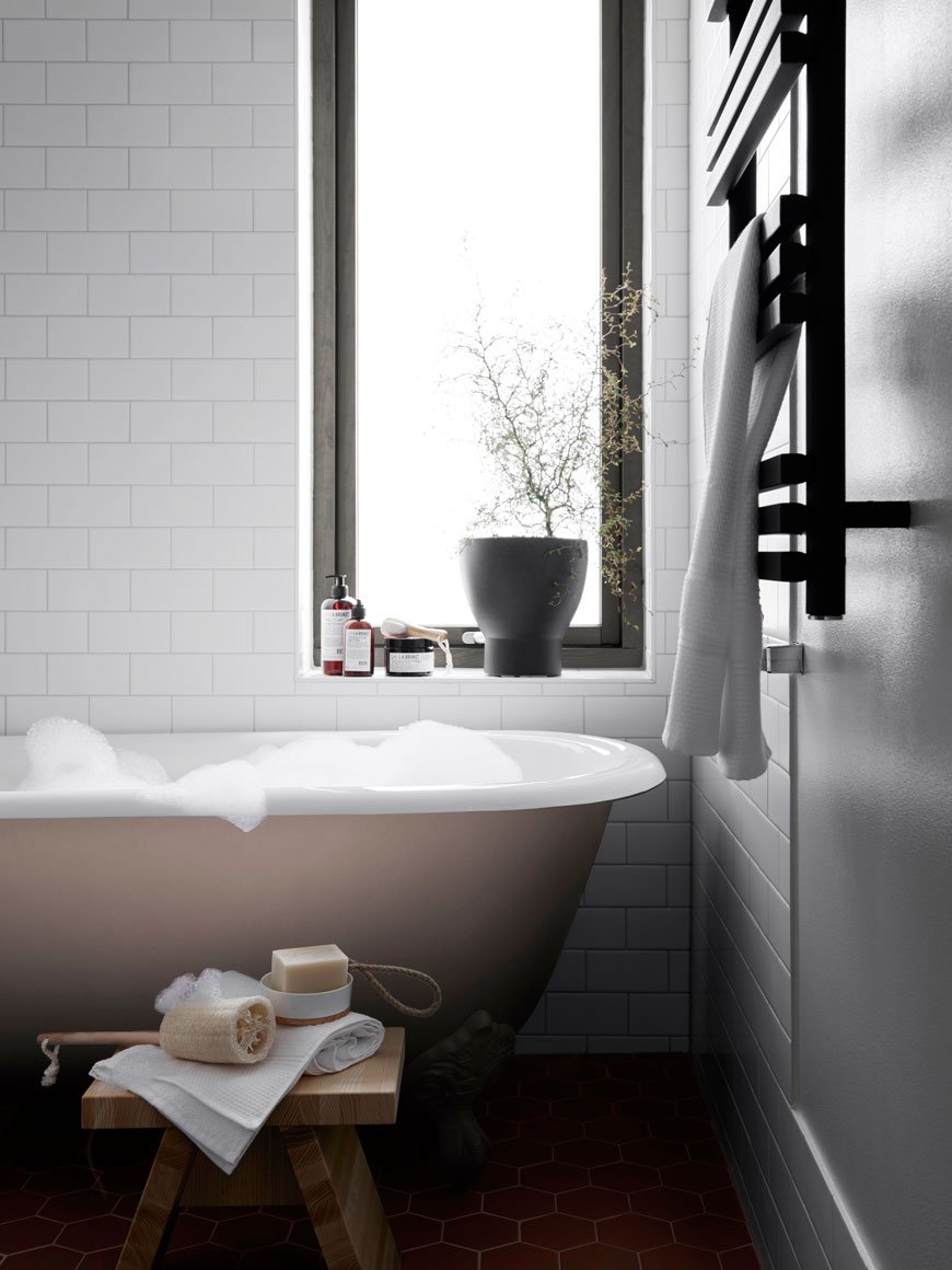
Photography courtesy of Blooc.
[AD] Midsummer with the Bernadotte Collection by Georg Jensen
[This post is part of a paid partnership with Georg Jensen. Products were loaned for the purpose of this post.]
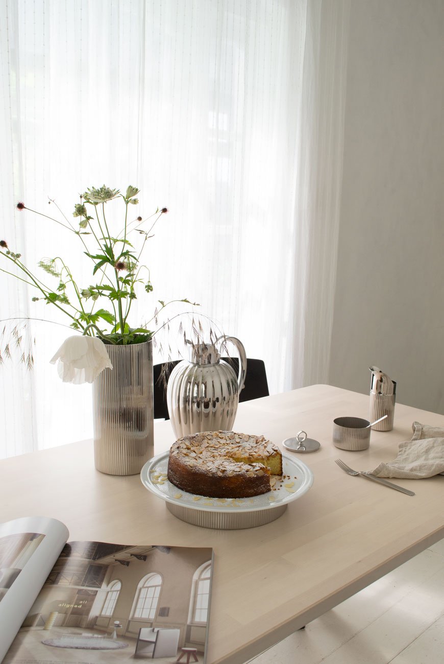
Of all the designs that span the Georg Jensen tableware collection, my favourite has to be the Bernadotte. With its clean, elegant lines and minimalist aesthetic, you'd be forgiven for assuming that this collection was new. It was, in fact, designed in 1931 by Swedish Prince Sigvard Bernadotte and has over time become a Scandinavian classic.His journey in design began at the Royal Swedish Academy of Fine Arts in 1929. Nicknamed 'The Design Prince', Bernadotte would make a name for himself as a pioneer of industrial design at a time when the style was beginning to move away from the ornate.During a visit to the 1930 Stockholm Exhibition, he was introduced to the work of architect Gunnar Asplund whose move towards stripped-back functionality within architecture would lay the foundations for Modernism and minimalism. Favouring practicality over opulence, functionalist architecture would centre around modular structures with a focus on the raw building materials, flat roofing and lots of glass. Driven by the idea of building for a better world, the functionalist movement would put the user at the centre of the experience, doing away with unnecessary beautification.Inspired by these ideals, Bernadotte would go on to form an alliance with Georg Jensen. Continuing on from the brand's traditional Art Nouveau style, his new era of functionalism would direct Georg Jensen towards more modern interpretations of silverware.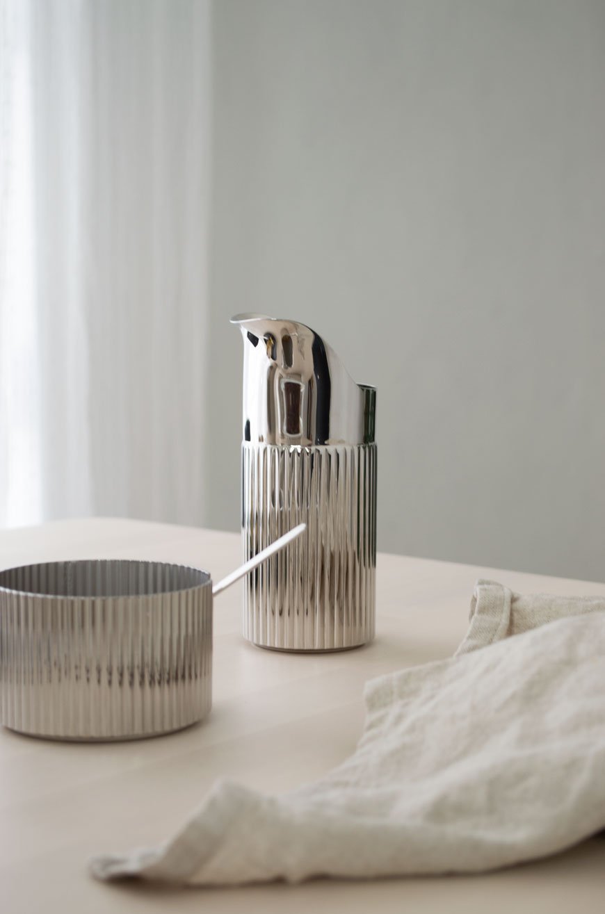
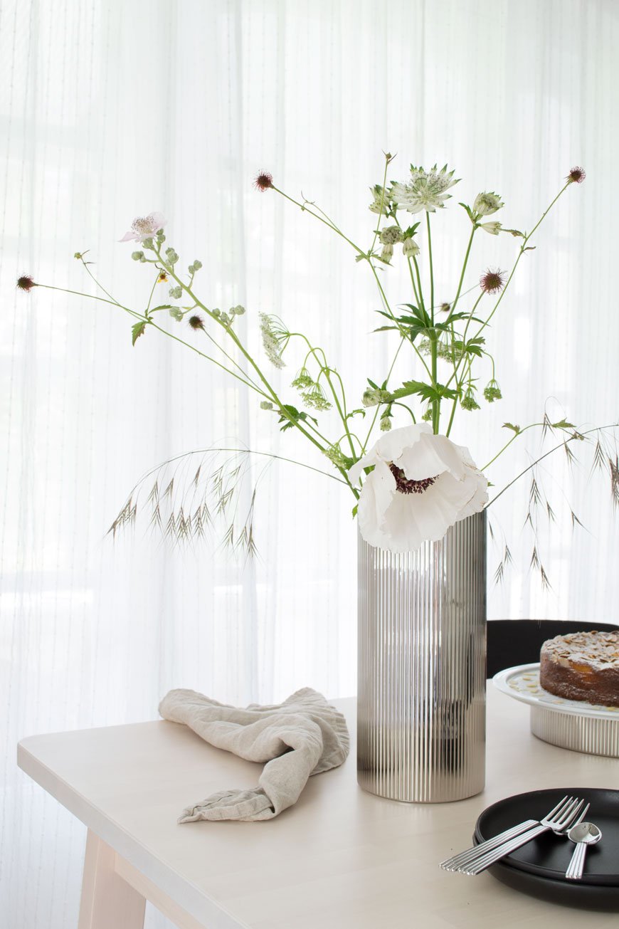 I shot the collection the day the weather broke, after almost a solid week of torrential rain. In June! With midsummer almost upon us, I felt a little Nordic inspired celebration was in order. Sitting on top of the Serving Plate is a ridiculously moist orange, almond and ricotta cake I baked the night before. It's a no flour sponge which makes it a perfect summer accompaniment for a light afternoon tea. And with a freshly brewed Thermo of coffee, I watched the afternoon sunlight play with the ripples in the steel.The vase is a real statement piece in its own right but I chose to create a free-form display of wild and garden flowers to show off its sculptural appeal. All the hard work I've put into our white garden is slowing revealing itself as the summer rolls on and I wanted to document some of the blooms I'm most proud of. The white 'Royal Wedding' poppy, cut from my garden along with the white astrantia I thought was a fitting connection to Bernadotte's royal heritage. Other wild additions picked from the meadow behind our house include barely open bramble flowers, geum seed heads, Queen Anne's Lace and grasses.Simple and free.
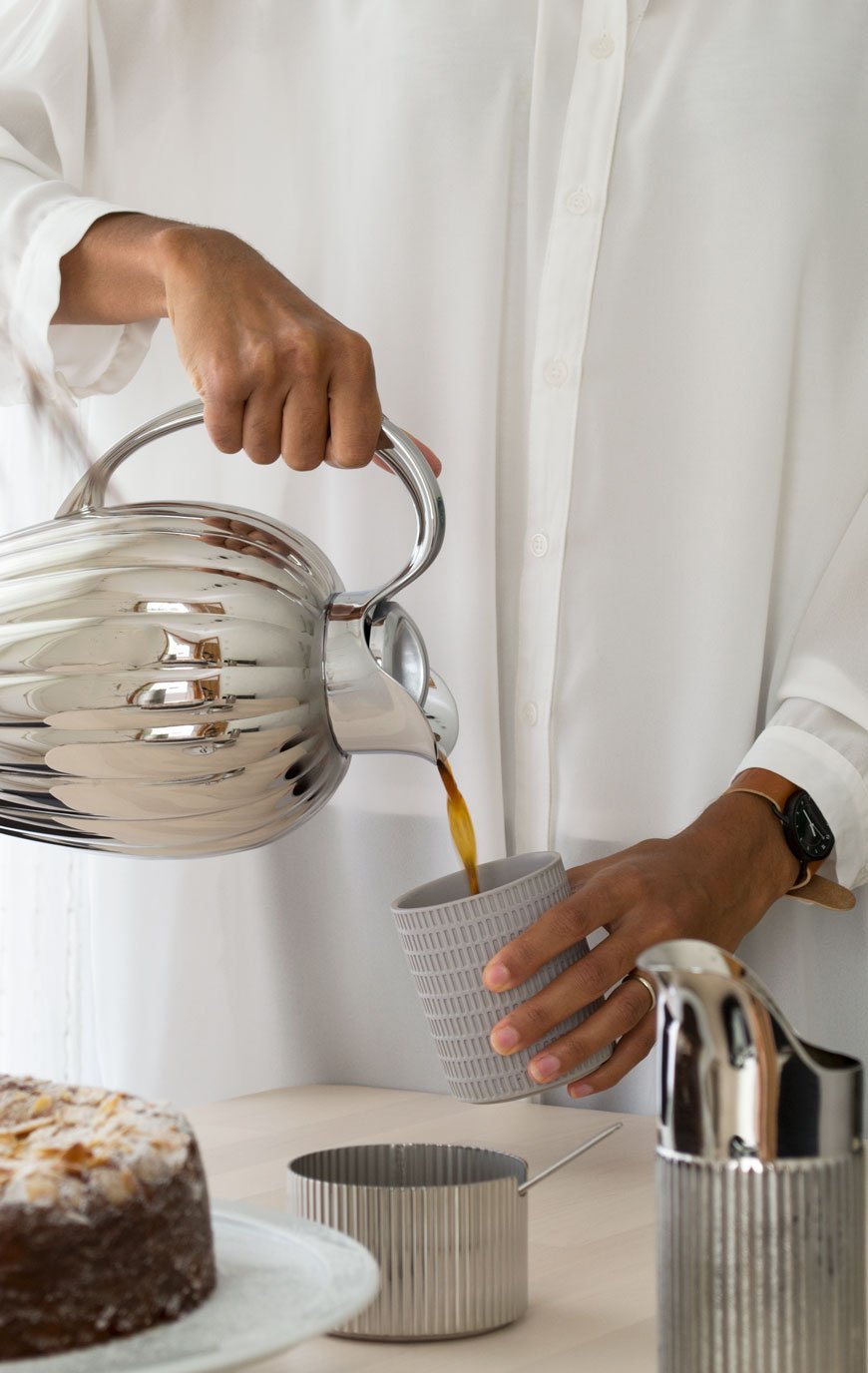
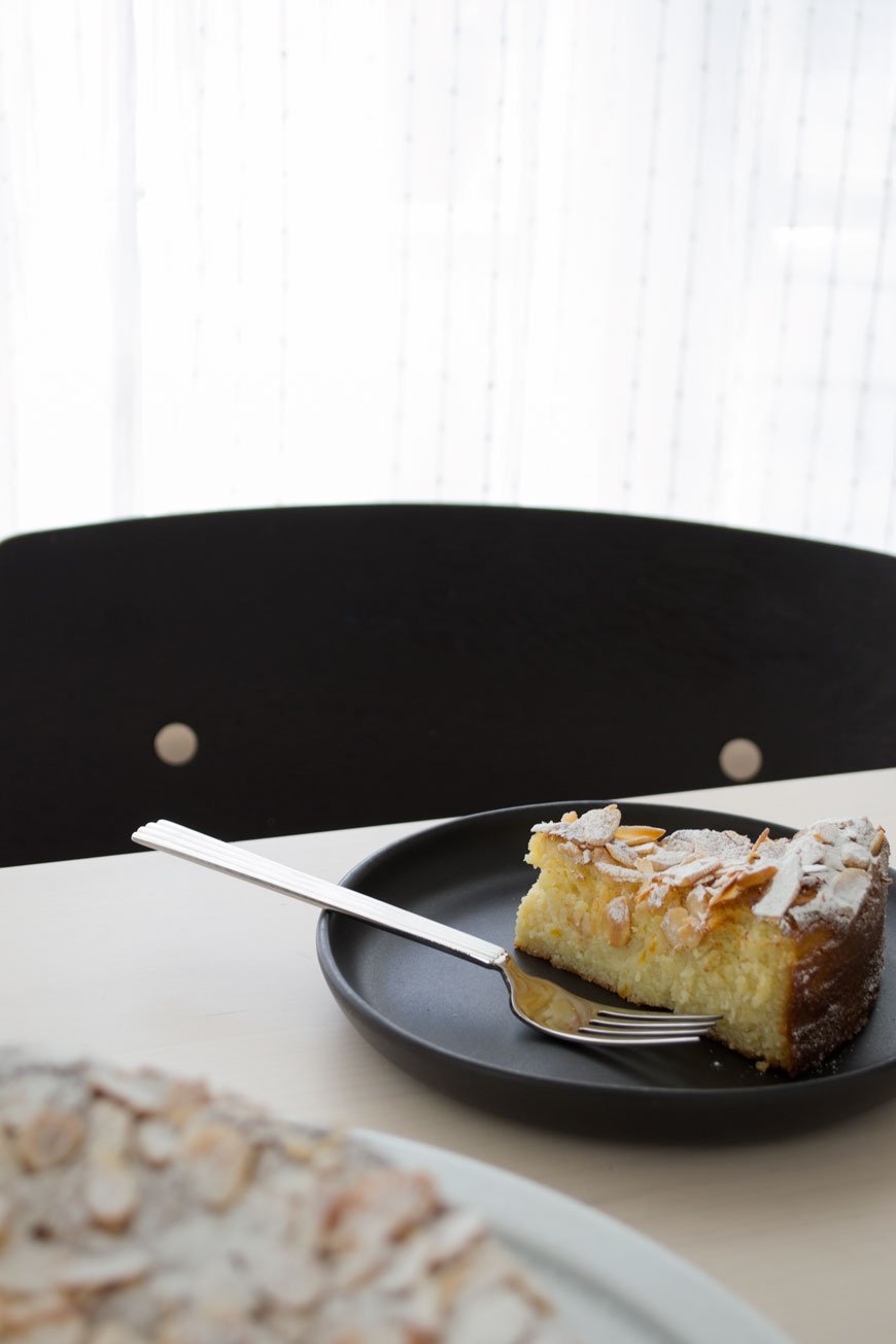
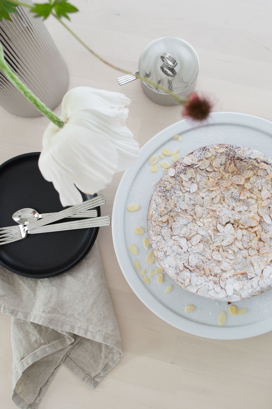
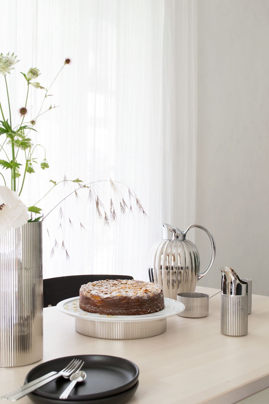
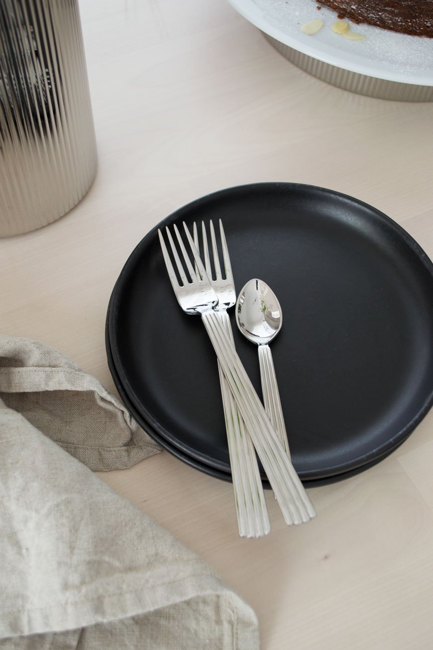
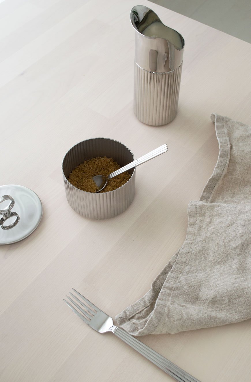
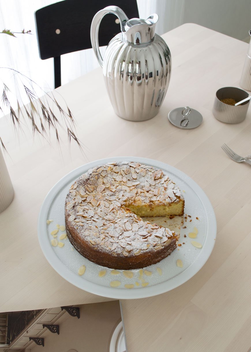 Serving Plate, £160 | Large Vase, £120 | Sugar Bowl and Spoon, £75 | Thermos, £195 | Creamer / Milk Jug, £65 | Luncheon Fork, £180 | Small Teaspoon, £100.
Photography & Styling © Tiffany Grant-Riley
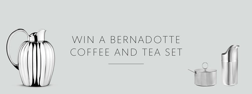 Would you like to win a Bernadotte coffee and tea set? Georg Jensen is hosting a competition:"Enjoy tea time in style with our classic Bernadotte designs in refined stainless steel. We’re giving away our large Bernadotte thermo as well as the new Bernadotte creamer and sugar bowl to a lucky winner – and that could be you. Simply sign up to receive our Georg Jensen newsletters to enter. The competition will run until 15 July 2019 and the winner will be contacted via email.*"https://www.georgjensen.com/global/bernadotte-competition* Please note - be sure to check 'NO THANKS' when clicking the link above to be redirected to the competition page. Terms and conditions apply. Good luck!
Nordic Design Highlights from 3daysofdesign Copenhagen
Three black stools line up outside the odd fellows mansion in Copenhagen at 3daysofdesign
We're back in Copenhagen today to explore some of my highlights from last month's visit to 3daysofdesign. The festival which is open to the public takes place every year, celebrating the best in Nordic design. With so many showrooms full of the most exquisite, minimal design it’s impossible not to feel overwhelmed by it all. In fact, you really need five days in the city to gear yourself up and wind down afterwards! With this, my very first visit to Copenhagen, the stakes were high. I landed the night before, checked into design hotel SP34, and headed out to dinner with friends ahead of a jam-packed day. And just as well I packed decent walking shoes because after a full day of 9am-10:30pm studio visits and meetings, I was done! By Friday mid-afternoon I was already flying back to London with a head full of inspiration. Soothing interiors and calm, muted spaces offset the feeling of chaos as we made our way around the city. Not surprisingly, textured lime and chalk-painted walls provided the backdrop for many collections with shades of light grey and subtle beige proving to be most popular. Darker palettes also came through, presenting a moodier, sophisticated aesthetic such as the New Works showroom. Among the many topics of conversation during the festival, the most common thread throughout was sustainability, mindfulness, and collaboration.
Senses by Louisa Grey & Frama
You just can't come to 3daysofdesign and not see the Frama Studio. Set inside a former 19th Century apothecary, the 'Senses' collaboration between London interior designer Louisa Grey and Frama's founder Niels Strøyer Christophersen takes you on a sensory journey. With influences of Japanese culture, the studio aimed to push back against our busy lifestyles, presenting a remedy for overload with restorative spaces in which to reconnect with nature and our inner selves. You were encouraged to slow your pace as you made your way around. It was impossible not to feel affected by the experience, as you took in the sounds, scents, and textures. Niels and Louisa talked about their common ground with a shared focus on wellbeing and natural, sustainable materials. The beautiful, old bones of the building are left raw and exposed in contrast to Frama's contemporary collection. There is a room for meditation featuring a Japanese Zen garden in miniature with carefully selected quarry stones. Another room explores sound alongside the latest scent from the St Paul's Apothecary collection. Beyond this, a room to bathe and relax with a Japanese wooden bath as its crowning glory. With glimpses of beautifully arranged grasses and a curated selection of Frama's ceramics, this was a place I'd have happily stayed in all day.
Frama Studio | Fredericiagade 57, 1310 Københaven.
Karimoku Case Study at Kinfolk Gallery
I think the word 'Kinfolk' would be enough of a highlight to leave it there, but then I think this new launch absolutely deserves an explanation. The Japanese thread continues with the launch of a new collaborative collection, Karimoku Case Study. This contemporary lifestyle brand unites both Nordic and Japanese design sensibilities. Showcased within the sanctuary of the Kinfolk Gallery, the collection is the result of a partnership between Japanese furniture manufacturers Karimoku and architectural studios Norm Architects and Keiji Ashizawa Design. In short, it was a dream. Inspired by the shrines, temples and gardens of Japan, the interiors were cocooning and warm. You got a sense of the space both in the layout and in the way Norm Architects and Keiji Ashizawa have explored and used negative space within the collection. The large, open rooms had been treated with DetaleCPH lime paint to introduce a quiet texture on which to present the collection. Respective values connected through nature and traditional craft come through in the furniture which is elegant and understated. Woven veneer wall art highlighted those connections and the importance of craft. The gallery was also dressed with pieces from like-minded co-exhibitors including Kvadrat upholstery, Sørensen Leather and floral design boutique Tableau. Keep your eyes peeled for slightly left-field floral design folks, tonal coloured displays are leading on from dried grasses...
*all photography © Monica Grue Steffensen.
Kinfolk | Amagertorv 14, 1160 Københaven.
Form & Refine Launch at Hotel Charlottenborg
Having discovered Form & Refine on Instagram a few months before their official launch (you may have seen their Alcoa vases in my feed) I was excited to see them as part of the Hotel Charlottenborg installation. Set inside the Kunsthal Charlottenborg (not pictured) the halls were turned into a hotel experience using a collective of design brands. Visually New Nordic in style, sustainable practices guide the collection by the use of materials and in supporting the smaller communities that produce them. Form & Refine aims to reduce its C02 footprint whilst celebrating time-honoured materials from around the world. Be it Scandinavian wood or Bolivian wool. With a focus on craft and traditional skills, they employ local workshops to produce their designs. The Alcoa vases (a favourite of mine for their graphic shape and matte surface) are produced in the ancient clay region of Alcobaça in Portugal where I made a visit to a family-owned ceramics factory last summer. I'd put money on the Origin lounge chair becoming a future classic too. Made in Danish ash from the forest of Damsbo, the backrest and seat almost float on its frame. Isn't it beautiful?
The &Tradition Village
Verner Panton's 1968 classic design The Flowerpot lamp, framed in the doorway of the &Tradition gallery at 3daysofdesign.
I've noticed lately how showrooms are evolving into more immersive and relaxed spaces. The new home of &Tradition is a gorgeous example, nestled inside a historic mansion dating back to 1913. Named 'The Village', it encompasses a showroom, gallery space and The Courtyard cafe, an oasis of lush, informal planting in which to meet for lunch or coffee. Visitors can experience new and classic design pieces from the collection at their leisure within 'The Home of a Collector' and take in all the period features of the building. What more could you want?! The 'Novelties' exhibition in the upstairs gallery space showcased the popular classics, including my favourite - the 1968 Flowerpot lamp designed by Verner Panton. A new release, the Elefy chair from Spanish designer Jamie Hayon was also on display, inspired by the large, curved form of the elephant.
&Tradition | Kronprinsessegade 4, 1306 Københaven.
Take me back already! Have my highlights left you feeling a little more zen now? Perhaps it's giving you food for thought with your own home? It definitely has for me - I'll be dipping my hands into lime painting my office in the coming weeks and I'll be working on a 'how to' piece if you fancy trying it for yourself. In the meantime, keep your eyes peeled for more on The Audo, an incredible residential workspace and restaurant created in collaboration with Menu Design. You. Will. Love.



















![[AD] New Bernadotte Collection Pieces - Nordic Entertaining by Georg Jensen](https://images.squarespace-cdn.com/content/v1/63c93d56b8f27c4ca17f2ed3/1682502166523-XNFTLU9K3UDI33UW4KTG/Georg_Jensen_Bernadotte_Tableware_02.jpg)

