[AD] Update And Elevate Your Dining Space with Pepper Sq
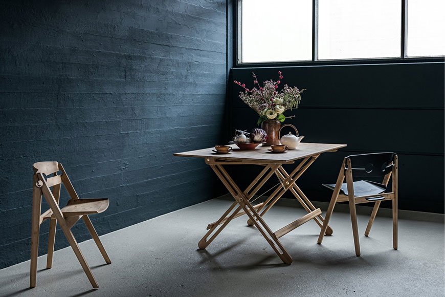
[Advertisement - this is a paid partnership with Pepper Sq.]
Sourcing the right furniture for your home takes time, especially when you're pulling elements from several different places. Which is why I'm introducing Pepper Sq today. A new homeware brand with a difference, their clever 'Spacemaking' tool takes some of the time and decision making out of the equation. It follows three simple steps:
1. Discover - Browse their impressive collection of room designs, compare styles and find your favourite.
2. Design - Customise your favourite room designs, check dimensions, match colours, choose patterns or find alternatives.
3. Enjoy - Turn that space into a thriving reality. Click and buy - you'll soon enjoy your new room design.
Grouping together a series of looks for each room of the house, furniture can be bought as a whole collection or edited accordingly before you buy. The best part of that is having a visual reference so you can imagine how it might look in your own home.
With this in mind, Pepper Sq invited me to share some advice on how to design a dining room using pieces from their collection.
The Brief - An Elevated, Sophisticated and Tranquil Dining Space
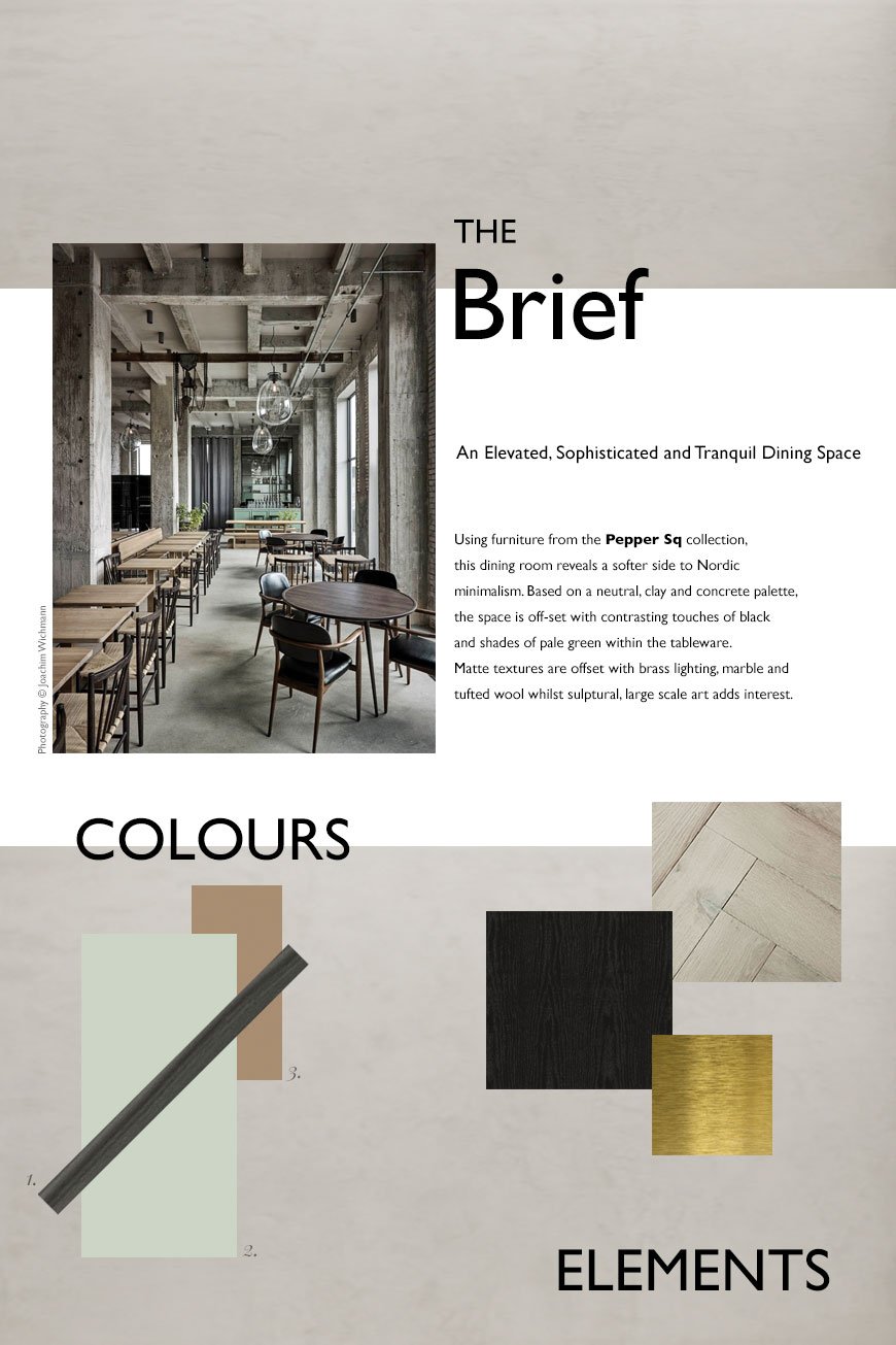
My initial thought was, what does a dining space look like today? I use the word 'space' intentionally, as in recent years, the traditional dining room has taken a back seat in favour of open plan kitchen/diners. It seems our kitchens have become the room that we naturally gravitate to as a social space, so the rising trend in kitchen living spaces shows just how much entertaining has become a part of our culture.
There's definitely still something to be said for a separate dining room though. And with some consideration, it can become a room for every day, not just shut away for special occasions...
With the topic of sustainability and the environment high on the agenda, many of us are looking inwards and homewards for comfort as an antidote to all the uncertainty. I wanted to create a welcoming, sophisticated and calming space with Nordic influences. Drawing on 'Tranquil Dawn', the Dulux 2020 colour of the year for its soothing influence as a new neutral, the scheme includes touches of pale green accessories against mid-grey limewashed walls and warm, parquet wood flooring.
There is brass detailing running through the lighting and tableware to warm up the colder tones in the limewashed walls. And I've used black as a welcome contrast to a rather tonal palette with black oak furniture.
Ultimately, I wanted to create an elevated space that makes using it every day feel special.
Inspiration
I pulled inspiration from the work of Copenhagen based studio Space Copenhagen. If you saw my stay at The Stratford hotel, their latest project, you'll know I was bowled over by the Brasserie. Set against a backdrop of soft, sand toned, textural lime painted walls, classic black bentwood chairs and brass detailing, it was the epitome of Nordic sophistication.
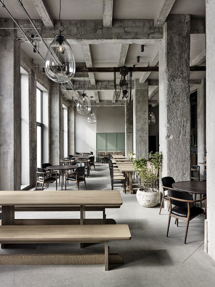
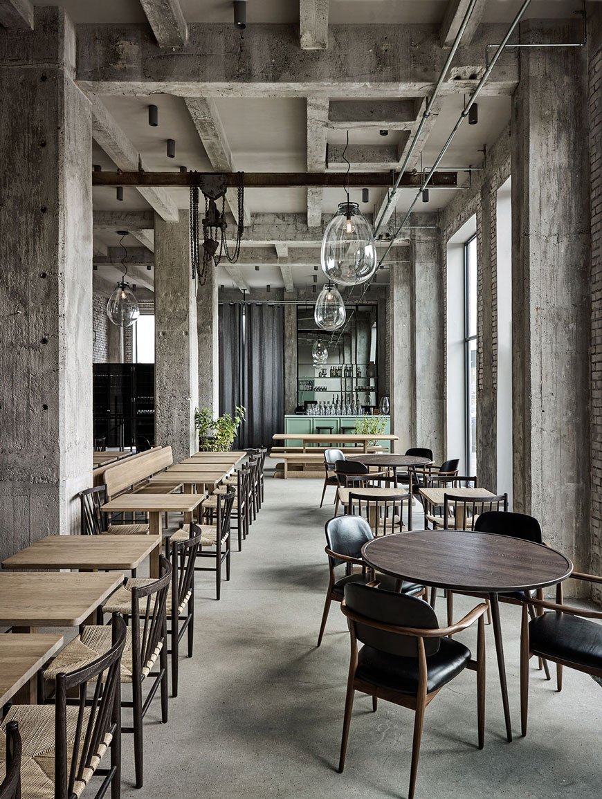
Diving deeper into their portfolio, I came across Restaurant 108 in Copenhagen, the sister to the legendary NOMA. The interior has retained its industrial concrete shell but introduces a softer side with seafoam green panelling on the bar and other parts of the restaurant. Although the exposed structure of the building appears very much essentialist in the way it has been designed, it is warmed by bespoke oak dining tables, curved back black leather chairs and potted plants.
The Finished Look
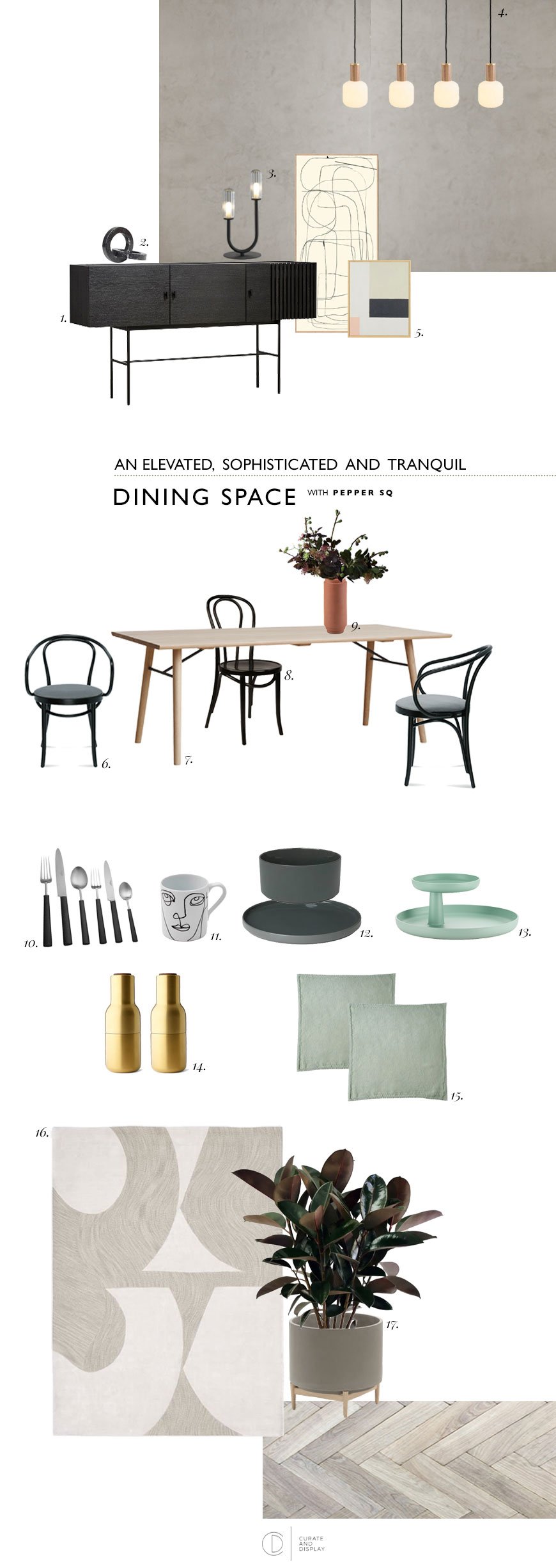
|1| Array sideboard, Pepper Sq |2|Marble Circles, Kristina Dam |3| Flora black table lamp, Pepper Sq |4| Oblo bulbs with oak and brass knuckle pendants|5| Abstract BYC Design & Tom Pigeon prints, Opumo |6|Berlin armchair, Pepper Sq |7| Alley oak dining table, Pepper Sq |8|Antwerp bentwood dining chair, Pepper Sq |9|Skagerak Edge vase, Finnish Design Shop |10| Ebony cutlery, The Conran Shop | 11 |Linea face mug, The Conran Shop |12|Agave green ceramics, Blomus |13| Rotary Tray, Vitra |14| Menu brass Bottle Grinders, Really Well Made |15| Mint linen napkins, The Conran Shop |16| Bold cut-out rug, West Elm |17|Florian concrete planter, La Redoute.
How To Choose The Right Dining Table
The dining table you choose will depend on the proportions of the space you have. If you have a fairly traditional, narrow room (like mine) then a rectangular table will be your best bet. I've picked the Alley table in light oak and brought in those touches of black I mentioned in the metal supports underneath. When you have a little more freedom of space or a squarer room then a round design would work well, providing you have enough space to walk around it with chairs in situ. It's also worth considering how many you need to seat at mealtimes. If you entertain a fair bit, an extending table affords you extra space at short notice.
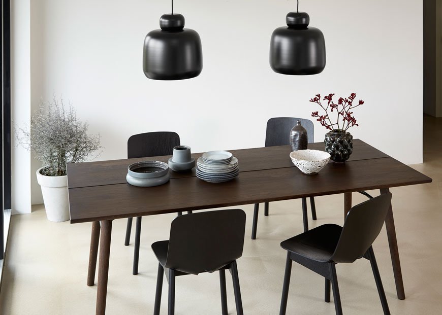
I love the timelessness of a bentwood chair, with a history that spans from the 19th Century, they're an enduring classic. I've mixed the Berlin armchair at either end of the table with a black Antwerp for a less matchy but still coherent look. Don't feel obliged to match all your chairs but choose a colour or material that ties them together.
Light Up The Table and The Room
Creating the right atmosphere with lighting is really important - you want the room to invite conversation. For above your table, find lighting that echos its shape. For example, a rectangular or linea grouping of pendants better suits a long table. Look at the direction the lights are facing in too and how it will affect the way the light falls onto the table or ceiling. Shades made from an opaque or smoked glass or wood veneer will give an altogether softer and warmer feel, which I love. Oblo LED bulbs paired with oak and brass knuckle pendants allow you to build your own statement lighting with diffused opaline glass.
Don't forget the rest of the room too. Table and floor lamps are just as important for providing ambient light, particularly if you don't like to use an overhead light in the dining room. The Flora table lamp has a sculptural style that just needs to be displayed alongside some art.
To Rug or Not To Rug?
Here's where I sit on the fence. I love to see a rug in a dining room when it's the right size. It helps to anchor and zone the space, particularly if you have an open kitchen/diner. A round dining table looks better with a round rug, likewise if you have a rectangular one. For a balanced look, ideally, the rug should be approx 24" to 28" wider than your dining table all the way around.
On the other hand? Having a young family means not having nice things. Ever. Believe me, I know how quickly that beautiful, hand-tufted 100% wool rug will end up caked in spaghetti and tomato sauce. If you have to have something, go for a flatweave that's easier to clean, or veto it entirely. If you don't want to forego the rug, try using one in conjunction with a sideboard instead so that it sits halfway underneath.
Why you need storage in your dining room
Sideboards and cupboards work really hard in a dining room, streamlining your view from clutter. Use one to free up extra space in the kitchen by storing the items you don't use every day along with other essentials like cutlery, cookbooks and table linens. I wouldn't be without ours, as it stores all the above as well as the kids' art supplies.
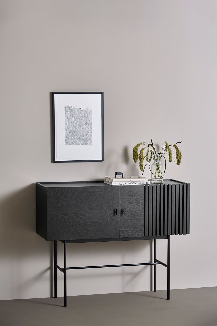
The minimal, clean lines of the black oak Array sideboard tie in beautifully with my moodboard, combining function with a striking, geometric form.
So there we have it, a few solid tips to help you update and elevate your dining room, with the help of the #peppersq #spacemaking tool for inspiration. I really can't wait to start renovating ours now...