[AD] Minimalist Art By Desenio In Our Edwardian Living Room
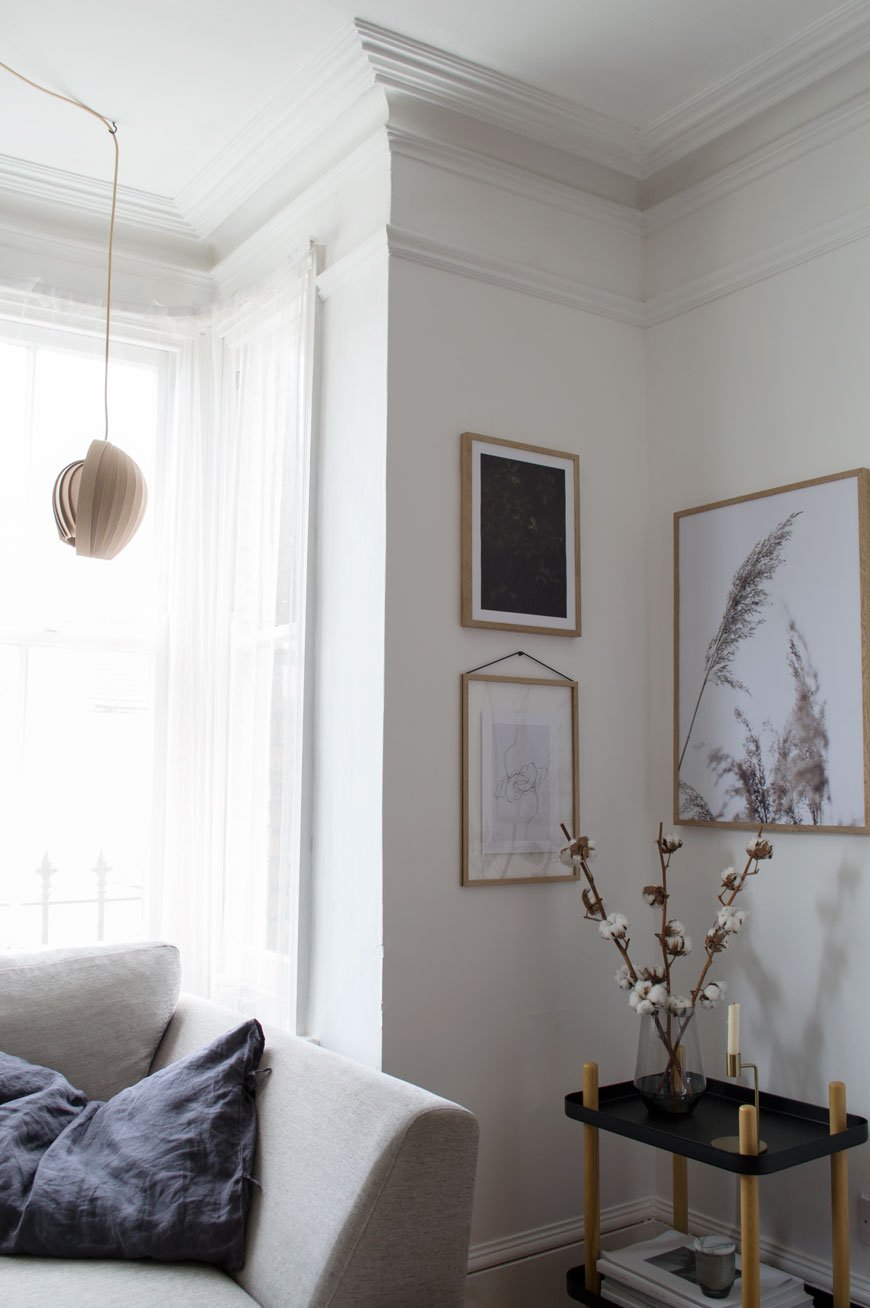 This is a paid partnership in collaboration with Desenio. Got a bit of a rare insight into our living room for you today, you know I like to do the before and after features in one hit but I thought I'd be brave and show how it is now. The walls and ceilings in here are in real need of replastering, the floors staining, new mantlepieces. The list is endless. See? I'm already making excuses! But it has beautiful bones so until we arrive at that point I've given the walls a fresh lick of white paint for a crisper look. Wall art is a quick and easy way to update a room without going all out, so I've chosen three new minimalist art prints from Desenio.
 There are two places I buy affordable art from when I can't stretch to buy directly from the artist (which to be honest has only happened once!) and Desenio is one of them. When you want to find an unusual piece that can't be found everywhere else, you'd be hard pushed not to find it here. A Swedish company with a passion for Scandinavian design, its ethos is that stylish wall art should be affordable to everyone. Prints start from £2.95 and there's a very useful Inspiration page which, if you're stuck on what to choose and how to hang it, has readily grouped collections you can purchase as a set. Be prepared to fall down a rabbit hole where the choice is concerned though...
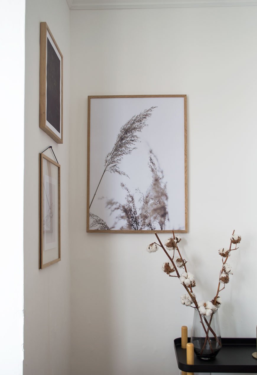
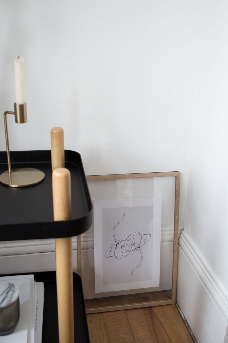
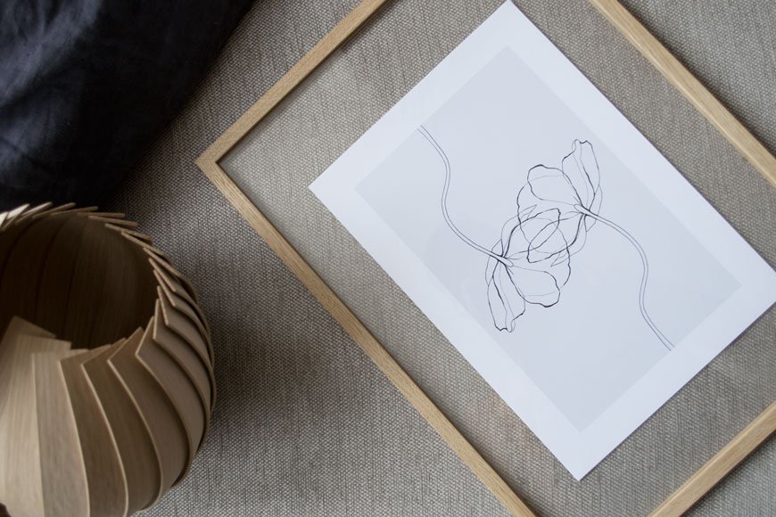 To take some of the indecision out of the equation I focused on a subject. I'd always planned to hang a collection of botanical prints in this corner leaving the rest of the walls clear and chose a muted colour palette of grey, beige and deep green. I want to look at quiet, thoughtful art when I'm home, compositions with simple line drawings, photographs capturing movement through leaves, something with space to breathe. The three I've chosen sum that up perfectly, don't you think?Hanging the Grass poster closer to the corner connects them when you're sitting on the sofa opposite. I've seen some thought-provoking examples of art hung in corners or at the edge of a wall together rather than the centre and I think it really works. I've also been wanting to try the Moebe transparent frame for ages; the design is clever in its simplicity and allows you to frame flat laid collections as well as prints whilst being able to see the wall behind. The entire frame is made from four grooved sides that hold the two acrylic glass sheets with the tension of a rubber band from which you hang it.
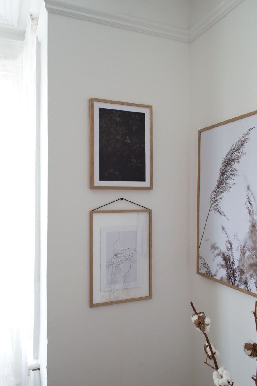
TOP TIP : A good tip for styling a gallery wall is to use the same type of frame, so your collection has a coherent look regardless of the art you have on display. Desenio offer simple designs in black, white and metal frames - I chose warm oak to counteract the north facing light. I love the soothing, natural effect it has in the room now, having some well-considered art up makes the space feel much warmer.
Now's a good time to find some minimalist art for your walls - there's a 25% discount code* 'curatedisplay' valid on posters between June 5th and June 7th 2018 (*except on frames and on handpicked-/collaboration posters).
Photography & Styling © Tiffany Grant-Riley
