New Nordic Dining Spaces With Muuto
 Although we're some way off from tackling the renovation of our dining room, it hasn't stopped me from obsessing over the furniture, and the design brand that I always come back to for inspiration is Muuto. If you're new to them, allow me spark a life long love affair (sorry, not sorry!) A name on the lips of mosts lovers of contemporary Scandinavian design, they are the epitome of New Nordic style, developing new materials and production methods to produce fresh and relevant pieces for the home. Some of the biggest creatives of our time collaborate with them, including Anderssen & Voll, Mette Duedahl and Cecille Manz, and in this way find innovative ways to present new minimalist design.
Muuto take their name from the Finnish muutos, meaning 'perspective'.
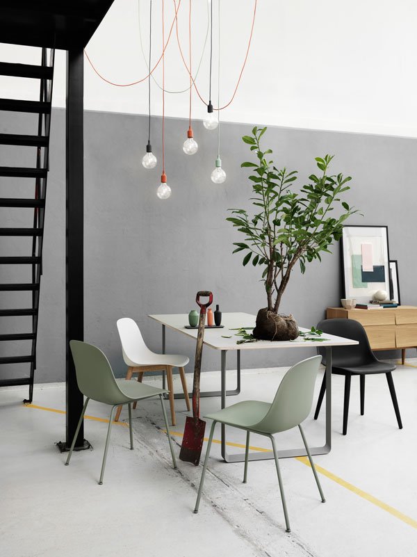
 Ever since we bought the house last summer, I've held it in mind that I wanted to find a comfortable balance between the traditional, original bones of the house and contemporary furniture. We have really beautiful floorboards, so I plan to sand back the 90s orange varnish and re-stain them with a pale wash, almost white but not quite. Might regret that one when I'm knee deep in solvent with kids and and cat trying their best to interrupt, I'll let you know how that one goes. The dining room is rather on the shady side, so the more light I can bounce around, the better - Rob does not do dark colours. I tried for dark green walls, really I did. Perhaps a pale grey instead?So I'm going to be starting from scratch as our current table is a reconditioned vintage piece with a surface so sticky that magazines end up staying if you leave them there too long (the varnish is lifting). I love the shape of the 70/70 table (above) where the frame almost disappears into the room, which means the legs don't become a hinderance with all four of us sitting around it. Ultimately, it needs to be something that stands up to the wear and tear of children so anything with a white surface might be out...
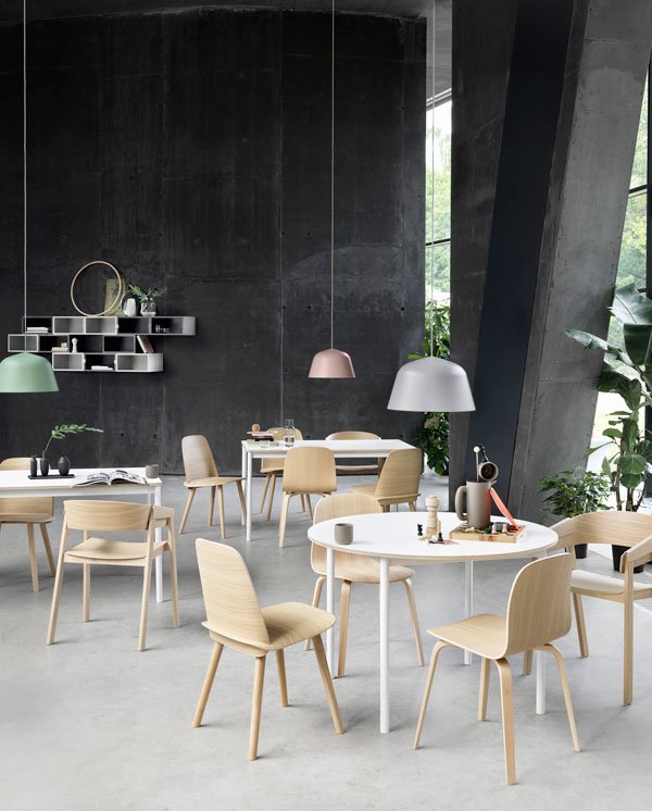
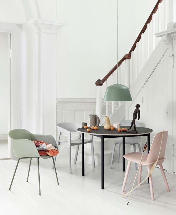
 Our current chairs are a black veneer design which were a temporary solution three years ago - it's time for a change. I'm a sucker for the simple qualities of natural wood as seen across their collection in a mix of oak, beech and plywood veneer. Here, the shape is the focus, the colour a bonus. If colour is more your thing though, there's brighter options from soft grey and pink to dusty red and dark green without losing the effect of the grain.
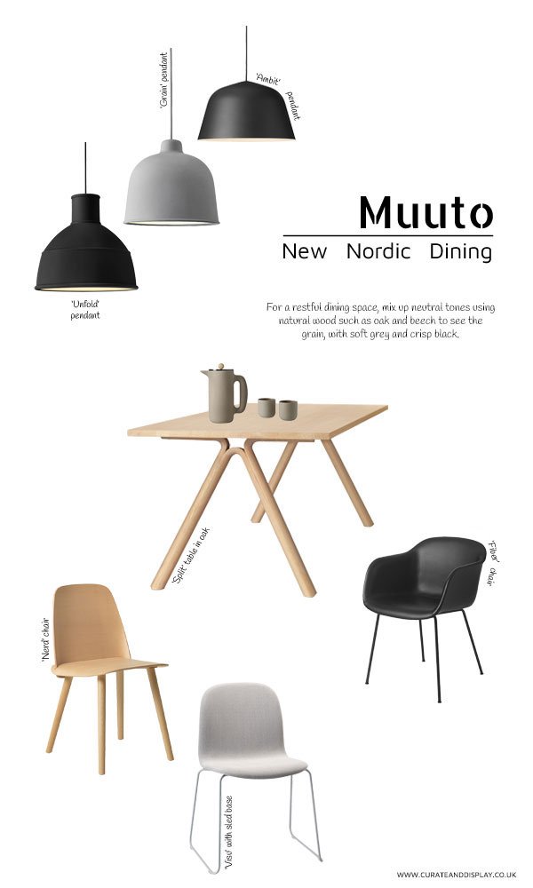
 So here's my starting point - using neutral tones and focusing on natural wood, be it in the dining table (this one is in oak, called Split) or in a combination of chairs. I like that there are a couple of designs such as the Visu and Fibre that come with different bases, so that you can switch up the styles for a less matchy-matchy look. I'm still undecided as to whether to choose a single large pendant light or opt for a grouping, but something in black or grey suspended low above the table creates a statement - I'm a particular fan of the 'Unfold', designed by Form Us With Love and made from silicone rubber.
LIGHTING [L to R]: Unfold pendant in black, Grain pendant lamp in grey, Ambit aluminium pendant; TABLE: Split table in oak, PUSH coffee maker, PUSH coffee mugs; CHAIRS [L TO R]: Nerd chair in beech, Visu ash wood grey chair with sled base, black Fiber chair with tube base.
What do you think of my dining room choices? Should I be brave and go for really dark walls? Have Muuto inspired you to refresh your dining space too?
This post is written in collaboration with LOVEThESIGN, the online shopping destination for the best in design, brought to you from Milan.
Photography courtesy of Muuto.