'Retailed' / Heal's Part One
I am beyond excited to kick-off a brand new series for you today! As a stylist I’m constantly looking around me for inspiration that could be translated into my next shoot or event and one of my go-to places is visual merchandising. It’s an aspect of styling that both fascinates and intrigues me, partly because the information on what’s involved in styling for retail isn’t so readily available. ‘Retailed’ is a no-holds barred look into the behind the scenes world of some of the most revered and coveted stores and brands here in the UK. Get a glimpse of the real world of “vm-ing” from the view point of their visual design teams who are the magic makers behind what makes a shopping experience so important. First up is part one of two posts covering two insightful days I spent with the visual team at Heal's on Tottenham Court Rd as they installed their summer window. With two centuries of brand heritage and dubbed ‘the home of modern and contemporary designer furniture’, Heal’s is constantly looking to the future. In my mind, it has and continues to be the fore-runner in cutting edge design, discovering and supporting emerging designers and never afraid to push boundaries.
 There's a real buzz about the place as I arrive- something I pick up on when I meet online marketing assistant Julia Deutsch for a whistle-stop tour. Emerging from a difficult few years, Heal’s is firmly in recovery and ringing in exciting changes-all in one go it would seem! As we headed to the first floor furniture showroom, Julia explained that the 100 year old building is under-going major structural renovations. It's still a little rough around the edges because ceilings are being raised to open up the spaces and the original wood flooring is being restored-let me tell you, it’s a thing of beauty! I also learn that physical renovations aren’t the only changes the store is experiencing- new manager Martin Colquhoun who was brought in 18 months ago as former business manager for Liberty’s home department has proved to be worth his weight in gold in steering this ship.

In keeping with Heals’ ethos to support British design, the store will make way for a ‘best of British’ room in which all of Heal’s chosen designers’ products from around the UK will be in once space. And as we progress from room to room towards the showroom at the front of the store I can spot many of my favourites -Imogen Heath, Tom Dixon and Kangan Agora to name but a few.
We find the visual team just back from their mid-morning break re-grouping at the front window. The working day usually starts around 7am and work is already well under way, so Julia leaves me with Display Supervisor Tatum who brings me up to date and introduces me to everyone. Her role is to over-see the team on a daily basis, keeping everyone up to date with the schedule. For the next week all hands are on deck to complete the main showroom and front window display.
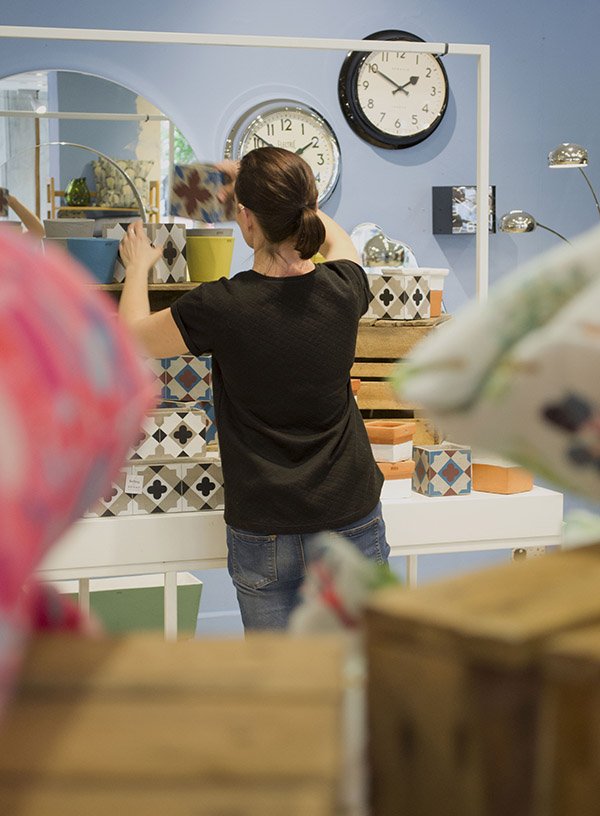
Everybody seems a little wary of me as I introduce myself, brandishing my camera, all but Visual Manager Phil Knudsen-Thomas who breezes by like a ray of sunshine, ready for his close-up. Phil is also new to the team. Having joined in January hoping to “blend in” he was soon appointed Visual Manager, responsible for designing the window schemes across all Heal’s stores. It’s hardly surprising though, given his hefty 22 years of vming and buying experience including Habitat, Barker and Stonehouse and Diesel.
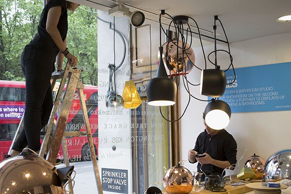
Next I meet Vicks and Mike, who both came to the job from the shop floor, having heard there was an opening on the team. For the most part, they'll be responsible for rewiring and hanging a new collection of lighting in the front window and take it from me, it's one hell of a task with around eight lights taking up one eight hour shift. There's a lot to consider in the process of installing them- they have to be carefully hung according to eye levels, enough to showcase the fittings and shades and be correctly wired. No big deal, right?!
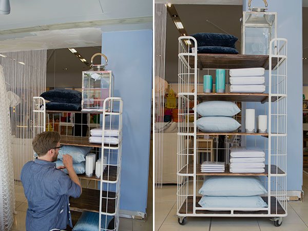
Sitting next to a white beach hut with a large pot of sky blue Dulux paint is Tess. It’s her first day today although having worked with Phil as his assistant previously she's not new to the role.
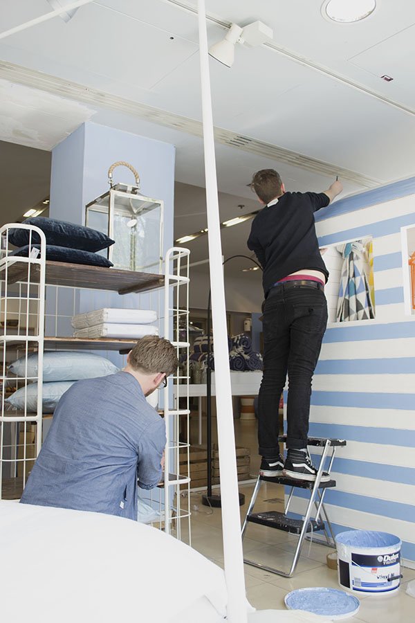
This summer window will be the last under creation of Phil’s predecessor whose approach differs to his own method of working. He explains that previously, the store’s approach to VMing has been from the viewpoint of an interior designer rather than a retailer, in that the sets may look great but they won't translate well enough unless the customer can relate to them, imagine themselves inside it and easily access the product. Planning ahead to Fall, he’ll be implementing changes in the way the windows are created, giving full creative license to the visual team and working much more closely with the buyers to determine which products are readily available first. From this he can plan the sets accordingly and flexibly, rather than agreeing a look before knowing what’s “in”. All future displays will be digitally designed in CAD too to give a better idea of scale and layout.
The Look
In keeping with summer, styling for the next week is focused on bringing the indoors outside, from alfresco dining to relaxed lounging. With a nod to coastal pursuits, the walls have been given a fresh coat of sky blue paint which is picked up in the linens and fabrics as well as giant pinwheels and kites made from the Heal's 1810 fabric collection. As the first fabric collection Heal's has produced in collaboration with designers since their last in the 1970s, there is real emphasis on this. Immediately, I'm drawn to a wooden bench in front of a fabric backdrop of blue sky and fluffy clouds. It's dressed to look like a Mediterranean feast, from the brightly patterned crockery stacked on top of thick wooden chopping boards, cobalt blue Pols Potten glasses, to the groupings of olive oil, sardines and olives. Very Portuguese in style.
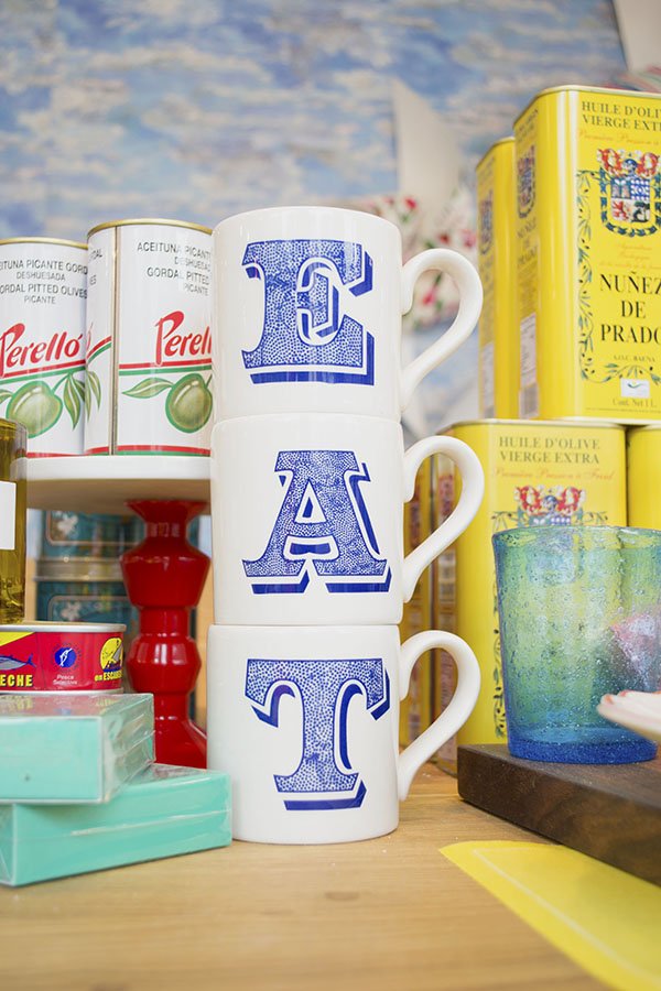
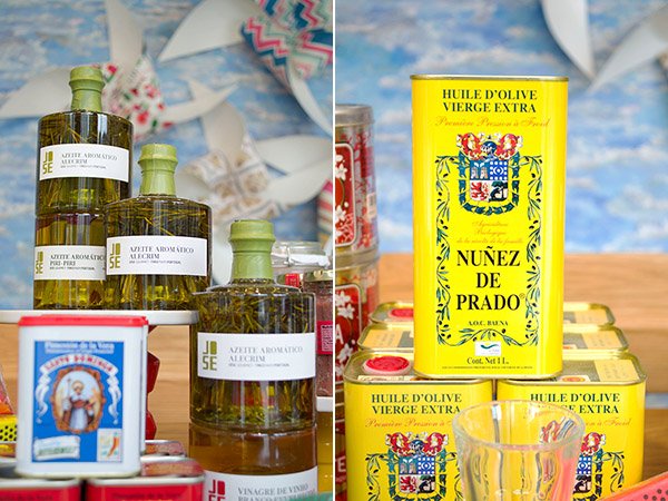
There is rich and vibrant colour at every turn, from the almost neon collection of baskets, hand painted rice bowls and brightly painted lanterns. It made me yearn to live in a place with a courtyard garden where the sun shone for 360 days of the year to enjoy it all in and I'm excited to see how the space will evolve over the next day.
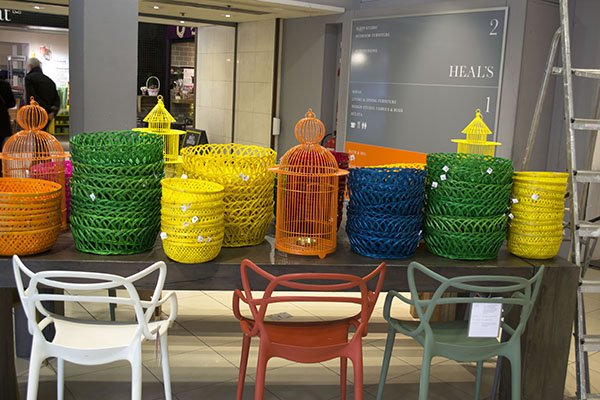
With the majority of the old wall behind the front windows gone following the renovations, the team are learning to find new ways to create and dress the set without it. Opening out the space into the showroom also encourages customers to step inside the window and interact with the space, where in some stores you might feel uncomfortable doing so, here it's encouraged.
For the remainder of the day, the team are installing lighting, moving and preparing product and gearing up for tomorrow where the best part of the set dressing will begin.
Join me next week for Part Two where we really start to see the space come together, I talk to the team about the highs and lows of the job and pick up some great VMing tips!