A Beautiful Black Wall
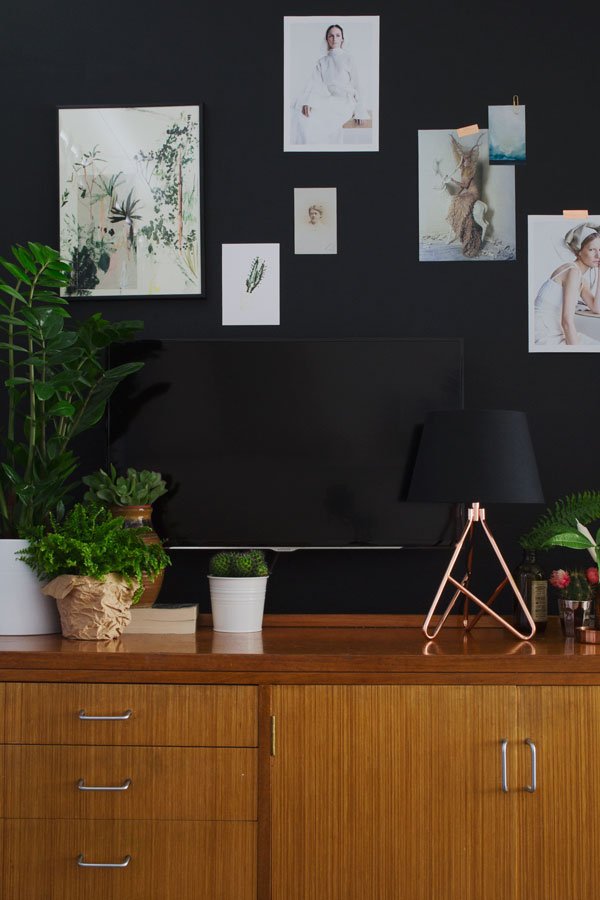 So I realised that I hadn't shared the results of our new black wall with you. Normally I'd prefer to wait until I've chosen all the art for the wall before I shared it with you but I thought, seeing as I've recently shot this part of our living space for the "project" I mentioned, that you might like to see it how it looks right now. Not finished. But nearly.First of all, can I just give Valspar massive high fives for the paint. Yes. You beauties. I tested three different brands including the stalwarts of the designer paint world in four different shades of black and their flat black 'La Plancha' in Premium came out on top. There are no subtle blue or brown undertones to this shade, just pure matt black in any light. The coverage is excellent and the paint is just the right consistency, really smooth even on this wall which is slightly textured. Two coats. Done. And no, this isn't a sponsored post, I'm just really impressed.
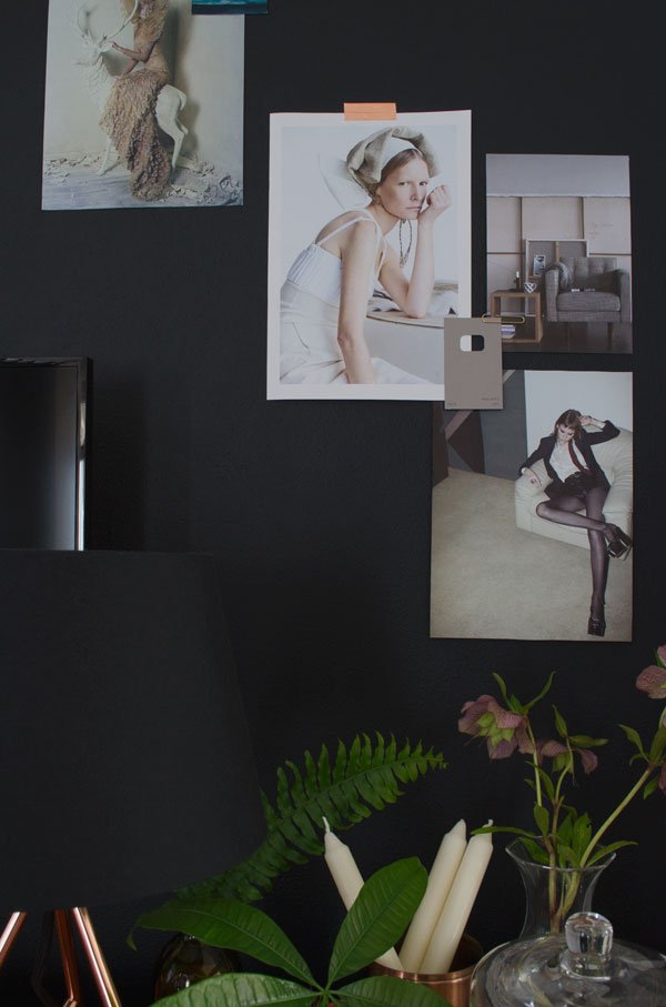 As per my mission here I've achieved what I set out to do (hide the God awful TV) and I'm loving the way it looks now, intentionally hidden against the wall rather than jumping out on bright white. Sometimes, depending on what you're watching, it's like a piece of art in itself.This area of the room is far from dark being right next to the front window, and I'm playing to that accessorising with polished copper and brown glass to pick up on the light. The almost orange tan wood of the sideboard has really brought it into its own too, picking it out as a feature in the room now, the focal point it needed being such a long and narrow space.
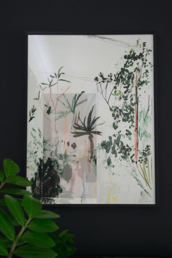 Have you seen this beautiful Kew Forestry botanical print by Alicia Galer on my IG feed? When I first saw it, I leapt up and ran up to Rob's office to show him. "That's nice..." he said. Nice????! I'm using it as the jumping off point for the other pieces to follow; abstract, minimal colour with perhaps a plant based story running through. Having discovered her on Instagram a few weeks ago and unable to find this particular print for sale anywhere (it was out of stock in Anthropologie) I got in touch and she very kindly rushed one out to me in time to shoot it (thanks Alicia!) I love her use of abstract shapes, the greens, the frenetic movement, yet still calm...Cannot wait to collect more of her work. For now, I'm enjoying playing around with the rest of the wall space moodboard style, pinning up snippets from magazines and lookbooks, keeps it fresh and interesting.
 So that's it. A little preview of the TV wall as it is right now. Are you feeling it? Trying really hard not to paint any of the other walls black now as much as I'm desperate to...I keep eyeing up the kitchen, but I think we're leaving that...Styling & Photography © Tiffany Grant-Riley
Bedroom Refresh / Better Sleep Month
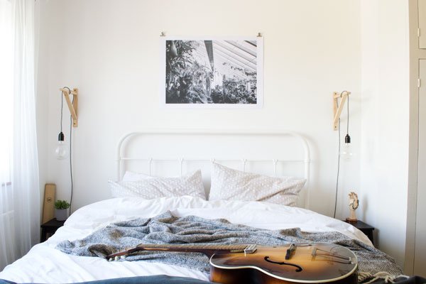 Gosh-is it May already? This month, if you didn't know, is Better Sleep Month and with this in mind I finally got my act together and gave our bedroom a little spring refresh following on from this winter post. It had been needing an update for a while now with the bedside lighting and a new print waiting to go up (aren't they amaaaaazing?!) so last weekend we got our heads down and Rob got the drill out. It's not quite finished yet (is it ever?!) as there's still new bedding to come - I'm experimenting away from classic white but for now, this is us.
 It got me thinking about what the perfect bedroom environment is and how not creating the right setting can really affect your mood. Essentially, it has to be a place that promotes sleep but also a space to nest, relax and make plans (I always have moments of inspiration as I'm falling sleep). In an ideal world, our room would be a lot more spacious...maybe with a roll top bath, tall ceilings boasting architectural features and a huge bed so that if we do have the kids in with us then the customary sleep gymnastics won't be as noticeable. As we don't live in a New York townhouse, this will do. Sure, it's a little on the small side with an awkward cupboard taking up space but as we're not really "stuff and clutter" people anyway the minimal look works for us.
 And what about you? I've teamed up with bedding experts Soak&Sleep as part of Better Sleep Month to delve into what gets us into and out of bed every day. We'd like you to tell us what makes for a good night's sleep-whether it's all about the pre-bedtime hot chocolate (that's mine) or a good book. Fancy sharing? Spend a couple of minutes with our questionnaire and you're in with a chance to win £150 to spend at Soak&Sleep. It is ALL about the charcoal grey French linen if you ask me...
The Nitty Gritty
To enter you must complete the questionnaire in full with the correct contact details. The winner will be drawn after the questionnaire closes at Midnight GMT on May 22nd and will be contacted via email. The prize of £150.00 can be used across any of the Soak&Sleep collection and there is no cash alternative.
Photography & styling © Tiffany Grant-Riley
Black Wall Tunnel Vision
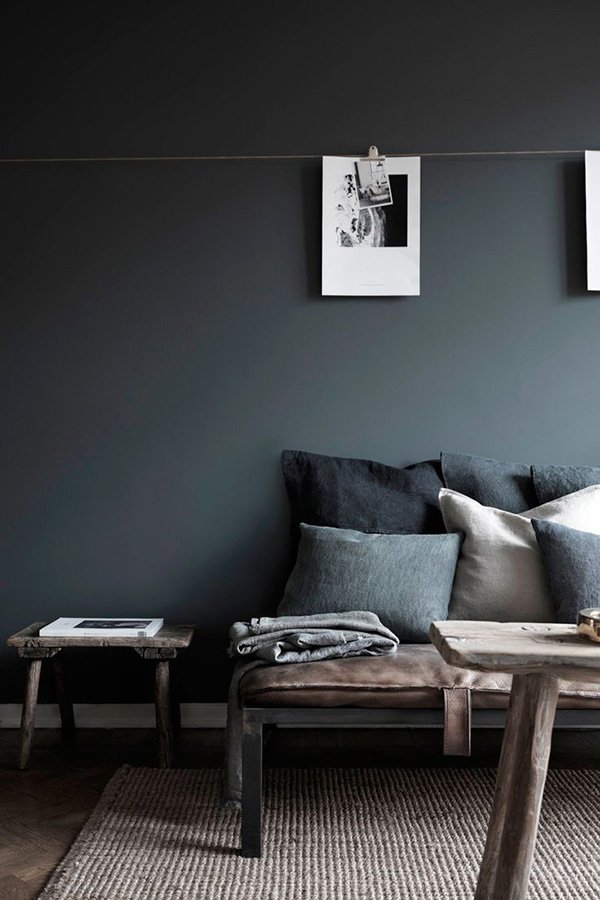 With my recent home project complete and a few weeks of not thinking about decorating behind me (are you kidding? It's all I thought about!) I've been turning my focus to 'The Black Wall'. On most occasions as I've sat down on our sofa and faced the wall the TV is mounted on, I've pretty much in one way or another wanted to take a sledge hammer to it. I can't stand looking at the television in all its blaring 32" glory, or the notion that most households must by default angle all their living room furniture at it - there's no hiding it for us. I stuck a RIBBA picture shelf above it when we first put it up and found a beautiful mid-century sideboard to anchor it with to try and lessen the impact but nope, I still hate it. So I decided to be bold and thought about ways in which I could better integrate the TV so that it looked more intentional. Paint it black, I thought! Hold on a second - don't freak out.Here's why it'll work without it looking like a 90s feature wall...✚ Our living space is full of natural light with white walls so the one I'm painting in black won't upset the balance. As ours is next to a huge window it'll add its own dimension to the room.✚ The sideboard under the TV has a warm teak stain which will stand out against the black.✚ It's the perfect backdrop for a gallery wall.✚ The black furniture and accessories we already have in the room will pick up against it perfectly.✚ A black wall with a black television means I won't notice it quite so much any more. I win.Now I'm seriously lusting after black walls and so this week I set to sourcing tester pots to help decide. The current runners are Little Greene and Farrow & Ball with newcomers Valspar for comparison. If you check out my Instagram you'll be able to see little snippets before I share the before & after.So what do you think? Tempted to take a walk over to the dark side or too nervous? Don't be! You might find my Black Walls Pinterest board a useful starting point...
Image: Hans Blomquist
My Workspace Reveal / The Befores & Afters
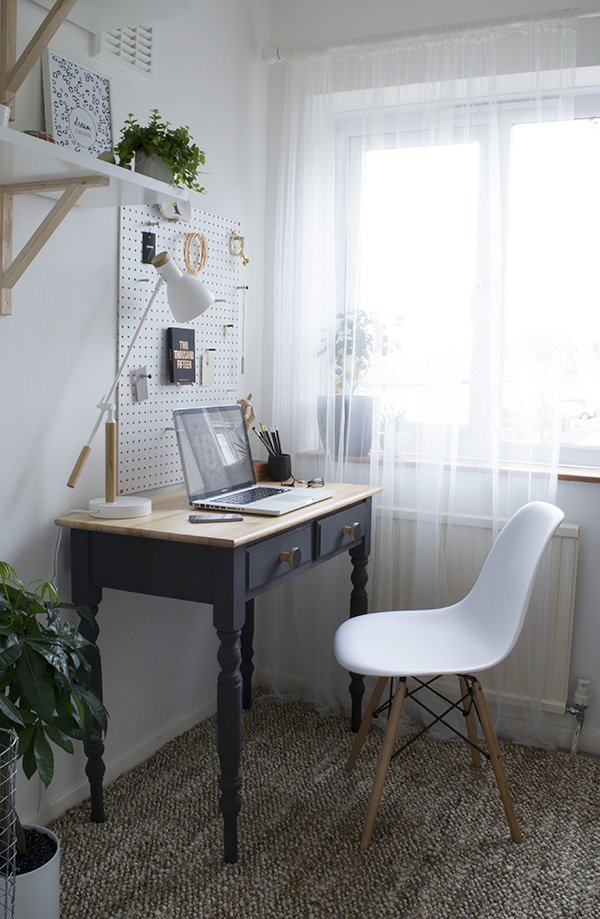
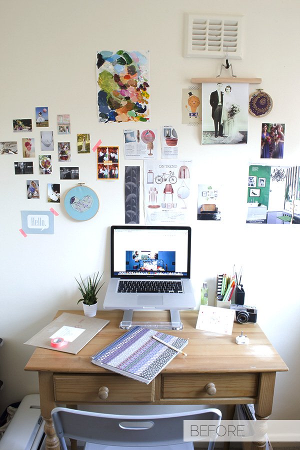
Today is a milestone - I'm excited (and relieved) to finally reveal my new-look workspace to you. We've been here for almost two years now and when I moved into this room it was a sort of shove everything in situation whilst I figured out what to do with it. I set up a desk, stuck some bits on the wall and put up with it as a sort of craft room. And then last August I decided in a fit of frustration that it wasn't working for me and it had to change. Storage was pretty sparse, there was no sense of my style which had changed so much since we'd moved and I didn't feel inspired to work in it, so for the next six months I launched into turning it into the best room in the house. Yes. For a space that's only 2m squared that's a ridiculously long time but hey, Rome wasn't built in a day, right? And it's good to slowly introduce my home to you, particularly as I'm usually quite guarded on that side of things. I feel self-conscious about it in a lot of ways, much of that comes from spending too much time picking over the bits of the house I can't stand or can't change, but that's all part of the joys of renting. Anyway, come and have a look!
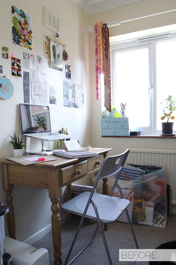
Given the size of the room and my penchant for bright white spaces, it was a no-brainer to paint out the cream with a brilliant white, introduce pale, untreated wood to compliment and a touch of black to set it all off. You can take a look at my inspiration on this Pinterest post and see how useful my Studio & Office board became in the process as my point of reference.
Flooring was a real issue for me and it took months to find the perfect rug. I don't have the glorious luxury of wooden flooring anymore so I kind of just wanted to forget that this carpet existed and find a rug large enough to cover the width of the wall that came out far enough beyond my desk. Try finding one that size within budget! My first attempt was a diamond Berber which seemed great in my head, but in situ just fought with the black desk and took all the focus away from the room down onto the floor. A minor panic ensued (my good friend at LapinBlu can vouch for that as I drilled her for advice) and by the end of the day had returned it and ordered another. I'd come to the conclusion that a textured, patterned rug was just wrong for this space and so Zara Home saved the day with a classic handwoven jute number instead. It was a bit more of an investment than planned but I love the surprisingly soft (for jute) texture under foot and that it adds to the space without distraction. Nervously I waited as Mosey sauntered in to inspect it and I thought he'd take to it as his scratch pad but I'm not sure he's even noticed it, so long as he can lounge underneath the radiator!
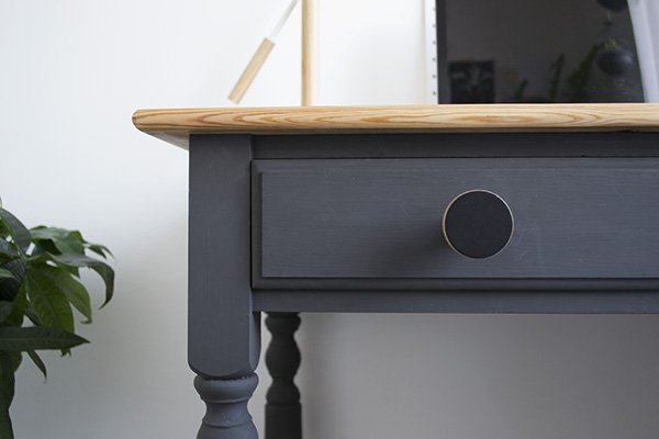
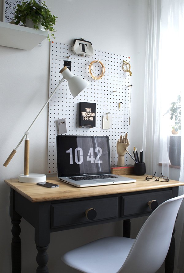 I'd planned to get a new desk in baltic ply on trestles encouraged by the guys at Hopper + Space, but when I couldn't find trestles small enough without taking up half the width of the room I had to be realistic and decided to update my existing one. My sister had given it to me after she'd decided she didn't want it anymore (thanks Meg) but as I thought it was out-dated and worn out in its current state it had to become a statement piece. I'll be posting a DIY piece on the desk later next week to show you how I did it, but in short, I sanded down the layers of stain on the surface to lighten the tone of the wood, gave it a coat of clear wax, chalk painted the base and changed the drawer knobs which are made from ply by Chocolate Creative. They're so sexy!
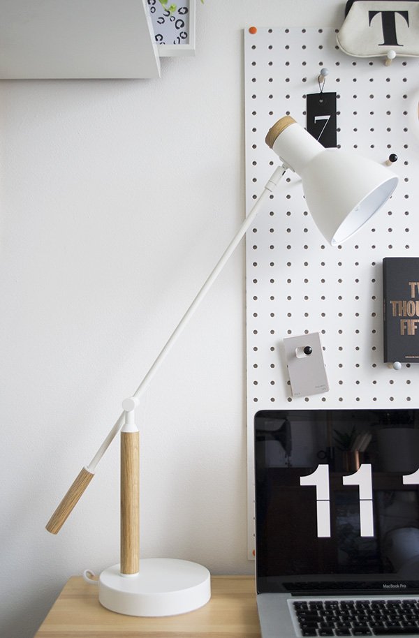
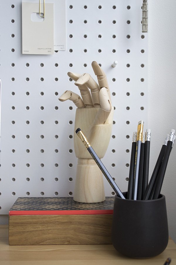 I've tried to eliminate the desk clutter and keep the surface as clear as possible with the white PegBoard from Block.The pegs arrived with coloured tips so I painted them out in black and white. I love that I can switch up the display whenever the urge strikes. The simple white desk lamp was a birthday present from my mum, the 'Cohen' by MADE.COM. Sheeeeeesh that lamp. It's just so elegant, don't you think?
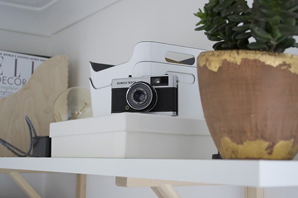
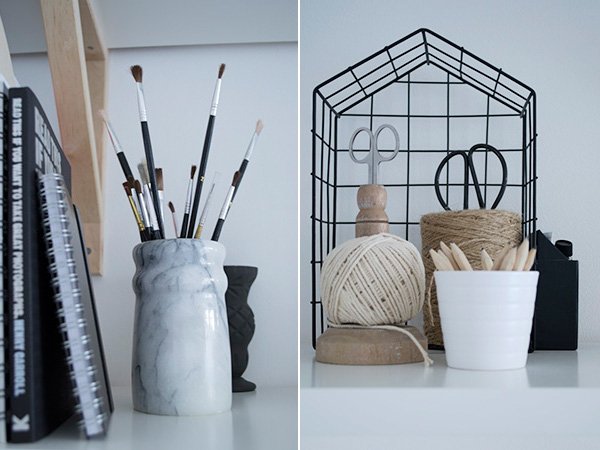
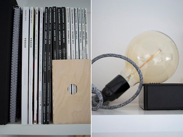
 Storage was a huge issue before I put in the shelving which I found in IKEA after quite a lot of searching and deliberating. I wanted to stick with the combination of white and untreated wood to compliment the rest of the look and I loved the mix and match shelving at IKEA. I used to store most things into plastic crates which I hated looking at, so I sorted through the paints and other pieces that weren't an every day necessity and moved them to the garage instead. Initially I'd had it in mind for three levels but it actually wasn't necessary once I'd got them into place, so the third will probably go into Tabitha's room when I get round to it. Now I use a mixture of desk drawers, shelving and my 1920s bureau behind it which is a much better solution.
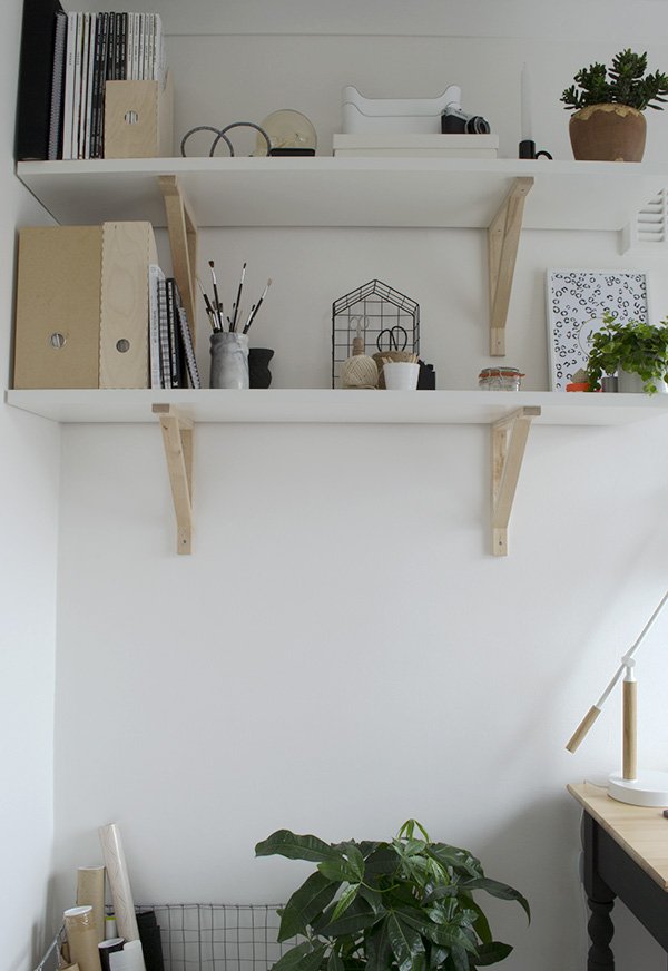
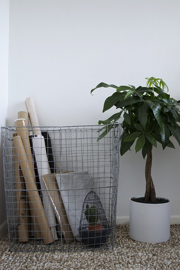 Let me just take a minute to talk about this basket. Oh wow, this basket. I saw it way back last summer when I'd popped into West Elm for a quick meeting and had to have it. Given the amount of prints, random rolls of paper and packaging I seem to collect (I hate throwing paper out) it made sense to store them all in something extremely stylish. Before I was just using a bag (see below) but the wire basket is a far better option and doesn't take up too much space either. Win.
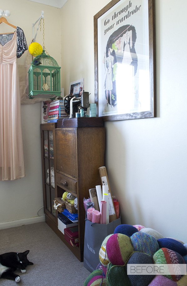
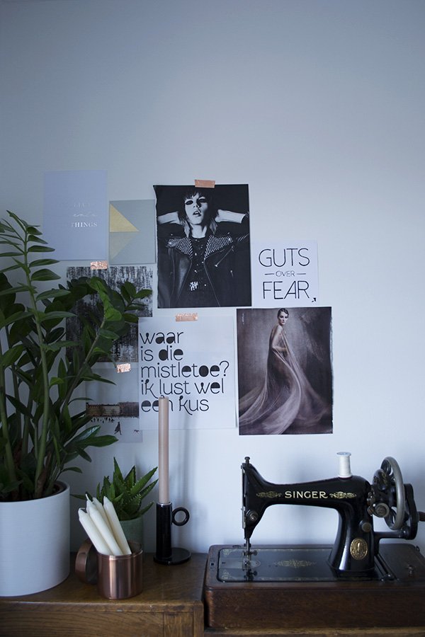
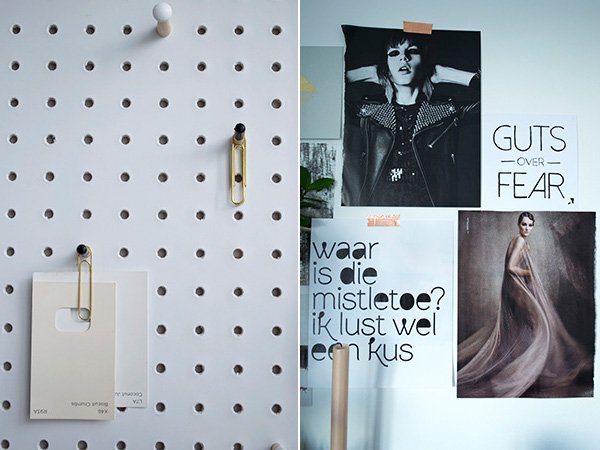
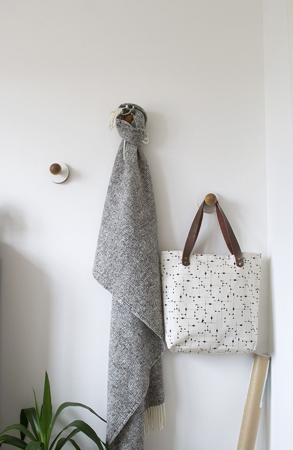 As floor space is at a premium in here, I was keen to source some wall hooks to keep things like my camera bag and tripod out of the way but also have somewhere that I could hang prints as I find them. When I had an email from designer Nikki Kreis to introduce her beautiful, minimal homeware collection, I called off the search when I found these beauties. With a layered plywood plate and smooth birch ball, they're so tactile and instantly become an extension of the wall.
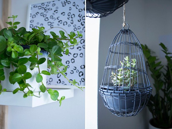
 Of course, it wouldn't feel complete without the presence of plants - you might have noticed that I'm a little obsessed? The hanging wire cloche planters in the window were found as a set of three in my local Oxfam which stocks discontinued Zara Home decor. Not sure if that's where they originally came from but either way I wasn't hanging around (excuse the pun) and snapped them up for a bargainous £6.99. The first plants I tried inside them were a bit of trial and error and didn't take too kindly to the bright light and heat from the radiator, so I switched to these two succulents which will spread and trail. So far, so good.
 Phew. So there we have it. One workspace, pretty much complete. Sure, it'll adapt over time and I plan to bring in some prints at a later stage just as soon as I can decide on what but for now, it's done. This is absolutely my favourite room in the house now. The kids come and hang out before bedtime in here too and I just love working with fresh walls to play with and a clean, bright space. What do you think?
Photography & Styling by Tiffany Grant-Riley
'Brilliant White' paint, Crown | Jute rug, Zara Home | Shelves 'EKBY JÄRPEN' & 'EKBY VALTER' brackets in birch, IKEA | White PegBoard, Block® | White & natural oak 'Cohen' table lamp, MADE.com | 'LILL' net curtain, IKEA | Wire mesh hamper, West Elm | Black chalk paint in 'Graphite', Annie Sloane | Black plywood drawer knobs, Chocolate Creative | Plywood & birch wall hooks, Kreisdesign
Urban Jungle Bloggers / Coffee & Plants
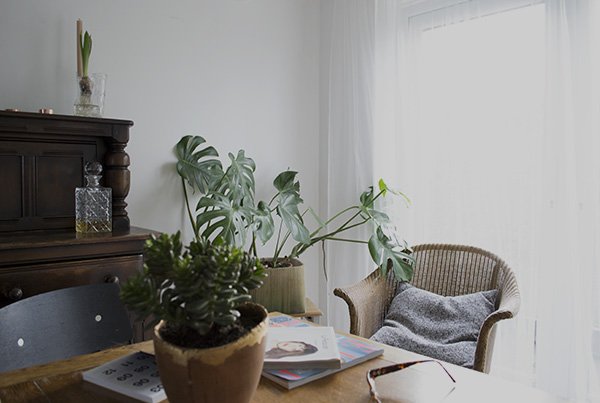
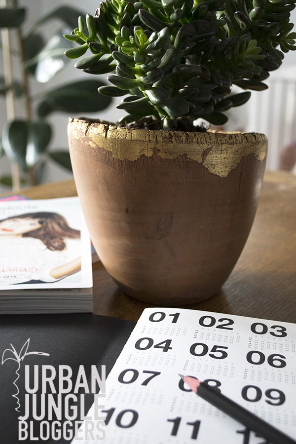 My latest Urban Jungle Bloggers post is actually a week early for once (!) and this month it's all about coffee and plants. This little beauty has just moved into my office, but for the purpose of the post I'm photographing it downstairs in our dining space. It's a variety of Crassula (money plant) that I picked up from Ikea, the leaves grow like tubes until they unfurl, quite amazing to watch. The moment I found the terracotta pot that it sits in in my local florist, I'm pretty sure I almost swallowed my tongue. That delicate gold leaf detailing-oh my! I bought two on the spot and gave one to my mother, so now we both have one each in our homes. Anyway-coffee- Would you like to join us?
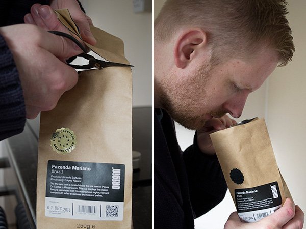
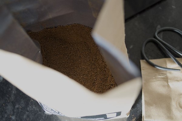
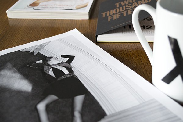
 Lunch is the best time of day in our house-we both work from home although I juggle mine around the children, so we all come together for something to eat and to talk about the day so far after Reuben comes back from nursery. Although it has it's ups and downs, this is definitely the best thing about being freelance-enjoying time with family at home when you choose. Especially when there's magazines to catch up on. If there's time then Rob will make us a "proper coffee" in the stove top percolator (I suck at it) and I think he really enjoy the ritual, so this time I thought I'd pop out to my local coffee bar and pick up a bag of Origin's Fazenda Mariano to try. So good.

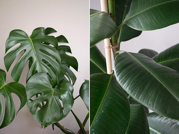 We enjoy a lot of light in this part of the house which makes it an ideal position for my monstera and rubber plants. They were "rescued" from supermarkets some six months ago and have grown from scrawny little weeds into absolute giants. I love them like my own children...well, near enough...
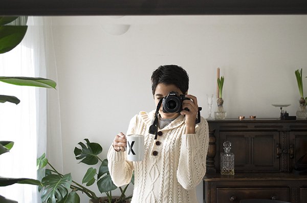 Thanks for joining me today! I've put together a little coffee shopping guide for the weekend, you know, in case you want to get in on some too...
Shopping Guide For The Caffeine Crazed!
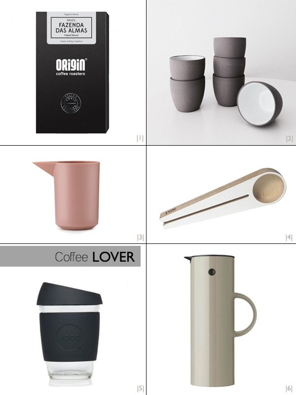 |1| Aside from their eye pleasing, monochrome branding (I'm a sucker for good branding) I love Origin's coffee and enjoy a cup at my favourite coffee bar when I'm in town running errands. They're a small roastery based down in Cornwall and keep the environment at the forefront of their ethos. This box of Fazenda Das Almas offers a sweet silky cup with notes of buttery hazelnut. Yes please.|2| I have a slight problem with espresso cups. I own far too many but I don't actually drink espresso. That said, it doesn't mean they don't have other uses, like looking so incredibly beautiful stacked up on a shelf for me to look at or as a vessel for a sweet little posy of herbs on a windowsill. Serax always kill it with their ceramics. Always. Thanks for stocking these little bad boys, Studio NL!|3| Designers from my favourite Danish lifestyle brand Normann Copenhagen have just released an achingly gorgeous new collection of jugs and flasks under the name of Geo. This is minimal design at its best, with a matt finish on the outside and glossy inner its clean design would look right at home here on my table. Please.|4| Made in Finland from birchwood ply, I think the Kapu coffee scoop by HILE is possibly the most beautiful scoop of any kind that I've ever seen. It's not just a scoop either, that cheeky little notch down the middle lets you clamp your bag of coffee shut when you've finished to keep it extra fresh.|5| Ever mindful of the amount of waste that's created every time we (or I) buy a coffee (most of the cups can't be and aren't recycled) I'm considering keeping a Joco cup in my bag to give to the barista when I grab my next fix. It's reusable, comes with a heat protector and it's so very sexy in clear glass and black. Comes in other colours too but, hey, black is a style classic.|6| A minimalist design classic from the late 1970s, the Stelton vaccum jug is a prime example of function and form working together. With eleven colours to choose from, I had a hard time making my mind up, but settled on Milano Sand-if this colour can stand the test of time as a trench coat then it'll be an enduring classic from which to serve my coffee.
Photography & styling © Tiffany Grant-Riley
Style It / Soft & Romantic Winter Decor
 Yikes - just three more sleeps until Christmas Day - are you just about ready? I find it really funny that even though I'd got myself into gear enough with the decor to come up with this DIY garland, nothing else was even close to getting done. Occupational hazard maybe? Needless to say, we pulled our collective fingers out over the weekend and got through a mountain of 'to-dos'. Yep. We owned it. Food, gifts, the lot. Phew.
 I've been thinking about creating more 'how to style' posts recently. Day to day I don't really think about how I style my work as I just do it, but there are a few guidelines that are worth remembering - would you like me to write more for you?Just for fun, today I'm sharing how to put this look together. Don't panic if you feel that there isn't time now, this isn't just a Christmas look as you can change up the colours throughout the year. You can recreate the look with or without the garland using a shelf, sideboard or even as a table runner (imagine that dressing a table for a New Year's Eve dinner!) I digress...You Will NeedPaper honeycomb balls in a variety of sizes - I chose white, ivory, grey and soft pinkCut glass vases - you can pick these up in a charity shop for peanuts and come in handy for all sorts of projectsHyacinth bulbs or similarSoft pink tall candlesSmall glass votives lined with copper tape
 ✚ Start with arranging the honeycomb balls. You'll need to layer them up slightly if you've enough depth to work with, so that you have some of the middling and smaller sizes towards the front, larger to the back. Cluster them a little so they're not uniform.✚ Introduce your candles. I put mine into a variety of cut glass vases as the glass will pick up the light from the candles and kick out an added glow onto your wall - just beautiful. Play around with height, for example if there's an obvious space that needs something tall and there's a vase that fits, use it. Same applies if there's a shorter vase and a gap at the front. Step back, tweak, step back and tweak some more.✚ Next up, add in your bulbs. I've displayed mine in a mixture of short glass vases and a tumbler for variation in height. See how I've arranged the short one towards the front and the taller further to the back?✚ Add a little interest. I wasn't happy with that little pink ball on it's own at the front, so I put it on top of a little pressed glass cake stand and added in another pink ball to the right. Also towards the back you might spot a glass decanter with silver cuff that I thought would do well to reflect the candlelight.✚ Finally, I placed at the front three small tea light votives that I'd covered with a strip of copper tape each. I liked the way they picked out the soft pink in the candles and garland.Here's a few top tips worth remembering:Odd numbers look better. It's difficult to explain why, but they do - 3 candles, 3 vases, 3 tea lights • Layer up, don't just put things side by side, try in front, behind or stacked on top • Introduce height but allow each object to relate to each other (so nothing too tall that disconnects from the others) • Work with triangles. It sounds odd but objects look more pleasing to the eye when they relate to each other via a triangle. I've used the candles to instigate this and pulled the eye across to the paper balls and down to the votives. See?I hope you found this useful enough to inspire your own styling at home? It was fun to pull an image apart step-by-step and analyse it for a change!I'm signing off for the Christmas holidays now but will be back soon with a rich and gorgeous recipe for hot chocolate before the year is out. Have a wonderful time! x
Inspiration For Christmas / A Winter Moodboard
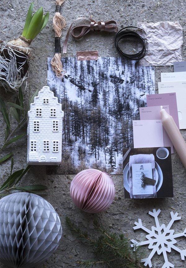 With Christmas just around the corner, I have a winter inspired moodboard to share with you today. For whatever reason this year, I've left Christmas to the very last minute-my shopping is still to be finished and the cupboards are as of yet bare, but I have at least thought about decor for the festive season. As long as it looks good, who needs food, right? Ha! I find that inspiration is more likely to strike when you're short of time or need a quick solution and this is definitely one of those situations.
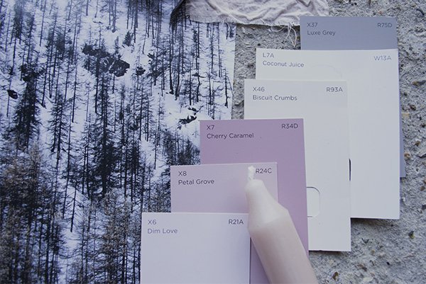
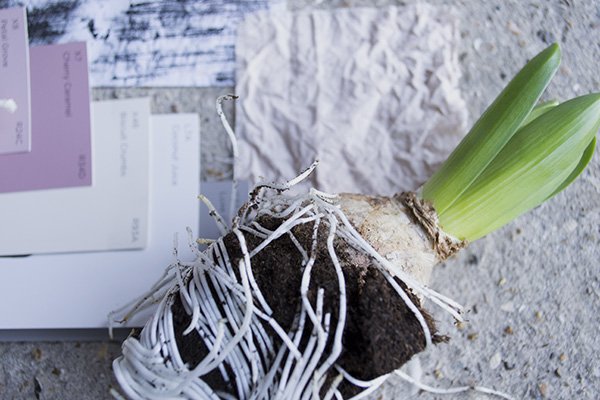
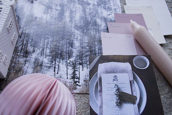 To tie in with our living space I've picked out a muted palette of light grey, soft pink, ivory and white with a smattering of copper to give it some lift. I'm not so much into bright colour these days, so this is a compromise. Still, they have a cool tone to them but still feel warm, don't you think? Hyacinth bulbs also play a part this year as you saw in my cosy and green bedroom, so I've also had it in mind to display some alongside candles in cut glass vases. More on that soon...The tree went up on Sunday and we decorated it with minimal fuss, just lights and a few wood and metal baubles - in fact it was a wise move as Tabitha is very keen on taking off the baubles to play with. I feel like I spend all day telling her "no" and discovering copper stars hidden under things! When I come down in the morning, the first thing I smell now is that fir tree, takes me right back to my childhood, such an evocative scent...Check back on Friday as I have the-most-beautiful DIY garland to share with you. I can't wait for you to see it!So tell me, what are your plans for Christmas this year?
Urban Jungle Bloggers / Cosy & Green Bedroom
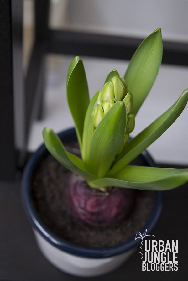 Hey, how's things? Work and home life have been pretty full on lately-I blinked and November was gone, which explains my tardy contribution to last month's Urban Jungle Bloggers topic, 'a cosy and green bedroom'. So today, I'm sharing a corner of our bedroom with you. In fact, I used this post as impetus to give the walls a refresh-they were Magnolia a couple of weeks ago. Just a simple lick of paint has given our room a lift and makes the most of the wonderful light we get throughout the day.
 I was thrilled when I saw that the topic was all about cosying our rooms for winter; this is my favourite time of year for snuggling under favourite blankets, layering up with jumpers and watching the world from a window.
 The wooden wall hooks are a recent DIY that I'll be sharing with you soon and the 'Kiss Kiss' banner looks quite at home there, don't you think?
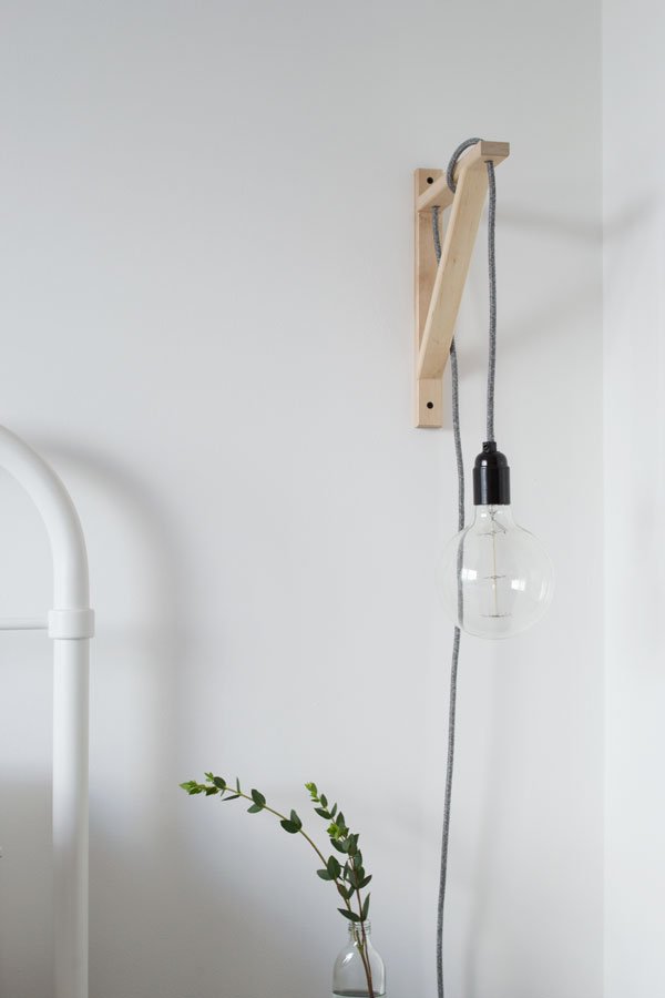
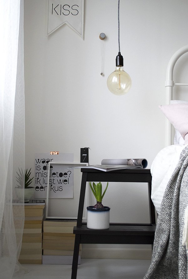 Bulbs have become my newest obsession-both plants and lights! I found the ombre blue rimmed pot in a charity shop for peanuts and love how it looks against that deep purple hyacinth bulb. I'm buying up more this week to put into clear jars-they don't need soil to grow in as they have everything they need inside the bulb. The spiky succulent on top of the books was a recent score from Ikea which sits well inside a soft green glazed terracotta bowl from Serax.The beautiful hanging bedside bulbs were a result of my pure hatred of the insipid ceiling light that we never use anyway, so we sourced the materials and made our own. The fabric cable is aptly named 'Old Grey Jumper'. Could I love it any more?!
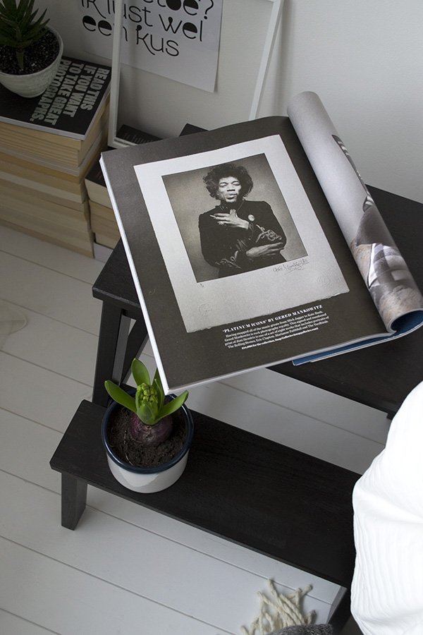
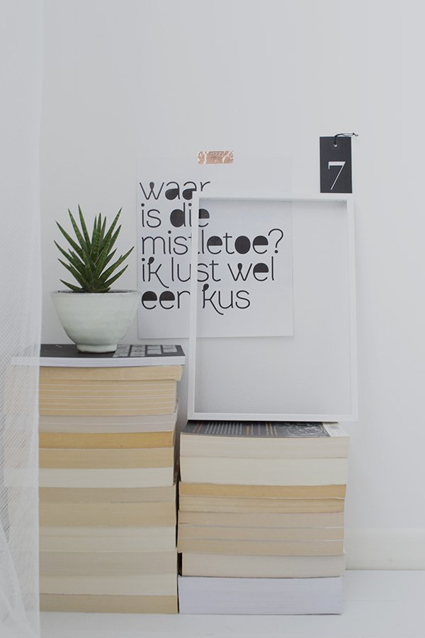 Hope you enjoyed my little tour and keep your eyes peeled on Wednesday when I share Christmas inspiration and how I'll be styling our home for the festive season.Do you have any rituals to ready your bedroom for winter?
Styling & photography © Tiffany Grant-Riley
Two Birthdays, Two Cakes, One Week
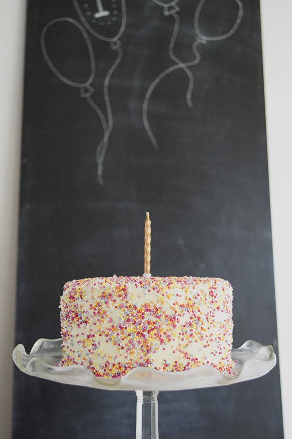 Wow. Is it really almost December now? You know, I've had these photos to share with you since the end of September, but I guess life gets in the way sometimes!
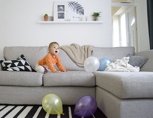 I don't often share much of my home life here, I tend to use Instagram for that on the odd occasion, but I'd had it in mind to share a few photos from my children's birthdays. Although there's almost three years between them, there's only one week separating their celebrations and this year I had my first taste of what it was going to be like for the next...however many years. Let's say it's going be interesting!
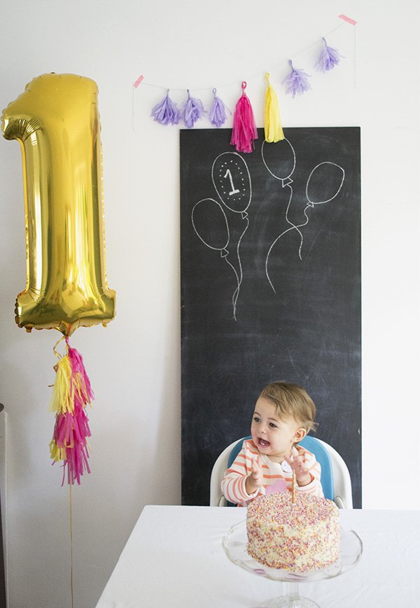 We decided on the no fuss approach this year, so I kept decor to a minimum with small balloons to kick around on the floor. I also made simple tissue paper tassel garlands and attached them to giant number balloons. Yes, they both had to have one, or else there'd be trouble!
 This is Miss Twitchit's first birthday cake, I loved baking the coloured layers, although I think I got more enjoyment out of it than they did! Found a couple of those sprinkles in my ear a few days later too...
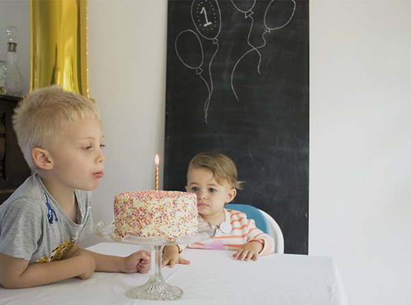
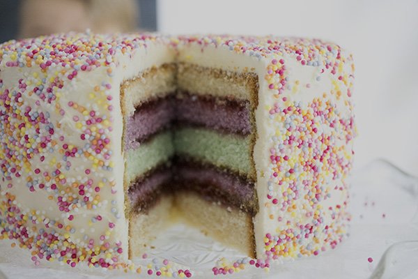
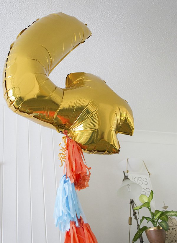
 As requested-a Dolly Mixture cake with chocolate sponge for my grown up boy. Look at him with his crazy hair. I mixed sprinkles into the icing for a little crunch and he absolutely loved it. We all did.Goodness knows what I'll have to pull out of the bag next year. Joint parties will be the ultimate no-no until they're in their late teens, I'm sure. Honestly, what were we thinking?! ;)
PINspired Spaces To Work & Create
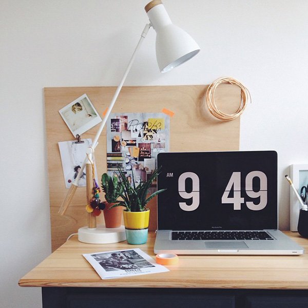
Over the past few months I've been researching and mood boarding ideas for my workspace re-design. Well, I say re-design, there was actually no design to it at all until recently. My 'Studio & Office' Pinterest board has been a fantastic point of reference for me as I've reached each point in my decorative process. From deciding where I should position my desk, how I want the room to function, to shelving, art and styling inspiration, it's been an invaluable tool and one I use on a daily basis.
This room reflects my style which has certainly matured over the years, particularly since I started working as a freelance stylist. You get to experience the work of some incredible designers and architects and want to find ways to bring some of those elements into your own home, or at least I do. Not one to follow trends, rather to create a home that reflects our own personal style as well as function, I'm keen to live in crisp white spaces with touches of black, greenery and natural materials and finishes.
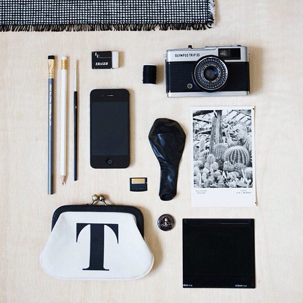
Before I reveal my new workspace to you, I wanted to share some of the imagery and ideas that have inspired me along with tips to create a room that works for you...
Paint It White
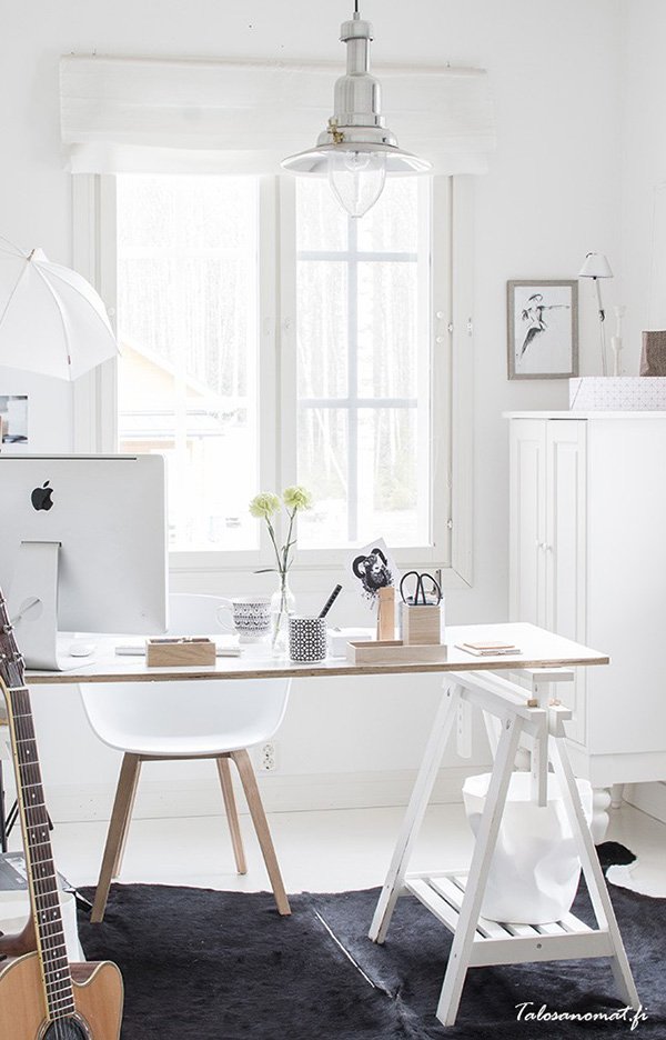 I realise that black and inky blues are fighting back against the swathe of Scandi white walls, but you can't beat a bright, white canvas for clearing your head and kick starting those ideas. Painting out the wishy-washy Magnolia walls was the very first thing I did. Look at this gorgeous space-it's fresh and drenched in light. The walls provide an ideal base for moodboarding or a gallery wall.
Clean & Spacious
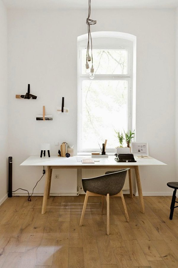
Although we're not all blessed with generous, high ceilings like this room, there are simple methods to keep it looking spacious. I can't work in clutter. Ok, that's a lie. I often do because I'm awful at being tidy, but I can't stand to look at it. By keeping accessories to a minimum and utilising your walls, it encourages you to keep your space in check, and you know what they say; "tidy desk, tidy mind..."
Clever Storage
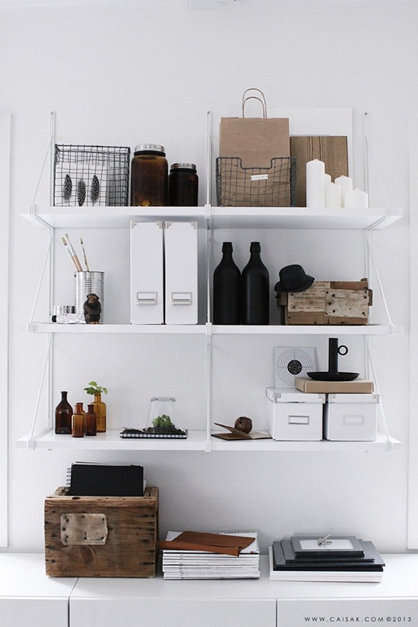
...which brings me onto storage. Do not attempt to buy any storage until you exactly what it is you need. For example, I'm desperate for a set of one of those vintage artist's flat drawers to keep sheets of paper and card in, but A: I have no space for such a thing and B: I don't work with large sheets of paper. Nice idea, but not for me. However, I do need small boxes to store and organise receipts, magazine boxes and plenty of pots for stationery. Use your space for a while until you work out what's missing and take it from there.
Go Au Naturale
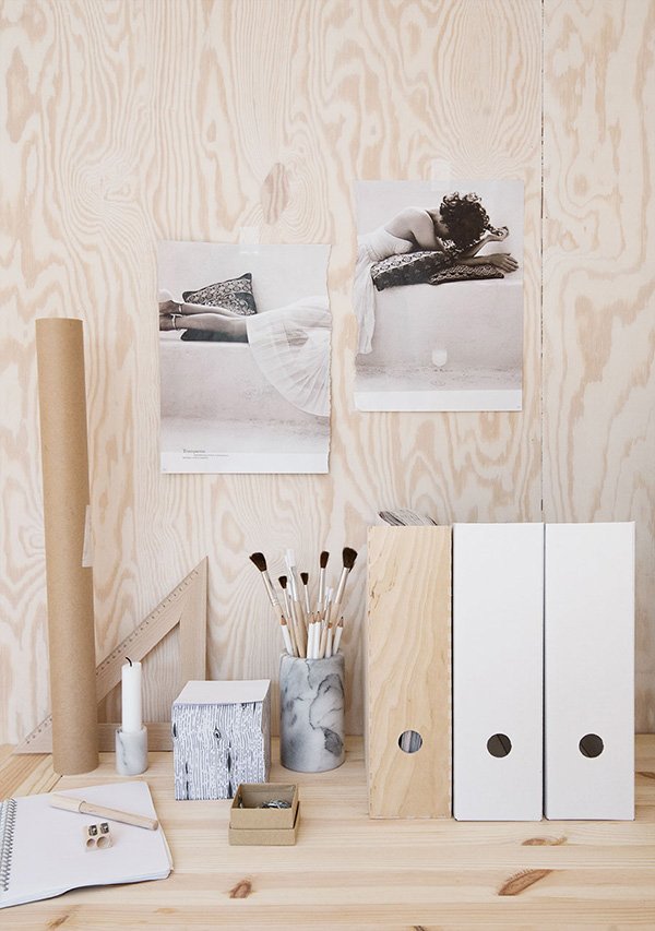
I love using natural materials in my home, the less treatment the better. Plywood is an absolute favourite, any wood with a pale appearance and strong grain running through it. The same goes for ceramics, stone and polished metal. My workspace is full of these elements and they work well in a minimal setting, particularly if, like me, you prefer minimal style.
Hope this post has got those creative cogs turning. Planning an office revamp of your own? Check out my Pinterest boards for plenty of stylish inspiration...
Accessories To Liven Up My Workspace
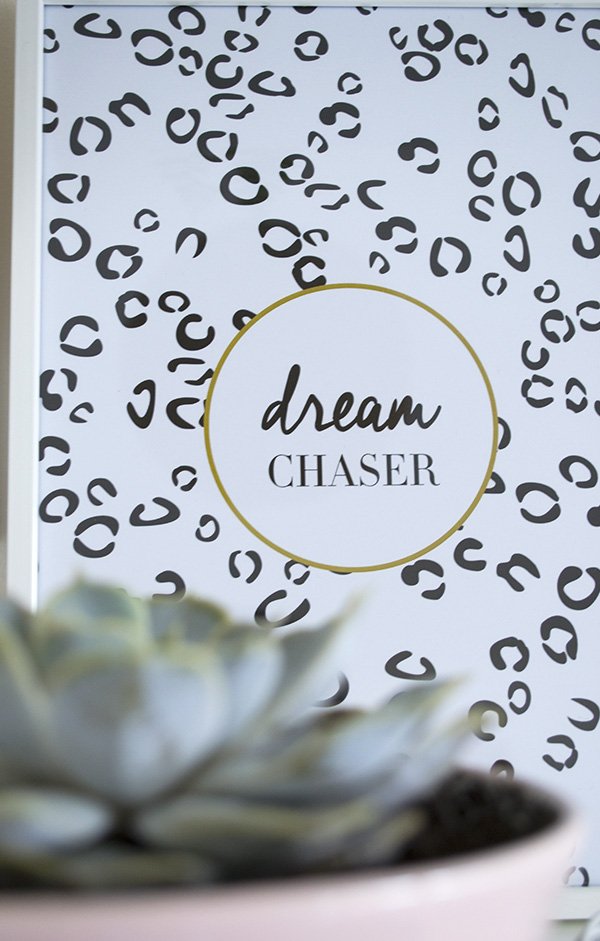 So I've been working away, most of the time very sporadically, on giving my workspace a re-design and new sense of purpose. Very little had changed since I first moved in the furniture 18 months ago and it was becoming a drag to work in. Tired of staring at four bland, utterly uninspiring Magnolia walls (what is it with landlords and that colour?!) I threw down my laptop in a dramatic act of defiance (I didn't really) and vowed to make it the one room in the house I really wanted to spend time in. A place for me.I'm very nearly ready to share it with you now. Last weekend Rob dutifully put up the shelves and I'm spending time slowly rediscovering pieces I already have as well as some of the new to bring the whole look together. Following my recent post, 'Decorating With Plants', and with a healthy population of green friends growing like triffids downstairs, I realised what was missing was the presence of plants to give my workspace a lift-it's pretty boxy and needed some softening. I find the majority of my plants in Homebase-they always have a brilliant selection of succulents (the mini pots are my weakness) and with a few left needing repotting on the kitchen windowsill, I hit the store running. With an impatient one year old in my trolley it had to be a dash and, 30 minutes later, we emerged with a jungle, pots and a few accessories.
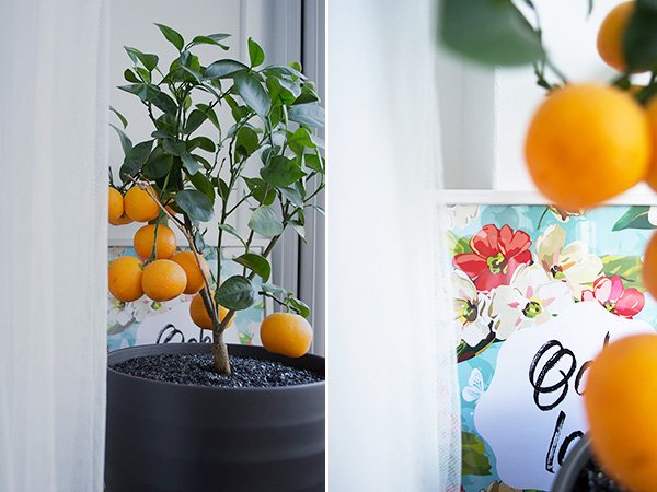 Billie the citrus tree (I name my plants you know) has been desperately seeking a bigger pot of her own since I acquired her in the summer and in her new black pot, her "strange fruit" pop vibrantly against the black. Behind her sits one of my favourite floral graphic prints from my 'Artful Walls' Great.ly boutique, by Becky Lord Designs. Earlier in the year she sent me a beautiful selection for my new space and sitting proudly in sleek, white metal frames, I love their splashes of colour. Just a little bit of 'girly' to soften up the bright white.
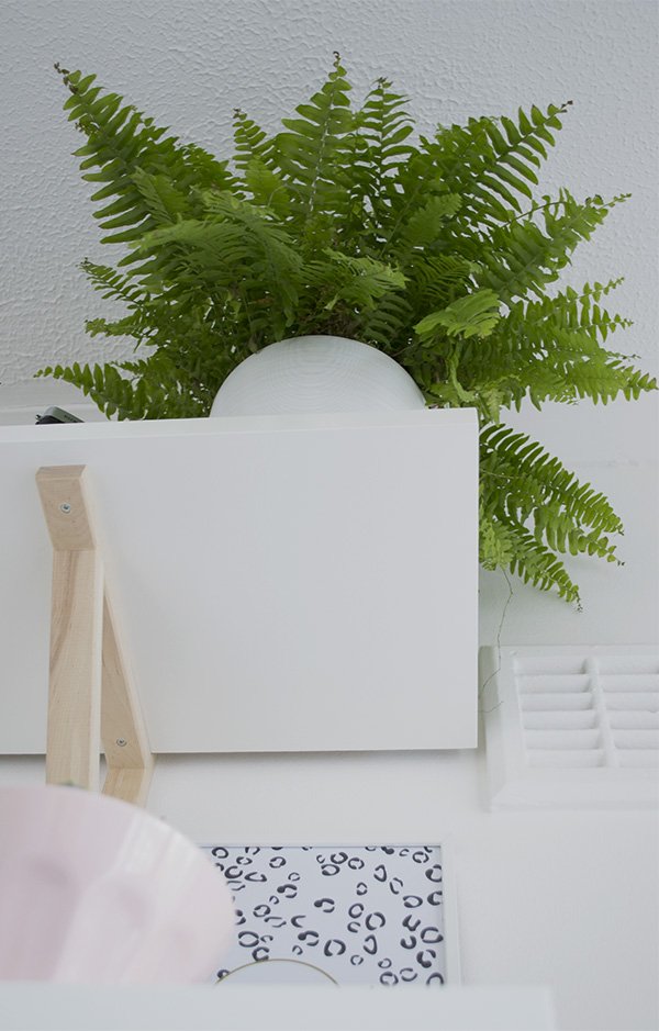 The fern was a compromise, I'd hoped to find something to trail softly over the edges of the shelves, but in the absence of anything I felt its shape would be perfect in drawing the eye up and giving the room a sense of height. I love how it explodes out its white pot.
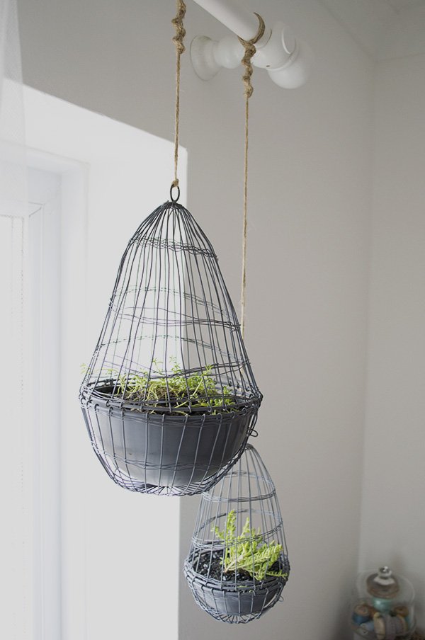 Remember these amazing wire cloches I picked up from my local Oxfam? Well, I thought I'd try planting them with some Sedum which is really an outdoor rockery plant, but I think they'll do well hanging in the window and will start to trail out as they grow. I even managed to macrame the twine at the top, I've not done that since primary school!
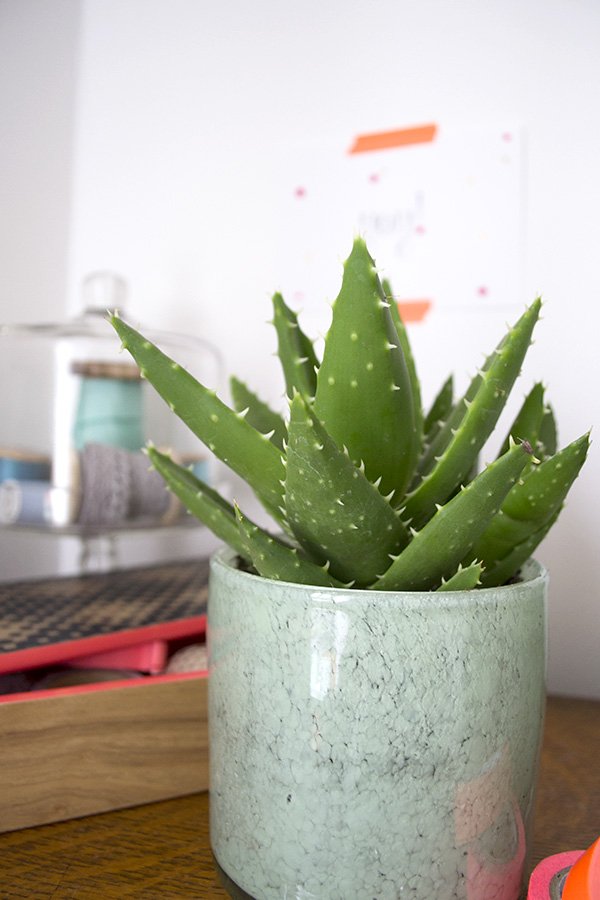
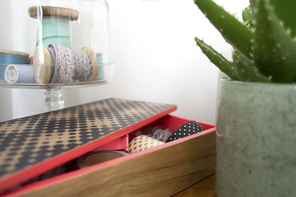
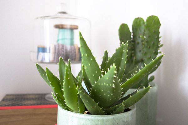 I'm always on the look out for new and interesting way to house my plants; the pots for the cacti are actually candle holders but I couldn't resist the marbled effect of that soft green, handblown glass. Aren't they beautiful? Using coloured glass votives is a great way to tie in with your colour scheme and add a little of the unexpected. The wooden Taoka box with black graphic print and coral inside is a new home for my tapes and trinkets, as most of the decor in here is black and white, I enjoy that vibrant pop of colour.
 Despite taking three months to reach the end of this project, I feel as though I've really accomplished something in this room and over-come the hurdle of renting. I thought I'd be stuck in decor limbo here, but I've changed the things I can, brought in some beautiful decor and the results are amazing. Can't wait for the big reveal!This post is in collaboration with Homebase.
Photography & styling © Tiffany Grant-Riley
Monochrome Scandi Style / Copenhagen Collection
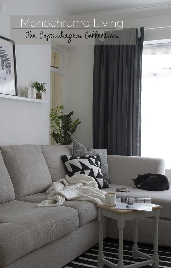 Shut the front door! This is the first time I've properly shared a corner of my home since this blog post last year. You might need to sit down. Are you ready?Our living space has been much neglected in the 18 months we've been renting this house. I started out with the best of intentions, aiming for a clean and fresh monochromatic scheme, it suits this mid-century house so perfectly and would make the most of the beautiful light we get, sitting at the top of a valley. I bought two sets of basic cotton tabbed curtains to cover the giant front window, joined, hemmed and dyed them, painted the walls white and ordered our sofa. Then I got distracted and bought a rug which went completely against the grain, and suddenly I was adding in a mish-mash of cushions which, although they looked great on their own, as a collection, they just didn't work. Completely lost, I went off to focus on my office (more of that to come).
 So when John Lewis got in touch about their new Copenhagen Collection and would I like to try some of the pieces, I jumped on it as a chance to turn our living space around. The collection oozes monochrome Scandi style, focused on texture- natural wood, wool, cool marble and metal, and you don't need to change your entire look to enjoy it either. It's the perfect time for an update, now Autumn is well and truly upon us, and I relish our evenings cuddled up amongst the cushions and blankets. After playing around and editing out a few bits and pieces, it looked like a completely different space and with very minimal effort. Even Rob was enthusiastic about my choice of cushions, which is highly unusual for him and said it suddenly looked very homely. I win.
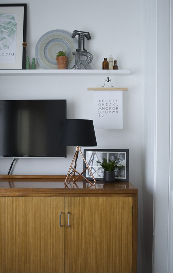
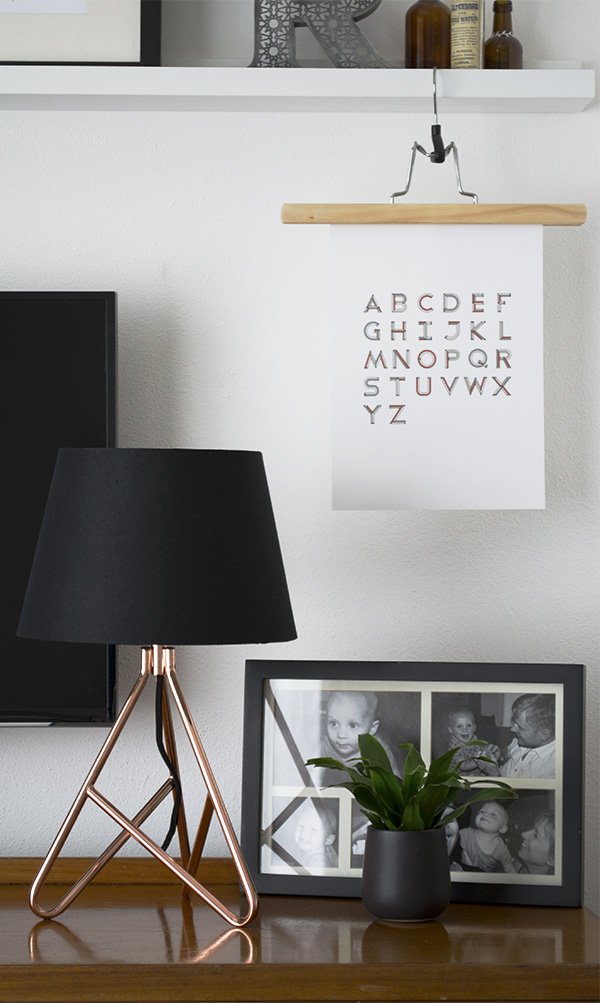 I'm not a fan of televisions, in fact, if we didn't have children, I'd scrap it all together, but for now we're stuck with it, so I'm always looking for ways to blend it in a little more. I love the shape of this copper based Albus Twisted Table Lamp with black shade, I've teamed it up with a black framed photo, typographic print designed by my brother and a botanical print on the shelf above to draw attention away from the TV. The little birds nest fern sits in a hand thrown black pot from Tunisia. I'm addicted to buying plants.
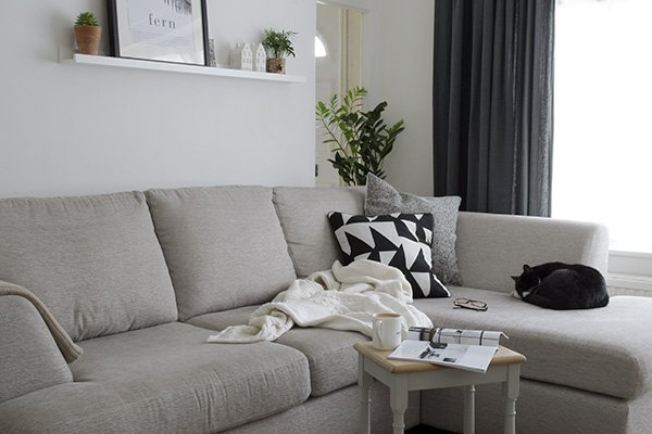
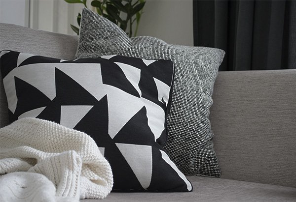 Our sofa is looking a little on the sparse side now I've taken the away the offending cushions, but the Chevron and Copenhagen designs have given it a much stronger look. I brought the knitted cotton blanket, originally meant to be a large bedspread, out of storage. It was knitted by my mum who abandoned it years ago and left it gathering dust on a shelf in her living room, so I rescued it. Looks so at home there, don't you think? This corner of the sofa becomes Reuben's during the day when he's a little sleepy after nursery and he loves to snuggle up under the blanket with a warm milk.
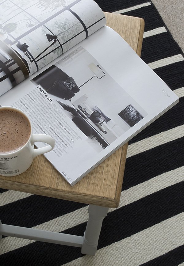 My favourite piece of all has to be the bold striped, hand woven Listrado rug. I used this as my "jumping off point" and built on that. Our carpets are horrendous and 'Mr Malawi' (our landlord) refuses to replace them, despite the balding underlay, frayed spots and the occasional screw hiding underneath (I kid you not) so rugs are my go-to piece to give the floors a lift and zone the important areas. The little table is one of three that Rob picked up years ago in a charity shop. They didn't look anything like that when he bought them, but they've been given a new lease of life as a recent DIY project and I can now look at them again. I'll be sharing that with you in a short while, keep those eyes peeled.
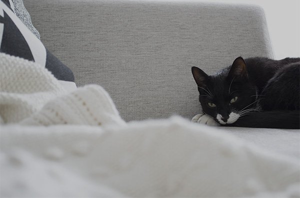
 The next step will be to warm up the look with some soft pink cushions, a colour that gels really well with Winter Scandi style, a few more copper accessories, maybe even add in some sequins, because I love a little sparkle.So what do you think of monochrome Scandi style? Mosey loves it, don't you?
*This is a collaborative post.
Charity Treasure / Scandi Style Circus Stool
So, Sunday afternoon I was knee deep in a gift finding mission for Reuben's pre-school teachers on the high street in Rochester and pulling nothing but blanks. As the daughter of a teacher myself, I'm all too familiar with the usual suspects that come home at the end of the academic year-smellies and chocolates, most of which we were more than happy to "share" with mum. But I didn't want to plump for the obvious, because, you know, I love to make work for myself, don't I? In my usual fashion I'd found umpteen things I'd like for myself, but what do you buy for someone you talk to almost every day and know so little about? So for a while, I gave up and went to rummage for props instead, because Rochester has a rich and abundant supply of antique and charity shops. Props are important you know.As we're steaming on ahead with operation "make this rental feel like ours", Reuben's bedroom is next on my list of attack. Having had yet again no response from our landlord 'Mr Malawi' as I call him (because he lives out there and the only form of communication is by mule to the local general store by fax) I've decided just to crack on and do it. I'm taking the walls from magnolia to white, it's hardly a big deal. Right? And in any case, this poor house is in desperate need of an update. And no, I won't be returning the walls back to magnolia when we leave. This isn't 1995. I digress.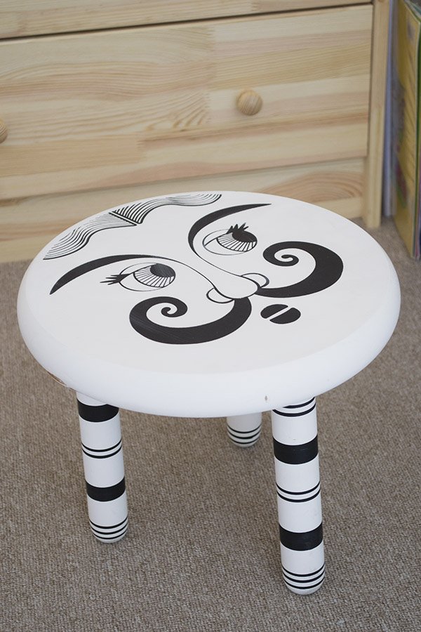 Walking past Oxfam, this little black and white stool sitting in the window caught my eye. Stripy legs with a scandi style, the face of a circus ringmaster...*sharp intake of breath* it was perfect for Reuben's room! Ten minutes later and £10 lighter I'd walked out with it and a very smug grin on my face. It'll need a little work doing, as you can see the wood has split a little at the side, but a little filler will sort that no problem. Isn't it utterly brilliant?!
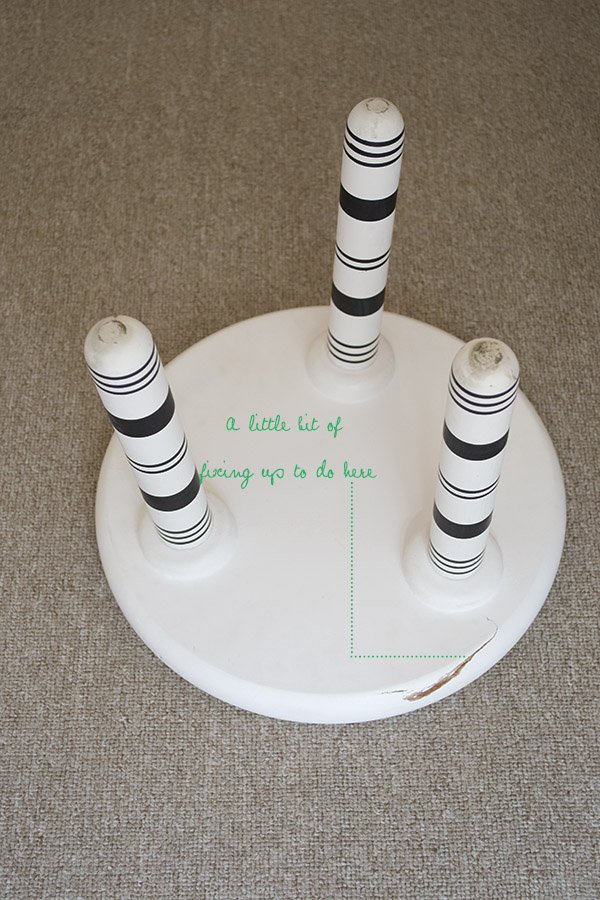
 Next week I'm cracking open the tin of paint, dragging out the dust sheets and getting stuck in. Can't wait to show you the progress! Isn't it always the way though, that when you're not looking for something it has a way of just landing in your lap!?
Dining Chairs / Matching VS. Mismatched
It's been full steam ahead with our plans to get the living space whipped into shape, and we have two sleek, gorgeous dining chairs to tie in with the 'Modern Botanicals' look we're working towards. After eight years of enduring clawing, scratching (any cat owners will know what I'm talking about), being stood on and turned into dens in the later years, we got to say goodbye to the high-backed rattans which served us so well. They had a good innings, but having to look at them every day covered in Playdoh and falling apart, I couldn't bear to look at them anymore. So here are my new babies. These are the Sigurd chairs from Ikea and boy are they comfortable. Hello back support! We set out looking for a style with arm rests but realised when we got to the store that they most likely wouldn't tuck under the table-no good when you need the space. Instead, we found these in white but eventually plumped for the black. I'm not going to show them with the table until the revamp is complete, so in the meantime I threw something together to give you an idea. What do you think?
 Now we're trying to decide whether to get another 2 to 4 in the same style, or buy a couple of vintage models and paint them (I liked the idea of having the odd one in Hemlock green) so we have a more mismatched aesthetic. I can't decide just yet. Whilst I think having the uniformity of matching chairs holds better with time, I do love the relaxed feel of a mis-matched set.
 Or do we buy a couple of old chairs and paint them all up black, so we're not too matchy-matchy but at least staying in keeping with the colour? How about the same chair in white? So many options...
 What are your thoughts? Do you have a mis-matched set that you love? Or perhaps you prefer a little more order?
DIY Scandi-Style Kids Bedding


 Cut your blocks of wood to size according to your stamp and trace the shape of each template roughly centre of each block to act as a guide when you're printing. Glue your templates (cross facing the right way up) to the centre of the other side of each block and you're ready to go.Step Three


A Small Office Tour - Just A Little Corner

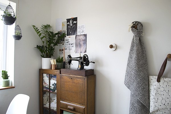
 I discovered this beautiful old bureau in our local charity shop a few years ago and, although it was partly my sewing cupboard, it was also needed to store some very ugly DVDs for some time, so being able to lovingly display all my fabrics, linens and sewing paraphernalia is just really exciting. I'm rediscovering things I forgot I had be it from past shoots, projects or events and I treasure them even more now.


