Grand Designs Live 2014 / My Top Picks For Interiors
Hello you! How was your weekend? Mine was a strange mixture of glorious, child-free design indulgence and chickenpox-my 7 month old is currently covered in spots, poor sausage.On Saturday I took Rob with me to the penultimate day of Grand Designs Live courtesy of John Lewis, to celebrate their 150th birthday. The store were launching their new range of large appliances at the show and I wished I had space for one of them, especially after exploring them first hand in their kitchens stand.Today I thought I'd share with you some of the interior style that caught my eye and my pick of the "ones to watch". There were some real gems too. I loved the room sets, one of which I've shared on the Facebook page as there just wasn't room here, but I've picked out my stand-outs and think you'll love them too...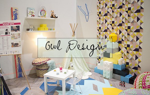
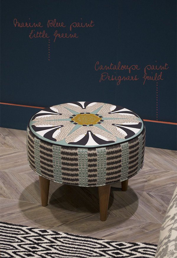
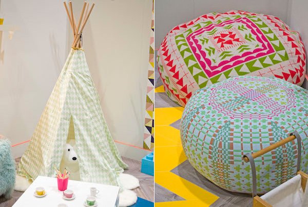 I absolutely loved the idea interior design duo Owl Design introduced into their room sets to use paint piping just above the skirting board. As seen in both sets, the splash of neon added a playful element in the kids room and really lifted the rich and decadent marine blue in the living room with that gorgeous cantaloupe orange. The kids room took inspiration from modern scandinavian style with fresh white walls and bright, zingy colour. The Lego storage bricks were a brilliant idea! We also decided that we needed to invest in a Donna Wilson Frank Pouffe-the sofa just isn't enough for us!I wish I'd taken better shots of the living space they'd styled-the colour story was a beautiful deep blue with clean wooden flooring and copper accessories, but the light wasn't the easiest to get right. I've not been able to stop thinking about that stunning Badger footstool by Orwell and Goode either. Seriously.
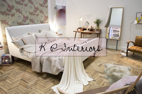
 The reclaimed oak parque flooring had me glued to this bedroom set by K P Interiors-isn't it stunning? What I wouldn't give for a real parque floor. The whole feel of this space was serene and calm and modern-vintage in style. Warm woods connect the look, from the flooring to the Ercol Treviso Desk and Loveseat (out of shot).
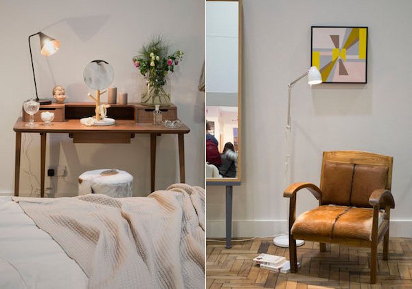 Our stars of the show were design collective Joined+Jointed. This collective of established and emerging designer makers were brought together by furniture designer Samuel Chan, who I had the pleasure to meet in person.
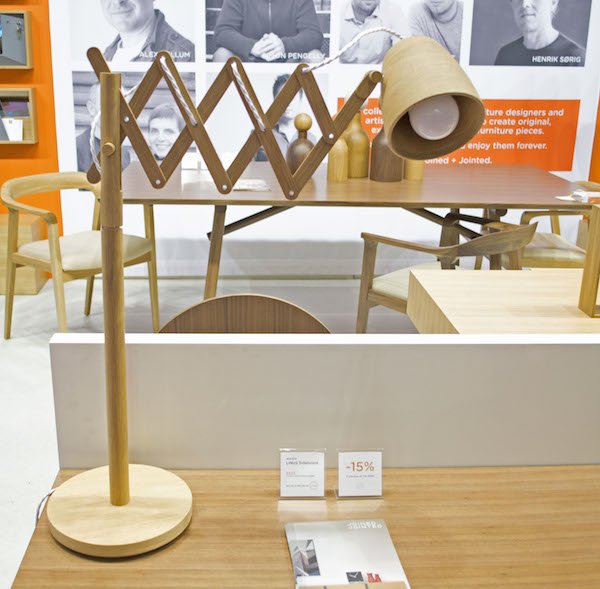
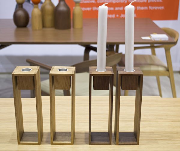
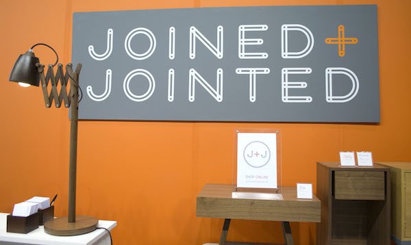 With a keen eye for clean lines and simplistic, functional yet completely beautiful design, Joined+Jointed showcased a stunning collection of pieces where the wood was left to shine through. I loved the smooth, tactile feel of the Willow Chair by Sean Yoo, which I'm told his unique design is that the chair back will never hit the wall when you push the legs back to it. Clever, no? My favourite piece, however was this beautiful accordian desk lamp which was also available as a floor lamp. Just exquisite and I'm desperate to have one on my desk!
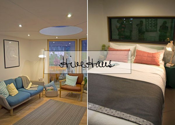 Did you see the incredible HiveHaus modular living space on George Clarke's Amazing Spaces? It blew me away. How excited I was, then, to see it standing there- I couldn't wait to get inside. A living space made from interconnecting hexagonal pods, they are custom designed to suit your needs in a sustainable and affordable way. Had I land to build on I think I'd choose one of these. A definite highlight for me and the bespoke pull-out kitchen was to die for. Unfortunately, I couldn't get a good shot of it as it was always full of people!
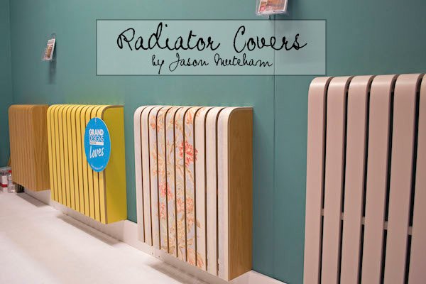 As my last top pick of the day, I'm lusting after the humble radiator cover. I think that designer/maker Jason Muteham may actually be a genius. How do we not all have these in our homes? Finally-a stylish alternative to the DIY store lattice model. Look at these beauties! Hand crafted by Jason they come painted, laminated, fabric covered or in timber. I think they're a feature in themselves, don't you?So what do you think of my favourites? Did you make it to the show too? What stood out for you? I'd love to hear your thoughts...And thanks again to John Lewis for treating us and a very happy 150th birthday to you!
Plans For Our Living Space - Modern Botanicals
They say you when you first move in to a space the biggest mistake you can make is to rush into decorating it. You should give yourself the time to live in it, get to know how the light changes throughout the day, what works for you, what doesn't. In the beginning when we moved in here, I was very set on what I wanted to do with the space and, at the time, it all revolved around white, grey and copper. I wanted a dark grey on the chimney breast (yes, the one with the dodgy "retro" gas fire) grey curtains and a grey sofa. For months I trawlled the DIY stores to hunt down the perfect shade of grey to coat the wall with, painting large sheets of paper, taping them up for a week at a time and "umming" and "ahhing" over each one. But then I couldn't find the right shade at all, in fact, all they seemed to do was draw the room in and suck in all the beautiful light we get here, and I realised that I was forcing the room into being something it wasn't.So I tried another tack, stopped over-thinking it and just let it be. For months. And instead of getting caught up in all the trends, some of which I'd rather forget (I mean you, "Radiant Orchid"!) I sat back and let the room come together on its own. Looking at what we already had and noticing a pattern in what I like to buy, I picked my most recent purchases of two beautiful ombre green rattan baskets as my "jumping off point". This past week as I've been working on Project Indoor Jungle the room is suddenly coming alive and I can finally see a coherent style emerging. Modern botanicals.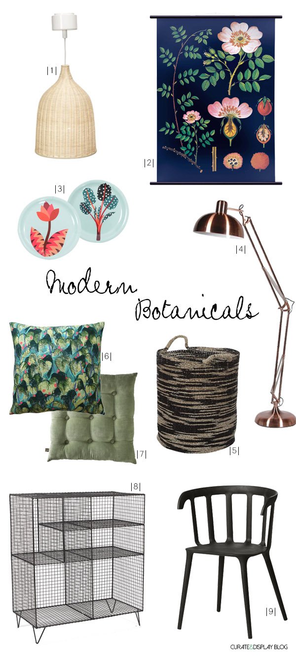
|1| Leran rattan pendant lamp | Ikea |2| Dog rose wall chart | Wallography |3| Heal's 1810 Herbarium coasters | Heals |4| Poppy angled floor lamp | NOTHS |5| Large woven basket | TK Maxx |6| Scarlet Green cushion | Imogen Heath |7| Buttoned velvet box cushion | Cox & Cox |8| Low wire storage unit | Loaf |9| Black chair with armrests | Ikea
I picked out a couple of looks that I love and working from my Plants & Botanicals Pinterest board and from those selected 9 key pieces to tie the look together. Keeping our white walls as a base with tones of grey to tie in our curtains and sofa, I'm bringing in a little more green in soft furnishings and possible in painting a couple of our wooden dining chairs a soft green. The matt black gives the look a more contemporary feel as the house is Mid-Century and I wanted to update our existing vintage dining table with the addition of the black chairs to compliment the green-what do you think to that?I'm desperate to own an original Jung Koch Quentell botanical chart, but being a little on the pricey side, Wallography have a beautiful alternative and I love the pink of that dog rose against the black background. It's so striking!The coasters were a discovery I made last week during my two day visit at Heal's (more on that next week!) As part of their new 1810 fabric collection-the first since they stopped producing a range in the 1970s, these gorgeous coasters are taken from the Hvass & Hannibal Herbarium collection. To die for.I think by now you know I'm a complete basket case, I need to have a lot of baskets in this house. Have you seen Marvin, my new rubber plant? He's in desperate need of repotting, so I thought when I've done that he'd look amazing in this black woven rattan basket to compliment my green ones.Last but not least. Storage. Given that my little urban jungle is growing by the week and reluctant to put up too much shelving to display them, something like this gorgeous wire shelving unit would be perfect for them. Maybe adding in my favourite cook books on one of the bottom and middle shelves would break them up a bit and make it easier for me to have them closer to hand-they currently live upstairs in the spare room.So there we have it-a much easier way to tie in an 'almost there' look and with minimal effort. It's light, fresh and satisfies my craving for green and print. I won't have to paint out that chimney breast when we move again either!What do you think? Are botanicals still floating your boat? I'd love to hear your thoughts!.
NEW! Butterscotch & Beesting Cushions To Covet!
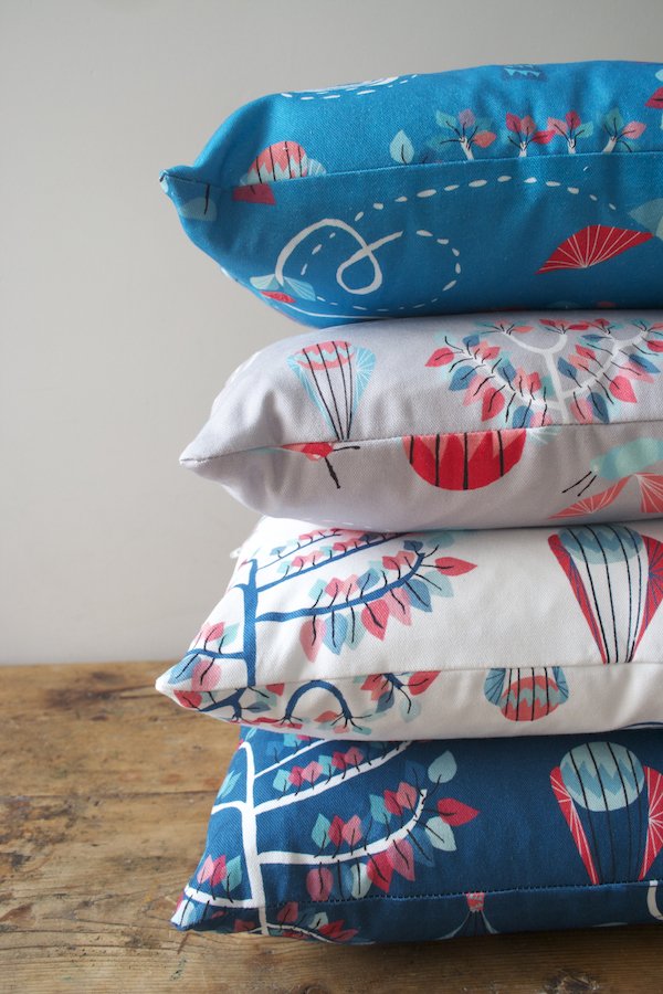
Back in October an email landed in my inbox from designer Camilla Westergaard of Butterscotch & Beesting which said she'd been secretly beavering away on a new print and would I be interested in featuring it when it was ready. It was a bee-centric design in her signature circus style and she was really excited about it. How could I not?!Camilla has such an imaginative, playful style which comes to life in her prints and fabrics. Inspired by children's illustrations and with a love for storytelling, she has created the whimsical world of Butterscotch & Beesting for her own mischevious characters, Mr Bumblewick Beesting and Miss Betty Butterscotch. This dashing ringmaster and former trapeze artist turned confectioner (Miss Betty doesn't have a head for heights apparently) will bring the magic of their circus antics into children's bedrooms everywhere if you let them.So I waited oh so very patiently (which is quite uncharacteristic for me) until just this week they appeared as a lovely surprise! Feast your eyes on these utterly delightful Bumble Bee Balloon cushions. As with all of Camilla's designs, these too come with a sweet little story..."I wanted to create a print that told the stories of the bees who steer the Butterscotch & Beesting Circus on its travels. The bees fly around the fabric, and you follow their path in the trail of the turning ferris wheel, the stem of the flower, and the root of the tree. There's a slight Fifties' influence to it I guess, particularly in the geometrics that make up the ferris wheel, and the clean lines. When I designed the pattern, I imagined it covering an Ercol sofa or daybed, and I'd still love to see it like that, with the bees spreading their wings."
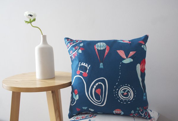
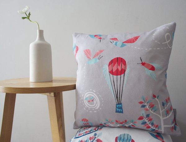
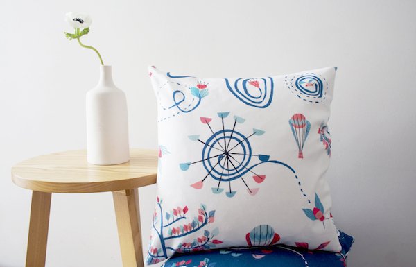 Every cushion is printed in Britain on cotton and lovingly stitched by Camilla's own fair hands. If you love a circus motif with a mid-century meets Scandinavian twist then I urge you to visit Butterscotch & Beesting. Thank you Camilla!
A Bloomin' Beautiful Workshop At West Elm!
I'm taking more of a less-chat-more-visual tact today seeing as it's Friday and I wanted to share with you some snaps from my drop-in workshop I held at West Elm London a couple of weekends ago. With a hectic week in the run up spent cutting templates, petals and stamens I thought I might actually drown under a mountain of crepe, but I couldn't wait to see what my "students" would pull out of the bag...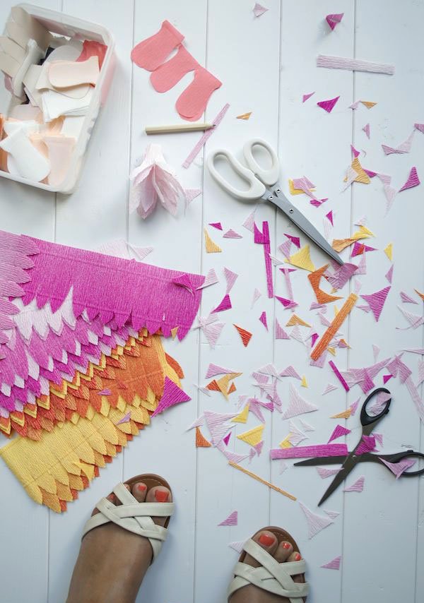 Armed with my kit full of beautiful paper and all the necessary accoutrements I spent a relaxed day teaching a fantastic group of mostly women (bar Hugh the barista who was rather gifted with his paper skills) the basics of crafting and creating flowers. We worked with a stock of sculptural florist's crepe and the slightly more delicate doublette paper which gives a beautiful, real look. Excuse the photos-they're all straight off my iPhone with no editing but the bright lighting in the store made the colours pop, and I liked that!
 So, with a cup of coffee in hand, we set to work stretching, twisting, binding, fringing and cupping our papers, working them to life in an explosion of gorgeous colour. You could also paint your petals or add in a smattering of glitter...
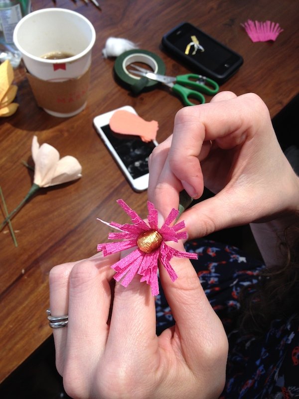
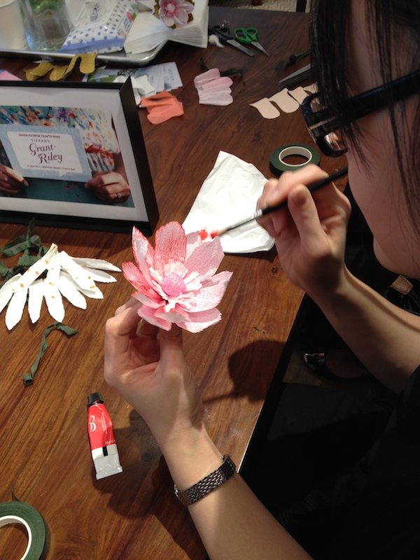 Even the most timid of participants found their confidence and, with a little practice had the basics down in no time and everyone went home with something they'd made themselves. I hope they were inspired to go out and make some of their own later on too!
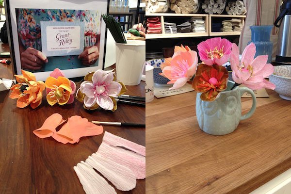
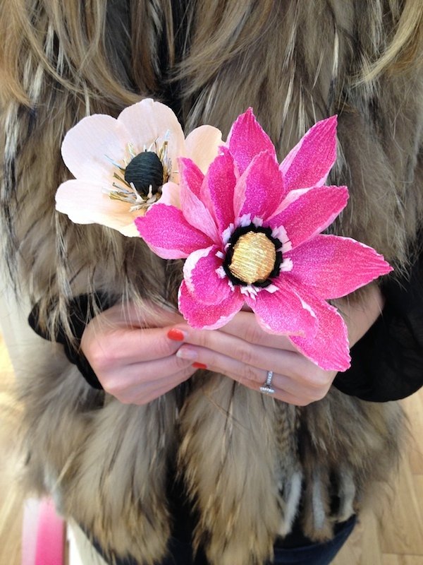
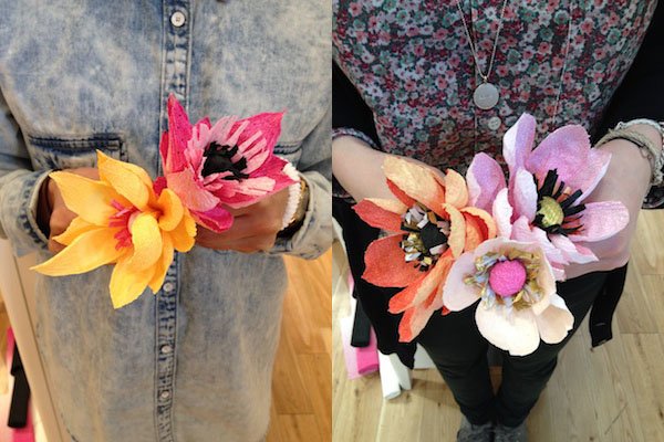
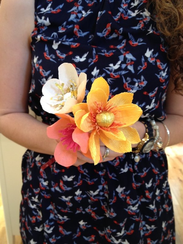
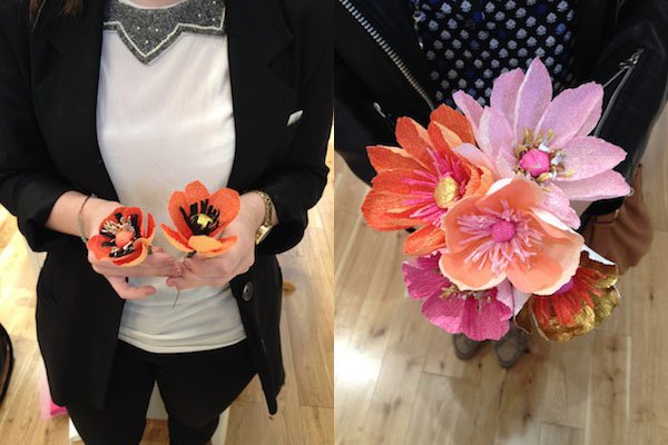
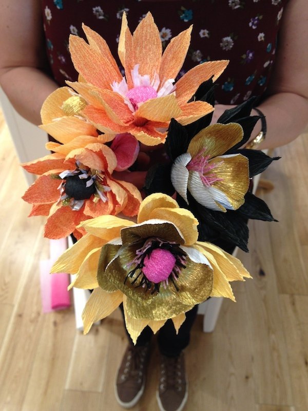 Thank you to everyone who took the time to learn something new and show their support, especially Jeska Herne at Lobster & Swan (and my star pupil, her good friend Judith!) Julieta Lucca, a few very good friends and...my mum who came to surprise me-see what she made in the photo above.Oh, and the team at West Elm of course-you are the perfect hosts, as always!I'm thinking of running another one a little later in the year-I have plenty of left over paper! Do you think you'd like to come along if I did?.
Leaf & June / 8 Houseplants For Every Home
I can't wait to introduce you to a new friend and talk plants today, but first I need to be honest about something. These past few months since Tabby was born, I'd fallen into a horrible funk about our house. I say "our house", it's not actually ours because we're renting it and, having owned a home, had the sale of "the house" we were buying fall through and taking a last minute rental just so we could catch our breath took some getting used to. We're still adjusting to it. Last week I had myself a little pity party and wrote this horribly draining post about how much I hated living in this house because I wasn't allowed to fall in love with it-it's not mine, so how could I? Then last week we sat down together, Rob and I, and made plans for our next move. It felt good to reboot and realign and the following morning I woke up feeling slightly more optimistic. I deleted that post and decided to carry on as before-hanging the curtains, painting the walls and making it feel like home for as long as we're here. And it felt good to have made that decision. Sure, my home isn't a show room, it's not catalogue ready packed with design classics, but it's real and human.And so part of my plan is to introduce an abundance of indoor planting. The one thing I love about my mum's house is the sheer number of plants she has, everywhere. In fact, I'm here now in her living room and as I type I can see seven in this one space. I want that for my home too and if you're renting it's one of the easiest ways to bring in some life and personality without committing to anything more permanent. Question is, where on earth do I start in choosing the right plant for the right space?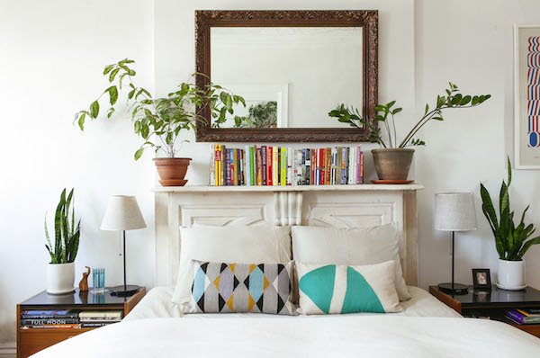 Enter Brooklyn based horticulturalist and plant designer Lisa Muñoz of Leaf and June. She is awesome. Born and raised in San Antonio, Texas, she grew up alongside her green fingered grandparents who cultivated her passion for gardening, producing fruit and vegetables in their backyard. They nicknamed her 'Leaf', a name which she combined with her grandmother's (June) to create the name for her newest business venture.
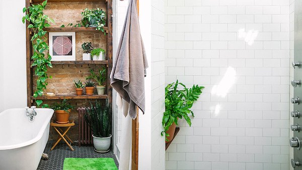
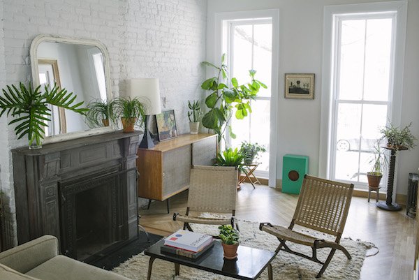 With a background in Animation and Visual Effects and producing commercials for the likes of Google and MoMa, you can see how beautifully her talent for the visual translates into her design portfolio. She has worked for Sprout Home and as Director of Horticulture for The Sill helping New Yorkers find and fall in love with their perfect houseplant before moving on to launch Leaf and June, designing for residential and commercial spaces as well as editorial and events.
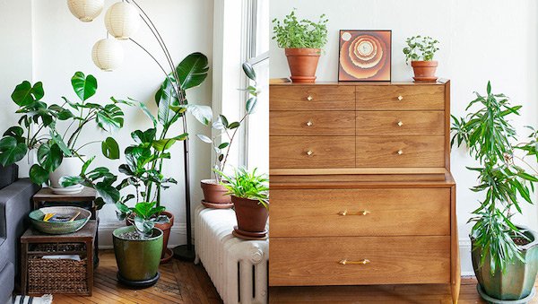
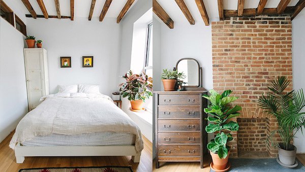 Isn't her style utterly gorgeous? Luscious green everywhere! I'm told she has over 50 plants in her apartment, too, which she names after 70s soul singers. A girl after my own heart. And because she's so amazing, Lisa's put together a selection of plants for us that thrive in great light, and plants more at home in a shady environment-the aim of which is to encourage you to introduce botanicals into your own space and to do it successfully.
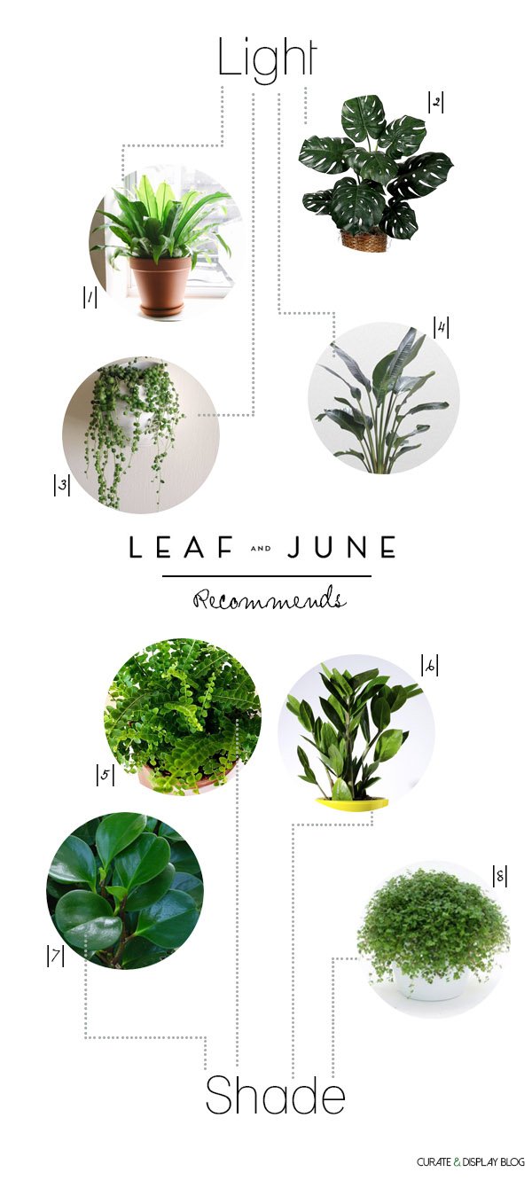
|1| Bird's Nest Fern (Asplenium indues) |2| Swiss Cheese Plant (Monstera deliciosa*) |3| String of Pearls (Senecio rowleyanus) |4| White Bird of Paradise (Strelitzia reginae) |5| Button Fern (Pellaea rotundifolia) |6| ZZ (Zamioculcas zamifolia) |7| Baby Rubber (Peperomia obtusifolia) |8| Baby's Tears (Soleirolia)
* This plant is toxic
Lisa has also designed a plant plan for our living space according to what we already have successfully growing and what will flourish elsewhere (she loved my monstera which also happens to be her favourite plant) so I'm going to spend a little time sourcing and planting before I share the reveal with you in a few weeks. I'm really excited to see and feel the room soften and come to life and hope that it inspires you to do the same.
Have you been inspired by Lisa's work? Follow her here for more beautiful botanicals...
Follow Leaf and JunePinterestTwitterFacebookInstagramAll photography © Erica Gannett.
DIY Easter Party Favours / The Outtakes
The past two weeks have been insane, in only the best way. For a couple of months now I've been working hard on a collaboration with West Elm and their London team and, in my usual "I need to prove something to myself" style (what is it with that??) I didn't do any of it by halves. I held my paper flower workshop in store at the weekend-more on that next week, my styled table in the "loft" has been sparkling like a beauty all week and last Wednesday my DIY Easter party favours post went live on Front+Main. I'm still getting over the buzz from all the amazing feedback on Instagram, Pinterest and Twitter-thank you if you spoke out and loved it.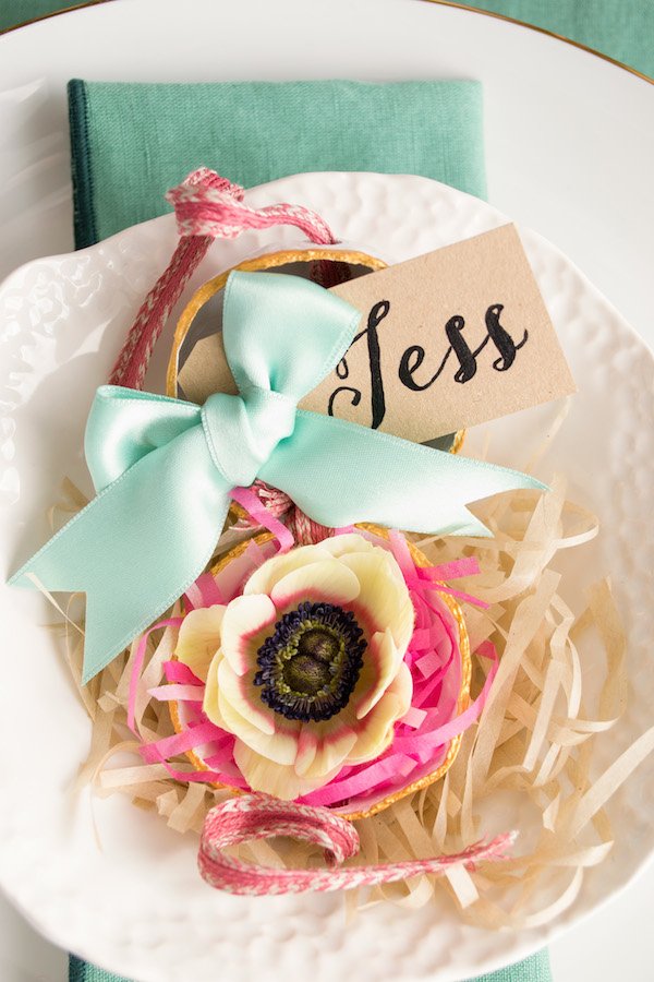 I came up with the design, perfected the DIY and shot and edited it myself. I don't think I could've predicted how well received it was going to be and I'm all the more proud of myself because, just two weeks before I took the final shots, I'd never used a DSLR before. Yep, never. I bought my Nikon D3100 in February as I felt that it was time to graduate from my iPhone, which is still my camera of choice when I'm out and about, but when it came to shooting styled pieces, it was coming up too short for my liking. I'm most definitely a run before walk kind of person when it comes to learning (I think that's why it took me so long to learn to drive!) and I get really frustrated when something doesn't work first time, but this time I was prepared to sit and read the boring manual, hunt for the best online tutorials and experiment. It paid off. I am a living testament to anyone that thinks learning something new is impossible-I got manual mode nailed in just a few days and look what I did! When you're under to pressure and you have no choice but to do something it-you will do it.So I really wanted to share the remaining shots that didn't get used for the post because, if I do say so myself, I think they're really beautiful. For example-this shot of my sister. She hates having her photo taken, so I told her I was only going to shoot her hands and torso and focus on the little pod. Then I pulled back a bit, focused on her face and got her looking quite relaxed. She'll probably hate me for this now!
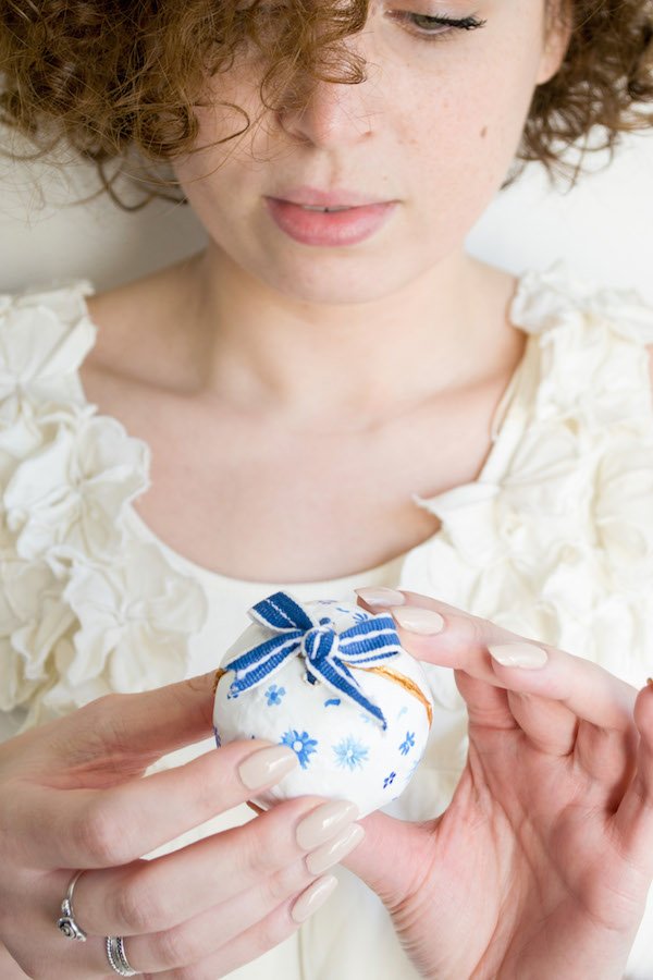 I took my inspiration for the floral motifs on the pods from Rifle Paper Co and Leslie Shewring-I could fawn over those designs all day long. Sweet, delicate and bursting with spring, don't you think? After a hectic day with Reuben and Tabby it was a real treat to sit down for a couple of evenings and get some ideas down in paint, I don't use my acrylics enough.
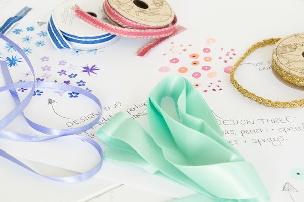
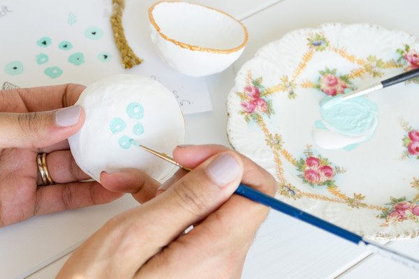 I got pretty handy setting up the shots and working with the timer given that my hands had to be in most of the frames to show the action. Took a little practice but I'm a pro now!
 That beautiful blue/green cotton napkin against the gold flatware. Oh my. It just works, doesn't it? And I was thrilled to find anemones in such excellent condition- I didn't have time to order them in through my florist so I did a run to M&S and was pleasantly surprised. Sometimes you buy them closed and can see the petals are bruised or browning around the edges, but these were immaculate and allowed me a good two days to work with them fresh.
 As a contrast to the soft tones of the irises and parrot tulips, I wanted to add in a pop of colour so I deconstructed a bouquet which had that beautiful protea flower inside, the vivid green leaves and hot pink Metalasia Muricata which dyed the water pink!
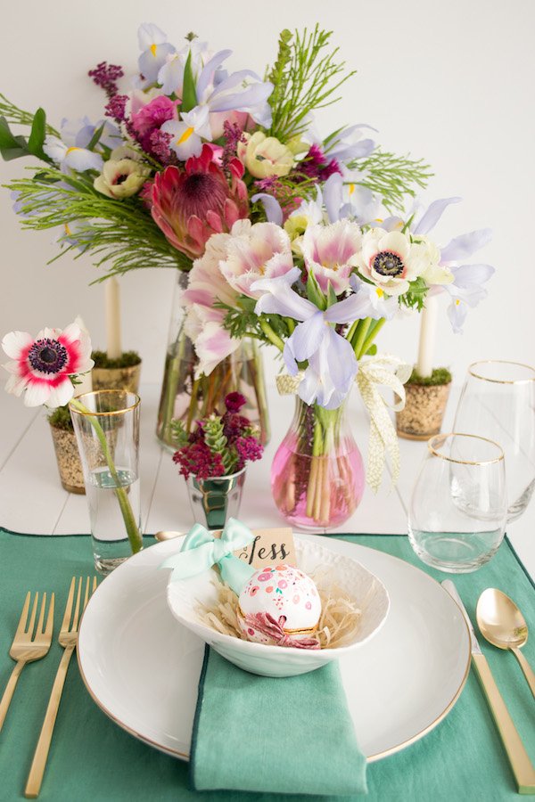 Do you love it? If you fancy having a go for yourself, you can find the tutorial here on Front+Main and most of the pieces I've styled the table with can be found online.Thanks again to West Elm for having me, and to the UK marketing manager Jess for bringing me onboard in the first place.I'll be back after the weekend with more about last weekend's workshop, how to choose the best indoor plants for your home with a special guest and more. Have a beautiful Easter!.
A Splash Of Spring With HEMA
I got some freakin' fantastic news from my friend in Holland last week. Get this-HEMA are opening two stores in London. Two stores!!!! Although I'm still unsure of an exact launch date, word on the street is they're planning to open 8 but test out the market here in the UK first with one based in Kingston and another in the Victoria area. Am I excited much? Yes, yes and yes, because now I can bring me home some Dutch style without having to lug it back in a suitcase!If you've ever been to Holland or Germany, then chances are you'll have come across HEMA on your shopping travels. Full of european style and a cross between Ikea and Wilkinsons (that's a British brand for my non UK readers) they offer home ware, fashion, crafts and food at affordable prices-they're a value brand but they're by no means cheap, if you know what I mean.To celebrate the news, I've done a little online shopping and picked out my HEMA spring favourites for quick and easy ideas for a home refresh.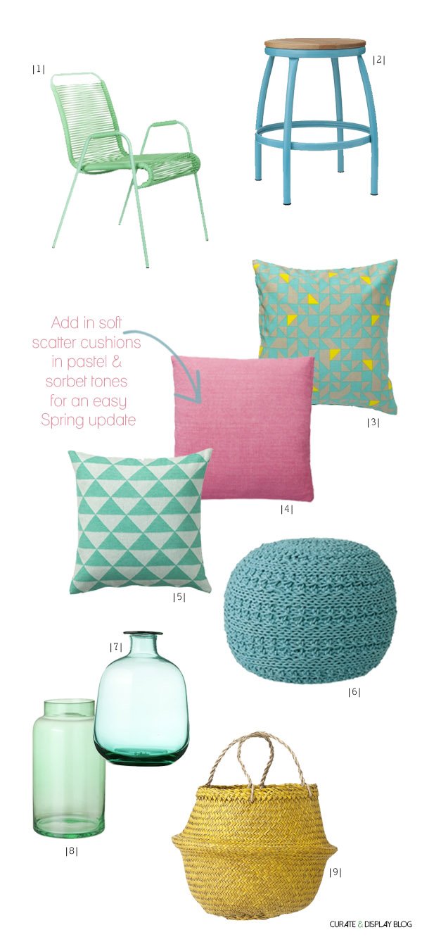
|1| Mint green garden chair |2| Blue stool |3| Mint, yellow & grey cushion |4| Blush pink cushion |5| Mint & white brushed graphic cushion |6| Pouf |7| Narrow neck vase |8| Green vase |9| Vietnamese basket
Mint is showing no signs of ducking out just yet and why should it-it's the ideal colour for spring and summer and works with so many other colour combinations. I picked out that amazing garden chair but quite frankly I'd happily have that in my office with a couple of cushions for good measure.As a habit I tend to shy away from pink, I think it used to have a rather dirty reputation for being a little on the tacky side, but it's enjoying a revival now and suddenly it's grown up and out of little girls bedrooms. I'm even toying with the idea of using it with coral tones in our bedroom. Maybe...Coloured glass is an ideal way to experiment with colour if you're a little shy to try-the tinted glass vases would compliment any cut blooms.Oh-and I need to talk about this basket. Baskets are my new obsession, I love the texture and my new "thing" is to display potted plants in them. I see this yellow one is a bag but you could easily pop a plate in the bottom of it to avoid water damage and put a statement plant (like a monstera or fiddle leaf fig) inside. Gorgeous.Are you a HEMA fan too? Does your place still need a spring clean? The weekend's on it's way, so maybe now is a good time to do a little shopping, too!Follow HEMA:TwitterFacebookPinterest.
My Styled Wedding Table At West Elm London
Follow my blog with BloglovinHello! Just popping my head up over a mound of paper-I've been so busy making paper flowers for the past couple of weeks that I've had very little head space for much else! I've been cutting, painting, scrunch pleating, cupping, fringing and glittering like crazy to get them ready in time. Yesterday, all 130 of these little crepe paper beauties which became my evening projects came with me to London's West Elm where they're now enjoying a new home as part of a table I styled with some of my favourite West Elm tableware.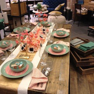 To tie in with my paper flower making workshop at the store next week, the West Elm team invited me to create a tablescape using whatever I liked-how exciting?!!! A few week back I got a sneak peek of the store's summer collection which showed that coral was likely to be a key colour. Riding on the coat tails of the pastel trend, we saw a brief introduction to coral in 2013, but this summer it's about to take centre-stage. And I love it.Inspired by the idea of a coral, gold and celadon green wedding reception and going all out with my love of pattern and bold colour, I set to work on pulling the look together for what took me most of the day-I was in heaven- settling in on the shop floor, pulling what I needed from the shelves and exploring in the stock rooms, playing and experimenting with the look. For some reason, I just can't move away from celadon green and these organic shaped plates are perfection. I absolutely love them, with such a calming tone they work so well within this colour story.
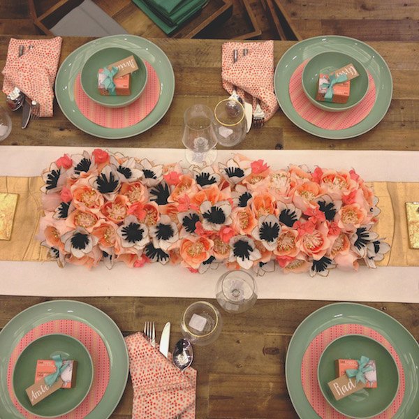 Using a gold and white cotton runner as my starting point, I glued each flower into a centrepiece on a separate piece of fabric with hot glue and overlaid it. The addition of gold glitter on the stamens and petal edges catch the light beautifully -imagine how romantic these would look in soft candlelight. Sigh...
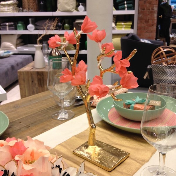
 These jewellery trees become multi-functional decorative pieces with a small handful of blossoms wound around their branches and add a little height to the table without being obstructive.
 To echo the red and coral print napkins, I found, as if by perfect serendipity, this coral, red and yellow patterned paper from Paperchase. Drawing templates from a side plate, I cut out the paper discs and laid them on top. They break up the green and tie in with the napkins and coral flowers. If you're a little afraid to work with colour or print but want to experiment then using paper overlays as part of your table decor is an inexpensive way to start.As sweet little gifts for each guest (names taken from the lovely staff members) I picked out orange and jasmine scented soaps from beefayre, tied with simple cotton ribbon. They smelt beautiful!
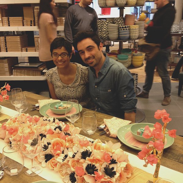 And then, as if my day couldn't get any better, Igor Josif of Happy Interior Blog (one of my must-reads) popped in with Bridgee of Little Star Blog. We've been in touch for some time but as he's based in Munich our paths have never crossed until now. As someone I greatly admire, I've come to him for advice on numerous occasions and he's always been so open to share his own experiences, so it was wonderful to catch up and for Igor to see my table come together at the right moment. Thank you for taking the photo Bridgee, although my iphone made the colours look slightly dodgy, you get the idea!Thank you to Paria, Rad, Jane, Jess and the rest of the West Elm team for making me feel at home to roam around and be in my creative bubble for the day. If you'd like to join me for my workshop next Saturday on April 12th you can find all the details here or pop into the store on Tottenham Court Rd and check out the table which will be there for the following week.So what do you think of my styling? Are you feeling the coral? Maybe the green? Perhaps you've been turned on to the idea of making your own paper flowers for your next occasion?.
Bohemian Style - The Family Love Tree
The other day I was having one of those "if you won the lottery" conversations with my husband, Rob. Yep. We have those from time to time, along with the "if my face looked like this when we met, would you have gone out with me?" (the answer is always no) and he asked what the first thing would be that I really wanted and had to buy straight away-a post win splurge. Initially I said nothing-because there's isn't really anything I absolutely have to have right now, bar the Tuscan farmhouse of course. Then I found The Family Love Tree's jaw-dropping, head-turning, make you trip up the curb rattan furniture and changed my mind. Yes. That's what I'd buy straight away. Give me everything.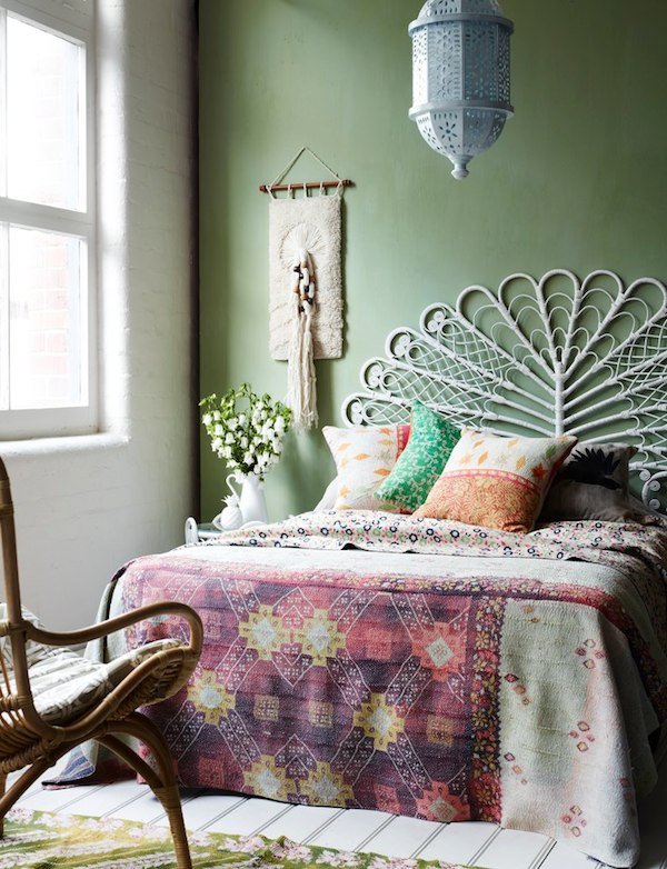 Just take a moment to pour over these gorgeous peacock bed heads and chairs, kantha quilts and bold, graphic cushions. Everything a beautiful, clashing palette of harmonious colour. It shouldn't work, but it totally does. No home should be absolutely perfect, it should be a little rough around the edges, lived in. That's what I love about this company, it's a celebration of colour and life and doesn't need to take itself too seriously to be stylish.
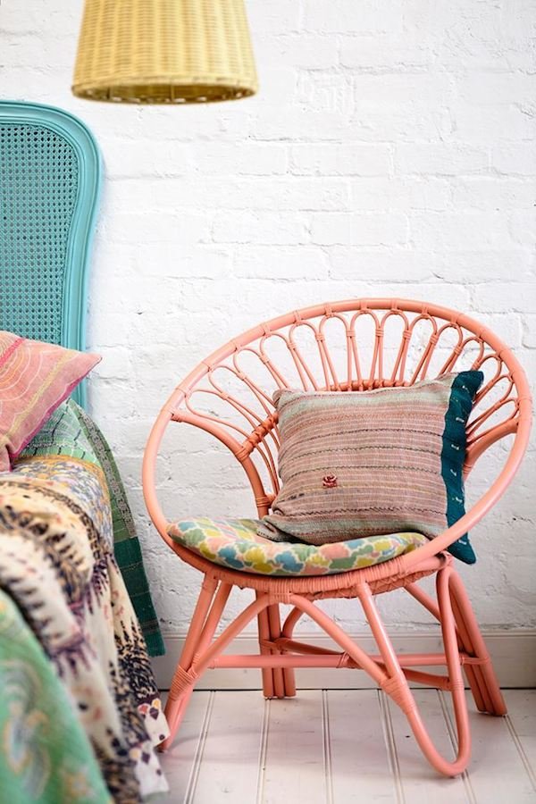 If like me you're old enough to remember these chairs, or indeed had one, you might be wishing you'd held onto it now. Australian stylist Katie Graham, founder of The Family Love Tree and all round interior genius has taken these retro classics and given them a fresh and contemporary, bohemian edge. It's almost as if she knows my style better than I do! She's a rule breaker-she loves to mix clashing colour, print and texture. I like a rebel.
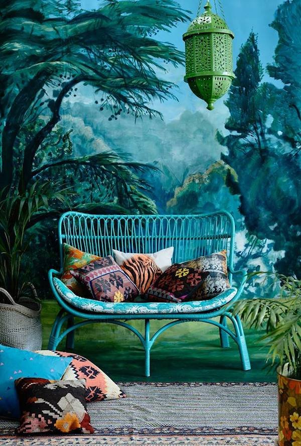 An Australian company (although they ship internationally) The Family Love tree ethically produce the rattan for their furniture in Indonesia where it's grown, harvested and produced by skilled villagers. The collection also includes macrame plants hangers, tables, screens, rugs and lighting-I think I could find the space to fit everything in if I had to.
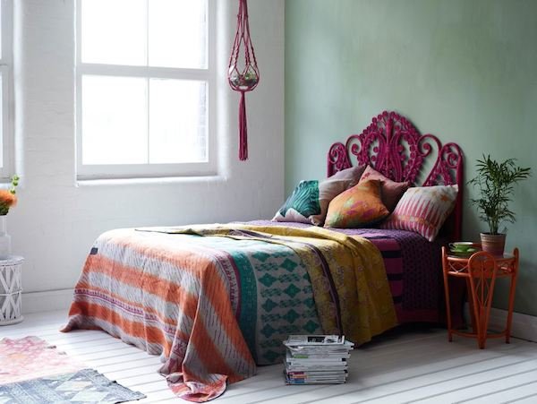
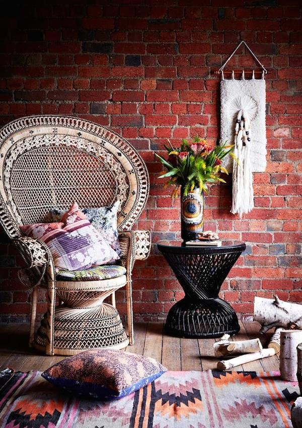 These beautiful shots taken by photographer Derek Swalwell and stunning backdrop below hand painted by visual artist Jacqui Stockdale make me want to add more colour into our blank canvas of a home. There's limits to what we can achieve here, but I've been holding off the colour for some reason-and that's not me. Maybe I'll listen to Katie's advice instead and just go for it!
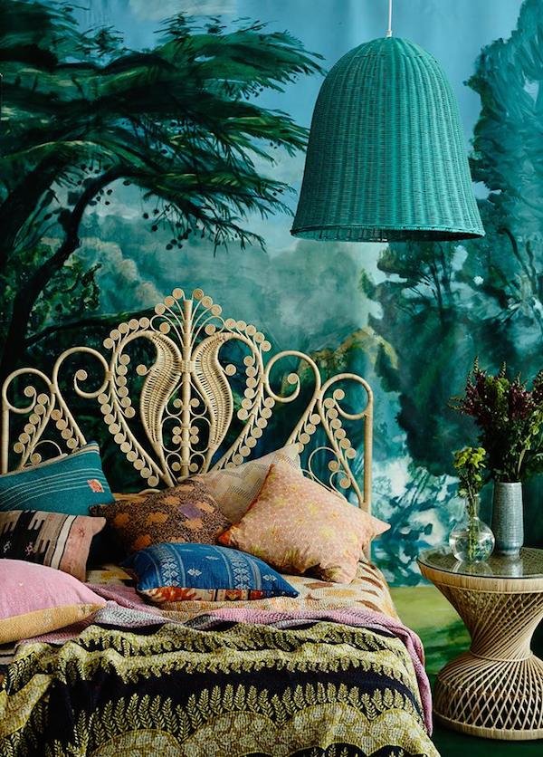 By the way, don't you think that bed looks like Jimi Hendrix just got up from it in his dressing gown to grab his guitar? Sigh...Get onboard and fall in love with The Family Love Tree here or if you're lucky enough to live in Richmond, Victoria, then you can actually shop in person. Jealous.FacebookPinterest Instagram.
Paper Flower Workshop With West Elm!
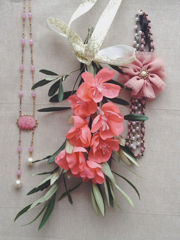 So...are you free on Saturday 12th of April? I'm hosting a free paper flower making workshop with the West Elm London team. Fancy learning how to make your own? You do?! Great!It'll be a relaxed afternoon in the Market Place (where you can grab a coffee or two at the same time) and I'll show you the basics of flower making with a simple five petal bloom for you to customise. You'll come away knowing all about crepe paper, how to sculpt it, gather and wrap your petals and stems as well as how to style and put your own personal touches on them.They're on trend for weddings and party decor, make gorgeous little accessories to wear and make perfect keep-forever gifts. Stop by between 11am and 4pm and make as many as you like.The Details:When? Saturday 12th April 2014, 11am-4pmWhere? West Elm, 209 Tottenham Court Rd, London, W1T 7PNRSVP: The West Elm Facebook page.See you there! x.
House Tour - Eos's Light & Airy Swiss Family Home
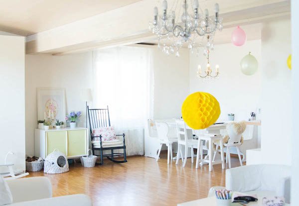
Good morning to you! How was your weekend? Mine was surprisingly chilled-we normally use the weekend to hammer through everything we don't get done in the week, but this time we filled it with gardening, the farmer's market and enjoying the spring sunshine. And you?Today's post has been about a year in coming to these pages and I'm seriously happy to have my lovely friend Eos from Signora Aurora blog here today, sharing some beautiful images from her home in Switzerland. When I first asked if she'd like to be featured, she was living in Turin (I found her blog through my obsession with Italy) but then house moves and new babies got in the way of things, so it had to wait.Eos (which means "dawn" in Greek) is, much like her name, a vibrant, calming character. She puts so much love into everything, be it writing for her blog, painting and sketching or creating her family home. She's open and honest, just like her home-that's what I love about it. She also rents, which for me is a big thing. Until last April the last time I'd rented was as a student, so suddenly I was faced with the idea that there'd be too many restrictions to make our house feel like our home. What Eos has done with hers is the perfect example of how to make a rented space your own. I hope she inspires other renters out there too..."I’m Eos Koch, an artist, a graphic and webdesigner, a storyteller and seeker of light and beauty. I live with my husband, our two daughters and our three dogs in the French speaking part of Switzerland. We came here last summer and before we lived for five years in the north of Italy. I grew up in the rainy, German speaking part of Switzerland, but at heart I’m a little gipsy girl and love to not stick to one place.
We live on the fourth and highest floor on 130 qm with an additional big terrace of other 60 qm. As an artist and designer I work from home and this space serves us as a living and working space in one.
We're renting this apartment and for the moment it totally fits our needs. Having a home that feels like a protected and secure nest is so important. I love lots of light and searching for the perfect space to rent in, my biggest attention was on the light. Coming from sunny Italy to live in the Swiss mountains, the missing sun was the most difficult thing to leave behind. I even researched for how the sun is moves, where the sun comes up in the morning and where it sets in the evening.
There are some details, like the colour of our kitchen and the floor in there, that I don’t like, but making the best of it and making these parts blend in as much as I can helps me to accept them. After all it isn’t my home and we will be here for some time until we go decide to see more of the world.
This is my studio, I love it to be white and airy. There's a door that goes out to the terrace. Most of my furniture is from Ikea, mixed together with pieces from thrift stores and flea markets. I love to paint old things in white to make them all connect.
In my studio are lots of tables and big closets for all my fabrics, papers and other supplies.
A peek into the bathroom, some spring flowers and a vintage map from Italy out of a book I found at the flea market. I love pops of color as much as I love white.
The girls room is full of toys and games, there is a lot of colour and pink going on here.
I force them to only hold on to the things they really love or are very beautiful. Since we've already moved long distance twice, we had to simplify and it just feels so much better to not own too much clutter.
This is an older painting I made for my eldest daughter's birthday- I love to express with colour and am a believer that beautiful art can change the mood of a room and tells a story.
Light makes a room beautiful for me and these floral curtains diffuse the light a little bit and make the room shine. The high bed is perfect for the children's room, since my girls are still little they have a lot of space underneath.
I found my nightstand at a flea market, years and years ago. I love that it's a trunk and I can fit inside all my books inside so the bedroom stays tidy. Our bed is a very easy construction my husband and I made together. It is oversized, which means there is one double and one single mattress next to each other. I need space to sleep.
This is the view from our living space into the kitchen. To make a boring kitchen more playful and blend in I hung a white chandelier and brought in some white accessories.
The view from the other side, out of the kitchen into our dining area, where my husband and I work on most of our projects at the kitchen table. The rocking chair is a proud keepsake from my grandfather and is the perfect place to sit down in the afternoon, drink a coffee and swing back and forth.
My little four year old is with me all day and when I’m cooking she likes to cook delicious little things for us out of play dough.
My special ingredients are plants and flowers, they life into my white space. Too much white in a home can look clean and sterile, but plants help to bring a little bit of colour.
Our sofa area to drink coffee with friends, chat and have a good time. In the back is our entryway and on the right is our outside space which I love even more than a garden- I love to live high in the sky and have views.
Lots of space, to dance, build forts with my daughters, play and create. I love to fill our life and for this it is always good to have some empty space. This is where my inspiration comes from.
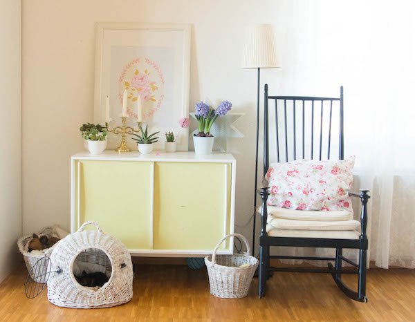
Lot of baskets all over with blankets for our dogs. I found this little yellow sideboard at the flea market and just painted it in white. The graphic print of the rose is a creation I made and printed myself.
Another nook to sketch, work and drink some coffee. The honeycomb balls I made by myself out of tissue paper, there are some good tutorials online to create your own.
My workplace and our space for dining. The table and corner bench is another keepsake from my grandfather, and to make him fit in I too painted it in white.
Big plants bring life into the space and they love to be near the window where there is a lot of light.
My love for chandeliers is easy to recognise, I especially love the old ones, but the mix of different styles makes the big picture more vivid.
I hope you enjoyed the little tour around my home. I love to surround us with beauty, this need comes from my belief that we have the control over our lives and how we want to feel. Creating a certain mood for our home helps us feel the way we want."
••••
I couldn't agree more! Thank you so very much for sharing your beautiful home with us Eos.If you'd like to follow Eos, check out the links below. She also has a beautiful new project that she's working to get off the ground, so if you love her work as much as I do, watch her project video to find out more.Would you like to give us a tour of your home? Perhaps you rent too and have found ways to make the space your own?
Decorate With Flowers - UK Book Blog Tour
I'm honoured to be hosting today's Decorate With Flowers book blog tour today and welcome to Curate & Display if you're stopping by for the first time. Today's post is quite a long one, so get the kettle on and settle in with a biccy or two...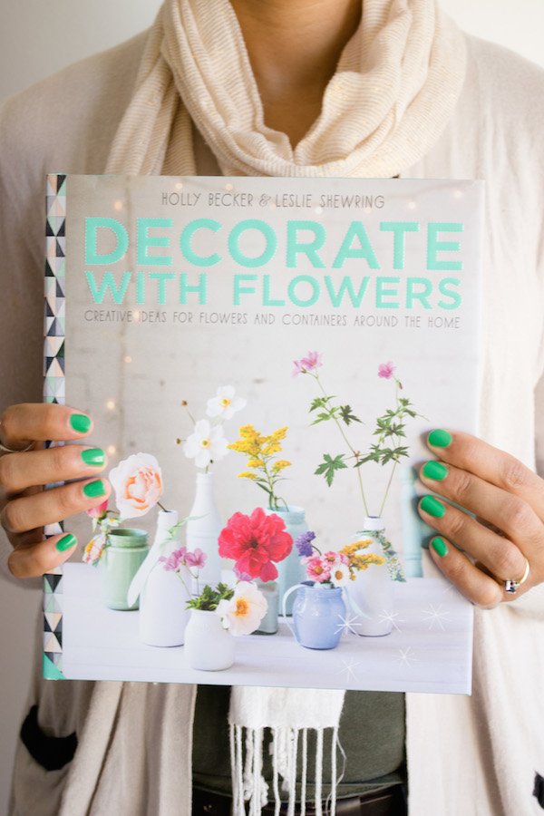 Here is a breathtakingly beautiful new book to inspire you, from the imaginings of two incredible stylists and close friends, Holly Becker and Leslie Shewring. There's no end to the talents that these two women share-both designers, creative directors, authors (this is Holly's third publication with Jacqui Small publishers) and mentors for bloggers everywhere, I admire them both very much. As one of Holly's Blogging Your Way students I also had the pleasure of meeting her in person at the launch of her last book, Decorate Workshop and she's just as exuberant in person as she is online!When Holly mentioned last year that she was working on a new book and this time with Leslie, I had one of those silly, excited moments to myself. Leslie first landed on my radar when she started writing and shooting her Color Me Pretty column for Holly's blog, Decor8. This was going to be good. There would be colour, pattern, a feast for the eyes and a craft element somewhere. I was right and I love it.Decorate With Flowers is a vibrant and fresh foray into creative floral styling at home, without the need for expensive vases and the complicated terminology. The simplicity of this book is a joy, there's no pressure to have a perfect selection of containers, rather to utilise what you have to hand to create something new with them. There are no hard and fast rules to this approach, dispelling the stuffiness that can accompany the more professional (and slightly scary) floristry books. With each turn of the page you can see the love that's gone into the making-Leslie's beautiful illustrations and photography, Holly's signature styling and conversational narrative. It's just too lovely.
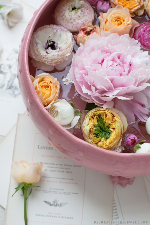 We jump right into the basics-building a capsule tool kit, how to choose the best quality blooms, how to prep and keep them flowering for longer and what to consider when you're putting an arrangement together. Then we look at three step-by-step arrangements, detailing how to approach a tied posy, medium arrangement with "sass" and a larger, blowsy creation. Start small, work your way up.
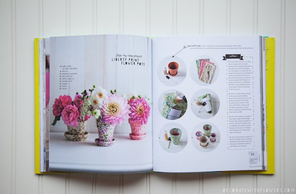
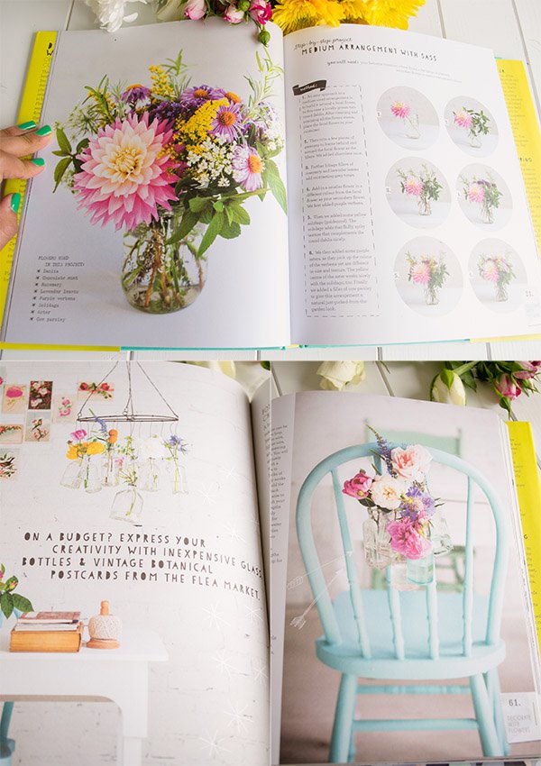 The book is divided into eight chapters based on a style theme and introduced with a moodboard -'Market' really caught my eye, drawing inspiration from visits to local flower markets around the world with pops of colour and texture. It reminded me of the last time I came to Utrecht with the flower stalls along the canal. Each project is created and styled within a real home, taking care to pull inspiration from the surroundings so that the flowers work as both complimentary features and subtle accents. My personal favourite was a playful little wreath which hangs on a corner of blogger Bri Emery's bed. Cute and punchy!All the projects are simple, stylish and easy to achieve with step-by step shots to help you along the way. I loved these Liberty print flower pots-if you're familiar with Holly's style you'll know she loves a bit of Liberty print, so it was great to see she'd used it here.
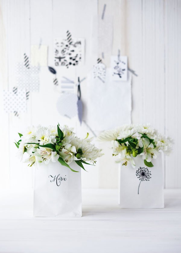
 So I had to try something out for myself because...well, how could I not? Flicking through, I fell head over heels for these gorgeous Graphic Stamped Bags. A simple white bag gives you carte blanche with your design and they hide the mechanics (because sometimes flowers just look better when you can't see the stems). You choose what to print with-be it a stamp and ink or a simple graphic pattern using pens or paint. They look amazing on the table as a sociable display (you can see over the top whilst you talk over dinner!) and you don't need to break into a sweat to make your own. Here's Holly and Leslie's beautiful creations for you to try your hand...
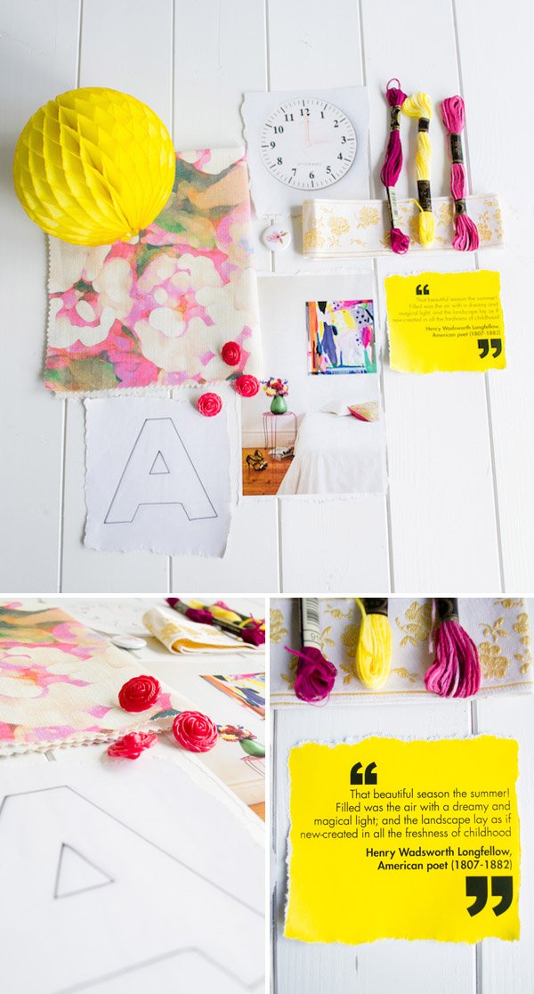
 And here are mine. I already had an idea of the colour story in my head and I had a fruitful two minutes in my office whilst I pulled together some inspiration for a quick moodboard-I love the Imogen Heath Pink Rosa fabric with that sculptural honeycomb ball. Lots of texture. You can probably deduce that my story was of summer, warm sun, rich pinks and yellow against crisp white. And bees. Lots of bees.
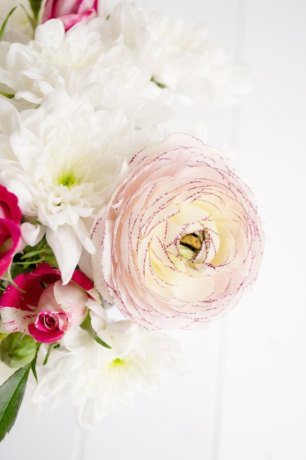
 The flowers were a mixture of supermarket staples (the chrysanthemums as the filler and spray roses) and specials from the florist-the beautiful pink and hot yellow ranunculus, my favourites. I set to work on some sketches for the stamps and carved up some lino board with a honeycomb and bee hive motif with metallic gold touches to complete them.
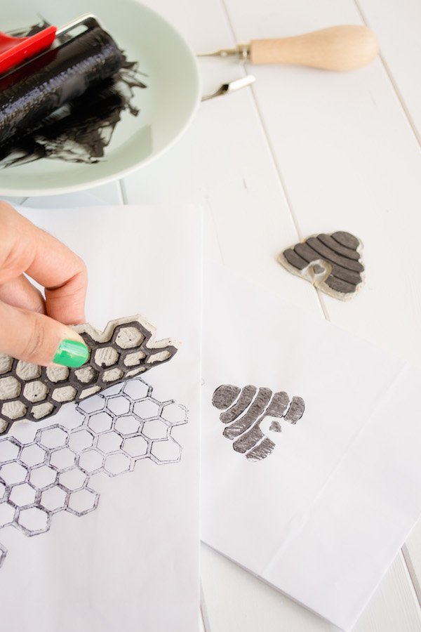 Arranging the flowers inside took a little bit of practice-choosing a glass with a wide neck really helped, then packing out with the filler flowers first before adding in the show-stoppers.
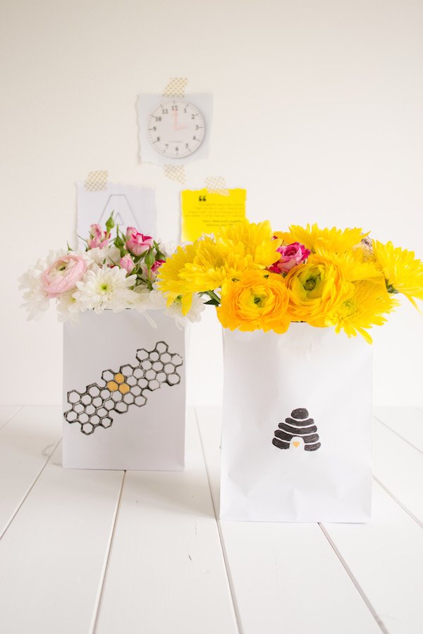
 Congratulations ladies! I absolutely LOVE this book. It's given me a new found confidence with flowers and made me realise that "flower arranging" isn't as daunting as I thought it'd be as long as you enjoy it and create something from the heart. And I did.Decorate With Flowers is out on official UK release on March 21st 2014 and you can pre-order your copy here. For all other release dates and exclusive content, please visit the Decorate With Flowers website.Image Credits1, 3, 6, 7, 8, 9 Tiffany Grant-Riley2, 4, 5 Decorate with Flowers.
Xylo - Furniture With A Story
Today's post is so much more than just good-looking decor (sounds like something Derek Zoolander would say...) It's a post full of heart, giving you a sense that home is not just where you hang your hat at the end of the day, it can also be where you work. It's about second chances, being given a chance to shine by someone who is willing to let you try - not just the furniture, but those that transform them.Furniture designer-maker Preme Dhillon got in touch on Twitter recently to introduce me to an amazing organisation she runs, Xylo Furniture, based in Brentford, West London, which nurtures and trains those struggling to find employment to breathe new life into old and pre-loved furniture...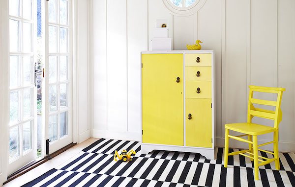 "The idea of Xylo was birthed out of a social enterprise in West London that sells second hand furniture as a means to providing work experience to long-term unemployed adults. When the idea was being developed in early 2013 I was working as a furniture maker in Brooklyn, New York but moved back to London last summer to put the vision of Xylo into action. At Xylo we work with a group of trainees who are often marginalized adults, teaching woodwork and restoration through each piece of furniture we create.
 What do you love about what you do?My favourite part of managing Xylo is working alongside the Xylo Trainees and seeing them take such delight in their work as they see the piece transform. We make sure that each trainee works on the same piece from beginning to end so that they feel a sense of accomplishment when they look upon what they have created. I think that the process of working at something with your hands is so encouraging, whether you are a naturally creative person or not, seeing a tangible change that you have created builds confidence. This is why the Xylo scheme is so beneficial to those who join the team. Also, each Xylo trainee has one of their own creations named after them so that they have something with their name on to be proud of!
 What does a piece of furniture need to have to be 'Xylo'd'?Our criteria for selecting furniture is that the pieces have been finely crafted, using techniques and processes that are now close to becoming a lost art. We work on pieces that have stood the test of time and have been loved for generations, we believe that these pieces should continue to be enjoyed. Xylo products often show signs of traditional woodwork such as hand-cut dovetails, these details are rarely found in contemporary furniture and we want to celebrate these skills and to draw attention to the craftsmanship. Traditional craftsmanship is the thread that runs throughout the Xylo product range.
 We also like to know how each piece was made and where it’s lived. We love learning about each items unique heritage and building it into the products story. When we sell an item we write the customer a letter describing their pieces story including where it can from, how it was made and which trainee has worked on it. Our tagline is ‘furniture with a story’ and we want our customers to engage with the unique story of their Xylo piece.
 Talk us through the process from sourcing to getting ready to sell a piece of furniture...Once we have chosen a piece we begin generating ideas for how we can enhance that item and build on its best qualities. We look at its unique features; for example ‘Is there a detailed carving to highlight and emphasize’. When designing a Xylo piece we also consider the history of the item and the era its from. If it’s a 1950s item we’ll play on the retro theme and to make it a statement piece iconic of that particular era. Once we have chosen a design that brings out the best in the original piece, we begin adapting it for the modern home and a member of the Xylo team will set to work. The Xylo trainee will sand, prime, paint and varnish each item and polish all of the original hardware such as handles and drawer pulls. We use Farrow & Ball paints because of their range of colours and finishes. What we love about Farrow & Ball is that they share our values; they are passionate about using age-old methods to produce products that will stand the test of time. All of our products reflect this ethos!
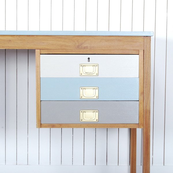 Throughout the restoration process we share updates of the progress through twitter and instagram so that our followers can see the items take shape. Once its complete we give the piece a name, write its story and publish it on the Xylo online shop.
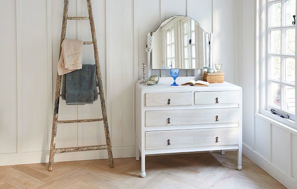 I must admit, I've cut corners and been a little spray happy with Plastikote in the past, so what advice could you give me if I wanted to restore a piece of furniture properly?Before you set to work on an old item of furniture inspect it thoroughly. At first glance it may look in good condition but sometimes the wood may have split over time and it will take a lot of work to repair. My other piece of advice would be to enjoy the process of restoring a piece of furniture. It may be time consuming but if you relish each stage; sanding, priming, painting etc. you’ll be delighted with seeing the fruits of your labour sat in your home."
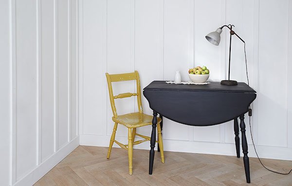 Reading about the Xylo trainees before they found the scheme and the positive affect it's had on their lives since brings home how important it is for all of us to feel included and valued. You can clearly see that in their work too. It's hard to pick a favourite, don't you think? We have a few large pieces in our home that worked so well in our old house (it was Edwardian) but in the mid-century home we're in now...well, they don't entirely fit but I can't part from them either. I think it's time to give them an update!Xylo is offering a 10% discount on your Xylo order with the code XyloCurate&Display. Take a look in the shop and pick out something you love. Follow Xylo Furniture
Happy House Warming!
 Welcome to Curate & Display, my new blogging home since moving out of The Curiosity Project! Now that we’re developing The Project into what it was originally (as an international gift swapping experience) it made sense for me to separate the two to avoid confusion - I also found it harder to blog under that title as it just didn’t “fit”. In short, I was blogging design, interiors and styling to my gift swapping audience which, whilst many of them held on for the ride and actually kinda liked it, others lost interest. Who could blame them? So here it is - Curate & Display! A warm and cosy place for real and attainable interior design, lifestyle inspiration, DIY and craft projects and insights into my work as a stylist. You can find out a little more about me here or check out some of my regular features. I’m also on the look out for fresh, new home tours and designers so if this might be you, take a look at Submissions for more info.It’s good to be back and blogging again after a good few months of solid working and motherhood. I’ve got some seriously exciting projects to share with you in the coming months that I’m currently working all hours to make a success-there’s a couple of shoots and a workshop coming up. Can’t wait to tell you all about it….
DIY Festive Fir Tree Garland
There's a lot of blank walls staring me in the face at the moment and so I've been thinking of ways to break them up a bit and bring some of the outdoors in. I decided to try my hand with a little natural decor and whatever I had to hand in my kit and, ta da! a festive fir tree garland is what sprung to mind. I ought to start by saying that my floristry skills are somewhat basic so please don't let this put you off-it's really basic and easy to do, I promise. Aside from collecting the fir tree clippings from my local woods (I took only what I needed I might add) and bumping them up with trimmings from the Christmas tree this garland took me about two hours to put together with a demanding toddler and baby for company. You could also use evergreen cuttings as an alternative which will smell gorgeous and it'll last around a week before it starts to droop.
 1. Start by cutting up your clippings into smaller pieces before building up bunches and securing them with florists tape wrapped around the base of each. To attach them to your rope, wind each bunch on with more tape, then layer up the following bunch so that it overlaps slightly and hides the mechanics. Repeat until your rope is covered. Think about how you'd like your garland to flow and make sure your bunches follow this pattern-I wanted the two ends to hang with the tips of the fir tree pointing down and the tips pointing left along the swag.2. Once your garland is complete, it'll be ready to hang. Determine where you want to display it and where you'll place your pins. As mine was attached to wooden tongue and groove I didn't have too much trouble getting them into place, but you might need a couple of picture hooks tacked in if it's a bit tricky for you. Just don't go putting holes in your plaster work please!Once my pins were in place and I was happy with the spacing, I tied a loop of fishing wire around garland at the point of the first drop and looped it onto the pin. I then did the same with the other side. You might find it easier if someone helps you support the weight of the garland while you do this although I managed on my own.3. If your garland tends to hang downwards with the weight, exposing the rope at the back then you might want to secure it with a little tape strategically placed on your wall to hold it. Mind your paint work when you come to remove it though!
 4. Next up it's time to make your sweet little copper stars. Using your cookie cutter as a template, gently wind the wire around the shape before cutting it a little longer at the ends and twisting the two ends together. I made around twelve of these in three different sizes.5. Hang your stars in varying lengths using the copper coloured thread with a little tape hidden behind your garland.
2013 Gift List - Graphic Girl
I absolutely love this time of year. The tree is up and smelling amazing, the salt dough wreath I made last year is hanging with pride on our front door and the living room is glowing magically with a liberal sprinkling of fairy lights. Thoughts are turning to last minute tasks, planning the menu for next week (I cannot wait to get baking!) and snapping up a few extra gifts before the big day. I admit that I am, yet again, rather late with my gift lists-for some reason I plan them with the best of intentions and then leave them to the very last minute, so I do apologise-perhaps next year I'll remember to give myself a kick up the backside in October!This collection of gifts have been geared towards a print and design savvy lady (or guy if you discount the earrings!) who loves bright and bold style and isn't afraid to show it off. I give you Graphic Girl! 1. I'm known for keeping wrapped up warm in the winter months, I've always got a scarf or shawl around my neck-even indoors. Absolutely LOVE this Bling Bling Brix silk scarf by Voxish Industries. It's a digitally printed masterpiece of "scratchy, worn paint textures adorned glitzy, sparkling vintage jewels." Want.2. Kangan Arora's (doesn't she have an amazing name?!) North Indian roots really shine through in her beautifully vibrant textiles. Inspired by her every day surroundings at home in India, from rickshaws to Bollywood posters, the results vibrate with excitement. Her fluro-bright, screen printed cushion makes for an ideal decorative pick-me-up.3. This pink, black and white graphic print would look fabulous in a simple black frame as shown on a white wall as part of a gallery in the same colour way. Who doesn't need a little love from time to time? Check out designer Luzelle van der Westhuisen's African and Scandinavian inspired designs here at Mengsel.4. Metallics are enjoying a (tasteful) design revival now and I'm relishing indulging my obsession for gold. Isn't this fragmented gold bone china mug by Petra Green just gorgeous? Launched in 2010, her lifestyle brand Room39 is founded upon the abstract, with a bold aesthetic and playful use of pattern.5. If like me you're renting right now and worry about the commitment of using colour and print in your home, invest in something like this woven woollen throw by Eleanor Pritchard Easterly at Heals. It gives a three dimensional quality and an instant injection of colour. It'd look great on our grey sofa, if I do say so myself...6. A print with a difference! Created by Danish illustrator Kristina Krogh for Ferm LIVING, this Butterfly print is all about texture, not only with the use of cold marble and stone but also the material it's printed on. Birch plywood.7. As the daughter of a goldsmith, I've spent a lot of time around some outrageously elaborate jewellery (packets of precious gems on the table was a normal occurrence) so when I choose pieces for myself, these days I prefer something simple and bold. In keeping with the current arrow trend I had to include these seriously cute Go Fetch arrow earrings from vintage accessory company Eclectic Eccentricity who breathe new life into worn out and unloved pieces. Stylish, simple and to the point, don't you think?So tell me, what's caught your eye here today and will it be going on your Christmas list?.
An Exclusive Pre-Launch West Elm Tour
Apologies for the mysterious disappearance-the past ten days have been a horrid fog of broken 25 year old boilers leading to no heating or hot water (thanks to our tight fisted landlord) followed by a virus which has slowly and steadily worked its way from our three year old, to three month old and finally the two of us. Fun times! Needless to say I have a whole heap of posts to share with you, just bear with me...
There was a real buzz in the air watching the visual merchandising team, flown in from the U.S working their magic, unpacking, sorting through and styling up box upon box of deliveries with a calm head and heaps of energy. As Jess walked me through each section of the store, from the living wall of plants on the ground floor (yes, they're all real and their hydration system is controlled from America!) to the West Elm Market -a social hub for coffee and croissants, cooking utensils and tableware, to the basement with its modern and stylish bedding, furniture and soft furnishings, I absolutely couldn't wait to see the store in all its glory. Unlike some shopping experiences where you're left feeling cold and uncomfortable, here you're encouraged to touch and try. The products have a sense of warmth, a story. There's something for everyone here, prices are accessible and the quality is excellent.
West Elm is an environmentally conscientious brand too, taking care to responsibly source their product materials, from organic and recycled textiles and fabrics to non-toxic dyes. A large portion of their products have also been designed and created in collaboration with artisans which personally I love-it's so important to support and showcase talented creatives. These hand-painted bowls are a perfect example of this -aren't they stunning?

Creative Baby Christmas Gifts
Last week I asked my lovely readers on our Facebook page for some impetus to help me put together some gift guides for Christmas 2013. One of my readers, Jane, recently gave birth to a baby boy who'll be 9 wks at Christmas and she wanted something creative that he can keep.When I was waiting for Reuben's arrival I spent days bent over my sewing machine stitching a beautiful (if I do say so myself) quilt which he still loves now at the age of 3. Tabby is now 10 wks, I still haven't made her anything and boy do I feel guilty! So in searching for these gorgeous gifts I've found plenty of inspiration for her too. Some items can be bought all ready for you to put together yourself whilst others I've included to put creative ideas into your heads. Jane, I hope this has gone some way to inspire you too! 1. I absolutely love these sweet little mice snuggled into a tin! Download the PDF, make your own and try your best to give them away! Wee Mouse Tin House 2. This guy looks like a real keeper and a forever teddy for little one. Blabla Kids Bearegard The Wolf Cloth Doll3. I actually bought this Bird Family from SuperLiving for Tabby's first Christmas present-so I have done something! I'll display them in a box shelf on her wall above her cot and they're something she can treasure forever.4. The Foldable Tori Rocking Horse from Miniluu is ideal for small spaces and it's natural wood finish means that you could customise it yourself...if you want to.5. A beautiful gift you can stitch yourself for a first Christmas and prepare yourselves for those first steps next year- First Baby Shoes Kit, Nel a Ned6. These Mokkasin garlands are a simple and effective way to bring colour into your baby's room. I love the muted colour selection in these ones which have been over-locked in a contrasting colour and finished with a little bell.7. Another DIY craft kit is the delightfully tactile Tweedy Toots Owl by SewGirl at NOTHS. A great project for you and a perfect keepsake too..
A Very French Riot Of Colour At Caroline McGrath!
You know sometimes when you see something and your jaw drops and you know you just have to have it? Yeah, that. Well actually, what I said when these fabulous cushions arrived in my inbox was "oh my god, I've got to feature those!" So I am!If you've yet to be introduced, meet fun and vibrant French brand, Le Cerise sur le Gâteau, the brain child of designer Anne Hubert. Delightfully quirky aren't they?

 Clogs Liberty | Clogs Pois Pink | Clogs Pois Duck Egg
I absolutely love the styling, it's no wonder that Anne started out as an editorial stylist. In fact I wish I'd done this myself-I do love a pop of colour.The collection takes reference from polaroid photography, fairy tales and a childish appetite for discovery which is brought to life through the bright prints and Day-Glo colours. These would look right at home in any fashion forward teenager's room or given pride of place on the sofa if you're a big kid like me.
All Anne's textiles are silk screen printed using water-based inks which, I'm told, are as colour fast as their chemical counterparts but much kinder to the environment and the fabrics she uses includes Toile de Jouy from Alsace, linen from Les Vosges and good old fashioned Liberty print. Everything she uses in her products are sourced as locally as possible, that's pretty important. What's not to love?
To shop the collection which includes funky tea towels to brighten up the kitchen, you can find them online at Caroline McGrath who also boasts a bevy of beautiful decor in time for Christmas..
How To Get The Best From Collaborative Shoots
Today, I thought I'd write a post aimed more towards newbies in the wedding industry or indeed anyone who designs their own product and is just beginning to build a portfolio. If you're embarking on this journey or updating your work you'll no doubt have a lot of networking and marketing to get stuck into. If your work is visual and relies on strong imagery (you might be a dress or textile designer or budding stylist even) then you'll be wanting beautifully shot and styled images to promote you on the pages of your website and, in effect, do a lot of the basic marketing for you. So, when your budget is zilch and you're cack handed with a camera, what are your options? Collaborative shoots can be a great way to achieve this and kill two birds with one stone-you network and build relationships with like-minded creatives within your circle and you should come away with a strong selection of images that everyone involved can use for their benefit. But, it's not always as cut and dry as that as I'll tell you from my own experience during six years as a wedding planner before I embarked on styling full time. When I first started Grant-Riley Weddings back in 2007 I had nothing but a bunch of folio images from my days as a stage manager-no bride was going to look at these and envisage how I could bring the vision of her wedding day to life. I knew no one and technically I was "no one" and I had no weight to my name. So what did I do? I started contacting bridal designers, a venue and a photographer and pulled together my own shoot one beautiful autumnal day in Richmond, Surrey to come up with some images that I could use to demonstrate my style at the time. I really had to persuade some designers to lend their gowns to me, a complete stranger and the concept of inspiration shoots was quite unheard of then. I was even turned down by one, which makes me smile now when I think that I've since gone on to work with gowns designed by the likes of Ian Stuart, Sassi Holford and Matthew Williamson. Excuse me while I blow my trumpet. Twitter didn't exist so my job was harder when it came to hunting down contacts. I had no florist onboard as I felt very uncomfortable asking for their flowers and time for free, so I negotiated a deal for cut flowers with a local market trader and did them myself out of my own pocket. I ended up with chrysanthemums and purple statice as centrepieces and brassicas (boy do they smell!) as accents for place settings. Some of it worked, a lot of it didn't!On another occasion, I cancelled a photographer last minute because the weather was set to be a wash-out and quite rightly made her very upset because she'd cancelled a holiday to see family in Sweden for me. I ended up working with another photographer in the end, but we're still friends!
 I'm hoping the following tips will guide you in the right direction and save you a lot of time in the long run so that you avoid the certain pitfalls that such shoots can create.1. Have A PurposeCollaborative "inspiration" shoots are ten a penny these days, particularly within the bridal industry. There are some exceptional examples of well devised, well executed work in which all parties involved have pulled together as a team and produced a clear, inspiring set of images. And then there are those that, well, don't. They might look perfectly pretty in every way but somehow underneath all this something's been lost in translation and the story or purpose has been lost leaving rather cloudy results. So how do you make yours stand out? My first piece of advice is to have a purpose. If it's the next season's collection of cushions you're shooting, don't waste time scouting for models to hold them- the cushions need to be the focus here. If you're focusing on a particular trend, then choose a few key elements in which to show it in action and don't become distracted with another. If it's a Downton Abbey inspired bridal shoot, don't be tempted to sneak a little 1950s in. It looks amateur. A simple concept is a strong one.2. Tailor Your ContentIf your ultimate goal is to have your images featured on a well known blog or printed in a national magazine for exposure then start by researching the aesthetic of where you're submitting your work. Is it a good match for you? For example, a DIY interiors test shoot might be better submitted to Mollie Makes than Good Housekeeping, or a dark, gothic inspired bridal shoot would suit Offbeat Bride or Rock n Roll Bride better than somewhere like Style Me Pretty.It's also a really good idea to think about the format you'll be shooting in-does the publication tend to prefer portrait over landscape? stand alone shots or duos? Are there certain colours they don't like to use?
3. Trade Your SkillsJust because you can't afford to give anything with monetary value it doesn't mean you can't skill swap instead. This way you're demonstrating that you are serious about your craft and that you respect who you're working with. If you're a florist, offer your photographer and model (if you're using one) a free bouquet to the value of X amount or something to show willing. If you make a product, gift one of your cushions or prints instead. Working for free has become one of those situations that we're all too quick to accept because we feel we have to (hell, I've done it a LOT in the past for folio) but remember to try and ensure you're paid for your time in some form.
4. Schedule Your Time & DelegateIn the lead up to shoot day you'll be busy sourcing, planning and coordinating. Make sure that you give yourself enough time to pull everything together and don't forget to factor in the time it takes for collections and returns (in some cases I've spent several days doing this). Choose someone to manage the overall process-if you've instigated the project then it ought to be you. Communicate with your team. Is everyone else pulling their weight? Is everyone on the same page?Let's not forget scheduling your shooting time on the day itself. Ask yourself...• How long will it take you to dress and style each set up?• How many set ups do you have and realistically, how many shots would you like to walk away with?• Which order will you shoot in? I find it's best to start with the most complicated scenes first.• How long will it take for you to break down your set, tidy and leave the premises?Based on these answers you should be able to draw up a running order. It's best to be as flexible as you can to allow movement if for whatever reason you have to change plans-it could be that the light isn't what you expected and you need to wait or location, or perhaps a model bails on you and you need to double up a look on another.
 6. Distribution & Use of ImagesThis is an area you really need to discuss with your photographer before you start the project if you can. How soon can they edit the images after the shoot? Are they happy for their images to be used by everyone for their own folios? Do they have any other stipulations?Agree a realistic time frame in which the images can be made available to everyone for download. This is generally what the pay-off is for your team so don't leave everyone waiting for too long afterwards, but give your photographer enough time to edit comfortably-they'll be juggling this with paid clients' work too.Another area to note if you're trying to get featured is whether the publication have an exclusivity clause or grace period before your images can be used anywhere else-this includes your own blog. Be clear on this first because it can be the difference between getting featured and not.
 7. Credit, credit, credit!It's after the event, your photographer has selected and edited your shots and they're ready to go. Congratulations! You're not quite done yet though. Now you need to get your credits done, thoroughly and correctly. If your shoot is being featured online and there's opportunity to, you need to make sure you credit everyone involved with a link to their website. Keep a list of featured product in each shot to include and don't forget your photographer too!If your images are going to print and it's just an image to two other than a full spread, it's not always possible to credit everyone, in which case the photographer is usually the only one you absolutely must highlight, unless of course the focus is on product too.So there we are. There is still heaps to discuss on this topic, but I wanted to keep it fairly precise and to the point for this post. I know that lots of you out there (some of whom I've worked with!) will have your own tips or opinions on this, so feel free to leave them in the comments below. I hope this has been a useful topic to cover and that it'll help you think twice and get the results you're aiming for before you head into the wild! A useful thing to remember, though, is that you'll learn more with every shoot that you do and you'll continue to do so-it's one of the things I love about the job!.


