Heal's Window Styling For A Scandinavian Apartment
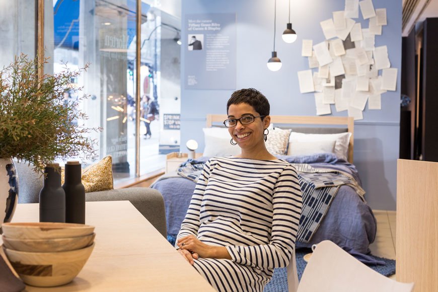
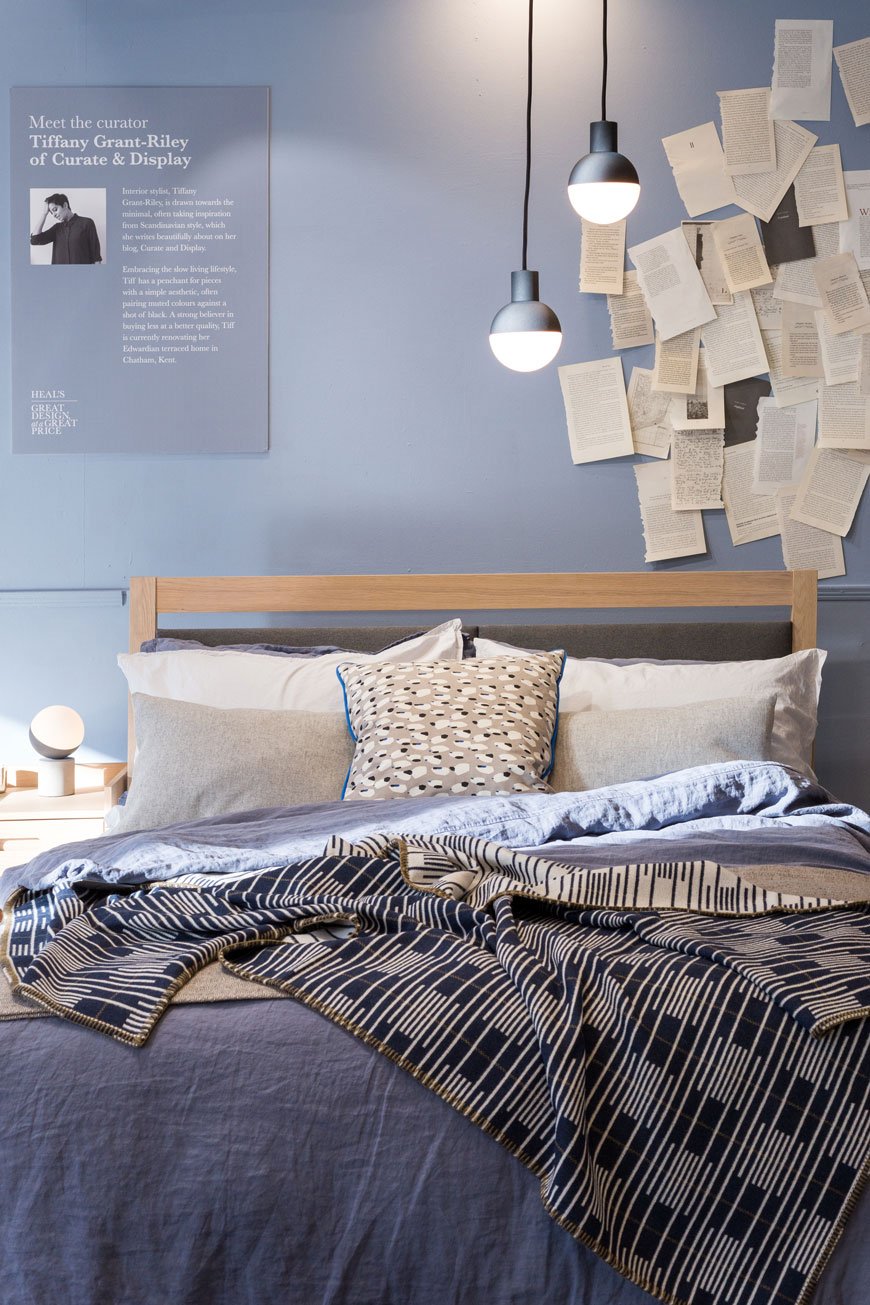 [ Sponsored content] If you follow my Instagram stories, you'll have spotted that I've been working with Heal's again on a new campaign - Great Design at a Great Price. Yes, I know, I've been asked back with window styling sidekick Kate Watson-Smyth, this time to style a window each at the flagship store on Tottenham Court Road store. Pinch me.With Heal's' reputation for championing British designers spanning two centuries, its become a mainstay of our design history. To show the versatility of some of the more well-priced furniture, ideal if you're on a budget, Heal's is currently showcasing a range of affordable accessories to show how to pull together a considered look for your home. Focusing on two collections - Kate with the industrial Brunel range and I the Scandi inspired Morten, we spent the morning raiding the shop floor with abandon. I'm pretty sure the visuals team were relieved when we'd both left so they could undo our trail of destruction!
The Morten Collection And A Scandi Apartment
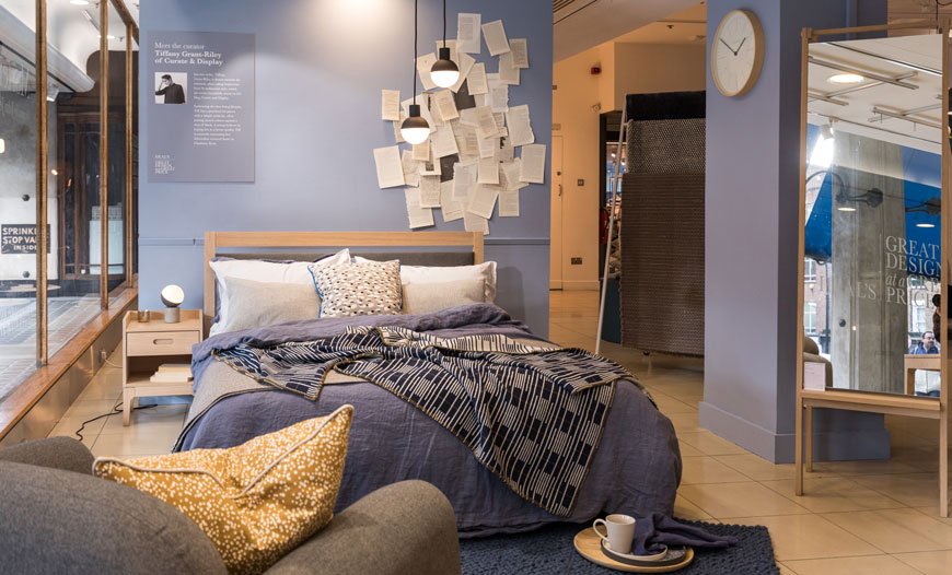
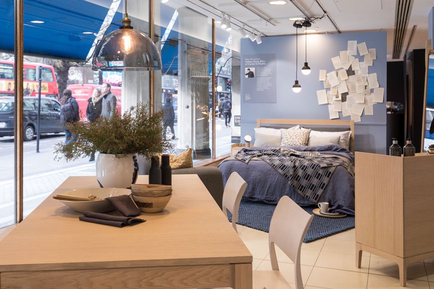
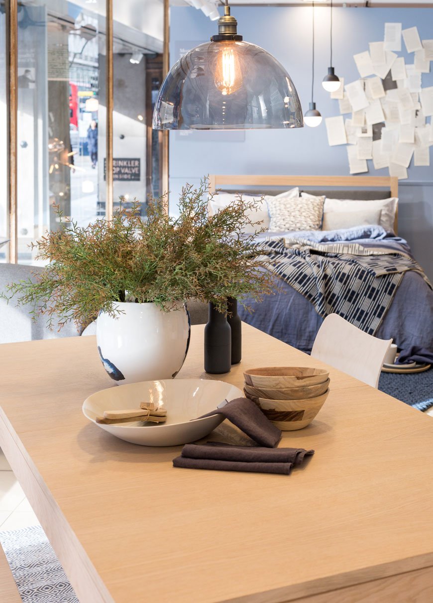
Designed by RCA design graduate and long-term collaborator John Jenkins, the Morten collection is crafted from whitewashed, solid oak. True to its minimalist, Scandinavian influences, the beauty is in the simplest details. From the elliptical handles of the drawers to the upholstered grey headboard on the bed, each piece has tapered legs, raising the furniture off the ground and giving the illusion of space underneath.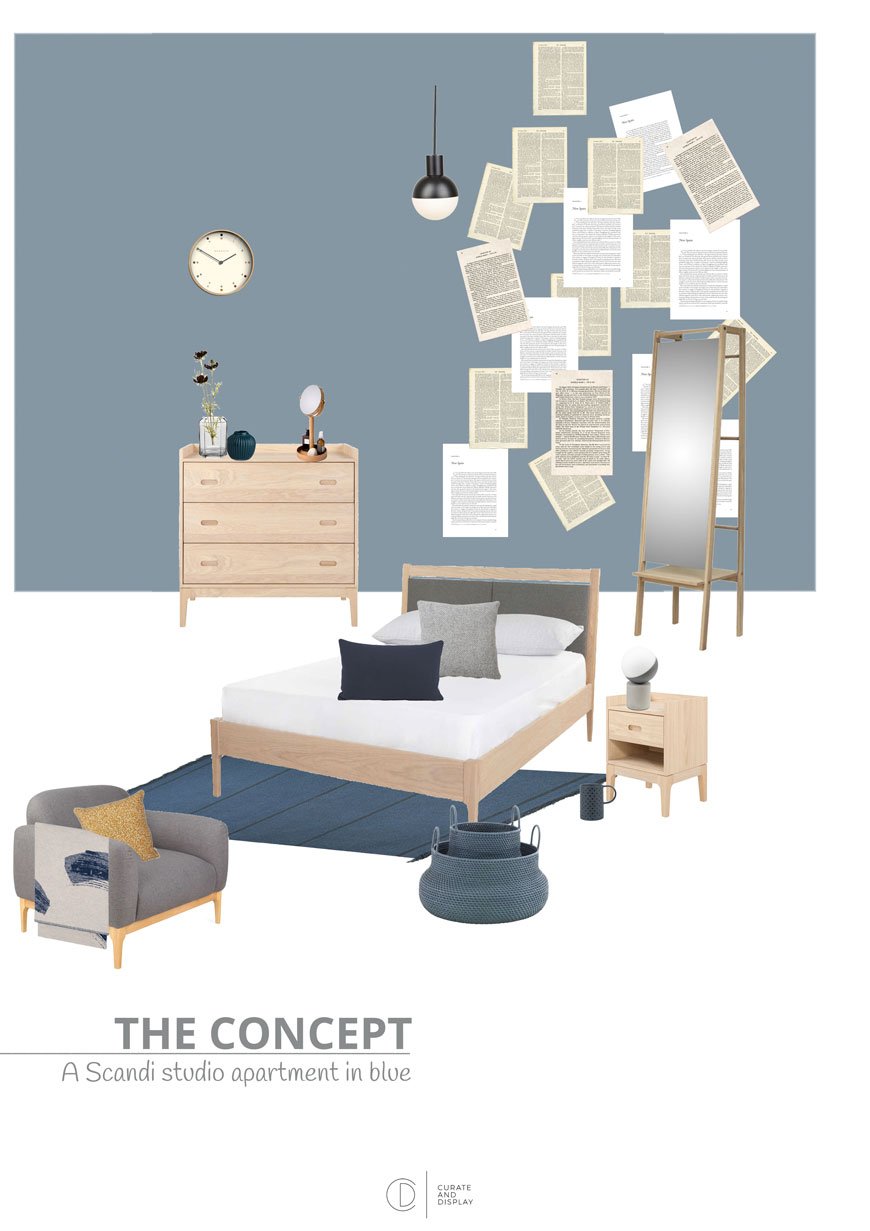 Taking my cue from the Scandi inspired range, I created a space that gave the feel of a studio apartment with the bedroom as the leading visual. With spring on the way (well, nearly) I centred the room around a tonal blue theme, broken up with graphic pattern and touches of mustard yellow.The shade of blue I chose for the walls was similar to what I used in the kids' room and quite frankly can't get enough of, James, by Little Greene paint. It really compliments the whitewashed oak in the Morten furniture and ties in the deeper blues and light greys. It also looks great with the black Fabian pendant lights and smaller concrete table lamp.The Morten armchair and chest of drawers act as a soft partition from the dining area but still gives that feeling of a minimal, open plan space. The new, exclusive addition to the collection is an extendable oak dining table and bench which I paired with the stackable Laclasica chair by Stua.

Shop The Look
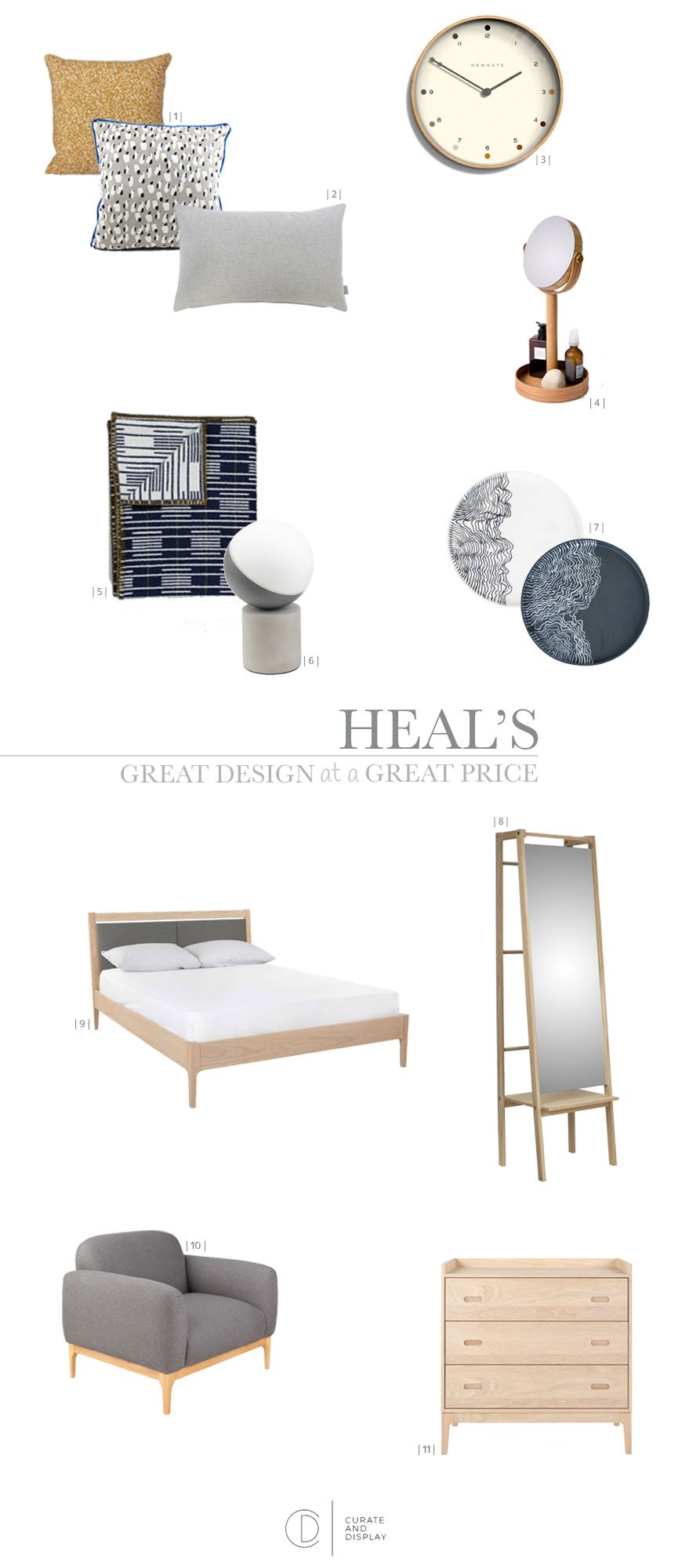
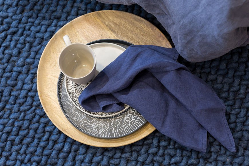
| 1 | Dottery cushion in Curry and Grey Spotted cushion, both Ferm Living | 2 | Grey wool Islington lumbar cushion | 3 | Newgate Pale Dot clock | 4 | Magnify mirror, Wireworks | 5 | Signal blanket, Eleanor Pritchard | 6 | Fabian concrete table lamp | 7 | Estuarine plates, Myer Halliday | 8 | Push floor mirror, Skagerak | 9 | Morten upholstered oak bed | 10 | Morten armchair | 11 | Morten three drawer chest
 On the other side of the window, Kate's mid-century industrial apartment took on warm tones of terracotta and pink. The Brunel collection, designed by Rob Scarlett is fully adaptable and ideal for small spaces with freestanding, leaning shelving and a modular sofa. Find out more about Kate's process over on her blog, Mad About The House.
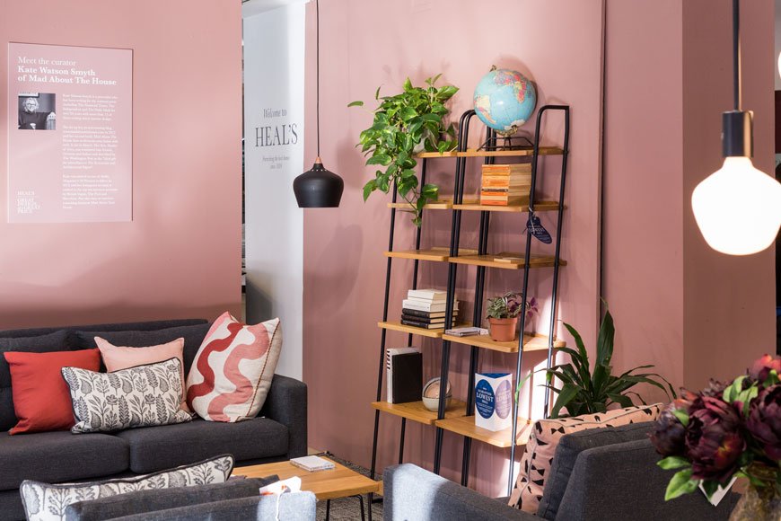 Our windows are in store now until Feb 19th, so do stop by, sit, recline and experience them both.Photography © Victoria Erdelevskaya