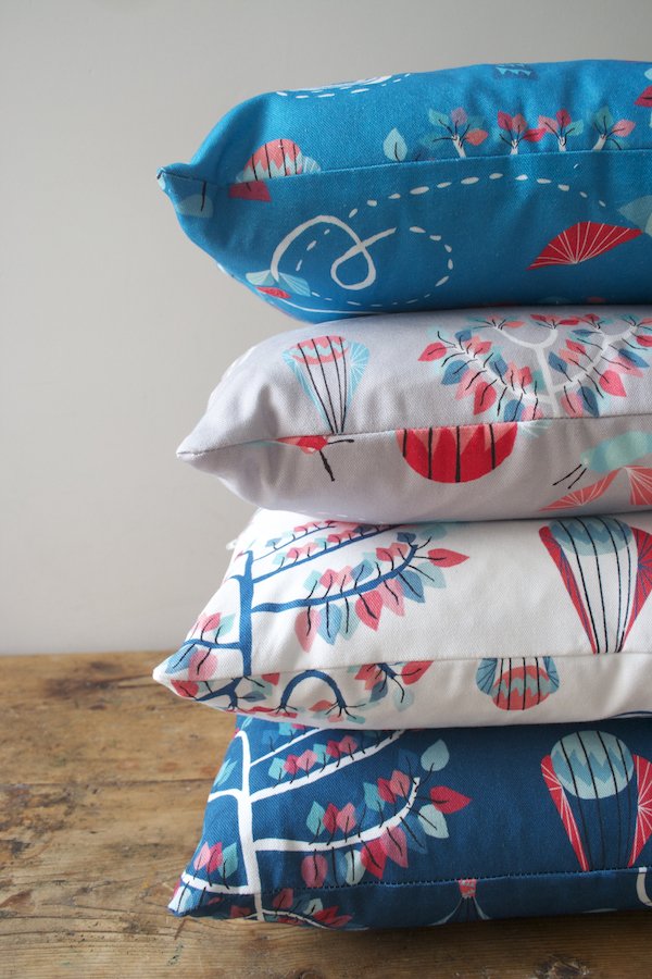
Beynon Modular Crafted Furniture
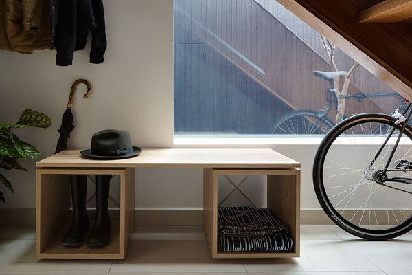
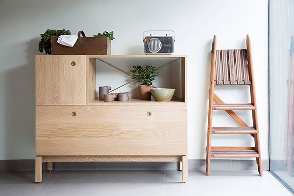 It's difficult to find impeccably well made modular furniture these days that can put its dukes up to the systems that revolutionised modern living in the mid-century era. Sure, there will always be the flat-pack, but if you're looking for solid, reliable and timeless, not so much. So I had my head turned with this beautifully crafted unit by British brand Beynon, hailed as heirloom quality and an adaptable piece of long-term furniture which grows with you over time. As modular suggests, you build your desired piece using a system of wooden units. You don't even have to wrestle with the tool kit because each unit has a simple interlocking mechanism that relies on the turn of a coin. Intelligent. And I love the various ways you can custom build and configure your own to suit your space and needs.
 Designed by industrial design specialist Keinton Butler and graphic designer Richard Davies, the units are produced by master craftsmen in Wiltshire using traditional techniques and made in white oiled oak. Isn't that pale wood bureau just perfection? And please, do yourself a favour and take a look at the poplar sideboard, the details in the grain of the wood are incredible. I could look at it all day.
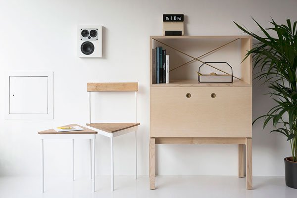
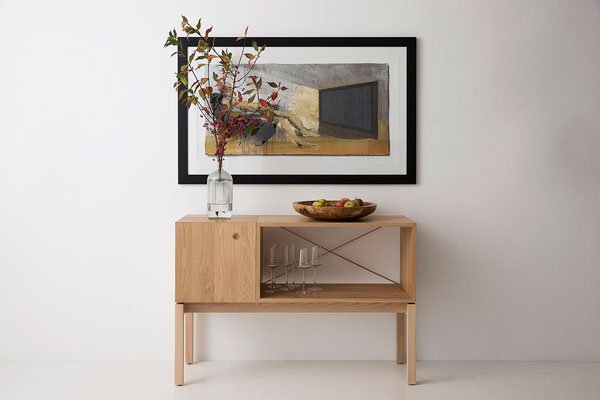 Beautifully simplistic details for adaptable living. I think this one could be a classic.
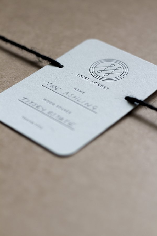
Feist Forest / The Ashling Table
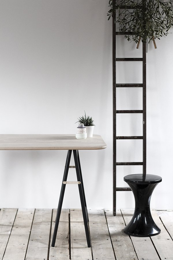
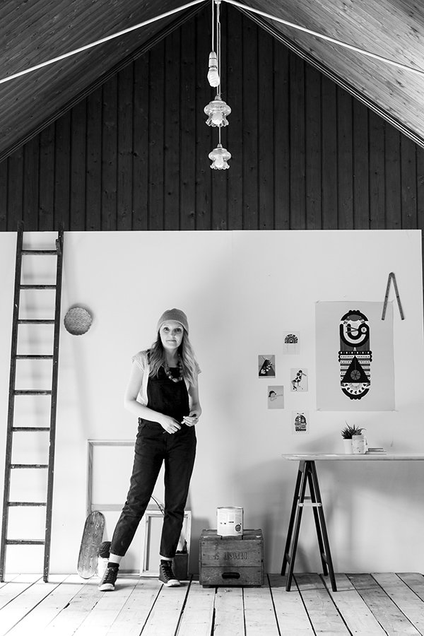
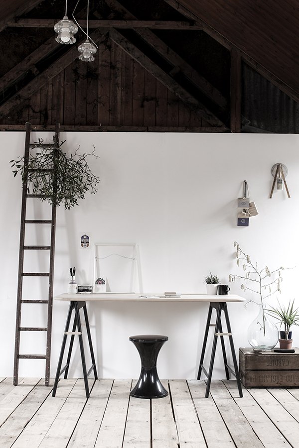 I have reason to be excited today as I introduce you to beautiful new independent design brand Feist Forest. Tucked away inside an old tin tabernacle in Devon, headed up by founder, designer and wood finisher Vicki Turner, Feist have been thus far quietly producing by hand one of the most stunning tables I have ever had the joy of discovering. The Ashling Table. Take a moment to pour over these exquisitely styled images. Oh for a tin tabernacle and that table...
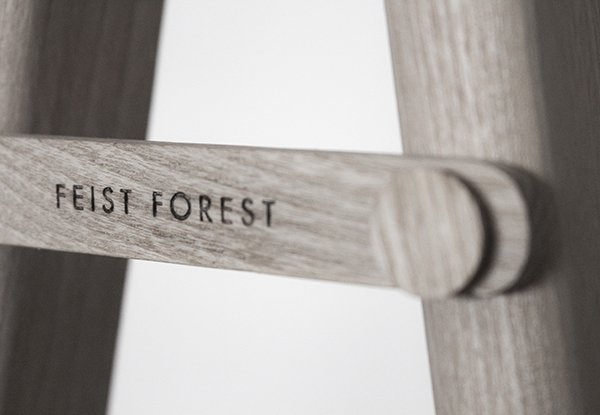
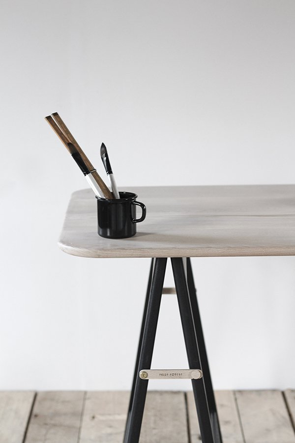 A trestle made for the most astute of design lovers, its subtle mix of pale ash and matt black lacquer make it a match made in heaven. Just look at that laser etching! This is a piece that will move and evolve with you, folding down to be stored upright with recessed brass hinges, it is flexible to the core. Production is a carefully considered process; the wood is sourced from sustainable British Ash in collaboration with Sutton Timber and tables are handcrafted in small batches in part with skilled craftsman Ben Algar from his workshop in Bedfordshire.
 Aside from nature, Vicki finds much of her inspiration in watching others come together to create and make great ideas happen."Seeing people who challenge the normal way of doing things and often appear a little crazy whilst they do so, yet battle on anyway. They're certainly the inspiration behind Feist Forest." And so she designed a table for them.
 Any plans for extending the collection? I asked. I for one would love to see The Ashling as a dining table. There are plans for different finishes and formats, new collaborations with local makers too. Keep those eyes peeled apparently.
 Find out more about Feist Forest's ethical practices on their site and try your very hardest not to fall in love with The Ashling. It's all over for me...
Six Kinda-White Dining Tables
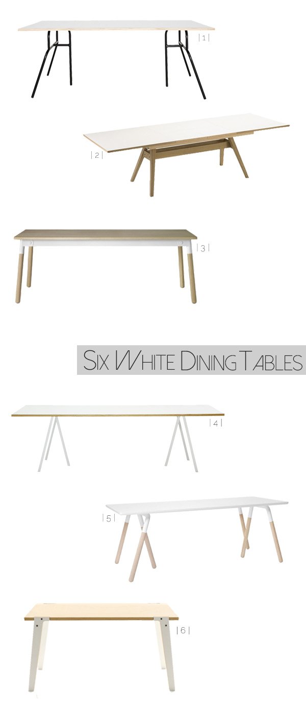 I've been looking for a new dining table for the longest time. The need is real. Something in white and pale wood that suits the home we have now; our current one is an extendable vintage piece, once restored by my father in-law and well loved, but it's time to move on now. It's almost jarring to look at, with too much dark wood in our dining space (and no beautiful white floors to speak of) so it all needs a lift. I'd been toying with the build-your-own IKEA trestles and baltic-ply option for a while, but felt that it wasn't permanent enough and I'd be worrying about spaghetti sauce staining the plywood top. Those are real issues. Having a surface with a clean, white top is ideal to shoot down onto when I'm working on a project at home, a lot of the time I end up using boards if I need a blank canvas which serves a purpose to an extent but does have its limitations. And everything looks better on white. Seriously. Of course, in typical me style, everything I fall in love with is what they refer to in editorial as "an investment piece" so I'm biding my time a little until I'm in a position to commit.To make my search a little easier and to give you a little food for thought if you're going down the same road, I've picked six of the best kinda-white dining tables (because they're not completely. Not ready for that yet). I've been making eyes at the Raft Table Na2 by &Tradition for so long now - I mean look at it-the trestle shape in the legs, the white laminate top (easy to care for with two messy children) powder coated steel and oak legs just scream "take me home!" It's no surprise that something this beautiful came from the geniuses behind NORM Architects. You beauties.Which one is doing it for you?
| 1 | MF0702 | House Doctor DK
| 2 | Skovby Olso SM11 Extending Table | Barker And Stonehouse
| 3 | Muuto Adaptable Dining Table | Nest
| 4 | Hay Loop Stand Table | Nest
| 5 | &Tradition Raft Table Na2 | OCCA Home
| 6 | Switch Table 'Mid' | rForm at Clippings.Com
Doe Leather Lookbook
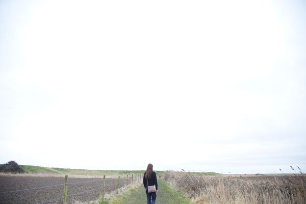 "Oh My God!" is pretty much what I said when these shots from Doe Leather's new lookbook landed in my inbox. Oh. MyGod. A wistful, solitary walk looking out across the tousled Suffolk countryside, waiting to explore with an exquisitely handcrafted leather bag slung over one shoulder...I don't really need to explain why they've caught my attention. But I'm going to anyway.
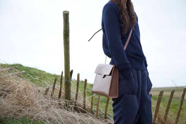 Social media has a wonderful way of bringing people together sometimes, my go-to community is on Instagram right now where I first met fellow Suffolk girl (always a conversation starter) and owner of Doe Leather, Deborah Thomas. Over the Easter break I found myself sitting at a table with her over coffee and pastries at Pump St Bakery - a last minute get-together whilst I visited my parents up in Suffolk. The room a cosy warm against the crisp cold of an Orford morning and with the shuck of the milk frother readying our lattés she told me her story of the Northamptonshire factory run by her family for three generations.
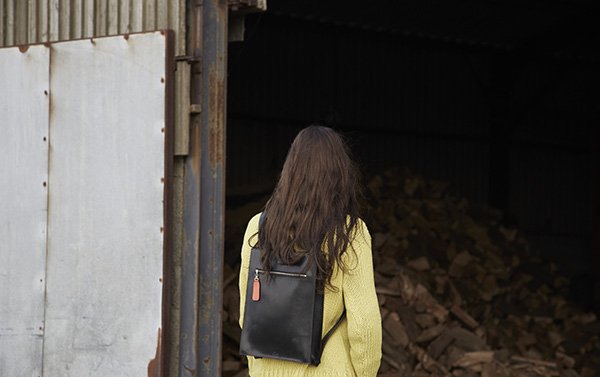 She told me how, spanning almost a century, her grandfathers built up a strong heritage in the British leather industry, producing and embossing hides for export only for the factory to close its doors in 2002, pushed out by the cheap and fast imported leather from the toxic tanneries. Google it. As she showed me some old photos of the factory in its Art Deco glory days to a postcard of a now derelict, empty staircase inside, I could see the how much this meant to her and the childhood memories attached to it.Now, Deborah is working to rebuild that heritage with her own collection of bridle leather accessories, produced in the Black Country in one of the last remaining leather workshops where the leather is lovingly nourished and crafted into bags over a period of several months. And the details? Oh you'll love this - the designs for the zip pulls have been cut from the factory swatch archives and stitched carefully to give each bag a unique identity and a piece of that history.
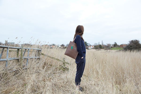
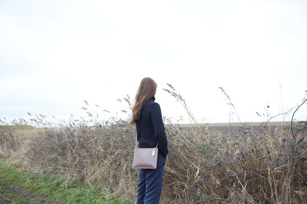 Ethically produced. British made. These are bags for life.
Photography © Julia Bostock
An Artful Style #4 / Studio Esinam Architectural Prints
Back in high school I learnt a little about technical drawings and elevations and it fascinated me - from all the intricate details that go into designing architectural elevations down to the complete joy of using the drawing table.When I first discovered Studio Esinam, a creative design studio based in Stockholm, I was really exciting to see how they'd taken technical elevations of some of the world's most famous landmarks and brought them into a home environment. Founded in 2013 by art director and architect duo Josefine Lilljegren and Sebastian Gokah, Studio Esinam looks to explore architecture from a fresh perspective, presenting familiar historical buildings that we have all in some way connected with in a new light, focusing on the structure and components that make them what they are. Beautiful, don't you think? 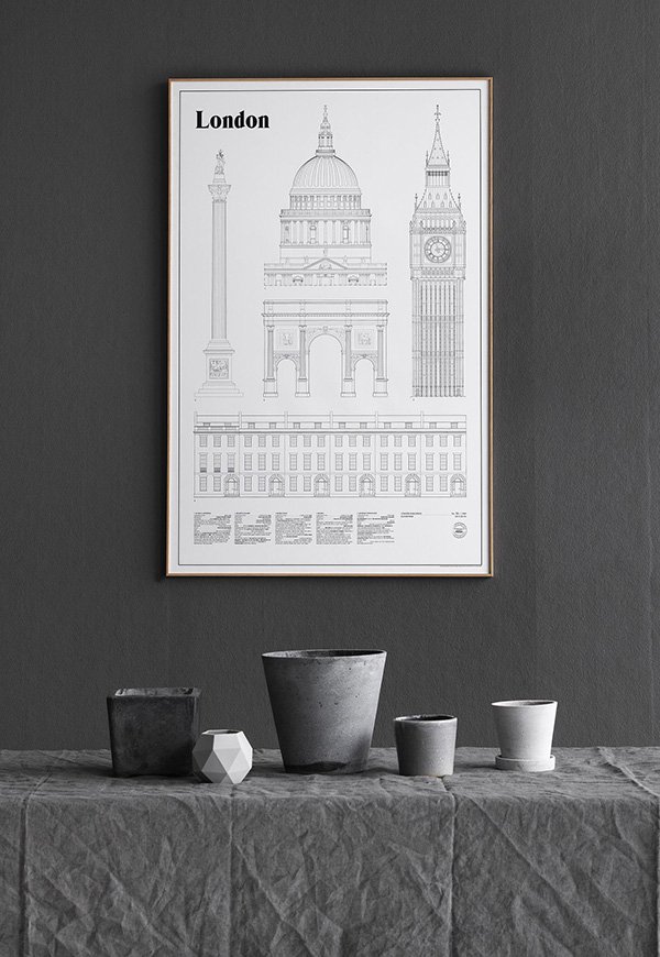
"To us architecture is so much more than visual, it's the smell of the bakery shop on
the corner, the feeling of a handle when entering a building, the sound of cars or birds
forming the backdrop of a scene. It's the memories and emotions that a place can
preserve for decades and bring to life in a second, the calming experience of the
places and spaces we already love as well as finding new ones to explore."
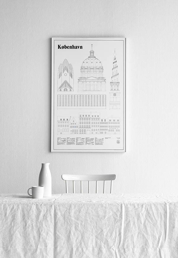 Prints like these really deserve some wall space to breathe and I love how Josefine and Sebastian have chosen to style their detailed line drawings in clean, monochromatic settings. Recently added to the collection are København and the much anticipated London (they're not fans of The Shard), both of which are limited edition. If you're inspired by these prints then you really must take a look at their Instagram which shares an insight into their creative process and how they view their surroundings (which just makes me long to explore Sweden!) lots of white, grey scale and negative space. Perfection.
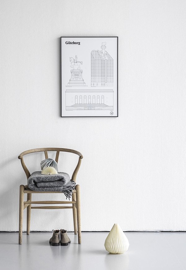
Photography © Studio Esinam
A Stylish Find / Appointed - Desktop Accessories
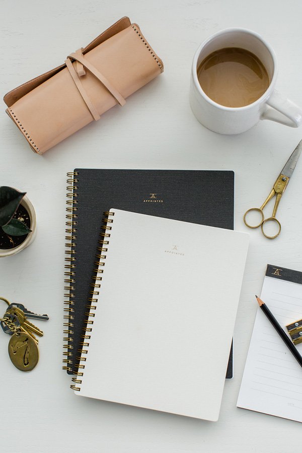 If my all-encompassing obsession with workspaces is anything to go by, you won't be surprised by my reaction to discovering new luxury desktop accessory brand Appointed. My eyes pretty much fell out of my head. A new enterprise by DC based graphic designer Suann Song of SIMPLESONG Design and already a year into the making, Appointed officially launched its Kickstarter campaign yesterday. As a huge fan of Suann and her team's work (you might recognise the beautiful stationery from this Sunday Suppers event) the new collection does not disappoint. Minimal in style and with a practical, beautiful and handmade ethos as its heart, this new line of work tools "makes utility look luxurious" and came into fruition after unsuccessful attempts to find well made, gender-neutral desktop products within the US. Aren't they utterly beautiful?
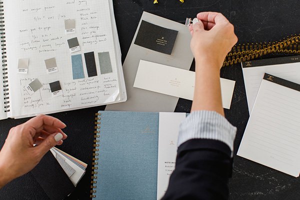
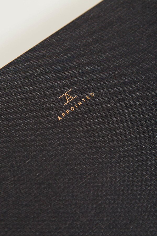 At the centre of the collection is a notebook and workbook available in either plain or gridded perforated sheets, bound with brass coils with foil embossed cloth or textured stock covers. Shall I keep going? Also available are planners and calendars for 2016, brass rulers and memo pads which will be rolled out in time for the launch of their online store later this summer. For more details or to join me in pledging support to get this exquisite new line off the ground take a look at the Appointed Kickstarter page.
Photography © Kate Headley Photography
Love It / FAYCE Textiles & Embroidered Relics
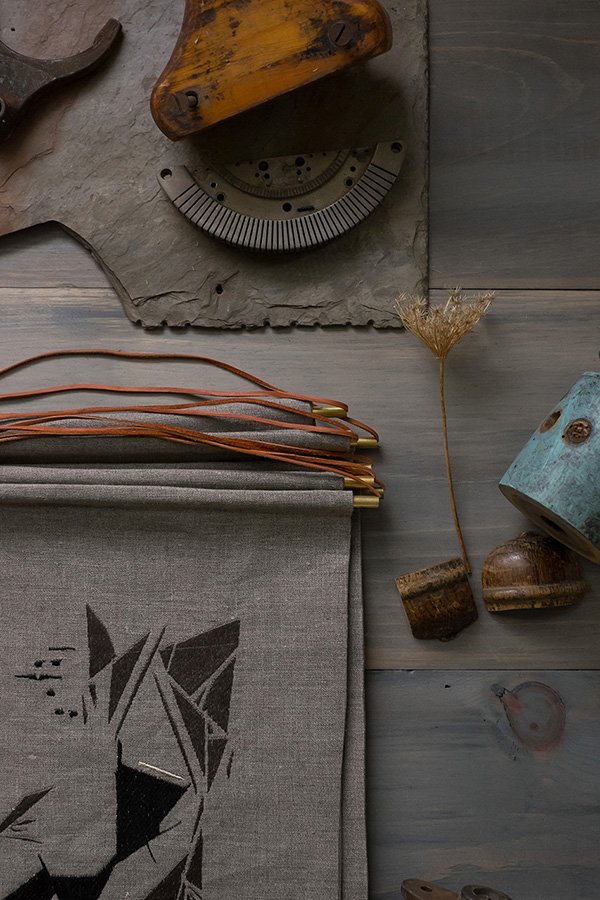 I often talk about Instagram as being an amazing platform for discovering designer-makers and gaining an insight into their creative processes. This absolutely rings true of my latest find, FAYCE textiles, an incredible company created by former illustrator Kim Rosen in New England. After a decade producing illustrations for clients in editorial, advertising and products she felt drawn to the world of textile design and boldly took the plunge launching her own collection. I instantly fell in love with 'RELIC', which draws inspiration from architectural artifacts, formations in nature and elements of vintage textiles. There was something about seeing the use of contemporary geometric lines come to life in a traditional form of needle work that grabbed my attention and got me imagining how utterly perfect they'd look on my sofa. I can never have enough cushions.
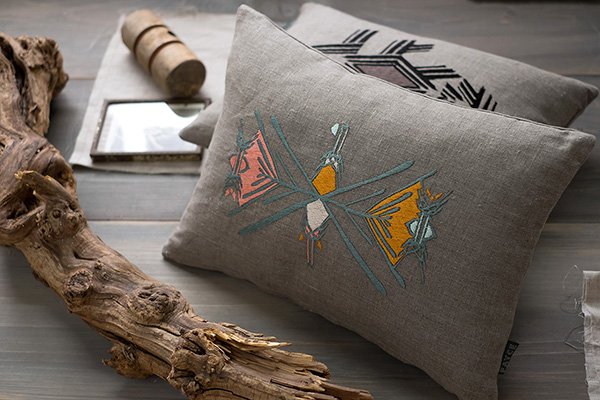
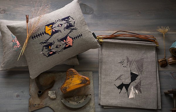 I love the combination of the muted grey and monochrome with pops of bright yellow, pink and teal. Kim achieves her striking designs using a combination of hand drawn and digital techniques before embroidering onto 100% linen, transforming them into cushions and wall hangings. There's something quite raw, almost Native American about them, don't you think?"My love of patterns and textiles runs deep. Since my days at the Fashion Institute of Technology, where I studied Advertising Design, I was surrounded by amazing textile designers and I learned to incorporate the main elements and principles of Design into all my artistic endeavours. Whether working in graphic design, illustration or textile design- line, composition, colour, texture and shape are always constant. This new Embroidered line combines these design elements that I love. I looked to vintage textiles, architecture, family heirlooms and nature for inspiration and the hand drawn embroidered designs were a natural and instinctual addition to the FAYCE brand." - Kim Rosen.
 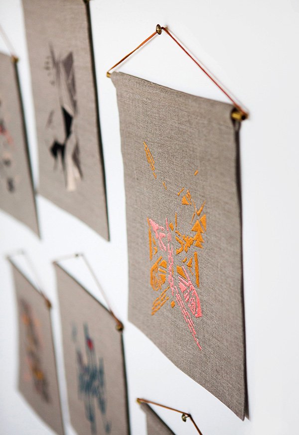 Kim's work is inspiring me to bust out my needles and flosses and start embroidering again. Could be a new trend alongside woven wall hangings?
Photography © Chattman Photography
The Cut #03 / Ceramics To Covet For Christmas
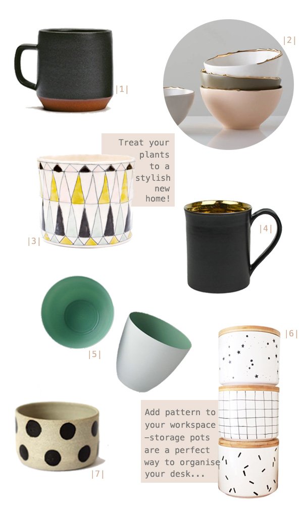
|1| Large 'Ash' coffee mug, Mazama |2| Flawed gold plated bowls, Studiomake at Gretel Home |3| Pyramid planter, LEIF |4| Bronze Glaze ceramic tea mug, Nôm Living |5| Mint porcelain tea light holder, Future and Found |6| Bamboo lidded storage jars, oh ho rachio! |7| Eclipse vessel, Takeawei Studio at Great.ly
This week's 'The Cut' was a complete no-brainer. With a burgeoning collection of ceramics at home (most of them home to a variety of plants) it made sense to put together a Christmas gift guide of personal favourites. Not an easy task given the choice out there!I try to buy my pots and mugs from small, independent designer-makers; the materials and craftmanship are all together a much higher quality. I love the rough feel of a hand thrown, stoneware mug like this from Mazama and the perfectly imperfect gold edges of Studiomake's plated bowls-isn't that muted colour palette just to die for?!Find a little of the unexpected inside Nom Living's bronze glazed mug (imagine sipping a rich hot chocolate from that!) or a splash of fresh mint from Future and Found's porcelain tea light holders. A small succulent would look very at home in one of those too.Speaking of planters, how could anyone resist the bold patterned Pyramid planter, an exclusive from LEIF or the spotty Eclipse vessel from my Great.ly boutique? Throw out those plastic pots and give them something worth to growing into.I nearly tripped over my tongue when designer-maker Oh No Rachio! tweeted a photo of her new collection of bamboo lidded storage pots last week. So popular were the first batch that she sold out and had to order more in, so get in there quick if you want to be in time for Christmas! Choose from three designs; grid, confetti or constellation and then use them in your workspace to store all those runaway bits of stationery. My absolute must have from the whole lot.Are you a crazy ceramics nut like me? What's taken your fancy?
An Artful Style #03 / Crisp Sheets & Botanical Prints
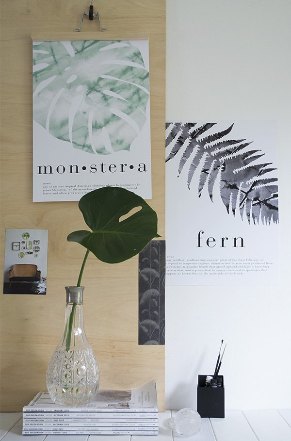 Instagram isn't just a great way to find inspiring photography, I think it's a brilliant tool for finding independent artists and designers. In fact, this is exactly how I found today's designer. Doing a search (I was looking for botanical prints) will often throw up some gems, and Crisp Sheets most definitely falls into that category.Dutch brand Crisp Sheets was founded at the beginning of the year by Lara Jans, who noticed a lack of good quality bedding with a modern design that didn't break the bank. As only the best of ideas come about through problem-solving, Lara embarked on a journey to design and produce her own which inevitably began to spill into art prints. Her background in visual merchandising plays a large part in Crisp Sheets's signature style, with strong botanical motifs, bold graphic type and geometric shapes. Each piece also has its own dictionary definition. Nice touch.What I particularly love about Lara's designs is that they feature hand painted watercolour elements and that soft aquarelle lends itself beautifully to the plant prints. You may have spotted two in my own living space-I have the Monstera and Fern prints which I absolutely adore and look brilliant framed in black or hung from a simple IKEA trouser hanger as they are at the moment.I'm expecting big things for Crisp Sheets in 2015, and as her pieces can already be found in design stores and boutiques worldwide, I can't wait to see what she's got up her sleeve next...
Photography & styling © Tiffany Grant-Riley
The Cut #02 / Tactile Textiles For Christmas

|1| Oyoy Fluffy Grey/Black Cushion, Skandivis |2| House of Rym 'Go Undercover' blanket grey, Starling Store |3| Grey Gradient Wool Rug, French Connection |4| Birch cushion, Fine Little Day |5| Tweed Emphasize Charcoal grey throw, Mourne Textiles |6| Bordered Round Jute rug, West Elm |7| Jamba cushion, Joss & Main |8| Melin Tregwynt Knot Blanket, Starling Store
Today's Christmas gift guide was such a joy to put together- every single item is top of my homeware must haves. Sigh. Aren't they all just so gorgeous?If there's one thing I absolutely cannot get enough of, it's textiles. They really make a home and, if like me you're renting, it's one of the easiest ways to make a place feel like your own. One of the things I loved doing whilst we settled in here was living in the house and getting to know the space for a while, making plans for where I'd like to put rugs, runners, throws etc and keeping my eyes open for the perfect design along the way.My choices are full of texture; from handwoven wool and jute, to the geometric shapes and birch tree bark, but they're also in keeping with my love of black, white and grey. Quite restful, don't you think? I've added in a touch of soft pink and mustard yellow too to see how it might look as I'm toying with the idea of bringing in soft pink to soften out the monochrome a little. The house is slowly starting to take shape, but I'd love all one or two of these pieces to make it feel complete. You never know...
The Cut #01 / 6 Must Have Prints For Christmas
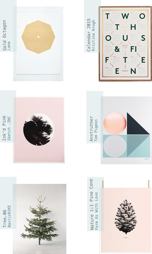 Hello! I have a new series for you today called The Cut, where I feature the most desirable items of home ware and lifestyle that I come across on my travels. Sure, it's not a new concept, but I think you'll really love my picks and maybe even find a little inspiration for your own home.It's that time of year again where we're turning our thoughts to Christmas, compiling ideas and planning if we're ahead of the game, panicking if not! Have you started yet? I most definitely haven't, but I have at least done a little research to give me a head start. I find categorising gift guides to suit all types an impossible task, so this year I've focused only on decor for the home that I'd absolutely love to receive for mine.My 6 must-have prints are, I believe, some of the most perfect examples of graphic art just begging to be framed and displayed in pride of place...✚ Copenhagen based graphic designer Kristina Krogh's 2015 Calendar is a brilliant combination of dark green typography and embossed copper foil. Useful and beautiful. Drawn to cold and warm raw materials, her work often features marble, plywood and cork to produce fascinating, textural art.✚ I love the impact of geometric shapes within the home, particularly three-dimensional forms cast in marble and concrete; the hand-pulled Gold Octagon by Lane would compliment a grouping of these as a vignette leant on a shallow shelf, don't you think?✚ A popular design from my 'Artful Walls' Great.ly boutique is British designer Sketch .Inc's 'Ink'd Pink', using a bleed of black ink as its focal point-perfect for my workspace to pick out the black accessories.✚ Current key trend (not that I care to follow too much) copper is showing no signs of fading. I love what designers Kirsty and Pete of Tom Pigeon have created in their Anstruther print with the metallic foil circle, charcoal grey and spearmint colour combo. With the right balance of feminine and masculine elements, this is a his 'n' her's pleaser for sure.✚ Inspired by nature's offerings at this time of year, I'm desperate for the rose pink and black pine cone designed by Form Us With Love, particularly as I'm starting to bring in touches of soft pink into our living space to warm it up a little. The photographic print of the fir tree by BastisRIKE would look wonderful styled as part of a minimal Christmas setting too; I'm even considering a "naked" tree this year, save for maybe the lights, although I'm not sure my son would be so impressed!Keep your eyes peeled for my next instalment, I'm talking textiles! So tell me, which of these prints is calling out to you?
A Stylish Find / Future and Found, Tufnell Park
 Future and Found is, if you'll excuse my dodgy pun, a seriously stylish find. A sweet discovery I made on a home shoot for LivingETC some months ago now (we had these deceptively delicate coffee pots on loan) I made it my mission to get to the shop in Tufnell Park and meet its founder Andrea Bates. Having recently moved, the shop is now settling in to its new location; a former factory complete with original metal framed windows, industrial brickwork and concrete flooring. Designed in a way that allows each carefully selected piece to shine without the feeling of clutter, the space is small and perfectly formed. I love that, by way of connecting with its name, you have to discover the shop for yourself, starting with a short walk through a covered walk through to a courtyard, where Andrea and her "right hand gal" Grace Poulter curate the space with outdoor decor, depending on the season.
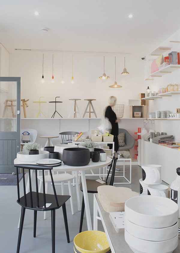
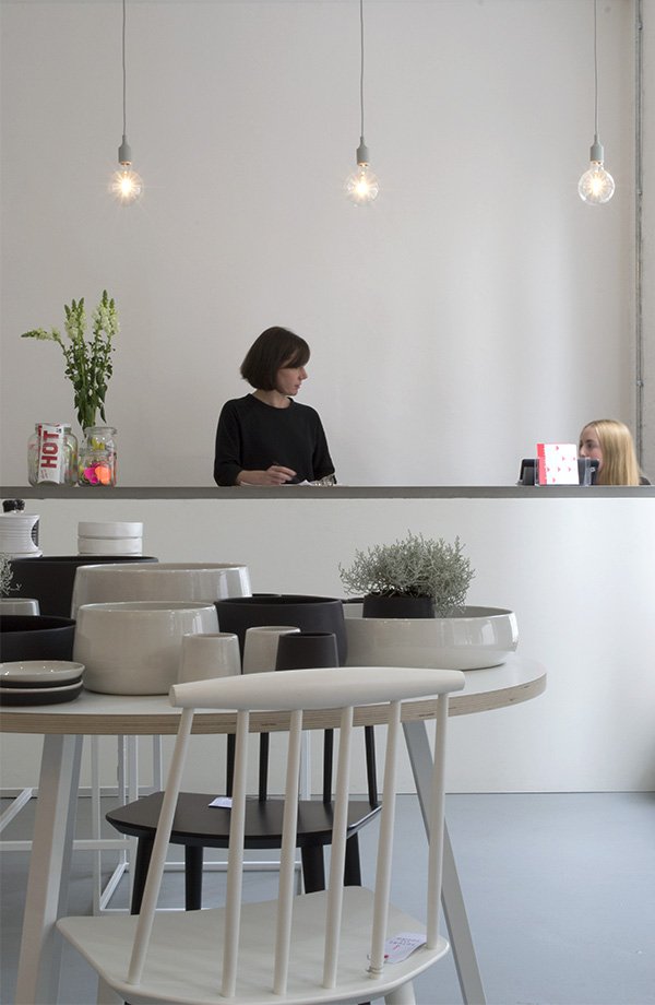 With a former career as a buyer for Heals and, more recently, Jamie Oliver, it's clear that Andrea's experience has influenced her choices in creating the Future and Found brand. Her Scandinavian aesthetic is crisp, clean and functional with a focus on hand-crafted, design-led pieces, grounded in a monochromatic scheme but given a lift with pops of neon. The shelving scheme was a custom design where the struts have been secured into the wall plaster-a stylish idea for open shelving in a kitchen or living space, don't you think?
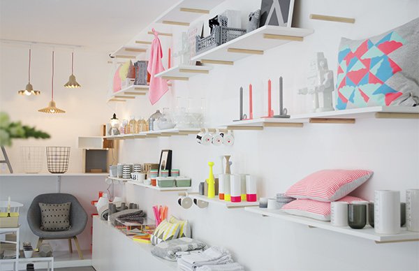 Amongst the future design classics from the likes of HAY, and Muuto are emerging British designers, including Kangan Arora, and ByAlex. With the London Design Festival now in full swing, Andrea and Grace will be on the look-out for new products from promising designers to bring back to the shop. She tells me that unlike large department stores where the time from sourcing and buying a product to getting them onto the shelves can take months, as a smaller set-up, Future and Found can discover pieces and make them available much faster, a freedom she very much enjoys.
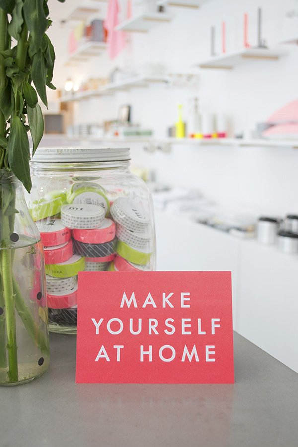
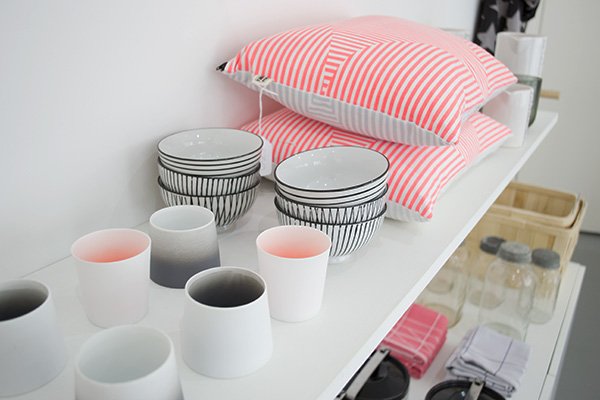
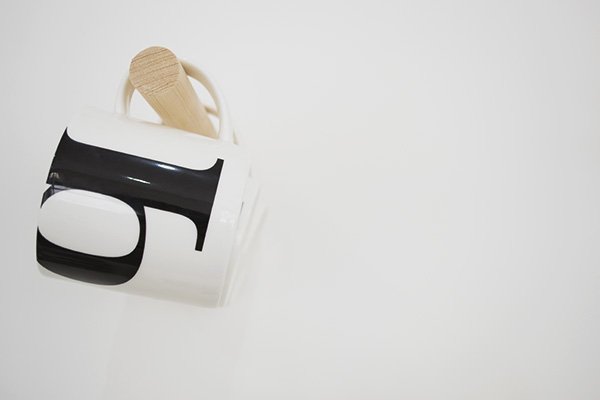
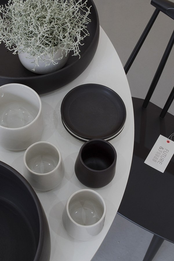 I couldn't take my eyes off these beautiful, handmade ceramics by Bel Art Creation based in Tunisia. Having recently re-styled our living space with a strong, monochromatic feel (more on that very soon!) it's a look I can't take my eyes off. Working with so much colour as I do, and wary of the trends that come and go, I feel more and more drawn to the simplicity of black and white.
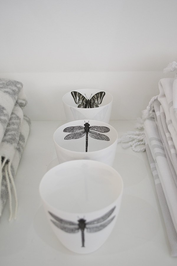 So many beautiful, covetable pieces for the home. Thanks for having me girls!
A Rustic Lunch in Another Country
Sigh. Can I be honest? As much as I'm trying hard to make a real go of having a life here in Rochester, my heart is still yearning for an Italian adventure. To pack up everything we own, stick a pin somewhere on that foot in the Mediterranean and call it home-oh the possibilities. I'm a "do now, think later" kind of girl, a risk taker, but I married a head over heart man...and he won out for now. So instead, I have to fabricate situations that allow me to imagine I'm there in a little home just outside the walls of Lucca, like listening to the bells ringing out across the town in the evening, drinking proper stove top coffee or, say, lunch in Another Country.
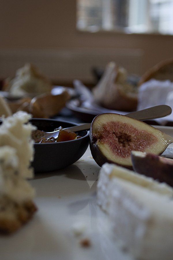
Newly opened in London's Marylebone, the beautiful Another Country showroom is home to some of the most stunning pieces of contemporary handmade furniture and home accessories I've ever had the joy of touching. Last weekend, I was invited to the store by fellow bloggers Kate Baxter and Daniel Nelson as part of the brand's #anothersummer campaign to team up with Heart Home magazine's editor Carole King for some styling fun. With the whole space to play in we were given full creative license to style up a story and shoot it using the furniture and props to hand. It took very little time for us to decide on a rustic theme, the furniture and accessories lending themselves so well to this simplistic style.
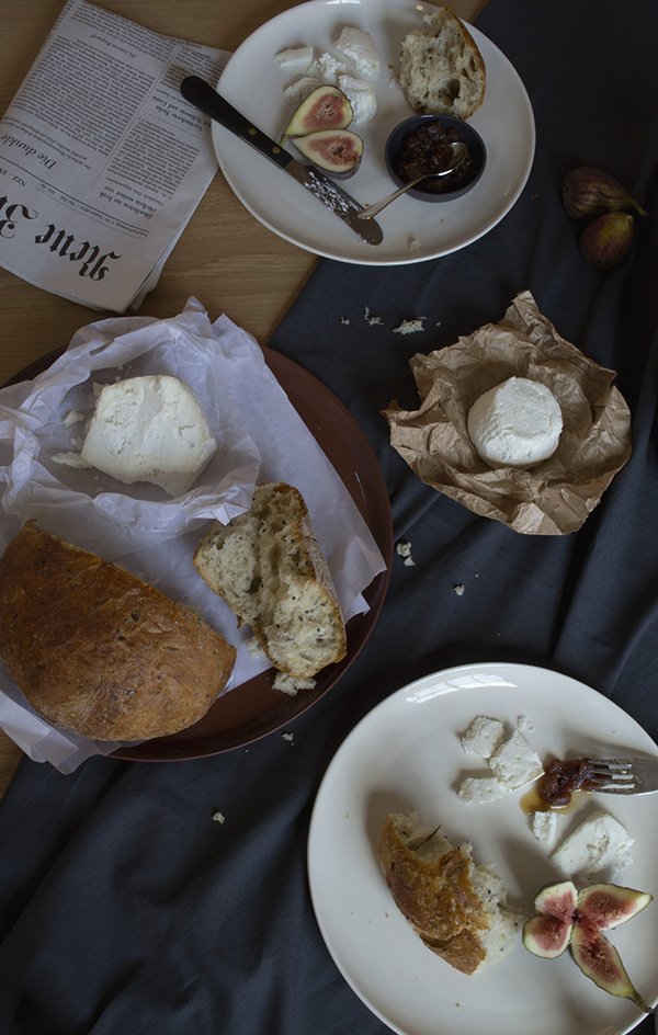
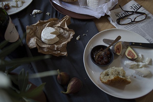
Fifteen minutes later we found ourselves on Marylebone High Street on a hunt for crusty herb and olive bread, figs, red wine and delicious cheese and chutney (courtesy of La Fromagerie). Back at the store, we chose a solid oak dining table as our starting point, and dressed it with a rumpled grey tablecloth of Carole's before building up the look with Ian Mcintyre's white stoneware dinner plates and terracotta platter. The sleek, black Provençal cutlery created a strong contrast against the white plates and I absolutely loved how glossy the pineapple chutney looked in the grey pinch pot. Those will be on my Christmas list for sure. To finish the look, Carole "borrowed" clippings of olive branches from the trees lining the street (nobody saw so it never happened) and there you have it-a rustic lunch for two in my imaginary Italian farmhouse kitchen. I'm home.
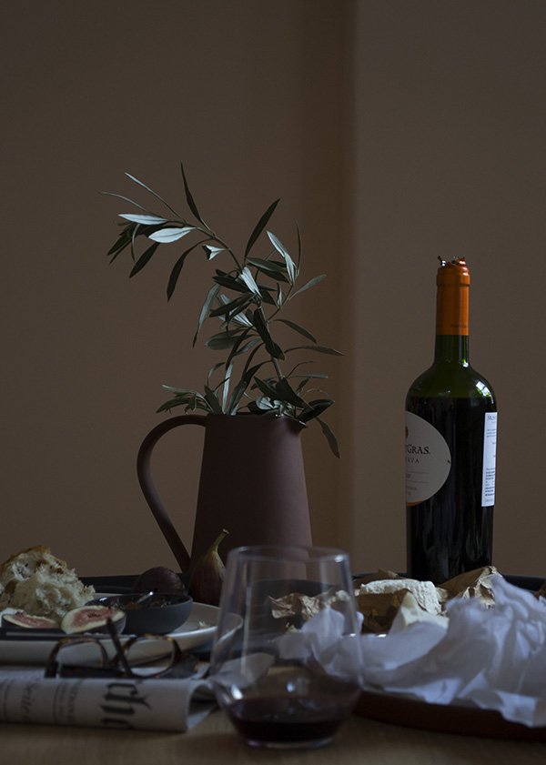
It was a real joy to experiment with a moodier style of photography for the most part because I'm more comfortable shooting in brighter conditions, so it got me out of my comfort zone. What do you think? I get a sense of the end of summer in these shots, with a feeling of autumn approaching in the deep blush of those figs, my favourite season of all.
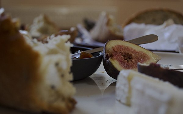
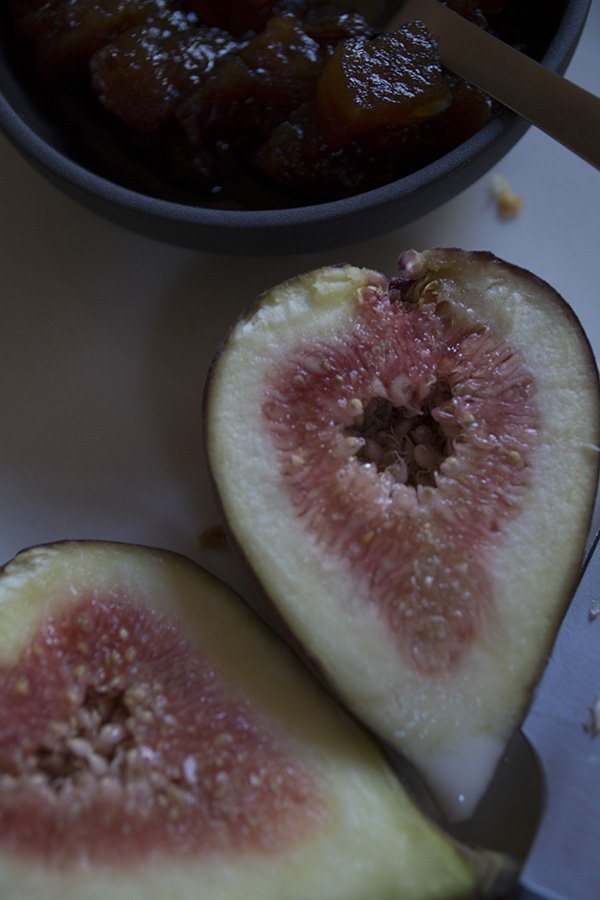
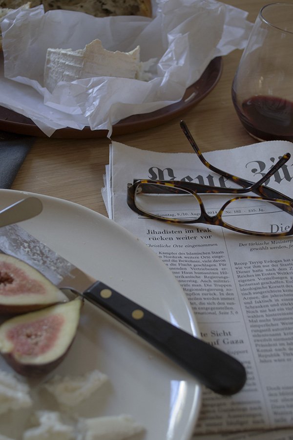
After we wrapped we sat down together with Kate and devoured the lot. La dolce fa niente. With a German newspaper.
Photography and styling © Tiffany Grant-Riley
Mourne Textiles / A Family Fabric
Good morning! How was your weekend? Mine was all about family. Although I've yet to meet her, I cherished watching my newborn niece experience her first few days of life through the photos my sister sent, and spent a glorious day with my little family in the seaside town of Whitstable, not far from where we live. There were oyster shells, pebble skimming, ice-cream so many beautiful beach houses-I can't wait to share more with you from our day on Wednesday.
****
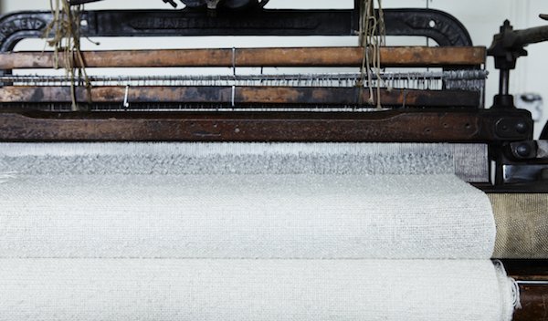
Continuing on my family theme today is an exceptional artisan business grown by three generations of the same family. Nestled in the side of the Mourne Mountains of County Down, Northern Ireland, is the Mourne Textiles design workshop.
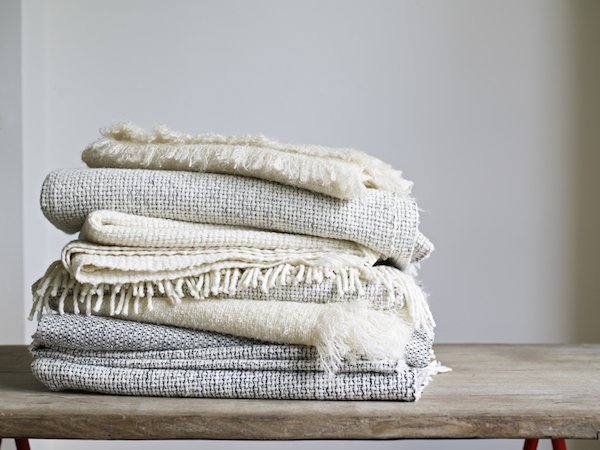 Founded by Norwegian designer Gerd Hay-Edie in 1954, the workshop has a rich history. Combining traditional weaving techniques with the finest spun yarns, Mourne produce exquisite throws, cushions and rugs which have been so much a part of British design history these past sixty years. There is simply too much to be said for Gerd's incredible achievements in establishing the Mourne name, but some of her finest moments include designing custom fabrics for mid-century designers Robin Day and Terence Conran who continued to use her specially created tweeds and upholstery for many years.Today, Mourne is enjoying a revival with Gerd's grandson Mario at the helm under the guidance of his mother and Master Weaver Karen.
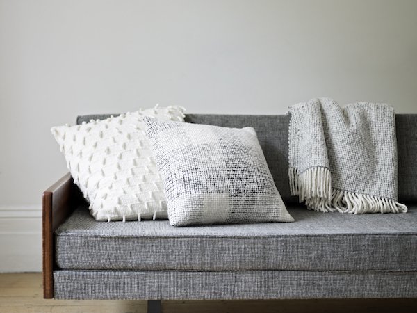 An integral part of his childhood, Mario remembers..."When I was a boy, the workshop was my playground. I vividly remember the unmistakable smell of lanolin from the fleeces, and in the background the rhythmic sounds of the looms creating fabric: it was a wonderful place to grow up."
 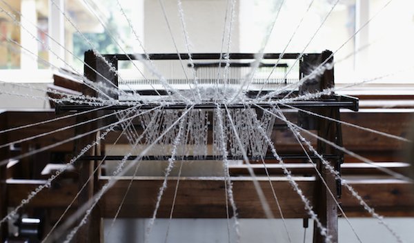 He has carefully selected some of his grandmother's most iconic designs to bring to life again and I have completely and utterly fallen in love with them-the textures, soft colours and beautiful, almost hand spun quality of the Donegal and Merino yarns. What I wouldn't give to knit with these. And so what that it's summer? Every sofa and bed needs a trusty throw or two and a good mountain of cushions to soften it up!The yarns are carefully sourced to replicate the traditional materials Gerd would've used in the past, although some are tricker to come by today. Mario explains:"Some of the yarn we are getting from Donegal have been spun exactly to our specification (a very textured yarn, very traditional to Ireland, which has a hand spun irregular feel,
 a bit like the spinner has been out for a few pints of the black stuff before coming home to spin) so as to match the yarn used by my grandmother in the 1950’s. Sadly, I haven’t got the luxury of picking these yarns off the shelf any more." 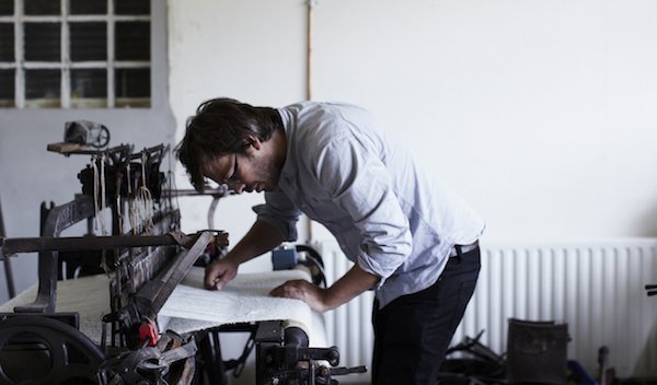 These hand woven Mourne Check cushions in Irish tweed have been dyed to match the original heritage colour palette as closely as possible, although they are also keen to introduce new colours using yarns available today. Aren't they beautiful?
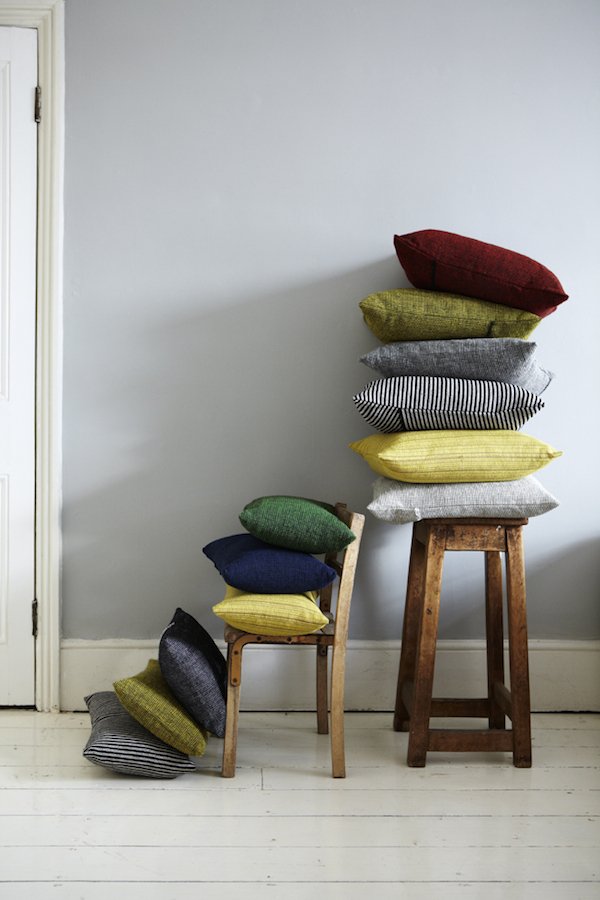
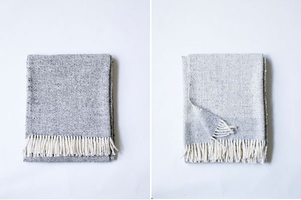
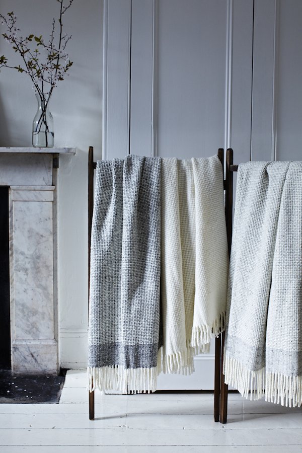 As we start to see a return of traditional production methods on home soil, I truly hope that small, family run businesses like Mourne will continue to thrive. It is so important to show our support and keep these traditions alive. I hope you love the collections as much as I do, too...
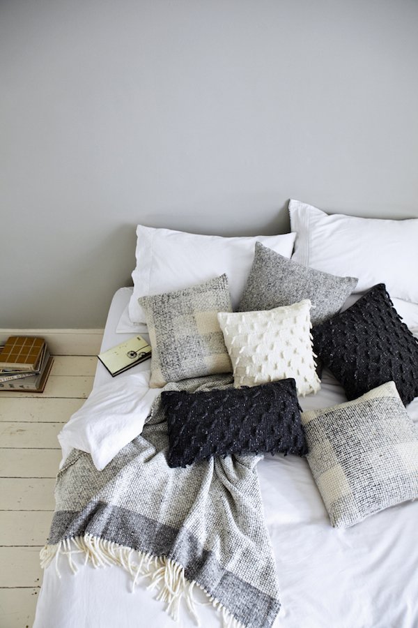 Image Credits: Tara Fisher PhotographyFollow MourneFacebookTwitterInstagramPinterest
'Retailed' / Heal's Part Two
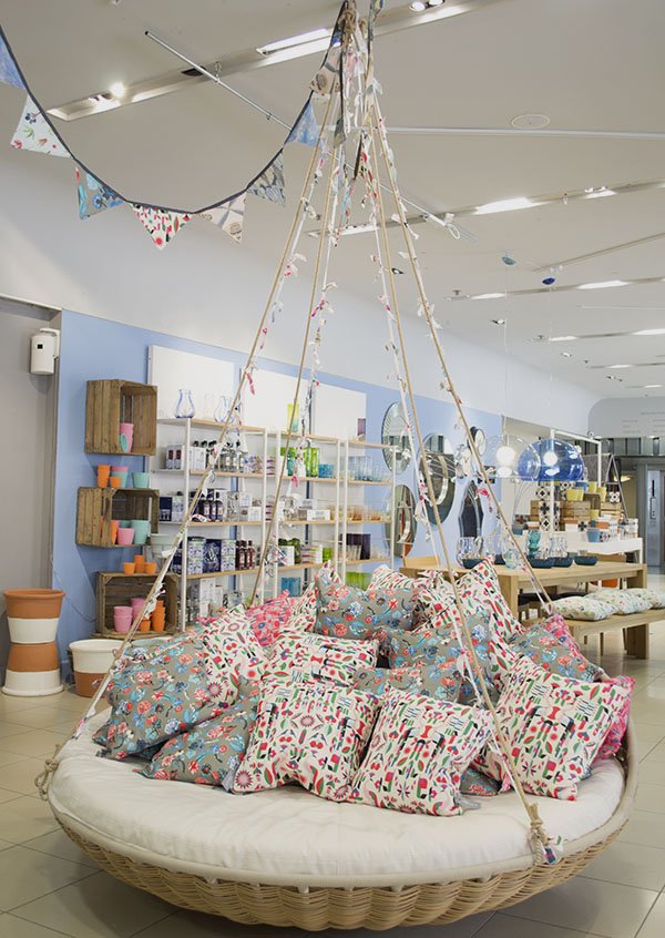
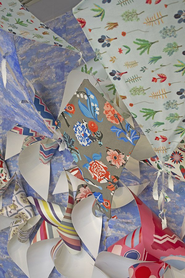
Last week in part one I introduced you to the visual team at Heal's as they began work on their summer windows and today I'm thrilled to bring you the second instalment of this feature. It’s my second day at Heal’s and I’m an hour late thanks to the tube strike, but Phil, Tatum and the team are already in full swing. The summer schemes are really coming together now, with the outdoor swing chair in place, the beach hut complete and in the showroom pin wheels and kites that Vicks made with 1810 fabric are going up.
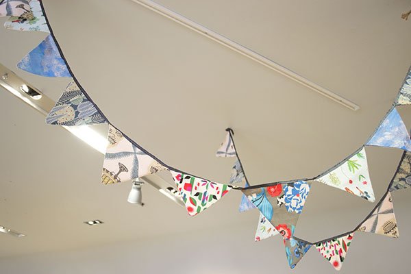
As I watched her put them up with Mike the day before she had clear reservations about their look- in fact she didn’t like them at all and felt they looked a little too homemade. I made the point that I sometimes have reservations about my work, but more often than not others really won’t be critiquing it anywhere near as much she would be and the only thought going through most people’s minds as they passed this window would be “oh, those are a really lovely idea”. She agreed and told me their buzz phrase of choice was “fresh eyes”, meaning “let’s come back tomorrow and look again”. This morning, with more of them up on the walls I can see that they add to the scene in context and really start to bring the look to life.
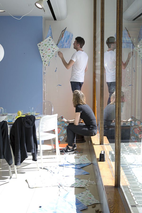
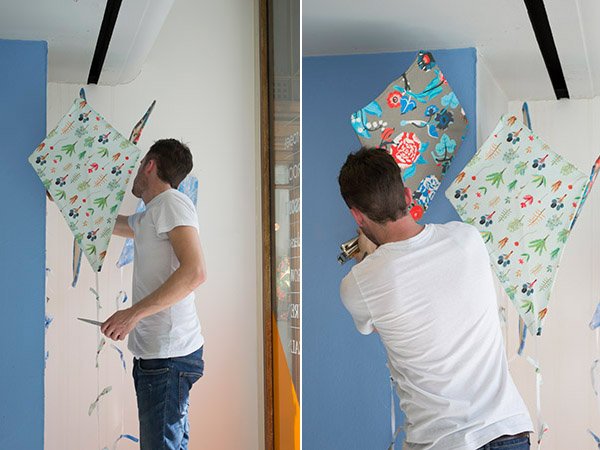
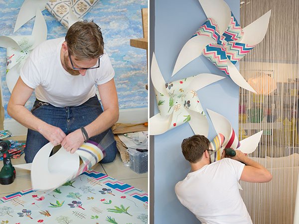
Phil is busy assembling the pin wheels made from a flexible plastic and screwing them onto the walls on the right hand side and centre. There are a variety of sizes to work with and as I watch he asks my opinion-do we need an extra here? Is 3 enough or should we try 5? (top tip: always group things in odd numbers, they look better that way).
Back in the office over lunch the team explain how important it is to work as a collective, to communicate and bounce ideas around. “It’s good for self assurance”. I ask if they are quite rigid in planning their schemes, but Mike tells me for the most part they have complete artistic license, which gives them the freedom to “dress as you go and don’t over-think it”. Phil chimes in in agreement “spontaneity brings up the best ideas sometimes” and it’s true- it’s far better to just “do” rather than think yourself into doing nothing. From experience, I'm inclined to agree.
I ask if there are any basic rules in the ‘Visual Merchandising 101’ handbook and generally anything goes, although it’s good to keep in mind the pyramid format, with height at the top and heavy, weighted items at the bottom.
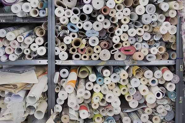
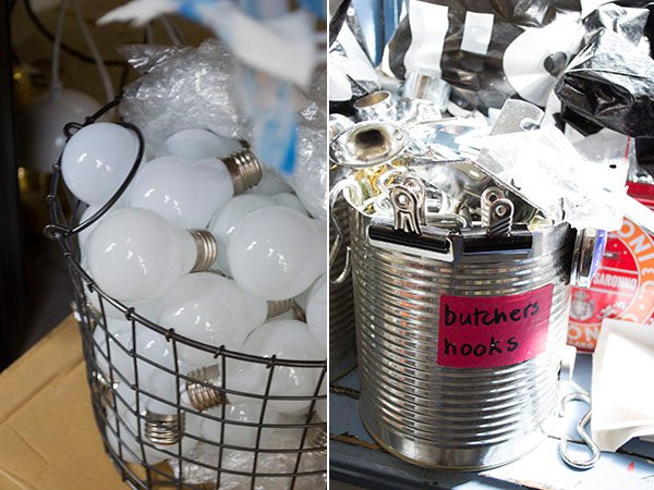
The Visual Office or “inner sanctum” as I called it feels like a home from home for me, a reminder from my days working in theatre, where the Stage Management office was always a hive of organised chaos. Mike has recently tidied it, and I believe him. There are stacks of wallpaper from past and current collections, tins of paint, piles of fabric and all sorts of odds and ends to aid the production process- drill bits, clamps, screws, nails and pots of glue. We are gathered around a group of tables in the centre of the room, the radio on in the background and Tatum at the head, checking over her emails and discussing Mike’s to-do list for the rest of the week, checking off and amending them on the white board.
So what’s the best thing about life as a visual merchandiser? Without doubt, being part of a great team, the creative aspect plays a large part, it’s hands on work and each day is different from the last. It’s pretty difficult to be bored here, that’s for sure. The down sides? There are few faults to find, apart from bubble wrapping (Vicks tells me she hates it as I imagine wrapping myself in it and rolling down the corridor) and ‘recovery’ which includes tidying, restocking and continuing on what other team members have left the day before.
Thinking about my occupational bug-bears and having to be constantly on my toes, ready for last minute changes, I ask how they feel about that. “You have to be ready to adapt and embrace change” says Mike, “If you’re not flexible, the job won’t work for you”. I’m told, however, that it’s rare that there are any major last minute changes the team have to take onboard. If there are any it’ll be product related and relatively easy to change out. Later that afternoon, Phil and Tatum discover that there are new lighting plans that will negate the majority of Mike and Vick’s rewiring and focusing the day before.
Back on the shop floor, Phil is asked to put up the decals for the new Ambrose collection which is being launched today in collaboration with the ‘Useful Beautiful’ exhibition at Geffyre Museum ready for the Fall collection arriving in store from August. The new collection has been created with space saving in mind, for those requiring more intelligently designed, multi-purpose furniture. The materials and construction methods are carefully considered to provide affordable pieces without compromising on quality and I can’t wait to get my hands on a piece or two. Heading out onto the street I join Phil and Tess armed with a spirit level and tape measure. With only one decal for each window, Phil has very little room for error and I don’t envy him this task. As they work on finding the centre and placing the sheet ready to be transferred, I catch a witty comment from a passerby “it’s not on straight, mate!” I bet they’d never heard that one before.
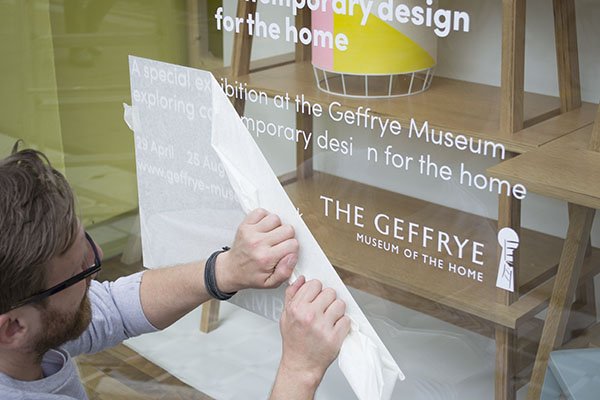
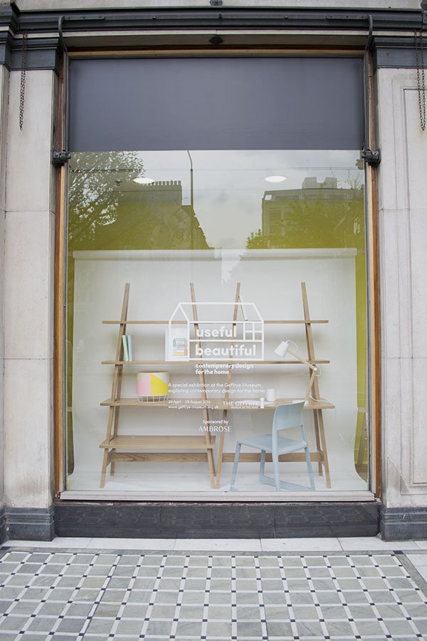
Finally, after holding my breath on a few tricky moments, the paper comes away and we can take a step back to view the windows. Perfectly straight.
Over on the left hand side of the window scheme, Mike and Vicks are still working away on the lighting, methodically wiring, cleaning and hanging each fixture. It’s extremely time consuming but the overall effect is stunning. Later on, manager Martin joins them to view the windows from the outside to gauge whether or not some need to be moved.
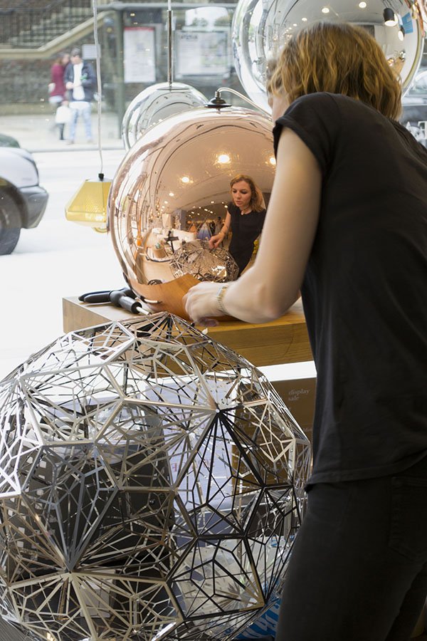
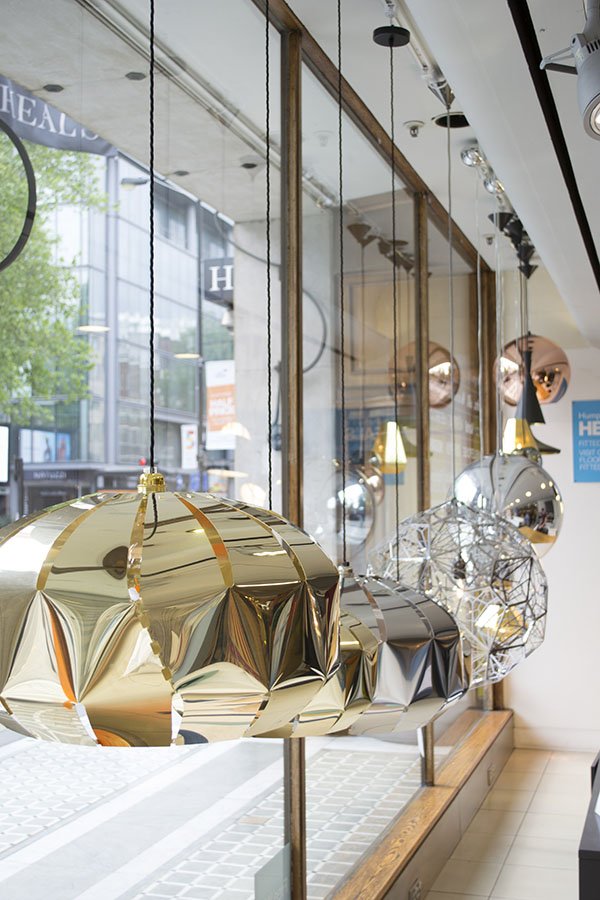
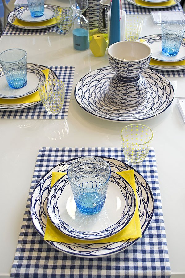
Now that the look is becoming more uniform, Martin can see a few areas where something is lacking and discusses with Tatum how they might make some changes- with him he carries a sample of striped bowls he feels might break up the blue which is a little too dominant.
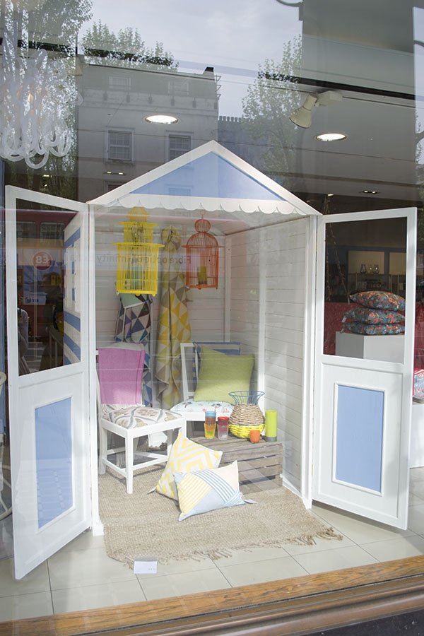
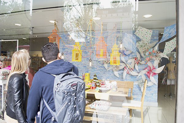
Before I leave, I meet one of the store's buyers as she catches up with Phil. She mentions a new range of cactus candles coming in later in the week that would be perfect for the windows. I wish I could've seen the complete, finished look at the end of the week. Cactus candles. Brilliant.
A HUGE thank you to Julia Deutsch for arranging my visit and of course to the visual team for letting me into their world.
What do you think of the Heal's look for summer and have you been past the store recently?
Which store would you like to see me explore next?
'Retailed' / Heal's Part One
I am beyond excited to kick-off a brand new series for you today! As a stylist I’m constantly looking around me for inspiration that could be translated into my next shoot or event and one of my go-to places is visual merchandising. It’s an aspect of styling that both fascinates and intrigues me, partly because the information on what’s involved in styling for retail isn’t so readily available. ‘Retailed’ is a no-holds barred look into the behind the scenes world of some of the most revered and coveted stores and brands here in the UK. Get a glimpse of the real world of “vm-ing” from the view point of their visual design teams who are the magic makers behind what makes a shopping experience so important. First up is part one of two posts covering two insightful days I spent with the visual team at Heal's on Tottenham Court Rd as they installed their summer window. With two centuries of brand heritage and dubbed ‘the home of modern and contemporary designer furniture’, Heal’s is constantly looking to the future. In my mind, it has and continues to be the fore-runner in cutting edge design, discovering and supporting emerging designers and never afraid to push boundaries.
 There's a real buzz about the place as I arrive- something I pick up on when I meet online marketing assistant Julia Deutsch for a whistle-stop tour. Emerging from a difficult few years, Heal’s is firmly in recovery and ringing in exciting changes-all in one go it would seem! As we headed to the first floor furniture showroom, Julia explained that the 100 year old building is under-going major structural renovations. It's still a little rough around the edges because ceilings are being raised to open up the spaces and the original wood flooring is being restored-let me tell you, it’s a thing of beauty! I also learn that physical renovations aren’t the only changes the store is experiencing- new manager Martin Colquhoun who was brought in 18 months ago as former business manager for Liberty’s home department has proved to be worth his weight in gold in steering this ship.
In keeping with Heals’ ethos to support British design, the store will make way for a ‘best of British’ room in which all of Heal’s chosen designers’ products from around the UK will be in once space. And as we progress from room to room towards the showroom at the front of the store I can spot many of my favourites -Imogen Heath, Tom Dixon and Kangan Agora to name but a few.
We find the visual team just back from their mid-morning break re-grouping at the front window. The working day usually starts around 7am and work is already well under way, so Julia leaves me with Display Supervisor Tatum who brings me up to date and introduces me to everyone. Her role is to over-see the team on a daily basis, keeping everyone up to date with the schedule. For the next week all hands are on deck to complete the main showroom and front window display.
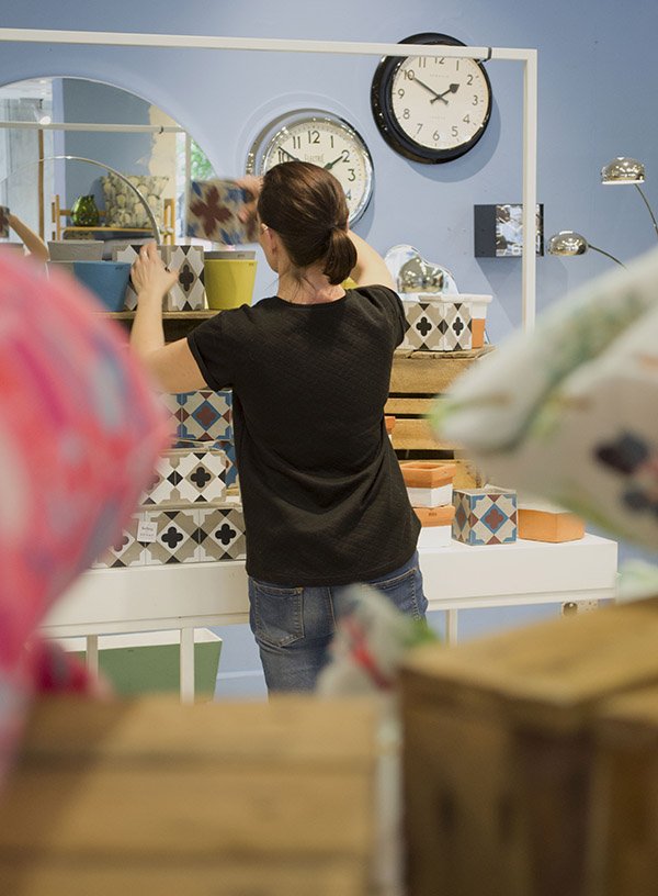
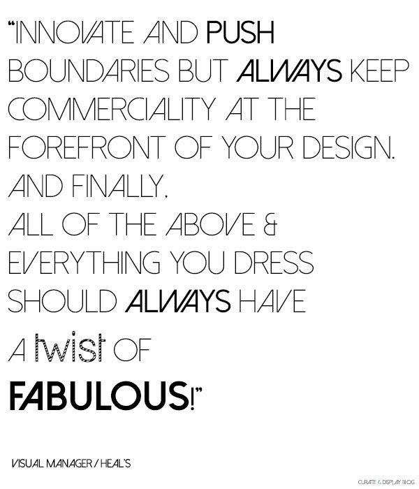
Everybody seems a little wary of me as I introduce myself, brandishing my camera, all but Visual Manager Phil Knudsen-Thomas who breezes by like a ray of sunshine, ready for his close-up. Phil is also new to the team. Having joined in January hoping to “blend in” he was soon appointed Visual Manager, responsible for designing the window schemes across all Heal’s stores. It’s hardly surprising though, given his hefty 22 years of vming and buying experience including Habitat, Barker and Stonehouse and Diesel.
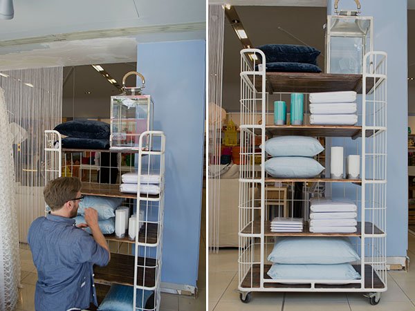
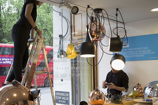
Next I meet Vicks and Mike, who both came to the job from the shop floor, having heard there was an opening on the team. For the most part, they'll be responsible for rewiring and hanging a new collection of lighting in the front window and take it from me, it's one hell of a task with around eight lights taking up one eight hour shift. There's a lot to consider in the process of installing them- they have to be carefully hung according to eye levels, enough to showcase the fittings and shades and be correctly wired. No big deal, right?!
Sitting next to a white beach hut with a large pot of sky blue Dulux paint is Tess. It’s her first day today although having worked with Phil as his assistant previously she's not new to the role.
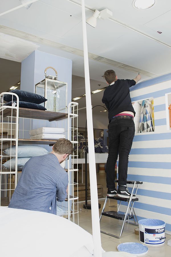
This summer window will be the last under creation of Phil’s predecessor whose approach differs to his own method of working. He explains that previously, the store’s approach to VMing has been from the viewpoint of an interior designer rather than a retailer, in that the sets may look great but they won't translate well enough unless the customer can relate to them, imagine themselves inside it and easily access the product. Planning ahead to Fall, he’ll be implementing changes in the way the windows are created, giving full creative license to the visual team and working much more closely with the buyers to determine which products are readily available first. From this he can plan the sets accordingly and flexibly, rather than agreeing a look before knowing what’s “in”. All future displays will be digitally designed in CAD too to give a better idea of scale and layout.
The Look
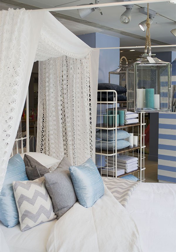
In keeping with summer, styling for the next week is focused on bringing the indoors outside, from alfresco dining to relaxed lounging. With a nod to coastal pursuits, the walls have been given a fresh coat of sky blue paint which is picked up in the linens and fabrics as well as giant pinwheels and kites made from the Heal's 1810 fabric collection. As the first fabric collection Heal's has produced in collaboration with designers since their last in the 1970s, there is real emphasis on this. Immediately, I'm drawn to a wooden bench in front of a fabric backdrop of blue sky and fluffy clouds. It's dressed to look like a Mediterranean feast, from the brightly patterned crockery stacked on top of thick wooden chopping boards, cobalt blue Pols Potten glasses, to the groupings of olive oil, sardines and olives. Very Portuguese in style.
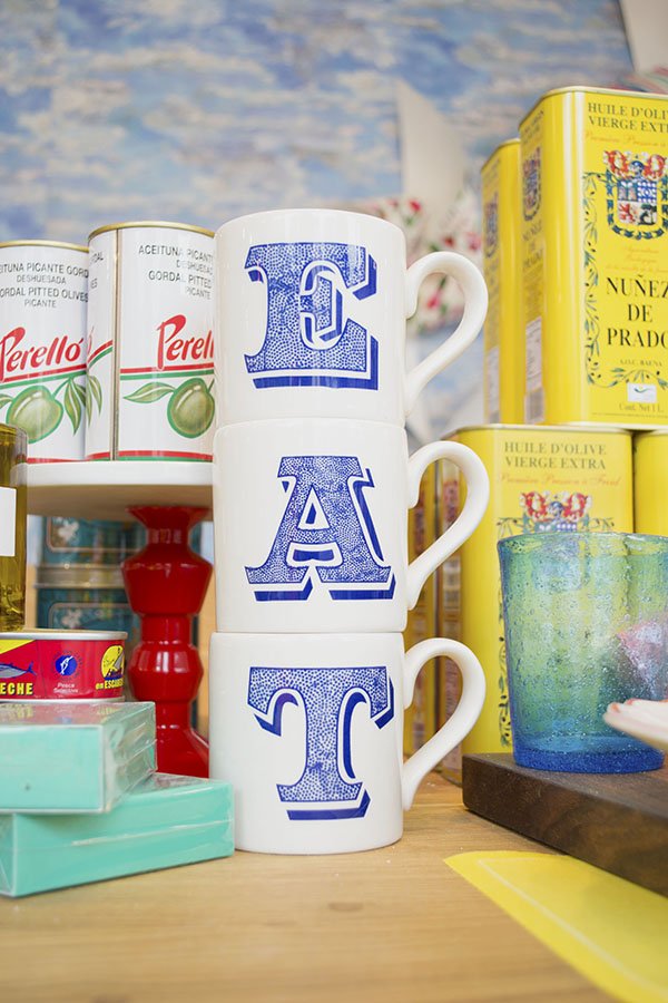
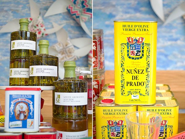
There is rich and vibrant colour at every turn, from the almost neon collection of baskets, hand painted rice bowls and brightly painted lanterns. It made me yearn to live in a place with a courtyard garden where the sun shone for 360 days of the year to enjoy it all in and I'm excited to see how the space will evolve over the next day.
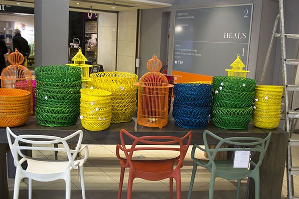
With the majority of the old wall behind the front windows gone following the renovations, the team are learning to find new ways to create and dress the set without it. Opening out the space into the showroom also encourages customers to step inside the window and interact with the space, where in some stores you might feel uncomfortable doing so, here it's encouraged.
For the remainder of the day, the team are installing lighting, moving and preparing product and gearing up for tomorrow where the best part of the set dressing will begin.
Join me next week for Part Two where we really start to see the space come together, I talk to the team about the highs and lows of the job and pick up some great VMing tips!
NEW! Butterscotch & Beesting Cushions To Covet!
Back in October an email landed in my inbox from designer Camilla Westergaard of Butterscotch & Beesting which said she'd been secretly beavering away on a new print and would I be interested in featuring it when it was ready. It was a bee-centric design in her signature circus style and she was really excited about it. How could I not?!Camilla has such an imaginative, playful style which comes to life in her prints and fabrics. Inspired by children's illustrations and with a love for storytelling, she has created the whimsical world of Butterscotch & Beesting for her own mischevious characters, Mr Bumblewick Beesting and Miss Betty Butterscotch. This dashing ringmaster and former trapeze artist turned confectioner (Miss Betty doesn't have a head for heights apparently) will bring the magic of their circus antics into children's bedrooms everywhere if you let them.So I waited oh so very patiently (which is quite uncharacteristic for me) until just this week they appeared as a lovely surprise! Feast your eyes on these utterly delightful Bumble Bee Balloon cushions. As with all of Camilla's designs, these too come with a sweet little story..."I wanted to create a print that told the stories of the bees who steer the Butterscotch & Beesting Circus on its travels. The bees fly around the fabric, and you follow their path in the trail of the turning ferris wheel, the stem of the flower, and the root of the tree. There's a slight Fifties' influence to it I guess, particularly in the geometrics that make up the ferris wheel, and the clean lines. When I designed the pattern, I imagined it covering an Ercol sofa or daybed, and I'd still love to see it like that, with the bees spreading their wings."
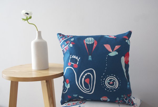
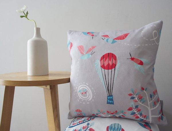
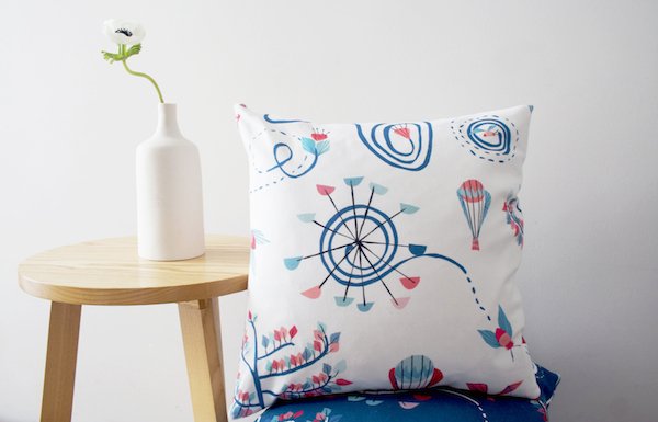 Every cushion is printed in Britain on cotton and lovingly stitched by Camilla's own fair hands. If you love a circus motif with a mid-century meets Scandinavian twist then I urge you to visit Butterscotch & Beesting. Thank you Camilla!