House of Grey X Bauwerk Limewash Paint

In a design match made in heaven, London based interior design studio House of Grey has just announced 'Visual Silence', a collection of limewash paints with Bauwerk Colour. Fans of limewashed walls, you will not be disappointed.
Headed by founder Louisa Grey, the studio is known for its pioneering approach to salutogenic design, meaning health and wellbeing is at the forefront of their process. Guided entirely by using only natural cradle-to-cradle materials, the studio seek to create grounded spaces that support human health and the environment. Known for their healing, sustainable interiors, House of Grey are the one UK studio who always come to mind when I think of calming, minimal and artisanal design. Joining together with Bauwerk whose natural, no VOC lime paints have already garnered world wide acclaim is a no-brainer. Lovers of House of Grey's minimal aesthetic can now bring some of that style into their own home.

The 'Visual Silence' collection is a palette of eight muted, earthy colours designed to bring a sense of clarity and harmony to any space. At the deeper end there's 'Nurture', a dark green that encourages deep relaxation as well as the smokier 'Cleanse' green for healing. At the paler end of the palette, there's 'Retreat', a chalky alternative to white and 'Balance', a deep neutral with a hint of taupe. I love the way the light refracts against the pigment and texture on the walls in these beautiful shots.


To discover more about this wonderful, natural paint, take a look at 'How To Decorate with Limewash Paint' as I take you through how I painted my studio it step-by-step.
The House of Grey limewash paint is available directly from Bauwerk where you can order samples, brushes and ready-mixed paint directly.

Photography by Michael Sinclair
House of Gärsnäs Apartment at Stockholm Design Week
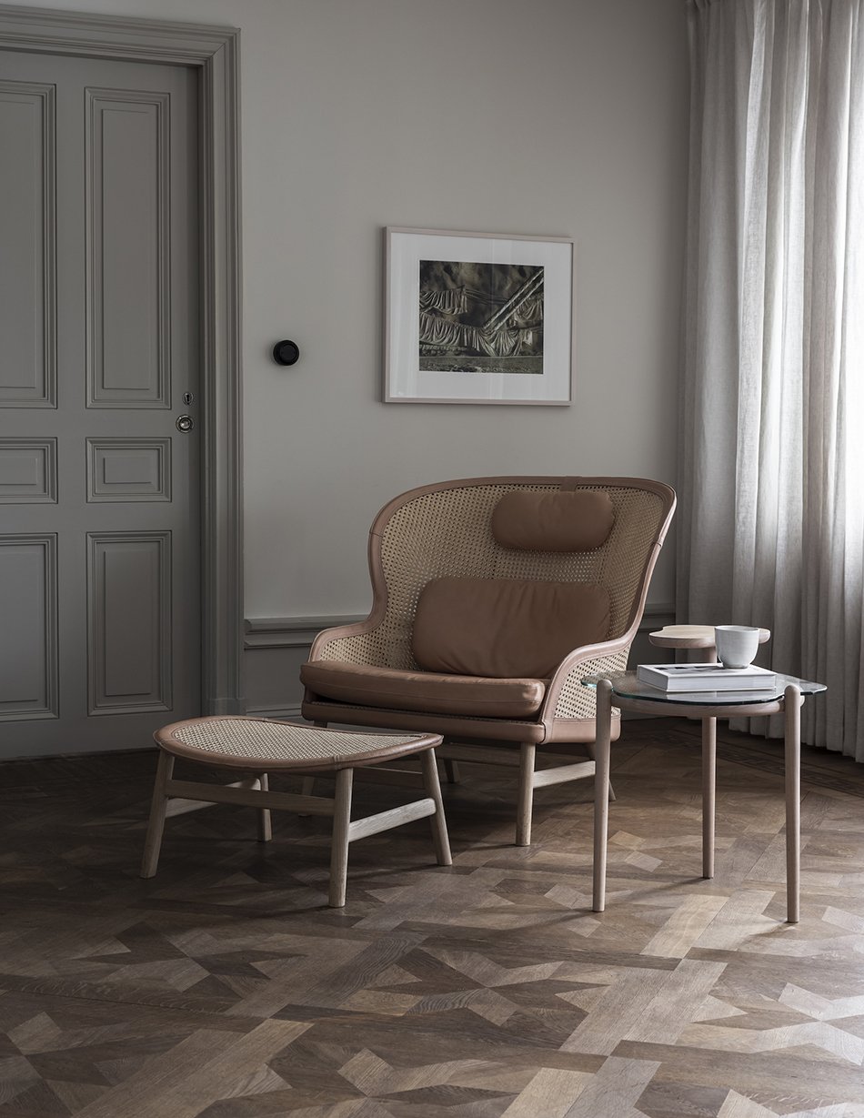
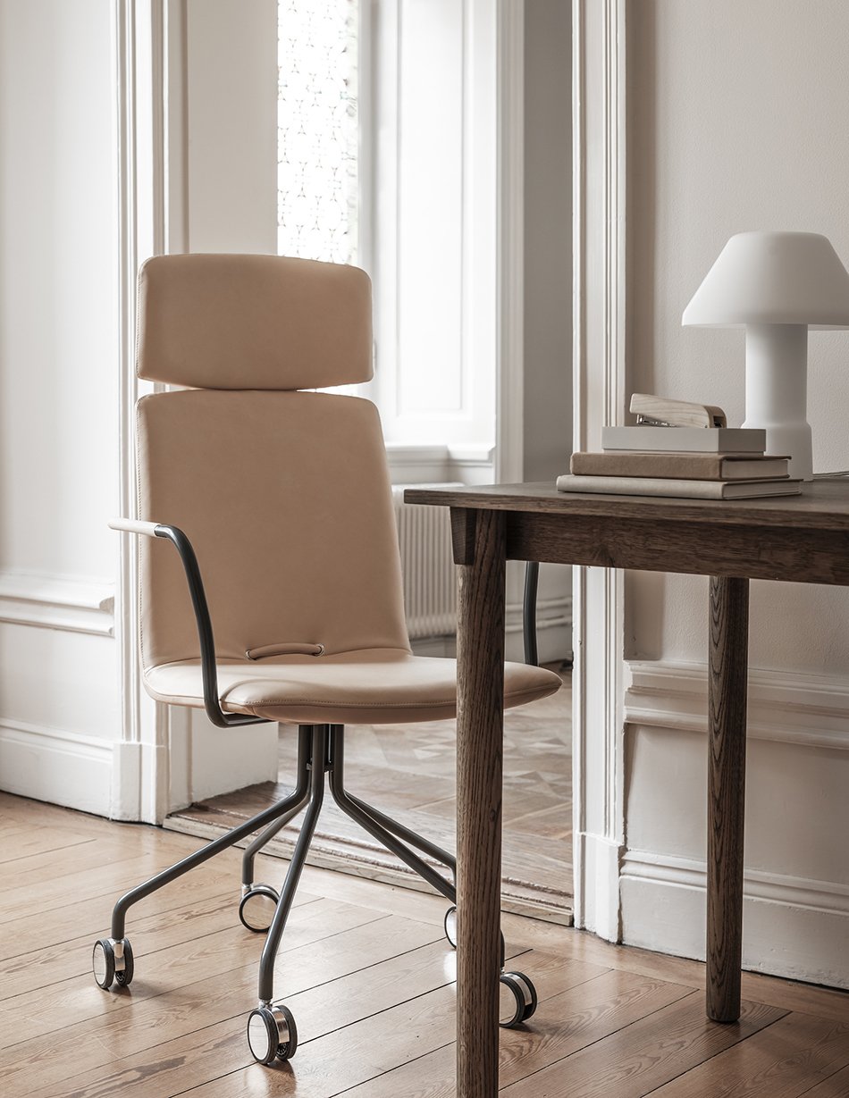
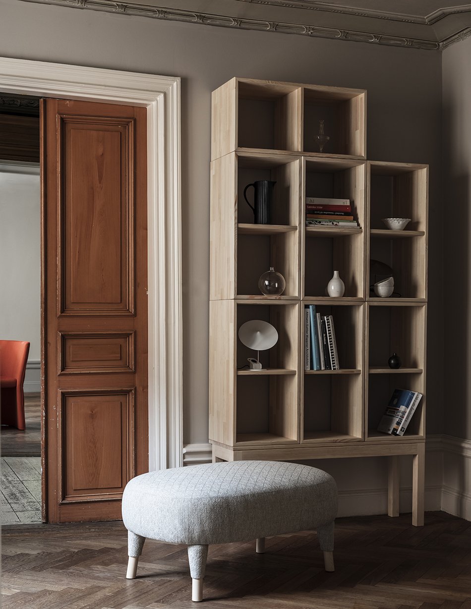
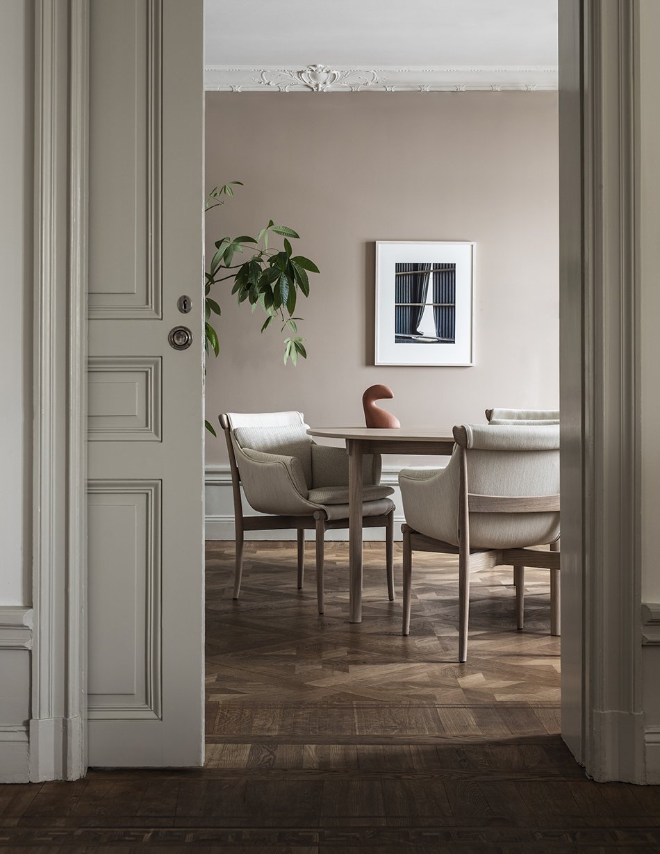
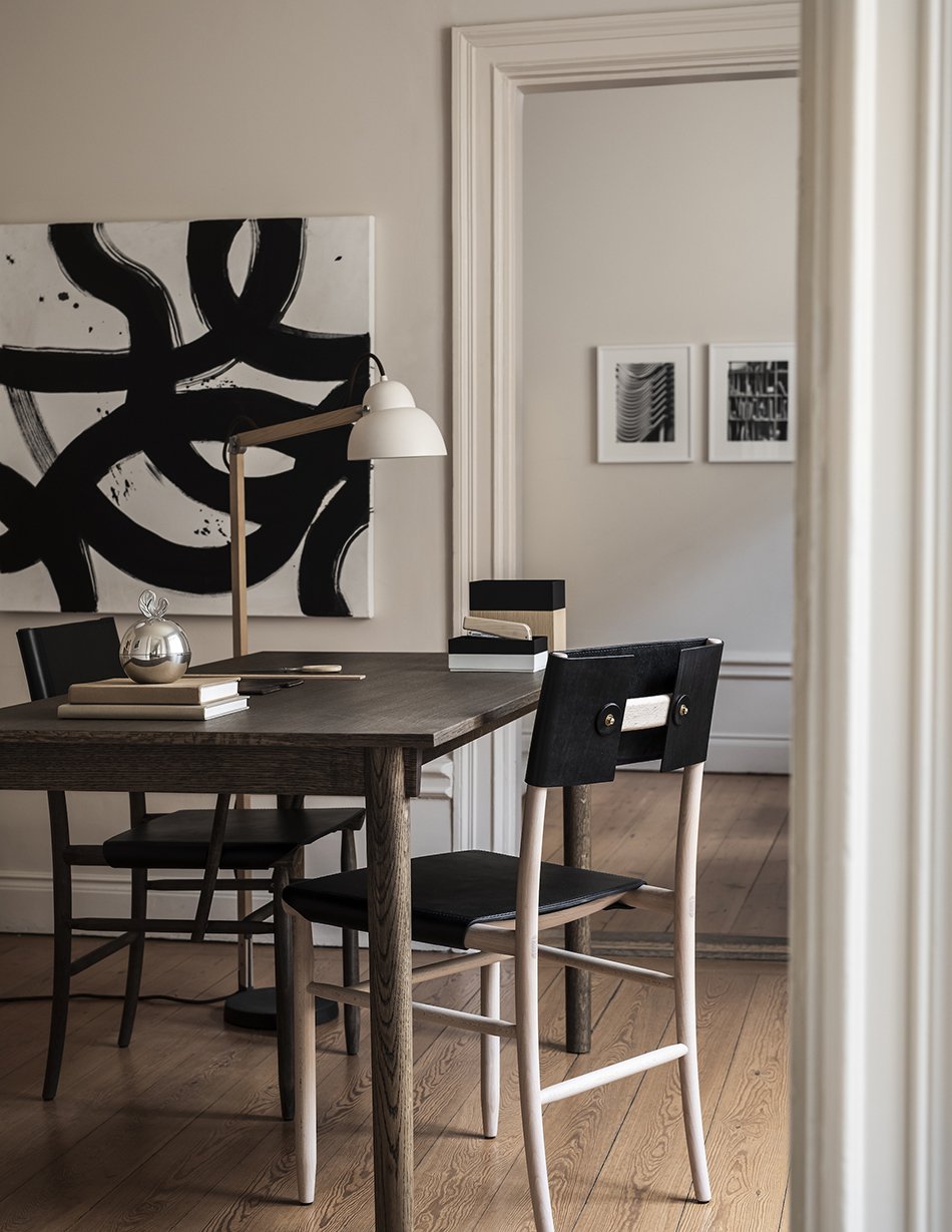
Gärsnäs, one of Sweden's oldest furniture brands has just launched a new showroom at Stockholm Design Week. Based in Skåne, it has been leading the way with sustainable furniture in its family run workshop since 1893.
A history spanning 128 years has created an archive of striking Scandinavian classics lead by well-known designer and owner Åke Axelsson and Anna and Dag Klockby. Known more for furnishing public spaces, the brand now longs to reach a wider audience to see its furniture in private homes. I'd welcome any of their designs in a heart beat.
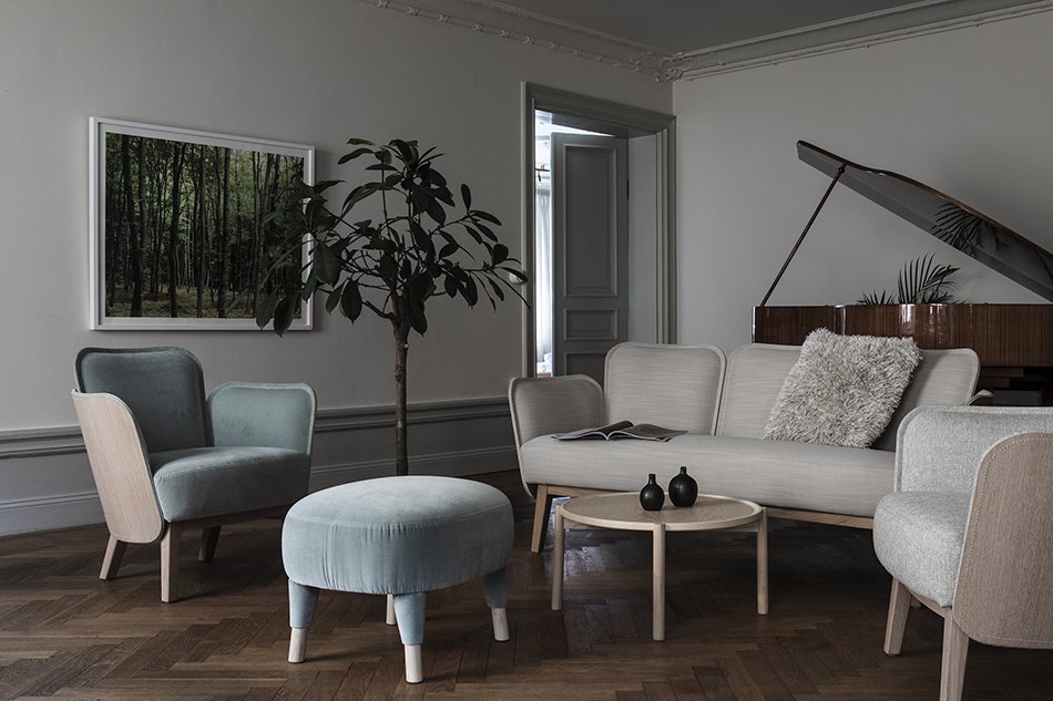
Curated by designer Nina Jobs, Gärsnäs marks a new chapter with a more relaxed and informal way to view their most iconic designs.
The collection is styled as they would be in a home setting inside a 17th century apartment in the Old Town district of Stockholm. And with views across to Skeppsholmen island, 'House of Gärnäs' is everything you would imagine a modern Scandinavian home to be.
In times when more and more people work from home, home environments are facing an interesting development. How should our homes change? What should happen to traditional spaces and apartment plans? What should be attractive in a few years?
Gärsnäs
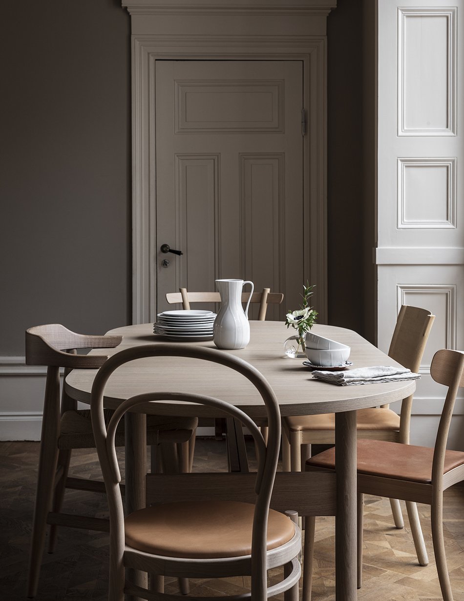
Baroque architecture reveals sweeping high ceilings with intricate cornicing and panelling. Moving through the apartment, each room is painted in tonal, neutral shades of eggshell, putty and chalk, creating a warm and minimal style that's elegant and harmonious. It's the perfect canvas for some of the most beautiful examples of Scandinavian furniture that I have ever seen.
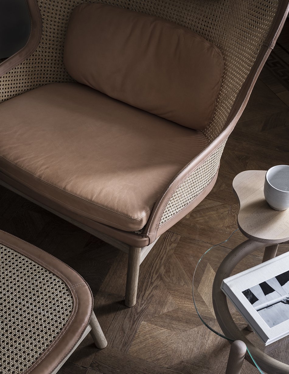
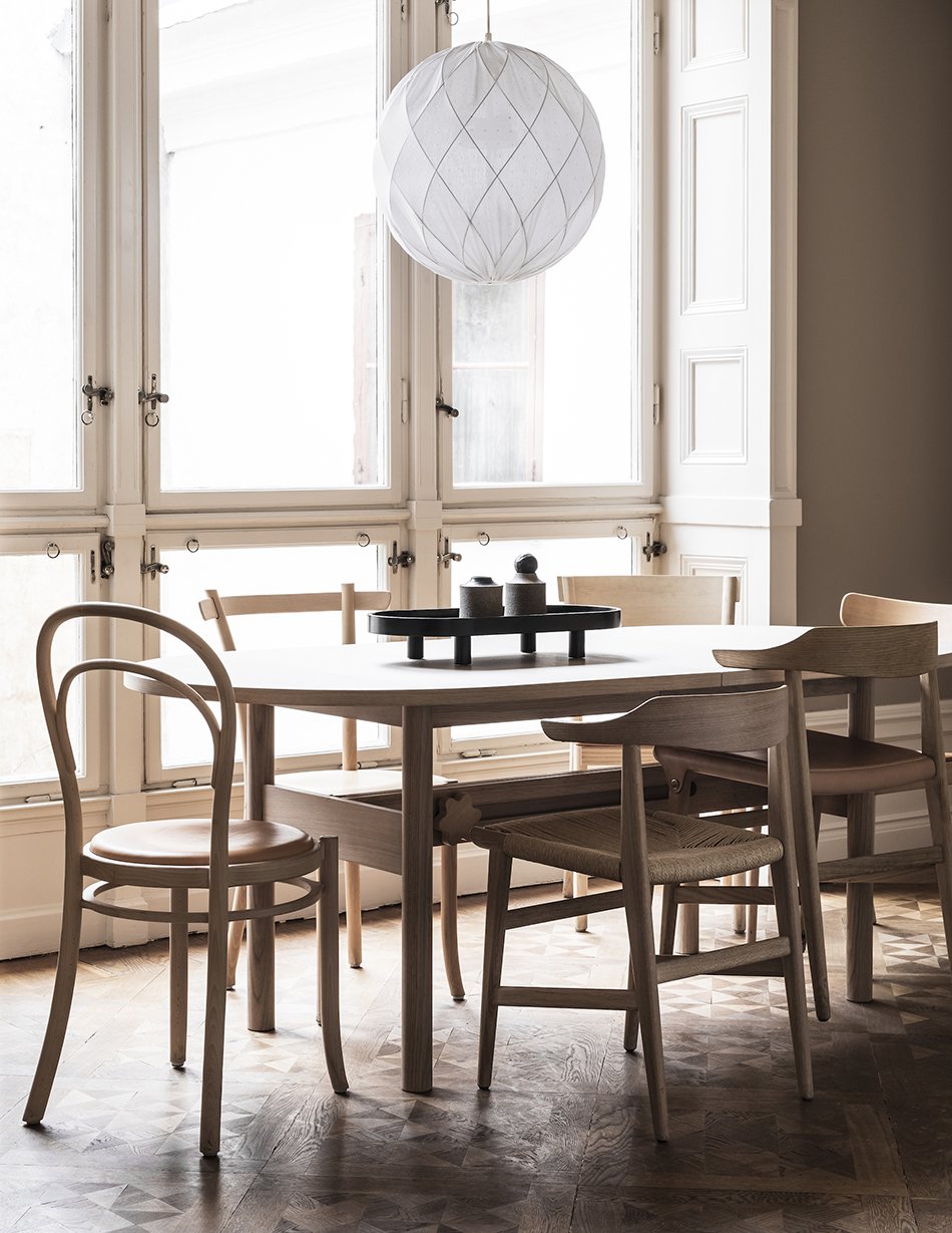
The collection spans earlier classics such as Åke Axelsson's 'Linnea', a modern take on the Thonet chair to the contemporary Bleck sofa, inspired by the back of a canvas frame, designed by TAF.
And the company continues its pledge towards sustainable production. Not only does it take back older pieces for renovation but is committed to being completely circular and carbon neutral by 2030.
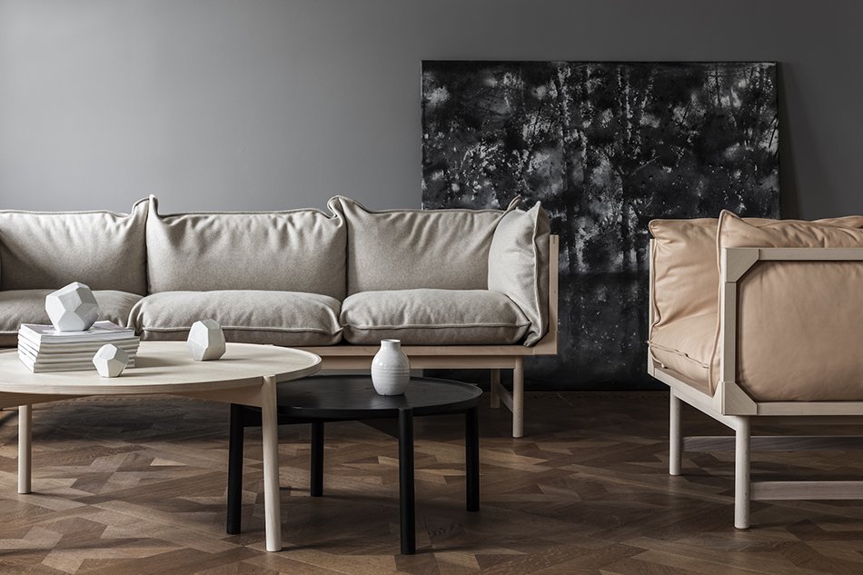
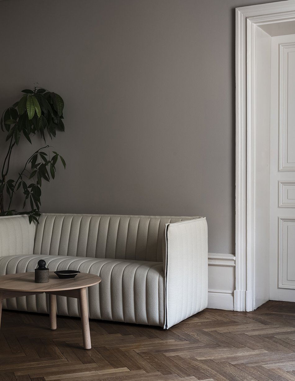
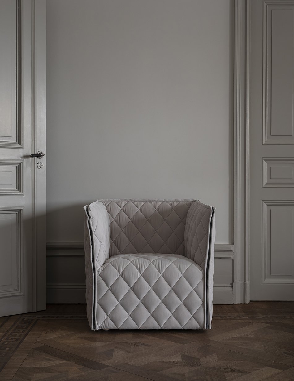

Visit by appointment only: Skeppsbron 30, 111 30 Stockholm, Sweden.
Photography © Mike Karlsson Lundgren, styling by Nina Jobs.
Sustainable Decorating | A Guide To Eco-Paint
[Advertisement] *Includes gifted and loaned product for the purpose of this post.
Graphenstone GrafClean in Vintage* | Zumirez boucle wool fabric in 'Moonbeam', Zinc Textiles* | Kuru ceramic bowl, Iittala* | Aino oak mirror, Skagerak* | Ridged tea-cup, Rose & Grey*
In recent years the paint industry has been making huge strides to clean up its act in the effort to produce more environmentally friendly paints. We now have so many options to help create a more sustainable home so why shouldn’t the paint we use reflect that choice?
As we move deeper into our renovation journey, I’m more mindful of the products I choose to use as part of our projects. If you're reading this then chances are you are too. Using accredited eco-paint means working towards a cleaner environment while improving the conditions inside our homes.
Of course, with so many options on the market selling us various benefits all under the umbrella of 'eco', 'organic' and 'non-toxic', it’s hard to know who to listen to. The information out there isn't always clear as to whether you're buying into a genuine product or just green-washing. No paint is 100% environmentally friendly but this simple and transparent guide to eco-paint will help clear up those questions when it comes to choosing the right paint for your home.
WHAT'S THE DIFFERENCE BETWEEN SYNTHETIC AND ECO-FRIENDLY PAINT?
Your average tin of paint from the DIY store will contain synthetic, plastic and petrochemicals and VOCs used to maintain its strength of colour, durability and general consistency.
Eco-friendly paint is comprised of naturally occurring materials, based on lime or a variety of clay and/or marble with natural pigments and oils. As a mineral-based product, their micro-porous qualities allows moisture to escape so your walls can breathe, doubling down on mould and damp. Ideal for an older property.
LET'S TALK ABOUT VOCS
Those synthetic chemicals I mentioned above include VOCs or ‘Volatile Organic Compounds’. These carbon-based substances emit vapours or gases that evaporate at low temperatures. You’ll often find them in other everyday products such as air fresheners and cleaning products and used in paint they're there to improve the consistency and drying process.
Current UK legislation states the maximum VOC content in a tin of interior emulsion is 30g per litre.
The effects of these can aggravate allergies or leave you feeling dizzy or nauseous amongst other reactions (and I think we’ve all felt that way at some point with a paintbrush in hand). Synthetic paints contain ingredients derived from plastics and can include formaldehyde and other petrol-chemicals which are known carcinogens. These evaporate into the air as the paint dries but can also exist on your walls for years afterwards, continuing to release into your home. Not a comforting thought.
Graphenstone GrafClean in Premium in 'Olive', small ball painted in 'Kombu'* | Hoxton 'Olive' gloss porcelain tile, Mandarin Stone | Linen blend Azuri fabric in 'Endive' fabric, Romo Textiles*
IS THERE ANY SUCH THING AS A ZERO VOC PAINT?
No. It’s impossible to be completely free of VOC emissions - did you know that burning fuels such as wood and coal releases these too? That said, paint can be classed as ‘zero VOCs’ when the level of which is negligible or up to 5 grams per litre.
WHAT ARE ECO-PAINTS MADE FROM?
There's no standard recipe as each brand varies but common ingredients include oils such as orange, linseed and castor as well as resins, silicate, lime and chalk. Natural pigments which create the colour are derived from plants, though in some cases these may come from insect or animal bi-products so if it's a vegan paint you're looking for its worth checking the list of ingredients first.
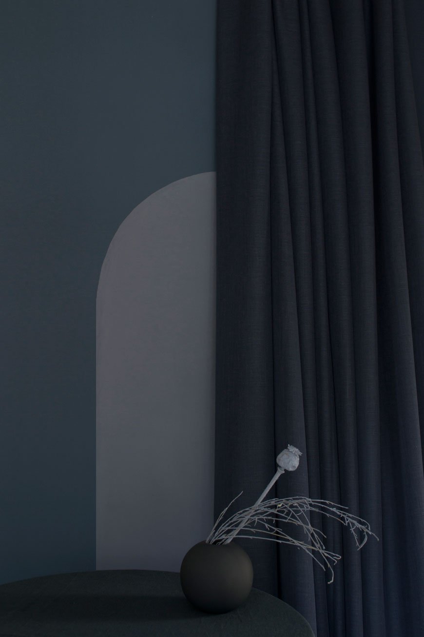
Graphenstone GrafClean Premium in 'Oxford' blue with an arch of 'Blue Steel'* | Ball vase, Cooee Design* | Bergen 'Smoky Blue' linen-look fabric, Villa Nova*
DO ECO-PAINTS SMELL?
Having used two different eco-paint brands, I can't deny that they don't come with a certain fragrance - they do. On the whole, however, it dissipates fairly quickly and thankfully doesn't contain harmful chemicals that you'd normally breathe in with standard synthetic paint.
ARE ECO-PAINTS AS DURABLE AS STANDARD PAINT?
Yes, they really are - washable and durable with options for woodwork and exteriors too. It's no longer a compromise to use ecological paints and you don't have to settle for a limited colour palette either. It's a no brainer, right?
BUT it's worth noting if you love the textured effect from traditional lime paints, these don't include additives to aid durability meaning if you're after wipeable walls, it's not the right one for you. These paints mark easily and will need recoating to cover them.
AREN'T ECO-PAINTS MORE EXPENSIVE THAN OTHERS?
There's not a huge difference in price between an eco-paint and other premium brands but they are definitely more expensive than a basic range of synthetic paint. What you pay for is the quality of and higher concentration of natural pigments. The better the quality, the more depth and ability they have to absorb light - this creates nuances of tone depending on the light coming into the room.
So is it worth the investment? Having used a range of paints across the board over the years I would say hands down, yes. Health and environmental benefits aside, you will ultimately save time choosing a better quality paint for coverage, consistency and durability.
An Exploration of Graphenstone Paint - A Lockdown Project
In anticipation of painting our hallway, I've been getting to grips with Graphenstone Paint's range of GrafClean Premium colours. Having heard such great things about them, I wanted to explore their range and try to settle on a colour. You won't find it here though - the result of these images comes from a lockdown challenge I set myself to create four contemporary tonally styled scenes using a selection of colours I think are currently popular or are set to enjoy a moment in our homes over the coming years. From top to bottom you'll find 'Vintage', a subtle beige with lilac tones, 'Old Lilac', a slightly aged pink, 'Olive' and 'Kombu' greens which connect us with nature and a deep 'Oxford' blue, contrasting with a lighter shade of 'Blue Steel'.
Holding 18 certifications and being a popular choice among architects and designers, Graphenstone Biosphere paints absorb CO2 directly from the environment thanks to their high concentration of lime. This air purifying paint removes 40% of CO2 within the first 30 days, continuing over 2 to 3 years. Their products are formulated with a lime base with added Graphene for durability, claiming to be 200x stronger than steel. Three 15litre pots absorb 15kg of CO2. If that doesn't grab your attention, I'll eat my hat.
The colours have great depth and excellent coverage- I painted their range of GrafClean colours straight on to plasterboard using a mix of brush and roller, though you'll get a more even finish with the latter. This product is matt, breathable and washable and rated the No.1 World's Most Certified Green Brand. Can't wait to use it for the rest of the house!
I'd love to hear your thoughts - have I persuaded you to take the eco-paint plunge?
These images were created using colours from the eco-paint brand Graphenstone, who provided the paint for the purpose of this post.
Styling and photography © Tiffany Grant-Riley
[AD] How To Decorate With Limewash Paint - Breathable Eco Paint From Bauwerk Colour
[Advertisement - this guide on how to use limewash paint was made in partnership with Bauwerk Colour who supplied the product for this post].
It's been a while since I've had new work on the house to show you, hasn't it? I know, progress has been frustratingly slow since we stripped the hallway in January. January! But, me being me and not wanting to sit idle over summer, I decided to give my workspace an update.
This room was originally the scullery when the house was built in 1904. Sandwiched between the kitchen and sunroom at the back of the house, it can feel a bit like a tunnel. Although it gets fabulous light from the South-West facing garden, when there's no sun, it's pretty miserable, not to mention bloody cold. The walls are extremely rough and, to embrace that old plaster texture, I wanted to use a natural paint that would accentuate it. After my trip to Copenhagen in May piqued my fascination with textured lime wash walls (it was everywhere), I knew this would be the perfect opportunity to road-test it!
Enter Bauwerk Colour, an Australian brand that began creating modern lime paint for interiors and exteriors almost twenty years ago. With a vast selection of colours inspired by nature, many produced in collaboration with world-renowned interior stylists, it was a complete no-brainer for me. Curious? Let's dive in a little deeper, shall we?
A brief history of limewash paint.
Historically, limewash has been around for centuries. As one of the very first around, it's a natural, environmentally safe paint. The paint is made when crushed limestone is burnt and 'slaked' (combined) with water to form a putty. This putty is aged, diluted with water and mineral pigment for colour and voila, we have limewash. A breathable paint which allows moisture to escape, it cures by taking carbon dioxide from the air as it dries. During this process, it forms calcium carbonate crystals as it hardens which gives it a unique luminosity when the light hits.
The colour of choice - 'Mykonos' gives a warm feel in winter and a holiday feel in summer.
What's the appeal of lime paint?
At the time our house was built, and indeed even earlier, natural paint solutions were being pushed out for newer, chemically-based paints. Think lead, turps and formaldehyde that strengthed the durability and finish of the paint. Today, awareness and attitudes towards the harmful effects such chemicals can have on the environment encourage us to look for natural alternatives when decorating our homes.
Painting round the pipes was tricky business but the paint stuck well thanks to the undercoat.
Without a doubt, the biggest argument in favour of this paint is its low impact on the environment. As it contains zero VOCs (volatile organic compounds that release vapours and gases over time) you can use it with a clear conscience. It's water-based and there are no strong odours to contend with. Though there definitely is a smell of some description, it disappears eventually.
If you love the look of unpainted plaster walls like these from our bedroom renovations, you'll love how easy it is to recreate that look without calling out the plasterer. It's ideal for older houses, particularly those which still bear the original horsehair plaster walls and need a little extra care. That expressive, almost cloudy texture can lend depth and character to newer properties too. I absolutely love the way it picks up the nuances of light throughout the day and the bolder you are with the brush strokes, the better!
My choice of 'Mykonos' from the Holiday collection, in the bucket and ready to go.
It looks great, but are there any downsides to it?
You'd be hard pushed to find any cons to using limewash, however, it's worth considering that it's not a wipable paint. If your walls pick up any wear and tear over time, you'll need to apply another coat.
There's an element of risk with limewash paint, so if you're not prepared to go with the flow, it might not be for you. By nature the finished look will depend on the surface you're painting onto and how well its been prepared beforehand, as well as how you apply it. You might also discover that you need to apply more than the recommended number of coats to get the required effect.
Limewash before and after I started the first coat on the back wall.
How to master the limewash paint technique
Before you order, check you're using the right product for the type of wall you're painting onto. I recommend using the appropriate brushes too. Don't use a roller! I used the 'block short' for smoother areas and the 'medium short' for brick and render.
First ensure that the surface you're painting is clean, dust-free and has a good, solid coat of undercoat or paint underneath. Bauwerk recommends an acrylic undercoat. Sometimes the lime paint can show up the differences of the structure in your wall - areas where the plaster has been patched with filler for example, so the undercoat will provide a solid base and avoiding ghosting.
Neutral, earthy tones styled using paint swatches, linen board and textured paper in a moodboard.
Unlike standard emulsion paint, limewash has the consistency of milk. The intensity of the colour is built up over several thin coats which are absorbed into the wall rather than sitting on top of it.
Some products come as a dry powder and require mixing with water but Bauwerk lime paint comes pre-mixed in recyclable pots from 250ml up to 10L. First, stir or whisk the pot up to mix any sediment and decant all of the paint into a bucket.
Working the limewash across the wall in a criss-cross action with a short, natural bristled paint brush.
Applying the second coat of limewash to the walls with criss-cross brush strokes
Dip the brush into the paint and flick off the excess to avoid drips. Starting in one corner and work your way into the centre of the wall using a criss-cross movement. You can be quite expressive with this. Keeping a wet edge as you go to avoid colour overlays, continue applying a thin coat to the walls. Repeat the process from each corner until you meet in the middle and then move on to the next wall.
Be prepared to work fast! I found that the limewash started drying pretty quickly, so it kept me on my toes to maintain a wet edge.
To build on that cloudy look, start subsequent coats in a different corner or in the centre and work your way outwards. Bauwerk has some brilliant 'how to' videos which demonstrate the technique a darn sight better than I can describe them!
So what's the verdict?
Let's just say, I think it's love. Mykonos was 100% the right choice. The room is still empty but I often find myself standing in the doorway, watching the walls catch the light.
I'll be the first to admit I was a little nervous before painting started. This was new territory for me and I don't like not knowing what to expect at the best of times. I think the best approach is to trust the process. I used this as a mantra until the second coat had dried and I could see the room taking shape. I took around ten days to apply three coats, allowing a few days in between for each to dry. Would I use it again? Absolutely yes.
If you found my tips on how to use limewash paint useful, check out my 'Decorate With Lime Paint' Pinterest board for inspiration.
Photography and styling © Tiffany Grant-Riley
[AD] Architectural KG1 Bookshelf | Circular Design From ENKL
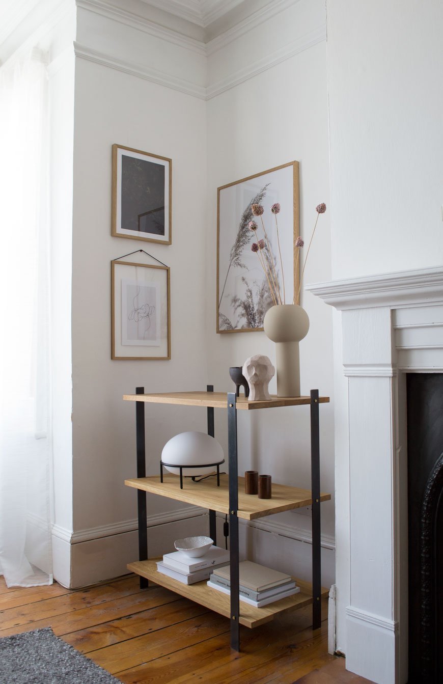
[Advertisement - this post includes gifted product from Enkl, Woud, Cooee Design and Massa Design Studio*, chosen by me and lovingly used in my home.]
During my visit to 3 Days of Design in Copenhagen earlier this year, I was lucky enough to meet ENKL, a new sustainable furniture brand whose DNA is built on a circular design model. Their collection of raw and functional pieces combine traditional craftsmanship with a minimal aesthetic.
Who Is ENKL and What Is Circular Design?
Based in Aarhus, ENKL was founded by Kristian Gatten and Lasse Tamberg in 2016. With backgrounds in architecture and carpentry, the friends began designing a capsule collection that would by-pass the traditional "take-make-dispose" production model, exploring ways in which materials could be utilised over and over again. You can see the architectural influences in the structure of ENKL's designs. What I love most is that all the joints, nuts and bolts are clearly visible. Honest and open design with nothing to hide. Each piece of furniture has been designed for easy disassembly so that if and when a piece reaches the end of its life, all the components can be separated, reused and recycled.
To help reduce waste and pollution, production is kept as local as possible with steel and brass elements made in Galten and Lystrup. Oak is sourced from the Czech Republic by a family-run carpentry business and finished at their studio in Denmark.
Enkl also offer to buy back their designs at 10% of the sales price in order to return their materials back into the production cycle. Over time they plan to add to their collection with designs made from the newly recycled materials. How's that for dedication?
The KG1 Bookshelf
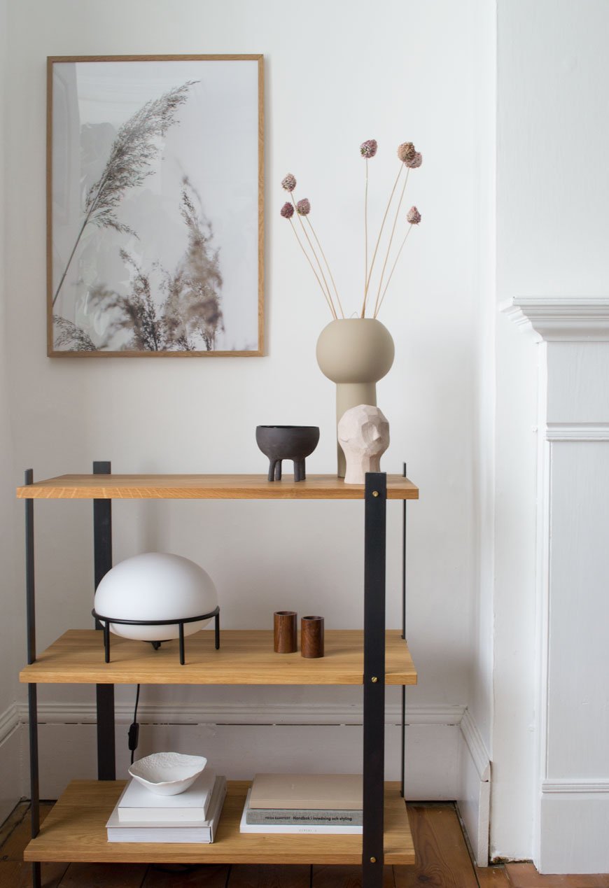
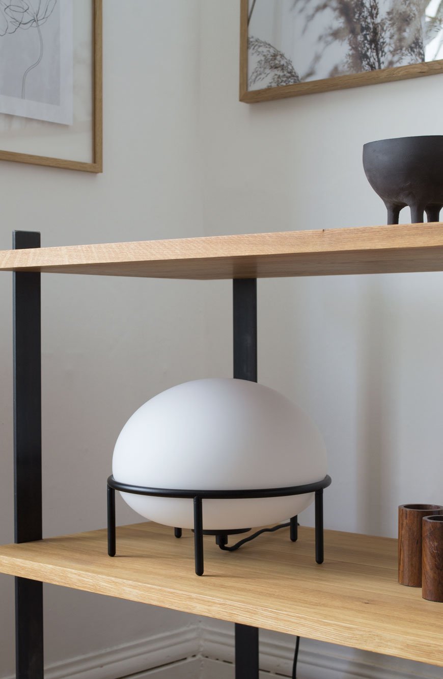
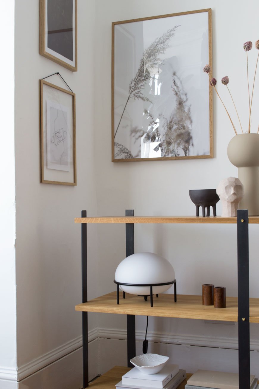
In my eyes, the real stand-out piece from the collection is the KG1 bookshelf. So much so that it now has pride of place in our living room. Although I have absolutely zero intention of recycling it, ever, its environmentally conscious, circular design was a huge plus. I want to continue to make conscious choices as to what I bring into my home and its impact on the environment, so choosing brands who share those values is important. Constructed from three solid oiled oak shelves, its held in a delicate balance with four flat steel legs. I love how its industrial appearance compliments the Edwardian features in this room.
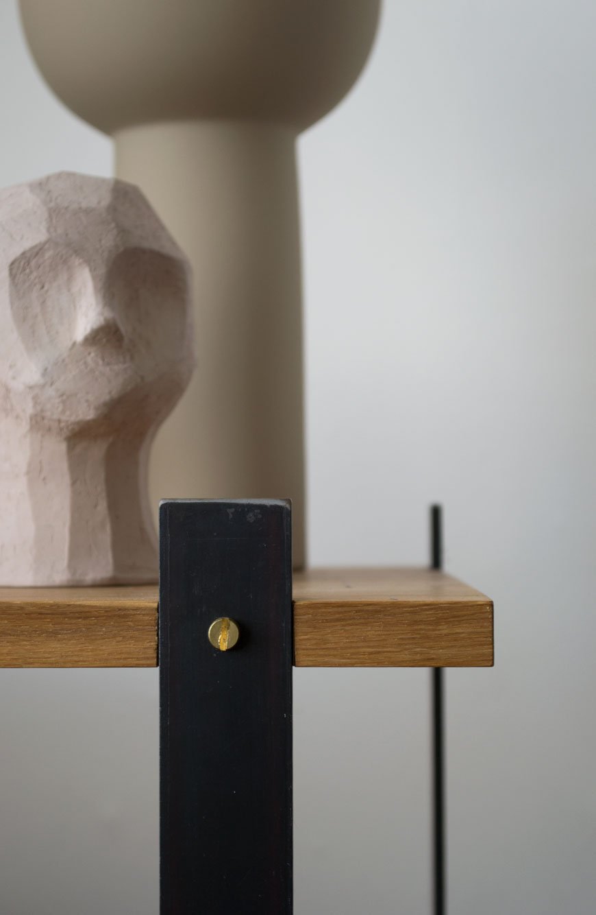
The beauty is in the details - from the brass screws to the highly unusual beeswax finish on the steel which both intensifies the black of the metal and prevents corrosion over time. It smells wonderful up close, a mix of beeswax and linseed oil.
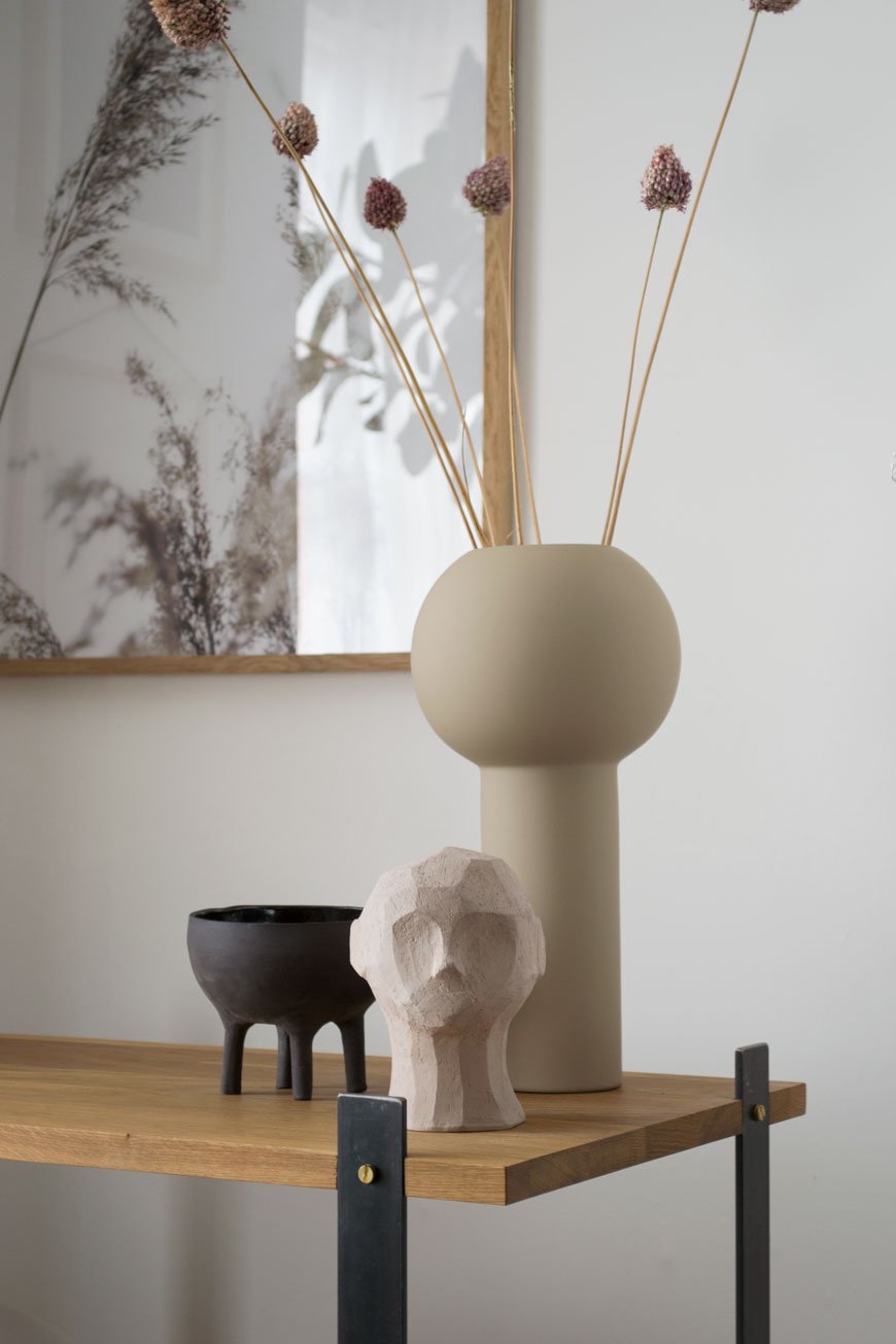
Styled with a few select treasures, the muted, sandy tones add warmth to this corner, elevated with a touch of black. Among them is the Olufemi sculpture from the new collaboration between artist Kristiina Haataja and Cooee Design. Haataja calls her unique approach to sculpting 'Ancient Cubism', combining ancient Greek sculpture with Post Modern Cubist form. I find it soothing to look at, the way the shadows form in the furrows of the concrete.
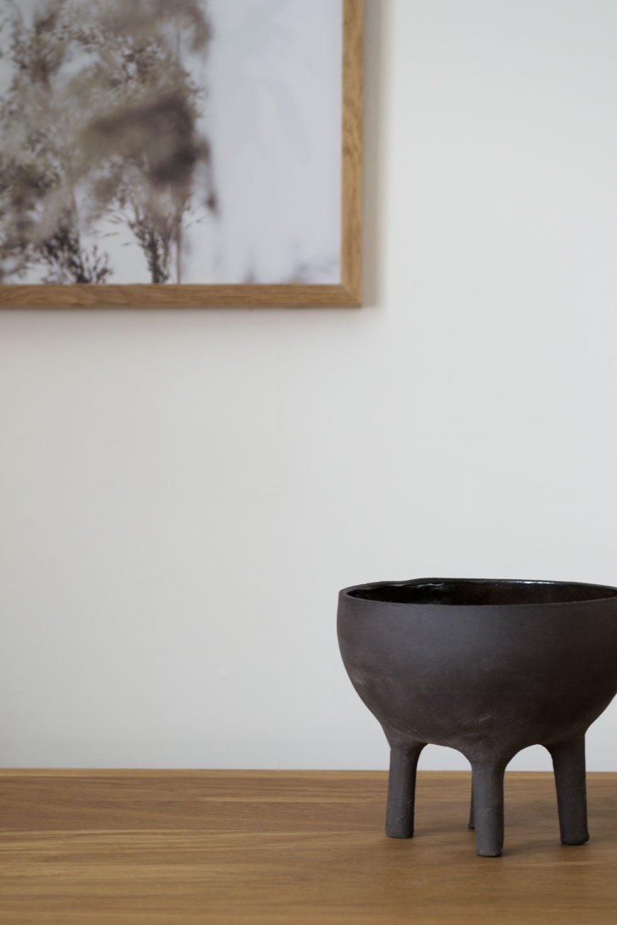
The little black Elephant pot was an Etsy find, all the way from Israel and made by Massa Design Studio. I love the contrast between the raw stoneware on the outside and glazed interior. See how its shape echoes the Pump lamp? Designed by Kutarq Studio for Woud, the soft light through its opal glass shade gives the impression of lifting off and levitating on its thin metal frame.
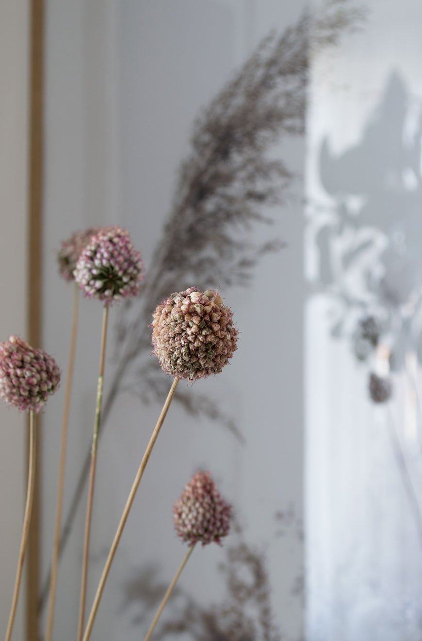
I’ve since dried the deep pink alliums that were growing happily in pots at the front of our house and they've taken on a much softer blush now. Their little bulbous heads are a sweet memory leftover from summer, bobbing around in their vase.
I'll be sharing tips on drying and styling flowers next month - I've grown loads! In the meantime, I'm off to the London Design Festival this week to see if I can't discover another design gem. Watch this space...
*Gifted items - KG1 Bookshelf, Enkl | Pump table lamp, Woud | Olufemi sculpture and Pillar vase in 'Sand', Cooee Design | Elephant pot, Massa Design Studio.
Styling and photography © Tiffany Grant-Riley.
Blooc Build Sustainable Living Housing Projects in Sweden
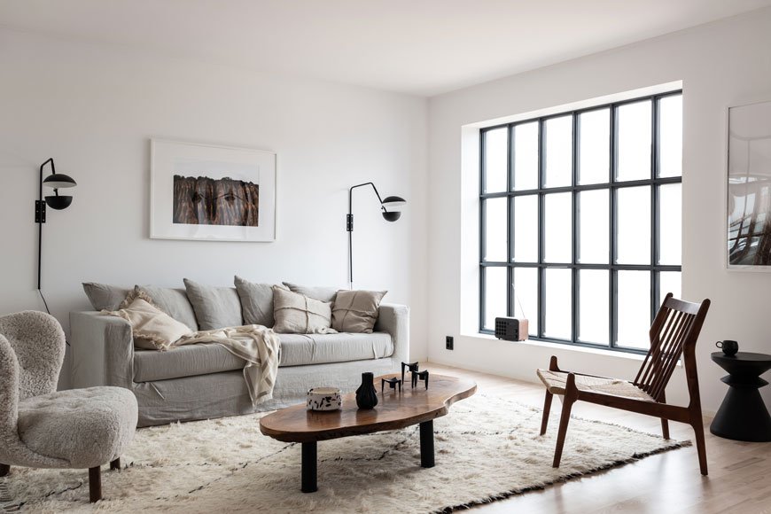
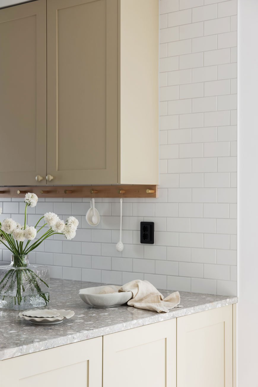
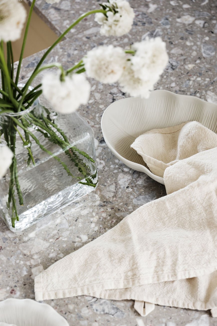
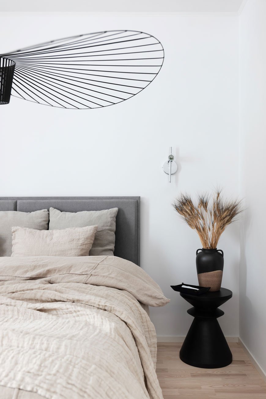
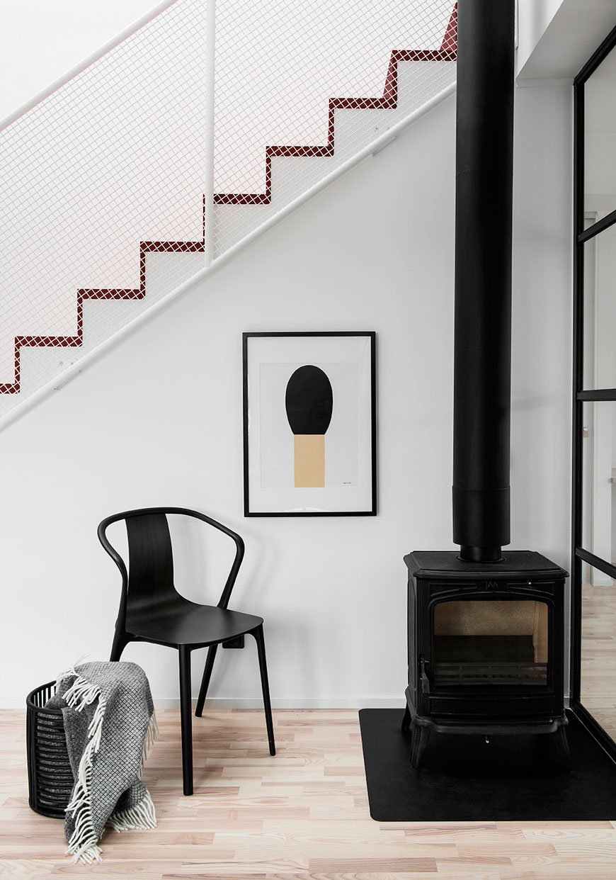
Taking these gorgeously styled images at face value, it'd be easy to get carried away with the aesthetics. I know I was when I discovered Blooc, a housing project company based in Sweden. It was the light-filled interiors carefully styled with Nordic design and custom details that caught my eye. Oh to have those steel warehouse style windows!
What sets them apart from other new builds though, is that these homes are designed for sustainable living from the ground up.
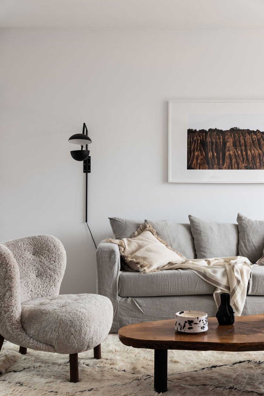
Launched in 2011, these architect-designed homes offer the best of contemporary city style, creating idyllic new garden communities out in the Swedish suburbs. The new Parkhausen development of semi-detached four bedroom homes is just 10 minutes from Väsby, featuring a muddy green wood-clad exterior. The airy, open-plan style interior is divided by floor to ceiling steel framed glass partitions, a clever way to continue the flow through individual spaces. A classic Scandinavian neutral colour palette runs throughout, from the soft grey linen sofa, textured Berber rugs, light oak furniture and wood floors. But I fell really hard for the garden room with its lush tropical plants, bringing biophilic design into the home and connecting you to nature.
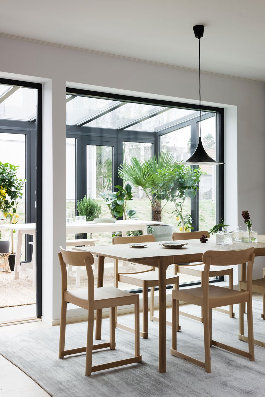
Modern Sustainable Living
According to recent reports in Sweden, only 4% of buyers have the desire or time to renovate, hardly surprising given the time, upheaval and costs that go into one. Anyone who has taken on a renovation project, however rewarding the outcome, will have wished at some point that they'd bought a new property instead. It has definitely crossed my mind a few times as we've uncovered leaks in the bathroom and faced the joyful task of replastering 100 year old walls!
All Blooc's homes are built using sustainable timber and other materials carrying the Swan label, the official sustainability ecolabel for Nordic products. Surrounded by nature, each build is well insulated and fitted out with new energy-efficient appliances to reduce its impact on the environment over time.
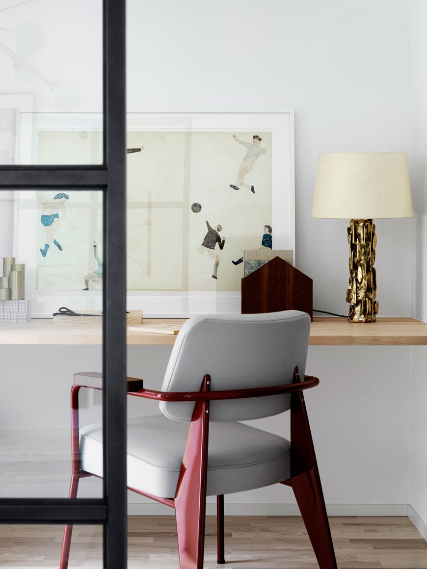
Blooc Objects
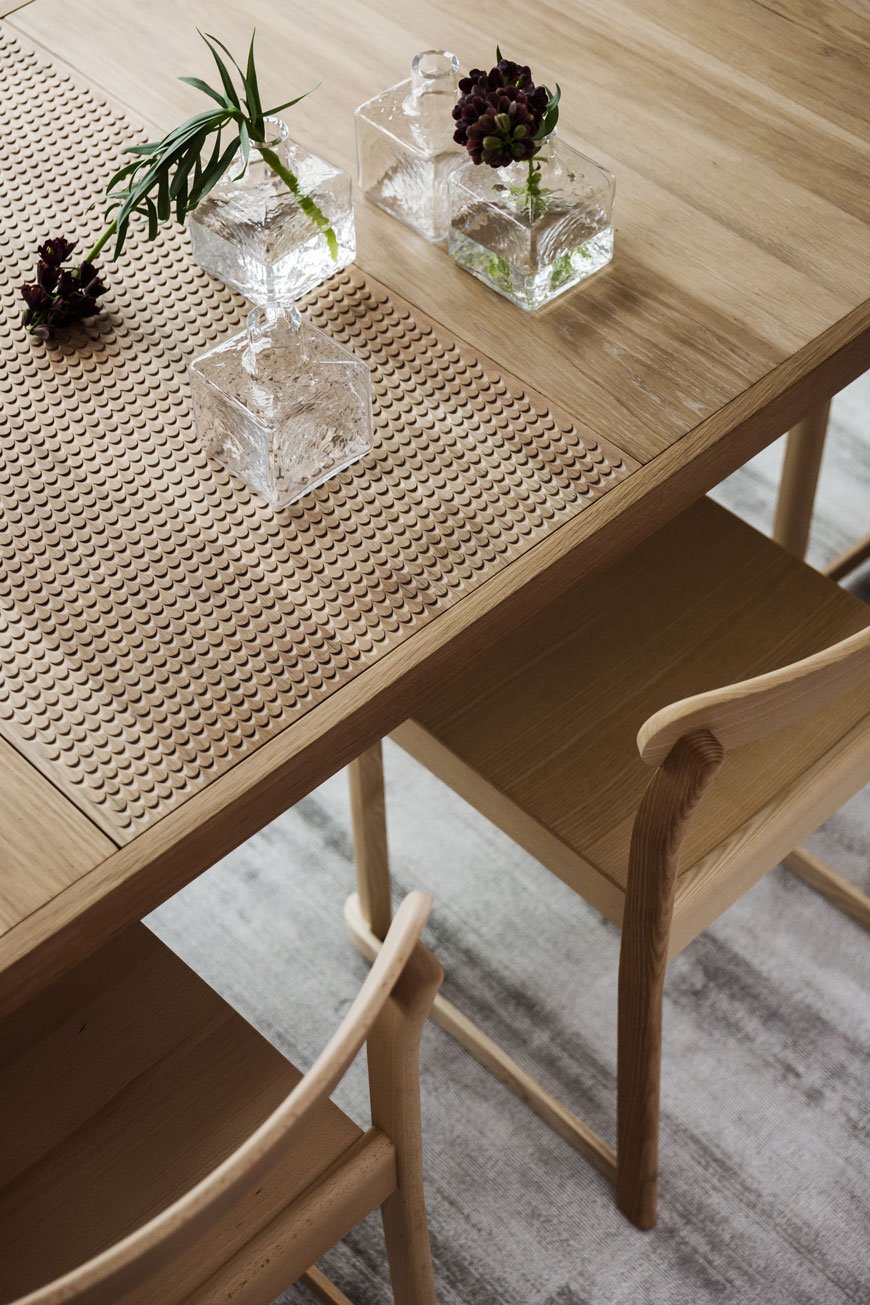
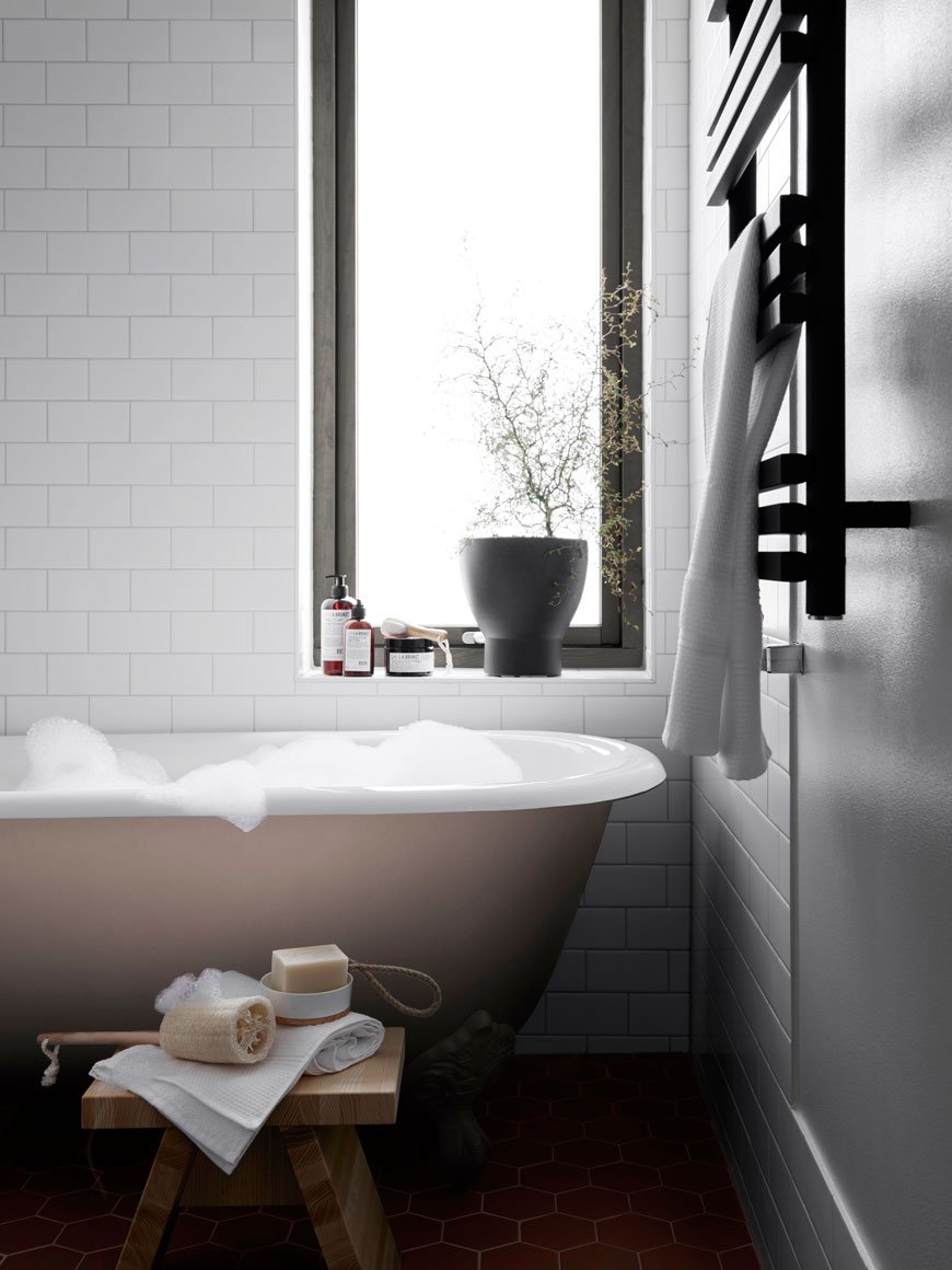
I was impressed to see that Blooc has its own collection of finishes and details exclusive to their homes. 'Blooc Objects' includes custom mirrors, kitchen cabinetry, bathrooms, handles and lighting used solely in their projects. They also produce a palette of contemporary colours that run through each project and gives it its own sense of identity - see how that muddy green from the exterior is carried into the bathroom cabinetry.
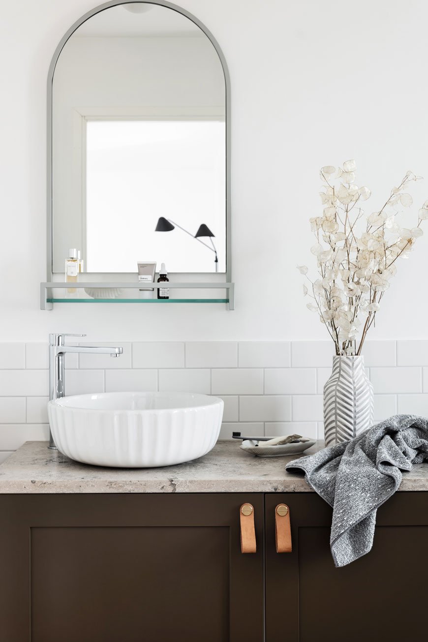
I would love to see more well-considered projects like these popping up in the UK, taking not only contemporary living into consideration, but fully sustainable practices too. What do you think - could you see yourself living here?
Photography courtesy of Blooc.
Sera Helsinki Ethical Rugs Empowering Vulnerable Communities
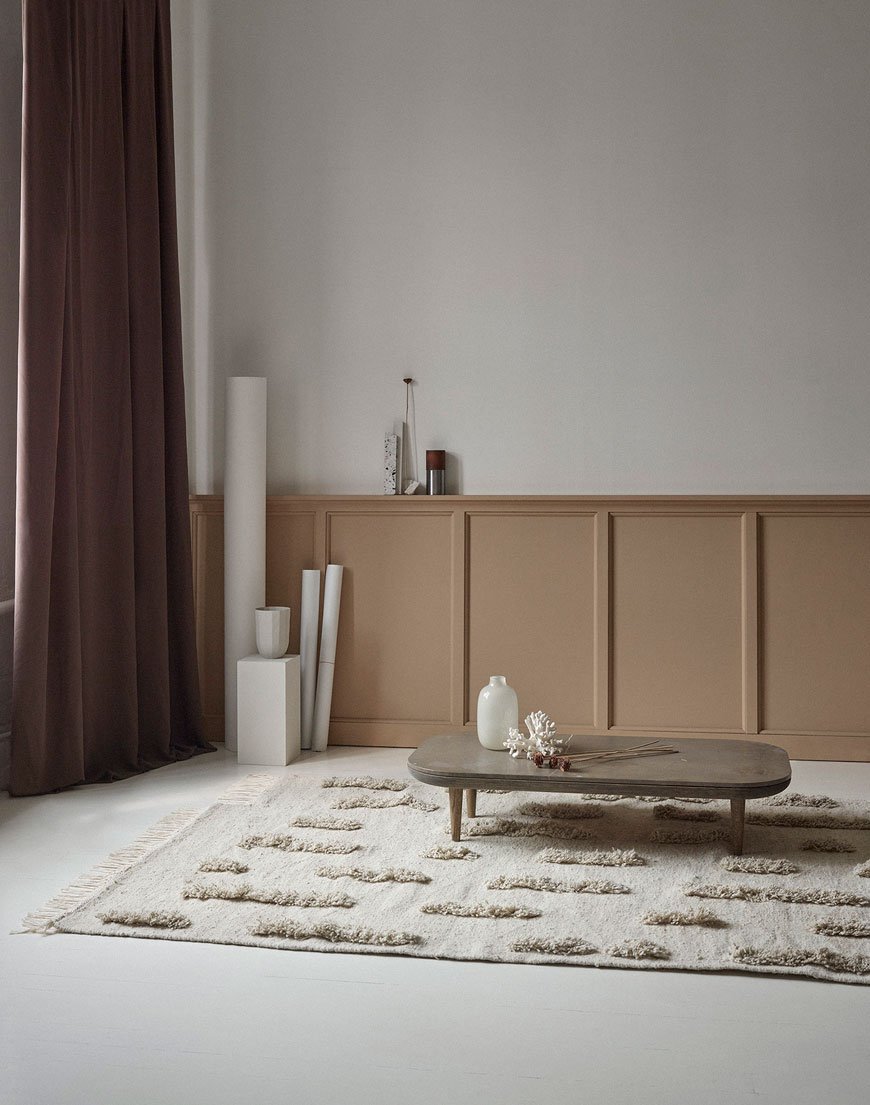 Yet again Instagram has unearthed a beautiful design discovery that I had to share with you, this time in the form of SERA HELSINKI. This ethical rug company is helping to create an inclusive community and lift it out of poverty.Friends Hanna Puharinen and Anna Suoheimo met at Aalto University in 2001 during their six-year Science Masters, sharing a passion for interior design. When Anna moved to Ethiopia with her family in 2010, she witnessed first hand the desperate situations that people with disabilities and single mothers faced, with extreme poverty offering no other option than to turn to begging on the streets. Compelled to make positive changes to the community, the pair set about training and supporting a community of weavers and artisans, empowering them with skills and a fair income.

 Taken from the Amharic word for 'work', SERA combines Finnish design sensibilities with traditional Ethiopian hand craftsmanship. The lambswool is locally sourced from farmers in the northern highlands of Ethiopia and the thread made by hand by the women in their families. Without intrusion from chemical processing, the natural colours of the wool allow the weavers to create the soothing tones and textures in the new Saaristo collection, designed by Anna Pirkola. Beginning in 2016 with just 8 weavers has grown into a 100 strong team, most of whom are blind. The intricate designs showcase exquisite artisanal woven wool rugs, cotton towels and leather bags.
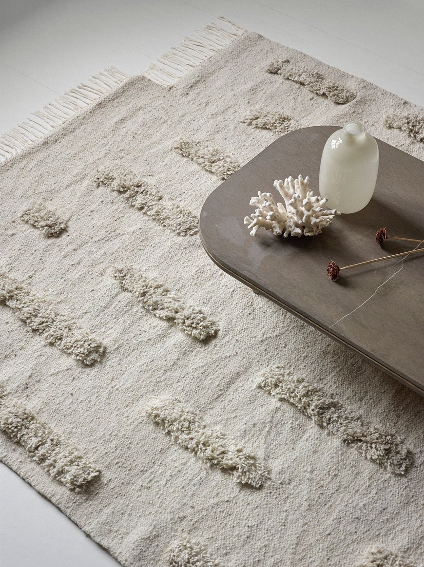

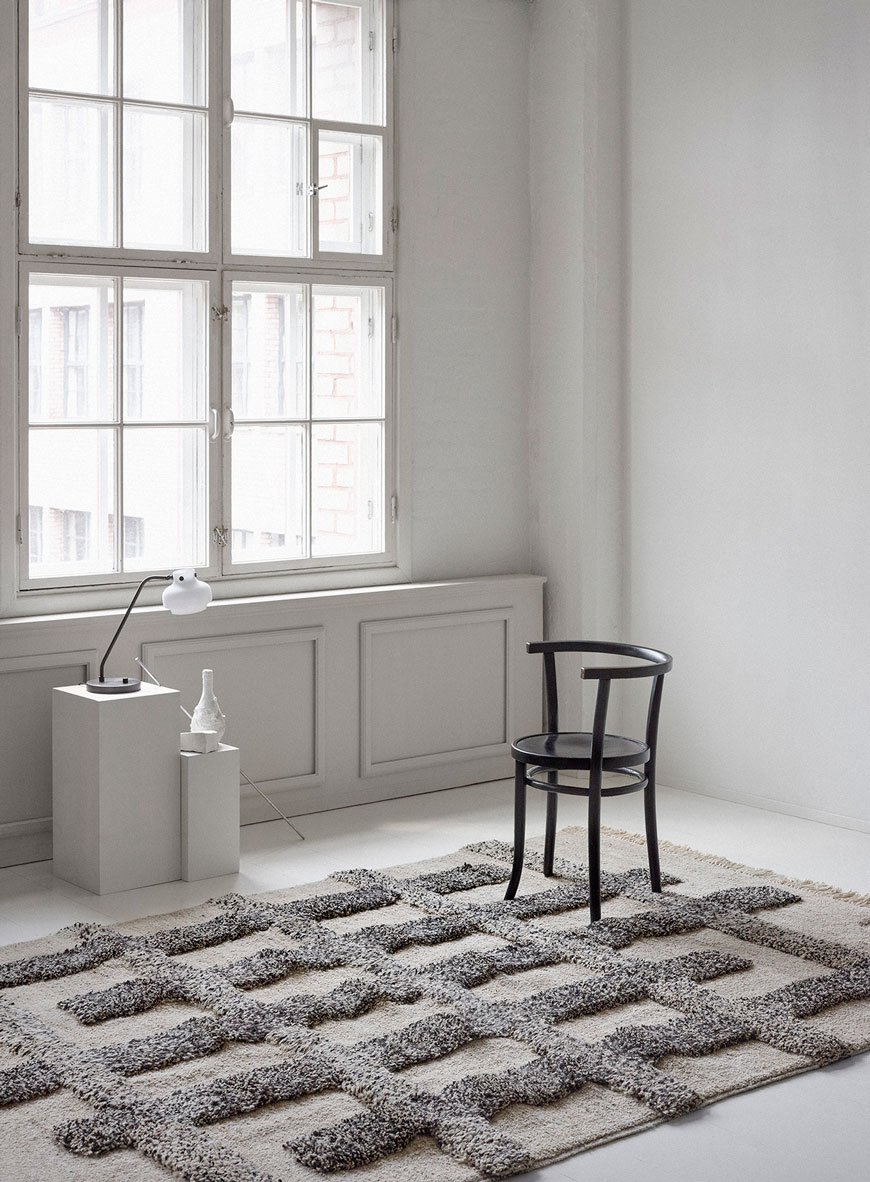 A beautiful focal point for any Scandinavian interior, the rugs are made to order and take approximately 2-3 weeks to produce. I've completely fallen for Sera Helsinki for striving to support and empower the local community in Ethiopia and for translating all that love and skill into a jaw-droppingly beautiful collection of ethical rugs. What a wonderful reminder to have in your home of the positive effects a social enterprise such as this can have. I'd happily have any of these grace the floor in my home one day...wouldn't you?
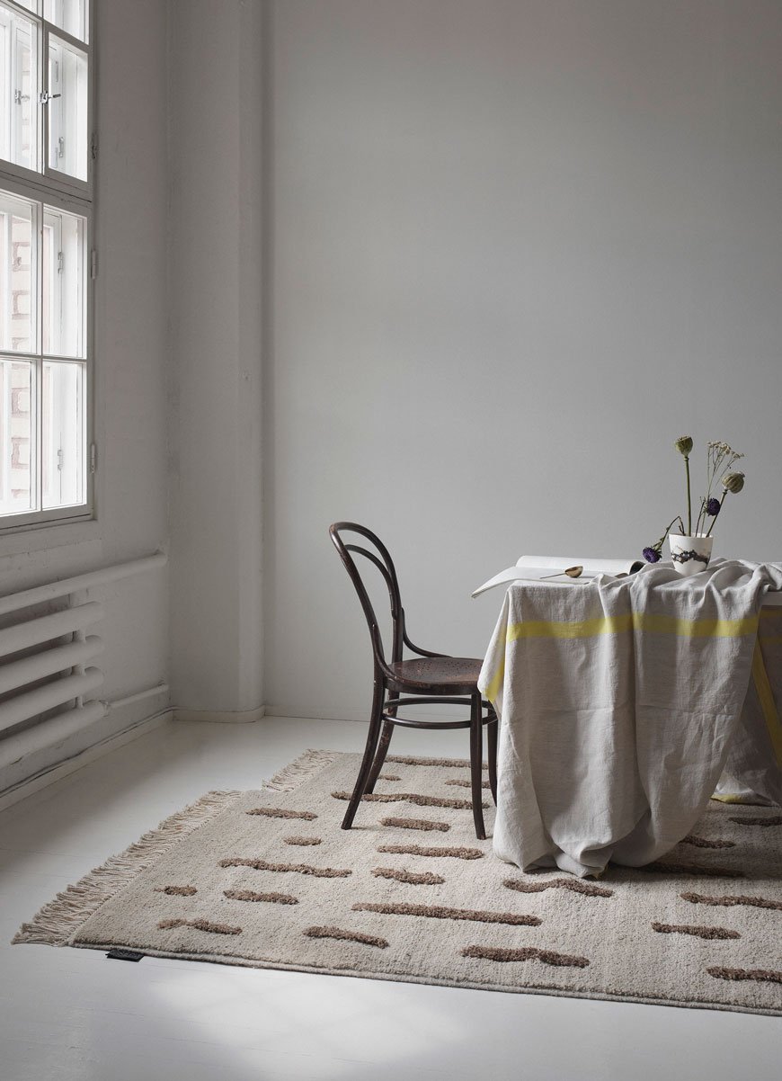
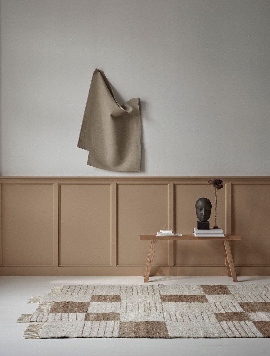
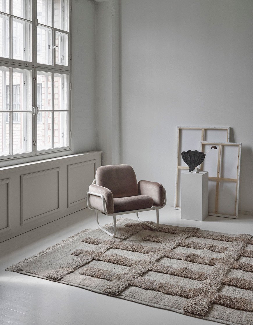
Photography courtesy of SERA HELSINKI, with thanks.
Mater Earth Gallery Brings Sustainable Danish Design to London
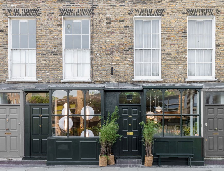 Back in Spring, I made time during Clerkenwell Design Week to visit the new Mater Earth Gallery. I am a huge fan of their soft, organic aesthetic and unwavering dedication to sustainable design. So when I heard they were setting up a new concept store in London all the way from Copenhagen, I had to see it for myself.Part of the new wave of Scandinavian minimalism, Mater was founded in 2006 with ethical and sustainable practices at the core of its design philosophy. Collaborating with an external team of new and established designers, the brand seeks to create timeless pieces rooted in high-quality craftsmanship.
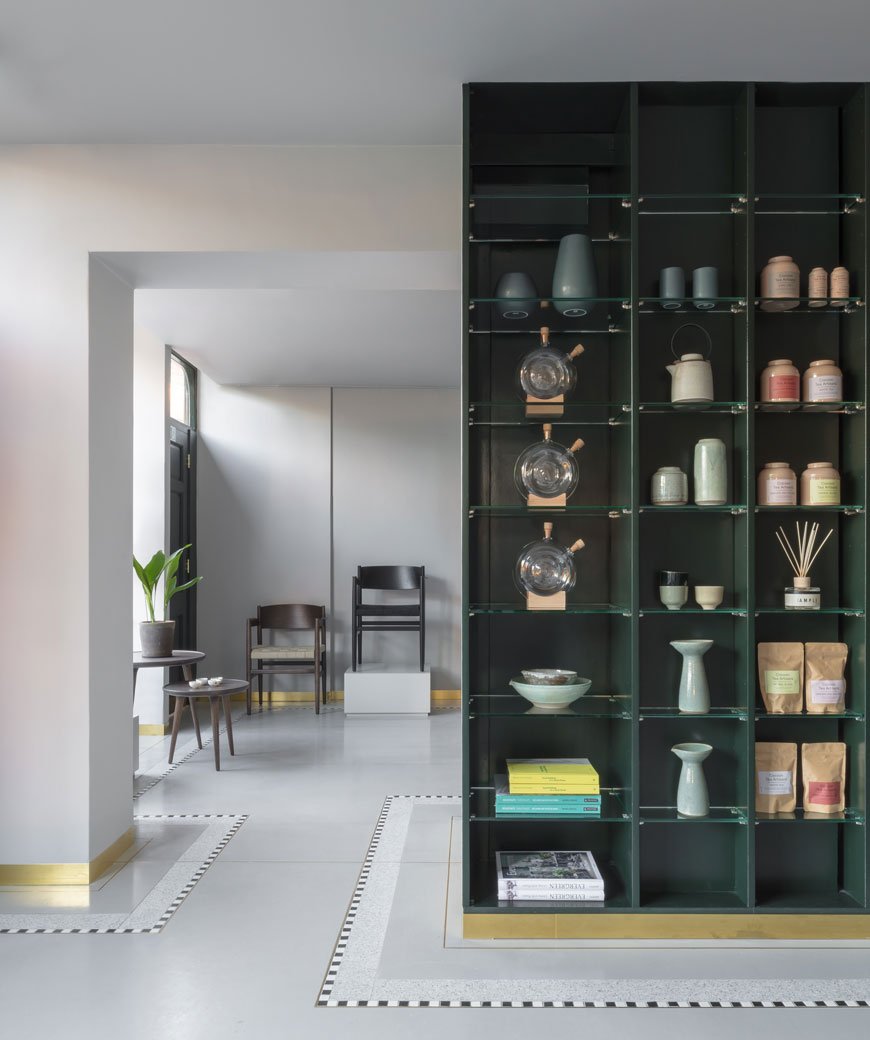
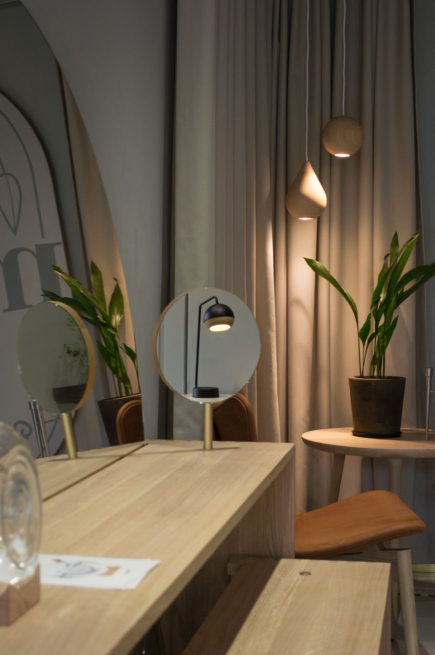
Mater means 'mother' in Latin. The name is the daily reminder of our small contribution to preventing the challenges 'mother earth' faces. Design influences how we as humans live our lives; it shapes values, culture and society. Unfortunately, we are increasingly aware that the choices made during design processes often have environmental consequences. However, as a manufacturer, we have the opportunity to rethink dubious practices and create ethical and sustainable design that minimises adverse social and environmental impacts.- Henrik Marstrand, CEO & Founder.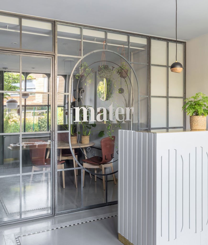 Mater's rostra of designers speaks like a who's who of design royalty; including Space Copenhagen, Eva Harlou and Pederjessen. Expect to see natural oak, cork and cane running through the collection.The Victorian building has been given a sympathetic update with brushed brass skirting and soft grey walls, blending down to the tiled floor in a similar tone. Inlaid brass edging lifts black and white mosaic tiling while dark green open shelves display a selection of ceramics, artisan teas and Eva Harlou's Double Bottle design.
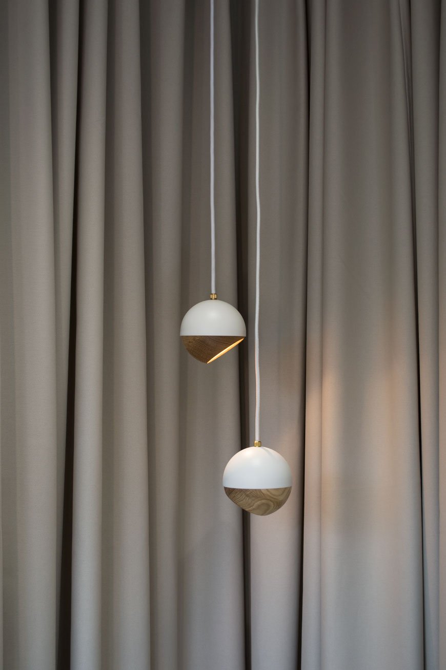
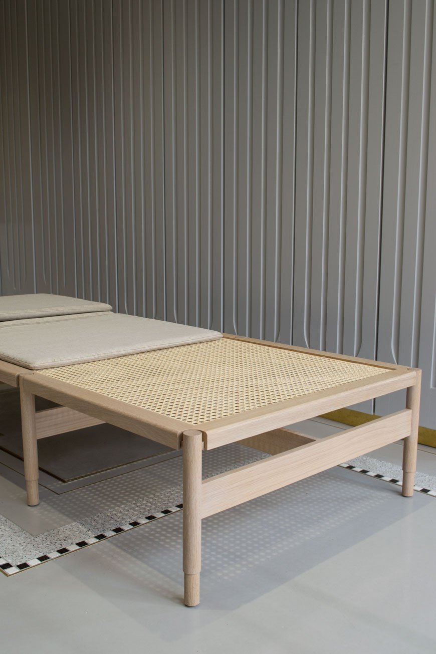 A daybed to die for - had I the space for it. The Winston, named after Churchill blends classic cane made in a 3rd generation Danish wicker workshop with a contemporary silhouette. The canvas seat is GOTS certified and the oak is FSC certified.
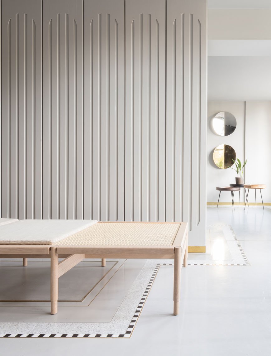
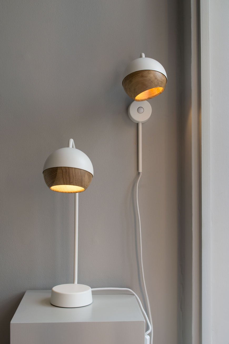 This is a calm space in which to see the collection. I instantly see soothing, tactile shapes when I think of Mater. From smooth Sørensen leather to the cupped oak of the Ray lamp, there are curves in almost everything here, bringing it all back to nature's form.
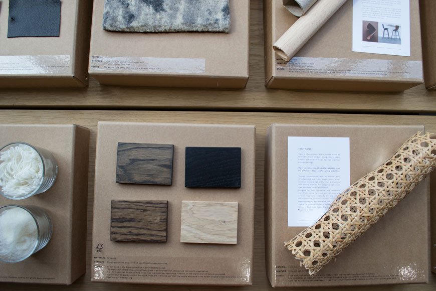 It's easy to stick a sustainability label on something and assume that's enough proof, but each step of the production process has a knock-on effect. You could say that it would be more sustainable to use the furniture we already have above making more. That said, it's important that designers and manufacturers move forward and claim greater responsibility in the way things are produced. As consumers, we need to educate ourselves in these practices and in turn change the way we consume. And of course, no production process is completely perfect, but better to be meticulous with what you do have control over than to ignore it entirely. The amount of plastic we're now having to find solutions for speaks volumes that old attitudes won't fly anymore.From day one, Mater has taken steps to ensure their practices take responsibility for supporting craftsmen with a fair living wage, good working environments and that their processes don't have a negative impact on the environment. This includes looking at water usage, the disposal of waste product and the social impact. Most of their collection is manufactured with FSC approved wood or mango wood which is a by-product of the mango fruit industry. The trees are felled after they no longer fruit and a new one is then planted in its place. They also use recycled aluminium (as seen in Space Copenhagen's stool) and LED lighting in a bid to make their lighting energy efficient.
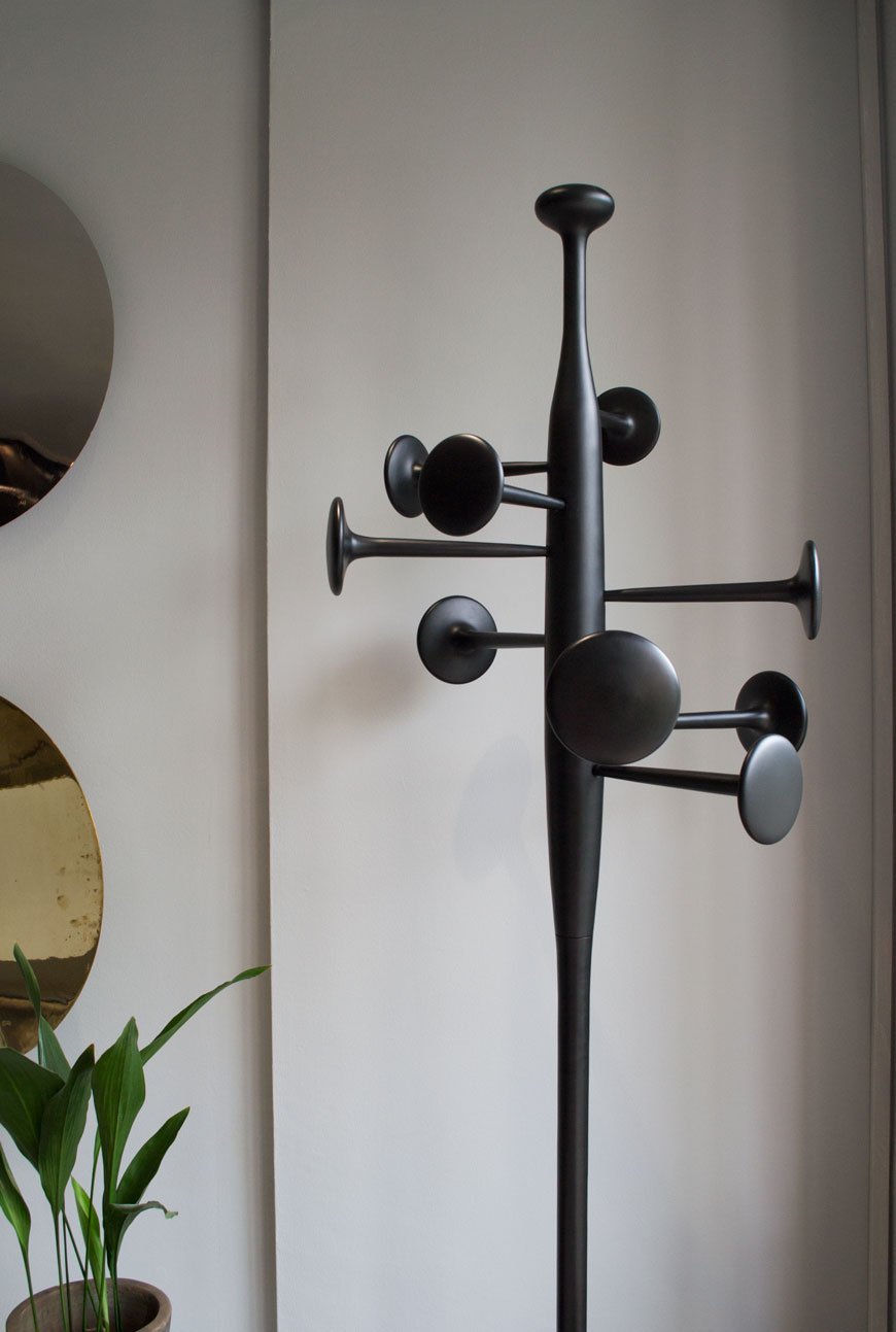 If you'd like to find out more about Mater's journey in sustainable design I would urge you to visit the London showroom. Experience the collection for yourself and ask as many questions as you like, the team are lovely.
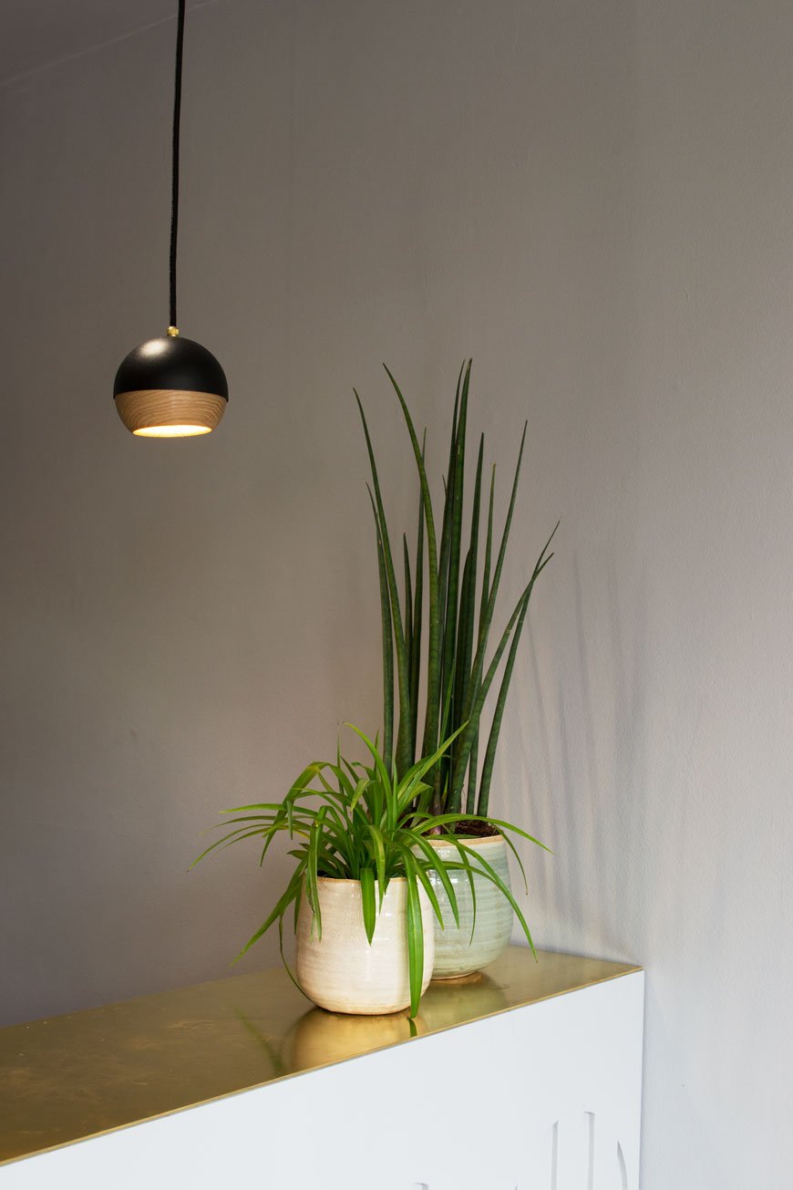
Visit the Mater Earth Gallery
36 Myddelton Street, Clerkenwell, London.
Additional photography © Tiffany Grant-Riley
5 Home Office Design Tips And HÅG Futu mesh Task Chair Giveaway [AD]
 This is a paid partnership in collaboration with Flokk.Take it from someone with ten years working from home under her belt, having a workspace that's both functional and inspiring is so important. Over the years I've tried out a number of not-so-great home office set-ups. I started from a reclining sofa (yep) and dining room table to a corner of the bedroom before having the luxury of a dedicated workspace.Aesthetics, of course, are what make a room but there's little point in having a stylish home office if it doesn't actually work for you. With that in mind, here are my five tips you should consider when you're designing your own space...
1. Choose The Right Chair
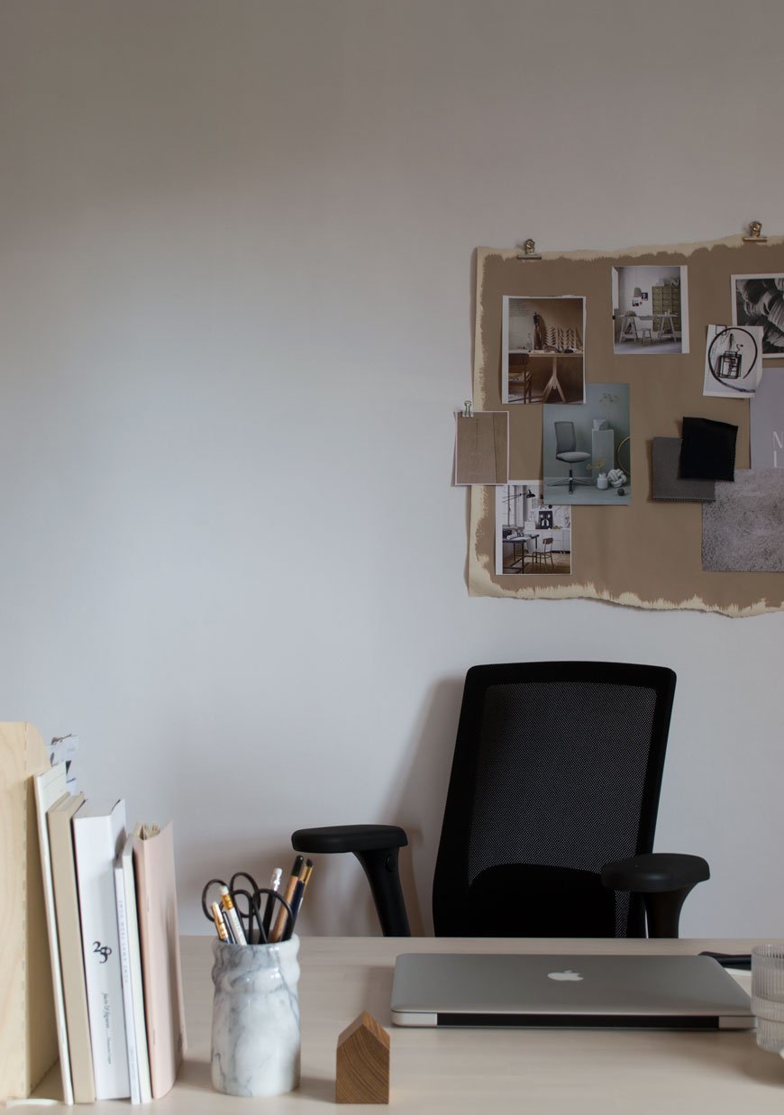 Top of the list. The office chair. Having spent years damaging my posture in a variety of static chairs and slumpy sofa cushions I can attest that choosing the right chair is the difference between getting in a focused days work in comfort and spending time in physio. I'll be honest and say that up til now I've categorically avoided office chairs. They've always felt too corporate and imposing for a home environment.When the furniture group Flokk got in touch to ask if I would try their Norwegian office furniture brand HÅG and their HÅG Futu mesh chair, I decided to put it to the test. Based in Røros, an old copper mining town on the UNESCO World Heritage List, HÅG have been manufacturing chairs since 1943. Before the chair arrived I was sold purely on the fact that this is a company that takes their impact on the environment seriously; mapping out and reducing production emissions and using recycled plastics since 1995, earning them the coveted Nordic Ecolabel.
Sit Properly
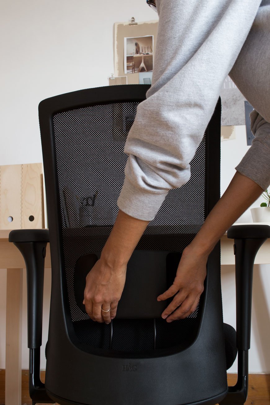
It's good practice to sit with your knees at a 90-degree angle with your feet on the floor, although HÅG actively encourages you to put your feet on the legs of the chair as you move which have ridged steel grips. Your arms should sit at a 90-degree angle to your desk to stop you from hunching your shoulders.Did you know that your calf muscle acts like a secondary heart in circulating blood back to the heart and comes into play when you actively move your feet? This is why when we're likely to be static for some time - on a long haul flight, for example, it's recommended to do leg exercises to increase your circulation. With this in mind, all HÅG chairs come with Balance® Technology which is totally intuitive, encouraging mobility and engaging your core. The amount the chair moves can be adjusted underneath the seat via three settings so you can opt for more or less as you see fit.The back comes up to shoulder height and combined with the transparent mesh it has a slender, lightweight appearance. My back feels completely supported against the FutuKnit™ mesh, a specially designed 3D knitted fabric which retains its tautness. If I want a gentle recline the seat can also be adjusted underneath.Unnecessary frills have been done away with, focusing on simple adjustable elements found in discrete buttons and small touch levers. The all-important lumbar support slides up and down, locking into place. The arms which are removable slide outwards as well as up and down with adjustable armrests that pivot inwards.The HÅG Futu mesh is a thoughtfully designed piece of Nordic simplicity. Having experienced the difference, I would recommend finding an ergonomic chair that suits your needs.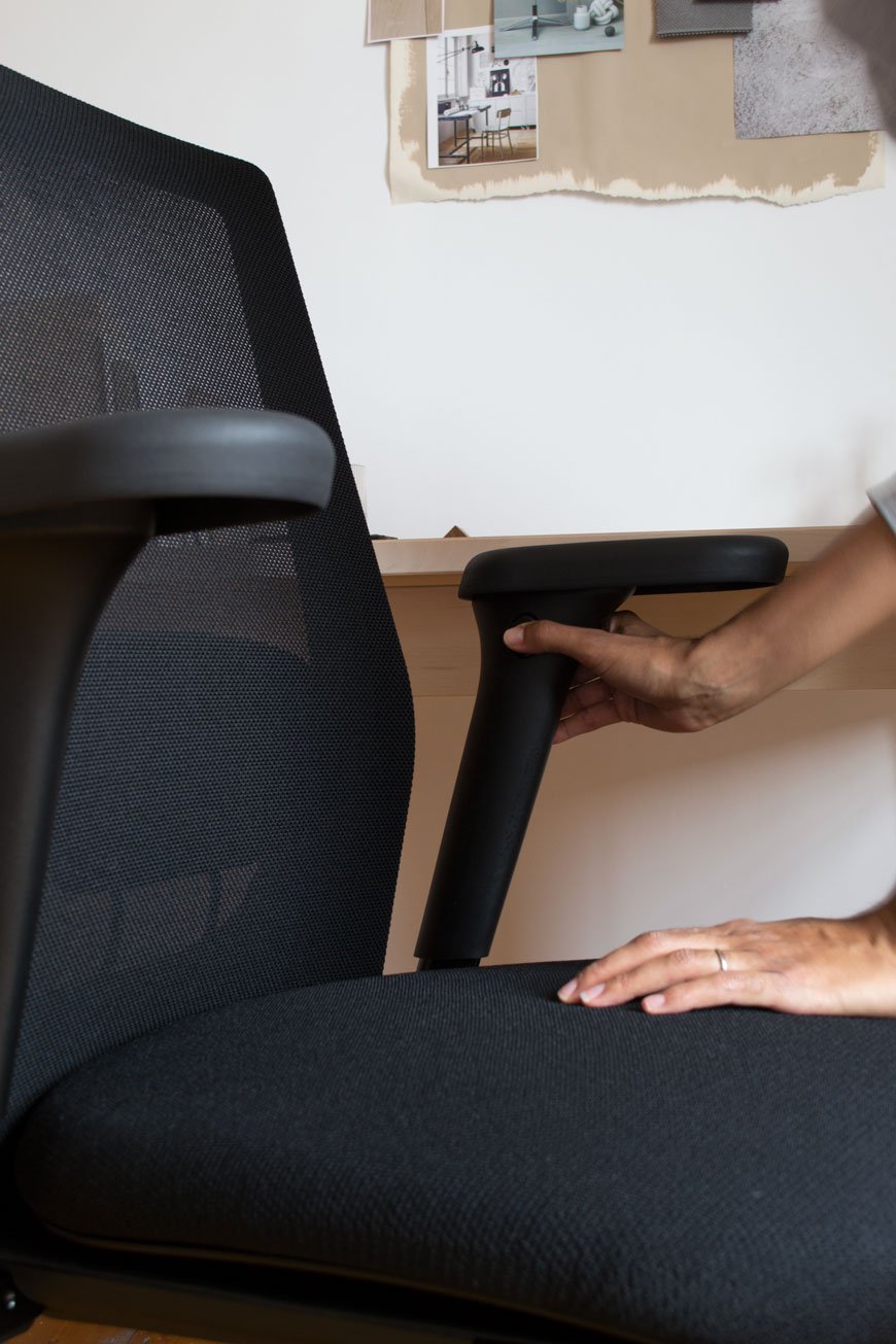
2. Making Room For A Home Office
Working from home can kick up a variety of distractions if you don't have a dedicated space. I say space because if setting aside a room isn't an option, you can carve out a corner instead. It could be in the dining room, on the landing if it's possible or a corner of the bedroom even which is where I currently work. Choose an area with good quality of light away from tempting distractions like the TV...the fridge.Don't be put off if you don't have room for a free-standing desk, you can utilise the wall space just as well. Put up a sturdy ledge instead or use the inside of a cupboard you can shut away at the end of the day.
3. How Will You Use Your Office?
How you design the space will depend entirely on how you plan to use it. Can you work with a shallow ledge for a laptop or will you need a deeper desk for a computer? Do you need space for dual screens or perhaps accessible storage is a more pressing need? Consider how much time you plan to spend working here and if you'll need to be able to shut it all away at the end of each day, particularly if you're working in a corner of a shared room. Once you've worked out your needs, designing the space and finding the furniture will be an easier process.
4. Plan Your Office Layout
 The shape of your space might already dictate your layout but if you've got free rein, I would recommend setting up close to a window in a position you won't get screen glare. Ensure you have enough room to move freely. Do you want to have storage in front or behind you? If floor space is limited then look at wall mounted solutions, otherwise you'll start to feel restricted which in turn will affect your ability to work.Use any available wall space for shelving or cupboards and keep them organised - don't be tempted to fill them with clutter. Keep your everyday essentials within reaching distance - the pot of pens, sticky notes, USB stick. A series of shallow picture ledges can be used to keep notebooks alongside art prints. Find a pinboard or pegboard and create a visual inspiration wall or use it for urgent reminders.Choose the right a task light. If you don't have space for one on your desk, consider a design you can attach to a shelf or directly to the wall, if not slender floor lamp is a great alternative.
5. Show Your Personality
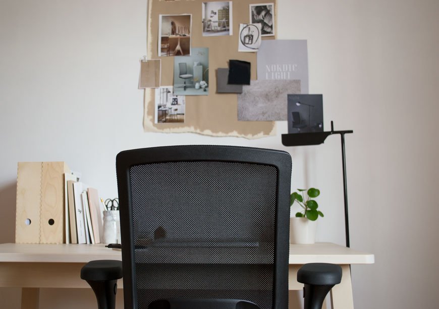
Whilst you want to give your home office a sense of separation from the rest of the house, it's important for it not to feel sterile. You're working from home after all so it needs to be a space you feel at ease in. Bring in a rug to zone your desk space, something that feels good underfoot.Colour is very much a personal choice but I recommend light or neutral shades over anything too dark. Bright colours will start to feel distracting after a while so if you're keen for a shot of colour, keep it to furniture, accessories or art.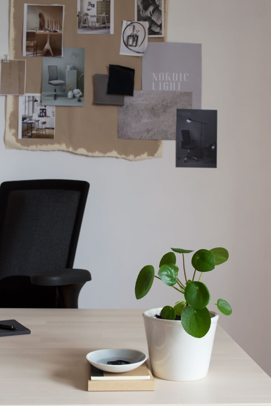 Having plants in the home reaches far beyond the botanical trend of the moment, they not only bring life into a space but they clean the air too. Keep a little pot on your desk, like my Pilea, or choose trailing plants to sit on your shelf above. Peperomia and String of Pearls are a great choice and Snake plant and Aloe Vera are ideal air purifiers.
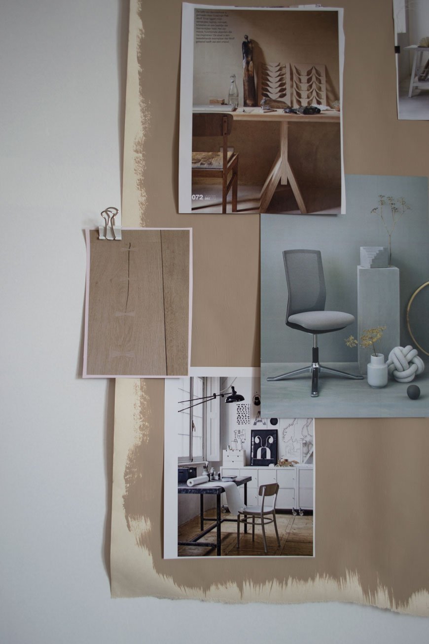
Enter HÅG's Home Office Giveaways
GIVEAWAY ONE - Win a HÅG Futu or Futu mesh task chair in the colour of your choice worth up to £730.For a chance to win, choose your favourite colour and leave a comment below.*GIVEAWAY TWO - HÅG is also running a competition to win a 30,000 euro office makeover."The winner will receive a visit from their expert interior architect who will provide advice on colours and fabrics. They’ll share with you our range of products, discussing what to add to your working environment to make it healthier, happier and more productive.Then all you have to do is sit back and wait for the transformation!"Please see T&Cs for further information.* T&Cs: Entrants must be aged 18+ and a resident of the UK. This giveaway closes on June 6th 2018. This giveaway is for X1 HÅG Futu mesh task chair only. The winner will be drawn using a random number generator and contacted via email by Flokk directly. Your contact details will not be shared with or sold to any third parties.
Photography & Styling © Tiffany Grant-Riley
Norrgavel | Sustainable Design Rooted In Nature
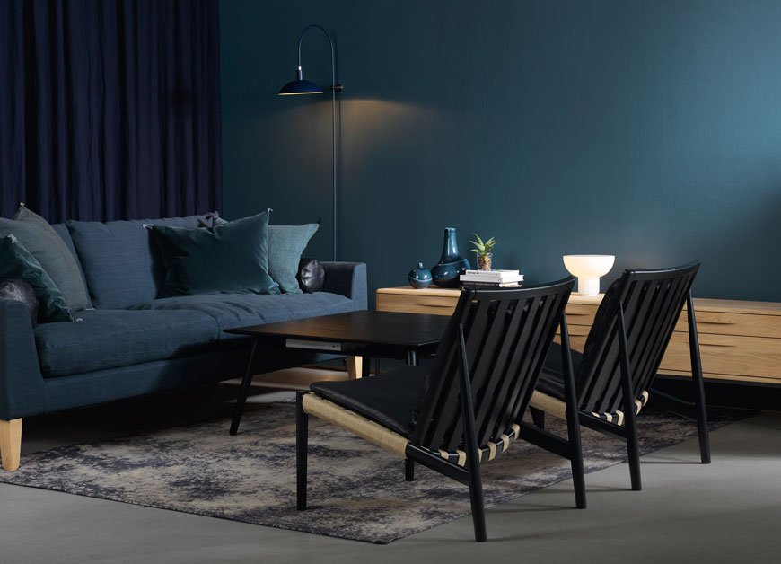 As it's Friday, I thought we could all do with a soothing introduction to the weekend with a collection of restful Swedish furniture. Trust me, you'll have trouble prizing yourself away from these gorgeous rooms...Founded in the early 90s in Sweden by architect and designer Nirvan Richter, Norrgavel is a design brand built on sustainability. Noticing a lack of high quality, well made furniture, he began to create a name synonymous with timeless, functional design, extolling the virtues of locally sourced wood such as birch, beech and oak. As a reaction to mass-produced furniture, Richter set to designing a collection made from renewable, raw materials that could be reused and passed down through the generations, needing only to be reupholstered should the need arise.What I love about Norrgavel's ethos (aside from the obvious) is the honesty behind the furniture. There is no fuss here. Wood is allowed to behave in exactly the way it should, untreated, or instead painted with an egg oil tempera which allows the grain to breathe over time. It's hardly surprising then that they received the acclaimed Nordic Swan Ecolabel as a mark of the brands commitment to the environment. Not really designed to be statement pieces, rather this furniture should easily blend into existing surroundings and look a part of the home without any effort.
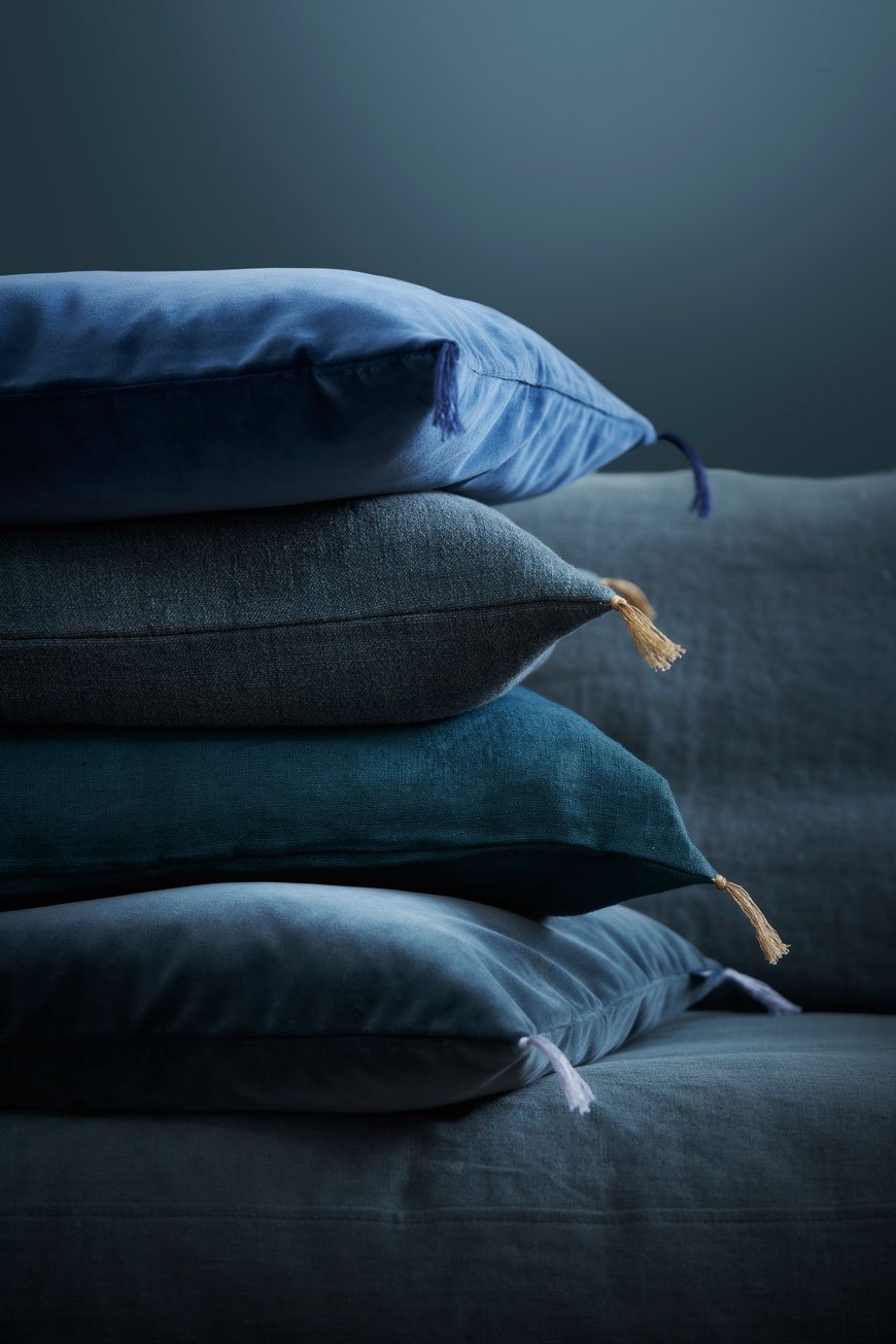
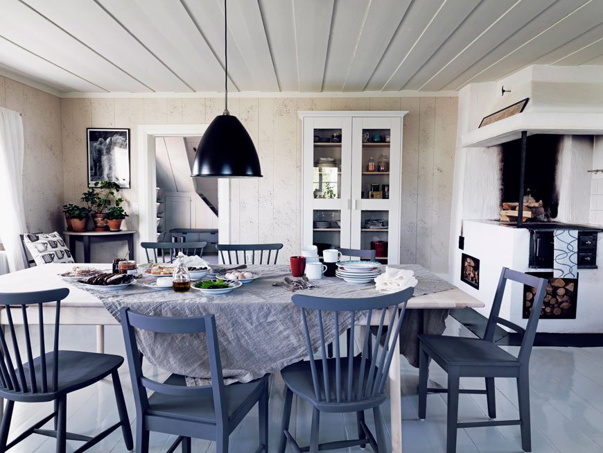
At Norrgavel, we want to create relationships with our customers. Rather than encourage passive consumption, we try to make it easy for customers to be present in the purchasing moment and to have a relationship with the things they choose to surround themselves with – encouraging them, quite simply, to consume less but to give themselves permission to have things of greater quality.Our intention is that a piece of Norrgavel furniture should act as your faithful servant. It should work well and make life simpler. An unobtrusive design that you only notice when using the furniture, but that is then all the more apparent. A chair that really supports the body, a handle designed to help fingers and hands to pull out a drawer. We create our furniture with the intention of it forming a backdrop to life rather than dominating. So we don’t feel that the design has to be amusing or create a sensation.
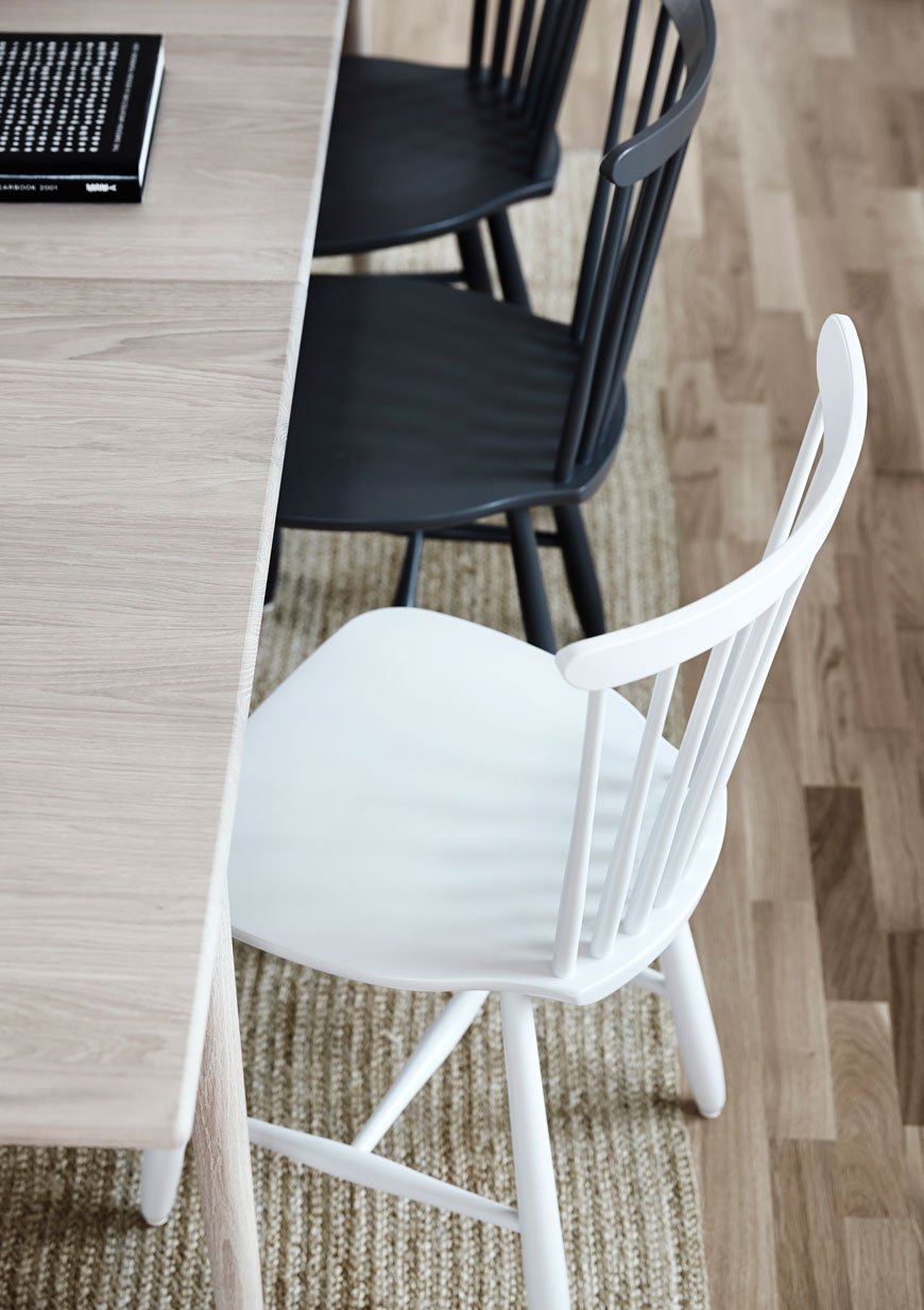
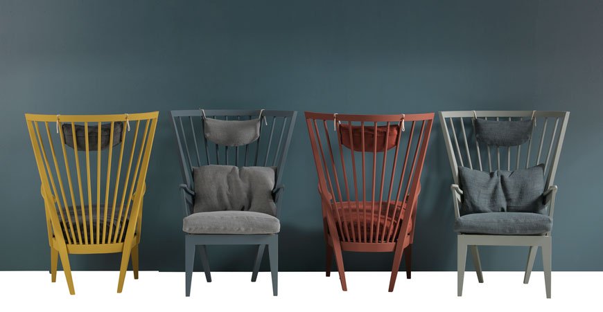
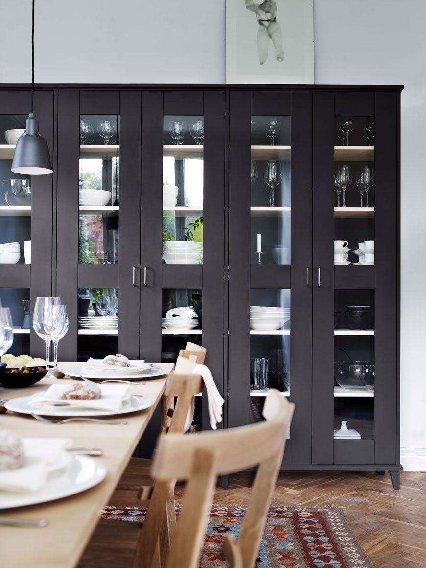
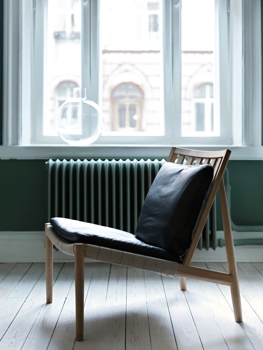
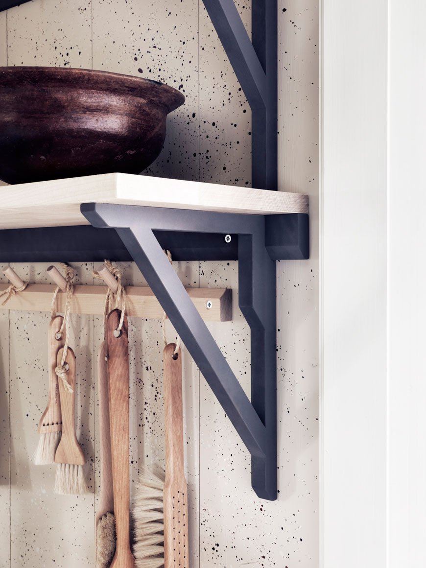 The Norrgavel collection also extends to home accessories, all of which are organic, including bed linen, rugs and tableware. If sustainable, natural materials are your thing (and they really should be) then take note. So, where to buy? Well, unless you're based in Sweden or Denmark it gets a bit tricky, however, I've done a little digging and you can purchase directly through a mail order. I'll take one of everything...
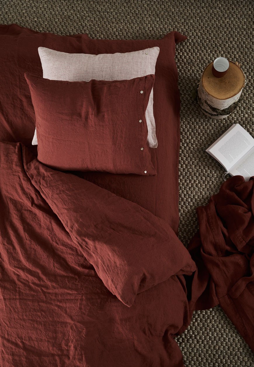
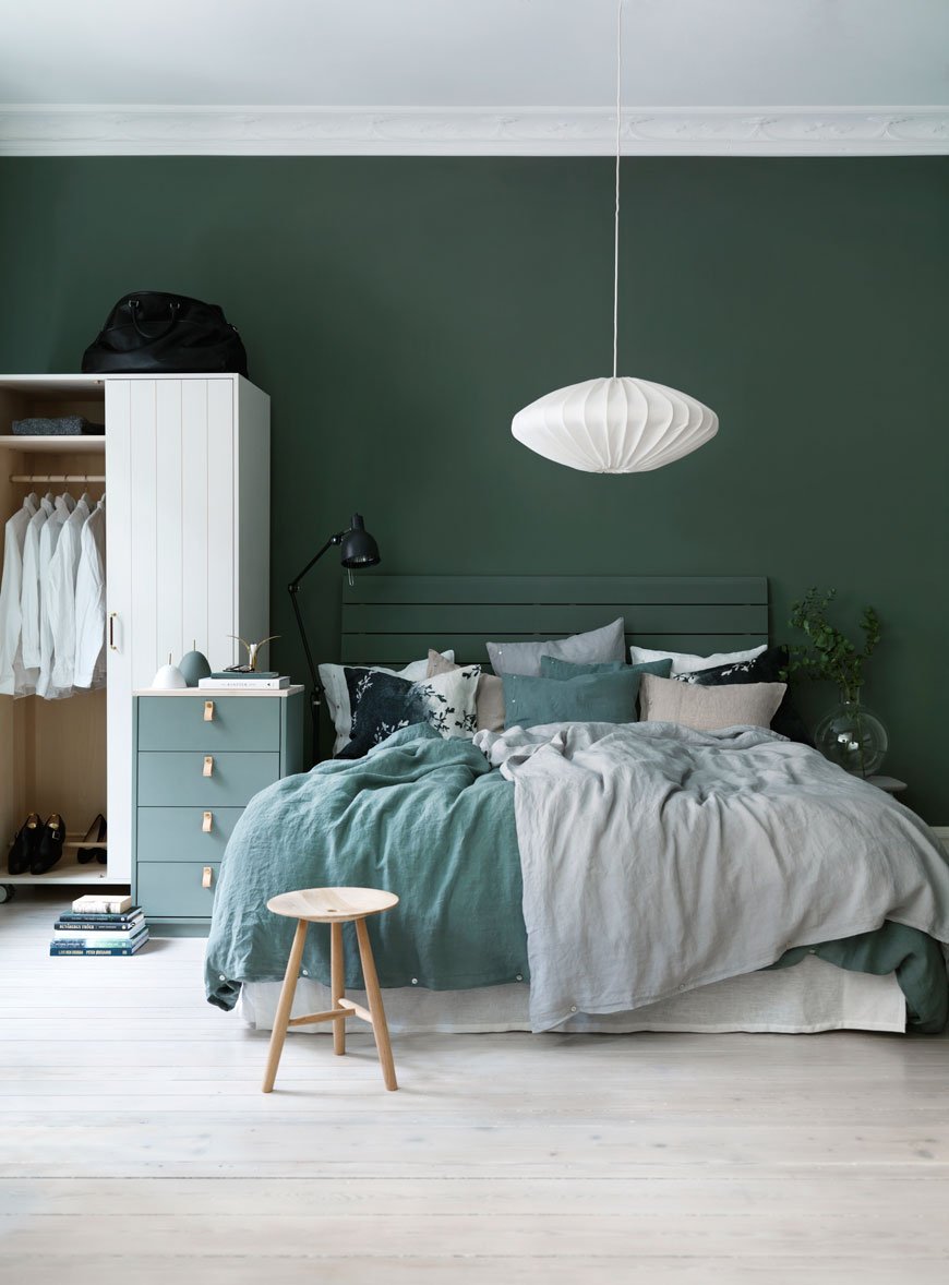
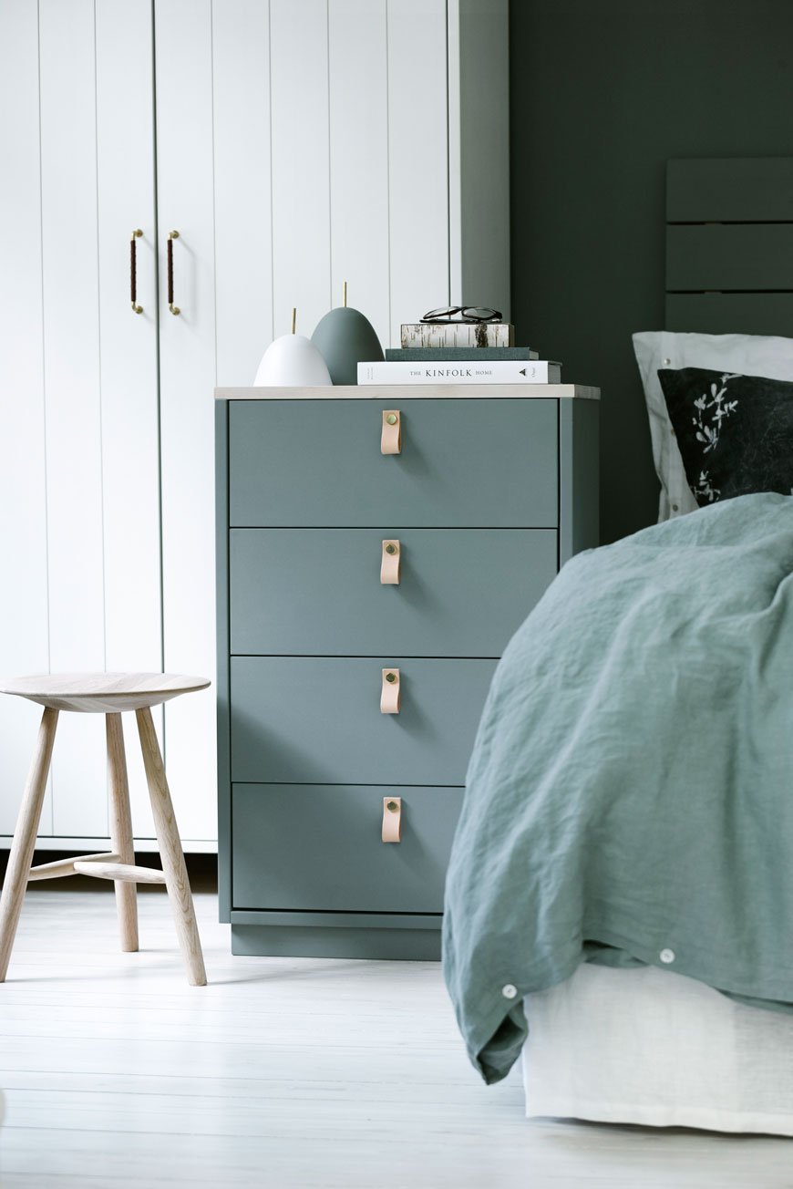
Photography courtesy of Norrgavel.
Kovac Family / L25 Lamp Giveaway
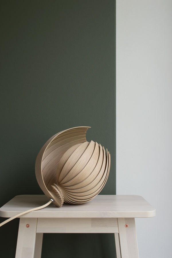 I'm back in the land of the living having stepped off my Spanish cloud at the weekend - last week I was away on a design tour, stopping off in Barcelona, Valencia and Madrid. If you've been following on Instagram you'll have had a little taste of what I got up to, but there will be more to come here on the blog over the coming weeks.For now, back to Scandinavian design and the organic shape of this, the L25 Lamp, so named because of the 25 pieces of oak its made from. Isn't it beautiful? Understated and quiet, but with a lot to say. Designed by Stockholm based design studio, Kovac Family, this lamp is locally produced, constructed from FSC sustainable oak and comes flatpacked for you to fold out yourself. You know how much I love design with a conscience and all the more so here as Kovac Family put proceeds from each lamp sale towards their biomimetic light project which aims to find new, eco-friendly solutions to help in designing and producing lighting by emulating nature itself.
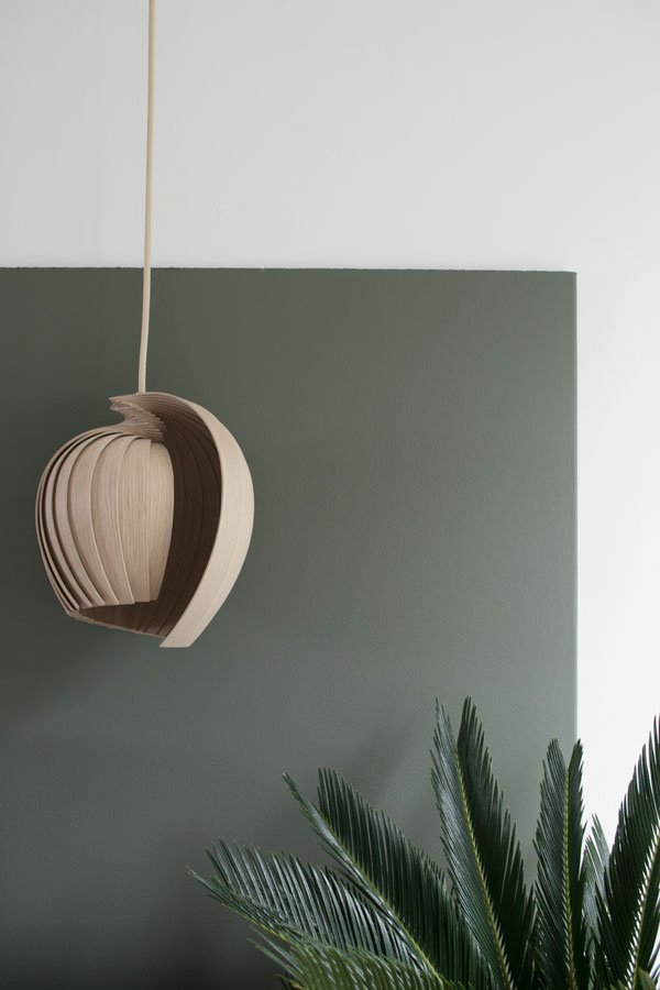
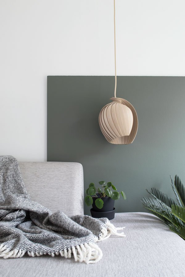 And because I knew you'd love it as much as I do, I've teamed up with Kovac Family with an Instagram giveaway. If you'd like to be in with a chance to win your own L25 Lamp in oak, here's what you need to do:• Switch over to Instagram and follow @kovac_family and @curatedisplay.• Find the giveaway post on my feed, leave a comment telling us where you'd like to hang your lamp and tag in a friend you think would like to enter too. Easy.The competition will run from Friday 22nd July and closes August 1st at midnight GMT. Entrants must live within Europe and the winner will be chosen at random by number generator. Good luck!
  I'm also taking over Stylist Magazine's Instagram account today as part of their #FridayFeast series, so do follow along for my take on interiors and a little taste of Spanish design! Photography & Styling © Tiffany Grant-Riley
Milan Interior Highlights / Mater Design
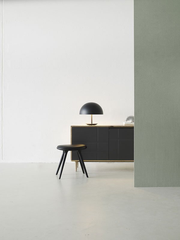
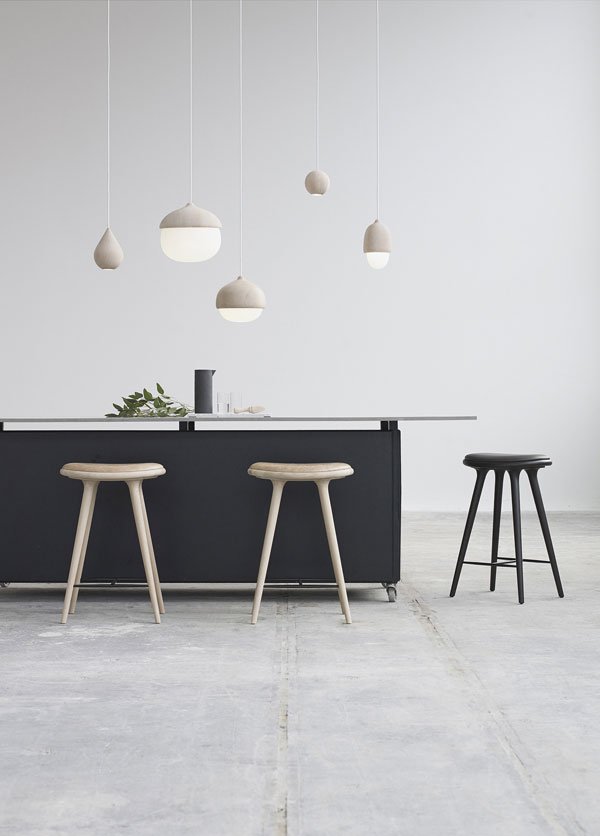
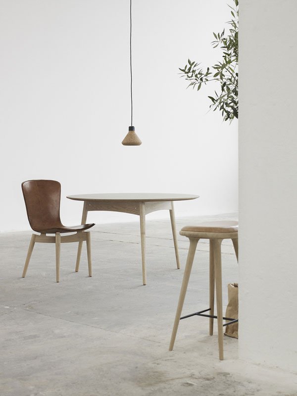 Last week the design world was abuzz with news from the Salone del Mobile Milano, an international furniture fair held in Milan and the only place to be for aficionados. Those attending the show kept us on tenterhooks between gelatos and leisurely lunches over Instagram with snap shots from the most revered and celebrated designers all over the world. Whilst I couldn't make it (too busy washing my hair) I instead put together my own highlights from the show.Kicking off with Danish brand Mater Design founded in 2006 by Henrik Marstrand, this design house collaborates with fresh, up and coming designers producing simple, understated pieces with the environment at its core. Mater Design work with certified wood and sustainable materials, supporting people and local craft traditions, believing in the importance of leaving as little impact on the environment as possible.My eye was drawn to the muted tones and organic shapes, so simple yet hold their own as contemporary, stand out pieces. The styling made me want to reach out and touch everything, particularly the Tehor lamp (below) made from alder wood and blown glass, created by Finnish designer Maija Puoskari.Cloudy Chair
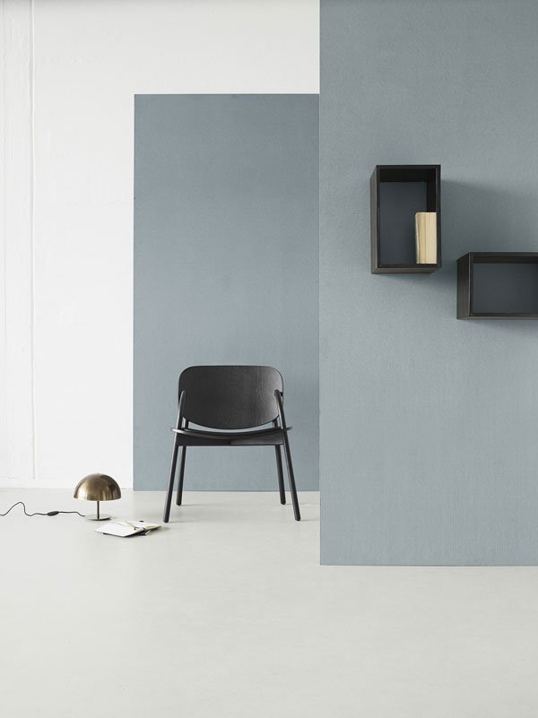 Sirka Sideboard
 Terhor Lamp


![[AD] How To Decorate With Limewash Paint - Breathable Eco Paint From Bauwerk Colour](https://images.squarespace-cdn.com/content/v1/63c93d56b8f27c4ca17f2ed3/1682502107222-V774E98QC55YCZE8SOMK/how_to_use_limewash_paint_bauwerk.jpg)


