An Artful Style #02 / The Artful Walls Collection
In my second instalment of my 'An Artful Style' series I've teamed up with Great.ly, with whom as a tastemaker I host my Curate & Display boutique, to share a few of my favourite pieces from my 'Artful Walls' collection. In a bid to encourage myself to purchase more art for our oh-so-naked walls, I put together a collection I'm really proud of, highlighting my love of expressive, abstract art and muted graphic prints. It's a little Jekyll and Hyde but at the same time, they work so well together.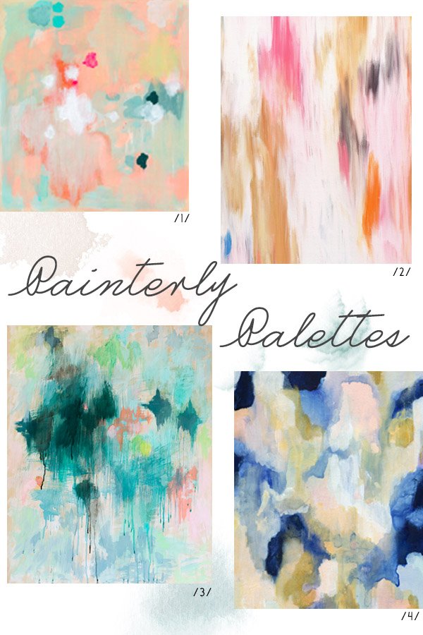
/1/ 'Everything All At Once | Belinda Marshall /2/ 'Isla' | Patricia Vargas /3/ 'Frost' | Belinda Marshall /4/ 'Melina' | Patricia Vargas
We saw in our second year of renting in April, still with blank walls staring back at us. Think I got so used to enjoying the beautiful white walls that I didn't think to put anything up. But that has to change because renting doesn't need to mean bare walls. In fact, if anything, the art you have on the walls should be what makes it feel more like a home. So I picked out the pieces that I feel would work well as part of a gallery wall or as a solo feature. I'd find it hard to stick with just one style-I love Belinda Marshall's frenetic, vibrant paintings in the same way that I love the quiet, organically organised shapes that Britt Castellano creates in her prints.
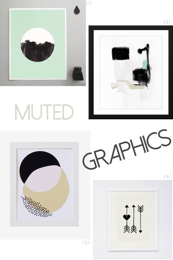
/1/ 'Ink'd Mint' | Sketch .Inc /2/ 'Let Go' | Jaime Derringer /3/ 'Overlapping Circles' | Britt Castellano /4/ 'Arrows' | Sandra Reichl
In my bid to "move in properly" I've spent the last fortnight painting my workspace with a fresh lick of crisp white, my desk has had a make-over and I've got a couple new prints from my own boutique waiting to go up. There's still nothing in here as I type but now is the time it all starts to come together. Can't wait to share it with you in a few weeks time!
You can make the most of Free Shipping until September 2nd when you shop the Artful Walls collection and find something new for your own walls. Tell me, which is your favourite?
A Rustic Lunch in Another Country
Sigh. Can I be honest? As much as I'm trying hard to make a real go of having a life here in Rochester, my heart is still yearning for an Italian adventure. To pack up everything we own, stick a pin somewhere on that foot in the Mediterranean and call it home-oh the possibilities. I'm a "do now, think later" kind of girl, a risk taker, but I married a head over heart man...and he won out for now. So instead, I have to fabricate situations that allow me to imagine I'm there in a little home just outside the walls of Lucca, like listening to the bells ringing out across the town in the evening, drinking proper stove top coffee or, say, lunch in Another Country.
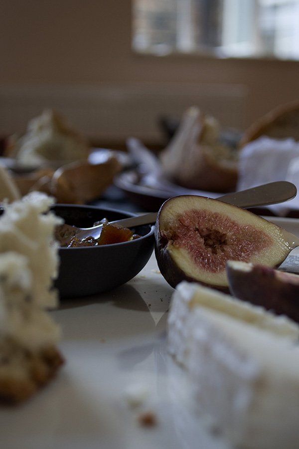
Newly opened in London's Marylebone, the beautiful Another Country showroom is home to some of the most stunning pieces of contemporary handmade furniture and home accessories I've ever had the joy of touching. Last weekend, I was invited to the store by fellow bloggers Kate Baxter and Daniel Nelson as part of the brand's #anothersummer campaign to team up with Heart Home magazine's editor Carole King for some styling fun. With the whole space to play in we were given full creative license to style up a story and shoot it using the furniture and props to hand. It took very little time for us to decide on a rustic theme, the furniture and accessories lending themselves so well to this simplistic style.
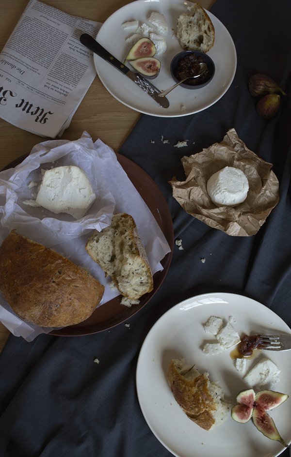
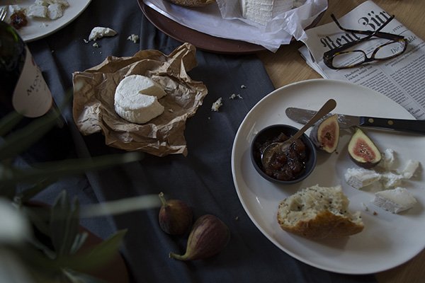
Fifteen minutes later we found ourselves on Marylebone High Street on a hunt for crusty herb and olive bread, figs, red wine and delicious cheese and chutney (courtesy of La Fromagerie). Back at the store, we chose a solid oak dining table as our starting point, and dressed it with a rumpled grey tablecloth of Carole's before building up the look with Ian Mcintyre's white stoneware dinner plates and terracotta platter. The sleek, black Provençal cutlery created a strong contrast against the white plates and I absolutely loved how glossy the pineapple chutney looked in the grey pinch pot. Those will be on my Christmas list for sure. To finish the look, Carole "borrowed" clippings of olive branches from the trees lining the street (nobody saw so it never happened) and there you have it-a rustic lunch for two in my imaginary Italian farmhouse kitchen. I'm home.
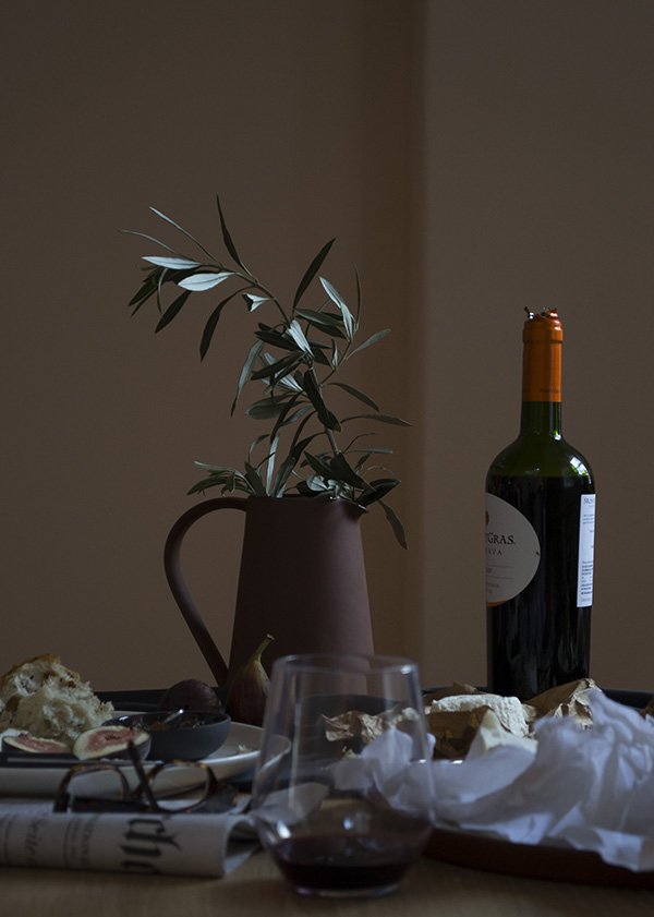
It was a real joy to experiment with a moodier style of photography for the most part because I'm more comfortable shooting in brighter conditions, so it got me out of my comfort zone. What do you think? I get a sense of the end of summer in these shots, with a feeling of autumn approaching in the deep blush of those figs, my favourite season of all.
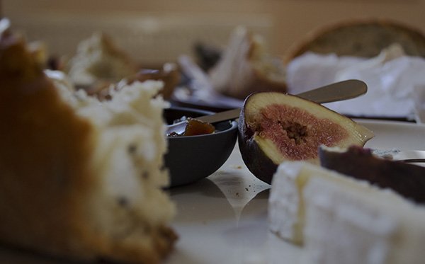
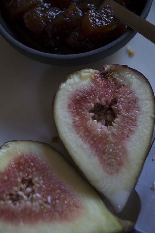
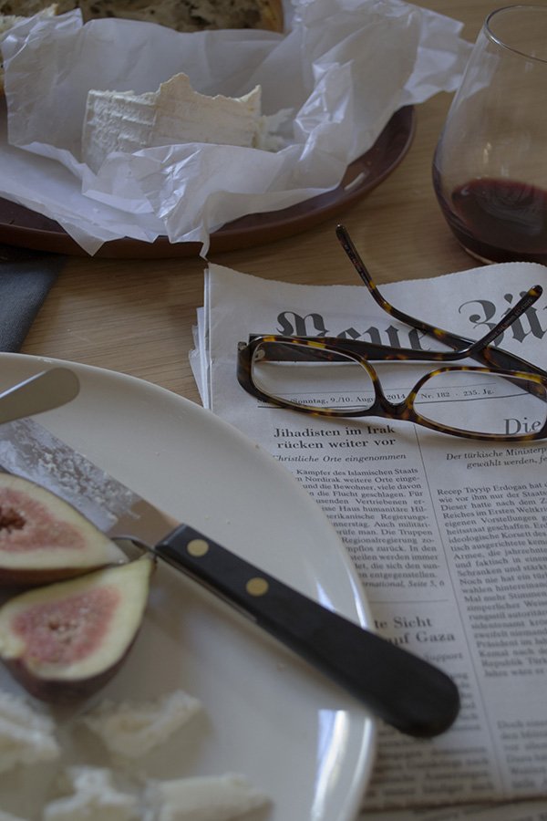
After we wrapped we sat down together with Kate and devoured the lot. La dolce fa niente. With a German newspaper.
Photography and styling © Tiffany Grant-Riley
Organic Linens by Laura Thomas
As much as I love and see the importance of having colour in the home, when it comes to bedding the jury is still out. We've been settled here for over a year now and the bedroom is still one of the biggest question marks in my mind when it comes to what to do with it. I don't think we've slept on anything but white sheets for the last five years-I find them cool and calming to sink into at the end of a long day. And on the odd occasion when I'm allowed a lay-in, they allow me the head space to think. So when Scottish designer Laura Thomas got in touch to tell me about her crisp, organic linens, I couldn't say no.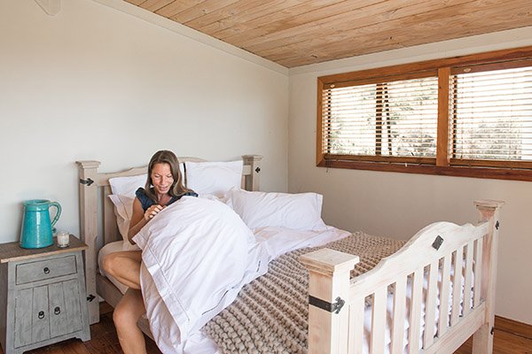 Back in 2012, Laura was living out in New Zealand with her young family, where she found it difficult to source mid-range, well made bedding. Thus, she began her own company, sourcing high quality, fair trade cottons from India, Egypt and Vietnam. All of her collections are white with beautiful embroidered detailing and a high thread count.
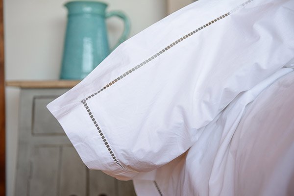
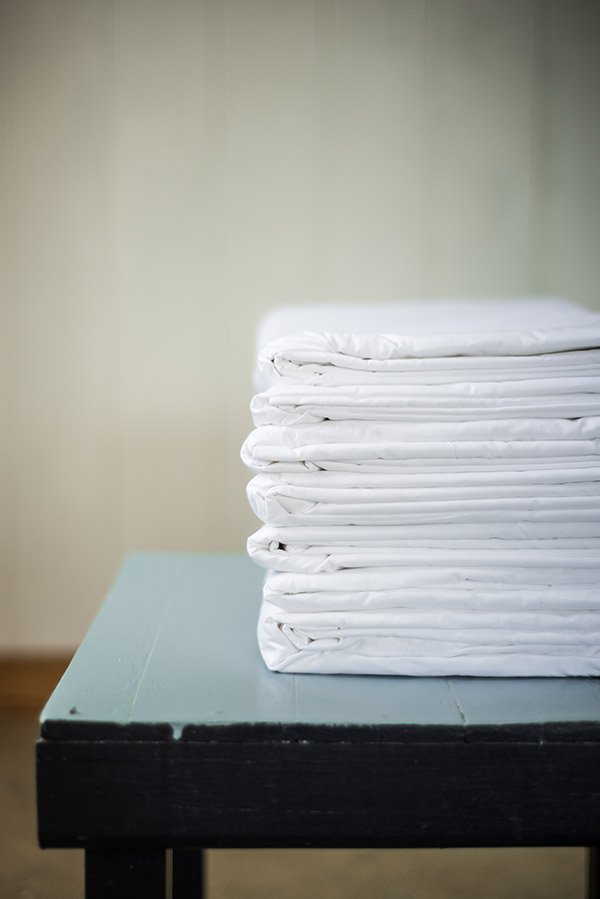 I'm a huge fan of Laura's ethos in being responsible and mindful of where and how her sheets are produced. And because they're organic, they're kinder on the environment too.
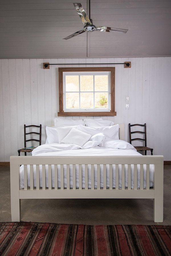 And my favourites? Hands down the Stockholm Collection (above). I just love the simple, stylish pleating around the edges. Because style doesn't need to shout to make a statement, right?

 Thank you Laura for getting in touch and for sending me a pair beautiful pillow cases to sleep on. I'm imagining the cool side of the pillow already. Think I'll turn in now...
Charity Treasure / Scandi Style Circus Stool
So, Sunday afternoon I was knee deep in a gift finding mission for Reuben's pre-school teachers on the high street in Rochester and pulling nothing but blanks. As the daughter of a teacher myself, I'm all too familiar with the usual suspects that come home at the end of the academic year-smellies and chocolates, most of which we were more than happy to "share" with mum. But I didn't want to plump for the obvious, because, you know, I love to make work for myself, don't I? In my usual fashion I'd found umpteen things I'd like for myself, but what do you buy for someone you talk to almost every day and know so little about? So for a while, I gave up and went to rummage for props instead, because Rochester has a rich and abundant supply of antique and charity shops. Props are important you know.As we're steaming on ahead with operation "make this rental feel like ours", Reuben's bedroom is next on my list of attack. Having had yet again no response from our landlord 'Mr Malawi' as I call him (because he lives out there and the only form of communication is by mule to the local general store by fax) I've decided just to crack on and do it. I'm taking the walls from magnolia to white, it's hardly a big deal. Right? And in any case, this poor house is in desperate need of an update. And no, I won't be returning the walls back to magnolia when we leave. This isn't 1995. I digress.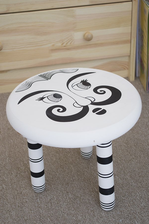 Walking past Oxfam, this little black and white stool sitting in the window caught my eye. Stripy legs with a scandi style, the face of a circus ringmaster...*sharp intake of breath* it was perfect for Reuben's room! Ten minutes later and £10 lighter I'd walked out with it and a very smug grin on my face. It'll need a little work doing, as you can see the wood has split a little at the side, but a little filler will sort that no problem. Isn't it utterly brilliant?!
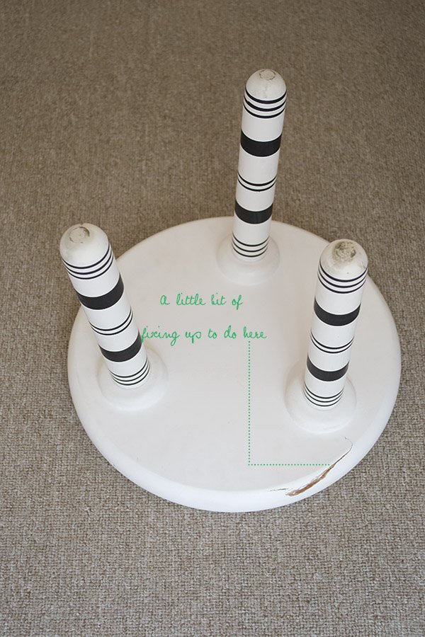
 Next week I'm cracking open the tin of paint, dragging out the dust sheets and getting stuck in. Can't wait to show you the progress! Isn't it always the way though, that when you're not looking for something it has a way of just landing in your lap!?
DIY Chair Styling For Love My Dress Blog
Although my wedding planning days are behind me, it would be impossible for me to leave it completely behind. I ran my wedding planning business, Grant-Riley Weddings for almost seven years and made some wonderful friends along the way, one of whom is wedding blogger Annabel Beeforth, the founder of top UK wedding blog Love My Dress. Following its recent rebrand I've come onboard as 'DIY and creative features contributor' which I'm absolutely over the moon about-a chance to create more beautiful DIYs to inspire brides with none of the stress that comes with shouldering the planning!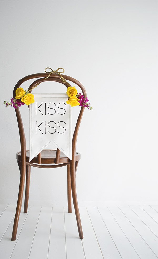 For my first feature, I decided to focus on styling chair backs as they're usually a real bug-bear amongst brides when they're deciding how best to style their wedding. A lot of venues still use rather outdated conference chairs or at least choose a style with upholstery that's difficult to compliment anything other than white. Red is a real pain. So, I thought that as an alternative to chair covers, I'd look at ways to draw attention anyway from the chair itself and onto the decor instead. Yes, I used a classic bentwood to demonstrate, but come on, it's my job to inspire and aspire too. I shot this series of three DIY tutorials at home amongst the chaos of my two small children, the nursery runs and everything in between, but you'd never tell, right?
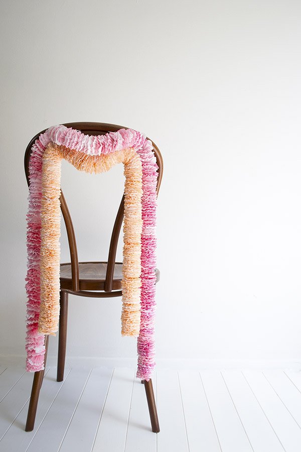 I've really fallen in love with crepe paper since I started my West Elm paper flower workshop, it's such a versatile material to use and these dipped garlands add a pop of colour to any space. They'd look awesome made longer as a backdrop too.I couldn't not work with fresh flowers, for a start it's the best season for huge, heady and romantic blooms. Isn't that frothy peony just something else?
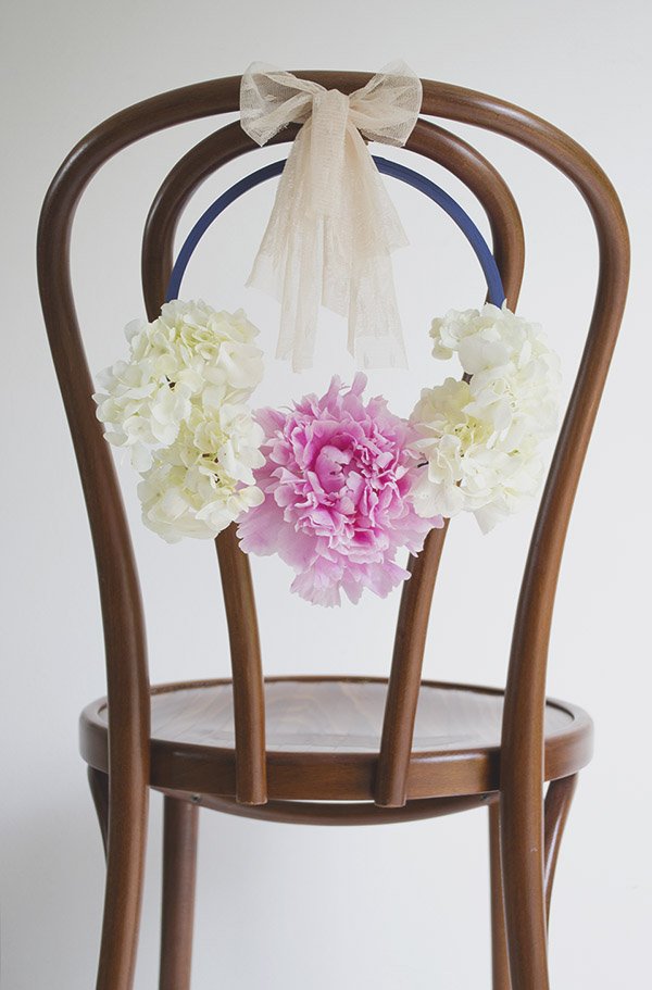 All my tutorials are easy to follow, some take a little more effort than others but I think they're worth it. To try them out yourself and to view the full DIY tutorials on Love My Dress, click on the links below:Kiss Kiss Wedding Chair BannerDipped Crepe Paper Chair GarlandPretty Floral Hoop Chair Back Tell me what do you think of them and if you get round to making your own, send me a photo, I'd love to see!
A Very Great.ly London Launch Party
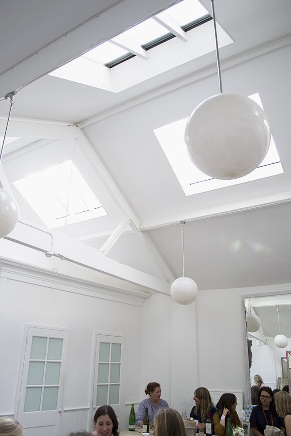
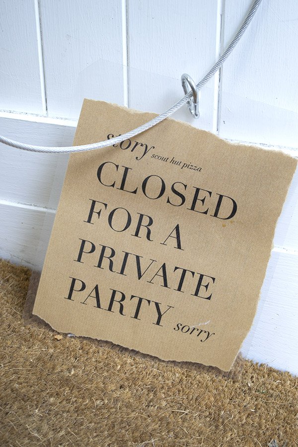
Oh hey! Could I just draw your attention to something quickly? If you look to the right of your screen you'll see that rather stylish box beckoning you to come and shop the Curate & Display boutique. Found it? You might want to take a look at that after you've read this...This week saw the exciting London launch of new online boutique shopping site, Great.ly, at the so-hip-it-hurts Story Deli in Shoreditch. An intimate gathering of bloggers (otherwise known as 'Tastemakers') and a small handful of designer/makers, we gathered to celebrate being part of the Great.ly venture and to finally meet the team from the U.S after months of virtual conversations. The concept behind Great.ly is in short pretty darn brilliant, thought up by CEO Sarah Bryden-Brown and her brilliant team. She noticed at the time that there wasn't an online platform connecting independent designer/makers directly to the bloggers that choose to promote their work to their readers. By joining up Makers directly to Tastemakers like me, we can support those makers by stocking their pieces in our online boutiques and bringing them straight to you, our readers.Over some of the most incredible pizza and wine I've tasted outside of Italy and with great conversation, we got to see and touch first hand some of the gorgeous pieces already available on Great.ly. I'll leave you to enjoy the photos. Can you believe that the Story building used to be a scout hut?!
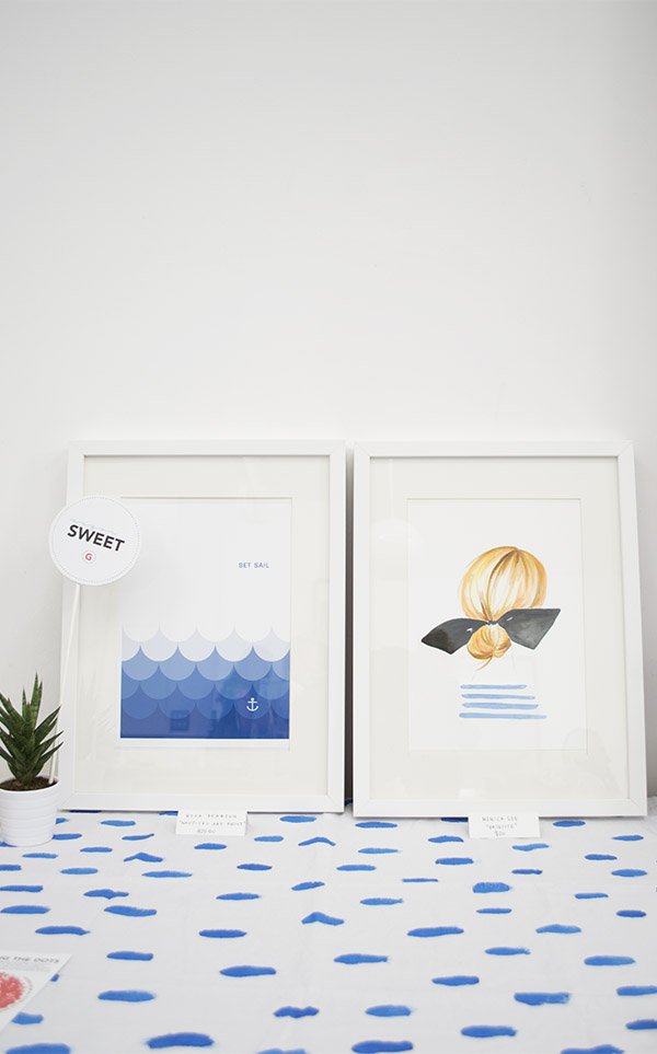
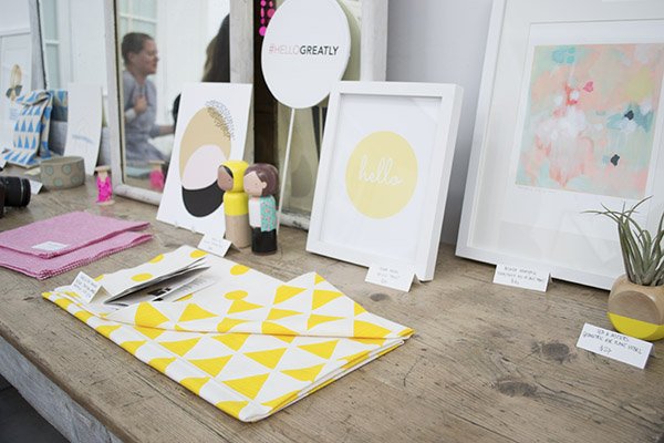
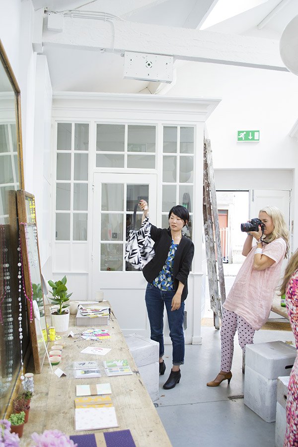
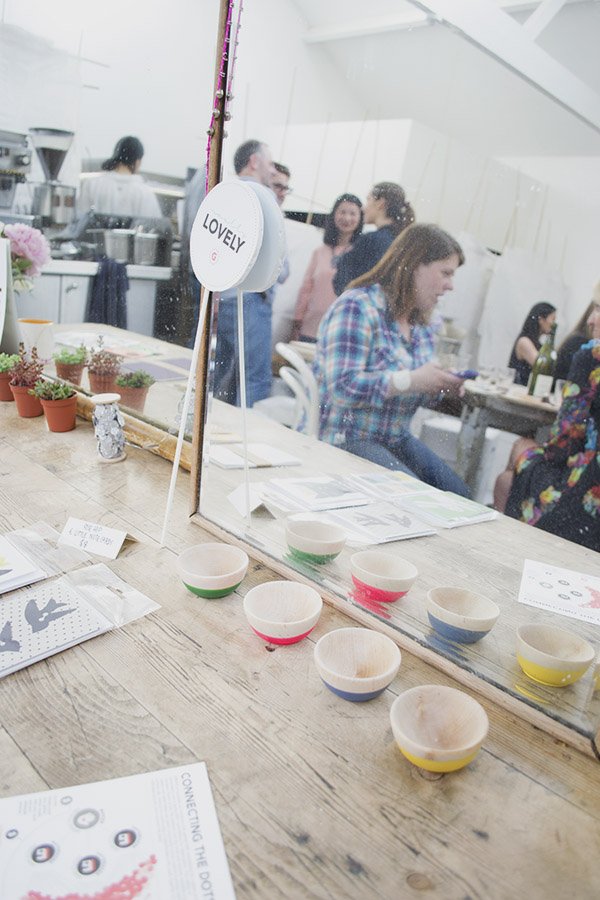
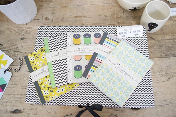
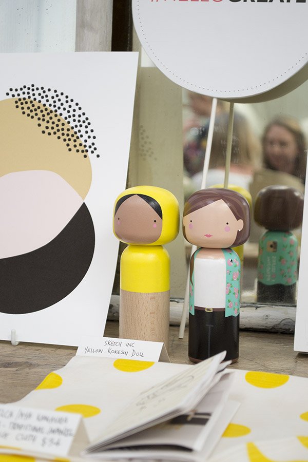
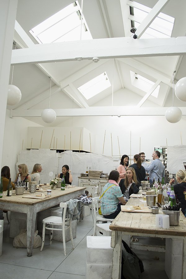
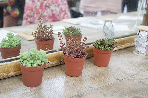
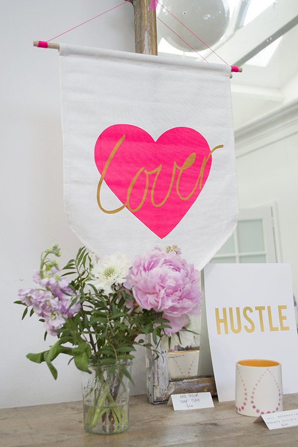
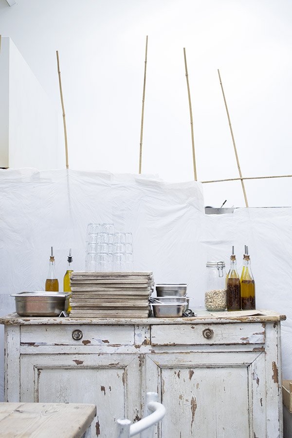
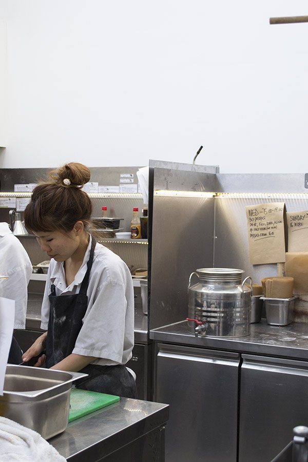
 Great.ly is a rapidly growing community of like-minded creatives and I'm honoured to be a part of it in helping expose wonderful independent makers to a global audience. Every maker has their own personal story and each piece is beautifully created by hand and sent straight to you. Right now this movement is building up real momentum and we need to keep it going. So if you're a designer and you have something you'd like to put forward to sell on Great.ly, be it through me or anyone else, do sign up and find out more about the benefits.Anyway, don't just take my word for it, go take a look, shop around and treat yourself to something a little bit different...
Artist Emily Jeffords & A Dreamy Print Giveaway
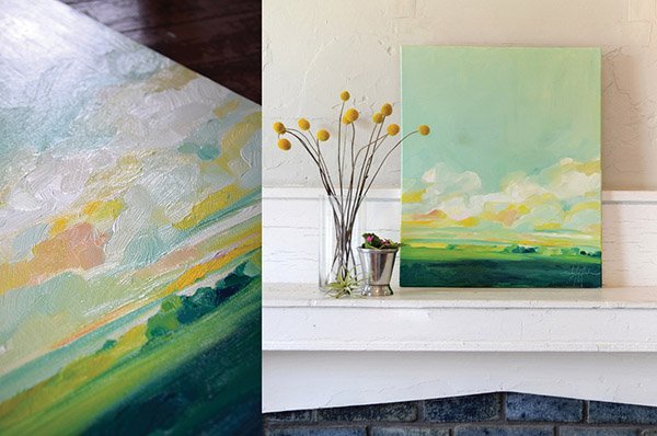
Happy July 4th to all my readers "across the pond"!I have a beautiful interview and giveaway to inspire you today from an American fine artist I greatly admire and whose work I covet so very much. Her name is Emily Jeffords and she paints in oils out of the White Whale Studios in Greenville, SC. Her art, for me, is like free falling into the sweetest, fluffiest skies you could imagine, or watching cloud forms, lying on a blanket in a grassy meadow. She creates the most delicious colour palettes full of texture and motion. Yes, she really is that good. In this interview, Emily shares her thoughts on creativity, finding inspiration and holding onto it and balancing life and her business...
 • How do you stay inspired and what do you do when you hit a creative wall?Sometimes inspiration seems illusive, and yet other times uncontrollably active. I find that flux depends so much on my personal energy. More than finding new places, discovering hidden gems, rest, or relaxation: excitement is key. Feeling even a hint of passion and really focusing on that feeling, allowing it to grow and develop in your mind… that is the golden trick.And along with that, being aware of new ideas and seeing the world with renewed eyes is endlessly valuable to instilling that curiosity and passion inside of you.
 • Do you have a ritual that you follow or certain conditions that have to be just right before you paint?Well I have two little girls who come to the studio with me every day, so rituals are fairly simple. Good (strong) coffee, music (I arrange my playlists by colour – because I am a total colour nerd) and incense. Then I’m good to start creating!

 • Which artists, contemporary or otherwise, inspire or have influenced you?Growing up I was fortunate to have a grandmother who really loved the artist. She would gift me giant books of impressionistic masters (Monet, Renoir, Cézanne…) full of brush-stroky fields, graceful figures, and pastel colors. I soaked them up! In high school I became very interested in work with more contrast, less romance. I love(d) Edward Hopper and Van Gogh and Andrew Wyeth to name a couple.

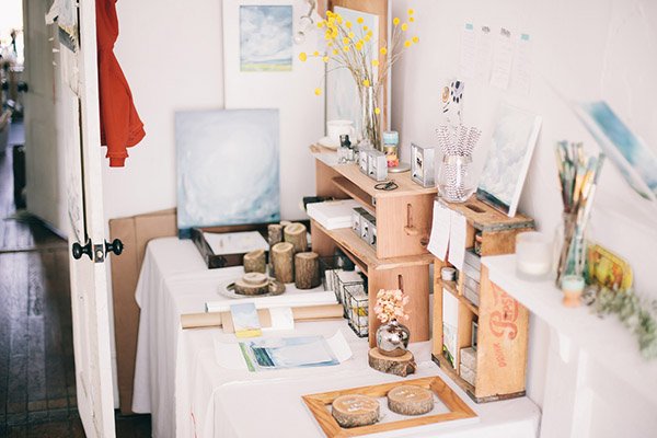 • You have two beautiful daughters-how do you balance life as a working artist with motherhood / how do you combine the two? (I ask this one because I have a 3 yr old son who is always desperate to make things with me when I’m crafting or styling, but because this is my work I’m reluctant to let him get involved. I’d love to know how you manage it. Geez, I sound like a bad mum!) -- no you do not!!!!So you understand my strangely organized days a little better, here is a mini-schedule.8:30-11:00: Get ready to leave for the studio, make lunches, reply to emails, do laundry, dress the girls, garden a bit… all while my girls run around upstairs playing and getting out as much energy as possible.12:00: Go to the studio where we all eat lunch. Then the girls do school work, watercolour paint, colour, play…and I paint in total quiet bliss (ha!! I wish).6:00: Go home, make dinner, go out for a walk or relax together. 9:00: Girls in bed. 10:00pm -2am: Work, work, work (with coffee, ice cream, TV, and my man).
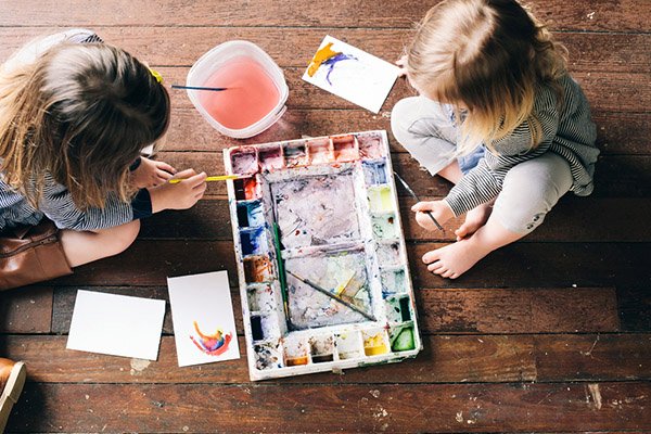 I’m learning (the hard way) that life as a full time artist / full time mother is all about communication and sharing. I have to share my time, art supplies, physical space, and mental space (sanity at times) and in return, they share their time and space with me. Feeling like they belong helps them respect my space as well. And knowing that they have my attention when needed helps them to not “act out” (as often.)Talking to my girls like adults – telling them our plans, asking for their input, listening… allows them to cooperate and to feel valued in my daily life.• Are there any particular colour palettes or combinations that you’re absolutely obsessed with or can’t move away from right now?I do many, many commissions and people really love teal, grey, and green (and so do I!!) but I am also loving this lovely shade of purple-cream-crimson that I sneak in as often as possible. Which is totally weird for me as I usually shy away from purples altogether.
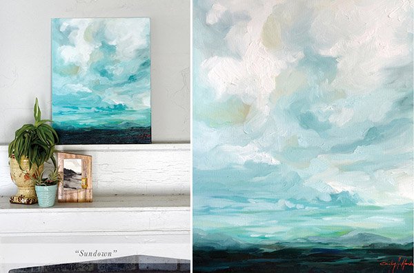 • What advice would you give to someone who is looking to buy or collect art for their home? The beautiful thing about artwork is that it is not only valuable but it enhances any space more than any other decoration. I would strongly recommend buying an original piece of artwork from an artist you enjoy rather than a reproduction, budget allowing of course. The impact that an original piece of artwork has in a space cannot be matched by a print.Look at a lot of art – in person if possible! And find a piece of artwork that really speaks to you and that you will enjoy living with in your space.I love the idea that the evolution – the life – of the painting lives on as the collector lives with it, spending their days with it and spending time thinking about it.Look for a painting that not only matches your home and your style, but one that will enamour your imagination.
••••

|1| 'Make My Getaway |2| 'To The Stillness' |3| 'From The Valley'
Emily has very kindly offered three of her 5x7 prints as a giveaway for three lucky winners! Each piece is printed onto fine art quality printing canvas, which feels like the real thing and would look beautiful framed anywhere in the house, especially as part of a gallery wall collection. Have you fallen in love with them yet?To Enter Via Twitter: Tweet '@TiffGrantRiley & @Emily_Jeffords and say hello with the hashtag #emilyjeffordsgiveaway'To Enter Via Instagram: Regram the Emily Jeffords image on my IG (tiff_grant_riley) with the hashtag #emilyjeffordsgiveawayYou can tweet or IG as many times as you wish to increase your chances (only once a day though please!)Entry closes at midnight on July 18th 2014.Good Luck! And if you can't wait that long, I also stock her in the 'Curated Art' section of my Curate & Display Great.ly boutique. What's your favourite?
Mid-Century Scandi Style / The Habitat A/W Preview
Hello stranger! How are things? I've just about recovered from two days of intense styling last week for a 'Back To College' look book- hence why I've been a little absent. I'll be able to share more in a week or two, so in the meantime, whilst we're in the depth of summer, let's talk Autumn/Winter decor and Habitat's latest collections. Don't be too shocked-most brands have been ready for Christmas for months!I've always had a soft spot for Habitat. When there was still a store at Bluewater Shopping Centre, a moderate portion of my student loan was may have been spent there. I loved to spend a good hour daydreaming, choosing the dinner set to go in my imaginary house that wasn't full of crusty students. At most, I bought mugs and fairy lights. So I was really rather chuffed to be invited to their A/W preview last week, hosted in a huge industrial space in the OXO Tower. Chuffed, except for the fact that I'd been booked on that last minute shoot, so was I going? No. However, the team at Habitat have very kindly sent over the preview shots for me to share with you.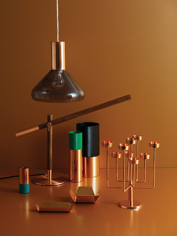 Imagine, if you will (and bear with me, because it's warm and light right now!) cosy copper tones, walnut, geometric shapes, playful colour and Scandi style.
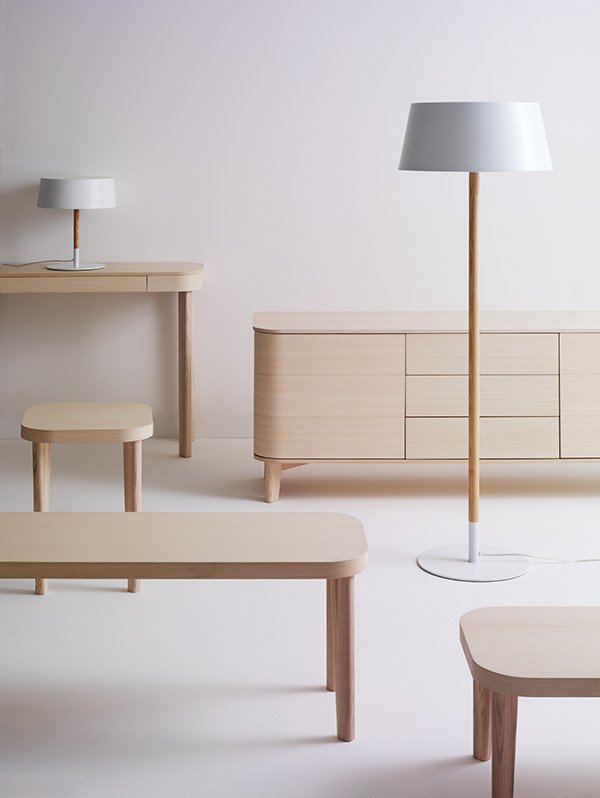 In store from September, the Habitat design studio have created a beautifully considered collection; there's furniture full of subtle details, stylish statement lighting and homages to Mid-Century design.
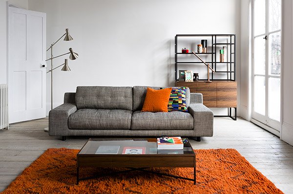 Pages from their look-book are like contemporary takes on Megan and Don Draper's New York apartment (for the Mad Men fans out there). There are no frills or fuss here, nothing is done for the sake of it. Each piece does the talking for itself and each one is a potential classic.
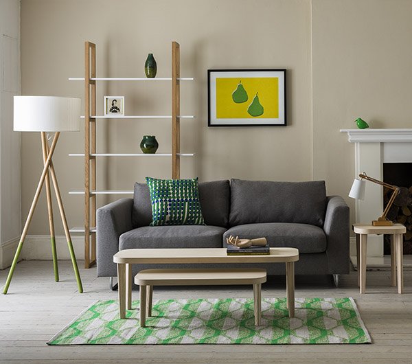 A key colour that repeats throughout the collection is green in varying shades and materials. That rug! I absolutely love this look with the use of bold, block colour in the accessories against a neutral backdrop. And I think you know by now that green is my go to colour, although not so much with interiors. Perhaps it's time for a change?
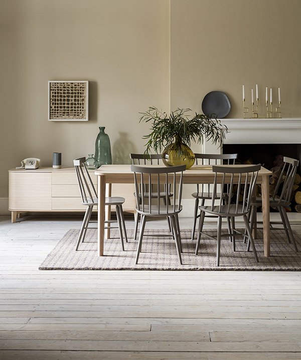 I was also really pleased to see a set of brand new, retro inspired dining furniture available. I was gearing up to hunt down a couple of vintage chairs to join our dining set and jump head over heels into another DIY, but perhaps these might work instead?
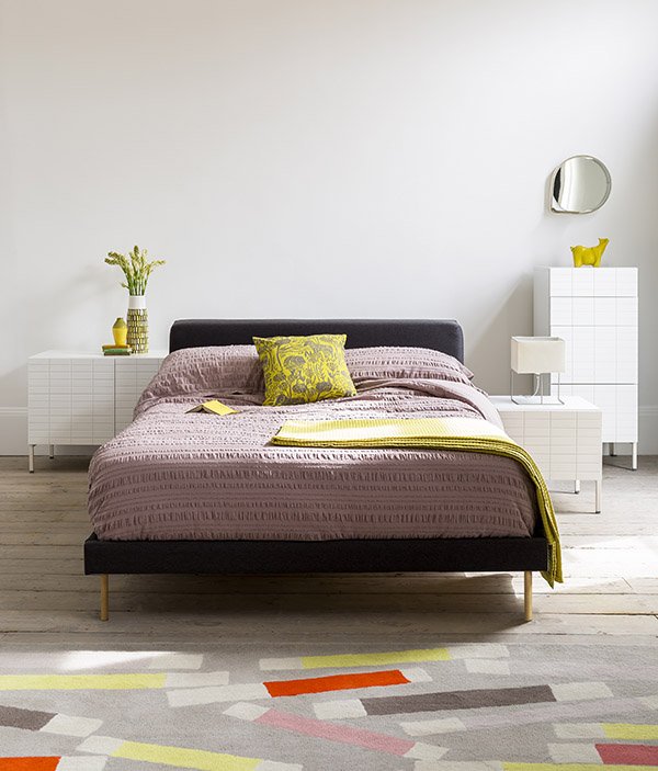 My final favourite was this muted pink Seersucker Pigeon bed linen. Be still my beating heart. Oh to curl up beneath the soft folds of this beautiful bedding...I'd love to hear your thoughts on what Habitat have in store this Autumn/Winter-is it what you expected? I was pleasantly surprised to see the use of so many bright colours as winter collections can be somewhat dark and moody. Good on you Habitat, can't wait to shop the collection!
Gardening Trends from GROWLondon
Over the weekend I was lucky enough to be invited to the brand new GROWLondon Contemporary Garden Fair by my new friends at Beefayre (you might remember that I used their beautiful soaps as favours here).The fair approached gardening as the name suggests from a contemporary angle, being much more design led than stalwarts like Chelsea, turning new gardeners on to the idea of nurturing a space of their own-be it a pot on the windowsill or a couple of acres. Aptly based on Hampstead Heath and very much a boutique experience with a fantastic collection of exhibitors, I took my mum along for the experience. Take a look at some of the trends I discovered as well as a few personal favourites...An Exotic Wilderness at Burford Garden Company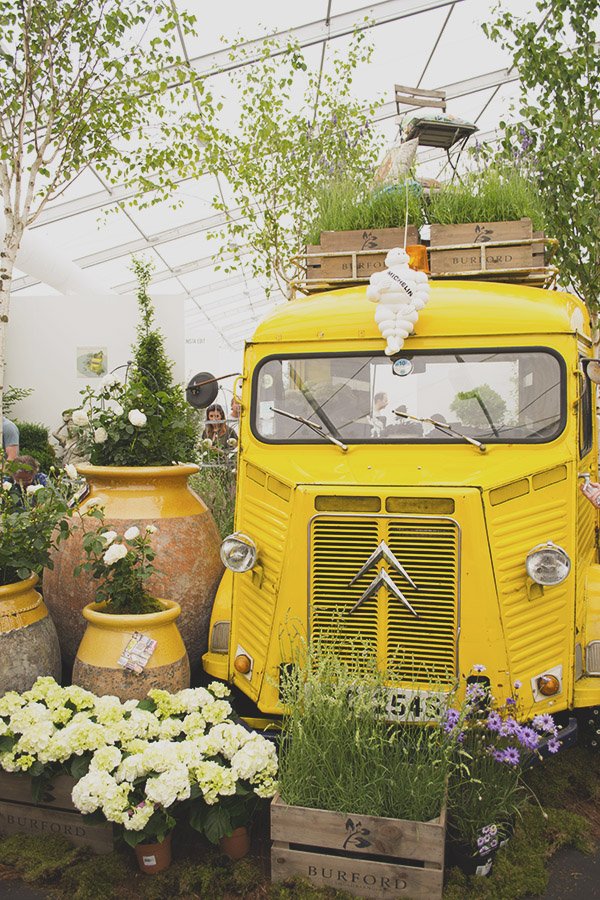
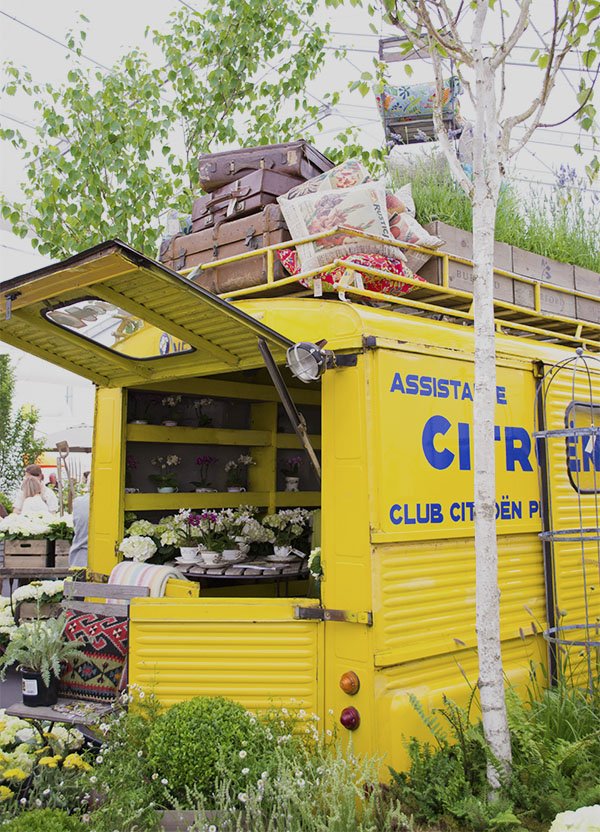 Burford Garden Company based in the Cotswolds brought down their sweet little vintage Citroen as the centrepiece of their vibrantly wild display of planting. Using a scheme predominantly of white hydrangeas, garden roses and lush ferns, interspersed with hot yellows, and purple lavender, they created an exotic wilderness.
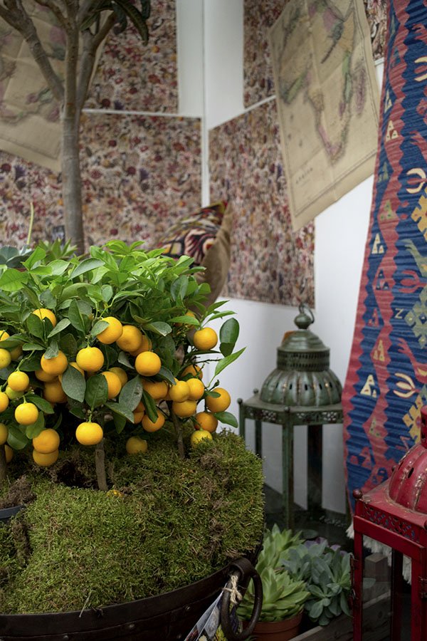 In one corner, a Moroccan riad awaited you, the walls adorned with handwoven textiles and maps, weathered metal lanterns, the greenest of succulents and miniature citrus trees (I had to bring one home with me!)
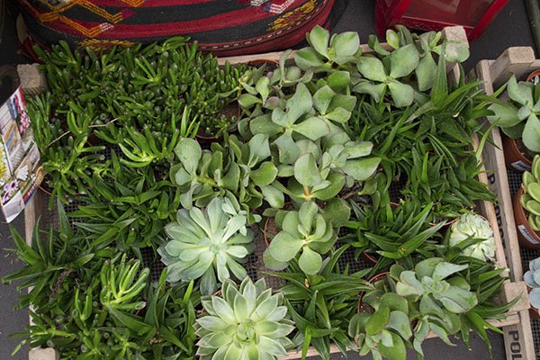
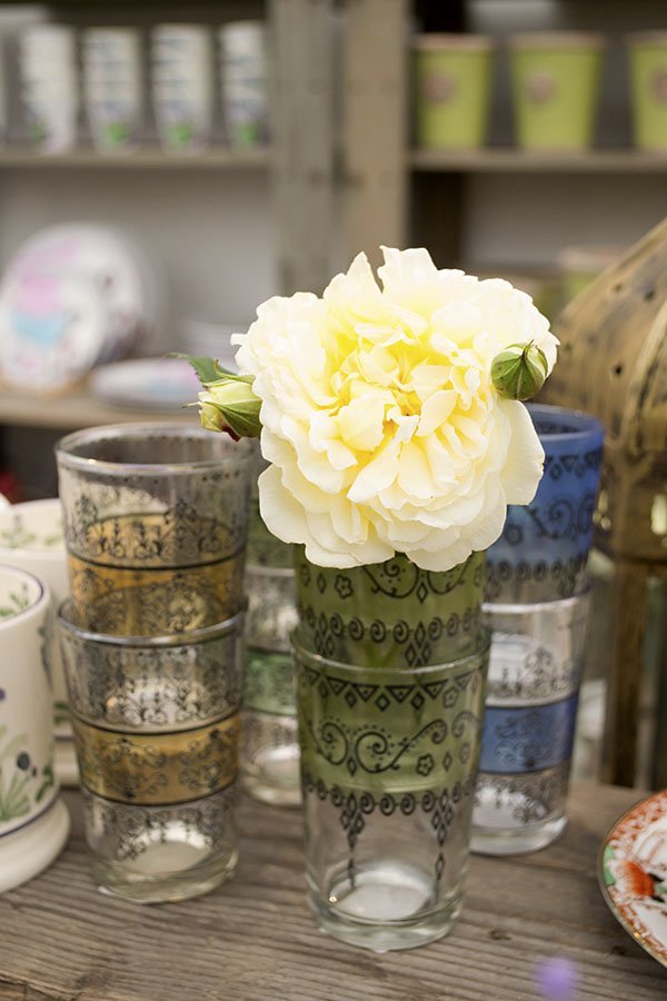
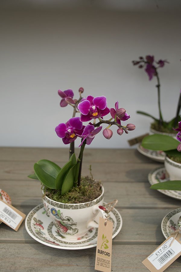 Verdant Houseplants by Judy Green's Garden Store
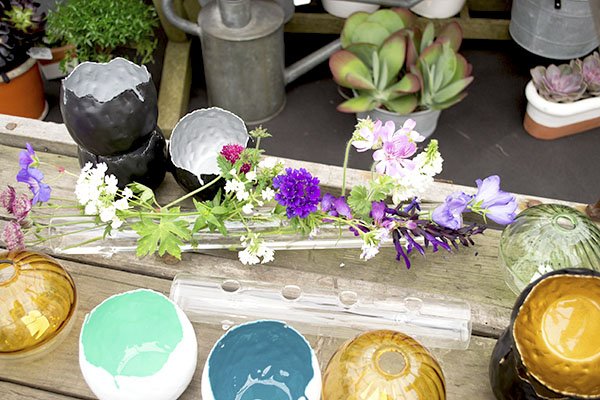
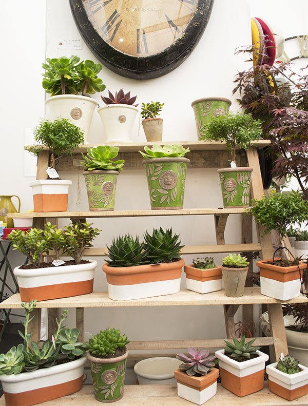 Local Hampstead garden boutique Judy Green's Garden Store focused on succulents and had the best selection of pots to show them off in. I loved these sweet little glass tube vases and the delicate ceramic bowls with colourful glazes.
 Buzzing About Beefayre
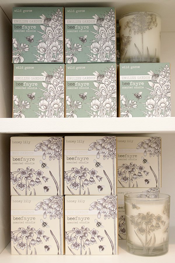
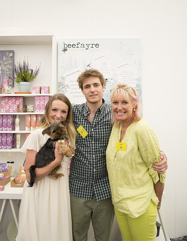 The most fragrant stand by far was organic beauty and home brand, Beefayre. Champion for the bees, nurturing hives on their own specially cultivated land, the team produce organic products made from beeswax and essentials oils. Artist and founder Sharon Jervis creates all the botanical artwork for their branding and packaging and her son Sam is a beekeeper and fountain of knowledge on bees -check out his credentials, they're impressive!TIP: Plant flowers in purples and mauves to attract bees, these colours are also of the most nutritional value.
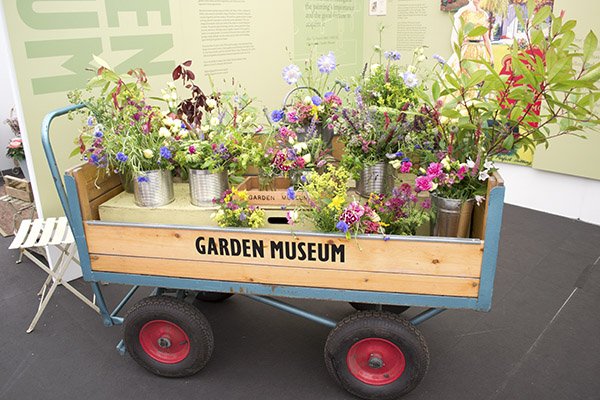
 The strongest trend I saw in full effect was the abundance of free and relaxed planting schemes and insect friendly wildflowers. No room for stuffy 70s style local council gardening here. Any container can become a space to plant and any space can be worthy of a small garden. Which brings me on to the sexy succulent...
 Contemporary Terrariums for Succulents & Air Plants
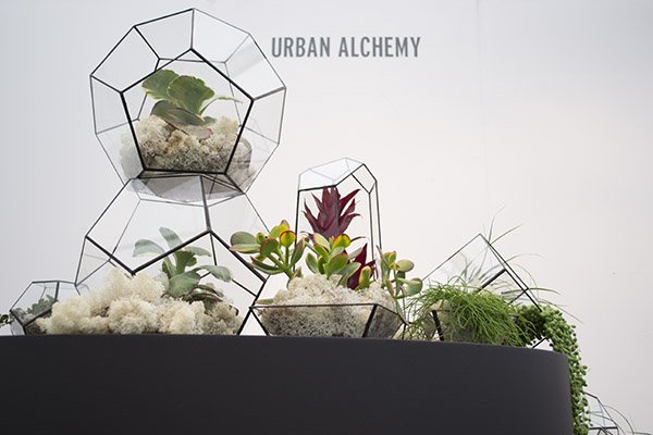
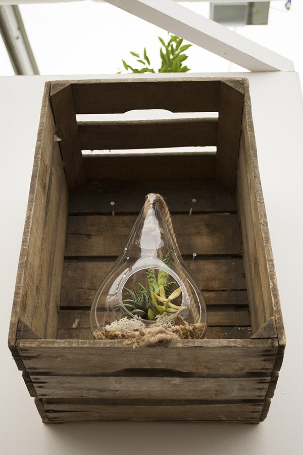
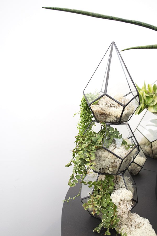 As my quest continues to build my urban jungle, I was so pleased to see succulents, air plants and terrariums holding their own. Yes! You can find beautifully made terrariums by specialists in the UK now!I got talking to Tom of The Urban Botanist, a new company he started up with his sister after she discovered the exciting new world of terrariums whilst out in Canada. There are several terrarium collections to choose from in various sizes with the Skyline bauble being the most versatile in that you can hang it-perfect for space saving. The black rimmed geometric Aztec designs really caught my attention though. I'd love to have one somewhere I could guarantee little fingers wouldn't break it. One day...
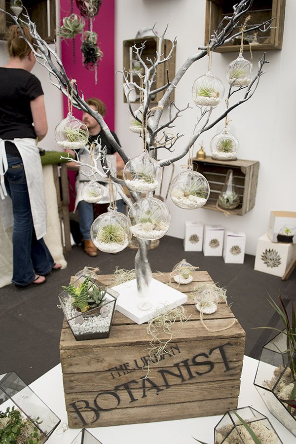
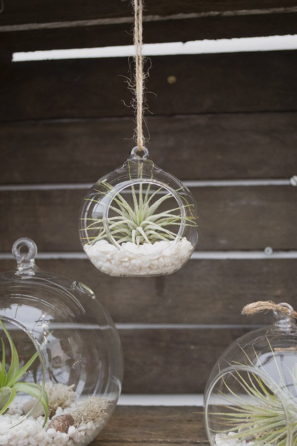 I found these air plants utterly fascinating-they have no root system and take their nutrients from the air and a spritz of water once every few weeks, so you can sit them anywhere!
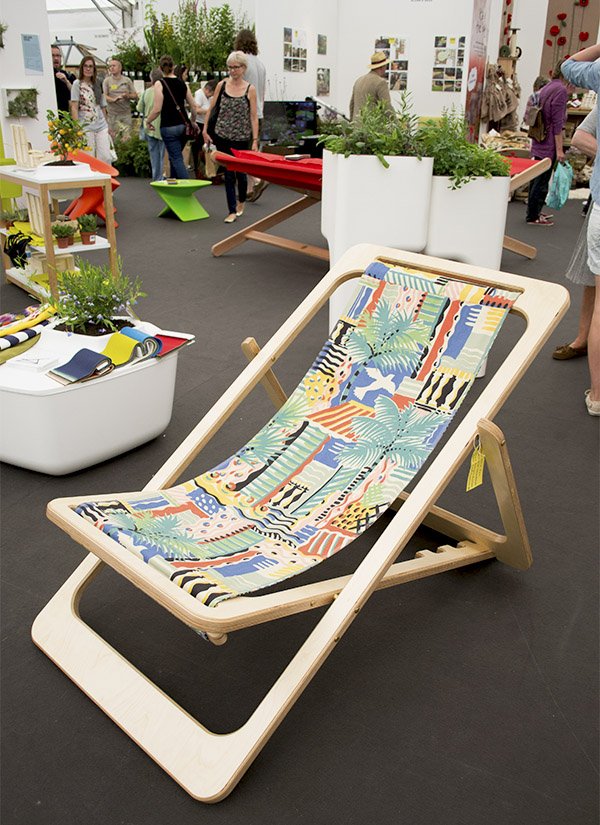
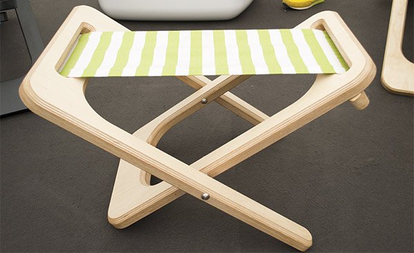
 Samson & Fox My final favourite caused me to practically leap across the room to get to it. The FlatJack Chair by Samson and Fox. Just look at it. Machined from a single sheet of Baltic birch plywood and stained and lacquered-see how it folds flat and can adjust reclining angles? It's a modern interpretation on a classic design and a thing of beauty. The multifunctional seat also becomes a table when you place a piece of ply across the top. It's too perfect. I have to have them.
 A huge congratulations to the GROWLondon team for a brilliant first year, I hope the next will be just as successful! And thank you to the Beefayre team for inviting me along to meet you.I'll finish with a very fitting quote I heard at a talk from garden and landscape designer, James Alexander-Sinclair who said:"The thing about gardening is there are no rules. The point of it is to make you happy." I couldn't agree more...
Take To Bed Textiles by Safomasi
***UPDATED ANNOUNCEMENT Mon 28th July 2014***This week the Great.ly team has invited all their tastemakers to take part in the 'Make Good' campaign, to raise awareness for the amazingly talented makers who allow us to create such beautifully curated boutiques with their pieces. Since writing this post, I'm over the moon that Safomasi have joined the Great.ly community as a maker and I'm lucky enough to add their Coconut Palm Pickers cushion to my boutique's collection of soft furnishings! Read on to find out more about their unique story, why they're so special and a little about their creative process...
****
It's Friiiiiiiiiiday people! Yeee haaa! And yesterday I made such an exciting new textile discovery and nearly wet myself in the scramble to contact them! Yes, you know I'm fond of boldy printed fabric, particularly when it's turned into a throw or cushion. Even my long distance mother-in-law who occasionally reads this blog from the south of France (hello Meg!) has noticed my penchant for soft furnishings.
Lately I've been thinking a lot about ethnic prints and have been searching for pieces I could introduce into our home that are stylish, contemporary and tastefully done. It's not easy to shake the 90s 'Evolution' store look that keeps popping into my head (in fact I think even they have moved on from that now) so I was bowled over to find these guys.
 Meet Sarah Fotheringham and Maninda Singh aka Safomasi. They live together, love together, travel and design together, meeting for the first time in Delhi on a photoshoot in 2010 (isn't that perfect serendipity?!) With Sarah's background in art and illustration and Maninda's experience in fashion and production it was pretty much a given they would end up creating something spectacular together and textiles seemed the most natural direction to take. Based in New Delhi, Safomasi is a beautiful mix of handmade contemporary prints and colours, combined with the rich, exotic traditions and cultures that inspire them on their travels. I love how Sarah injects her illustrations into their textile designs, giving them a quirky flavour. We love a bit of quirk.
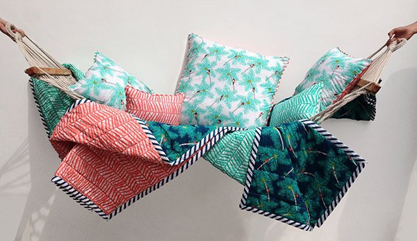
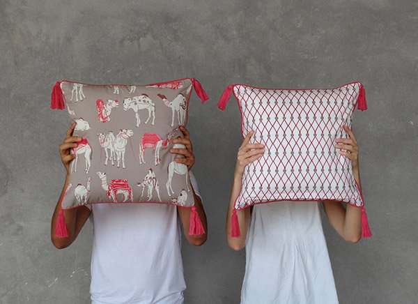 "We thought that in India there were lots of traditional quilts with common designs and patterns, but a lack of contemporary, unique designs. In the UK you don't often find this type of quilt, but they work really well there as they are so versatile."Sarah's beautiful screen printed illustrations transport you off on a journey of exploration - from the coconut palm pickers and fishermen from the Alleppey Collection, inspired by the Keralan coast..."Capturing the lush landscape of the South Indian state of Kerala in colourful hues of fresh mint, lime, teal blue and coral."
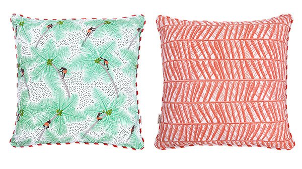
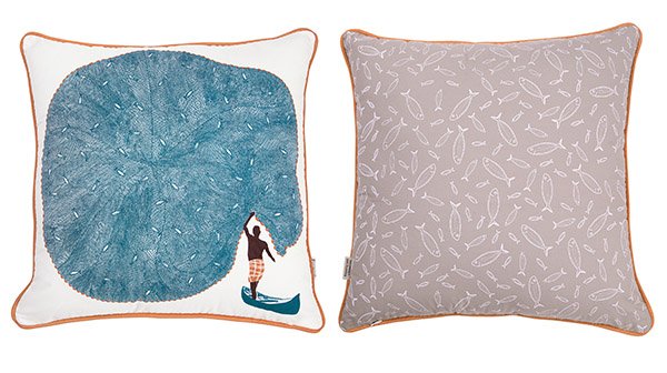
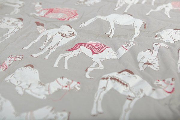
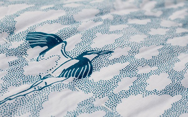 To the vibrant and patternful Pushkar Collection, named after the camel fair..."From decorated camels to snappily dressed traders, we interpreted the colours and ornaments of the fair to create a collection of three distinctive, engaging and colourful prints."
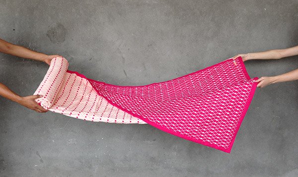
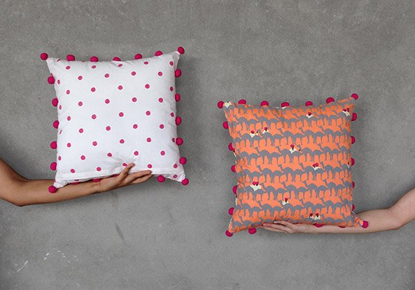 All printed and made in India, Safomasi also produce a gorgeous kitchen and tableware collection-ideal for this month's topic of 'outdoor living', don't you think?So come on, tell me-are you as excited by Safomasi as I am? I don't even know where to start, although I think the Alleppey Collection is my favourite-I've always been drawn to greens and the palm leaves would compliment my little urban jungle perfectly. What's your favourite?
Outdoor Living / Summer Blue Accessories
Good morning! I'm slightly reluctant to peek through the curtains today given that the sun has been a little shy these past few days, but seeing as this month is all about outdoor living, I'm pushing ahead and being optimistic!This summer we're seeing a strong presence of beautiful, Mediterranean blues in tableware - a trend I'm really happy to see. On a balmy summer evening, what could be better than to invite our friends for a picnic in the garden and transform ourselves to the French Riviera...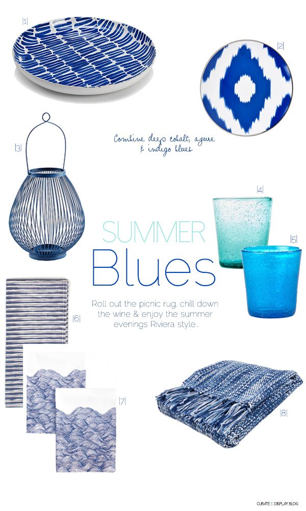
|1| Indigo platter | M&S |2| Ikat bread plate | Zara Home |3| Jessica Lantern | John Lewis |4| & |5| Hand-blown glasses | Howkapow |6| Tribal Stripe Navy napkins | Great.ly |7| Waves napkin set | LEIF |8| Blue Wick Weave blanket | Zara Home
Combine tones of blue, from deep cobalt to rich azure with interesting textures-woven throws, thick cottons and smooth glazes. My latest obsession is the humble napkin. Such a small touch makes a huge different to a tablescape and I've just started stocking Hallie Gray's striking Tribal Stripes in my Great.ly store. Aren't they stylish?
The beauty of this look is that nothing is too matchy and try-hard. It's an effortless style, don't you think? Now, pass me the mezze platter...
Dining Chairs / Matching VS. Mismatched
It's been full steam ahead with our plans to get the living space whipped into shape, and we have two sleek, gorgeous dining chairs to tie in with the 'Modern Botanicals' look we're working towards. After eight years of enduring clawing, scratching (any cat owners will know what I'm talking about), being stood on and turned into dens in the later years, we got to say goodbye to the high-backed rattans which served us so well. They had a good innings, but having to look at them every day covered in Playdoh and falling apart, I couldn't bear to look at them anymore. So here are my new babies. These are the Sigurd chairs from Ikea and boy are they comfortable. Hello back support! We set out looking for a style with arm rests but realised when we got to the store that they most likely wouldn't tuck under the table-no good when you need the space. Instead, we found these in white but eventually plumped for the black. I'm not going to show them with the table until the revamp is complete, so in the meantime I threw something together to give you an idea. What do you think?
 Now we're trying to decide whether to get another 2 to 4 in the same style, or buy a couple of vintage models and paint them (I liked the idea of having the odd one in Hemlock green) so we have a more mismatched aesthetic. I can't decide just yet. Whilst I think having the uniformity of matching chairs holds better with time, I do love the relaxed feel of a mis-matched set.
 Or do we buy a couple of old chairs and paint them all up black, so we're not too matchy-matchy but at least staying in keeping with the colour? How about the same chair in white? So many options...
 What are your thoughts? Do you have a mis-matched set that you love? Or perhaps you prefer a little more order?
Frolicking On Whitstable Beach
 At the weekend we took the bull by the horns, chucked the kids in the back of the car and spent a glorious day at the beach in Whitstable. The last time I'd visited was some 4 years ago now, seven months pregnant with Reuben and working on a shoot in the blazing sun, so it was so good to be back again with our little family. This was to be Tabby's first beach experience and I couldn't wait to see how she took to it.
 Arriving into the town and spotting the coast from the top of the hill always fills us with a sense of excitement and anticipation for fresh fish and chips, ice cream and the cool water lapping at our toes.
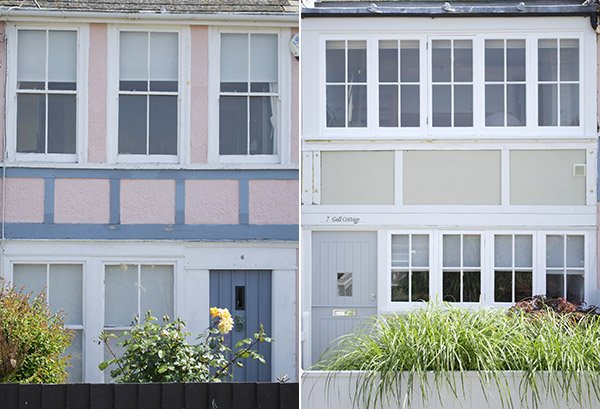
 There's just something about seaside towns isn't there? We've toyed with the idea that we'd live happily in one (don't we all when the sun is shining?) and before we landed here in Rochester we were seriously considering it, but the right house never materialised. Not to say that it won't, but for now, we're happy just being tourists. And oh my, the beach houses, the beach houses. Wouldn't you love to have a little nose inside?
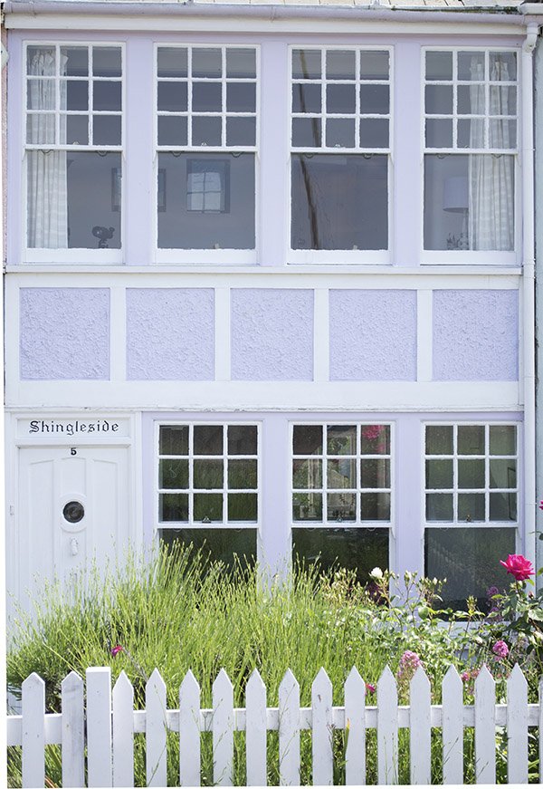
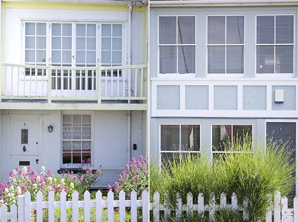
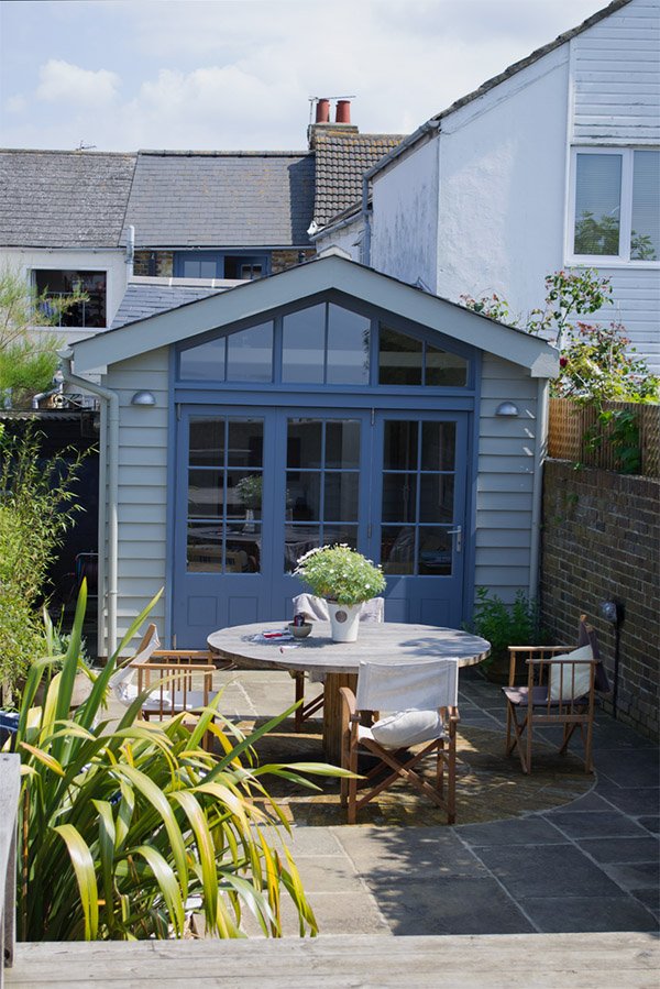
 I loved this chic extension-the grey blue door frames and weatherboarding with a courtyard backing onto it, complete with sea views and leafy plants in the garden.
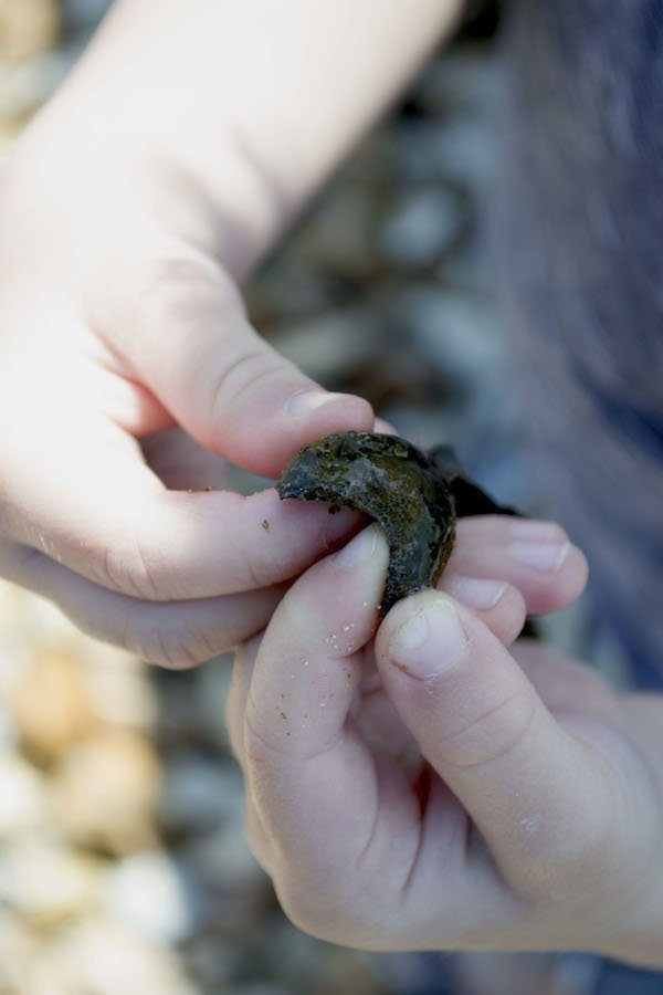
 The children were in their element-Reuben, fascinated by the different types of seaweed we found and Tabby with the pebbles (she really didn't enjoy the water at all!) With a section of beach completely to ourselves we were free to paddle and relax on our own-such bliss.


 Famous for its oysters, you're never short of finding them here. Outside The Whitstable Oyster Company was mound upon mound of empty shells. We of course had to bring some home for Reuben's collection of found treasures.

 As we made our way back to the car, two children sleepy from the sea air, ice cream around their mouths, we came across a mobile garden organised by the Whitstable In Bloom action group who paraded past with wheelbarrows, bicycles and trollies filled with the most beautiful miniature gardens for everyone to enjoy. Just goes to show that you don't need a huge plot of land to enjoy gardening.
 I hope you enjoyed our little jaunt to the sea. Do you have any plans to visit the coast soon or maybe you live by it-what's it like?
Mourne Textiles / A Family Fabric
Good morning! How was your weekend? Mine was all about family. Although I've yet to meet her, I cherished watching my newborn niece experience her first few days of life through the photos my sister sent, and spent a glorious day with my little family in the seaside town of Whitstable, not far from where we live. There were oyster shells, pebble skimming, ice-cream so many beautiful beach houses-I can't wait to share more with you from our day on Wednesday.
****
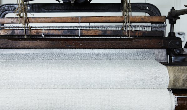
Continuing on my family theme today is an exceptional artisan business grown by three generations of the same family. Nestled in the side of the Mourne Mountains of County Down, Northern Ireland, is the Mourne Textiles design workshop.
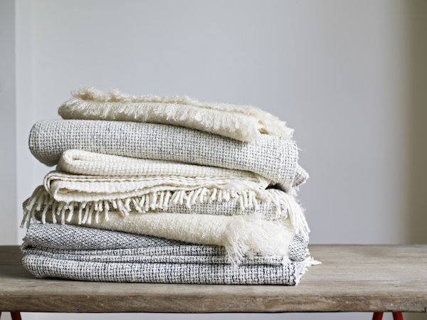 Founded by Norwegian designer Gerd Hay-Edie in 1954, the workshop has a rich history. Combining traditional weaving techniques with the finest spun yarns, Mourne produce exquisite throws, cushions and rugs which have been so much a part of British design history these past sixty years. There is simply too much to be said for Gerd's incredible achievements in establishing the Mourne name, but some of her finest moments include designing custom fabrics for mid-century designers Robin Day and Terence Conran who continued to use her specially created tweeds and upholstery for many years.Today, Mourne is enjoying a revival with Gerd's grandson Mario at the helm under the guidance of his mother and Master Weaver Karen.
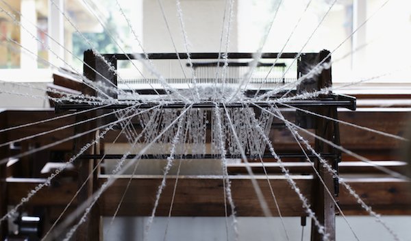
 An integral part of his childhood, Mario remembers..."When I was a boy, the workshop was my playground. I vividly remember the unmistakable smell of lanolin from the fleeces, and in the background the rhythmic sounds of the looms creating fabric: it was a wonderful place to grow up."
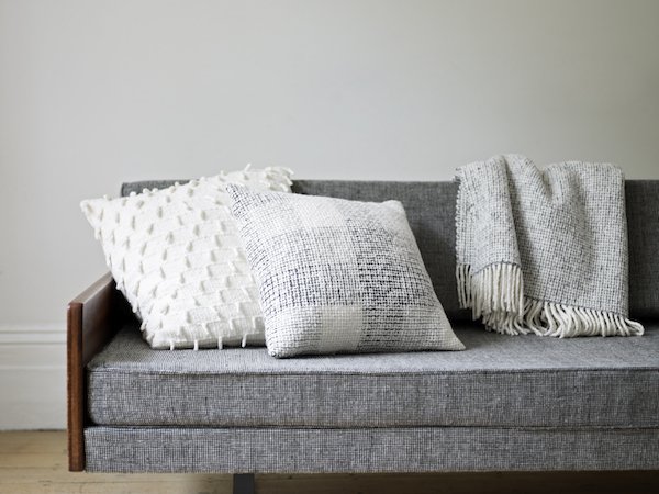
  He has carefully selected some of his grandmother's most iconic designs to bring to life again and I have completely and utterly fallen in love with them-the textures, soft colours and beautiful, almost hand spun quality of the Donegal and Merino yarns. What I wouldn't give to knit with these. And so what that it's summer? Every sofa and bed needs a trusty throw or two and a good mountain of cushions to soften it up!The yarns are carefully sourced to replicate the traditional materials Gerd would've used in the past, although some are tricker to come by today. Mario explains:"Some of the yarn we are getting from Donegal have been spun exactly to our specification (a very textured yarn, very traditional to Ireland, which has a hand spun irregular feel,
 a bit like the spinner has been out for a few pints of the black stuff before coming home to spin) so as to match the yarn used by my grandmother in the 1950’s. Sadly, I haven’t got the luxury of picking these yarns off the shelf any more." 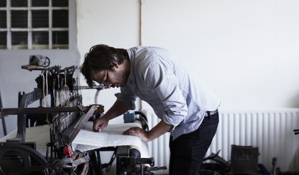 These hand woven Mourne Check cushions in Irish tweed have been dyed to match the original heritage colour palette as closely as possible, although they are also keen to introduce new colours using yarns available today. Aren't they beautiful?
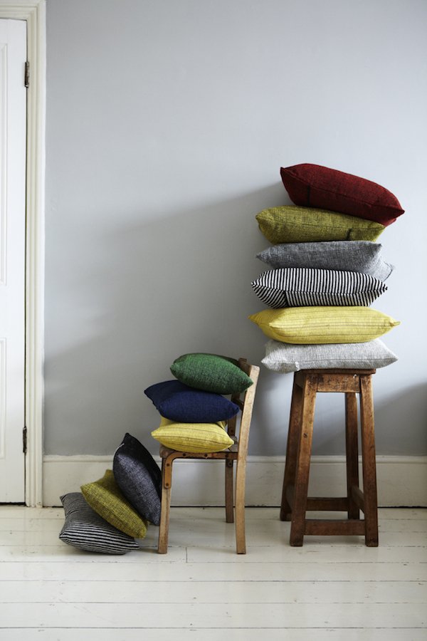
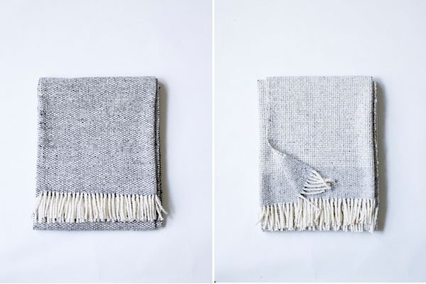
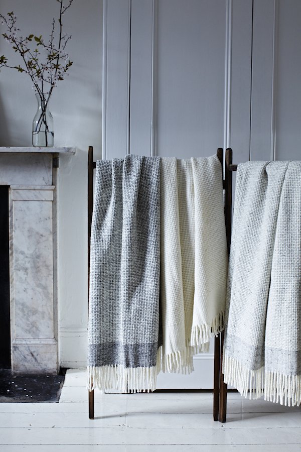 As we start to see a return of traditional production methods on home soil, I truly hope that small, family run businesses like Mourne will continue to thrive. It is so important to show our support and keep these traditions alive. I hope you love the collections as much as I do, too...
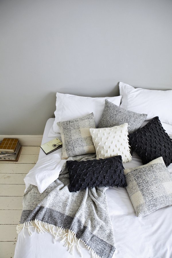 Image Credits: Tara Fisher PhotographyFollow MourneFacebookTwitterInstagramPinterest
'Retailed' / Heal's Part Two
Last week in part one I introduced you to the visual team at Heal's as they began work on their summer windows and today I'm thrilled to bring you the second instalment of this feature. It’s my second day at Heal’s and I’m an hour late thanks to the tube strike, but Phil, Tatum and the team are already in full swing. The summer schemes are really coming together now, with the outdoor swing chair in place, the beach hut complete and in the showroom pin wheels and kites that Vicks made with 1810 fabric are going up.
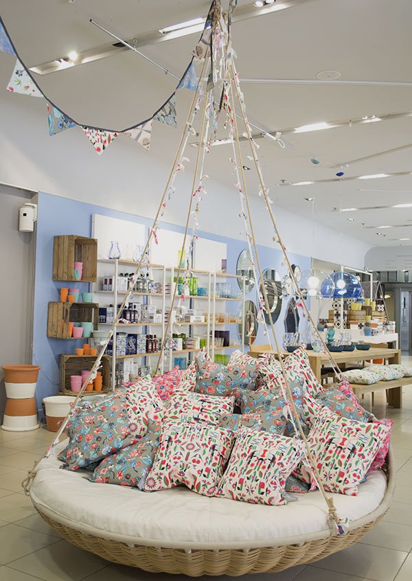
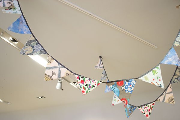
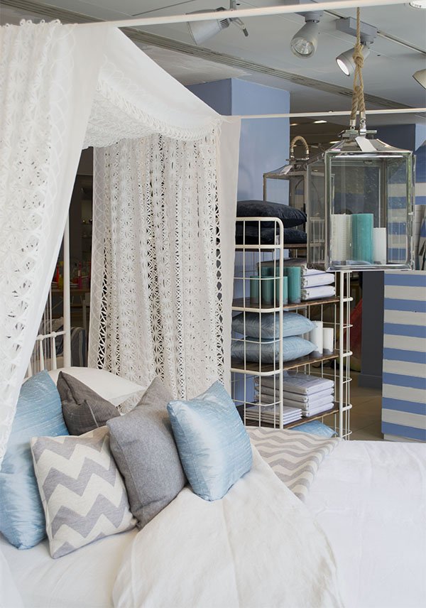
As I watched her put them up with Mike the day before she had clear reservations about their look- in fact she didn’t like them at all and felt they looked a little too homemade. I made the point that I sometimes have reservations about my work, but more often than not others really won’t be critiquing it anywhere near as much she would be and the only thought going through most people’s minds as they passed this window would be “oh, those are a really lovely idea”. She agreed and told me their buzz phrase of choice was “fresh eyes”, meaning “let’s come back tomorrow and look again”. This morning, with more of them up on the walls I can see that they add to the scene in context and really start to bring the look to life.
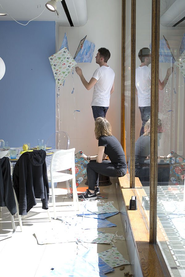
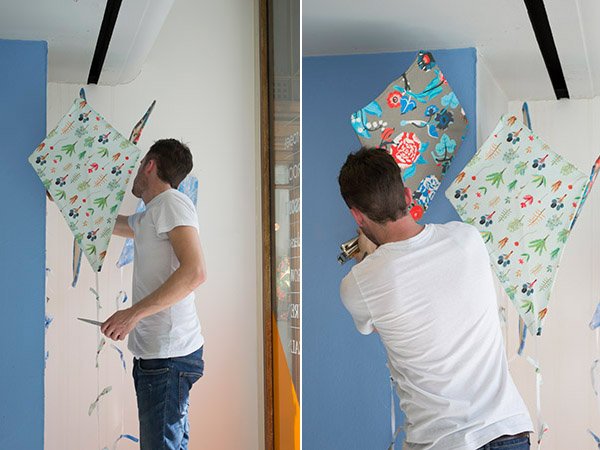
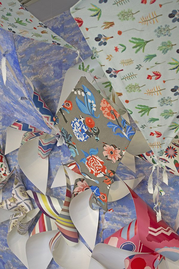
Phil is busy assembling the pin wheels made from a flexible plastic and screwing them onto the walls on the right hand side and centre. There are a variety of sizes to work with and as I watch he asks my opinion-do we need an extra here? Is 3 enough or should we try 5? (top tip: always group things in odd numbers, they look better that way).
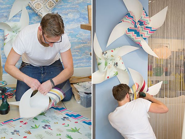
Back in the office over lunch the team explain how important it is to work as a collective, to communicate and bounce ideas around. “It’s good for self assurance”. I ask if they are quite rigid in planning their schemes, but Mike tells me for the most part they have complete artistic license, which gives them the freedom to “dress as you go and don’t over-think it”. Phil chimes in in agreement “spontaneity brings up the best ideas sometimes” and it’s true- it’s far better to just “do” rather than think yourself into doing nothing. From experience, I'm inclined to agree.
I ask if there are any basic rules in the ‘Visual Merchandising 101’ handbook and generally anything goes, although it’s good to keep in mind the pyramid format, with height at the top and heavy, weighted items at the bottom.
The Visual Office or “inner sanctum” as I called it feels like a home from home for me, a reminder from my days working in theatre, where the Stage Management office was always a hive of organised chaos. Mike has recently tidied it, and I believe him. There are stacks of wallpaper from past and current collections, tins of paint, piles of fabric and all sorts of odds and ends to aid the production process- drill bits, clamps, screws, nails and pots of glue. We are gathered around a group of tables in the centre of the room, the radio on in the background and Tatum at the head, checking over her emails and discussing Mike’s to-do list for the rest of the week, checking off and amending them on the white board.
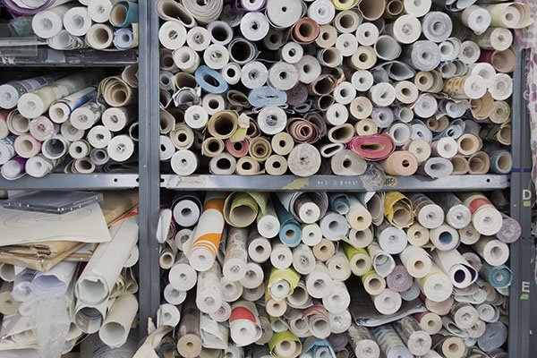
So what’s the best thing about life as a visual merchandiser? Without doubt, being part of a great team, the creative aspect plays a large part, it’s hands on work and each day is different from the last. It’s pretty difficult to be bored here, that’s for sure. The down sides? There are few faults to find, apart from bubble wrapping (Vicks tells me she hates it as I imagine wrapping myself in it and rolling down the corridor) and ‘recovery’ which includes tidying, restocking and continuing on what other team members have left the day before.
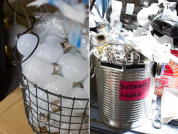
Thinking about my occupational bug-bears and having to be constantly on my toes, ready for last minute changes, I ask how they feel about that. “You have to be ready to adapt and embrace change” says Mike, “If you’re not flexible, the job won’t work for you”. I’m told, however, that it’s rare that there are any major last minute changes the team have to take onboard. If there are any it’ll be product related and relatively easy to change out. Later that afternoon, Phil and Tatum discover that there are new lighting plans that will negate the majority of Mike and Vick’s rewiring and focusing the day before.
Back on the shop floor, Phil is asked to put up the decals for the new Ambrose collection which is being launched today in collaboration with the ‘Useful Beautiful’ exhibition at Geffyre Museum ready for the Fall collection arriving in store from August. The new collection has been created with space saving in mind, for those requiring more intelligently designed, multi-purpose furniture. The materials and construction methods are carefully considered to provide affordable pieces without compromising on quality and I can’t wait to get my hands on a piece or two. Heading out onto the street I join Phil and Tess armed with a spirit level and tape measure. With only one decal for each window, Phil has very little room for error and I don’t envy him this task. As they work on finding the centre and placing the sheet ready to be transferred, I catch a witty comment from a passerby “it’s not on straight, mate!” I bet they’d never heard that one before.
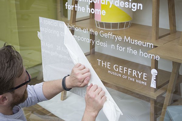
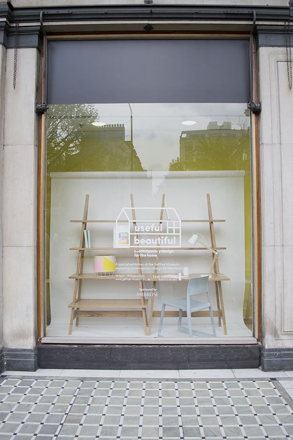
Finally, after holding my breath on a few tricky moments, the paper comes away and we can take a step back to view the windows. Perfectly straight.
Over on the left hand side of the window scheme, Mike and Vicks are still working away on the lighting, methodically wiring, cleaning and hanging each fixture. It’s extremely time consuming but the overall effect is stunning. Later on, manager Martin joins them to view the windows from the outside to gauge whether or not some need to be moved.
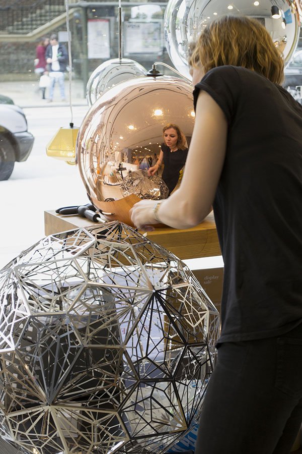
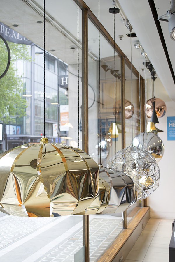
Now that the look is becoming more uniform, Martin can see a few areas where something is lacking and discusses with Tatum how they might make some changes- with him he carries a sample of striped bowls he feels might break up the blue which is a little too dominant.
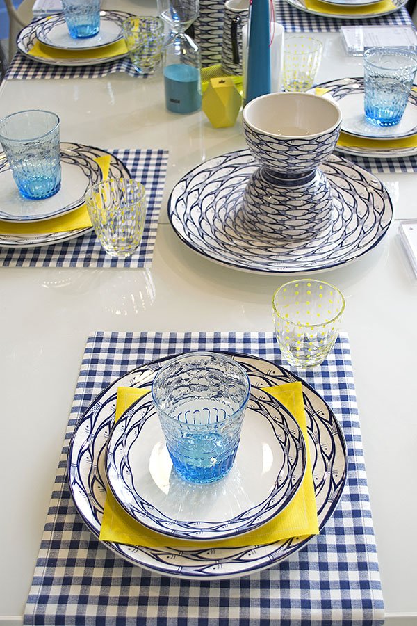
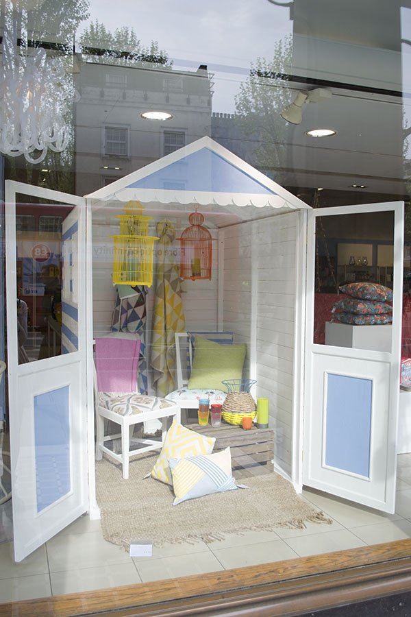
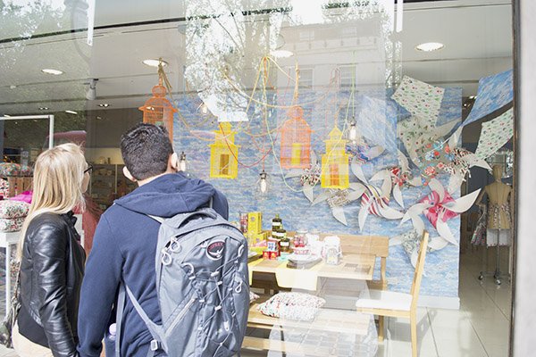
Before I leave, I meet one of the store's buyers as she catches up with Phil. She mentions a new range of cactus candles coming in later in the week that would be perfect for the windows. I wish I could've seen the complete, finished look at the end of the week. Cactus candles. Brilliant.

A HUGE thank you to Julia Deutsch for arranging my visit and of course to the visual team for letting me into their world.
What do you think of the Heal's look for summer and have you been past the store recently?
Which store would you like to see me explore next?
A Stylish Find / Fabrique Swedish Bakery, Hoxton
I have a gorgeous new find for you today. Absolute heaven. I walked through the door and inwardly squealed - does anyone else do that?!

 The overall space has a light and airy feel in true Swedish fashion. It's furnished deliberately sparsely making a feature from the industrial surroundings of exposed brick walls, corrugated iron roofing and concrete flooring. I loved the delicate little touches that softened the hard, industrial edge too-soft pink and lilac plates and cut glass beakers. Beautiful. It's all about the bread here, and hot damn it's good. Love the Fabrique look as much as I do? I've pulled together four items to inspire you to recreate your own industrial bakery in the kitchen. Look for organic materials-iron, steel and untreated wood and combine with soft pinks, charcoal grey and bright white. It's fresh, on trend and creates a statement without clutter and fuss.
- Sula Reclaimed Stool | Nkuku
- Spun reflector | Davey Lighting
- Solid pink organic shaped lunch plate | Rice
- Koda Tumbler | Zara Home
So Hot Right Now / Plywood
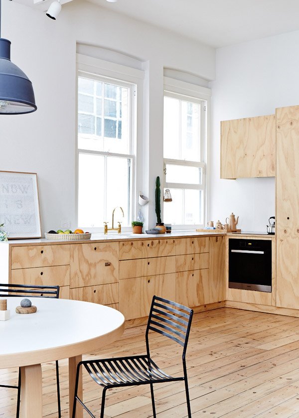
How sexy is plywood right now? That's a sentence I never, ever thought I'd utter and yet, there it is. Suddenly I can't stop thinking about it. I want to use it as my new desk once my workspace is ready and I'm thinking about creating a funky desk out of it for Reuben's room too. My father-in-law, a former builder and master craftsman would think me utterly crazy, but there's just something about it. It's raw, unapologetic. It can only be what it is. But I don't mean chucked on the floor to aid the path of a filthy wheelbarrow or nailed over a broken window, I mean used intentionally as part of the make-up of a home. In the kitchen as minimal units, a wall of storage, or flooring even.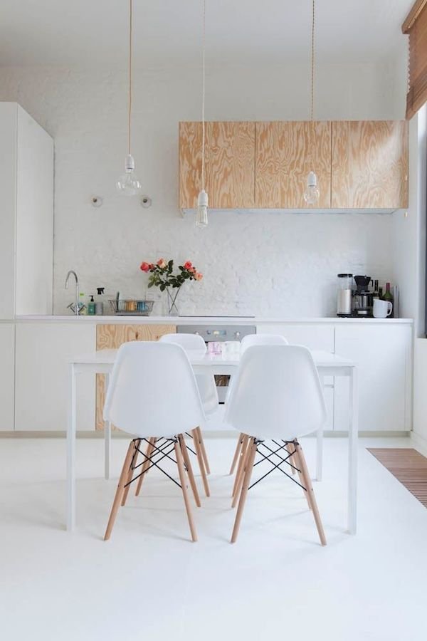 These beautiful kitchens are the perfect example of how brilliant plywood as a material can be when left to shine, especially paired with white. It's uncomplicated and contemporary in feel and I love that you can see the grain of the wood without having to treat it. Whilst it's not a material for every home, I think it's versatility makes it ideal for a blank canvas space-be it an industrial apartment or a small two up to two down Victorian terrace.
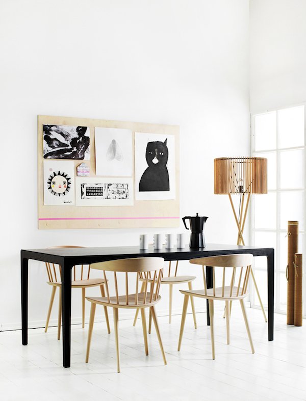
 Ok, so I'm starting to bring you round to my way of thinking, but you're still not sure? Try it in your workspace as a backdrop for your moodboards...
 So tell me-am I crazy? Is it not really your bag or are you absolutely on board with plywood? Tell me your thoughts!
'Retailed' / Heal's Part One
I am beyond excited to kick-off a brand new series for you today! As a stylist I’m constantly looking around me for inspiration that could be translated into my next shoot or event and one of my go-to places is visual merchandising. It’s an aspect of styling that both fascinates and intrigues me, partly because the information on what’s involved in styling for retail isn’t so readily available. ‘Retailed’ is a no-holds barred look into the behind the scenes world of some of the most revered and coveted stores and brands here in the UK. Get a glimpse of the real world of “vm-ing” from the view point of their visual design teams who are the magic makers behind what makes a shopping experience so important. First up is part one of two posts covering two insightful days I spent with the visual team at Heal's on Tottenham Court Rd as they installed their summer window. With two centuries of brand heritage and dubbed ‘the home of modern and contemporary designer furniture’, Heal’s is constantly looking to the future. In my mind, it has and continues to be the fore-runner in cutting edge design, discovering and supporting emerging designers and never afraid to push boundaries.
 There's a real buzz about the place as I arrive- something I pick up on when I meet online marketing assistant Julia Deutsch for a whistle-stop tour. Emerging from a difficult few years, Heal’s is firmly in recovery and ringing in exciting changes-all in one go it would seem! As we headed to the first floor furniture showroom, Julia explained that the 100 year old building is under-going major structural renovations. It's still a little rough around the edges because ceilings are being raised to open up the spaces and the original wood flooring is being restored-let me tell you, it’s a thing of beauty! I also learn that physical renovations aren’t the only changes the store is experiencing- new manager Martin Colquhoun who was brought in 18 months ago as former business manager for Liberty’s home department has proved to be worth his weight in gold in steering this ship.

In keeping with Heals’ ethos to support British design, the store will make way for a ‘best of British’ room in which all of Heal’s chosen designers’ products from around the UK will be in once space. And as we progress from room to room towards the showroom at the front of the store I can spot many of my favourites -Imogen Heath, Tom Dixon and Kangan Agora to name but a few.
We find the visual team just back from their mid-morning break re-grouping at the front window. The working day usually starts around 7am and work is already well under way, so Julia leaves me with Display Supervisor Tatum who brings me up to date and introduces me to everyone. Her role is to over-see the team on a daily basis, keeping everyone up to date with the schedule. For the next week all hands are on deck to complete the main showroom and front window display.
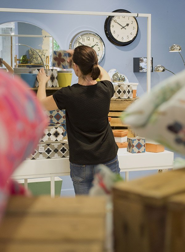
Everybody seems a little wary of me as I introduce myself, brandishing my camera, all but Visual Manager Phil Knudsen-Thomas who breezes by like a ray of sunshine, ready for his close-up. Phil is also new to the team. Having joined in January hoping to “blend in” he was soon appointed Visual Manager, responsible for designing the window schemes across all Heal’s stores. It’s hardly surprising though, given his hefty 22 years of vming and buying experience including Habitat, Barker and Stonehouse and Diesel.
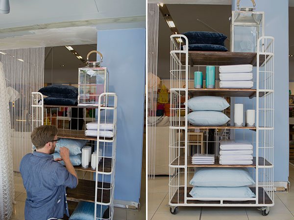
Next I meet Vicks and Mike, who both came to the job from the shop floor, having heard there was an opening on the team. For the most part, they'll be responsible for rewiring and hanging a new collection of lighting in the front window and take it from me, it's one hell of a task with around eight lights taking up one eight hour shift. There's a lot to consider in the process of installing them- they have to be carefully hung according to eye levels, enough to showcase the fittings and shades and be correctly wired. No big deal, right?!
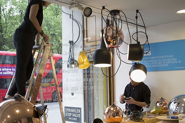
Sitting next to a white beach hut with a large pot of sky blue Dulux paint is Tess. It’s her first day today although having worked with Phil as his assistant previously she's not new to the role.
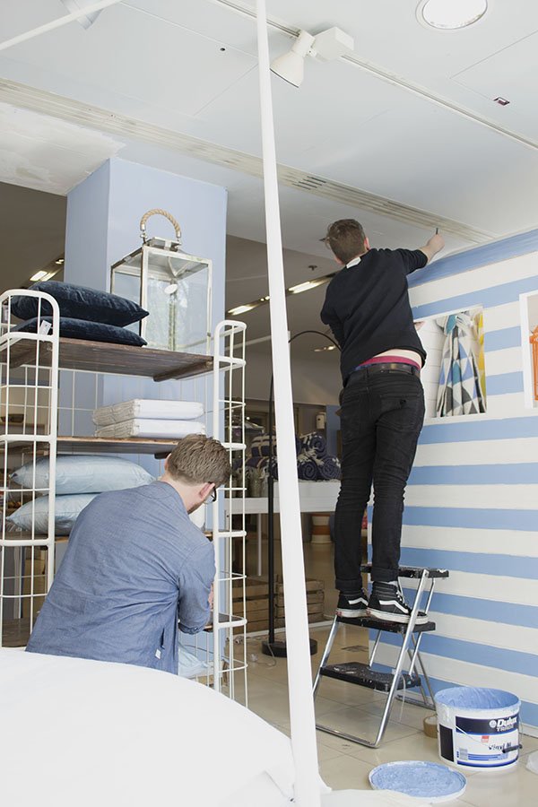
This summer window will be the last under creation of Phil’s predecessor whose approach differs to his own method of working. He explains that previously, the store’s approach to VMing has been from the viewpoint of an interior designer rather than a retailer, in that the sets may look great but they won't translate well enough unless the customer can relate to them, imagine themselves inside it and easily access the product. Planning ahead to Fall, he’ll be implementing changes in the way the windows are created, giving full creative license to the visual team and working much more closely with the buyers to determine which products are readily available first. From this he can plan the sets accordingly and flexibly, rather than agreeing a look before knowing what’s “in”. All future displays will be digitally designed in CAD too to give a better idea of scale and layout.
The Look
In keeping with summer, styling for the next week is focused on bringing the indoors outside, from alfresco dining to relaxed lounging. With a nod to coastal pursuits, the walls have been given a fresh coat of sky blue paint which is picked up in the linens and fabrics as well as giant pinwheels and kites made from the Heal's 1810 fabric collection. As the first fabric collection Heal's has produced in collaboration with designers since their last in the 1970s, there is real emphasis on this. Immediately, I'm drawn to a wooden bench in front of a fabric backdrop of blue sky and fluffy clouds. It's dressed to look like a Mediterranean feast, from the brightly patterned crockery stacked on top of thick wooden chopping boards, cobalt blue Pols Potten glasses, to the groupings of olive oil, sardines and olives. Very Portuguese in style.
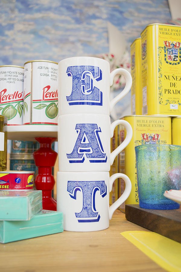
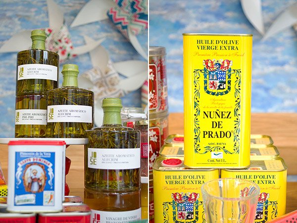
There is rich and vibrant colour at every turn, from the almost neon collection of baskets, hand painted rice bowls and brightly painted lanterns. It made me yearn to live in a place with a courtyard garden where the sun shone for 360 days of the year to enjoy it all in and I'm excited to see how the space will evolve over the next day.
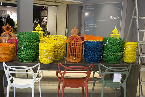
With the majority of the old wall behind the front windows gone following the renovations, the team are learning to find new ways to create and dress the set without it. Opening out the space into the showroom also encourages customers to step inside the window and interact with the space, where in some stores you might feel uncomfortable doing so, here it's encouraged.
For the remainder of the day, the team are installing lighting, moving and preparing product and gearing up for tomorrow where the best part of the set dressing will begin.
Join me next week for Part Two where we really start to see the space come together, I talk to the team about the highs and lows of the job and pick up some great VMing tips!
Bathroom Inspiration: Bottle Green, Black & White
 Good afternoon everyone, how is your Thursday going? I was hit with a sudden surge of inspiration this morning so whilst it's fresh in my mind I'll share this with you now!It might sound like an odd thing to say, but I've been thinking about this beautiful image from the Chaucer Road townhouse in Herne Hill ever since I pinned it earlier this week. An exuberant mix of Victoriana meets modern style, for me this is exactly how I would want my own bathroom to look had I the luxury of a roll-top bath and plenty of light. So, I set to putting together some inspiration that I could put into a journal ready for when we find our new home. Who knows, maybe I'll find a way to bring some of these elements into it?
 Using a crisp white base, I would bring in dark and bottle green tones in with metro tiles as a splash-back around the bath and sink (see below) and echo this around the room with a collection of sweet little green glass bottles and pots to sit on the windowsill perhaps. If the room isn't big enough for blocks of black (like the bath as pictured above) then display ferns and succulents inside black pots, it will bring out the vibrancy of the leaves too.
 To soften the contrast in colour I love the idea of bringing in some soft lace-perhaps a re-purposed lace tablecloth made into a roman blind or simple screen over the window. I've also touched on the idea of introducing a little antique gold into the mix to create a little luxury. An old gilt mirror or a grouping of chunky gold candles would make a beautiful addition to the room.

Mabel and Bird / Cushions For The Kids' Room
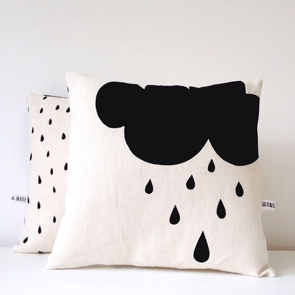
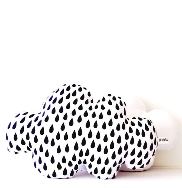
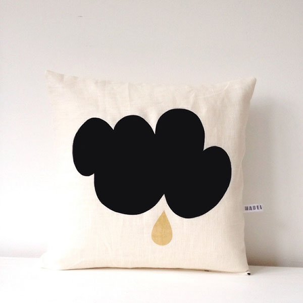
What a week! My goodness I need this weekend. The chickenpox have gone, my baby girl is "back", house is relatively tidy and the forecast is set to be spectacular. Heck-I might even make meringues! Hopefully this weekend the only rainclouds you'll be seeing will be these from UK printmaker Emma Pearson of Mabel and Bird. I discovered her sweet little Folksy shop yesterday and thought her cushions would make the perfect addition to a kid's room, particularly if they (or, rather, you) love monochromatic, scandinavian style. I think they'd look great in Reuben's room to match his bedding, don't you think?!