Travel Antwerp | Images From Designcentre de Winkelhaak
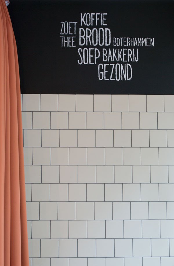
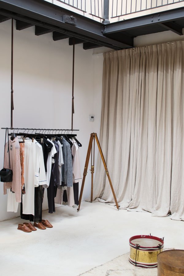
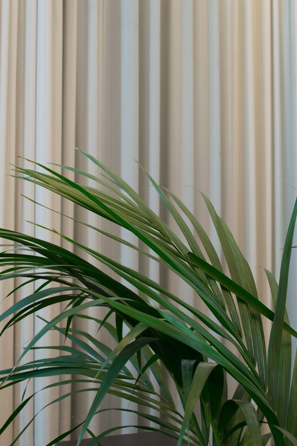 It's often said that the best design comes from the need to solve a problem, to improve an existing way of life. The Designcentre de Winkelhaak, located a stone's throw from the Antwerp city train station has proved itself to be just that.The Designcentre is in part a social project, created from the need to improve what was a difficult area in the central station district which was rife with prostitution and drug culture. The neighbourhood was in need of investment and renovation but crucially in a way that didn't drive out the existing community and encourage gentrification. Described as an incubator for creative entrepreneurship, this award winning centre, now in its 15th year is an ever evolving hub for designers, creatives and enthusiasts, with studios to rent, exhibition space, on hand advise and brand new design shop which extols the virtues of its Belgian Design Essentials.With over 30 designers and studios under one roof, the centre promotes new and young Belgian design, providing business support, co-working spaces and an environment in which this design community meet regularly to discuss ideas and help each other to grow their businesses.Adjoined to the centre is BarOscar, a warm and welcoming cafe with meeting spaces below for designers and customers - it apparently also serves the best coffee in Antwerp, although I'd challenge that with their hot chocolate which was ridiculously comforting on a cold October afternoon.In an effort to feel inclusive of its surrounding residents, the Designcentre has an open door policy - the building itself is essentially made up of wall to wall windows which encourages transparency so that activity inside the building can be seen. I wish I'd had more time to photograph the space for you properly, but my eyes were taken by all the small details, the concrete walls, metal structured windows, open spaces and of course, those double height floor to ceiling curtains.
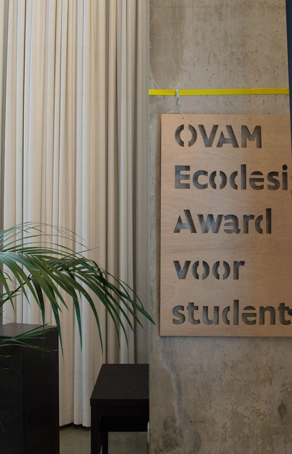
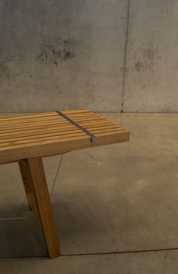 Inside the open exhibition space in the basement (sometimes used for expos and design events) were pieces on display from the 2016 winners of OVAM Ecodesign Awards. I particularly loved the SPAN bench, designed by Jonathan Engels which is based on the principle of compression and tension between the oak seat and frame and steel cables.

 A brilliant and shining example in so many ways - from the support of young Belgian design, the way in which it has helped to improve what was a troubled area of the city, to the architecture itself, the centre is always finding new ways to adapt and sustain.Visit Designcentre de Winkelhaak / Long Winkelhaakstraat, 2060 Antwerp.Mon - Fri: 09:00 - 18:00Sat: 10:00 - 16:00To see more about the design centre and visit during your stay in Antwerp, check out the website.The Function+Form Bloggers Design Tour was organised in collaboration with Pentacom PR and Designcentre de Winkelhaak, with thanks.
Photography © Tiffany Grant-Riley
Modern Scandi Kids Room Makeover - The Reveal
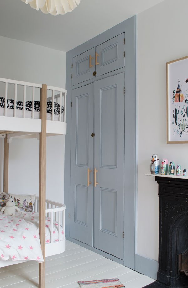 When we bought this house, it was sort of a given that we were going to tackle the kids room first as we wanted them both to feel settled in the new place as soon as possible, surrounded by familiar things from their old room but with a few new and exciting additions too.The room itself is on the whole really light, so we wanted a clean, modern space with accents of grey-blue (check out my inspiration in this post). We knew it wasn't going to be a quick job as four out of the three walls needed re-plastering and we'd decided to sand back and paint the wooden floors, but it took longer still to finish whilst navigating the chaos of moving and settling in and every day life. Aside from the plastering and replacing the radiator, we did everything ourselves and its been a great starting point for the rest of the house...although I won't be painting any more floorboards.
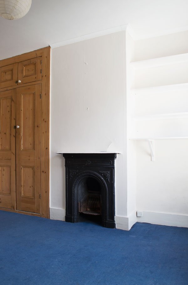 Essentially, everything needed stripping back so we could get a better idea of what needed attention. The carpet came up really easily (no underlay underneath either) revealing the hearth plate on the fireplace underneath and beautiful, really dirty floorboards. Seriously exciting. The walls were a little tricker as we had to remove the shelves from the alcove which had more or less been screwed in and painted onto the wall. Years worth of gloss paint to hack off to get them off. And then there was the polystyrene coving across the top of the ceiling which had to be chiselled off at the same time as the lining paper. The other delightful thing about this house is trying to locate and remove all the strange cable and phone line ports which have been added over the years - there were a few in here too.
 The floors were given two coats of Wimborne White by Farrow & Ball which gave great coverage and I have to say is holding up well to the sort of everyday abuse wooden floors get from small children-toy car traffic, chairs dragged across the floor etc. If you're tackling a similar project and are as clueless as we were when we started, take a look at out (almost) definitive guide to sanding and painting wooden floors.
 Rob did most of the fiddly painting such as a fresh coat on the ceiling and the cupboard doors were really his project whilst I focused on the walls and skirting boards. After weeks of umming and ahhing over the perfect shade of grey-blue for the woodwork, I picked 'Celestial Blue' by Dulux. The paint didn't need thinning at all and only two coats were needed.
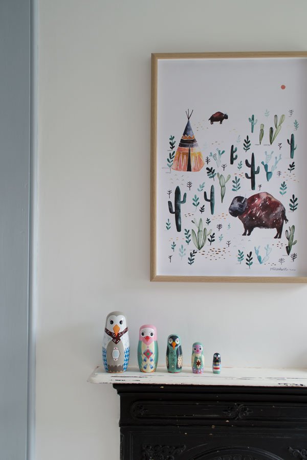
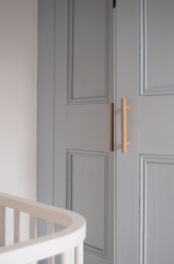 The original Victorian cupboard is my absolute joy. I'm honestly so chuffed I took a gamble and decided to paint it. There's so much orange stained pine in the house which I find a little over-powering, so I overcame my fear of painting original features and jumped in with both feet. This is generally a really bright room, although typically it was cloudy on the day I shot it, but I love the way the tone of the blue changes at different times of the day. The beautiful minimal door handles are a bespoke design by Chocolate Creative (listed on the source list below) from plywood and birch and give a very traditional cupboard a more contemporary feel. It also means the kids can easily access all their books, games and clothes inside and I plan to restore and decorate the inside properly a little further down the line.
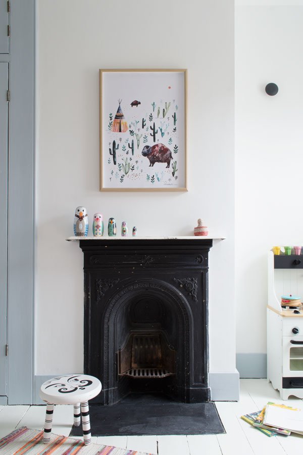 The only feature we decided to leave as was is the fireplace.You can see there are layers of paint underneath which over the years have been rubbed off in places. Much to my mother's dismay (she wants us to restore it) we love how rough and patchy it looks against the otherwise quite polished decor.
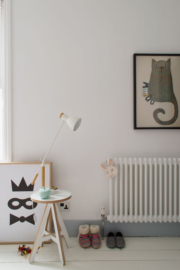
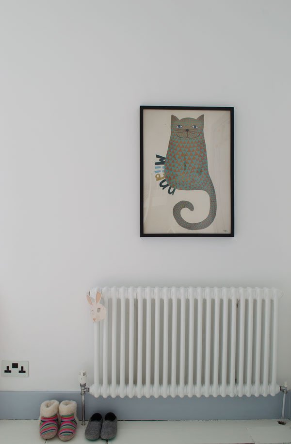 We replaced the old radiator with a new column and chrome pipes. I much prefer this style in keeping with the age of the house, but without the inefficiency which comes with original styles. Rob also wired in new white metal fronted sockets with black inserts, a new black toggle light switch and black ceiling rose from Dowsing & Reynolds. Small details make all the difference is a space this small.
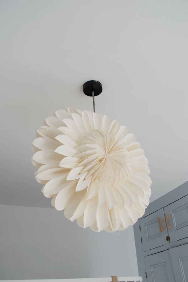
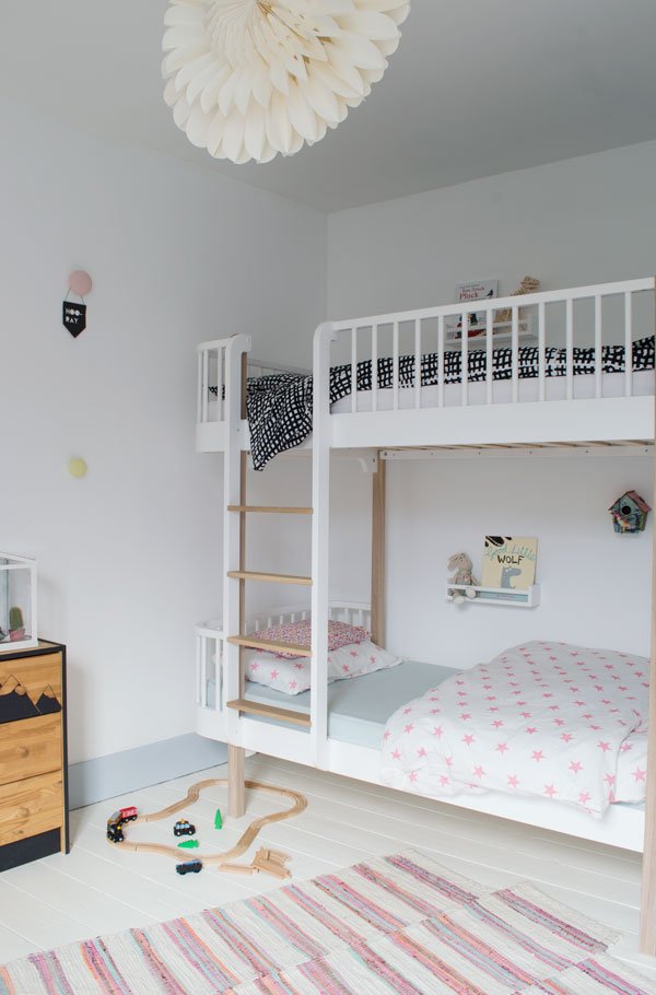 It was only when we put their new bunk bed together and moved it into the room that we really saw it all pulling together. This was the bed I'd had in mind for this room before anything else and I knew the kids would love the novelty of sharing it. The pale oak details tie in with other wooden details in the room and its fun, contemporary shape brings the room up to date. We bought two organic cotton mattresses that are curved to fit with the bed and are made from a combination of coconut coir, natural latex, natural fleece wool and unbleached cotton. They're a dream to lie on (which we've had to do several times) and the covers are completely removable in case they need to be washed.

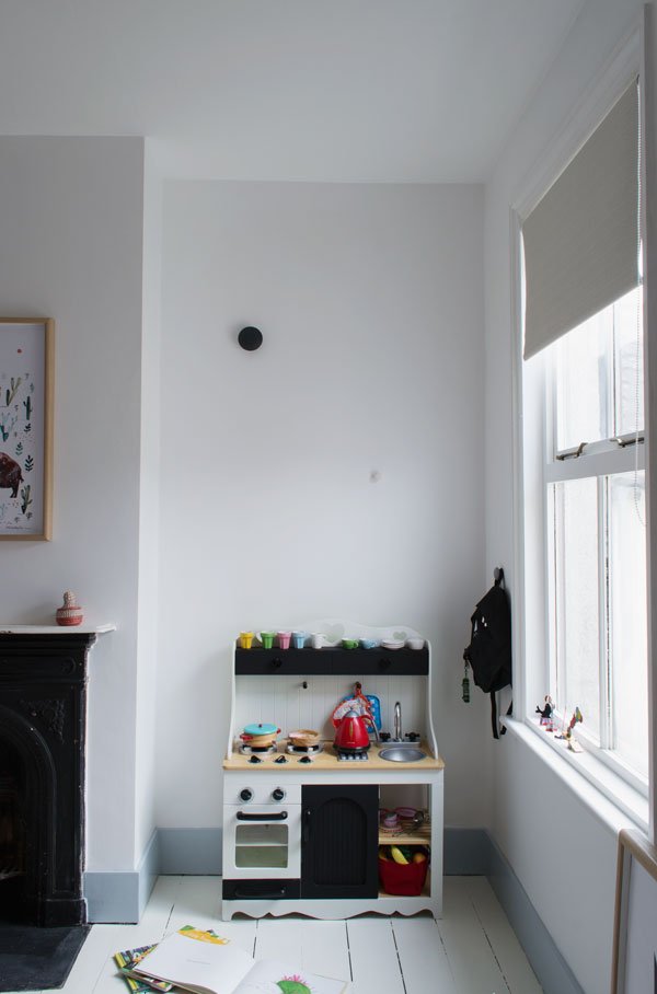 The little kitchen was given to us by a friend whose daughter had outgrown it. It was pink and green then, so I took it apart and gave it a monochrome revamp
 because I can't help myself. My daughter still isn't quite into playing with it yet, so if she's still not keen after a year or so, my plan will be to build a plywood box desk into this alcove that they can both sit at and be creative together.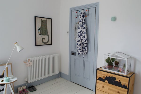 And there we have it. Room one down. Only the rest of the house to go...
•••
Source List:*White and oak bunk bed - Oliver Furniture, Nubie.Organic cotton mattresses - Little Green Sheep, Nubie*Dulux 'Ultra White' emulsion paint - Homebase.*Dulux 'Celestial Blue' wood paint - Dulux, Homebase.Two column radiator - Wickes.Porcelain wall hooks - Anne Black DK.*Bespoke 'bench' cupboard door handles - Chocolate Creative.Oatmeal linen look roller blind - Homebase.White 'A' Stool (used as side table) - ByAlex.White 'Cohen' table lamp - MADE.COM.'Socker' greenhouse - IKEA.Cacti, from a selection at The Hendersons.*Black and white sockets and vintage style toggle light switch - Dowsing & Reynolds.Black and white vintage stool - charity shop find.'Rast' chest of drawers - (painted) IKEA.Mini bedside shelves - (painted) Bekväm spice racks, IKEA.Pink, orange and blue rag rug - Zara Home (discontinued).'Bison' illustration poster - Gretas SchwesterBlack and white grid bedding - IKEA (discontinued).Pink and white star bedding - H&M Home.White paper lotus light - Bungalow DK.'Miiaaw' cat poster - Michelle Carlslund Illustration.Mask poster - Wild Boys & Girls.* Indicates where product has been gifted as part of this collaboration. Photography & Styling © Tiffany Grant-Riley
How To Make A Kokedama Hanging Garden
 Almost this time last year I was shooting this tutorial piece for the book 'Urban Jungle - Living & Styling with Plants' and today I wanted to show you how to make a Kokedama (meaning "moss ball") hanging garden. Not only do they make a stunning feature of an otherwise blank corner of a room, but they're also use up very little space if large potted houseplants aren't an option for you.If you're a plant lover and you've had your eyes open over the past year or so, you'll have noticed this new trend of hanging moss ball plants popping up everywhere, taken from the traditional Japanese art of displaying plants. I managed to teach myself to do this on the fly as I shot it, so although the overall concept might sound daunting, it couldn't be easier to do. The mixing of the soils and wrapping the moss and string is a therapeutic, hands on way to garden and if you choose the right plant, it'll be happy for as long as you take good care. Mine have been thriving for almost a year now too...You Will Need:A space to make mess. If this is at your table indoors, put paper down (and on the floor too). Otherwise, go outside!Moisture loving plants - ferns are ideal (I've used the Asparagus variety) as well as ivy, small trees and orchids.Sphagnum moss.All-purpose compost.Bonsai or Akadama soil.Garden or waxed twine or thin cord.Sheet moss.
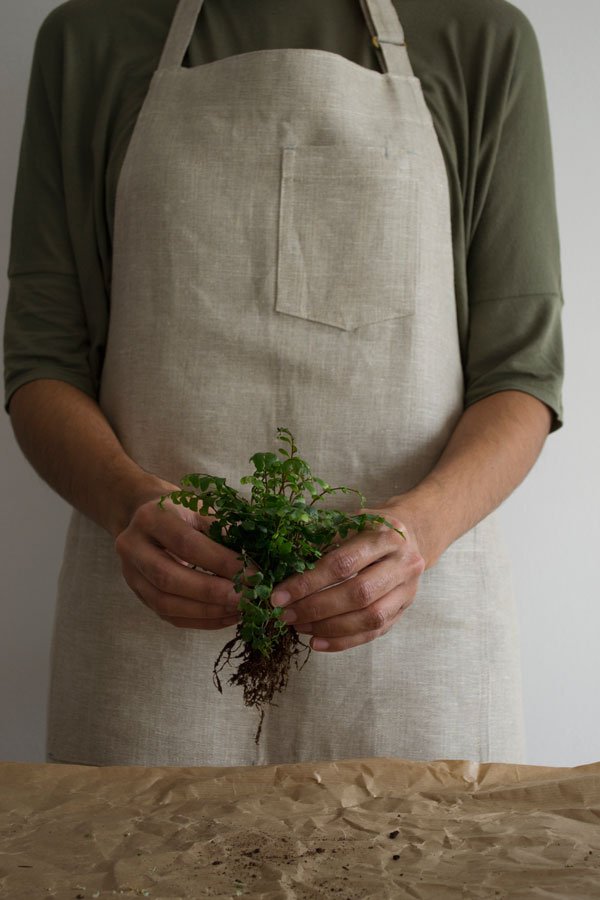 |1| Remove the access soil from to expose the roots of the plant taking care not to break them. Wrap the root ball in the Sphagnum moss. This will keep the core of the ball nice and moist.
 |2| In a bucket or large bowl, combine in equal parts the compost and soil, mixing it with water until the soil just clumps together as you make a ball. Form a solid ball large enough to house the roots of the plant (you may need to squeeze out the excess water to do this). Make a hole for the roots of the plant and gently insert it, squeezing the soil back around it.
 |3| Place your plant ball onto a sheet of moss and bring the sides up around the soil, making sure to remove any excess folds, then firmly (but not too tightly) wrap the ball with the string.
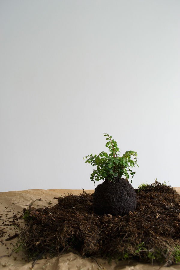
 |4| Wrap the ball with the string until the moss the ball is secure. Tie three additional lengths of string on the plant ready to hang it up and choose a location your plant will love. If you're unable to hang your Kokedama, you can also display them on a shelf or other surface with a small plate or saucer underneath to catch the excess moisture.TIP: Keep an eye on how moist the Kokedama is - watering once a week by submerging it or regularly spritzing with water will keep it happy. I add feed into the water during the growing months (Spring and Summer) too.
 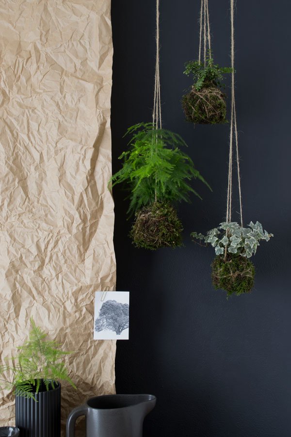 To see more beautiful DIY plant tutorials and inspirational urban jungle stylings, you can purchase 'Urban Jungle - Living & Styling with Plants' here and follow the community on Instagram @urbanjungleblog #urbanjunglebook.
Photography & Styling © Tiffany Grant-Riley (with thanks to Enrich & Endure for the loan of the linen apron).
Sneak Peek Kids Room Update | When You Paint For Days
 No one ever tells you when you start renovating a place just how long it will take. Or that there may be minor set-backs, like when you choose the same shade of white for the walls as the floor and it turns out that it actually isn't the same after all (let's call it cream). So you then you complain and the paint company "runs tests" and tells you that actually it's fine and must be something to do with the way you prepped the wall (it wasn't, by the way).But it's all good. I've calmed down now, resolving to plump for Dulux's Ultra White (did you know it has light reflective particles in it?!) and I'm back with my last update on the kids room before the big 'before & after' next week. Before we do that, let's take a look back over our progress...Following this post where, having had three out of four walls re-plastered we then worked on painting the wooden floor, before cracking on with painting the walls, woodwork and installing a new radiator. Rob worked flat out repairing and painting the ceiling and putting in new electrical points (just you wait!)
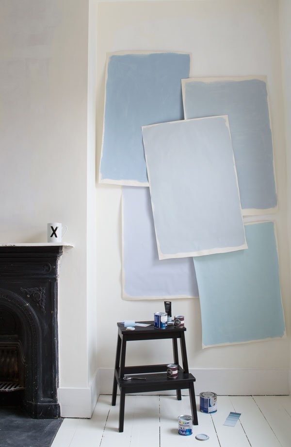
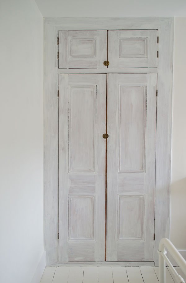 The original cupboard doors, which started out in orange pine, have been given a refresh and if you saw my recent post sharing kids room style influences, you'll have seen I was going all out on finding the perfect grey-blue to paint it with. Let me tell you, it wasn't easy finding the right shade - I must've stood for hours with tester paper all over the wall studying the light, trying Farrow & Ball's Parma Gray and 'Mount Fuji' by Crown to name a few but yet again Dulux came good with 'Celestial Cloud #4'. And it really is celestial. Ahhhhhh.
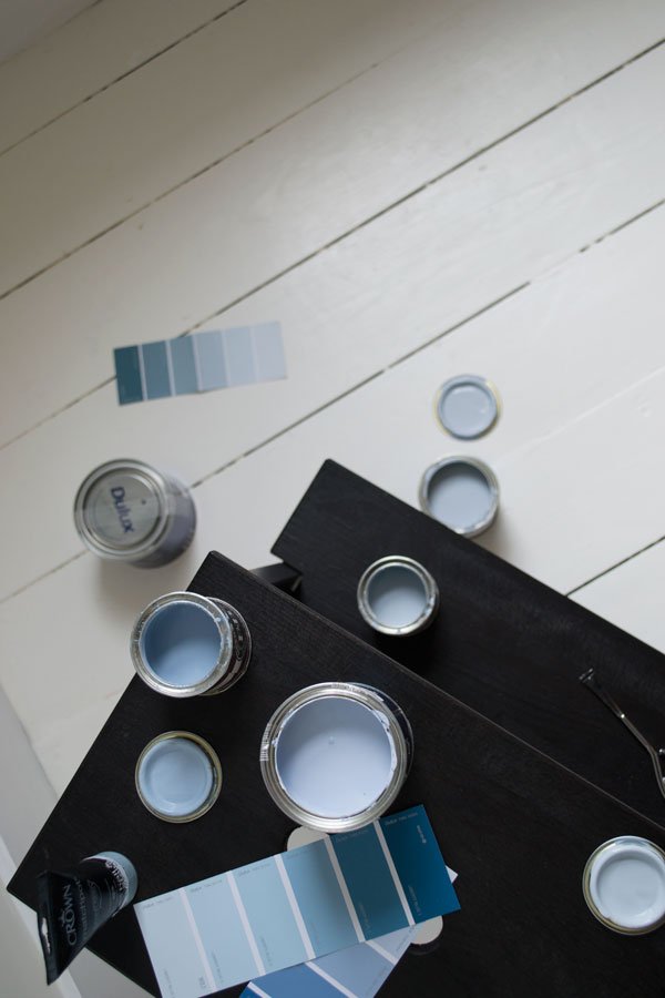
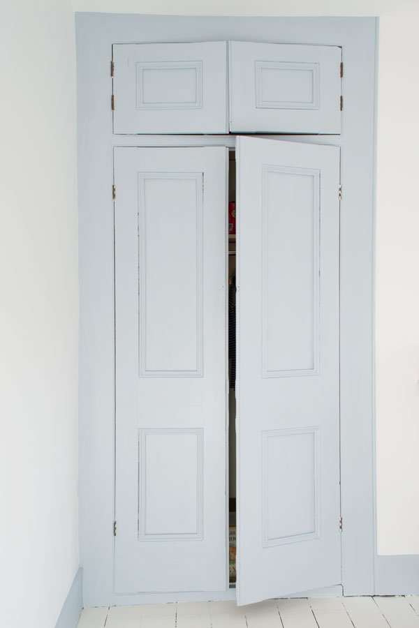 It instantly makes the room feel calmer, don't you think? We extended the blue out to the skirting board and the back of their bedroom door which I thought was an effective way of bringing more of the colour in without it being overwhelming. To finish the treatment on the cupboard, we reattached the brass catches and added two sets of bespoke handles - I can't wait for you to see it all come together!
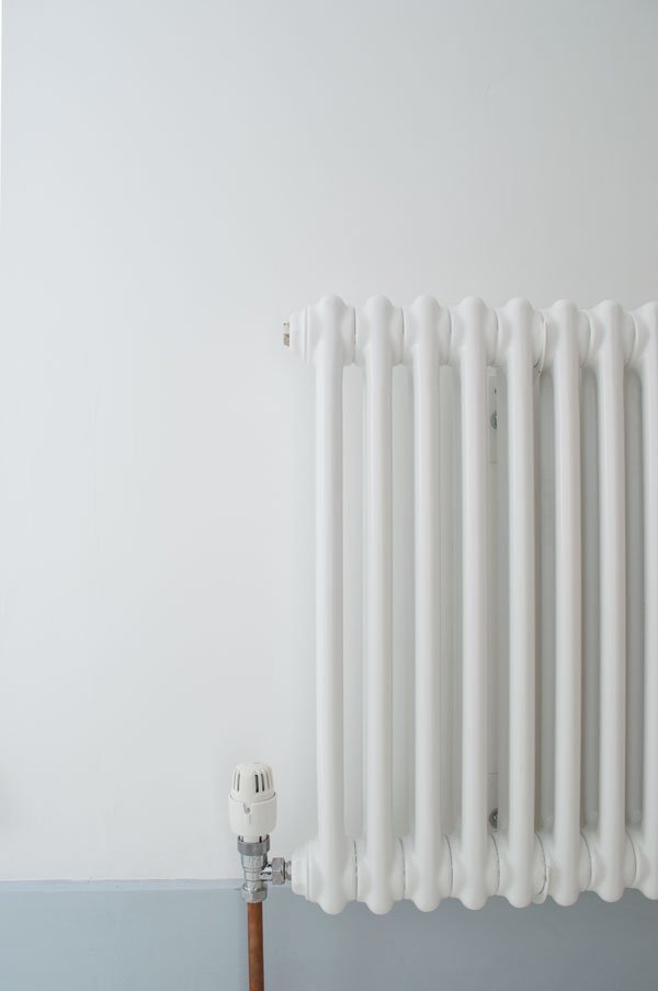 Eventually all the radiators in the whole house will be replaced with modern column styles, so we started the process here with a simple two column design. It did of course mean that some of the boards had to be pulled up to get it plumbed in, but it was a minor cosmetic job.
 And that's all you're getting for now. I'm spending the next few days adding a few last minute touches and tweaks and I'll be back with the first complete room in the house next week. Progress!
Photography © Tiffany Grant-Riley
This post is in collaboration with Homebase.
Travel Antwerp | Valerie Objects at Gallery Valerie Traan
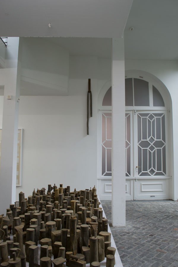 It is impossible to imagine what's behind the large double width door of gallery Valerie Traan, one of the locations we visited during our Function+Form design tour of Antwerp. This white, modernist gallery space is also the private home of art director Veerle Wenes who wanted to live in the same place that she worked, dissolving the distinction between the two. During gallery open hours, Veerle allows the public into her home where the bright whites make way for soothing greys (there's that blue-grey I was talking about) and where more works of art transform into useful objects over the look-but-don't-touch feel of a gallery.
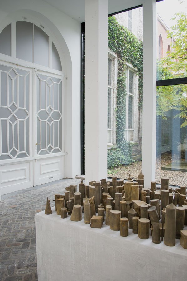
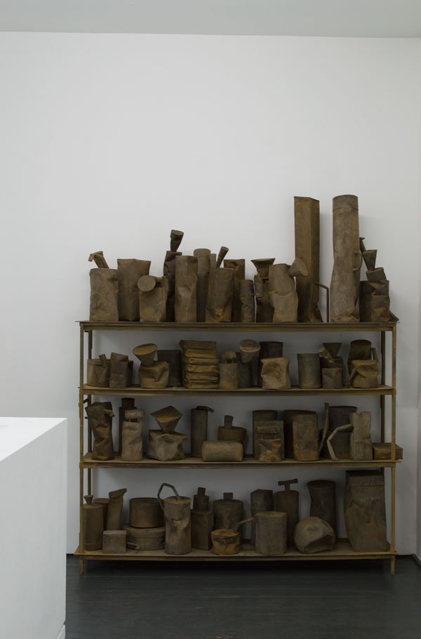
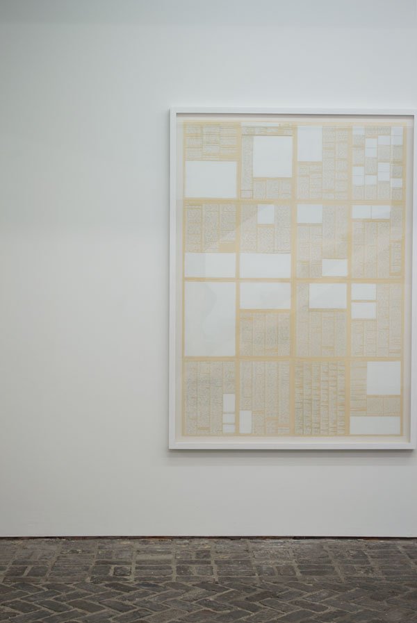 A former working space for nuns, Veerle wanted to hold on to the existing architecture including the distinctly Flemish herringbone brick floor, combining a contemporary black staircase and large windows looking out into a central courtyard. It is clear that Veerle lives by the art she chooses, in that she is drawn to every day objects which are each interpreted differently according to its maker, drawn to the story behind each piece. Works on display included 'The End Of The World For Beginners' exhibition created by artist Johan De Wit (pictured above) whose pieces, despite taking on the look of battered, weather worn metal relics are actually constructed entirely of paper. Looking into another courtyard the Wire S chairs by Muller Van Severen show a clever use of outdoor exhibition space.
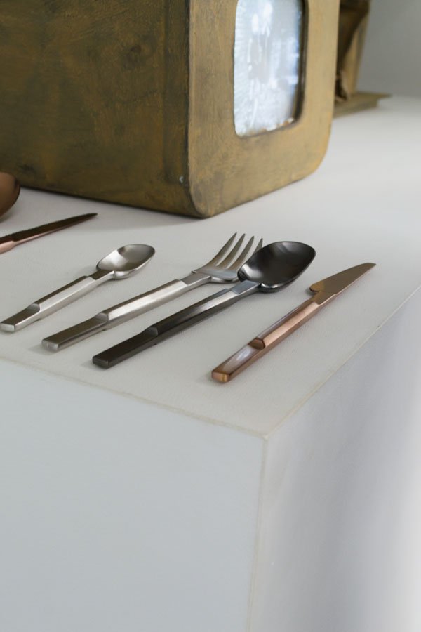
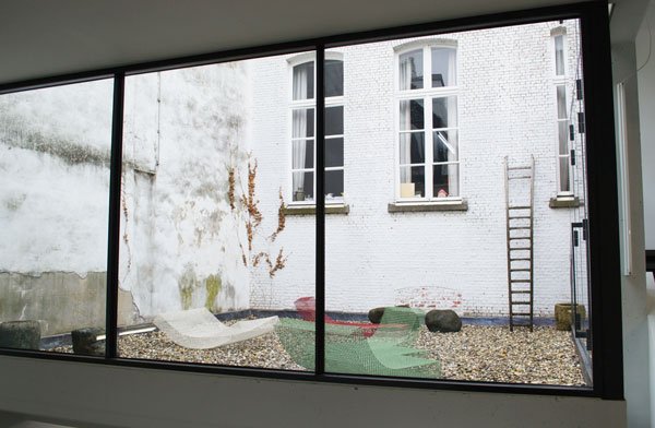 The gallery is also home to Valerie Objects, a new design label launched in collaboration with Axel Van Den Bossche and Frank Lambert (founders of Serax) working with architects, designers and artists to bring to life tangible objects. Highlights of the collection includes the Rocking Chair and Hanging Lamp by Muller Van Severen, The Cutlery Project, featuring two different designs by Maarten Baas and Koichi Futatsumata, and Hidden Vases (a personal favourite) by Dutch designer Chris Kabel.
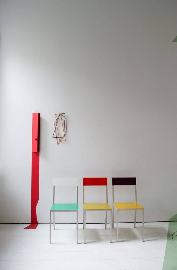
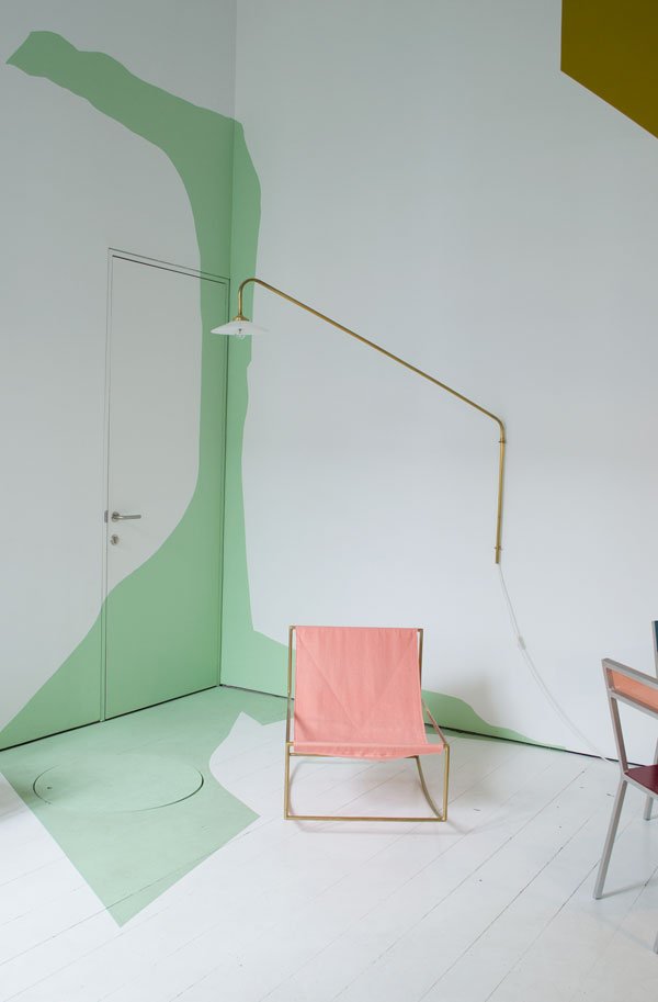 Upstairs awaits a playful room of colour and shape, with pieces by Muller Van Severen taking centre stage and a series of hidden doors to add to the sense of surprise.
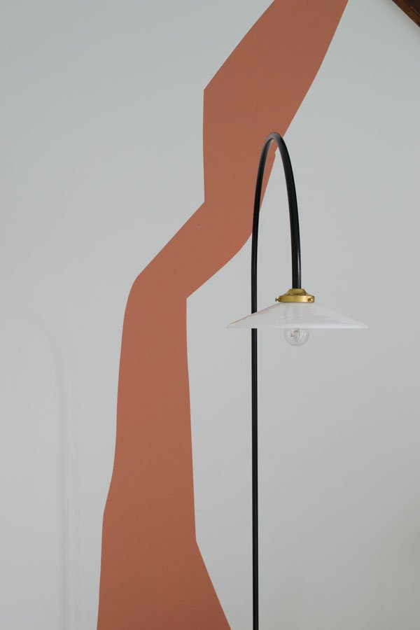
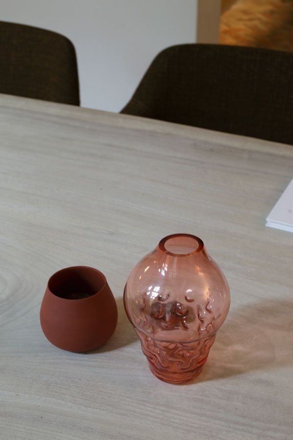
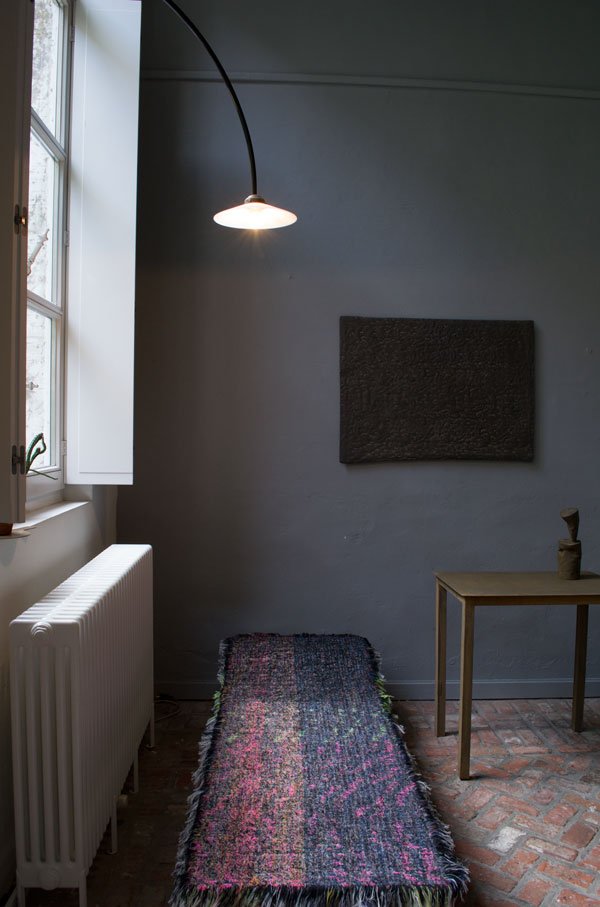
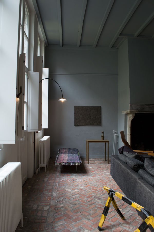 A destination not to be missed by art and design lovers alike, the gallery puts a completely different spin on the conventional public space, offering a fresh perspective for visitors to immerse themselves in. I for one will be back.Visit gallery Valerie Traan - Reyndersstraat 12, 2000 Antwerp, Belgium | Open Thurs, Fri, Sat 2pm - 6pm and by appointment. The Function+Form Bloggers Design Tour Antwerp was organised in association with Pentacom PR and Design Centre Winkelhaak. #BloggersTourAntwerp #WeAreFunctionAndForm.
Photography © Tiffany Grant-Riley
Handprinted Textiles from a Victorian Riverside Mill
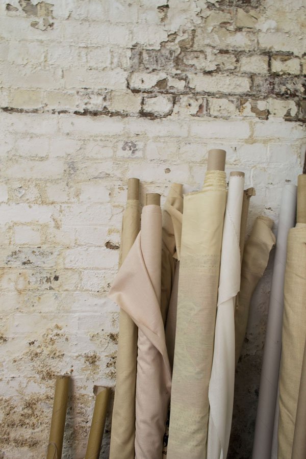 Sometimes you can walk past a building you love for years without the slightest clue as to what's inside it, but you always wonder, right? Well, the mystery of one my favourite warehouse buildings was debunked last year when I discovered through sheer coincidence that it was home to family run handprinted textiles company, Marina Mill.Just across the river from Rochester in Kent, this beautiful Victorian warehouse, known to have originally been a former Bryant & May match factory has been their base since the early 90s. Barely touched in all those years, the building is every bit as beautiful in its age as the fabrics that are produced here too. In 1967 following a degree in Fine Art and several years working along side Czech artist and designer Zika Asher, founder Keith Rawkins and his wife Stephanie began their journey into textiles from their basement flat in Fulham. Originally designing for the fashion industry, their focus gradually shifted to interiors and they were later joined by their daughter Tandine and son Guy in the late 80s. I popped over (literally) to meet Tandine and have a good look round...
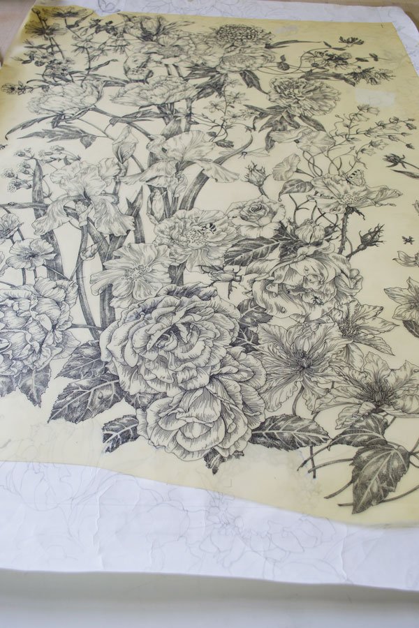 Over the many years the company has been producing handprinted textiles, the team have collaborated on designs for Colefax & Fowler, English Heritage and continue to develop fabrics for well known interior designers. Given the nature of their work and that so many designs are exclusive, I was unable to photograph much of it, however, I've seen it all with my own eyes and the quality is pretty breath-taking.
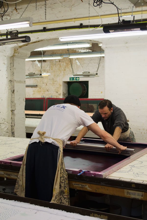
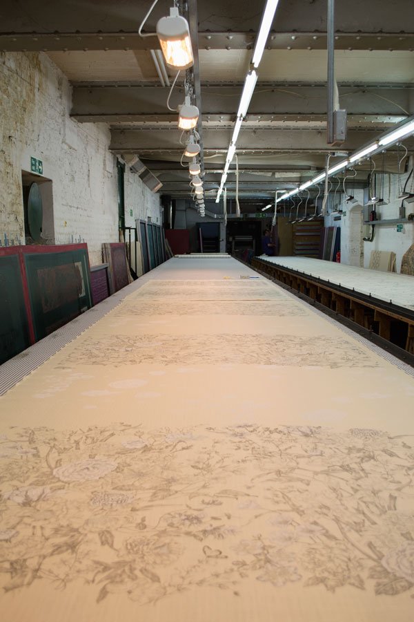 The process is quite complex, but what I understood was that each design is drawn out and developed, then moves on to computer where repeats are worked out before the screens can be printed and ready to use. Most fabrics with more than one colour (a maximum of six is used in general) will be left to dry in stages before the next colour is added on top-you can see the heaters on the ceiling which help to speed up the process.Tandine tells me how space was so limited in the basement flat in Fulham that her parents could only print a certain amount at any one time, so I could see why the warehouse was such a perfect fit for their needs - these printing tables are 28 feet long! It's a two man job to screen print too, both carefully placing the screen against markings at intervals to ensure the design lines up, then swiftly dragging the ink across with a squeegee.
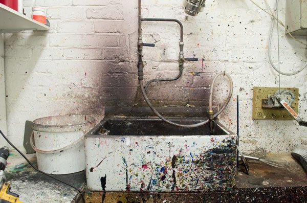
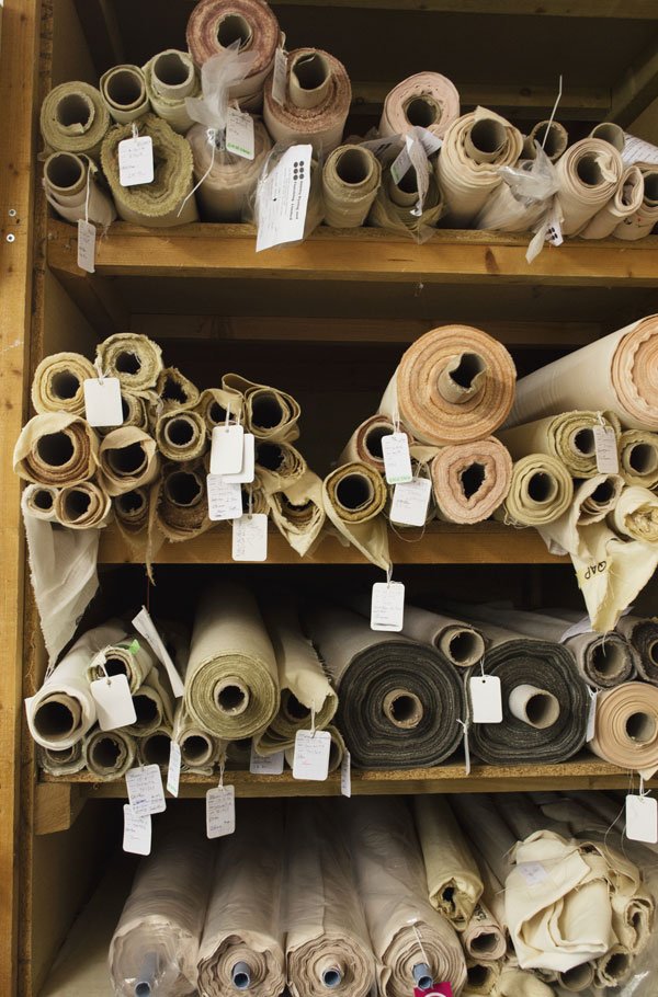
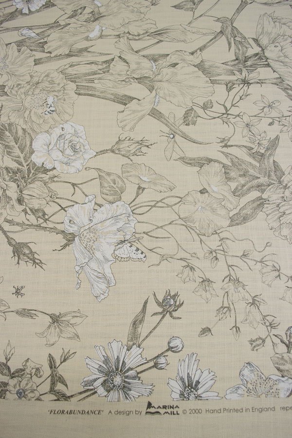
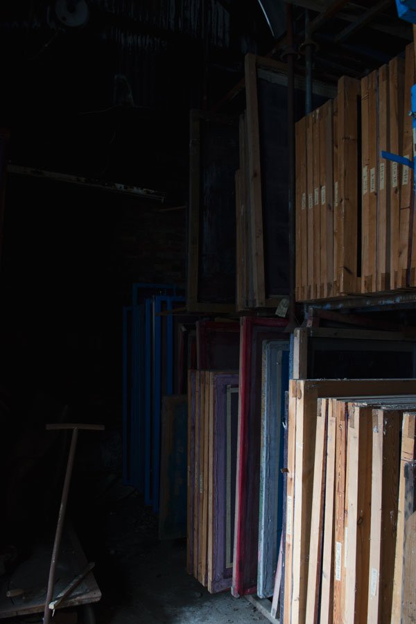 This large Victorian shed houses their entire print archive, row upon row of screens hiding yet more elaborate designs. Tandine expressed that she would love to have their own regular collection in future, so perhaps these will see the light of day again soon?
 Much of the cottons they use to print on are British made which makes me love what they do all the more. It's so rare to find a company with such a rich history that has survived the test of time, much less a stones throw from me. Whilst they continue to adapt to the market (including supplying to the Superyacht industry), I'm happy to see that they hold on to their origins and in turn support other British companies too.
Photography © Tiffany Grant-Riley
Grey-Blue Kids Room Inspiration
 Lately I just can't get enough of grey-blue. I've noticed for months now that this colour has been jumping out at me everywhere - I can pick out the tiniest glint of it at 100 paces! I find it really soothing and love how versatile it is against bright and muted colours alike. Have you noticed it popping up on your radar too? When we started working on the kids room, I wanted to find an accent colour that was a little different from the pistachio green they had in their last room which worked well with bright whites, the black in the fireplace and pale wood. Although it's quite a classic colour suited to period homes, it translates beautifully to more contemporary spaces too, and given that we're working to blend the history of our new home with a more modern style I felt a grey-blue would fit perfectly. I'll tell you more about my ridiculous quest to find the right shade when I share my next bedroom update, but for now, here's three grey-blue kids rooms which caught my attention...
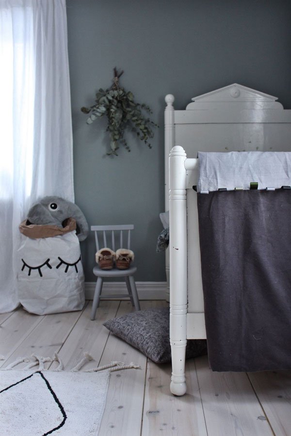 A darker shade of grey blue creates a sophisticated, restful environment, especially with the pale wood floors. Here, Emily Slotte has mixed in vintage floral textiles and crumpled linens in her son's bedroom making a cosy space for bedtime.
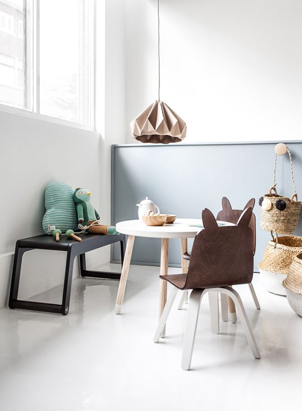
 Maiju Saw combines flea market finds and natural textures in her children's room, blending a darker grey wardrobe against the wall colour for subtle contrast.Whilst it's not always possible to introduce the colour onto your walls (particularly if you're renting) there are other ways to incorporate it. Rafa Kids have used additional low level wall panelling made from painted MDF or plywood (see first image) and created a zoned play area from the space. Alternatively, look for accessories in varying grey-blue tones for depth such as storage baskets, bedding and rugs. If you're looking for paint, try Celestial Cloud by Dulux or Farrow & Ball's Oval Room Blue.
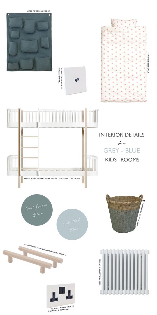
Wall pouch, Numero 74 at Smallable | Star bedding, H&M | Toggle light switch, Dowsing & Reynolds | Black + white socket, Dowsing & Reynolds | White + oak Scandi bunk bed, Oliver Furniture, Nubie | Grey storage basket, Numero 74 at Smallable | Bench door handles, Chocolate Creative | White column radiator, Wickes
MENU | Minimalist Design SS17 Collection
 As far as Scandinavian design goes, MENU is pretty high up on the list for always reinventing simplistic, minimalist furniture through a collaboration of super talented designers. Yes, the SS17 collection is every bit as desirable, if not more now that MENU have included a collection of absolutely beautiful seating demonstrating a less boxy approach to comfortable sofas. Can we just take a minute to talk about the Tailor sofa, please? Created by Portuguese designer Rui Alves who was inspired by his grandfather's favourite tailor shop, drawing on a sense of authenticity, remembering suits handing on wooden hangers and the tailors working over their benches. Every part of this sofa is meant to be seen and admired, from its scooping structure made from oak, the wooden joints and the general flow of the piece. I can't imagine a better piece for our living room now either. Ok, well a girl can dream...
 Smaller details include the Glow Hurricane candle holder designed by Norm Architects. Inspired by traditional oil lamps, it casts a soft glow from its opaline glass top which sits on top of a bronzed solid brass base.
 Benches continue to make themselves at home in 2017 as really a versatile piece of furniture, so I'm really pleased to see the Meet Bench amongst this collection. It's perfect for two to sit on but also works well as an occasional table - I'd use it in the hallway to keep our unruly shoes under control, although it'd be an equally perfect home for our growing family of plants too.
 Spring and summer sees a continuation of minimal luxe style using quality materials, from marble and oak to smoked glass and solid bronze. Practically perfect. Which design speak to you?
All photography courtesy of MENU.
A Year In Curate & Display | The Best Of 2016
 Well, here we are - the very last day of 2016. How was your Christmas break? Despite all of us coming down with a delightful illness, we still managed to celebrate, slow down, get out and explore and generally make the best of the not-so-good situation! If nothing else, I think it was sending a strong message that we need to listen to our bodies and give ourselves time to just be. I think maybe self care will come up a little higher on my agenda next year!I'll keep this post brief, but before I sign off, I wanted to run through some of my highlights of 2016. It was an unexpected year of travel, of being brave and jumping off the deep end. Annie and I took our design community Function+Form to new heights, collaborating with Houzz UK on two very special home tours, teaming up with Centrepoint charity to shout about their new Dean St Cafe project and organising a bloggers tour to Antwerp to discover new design talent.Just before Christmas I wound up working on a shoot with Pinterest UK for Stylist Magazine's 'Handmade Issue' which was nothing short of a dream come true (see the couple of quick shots I took from the day).We finally bought our own home again after three uncertain years of renting and even though looking around me now as I type I can see countless money-draining jobs that need doing just from my seat alone, it'll all be worth it to experience the journey and share our house joys and woes with you. Heck, you might even find it useful too!
Curate & Display's Top 10 Posts of 2016 (in no particular order)
- A Place To Stay | Hotel Alexandra Hilton, Barcelona
- The New House | The Before Tour - You can follow our updates on Instagram using #TheChathamHouse or see our sources of inspiration over on Pinterest.
- Essentials For New Nordic Kitchen Style
- Monochrome Hackney Loft Conversion
- A Nina+Co Coffee Break
- Milan Interior Highlights | Mater Design
- Bright Creative Renter Friendly Kids Room Decor
- London Design Festival Highlights
- Urban Jungle Book | Living + Styling with Plants - It was a real honour to be involved in the book and part of such a wonderfully green-fingered community.
- Travel Antwerp | St Vincents Lifestyle Store - a real highlight from our visit to Antwerp in October. #BloggersTourAntwerp #WeAreFunctionAndForm
So thank you for stopping by here and supporting Curate & Display - 2017 will be its third year and so we felt it was time to give it a little renovation of its own. I can't wait to share it with you!Have a very happy, fruitful, comforting, challenging (in a good way) 2017 and I'll see you on the other side with more contemporary design, travel tips and house renovation anecdotes.Tiff X 
Photography & Styling © Tiffany Grant-Riley
Christmas Styling Inspiration | Minimal Wreath
 I'll be honest, I'm about as prepared for Christmas as...well, someone completely unprepared, so I'm looking for quick festive fixes this year like this minimal wreath, I'm all for simple Scandinavian style-particularly at this time of year. This one is now hanging on our front door, but the plan will be to make a couple more of these to group together on the wall in our living room and to have as part of our Christmas table. The beauty of these wreaths is that they're quick to put together and they always look beautiful - embrace the imperfections!I've used longer lasting greenery from the garden and cuttings from the Christmas tree alongside fillers you can find at your florists. You might want to substitute the harder to find items (like the cotton flower) for others to make life a little easier, which is entirely the point!
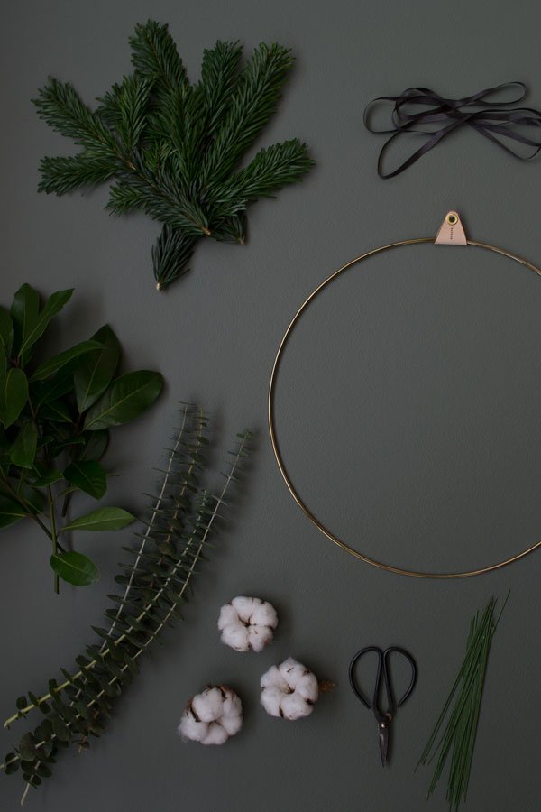 You Will Need:• A brass wreath ring (mine is a design by Strups) or a wooden embroidery hoop.• Florists wire - use a thinner gauge that you can wrap with.• Bay tree cuttings.• Eucalyptus - I've used Baby Blue for the structure.• Fir tree cuttings.• Cotton flowers or an alternative such as waxflower or winter berries.• Ribbon.
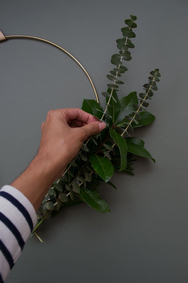 Make two more or less identical bunches with the greenery, layering them up until you have the desired look. Wrap them with wire at the base of each. If you have cotton flower, gently push a piece of florists wire through the centre of each leaving a length of the wire on either side. Alternatively, create a small posy with berries or waxflower.
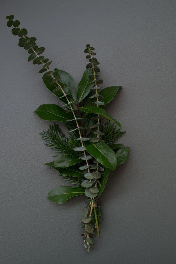
 Place each bunch exactly where you want them to sit on your wreath. Use short lengths of wire to secure each bunch at the base and further up the ring, then add in your cotton flower, wrapping over the top of the ends to disguise them. I like mine a little off-centre.
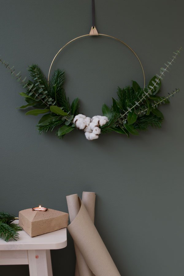 And that's it. Find somewhere to hang it and you've time left to
 freak out about how much you've still got to do pour yourself a drink and admire your handiwork. Oh, and maybe take a look at my Scandinavian Christmas Table inspiration from last year...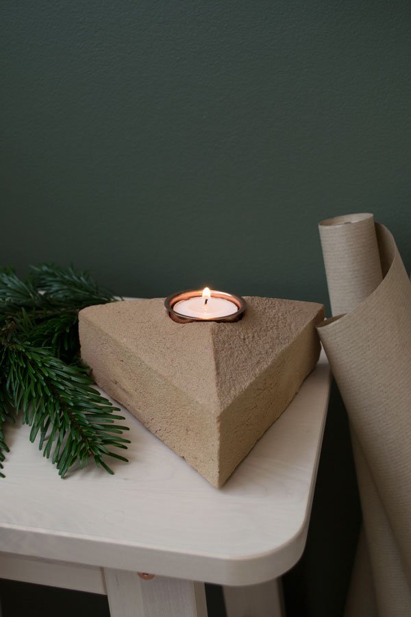 • Sand cast brick tea light designed by Lane By Post.
Photography & Styling © Tiffany Grant-Riley
Spanish Design | Xavier Mañosa and Apparatu
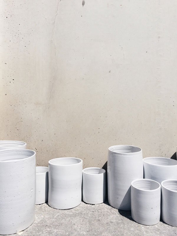
 One of my biggest loves in life, aside from plants, is ceramics. I'm always fascinated by the process, from the type of clay, the quality of its texture, the shaping, the firing, glazing. Each piece tells a story and sometimes even the maker's marks can be found somewhere on the surface. So I thought that it's high time I brought you more from my travels to Spain back in July and our visit to meet designer and ceramist Xavier Mañosa at his workshop, Apparatu. It seems a world away now as we said goodbye to Marset and headed out of Barcelona to a quiet industrial estate in Rubí, wondering where on earth we were! The only tell-tale sign was a large skip filled with broken shards of pottery and a stack of rejected vases...
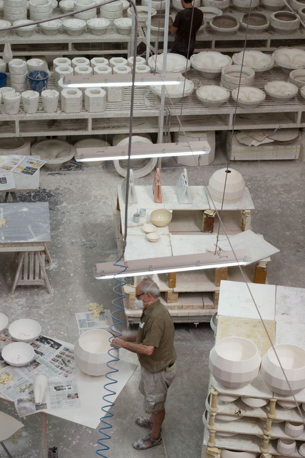
 Inside the large unit was a hive of activity, despite the heat from the midday sun and the large kilns. Everything was covered in dust, with stacks of pottery at various stages and large casts slowly drying. Absolute heaven for me!Apparatu is a very close knit team with Xavier and his parents at the heart of it, who began the pottery workshop forty years ago. Growing up in such a creative environment must have had some effect on Xavier, although despite studying industrial design and moving out to Berlin, he didn't find his way back to ceramics until he started collaborating with design trio Mashallah Design, experimenting with more graphic, three-dimensional shapes. He moved back home and into his parents workshop, bringing their very traditional business into the here and now, producing pieces for the likes of Marset in the Scotch Club and beautifully fluid Pleat Box lamp collection.
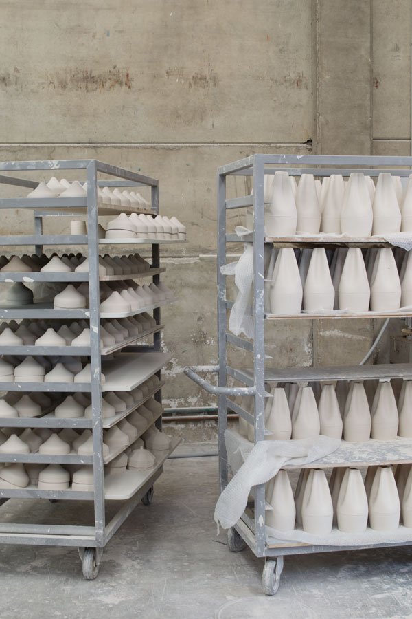
 The lamps are made using moulds filled with a liquid clay (secret recipe) allowing them partly to dry before draining the remains away and leaving a shell to form. It's this that becomes the basic structure of the lamp which is fired several times throughout.You get the sense that you are entirely at the mercy of a slow and exacting process here - if the air is too moist or too dry it greatly affects the quality of the casts. Each piece is painstakingly examined, sanded down for smoothness and glazed by hand. Anything that doesn't make the grade is discarded. Although I was captivated by the glossy gold insides of the Pleat Box lamp (did you know that the glaze is brown?) my real loves were seeing the stacks of shades at their bisque stage after their first firing - a clean, crisp white. Aren't they stunning?

 It is hard to capture the feeling inside this space from a few photographs, the close bond shared by the Mañosa family or the connection between their past and future as Apparatu, but Xavier goes some way to explain it in this beautiful film 'Reflections on Light'.The Sunny Design Days Tour was kindly organised by the Association of Spanish Design.
Belgian Design | Universo Positivo Furniture
 During our Function+Form Design Tour in Antwerp, we were introduced to three Belgian furniture brands - Ethnicraft, Universo Positivo and Notre Mond inside one of the oldest buildings in the city. Located just off the Kloosterstraat (which is the place for antique and vintage shopping by the way) and dating from 1541, this beautifully higgledy-piggledy building is now home to seasonal concept store Quatuor. Across three floors, each room stems from a narrow staircase, leading through to other smaller spaces all styled for the winter season with pieces of wooden furniture from these collections. Unfortunately, as the light was somewhat lacking, I'm sharing my picks from Universo Positivo's Look Book instead. I promise you won't be disappointed...
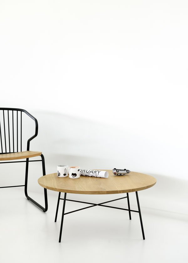
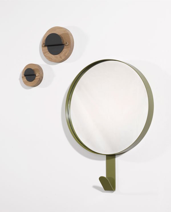 The brand was initiated by Ethnicraft (to be featured next week) and husband and wife design team Jan and Lara who collaborate on each collection with eight other European designers. In 2013 the team debuted their collection at Maison & Objet in Paris with its contemporary, minimalist style, featuring warm oak combined with lacquered metal. How could I not fall in love with the simplicity of each piece and how the materials are celebrated for what they are.
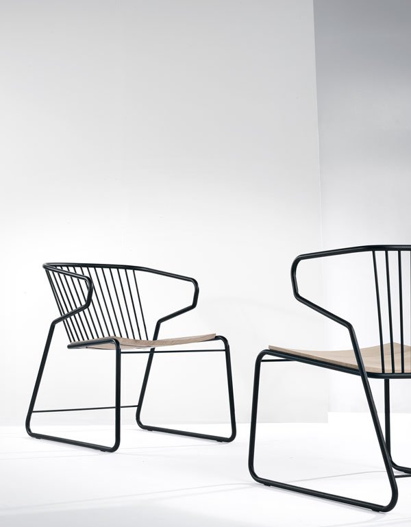 Jan and Lara wanted to create multifunctional, affordable furniture with a focus on timeless aesthetics. Most importantly though, Universo's products are all produced within Europe, using sustainable materials. I could really see my personal favourite, the Gabbia chair, at the head of a table or as a feature piece in the bedroom - it has such a striking form with its black metal curves.
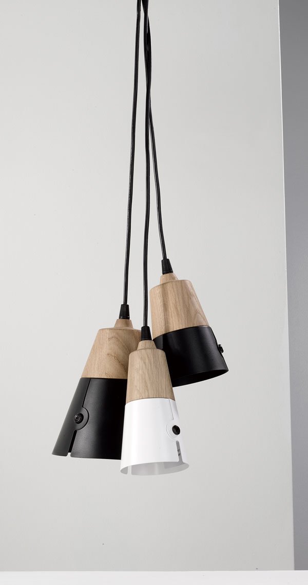
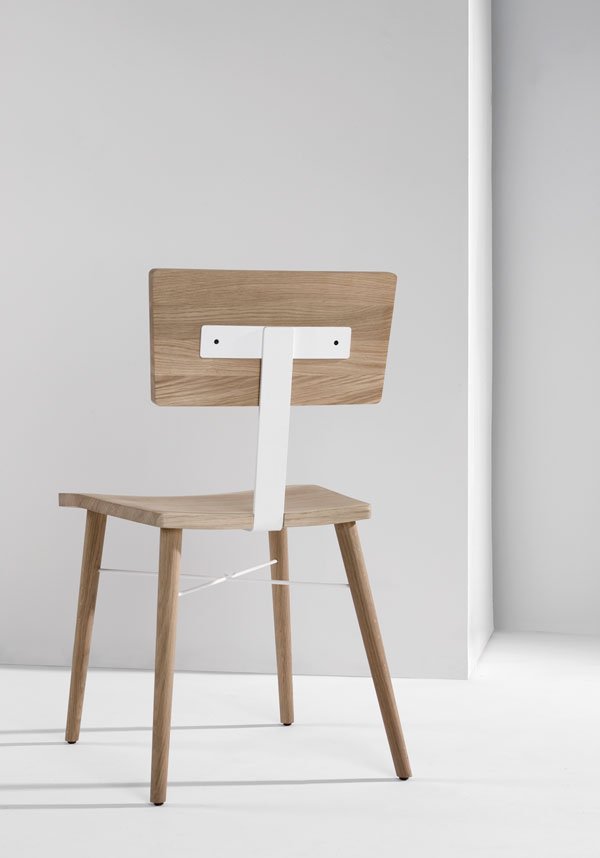
 Check back next week to take a look at the Ethnicraft collection, particularly if wooden furniture is your bag...Our Function+Form Bloggers Design Tour to Antwerp was organised in collaboration with Pentacom PR, City Of Antwerp and the Design Centre Winkelhaak.Check out our hashtags on social for more: #BloggersTourAntwerp #WeAreFunctionAndForm.
Nubie | Contemporary Kids Room Style
 Ever since we started making plans for the new kids room, I knew that I wanted to find extra special furniture for their space. I'm talking the kind of furniture for design loving parents that the kids love too, something contemporary with Scandinavian influences. I have to say, my initial search for bunk beds left me feeling rather cold - everything I found seemed a little too traditional, safe. Maybe even a little boring. And then I found Nubie. Can I get a "hell yeah!"?
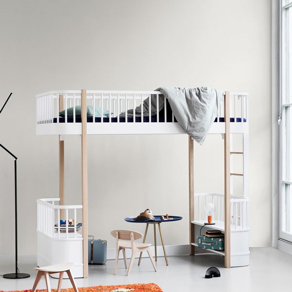 Nubie was launched eight years ago by a parent with similar experiences to mine who felt frustrated by the lack of unique, stylish and well designed kids furniture. Having sourced the best in children's products around the world, Nubie is now a one-stop online destination for wow factor kids room design. There's not much you can't find here, including bedding, wallpaper, toys and wall hooks alongside beds and desks, all of which is beautifully considered and produced to a high standard.
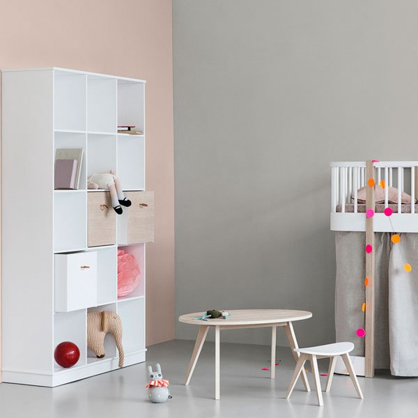 Some of my absolute favourites come from brands such as Oliver Furniture based outside of Copenhagen, Oeuf NYC, Ferm Living, Nobodinoz from Barcelona and Cerise Sur La Gateau for a spot of quirk. I love the simple pale wood furniture, the organic, tactile shapes and pops of brightly coloured textiles. Just the way I'd like their room to be when we finish in a couple of weeks (keep your eyes peeled!)
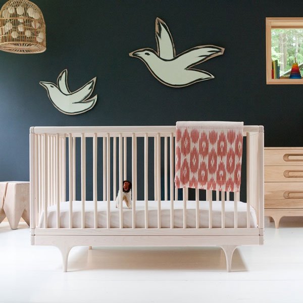 And in case you're feeling jealous that the kids get all the fun, Nubie also has a range for grown-ups too. Although that may be for another post...
1. Play kitchen, Sebra | 2. Rabbit cushion, Ferm Living | Lina Dotty cushion in Peacock, La Cerise Sur La Gateau | 3. Babou black shelves, Rose In April | 4. Paloma wool rug, Olli Ella | 5. Oak Ping Pong chair, Oliver Furniture | 6. Mint storage bench, Flexa | 7. Jute rug with blue sticks, Ferm Living | 8. Brooklyn child to teen desk, Oeuf NYC
Travel Antwerp | St Vincents Lifestyle Store
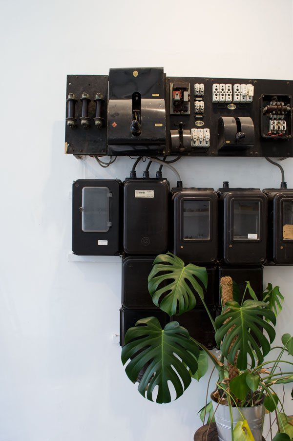 Back in October and almost a year since we launched, Annie and I hosted our first Function+Form Bloggers Design Tour over a long weekend. We started Function+Form as a way to bring together like-minded individuals through a love of design and interiors, giving new and more established designers a platform to share their work and process through our intimate gatherings held three times a year. After our second event in the spring, we felt ready to explore the design world beyond London and decided to find a city with a relatively untapped design community. We chose Antwerp. A cosmopolitan city famous for its fashion creatives - Dries Van Noten to name but one, for its gabled stone townhouses, sprawling harbour, De Koninck Brewery...but beyond this, we knew that readers looking to discover a new and emerging city would have plenty to explore here.Kicking off my new series 'Travel Antwerp' which explores the merits of Belgian design and lifestyle in this young city of design, is shopping destination and lifestyle concept store St Vincents. This is an absolute must, not only for the carefully curated homeware and fashion, but the location alone is reason enough to spend at least an hour soaking up the interiors with a freshly brewed coffee from the cafe - of course. And you're encouraged to stay as long as you like, although be warned of the desire to want to buy everything, particularly if you've only got a carry-on case. This place makes me want to give up plastering our walls in favour of rough brick (you'll see what I mean) and set myself to task building dark green chipboard cupboards for the kitchen. It totally works.
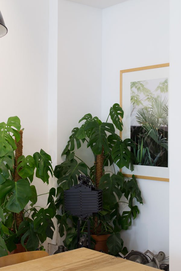
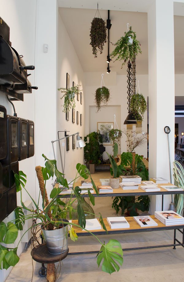
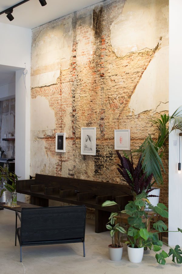 A very recent addition to the city, the store was opened in December 2015 by economist-lawyer duo Henri and Geraldine. Originally an old printing office, the store is an ever-changing home to a thoughtful selection of design ( naturally I came home with Hasami plates), coffee table reads, stationery, art and clothing. Virtually everything here is for sale, including the furniture. A well considered space free of clutter, St Vincents is made all the more welcoming for the abundance of green houseplants who are well cared for and flourishing here.
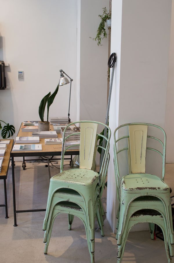
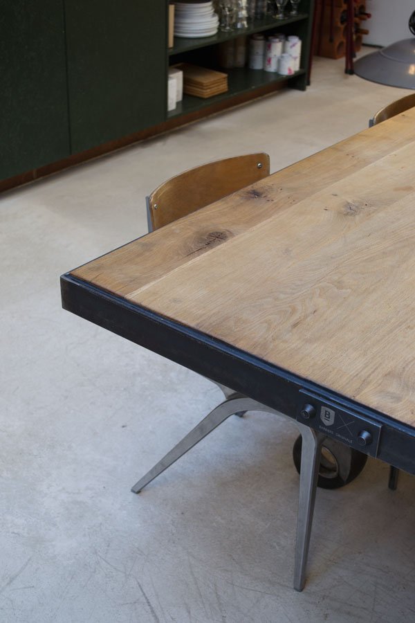 To see more from our Antwerp city break and the group of bloggers who joined us, check out #BloggersTourAntwerp and #WeAreFunctionAndForm on Instagram.St Vincents | Kleine Markt 13 | 2000 Antwerpen | Belgium Open: Mon - Sun 10:30am to 6:30pm (closed Tuesdays) Our Antwerp city break was organised in collaboration with Pentacom PR and Design Centre Winkelhaak. To find out more about joining one of our Function+Form events, take a look at our website.Photography © Tiffany Grant-Riley
Urban Jungle Book | Living + Styling With Plants
 From time to time I'll review a book here that I think will be something you yourselves would love to own, either as thing of beauty for the coffee table (I still don't own one yet by the way) or as a useful resource for your own home.It goes without saying that I'm a little more invested in this one than most as it's written by two good friends of mine. Igor Josifovic and Judith De Graaff are fellow bloggers and founders of the Urban Jungle Bloggers community which they started in 2013 having discovered a mutual love of plants. Their community has grown immensely since then, proving that plants are beneficial to our emotional well-being as well as enhancing our homes visually. Earlier this spring I shot a few spaces within our home for this very book and I'm really proud to see them here amongst such a lovely group of plant lovers.
 This urban jungle book, titled 'Urban Jungle - Living and Styling with Plants' is a joyous celebration of indoor gardening. Whether you're new to botanicals or more experienced, this book is a friendly and informative way to immerse yourself.
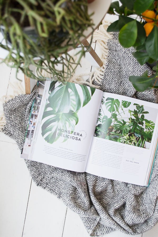
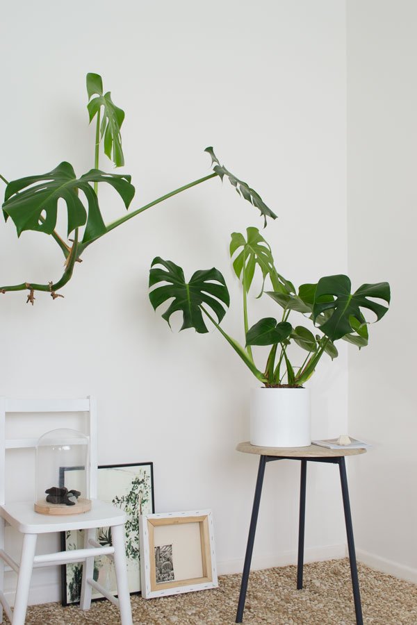

 Focusing on 11 varieties of plants, the book mixes tips and advice for plant care and propagation with beautiful images from the homes of Urban Jungle enthusiasts across the globe. There are DIY tutorials for more hands on creative planting (I'll be sharing one of mine with you next week) and styling inspirations, interleaved with illustrations by Saar Manche. A truly inspired read, this Urban Jungle book will motivate anyone (however black fingered you think you might be) to start growing their own little garden and I can't wait to continue that journey with mine.
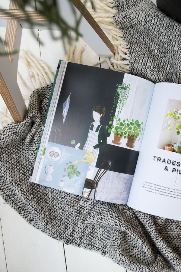 You can order your copy direct from Amazon, currently available in the U.S, UK and Germany, published by Callwey.
mahabis | Slippers For Kids
 When creators of the most stylish slipper known to man hinted about a kids collection at their launch last year, I was excited to say the least. Kids slippers are a bit of a bane to be honest, they're either covered in gimmicks which become old and boring when the novelty wears off or they're badly made. Given that I wear my beloved mahabis every day at home (and out in the garden) I couldn't understand why anyone hadn't already put an indoor/outdoor slipper in production for kids. It's just common sense, right? As expected, mahabis did not disappoint and Reuben has been walking a little taller in his "grown-up slippers" since his arrived at the weekend. They share the same minimal design as their adult counterparts, they're just a little bit smaller.
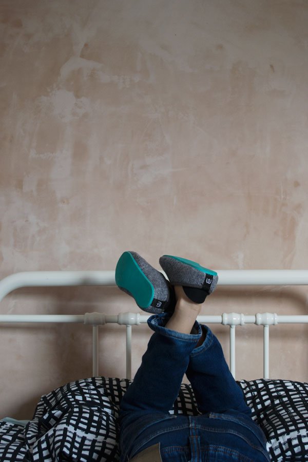
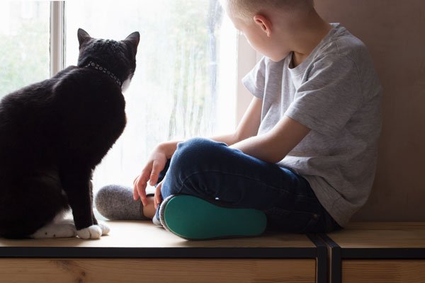 The kids collection comes in the Classic and Summer slipper design with the same choice of coloured soles to choose from - Reuben went for Gotland Green. The only difference is that the outdoor sole is perminantly attached, so you don't have to try to put on or remove them in a rush (kids never stay still).
 Sizes range from 28 to 35 (that's UK 10 to 2.5) and there are plans to make smaller sizes soon. I'd go so far as to say that shopping for kids slippers is going to be whole lot easier from now on...don't you think?
 #mahabiskids
Photography & styling © Tiffany Grant-Riley
How To Paint Wooden Floors | A DIY Guide
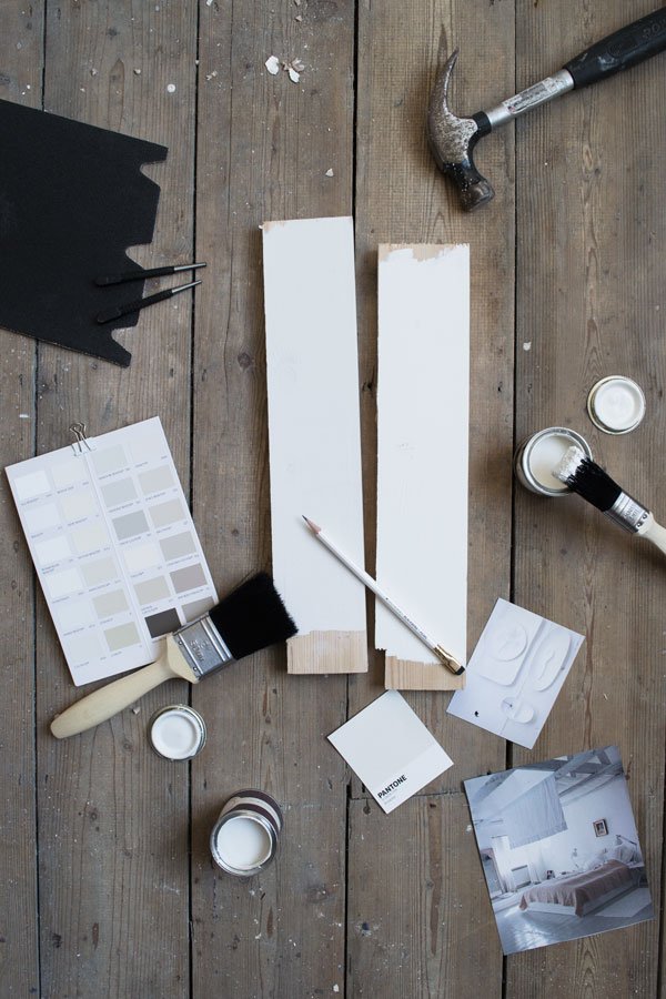 In the weeks before we finally moved in we'd been working on our new home and I thought now would be the perfect time for an update on progress in the kids room with a guide to help you paint wooden floors.Having stripped away the thick layers of painted wallpaper (see how it looked in the before tour) and discovered the good and the not-so-perfect crumbling walls beneath, we called in an excellent plasterer who got the job done in a couple of hours. The blue carpet came up without a fight (or any underlay!) to reveal the floor which aside from a small amount of carpet glue and a few layers of dirt on top, were in great condition. As it's a really bright room, we wanted to go with a white floor, picking out a couple of shades from Farrow & Ball and settling on Wimborne White which has warm tone to it.They say the best way to learn is on the job...we began the process virtually clueless but now with experience under our belts I think we have a definitive guide here. Let's get to it...
 FOR SANDING AND PREPARATION• Commercial floor sander-we hired ours for around £70 a week from a local company.• A mix of grade sanding belts for the sander ranging from 40 to 120 grit - you can purchase these when you hire the sander.• Palm sander for the edges of the room. The Bosch PSM 200 AES has two different configurations for sanding at angles with a built in dust box.• A punch tool (these allow you to drive the floor nails in without damaging the wood).• Drill - the Stanley Fatmax cordless is pretty nifty with two batteries.• White spirit.Before you go anywhere near a sander, check that all nails and screws are well secured into the floor, otherwise you'll go through all your sanding belts in no time when they tear them. If your floor has the original nails, use a punch tool and hammer them in to just below the surface of the wood, otherwise you can secure any wobbly boards with screws.On an older floor you'll find that boards have often been cut and removed at some point to make way for electrical and plumbing work. These will need to be secured. Lift the loose boards first to make 100% sure of what's underneath before you start drilling or screwing - you don't want to hit a pipe or wire.Drill pilot holes and use a countersink bit (fairly generously) before screwing to ensure screws sit below the surface of the floor. Then you can simply fill over the top and you'll never see them. Obviously leave exposed any that you may need to unscrew again in the near future - these can always be filled and touched up at a later date.Vacuum any loose dirt from the surface and grooves between and scrape the join between the skirting and floor if you have one to avoid painting in bits of dirt. Give the floor a wash to remove any more surface dirt before you sand.TIP: Is there any carpet glue left? You can use white spirit and a scraper to remove the worst of the residue, then the rest should come off with the sander.You can now begin the fun part-the sanding!
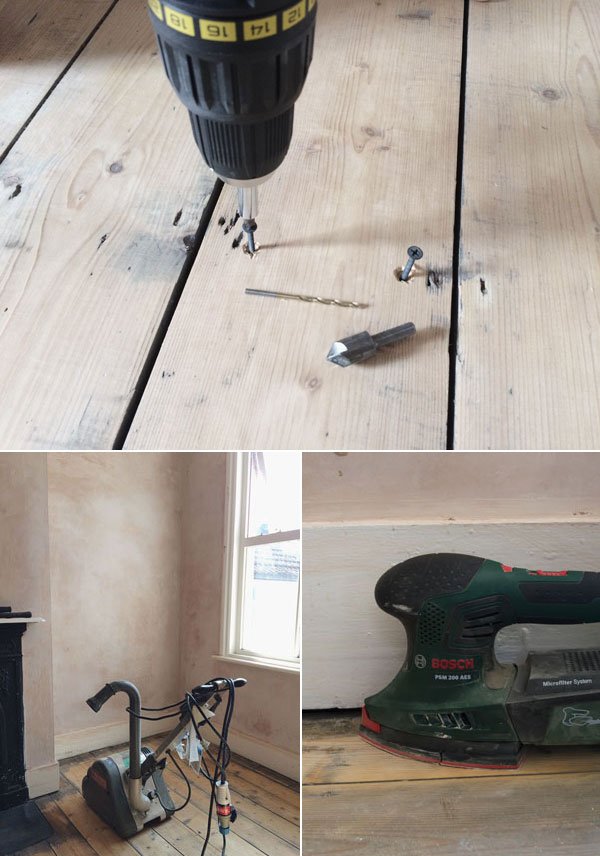 It doesn't matter which way round you approach it - we did the main part of the floor first and the edges last, but you need to make sure you remove the layers until the wood is looking brighter. Start with a heaver grade such as a 40 grit first to remove the ground in dirt, then finish with a finer grade for a smooth finish. Make sure you're happy with the feel of it under foot as once you've painted there's no going back.
TO PREP FOR PAINTING
• Wood knotting solution.• Wood filler. You can make your own from the sawdust mixed with Bona Mix & Fill or use an all purpose filler.Vacuum and wash the floor again to remove any residual dust and dirt and leave it to completely dry. You might need to repeat this stage a couple of times so as not to paint the dust into the floor. Not nice. It's always advised when painting any wood to ensure that you treat all the knots with a coat of knotting solution to stop them showing through the paint afterwards. In some cases, the knots might be sappy and I'm told that if you treat them with a heat gun you can draw the sap out and scrape it off before you knot them. Just be really careful.Fill any large gaps in the boards with the filler, allow to fully dry and then sand smooth by hand.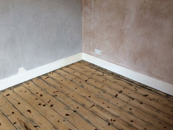 READY TO PAINT• Undercoat and primer - try Farrow & Ball's light and pale undertones for white floors.• Good quality floor paint - we used Wimborne White by Farrow & Ball.• Good quality paint brushes. Trust me, you don't want to be picking loose hairs out of the paint.
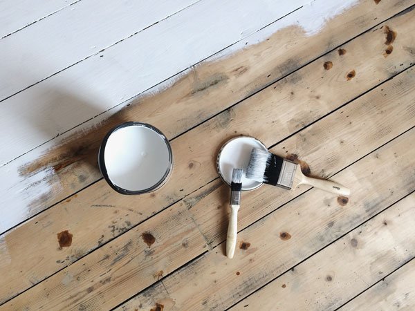 Now you can get on with the painting. Give the floor another vacuum to remove any last bits of dust including underneath the skirting boards then apply a layer of undercoat and primer. Go around the edges of the room first with a small brush, then fill in with a larger one, making sure to paint yourself out of the room. Don't maroon yourself! Once the undercoat is dry, follow the instructions of your paint of choice for the topcoat. This floor required two coats of the top coat and it has a slight satin finish for heavy duty wear.TIP: You might not like the look of the wood showing between each board - I didn't, so I was quite liberal in working the paint in between the joins.If you've time to, leave the floor to cure for a few days. We left ours for approx. 10 before putting any furniture onto it and I think it made a difference to the finish.
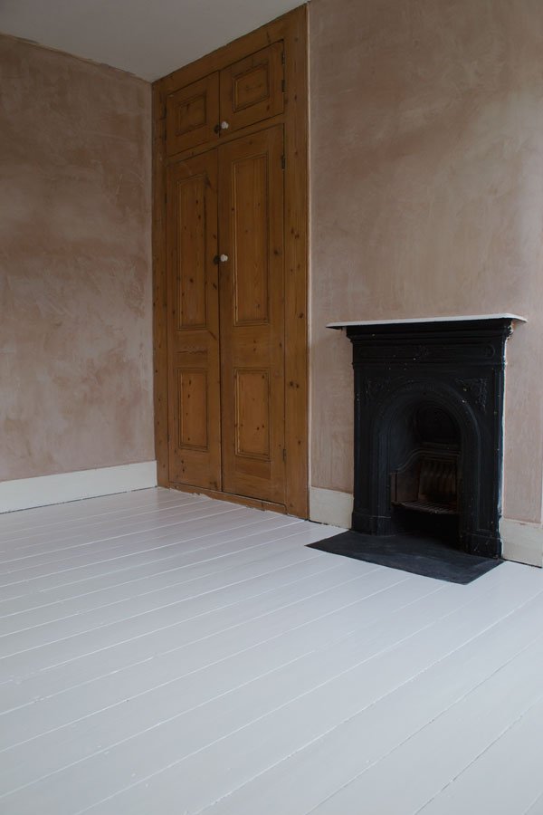 And here's the finished floor. Pretty sweet, right? It's worth remembering that painted floors will always chip eventually, and that's part of the charm, but for now, the kids are enjoying playing on it!Next step? Prepping the ceiling, walls and woodwork. More on that and the colour we've chosen soon...Got plans to paint your floors? Has this been useful? You can follow our journey with #TheChathamHouse on Instagram and join the conversation.Photography © Tiffany Grant-Riley
*This post is in collaboration with Homebase.
London Design Festival / Highlights
This year's line-up at the London Design Festival was just too much for me not to make an effort to turn up to see, and given that it was pretty much three weeks ago already, it's taken me a while to get through it all! With so many incredible shows and exhibitions open across the city, it was a difficult task to choose where my focus would lie over the course of my two day escape, so I focused on the east. Here are my highlights - hold on tight for the eye candy!
Bare Minimum at Viaduct
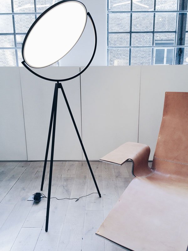 During a tour of the Clerkenwell design quarter, we began at Viaduct for the Bare Minimum exhibition, a beautifully curated selection of minimalist furniture and lighting. The focus for the show was to highlight a fresh perspective on minimalist design, exploring the detail in choice of materials, textures, shape and colour. Designers included Jasper Morrison, Giapato & Coombes, Maarten van Severen and E15.
100% Norway
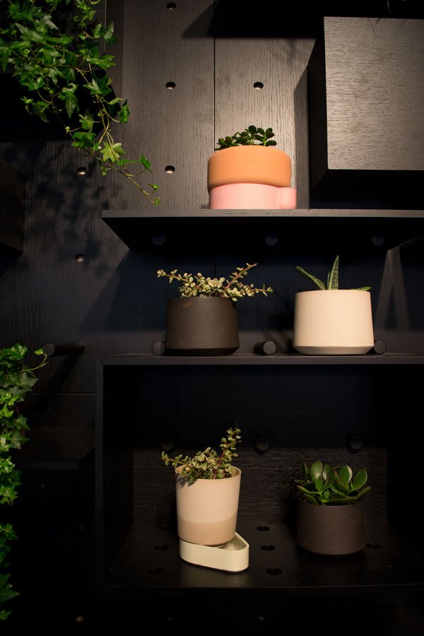
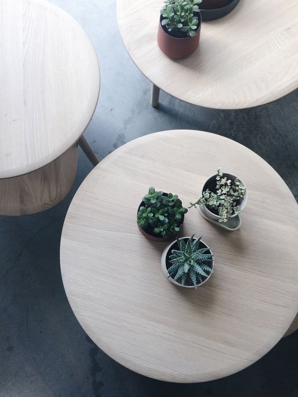 It's pretty evident (and exciting) to see that the botanicals trend is showing no sign of slowing down, and ceramic artist Ann Kristin Einarsen's planters were top of my list to visit at 100% Norwary. Give me smooth, matt ceramics, throw in some green planting and I. Am. There. A woodcrafter turned ceramics designer, Einarsen's inspiration for the two tone Rolla and Sip planters were the salt and pepper grinders created for Muuto. Currently a protoype (I desperately need these!) the user is encouraged to mix the pots and bases to create a different look for their indoor plants. Yes. Please.
London Design Fair
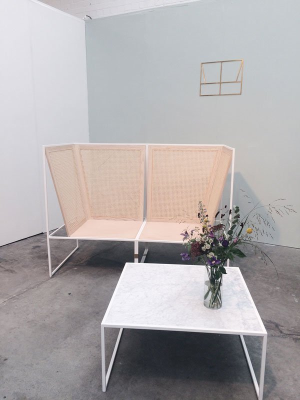 Seen earlier this year in Copenhagen and causing quite a stir, the #80 White modular sofa by Camilla Aggestrup was, I thought, every bit as stunning in the flesh. Designed for commercial spaces, the sofa can be split into single seats or added to according to its use. With a woven, transparent high back it gives a sense of privacy and I loved its simple, graphic shape.
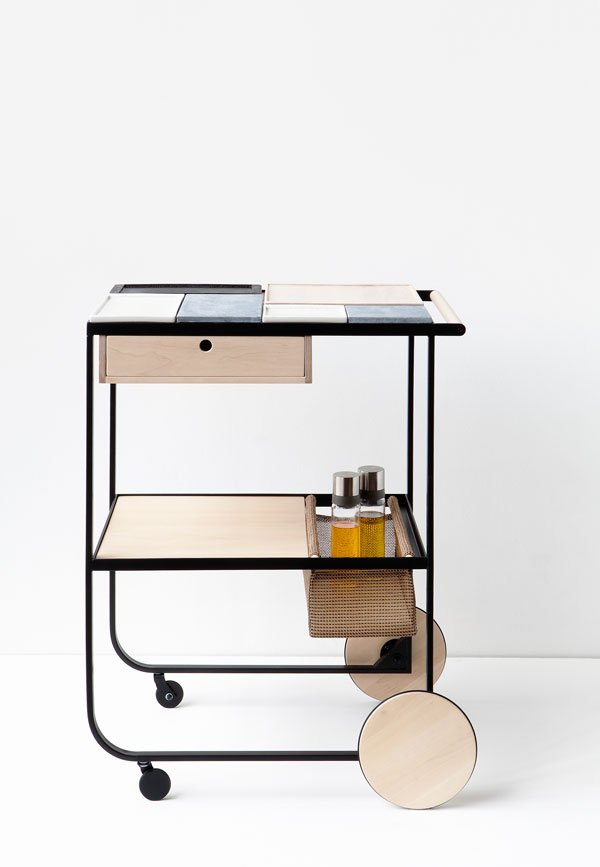 The serving trolley has started to become a more familiar site within our homes again following its popularity in the 50s and 60s and home entertaining. Finnish designer Maiju Uski's contemporary take was designed to serve the different actions of cooking and serving with its steel frame, niche to hang useful things and small drawer The top of the trolley holds a tactile configuration of wooden chopping boards, soap stone platters and porcelain plates. I could really see this as a portable home for plants too, but then I would, wouldn't I!
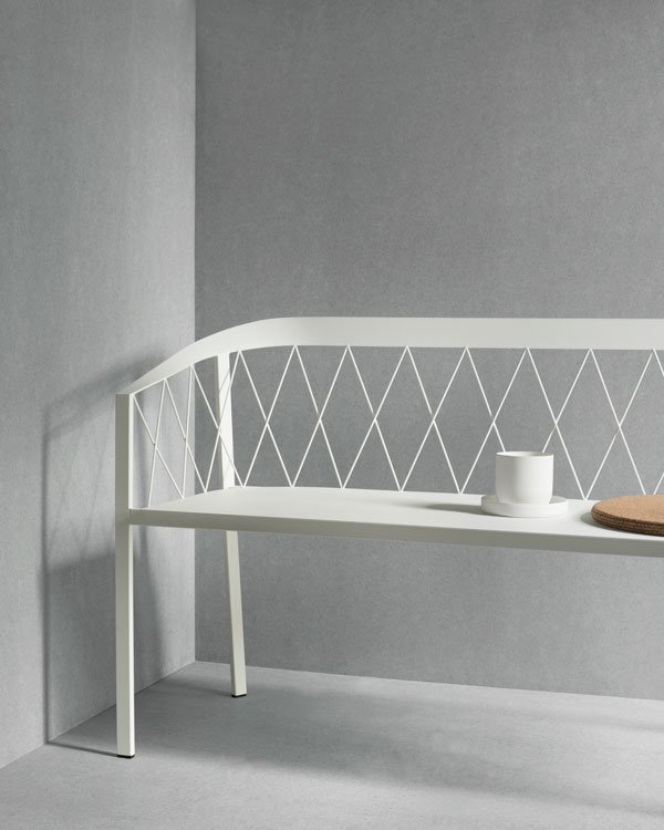 With day beds and benches becoming a more portable alternative to the sofa, I was pleased to see the collection by Danish brand Friends&Founders. Based on their "favourite spot" philosophy, founders Rasmus and Ida Linea Hildebrand design multifunctional and multi-spacial furniture to encourage indoor/outdoor use and flexible living.
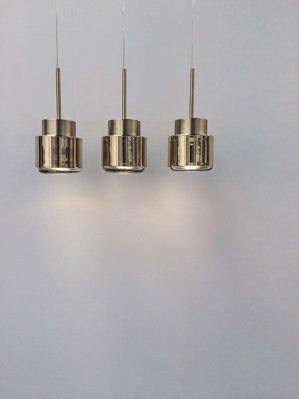 Young Mexican designer David Pompa combined traditional Mexican techniques and contemporary style to create his lighting collection. Using a combination of handblown glass, pottery, polished metals and woven PVC, Pompa's work is putting new Mexican design on the map. I was particularly struck by the barro negro (black pottery) found in Oaxaca which through a process of smoking gives its metallic effect used in his designs.
Mini Living Installations by Asif Khan
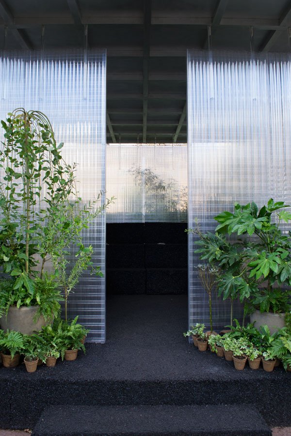 The most stand-out piece from the whole week was the Mini Living experience, a series of three small scale urban gardens in Shoreditch. Designed by architect Asif Khan in collaboration with horticulturalists and plant designers Conservatory Archives, each installation was created to explore solutions to urban living as spaces to relax and connect with others. These fully immersive forest spaces felt like a cocoon, with transparent walls letting in soft light and a variety of plants which members of the public were invited to take home after the festival as a continuation.
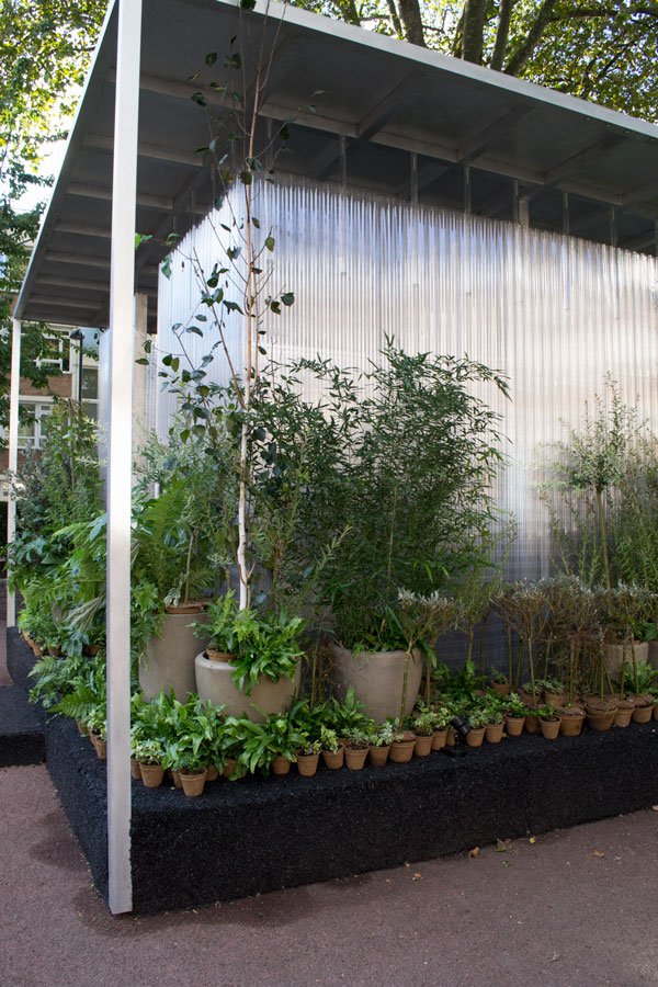 Did you managed to see anything of note from the festival this year? Tell me what I missed!
A Minimal Minute / September Musings
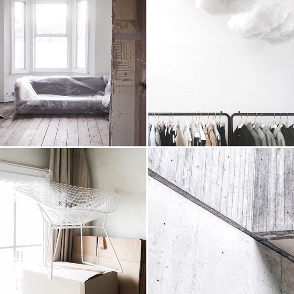 If you follow me on Instagram you might already be familiar with #aminimalminute, a hashtag I started with friend and fellow slow living advocate, Ilaria Fatone. We started this together at the end of last year to pool together moments of slow living and minimalism and to share our own. Quiet moments to pause. It could be a beautifully designed piece of architecture, a thought during your day, a corner of your home. And home has been playing a huge role in our lives over the summer - perhaps that's why I chose home and moving related images in my selection this month! Thank you everyone for the beautifully composed photos (credits below).I honestly feel like slinking off to hide inside a dark cupboard on my own right now. With D-Day for the move looming, I'd rather just curl up and come back out when it's all done. There is just so much to do. And underneath all the elation of finding our family a place of our own again, there's still the weight of all the work we need to do to leave this house ready for the next tenants. There's the painting over, the patching up, the cleaning, the digging, the sweeping. And the new house? My goodness, where to start. It is overwhelming. My ability to see the wood from the trees has failed me. Even though we are slowly getting there, making the kids room our first priority (the first few stages of that will be up in the next week or so) there is just so much to think about. But I guess making a home from scratch takes time right? So it's just baby steps, every day.Already this house is beginning to echo. I've finally started packing up my workspace, taking extra time to enjoy the light in here before I roll up the rug and unscrew the pegboard. And the thought of actually leaving in a few weeks time leaves me with that awful homesick feeling. We don't really want to leave. Don't get me wrong, the chocolate brown carpet, 70s gas fire and temperamental boiler will not be missed, but so many happy things happened here. I welcomed in my 30s with friends who surprised me from Holland, Reuben started nursery and school from this house, we made forever friends, brought home our newborn daughter, nurtured all the plants here. I even started this blog from this house, worked on a couple of beautiful books, planned shoots, came home happy and weary from travels abroad.We will miss it all so much.Images © Top Left: @catesthill Top Right: @septemberedit Bottom Left: @tiphaine._ Bottom Right: @lauren__greene
Behomm / Home Exchange For Creatives
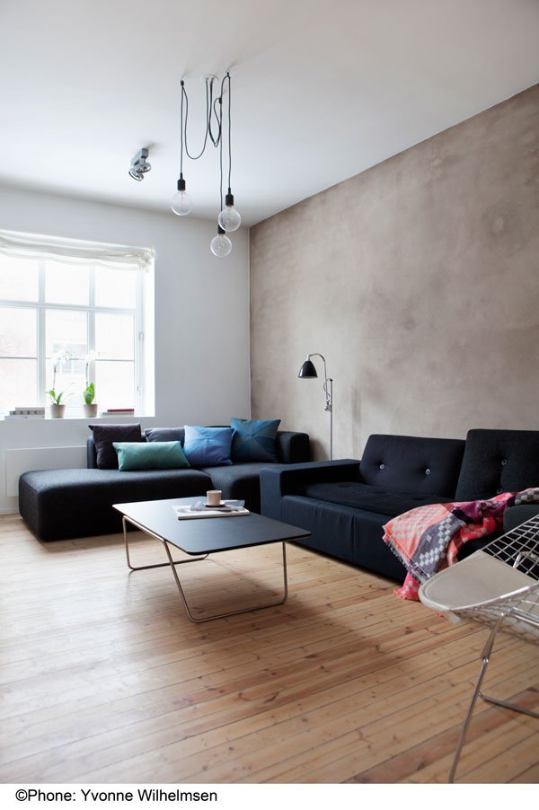 September in our house always equates to the start of school and birthdays month (no one cares about the London Design Festival apart from me) and by this time of year I'm really yearning for a holiday. Whilst home exchange schemes are nothing new, there has been somewhat of a gap when it comes to finding a home and family you can swap with who share your creative background and a passion for design. Until now, anyway.Behomm (that's "be home") was launched in 2013 by Augst Juste and Eva Calduch based in Barcelona. Both graphic designers, they felt there was something missing from their holiday experience, and so they created a new platform which hosts over 1,900 members and 59 countries to choose from. It's the home exchange community only for creatives and design lovers and boasts the most achingly stylish portfolio from across the globe. Members include architects, designers, stylists, photographers and artists, each with a very unique take on what home means to them. It's a holiday in itself just taking the time to explore a stranger's home with similar passions to your own, stepping into their shoes for a short while, don't you think? I love that you can gain a sense of that family's personality and enjoy their way of life whilst they experience yours. Behomm takes it one step further from just free accommodation, moving to create new connections between families elsewhere in the world.
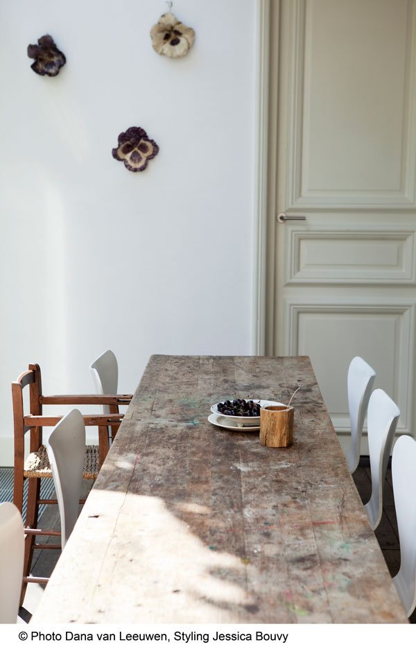
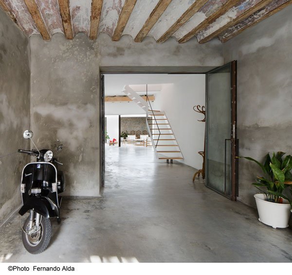 I could spend all day imagining wonderful holidays in any one of these incredible homes, couldn't you? Who knows, maybe one day when we've got the new place up to scratch, we could join too...
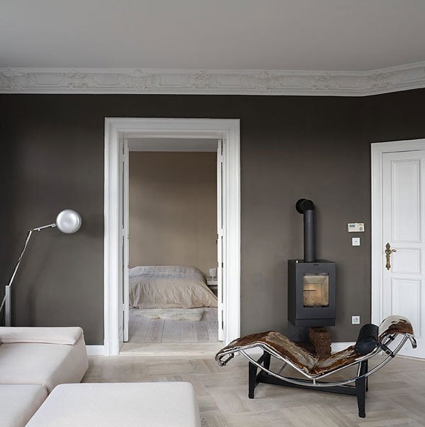
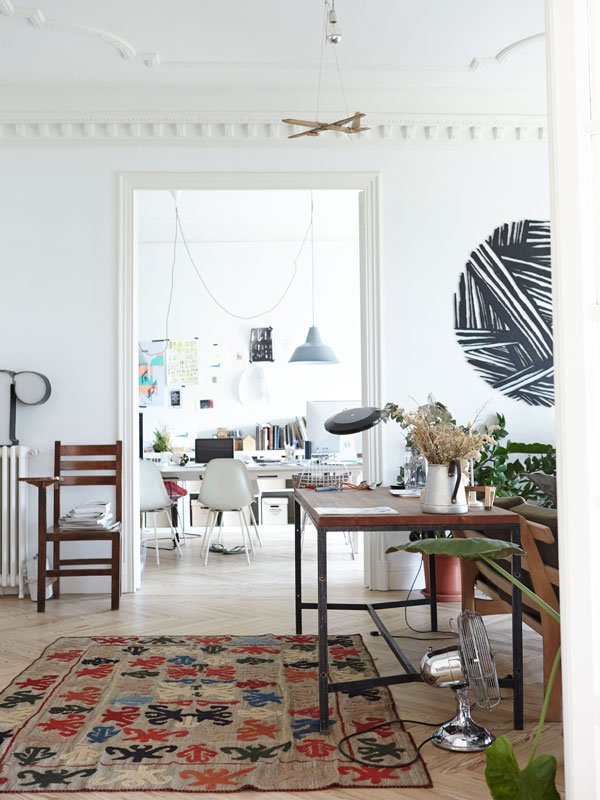 Behomm is a by invitation only membership but they are offering a free membership trial for a limited amount of time. *With thanks to Behomm for permission to use to images from their community's homes.
