Beynon Modular Crafted Furniture
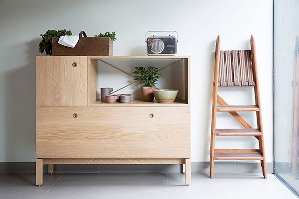 It's difficult to find impeccably well made modular furniture these days that can put its dukes up to the systems that revolutionised modern living in the mid-century era. Sure, there will always be the flat-pack, but if you're looking for solid, reliable and timeless, not so much. So I had my head turned with this beautifully crafted unit by British brand Beynon, hailed as heirloom quality and an adaptable piece of long-term furniture which grows with you over time. As modular suggests, you build your desired piece using a system of wooden units. You don't even have to wrestle with the tool kit because each unit has a simple interlocking mechanism that relies on the turn of a coin. Intelligent. And I love the various ways you can custom build and configure your own to suit your space and needs.
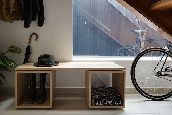 Designed by industrial design specialist Keinton Butler and graphic designer Richard Davies, the units are produced by master craftsmen in Wiltshire using traditional techniques and made in white oiled oak. Isn't that pale wood bureau just perfection? And please, do yourself a favour and take a look at the poplar sideboard, the details in the grain of the wood are incredible. I could look at it all day.
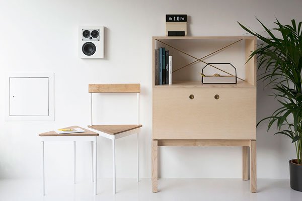
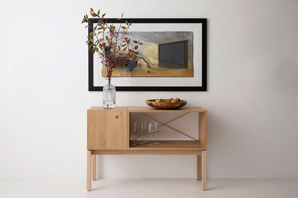 Beautifully simplistic details for adaptable living. I think this one could be a classic.
at{mine} / The Online Interiors Community
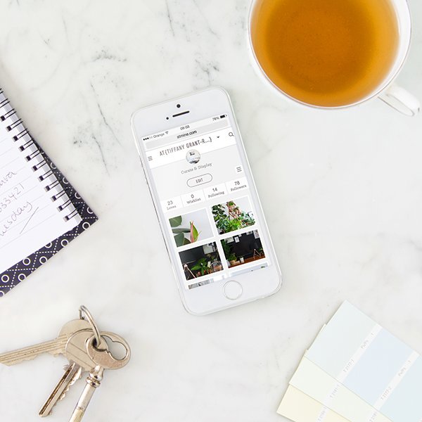 For the past year I've been a very fortunate Beta member of new online interiors community, at{mine}. Introduced to the site by my good friend Igor Josif of Happy Interior blog, I jumped at the chance to be a part of it as it developed through the early days with a feeling that this was something that would really take off. The concept has been nurtured into being by long time friends Helena Benelbas and Ia Bergman who found that there wasn't a dedicated online space for interiors enthusiasts and professionals to share their own spaces and interact with other like-minded people. We all love to be a little nosy, right?
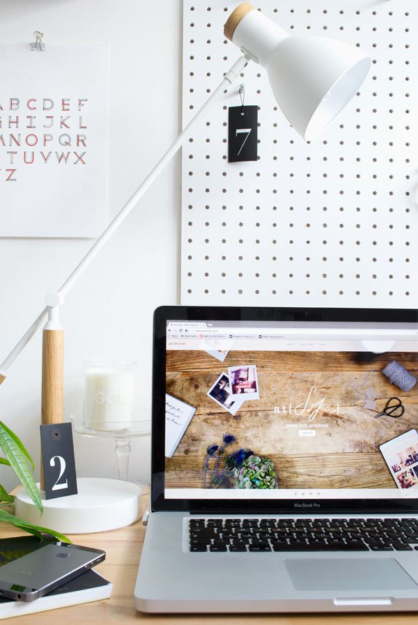 An inspiring little community of just over 1,000 now, at{mine} is building a steady membership reaching across the globe with its beautifully styled, simple interface, including recently updated additions that Beta members helped the team to develop as we got to know the site. How does it work? Members can upload and share images of their homes which are categorised by room, tag items in each room and where they came from and include a caption or story. Other members of the community can search for and follow other users whose photos appear in the gorgeous new home feed, 'love' an image, add a tagged item to their interiors wish-list or comment if they want to connect. Finally! A homely online space for sharing real interiors in one place.Have I piqued your interest? Fancy a look around some of my favourites? I'd love for you to join me and see what it's all about so at{mine} have kindly created an invitation for you to come and check it out before the site opens to the public. See you there...
Six Styling Tips For A Minimal Bedroom
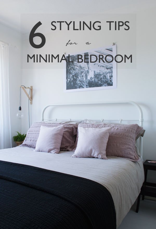 Hello, Friday and hello weekend! Wow has this week been one of those ones, if you know what I mean. Like trying to paint the kids room with them in it. I kid you not (if you'll excuse the bad joke). In fact, there's been a whole lot of focus on the bedrooms at home lately. Recently I've been experimenting a little with our style of bedding and attempting to move away from my go-to whites and greys. I know. Whaaaat?! I don't like to style according to season because I tend to use and wear the same colour palette all year round, but this time I just wanted to try something a little different, still in muted tones but a little further away from my usual monochrome. So I let Rob pick. And the boy done good...at least I think so now. When I got the sheets out I had a
 major minor panic but once I got used to the oatmeal (which I'd pared with 'pigeon pink seersucker pillow cases and a black matelasse bedspread) it started growing on me. I took the soft pink throw pillows from the sofa downstairs and somehow they pulled the whole look together. Hello oatmeal! Just the right balance of feminine to masculine, don't you think? So, I thought I'd share with you some useful tips for styling a minimal bedroom, not so that it feels too sparse or even too perfect to live in, rather to enhance your down-time and help make your space a place you can relax and (hopefully) sleep in.
Clear Out The Clutter
If there's one thing that instantly gets me down, it's being surrounded by clutter. I don't mean for a second that I live in a squeaky clean white box with nothing in it (where's the joy in that?) merely that I choose very carefully the things that come into our home and they are there because they serve a purpose or they add something to the room. If it hasn't been used in at least six months, then it goes. So, have a good clear-out, go through your wardrobe and shoe collection and make some space. Is there room for you to store some items out of sight-under the bed or inside a cupboard for example?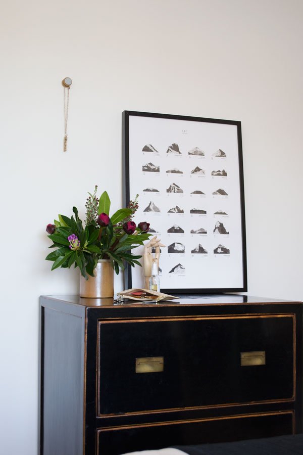
Neutrals Please
Find a neutral colour of paint and refresh your walls. Ours were standard Magnolia when we moved in but I wanted and instant lift so went with a shade of white instead to make the most of the light we have during the day. It's worth noting, however, that white will only work in a room where there is plenty of light, without it, it can look really flat and cold. If you have a dark room, try instead a pale grey, beige or other soft colours such as rose pink or nude to give the room a restful feel. The same goes for your bedding choices. Pick out muted or monochrome shades and fabrics like linens and cotton for a more natural feel and layer them up with textured blankets, throws and pillows.
Functional Furniture
Choose your furniture with intention and use only what you know you'll need or have room for. I prefer pieces with clean lines, but minimal doesn't have to mean contemporary. Our room doesn't have space for a wardbrobe, but given that we're not huge fans of solid pieces of furniture anyway, we have a simple, black clothes rail instead which still gives the room a sense of space as you can see through and around it. The same with bedside tables-it doesn't have to be your typical idea of one (particularly if you're pushed for space) but you could utilise an old fruit crate or a set of steps which will allow you a surface on the top for the essentials and have space inside on underneath for some books or magazines. Think also about the sort of materials your furniture is made from-plywood or pale woods work really well as part of a minimal aesthetic, as do black and white metal and high gloss surfaces.
Statement Lighting
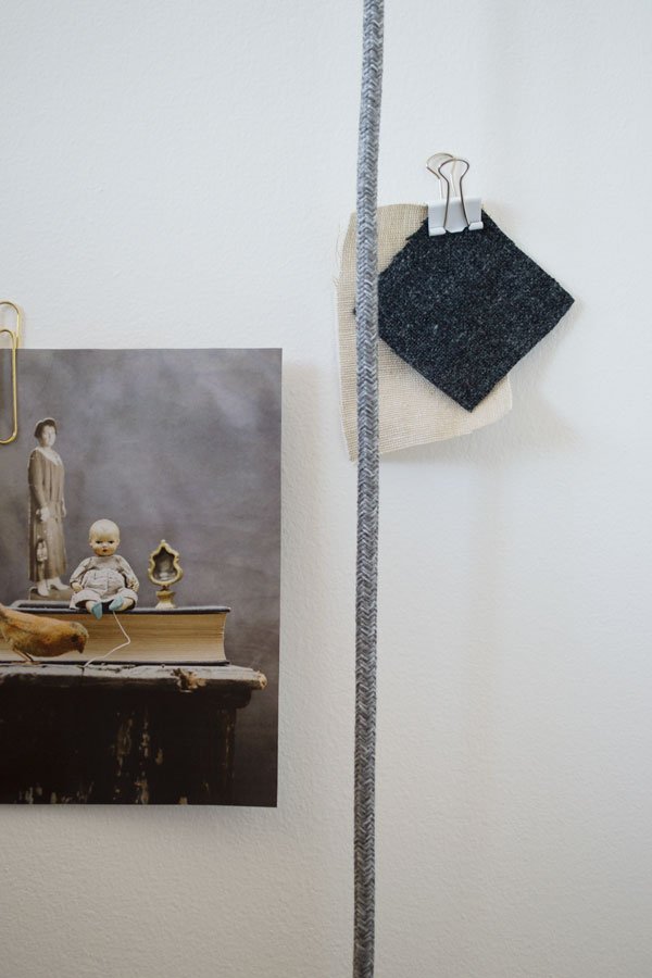
Don't ignore your lighting! Sometimes, the single light hanging from the ceiling just isn't enough. Swap out that tatty old shade and replace it with something in a translucent paper for a warmer glow or a large sculptural piece if you've tall ceiling to take advantage of. Alternatively, forgo the ceiling lights completely and use black cabled festoons loosely hung over the bed or draped down the corner of a wall. We use vintage style Edison bulbs with gorgeous Italian fabric cable which we wall mounted with IKEA brackets to give us extra bedside space. Now they're a feature in themselves.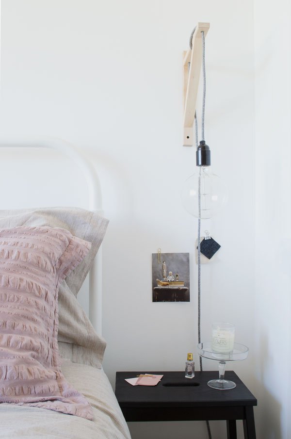
Touches Of Green
I wouldn't be doing my job as an Urban Jungle Blogger if I didn't tell you to go nuts with the plants - they bring vibrancy and texture to a room with minimal effort and you can pick them up cheaply in most supermarkets or IKEA which stock some really exciting varieties. Buying a small wrap of foliage from your florist and using single stems in a small bud vase or bottle is a simple touch if potted plants aren't your thing-I use eucalyptus and fern all the time. For today's post though, I went all out on a bunch of deep burgundy peonies. Can't wait for them to unfurl.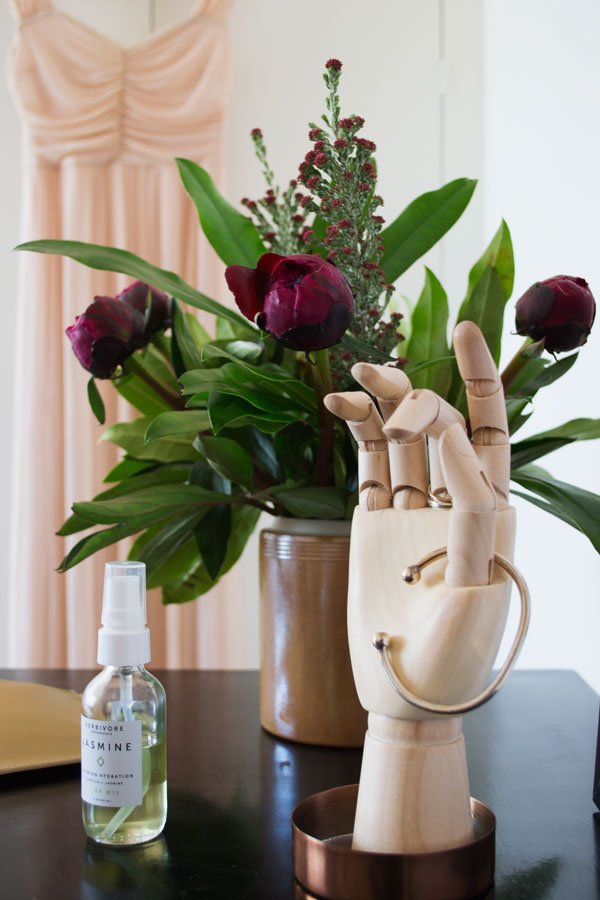
Be Artful
Don't forget to bring pieces of art into the room. I like to use singular, bold black and white designs that stand out against the white-leaving some of the walls blank gives a feeling of having some space to breathe. As an alternative, pull together a gallery wall of the pieces you've collected, lean larger framed art work against the wall on the floor or use wall-mounted frame ledges for a linear look. I like to use metal clips to display groupings of magazine cuttings I fall in love with and also use them to help me decide where I'm eventually going to hang a framed piece, like this one by Dot & Fox Print Shop.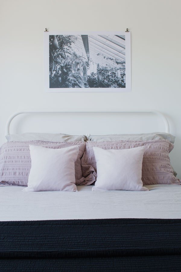
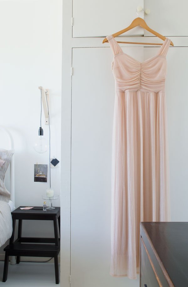 So there we are, six sure fire ways to style a minimal bedroom in a more meaningful way. Try saying that with toast in your mouth.
Photography & styling © Tiffany Grant-Riley
This post is in collaboration with Habitat as part of their #HabitatVoyeur campaign. Have you seen the ad on TV yet? Upload your Habitat product in your home for a chance to win a Hendricks sofa.
Feist Forest / The Ashling Table
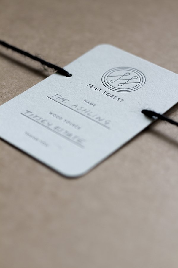
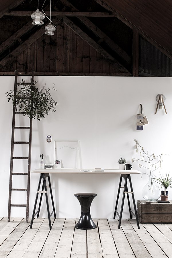 I have reason to be excited today as I introduce you to beautiful new independent design brand Feist Forest. Tucked away inside an old tin tabernacle in Devon, headed up by founder, designer and wood finisher Vicki Turner, Feist have been thus far quietly producing by hand one of the most stunning tables I have ever had the joy of discovering. The Ashling Table. Take a moment to pour over these exquisitely styled images. Oh for a tin tabernacle and that table...
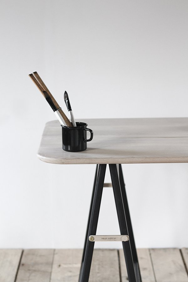 A trestle made for the most astute of design lovers, its subtle mix of pale ash and matt black lacquer make it a match made in heaven. Just look at that laser etching! This is a piece that will move and evolve with you, folding down to be stored upright with recessed brass hinges, it is flexible to the core. Production is a carefully considered process; the wood is sourced from sustainable British Ash in collaboration with Sutton Timber and tables are handcrafted in small batches in part with skilled craftsman Ben Algar from his workshop in Bedfordshire.
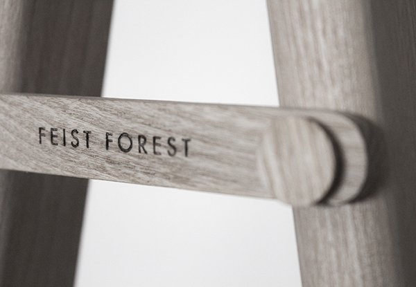
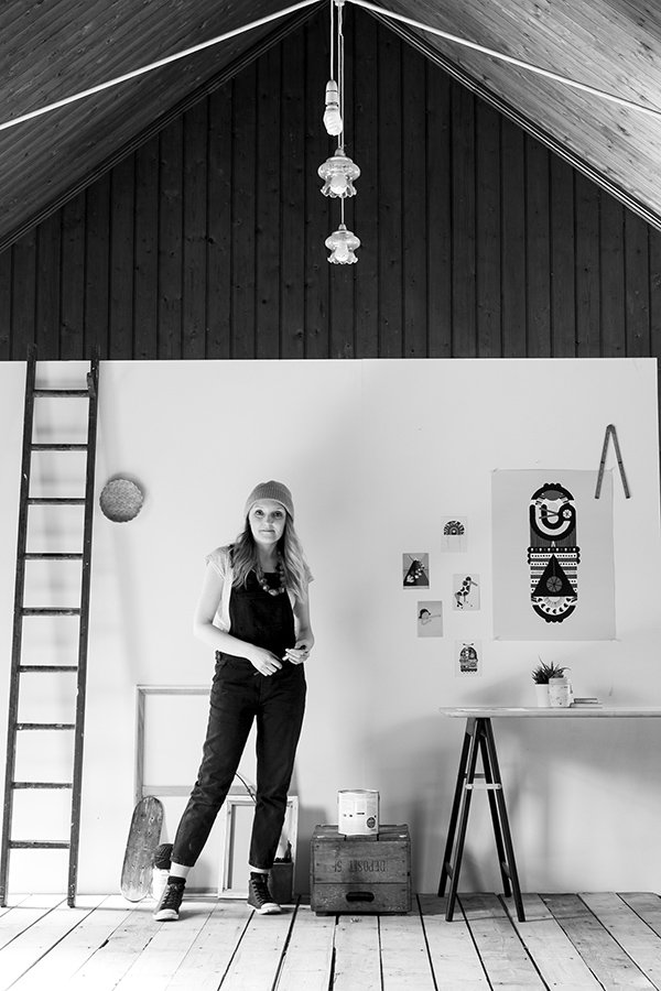
 Aside from nature, Vicki finds much of her inspiration in watching others come together to create and make great ideas happen."Seeing people who challenge the normal way of doing things and often appear a little crazy whilst they do so, yet battle on anyway. They're certainly the inspiration behind Feist Forest." And so she designed a table for them.
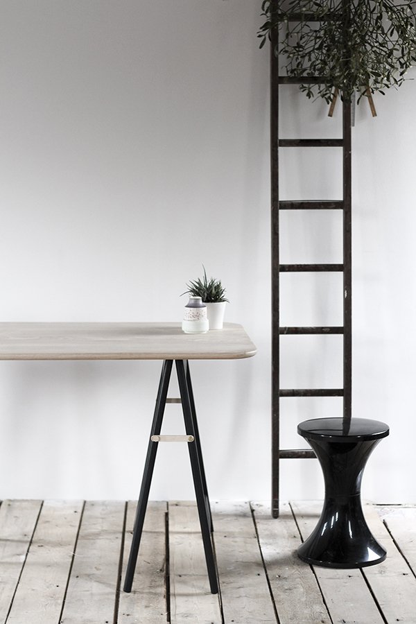 Any plans for extending the collection? I asked. I for one would love to see The Ashling as a dining table. There are plans for different finishes and formats, new collaborations with local makers too. Keep those eyes peeled apparently.
 Find out more about Feist Forest's ethical practices on their site and try your very hardest not to fall in love with The Ashling. It's all over for me...
Six Kinda-White Dining Tables
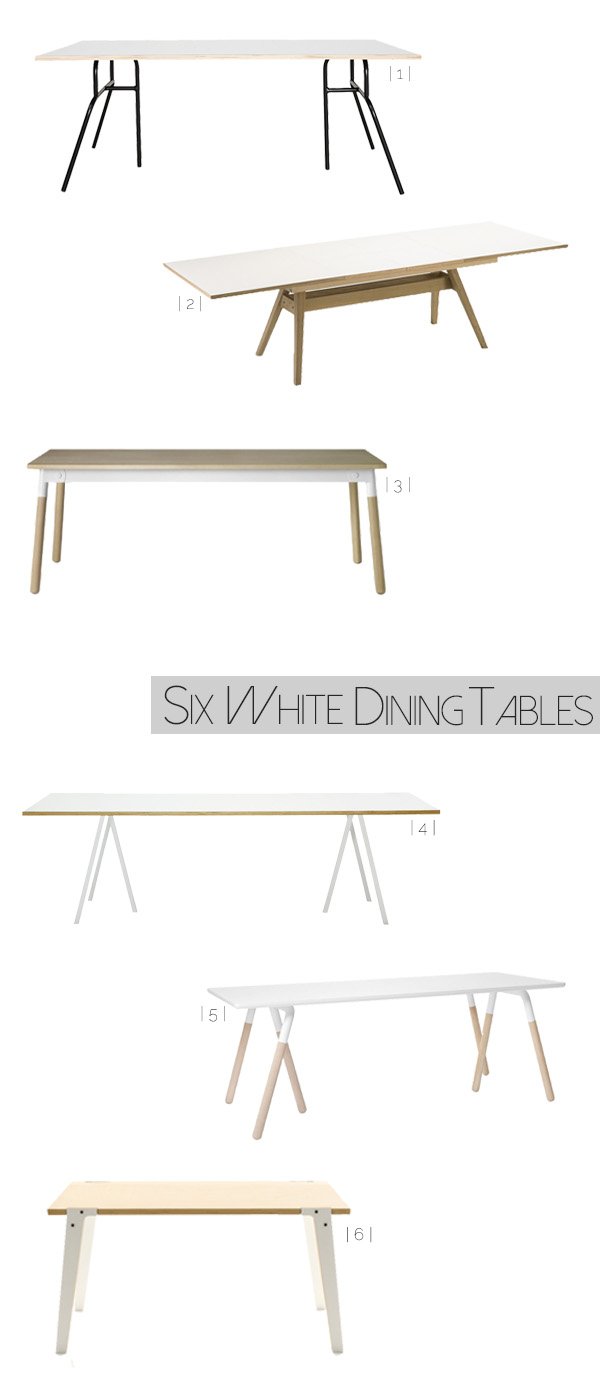 I've been looking for a new dining table for the longest time. The need is real. Something in white and pale wood that suits the home we have now; our current one is an extendable vintage piece, once restored by my father in-law and well loved, but it's time to move on now. It's almost jarring to look at, with too much dark wood in our dining space (and no beautiful white floors to speak of) so it all needs a lift. I'd been toying with the build-your-own IKEA trestles and baltic-ply option for a while, but felt that it wasn't permanent enough and I'd be worrying about spaghetti sauce staining the plywood top. Those are real issues. Having a surface with a clean, white top is ideal to shoot down onto when I'm working on a project at home, a lot of the time I end up using boards if I need a blank canvas which serves a purpose to an extent but does have its limitations. And everything looks better on white. Seriously. Of course, in typical me style, everything I fall in love with is what they refer to in editorial as "an investment piece" so I'm biding my time a little until I'm in a position to commit.To make my search a little easier and to give you a little food for thought if you're going down the same road, I've picked six of the best kinda-white dining tables (because they're not completely. Not ready for that yet). I've been making eyes at the Raft Table Na2 by &Tradition for so long now - I mean look at it-the trestle shape in the legs, the white laminate top (easy to care for with two messy children) powder coated steel and oak legs just scream "take me home!" It's no surprise that something this beautiful came from the geniuses behind NORM Architects. You beauties.Which one is doing it for you?
| 1 | MF0702 | House Doctor DK
| 2 | Skovby Olso SM11 Extending Table | Barker And Stonehouse
| 3 | Muuto Adaptable Dining Table | Nest
| 4 | Hay Loop Stand Table | Nest
| 5 | &Tradition Raft Table Na2 | OCCA Home
| 6 | Switch Table 'Mid' | rForm at Clippings.Com
A Beautiful Black Wall
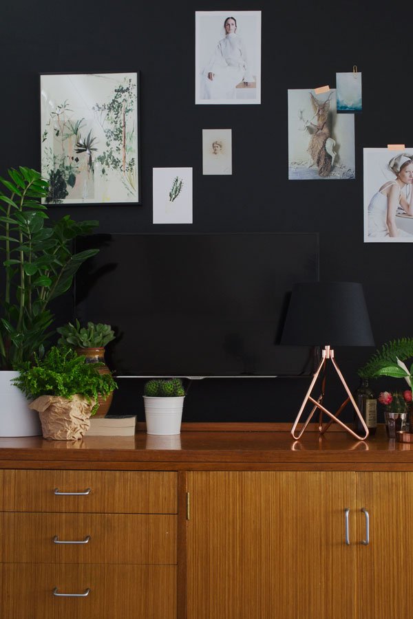 So I realised that I hadn't shared the results of our new black wall with you. Normally I'd prefer to wait until I've chosen all the art for the wall before I shared it with you but I thought, seeing as I've recently shot this part of our living space for the "project" I mentioned, that you might like to see it how it looks right now. Not finished. But nearly.First of all, can I just give Valspar massive high fives for the paint. Yes. You beauties. I tested three different brands including the stalwarts of the designer paint world in four different shades of black and their flat black 'La Plancha' in Premium came out on top. There are no subtle blue or brown undertones to this shade, just pure matt black in any light. The coverage is excellent and the paint is just the right consistency, really smooth even on this wall which is slightly textured. Two coats. Done. And no, this isn't a sponsored post, I'm just really impressed.
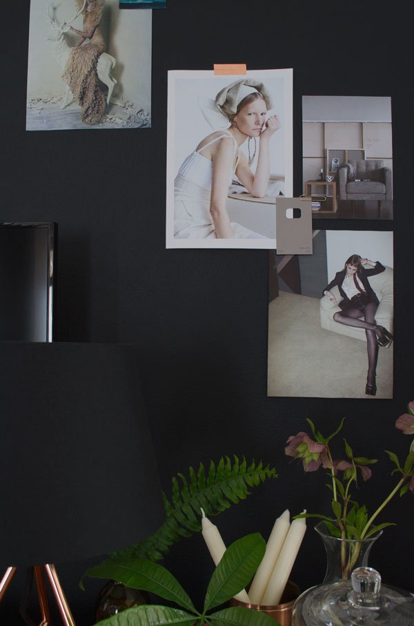 As per my mission here I've achieved what I set out to do (hide the God awful TV) and I'm loving the way it looks now, intentionally hidden against the wall rather than jumping out on bright white. Sometimes, depending on what you're watching, it's like a piece of art in itself.This area of the room is far from dark being right next to the front window, and I'm playing to that accessorising with polished copper and brown glass to pick up on the light. The almost orange tan wood of the sideboard has really brought it into its own too, picking it out as a feature in the room now, the focal point it needed being such a long and narrow space.
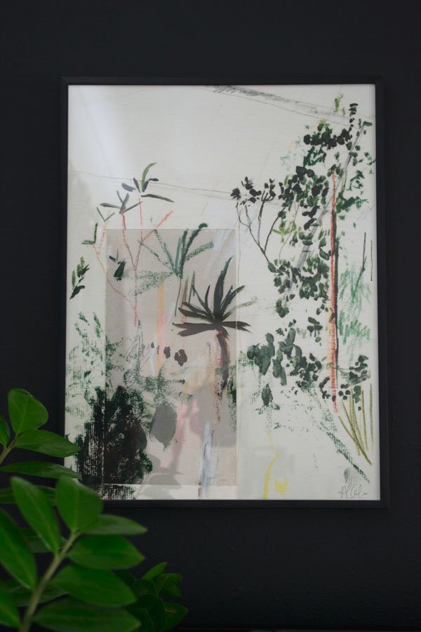 Have you seen this beautiful Kew Forestry botanical print by Alicia Galer on my IG feed? When I first saw it, I leapt up and ran up to Rob's office to show him. "That's nice..." he said. Nice????! I'm using it as the jumping off point for the other pieces to follow; abstract, minimal colour with perhaps a plant based story running through. Having discovered her on Instagram a few weeks ago and unable to find this particular print for sale anywhere (it was out of stock in Anthropologie) I got in touch and she very kindly rushed one out to me in time to shoot it (thanks Alicia!) I love her use of abstract shapes, the greens, the frenetic movement, yet still calm...Cannot wait to collect more of her work. For now, I'm enjoying playing around with the rest of the wall space moodboard style, pinning up snippets from magazines and lookbooks, keeps it fresh and interesting.
 So that's it. A little preview of the TV wall as it is right now. Are you feeling it? Trying really hard not to paint any of the other walls black now as much as I'm desperate to...I keep eyeing up the kitchen, but I think we're leaving that...Styling & Photography © Tiffany Grant-Riley
Design Apartments Weimar
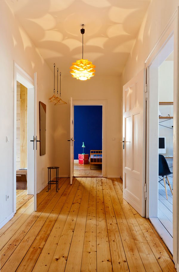 It's rare to come across a design based community project as wonderful as this. As all the best ideas are, The Design Apartments Weimar was born from the need to solve a particular problem. Four years ago, German actor and design enthusiast Mark Pohl bought an historic townhouse in need of renovation in Weimar, the home of the Bauhaus University Weimar. With several friends interior design graduates struggling to get their work known, he came up with the idea to renovate the space into two holiday apartments furnished with pieces designed by the local students. Guests experience living first hand alongside these pieces and are invited to shop directly from the apartments or through the online store. What a stroke of genius. Pale wood flooring throughout, tall ceilings and light drenched spaces. The combination of new, young design with vintage. Every piece of furniture is carefully considered, drawing attention to a flash of colour, a sculptural shape. A Bauhaus fan's dream, right? I want to be here, right now, bare foot with cup of coffee in hand just quietly taking it all in...
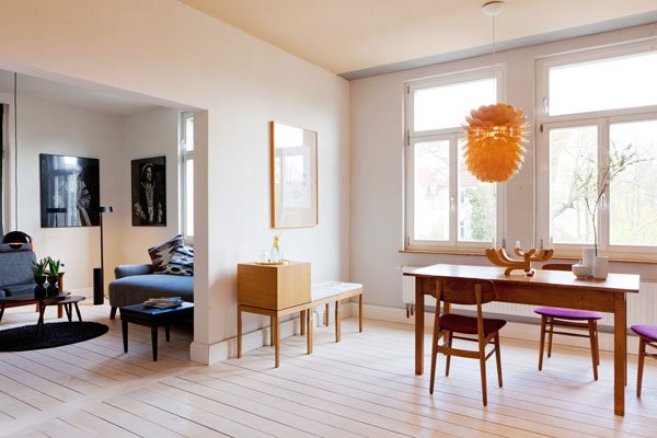
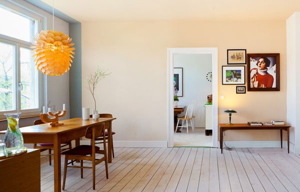
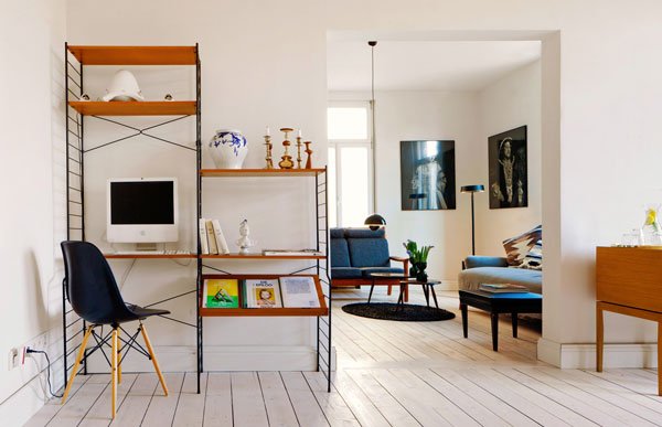
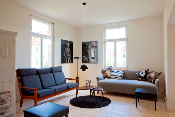
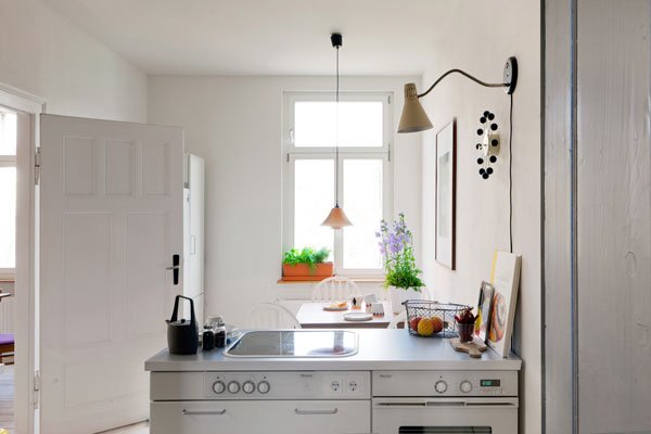
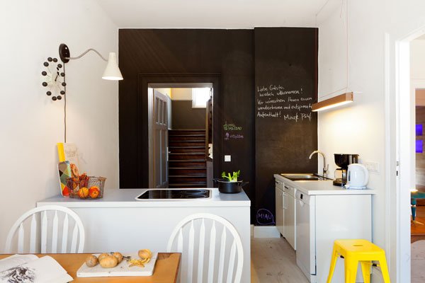
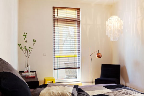 Follow all the beautiful details from the apartment through Instagram. Well, this is going up on my holiday list, fancy it?Photography © Matthias Eckert.
Birthday Giveaway Week Winners!
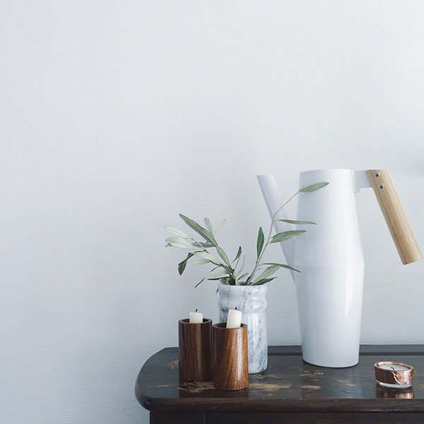 Good morning! I guess you're all waiting to find out who won the prizes from the amaaaaazing first Blog Birthday Giveaway Week, right? It was a full on, exciting six days of celebrating with some of my favourite brands and designers and I'd like to say a huge thanks to all who so generously agreed to be a part of it and of course every one who entered, shared and enthused!So let's get down to business, shall we?
The Winners
✚ Lane Twin-Tone Lampshade (in your choice of colour) goes to Sara Franks - congratulation!✚ 'For Rest' photographic print by One Must Dash from Future And Found - well done Julieta Lucca!✚ Via Martine's beautiful Instagram collage is won by Erin De Mange.✚ The beautiful plywood pegboard by Kreis Design goes to Fiona Bottrill. Happy pegging!✚ Look forward to snuggling your little one up in the Mourne Textiles baby blanket Laura Humphries-you won!✚ And the winner of the massive £600 sofa giveaway with Habitat goes to Katie Fig. Good work Katie. No go sit down and choose your favourite!If all winners could please email me via the contact page with their full name and address then I'll sort getting your gifts to you. I hope they all make a difference to your homes and put a smile on your face.Thanks again to all who took part! No pressure for the second birthday then...
Image © Tiffany Grant-Riley via Instagram
Giveaway #06 / Habitat Sofa or Armchair Worth £600
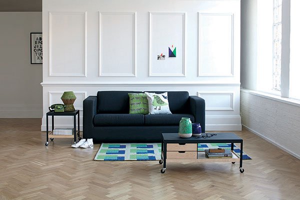 Well, here we are on the final day of birthday giveaway week so I thought we'd go out with a bang with Giveaway #06 - an incredible gift from Habitat up for grabs - a chance to win a sofa or armchair of your choice up to the value of £600. Shut up! So if you saw my Habitat Fresh For Spring post last week here's a chance for you to jump straight in and update your lounging situation.Choosing the perfect sofa is a big deal, almost as much as buying (or renting) the house itself. We bought ours three weeks after Miss Twitchit was born as were were all scrunched up on a two seater when we moved into a bigger home. It didn't work for us anymore...but then the sofa we ended up with, although bigger, was so not worth what we paid for it. Sure, we didn't want a forever piece with two small children and sticky fingers, but we at least needed it to hold up to the daily beating and still look good. Biggest regret. And now we're stuck with it. It slouches, the seat cushions move, it's like sitting on a marshmallow. Sob. So, choose wisely. Do I have your attention now? Maybe you've just moved, your current situation is looking sloppy or like us the family has grown and you need more space to spread out on? Well, to get you thinking about a favourite to snuggle up on, I've narrowed down a few of mine and they're all within budget...
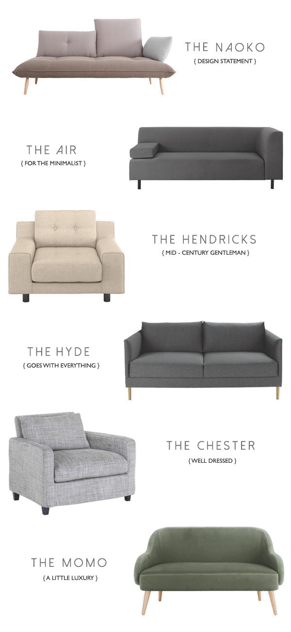 ✚To Enter The Giveaway✚Retweet any of the Habitat giveaway tweets from Curate & Display.Follow Habitat's Facebook page and leave a comment under the giveaway post on Curate & Display's page.Regram the image posted on Curate & Display's Instagram and tag Habitat and Curate & Display with #cdbirthdaygiveaway
The Nitty Gritty
* Please note: Prices may change according to Habitat sale period. Prices were correct at time of publication.
Entrants must reside within the UK. This giveaway closes on Saturday 18th April at Midnight GMT. The winner will be chosen at random using a number generator and contacted via email. The winner has 7 days to respond before another winner is chosen. The prize will be shipped directly from Habitat and there is no cash alternative.
Giveaway #05 / Mourne Textiles Children's Blanket
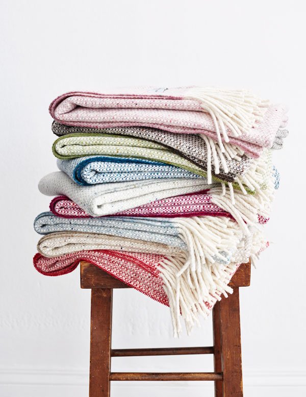 I couldn't think about celebrating Curate & Display's first birthday without a mention for one of the loveliest, most genuine friends that I have made through this blog along the way, whose family run textiles business has come on in leaps and bounds since I first got in touch to feature them. And no, their success has nothing to do with me, really, their beautiful, handwoven accessories do all of the talking, so much so that most recently the likes of Jamie Oliver has been singing their praises on his Instagram feed. Mourne Textiles caught my eye in spring last year when I came across their rich family history. The skill, dedication and pure heart that has gone into rebuilding the foundations of a sixty year legacy is nothing short of incredible and it is so deserved that they are being recognised and appreciated now that focus is changing towards British and handmade once again. I would very much recommend that you take a look at their history, which started with Mario's grandmother Gerd Hay Edie from a small workshop at the foot of the Mourne mountains and get a real sense of their beautiful accessories. Ok, I'm going to stop now because I could write a thesis on these guys...I talk about them to almost anyone who will listen!
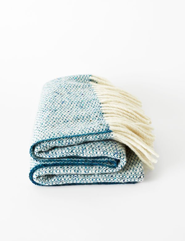
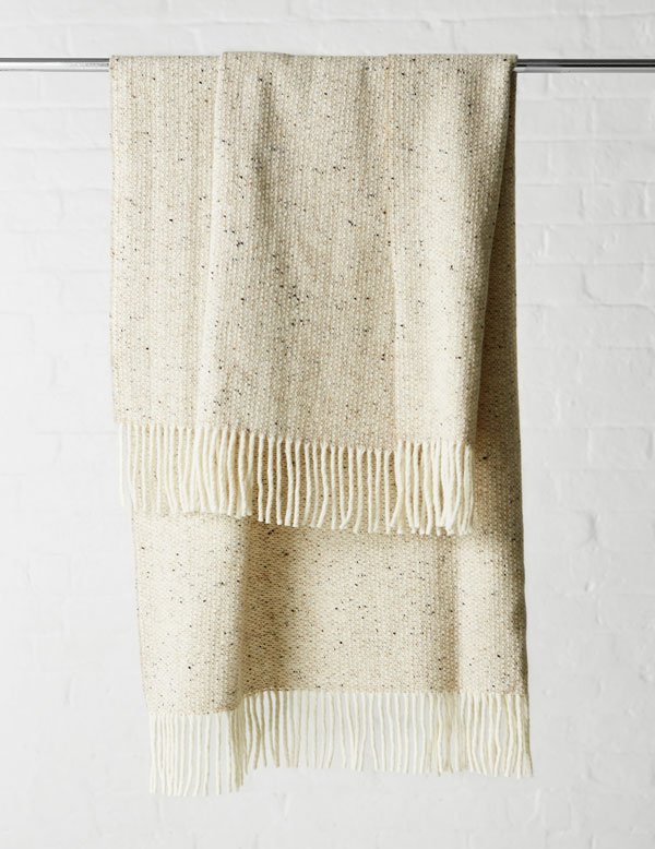 So, Giveaway #05 was a complete no-brainer and I'm delighted to offer something new from their children's blanket collection in the colour of your choice. The blanket measures 80cm X 140cm and is a wonderful example of the Tweed Emphasize, a Mourne design created by founder Gerd Hay-Edie in 1956 (I have the grown-up version and it's pretty much amazing). A perfect forever piece to give to a little one, I love the idea of this blanket becoming a much-loved comforter - a corner scrunched up tight in a fist to aid thumb sucking, there to transform into a super hero cape, a picnic rug for the teddy bears or simply to snuggle up under before bed.
 ✚ To Enter The Giveaway ✚You can enter in one or two ways:• Make sure you're following Mourne Textiles on Facebook, then check back to the Curate & Display page to leave your colour of choice underneath the giveaway post.• For Instagram, regram the image posted on the Curate & Display feed and tag it with Mourne Textiles and Curate & Display with #cdbirthdaygiveaway.Good Luck!
Photography © Tara Fisher
The Nitty Gritty
Entrants must reside within the UK. This giveaway closes on Friday 17th April at Midnight GMT. The winner will be chosen at random using a number generator and contacted via email. The winner has 7 days to respond before another winner is chosen. The winner must choose from the children's blanket collection. The prize will be shipped directly from Mourne Textiles and there is no cash alternative.
Blog First Birthday Giveaway Week!
 Wow! So it would seem that I've been writing Curate & Display for a whole year - what an incredible year it has been. It started as a place to share my work and develop as an interior stylist which has definitely been a huge part of it but grew into so much more, creating friendships with fellow bloggers and collaborating on some wonderful projects. And there is more to come (which I tell you more about soon and it's a dream come true!) Of course, the best part has been connecting with you and I really do hope that you've found something here that has inspired you somewhere along the way.Well, I couldn't let this first milestone pass without a celebration, so I've been working on an amazing week of giveaways with some of my favourite designers and brands. Yep - every day is a new giveaway, each runs separately for a week so make sure you stop by and be a part of it! You can also keep a toe in over on Instagram and Facebook as the competition will be focused there.Thank you for continuing to read my ramblings, for taking the time to 'like' or comment. It means an awful lot.See you on Monday...Tiff X
Habitat / Fresh For Spring
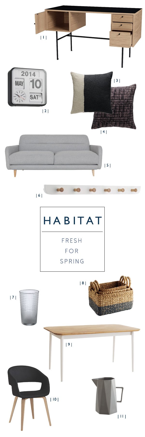 How good does it feel to have some sunlight back in our lives? Yes to that! I don't know about you but I'm feeling a renewed sense of energy to get back on track with the house, done with hibernation. I'm also feeling more at home in my personal style (particularly after I wrote this post) and I'm moving more and more towards the minimal and simple these days. I prefer a muted palette over bright colour and seek natural, untreated materials for an overall more restful atmosphere. Spring for me is a time to implement changes, refresh and reboot as these all have a really positive impact on the way that we feel - clear minds, space to breathe and all that.Updating your home for the spring season doesn't need to involve a huge upheaval, just introducing small details can make all the difference so to instil a little inspiration I've selected my favourite picks from Habitat's new collection to be fresh for spring...| 1 | I'm a sucker for a stylish workspace and I love this Okli desk for its light oak combined with the black laminate top and legs. This would be perfect for Rob's office which is in dire need of an update!| 2 | A timeless classic (sorry for the pun) that makes a bold statement and works for its wall space. Flap analogue clock.| 3 | & | 4 | Texture is so important when you're choosing soft furnishings, particularly if you're not so keen on colour as it helps to give a room some interest. While these cushions are still quite muted, they still hold their own. Astell grey and cream bouclé cushion and Bate cushion (unfortunately just sold out at time of publication).| 5 | A chic option in classic grey wool, it's a sofa for lounging but isn't clumpy on space.| 6 | Clean and simple wall hooks are ideal for additional storage when floorspace is at a premium. Hang them in the hallway, in the kids room to keep random clothes off the floor or your workspace-there's a handy ledge at the back for keeping letters or other small items too.| 7 | Our glassware is somewhat thin on the ground at the moment and could do with mixing up a bit. These textured Elmore high ball glasses totally raise the bar. Sorry. Another pun.| 8 | I think every home should have a set of baskets somewhere, they help make the day to day clutter a little easier on the eye. These Coby water hyacinth baskets are perfect for storing clean towels, magazines, toys - you name it.| 9 | I'm currently on the look out for a new dining table-our old one is great for space as it extends at both ends but the dark wood looks kinda clumpy in our dining space now. The Talia oak dining table is a perfect compromise seating up to six with a lighter oak top and white base. Gives a feeling of more space and our black chairs would look right at home underneath it.| 10 | Mix up your dining chairs and avoid being too matchy-matchy. I like the idea of having two of these at each end of the table so I don't have to fight with Rob over who gets the comfy chair.| 11 | The faceted grey Deacon jug is a more masculine option for displaying greenery or used in its traditional sense makes a welcome addition to the table. I'm loving a blue-grey palette for spring tableware at the moment, it's a subtle alternative to sweet pastels.Have I got you feeling inspired for spring now? Then you'll want to keep your eyes peeled next week as I'm gearing up to celebrate Curate & Display's first blog birthday. Boy have I got some goodies for you. For real. Stay tuned...
TOAST + Botany Pop-Up Shop
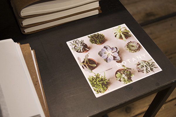
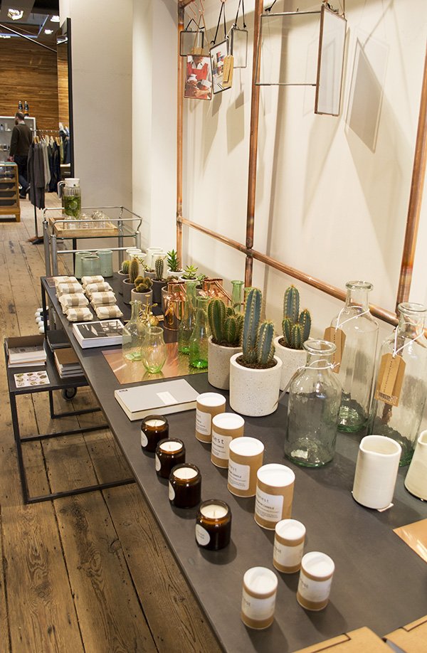 I'm a firm believer in the less is more approach, an ethos that is synonymous with lifestyle brand TOAST. If you've ever had the all-consuming pleasure of pouring over their Lookbook you'll know exactly what I'm talking about, it's an ode to slow-living, absorbing your surroundings, finding meaning in the simple things like, for example, the joy of plants. Over the next few weeks, TOAST's Notting Hill store is hosting a botanist's dream of a pop-up shop, collaborating with Hackney based plant and homeware concept store Botany. I stopped by to check it out...
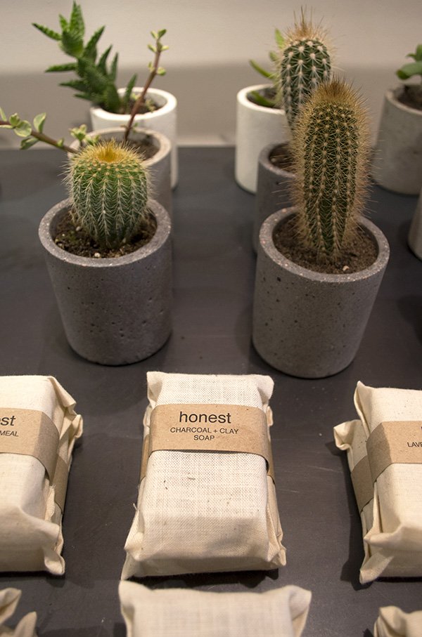
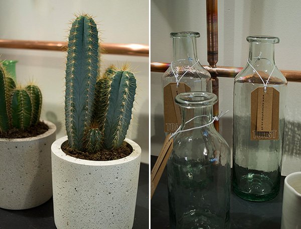 Founded only last year by die-hard plant lover and former menswear product developer Andrea Maynard, Botany believes "that good, useful, ethical design and considered surroundings make for a beautiful and balanced life." I couldn't agree more and instantly made a beeline for the concrete planters (housing a variety of cacti) and copper watering cans - the accessories are as important as the plant as far as I'm concerned!
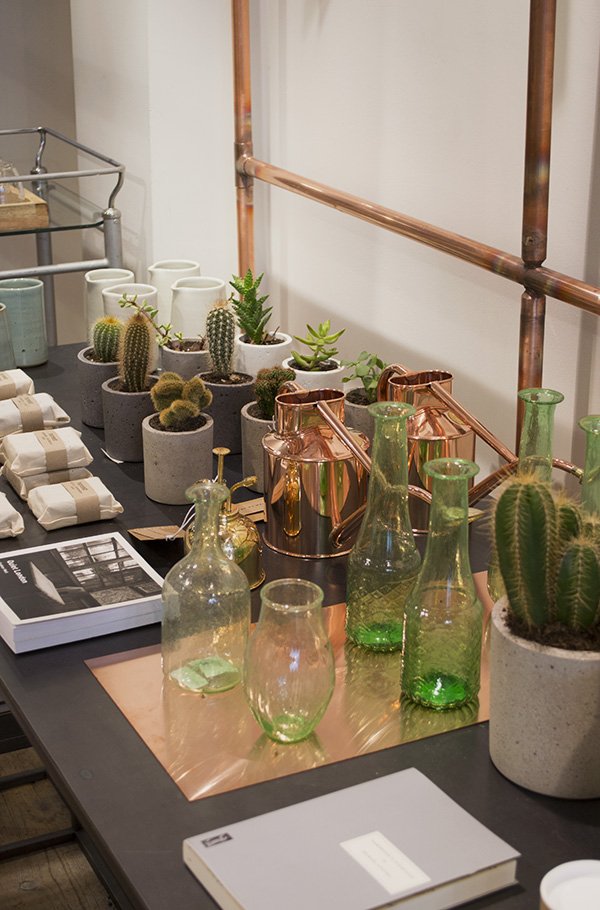 Amongst the bounty of plants sat some beautiful examples of handcrafted homeware and organic skincare products including soaps and candles by Honest and tactile cork covered notebooks.
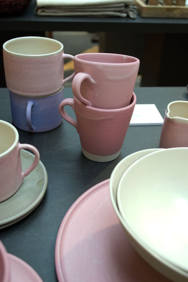 I couldn't resist exploring the rest of the store, enjoying the feeling of space inside which had light streaming down through sky lights, bright white paint on rough brick walls and large planters of tall bamboo reaching upward. No surprise that I was so drawn to the softly glazed Eve tableware, hand thrown in Suffolk where I grew up. Always a sucker for good quality ceramics, I could see these sitting pretty on the table for Easter lunch.
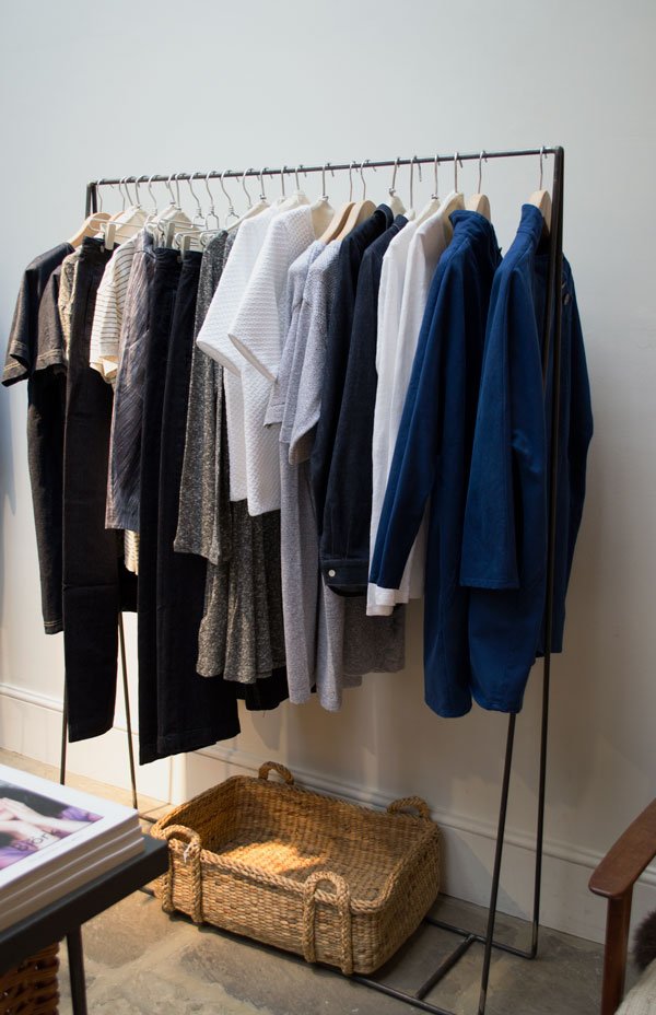
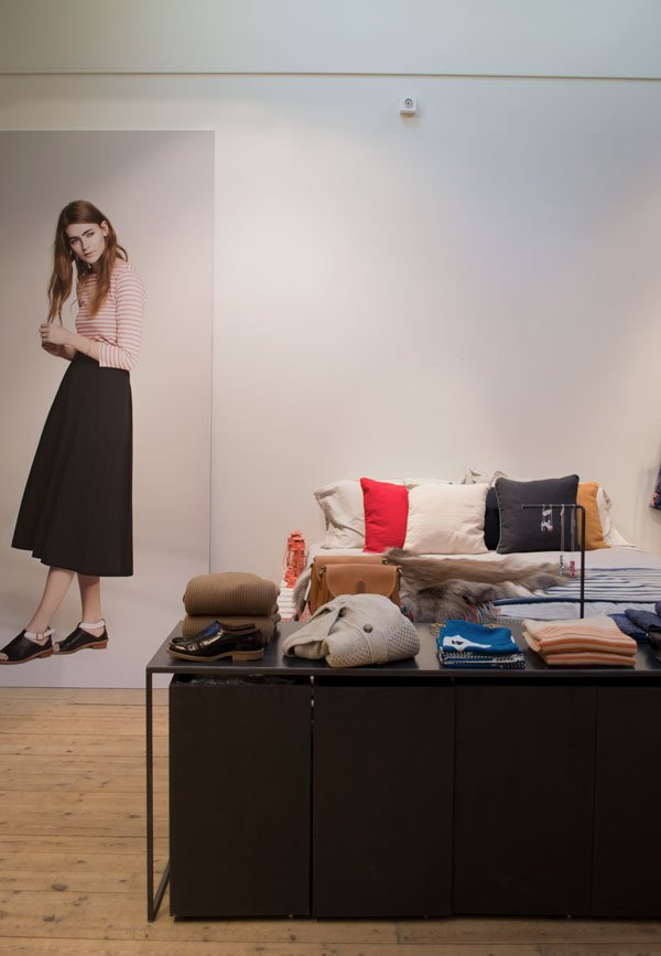


 As part of the pop-up, TOAST is running a competition on Instagram for those who visit during its residency - take a snap of the pop-up and upload it with #TOASTANDBOTANY to win this basket full of succulents. Open until May 2nd...what are you waiting for?!
Coffee At Future And Found
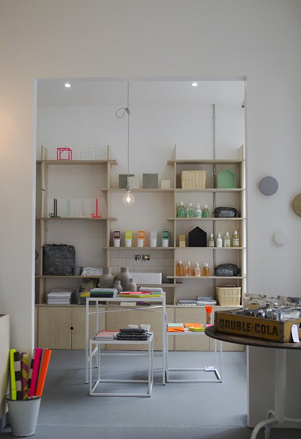 Much has changed since my last visit to Tufnell Park's interiors store Future and Found, and this weekend I took some time out for a catch-up to see the beautiful new space. Kicking off 2015 with a full-on renovation and extending the shop floor to hold even more lust-worthy homewares, the new extension holds a dedicated space for everything bedroom and bathroom.
 The shelving system was designed by owner Andrea Bates and built in plywood - I love her decision to add in the sink, it gives the space a definitive purpose and allows you to visualise how certain things might look in your own home. Wow, how much do I want those shelves. If I'm honest, I found it ridiculously difficult to whittle down all the photos I'd taken for this post because as you well know I'm like a kid in a sweet shop when faced with all my favourite brands in one space, top of the list being HAY (I spotted the Scholten & Baijings grid bed linen) Muuto and newcomers to Future and Found Normann Copenhagen. I think I may just have found my style soulmate in Andrea! But anyway, I digress...
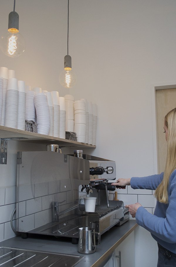
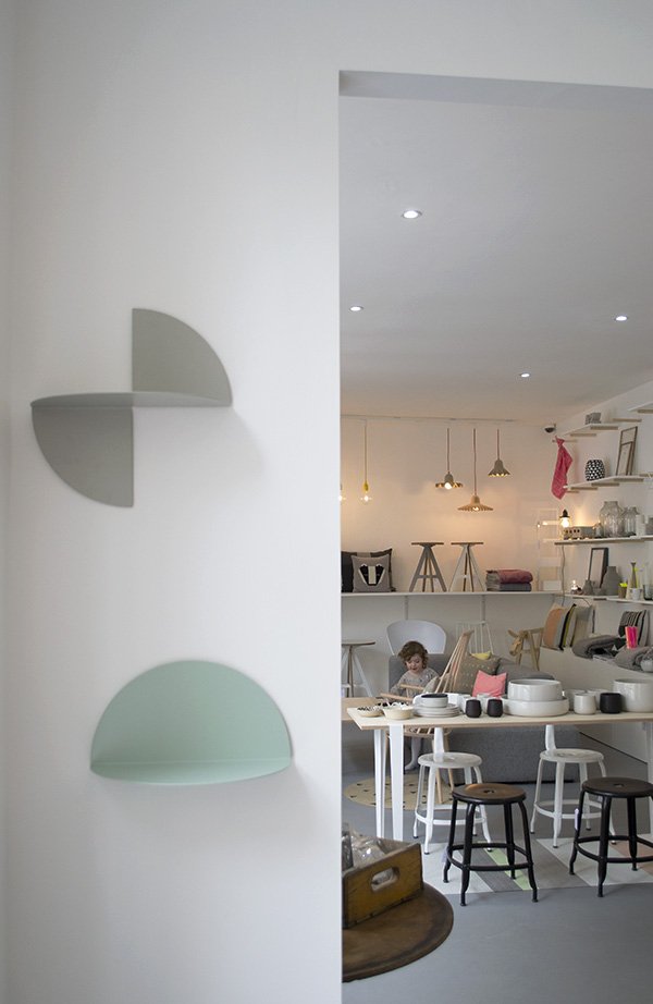 The new space also includes a coffee hatch which opens out onto the courtyard and from this Thursday will be perfect for grabbing coffee and cake on the go (or to take round the shop with you like I did).
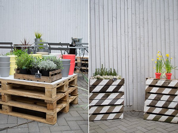
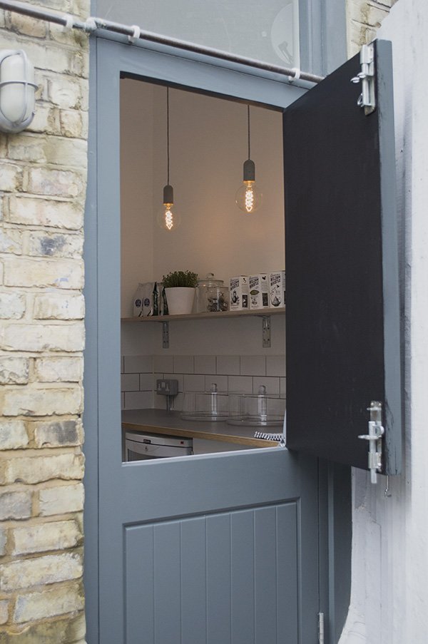
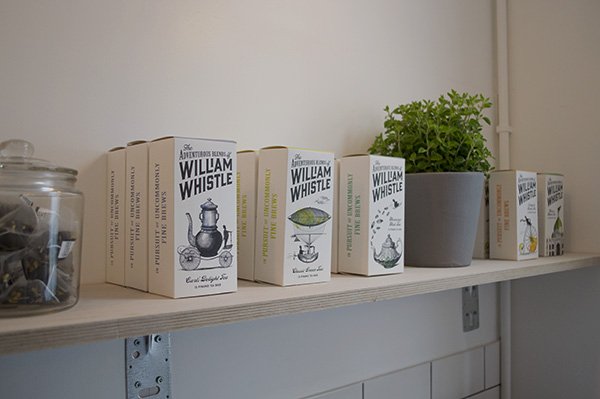 Grace gave me a demo of the gleaming new machine and I can vouch that the coffee is really good.
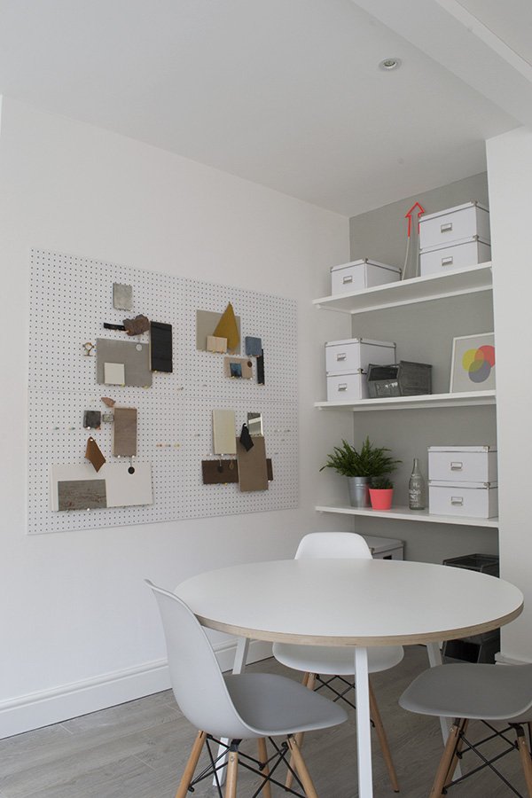
 As shopping experiences go, Future and Found is pretty unique, offering interior design alongside its curated homeware collection with a new workspace upstairs in Andrea's former living space. Making the most of the space and light inside this former factory building, this room echoes the minimal style of the shop floor. I love the new consultation area with inspiration boards showing some of their recent home projects - and do you recognise the white pegboards?
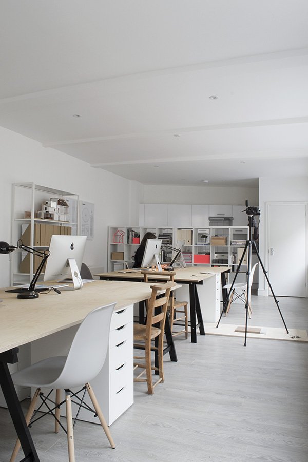 The team have been brilliantly clever in making every inch of floor space work that little bit harder and by losing the smaller office downstairs to make room for the extension and coffee hatch, moving Andrea's living space up a level to allow for the new workspace, Future and Found has grown intelligently and matured into the brand staple it so rightly deserves to be.So if this doesn't whet your whistle enough to get you down to Tufnell Park (left out of the tube station and across the road just for reference) then maybe a few of my shop favourites will...
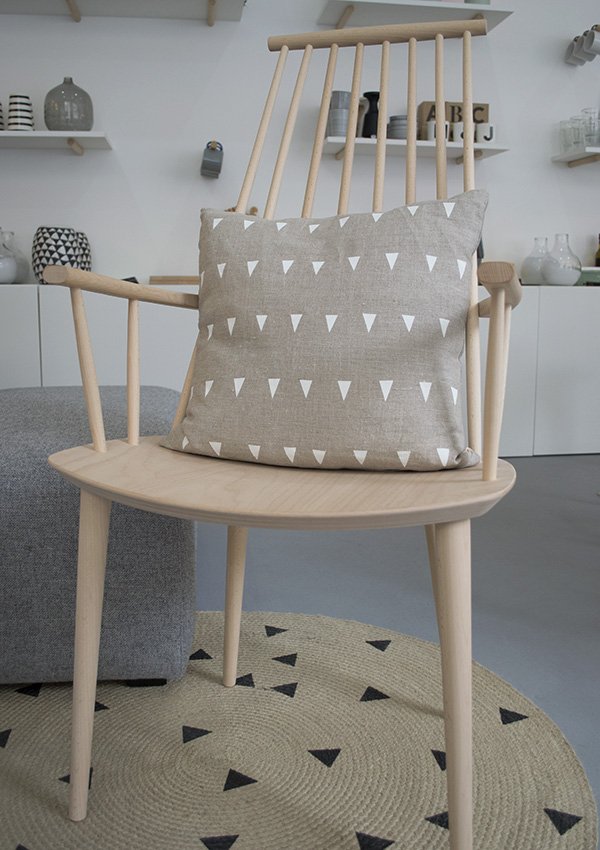 How about this J110 chair by HAY in natural beech?
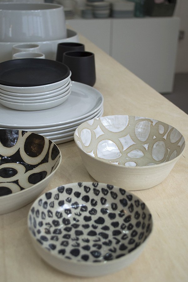
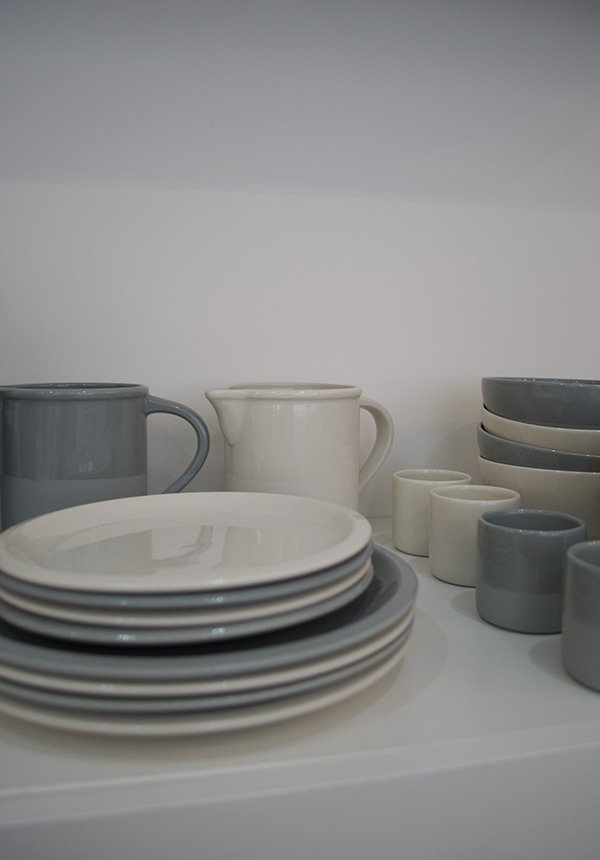 I'm down for subtle colours of spring in grey-blue and off white ceramic tableware by French brand Jars...And love the organic patterns in these monochrome bowls created by local ceramicist Hannah Bould. She's most definitely one to watch.
 Keep your eyes peeled next week for a little Future and Found collaboration and in the meantime, get yourself down to the hatch for coffee from Thursday...
An Artful Style #4 / Studio Esinam Architectural Prints
Back in high school I learnt a little about technical drawings and elevations and it fascinated me - from all the intricate details that go into designing architectural elevations down to the complete joy of using the drawing table.When I first discovered Studio Esinam, a creative design studio based in Stockholm, I was really exciting to see how they'd taken technical elevations of some of the world's most famous landmarks and brought them into a home environment. Founded in 2013 by art director and architect duo Josefine Lilljegren and Sebastian Gokah, Studio Esinam looks to explore architecture from a fresh perspective, presenting familiar historical buildings that we have all in some way connected with in a new light, focusing on the structure and components that make them what they are. Beautiful, don't you think? 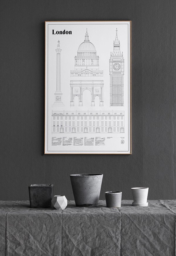
"To us architecture is so much more than visual, it's the smell of the bakery shop on
the corner, the feeling of a handle when entering a building, the sound of cars or birds
forming the backdrop of a scene. It's the memories and emotions that a place can
preserve for decades and bring to life in a second, the calming experience of the
places and spaces we already love as well as finding new ones to explore."
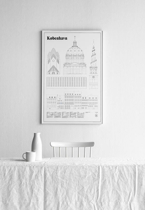 Prints like these really deserve some wall space to breathe and I love how Josefine and Sebastian have chosen to style their detailed line drawings in clean, monochromatic settings. Recently added to the collection are København and the much anticipated London (they're not fans of The Shard), both of which are limited edition. If you're inspired by these prints then you really must take a look at their Instagram which shares an insight into their creative process and how they view their surroundings (which just makes me long to explore Sweden!) lots of white, grey scale and negative space. Perfection.
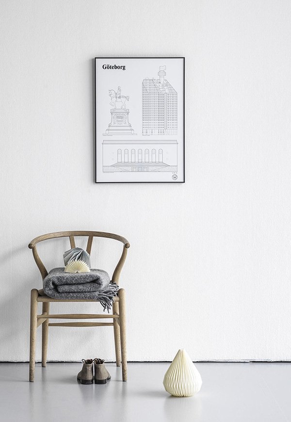
Photography © Studio Esinam
DIY Pine Desk Revamp
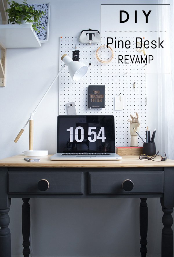 So today I thought I'd share a DIY with you to show how I transformed my old pine desk from the unloved, not-so-stylish specimen it was into the focal piece it is now. I've done a few DIY furniture projects in the past with varying degrees of success (don't ask me about the white and gold glitter bedside table. Please) But my style and tastes have done a fair bit of growing and maturing since then and I was ready to approach this one very differently, like it truly mattered. Honestly, when I started decorating my workspace my initial plan was to ditch the desk completely in favour of trestles with a baltic ply top to stretch across a full wall. But then the only trestles I could find were far too wide and as this room is only 2m x 2m...you get the picture. After a
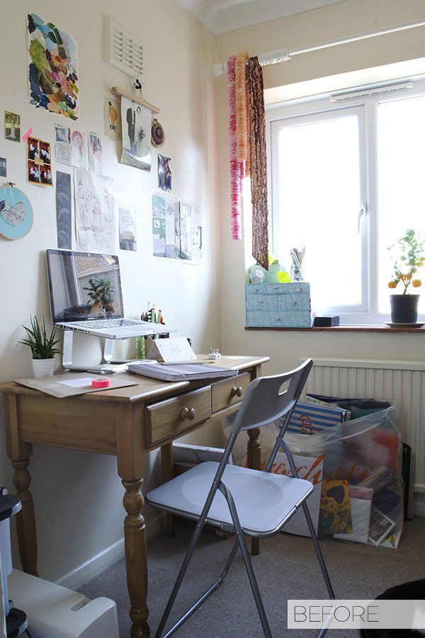
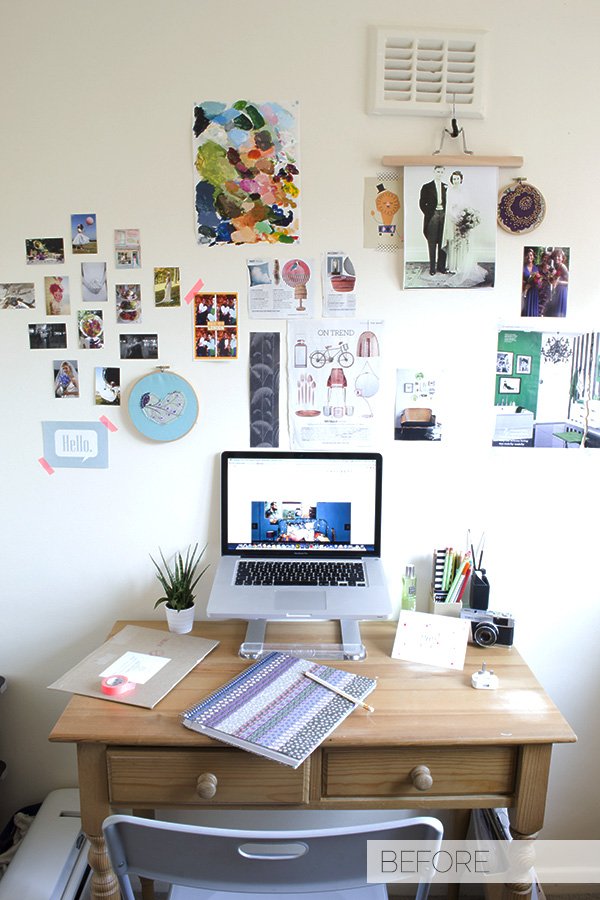
 long short sulk, I put the trestles, the plywood and the hairpin legs to one side and looked at it objectively. The desk just needed some love...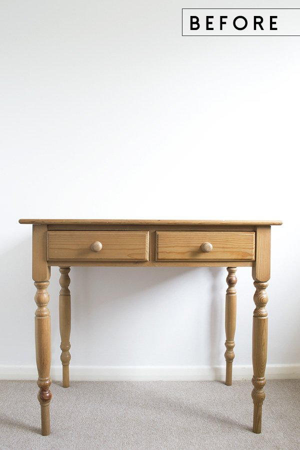 Here's how it started out. Sure, the shape is a little out-dated and most definitely well loved (I used to paint on the top-can you tell?!) but I thought with a little work it could actually become a real show-stopper.
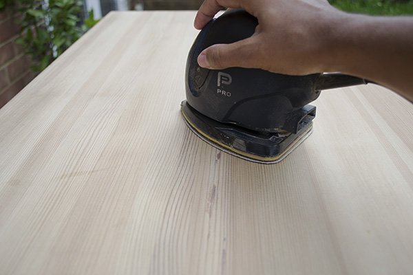
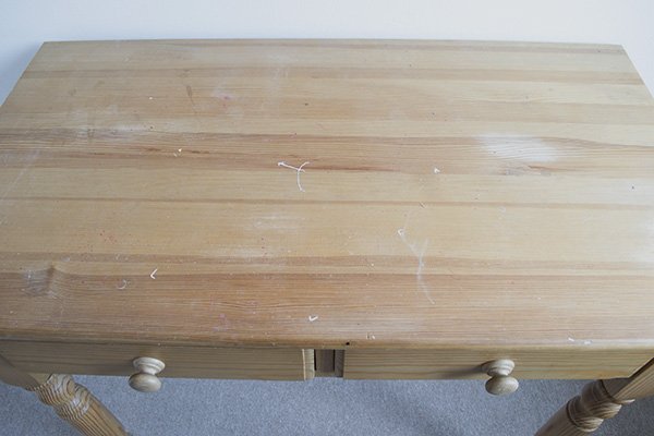 An afternoon outside with the sander lifted off the nasty flecks of paint and orange stain and left a beautiful pale grain that I wanted to keep.
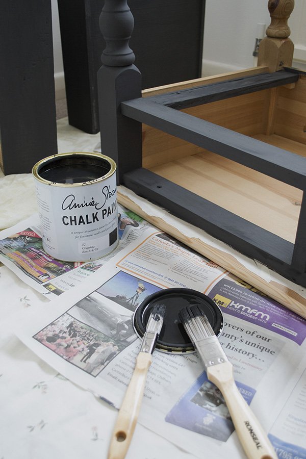
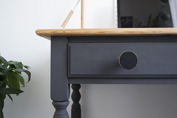
 Next up, I painted the base and drawers in Annie Sloan's Graphite which I watered down slightly to give a smoother finish (it dries quite quickly so you have to work fast). It's a beautiful, matt, not-quite-black and I chose not to wax it to keep a flat finish. Tip: if you want to go for a matt look, make sure you don't skip on quality with your brushes as the paint will pick up on that. After two coats the top was ready to wax.
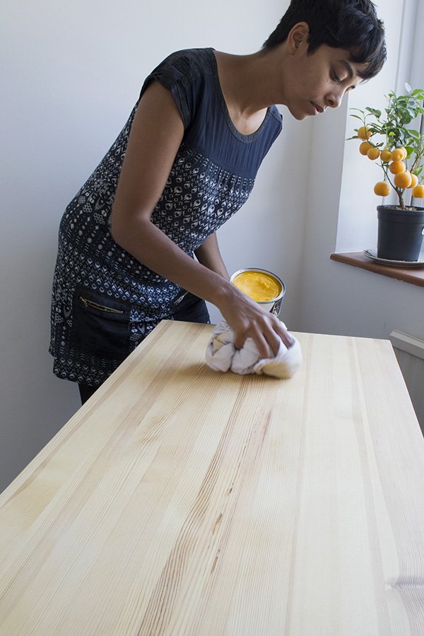
 I used a couple of coats of Liberon Black Bison clear wax to preserve the pale surface with a lint free cloth (yes, it's massive). The wax smelt amazing but more importantly it didn't add any shine to the top or affect the colour of the pine.
 The biggest game changer was the beautiful plywood knobs which came from Chocolate Creative - I had to get some plywood in there somewhere, right? I love that they're big and tactile and the grain in the centres picks up the top of the desk. Here's the finished article...
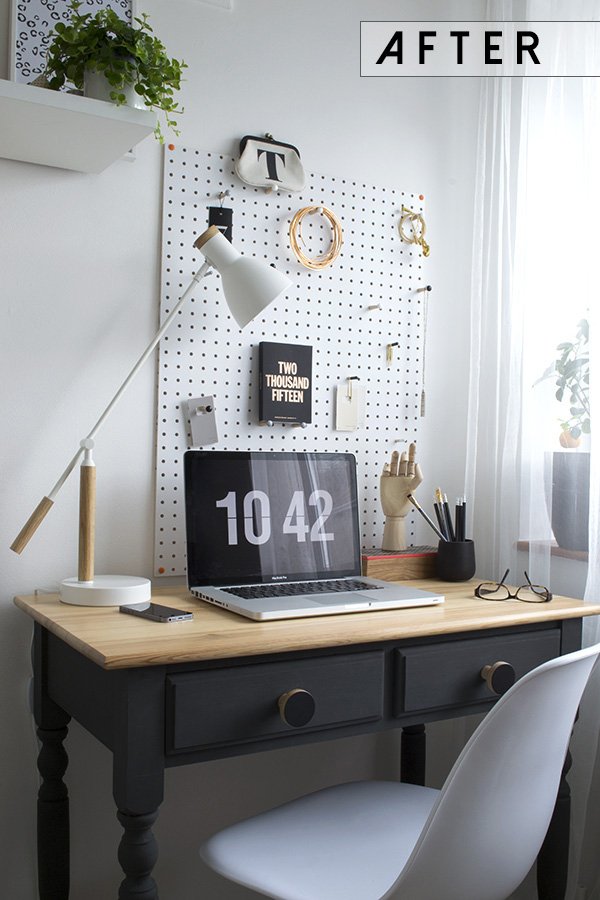 I should just take a minute to thank my brilliant father-in-law Bob The Builder (yes, his name is Bob and he is a retired builder) who was on hand over email to help me when I freaked out over which wax to use, how to use it etc. He really is a fountain of (almost all) knowledge.Do you have an old piece of pine furniture knocking around that could benefit from a little love? You might be surprised with the results...
Sunday Styling at Do South Shop
 A few Sundays ago I found myself heading out on a beautiful spring morning to Do South Shop for breakfast and a spot of styling with some blogger friends of mine. With an eclectic mix of retro, contemporary Scandinavian and ethnic home decor, Do South can be found in the Crystal Palace Triangle with one of the best views of London on its doorstep. I arrive to a scene of organised chaos-the shop has been deliberately rearranged into four designated areas for each of us to transform, with friends Annie Kruise of Style Juicer and Sarah Louise Kimmer (Lapin Blu) having a catch-up on an achingly beautiful oatmeal tweed sofa. Breakfast is an indulgent selection of pastries and brownies from Blackbird Bakery which we pick at as we take in our surroundings. I have my eye on a corner sofa and wonder if I'll get to play with it later.
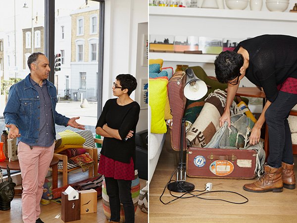 Opened in March 2011 by artist and musician Freddie Oke on his return from living out in Melbourne, the shop reflects his unique perspective on interior style; the furniture he selects speaks to him as would a piece of music. And as music plays such a huge part within my own family it's so refreshing to hear the two married in that way...particularly as I have a penchant for naming my plants after musicians! Everything here connects beautifully in a way that perhaps you thought they wouldn't; from the brightly beaded African masks and wooden skinny man statues, mid-century arm chairs and clean lined HAY DLM tables. A keen traveller, it's almost deliberate that Freddie wants the Do South experience to feel like exploring new territories. Essentially, he chooses what makes him happy and it totally works.When I'm styling on the day job I'm used to having the pressure of time, be it on a location booked by the hour or in someone's own home where they'll want it back at the end of the day, so it was a welcome change to have a little time to play with no preconceived ideas as to what my plan would be. With the four locations folded up onto little bits of paper to be drawn from a pot, I was first up. The sofa was mine.
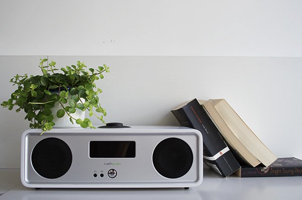
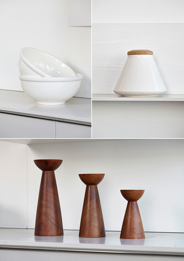
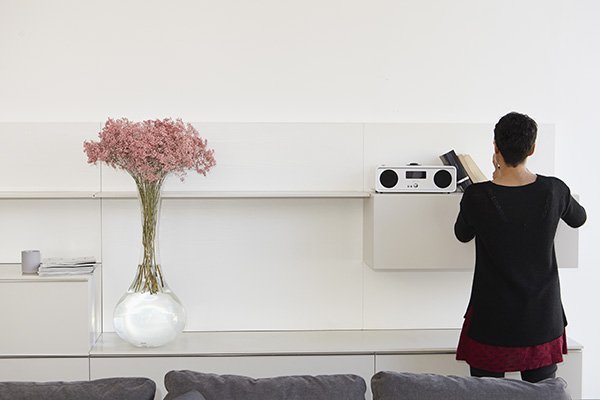
 You know me by now - I like to keep things simple. The feeling of allowing a space to breathe is very important to me, so whilst it may seem tempting to want to fill out the entire shelving unit that came with my sofa setting, the real skill is in knowing when to stop. The very first piece I chose was actually the tall vase of pink gypsophila (who knew it came in that pink?!) which I then used as a subtle colour story, picking it out in the HAY dot cushions and copper candlestick holder to compliment. I liked that the wall unit could also be used to store and display tableware as well as the obligatory collection of books and magazines and loved the clean, white ceramics. Not wanting to make the space feel too stark, I added in the wooden candle trio and tall vintage floor lamp to warm it up. Now if I could just lift the whole set-up out and into my place I would be happy. So happy.
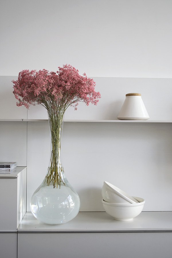 And here is my finished shot, beautifully captured by interiors photographer Kristy Noble. What do you think?
 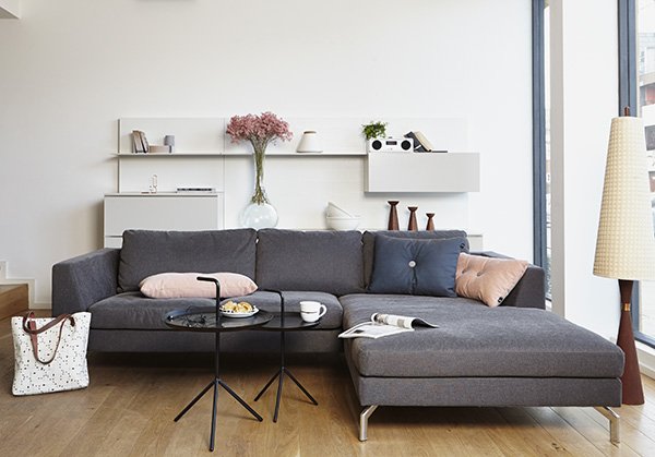 Corner sofa, OSCAR | Coffee tables, HAY DLM | Dot cushions, HAY | Vintage Candle Trio | Radio, Ruark R2i
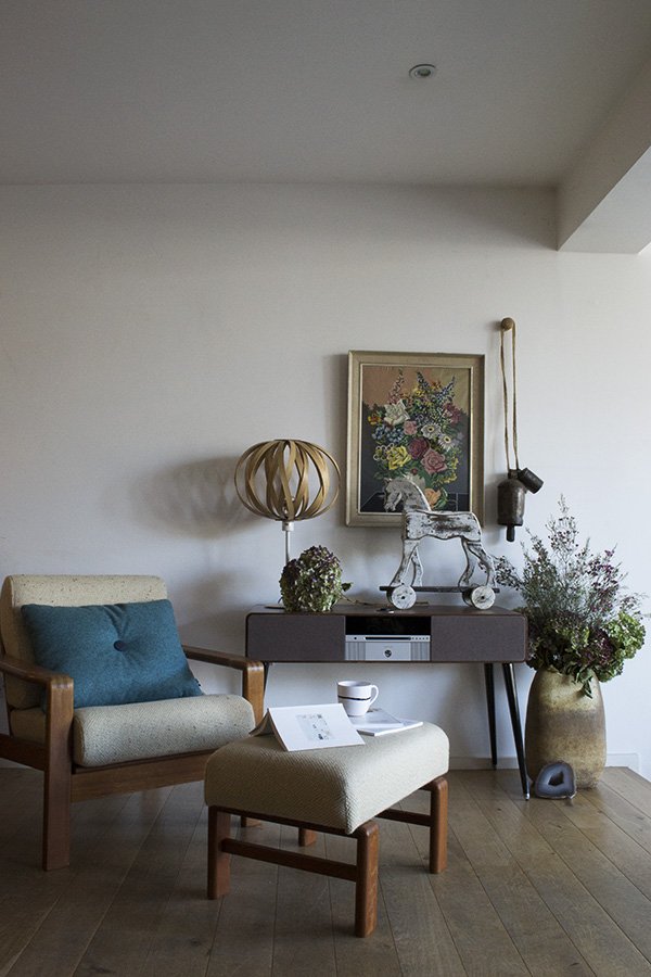 Sarah-Louise created a space, starting with the Ruark R7 sound system, which was just so completely 'her'. As an avid collector of chairs it was a no-brainer that she'd choose that beautiful oatmeal armchair and footstool. I love the depth of colour she's woven in, from the teal Dot cushion and two-tone hydrandeas in the urn, pulling your eye up to the vintage painting on the wall. Looks like a dreamy slow Sunday, don't you think?
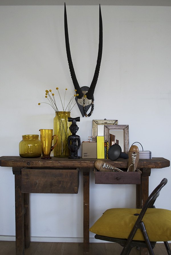 Annie shares an aesthetic much like mine in that she doesn't really go for colour in a big way, so she surprised us all when she pulled this mustard yellow scheme out of the bag with the console table as her jumping off point. The touches of black in the statue and antelope horns still give the look a contemporary edge and I love how she used a pair of vintage shoes to make it look lived in.
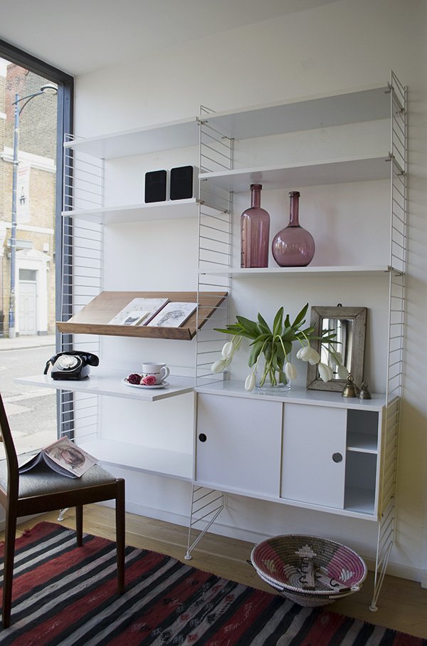 Cate St Hill chose a personal favourite of hers, the String shelving system. A Scandinavian design classic, the clean white lines provided an ideal backdrop for Cate to make it feel a little more homely. With a red, black and pink colour palette, this space is a place to work and relax and I love the characterful details in the silver bells, African baskets and mirror.
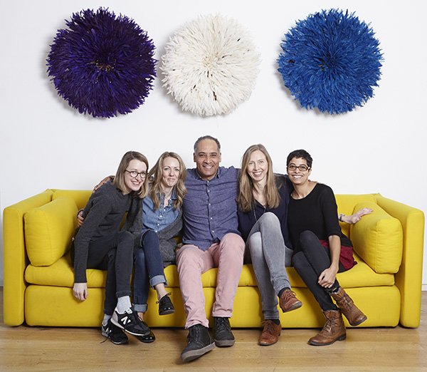 And here we all are with Freddie doing our best to "look natural". Thank you to Freddie and his team for organising such a fantastic morning for us - I look forward to seeing more from Do South very soon and urge you to make the trip and see it all for yourself too.
Photography © Tiffany Grant-Riley unless otherwise stated.
Black Wall Tunnel Vision
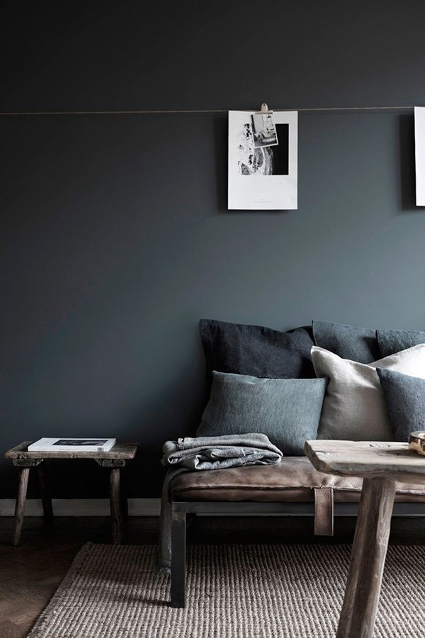 With my recent home project complete and a few weeks of not thinking about decorating behind me (are you kidding? It's all I thought about!) I've been turning my focus to 'The Black Wall'. On most occasions as I've sat down on our sofa and faced the wall the TV is mounted on, I've pretty much in one way or another wanted to take a sledge hammer to it. I can't stand looking at the television in all its blaring 32" glory, or the notion that most households must by default angle all their living room furniture at it - there's no hiding it for us. I stuck a RIBBA picture shelf above it when we first put it up and found a beautiful mid-century sideboard to anchor it with to try and lessen the impact but nope, I still hate it. So I decided to be bold and thought about ways in which I could better integrate the TV so that it looked more intentional. Paint it black, I thought! Hold on a second - don't freak out.Here's why it'll work without it looking like a 90s feature wall...✚ Our living space is full of natural light with white walls so the one I'm painting in black won't upset the balance. As ours is next to a huge window it'll add its own dimension to the room.✚ The sideboard under the TV has a warm teak stain which will stand out against the black.✚ It's the perfect backdrop for a gallery wall.✚ The black furniture and accessories we already have in the room will pick up against it perfectly.✚ A black wall with a black television means I won't notice it quite so much any more. I win.Now I'm seriously lusting after black walls and so this week I set to sourcing tester pots to help decide. The current runners are Little Greene and Farrow & Ball with newcomers Valspar for comparison. If you check out my Instagram you'll be able to see little snippets before I share the before & after.So what do you think? Tempted to take a walk over to the dark side or too nervous? Don't be! You might find my Black Walls Pinterest board a useful starting point...
Image: Hans Blomquist
My Workspace Reveal / The Befores & Afters
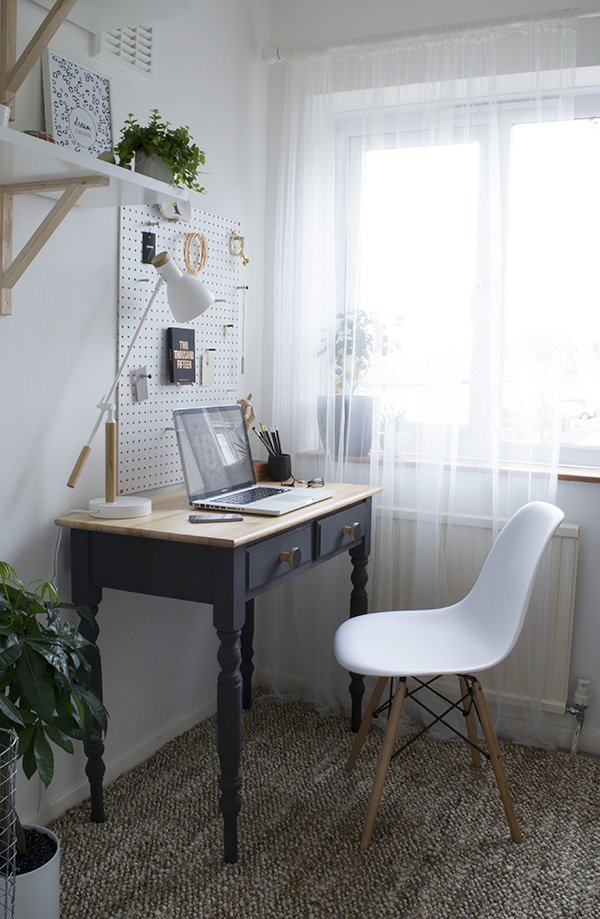
Today is a milestone - I'm excited (and relieved) to finally reveal my new-look workspace to you. We've been here for almost two years now and when I moved into this room it was a sort of shove everything in situation whilst I figured out what to do with it. I set up a desk, stuck some bits on the wall and put up with it as a sort of craft room. And then last August I decided in a fit of frustration that it wasn't working for me and it had to change. Storage was pretty sparse, there was no sense of my style which had changed so much since we'd moved and I didn't feel inspired to work in it, so for the next six months I launched into turning it into the best room in the house. Yes. For a space that's only 2m squared that's a ridiculously long time but hey, Rome wasn't built in a day, right? And it's good to slowly introduce my home to you, particularly as I'm usually quite guarded on that side of things. I feel self-conscious about it in a lot of ways, much of that comes from spending too much time picking over the bits of the house I can't stand or can't change, but that's all part of the joys of renting. Anyway, come and have a look!
Given the size of the room and my penchant for bright white spaces, it was a no-brainer to paint out the cream with a brilliant white, introduce pale, untreated wood to compliment and a touch of black to set it all off. You can take a look at my inspiration on this Pinterest post and see how useful my Studio & Office board became in the process as my point of reference.
Flooring was a real issue for me and it took months to find the perfect rug. I don't have the glorious luxury of wooden flooring anymore so I kind of just wanted to forget that this carpet existed and find a rug large enough to cover the width of the wall that came out far enough beyond my desk. Try finding one that size within budget! My first attempt was a diamond Berber which seemed great in my head, but in situ just fought with the black desk and took all the focus away from the room down onto the floor. A minor panic ensued (my good friend at LapinBlu can vouch for that as I drilled her for advice) and by the end of the day had returned it and ordered another. I'd come to the conclusion that a textured, patterned rug was just wrong for this space and so Zara Home saved the day with a classic handwoven jute number instead. It was a bit more of an investment than planned but I love the surprisingly soft (for jute) texture under foot and that it adds to the space without distraction. Nervously I waited as Mosey sauntered in to inspect it and I thought he'd take to it as his scratch pad but I'm not sure he's even noticed it, so long as he can lounge underneath the radiator!
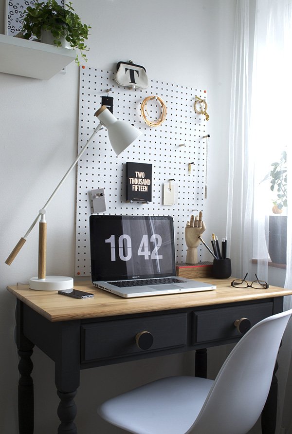 I'd planned to get a new desk in baltic ply on trestles encouraged by the guys at Hopper + Space, but when I couldn't find trestles small enough without taking up half the width of the room I had to be realistic and decided to update my existing one. My sister had given it to me after she'd decided she didn't want it anymore (thanks Meg) but as I thought it was out-dated and worn out in its current state it had to become a statement piece. I'll be posting a DIY piece on the desk later next week to show you how I did it, but in short, I sanded down the layers of stain on the surface to lighten the tone of the wood, gave it a coat of clear wax, chalk painted the base and changed the drawer knobs which are made from ply by Chocolate Creative. They're so sexy!
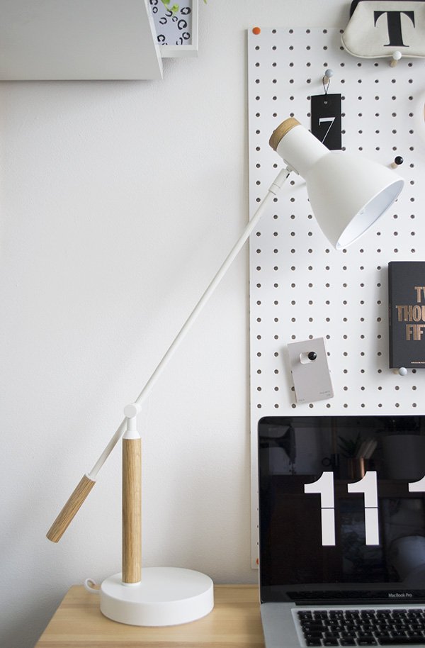
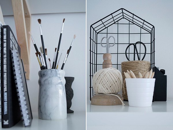
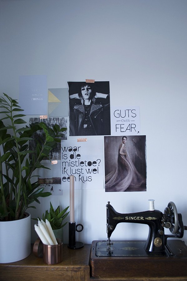
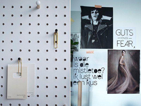
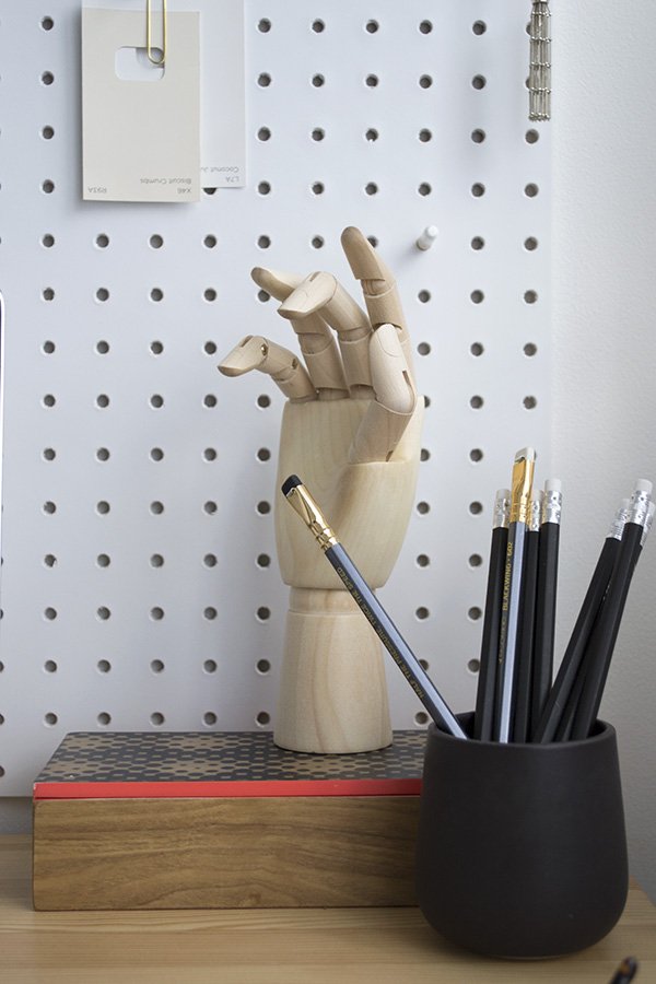 I've tried to eliminate the desk clutter and keep the surface as clear as possible with the white PegBoard from Block.The pegs arrived with coloured tips so I painted them out in black and white. I love that I can switch up the display whenever the urge strikes. The simple white desk lamp was a birthday present from my mum, the 'Cohen' by MADE.COM. Sheeeeeesh that lamp. It's just so elegant, don't you think?
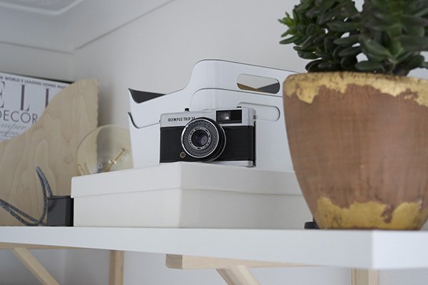
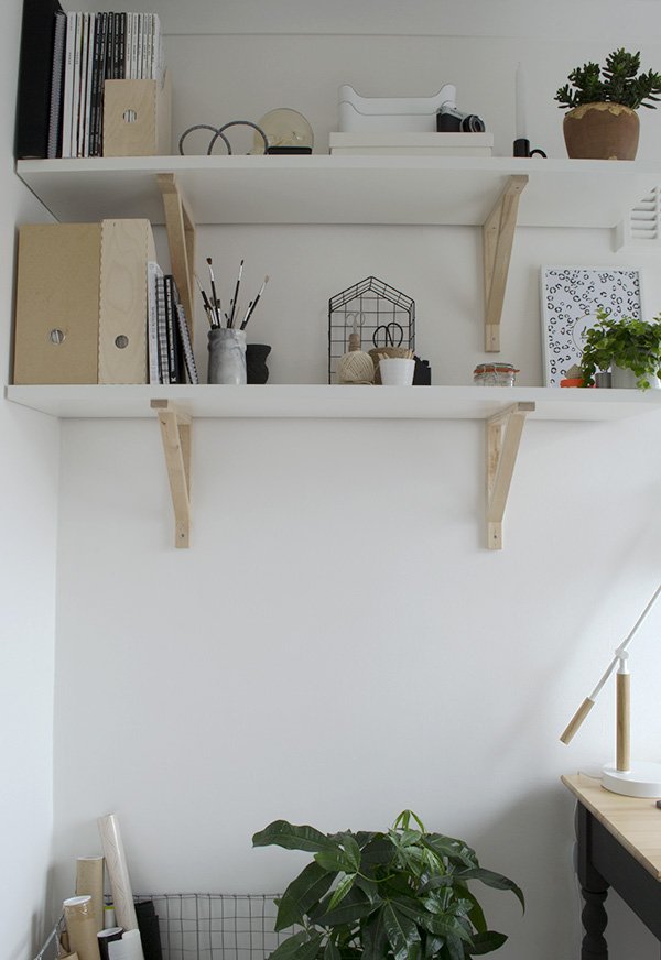
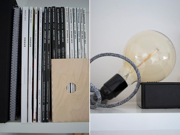
 Storage was a huge issue before I put in the shelving which I found in IKEA after quite a lot of searching and deliberating. I wanted to stick with the combination of white and untreated wood to compliment the rest of the look and I loved the mix and match shelving at IKEA. I used to store most things into plastic crates which I hated looking at, so I sorted through the paints and other pieces that weren't an every day necessity and moved them to the garage instead. Initially I'd had it in mind for three levels but it actually wasn't necessary once I'd got them into place, so the third will probably go into Tabitha's room when I get round to it. Now I use a mixture of desk drawers, shelving and my 1920s bureau behind it which is a much better solution.
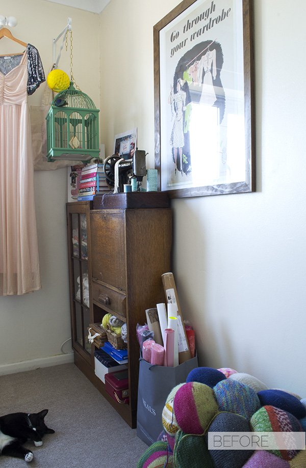
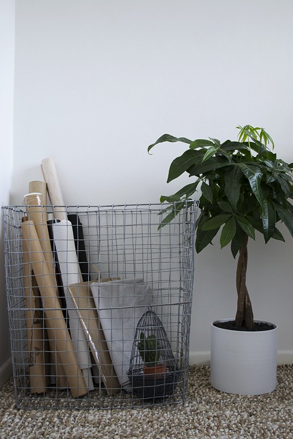 Let me just take a minute to talk about this basket. Oh wow, this basket. I saw it way back last summer when I'd popped into West Elm for a quick meeting and had to have it. Given the amount of prints, random rolls of paper and packaging I seem to collect (I hate throwing paper out) it made sense to store them all in something extremely stylish. Before I was just using a bag (see below) but the wire basket is a far better option and doesn't take up too much space either. Win.
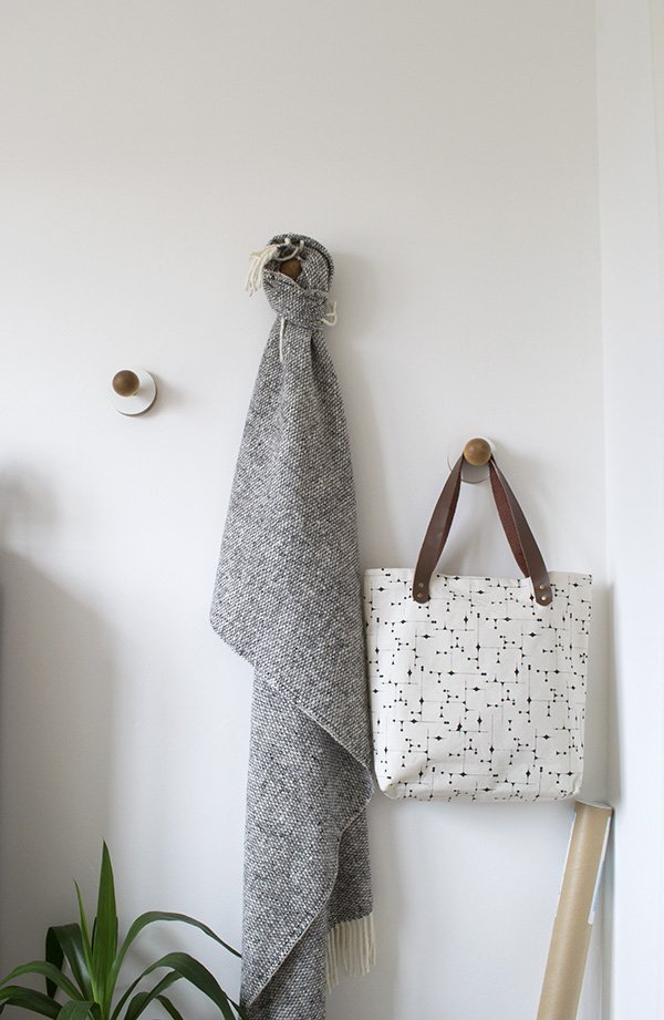 As floor space is at a premium in here, I was keen to source some wall hooks to keep things like my camera bag and tripod out of the way but also have somewhere that I could hang prints as I find them. When I had an email from designer Nikki Kreis to introduce her beautiful, minimal homeware collection, I called off the search when I found these beauties. With a layered plywood plate and smooth birch ball, they're so tactile and instantly become an extension of the wall.
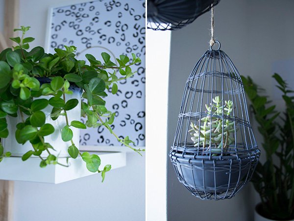
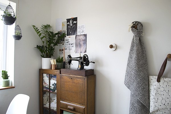 Of course, it wouldn't feel complete without the presence of plants - you might have noticed that I'm a little obsessed? The hanging wire cloche planters in the window were found as a set of three in my local Oxfam which stocks discontinued Zara Home decor. Not sure if that's where they originally came from but either way I wasn't hanging around (excuse the pun) and snapped them up for a bargainous £6.99. The first plants I tried inside them were a bit of trial and error and didn't take too kindly to the bright light and heat from the radiator, so I switched to these two succulents which will spread and trail. So far, so good.
 Phew. So there we have it. One workspace, pretty much complete. Sure, it'll adapt over time and I plan to bring in some prints at a later stage just as soon as I can decide on what but for now, it's done. This is absolutely my favourite room in the house now. The kids come and hang out before bedtime in here too and I just love working with fresh walls to play with and a clean, bright space. What do you think?
Photography & Styling by Tiffany Grant-Riley
'Brilliant White' paint, Crown | Jute rug, Zara Home | Shelves 'EKBY JÄRPEN' & 'EKBY VALTER' brackets in birch, IKEA | White PegBoard, Block® | White & natural oak 'Cohen' table lamp, MADE.com | 'LILL' net curtain, IKEA | Wire mesh hamper, West Elm | Black chalk paint in 'Graphite', Annie Sloane | Black plywood drawer knobs, Chocolate Creative | Plywood & birch wall hooks, Kreisdesign
Getting Plastered With Rooms Made For You
 Ha. The title got your attention didn't it? Well, to some extent I did indeed get plastered - last Wednesday on the 34th floor of The Shard no less, but not in the alcoholic sense. I was there to work. Come on, how unprofessional would that be?I digress. I'd been invited along with a group of fantastic bloggers by Rooms Made For You, a new brand by kings of plaster and construction British Gypsum, to road test some of their incredible new products for the home. And let me tell you - they are actually incredible. Game changers in fact.
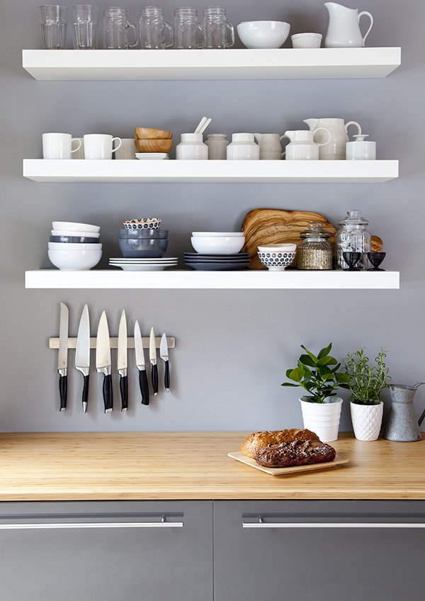 Breaking down the boundaries of standard plaster board and walls that won't take weight of your shelves without a million plugs, the Lifestyle Wall revolutionises the way we use our homes. Allowing you to screw straight into the wall with complete ease without the need for fixings (we had a little timed competition with some screws to test it out) it's seriously strong stuff. I think it may even save a few marriages. The kitchen above, styled by interior designer Becky Clarke sees it in action. Clever, no?
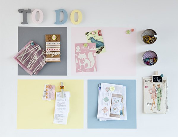 Although we're committed to renting for now until we're ready to buy again, I'm keeping an eye on the features I'd love to have in our home one day and the Magnetic Plaster is one of them. Ideal for kids rooms, office spaces, kitchens-you name it, the plaster goes on in the same way as standard but contains a form of volcanic rock which attracts magnets. Imagine being able to hang pictures without going into the wall at all, organise the family's activities in a fun way in the kitchen or have an entire wall dedicated to play in the kids room.The last product that I wish we'd had in our old home (an Edwardian terrace with beautiful-but-noisy wooden floors) was the Silent Floor. The new 'Quiet Mark' certified insulation essentially goes into your ceiling to block out any noise from travelling through. Perfect if you have kids and teens in the house - we've woken the children up laughing too loudly at the telly before now too.I think these guys are about to change the way we use our homes for the better-in fact I'm surprised it hasn't happened a lot earlier. Already being tested in new builds across the country, it's exciting to see that this might soon become the new standard. Why would you want to bother with the constraints of decorating when these completely free up your creativity? I'd love to hear your thoughts...Thank you to Rooms Made For You for hosting a wonderful morning and to the Shangri-la Hotel for looking after us so well-the views really are breath-taking.In association with Rooms Made For You.