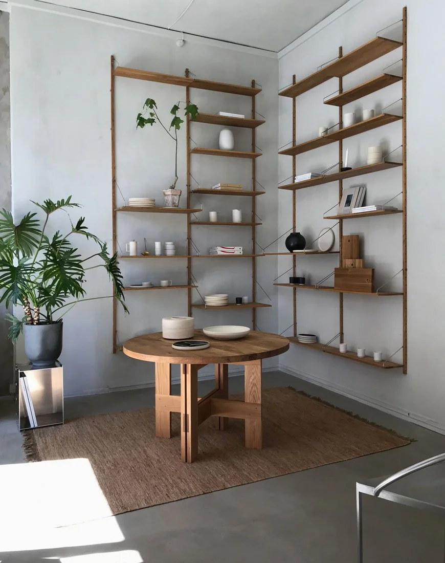
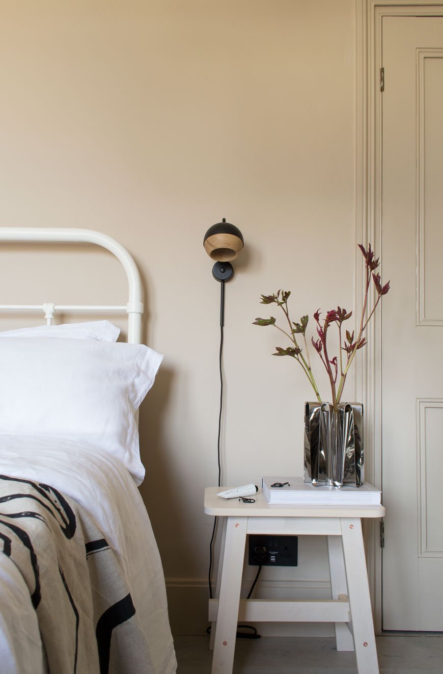
Nordic Design Highlights from 3daysofdesign Copenhagen
Three black stools line up outside the odd fellows mansion in Copenhagen at 3daysofdesign
We're back in Copenhagen today to explore some of my highlights from last month's visit to 3daysofdesign. The festival which is open to the public takes place every year, celebrating the best in Nordic design. With so many showrooms full of the most exquisite, minimal design it’s impossible not to feel overwhelmed by it all. In fact, you really need five days in the city to gear yourself up and wind down afterwards! With this, my very first visit to Copenhagen, the stakes were high. I landed the night before, checked into design hotel SP34, and headed out to dinner with friends ahead of a jam-packed day. And just as well I packed decent walking shoes because after a full day of 9am-10:30pm studio visits and meetings, I was done! By Friday mid-afternoon I was already flying back to London with a head full of inspiration. Soothing interiors and calm, muted spaces offset the feeling of chaos as we made our way around the city. Not surprisingly, textured lime and chalk-painted walls provided the backdrop for many collections with shades of light grey and subtle beige proving to be most popular. Darker palettes also came through, presenting a moodier, sophisticated aesthetic such as the New Works showroom. Among the many topics of conversation during the festival, the most common thread throughout was sustainability, mindfulness, and collaboration.
Senses by Louisa Grey & Frama
You just can't come to 3daysofdesign and not see the Frama Studio. Set inside a former 19th Century apothecary, the 'Senses' collaboration between London interior designer Louisa Grey and Frama's founder Niels Strøyer Christophersen takes you on a sensory journey. With influences of Japanese culture, the studio aimed to push back against our busy lifestyles, presenting a remedy for overload with restorative spaces in which to reconnect with nature and our inner selves. You were encouraged to slow your pace as you made your way around. It was impossible not to feel affected by the experience, as you took in the sounds, scents, and textures. Niels and Louisa talked about their common ground with a shared focus on wellbeing and natural, sustainable materials. The beautiful, old bones of the building are left raw and exposed in contrast to Frama's contemporary collection. There is a room for meditation featuring a Japanese Zen garden in miniature with carefully selected quarry stones. Another room explores sound alongside the latest scent from the St Paul's Apothecary collection. Beyond this, a room to bathe and relax with a Japanese wooden bath as its crowning glory. With glimpses of beautifully arranged grasses and a curated selection of Frama's ceramics, this was a place I'd have happily stayed in all day.
Frama Studio | Fredericiagade 57, 1310 Københaven.
Karimoku Case Study at Kinfolk Gallery
I think the word 'Kinfolk' would be enough of a highlight to leave it there, but then I think this new launch absolutely deserves an explanation. The Japanese thread continues with the launch of a new collaborative collection, Karimoku Case Study. This contemporary lifestyle brand unites both Nordic and Japanese design sensibilities. Showcased within the sanctuary of the Kinfolk Gallery, the collection is the result of a partnership between Japanese furniture manufacturers Karimoku and architectural studios Norm Architects and Keiji Ashizawa Design. In short, it was a dream. Inspired by the shrines, temples and gardens of Japan, the interiors were cocooning and warm. You got a sense of the space both in the layout and in the way Norm Architects and Keiji Ashizawa have explored and used negative space within the collection. The large, open rooms had been treated with DetaleCPH lime paint to introduce a quiet texture on which to present the collection. Respective values connected through nature and traditional craft come through in the furniture which is elegant and understated. Woven veneer wall art highlighted those connections and the importance of craft. The gallery was also dressed with pieces from like-minded co-exhibitors including Kvadrat upholstery, Sørensen Leather and floral design boutique Tableau. Keep your eyes peeled for slightly left-field floral design folks, tonal coloured displays are leading on from dried grasses...
*all photography © Monica Grue Steffensen.
Kinfolk | Amagertorv 14, 1160 Københaven.
Form & Refine Launch at Hotel Charlottenborg
Having discovered Form & Refine on Instagram a few months before their official launch (you may have seen their Alcoa vases in my feed) I was excited to see them as part of the Hotel Charlottenborg installation. Set inside the Kunsthal Charlottenborg (not pictured) the halls were turned into a hotel experience using a collective of design brands. Visually New Nordic in style, sustainable practices guide the collection by the use of materials and in supporting the smaller communities that produce them. Form & Refine aims to reduce its C02 footprint whilst celebrating time-honoured materials from around the world. Be it Scandinavian wood or Bolivian wool. With a focus on craft and traditional skills, they employ local workshops to produce their designs. The Alcoa vases (a favourite of mine for their graphic shape and matte surface) are produced in the ancient clay region of Alcobaça in Portugal where I made a visit to a family-owned ceramics factory last summer. I'd put money on the Origin lounge chair becoming a future classic too. Made in Danish ash from the forest of Damsbo, the backrest and seat almost float on its frame. Isn't it beautiful?
The &Tradition Village
Verner Panton's 1968 classic design The Flowerpot lamp, framed in the doorway of the &Tradition gallery at 3daysofdesign.
I've noticed lately how showrooms are evolving into more immersive and relaxed spaces. The new home of &Tradition is a gorgeous example, nestled inside a historic mansion dating back to 1913. Named 'The Village', it encompasses a showroom, gallery space and The Courtyard cafe, an oasis of lush, informal planting in which to meet for lunch or coffee. Visitors can experience new and classic design pieces from the collection at their leisure within 'The Home of a Collector' and take in all the period features of the building. What more could you want?! The 'Novelties' exhibition in the upstairs gallery space showcased the popular classics, including my favourite - the 1968 Flowerpot lamp designed by Verner Panton. A new release, the Elefy chair from Spanish designer Jamie Hayon was also on display, inspired by the large, curved form of the elephant.
&Tradition | Kronprinsessegade 4, 1306 Københaven.
Take me back already! Have my highlights left you feeling a little more zen now? Perhaps it's giving you food for thought with your own home? It definitely has for me - I'll be dipping my hands into lime painting my office in the coming weeks and I'll be working on a 'how to' piece if you fancy trying it for yourself. In the meantime, keep your eyes peeled for more on The Audo, an incredible residential workspace and restaurant created in collaboration with Menu Design. You. Will. Love.
Outdoor Furniture for a Modern Scandi Garden
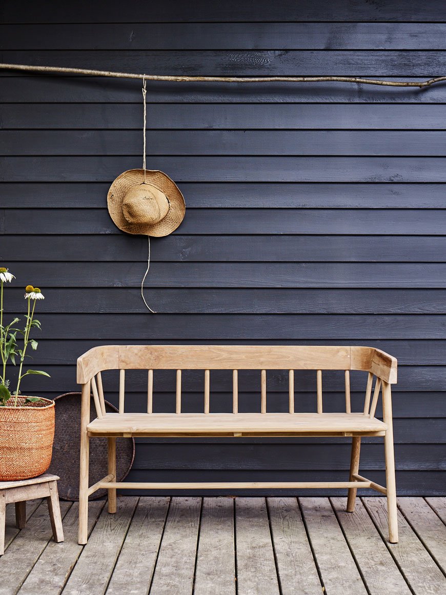 It’s true that outdoor furniture has a bit of a reputation for being outdated and plastic-y. A far cry from its indoor cousin, it might be down to the fact that we use it seasonally here in the UK, in between ducking rain showers. But as our gardens are beginning to evolve into outdoor living spaces, brands are catching up. As I'm always so good to you, I’ve put aside our house renovations to pick out five brands with collections that suit a modern Scandi garden. Think clean lines with a crafted feel to compliment contemporary planting, perhaps a gravel garden with black fencing and architectural planting. A space that remains both timeless and a place to spend time in. Furniture made with honest materials. In short, exactly what I’m working towards with my own garden!
Rowen and Wren
What I love about Rowen and Wren is their keen eye for beautifully crafted, simple homewares that sit comfortably in just about any setting. I've honed in on two of their functional, wooden collections which illustrate just that.Made from sustainable teak, the Byron bench bridges the gap between indoors and out. With its smooth, curved back it makes an ideal spot for that morning coffee, perhaps with a cushion on the seat. It's a versatile addition to have at the table too - keep it indoors in the winter and bring it outside with the warmer months.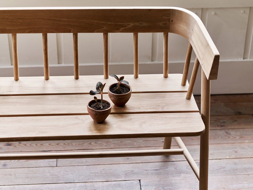
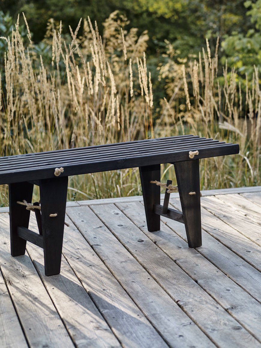
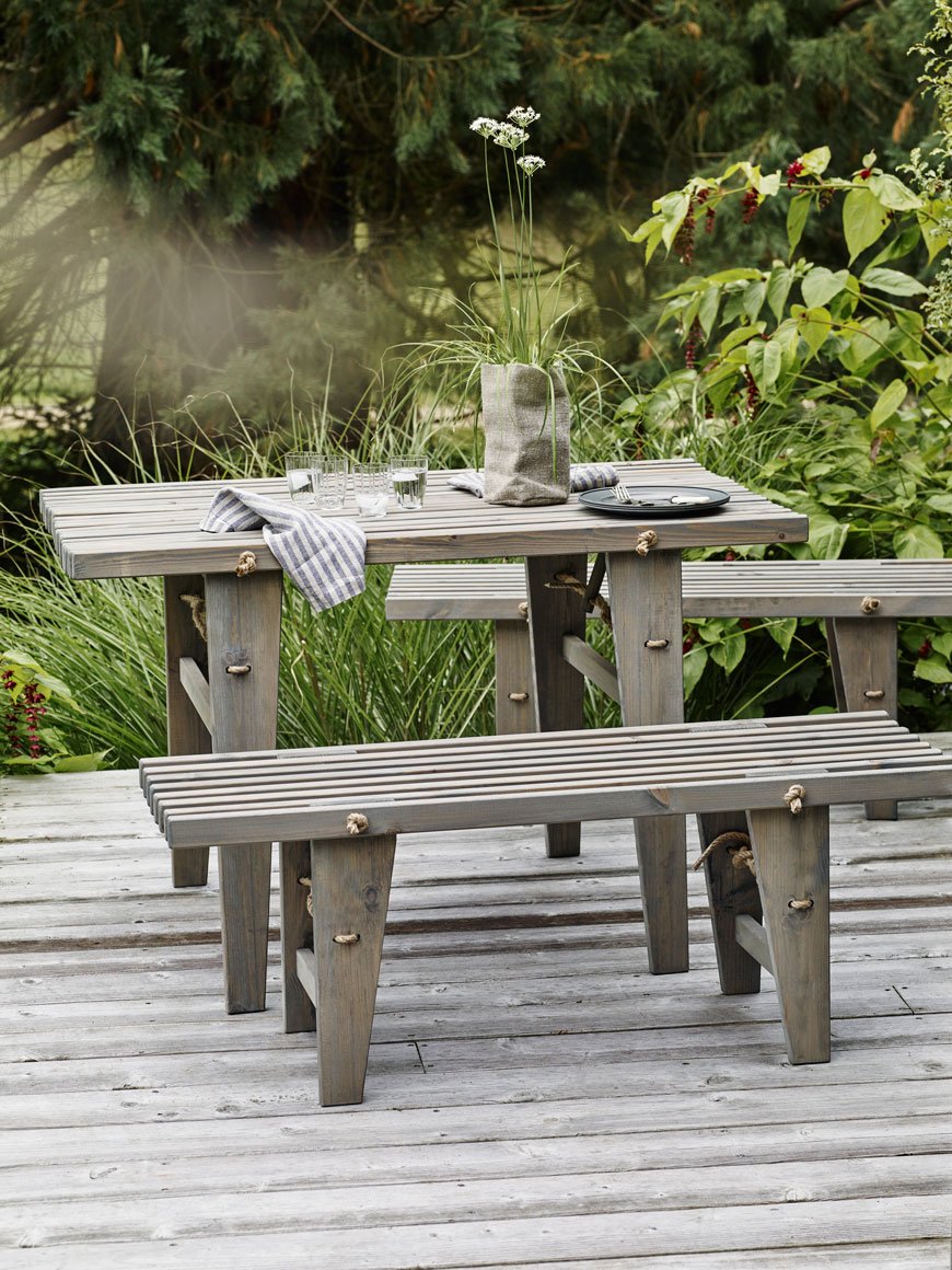 Drawing on the slatted wood trend, the Harman collection has coastal appeal with its combination of wood and rope. Effortlessly stylish, the table and benches are perfect for impromptu gatherings in the garden and come in oiled grey or black. There's also scope to mix and match your garden set-up with stools and chairs to compliment. I could see myself using the black bench in our hallway during the winter months, so much would it compliment a minimal interior.
Woud
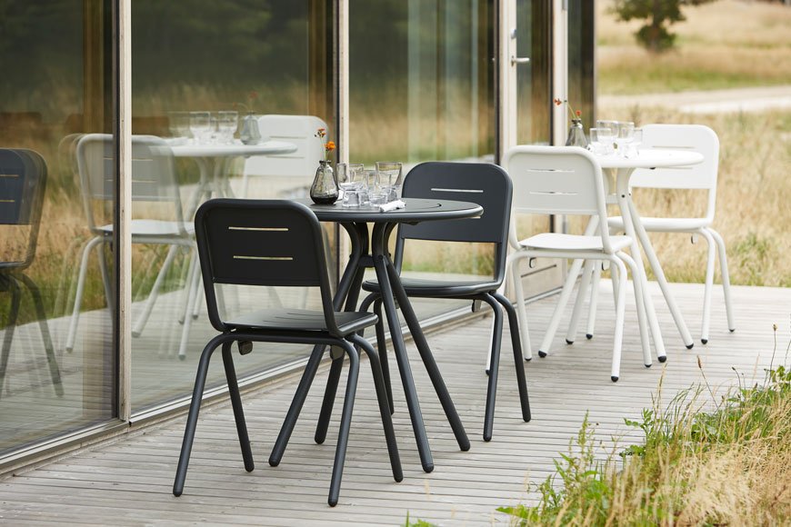
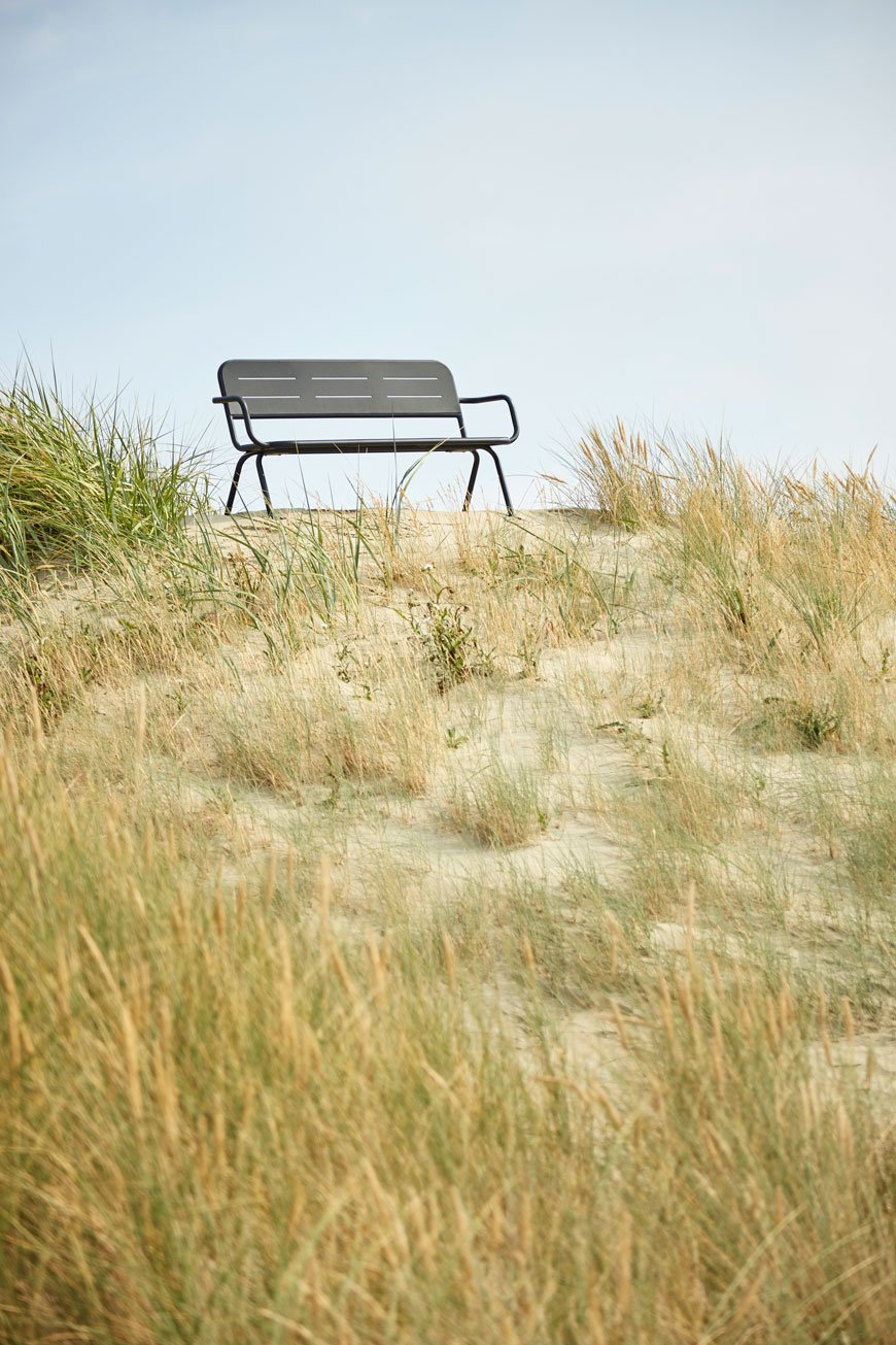
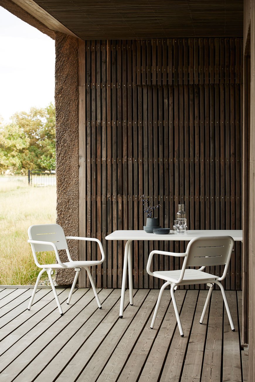 As I recently featured the indoor side of Danish brand Woud's collection, it made sense to explore their outdoor furniture here.Designed by Fasting & Rolff, the Ray collection is a light and modern interpretation of French cafe furniture. Made from aluminium with steel inside the tubes to give it weight, it also comes in a light blue and rose pink (though obviously, I'm more partial to the black and white!) Its minimal curves bring a contemporary feel to any garden and grooves in the seat cast playful shadows underneath. You can also choose to include armrests on the Ray Chair and Bench too which in my eyes makes it a striking and versatile collection for a modern Scandi garden space.
Garden Trading
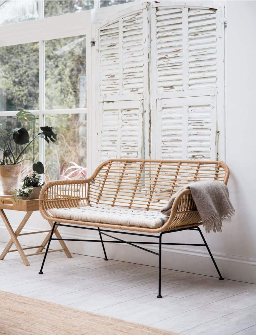 You can always rely on Garden Trading for classic accessories for the garden. Although I'm familiar with their artisanal planters and tools, this is the first time I've sat up and taken note of their outdoor collection. And there are some real gems. Natural, sustainable materials such as cane and bamboo always look at home in the garden and the organic shape of the Hampstead bench is no exception. Made from woven, all-weather bamboo on a powder coated steel frame it would steal the show in a sunroom or as a focal point in your garden.
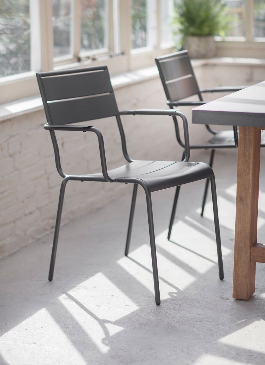
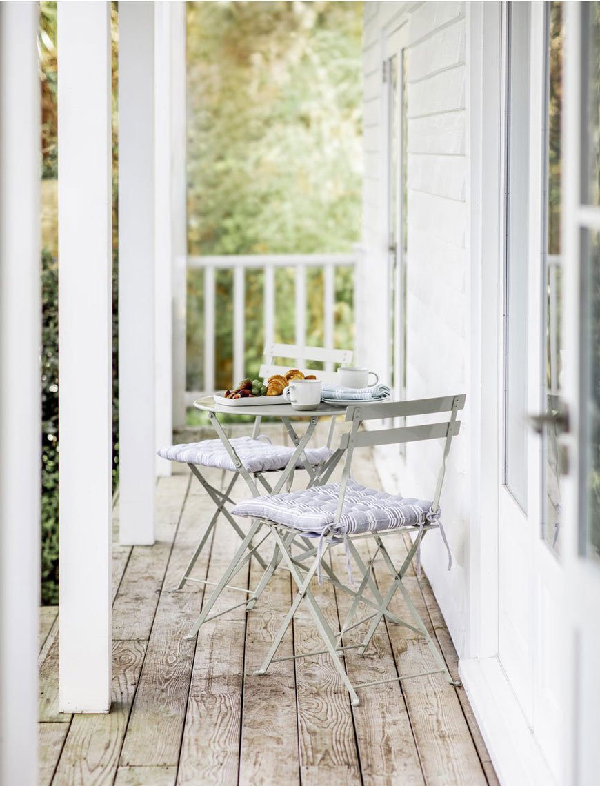 Of course, the classic choice for alfresco dining is always the bistro table and chairs and the Rive Droite comes in a selection of colours - I love the clay, of course. And below, the Thurloe chair is a stand-alone design intended to be paired with other furniture. The matt dark grey and sleek armrests give it a contemporary look that also lends itself to a more rustic style.
Skagerak
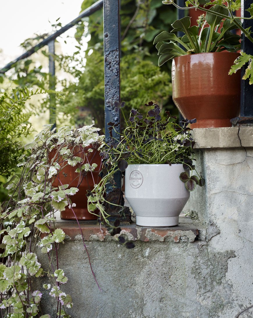
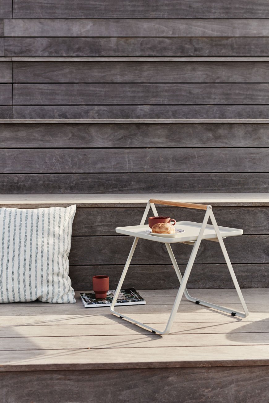
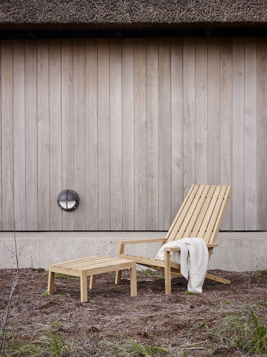
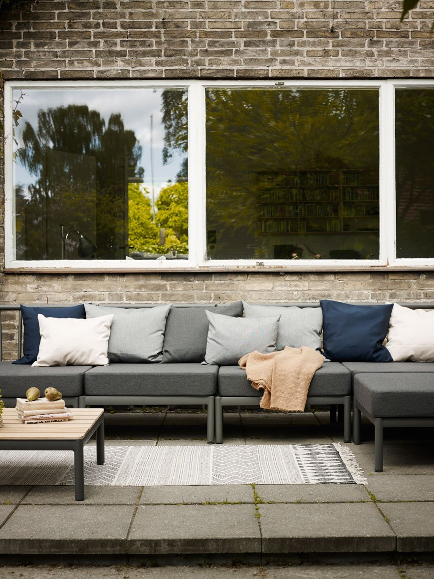
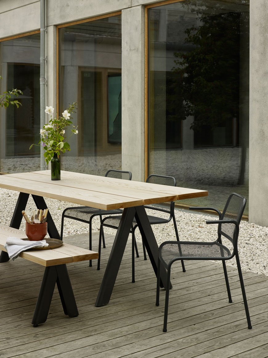 Marrying quintessential Scandinavian style with contemporary materials, Skagerak's collection of garden furniture is vast. Literally, so many choices and they all compliment each other effortlessly. Freshen up your space with smaller details like the terracotta Edge pots or a By Your Side table. Play with a classic Overlap wooden table with meshed metal Mira chairs. Kick back in the high-backed Between Lines deck chair or seat the whole clan on the Tradition modular sofa. For smaller gardens, courtyards or balconies, the collection also includes foldable tables, stackable stools and Oeko-Tex certified outdoor cushions. I'll take the lot!
Mater
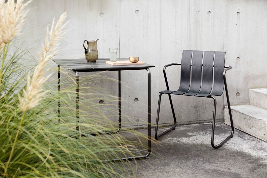
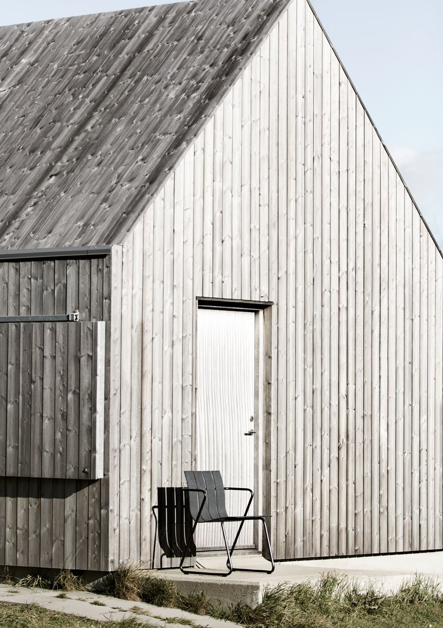
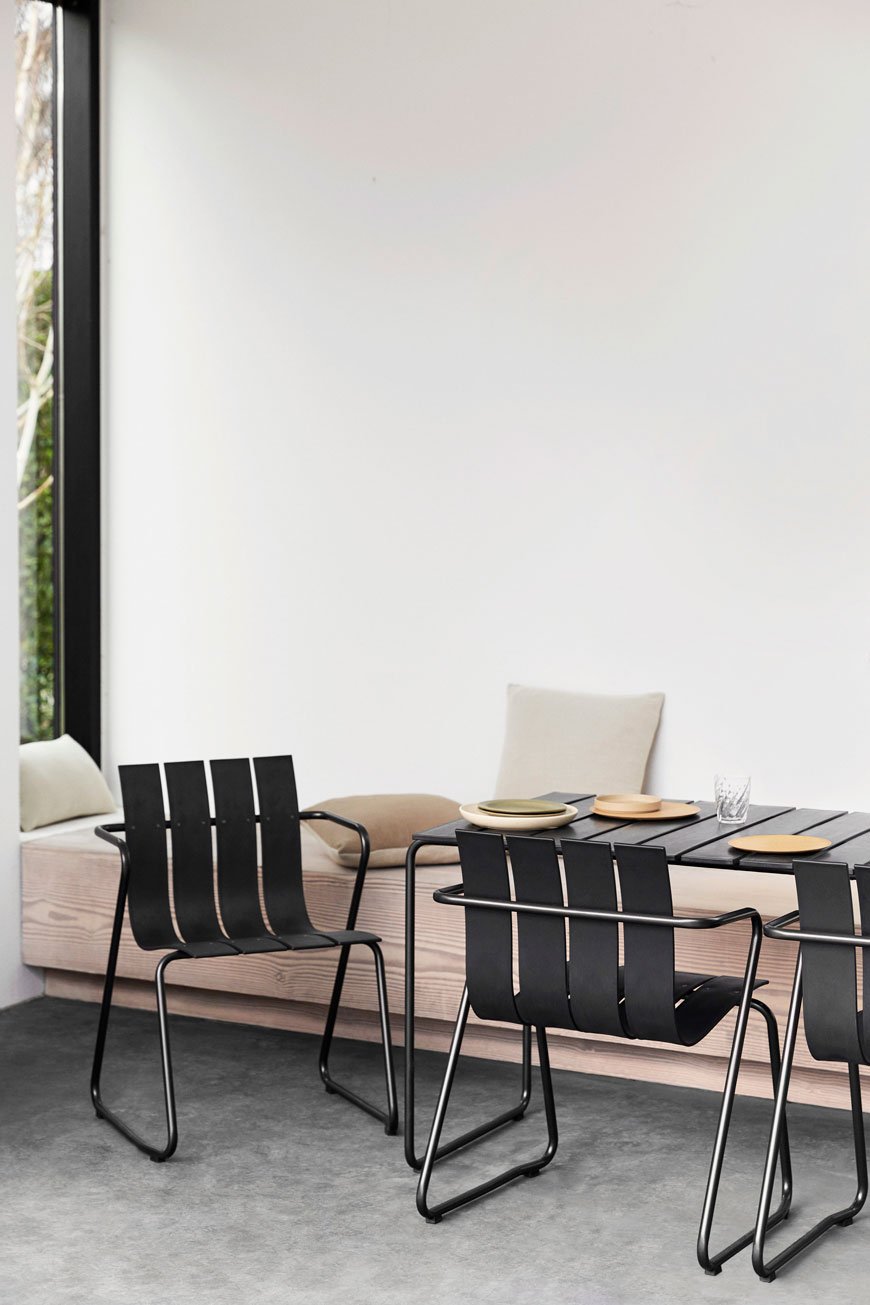 You know how much I love and support Mater in their endeavours to change the landscape of sustainable design. Founded with the environment in mind from the very beginning, this Danish brand focuses on circular design instead of throwing a piece away when it reaches the end of its life. All the components can be separated and recycled if and when the time comes.In what I think is their first foray into outdoor furniture, the Ocean collection reuses 960g of ocean plastic per chair. Although it looks wholly contemporary, the original model was actually designed in 1955 by Danish designer Nanna Ditzel. This updated, eco-conscious version also includes a table made from the same moulded plastic slats with a steel frame. So, not only does the Ocean collection bring long-lasting style into the garden, but it's also doing its bit by cleaning up the ocean. No wonder its winning awards!
New Works Showroom Designed By Lotta Agaton Interiors
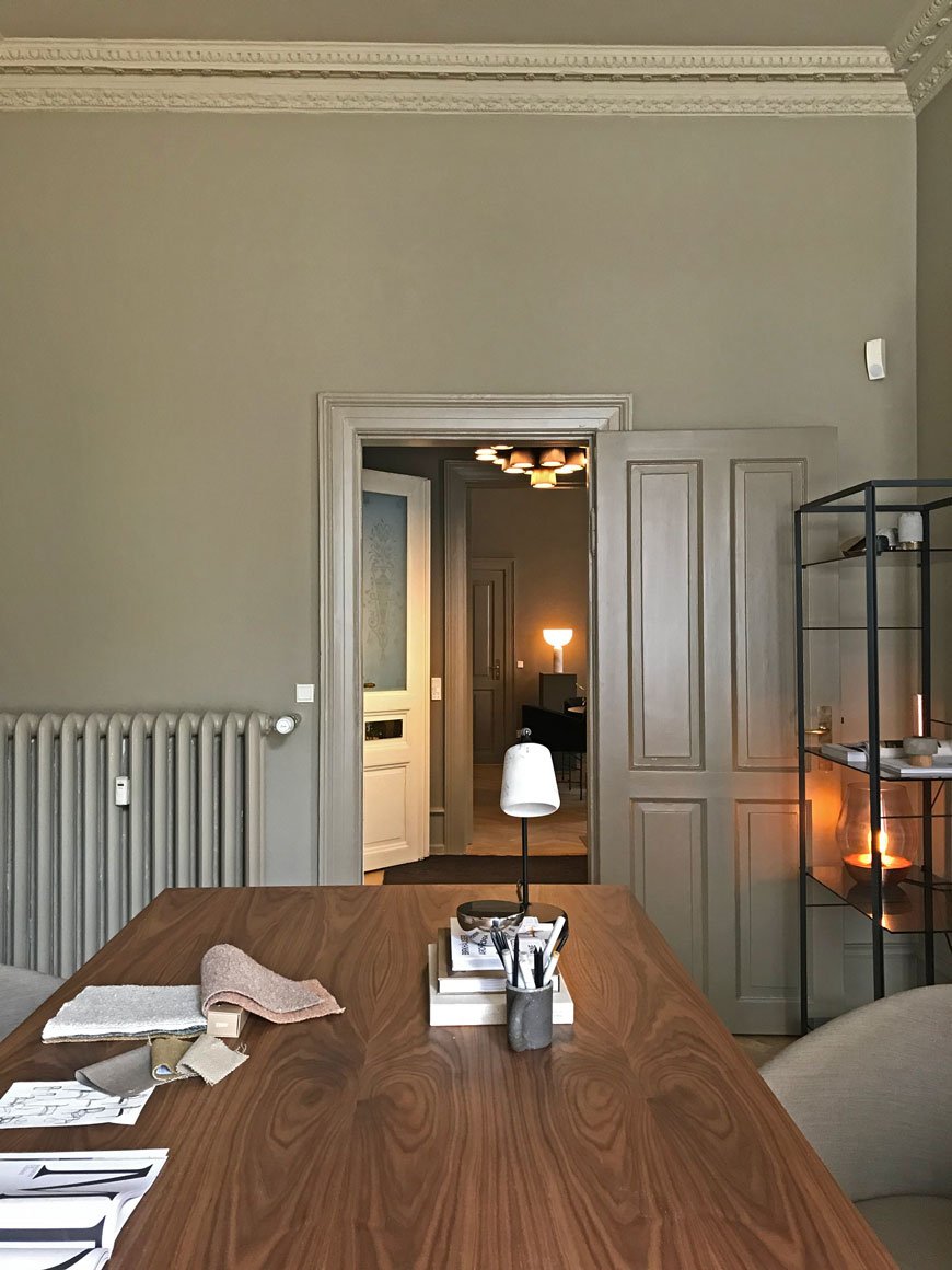 Last week I had the unbridled joy of visiting the new New Works showroom as part of the 3daysofdesign festival in Copenhagen. Designed in collaboration with Lotta Agaton Interiors, whose design company have become one of the most revered in Scandinavia, it was everything I hoped it would be. As a brand who describes its collection "at the intersection of old and new. Light and dark. Art and design", the New Works showroom embodies just that.Whilst the brighter, paler shades have become an intrinsic part of the Nordic aesthetic, in recent years, darker palettes have been making their way into interiors. Lovers of dark, earthy shades? This is your time.
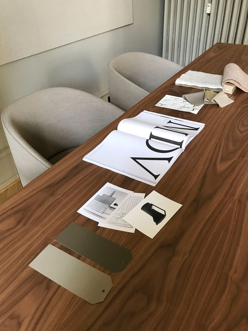 Situated in the iconic Frederiksstaden district famous for its complex of rococo architecture, the showroom is a striking example of the contrast between a historic setting and contemporary design. Here, Lotta's team have delivered a soothing and sophisticated home for the New Works collection. Architectural mouldings such as the detailing over the doorways and skirtings have been painted in Salon Drab by Farrow & Ball along with the walls to accentuate the full height of each interconnecting room. As is typical with the moodier spectrum of colours, it's difficult to show the exact shade in these photos as the nuances of light change the tone from room to room.
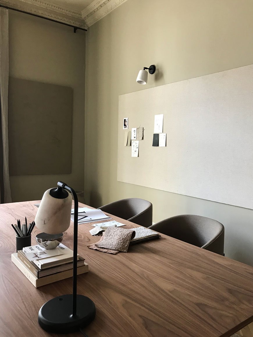

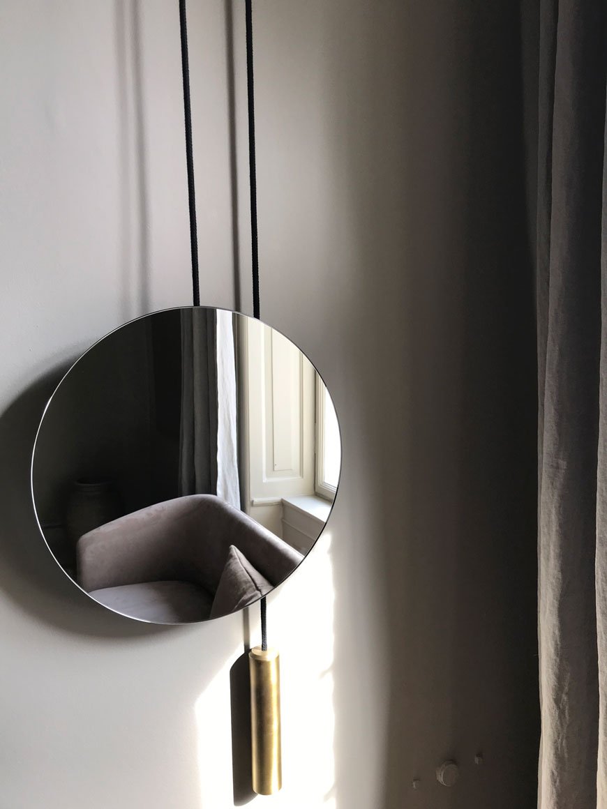 Against this backdrop of deep beige, rich brown and oatmeal sit new additions to the collection. Pictured below are the enveloping curves of the Covent sofa by Arde Design Studio and upholstered in Kvadrat. Alongside, the Mass coffee table in walnut and my favourite, the Mass daybed from Hong Kong studio Lim + Lu. Almost blending into the background but for the light is the new Lantern floor lamp, inspired by Chinese rice paper lanterns.In such a tactile space, you can't help but want to touch everything. Honouring the natural materials included within the collection, additional stylings feature crumpled linen curtains from textile brand Astrid and deep piled rugs from Roots Living.
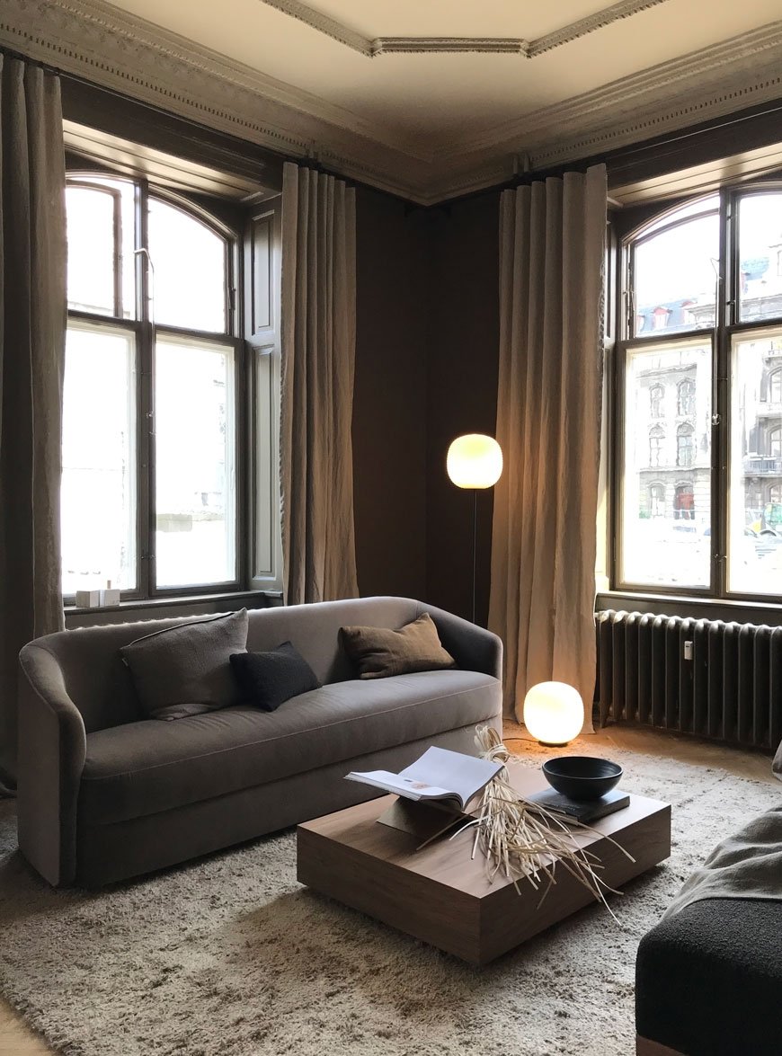
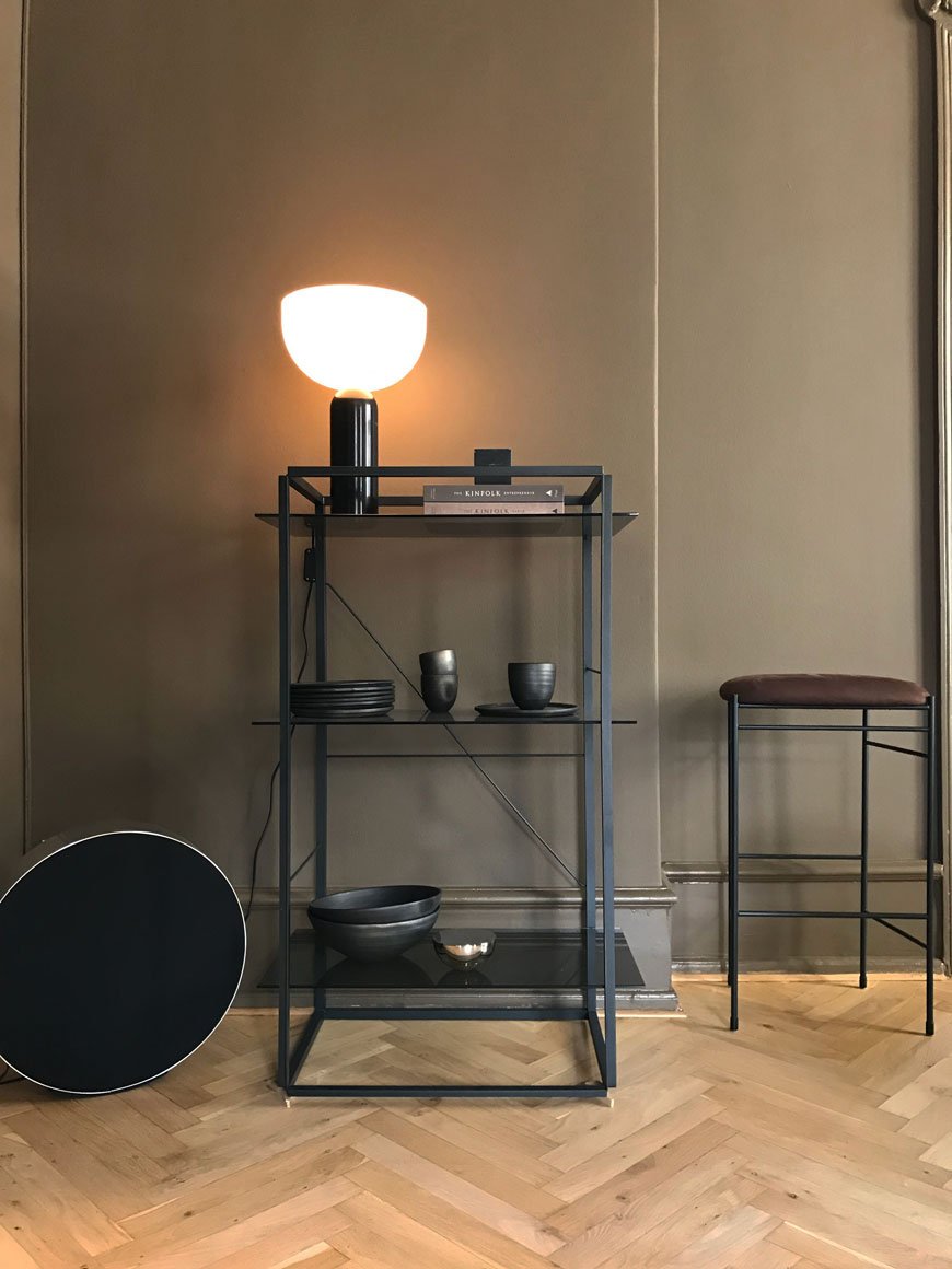
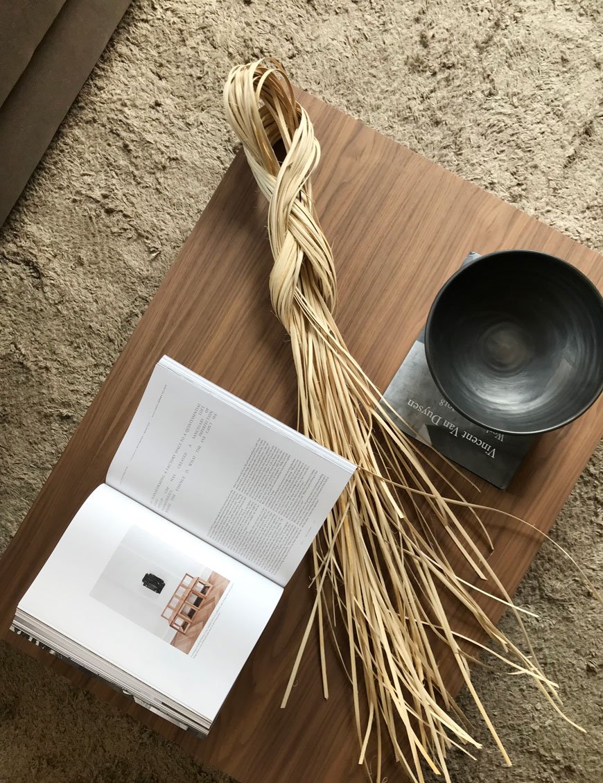
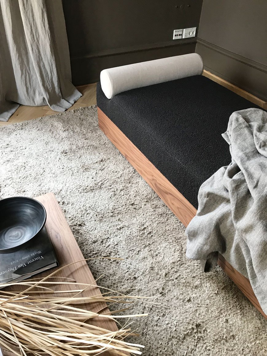 I'm pretty sure I just heard you fall in love with it. Am I right?For an extra dose of neutral interiors, check out my beige bedroom before and after. Stay tuned for more from Copenhagen!
Photography © Tiffany Grant-Riley
Spring Details In My Black and White Garden
 I don't share enough of our black and white garden here - strange considering I'm almost more invested in it than our home renovations!After days of on-off torrential rain, there came a break on Friday. Enough to see the light pick up the intense new-green in the leaves and watch beads of water balance precariously on petals. Quick off the mark to grab my camera, I shot some details before the weather changed direction again.

 I didn't quite finish painting the fences last year, so I've been cracking on at any available opportunity. They were originally a scruffy green so I chose black to make them almost disappear. I've used Ronseal's Duck's Back and 5L tins are about £10 from B&Q at the moment. The black gives the plants a more contemporary backdrop as they change throughout the year. Far more striking, don't you think?The current layout is very typical of a terraced garden - think long stretch of lawn and borders around the edge. Nothing wrong with that, but you know me, I like to mix it up. Eventually, I'm envisaging a mostly white garden with a mix of prairie and tropical planting. A total oxymoron, I know, but I just love a lush mix of large scale, architectural foliage mixed in with delicate flowers and wispy grasses. I'm hugely inspired by Beth Chatto's dry garden which was created entirely from drought loving plants. Really worth a visit. I also really fell in love with the LAND collaboration at London Design Week last year. Ultimately, the plan is to reduce the amount of lawn, get in some hard landscaping and break up the linear, traditional layout.We've no plans for any major groundwork this year as the hallway is literally sucking the lives out of us but I'd love to know if you'd like to see more from our garden later in the year? Are you taking on any major gardening projects?
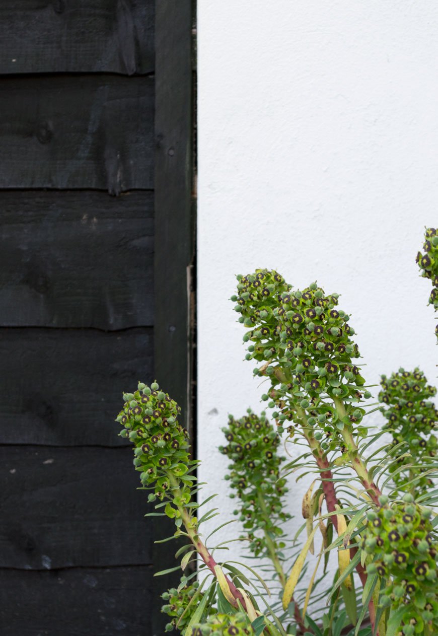
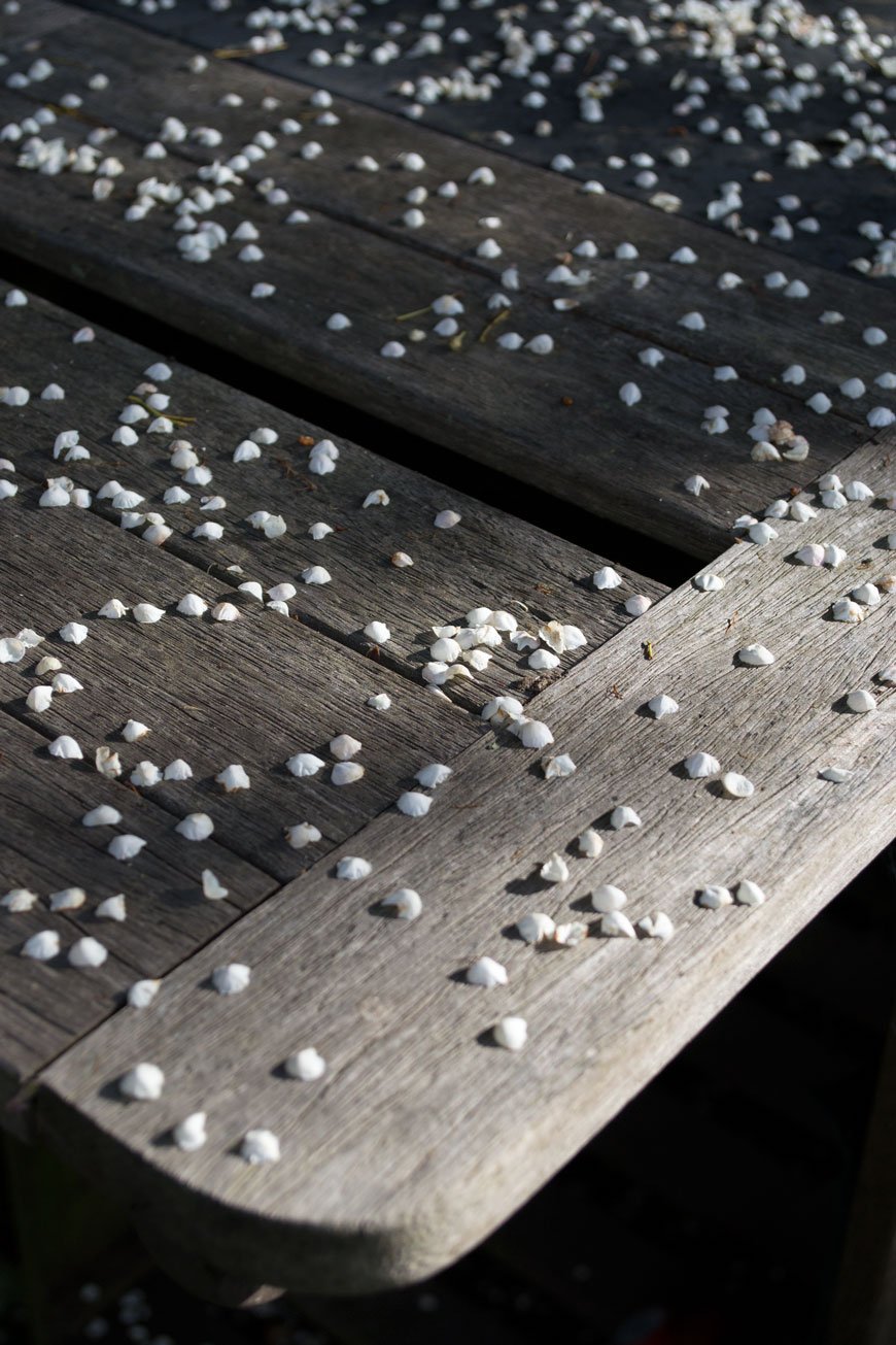
Photography © Tiffany Grant-Riley.
Discovering Honest Danish Design by Woud
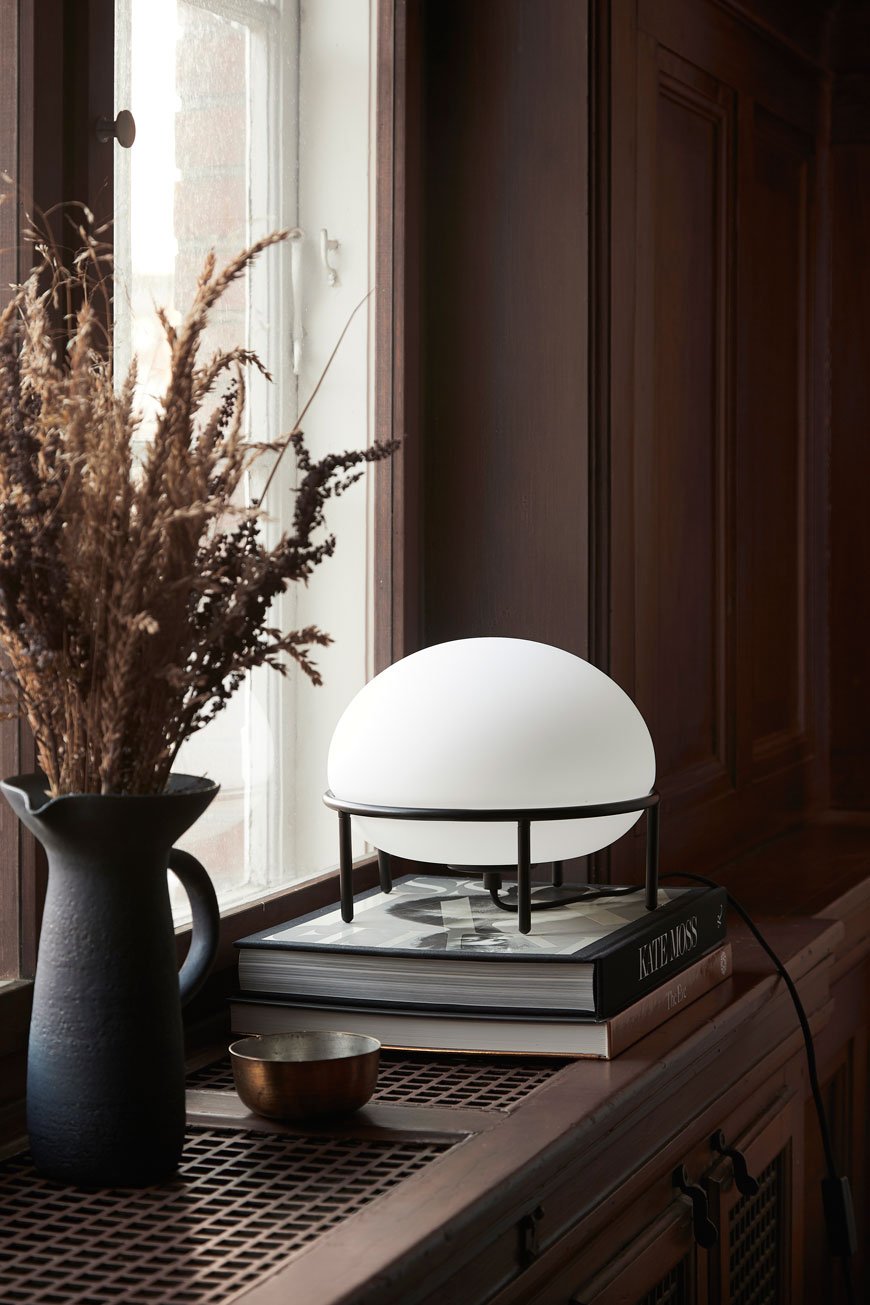 When private label furniture consultants Mia and Torben Koed decided to put their 30 years of experience into a new project, they envisaged a collective of new and established designers carrying the Scandinavian tradition into a new era of furniture design. In 2014 that idea became Woud, one of my favourite New Nordic design names I've been following closely since discovering them a few years back.In my mind, Woud embodies a sophisticated and elegant aesthetic reminiscent of the modernist Scandi classics. Designed for everyday use, you can see these "new originals" becoming quintessential 21st-century treasures. With the aim to spark a "love at first sight" reaction, the collection spans beautifully sculptural dining chairs, clever space-saving storage and playful accessories.Under a 45 strong team of international designers, the collection is connected by the shared vision to create functional, livable pieces. Amongst them includes Helsinki based Poiat (a personal favourite when they exhibit at London Design Week) Toronto studio MSDS and Bauhaus University Weimar educated Schmahl+Schnippering.
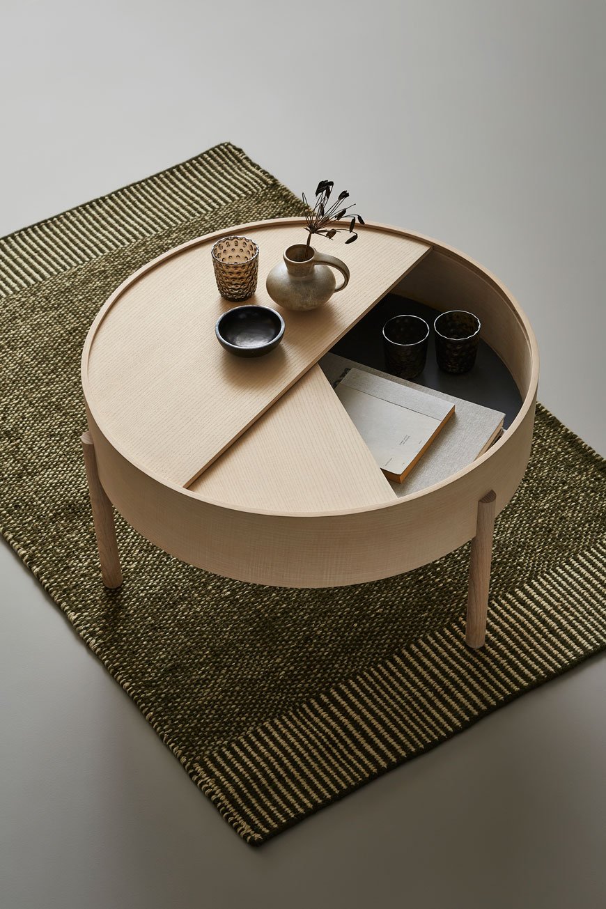 The piece that kicked off the Woud love affair for me is the Arc coffee table, which also comes in a smaller side addition. Designed by Julie Begtrup and Ditte Vad during a period of time that they lived together. It's delightfully playful, with an element of 'hide and seek' in the sliding table top, enabling you to clear away the clutter at a moment's notice.
We believe timeless design can express personalities, evoke feelings, inspire people and create beautiful homes.
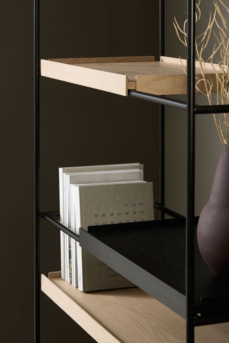
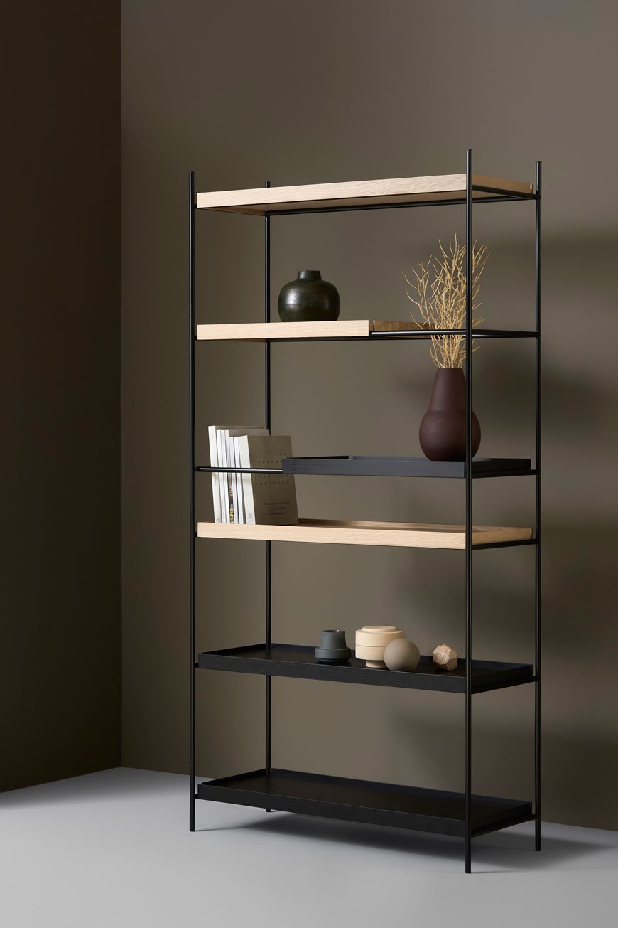 The Tray Shelf can be configured to accommodate taller objects that aren't able to fit on standard shelves. Designed by Berlin-based Hanne Willmann, its delicate and slender form carries a minimalist Japanese aesthetic with its system of oak trays and matte powdered frames.
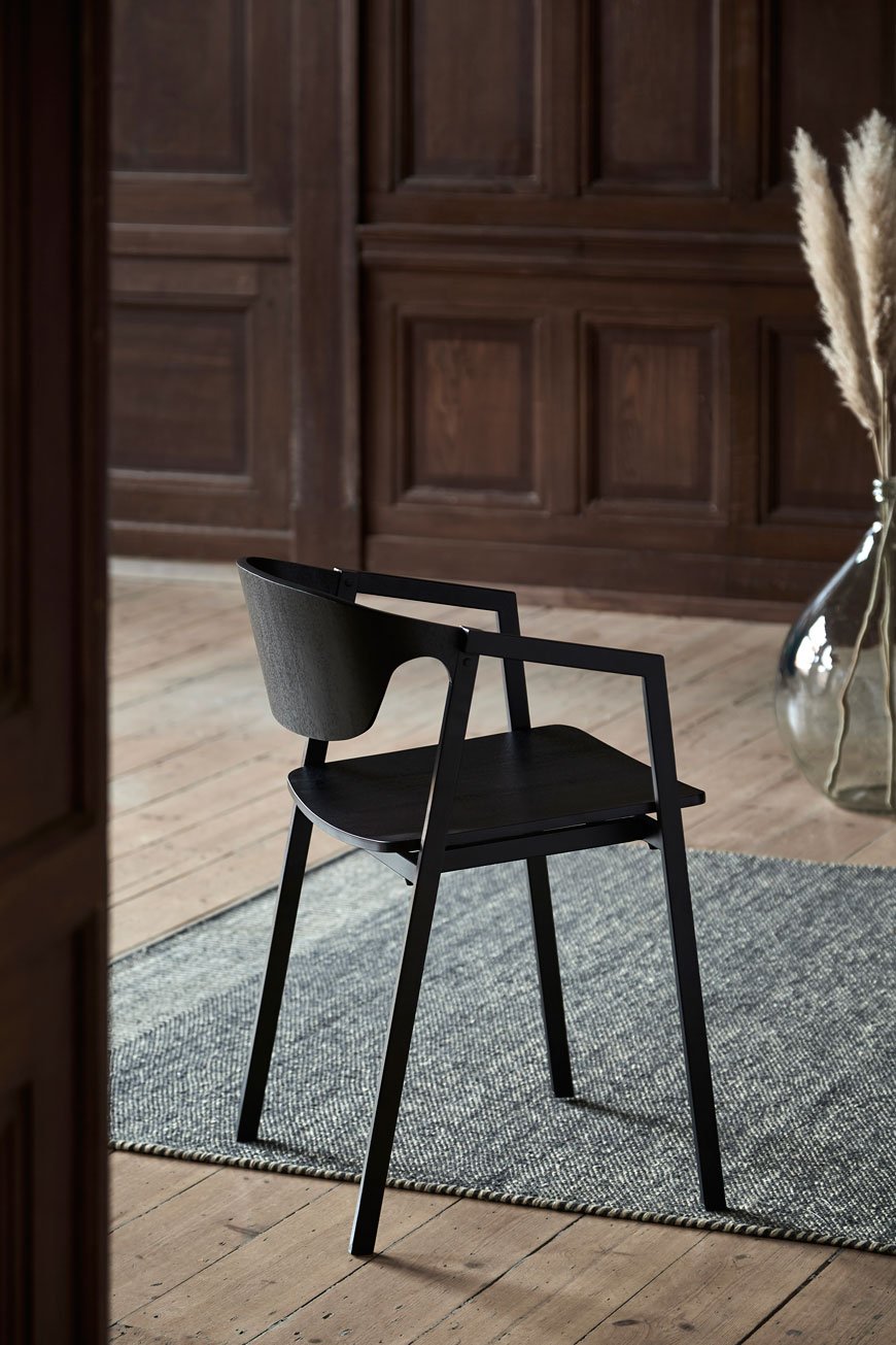
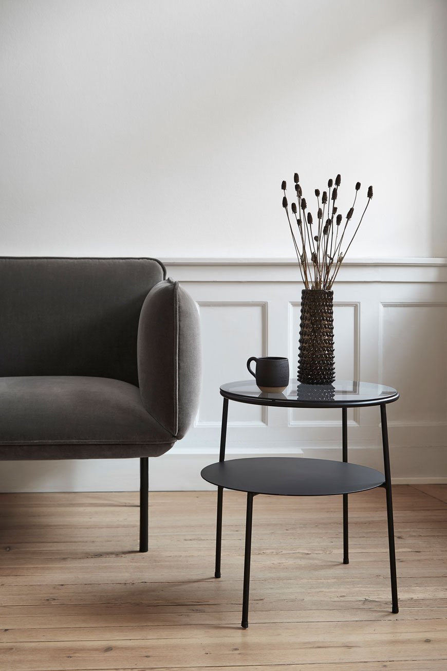 New pieces from the SS19 collection share elements of on-trend curves without losing the lightweight frames Woud are known for. Take Mika Tolvanen's Naaki sofa for example, with its plump, firm seating and thin legs. The Duo side table designed by Taiwanese born Canadian Chifen Cheng draws inspiration from overlapping circles with an additional glass layer on top.Below, the S.A.C chair (short for stacking armchair) combines the best of Nordic and Japanese design. Made from a combination of metal frame and plywood seat, its simplistic shape means it can be stacked without the veneer ever touching thanks to its curved back. I just love how it visually commands the space its in without taking up too much of it.
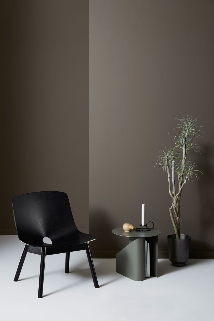 Ready for a bit of design geekery? A new and innovative type of plywood called Grada has been used to create the normally difficult to achieve cone shape of the Mono chair (above). Through the process of heat and high pressure, faster, more ecological production methods have opened up what would have traditionally taken several stages of cutting, glueing and pressing to achieve.
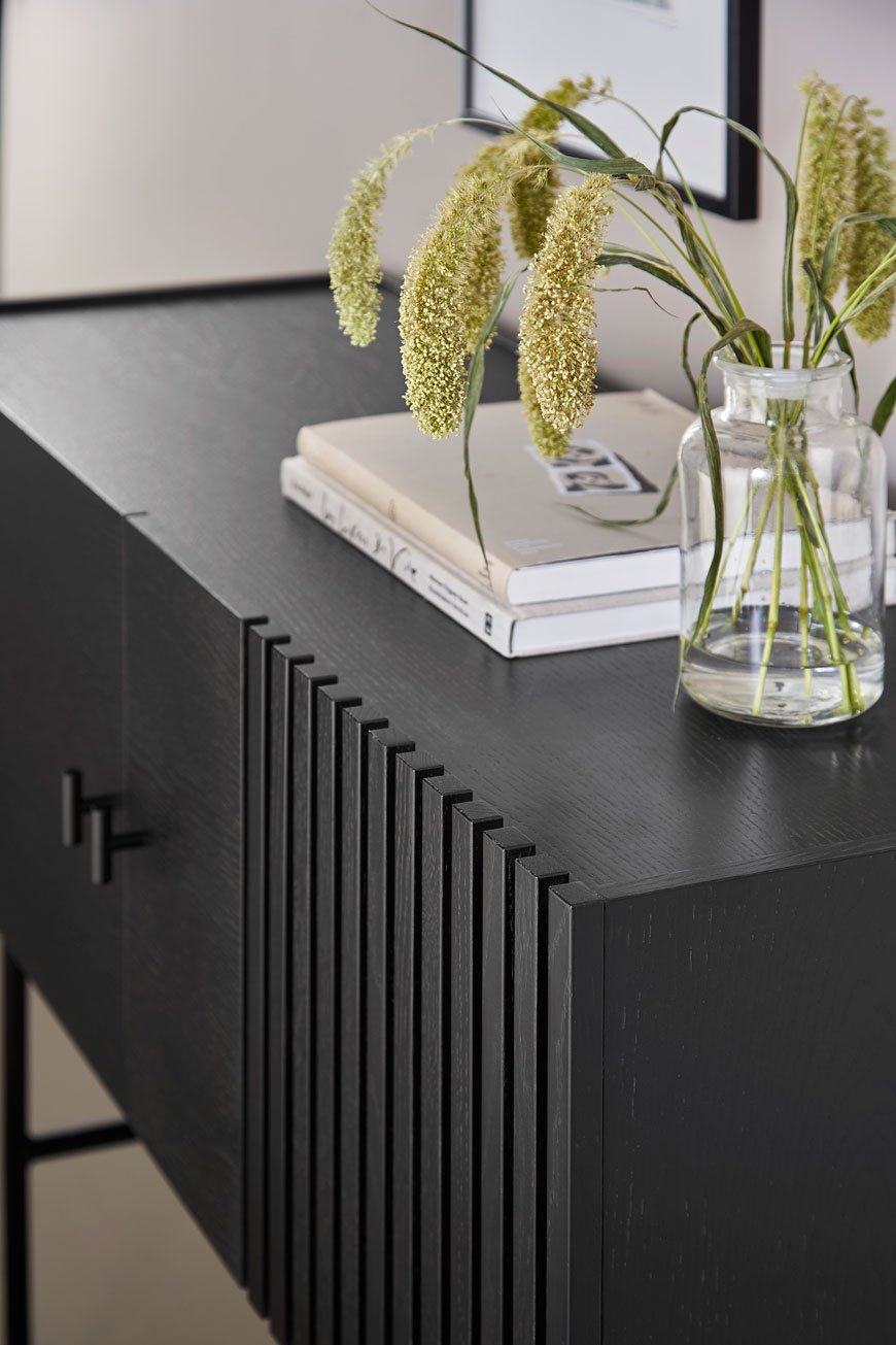
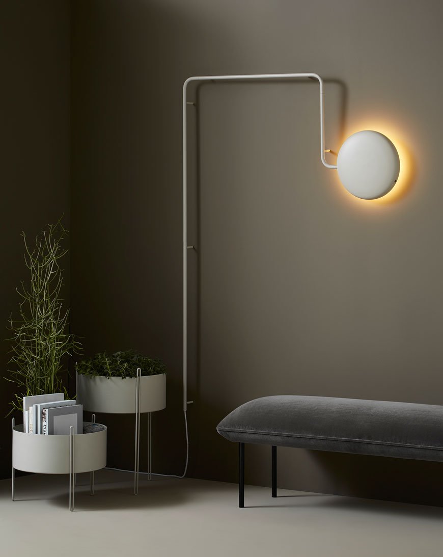
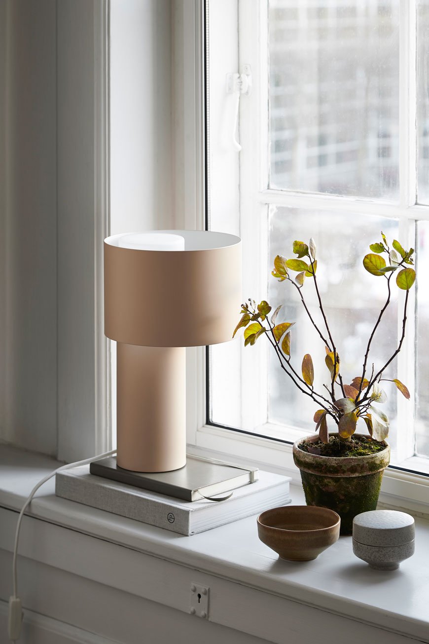 I think you'll agree that as far as New Nordic style goes, Woud have found the sweet spot between traditional heritage and future-proof design. I'm excited to see where they take it next...
Photography courtesy of Woud.
[AD] Frequency Collection Designed by Kelly Wearstler for Georg Jensen
[AD - this is a paid partnership with Georg Jensen. Product featured here was loaned for the purpose of this post.]
These first few days of Spring have without a doubt given us all a boost here at home. We've sorted through the clutter of winter and freshened up our tired looking living room. It's been wonderful to watch the quality of light change as shadowy corners disappear and there are moments when sitting in the warm sun in the garden are almost within grasp. Almost. This week, I've had the pleasure of styling a brand new collection from Danish silversmiths Georg Jensen. With over 100 years of design history, the brand continues its signature style of simplistic, organic forms, collaborating with innovative designers who understand its Danish sensibilities.
Frequency Vase
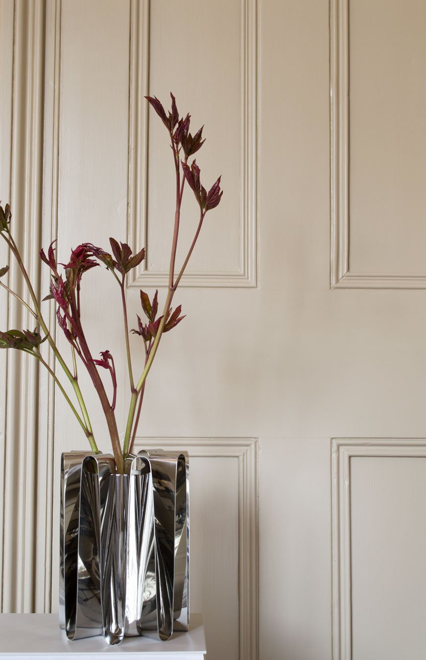 Handcrafted in striking stainless steel, the new Frequency collection is the result of a collaboration with world-renowned American designer Kelly Wearstler. Known for her exploration of colour, pattern and making vintage look contemporary, Kelly's work is so distinctive that you recognise it instantly. This collection is different for its pared-back, minimal feel which fits so well in my home. I've chosen three of six pieces using foliage and blooms from my garden to illustrate their dramatic, sculptural presence. I think the collection beautifully combines Kelly's contemporary Californian style with Georg Jensen's Scandinavian heritage.
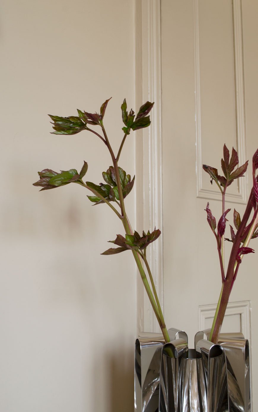 Inspired by her home on Malibu beach, the steel waves evoke a sense of fluidity, balance and energy. Each piece changes its appearance according to the nuances of the light. The undulating waves picking up the soft mid-morning sun in the bedroom, bouncing it back onto the walls. Living close to the river here, (though Medway is definitely not L.A!) I can understand why Kelly's work is often informed by nature. Here, I've picked new shoots from a Sarah Bernhardt peony, whose deep red stems unfurl into vibrant green leaves. Aren't they striking?
Frequency Centrepiece
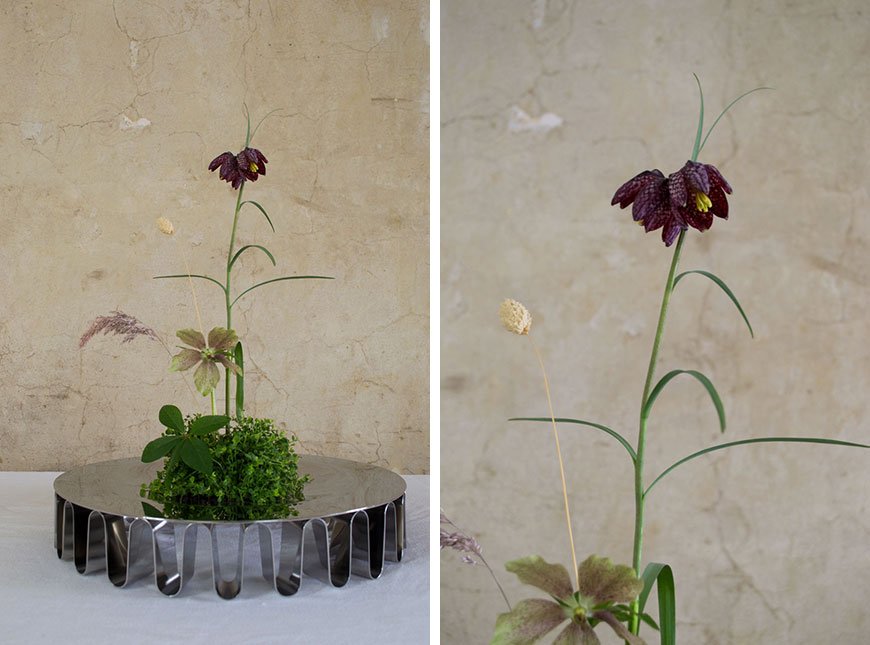
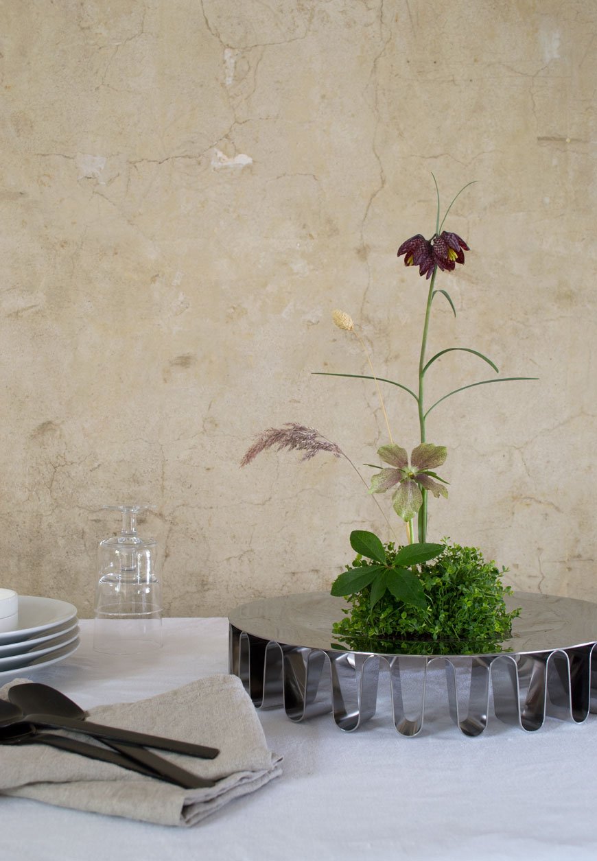 Capturing the collection was no mean feat - the highly polished steel reflects back every surface, which I very much welcome in our dining room which, despite its south-facing aspect gets the least amount of light. I loved creating this ikebana arrangement with the Frequency Centrepiece, using select spring flowers and foliage from my garden. The contrast of the smooth surface of the bowl against the cracked plaster walls added texture to the scene. Its delicate, ribbon-like waves give the surface the appearance of floating. As a versatile design, the Centrepiece could also be used for fruit or to display treasures.
Frequency Hurricane
There is an energy in the silhouettes, a vibrant movement that comes to life through the beautiful folds in the steel. Each design is like a sculptural conductor of this energy.- Designer Kelly Wearstler.
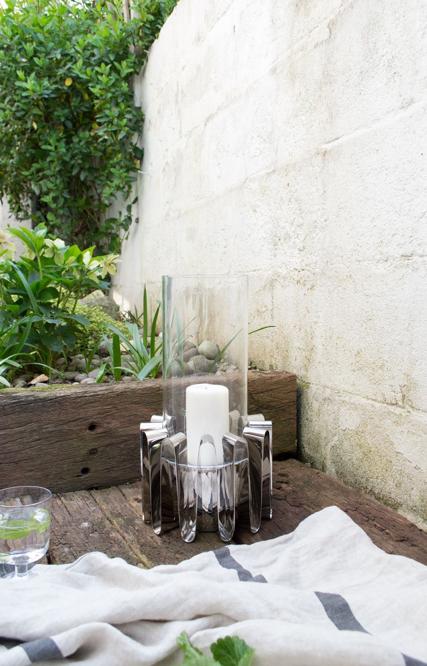
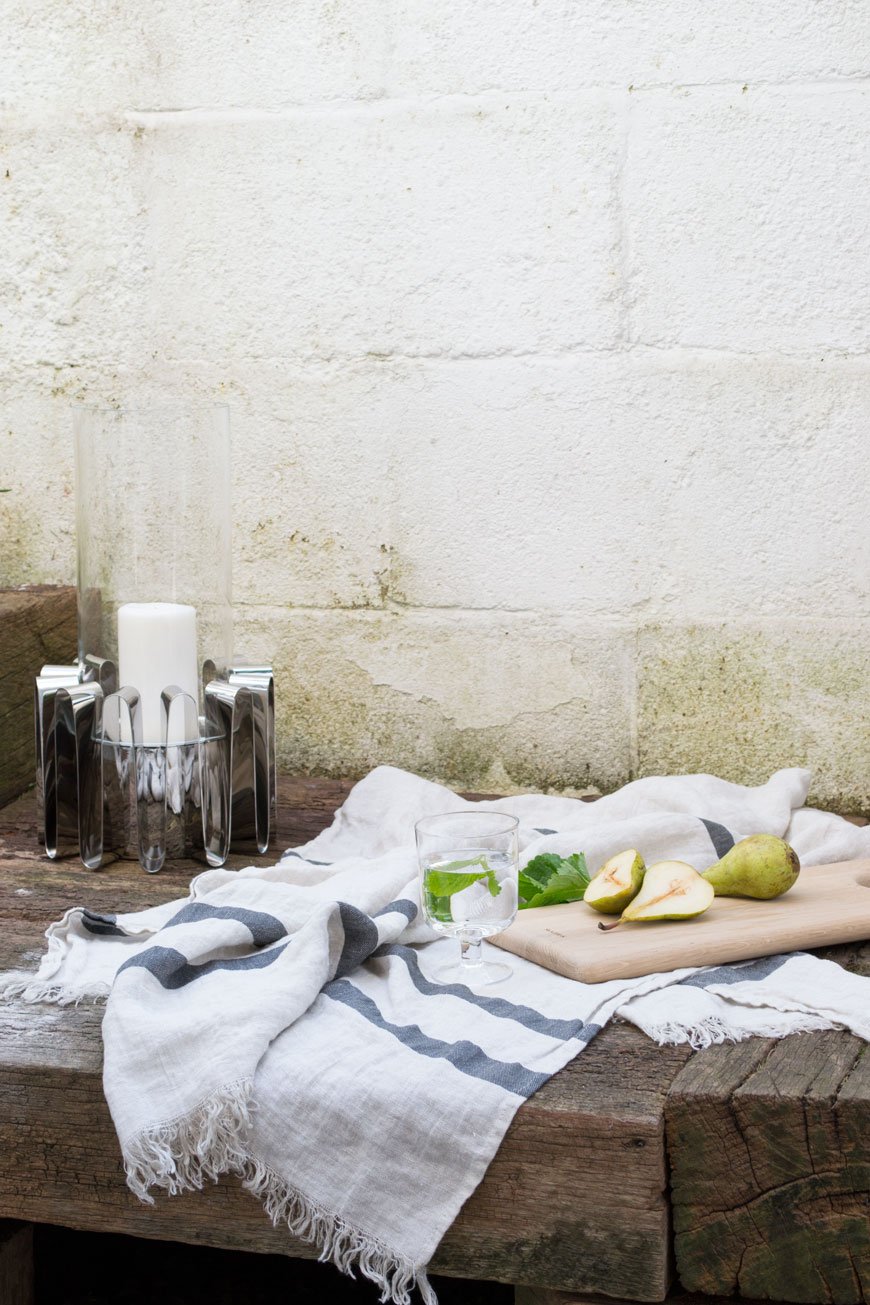
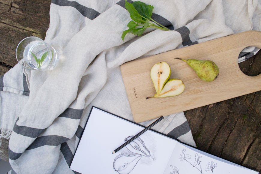
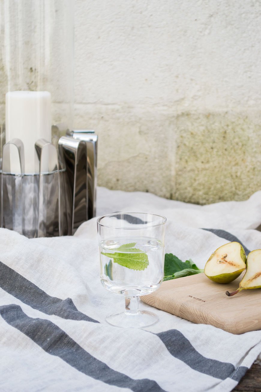 A little premature on my part, but these images speak of warmer days to come. There's a small yard space opposite my kitchen with a little deck made from reclaimed railway sleepers. After 4pm it becomes a real sun trap and you'll often find me here within shouting distance of the back door. A linen towel doubles up as a picnic blanket and there's time to sit and watch the evening to draw in, Hurricane lantern lit and something cool to drink in hand. It's not quite California, but it'll do.
 The Frequency Collection is available instore and online at www.georgjensen.com.
Photography and Styling © Tiffany Grant-Riley.
[AD] A Timeless Rug In A Scandi-Style Living Room With Habitat
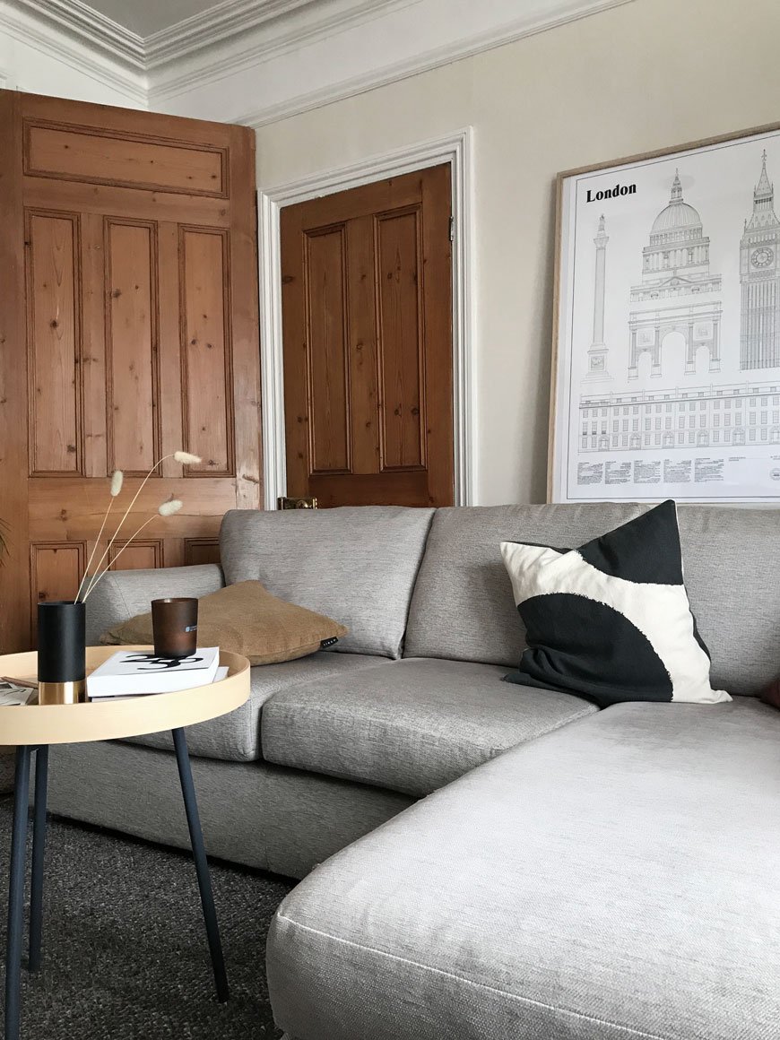
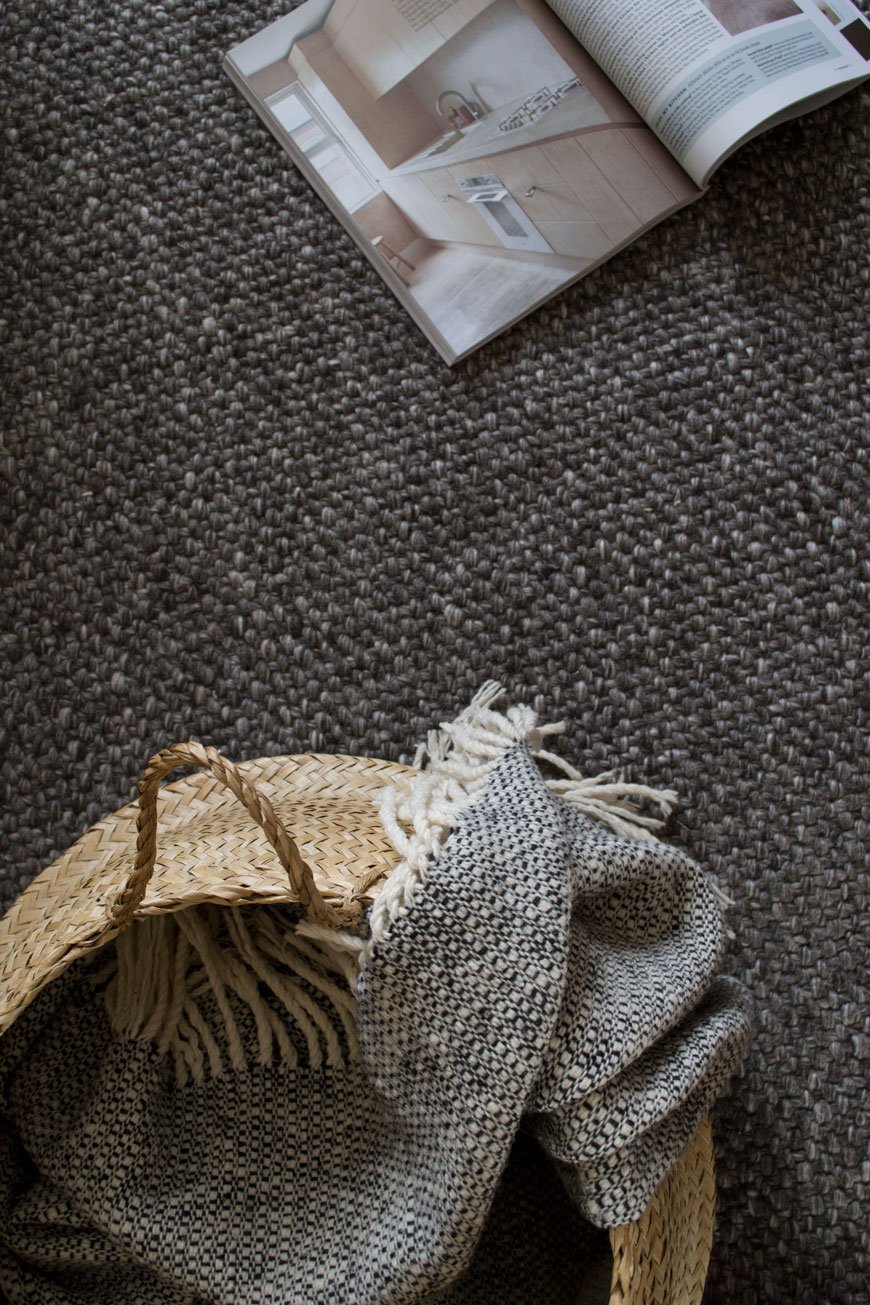
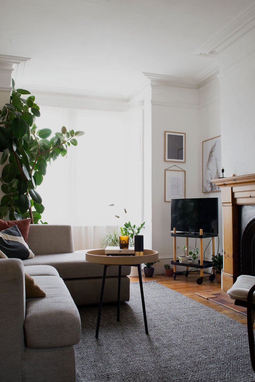 This post is an advertisement in partnership with Habitat. I've been looking for a simple and timeless rug for our living room since, well, I had to throw the old one out. The last one broke me. Really. I saved hard for the most beautiful woven jute rug that I used to have in my home workspace in Rochester but when we moved into 'The Chatham House' it ended up in the living room. No longer in the safe confines of my workspace, it was subjected to all sorts of spills (milk included) and other child-related detritus so that in the end, I had to give up and say goodbye. I couldn't take picking bits of grape and pizza out of it any longer.Finding a more family-friendly alternative hasn't been an easy task but since our living room has needed pepping up for a while, I asked Habitat to help me find a solution. Because their selection of rugs is on-point. Always. With the living room currently boasting someone else's decorative choices albeit on the neutral side, ultimately, this rug would have to shoulder the job of carrying the room through this in-between stage before we renovate it. Quite a heavy task for an accessory but as I can't stand the amount of bright orange pine there is in here I knew a large scale rug would help defuse it a little.
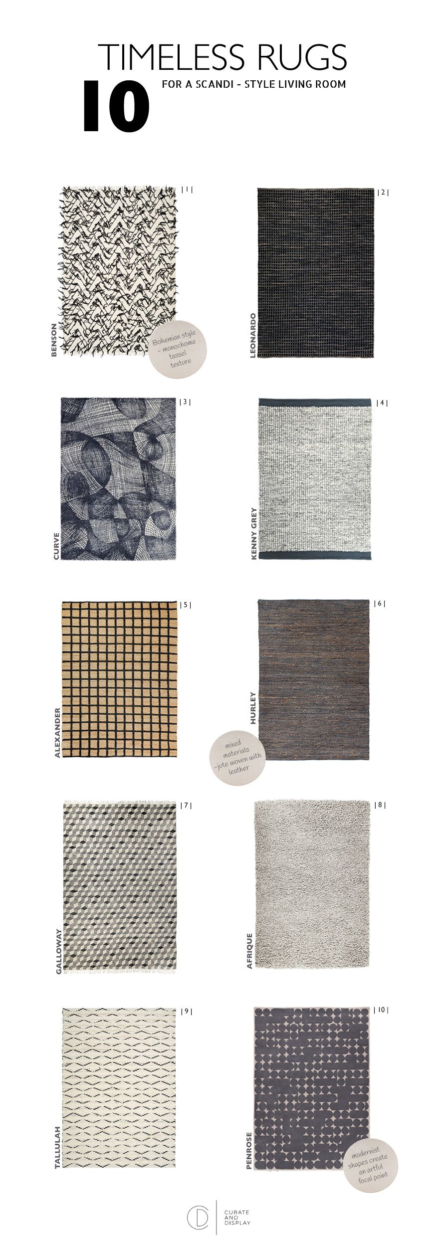
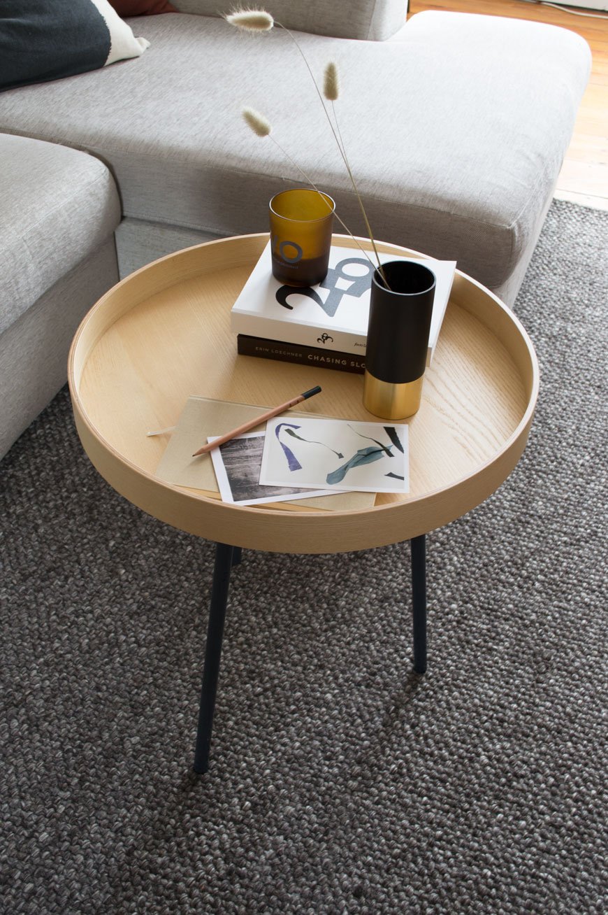
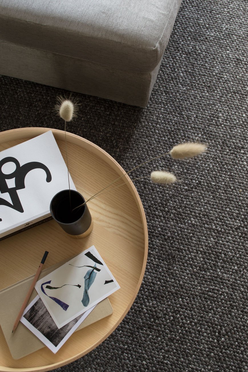 Enter 'Roderick' (incidentally sharing the same name as my step-dad). He's a smart, stylish Scandinavian. Just enough texture without trapping crumbs and dust, dark enough to hide any potential spills (we have a not-on-the-rug policy now though) and he's a handwoven, wool design which feels soft underfoot. It's quite a large piece at 170x240cm and the deep grey is a warm base against our light grey corner sofa, drawing your eye away from the orange pine floor. I think I love this room 100% more than I did without it. Choosing the right rug for the right space can be a hefty investment so I always recommend to look for something neutral that will compliment any interior. Here are a few points to consider:• Upscale your floor. Here's the thing. Small rugs in small rooms make the room look smaller. Go for as big a rug as you can afford and see the difference it makes to the feel of the room. It will open it up. Promise.• It's all in the placement. The general rule of thumb in the living room is to have the front legs of your sofa and armchair(s) on and the back legs off the rug but that depends largely on the size and set-up you have. This guide from A Pair & A Spare is pretty brilliant. It also helps to mark out the size of the rug on the floor with masking tape first to give you a visual aid - I did this to check the 'Roderick' was large enough for our living room.• Fabric and weave. Thicker piled rugs like the Berber style and anything with a highly textured weave will need more maintenance. This might include brushing it out to stop the strands and tassels from matting. In which case, these styles are better in low traffic areas. Flat woven, cotton rugs are better suited to heavy traffic areas as they're generally easier clean.• Shape. Remember to pick a style that fits with the shape of your room. I prefer rectangular rugs for ease of use (most of us have rooms this shape anyway) however a large, round rug can work well when the room is large enough - usually in a dining space with a round table. Referring to the placement guide (above) will give you an idea of how the right shape works.• Stick to neutrals. A good quality rug, chosen well, will last. Find something in a muted colour palette that complements the room whether you have dark or light walls. Neutral doesn't mean boring either - don't be afraid to go for pattern, look for tone on tone designs or a raised, tufted weave against a flat base for interesting textures that draw the eye.I've picked out 10 timeless rugs from the Habitat collection to suit any Scandi-style interior. There's a good mix of highly textural Berber styles for a laid-back Bohemian look (hello Benson and Tallulah) and good solid earners like Hurley with a sturdy leather and jute weave. I do have a soft spot for Alexander though, love the gridded jute. Quite the statement. What's catching your eye?
Photography © Tiffany Grant-Riley
12 Monochrome Hallway Floor Tiles Edit
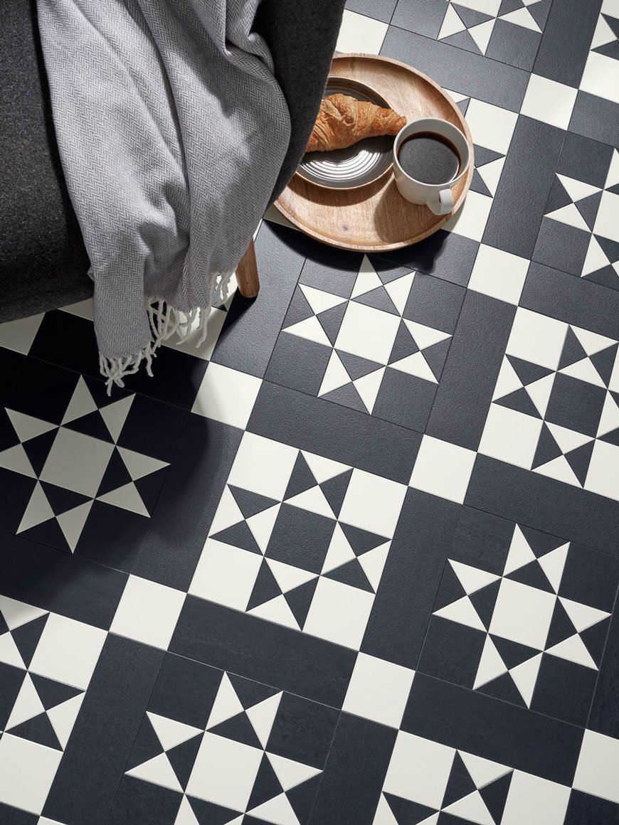 With the bedroom complete (for now) we're turning our attention to the hallway next, kicking off the proceedings with my edit of 12 monochrome hallway floor tiles. They're hard wearing, easy to clean (particularly with kids and pets at home) and the varieties are virtually endless. While it's definitely not the Scandinavian thing to do, here in the UK, historically, Edwardian hallways like ours were tiled and I want to continue that tradition with a timeless, contemporary feel.Recently, our hallway has been leaving me with a touch of decorator's stalemate, completely overwhelmed by the size of the task. I'll go into the finer points of the project in the coming weeks, but with so much to complete, I'd not had a clear idea of the finished look in my mind as I had with the previous rooms. So I decided to use the floor tiles as my jumping off point and build up the scheme around those.I'm very mindful that our hallway is pretty narrow, dark and I'm keen not to overpower the space with a busy pattern. I love to see a full-on patterned design in larger spaces that can handle scale, but as the hallway should set a precedent for the rest of the house, I want it to suggest a calm and inviting home, picking up on the restrained colour palette we've used thus far.
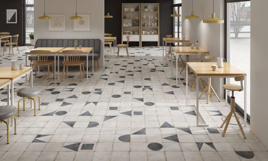 If you're in the same boat and are on the hunt for something with subtlety, I think you might just find something here. I've gone with a simple selection, focusing on a mix of pale white, cream and soft black tiles. The range of shapes and materials are what sets an eye-catching tile apart from a boring one with my pick of herringbone and penny mosaic sheets in marble and glossy porcelain. A subtle crackle glaze or sign of a brush mark suggests a handmade, crafted approach. Of course, there's just a hint of pattern with contemporary shapes to break the blank space. The beauty of using individual tiles is the freedom it gives you to add in some interest to a blank canvas, providing, of course, you choose the same size and shape to avoid installation issues.
How To Choose Your Hallway Tiles - A Potted Guide.
Right tile, right place - Entrances and hallways are high traffic areas, so before you get too into the design of things check the suitability of the tiles first.Materials - Porcelain, ceramic, encaustic, concrete. What to choose? Thankfully, these are all pretty solid choices for hallways with porcelain and concrete being the strongest. Encaustic and concrete tiles will need sealing once down to protect them over time and may need repeating every few years to keep them topped up.Consider scale - Depending on the size of your floor, certain designs can get lost, particularly if you're using a mosaic design. Think about whether you're happy to have smaller shapes or patterns or if you'd prefer to scale up for something larger. Similarly, you might prefer to use larger sheets for less interruption of grout in between which gives the illusion of more space.Pattern play - Is there a repeat pattern that you need to stick to or does the collection come with variations you can play with? Decide whether you'd prefer a uniform look or a more freeform style.Over order - Most tile sites already work in an additional 10% extra on top of your order to account for cuts and the odd breakage but if not, remember to add this in yourself. As tiles are produced in batches, it makes sense to have more than enough to ensure each tile looks uniform as separate batches can vary.Installation - Who will be laying the tiles? If you're not feeling confident, definitely look for an experienced floor layer. Check your subfloor first and make sure you have a solid base on which to tile. If you're tiling onto a wood floor, you'll need to board it out with plywood, whereas a concrete base will need to be completely level to avoid the tiles cracking afterwards.I feel like a kid in a sweetshop with a clearer vision ahead...now comes the hard part. Choosing!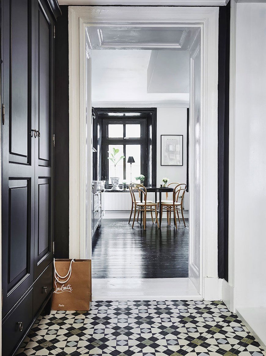
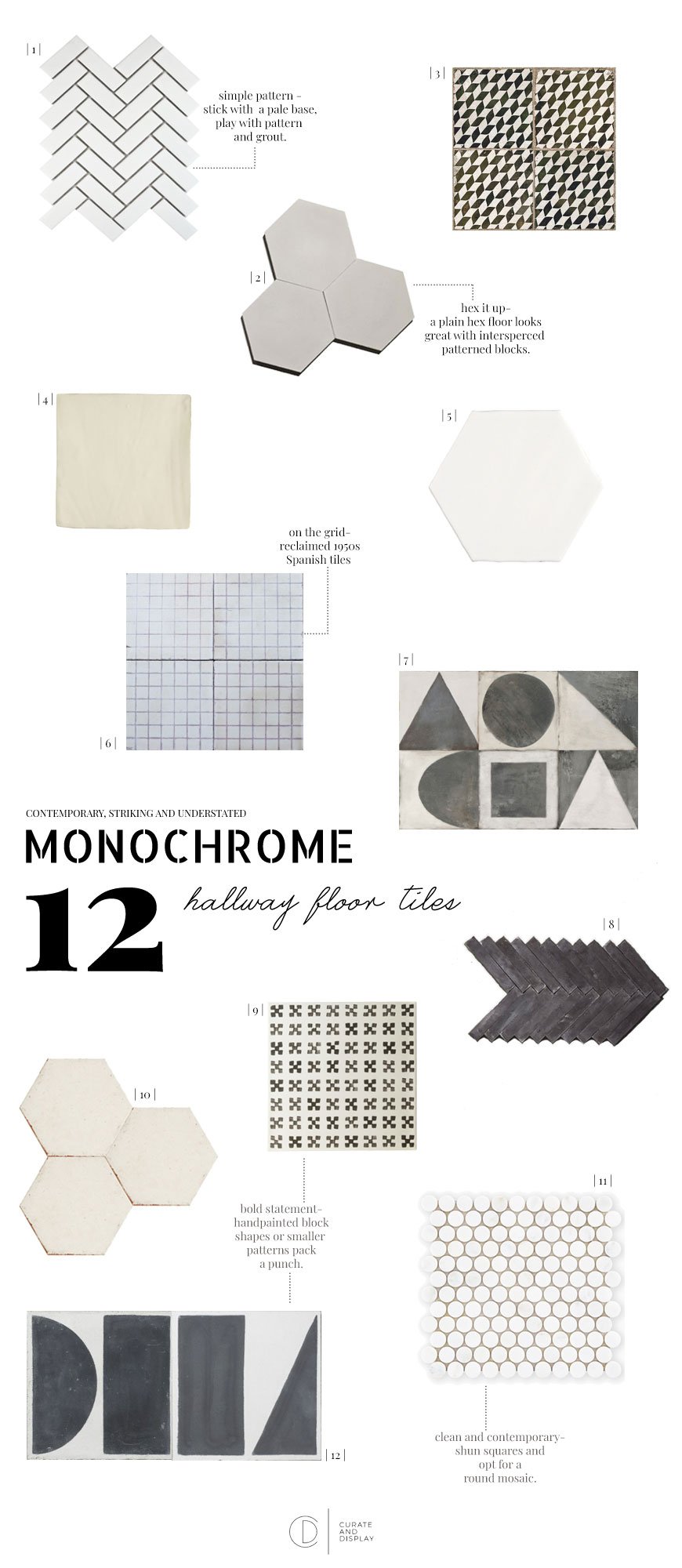
| 1 | 'Bijou' gloss white herringbone mosaic, Walls and Floor | 2 | Handmade Hex Gris, Maitland & Poate | 3 | Metropolis Geometric tile, Tons of Tiles | 4 | Florence white square tile, Mandarin Stone | 5 | Seville White hex, Porcelain Superstore | 6 | Ochosencillo reclaimed tiles, Maitland & Poate | 7 | Monochrome Decor, Mandarin Stone | 8 | Black herringbone encaustic, Otto Tiles | 9 | Baccarat, Fired Earth | 10 | Argila Andaman worn hex, Best Tile | 11 | East Haven round penny mosaic, Claybrook Studio | 12 | Split shift shape series, Bert & May.
Sera Helsinki Ethical Rugs Empowering Vulnerable Communities
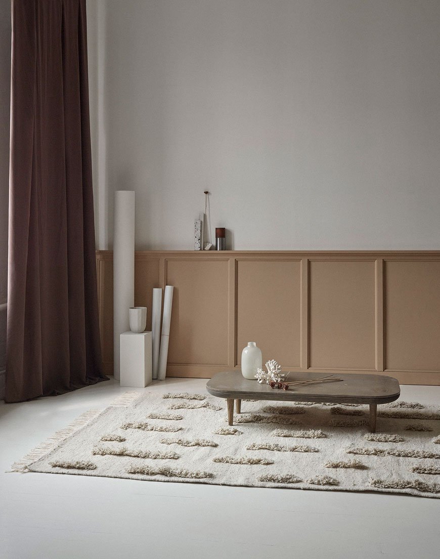 Yet again Instagram has unearthed a beautiful design discovery that I had to share with you, this time in the form of SERA HELSINKI. This ethical rug company is helping to create an inclusive community and lift it out of poverty.Friends Hanna Puharinen and Anna Suoheimo met at Aalto University in 2001 during their six-year Science Masters, sharing a passion for interior design. When Anna moved to Ethiopia with her family in 2010, she witnessed first hand the desperate situations that people with disabilities and single mothers faced, with extreme poverty offering no other option than to turn to begging on the streets. Compelled to make positive changes to the community, the pair set about training and supporting a community of weavers and artisans, empowering them with skills and a fair income.
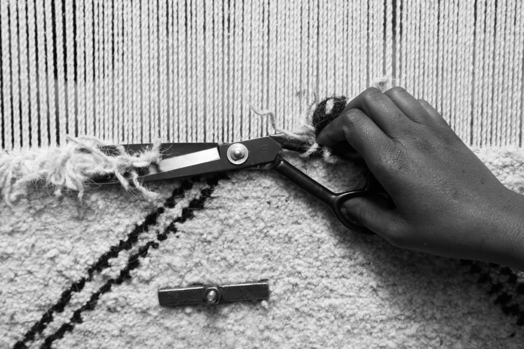
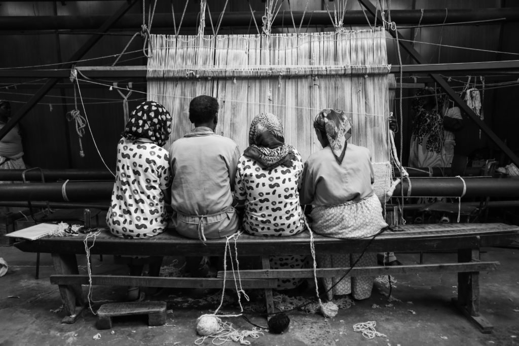 Taken from the Amharic word for 'work', SERA combines Finnish design sensibilities with traditional Ethiopian hand craftsmanship. The lambswool is locally sourced from farmers in the northern highlands of Ethiopia and the thread made by hand by the women in their families. Without intrusion from chemical processing, the natural colours of the wool allow the weavers to create the soothing tones and textures in the new Saaristo collection, designed by Anna Pirkola. Beginning in 2016 with just 8 weavers has grown into a 100 strong team, most of whom are blind. The intricate designs showcase exquisite artisanal woven wool rugs, cotton towels and leather bags.
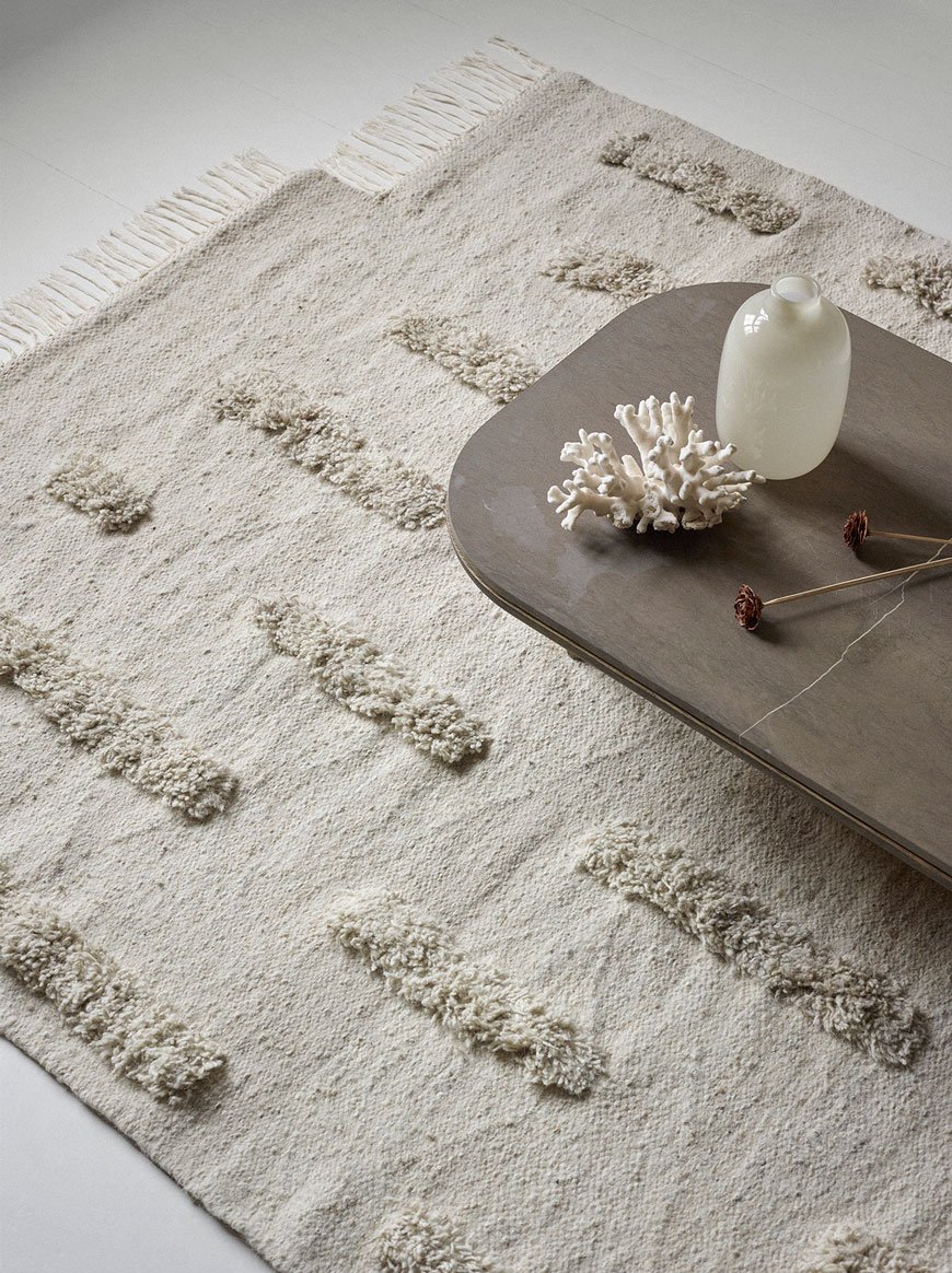

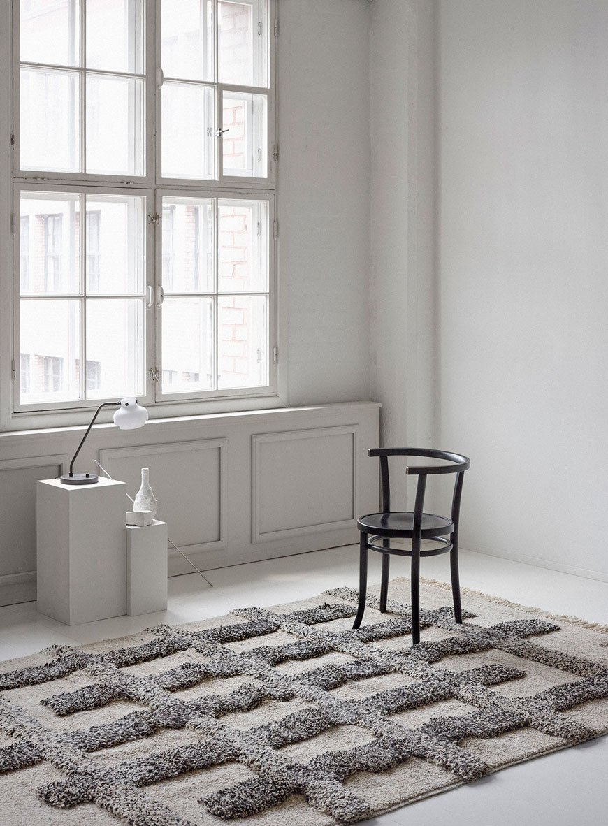 A beautiful focal point for any Scandinavian interior, the rugs are made to order and take approximately 2-3 weeks to produce. I've completely fallen for Sera Helsinki for striving to support and empower the local community in Ethiopia and for translating all that love and skill into a jaw-droppingly beautiful collection of ethical rugs. What a wonderful reminder to have in your home of the positive effects a social enterprise such as this can have. I'd happily have any of these grace the floor in my home one day...wouldn't you?
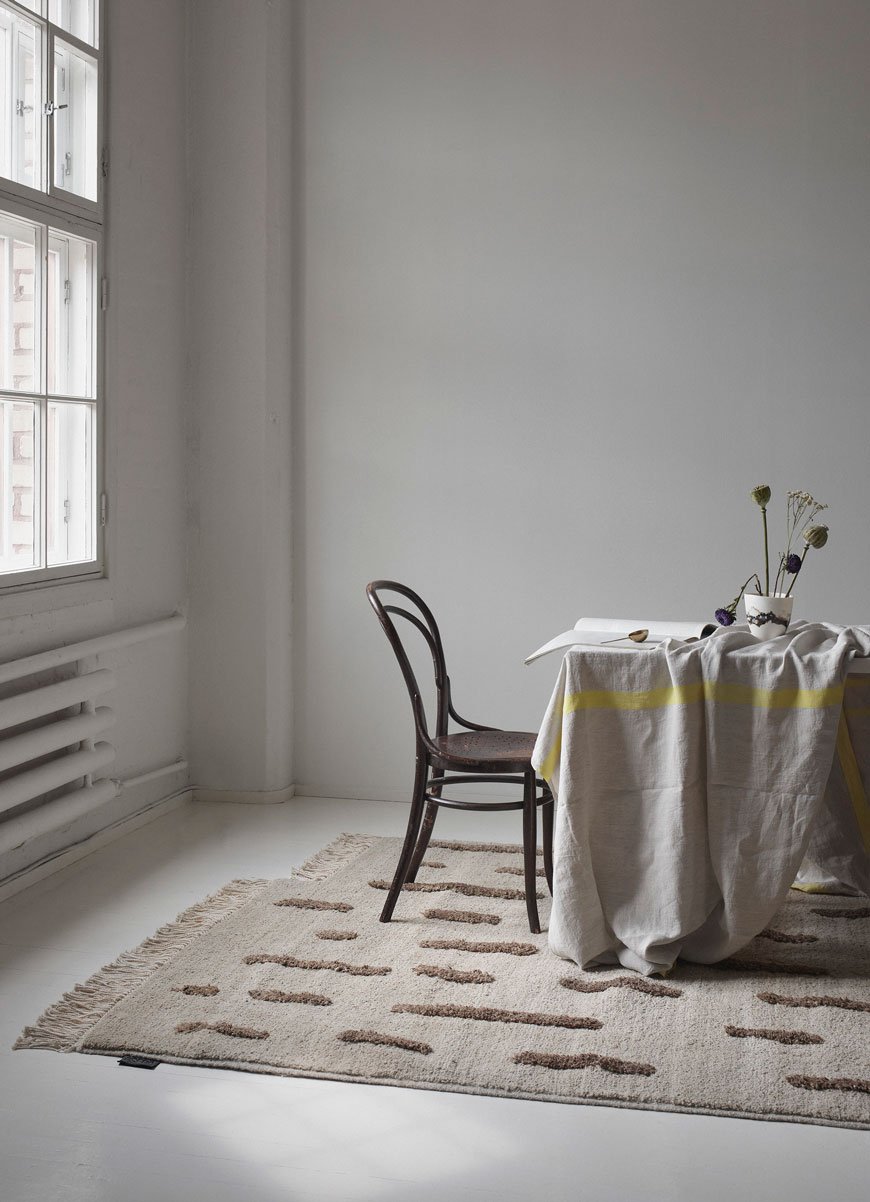
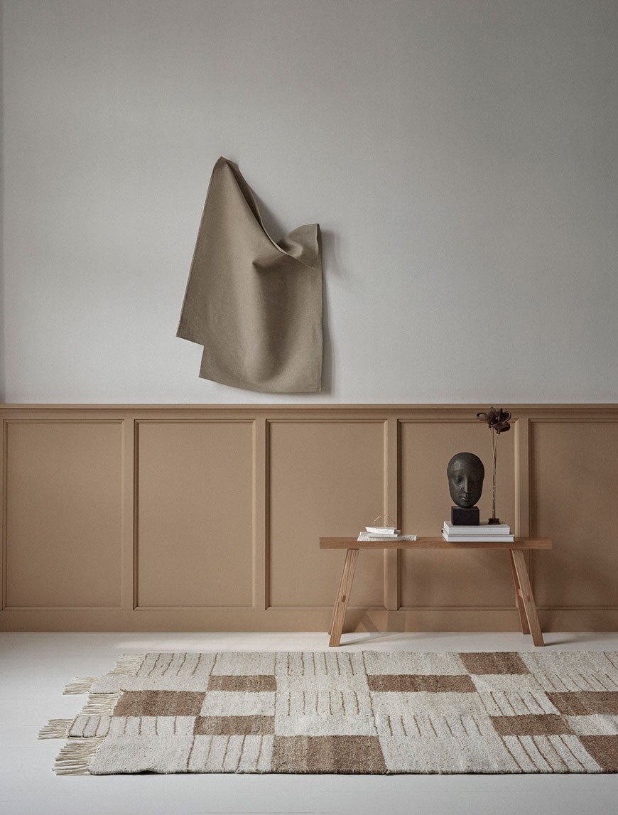
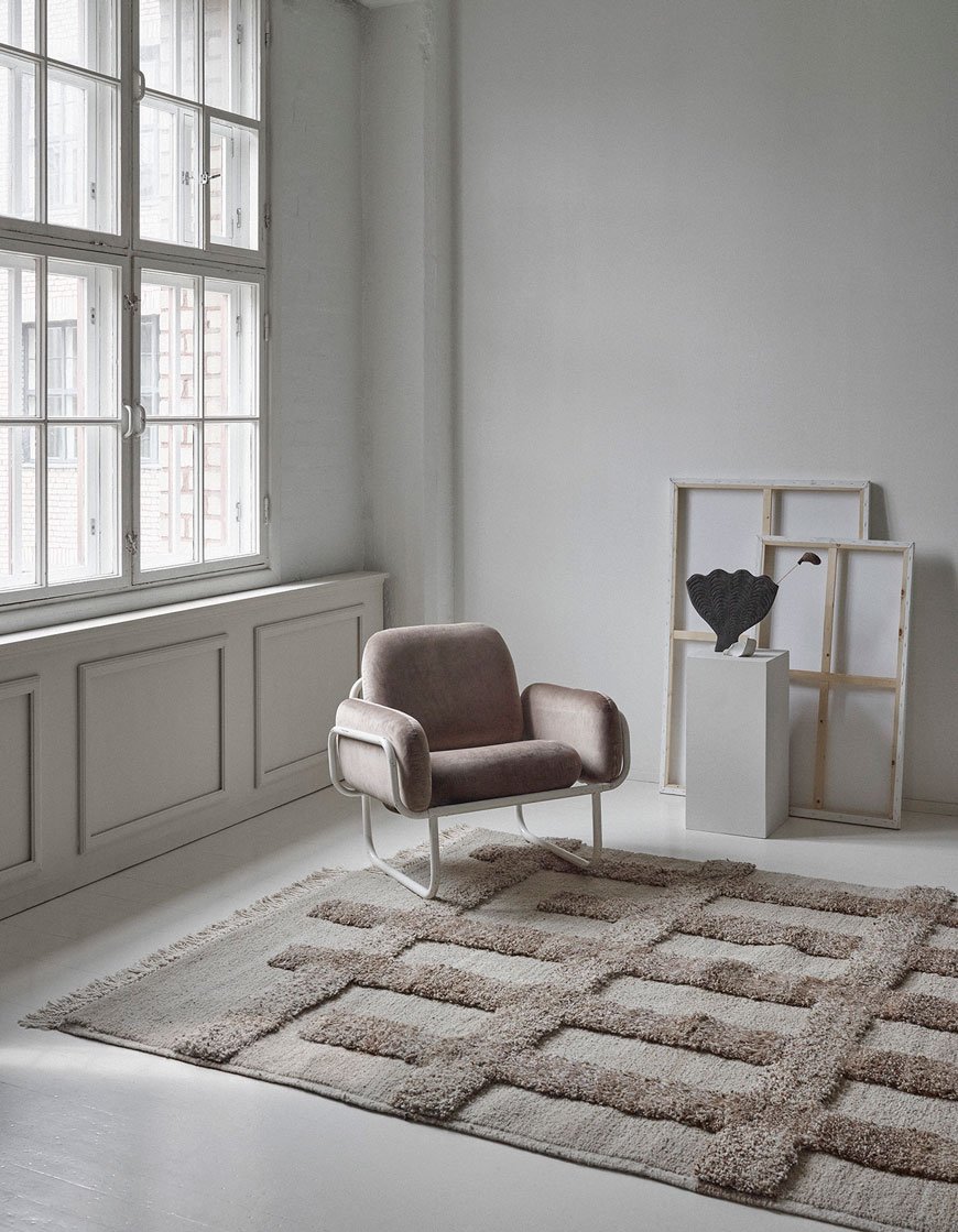
Photography courtesy of SERA HELSINKI, with thanks.
[AD] WIN A Trip For Two To Copenhagen With Georg Jensen
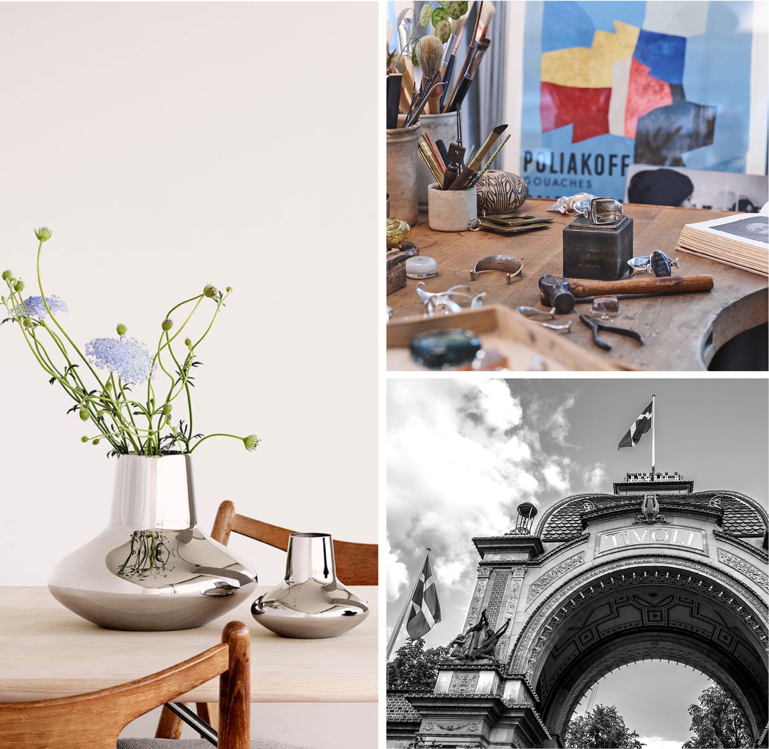
 This is a paid partnership with Georg Jensen.If you're a fan of Scandinavian culture, you'll know that Denmark boasts its fair share of that rich design history with Copenhagen its most famous city for nurturing some of the most revered designs in the world. A household name with over 100 years of silversmithing history, Georg Jensen continue this legacy with classic and contemporary style, making timeless pieces with integrity. I'm very pleased to be working with them throughout the year to share some of their beautiful collections and hopefully bring a sense of their heritage to you.But now - to the competition. Do you want to travel more this year? Let Georg Jensen help to make it happen for you. Simply visit them in store for the chance to win a trip for two to Copenhagen. The winner will receive two return flights, one night stay in a hotel, dinner for two in one of Copenhagen’s most famous restaurants and a private tour of their iconic Georg Jensen Silversmithy.To Enter: Visit one of their London stores, leave your contact details on one of their customer cards and cross your fingers! The winner will be chosen at random in a prize draw on the 28th March 2019. Good luck! Terms and conditions apply.*
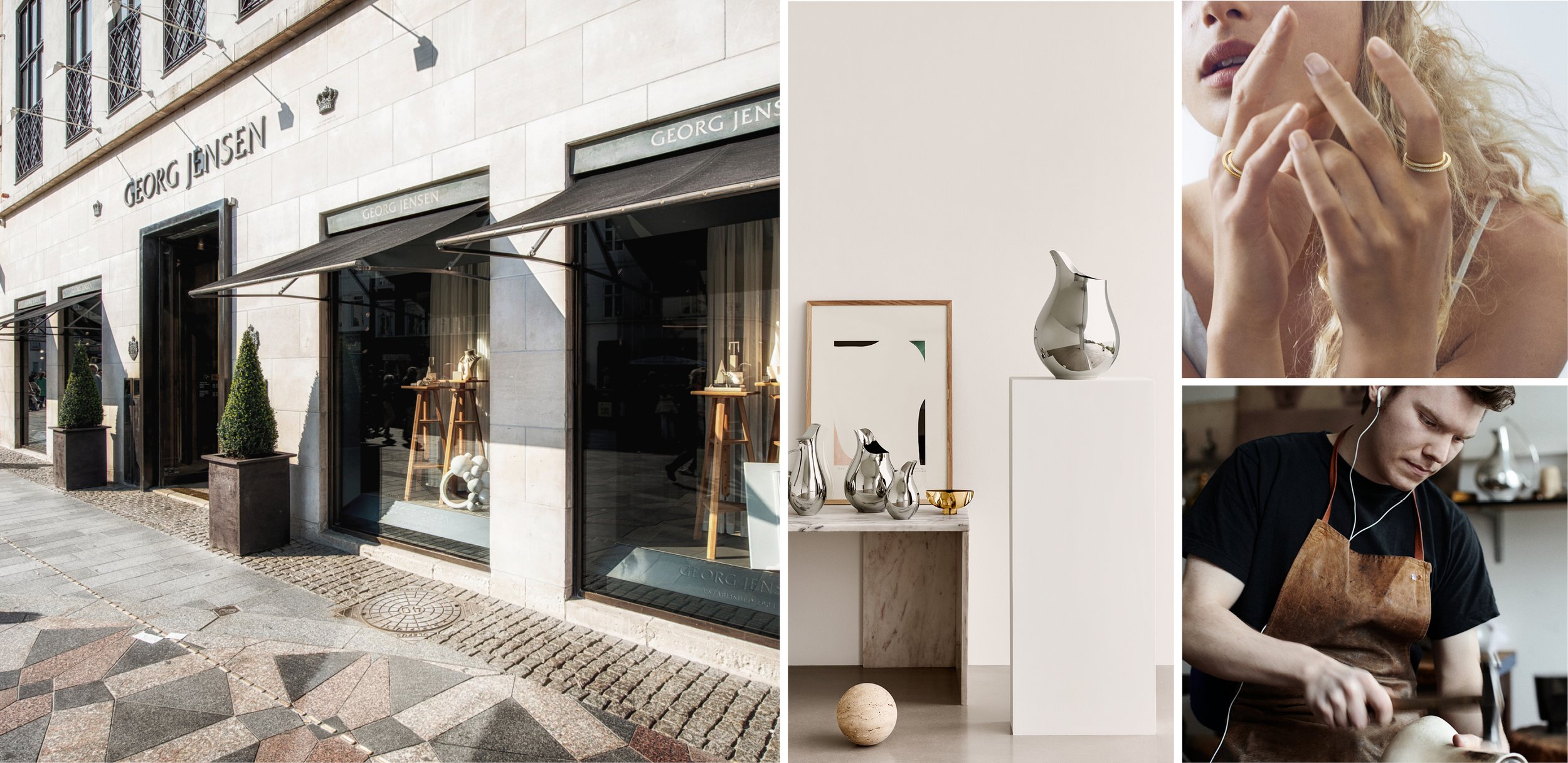
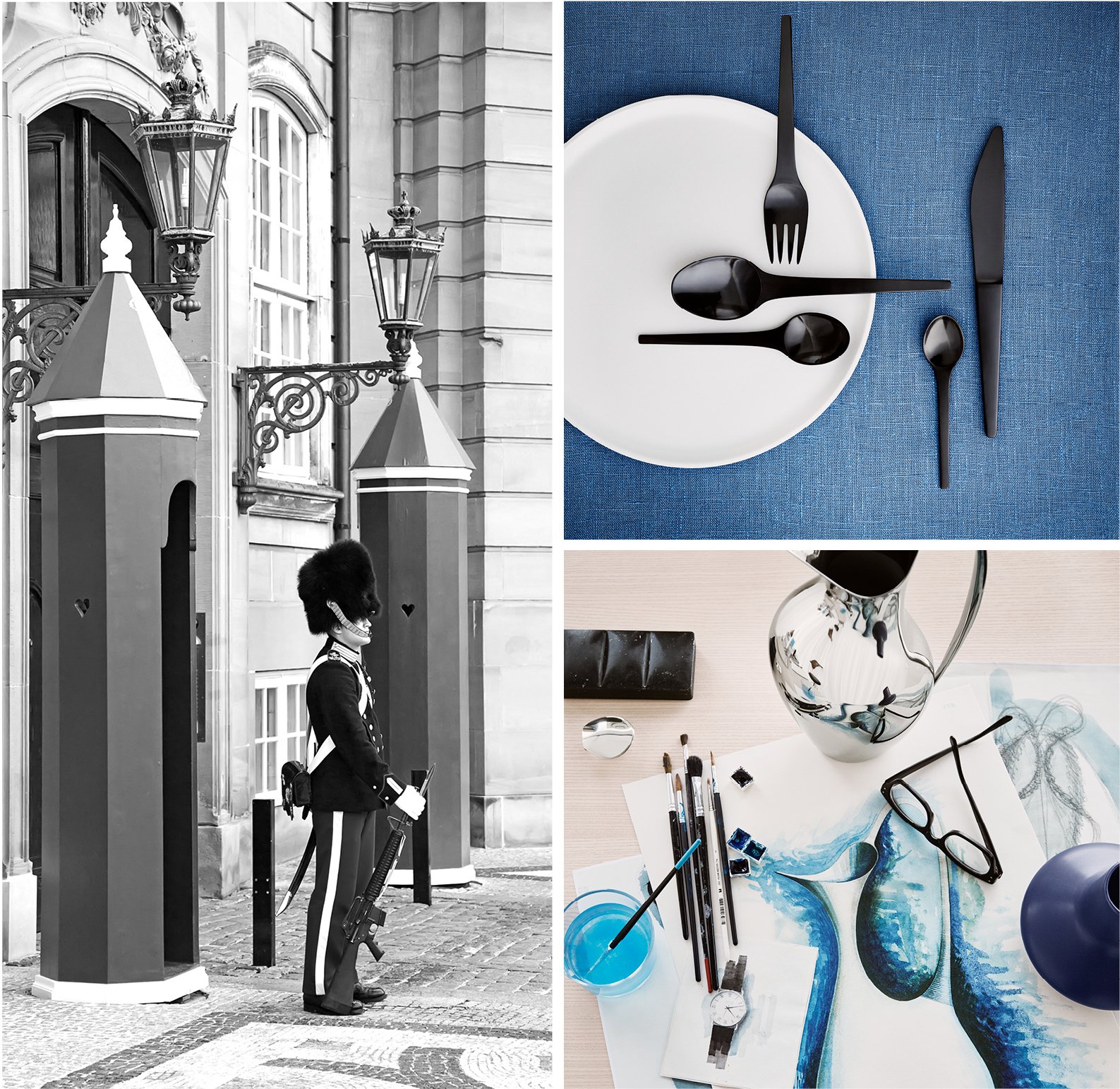

*Terms and Conditions.
The competition begins on 13th February 2019 and ends on 28th March 2019. To enter the competition you must be aged 18 or over and be a resident of Great Britain. Employees of Georg Jensen Ltd., its agents, contractors or retailers and anyone else connected with the promotion are not eligible to participate. By entering into this competition, your full name and city of residence may be published at www.georgjensen.com . There will be one winner only. The prize cannot be exchanged for monetary value. The prize must be redeemed in the year 2019. Georg Jensen Ltd. reserves the right to manage the booking of the airline, hotel and restaurant. No purchase is necessary to enter the competition. There is no limit to the number of entries a participant can enter. Georg Jensen Ltd. takes no responsibility for entries which are lost, delayed, misdirected, incomplete or cannot be delivered or entered for any technical or other reason. The competition cannot be entered online. The competition can only be entered in the Georg Jensen Mount Street, Georg Jensen Westfield, Georg Jensen Royal Exchange or Georg Jensen Selfridges store. Georg Jensen Ltd. will notify the winner by email on 29th March 2019. If the winner does not respond within 14 days of being notified, the winner’s prize will be forfeited and Georg Jensen will be entitled to select a new winner. The new winner will then have 14 days to respond once notified or they will also forfeit their price. If a winner rejects the prize, the winner’s prize will be forfeited and Georg Jensen Ltd. will be entitled to select another winner. The winner of this competition is entitled to bring one guest on the trip for two to Copenhagen with them and must obtain the consent of this person before providing their details (such as name, date of birth, passport number, and passport expiry and contact details) to Georg Jensen Ltd. Georg Jensen Ltd. accepts no responsibility for any damage, loss, liabilities, injury or disappointment incurred or suffered by you as a result of you entering the competition, accepting the prize or not being selected as the winner. The decision of Georg Jensen Ltd. in all matters under its control is final and binding. Georg Jensen Ltd. reserve the right at any time to modify or discontinue, temporarily or permanently, the prize draw with or without prior notice due to reasons outside its control. Georg Jensen Ltd. shall not be held liable for any failure to comply with its obligations where the failure is caused by something outside its reasonable control – such circumstances shall include, but not be limited to, weather conditions, fire, flood, hurricane, strike, industrial dispute, war, hostilities, political unrest, riots, civil commotion, inevitable accidents, supervening legislation or any other circumstances amounting to force majeure. Georg Jensen Ltd. reserves the right to award an alternative prize of equal or greater value, should the advertised prize or any part of it become unavailable for any reason. The competition promoter is Georg Jensen Ltd. The competition will be governed by English Law. By participating in the competition you are deemed to have read and understood these terms and conditions and agree to be bound by them. If you breach any of the terms and conditions, you will be automatically disqualified from the competition.
Use of your personal data
By entering into competition, participants give consent to 1) Georg Jensen Ltd.’s collection and processing of their full name, e-mail address and/or phone number and city of residence and 2) to receive an invitation to become a member of My Georg Jensen. The collected personal data will be used for the competition administration purposes and for communication on advantages related to becoming a My Georg Jensen member and will be stored for a period of maximum 30 days after completion of the competition. Personal data of the winner and the guest will be processed for the booking administration purposes and will be deleted 6 months after the completed trip date. Once you have entered the competition, you will be invited to participate in the My Georg Jensen customer club. If you subsequently decide to become a member of My Georg Jensen, the processing of your personal data in relation to this will be subject to our Privacy Policy available at https://www.georgjensen.com/en-gb/privacy-policy and Terms of Membership, found here: https://www.georgjensen.com/en-gb/terms-of-membership. By entering into competition, participants consent to that his / her full name and city of residence can be published at https://www.georgjensen.com/en-gb.The participants can obtain information on Georg Jensen Ltd’s processing of their personal data or withdraw their consent by sending an e-mail to ukcustomerservice@georgjensen.com. ;
Photography: courtesy of Georg Jensen.
A Very Comfortable Ferm Living Spring Summer 2019
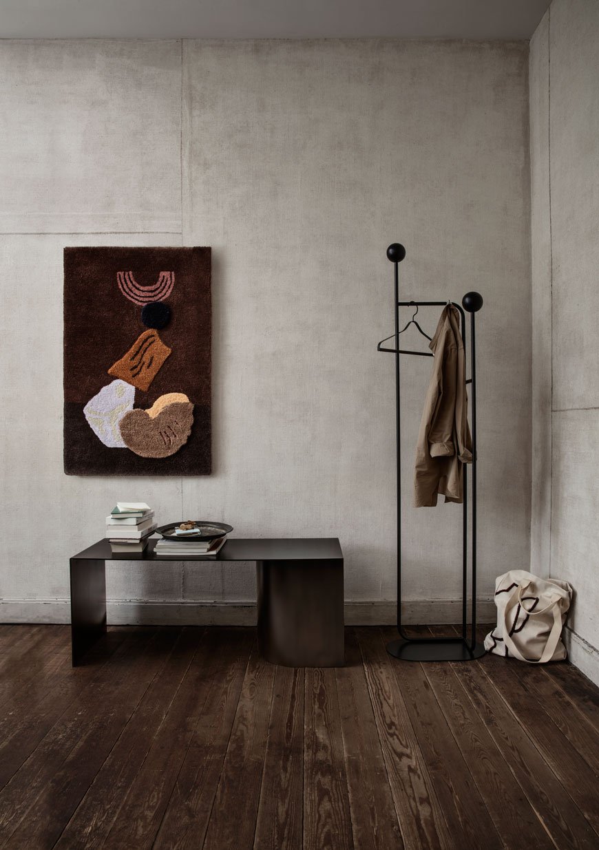 Making an edited selection from the new Ferm Living SS 2019 catalogue was no joke. Seriously. I struggled to keep the number of images down because, as always, the quality of styling is just through-the-roof exquisite. Unusually for me, I'm drawn to the dark wood interiors here - just as I'm slowing working them out of our home.This year founder and creative director Trine Andersen has brought the new collection to life in the homes of seven female creatives. Titled 'Space To Feel Comfortably You', the collection presents each room of a home with the backdrop of an existing interior. Rooms feel natural, lived in and comfortable.Known for their forward-thinking approach to design, the collection promises more abstract forms and a rich colour palette. Tactility remains high on the agenda, mixing textured woven art and textiles with smooth marble and slim metal structures.
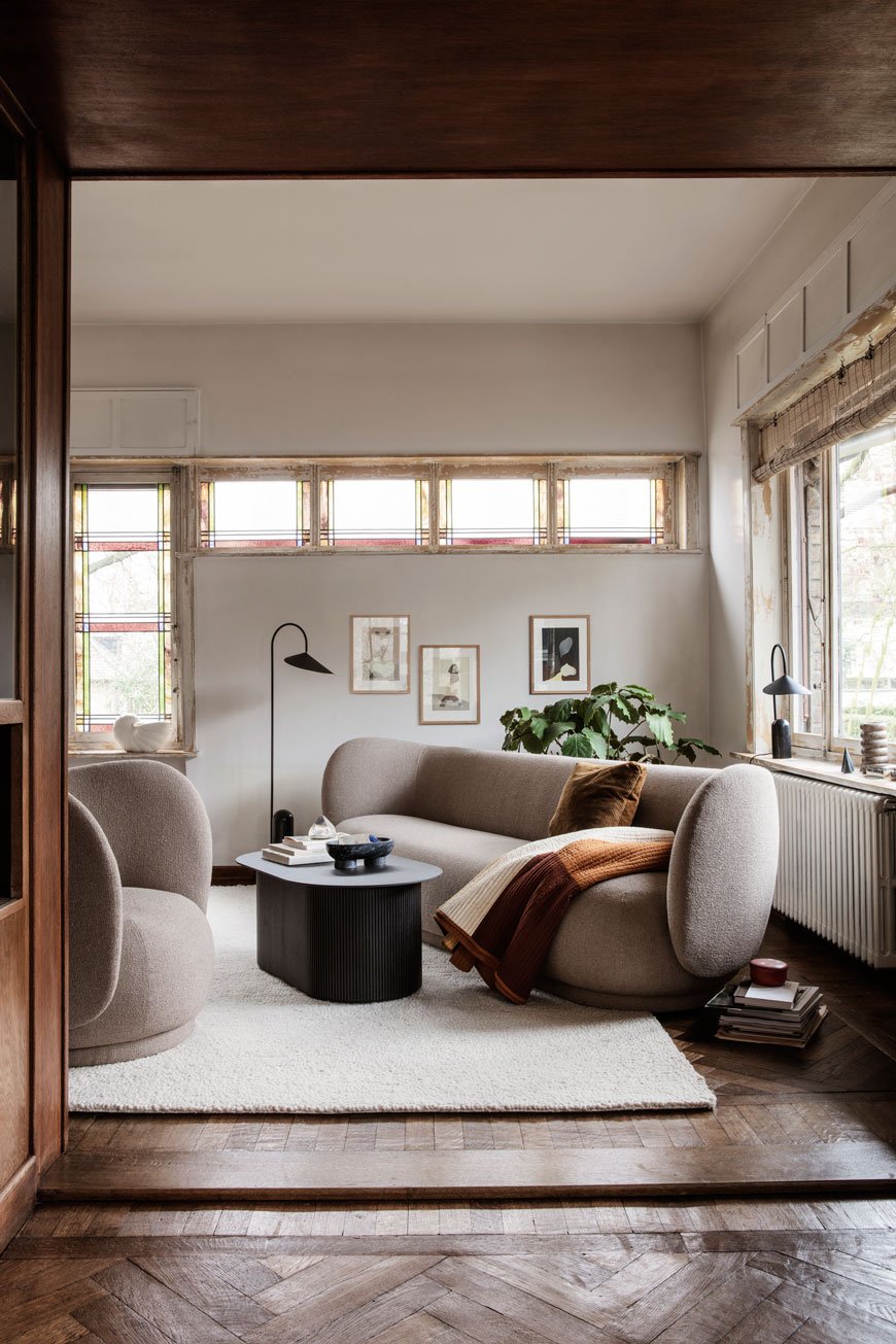
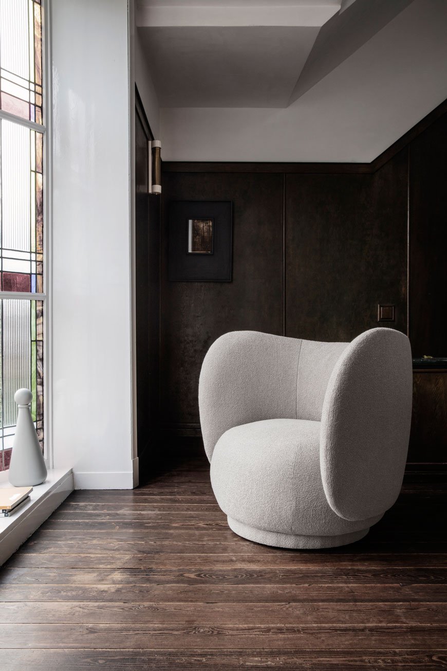 Stand-out pieces include the Rico lounge chair and sofa with their sweeping curved shell back in Art Deco style. The bouclé upholstery is made using uneven yarn for a loopy texture. Such an elegant design.As ever, I still have designs on the Haze Vitrine for our dining room...one day. Such a slender piece of storage, perfect for a small corner to store a few essentials.
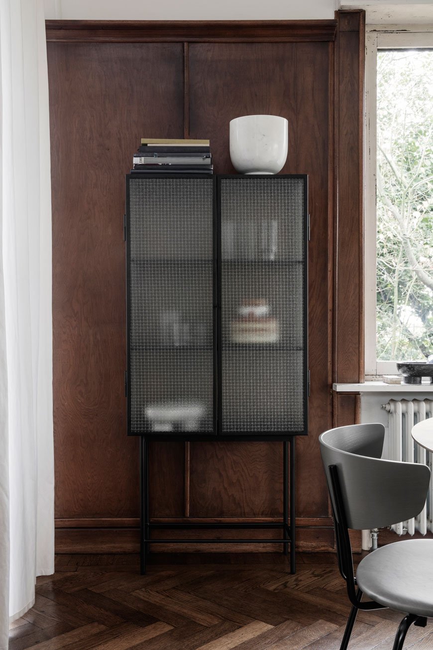
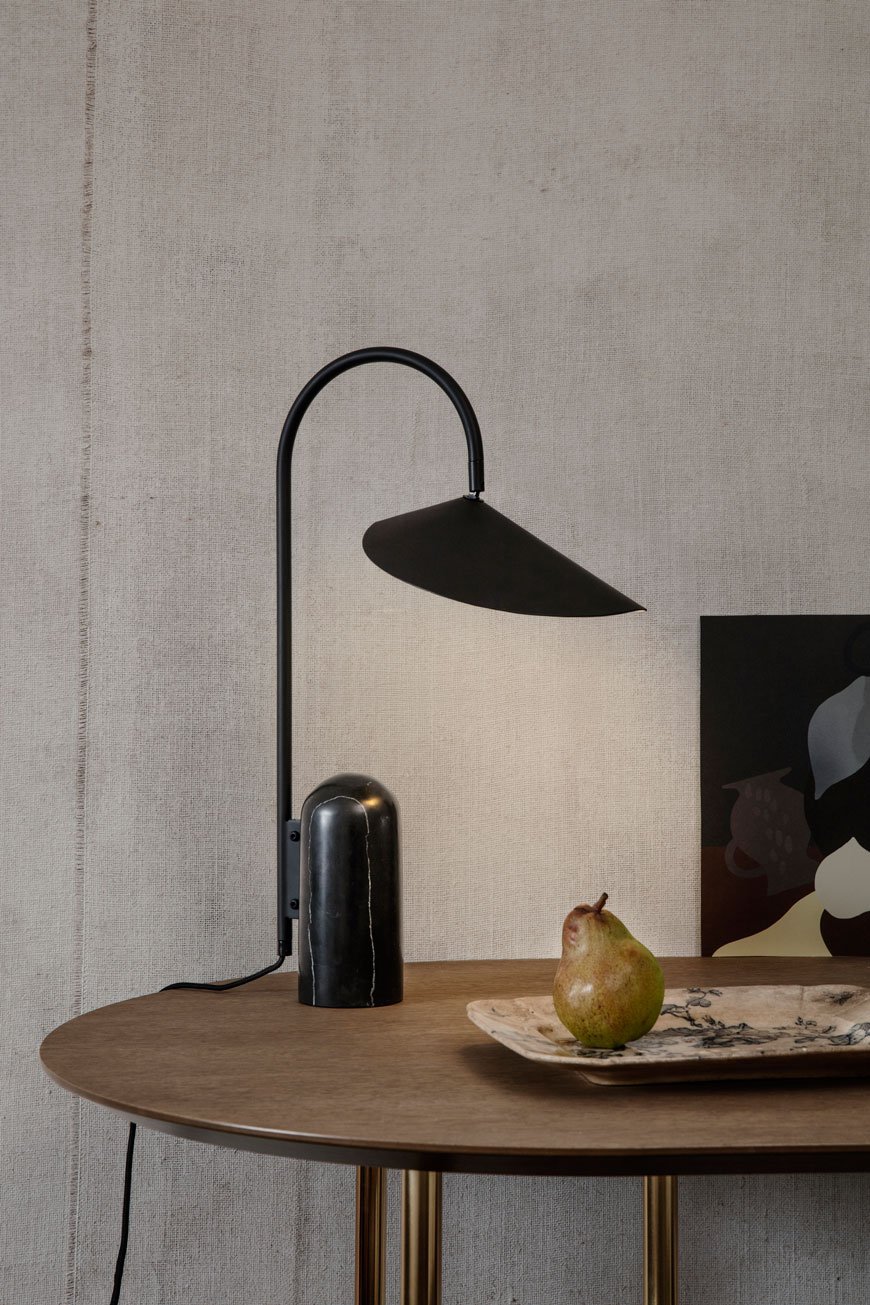
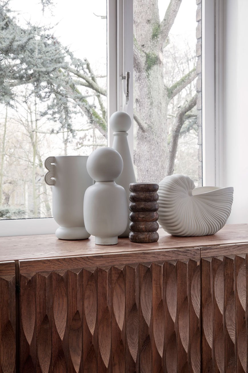
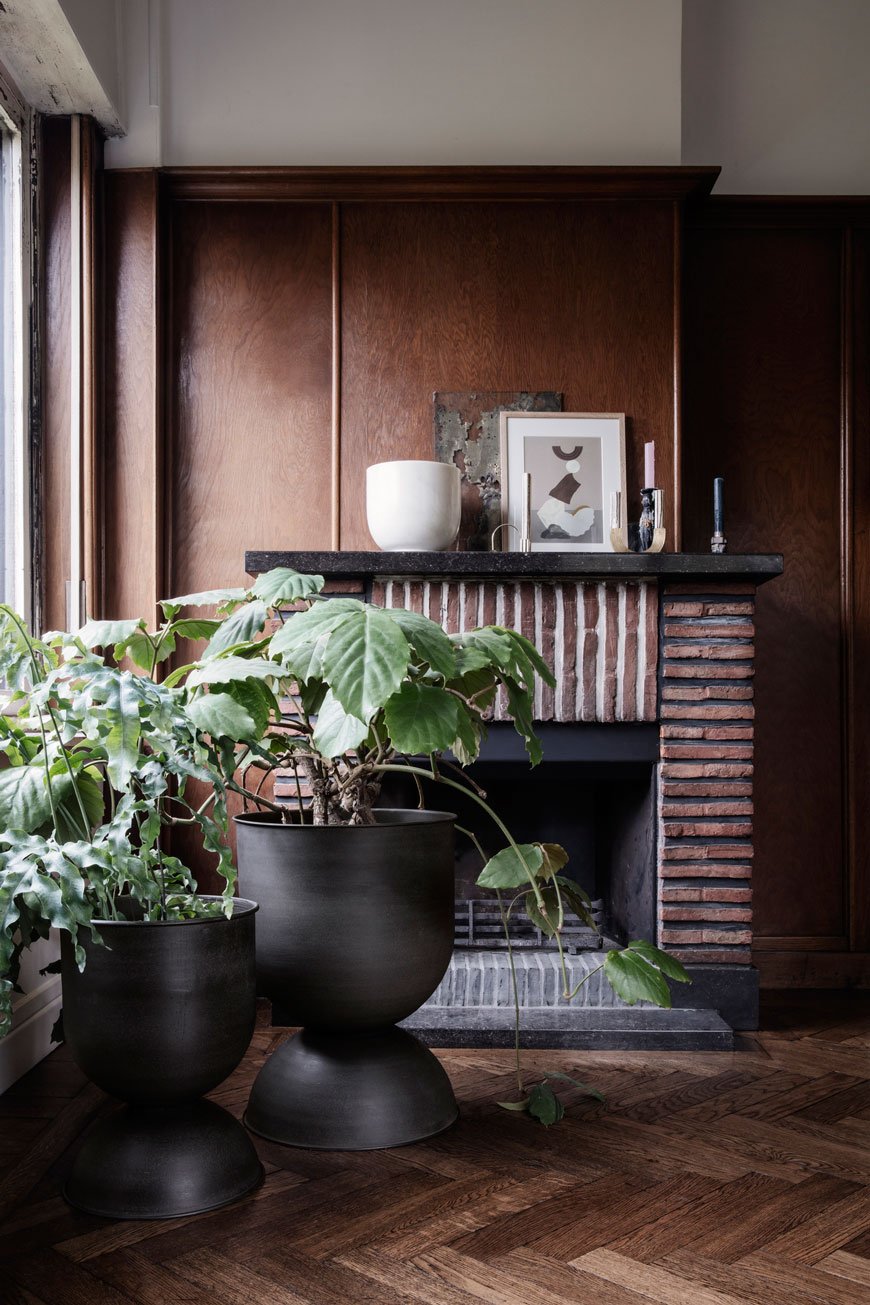
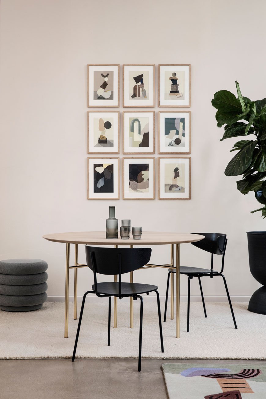
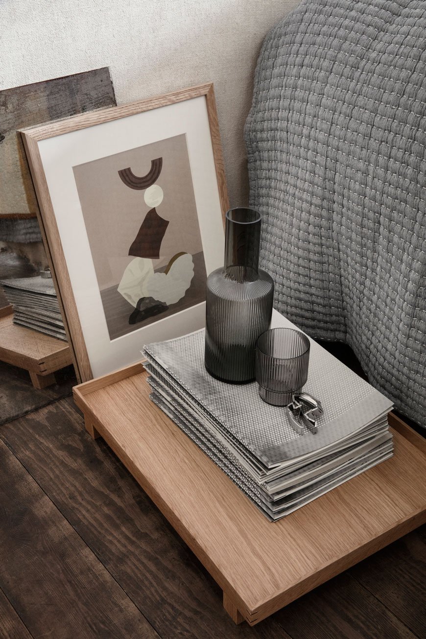
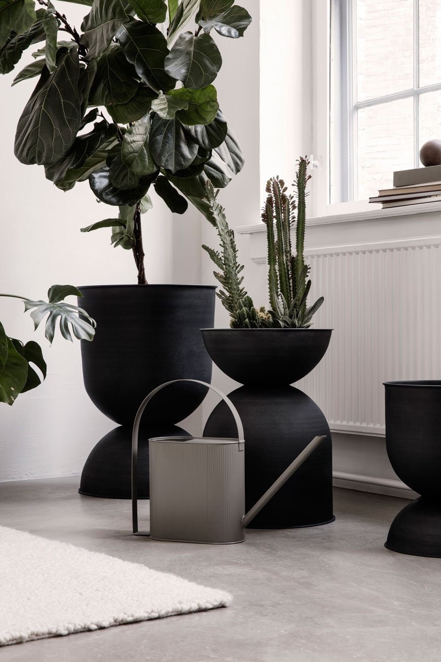
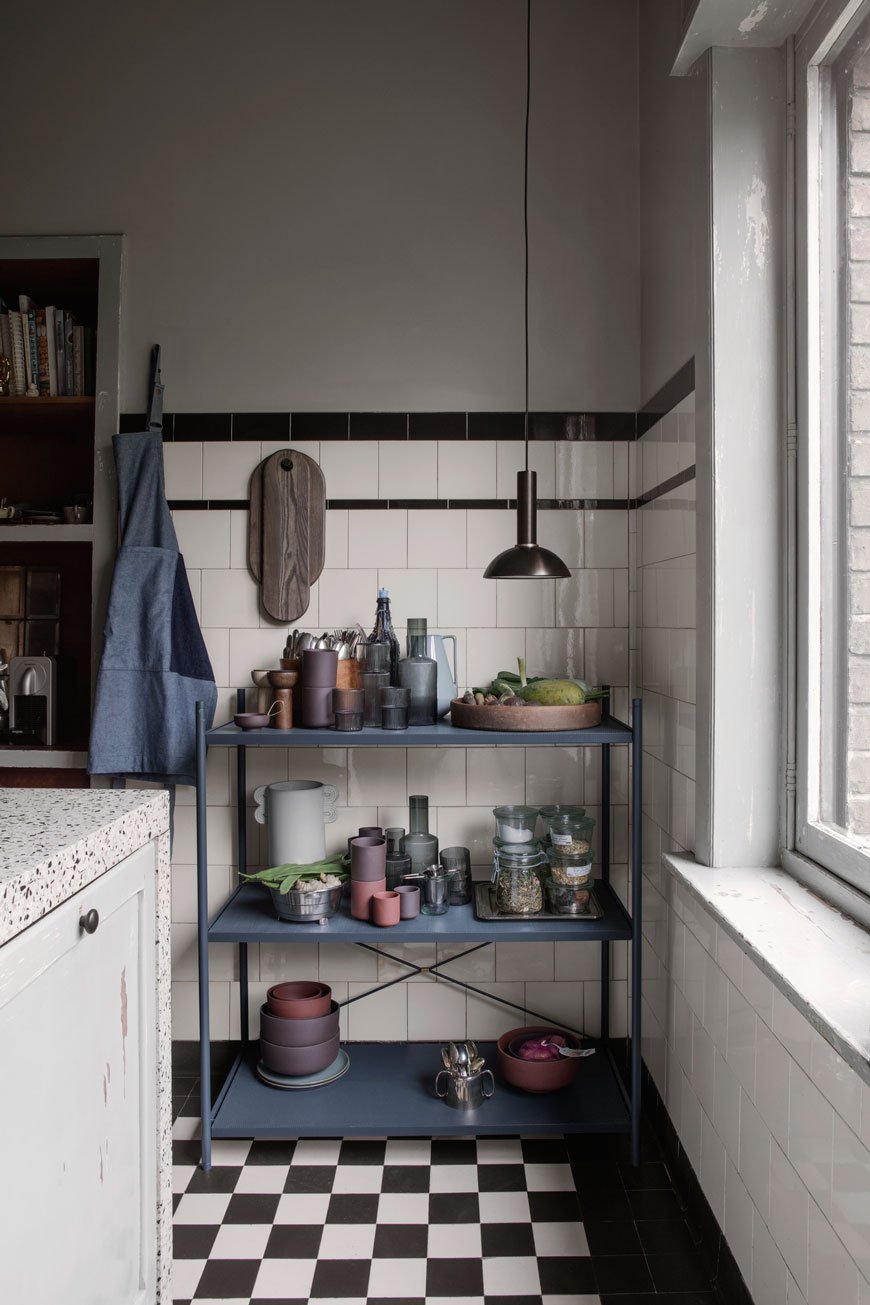 See? I told you. It was an impossible task to choose. And there's still so much more, especially hearing from the homeowners themselves. It's always fascinating to learn how others use their homes, how different their lives are from our own. For that, I'd recommend spending a little more time reading the catalogue. You're welcome.
All imagery courtesy of Ferm Living, with thanks.
Rex Kralj New Variations On A Slovenian Classic
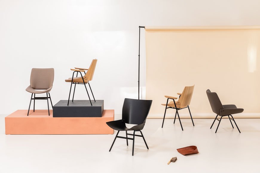 When I think of modernist designers, Niko Kralj isn't the first name that springs to mind. In fact, I knew nothing of him until I discovered Utopiast, an online store specialising in South and Eastern European design. Drawn to the minimalist shape of a plywood chair I was surprised to find that the original design was 60 years old. So who was Niko Kralj?
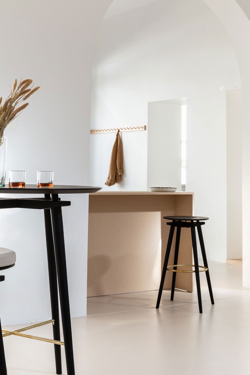
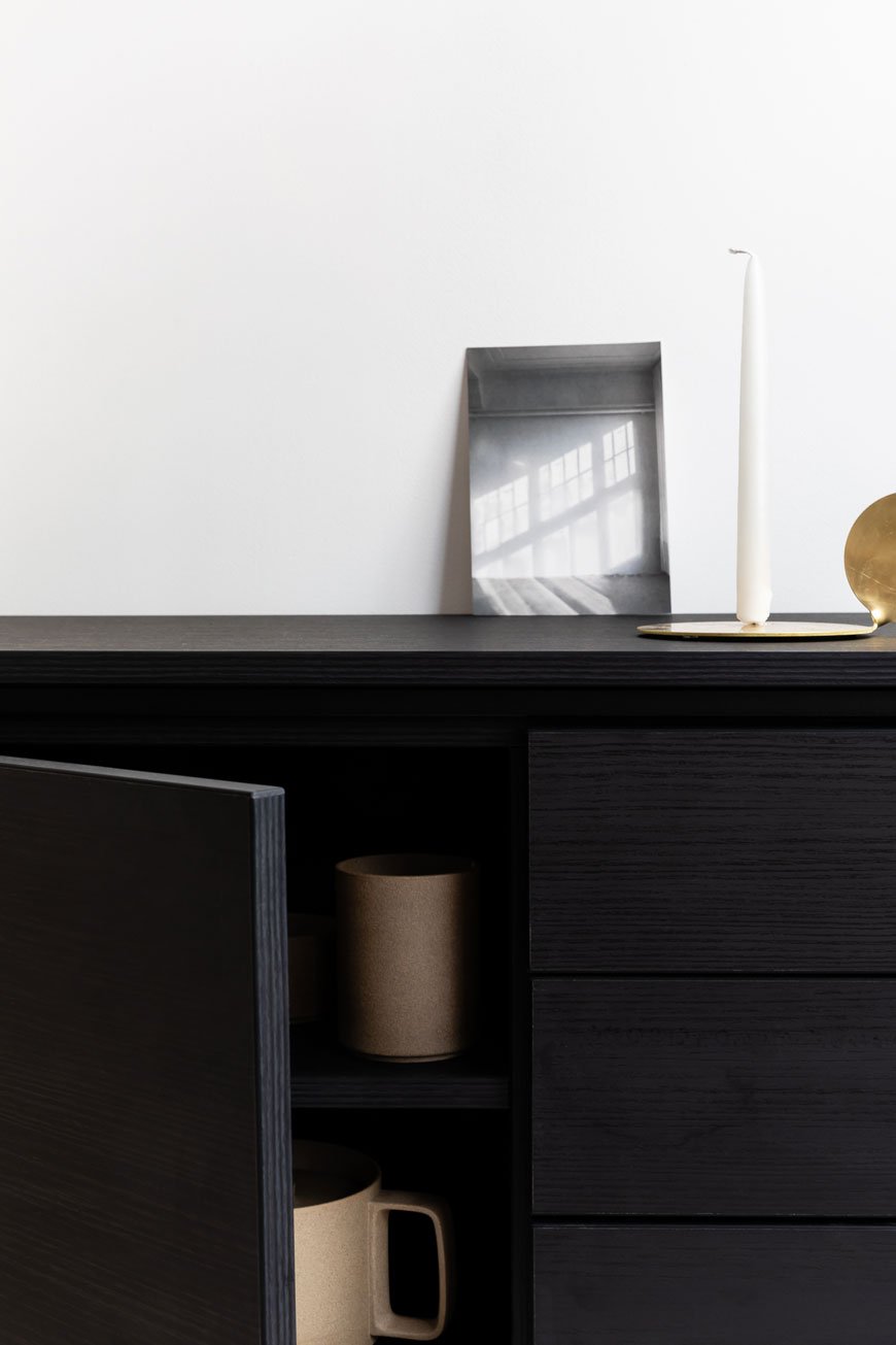
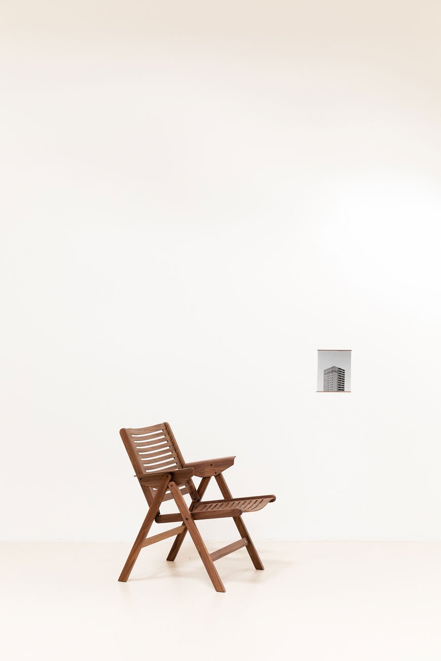 A true innovator of minimalist design, this architect and industrial designer hailed from Slovenia. In 1952, Kralj made the first steps towards creating the Rex Chair in 1952. This moulded plywood, slatted design would become a familiar piece in post-war Slovenian homes with its light-weight form and ability to fold away. In 1956, The Rex Lounge chair, Rocker and Daybed of the same composition would follow to complete the collection. He would become known for his simplistic forms, finding ways to join the wood using a minimal amount of screws and bolts. During his lifetime, Kralj would go on to make some of the most important contributions to functional, modernist design.Continuing his legacy, Studio Rex Kralj was established in 2011, taking inspiration from Kralj's name in Latin, also Slovenian for 'king'. The studio has since reissued some of his more iconic designs, particularly those that never saw it to production. Among them sits the Mosquito chair, designed in 1953, the Stool CC and my personal favourite - the Shell Lounge. The brand new 'Variations' catalogue is full to the brim with utterly beautiful, minimalist styling, showing the collection in different finishes and colourways.
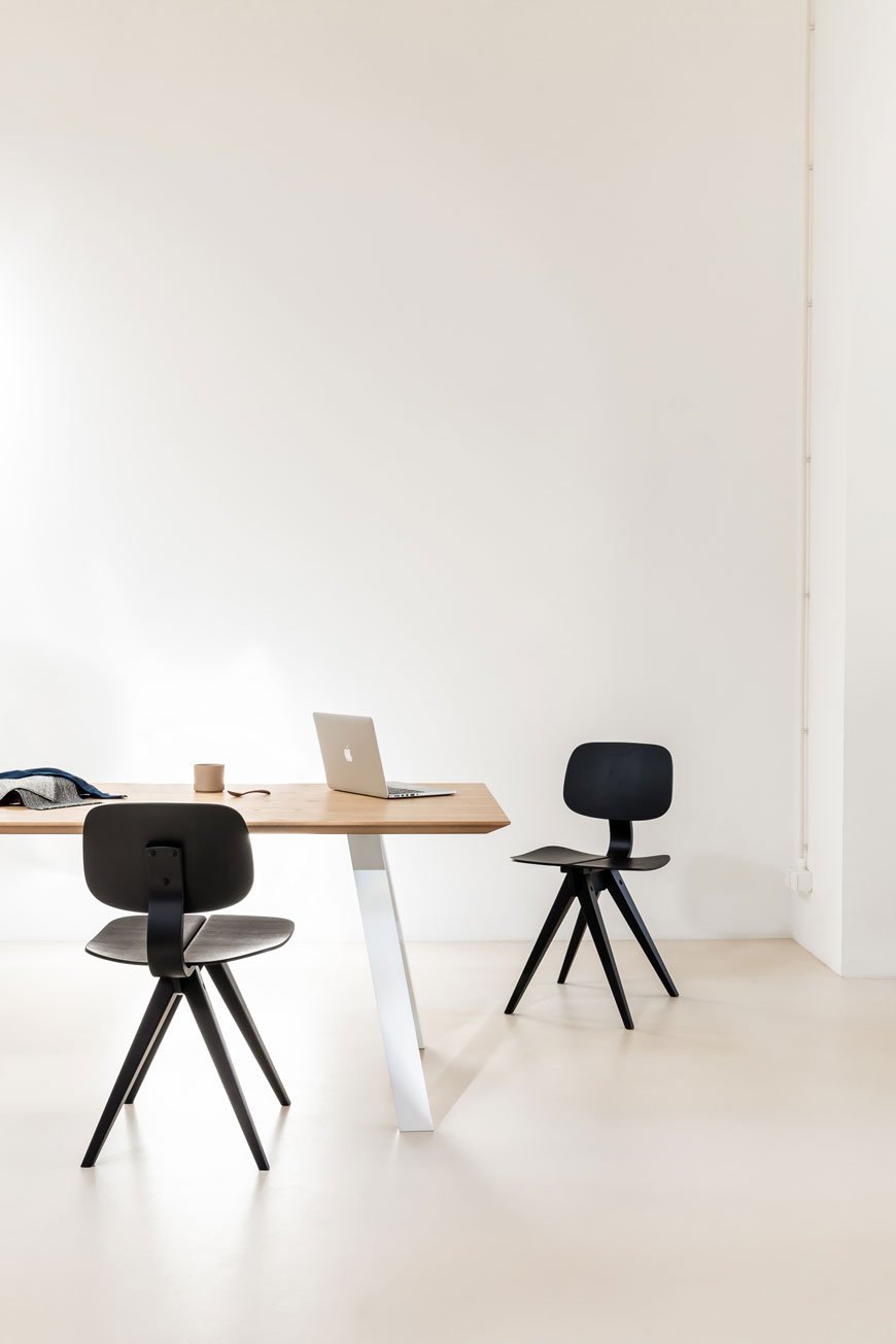
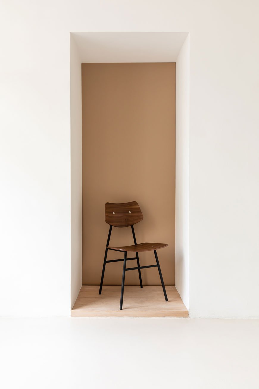
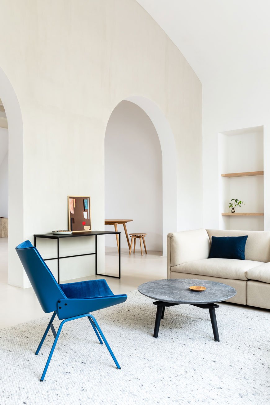 Working in collaboration with contemporary designers, the studio has brought new variations into the collection, including German fashion designer Lili Radu and her colourful take on the upholstered Shell Lounge. New table designs based on Kralj's original cross section seen in the Stool CC extend the collection. The almost disconnected surface gives the appearance of the floating which adds to the spacious feel of the design. I think my new favourite dining chair is the 4455 (below) with its curved back which comes in a velvet edition too.
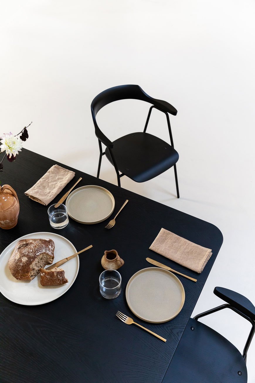

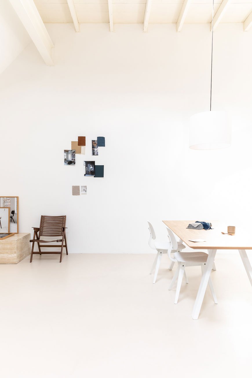 So now you know who Niko Kralj is if you didn't already. His work deserves to be shouted from the rooftops, and under the direction of the studio they translate so well into contemporary living, don't you think?
Photography © Marieke Verdenius and concept and styling by Design Studio Nu for Rex Kralj.
6 Things I've Learnt About Slow Decorating
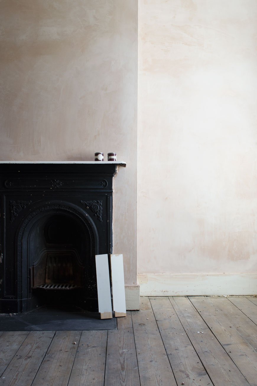
You know, it’s interesting how many readers and friends imagine us to be all done and dusted with our renovation project. Whatever happened to doing things slowly? Perceptions of the online world I’ve detailed here may well have filled in the gaps so you think that we’ve called in a skilled team of contractors and a massive budget to do the lot in one go. But. The fact remains, we’re a family of five (cat included) living on a modest income without the means (or desire) to move out for works to be done. Although it has crossed my mind on many occasion. Believe it or not, for the most part, we actually enjoy DIY and want to give ‘The Chatham House’ as we call it, the very best we can, respecting its history and in making it our home.
If I'm honest, this house we’ve called home for two years now was not initially on the cards for us. The initial plan was to look at buying a stop-gap to turn around within a year or two and move on. BUT then we found this one. And suddenly we were looking at staying put and pouring everything we had into it. A total curveball. With only three or four previous owners, we've been spoilt with a lot of original features. Along with that we also inherited a whole heap of bodge jobs that need picking apart. Buying a doer-upper has meant re-evaluating and taking a few deep breaths at the thought of all that plastering. It’s also slowed down the whole renovation/decoration process, which, as the least impatient human on this planet was no easy pill to swallow. This sounds like you too, right? What I will say is having that time on your hands is actually a massive gift. Here’s what I’ve learnt about slow decorating so far...
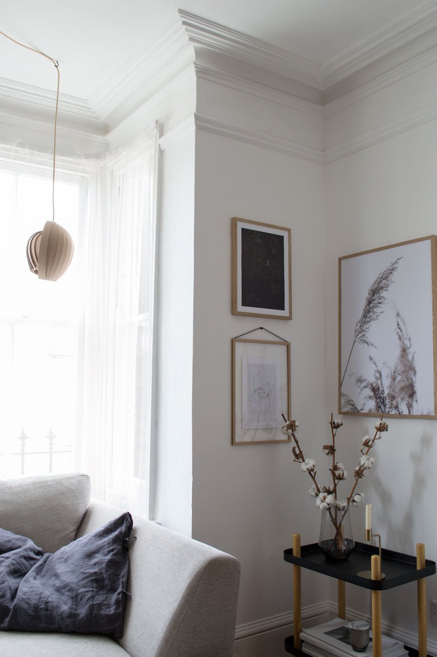
You Will Change Your Mind. A lot.
The most popular question I’m asked time and time again is “what advice would you give new homeowners?" Don’t act on impulse. Please. Do not pick up a paint chart, paintbrush or box of tiles until you’ve really spent some time in the house. Instead, wait. It’s boring, yes, frustrating, hell yes, but I can guarantee you’ll thank yourself in the long run. You might just save yourself from a rash decision or two. An example? We've lived with half raspberry pink, half gloss white anaglypta walls in our hallway for TWO YEARS. Why? Good question. Well, it's a very dark space so for one, I needed time to see how the light behaved at different times throughout the year to determine the right colour palette to use. I'm still not sure whether we ought to replace the ceiling lights with wall lights and we need to decide on how we're treating the stairs. Stripping it when we moved in would've meant living with some very crumbly old walls for quite so time which, in an already cold and drafty space wouldn't be the most sensible move. I've been such a good girl!
Useful pointers to consider before you start decorating:• Trends move quickly. Whatever you love now might not be top of your list in a year's time.• How will you use each room? Be realistic here - if you like the idea of a home office but know you'll end up at the dining table/sofa then use it as a guest room instead.• What works well for you now and what doesn't? Do you need to rethink storage? Do you need to update the heating and windows if it's a little on the draughty side?• Choose colour carefully. Paint looks completely different in a room depending on the time of day and which way it's facing, e.g. North facing light will be bluer and cool whilst South facing is warmer and most consistent during the main part of the day. Our bedroom faces North-East so I chose a warm beige paint to counteract the cold light and it reacts beautifully as the sun rises across one wall.• How do you want your home to feel and where will you start the process? You need to consider how you'll make the rest of the house connect with that room and feel like a coherent space.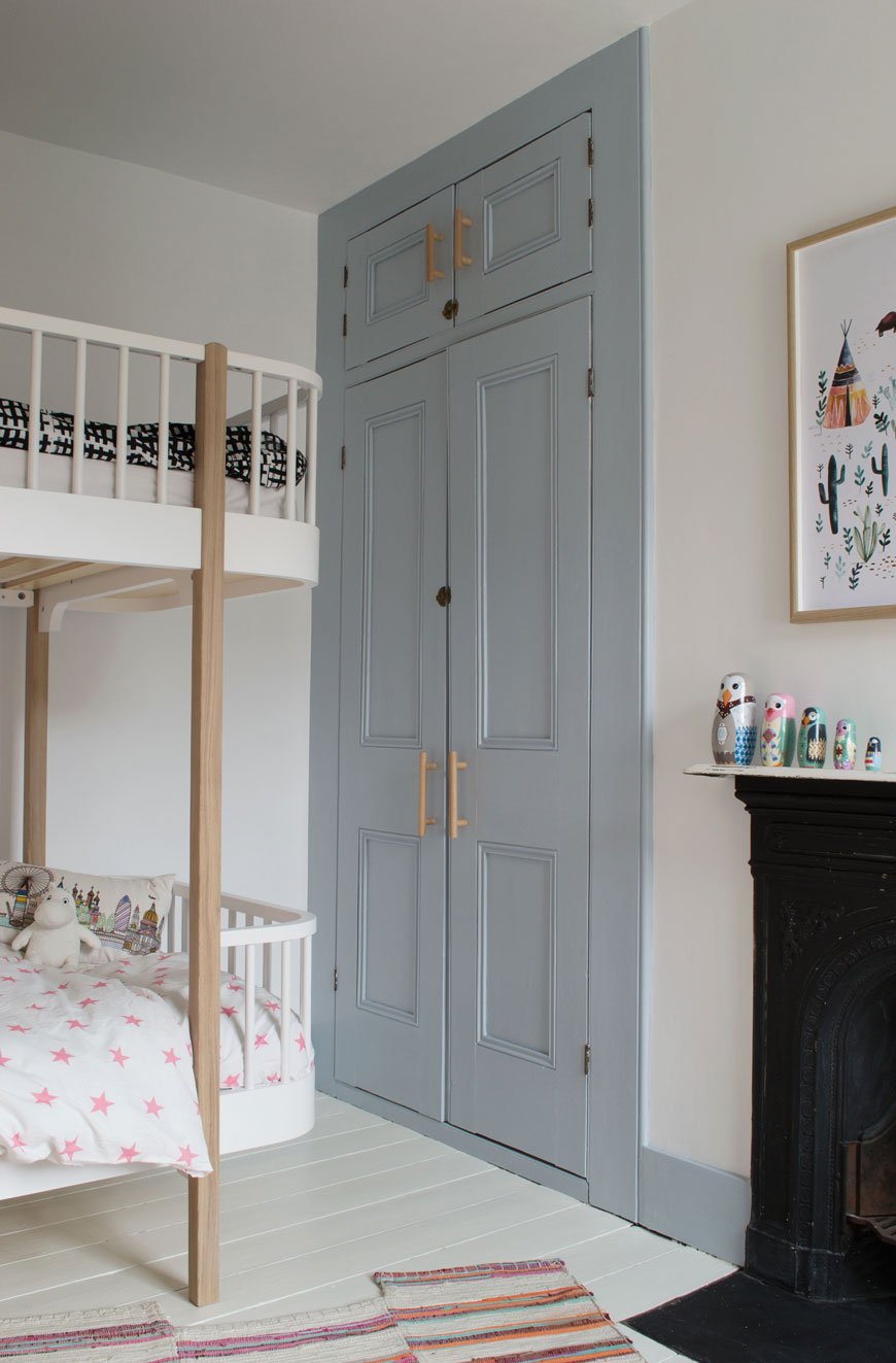
Tackle One Project At A Time.
Renovating is stressful, there's no doubt about it. Even if you've got somewhere else to live while work is going on, you still have to relocate and manage the project in the meantime. Tackling one room/project at a time will minimise the upheaval and stress and give you the headspace to give it your full focus. When you've ticked that off, move on to the next room.
Establish A Strong Foundation.
Unless you're moving into a new build it's likely there's groundwork to do. I like to call them the boring necessities, things like:• Structural works - knocking through / relocating walls.• Rewiring and plumbing.• Plasterwork.• Replacing or strengthening floorboards. We did this in the bathroom just before Christmas when we realised our shower had completely rotted the joists underneath!Some pretty important jobs. These should come top of your list, ahead of the cosmetic stuff to avoid the unfortunate need to start from scratch.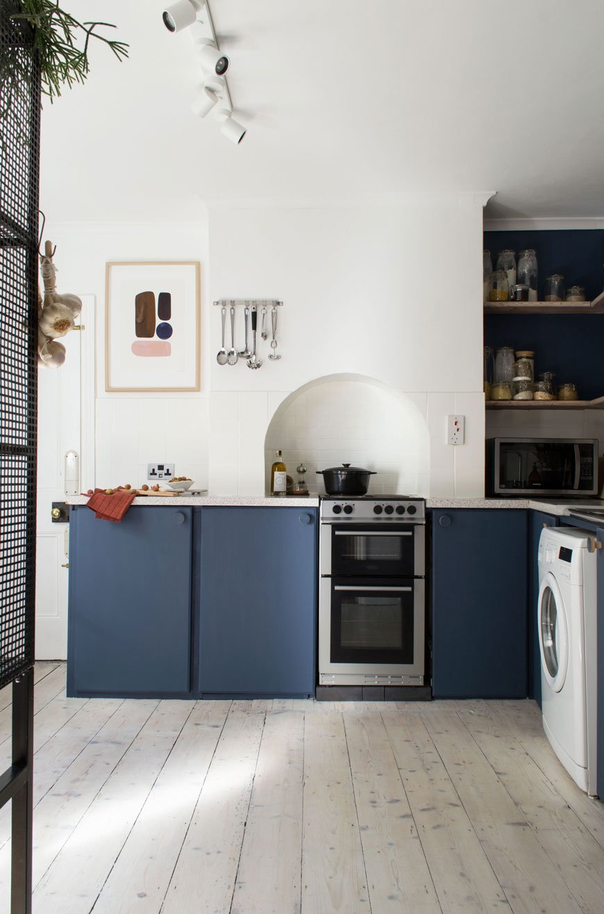
Live In The Now
Holding onto those big “one day” plans are completely valid. We'd like to extend the kitchen and create another room in the loft at some point, but not for a few years yet. Don't feel that you can't make changes to make it your own in the meantime. That's why we decided to do a kitchen refresh so we could fully utilise the existing space and enjoy it for the time being. And honestly, crappy cupboard planning aside (thanks previous owners) I love it so much that I'd be quite happy if that extension didn't happen. Almost.
Is It Really You? Think It Through.
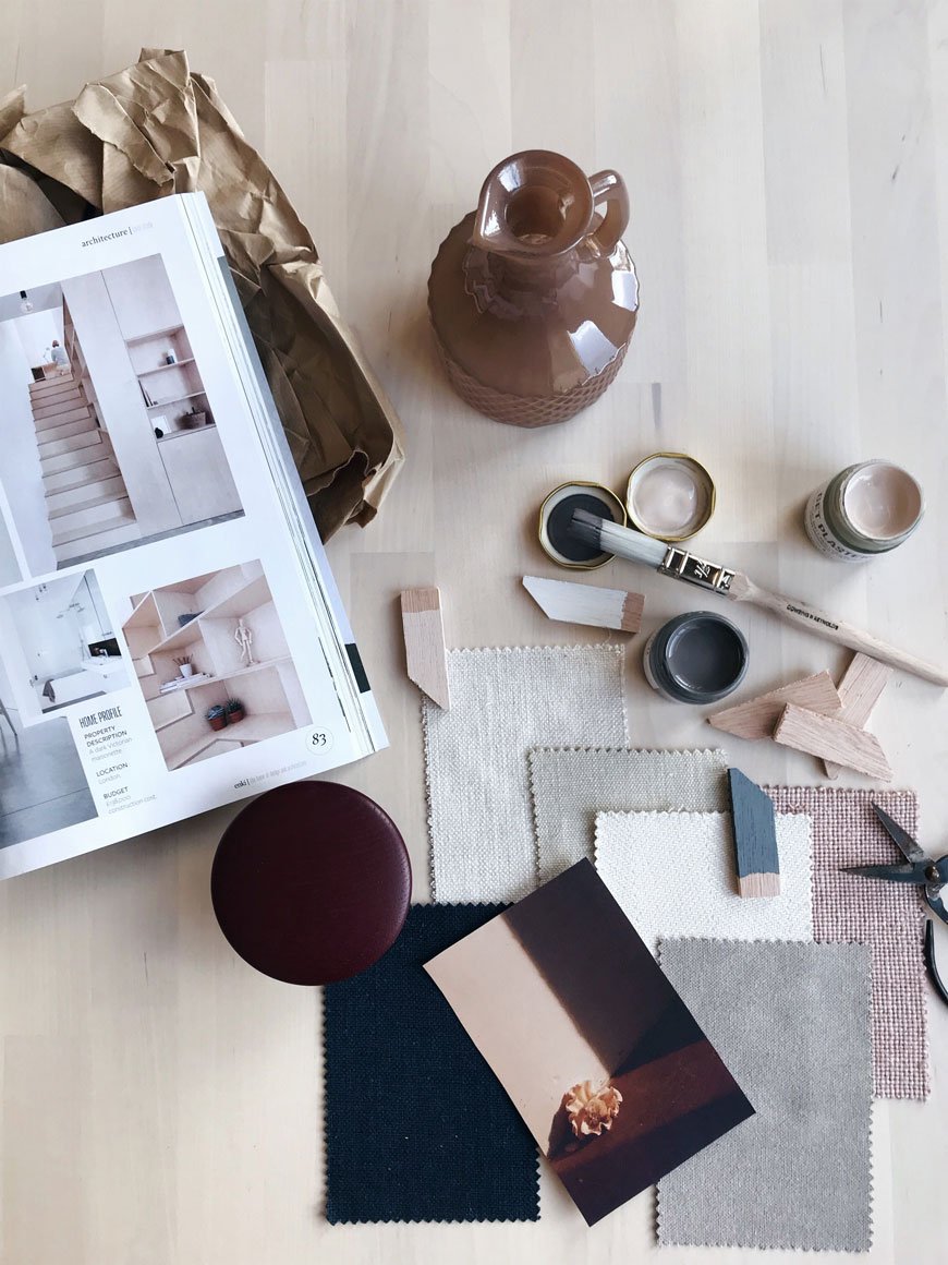
Take time when you're designing each room and don't be too quick to hop onto trends. It's great to draw inspiration from Pinterest, Instagram and glossy mags as a starting point. Step away before anxiety hits though. It's worth knowing that those images are shot for editorial purposes as an aspirational piece. I know because I've styled homes for magazines. I do it myself when I shoot - in reality, nobody wants to see the mess, they want to see something they can aspire to. You see the carefully considered image but what you don't see is what's going on behind the scenes, where we've moved other bits of furniture out of shot, rolled up a rug, decluttered those shelves.So be honest with yourself and create a space that speaks volumes about you. Revisit places you love and draw inspiration from them. Collect images that you connect with. Experiment with textures and materials. Can you see the furniture you already own working within your plans?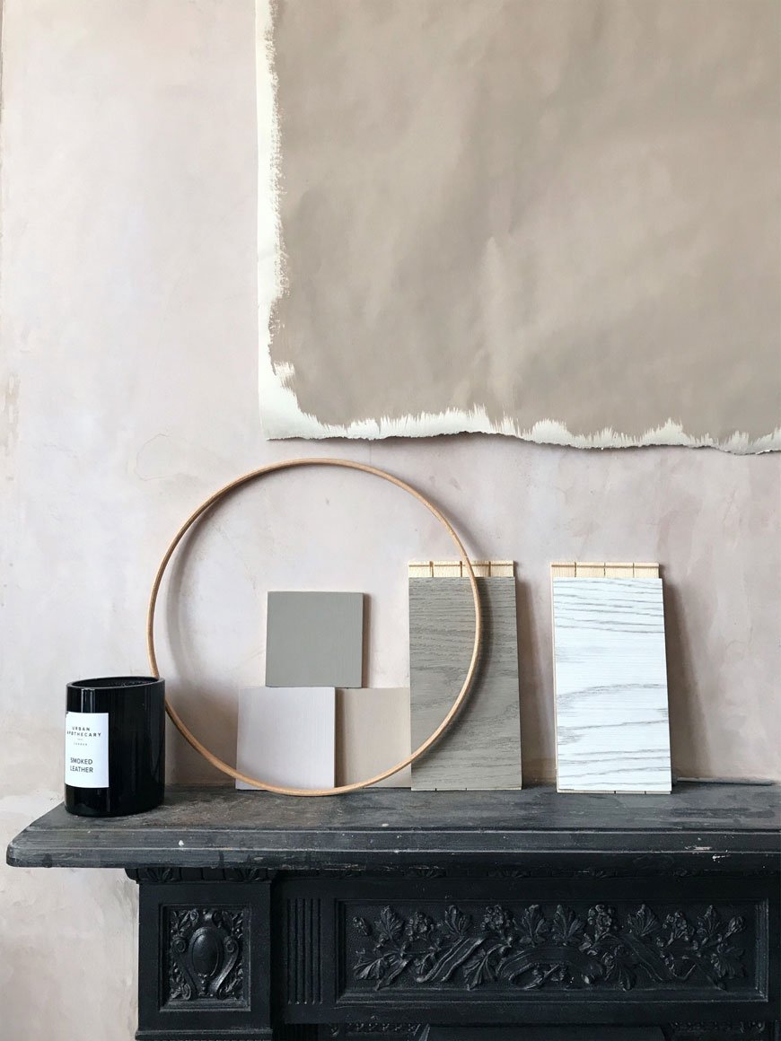
Agree Before You Start.
This one's for me really, because my default is to steam ahead without letting Rob in on the full picture. Yep, I hold my hands up. But then, he's the cautious one and I'm the reactive one...most of the time...and that's why we work. Plan as much as you can to the most minute of detail. Of course, leave some room for a little artistic license but I'm talking about agreeing on the work you'll be doing yourselves (and who) what you need to outsource and choosing the scheme together. Set out a clear timescale and try to stick to it as best you can. I'm going to try and detail this with you when we start the hallway later this month.
Enjoy The Journey
When you've stopped arguing, remember to enjoy the process. Every little change you make brings you a step closer to your vision. I'll never forget how different our bedroom and kitchen felt when we got rid of the orange pine floor. A new lease of life! There may be unforeseen circumstances along the way that need your attention (referring back to those foundation points) but with patience and focus you'll create a space you can be really proud of and pick up new skills along the way.
Photography © Tiffany Grant-Riley featuring #TheChathamHouse.
Slow New Year Intentions In 2019
 And just like that we're back and into a new year - Happy 2019 to you, lovely reader. How was your Christmas break - are you feeling rested and ready to crack on? Perhaps you're feeling apprehensive about what the coming year holds? I totally hear you.I deliberately took a longer break this time and I well and truly shut down. It seems I really needed it. The fact that I did not think about or lifted a finger to work is a testament to just how needed it was. I felt truly present with my family without keeping half an eye on my inbox. I used the camera not attached to my phone for a change when we went out for walks in the low winter sun.But. In the days following New Year's Eve, a creeping feeling of anxiety started to take over. I hadn't put 2018 to bed and set new goals for the year ahead. I ended up a crumpled mess, sat on the sofa in the dark, trying to pick apart the last ten years. Where was I going? What was the point? I've never been one for resolutions and I find the bombardment of 'New Year, New You' memes totally unrealistic and unattainable. So why was I worried that by not making plans I was setting myself up to fail? We're all just figuring it out as we go along, aren't we? The answer is that I didn't want to stand still, get left behind, to feel regret at not having tried that little bit harder.Here's the thing though. And I'm telling myself as much as I'm telling you. Success is relative. What's top of someone else's list might not even feature on yours. And I could go into the depths of how time is a man-made construct which only serves to create more pressure and anxiety...So let's look at it this way instead. Take a slower approach and give yourself permission to ditch the pressure. I'm a great believer in putting your intentions out there and being consistent - when the time is right things find a way to align. Whether you're into Oprah style visualisation boards or prefer to write down all those plans you have in mind, bring them into being. I'll share a few of mine:• To continue travelling. Scandinavia especially. It's likely I'm the only Nordic design writer who has never been to Scandinavia.• Crack on with #TheChathamHouse renovations. Hallway next - be gone pink walls!• Continue to develop my photography skills and get to grips with realistic rendering for interiors. That's a bit niche!• Take at least two family holidays this year. No point writing about slow living if I don't live it.• To take on new clients for home and property staging.• Continue running on my decrepit knees however short the distances!Keep on keeping on. Nothing will get you closer to where you want to be than just showing up every day and doing the work. It's as simple and frustratingly difficult as that. Good, old-fashioned graft. And sure, much of the year will be shrouded in mystery but being open to those unpredictable, left-field experiences are what makes being along for the ride exciting.And the photo above? It was a magical, misty moment I captured in the right place at the right time on a family walk at Bedgebury Pinetum. Had I not turned my head to look down this path, I'd have missed it.Happy New Year.Tiff x
Photography © Tiffany Grant-Riley
Slow Sounds Soundtrack No3 Winter Playlist For Slow Living
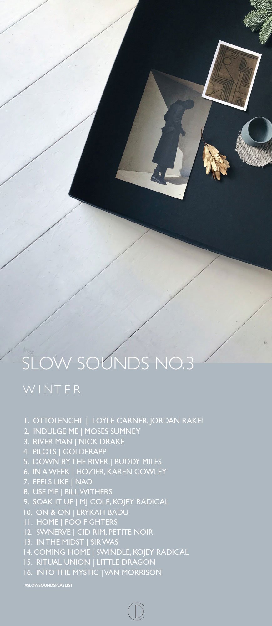 And here it is, my last Slow Sounds playlist of the year and indeed the last post before everyone winds down for Christmas. I hope I've managed to catch you in time!I started this series to share how important I feel music is to the slow living lifestyle. And I don't just mean the tempo, but the ability music has to focus our thoughts, give us clarity or a chance for escapism. Food for the soul. You can listen to my Spring and Summer soundtracks to get a feel for the series which has naturally taken a seasonal direction. Perhaps I use colour next year?I've been sat at my desk under a blanket with moody, rainy afternoons to influence my choices this time. There's been much staring longingly at the empty fire grate (now swept and awaiting its first fire) so this begs to be listened to in a warm and cosy room. Aptly named for Winter, this is a playlist for reflection with songs chosen for their poetry and storytelling, centred around a feeling of home. What better time to look back on the year than now, with friends and family. Sit and acknowledge the good with the bad and make plans, not resolutions.Thank you, as always, for reading. I write for you, so if there's a certain interior design topic you'd like help with, please shout at me! I'll be back in January with my usual helping of Nordic design and hopefully some tentative next steps for the house. We can't look at the pink hallway any longer and the living and dining room need a great deal of TLC so...A Very Happy Christmas and New Year from me!Tiff xx#slowsoundsplaylist
Simple Ideas For Natural Nordic Christmas Decorations
 I know there are a few last-minute kindred spirits out there yet to even start on Christmas preparations. It's the same every year, I don't like to plan too far ahead or decorate too soon, it gets boring don't you think? This year, as with every year, we're keeping Christmas simple. I like fuss-free, minimal decorations which don't require a huge amount of effort. My simple tips for natural, Nordic Christmas style should keep you on the straight and narrow when the overwhelm gets...well, overwhelming.
Minimal Gift Wrap
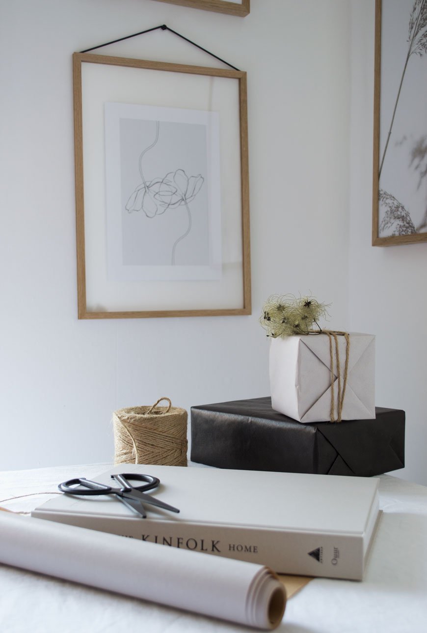
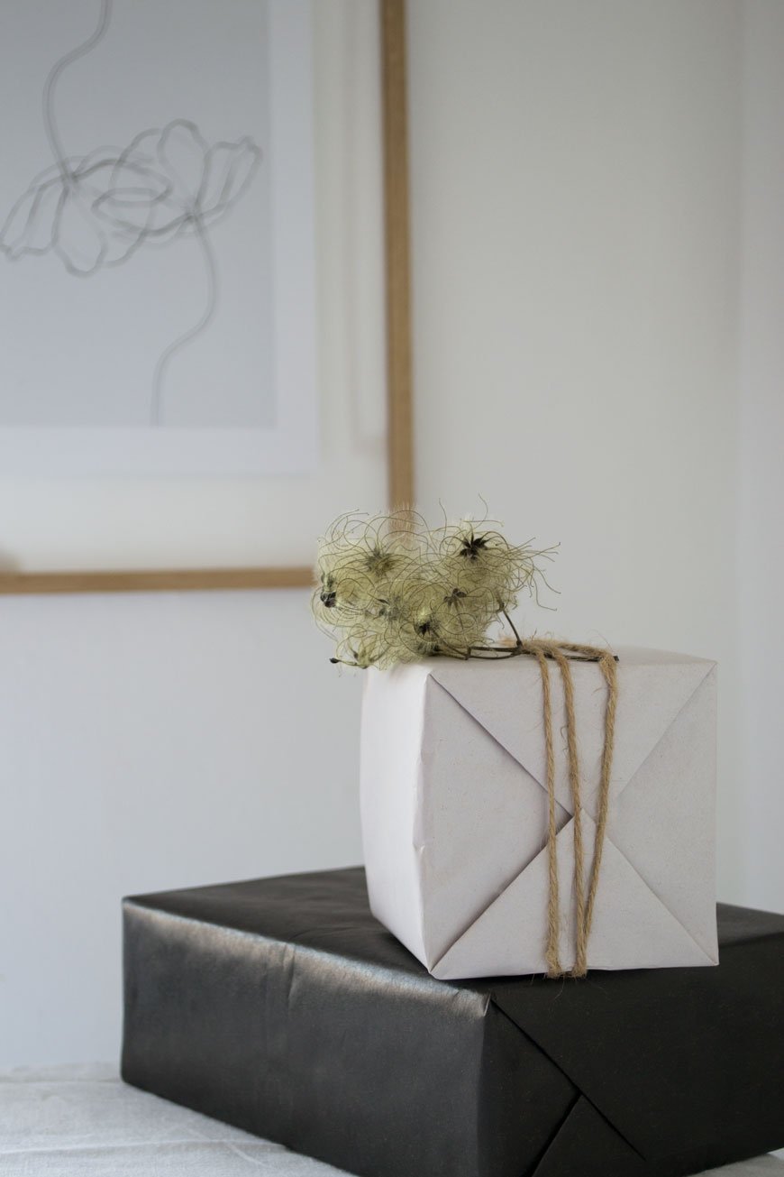 I'm using plain, recyclable gift wrap in black and white, tying them with garden twine or burgundy satin ribbon. Plain kraft paper also looks beautiful and you can finish them with a sprig of fir tree for a seasonal look. To give my wrap a little extra something, I've picked seed heads on one of my walks and carefully secured them under the twine. I've used Old Man's Beard, a wild growing variety of Clematis which you'll find everywhere at this time of year.
Monochrome Table Decor With A Twist
 Whereas last year I went for a moody, atmospheric Christmas table, this year calls for a brighter look. Following on from the monochrome gift wrapping, I've used a white linen tablecloth for the base along with our black plates and cutlery which gets used every day. I think food looks best on black or white plates, you really can't go wrong with classic dinnerware. Ultimately, when I've spent all that time cooking, I want a quick and simple look that I can bring to the table with a real sense of occasion. This took about 15 minutes, though you might like to get the cuttings ready in advance.Tip: Think about how you're going to use the table - will you be serving straight onto plates from the kitchen or leaving your guests to help themselves directly from the table? Which you choose will show you how much available space you have on the table to decorate. As I'm serving from the kitchen, I've left room for the centrepiece of candles.
 A set of gold coasters become a reflective base for off-white church candles, bringing Nordic Christmas style to the table. Nestled between them are cuttings of blue spruce, bought from my local florist, but you could also use cuttings from your own tree once you've shaped it.
 Simple, foraged details look extra special. These are 'samaras' from ash trees that I've painted gold and tucked into natural linen napkins. They continue a subtle touch of gold through from the centrepiece, which I love. Champagne coup glasses are ten a penny now, but I bought our 1940s set years ago when they were quite hard to find. They come out every year now and I love drinking from them, even though what you get in them equates to two mouthfuls!
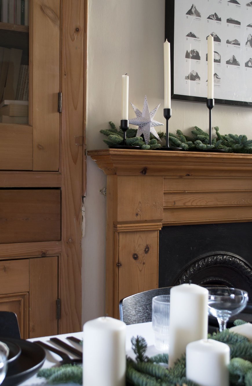
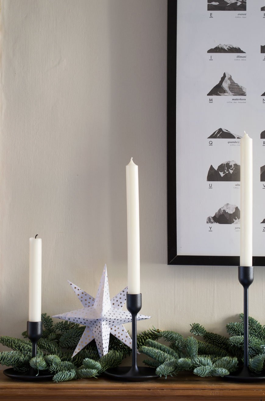
 Even the mantlepieces get a little attention. Again I've used cuttings of spruce across the length and nestled in a trio of candlestick holders on one side. Things always look better styled in threes.And there we have it. My two cents worth of Nordic Christmas styling tips for this year. I hope my simple suggestions have sparked some activity in you for those last minute touches!
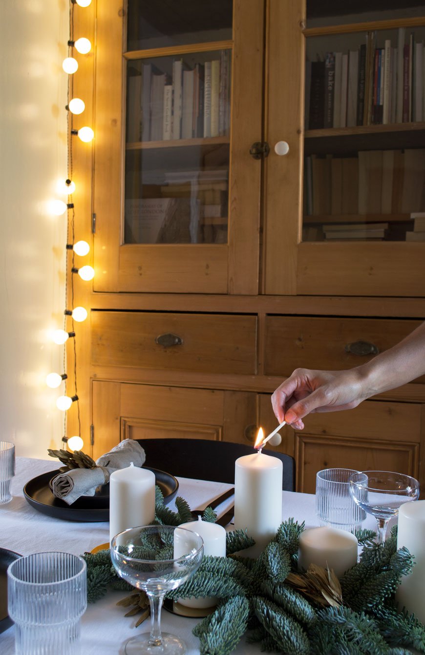 Natural linen napkins, £6, Arket.Set of four Ripple glasses, £35, Ferm Living at Amara.Glattis gold coasters (used as candle bases) £3.75, IKEA.Fenomen set of 5 white block candles, £4.25, IKEA.Turini 16 piece black finish cutlery, £95, Habitat.Black dinner plates, £52 and £56 each for a set of four, Eva Solo.Givande black and white wrapping paper, £1.75 each, IKEA.Set of three Fulltalig black candlesticks, £9, IKEA.
Photography & Styling © Tiffany Grant-Riley
Shop Independent | A Gift Guide For Design Conscious Teens
A little delayed but I'm ready to present the first of my 'Shop Independent Christmas Gift Guides'. Yes, I'm making a point to support independents as much as possible, which shouldn't really be that hard. However, when the powers that be on Instagram asked for a round-up for teens, I may have winced a little. Not gonna lie. I literally have no idea what teens like these days. Hilariously, looking back at the things I wanted made me realise how much fashion has gone full circle. It's all about the 90s now (not that anything here reflects that). Doing a little research online and going deep underground (asking a real one) what I came up with was a little disheartening. Tech. And clothes. Which is obvious really, but when you're trying to source only from independent shops it becomes really tricky. So I had to look beyond the obvious to things you can't just get off the high street. Brands I've come to know, love and use myself. I think you'll agree, this a pretty darn good edit for the design conscious teen...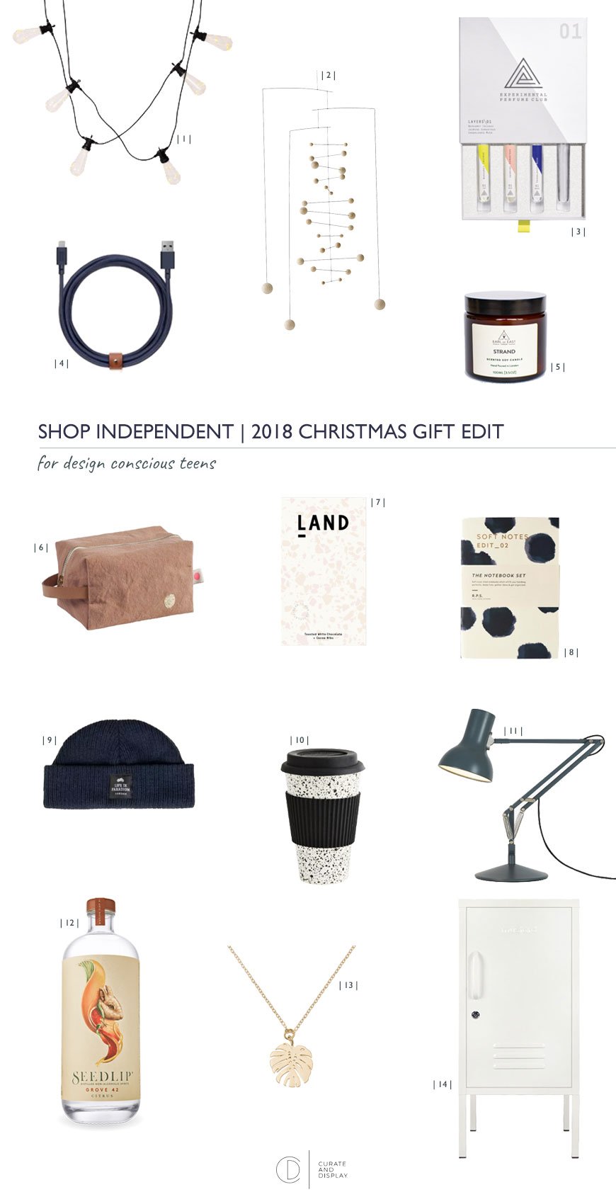 | 1 | Soft, ambient bedroom lighting is key to any bedroom, these Light The Way festoon strings have copper LEDs wrapped inside the bulbs for a little extra twinkle. | The Forest & Co.| 2 | A mesmerising way to unwind, the Counterpoint Nature Mobile designed by Ole Flensted in 1970 remains in constant motion. | Eastern Biological.| 3 | For the perfume lover, learn how to layer up your own personal scent with the Blending Collection. Having taken one of their workshops earlier in the year, I can attest it's a fascinating and uniquely personal process. | Experimental Perfume Club.| 4 | No need to roll out of bed to charge your phone again. The Native Union Belt Cable has a 3m distance with a handy leather strap to keep tangles at bay. | i you all.| 5 | The Earl of East London journey began with its founders blending their soy wax candles on their kitchen table. Fast forward a few years and they now have a base in Hackney and at the new Coal Drop's Yard at King's Cross. 'Strand' travel candle draws influences from Copenhagen and its Baltic sea breezes | Earl of East London.| 6 | You'll know I'm a big fan of French brand la cerise sur le gāteau if you've seen their linens in our kitchen. I LOVE their sturdy cotton accessories, made in Portugal with designer Anne Hubert's quirky touches. Use the Pouch Cube as a pencil case, make-up bag - whatever. | la cerise sur le gāteau.| 7 | Made in Bethnal Green, founder and chocolatier Phil Landers sees Nicaraguan cocoa beans through the entire process to make award-winning LAND chocolate. LAND.| 8 | Quill is a stationery lover's dream where one's passions for paper can be indulged with a workshop or two. I loved this painterly set of notebooks designed by Norwegian brand, Darling Clementine. Of course. | Quill London.| 9 | Independent menswear shop Coban is run by two brothers in Stoke Newington. Carry off the hipster fisherman look with a navy fisherman beanie, Life In Paradigm. | Coban.| 10 | Coffee to go in a reusable bamboo black and white speckled cup, Madam Stoltz | Printer and Tailor. | 11 | An absolute design classic. The Anglepoise Type 75 mini desk lamp in slate grey is a timeless piece to last a lifetime. Indish.| 12 | Don't panic - this drink is non-alcoholic! 'Grove 42' by Seedlip is a citrus delight made from distilled botanicals and makes a grown-up alternative for all those festive toasts | Seedlip| 13 | A sweet gesture for the plant lover, the gold-plated Monstera Elpis necklace | A Weathered Penny|14 | I saw these in the flesh not long after their launch in summer and thought they were bloody brilliant. The Shorty Locker by Mustard makes an ideal bedside cabinet with 3 nifty shelves, or just for cramming in all the crap left on the floor. | Molly Meg.So how did I do? And do you have any more suggestions for gifts for teens this year?
New Abstract Art Prints For Your Walls
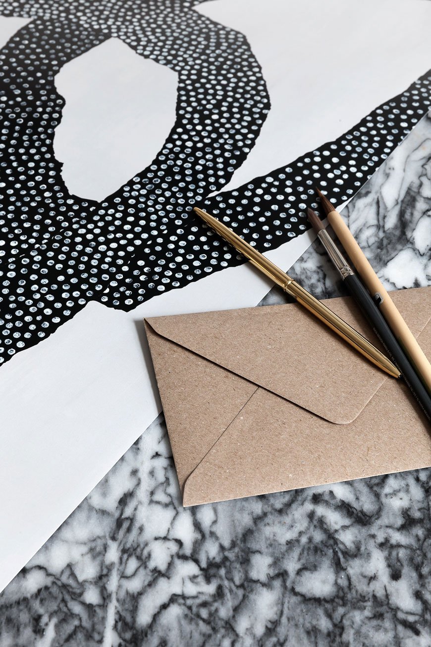 Hello stranger, I apologise for the radio silence here of late but work has needed all my attention with last-minute shoots and writing pieces for other lovely people. I had plans to have my gift guides up by now, best-laid plans and all. As a type, my father-in-law is cutting sections of ceiling joists out in my office which have rotted thanks to a badly installed shower in the bathroom upstairs. Who said renovating wasn't fun?!Anyway, I digress. I have for your delectation, a selection of brand new abstract art prints. My beady eye is always on the look-out for striking wall art and these absolutely tick the box.
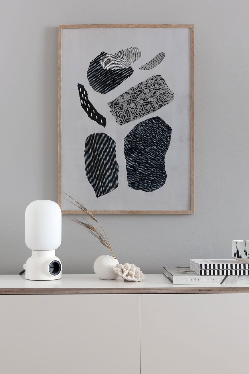
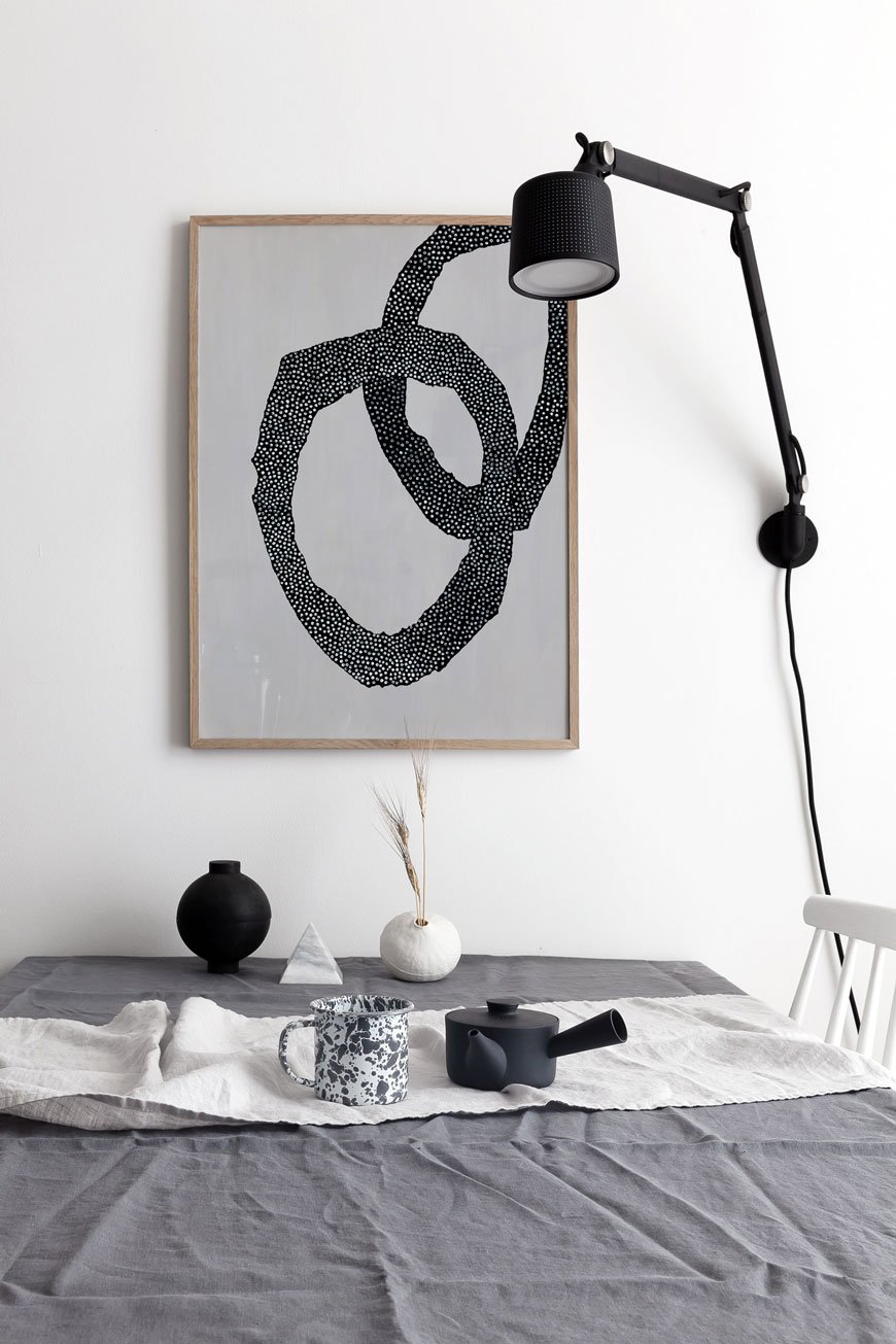 Hot off the press! The prolifically brilliant Coco Lapine has just released the aptly named 'Abstrakt' collection featuring two shapely designs. Each print was made using a collage of handpainted paper cuttings. I love the appearance of texture the patterns give them - a great way to add interest to a monochrome interior.
 A personal favourite go-to for prints, The Poster Club has joined forces with world-renowned fashion designer Malene Birger. After 25 years experience in the fashion industry founding the Day Birger and Mikkelsen and Fashion House by Malene Birger brands, she sold her shares in 2014 to focus on new directions. As a passionate artist and collector, she has spent much of her time developing her own creations alongside interiors projects from her studio in Lake Como. Her passion for strong, contemporary forms can be seen across six abstract wall art prints. I love the strong, graphic shapes in these ink drawings, don't you?
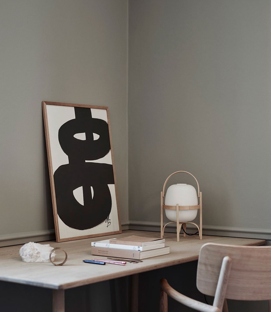
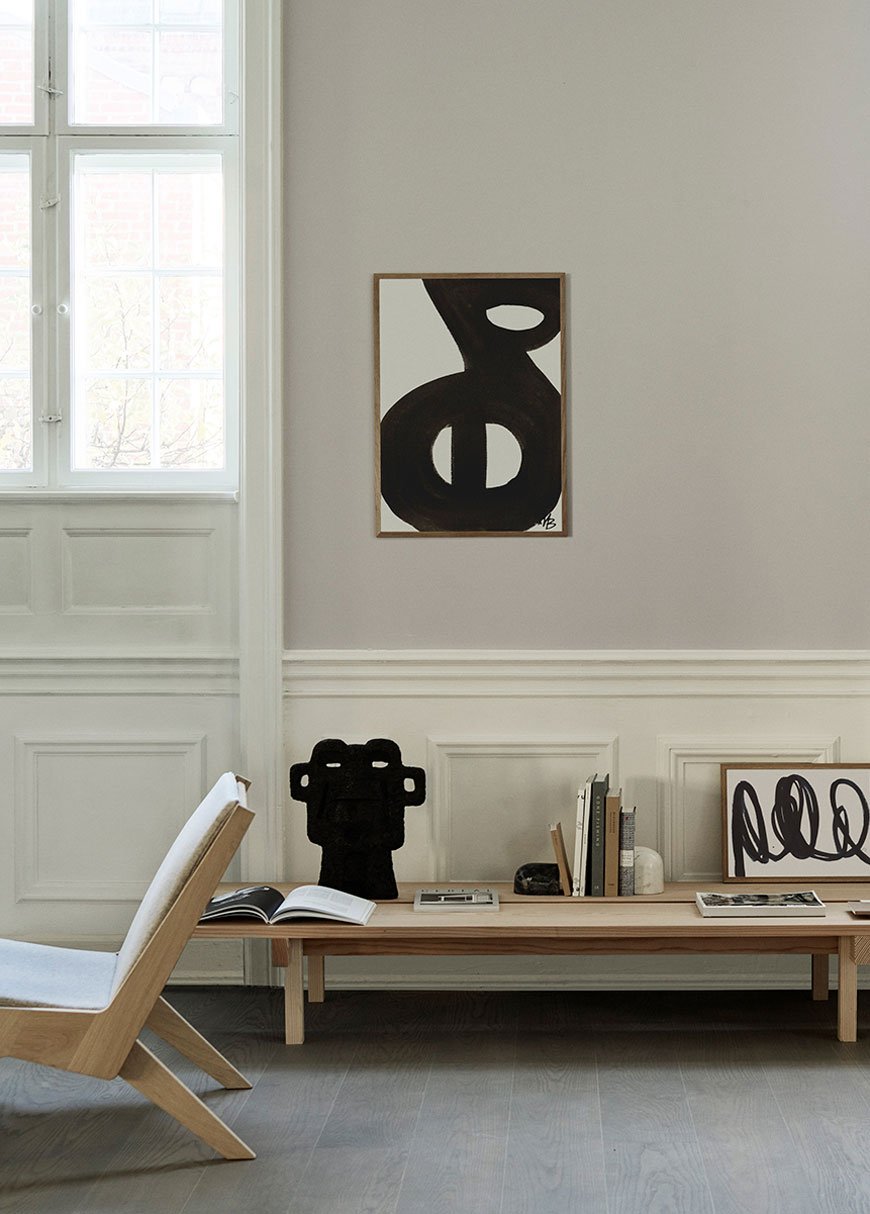
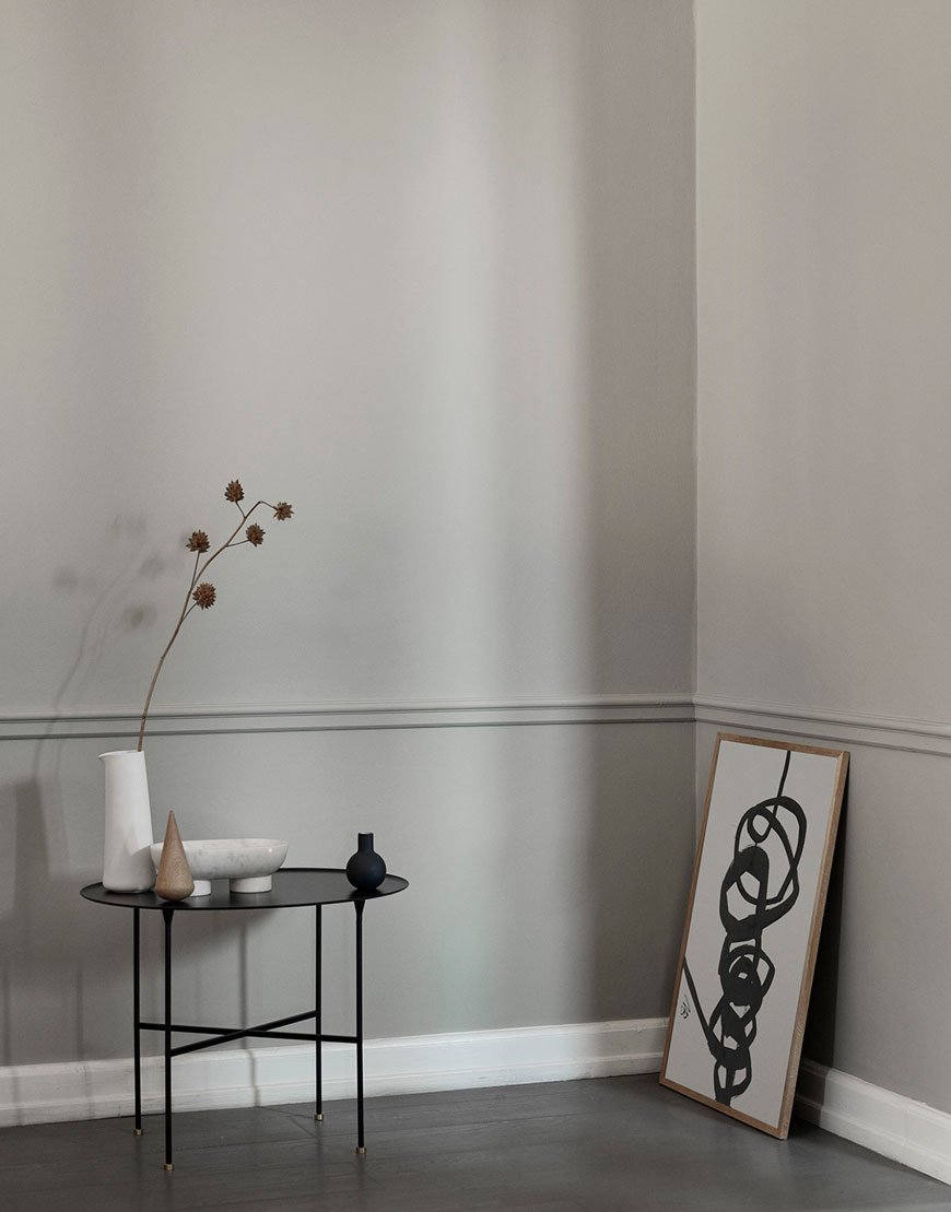 These beautiful images were styled by Pernille Vest and shot by photographer Emil Monty Freddie and at the stunning Skagerak showroom in Copenhagen.
[AD] Styling My Home For Winter with NABO
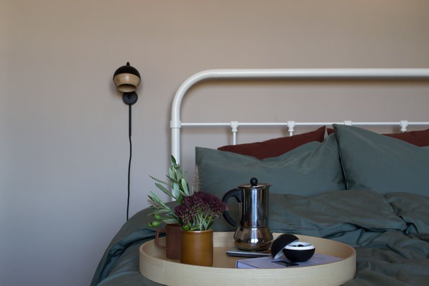 This is a paid partnership in collaboration with NABO.
This time of year, whilst I’m nowhere near ready to mention the Christmas, I do like to acknowledge winter and bring some seasonal touches into our home. It’s all about wanting to feel warm, cosy and cocooned this time of year. Candles aside, what other things can you do to celebrate winter in your home? I’ve teamed up with Danish lifestyle shop Nabo to share some inspiration.
Danish for 'neighbour', NABO was launched by visual artist Christina Thaisen in 2017 from her home, a former jam factory, in London. Hailing from the city of Copenhagen with design in her blood, Christina has created an online shop for beautifully crafted Danish homeware with a personal story.
We don’t follow fashion or the latest trends but source products that are timeless, functional and long-lasting.'Things' cannot create a home. It’s the connection you have to what you surround yourself with that creates a feeling of belonging, of home. Therefore, we think it’s important to tell the story behind the products and brands we stock for you to make that connection and to help create homes that are more meaningful.
Showcasing new designers and functional pieces meant for daily use, Christina often makes journeys back to Copenhagen to add to her carefully curated collection. I've found it almost impossible to choose favourites but I've highlighted some of the most beautiful examples used in my own home.
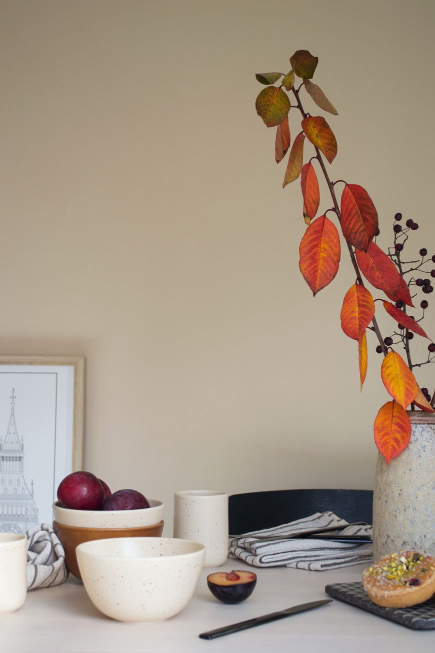
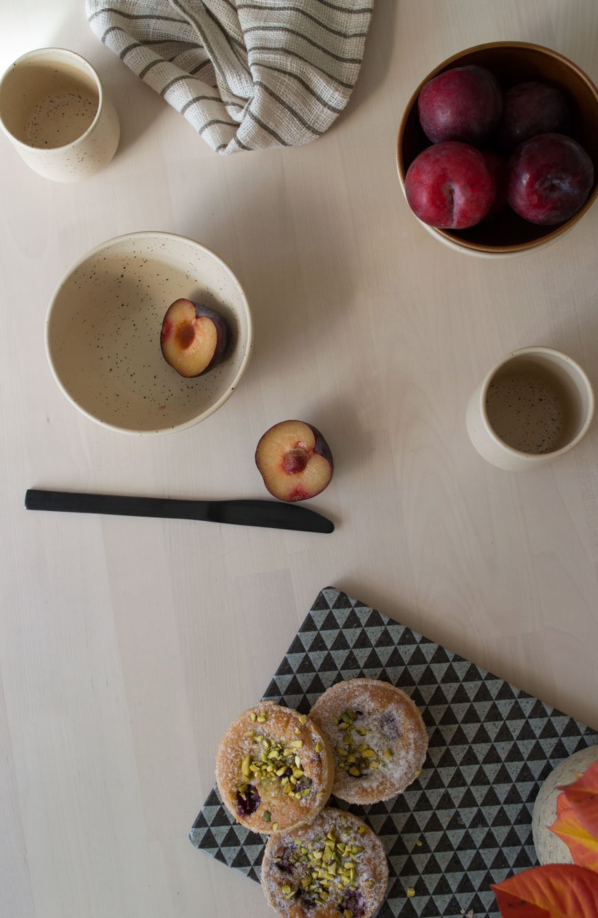
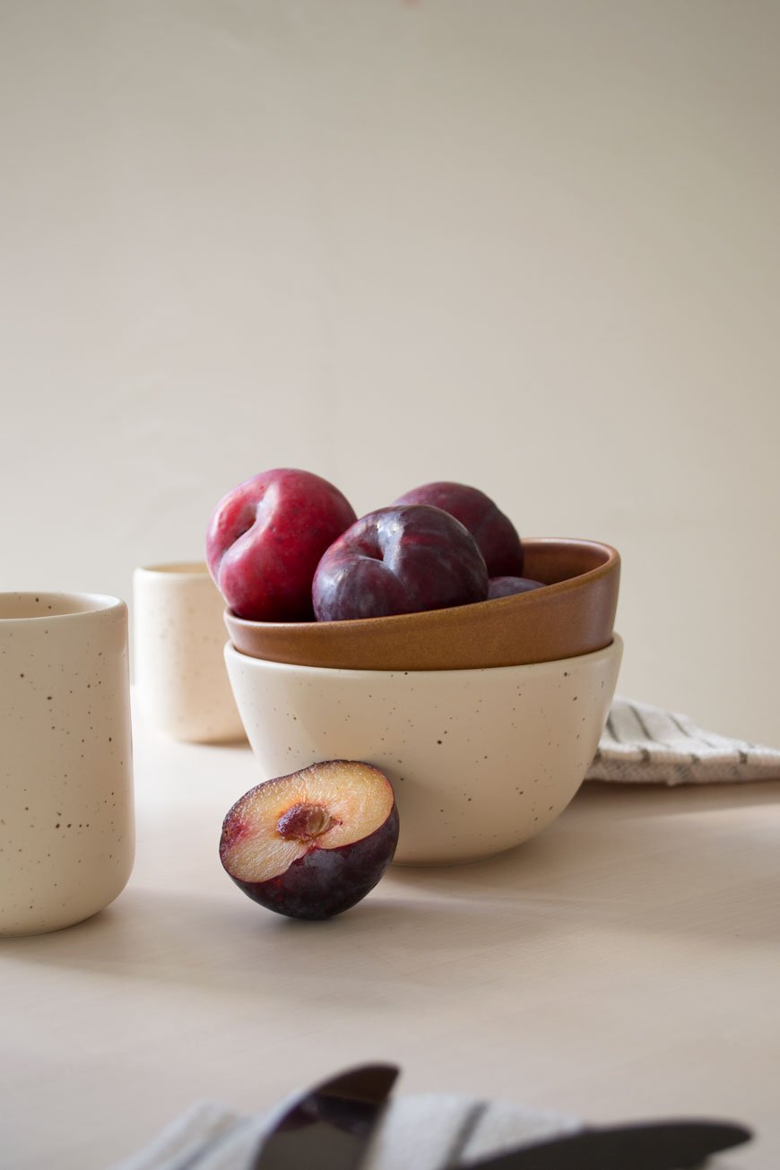
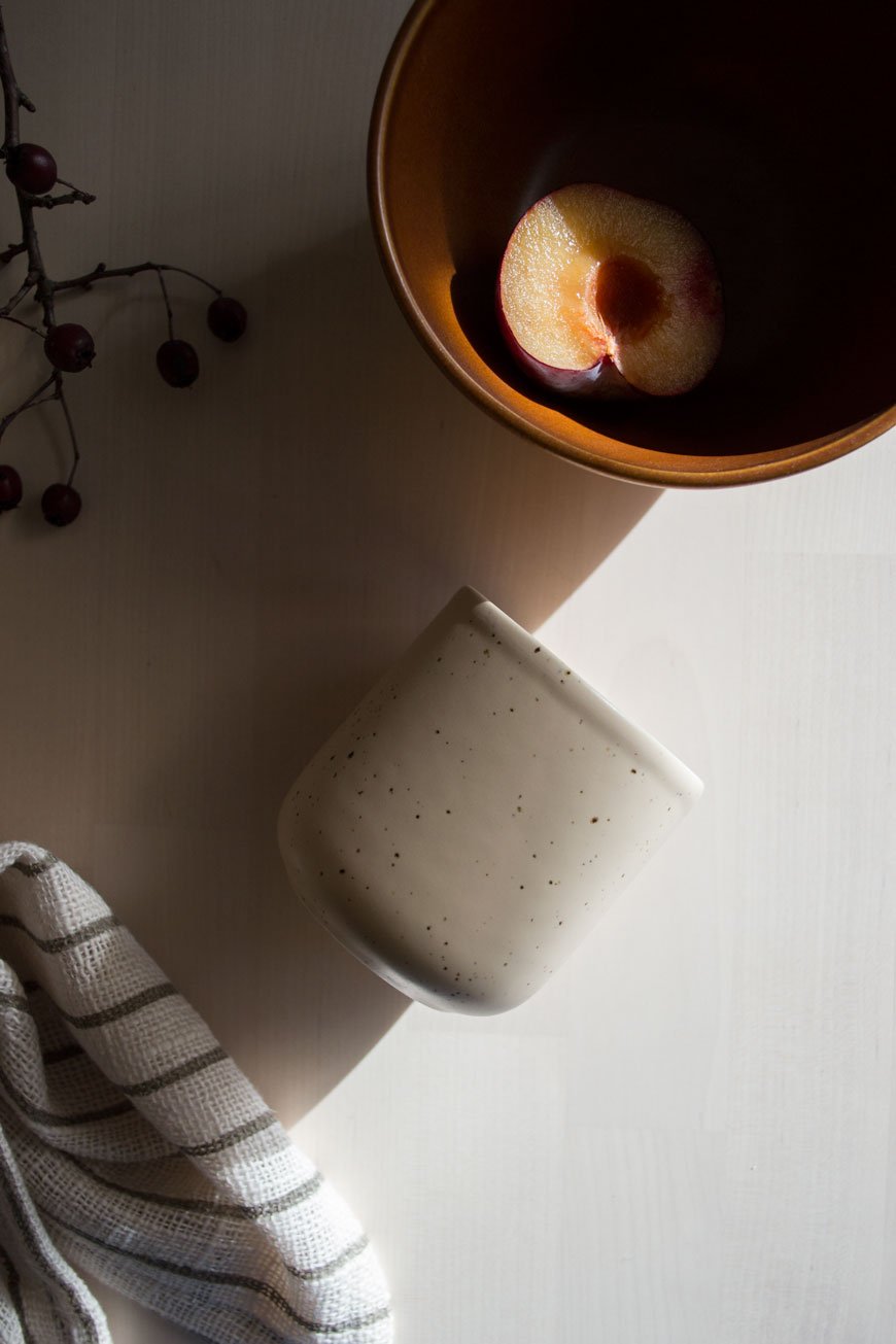
We always make an effort for slow family breakfasts at the weekend which are usually a mix of pastries, cereal and fruit (the kids love a variety to pick at). The tableware obsessive in me was instantly drawn to ceramist Mette Duedahl's collection of ceramics. The oatmeal and earth tones instantly warm up the table for breakfast alongside my slubby Khadi napkins. Simple touches can make such a difference. I brought home some fiery branches foraged from a morning walk to bring a sense of occasion to the table. The rusty toned leaves and deep red berries really draw out the organic fleckles in the large Tina Marie vase.
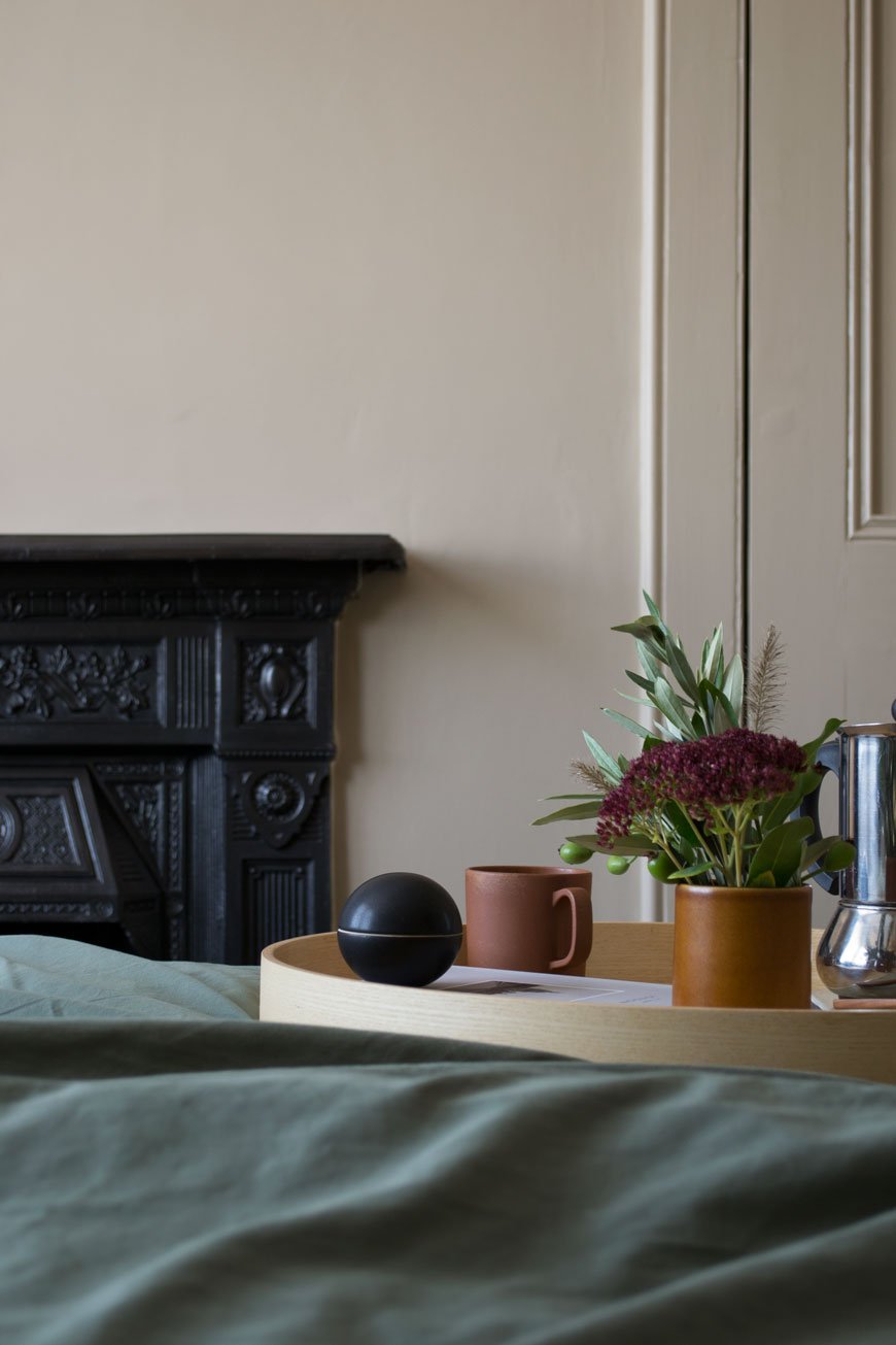
If you switch your duvet for a heavier tog come winter, you might like to dry a darker shade of bedding too. Nothing beats freshly laundered sheets for ramping up the cosy factor and the olive green cotton Tekla bedding has added depth of colour in our bedroom. I love how it looks against the beige walls. We've even tried sleeping the Scandinavian way with a set each so we don't have to play tug of war with the covers!
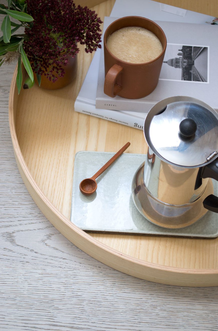
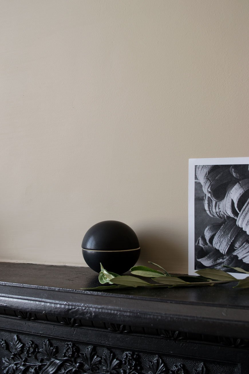
A stand-out piece from NABO’s collection is the striking black bonbonnière pot by Uh La La. A sculptural piece in its own right, it's perfect for stashing nibbles or small pieces of jewellery. This is a piece that would look great styled on a mantlepiece or living room shelves alongside other select treasures.
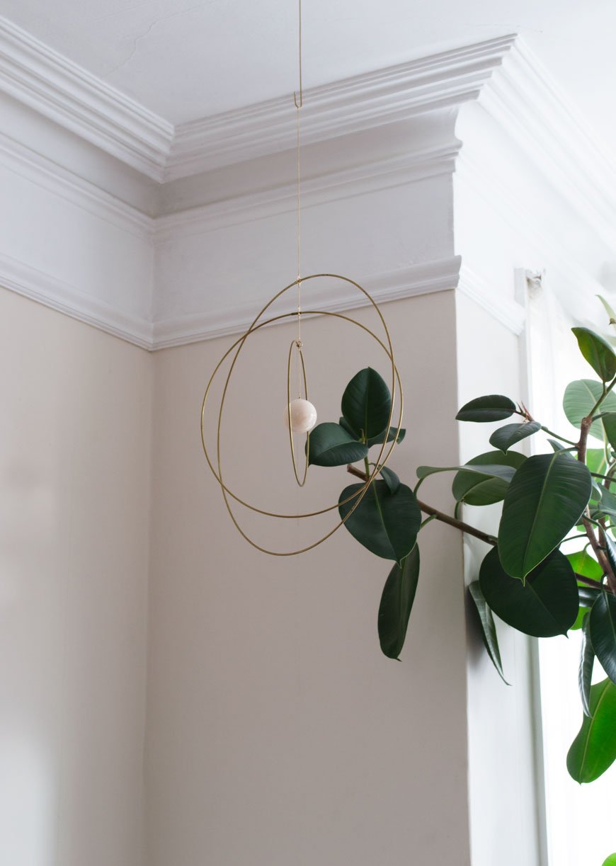
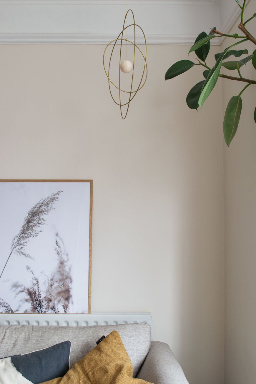
We've not done a great deal to the living room since moving in, there's seems little point until we begin work next year. It can feel a little cold with its north-facing light but our rubber tree Marvin definitely helps to soften the edges. I've added some spice toned cushions to help warm it up and there are brass candle holders by the fireplace. One thing I've really taken to this year is mobiles for grown-up spaces. I'm seeing them everywhere. Hung above a sideboard or in our case, just behind the sofa, they add visual interest as a piece of sculptural art. When we have candles lit in the evening, the light flickers off the warm brass rings of the Galaxy Globe which are centred by the white marble ball.
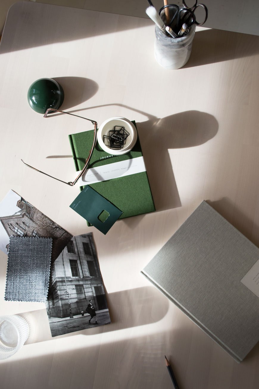
 My office has had a serious winter sort-out following a busy few months. With tote bags and mounds of press material, decluttering my desk has worked wonders for keeping a clear head - do you find the same? Kicking off the New Year with a fresh diary or journal makes all the difference to your organisational skills too. I don't like using an online diary, although I share one with Rob, I find things go in better if I've written them down. If you're into your stationery like me, you'll appreciate the quality of NOTEM Studio's journals. A solid and reliable piece of paper kit, they're made from Scandinavian paper and covered in woven cloth, of course.
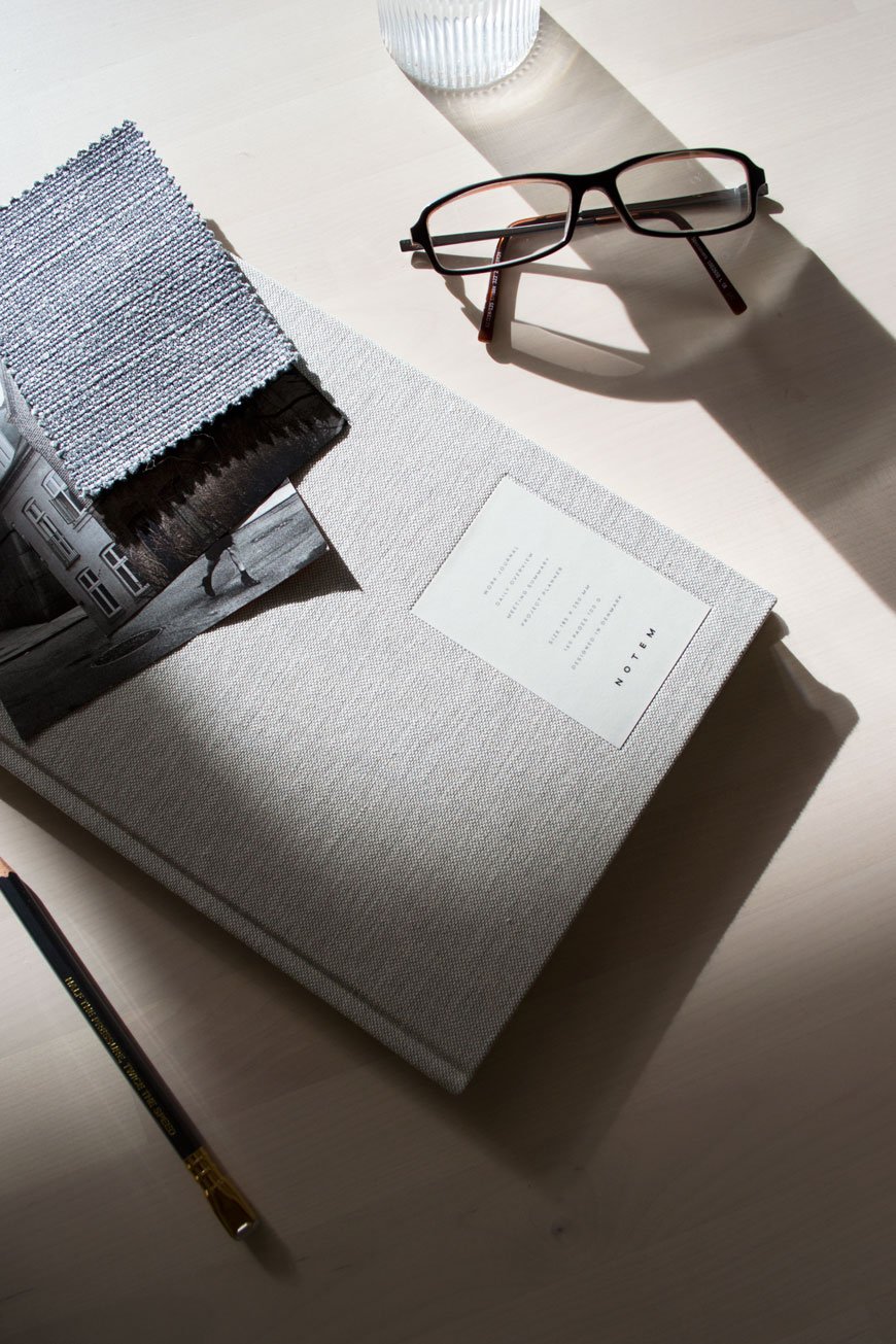
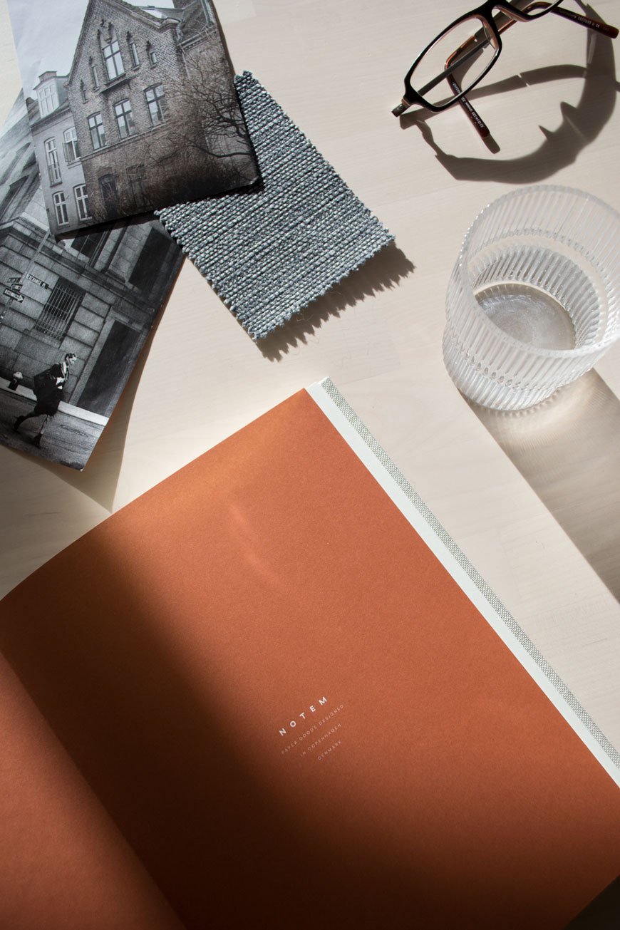 Love what you see? You can enjoy a 20% discount with NABO across the entire collection using CURATEDISPLAY20 when you check out. Valid until 20th December 2018.
Photography & Styling © Tiffany Grant-Riley
Warm Amber - The New Nordic Take on a 1970s Classic
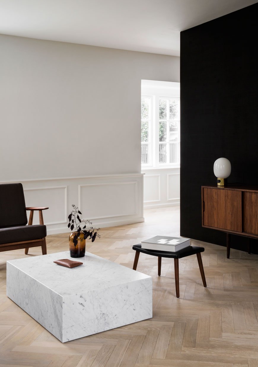 Not quite mustard yellow or brown and definitely not copper, warm amber home accessories are fast becoming the colour of the moment. Popularised in the 1970s, I've noticed its slow and steady return to the Nordic design scene over the past year.
I’m old enough to remember the retro amber, brown and red patterned carpets (we had one once) and it’s oddly comforting to see these colours making a comeback, although definitely not in the same, garish way they did. This reinterpreted version of warm amber is rather apt given that we’re coming into winter now, nature surrounding us by rich, rustic tones.
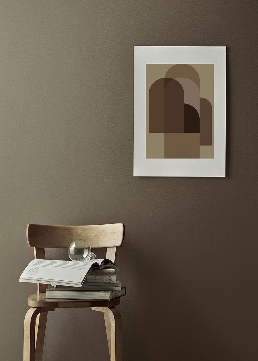
How To Work With Warm Amber At Home
I recommend using it as a subtle accent worked in as an accessory. A large vase, glass lamp or throw is just enough to give a hint without going full-on 1970s. This warm shade lends itself beautifully to lighting, as seen in the Louis Poulsen PH 3/2 lamp which comes in a limited edition amber glass shade.
The great thing about amber is its a versatile colour; it stands out against a neutral base and compliments richer, bold colours. The result, of course, will be completely different. I'd style it with seasonal flowers or grasses and perhaps layer a simple throw with similarly toned cushions. I also love to see it paired with brass and marble for a more luxurious feel.
It’s far harder to get amber right in textiles, predominantly because the colour is taken from tree resin and therefore works best with translucent materials. If you can look for a shade in between orange and brown, you might just have it. Warm Nordic’s mid-century inspired lean chair is near enough spot on with its velvet upholstery and H&M Home recently launched its 'Sleek Amber' collection which includes waffle bedspreads and linen cushions. I've put together a cheeky round-up too which is well worth a look if you fancy a dabble.
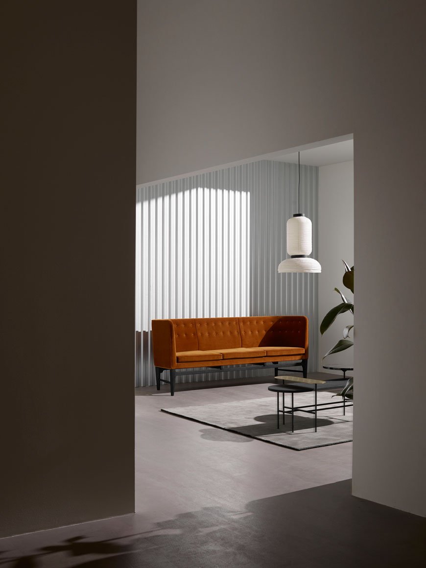 So tell me, am I way off the mark with amber, or are you warming to it?
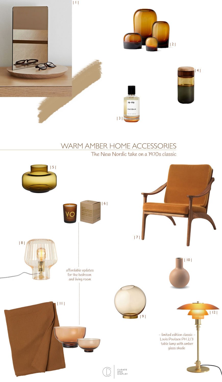
| 1 | Orlo table top mirror, Another Brand | 2 | Amber Troll Vase, Menu | 3 | Kasbah Eau De Parfum, 19-69 | 4 | No-Pi-No-Pi stackable vase, New Works | 5 | Marimekko Urna vase | 6 | Anise Patchouli candle, Compagnie de Provence | 7 | Lean back lounge chair, Warm Nordic | 8 | Ewer Champagne glass and brass lamp, MADE.COM | 9 | AYTM amber globe vase | 10 | Cafe au lait collar vase, Cooee |11| Waffled double bedspread and stemmed bowls, H&M Home |12| Limited edition Louis Poulsen PH 3/2 lamp in amber
••stockists correct at time of publication.
