[AD] Our Nordic Luxe Beige Bedroom Before and After
 This post includes gifted product.** Well, that's quite a mouthful. A Nordic luxe beige bedroom. I was beginning to think this day would never come. Two years ago when we moved in, I couldn't see this past the Prince-inspired purple feature wall and peeling wallpaper. And I'm a big Prince fan. But here we are. Back with another before and after. Prepare to witness the fruits of our blood, sweat and tears, of which there have been plenty of each!
How The Bedroom Looked Before
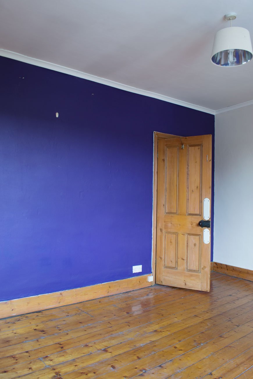 My advice to you? Always be suspicious of papered walls in old houses. It is trying to trick you into thinking "nothing to see here!" Our bedroom couldn't even be bothered to hide the fact that most of the plaster beneath had blown. And good luck trying to actually remove that wallpaper, my goodness. I've no idea what was used to fix it to the wall but I don't think it was your bog standard paste! You can see more of what lurked behind the paper and the freshly plastered walls here. Oh and how you loved those plaster walls. I know you'd prefer that we left them like that, but we wanted the room to feel finished.
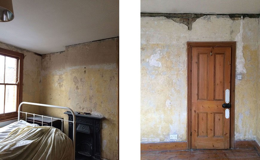 The journey from start to finish has been quite a lengthy one which in all honesty, I'm thankful for. It gave us the time to better understand how the north facing light moved throughout the day and made choosing the colour a lot easier. It gave us time to realise that we needed to put a new floor down, as much as we loved the baseboards, sanding and staining wasn't going to be an option this time. Ultimately, it gave us time to understand how we used the room, how we wanted it to work for us and how we wanted it to feel.
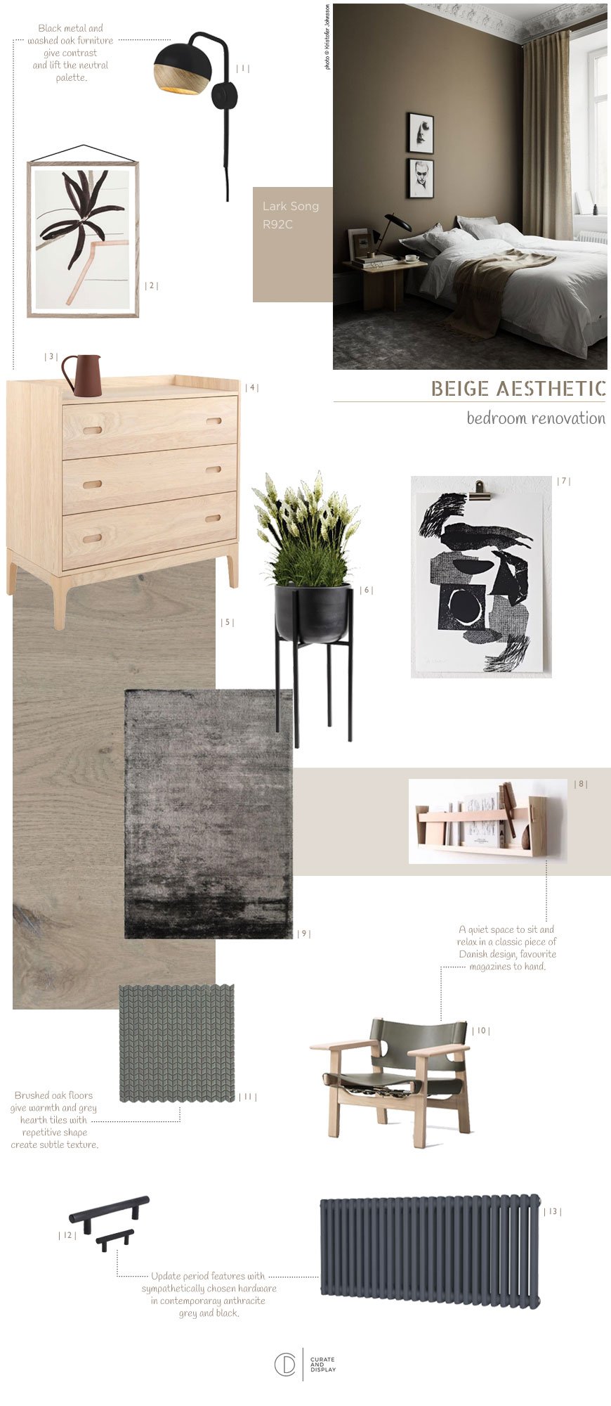 The full design post demonstrates how we arrived at warm beige and how I pulled together the look inspired by past stays in design hotels. The most important part of the whole design is that the room felt like a sanctuary. I wanted it to feel minimal with a Nordic luxe look, drawing on high-quality materials, including the Havwoods oak flooring, black metal hardware and additional furniture. There would be contrasting textures of velvet, linen, metal details and warm wood.
How The Bedroom Looks Now
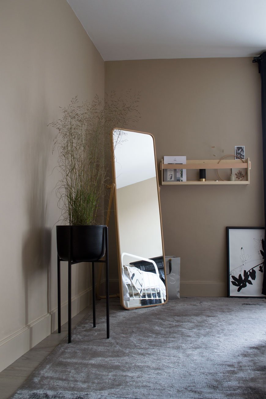 Our journey towards the finish line began in summer, using our plastered walls as our starting point.Work included:• Laying a new engineered oak floor.• Tiling the hearth plate.• Polishing the fireplace.• Painting the walls and woodwork.• Replacing the radiator for a Victorian column style.• Replacing hardware including sockets, switch and cupboard handles.We used the same shade of beige, Lark Song by Valspar, across all the walls and woodwork for a contemporary tone-on-tone effect. It's amazing to see how much the colour changes depending on the light - sometimes appearing almost plaster pink, other times with slight green undertones. It has the ability to glow when the sun hits the corner with the mirror in the early morning and feels warm and moody in the evenings.
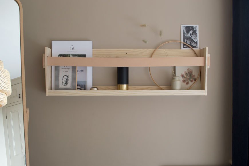
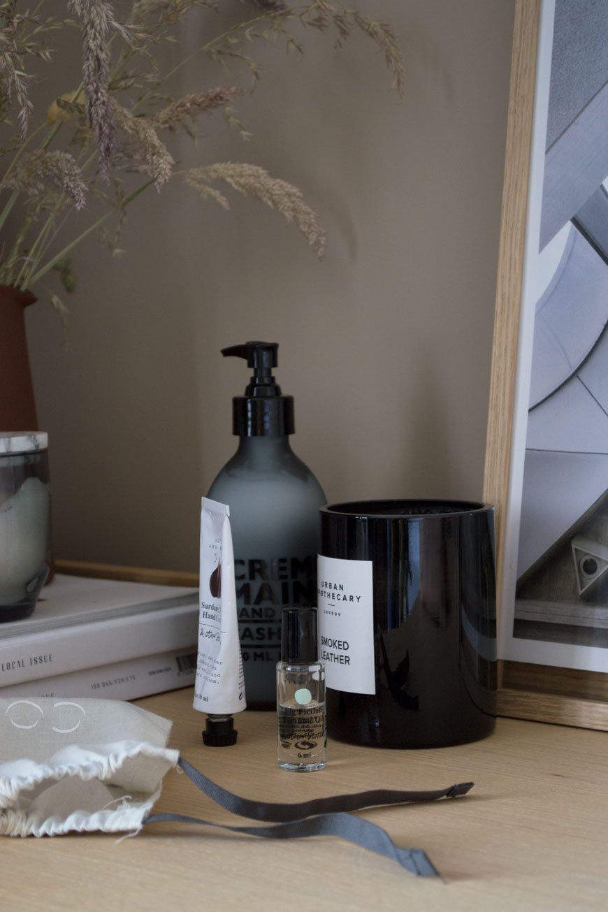
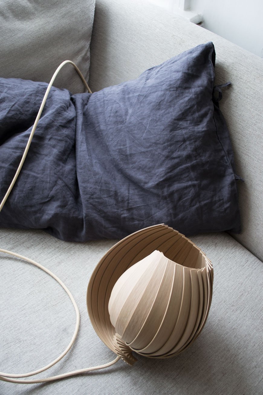
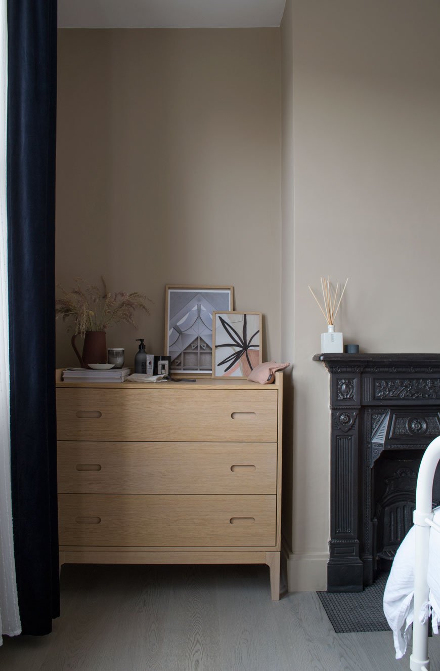 I picked out furniture and accessories with similar warm tones to lift the wall colour, starting with the Sinnerlig bamboo lamp shade that we got last year, tying it in with oak picture frames on top of the chest of drawers. Continuing with tonal furniture, we kept the floor length IKEA mirror and I chose the Shelf90 in ash and leather, designed by SSM and handmade by their studio in Sweden. It's been on my list for such a long time and is the perfect size for a select number of books and our mini speaker. This part of the room will really come into its own as a reading corner when we eventually find a suitable chair for it. No, I didn't get to keep The Spanish Chair.Somehow we instinctively choose furniture with skinny legs which actually give the illusion of space by allowing the floor to be seen underneath. Our hospital-style metal bed has been with us for a few years, a John Lewis design no longer sold, but we still love it. A new of mine is the black metal planter from Cox & Cox which in which I planted grasses instead of my usual houseplant.Given that I tend to lean towards jute woven rugs, I surprised myself in choosing this 'Dolce' charcoal grey viscose rug from the Houseology Collection. It feels super silky underfoot and ties in with luxury hotel style. It also bounces the light as you can see from the photos and connects tonally with the oak flooring, provided by Havwoods. If you read the installation post, you'll know how much of a difference the new floor has made to the room. In fact, the overall look wouldn't work without it there to pull it together. It feels so much warmer and quieter too, which means no more avoiding those squeaky floorboards in the night.
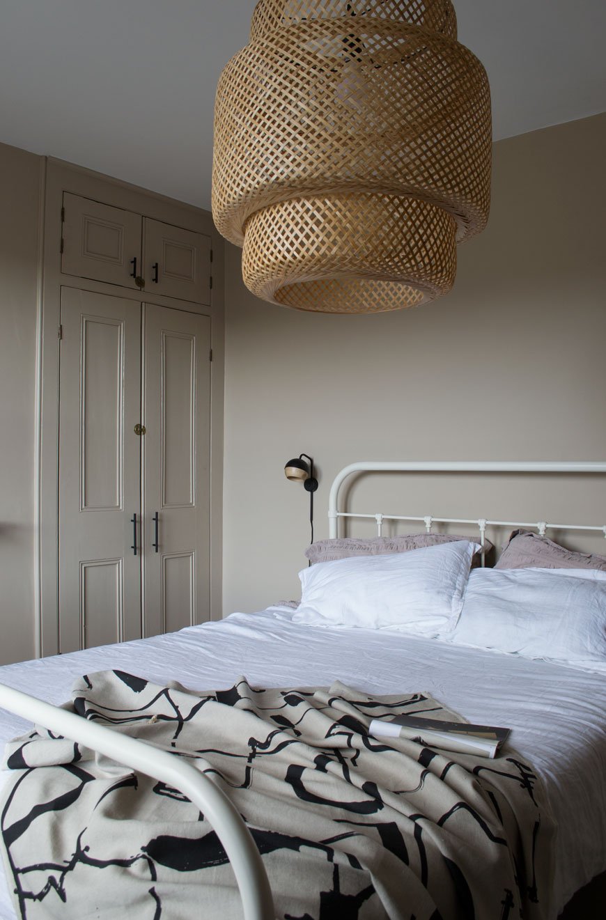
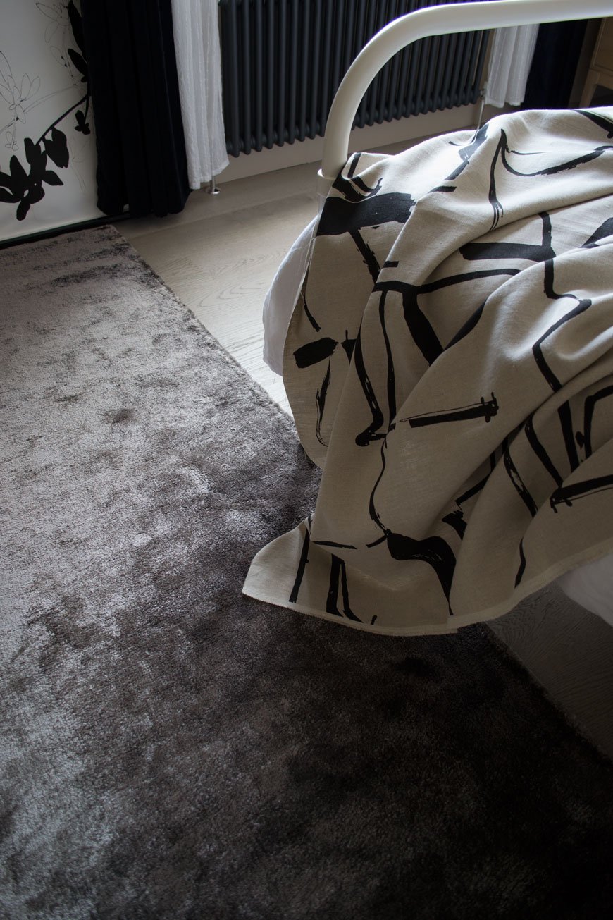
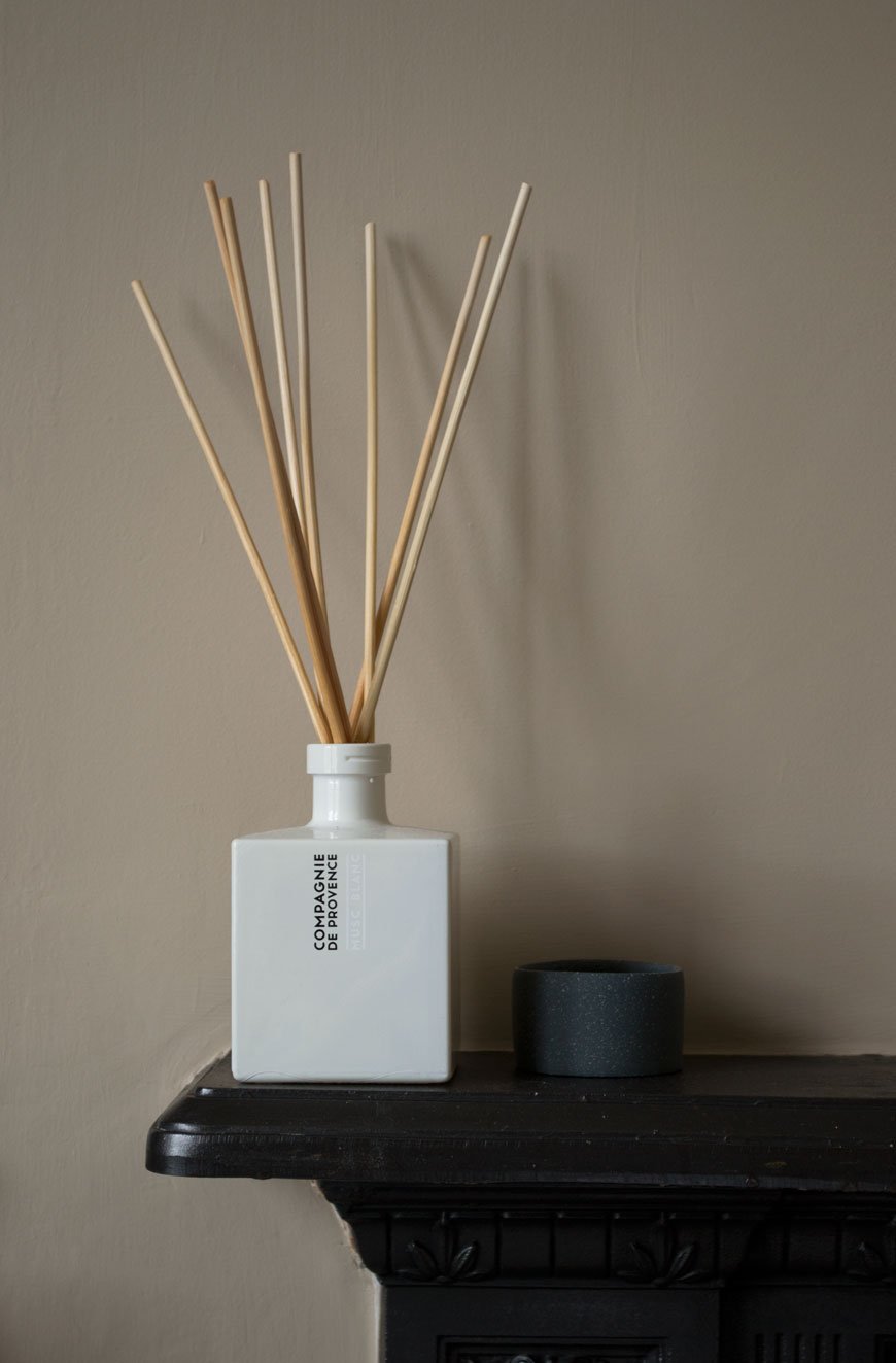
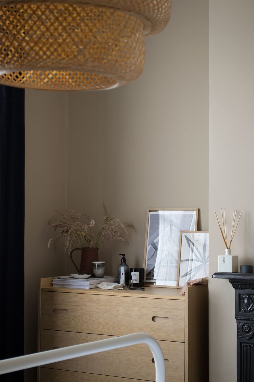
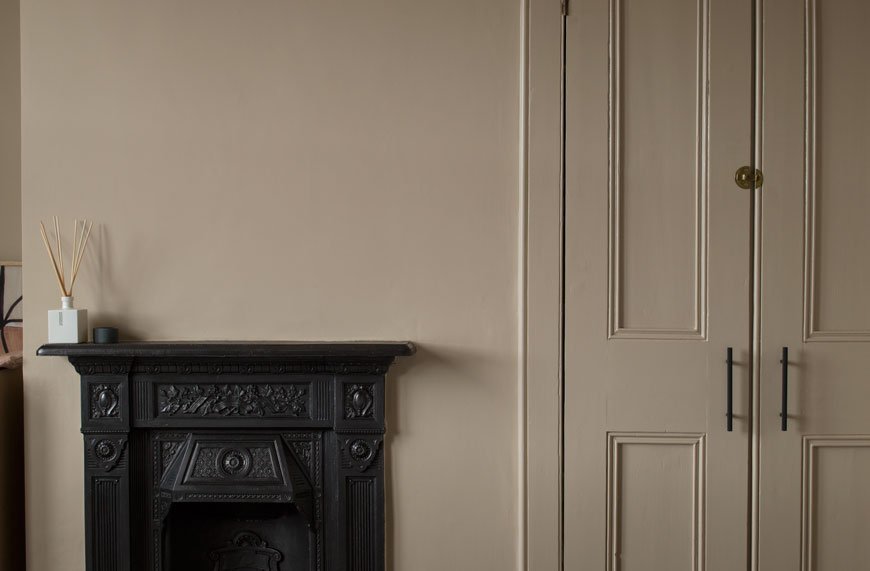
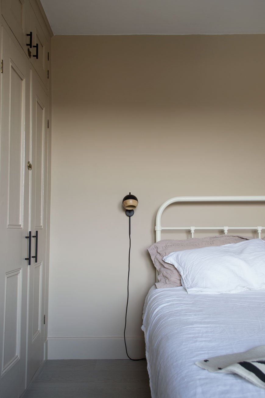 The wall lamps are designed by Pederjessen for Mater, who I featured recently for their sustainable Danish design. The black Ray lamps are a nifty piece of design. Did you know that the oak part of the shade is held with magnets allowing you to pivot and direct the light? Did you notice something missing? Yes, bedside tables. A previous attempted failed but ultimately, I'll be adding discrete and narrow bedside ledges which will sit below the lamps, painted into the wall.
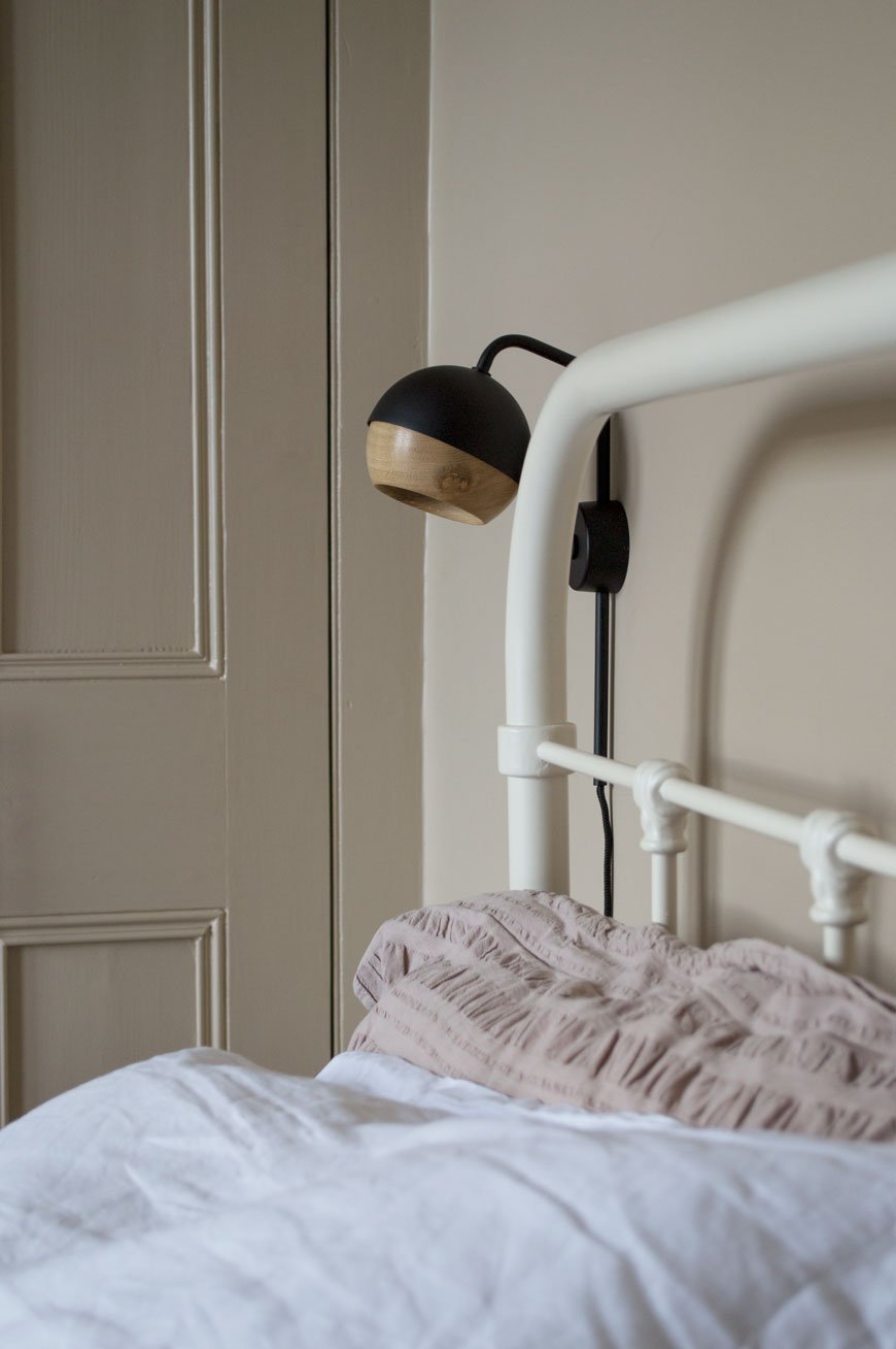
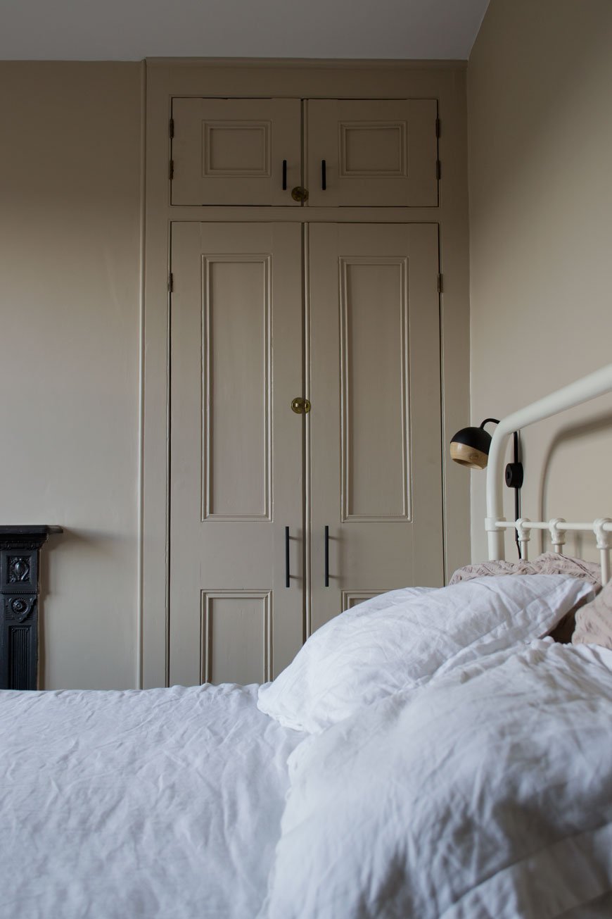
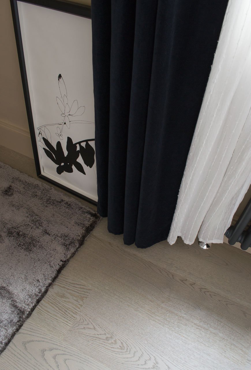
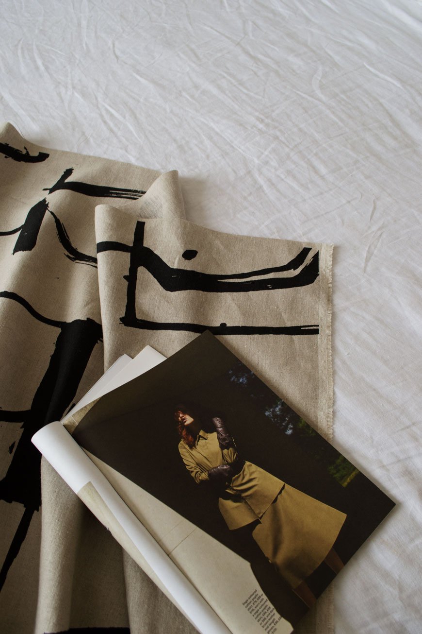
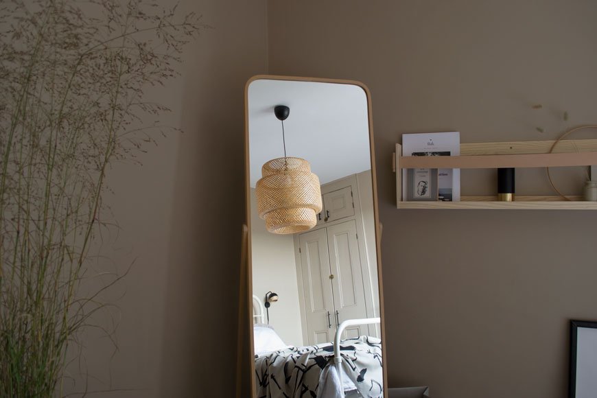
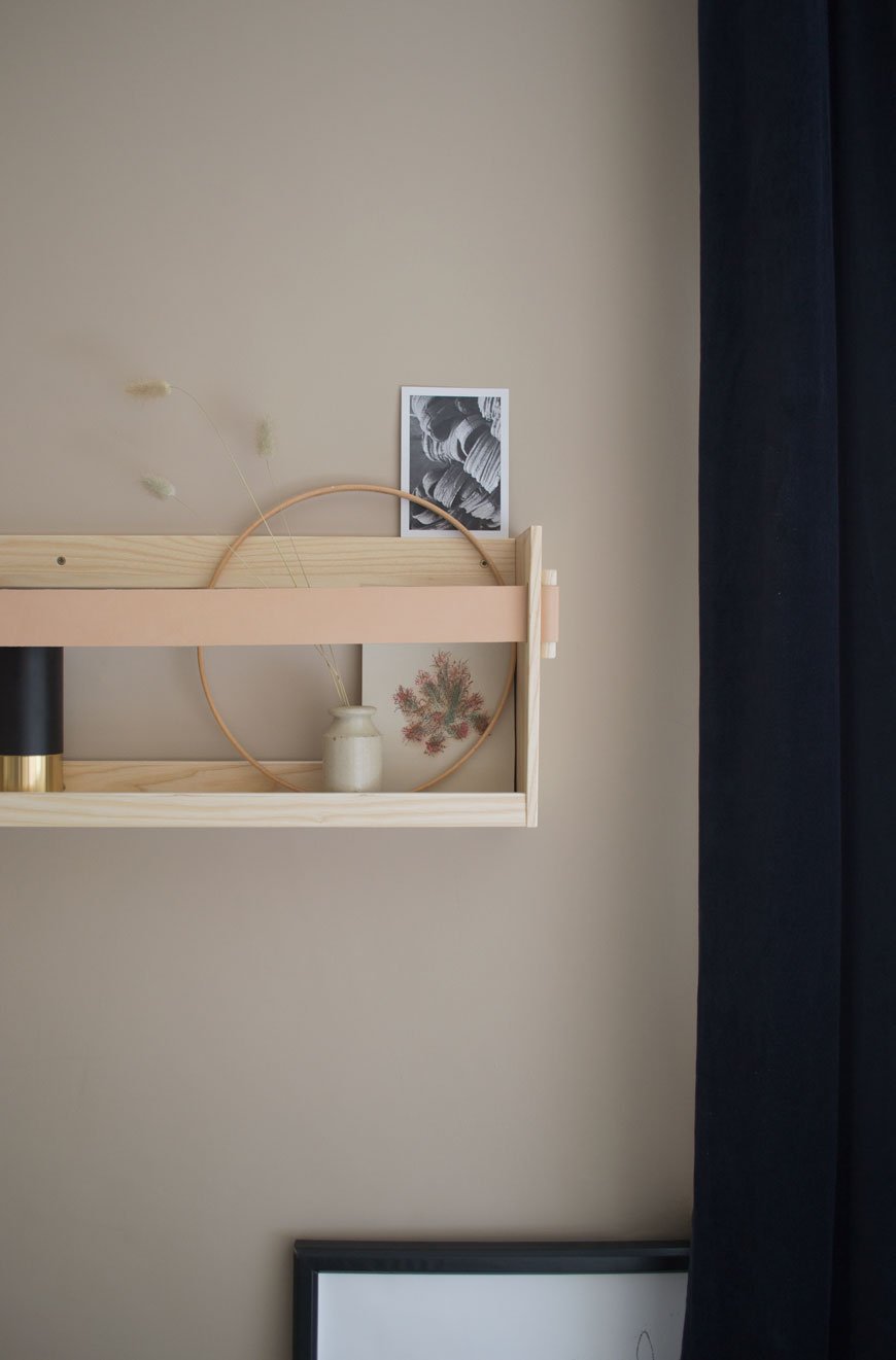
Of course, a home is never truly finished and we’ve left space for this room to grow. Much of the practical work has been Rob’s baby. He’s done an incredible job and is putting the finishing touches to tiling the hearth plate (hence why you haven’t seen much of it). I’ve left space for a large round mirror to hang above the chest of drawers and there's bedsides and a reading chair to sort. For now, though, we can finally see out the winter in a warm and inviting bedroom that we can’t wait to spend time in.
On Pinterest? Check out my beige and greige interiors board for more inspiration or #TheChathamHouse on social to follow our renovation journey.
Beige paint - 'Lark Song' by Valspar in matt for walls and satin for wood and metal.Engineered oak flooring - Shadow Grey 188 from the Havwoods Karelia range.**Black metal sockets and vintage toggle switch - Dowsing & Reynolds.Knurled Skyscraper cupboard handles - Dowsing & Reynolds**Bamboo Sinnerlig lamp - IKEA.Black Ray wall lamps - Mater.**Black metal planter - Cox & Cox.**Oak picture frames - Cox & Cox.**Shelf90 in ash and leather - SSM**Charcoal grey 'Dolce' Rug - Houseology.**Morten oak chest of drawers - Heal's.**Anthracite grey column radiator - Trade Radiators.'Monolith' printed cotton fabric - Laura Slater.
Photography & styling © Tiffany Grant-Riley
This Hackney Home Designed by Biasol Has The Blues
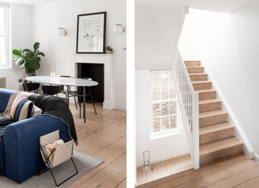
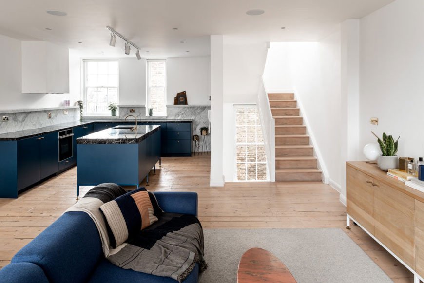
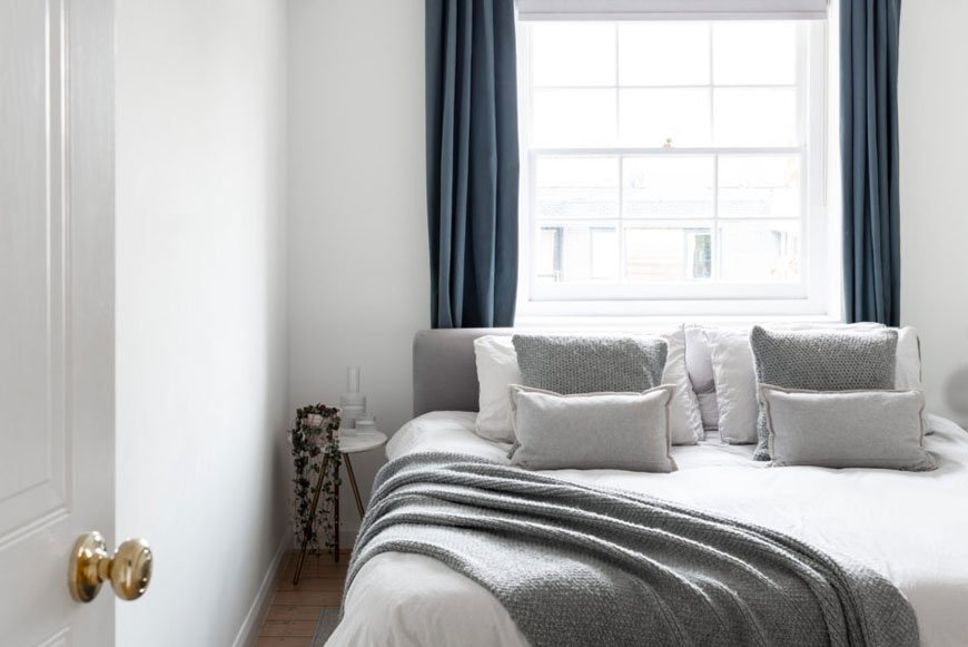
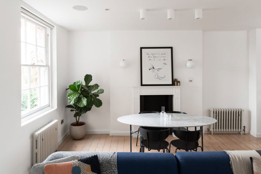 I already know what you're going to say. "Not another blue kitchen Tiff! Come on!" Well yes, it is another blue kitchen, but what I particularly love about this Hackney home that I gleefully discovered on The Modern House is that almost every room is cleverly anchored with the blue. No other colour speaks to me the way this particular blue does, so I for one completely understand why the architects chose it for this project.
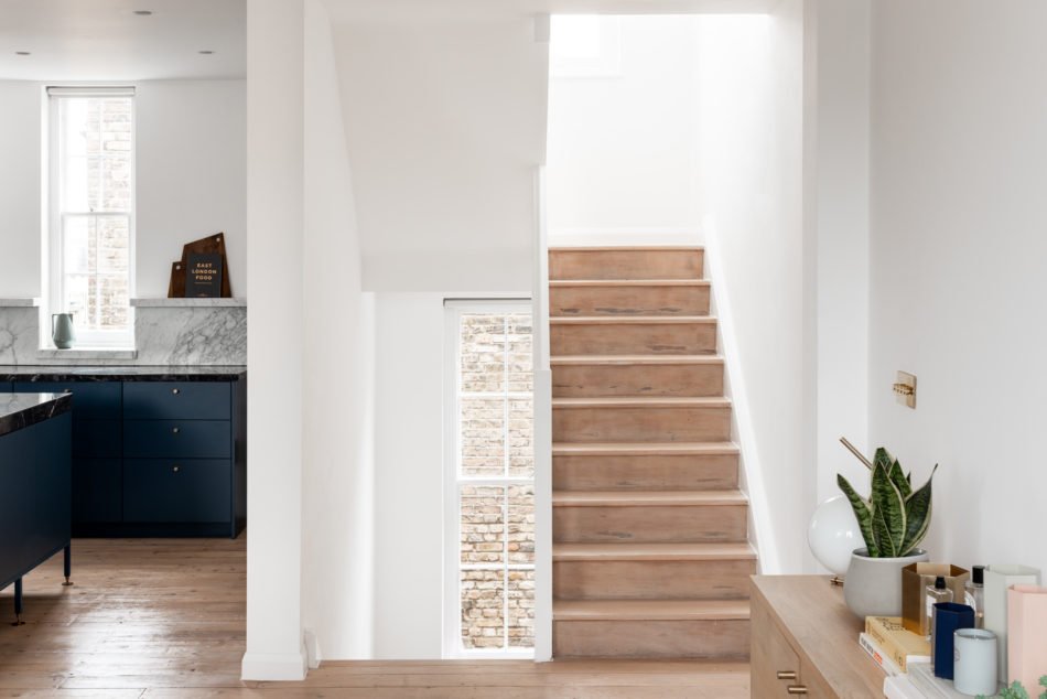
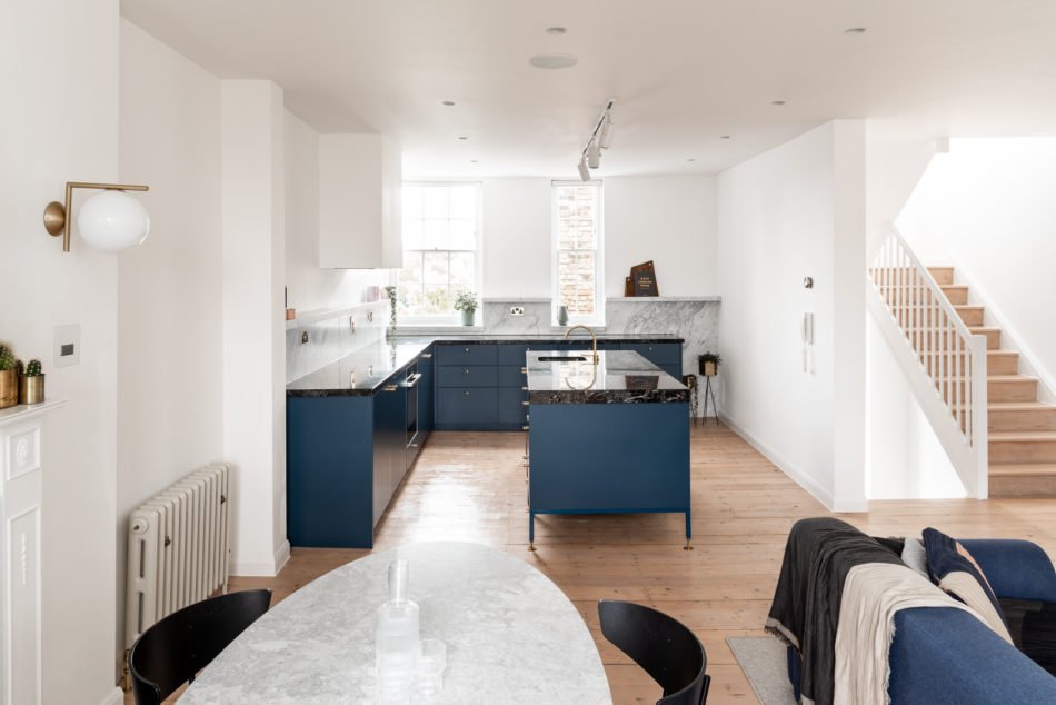 Those Aussie architects really do have it down. I'm always in awe of what some of the design studios in Australia are coming up with, particularly having great weather and light on their side. So it's interesting to see how Melbourne based studio Biasol tackled this Georgian maisonette and its typically dark interior. As you can see, they did away with the traditional layout, opening it up into a light-filled living space. Original sash windows, timber floors and cast iron radiators connect the building to its past, whilst bright white walls and contemporary furniture connect its residents to modern living. Minimally styled to accentuate the craftsmanship of the architecture, you can truly appreciate the quality of the materials Biasol has chosen to use.
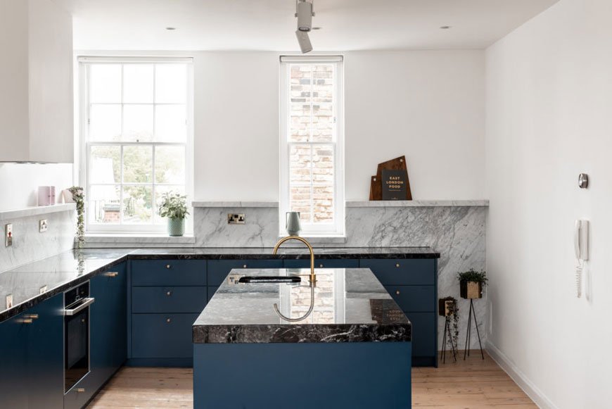 The freestanding island in the kitchen has been elevated with brass legs to allow the space to continue to flow beneath. Marble features heavily across this property with black Grigio Carnico kitchen surfaces and herringbone Carrara in the bathrooms. Accents of brass in the hardware and mixer tap enhance the rich, blue cabinetry, echoing in the living and dining spaces through wall mounted Flos IC lights. I'm completely in love, are you?
 See more of those clever blue details in this Hackney home over on The Modern House. And if you've got a bit of cash lying around, it's going for a cool £1m.
Photography © The Modern House.
[AD] Fredericia Celebrate 60 Years of The Spanish Chair
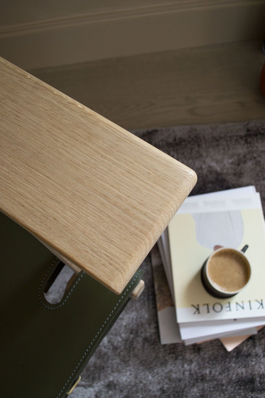
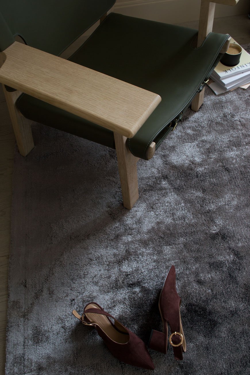
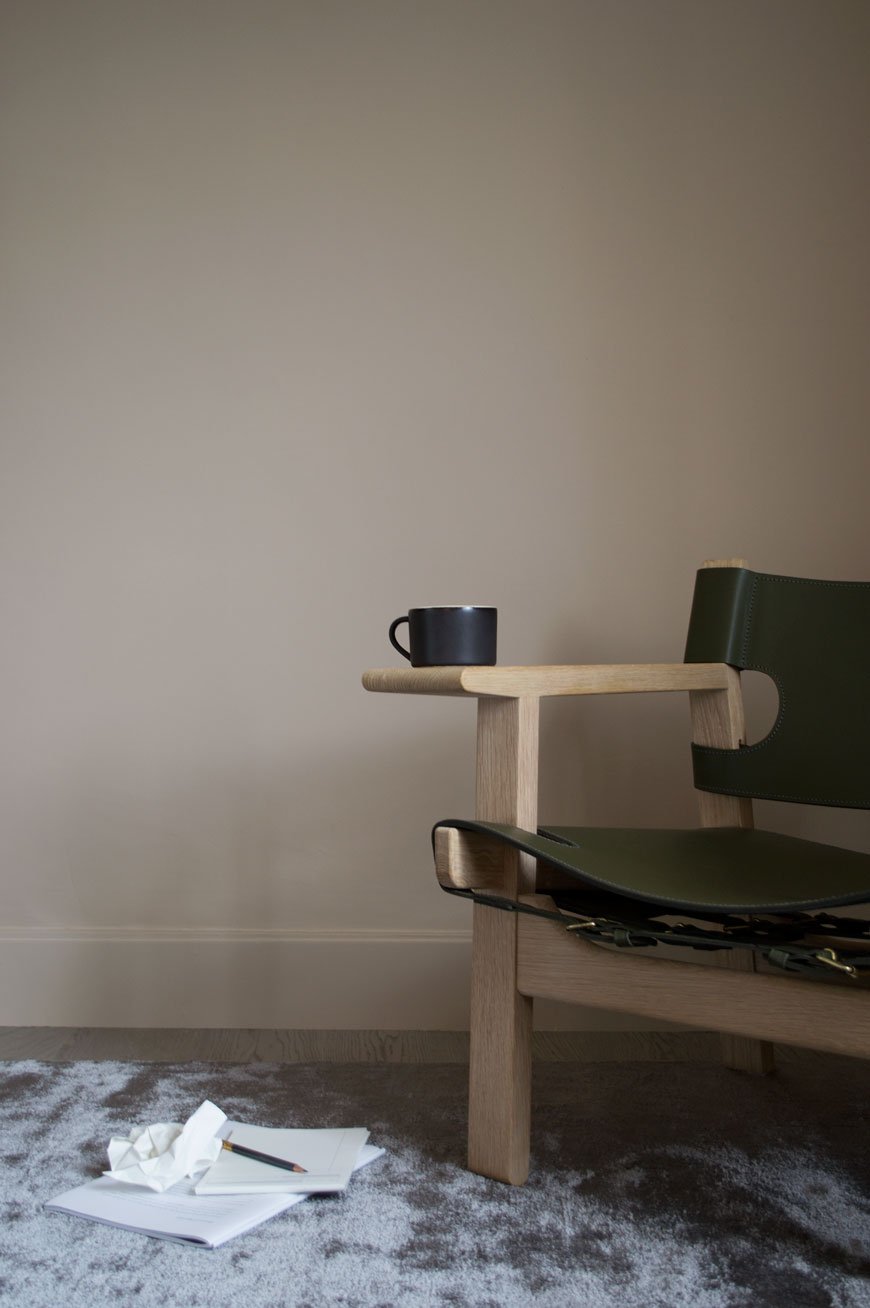
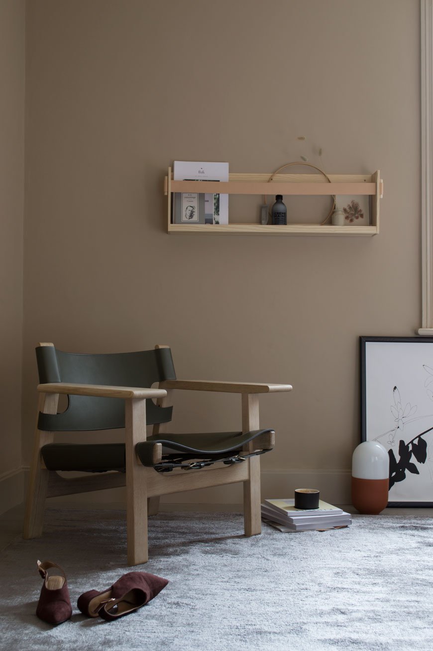 This is a paid partnership with Fredericia. I first made an acquaintance with this beautiful chair two years ago when I was introduced to Fredericia at the London Design Festival. Inviting me to experience their collection for myself, I was somewhat spoilt for choice. They took one look at me and said "that one - that's the chair for you". It was The Spanish Chair, a modernist classic launched in 1958 by Børge Mogensen.It is a dream to sit in. Despite its upright position, I promise you, it's just perfect for kicking off your shoes and losing yourself in a good read. It creaks as it adjusts to your shifting weight, with arms just right for your mug of coffee, a notepad. It's been staying in our unfinished bedroom and I've had the pure, unadulterated pleasure of styling and living with it for the past few weeks.
Who Are Fredericia?
Named after a small industrial town in Denmark, the Fredericia design house was founded in 1911 operating as a chair factory. During its first twenty years of production, the factory concentrated on upholstery, later becoming the first licenser of Thonet in Scandinavia. Family owned to this day, its humble beginnings and near bankruptcy would see it become a forerunner of Danish Modernism.In 1955, the factory was acquired by CEO and architect Andreas Graversen who brought in close friend and designer Børge Mogensen to turn it around. Over the next twenty years, Mogensen would go on to design a string of Danish modern classics, including his first - the No.1 Sofa whose shape would arguably become the most emulated silhouette for furniture in modern design. His style was described by Graversen as "unpretentious, pure and honest". His ethos was to create pieces that would blend seamlessly into the every day, interested in the functionality and simplicity of it over the short term trend. Today, Fredericia is home to some of the most revered designers of our time, including Cecilie Manz, Gamfratesi and our very own Jasper Morrison. Building on a proud heritage, Fredericia continues to create the modern originals of tomorrow. Their designs show the high level of craftsmanship, long-lasting integrity and of course, the quintessentially Danish aesthetic for which they're known.
The Spanish Chair
On a journey through Spain, Mogensen noticed a chair with wide arm-rests, a style common in parts influenced by Islamic culture. This sparked an internal based on functionality, a clean aesthetic and unassuming, rustic materials that would ultimately become The Spanish Chair.Manufactured by Fredericia to his exacting standard, the chair's geometric frame ensures greater stability. Whereas flat sawn wood has a tendency to split, the stronger quartersawn oak frame shows the almost straight stripes of grain that run through the wood. Vegetable tanned saddle leather becomes the backrest and seat, a Medieval Spanish methodology of furniture construction that would inspire Mogensen throughout his career. One can just imagine the beautiful patina that would develop in the leather over time. Brass buckles underneath tighten the leather as it softens and the wide armrests are intended to be used as a ledge for a cup or book, doing away with the table and opening up space.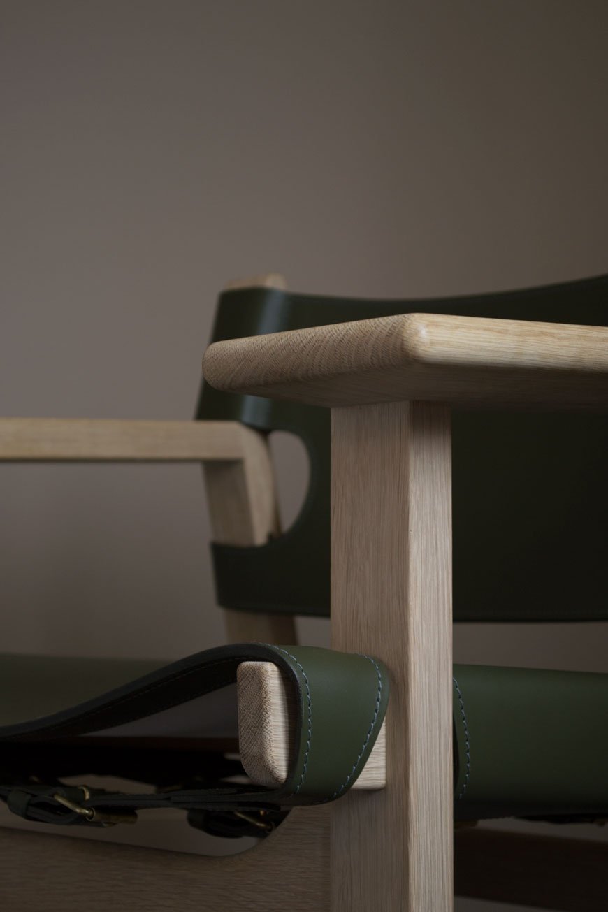 As this year marks the 60th anniversary of The Spanish Chair, Fredericia has produced a limited edition in one of Mogensen's most loved shades sourced from his archive. Olive Green. Undoubtedly a popular colour in Mid-Century design, the chair is a symbol of the longevity and enduring nature of Fredericia's rich design heritage. Available until December 31st 2018.
Photography & styling © Tiffany Grant-Riley
Yes To These Earthy Green Kitchen Units
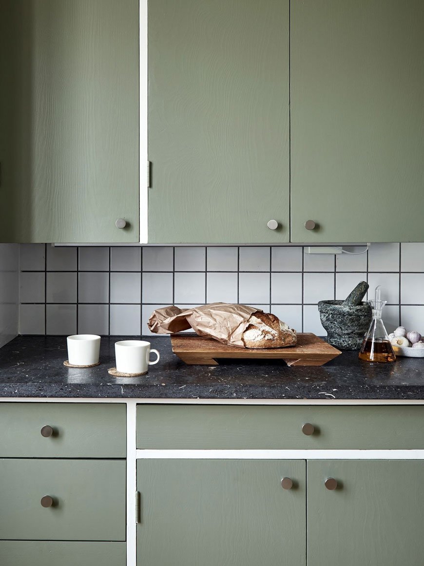
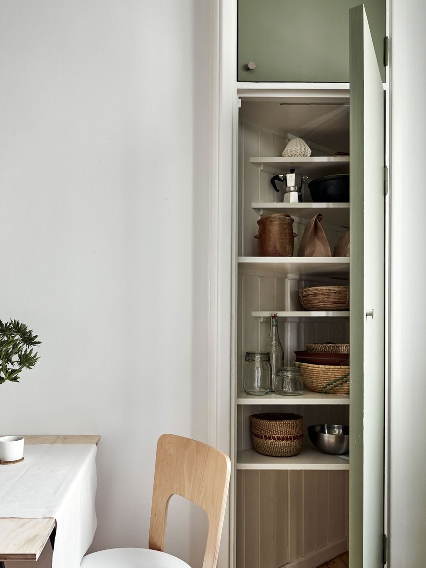
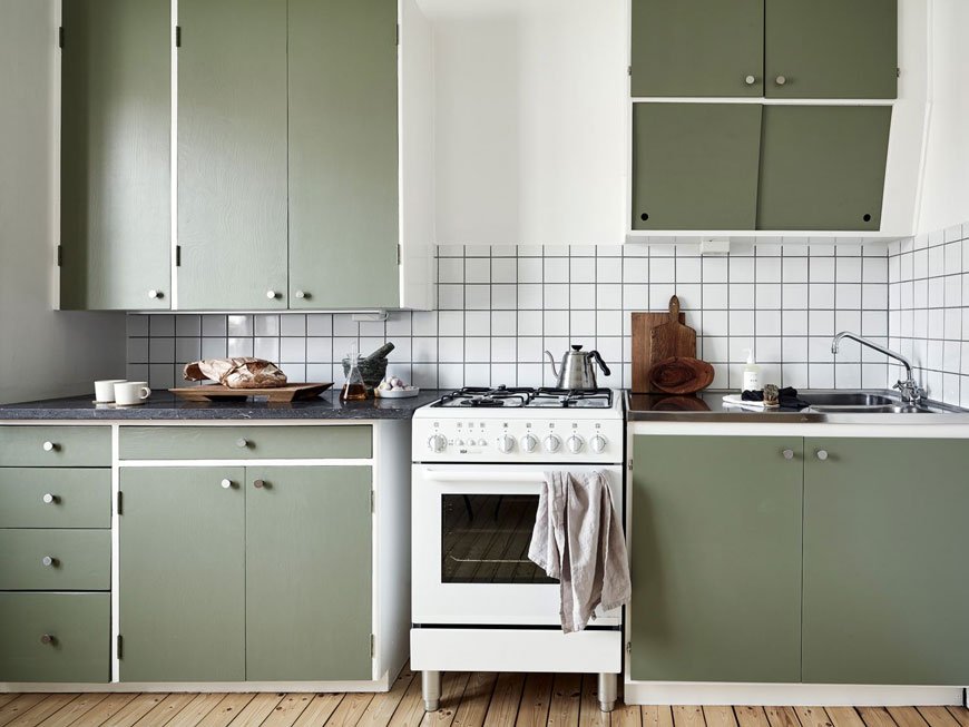
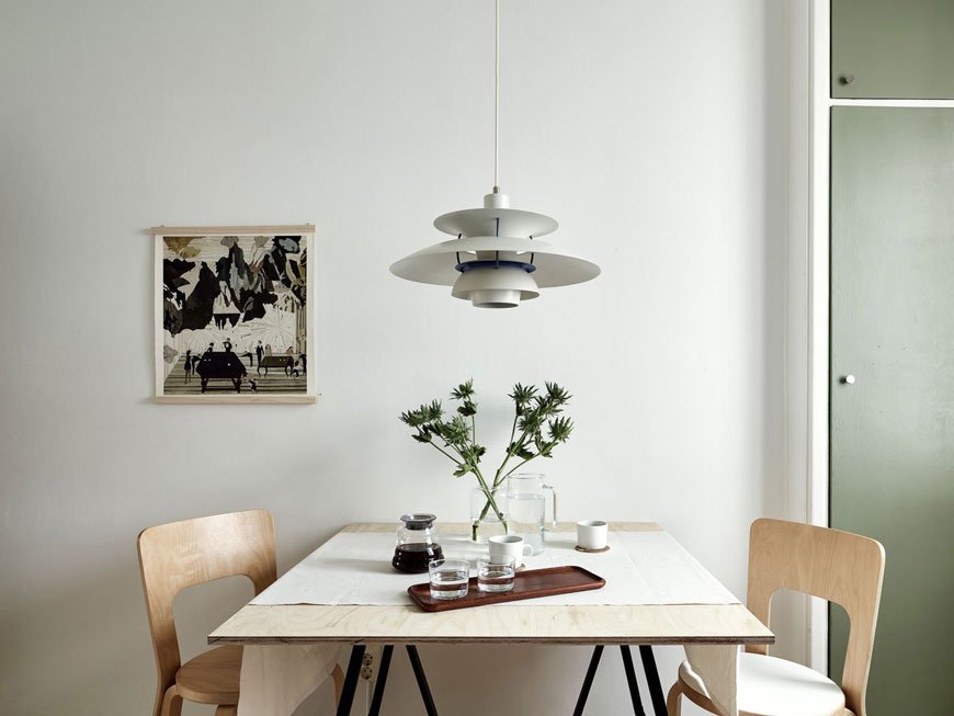 In case you haven't noticed, I've got a thing about kitchens. When we were planning ours, green cupboard fronts were a close runner. Eventually, we chose a deep blue, but this Gothenburg apartment has left me wondering what might have been with its earthy green kitchen units. What a peaceful space. Built in the 1930s, the kitchen has been restored and the cupboards given a fresh update in Sage Green by Little Greene Paint which sing against Italian slate worktops. It's all about the contrast people. Stainless steel knobs add to the bespoke feel which - top tip - is one thing you can easily change if your cupboards need an update.The classic square white tiles are from Vitra and grouted in black, similar to this monochrome kitchen.
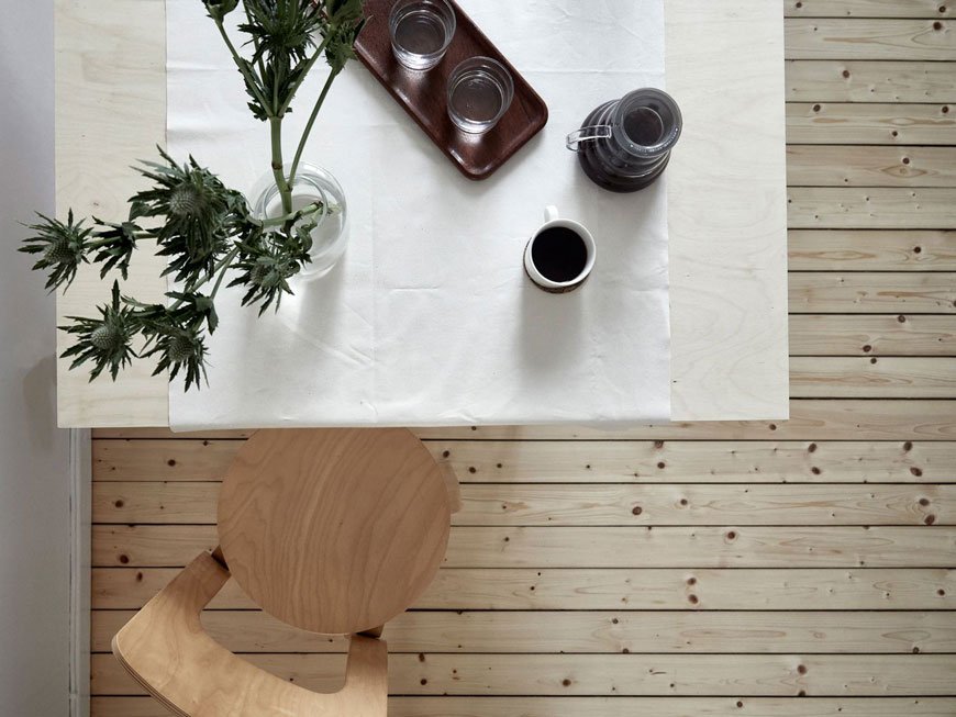
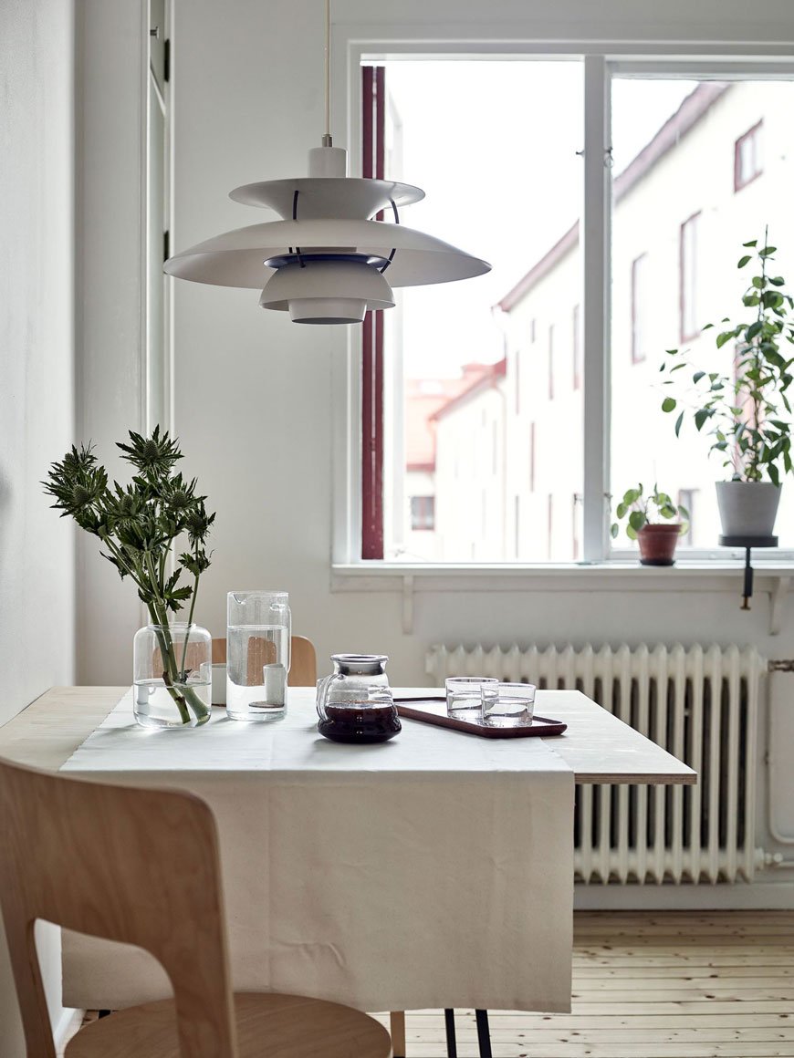
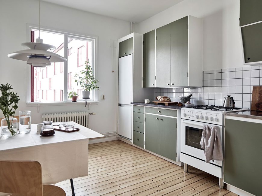 Just like our kitchen, and perhaps because due to space constraints they had no choice, they've installed a freestanding cooker. Built in appliances aren't everything.Every nook and cranny has been utilised - take a look at corner cupboard used for storing baskets and the all-important coffee essentials. There's even enough room for a table, neatly styled with two birch 66 chairs, designed by the father of Scandinavian design Alvar Aalto. Tying in with the newly resurfaced floors, they bring a feeling of warmth to the room. Could you imagine shuffling in here for your breakfast and feeling instantly soothed?!
 Photography © Kvarteret Mäkleri
[AD] Our New Engineered Oak Floor in the Bedroom
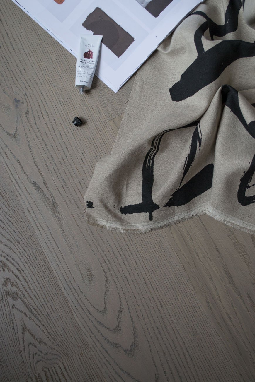 This is a paid partnership with Havwoods. Have you noticed our plaster pink bedroom walls have been replaced with a cocooning beige? There's also a sophisticated, engineered oak floor down too! Yes, the floorers came last week to lay our Havwoods planks and I'm in love with how different it makes the room feel. I know what you're going to say. Why didn't we sand and stain the original floors then? Good question. I remember being on a shoot a few years back and the assistant stylist told me the best thing she ever did in their Victorian home was to put wood flooring over the top of the original. It made such a difference to the warmth of the house, she said. As a restoration purist, I was a little horrified. Why would you cover up such a beautiful piece of history?!
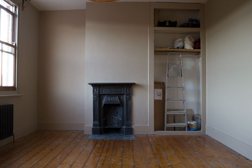 Now I get it. Firstly, what we've been calling the original floor was only ever meant to be a base for the now long gone floor at the time to sit on top of. A subfloor. That explains the gaps under the skirting which show where that floor would've been. And it's draughty. Having been through the very messy, time-consuming process of finishing the kitchen floor ourselves, we just wanted the job done and with a much warmer finish.
Why Choose An Engineered Oak Floor Over Laminate
In all honesty, I'm not a fan of laminate flooring. It's a throwback from the 90s when everyone had that blonde wood effect planking that bubbled and marked really easily. There's no doubt that laminate has come a long way since then and with better printing technologies it's difficult to spot the difference now. Here's the thing though. Laminate is typically made from a composition of melamine resin and fibre board topped with a printed, laminated image to look like wood, but wood it is not. It's not remotely eco-friendly and has a lifespan of around 20 years. Although it's possible to replace planks if they need repair, you can't refinish them if they need maintenance.There's a new level of upheaval and added cost with a solid wood floor, so in an effort to stick with ethical products and honour the age of the house, an engineered oak flooring felt like a good compromise. It's important to us that we know the provenance of what we have in our home and all Havwoods products are traceable and certified. Unlike laminate, it's all wood. It can last a lifetime and will take sanding and refinishing several times if necessary. Each plank is completely different too; the oak on our floor has a beautiful wavy grain with a smattering of 'pips and burrs'. It has a wonderful texture under foot and frankly, there's no competition.
Decisions, Decisions and The Karelia Range
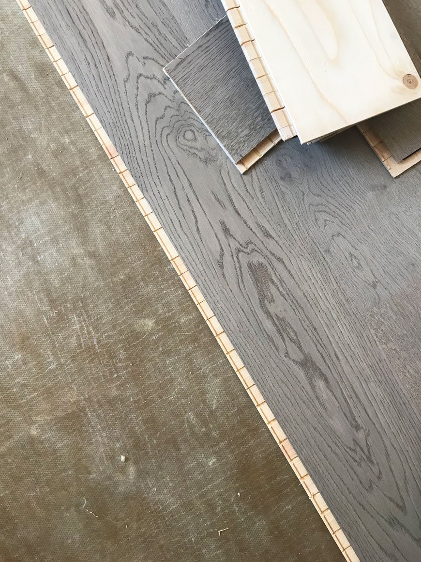
Earlier in the year, I visited the Havwoods showroom in Clerkenwell. A treasure trove full to the brim of floor samples, from solid parquet and reclaimed planks to HDF Composite, it's easy to feel overwhelmed.TIP: My advice would be to have some understanding of the look and feel you're aiming for to help narrow it down, even if all you can say is you want the floor to look warm, classic farmhouse.Going in with a contemporary, Nordic look in mind with a touch of grey, it was almost a gut feeling when I was shown Shadow Grey (188) from the Karelia range. This collection is a click system, made from European oak, with a 3.5mm lamella (that's the oak top) and a double base layer of Finnish spruce. The square edge on the planks gives the floor a contemporary luxe feel - however other designs in the Karelia range have a bevelled edge.I took a couple of different samples home just for comparison, but not surprisingly having let it sit in the room for a few days we were unanimously for the Shadow Grey. Yes, it was pretty hard to imagine a whole floor from one sample piece, but the lifestyle images from The Wood Book helped piece it together.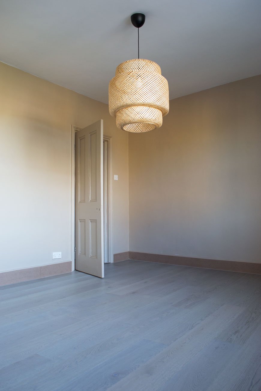
Floating vs. Gluing Installation
You've got two choices when you're laying an engineered floor - glueing it down to the underlay or floating it on top. There are pros and cons for both but ultimately we decided to float it which will allow the wood to breathe and move without fighting against glue. This does mean there's an element of bounce to the floor but I prefer knowing it has room to shift without buckling.
Skirting Options
Normally when you have a new floor fitted the existing boards are removed, but in this case, having already plastered the walls we didn't want to open a new can of worms. In older properties, the skirting can be cut into to fit in the new floor underneath, but I wasn't keen on that for the same reason. We didn't like scotia or other more decorative trimmings, so the floorers suggested adding an MDF skirting on top of the old ones (which we'd already painted, gah!). Slightly lower than the old boards, when painted they'd look a little more ornate but you'd never tell the difference. Needless to say, we went with that.TIP: Make sure you use a paint that's suitable for MDF as it absorbs a lot. We used a primer first before going on with our Valspar colour.Now we're into the final week of finishing the snag list, hanging lights, screwing in handles and all the small details before it'll be ready to move into properly. Can't wait to show you the full transformation!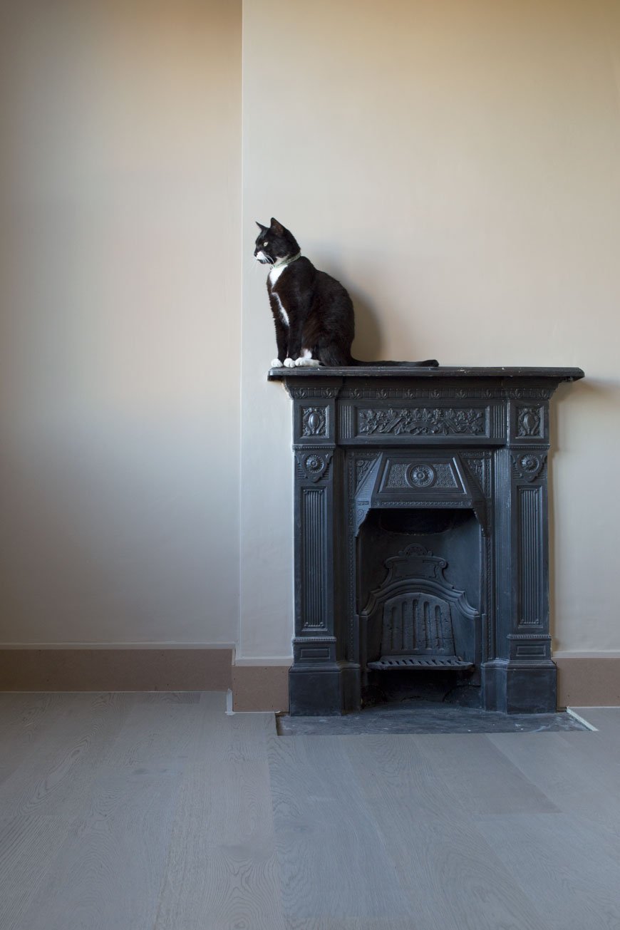
Photography © Tiffany Grant-Riley
Gorgeous New Nordic Design From Gejst
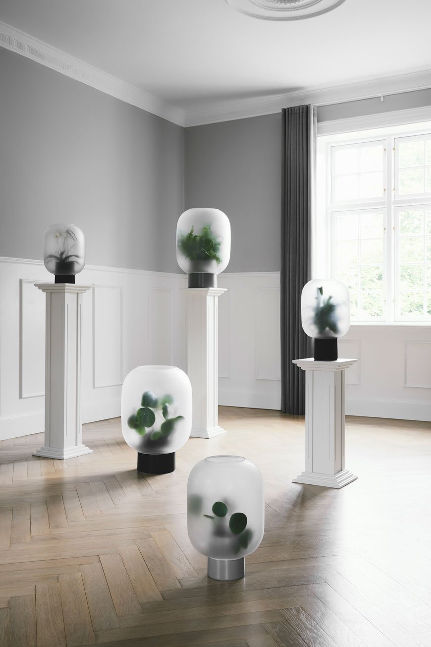 I thought I'd end the week with a few new design updates from Gejst. The word 'gejst' is Danish for excitement and enthusiasm which is how the Nordic design brand of the same name describes their creative approach. Their multi-functional products inspire the desire to get organised in all of us and the new catalogue is brimming with small space, clever storage solutions.Founded in the Danish town of Odense in 2013, the Gejst collection takes classic elements of Nordic design traditions and reworks them into playful, functional pieces. Designer Michael Rem describes his experience of that process, termed as creating 'the new simple',
“Being a designer means absorbing all of the daily influences that life offers endlessly, and consciously experiencing it. All the sounds, colours, forms and events are mixed together in the subconscious with your personality and emotions, so that all of this can be combined to form something new...
The Flex Rail
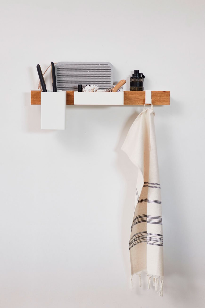
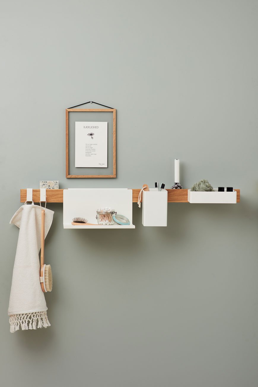
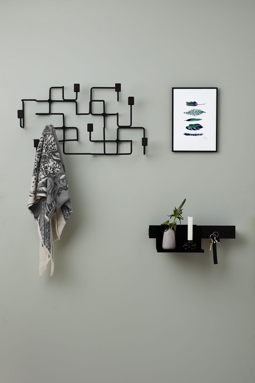
If there's one thing the Scandinavians know how to design, it's the shelf. Am I right? There's really nothing new in furniture left to be designed, but there are always new ways to approach them. The magnetic Flex rail is all kinds of brilliant, with interchangeable accessories to customise the way you choose to use it. There are infinite possibilities that fit seamlessly with most home situations, be it kitchen, bathroom, bedroom or workspace. It even comes with a nifty holder for coffee filters. Now that's attention to detail.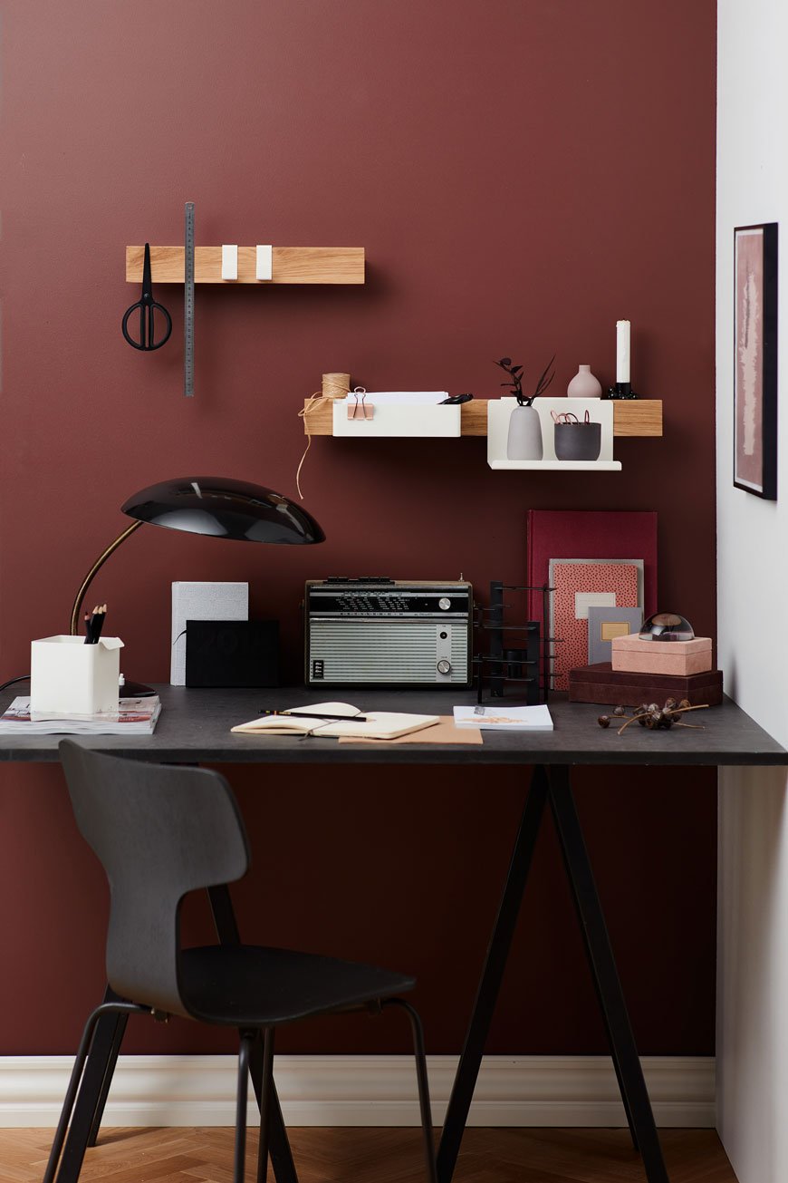
Nivo Shelf
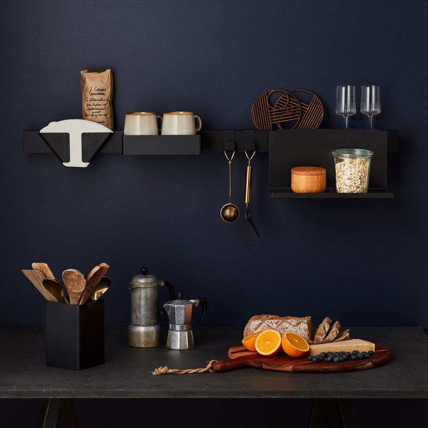
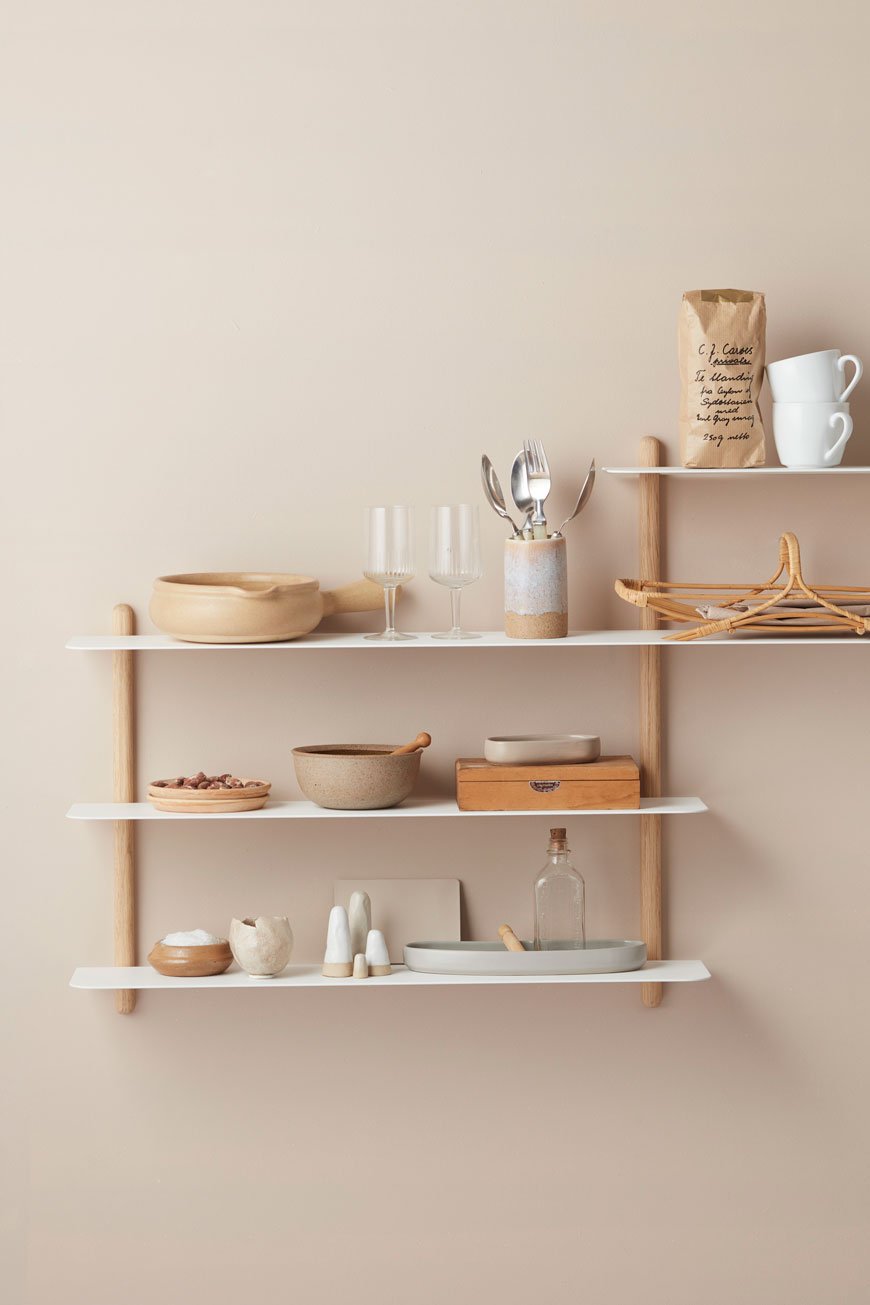
Designed by Berlin design studio Böttcher & Kayer, the elegant Nivo shelf is so light in frame, it almost isn't there. With its bright white shelves (it also comes in black), the Nivo has no visible screws and allows the walls behind to breathe space.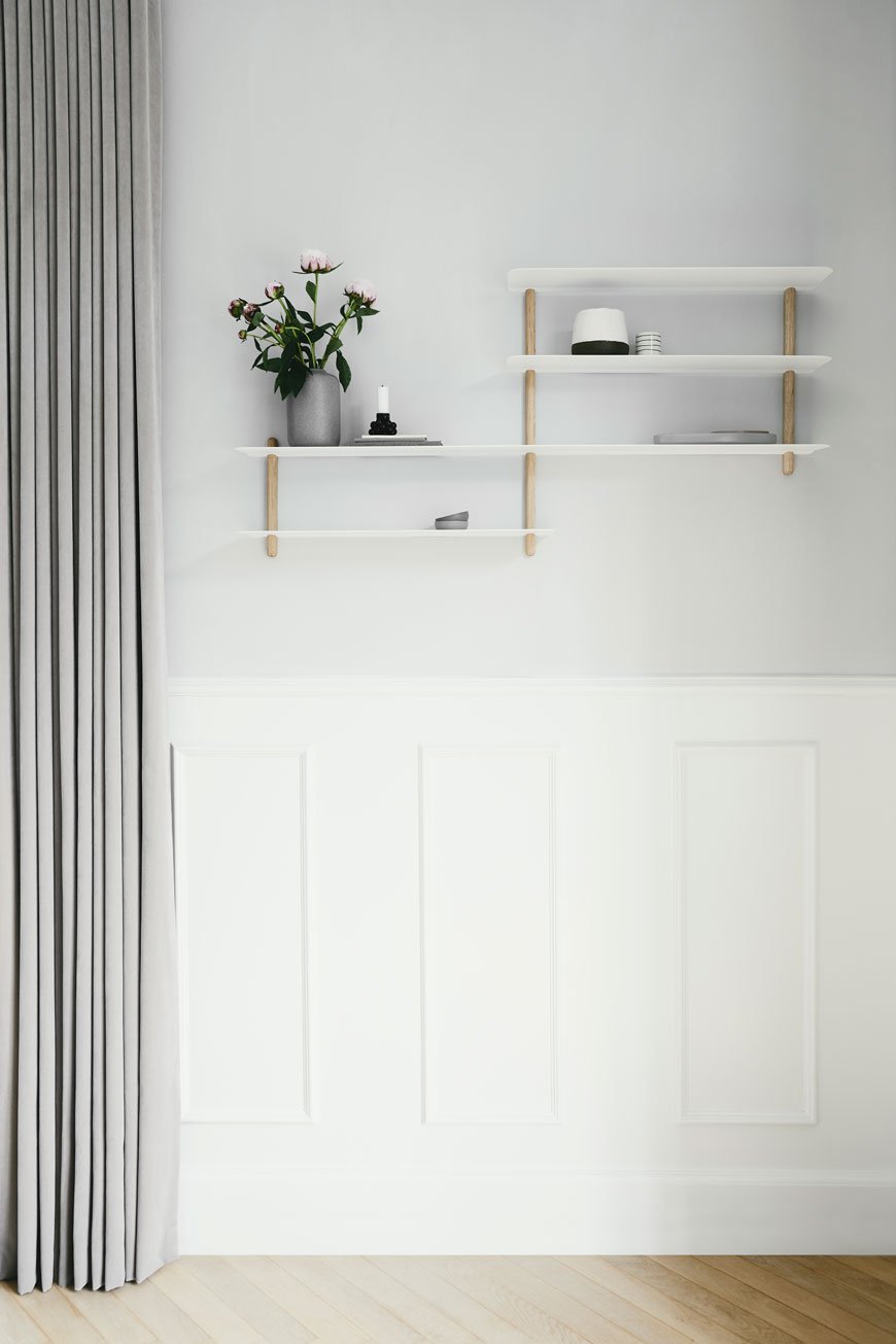
Nebl Planter
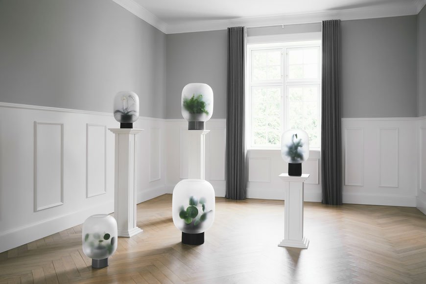 Inspired by dewdrop tipped grass and the silence of fog covered streets, the Nebl planter diffuses the form of each plant like an abstract painting. Consisting of two parts with a ceramic base and frosted matt glass top, Michael Rem's design makes it hard not to be fascinated by this new way of displaying houseplants.
Accessories for Play
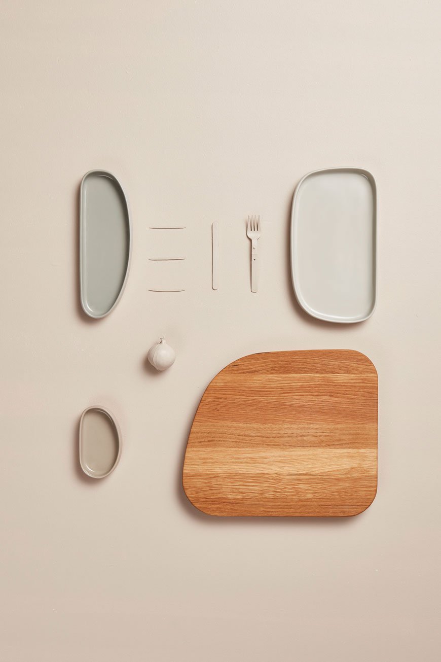
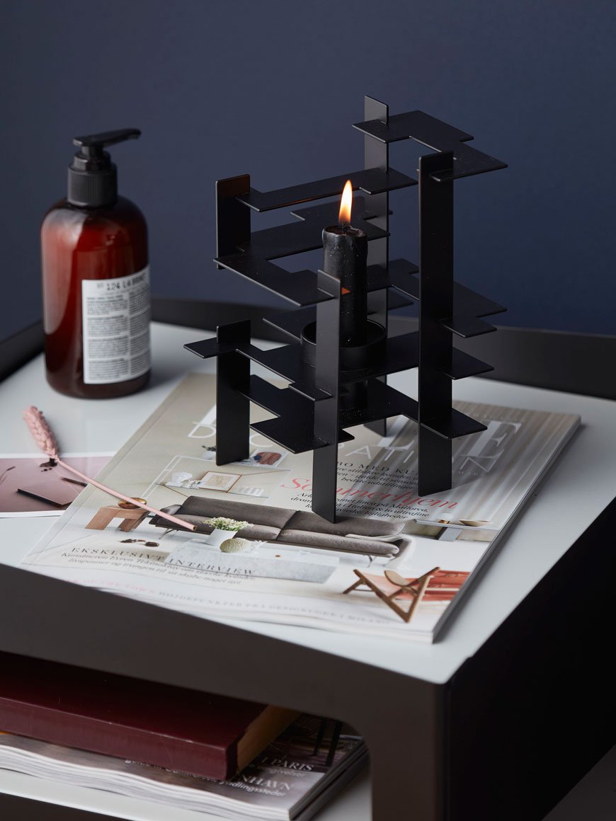 The collection also supports additional accessories with a touch of playfulness. A favourite is the Galet board which comes with three ceramic bowls. Designed to sit flush with the edge of the board to compartmentalise your chopping (so very satisfying) or stack inside one another, they can also be used as storage in other capacities.Happy to have scratched your organisational itch. For details of the collection, including the Sceene shelving unit head to Gejst where you can purchase direct.
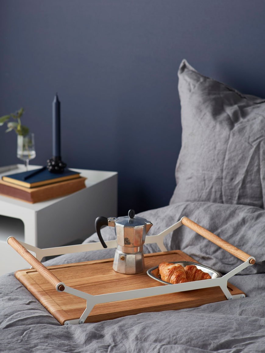
Photography courtesy of Gejst.
[AD] A Stay At The Pilgrm Hotel In Paddington
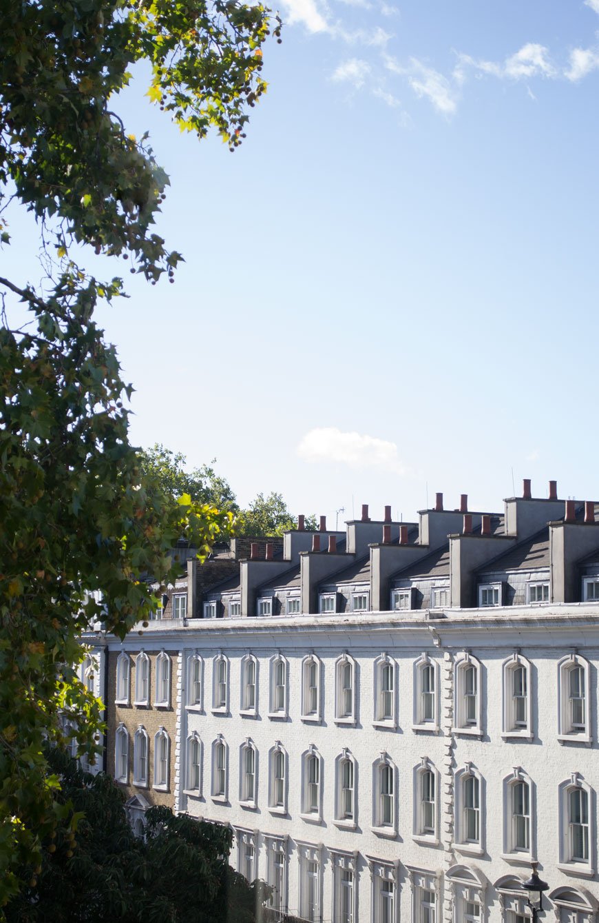 My stay at The Pilgrm was a press stay in exchange for this post. There's no shortage of achingly cool new build hotels in London. It seems one opens up every month what with all the expansions happening across the city. There are few, however, that blend seamlessly into the history of a building with the finesse with which The Pilgrm does. And yes, that's Pilgrm, no 'i'. Not even a stone's throw from Paddington Station, this no-frills luxury hotel is ceiling-to-floor with custom built, reclaimed design.
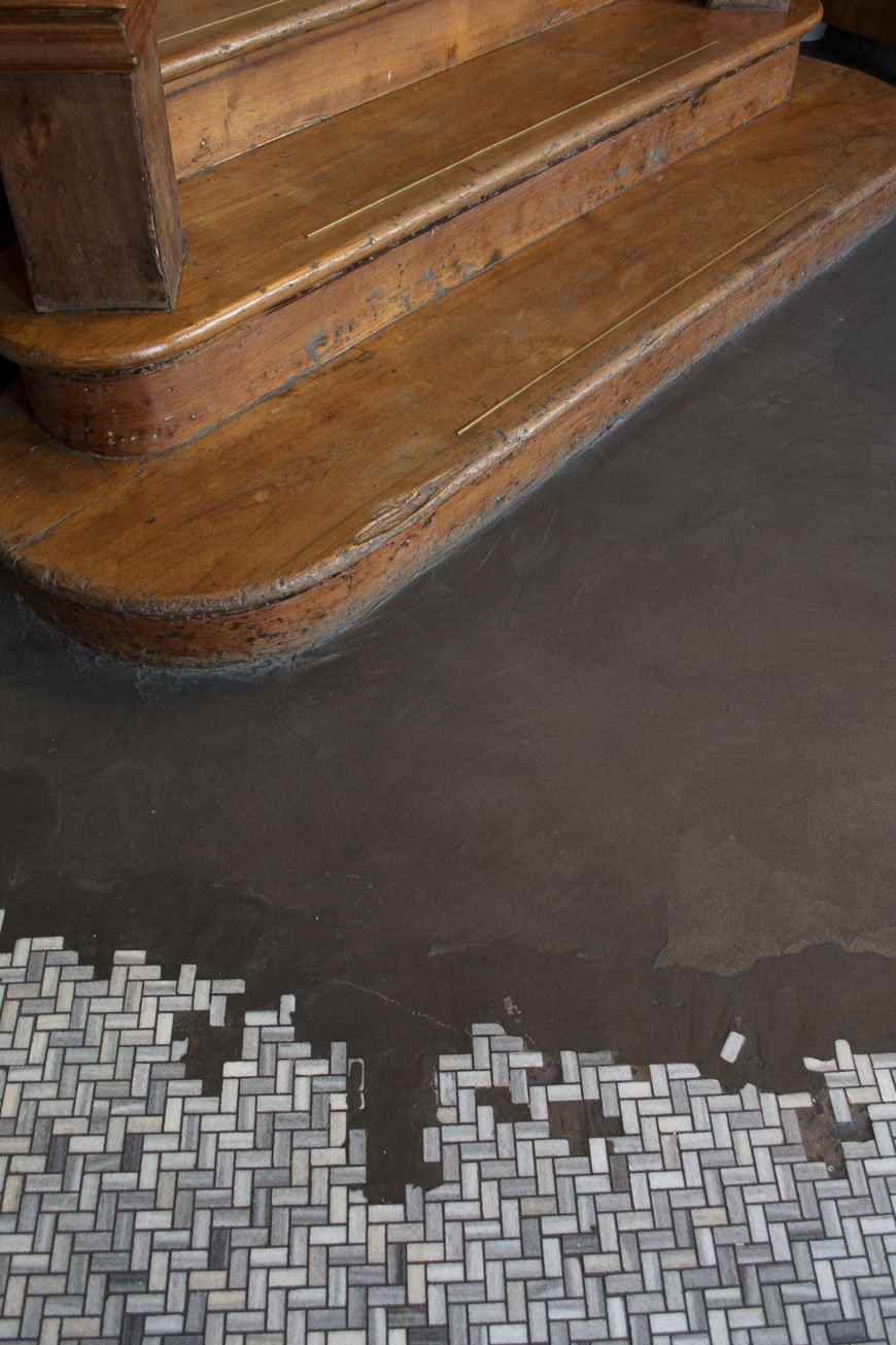
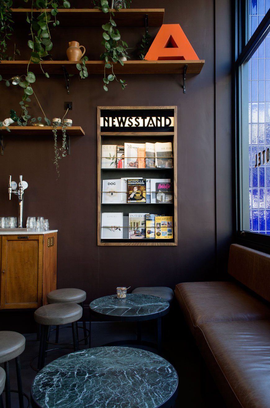 Cobalt blue tiles across the front of a groundfloor Workshop Coffee announce The Pilgrm as a meeting point, light streaming into the reception across a partially tiled floor. There's no traditional lobby here - that's the point. Instead, you're greeted inside the cafe and checked in quickly on an iPad. Walking in, you could be tricked into thinking that the building had always been this way - the grand mahogany staircase and wall mounted leather seats. Yet, The Pilgrm is a shining example of reclamation, renovation and innovation brought into being by Sheffield based architecture studio 93ft.
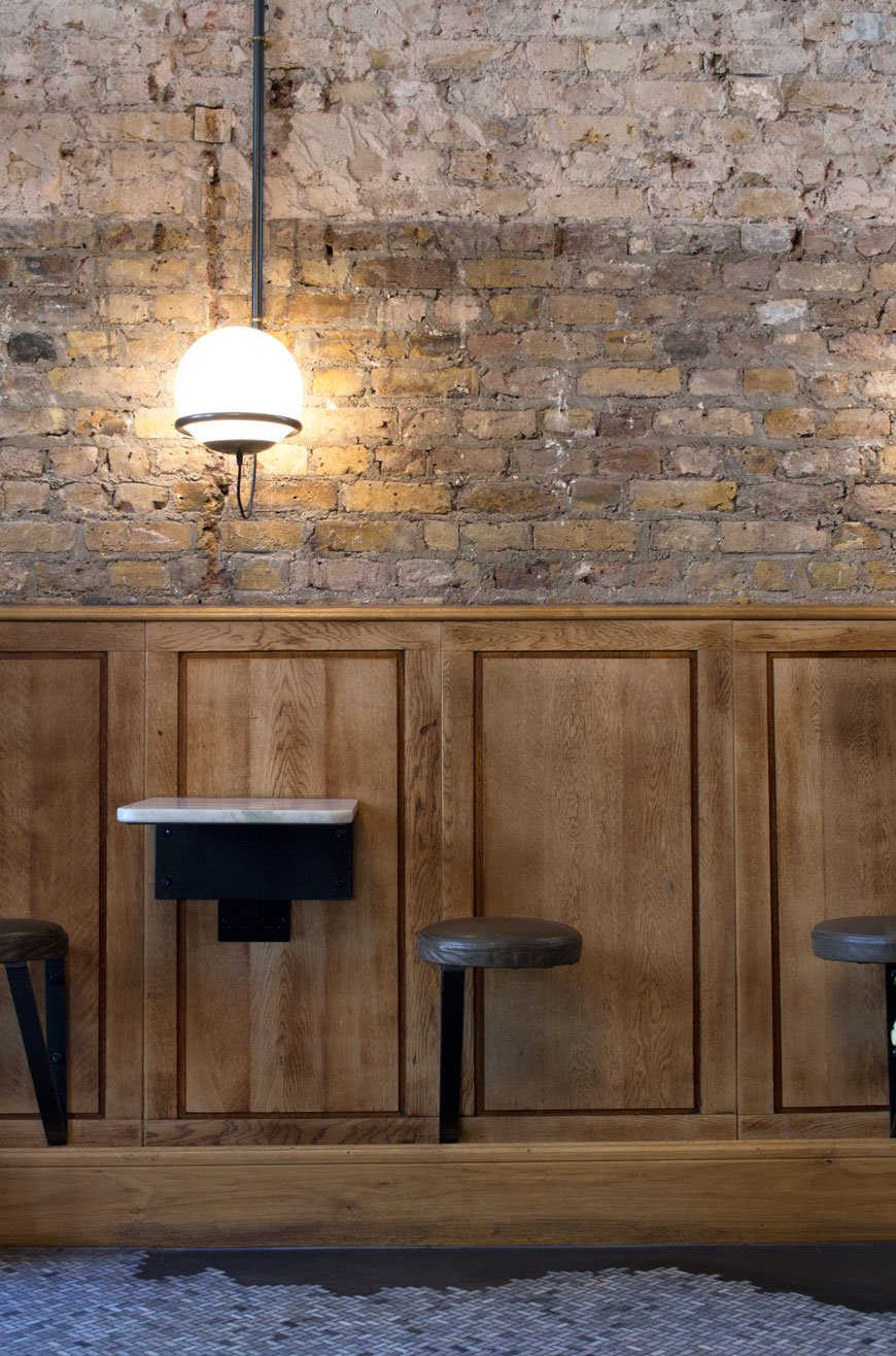 What began life as a collection of Victorian buildings on Norfolk Square has been transformed into 73 bedrooms across a series of wings and multi-levels. A feeling of understated luxe runs through the interior; from original cornices in the rooms to 200-year-old reclaimed mahogany floorboards repurposed into headboards and wall panelling. There's something very 19th century Paris about it. Architectural salvage enhances the heritage of the building, in fact, the majority of the furniture was designed and produced by 93ft, fitting the hotel out with over 1,000 unique pieces. Somehow, this blend of old-new materials brings a well-worn feeling into a this recently launched building.
If you can be sustainable, why wouldn’t you? When it comes to interiors, a beautiful historic building gives us a history, we like to work with what’s already there, we don’t believe in throwaway culture”. - Tim Hubbard, 93ft
 Rooms are split into Bunk, Small, Medium and Large each with a bijou black and white tiled shower room. Making the most of the available space, rooms are kitted out with custom mirror fronted hanging rails and metal bedside shelves. Ceiling lights are thankfully vetoed for sleek black wall lamps - so no banging your head in the smaller rooms. Elegant mid-grey walls contrast the white Egyptian cotton bedding and a Marshall Bluetooth speaker is very welcome for kicking back with your own playlist. Galvanised steel planters on the wall offer a homely, personal touch alongside unique pieces of art.


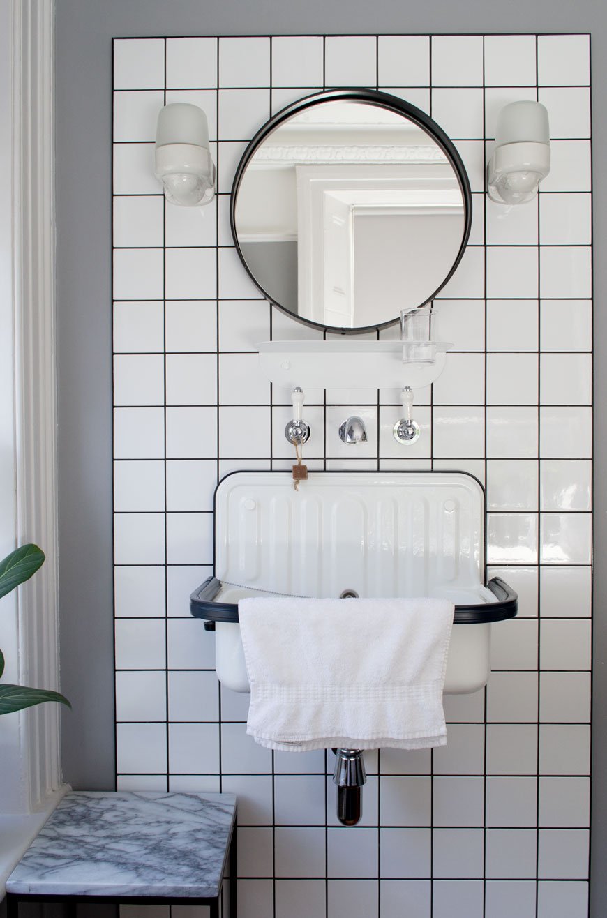
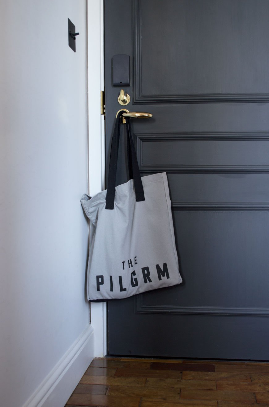 Staying true to its mantra 'Everything you truly need, nothing you don't', you won't find mini-bars, trouser presses or tea and coffee making facilities in the rooms here. Should you need a cuppa first thing though, there are communal Pantry rooms on the landing of each floor, which I think is a thoughtful touch.
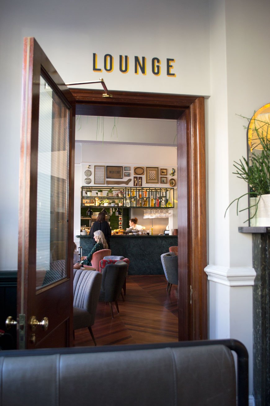 For something more substantial though, the Lounge serves up a mean menu from 7am - 10pm. Exhausted at the end of a manic week covering LDF, the last thing we wanted to do was head back out to eat. Thankfully, staying in at The Pilgrm is definitely the new going out. Set amongst old-world glamour with its polished parquet floor is the green velvet banquette made for indulgent lounging. The dark green window behind it is yet another custom piece, which with its inset brass downlights I was surprised to learn it wasn't an original feature. 30 antique German cocktail chairs sourced and reupholstered by 93ft added to the charm of the room and were a welcome backdrop to our quiet dinner (and obligatory glass of Prosecco). If you're a breakfast person, I totally recommend the 'Pilgrm Continental', served on top of the marble bar featuring fresh pastries, homemade yoghurts and other locally sourced delights. Weekend rates start at £149 a night (small room) and breakfast is not included.The Pilgrm marks a promising new direction for hotel experiences. Doing away with frivolous luxuries and focusing on atmosphere and hospitality is where it gets it right. I only hope more follow suit in revitalising and repurposing materials in the way they have. Of course, it fosters a greater sense of responsibility but also brings a feeling of home and comfort you can find only in design with history. And the coffee is great.
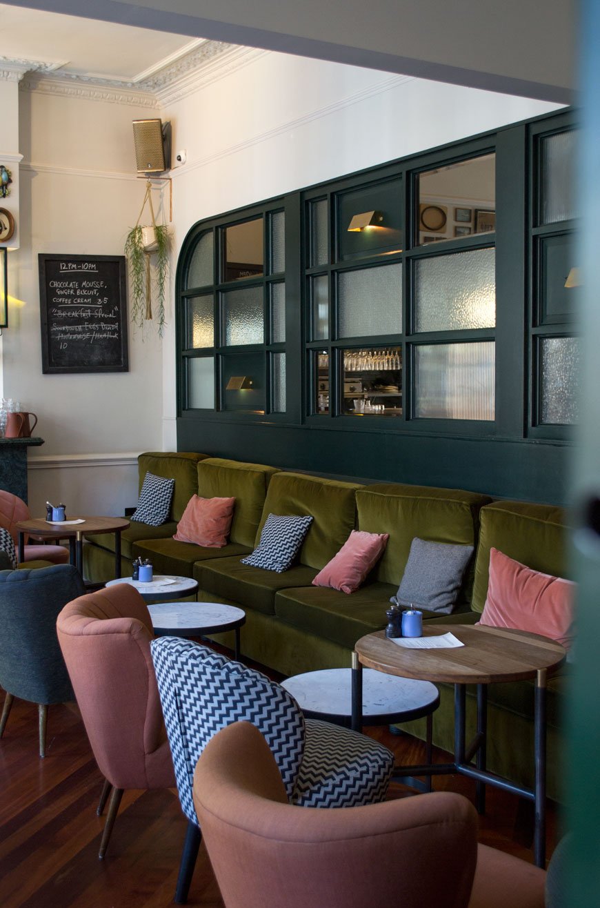
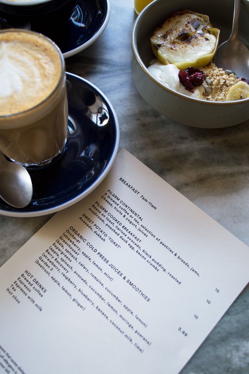
Photography © Tiffany Grant-Riley
Mater Earth Gallery Brings Sustainable Danish Design to London
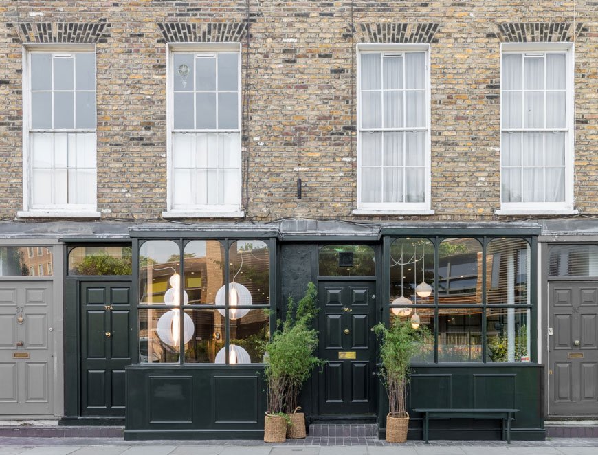 Back in Spring, I made time during Clerkenwell Design Week to visit the new Mater Earth Gallery. I am a huge fan of their soft, organic aesthetic and unwavering dedication to sustainable design. So when I heard they were setting up a new concept store in London all the way from Copenhagen, I had to see it for myself.Part of the new wave of Scandinavian minimalism, Mater was founded in 2006 with ethical and sustainable practices at the core of its design philosophy. Collaborating with an external team of new and established designers, the brand seeks to create timeless pieces rooted in high-quality craftsmanship.
Mater means 'mother' in Latin. The name is the daily reminder of our small contribution to preventing the challenges 'mother earth' faces. Design influences how we as humans live our lives; it shapes values, culture and society. Unfortunately, we are increasingly aware that the choices made during design processes often have environmental consequences. However, as a manufacturer, we have the opportunity to rethink dubious practices and create ethical and sustainable design that minimises adverse social and environmental impacts.- Henrik Marstrand, CEO & Founder.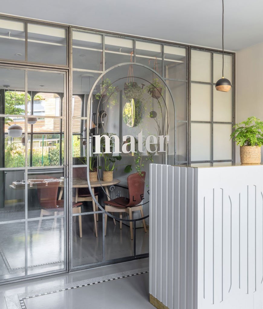 Mater's rostra of designers speaks like a who's who of design royalty; including Space Copenhagen, Eva Harlou and Pederjessen. Expect to see natural oak, cork and cane running through the collection.The Victorian building has been given a sympathetic update with brushed brass skirting and soft grey walls, blending down to the tiled floor in a similar tone. Inlaid brass edging lifts black and white mosaic tiling while dark green open shelves display a selection of ceramics, artisan teas and Eva Harlou's Double Bottle design.
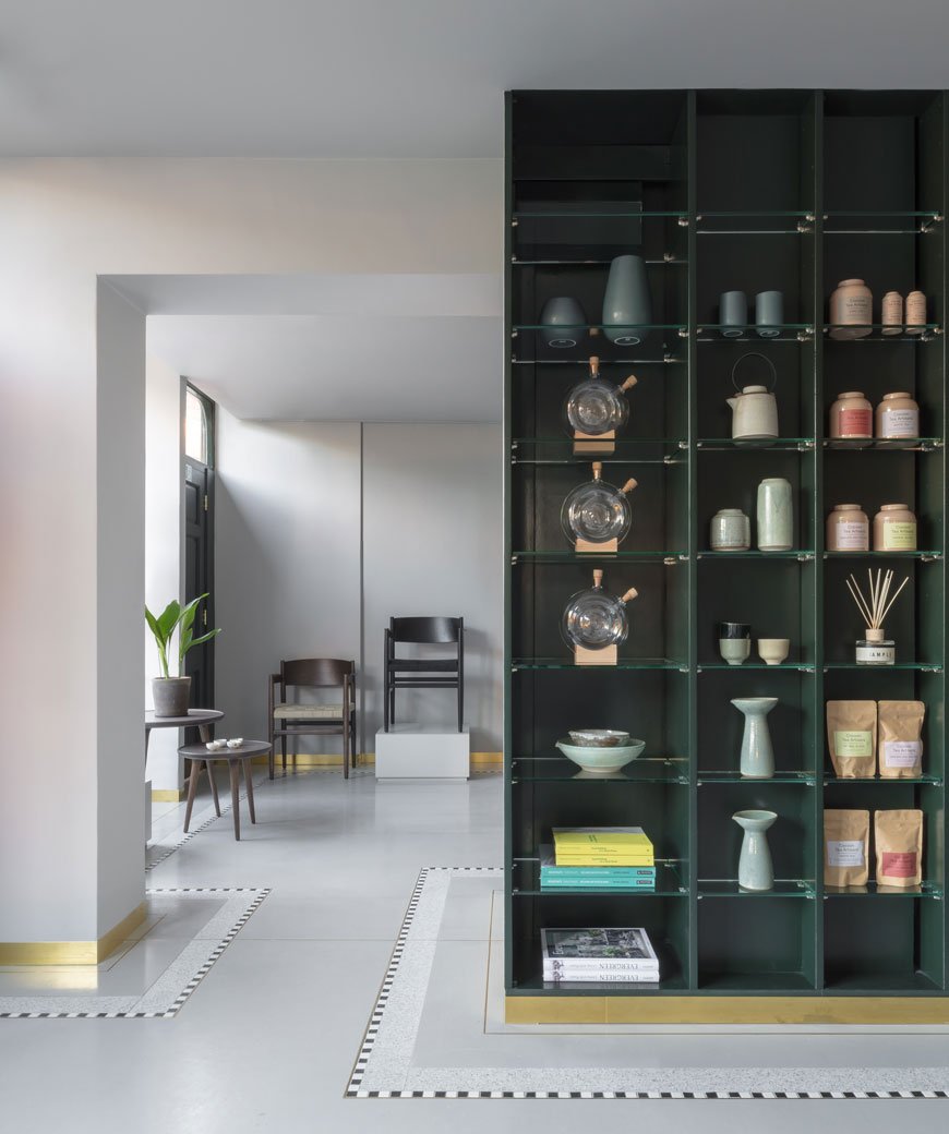
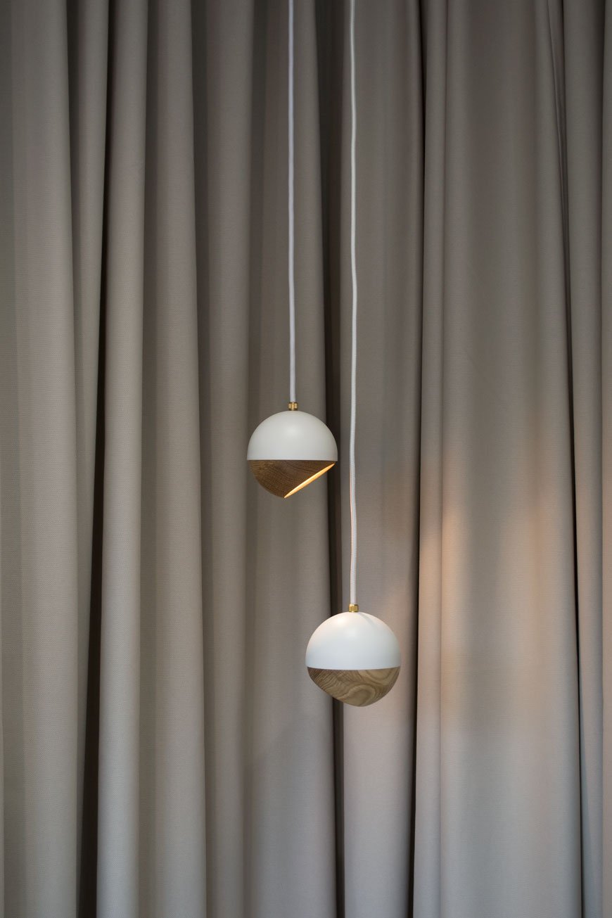
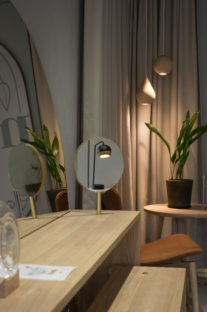
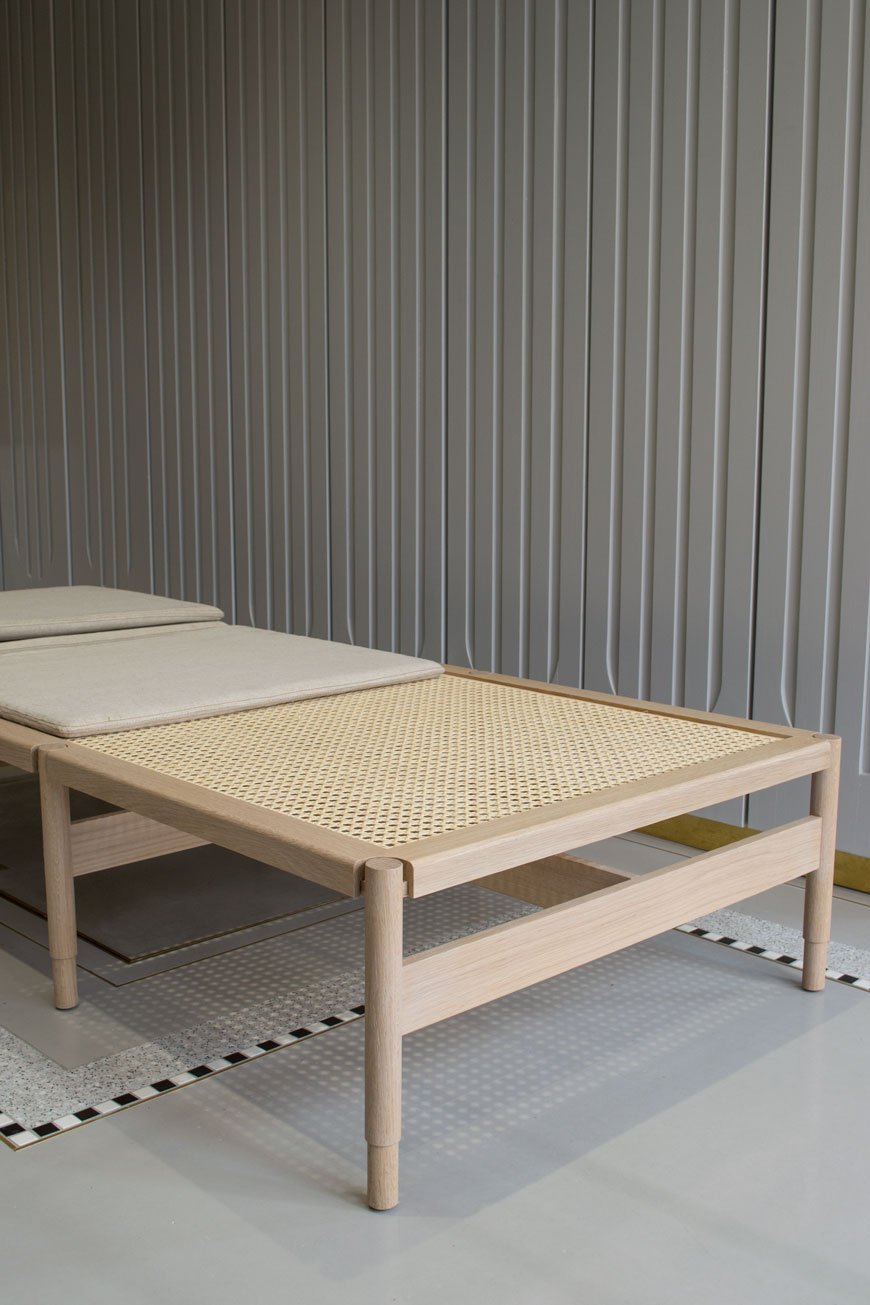 A daybed to die for - had I the space for it. The Winston, named after Churchill blends classic cane made in a 3rd generation Danish wicker workshop with a contemporary silhouette. The canvas seat is GOTS certified and the oak is FSC certified.
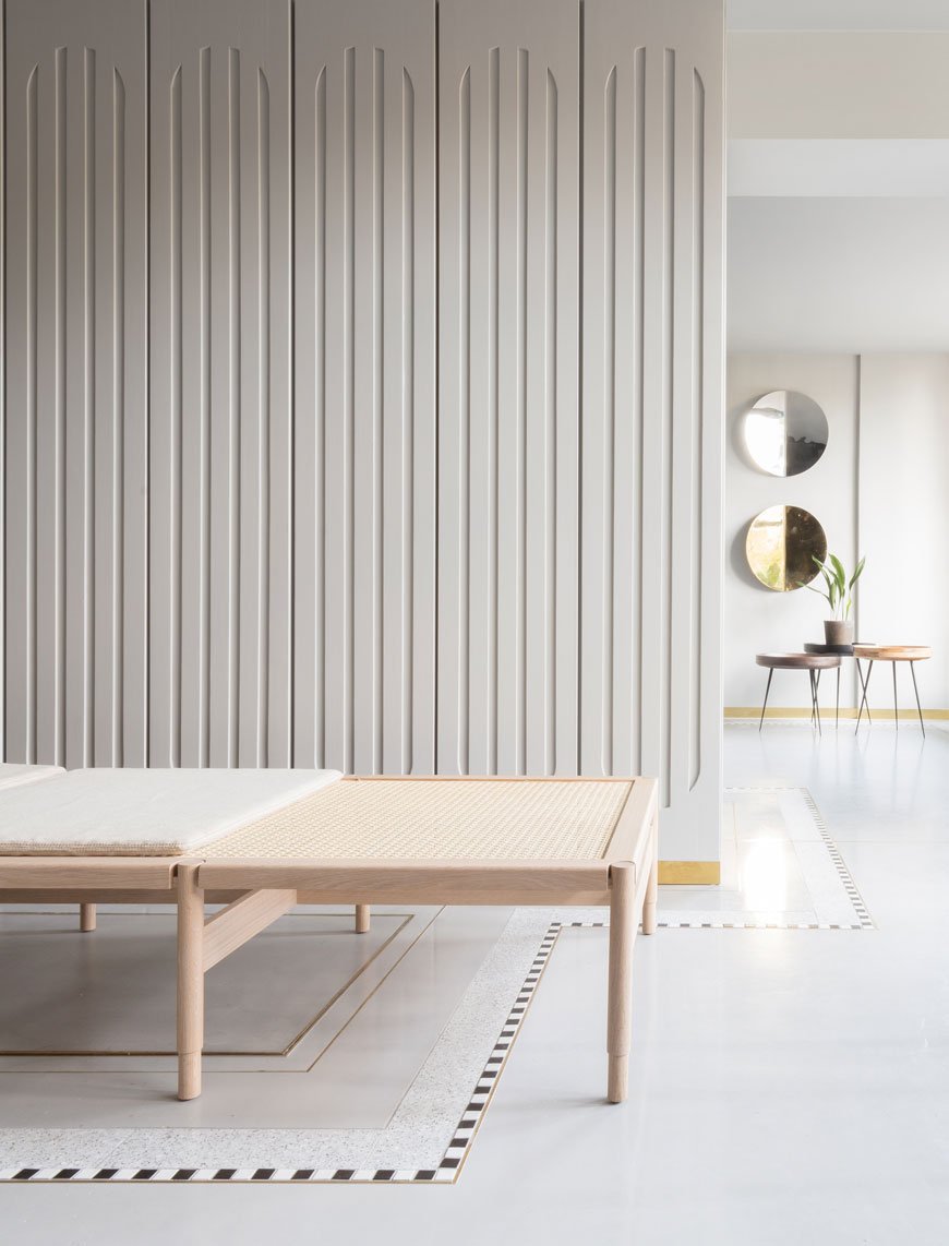
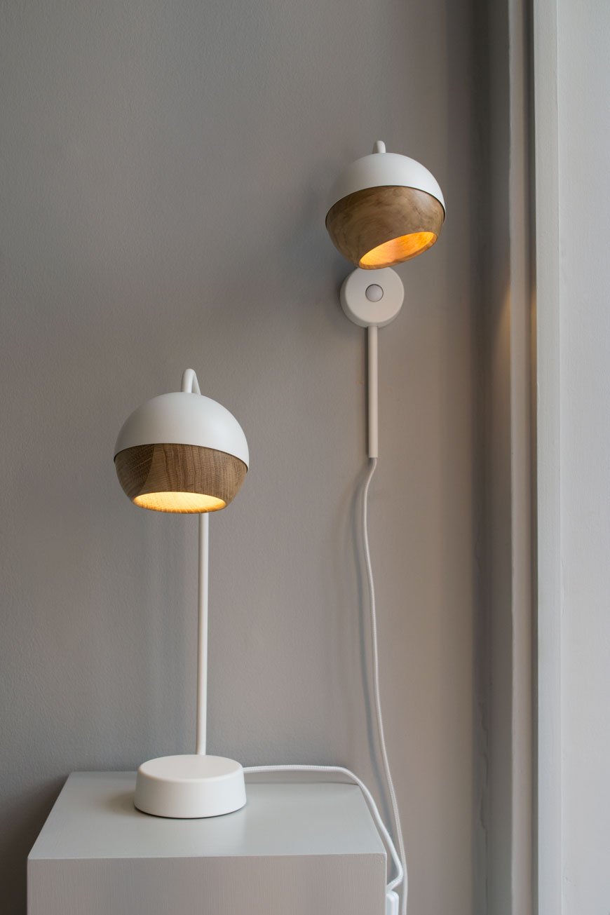 This is a calm space in which to see the collection. I instantly see soothing, tactile shapes when I think of Mater. From smooth Sørensen leather to the cupped oak of the Ray lamp, there are curves in almost everything here, bringing it all back to nature's form.
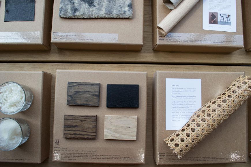 It's easy to stick a sustainability label on something and assume that's enough proof, but each step of the production process has a knock-on effect. You could say that it would be more sustainable to use the furniture we already have above making more. That said, it's important that designers and manufacturers move forward and claim greater responsibility in the way things are produced. As consumers, we need to educate ourselves in these practices and in turn change the way we consume. And of course, no production process is completely perfect, but better to be meticulous with what you do have control over than to ignore it entirely. The amount of plastic we're now having to find solutions for speaks volumes that old attitudes won't fly anymore.From day one, Mater has taken steps to ensure their practices take responsibility for supporting craftsmen with a fair living wage, good working environments and that their processes don't have a negative impact on the environment. This includes looking at water usage, the disposal of waste product and the social impact. Most of their collection is manufactured with FSC approved wood or mango wood which is a by-product of the mango fruit industry. The trees are felled after they no longer fruit and a new one is then planted in its place. They also use recycled aluminium (as seen in Space Copenhagen's stool) and LED lighting in a bid to make their lighting energy efficient.
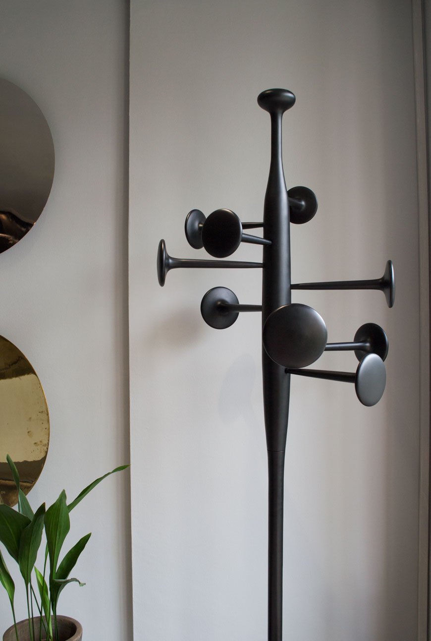 If you'd like to find out more about Mater's journey in sustainable design I would urge you to visit the London showroom. Experience the collection for yourself and ask as many questions as you like, the team are lovely.
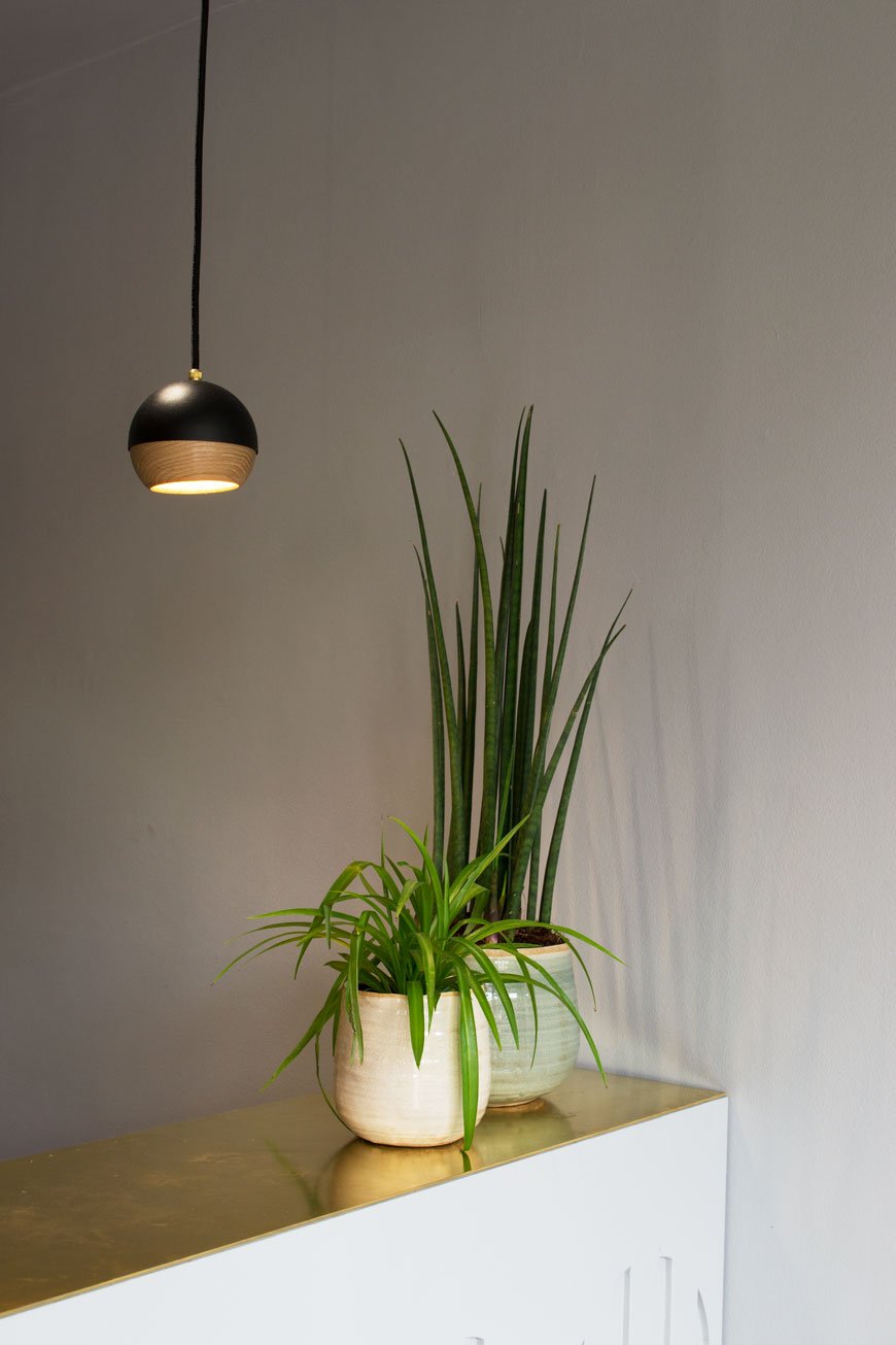
Visit the Mater Earth Gallery
36 Myddelton Street, Clerkenwell, London.
Additional photography © Tiffany Grant-Riley
Laura Slater x The Plant Room LAND at LDF
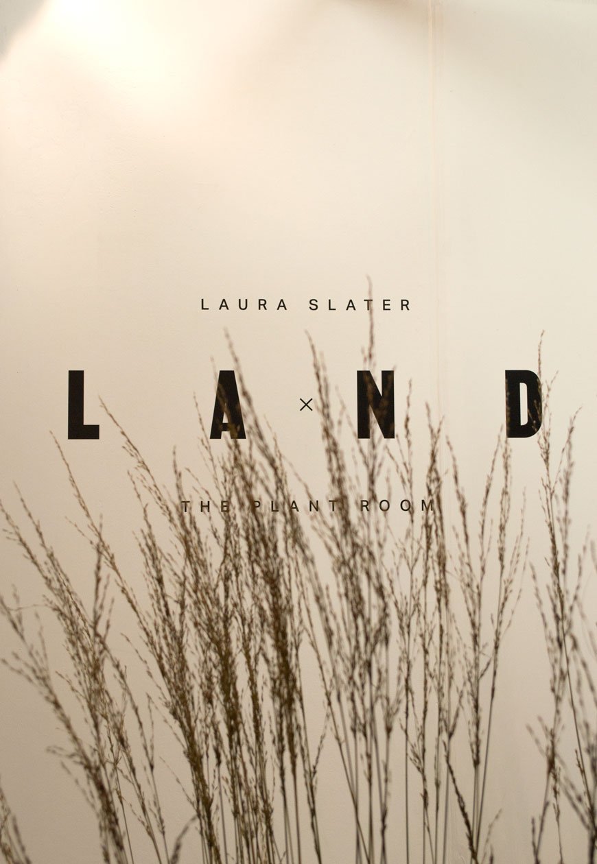
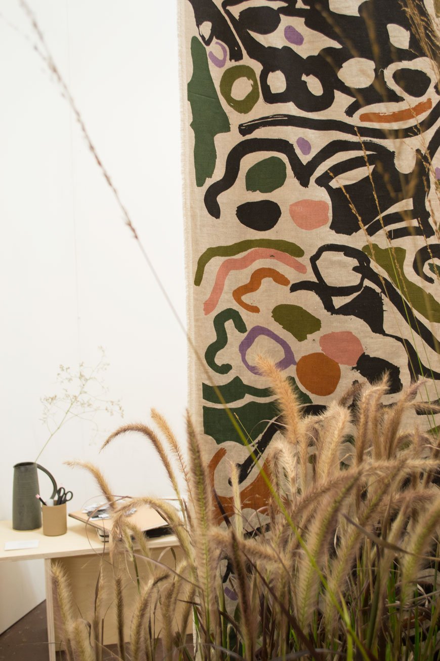
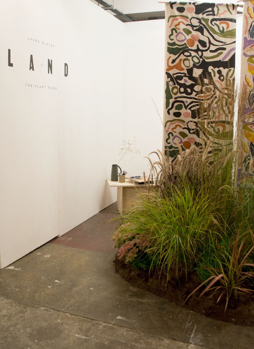
One of the biggest highlights of my LDF experience this year was the LAND collaboration between textile designer Laura Slater and Zosia Berkieta-Lewis of The Plant Room. My photos really don't do it justice, but it was so beautiful that I have to show you.
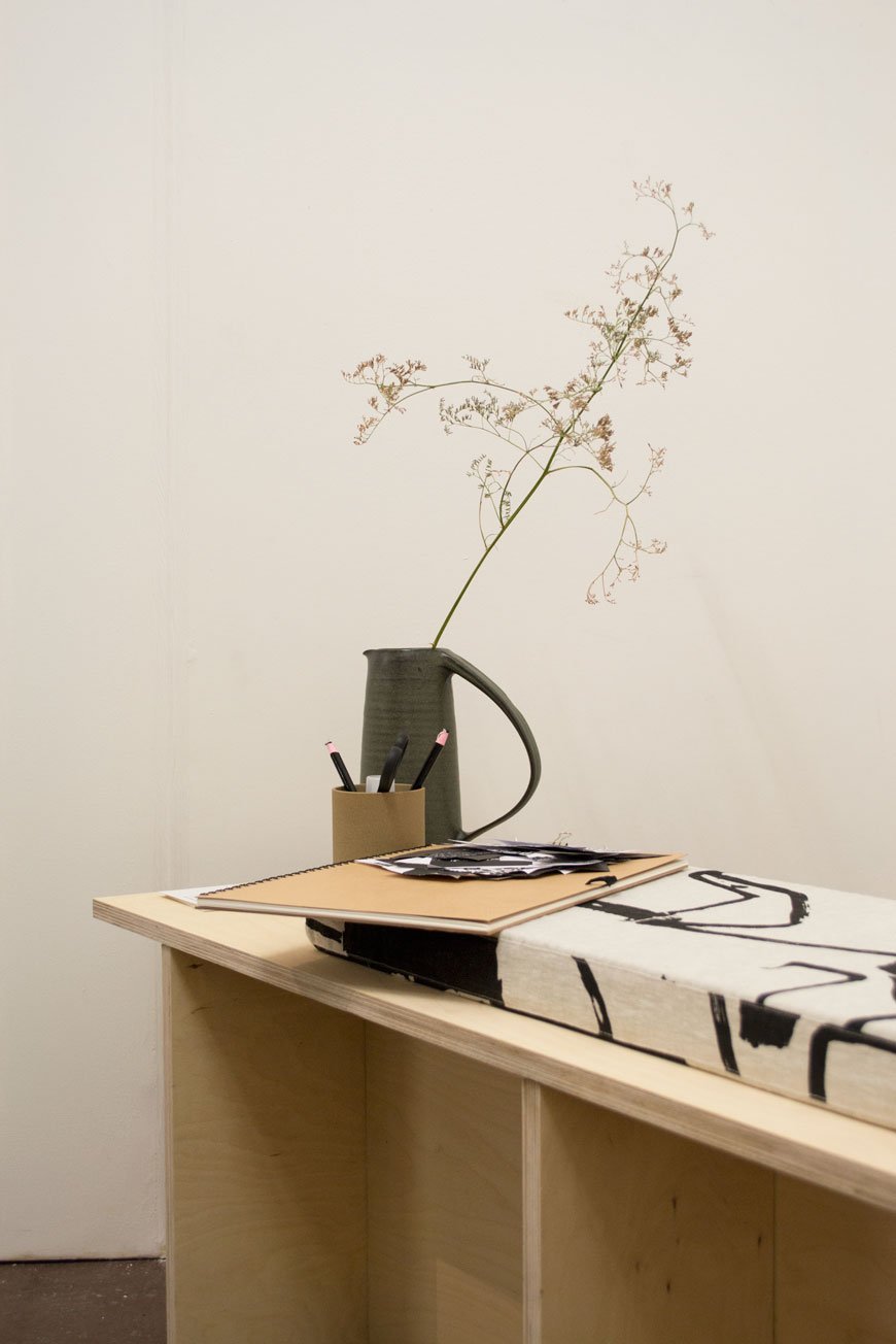
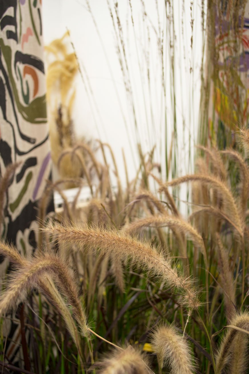
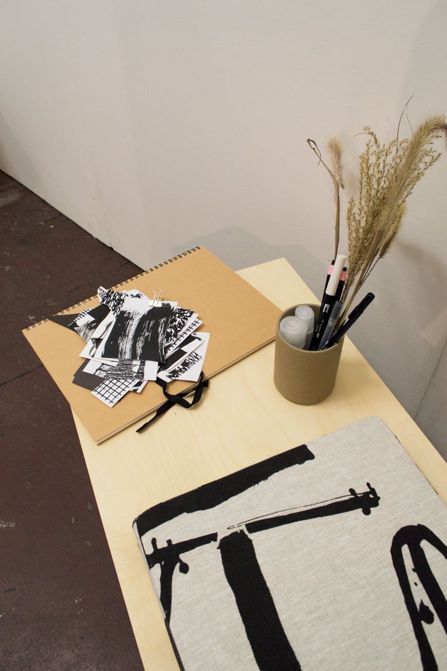
Both based in Leeds, these two incredibly talented women came together with the support of a Kickstarter campaign. Bringing Laura’s bold, printed textiles and Zosia’s flair for botanical design, LAND showcased Slater’s new collection of the same name. Set amongst a prairie-style mini garden, the installation doubled up as an interactive experience promoting the restorative nature of plants. Visitors were invited to draw their observations in sketchbooks or to simply sit on custom made benches and drink in the calm.
A common thread running through LDF 2018, slow and restful spaces were an indication of society’s need for tranquillity amongst the pressures of everyday living. As an advocate for the benefits of slow living and the positive effects it can have on our mental health, I was so pleased to see this topic being explored in more depth this year this.
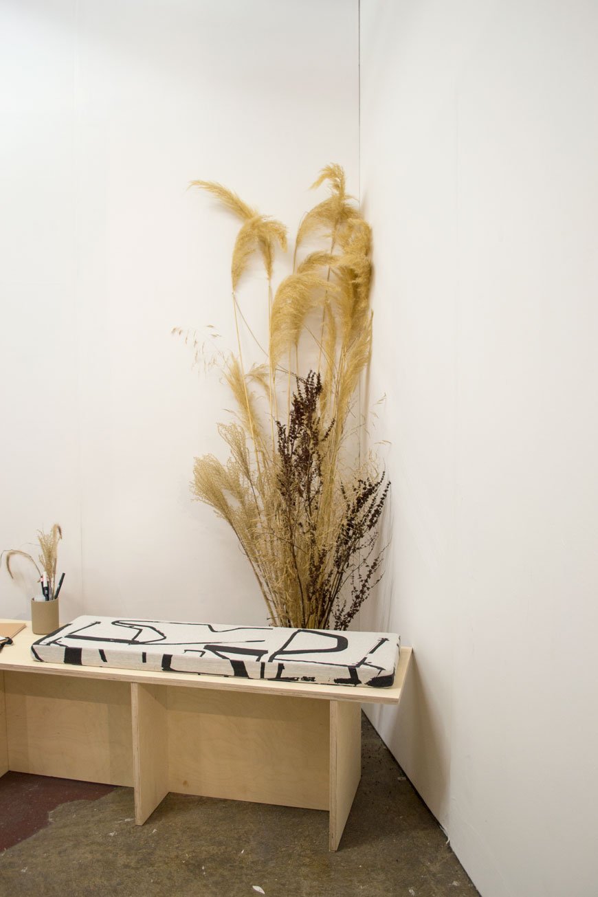
Inspired by a five-week residency at Cove Park, Scotland, Slater spent much of her time there exploring pattern. Her free-form drawings emerged as interpretations of the natural surroundings of the Rosneath Penninsula. The result of this became her LAND screen printed collection which can be seen hanging behind the garden.
Zosia’s own work involves designing botanical installations for various platforms - events, shops, workspaces. Her style is wild, expressive and textural. We talked about our mutual love for grasses and the Dutch garden designer Piet Oudolf. If you're not familiar with his work, you must take a look.
When I got home, I was inspired to order more grasses for the garden. And I may have bought some of the black 'Monolith' fabric seen on the benches for our bedroom project too. Because it was just too perfect to pass up.
Photography © Tiffany Grant-Riley
[AD] Nordic Luxe Beige Bedroom Inspiration
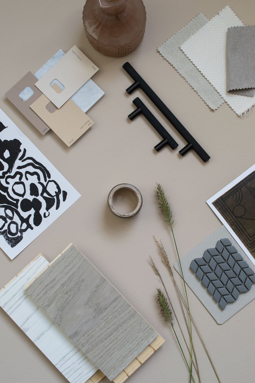 [AD] This is a paid partnership in which various products have been gifted*. Neutral interiors get a really bad rap as boring and unimaginative. The thing is though, there's just as much skill that goes into making neutrals work as there is for playing with bold colour. As the renovation work draws to a close on our current project, I'm sharing my latest mood boards, talking you through the inspiration behind our Nordic luxe beige bedroom. You'll find tips and tricks on how to lift a beige scheme and turn it into anything but boring.
The Brief
We wanted the bedroom to have a design hotel feel to it. A sanctuary to escape to with a focus on high-quality, luxury materials whilst remaining faithful to the period features of the house. If there's one thing I've learnt from the many hotel stays I've experienced over the years, it's the attention to the absolute essentials that matter. It's a feel of a soft rug underfoot, well-chosen lighting and the way the room has been designed to enhance sleep and relaxation. I've also been so inspired by what the likes of Menu, Fredericia and Muuto have been doing as brands that I wanted to recreate the minimal luxe look in our room.It was important that the bedroom connected with the rest of the house so I wanted to continue the thread of high contrasting tones (in this case black and grey) with pale wood and abstract art. The room needed to be minimally styled for it to be a restful space in which to wind down.
Choosing The Right Shade
Our bedroom is north facing and the light has a cool quality to it at certain times of the day so anything with blue undertones was out of the question. If you have the same problem, choosing a colour with warm undertones of red or yellow might help.Letting go of the plaster walls was a difficult decision (and so many of you echoed those sentiments on Instagram) but it was time for a solid colour, something just as soothing but warmer. Finding the right shade of beige took some doing - I went through so many samples I almost couldn't see it anymore. And then Valspar pulled it out the bag. Hello, the aptly named 'Lark Song'. I'm hoping you can see the red undertones from the shots I took below?Having chosen the colour, I wanted to continue it into the woodwork too, using satin paint in the same shade for a subtle sheen on the skirting, doors and around the window. This will give the bedroom a contemporary update and bring out the contrast between matt and sheen.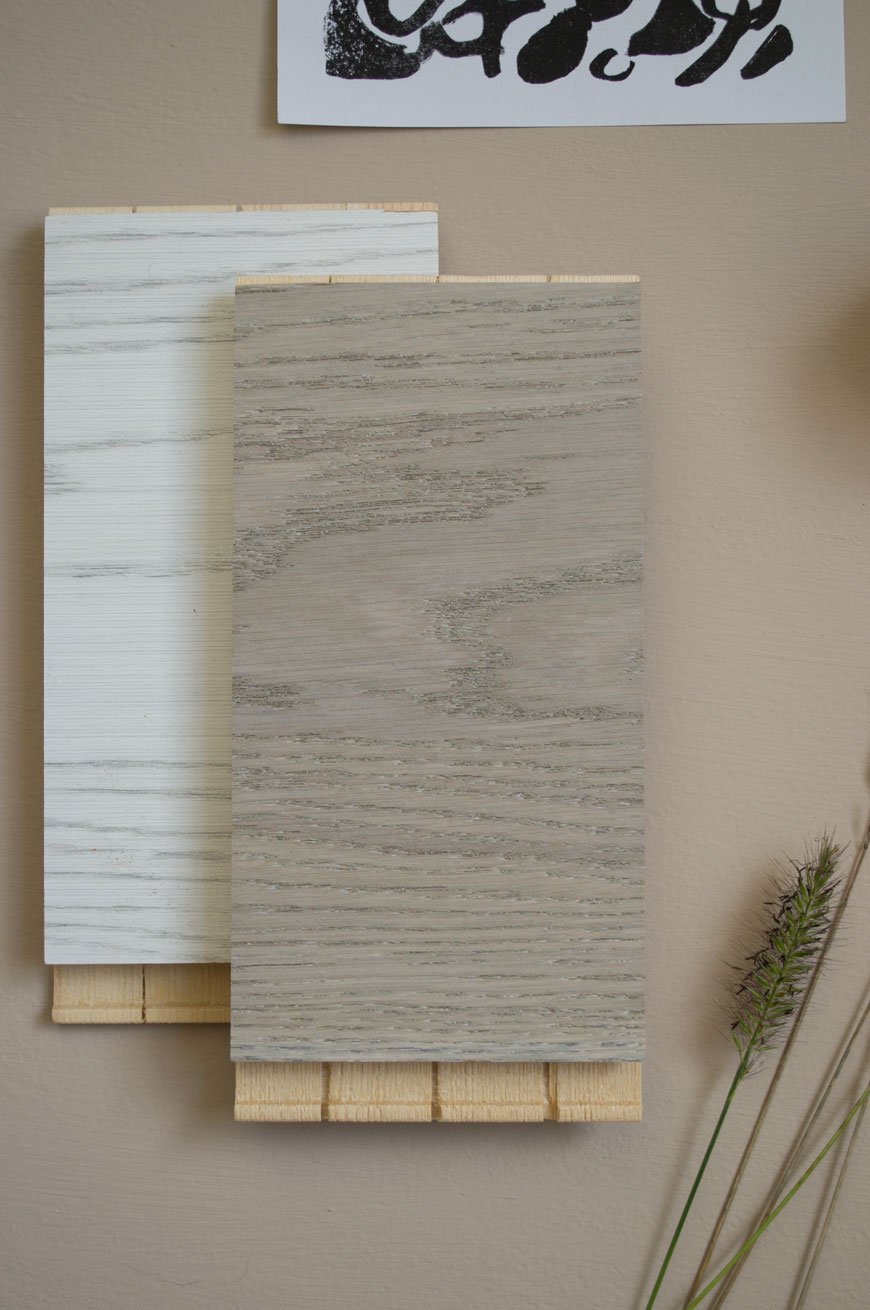
The Floor
This was the first room we've done in the house where we decided to put a new floor down. Although the original floorboards are in good condition, they make the room feel cold in the winter months and the idea of sanding and staining them filled us both with dread. Great in the kitchen, not in here. So a few months ago I spent a very easy hour at Havwoods, comparing their engineered wood flooring samples and looking for something with a washed, grey tone. I eventually arrived at Shadow Grey, a real oak design from the Karelia range which has been brushed and stained with an oil finish. These boards work on a click system and I'll be able to share the installation with you once the floor has gone down next week.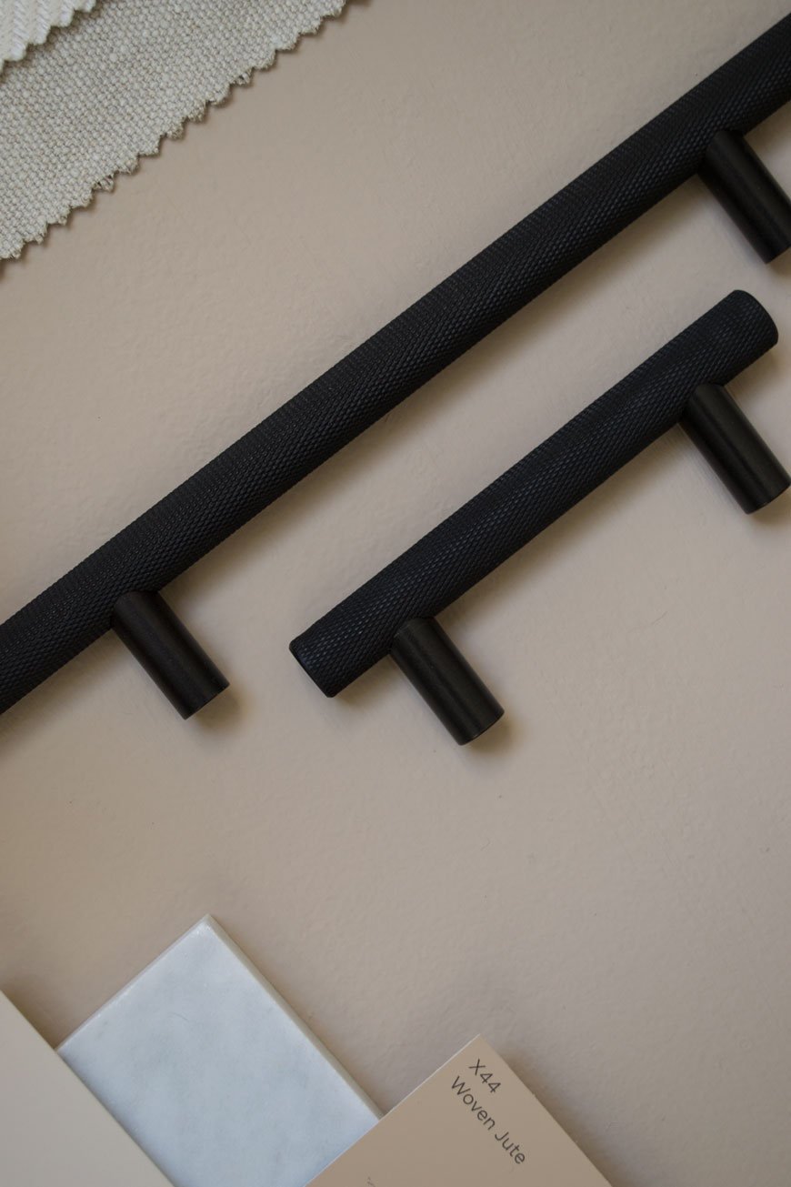
Natural Elements
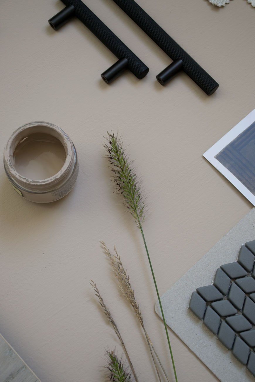
I'm going to highlight the tonal relationships between the beige walls, grey floor and light oak furniture. There'll be a small reading nook in the corner where my desk used to be, with SSM's ash and leather 'Shelf90' for a collection of reads and Fredericia's 60 Years Special Edition Spanish chair. The olive green leather is to die for. I literally can't wait to pull this corner together! The mix of smooth leather, light wood and linen on the bed itself will create a harmonious feeling, to feel easy on the eye.Of course, no room in our house would feel right without some element of planting, so I'll be using a mix of dried and potted grasses to style with. I'm obsessed with grasses and have been growing several varieties in our garden the past year.
High Contrast and Tactile Finishes
It's so easy to make a beige bedroom scheme feel flat if you ignore the contrasting elements. I'm talking about the darker shades that give it depth. In the kitchen I used dark blue and black with white, in here I'm continuing the black. I've picked out knurled, black metal cupboard door handles which echo the style of the ones we used in the kids' room. Against the beige doors, they'll ready pop. We'll also be tiling the hearth plate in a matt glass mosaic design which gives a level of tactility without the need for colour. The grey in the tiles will pick up against the anthracite grey column radiator which we've chosen to compliment the age of the house.A deep pile rug in Graphite draws on the design hotel feel we wanted and abstract art continues the thread from the sunroom and kitchen. Remember, texture is key. Whether it's polished marble or metal, sheepskin or woven fabrics. Mix up the texture and you'll add depth and interest to a neutral design scheme.We're so nearly there now. The next couple of weeks is going to be a mad dash to the finish line but it'll be worth the wait to show you the transformation!
| 1 | Ray black wall lamp, Mater* | 2 | Oak frame, Cox & Cox* | 3 | Terracotta pitcher, Another Country | 4 | Morten oak chest of drawers, Heal's | 5 | Shadow Grey engineered oak flooring, Havwoods* | 6 | Black standing planter, Cox & Cox* | 7 | 'Collage' screen print, Laura Slater | 8 | Ash and leather 'Shelf 90', SSM* | 9 | Dolce rug in Graphite, Houseology* | 10 | Spanish Chair 60 Years Special Edition, Fredericia* | 11 | Confiserie Fogg mosaic hearth tiles, Claybrook | 12 | Skyscraper knurled handles, Dowsing & Reynolds* | 13 | Grey column radiator Anthracite, Trade Radiators.
Photography & styling © Tiffany Grant-Riley
STILL By Form Pop-up Restaurant with 26 Grains
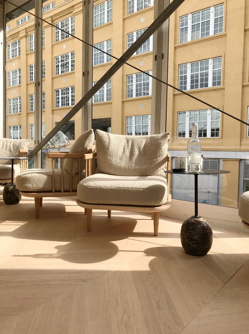
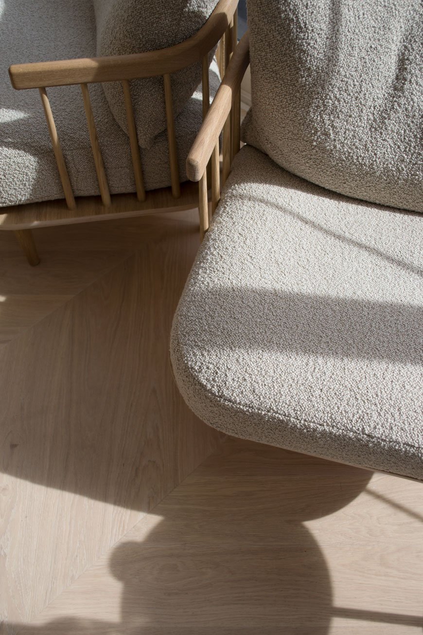
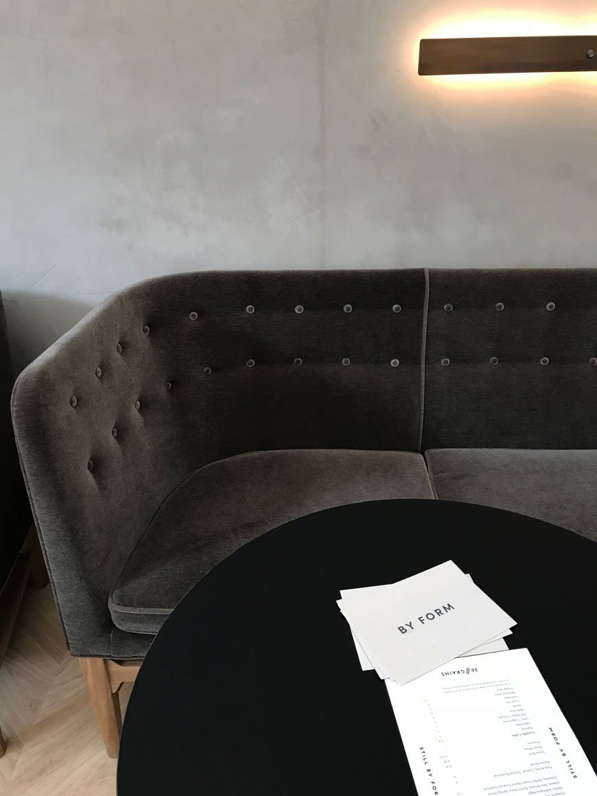
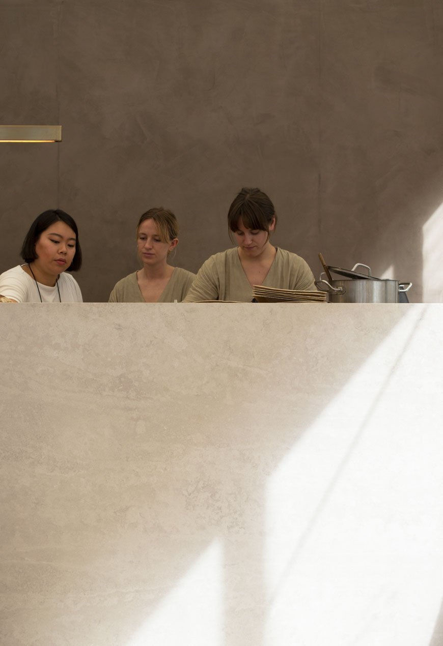 During an intense few days covering London Design Week, I find myself cocooned inside a tranquil haven, set amongst the hubbub of DesignJunction. A pop-up restaurant aptly named STILL, the temporary space is a collaborative project led by design consultancy BY FORM and Scandinavian inspired restaurant 26 Grains.Influenced by Danish design and Japanese aesthetics, STILL holds space for quiet contemplation and relaxation in which to refuel on wholesome dishes and refresh your senses. The perfect antidote to sensory overload, the restaurant imbues the essence of Nordic minimalism. From the soothing colour palette and gentle textures to the carefully chosen soundtrack. I do not want to leave.The restaurant showcases current and emerging design brands represented by BY FORM, including the instantly recognisable furniture from &Tradition and textiles by Kvadrat. Elegant Mayor sofas upholstered in dark grey velvet line one wall with Anderssen & Voll Pavillion chairs facing opposite. Choosing pieces with light and airy frames, the overall effect gives STILL a feeling of space, of room to breathe. Along the full height wall of window, Fly chairs sit drenched in sun, throwing out stark shadows across Atkinson & Kirby's brushed oak floor.
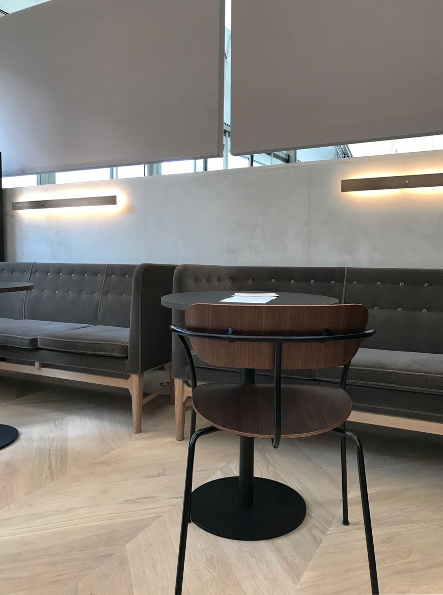 Acoustic technology developed by Zilenzio screens the outer shell of the restaurant. The Kyoto screen collection was designed by Note Design Studio and was inspired by the tearooms from the same place. The sound absorbing walls do a great deal to cut out external noise, no mean feat in such a vast tented space.
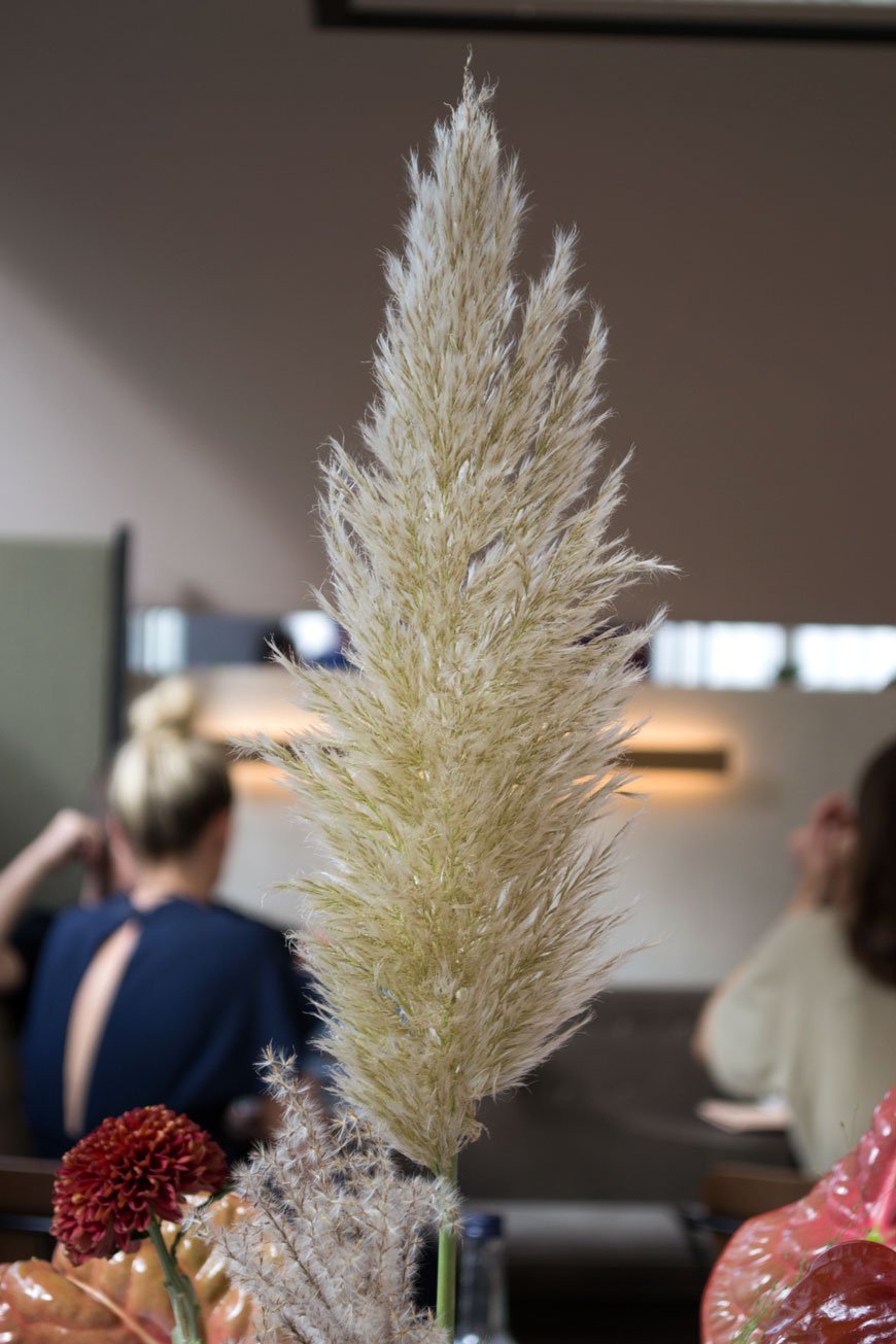
 I was amazed to see plaster used on the walls here. The BY FORM team applied it themselves using KABE Copenhagen, a DIY coloured plaster which enables you to polish it to a fine finish. Again inspired by the Japanese, the KABE plaster provides a restful, raw backdrop for STILL and with 37 colours in the collection it had most of us considering it for our homes too.Simple, wholesome fare by Neals Yard cafe 26 Grains gave depth to the whole Nordic experience. Influenced by her year working in Copenhagen, founder Alex Hely-Hutchinson brings elements of Scandinavian cuisine to her own menu with a specific focus on the exciting ways grains are used within dishes across the board.

 And so it was on to the next location, replete, recharged and ready for the next experience...
Photography © Tiffany Grant-Riley
Plant Heaven At Botanical Gardens Meise
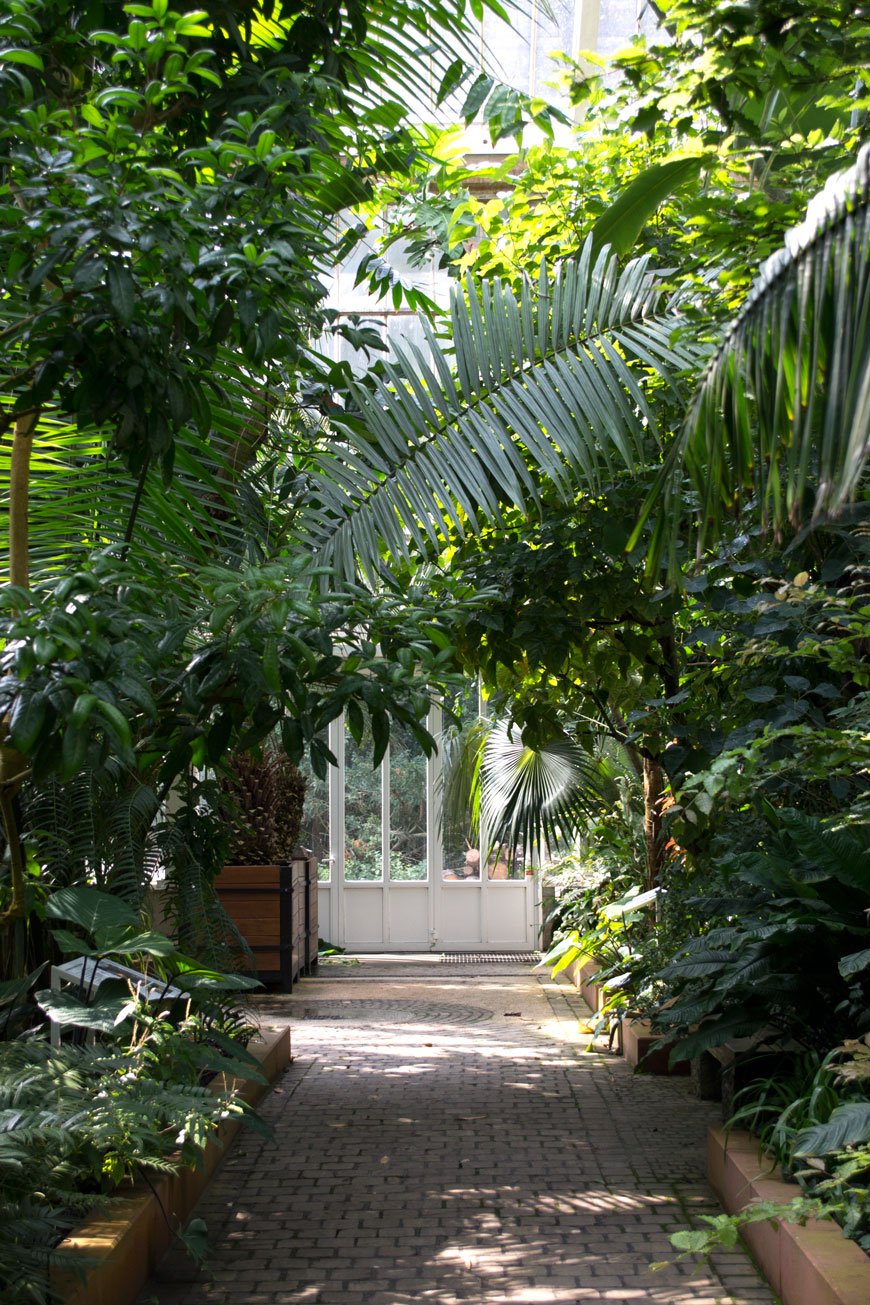
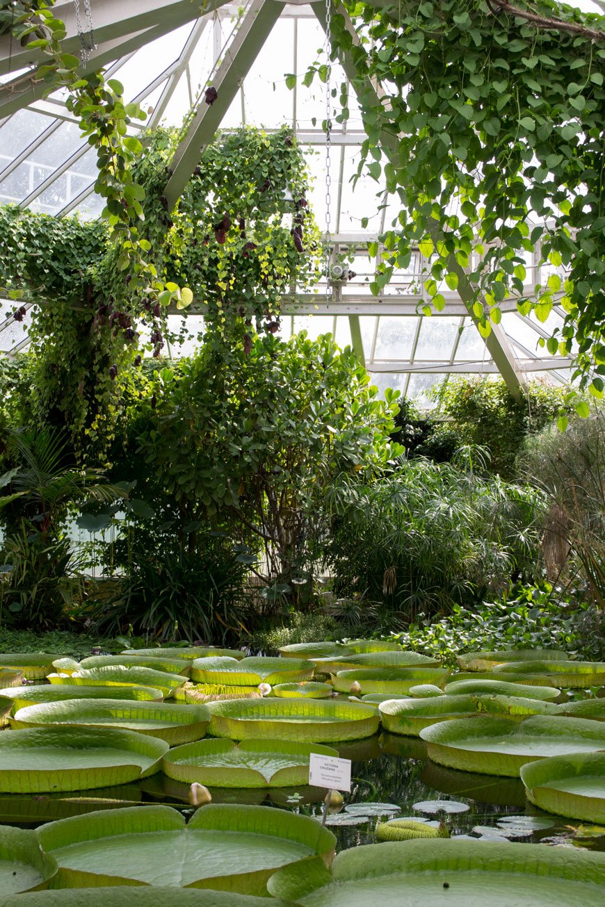
 I'm doing my best to channel all of the calm this week, which marks the launch of London Design Week 2018 (yaaaaasssss!) and my daughter's 5th birthday. It's about to get crazy busy. As this is the first LDF I'm covering for more than one day of events, it means there's some serious design coming your way next week.Today, though, I'm transporting you to the Botanical Gardens Meise. For our family break this summer, we decided to explore the city we've been to many times but only in passing through. The city is fairly compact and we were surprised at just how much there was to do which wasn't remotely touristy. Ok, we did visit the Atomium (the one touristy thing we did all week) but it was worth being herded around for the history of the architecture.Obsessed plant lady that I am, I was determined to visit at least one tropical garden over the summer and although Royal Greenhouses of Laeken were closed, we made it to Meise on a sweltering afternoon. Thankfully, gardens are the one place kids generally don't get bored with as long as there's space to run around so I was happy to disguise a totally selfish trip with something fun for the kids. Ha.With a history dating back to 1796, the botanical gardens house more than 18,000 species of plant, including 13 separate environments within the plant palace. Just 20 minutes outside of Brussels by bus, the gardens feature one of the most stunning glasshouses I've ever been in. And I don't say that lightly. I honestly began to well up with the sheer enormity of it all when I stepped through those sliding doors. The heat, the humidity, the quiet. Just wandering aimlessly, gazing up at banana and palm trees which would dwarf our house in height. Giant lily pads strong enough to support a baby (and they have!) Cacti standing like resplendent sculptures. I could go on but instead, I'll let the photography do the talking. And if you ever find yourself in Brussels, make a little effort to seek house Plantentuin Meise. You simply must.





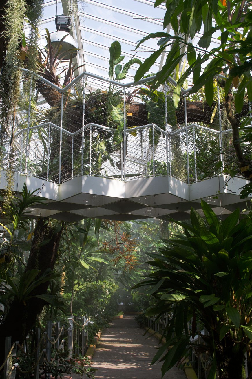
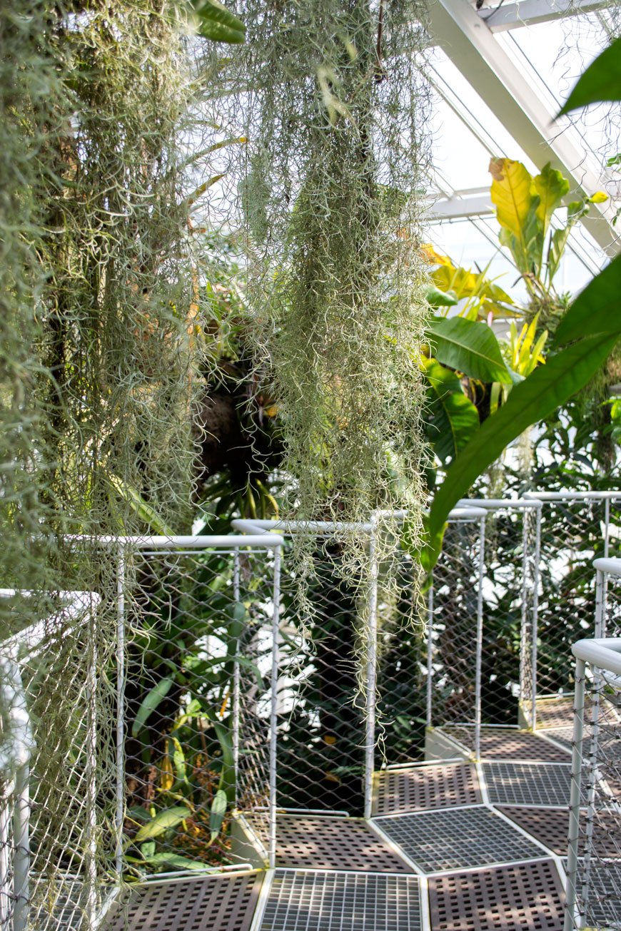
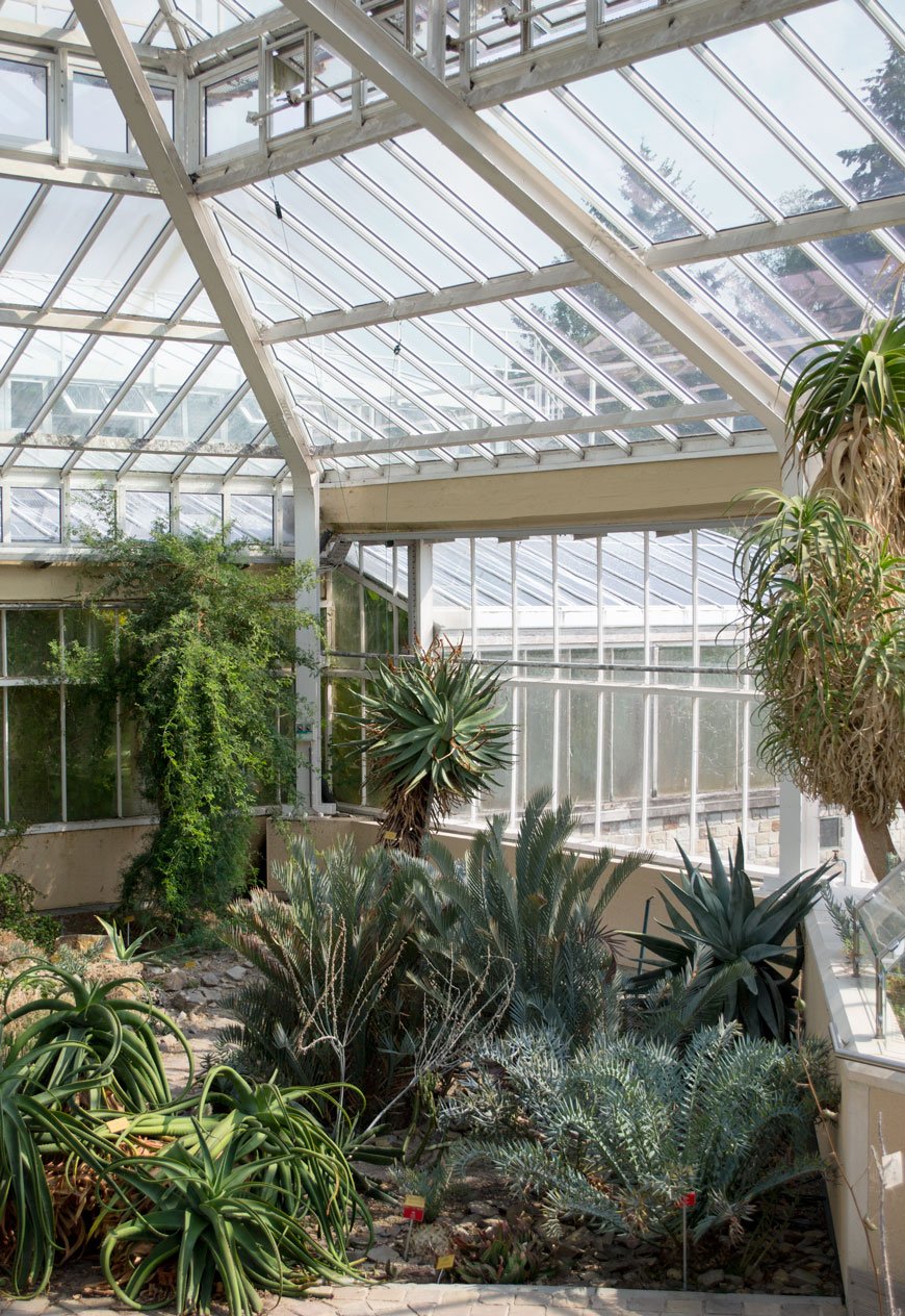

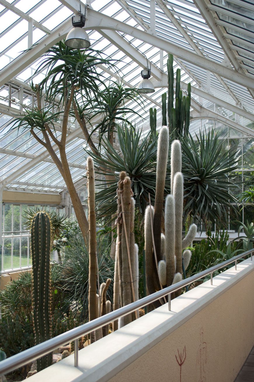
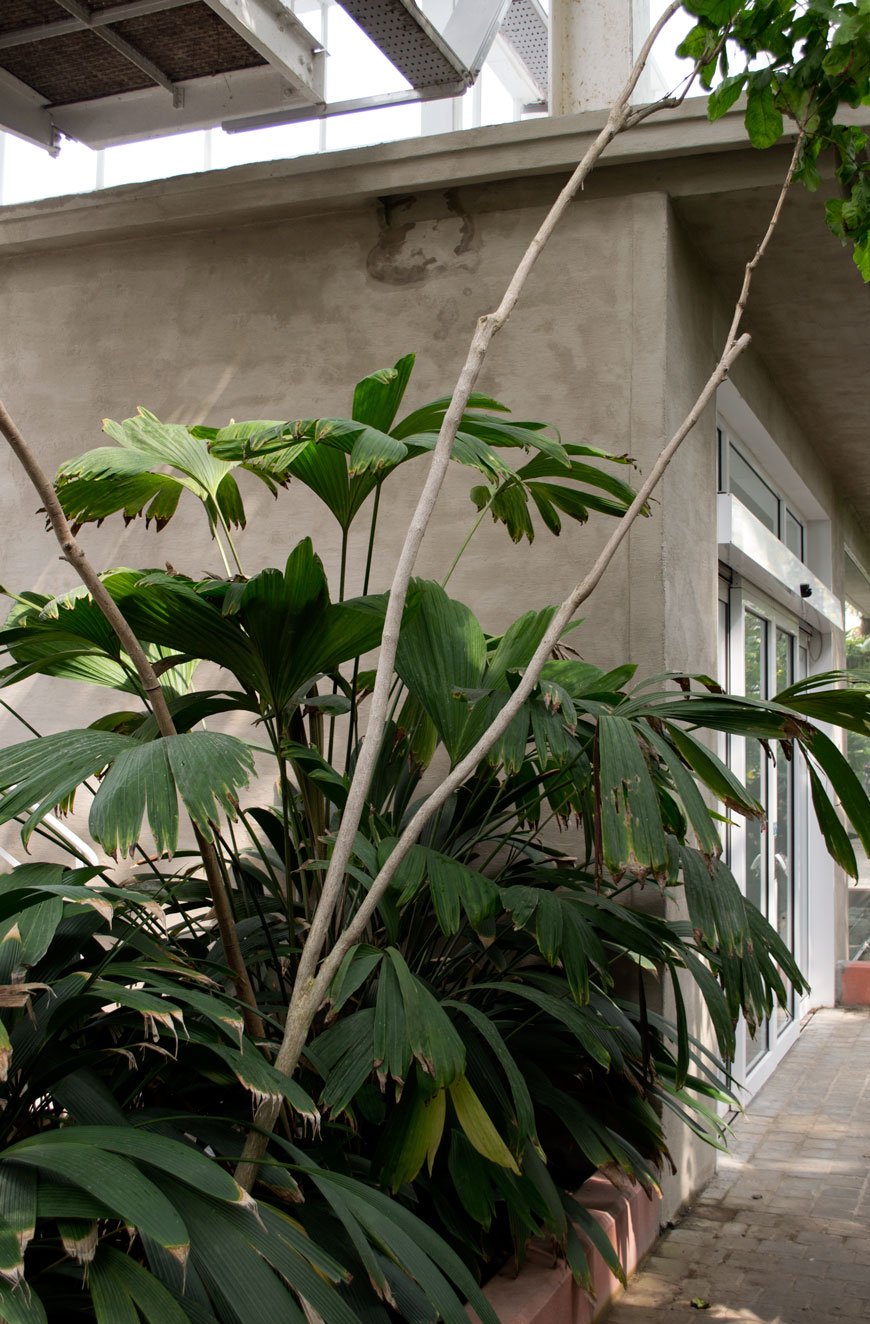
Photography © Tiffany Grant-Riley
Striking Monochrome Kitchen in A Warm Gothenburg Apartment
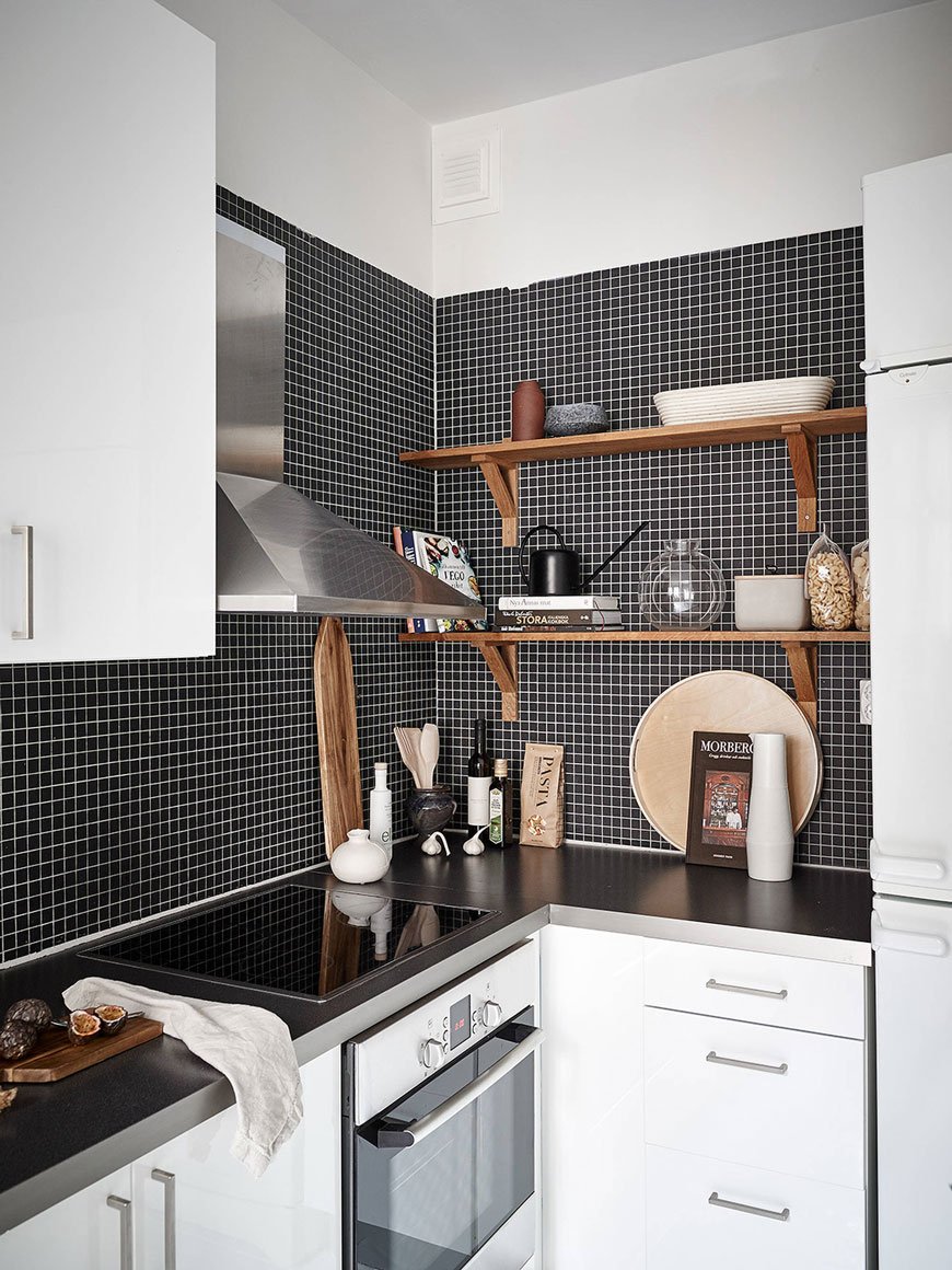
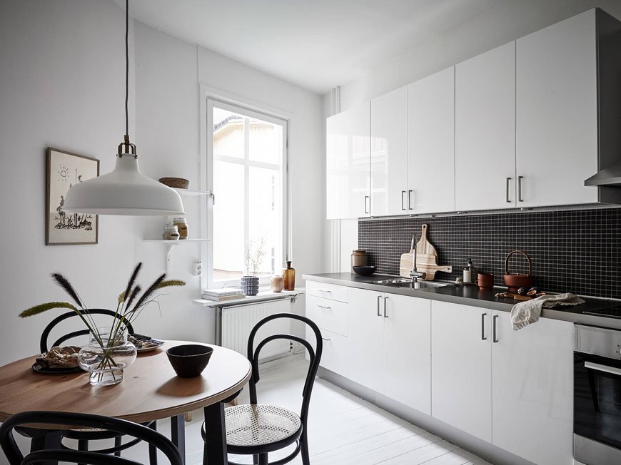 If only all estate agents took this much care with their properties. I actually despair at the way we sell houses here, home staging is the last thing on any seller's mind when it really ought to be the first. So while I don't haunt the UK real estate sites much, I do spend a fair bit of time trawling the Scandinavian ones for the pure joy of the way they get it so right.You know I love a kitchen with period features. This turn of the century apartment in Gothenburg hit me right between the eyes. With the right balance of period features and contemporary design, its most striking feature is a monochrome kitchen with black mosaic tiling. In fact, let's start there shall we?
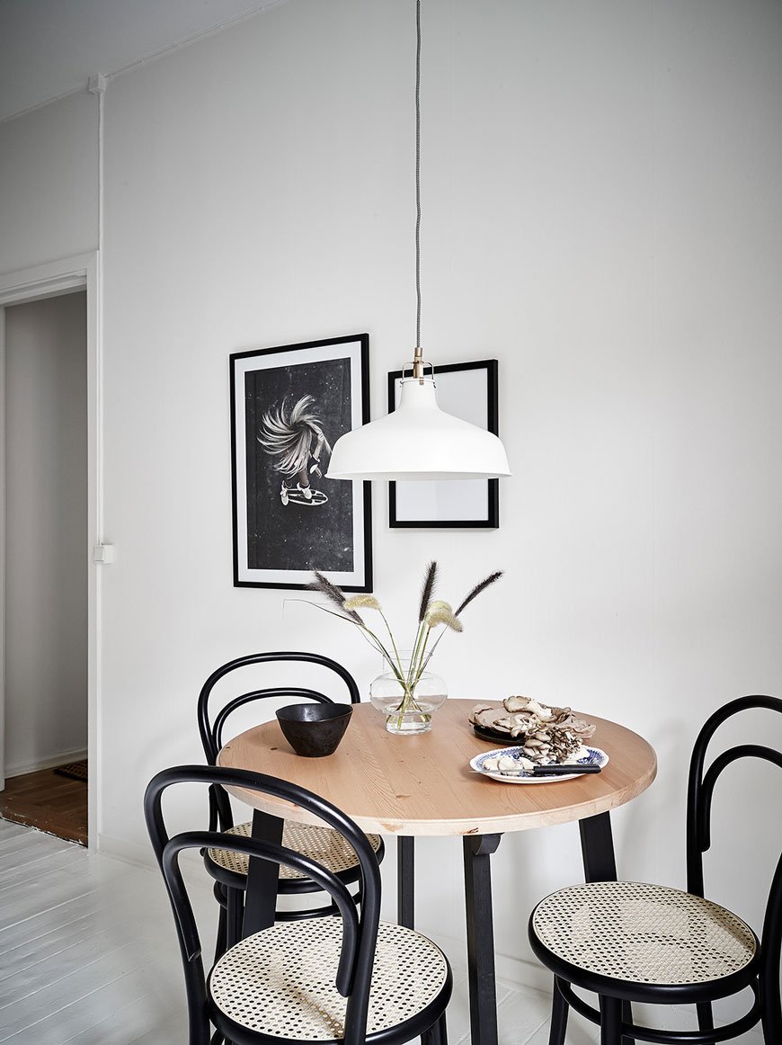 Classic Thonet coffee house chairs in contemporary black lend themselves to the period of the building, referencing the black mosaic splashback. I've yet to see a monochrome kitchen done better, particularly in a modest space.
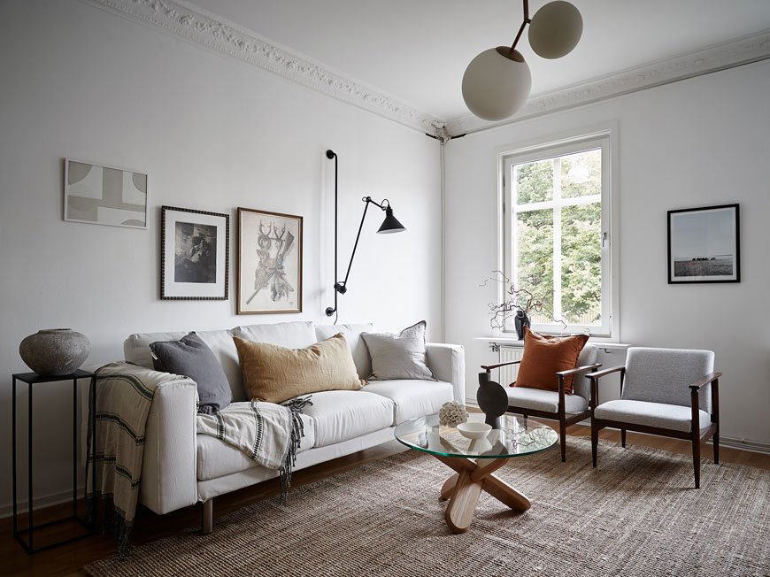 Absolutely drenched in light, the white walls highlight the beautiful stuccoed ceilings and tiled fireplace. New parquet flooring brings an element of warmth to the apartment while lofty ceilings give a feeling of grandeur, typical of buildings of its era. I love the touches of terracotta and saffron yellow throughout.Carefully chosen pieces of art add personality and interest, combining natural woven textures in the large living room rug with tactile ceramic vases and abstract art.
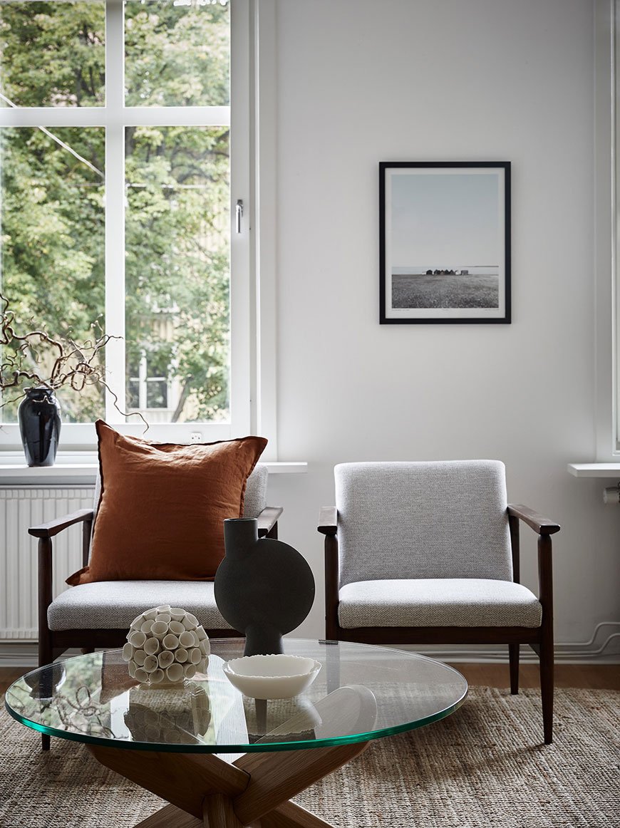
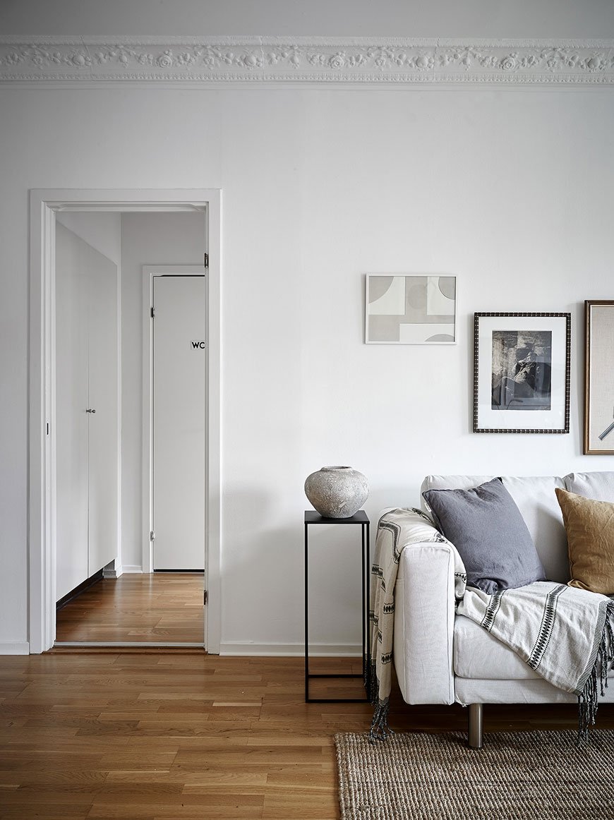
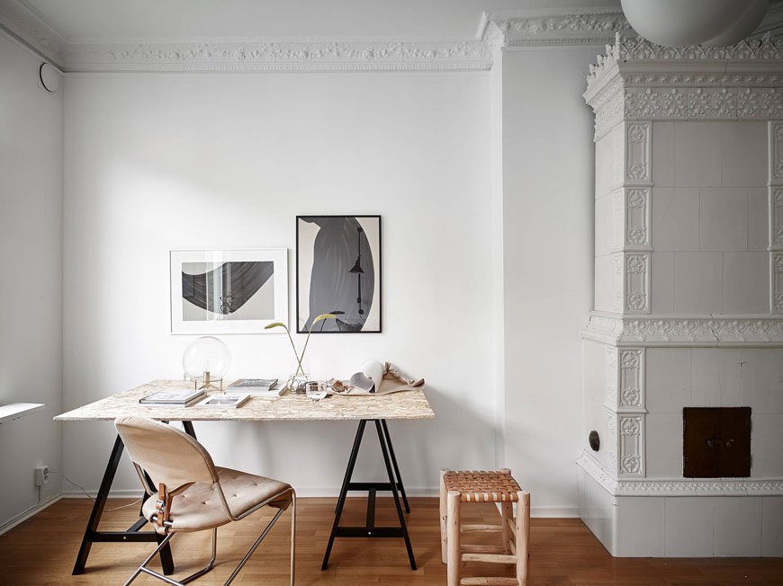
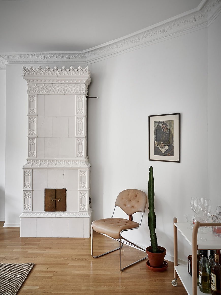 I adore the original Swedish fireplace, although this one isn't functioning, it's pieces of historical interest like this that give this home real character.
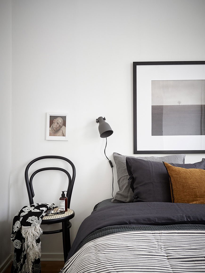
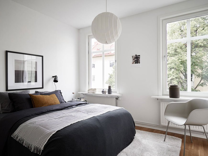 A clutter-free bedroom with only the essentials feels open and airy with tall windows looking out onto trees and the contrast as seen in the kitchen is echoed on the bed with dark blue, grey and spice linens and throws.I'm completely in love with his apartment. It doesn't shout or work too hard to show off the character and the quality of light is key in making this property feel spacious. What do you think?
 Photography © Jonas Berg for Stadshem.
[AD] Bedroommood Crisp Cotton Sheets
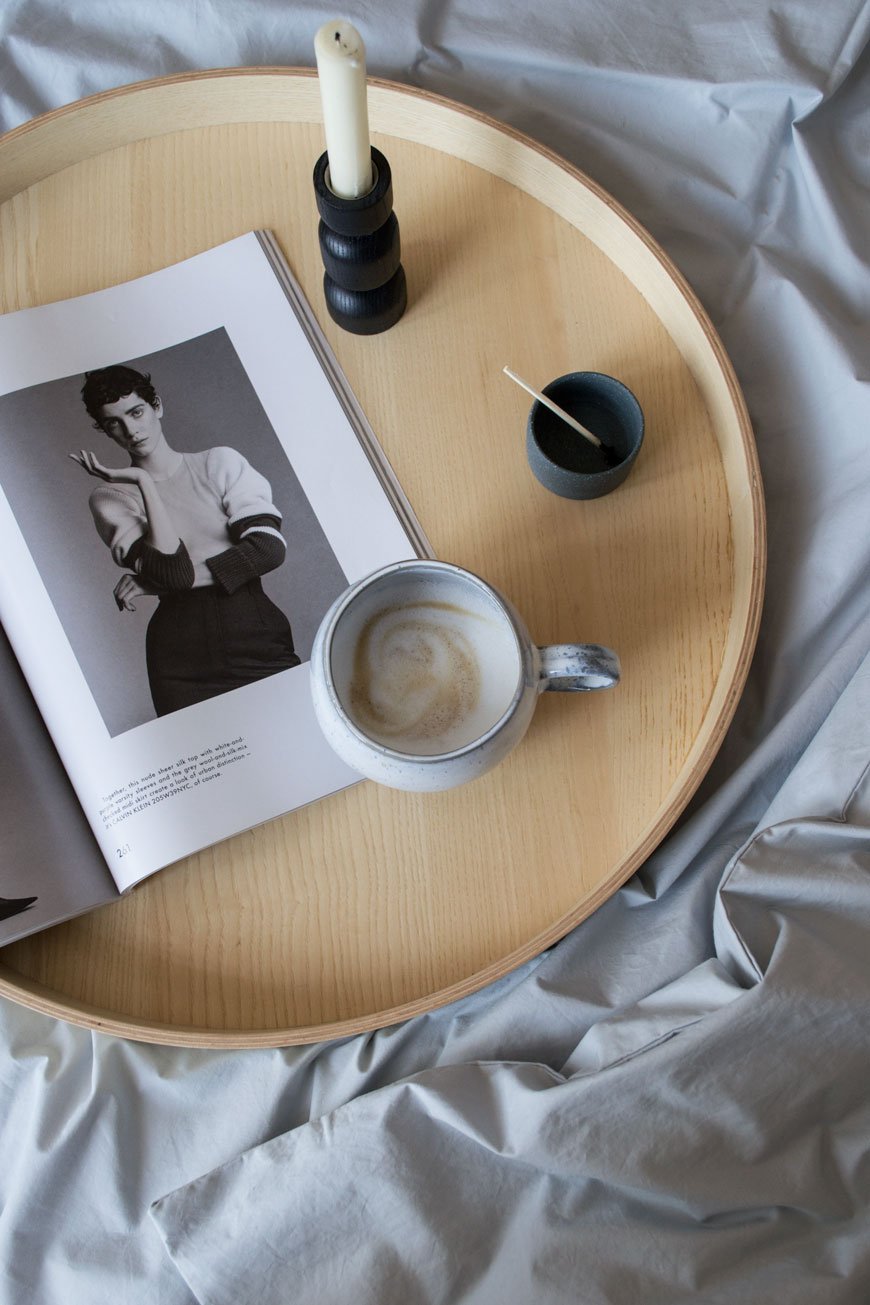 This is a paid partnership in collaboration with Bedroommood. I love September. It feels far more like the beginning of New Year than January. Maybe it's the fact that school starts back or it's the London Design Festival this month, but either way, it feels like a month full of possibilities. Know what I mean?How was your summer? I spent mine enjoying a slower pace, finding inspiration in the garden. And running around with the children - can't slow down too much! The bedroom already looks like a hotel room following its fresh coat of paint - Rob spent a few days on it while we gave him some space up in Suffolk. I can't wait to share it with you in October!In anticipation of the colder months, I've swapped out the linen bedding in favour of crisp cotton sheets from Bedroommood. Made by a small team in Lithuania, the founders find little luxuries in the fabric they've chosen. Championing Oeko-Tex® certified Egyptian cotton (which means its grown and processed with no nasties) it's woven with a minimum of 300 thread count, meaning it's a softer, stronger quality than average.Designed with a minimalistic approach in collaboration with designer Vida Vyšniauskienė, the collection sticks to a palette of blues, greys and white with the option of matt percale or sateen for a slight sheen.
We believe in simple things. We are fans of minimalism. We wanted colours that would gently embrace you and will not disturb you on your way towards the state of ideal sleep.
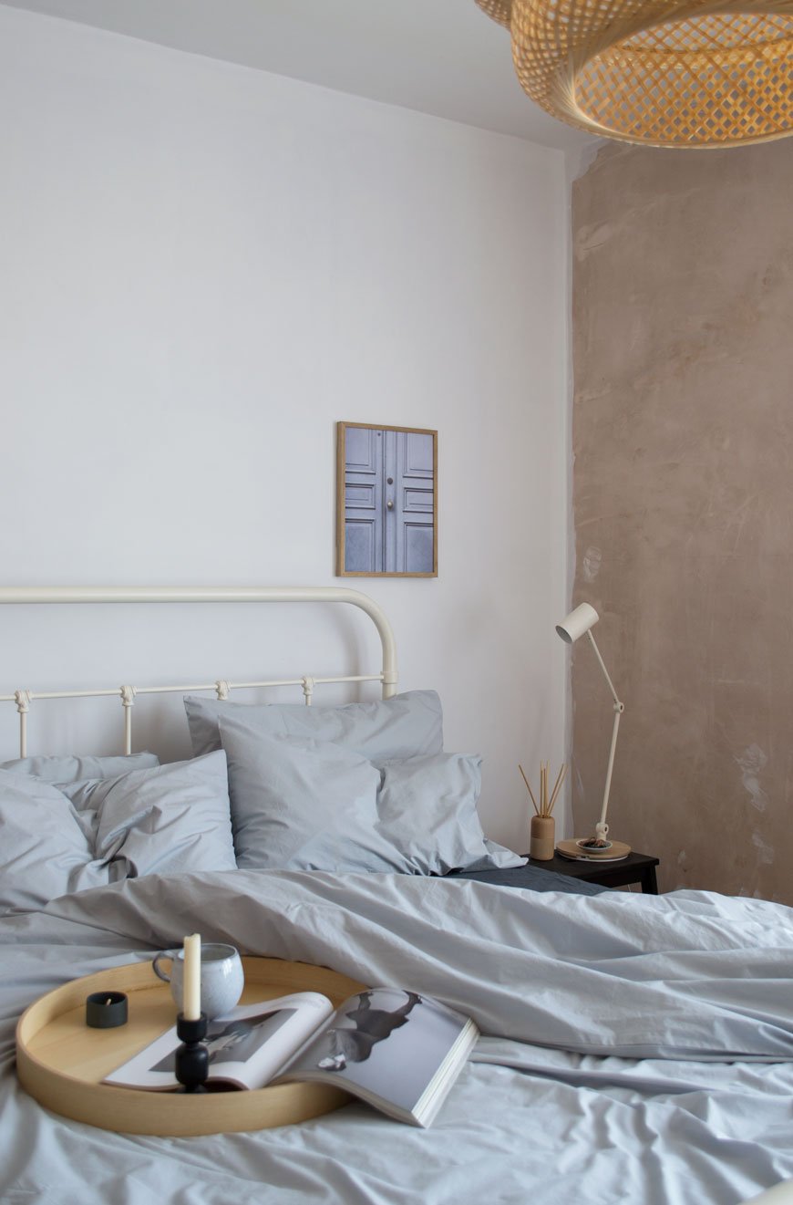
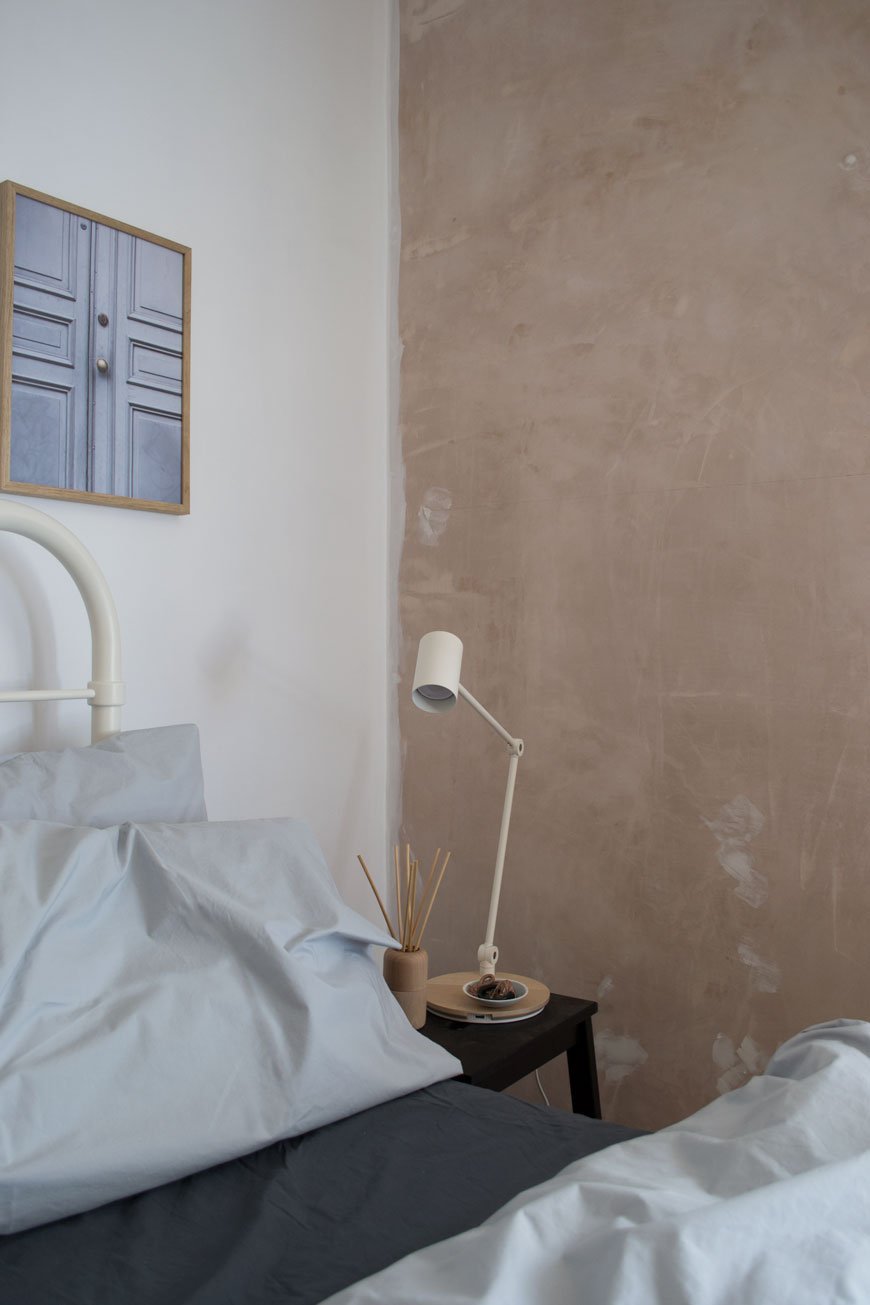 As I'm pulling inspiration from some of my favourite hotel experiences for the bedroom, the best place to start is with the bedding. I'm naturally drawn to contrasting tones in our home so I've paired light grey with a charcoal grey percale sheet which looks striking against the new beige walls. I love the crisp rustle of the duvet, the casual, stonewashed feel and the bonus of not needing to iron them. In fact, as far as cotton sheets go, these are superior. An easy way to update your room without going to the trouble of a complete makeover.

 Having washed and used them several times since they arrived, the quality holds beautifully. The fitted sheet comes with a well thought out 'long side' label so you don't have to guess when you're making the bed up. Over the summer we had had cat-sitting guests use them in our guest room while we were away and they mentioned how lovely they were to sleep in. Bring on autumn. *To try out the benefits of cotton sheets yourself, take 20% off at Bedroommood with the code TIFFANY20, valid until Sept 30th 2018.

Photography and styling © Tiffany Grant-Riley
Slow Sounds No 2 Summer Playlist
 The Slow Sounds series is back with a summer playlist and with it my last post until September. Expect serious grooves, a strong British line-up (shout out to my girls LaSharVu and my daily obsession Tom Misch representing London) guitars to give you stanky face* and warm brass for balmy nights in the garden. These are the tracks we're playing on repeat in #thechathamhouse this summer and I hope you'll be doing the same.So what's my plan for the summer? Well, work on the bedroom is going ahead with a beautiful floor being laid, walls painted and all the small details which help to pull it all together. Look out for the moodboard in September before I feature the room in October. Track no.6 is going to help me push past those moments when I'm sick of the sight of paint!Track no.4 has a personal connection to it as Vula sang me down the aisle on our wedding day and blew the place apart with her band in the evening. Next month we celebrate our 10th wedding anniversary (how??!!!) and we'll be with the kids in Brussels for five days, returning to Antwerp and hopefully Ghent while we're there. I can't wait to get amongst the Flemish architecture again and I'm hoping to squeeze out a mini city guide once we're back if you're interested?Mostly though, I've worked to a point where I can actually take summer off, slow down and spend a few days meandering with the kids just following wherever the day decides to take us. Happy Days.Have a beautiful summer and see you on the other side...* Refers to the face you make which implies the music is giving you serious grooves but looks like you can smell something really bad.#slowsoundsplaylist
An Exclusive Tour Of The Made.com Ceramics Factory In Portugal
A mound of clay trimmings from a ceramics factory in Portugal.
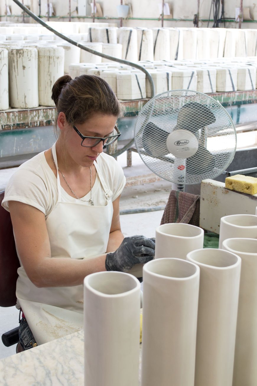
The tides are turning in the way that brands, and in turn us as consumers, are waking up to what we buy for our homes. We want to know its provenance - where its materials came from, whose hands have moulded and crafted it and that we in a small way are part of supporting that process positively.A few weeks ago, I hopped on a flight to Lisbon with the MADE.com team to join them on a tour of two of their family-run ceramics factories. A stone's throw from the city, the region has a deeply rooted history in ceramics, dating back to the founding of the monasteries. Generations of families work here, one specialising in decorative items (vases, etc) and the other in tableware. Each with 30 to 40 years of production history, they were specifically chosen by MADE's design team to produce their Noah dinner set and Cactus vase, amongst others. What they don't know about clay and ceramics really isn't worth knowing and what I expected to be a clinical process of machine and uniformity was quite the opposite. Each piece is made by hand and guided through various stages under the watchful eyes of skilled workers.
The Mother Mould
A plaster mould for a set of bowls sits in the workshop at a ceramics factory in Portugal
At the beginning of the process, the factory work in tandem with MADE to design the first mock-up which is taken from technical drawings and moulded from soft plaster. At this stage, the mould can be altered as necessary. Once finalised, the 'mother mould' is created from which the entire collection will stem from.
Pouring And Setting The Slip
Factory worker opens up the moulds to allow the slip to dry out in a ceramics factory in Portugal
Notice those huge vessels up in the rafters? This is where the liquid clay or 'slip' in poured from, using gravity to reduce the air bubbles as it makes its way down into pipes. The clay is locally sourced, chosen for its quality and durability. Anything from 10 to 120 moulds a day are filled with slip, sealed and left to dry for around 20 to 45 minutes before opening them up to dry out. The longer the slip stays in the mould, the thicker the wall of the vase or mug. Plates are made using a different process using solid clay blocks and a pressing machine, all overseen by hand. Up 500 are made each day and I've never seen anything so satisfying to watch!
The Rough With The Smooth
After an initial dry out, any rough edges and imperfections are scraped away with a knife and smoothed with a wet sponge. A second drying out stage to ensure each piece is dry is needed before the first firing in the kiln. What I love so much about the handmade process is that each batch behaves differently depending on the clay mix, the time of year, what the weather happens to be doing. No day is exactly the same and it takes real expertise to understand how to navigate those variations. In winter the drying process is naturally much slower and batches are moved to closer to the kilns to dry, whilst in summer it's much faster.
The Bisque Stage
My favourite part of the whole process - the bisque stage, where the pots have had their first firing in the kiln at a scorching 1,090 degrees. There's something incredibly satisfying, looking at rows of carefully stacked, alabaster white bisque. Before moving onto the glazing stage, every pot is tapped with a stick to listen for any cracks which dull the sound.
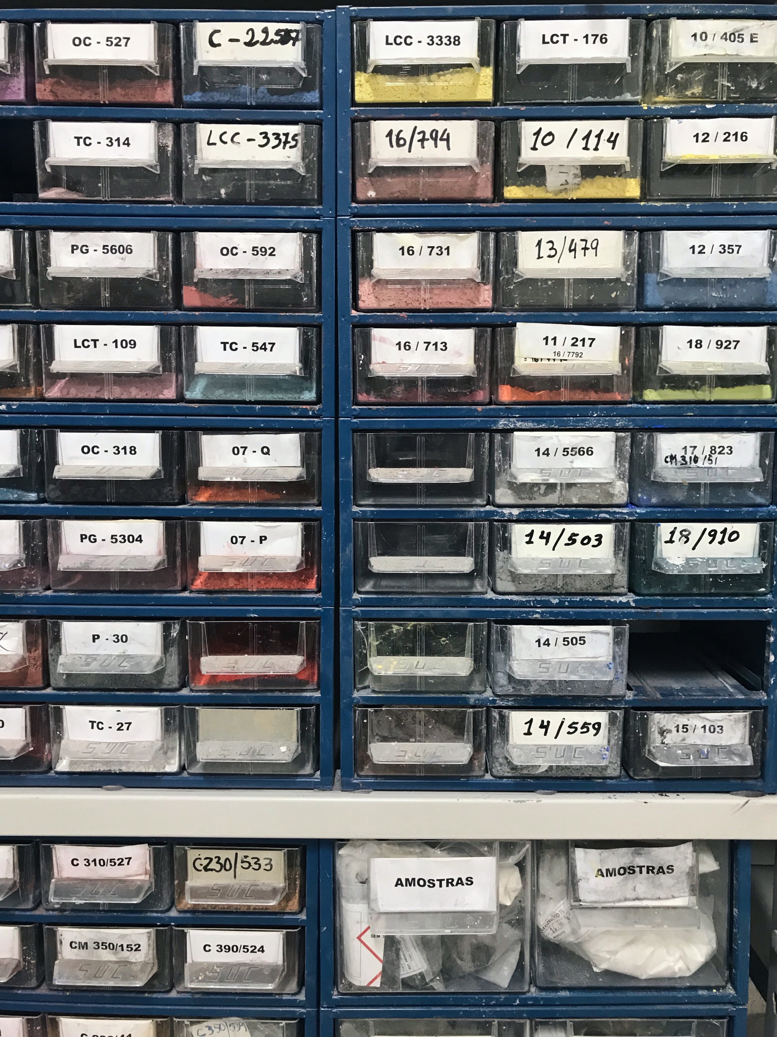
The Chemistry Of Glaze
In the past 40 years, both factories have seen trends move from the highly decorative, traditional Portuguese style to the more sculptural shapes and simple block colours we want in our homes today. With the crash of the ceramics industry in the 90s, unable to keep up with mass production from China, they had to modernise to survive. Combining their traditional techniques with contemporary styles and new glazing technologies, they now offer a very bespoke and personal relationship with brands like MADE.
We need to attempt to produce ceramics with the techiniques, knowledge and skills from the past, with what the market demands nowadays.
Nunu, factory owner and son of the founder.
Demand is in the use of textured finishes and unique pigments which are mixed by technicians in the lab or 'kitchen'. MADE will visit once or twice a year to plan new season colour palettes and ideas for unique finishes, with each client having their own exclusive range to avoid crossovers.Pieces are then either sprayed or dipped in glaze, fired in the kiln for 9 to 10 hours then checked and packed ready to be shipped. It's highly likely if you own a MADE vase that it'll have been held under the watchful eye of just one woman with 20 years quality control experience. How's that for a personal touch?Thus concludes my potted tour (ahem) of the MADE ceramics factories. It's been a wonderful experience to see how this industry has been revitalised, bringing the focus on skills and the personal connection to the things we own back onto our doorsteps. I certainly won't look at my Peder vase in the same way again...
Photography © Tiffany Grant-Riley
20 Of The Best Budget To Blow Out Black Wall Lights
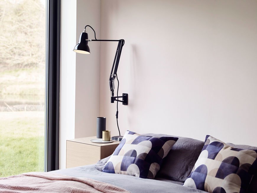
I’m popping over the parapet while I still can, as I wade my way through the depths of the end of term summer madness. If you’re in it too, keep going my friend, you’re almost there. And then it's only the next six weeks of holidays to get through...
Aside from the school stuff, I’ve been answering requests on Instagram for a black wall lights source page. You’ll know by now that I think a shot of black instantly improves a room, whether its to add contrast or tone on tone and my 20 Best Black Wall Lights have been chosen for their contemporary designs and minimalist attributes. No dodgy sconces here people. And I happen to be in the market for our bedroom which is almost ready for painting. I need to get as much off the floor as possible. Despite having a fairly spacious room, the way we configure the bed makes it difficult to fit bedside tables on both sides as we end up hitting doors. Hence the need for wall lights and quite possibly small ledges for the important stuff. Or maybe just one central swing arm that we can share? Decisions, decisions...
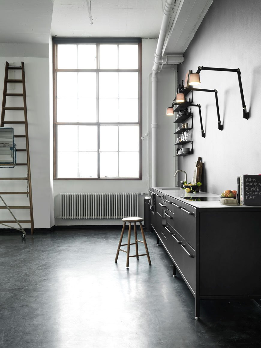
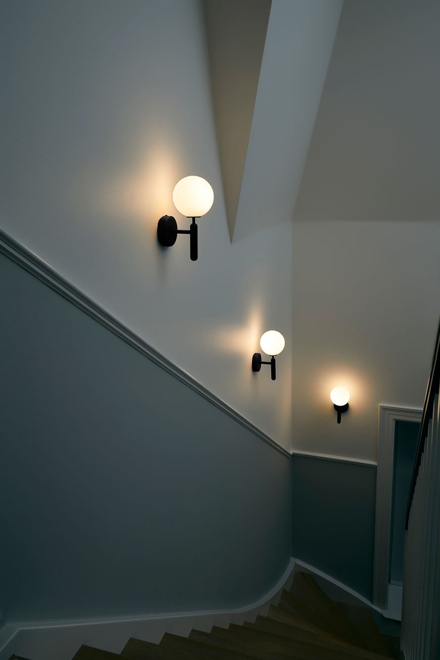
There’s a good mix of new designs and reissued classics with a Nordic aesthetic and strong, architectural shape. Take the perforated head on the Vipp lamp for example, which defuses light outwards as well as down. And then there's the covetable La Lampe Gras No.214, or indeed any of that series, reproduced by DWC. I live for that lamp. Such elegance. Ugh.
The more compact styles are spot on for nooks and hallways, especially the globe styles. Opal glass has made a huge comeback in recent years as it gives off a warm, diffused ambience. Adjustable arm lamps are better suited for task lighting - for reading in the living room or above the kitchen worktops whilst you're preparing dinner.
You'll also be pleased to know that most of these lamps don't need wiring into the wall (who has time for that?) which makes it easier to move them around as you need to.
Of course, it's not possible to include everything in my top 20, and I've had to veto a few in favour of affordability. I'm just being sensible. Now I just have the task of choosing. Like that's going to be easy...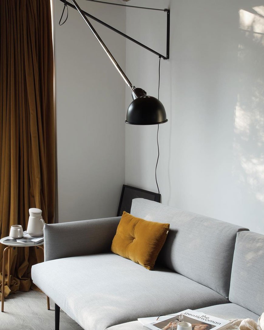
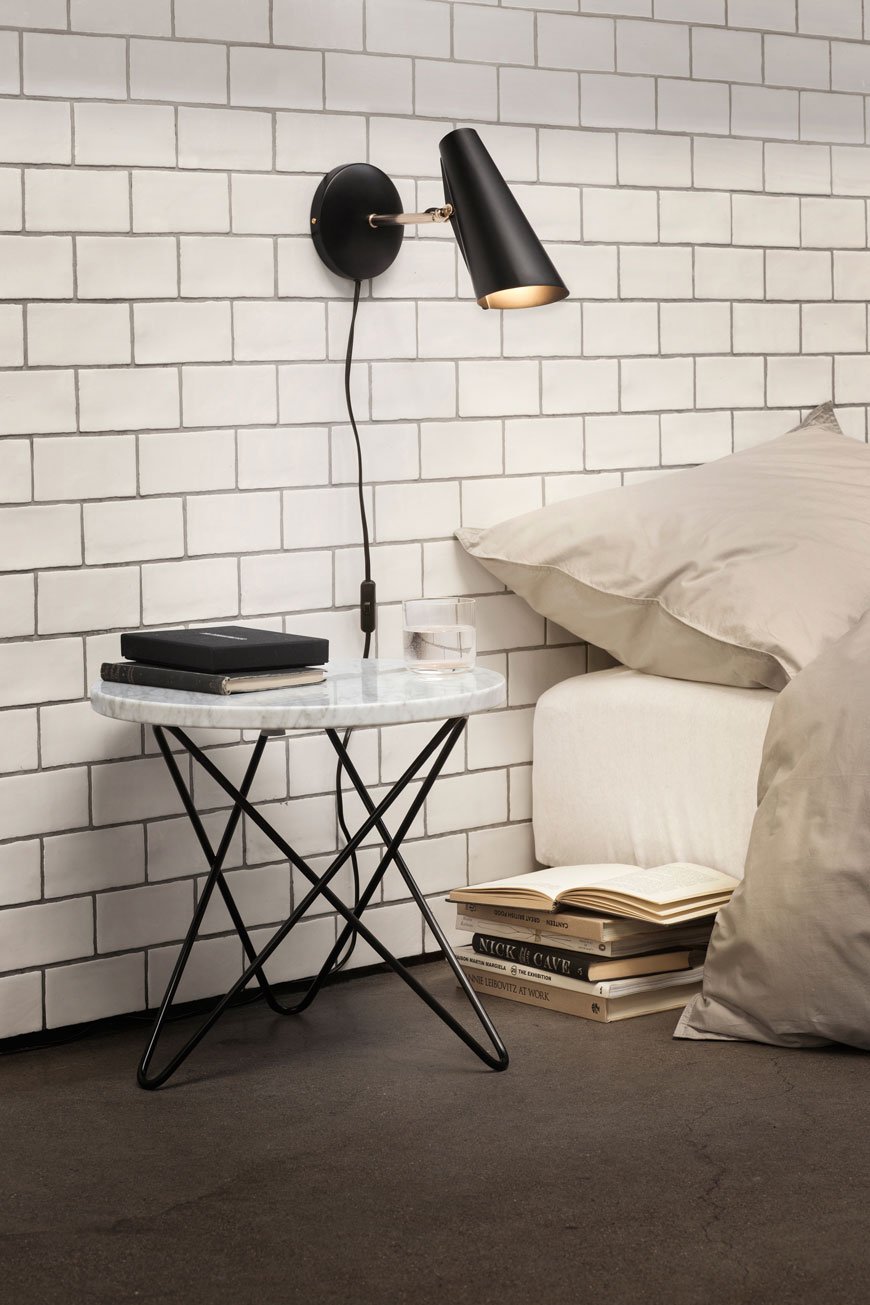
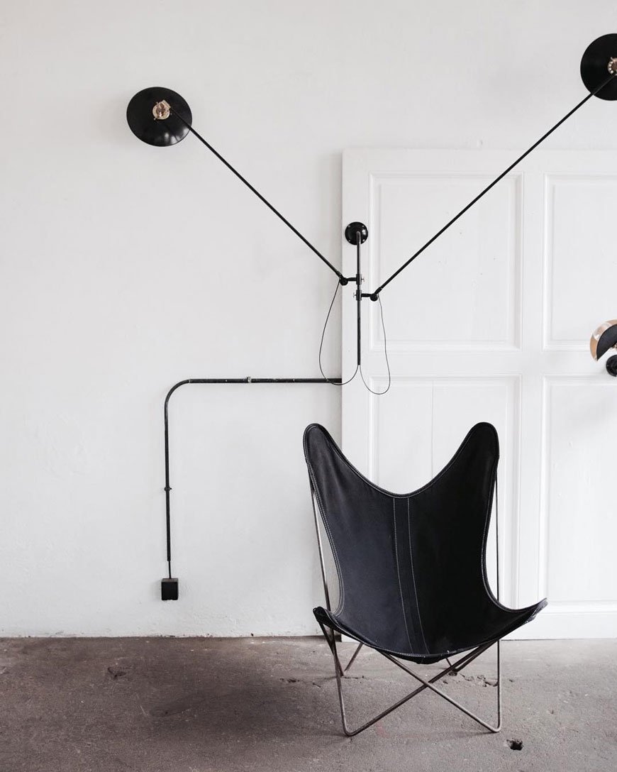
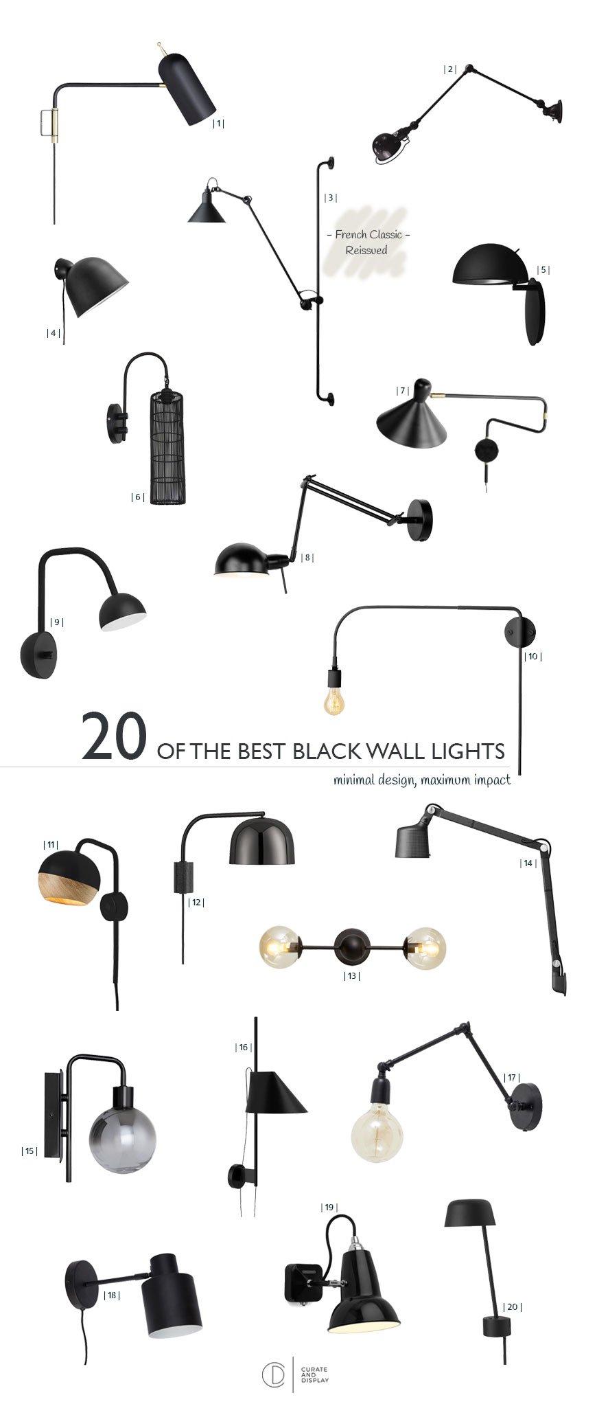
| 1 | Design Project LED wall light, John Lewis | 2 | Jielde Signal two arm, Clippings | 3 | La Lampe Gras No.214 by DCW, Houseology | 4 | Woud Kuppi, Nest | 5 | Radon by LightyearsDK, SCP | 6 | Matted black wall light, Rockett St George | 7 | Ogilvy swing arm, MADE | 8 | Its About RoMi Glasgow lamp, Naken | 9 | Blush by Northern, The Lollipop Shoppe | 10 | Warren wall lamp by Menu, Really Well Made | 11 | Mater Ray wall light, Cloudberry Living | 12 | Grant, Normann Copenhagen | 13 | Orbit, Dwell | 14 | Wall lamp, Vipp | 15 | Dano smoked globe, John Lewis | 16 | Louis Poulsen Yuh, Clippings | 17 | Hollin, Out There Interiors | 18 | Hübsch wall light, Smallable | 19 | Anglepoise Original 1227 Mini, Heal's | 20 | Muuto Lean lamp, Nunido
** Stockists correct at time of publication.
Good Hotel London | The Floating Hotel With A Social Cause
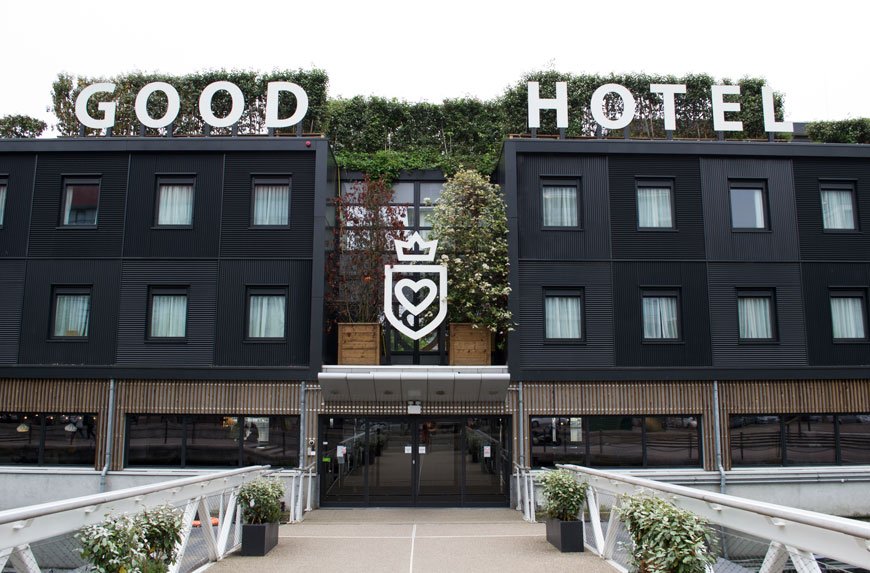 If I told you this hotel had been floated across the North Sea from Amsterdam to London's Royal Victoria Dock you'd think I was joking, right? Well. It was. Back in 2016 following a stint in its home of Amsterdam and a redesign at a shipyard, it made its way on a submerged barge to be docked here.
The Good Story
Good Hotel is a new hotel experience founded upon social enterprise by Marten Dresen. Offering hospitality training to previously unemployed locals through their Good Training program, the hotel guides recruits through a three-month residency before helping them secure employment within the industry. During its stay in London, Good Hotel supports local businesses and sources local ingredients, investing the profits back into educating children from low-income families in Antigua, Guatemala.Designed by Remko Verhaagen and Art Director Sikko Valk of studio Blooey who focus on social and ecological projects, it's hard to believe this structure started life as a detention centre. In my mind, it is quintessentially Dutch. From its altruism to contemporary industrial interiors and relaxed atmosphere. It offers simplistic luxury and a different perspective of London, being that little bit further out from the centre.
The Rooms
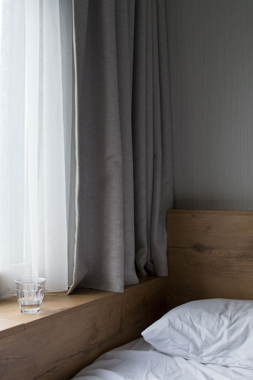
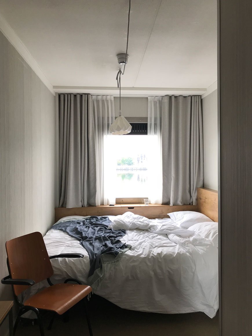 There are four types of room at Good Hotel London, starting with a standard double at £98 a night up to the corner waterview room at £135 upwards. We stayed in the deluxe waterview room with wall to wall kingsize bed, inspired by the traditional Dutch bedstee. It's certainly cosy, but the minimalist design and full-size window onto the water makes it feel spacious. The room includes custom built shelving and desk also designed by Verhaagen, a full-length mirror and stand-up en-suite shower with FAIR CosmEthics toiletries. There are iconic swing arm lights mounted on the walls and a nifty hidden phone charger in the windowsill.
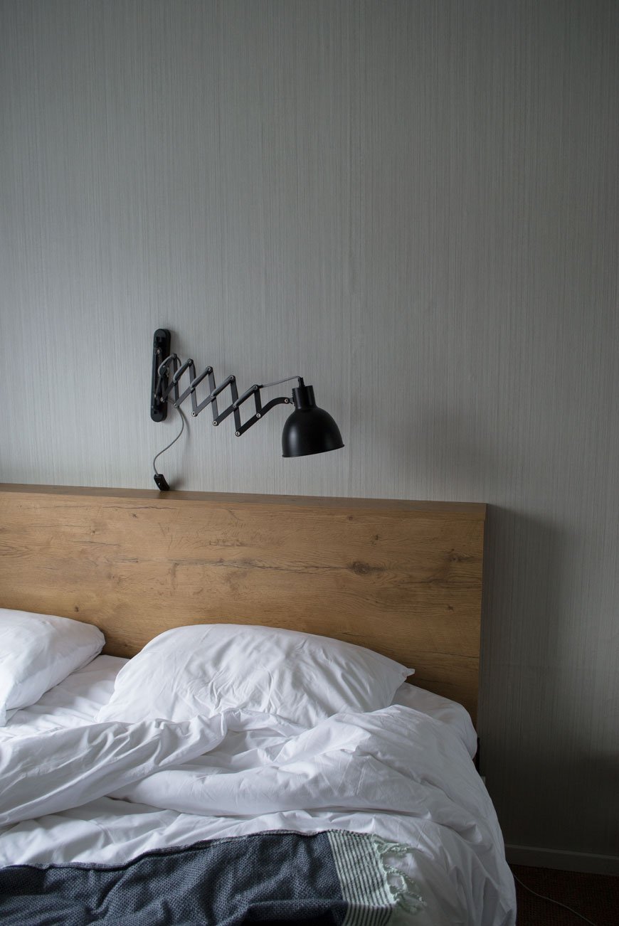 You won't find TVs in the bedrooms and that's a deliberate decision, encouraging guests to use the Living Room or to venture up to The Roof to drink in the view. Quite literally.
The Social Spaces
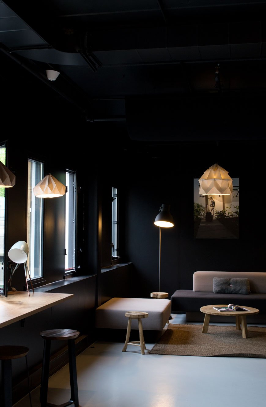
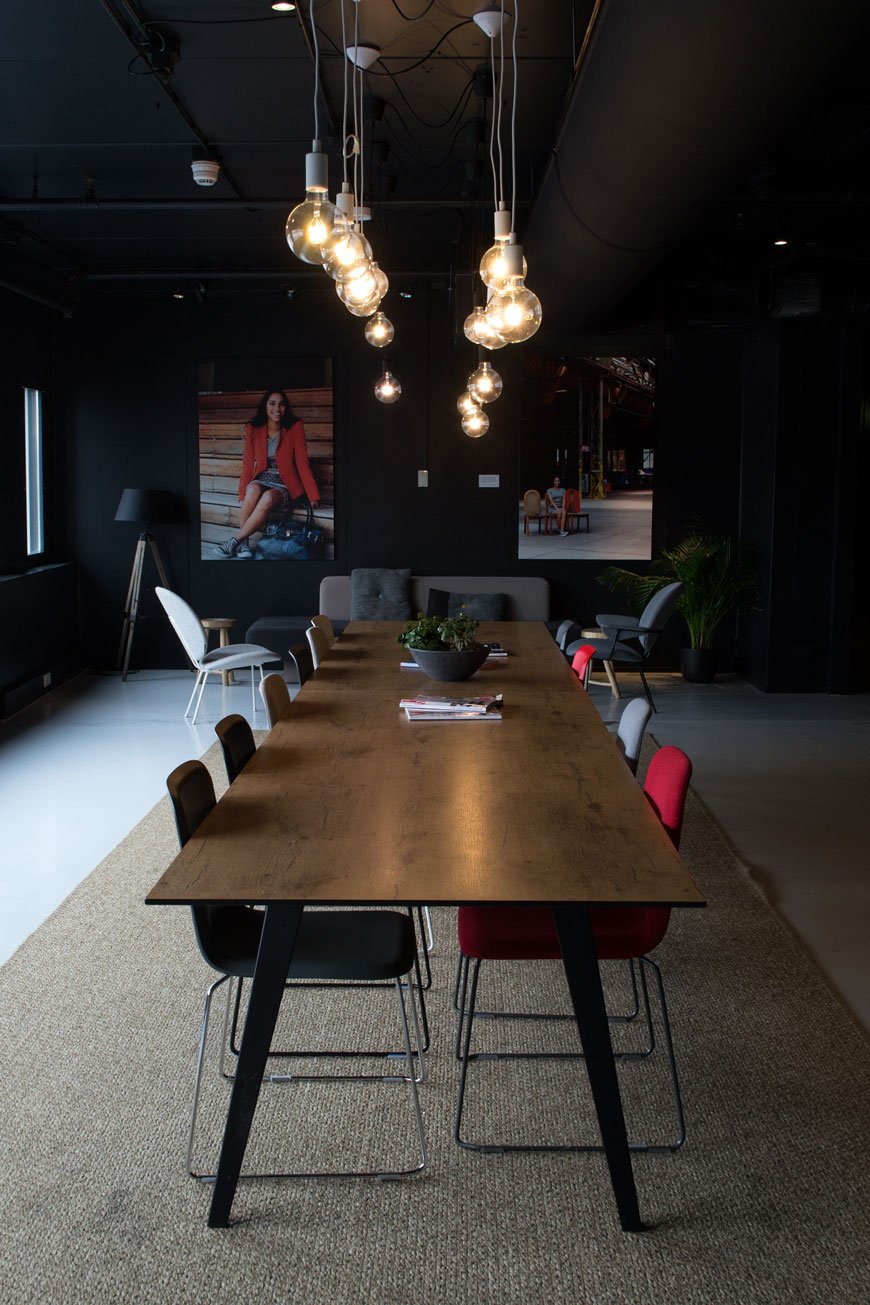
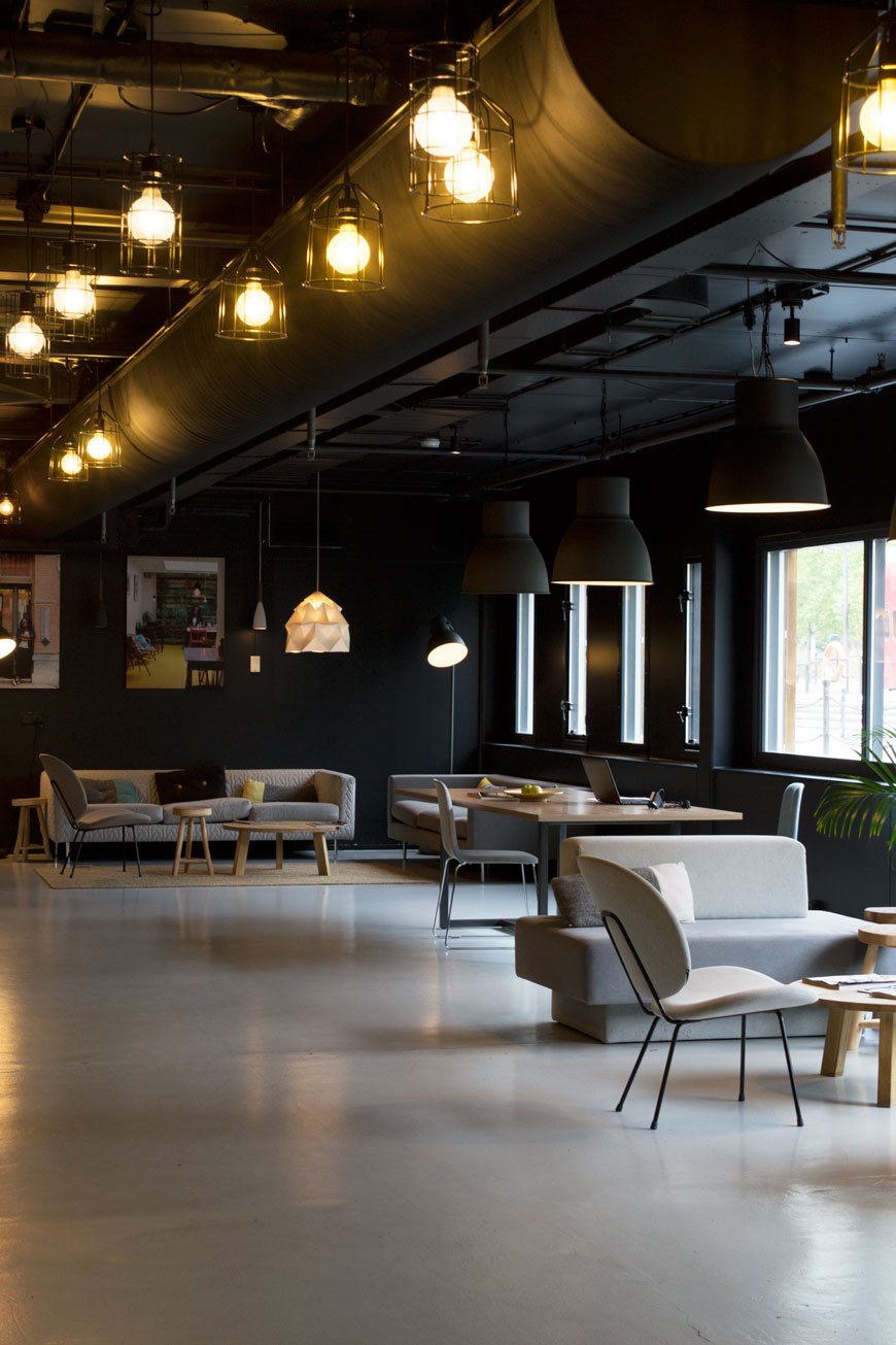 The shared spaces are open plan to connect guests and staff together, the result of which is more homely. Seating and dining areas are cleverly zoned using steel framed wood screening so that even when you're lounging on one of the minimal sofas, you can still see through to the bar or across the water. Shelves filled with books and magazines encourage you to stop and sit. The cool, industrial structure of metal and polished concrete is warmed with contrasting wooden tables and sisal rugs.Along with custom pieces designed by Blooey, furniture from Lensvelt and Moooi sit alongside everyday items from HEMA. This is a pared-back interior where the luxury is in the honest materials and feeling of space.
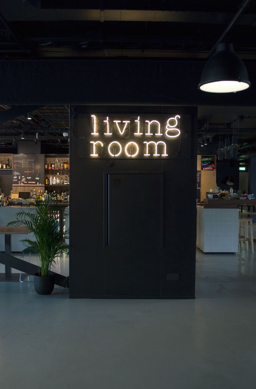
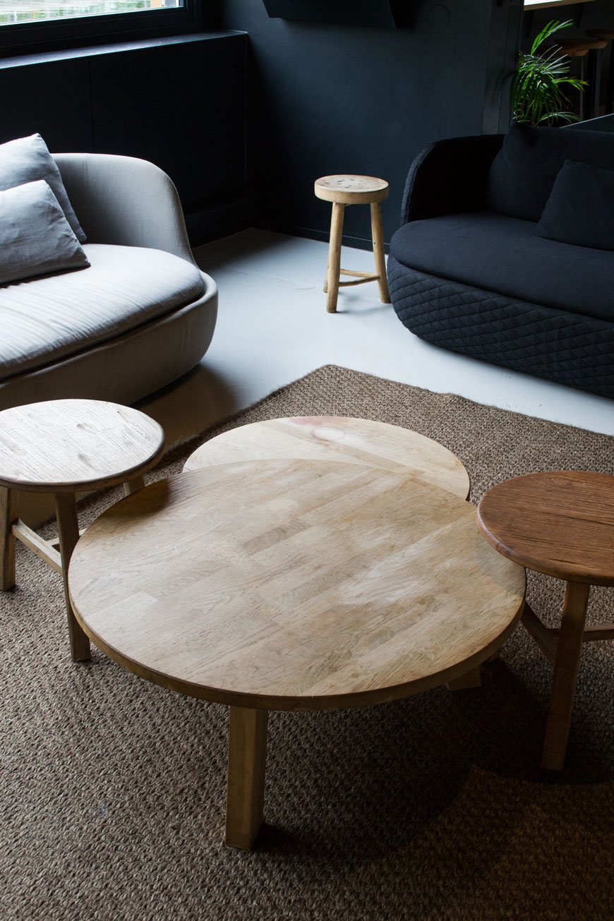
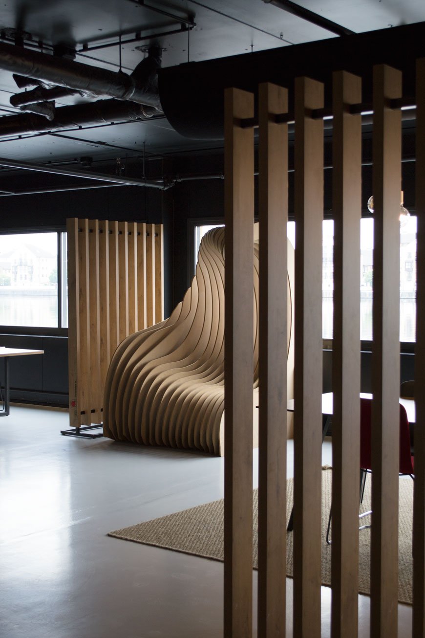 Unlike hotels where it's policy for staff to blend into the surroundings, here their portraits hang on the walls, sharing their personal journeys as part of the Good Hotel. Staff will happily engage in conversation, telling you about the history of the hotel and perhaps a little of their own experiences. The positive impact that the hotel has on the area is clear.
Up On The Roof
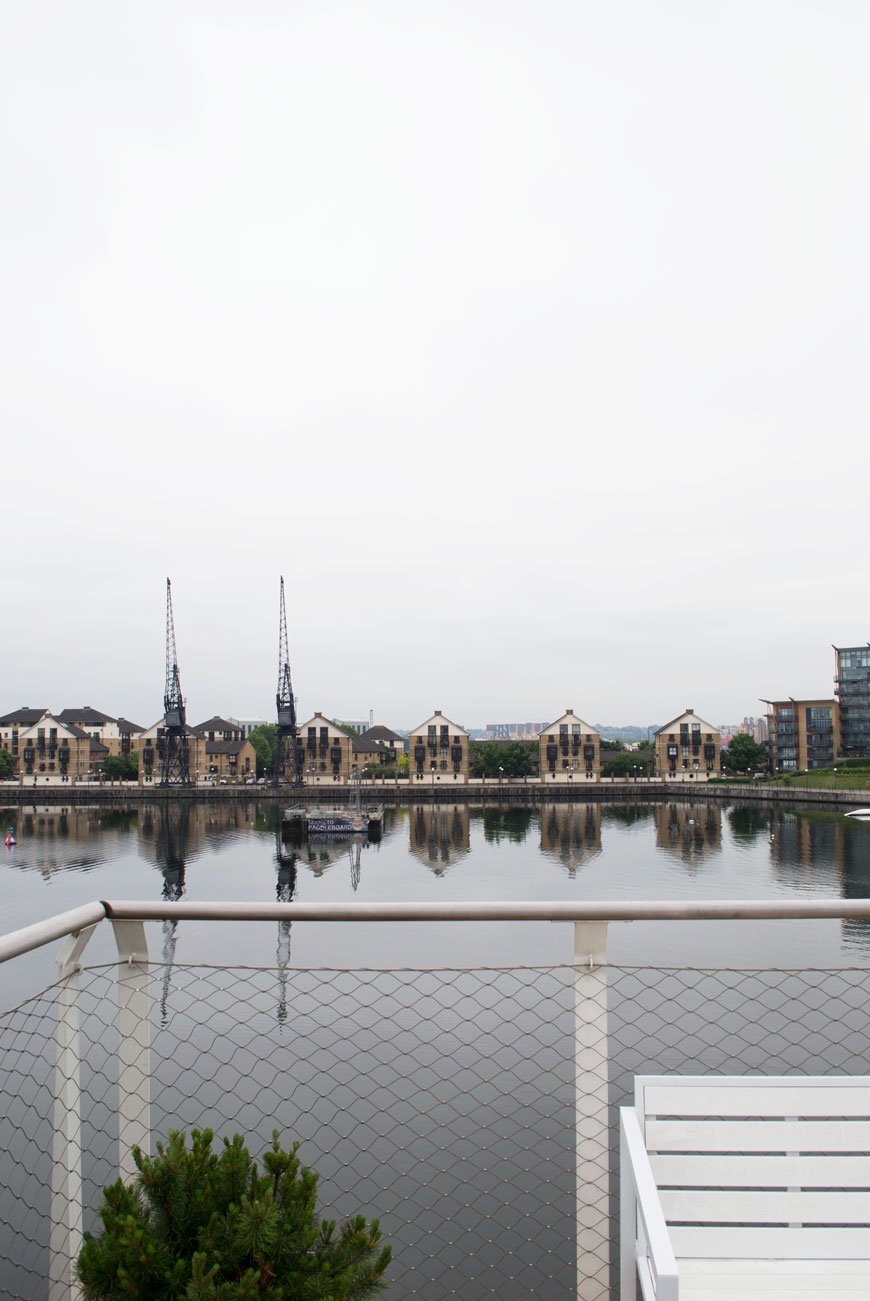 It wasn't the sunniest day during our visit, but you can get a real sense of the area from The Roof bar. The Emirates cable car is right next door drawing your eye over to the O2 Arena on the Greenwich Peninsula. Planes from City Airport jet over every ten minutes (you quickly acclimatise to this and they stop later in the evening) and there are more eateries up towards the Excel, though quite frankly with food this good here, you shouldn't need to leave. Ever.
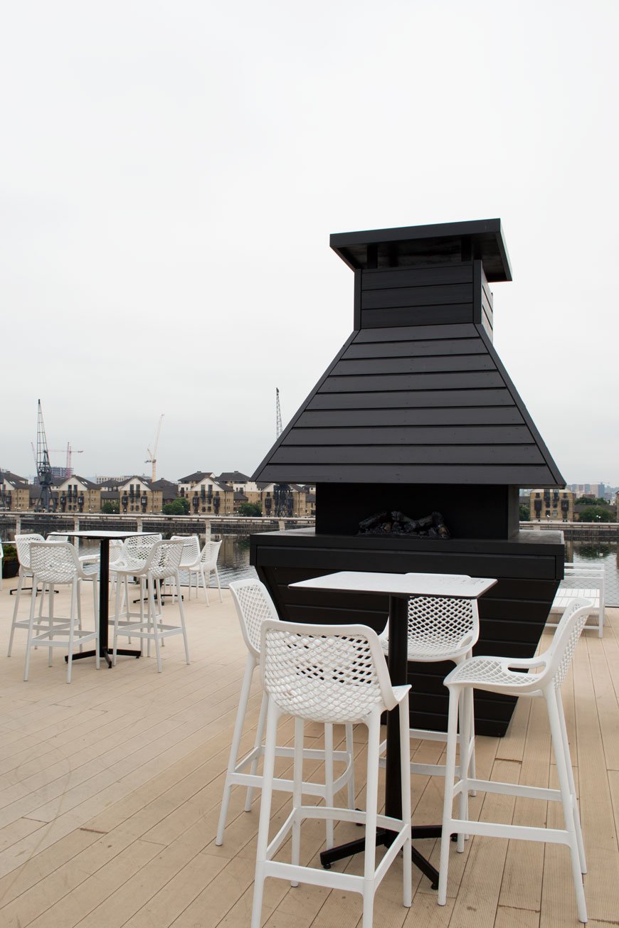
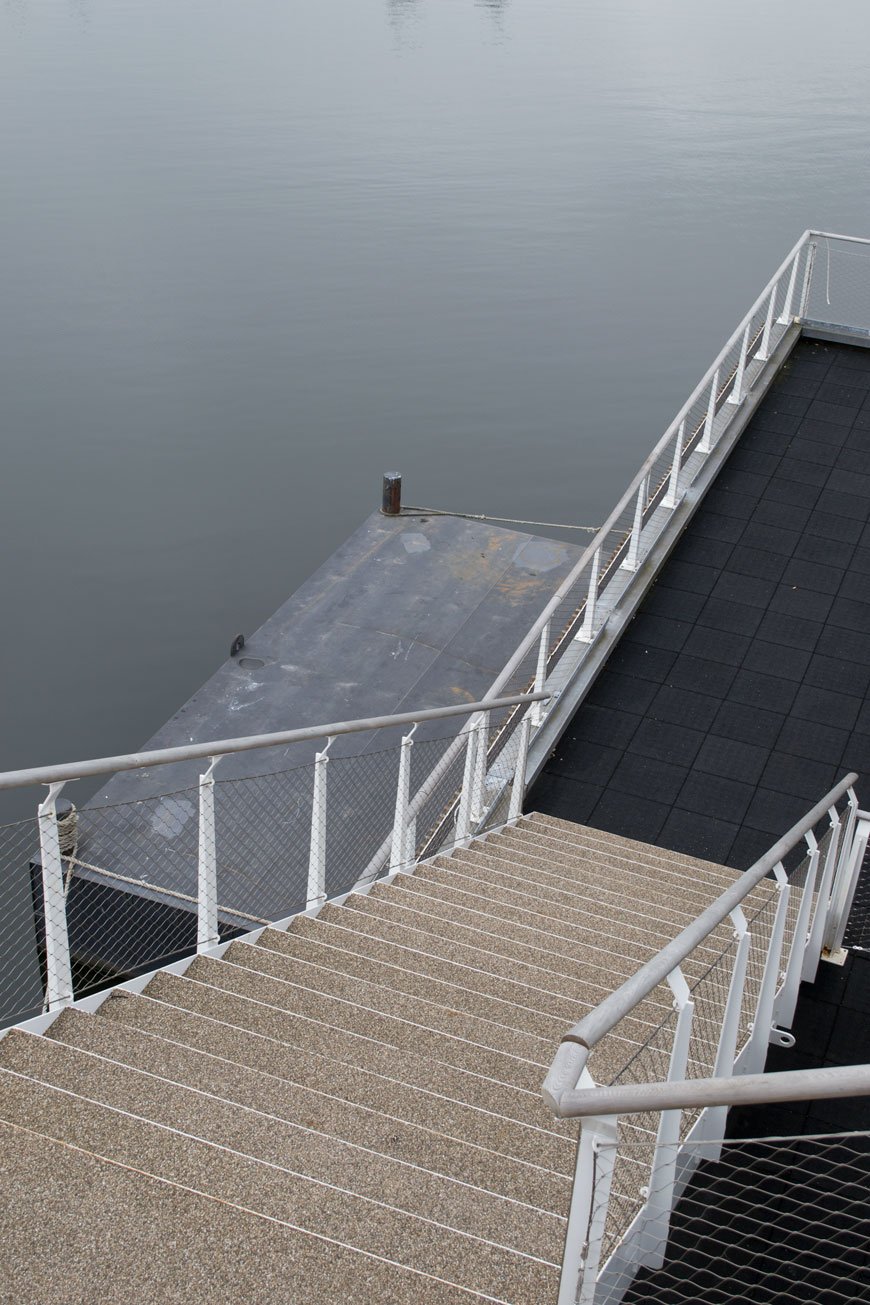 As if I need to persuade you any further, I think the Dutch have home from home hospitality nailed. I just wish all hotels would follow this model. A place with style and heart. The Good Hotel will be docked here until 2021 when it will make its way on to a new home.
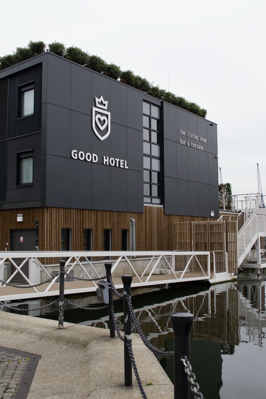 Want more inspiration? Check out this London getaway.Good Hotel, Western Gateway, Royal Victoria Dock, London, E16 1FA.
Photography © Tiffany Grant-Riley
[AD] Minimalist Art By Desenio In Our Edwardian Living Room
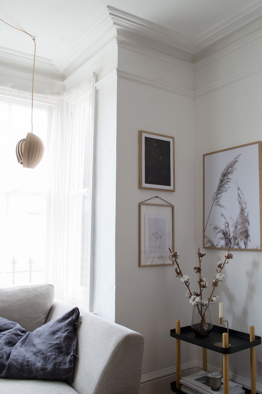 This is a paid partnership in collaboration with Desenio. Got a bit of a rare insight into our living room for you today, you know I like to do the before and after features in one hit but I thought I'd be brave and show how it is now. The walls and ceilings in here are in real need of replastering, the floors staining, new mantlepieces. The list is endless. See? I'm already making excuses! But it has beautiful bones so until we arrive at that point I've given the walls a fresh lick of white paint for a crisper look. Wall art is a quick and easy way to update a room without going all out, so I've chosen three new minimalist art prints from Desenio.
 There are two places I buy affordable art from when I can't stretch to buy directly from the artist (which to be honest has only happened once!) and Desenio is one of them. When you want to find an unusual piece that can't be found everywhere else, you'd be hard pushed not to find it here. A Swedish company with a passion for Scandinavian design, its ethos is that stylish wall art should be affordable to everyone. Prints start from £2.95 and there's a very useful Inspiration page which, if you're stuck on what to choose and how to hang it, has readily grouped collections you can purchase as a set. Be prepared to fall down a rabbit hole where the choice is concerned though...
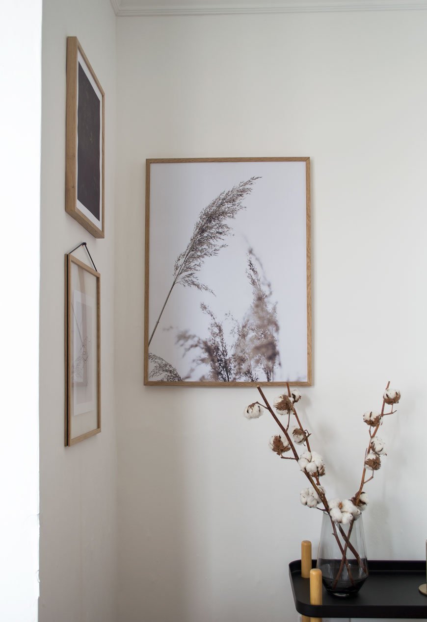
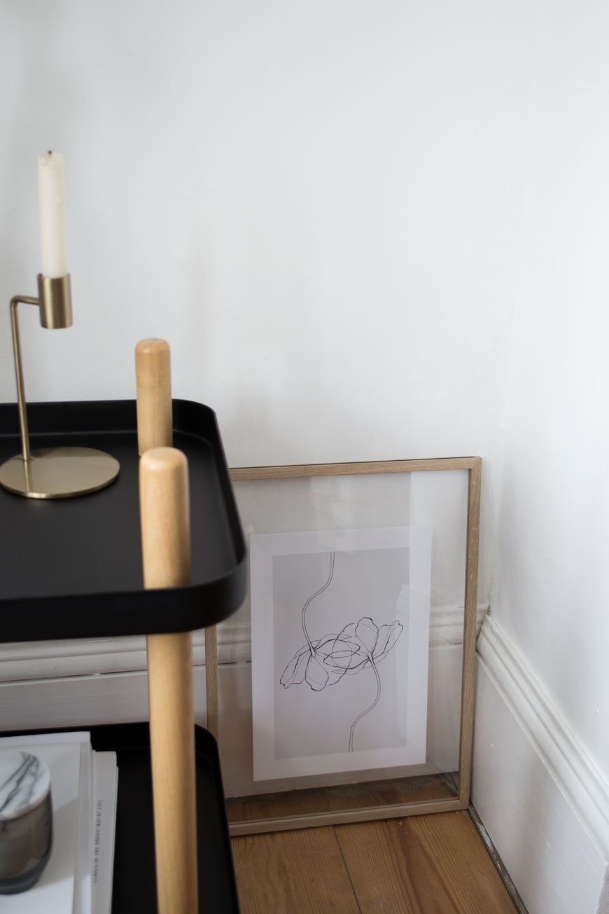
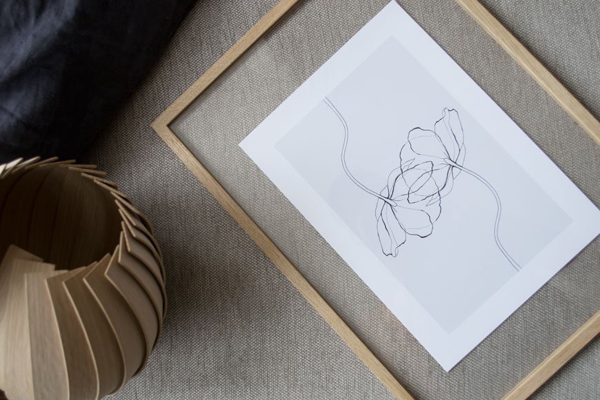 To take some of the indecision out of the equation I focused on a subject. I'd always planned to hang a collection of botanical prints in this corner leaving the rest of the walls clear and chose a muted colour palette of grey, beige and deep green. I want to look at quiet, thoughtful art when I'm home, compositions with simple line drawings, photographs capturing movement through leaves, something with space to breathe. The three I've chosen sum that up perfectly, don't you think?Hanging the Grass poster closer to the corner connects them when you're sitting on the sofa opposite. I've seen some thought-provoking examples of art hung in corners or at the edge of a wall together rather than the centre and I think it really works. I've also been wanting to try the Moebe transparent frame for ages; the design is clever in its simplicity and allows you to frame flat laid collections as well as prints whilst being able to see the wall behind. The entire frame is made from four grooved sides that hold the two acrylic glass sheets with the tension of a rubber band from which you hang it.
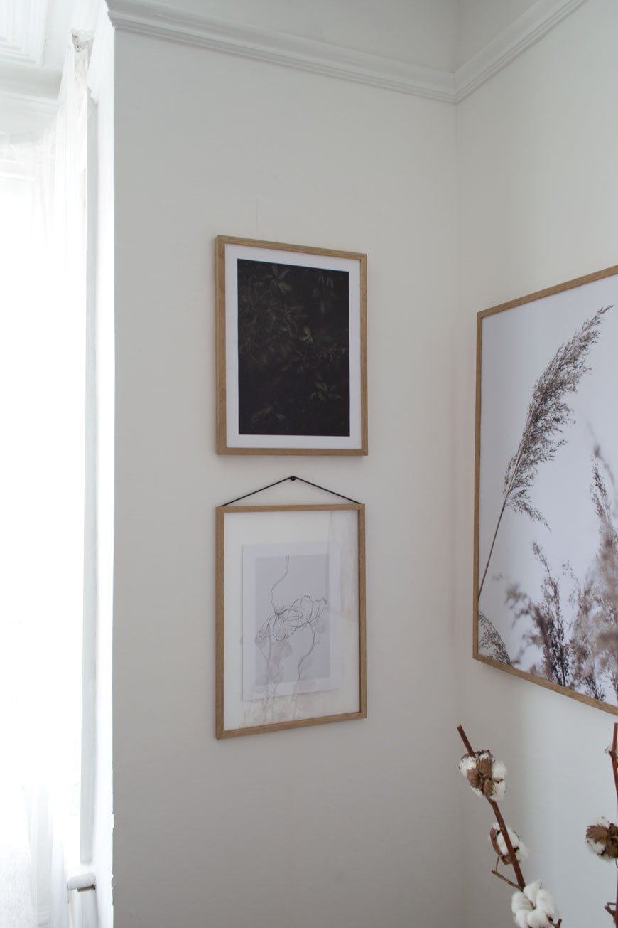
TOP TIP : A good tip for styling a gallery wall is to use the same type of frame, so your collection has a coherent look regardless of the art you have on display. Desenio offer simple designs in black, white and metal frames - I chose warm oak to counteract the north facing light. I love the soothing, natural effect it has in the room now, having some well-considered art up makes the space feel much warmer.
Now's a good time to find some minimalist art for your walls - there's a 25% discount code* 'curatedisplay' valid on posters between June 5th and June 7th 2018 (*except on frames and on handpicked-/collaboration posters).
Photography & Styling © Tiffany Grant-Riley

5 Home Office Design Tips And HÅG Futu mesh Task Chair Giveaway [AD]
 This is a paid partnership in collaboration with Flokk.Take it from someone with ten years working from home under her belt, having a workspace that's both functional and inspiring is so important. Over the years I've tried out a number of not-so-great home office set-ups. I started from a reclining sofa (yep) and dining room table to a corner of the bedroom before having the luxury of a dedicated workspace.Aesthetics, of course, are what make a room but there's little point in having a stylish home office if it doesn't actually work for you. With that in mind, here are my five tips you should consider when you're designing your own space...
1. Choose The Right Chair
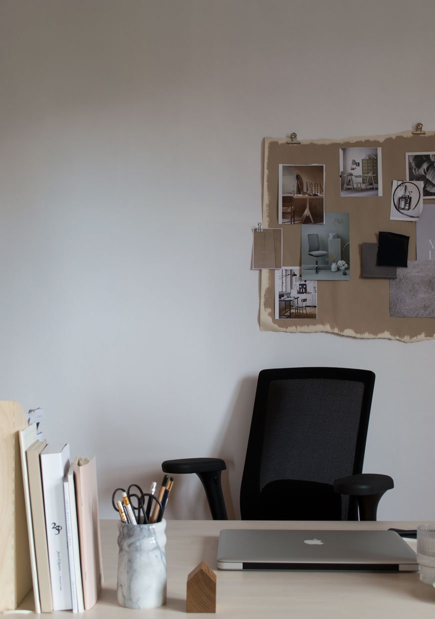 Top of the list. The office chair. Having spent years damaging my posture in a variety of static chairs and slumpy sofa cushions I can attest that choosing the right chair is the difference between getting in a focused days work in comfort and spending time in physio. I'll be honest and say that up til now I've categorically avoided office chairs. They've always felt too corporate and imposing for a home environment.When the furniture group Flokk got in touch to ask if I would try their Norwegian office furniture brand HÅG and their HÅG Futu mesh chair, I decided to put it to the test. Based in Røros, an old copper mining town on the UNESCO World Heritage List, HÅG have been manufacturing chairs since 1943. Before the chair arrived I was sold purely on the fact that this is a company that takes their impact on the environment seriously; mapping out and reducing production emissions and using recycled plastics since 1995, earning them the coveted Nordic Ecolabel.
Sit Properly
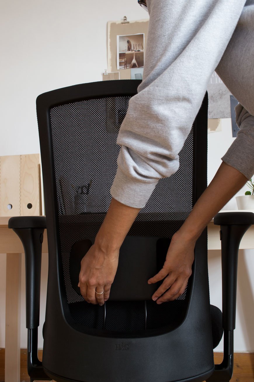
It's good practice to sit with your knees at a 90-degree angle with your feet on the floor, although HÅG actively encourages you to put your feet on the legs of the chair as you move which have ridged steel grips. Your arms should sit at a 90-degree angle to your desk to stop you from hunching your shoulders.Did you know that your calf muscle acts like a secondary heart in circulating blood back to the heart and comes into play when you actively move your feet? This is why when we're likely to be static for some time - on a long haul flight, for example, it's recommended to do leg exercises to increase your circulation. With this in mind, all HÅG chairs come with Balance® Technology which is totally intuitive, encouraging mobility and engaging your core. The amount the chair moves can be adjusted underneath the seat via three settings so you can opt for more or less as you see fit.The back comes up to shoulder height and combined with the transparent mesh it has a slender, lightweight appearance. My back feels completely supported against the FutuKnit™ mesh, a specially designed 3D knitted fabric which retains its tautness. If I want a gentle recline the seat can also be adjusted underneath.Unnecessary frills have been done away with, focusing on simple adjustable elements found in discrete buttons and small touch levers. The all-important lumbar support slides up and down, locking into place. The arms which are removable slide outwards as well as up and down with adjustable armrests that pivot inwards.The HÅG Futu mesh is a thoughtfully designed piece of Nordic simplicity. Having experienced the difference, I would recommend finding an ergonomic chair that suits your needs.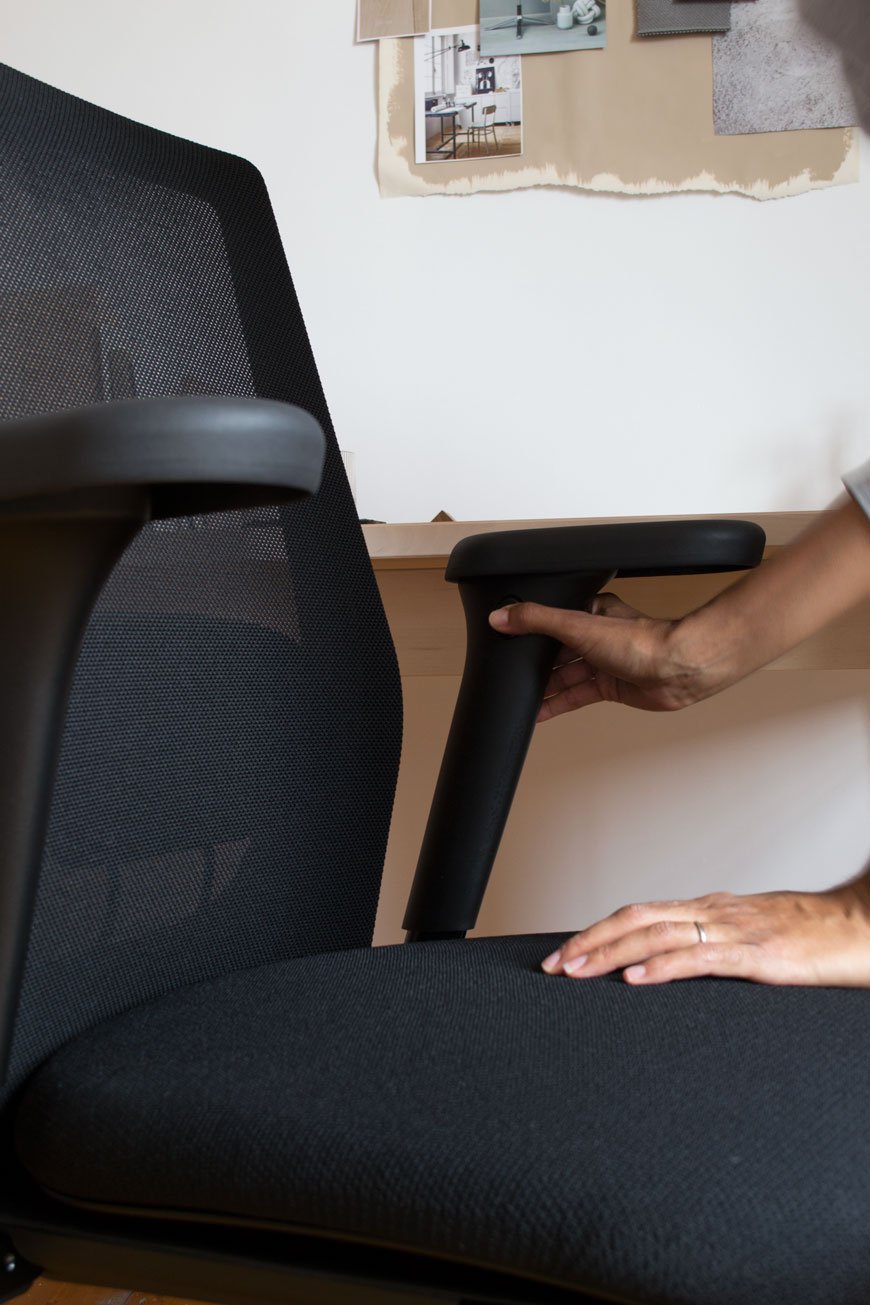
2. Making Room For A Home Office
Working from home can kick up a variety of distractions if you don't have a dedicated space. I say space because if setting aside a room isn't an option, you can carve out a corner instead. It could be in the dining room, on the landing if it's possible or a corner of the bedroom even which is where I currently work. Choose an area with good quality of light away from tempting distractions like the TV...the fridge.Don't be put off if you don't have room for a free-standing desk, you can utilise the wall space just as well. Put up a sturdy ledge instead or use the inside of a cupboard you can shut away at the end of the day.
3. How Will You Use Your Office?
How you design the space will depend entirely on how you plan to use it. Can you work with a shallow ledge for a laptop or will you need a deeper desk for a computer? Do you need space for dual screens or perhaps accessible storage is a more pressing need? Consider how much time you plan to spend working here and if you'll need to be able to shut it all away at the end of each day, particularly if you're working in a corner of a shared room. Once you've worked out your needs, designing the space and finding the furniture will be an easier process.
4. Plan Your Office Layout
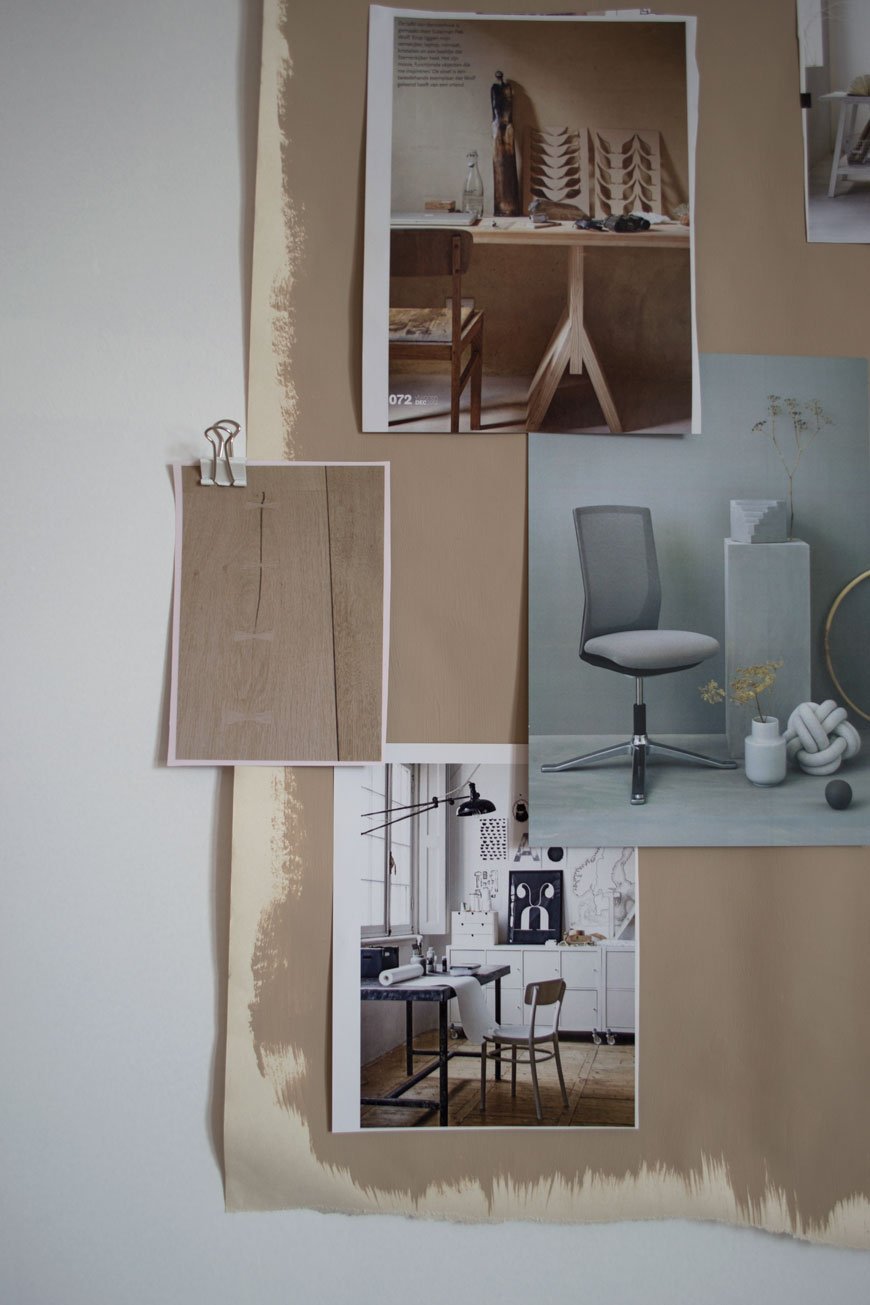
 The shape of your space might already dictate your layout but if you've got free rein, I would recommend setting up close to a window in a position you won't get screen glare. Ensure you have enough room to move freely. Do you want to have storage in front or behind you? If floor space is limited then look at wall mounted solutions, otherwise you'll start to feel restricted which in turn will affect your ability to work.Use any available wall space for shelving or cupboards and keep them organised - don't be tempted to fill them with clutter. Keep your everyday essentials within reaching distance - the pot of pens, sticky notes, USB stick. A series of shallow picture ledges can be used to keep notebooks alongside art prints. Find a pinboard or pegboard and create a visual inspiration wall or use it for urgent reminders.Choose the right a task light. If you don't have space for one on your desk, consider a design you can attach to a shelf or directly to the wall, if not slender floor lamp is a great alternative.
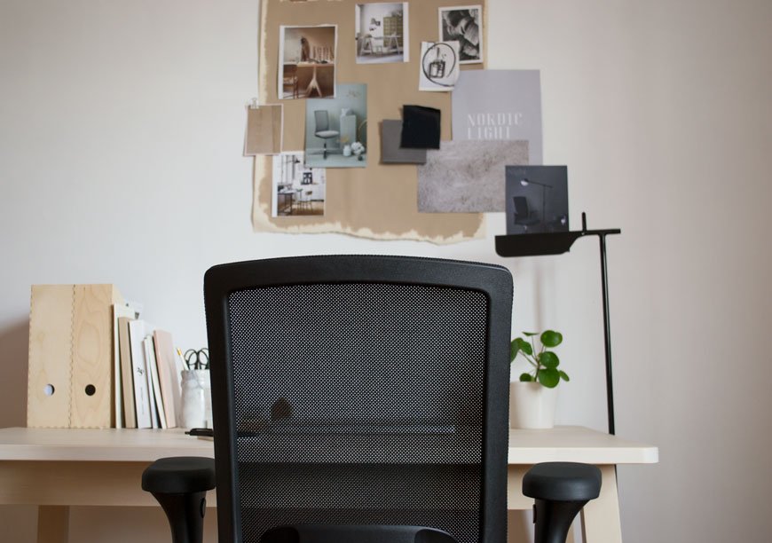
5. Show Your Personality
Whilst you want to give your home office a sense of separation from the rest of the house, it's important for it not to feel sterile. You're working from home after all so it needs to be a space you feel at ease in. Bring in a rug to zone your desk space, something that feels good underfoot.Colour is very much a personal choice but I recommend light or neutral shades over anything too dark. Bright colours will start to feel distracting after a while so if you're keen for a shot of colour, keep it to furniture, accessories or art.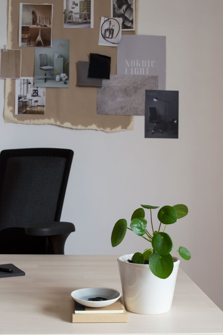 Having plants in the home reaches far beyond the botanical trend of the moment, they not only bring life into a space but they clean the air too. Keep a little pot on your desk, like my Pilea, or choose trailing plants to sit on your shelf above. Peperomia and String of Pearls are a great choice and Snake plant and Aloe Vera are ideal air purifiers.
Enter HÅG's Home Office Giveaways
GIVEAWAY ONE - Win a HÅG Futu or Futu mesh task chair in the colour of your choice worth up to £730.For a chance to win, choose your favourite colour and leave a comment below.*GIVEAWAY TWO - HÅG is also running a competition to win a 30,000 euro office makeover."The winner will receive a visit from their expert interior architect who will provide advice on colours and fabrics. They’ll share with you our range of products, discussing what to add to your working environment to make it healthier, happier and more productive.Then all you have to do is sit back and wait for the transformation!"Please see T&Cs for further information.* T&Cs: Entrants must be aged 18+ and a resident of the UK. This giveaway closes on June 6th 2018. This giveaway is for X1 HÅG Futu mesh task chair only. The winner will be drawn using a random number generator and contacted via email by Flokk directly. Your contact details will not be shared with or sold to any third parties.


