Slow Wanderings In A Dungeness Coastal Wilderness
 The last time we made the trek out to Dungeness was New Year's Day, 2017. It was beyond cold, unforgiving and bleak with biting winds. So much so in fact that we ended up seeking refuge inside a steamy and warm cafe in Rye, though not before I braved it to get a few shots of The Retreat. We returned last weekend in warmer climes to explore further and lose ourselves for the day.If you've an unexplained hankering for desolate, post-apocalyptic landscapes as I do, I needn't have to explain too much as to why so many others are drawn to Dungeness. Aptly named The Fifth Continent, there is a real sense of resilience here, a place that feels so baron it's a wonder anything grows, but it does. Wildflowers push through the shingle defiantly and the heady coconut scent of gorse is everywhere. A landscape as flat as a pancake with nothing to see for miles but the coastline and scrubland, you'll find the power station, the two lighthouses (one of which you can climb for stunning views) and a hotch-potch of private homes. Dotted about the shingle beach are remains of derelict fisherman's shacks, sculpture-like rusting machinery and abandoned boats. If you want to find somewhere to get lost within yourself, this is the place to go.
 You wouldn't think that Dungeness could be a desirable location for architects, but the lure of this flat coastal setting has seen a number of contemporary, black and corroded steel builds rising up from the shingle. Built with sensitivity for the history of the area, they look very much as though they belong here. And what I wouldn't give to own one.
Design Stays In Dungeness
Some of the new architect designed builds are available to rent as holiday homes. This experience is as much about immersing yourself in the design of the place as much as it is the landscape...PS1 - a former WW2 fuel pumping station.The Shingle House - designed by Scottish studio NORD.The Retreat - an award-winning home with views across the English Channel.Coastguard Lookout - a converted 1950s coastguard tower.


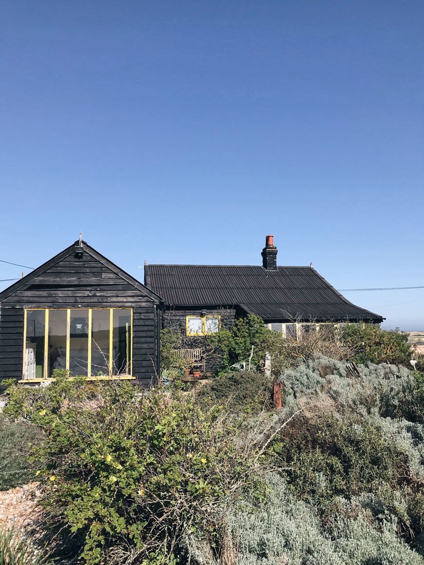 There are no formal boundaries marked by fencing as you would expect and with no defined gardens it can feel a little sneaky picking your way across the shingle beach, unsure as to what's private and what's not. The famous Prospect Cottage and garden of the late Derek Jarman seems to appear out from the landscape as if it had always been there, dotted with reclaimed beach treasures turned sculptures. The yellow framed windows of his weathered, black cottage make the gorse 'pop' and are a beacon for art and garden enthusiasts who make the pilgrimage here. This garden is constantly evolving, rather than a shrine and Derek's partner still lives here, changing the planting as the garden sees fit.I urge you to carve out some time to spend here this summer. It is a wilderness like no other.
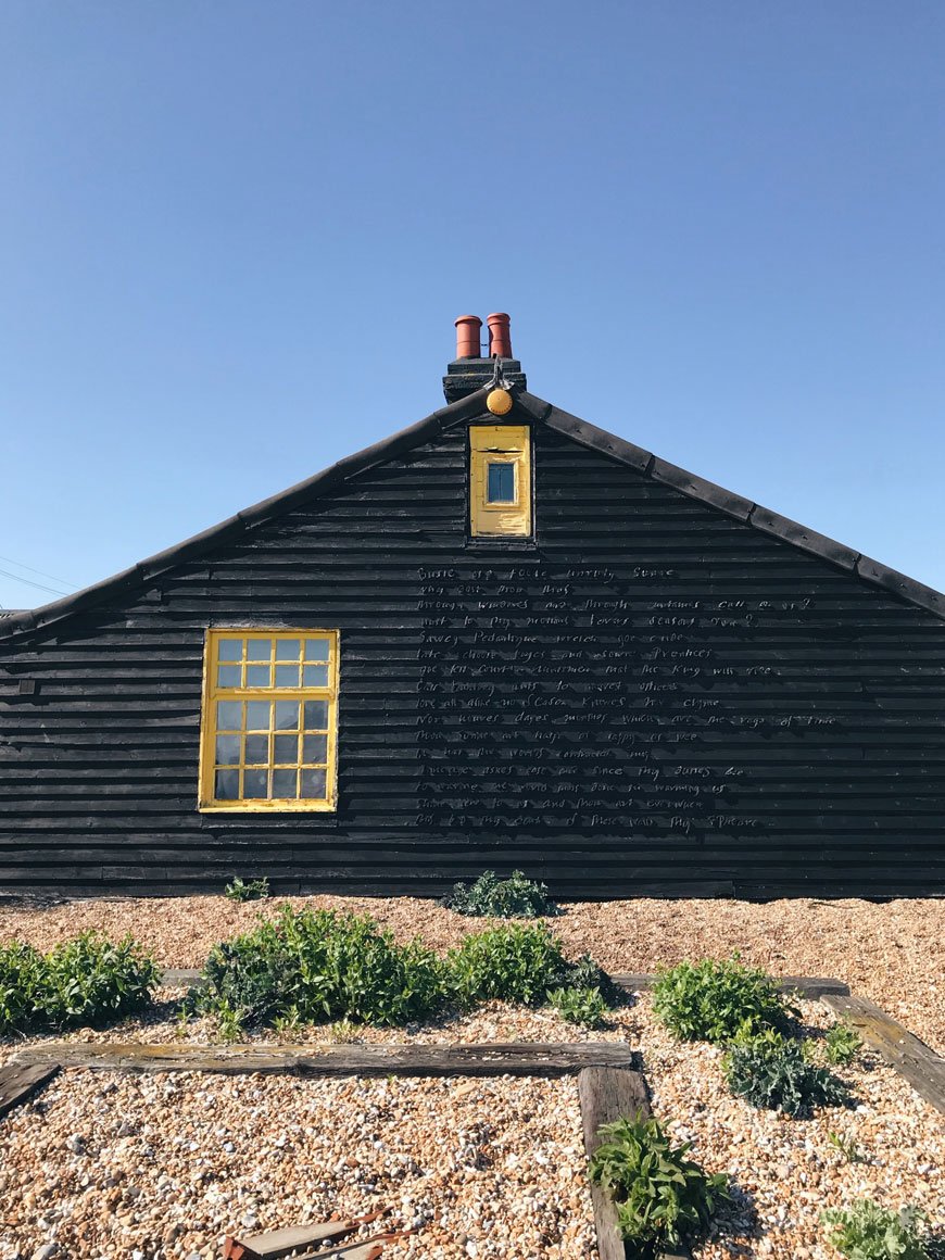
Photography © Tiffany Grant-Riley
Small Space Summer Garden Inspiration At Granit
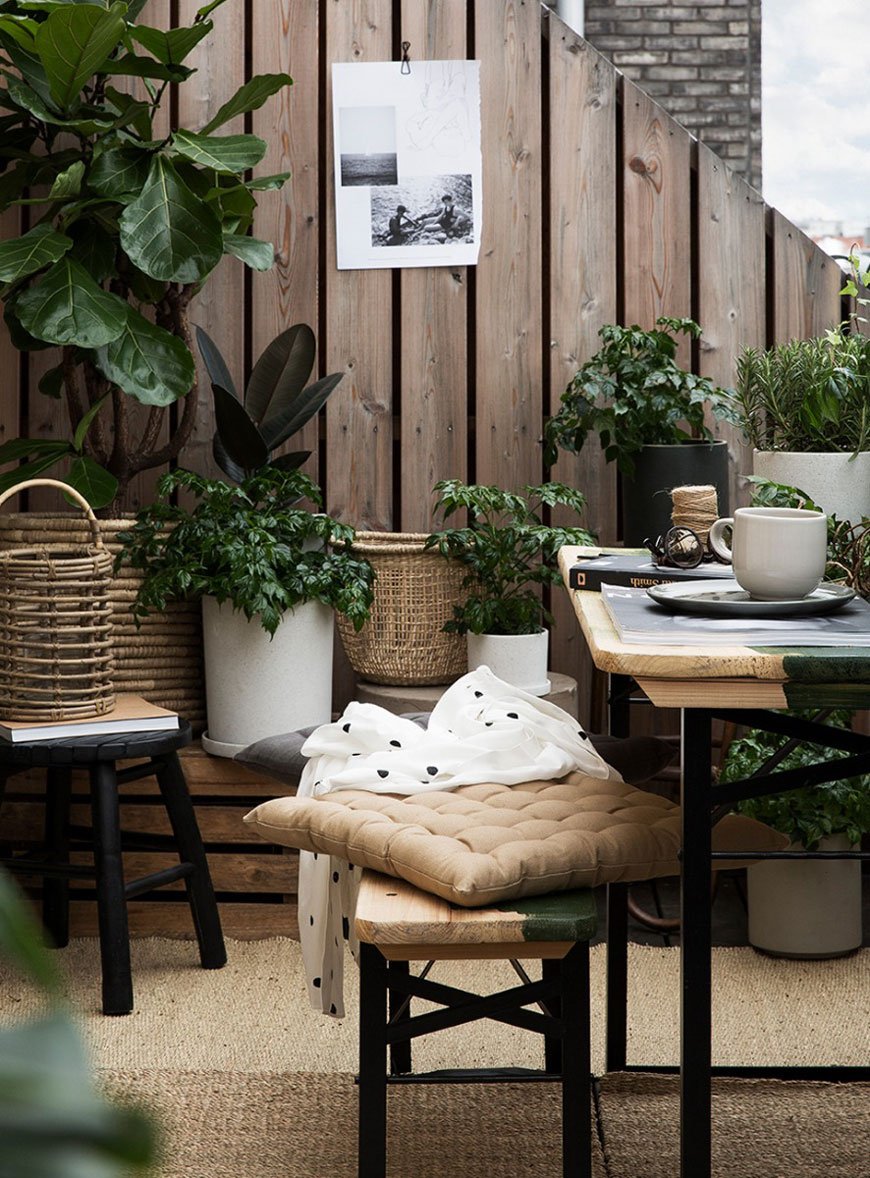 With the longer days here to stay a while and an abundance of plants to choose from, now is the perfect time to explore small space summer garden inspiration from Swedish store Granit.I'm a huge fan of Granit, a brand established by two friends back in 1996 who wanted to simplify their lives through a minimalist approach to functional homeware. You'll find baskets and crates, monochrome pots, furniture and finishing touches and with a focus on sustainable design in neutral colours.The SS18 lookbook is giving me hazy summer garden vibes and makes me want to take our sunroom to the next level. The vibrant greens in the plants do the talking in simple black and white concrete pots and there are lush hideaways in small corners...
A Balcony Oasis
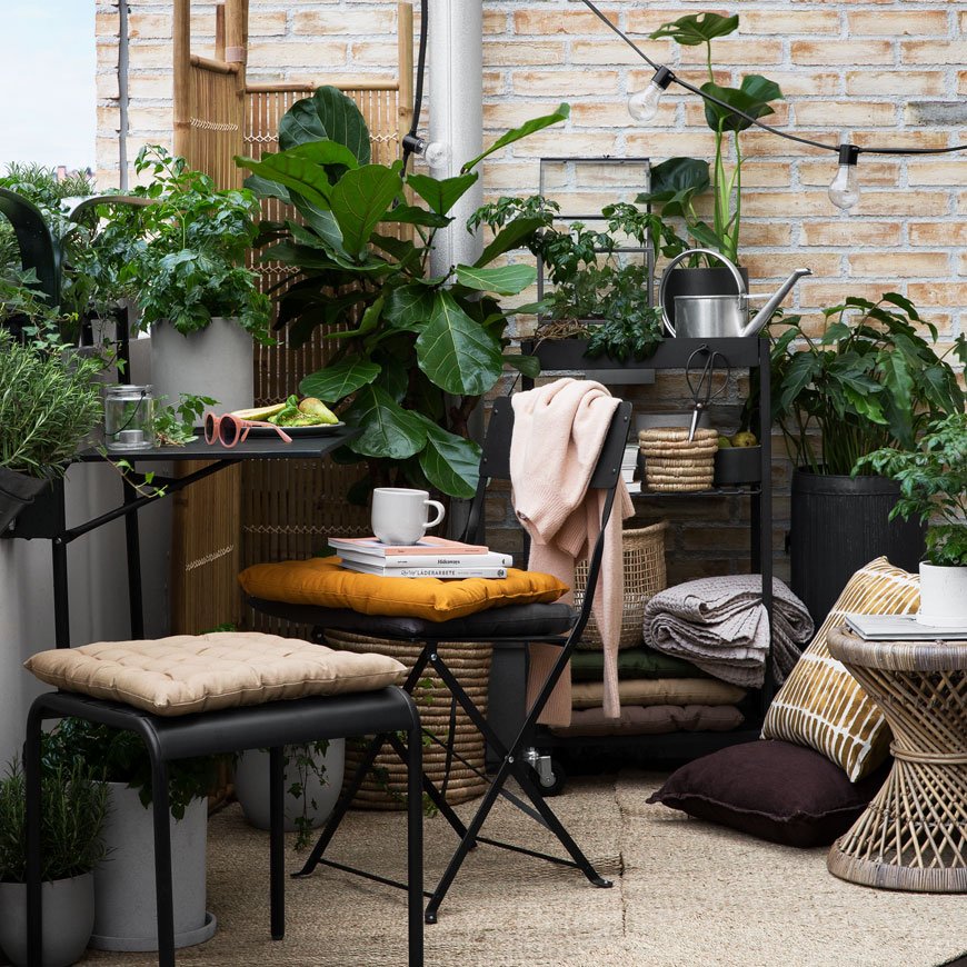 Do you have a balcony? Well then I'm jealous. Proving that a lack of space doesn't mean you can't enjoy a garden, plants can be displayed on tiered trolleys and narrow benches. Find furniture with small footprints to raise up your pots. Choose tall, narrow plants for their height; ideal for balconies, potted up and placed into woven baskets for textural contrast. If you have a small section of wall, think about wall mounting planters or attaching a piece of metal gridding for a climber to make the most of.
Every Space Is A Garden Opportunity
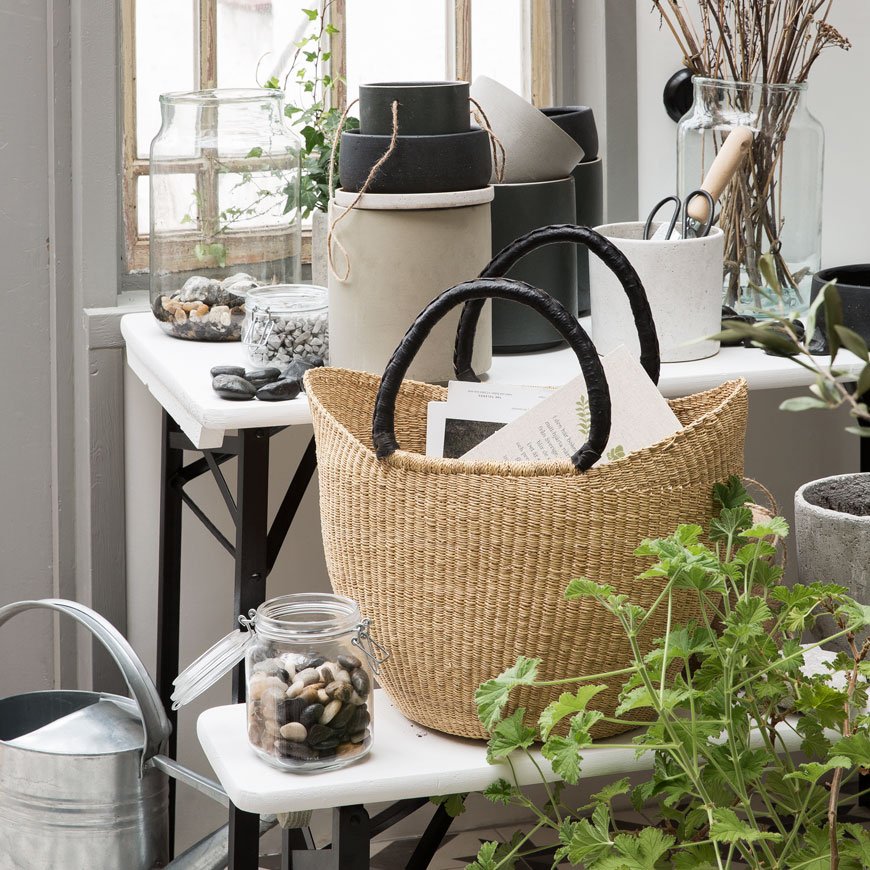 If you don't have access to an outdoor garden or sturdy windowsill then look at what you have indoors. Find an area that receives good light and use this as your starting point. Think about levels - attach trailing hanging plants from the ceiling or an existing curtain rail if you don't trust your DIY skills. Don't be afraid of large-scale plants. Despite it being a small space, taller plants will actually make it feel bigger because they make use of the height of the room rather than width. A bamboo is ideal with narrow leaves and structural stems, as is a rubber tree or fiddle leaf fig if you're a dab hand with temperamental varieties. Utilise low-level stools for large single pots and shelves to display a selection.
Kitchen Garden
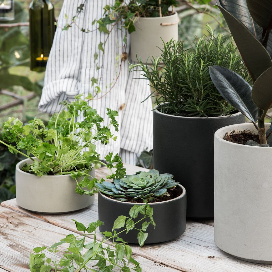 You can easily grow herbs from pots on a kitchen windowsill. Not only do they soften up the room but they're incredibly handy to have to hand and pinch off what you need as you cook. Some are easier to look after than others, but the Mediterranean varieties need very little attention to be happy. If there's a little more room, you could even try growing tomatoes. You will need to support the vines as they grow taller, but I have managed one or two plants from a medium-sized pot in a corner of the kitchen before.
Bring Summer Garden Style Indoors
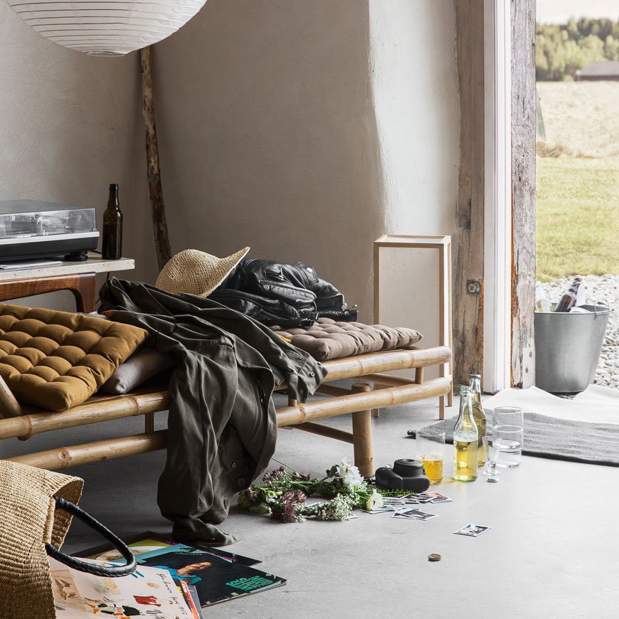 Bring summer garden style into your home with natural accessories. Woven seagrass mats feel great underfoot and raw, slubby linen cushions give a relaxed feel. I love Granit's earthy, spicy palette of linens and their bamboo daybed, spot on for lazy afternoon lounging with a good read.
 Don't forget the dining table too. If you've space to, a single branch of olive or apple blossom looks great in a large glass vase, as do small pots and vases with little posies. Wreaths are popular all year round, hung nonchalantly from a chair back (as below) or hung on the wall. Try making your own from foraged branches and summer blooms and if we're walking scale, the bigger the better if you ask me.
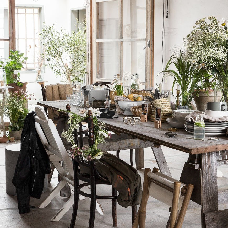 So now I've planted a few seeds for summer garden inspiration, it's your turn to put them into practice! One last tip from me? If in doubt, CRAM IT IN. I want to feel enveloped and cocooned by my garden, don't be afraid to layer up your canopy! And I'm sorry if my introduction to Granit will cause your bank account distress, particularly when I tell you that they ship to the EU...and for now that still includes us in the UK. Uh ohhh...
All imagery courtesy of © Granit with thanks.
The Nordic Style Sofa Chair Edit From £300
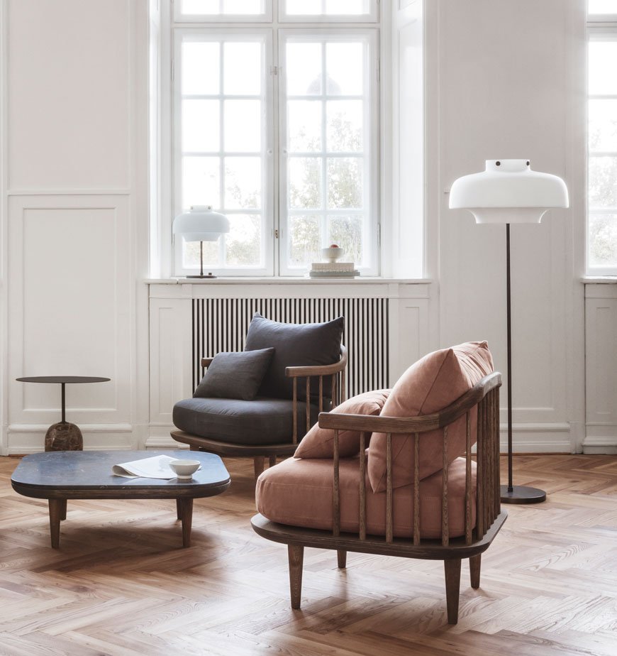 I have been on a tireless quest to find the perfect seat to fit inside our small bay window in our living room. It's not the biggest space to fill, so options are limited when you have just under 130cm width to work with. Following hours of flailing around with a tape measure, I present the solution.I give you the sofa chair. Or the Snuggler. Or the loveseat, if you like. Not quite a sofa, not quite an armchair, but a hybrid of superior quality lounging. I'm talking about the kind of chair you can nonchalantly swing your legs over the side of the arm in. A chair with a deep seat made for sharing. For when a lounge chair is not enough. If you have an awkward nook or more modest proportions where a sofa wouldn't fit, this may be the answer for you too.
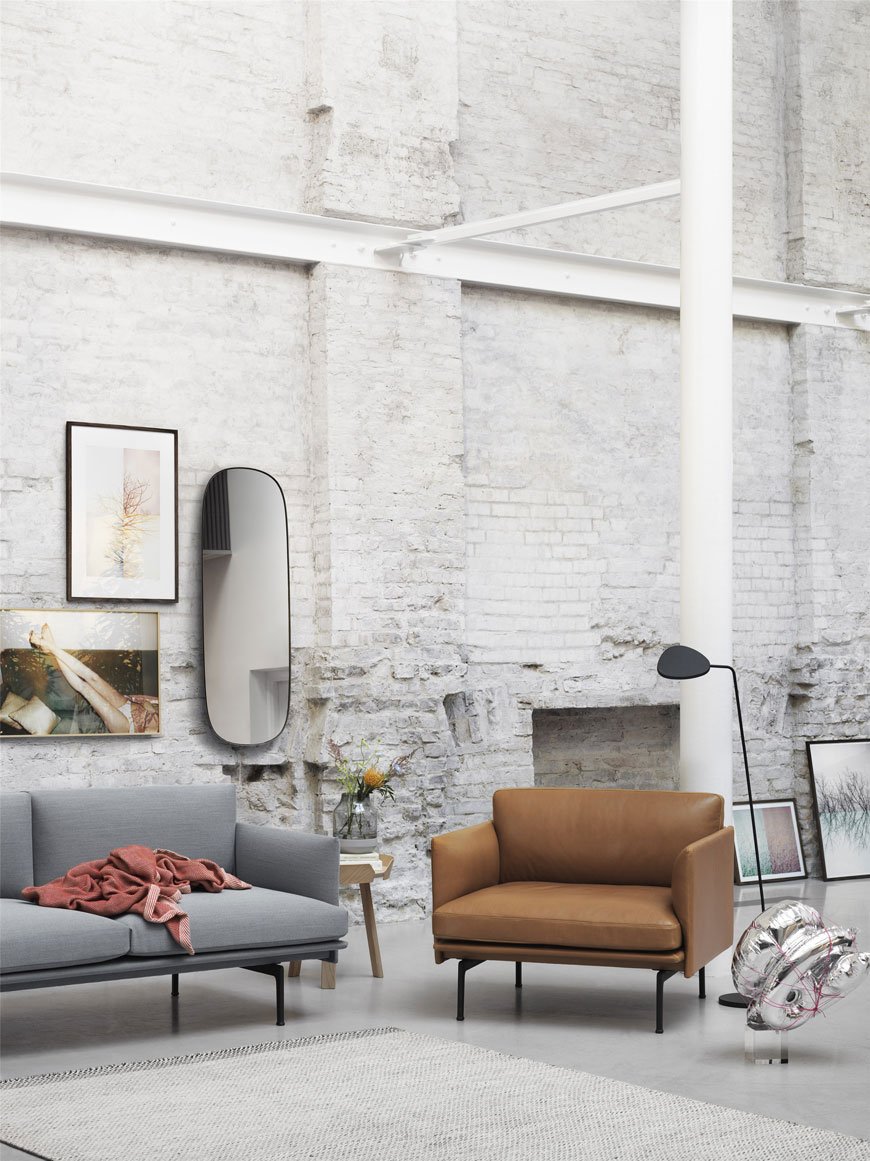 So I've trawled the web, pulling in my edit of nine Nordic style sofa chairs for your delectation. With one eye firmly on the price point, there's a pretty comprehensive selection from just under £300 up to £2,000 to suit all budgets. I even went one step further in the name of design, seizing the chance to road test a few when the opportunity arose, so I'll put my money where my mouth is. Most of the chosen designs come with a huge selection of upholstery (and I recommend you order samples) ranging from linen and cotton blends, velvet and leather. I may have found the perfect design for our living room, with a little restraint on my part - it's hard to be practical when you're exposed to such gorgeous designs. Of course, I'd love to throw a few thousand at a Nordic dream, but I have two children and a cat with claws. Oh. And a very clumsy husband...
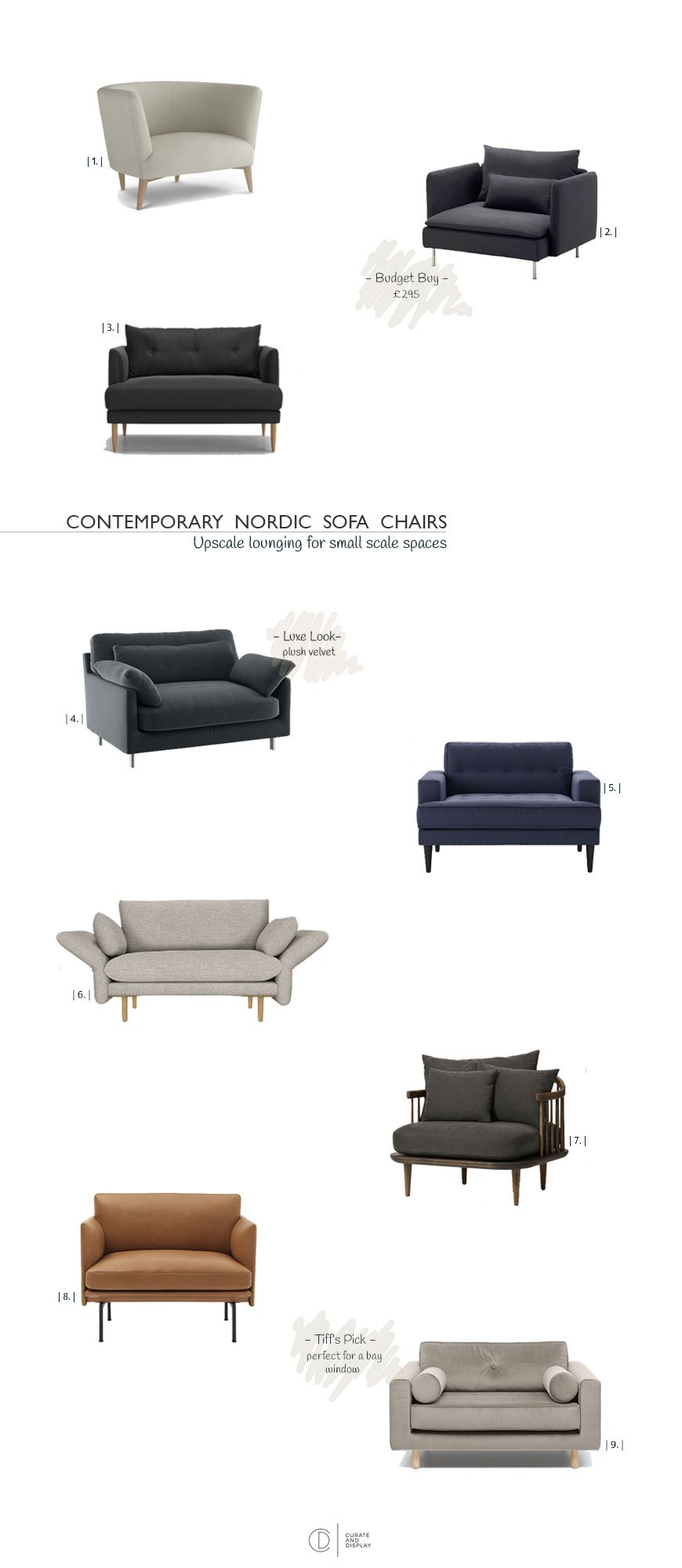
| 1 | Elton Snuggler chair in Barley Weave, Arlo & Jacob | 2 | Söderhamn chair, IKEA | 3 | Kalmar loveseat in Quartz House Weave, Swoon Editions | 4 | Cuscino compact sofa, Habitat | 5 | Mabel Loveseat in Uniform Blue, Sofa.com | 6 | No.142 Snuggler in Storm Grey, John Lewis | 7 | Fly Chair in Smoked Oak, &Tradition at Nest | 8 | Outline Chair with leather upholstery, Muuto at Heal's | 9 | Avenue Loveseat in Velvet Grey, Fest Amsterdam
Swedish Linens Sheets For Clean Conscience Sleep
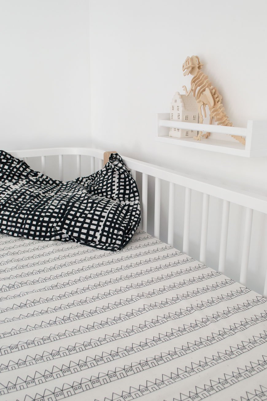
Whilst my two were away at their Grandparents over Easter, I took the opportunity to attack their room. You know, all the usual boring things you want to do when they’re here but find impossible - sorting through mountains of toys, cleaning snot marks off the wall, a really thorough vacuuming...
I've not bought any new bedding since we finished their bedroom as for the most part I don't want mountains of spares piling up in the airing cupboard. Ultimately though, we're making a conscious effort to use only what we need opting for slow fashion over the mass produced. When I got an email from Swedish textile designer Hannah Johnsén to tell me about her new venture, it was like hearing from a kindred spirit and I had to tell you about it.
After studying in London, she began her journey designing knitwear but as a mother of two, it became more important to her to create a cosy environment for her family. With good quality sleep as her focus - and let's face it we all feel better for some decent sleep, she designed a collection of 100% organic percale sheets, made in Portugal with GOTS certified, ethically produced cotton. With every stage of the process scrutinised, all sheets are digitally printed, meaning less water usage and free of plastic packaging. Add to that a fun and playful collection of bold, graphic prints and Swedish Linens was born.
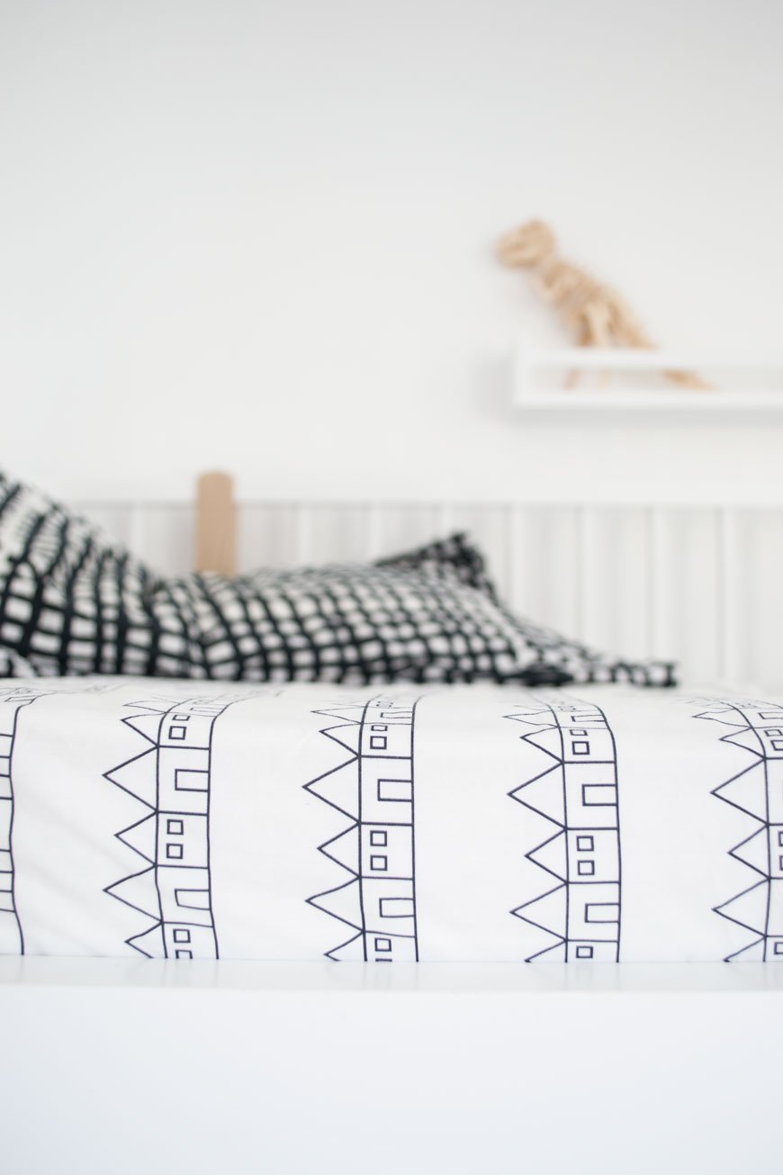
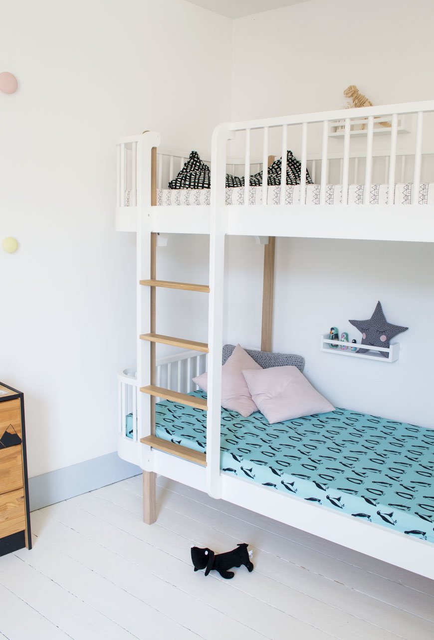
You can see how Hannah's Scandinavian roots have influenced her collection, particularly Lindbacken, named after a town close to her home of Uppsala with its rows of houses. My daughter made a beeline for the Minty Blue Penguins and she loves to count them at bedtime...which is more interesting than sheep I suppose!
Sizes range from crib, single to double meaning they’re not just for kids in case you were wondering and I’m told a king size option will be available later in the year.
For an exclusive 15% discount, use the code curatedisplay15 at the checkout until 2nd May 2018. 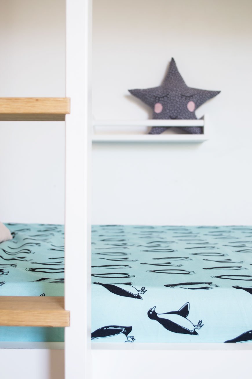
Photography & styling © Tiffany Grant-Riley
* Swedish Linens kindly gifted two sheets for the purpose of this post.
Slow Sounds No 1 Spring Playlist
 I know talking about the weather is one thing us Brits know how to do well, so I'm
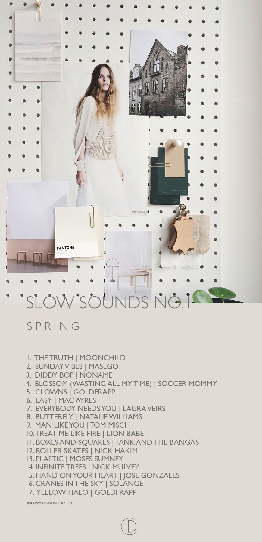
 not sorry but please excuse me while I say my GOD that was the LONGEST winter we've had in a long time. Wow. And then this week, Spring broke in all its glory. I spent the last few afternoons digging out wider borders in the garden, planting banana trees and kicking about in my Birkenstocks (how I missed them so).So in celebration of ditching all those layers, in celebration of the longer days, brighter afternoons and sun-kissed evenings, I'm beginning a new series to accompany your slower days. Music is a big deal in our house. My husband is a musician, my father's side has a long legacy of some pretty pivotal Caribbean music, I'm a very rusty violinist and I used to sing Jazz and Blues before my self-awareness got the better of me. These days, I confine the vocals to the house, but it's a real release for me. The house is never quiet, just how I like it.Anyway - here's Slow Sounds No.1 - a playlist for Spring. A mix of contemporary jazz, soul and a touch of folk to listen to as the garden starts to wake up again. I hope you enjoy my carefully selected picks and that I've introduced you to a few new secrets of mine...#slowsoundsplaylist
New by Menu | Minimalist show flat in Shoreditch
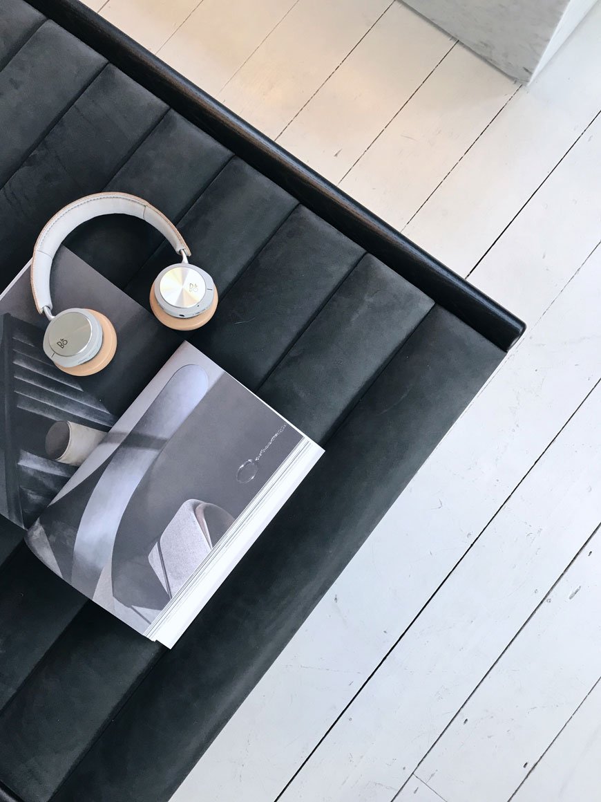
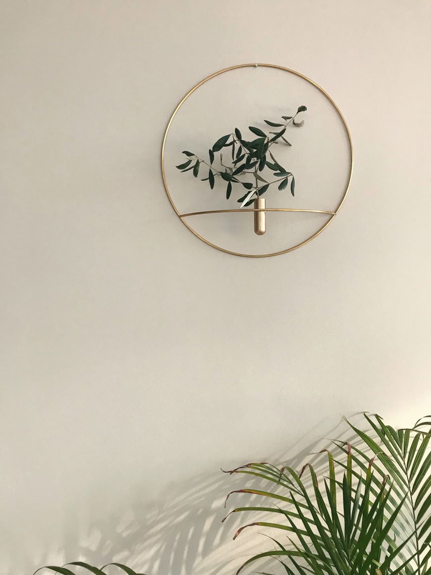
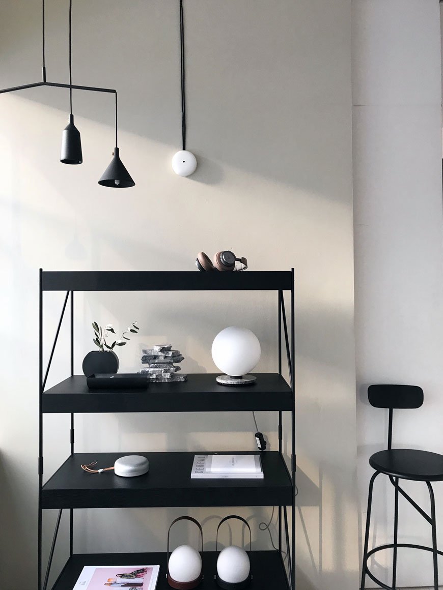
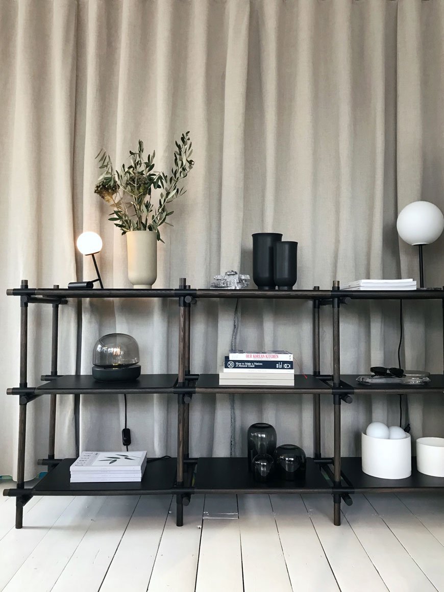 There are few things that could dissuade me from spending time in Shoreditch, least of all the new MENU show flat. What better location in London than here, an area with an industrial past, constantly adapting to and welcoming new forms of architecture, social experiences and urban living. A collaborative, multidisciplinary design house, Menu's ethos embodies these surroundings. Think converted warehouse, large, industrial windows, white walls and white painted floors. And then add onto that backdrop, a considered, livable space featuring MENU's New Nordic vision of minimalist design.I ring the bell and I'm welcomed up by Kaspar, the UK representative for the company, who also happens to live here. I'm not jealous. He leads me down a narrow corridor partitioned off by linen curtain on one side, with a small, functional kitchen on the other, before the space opens out into a large, bright living and dining area. The room is zoned into different areas, cleverly defined by a raised platform for reading, featuring the characteristically slender Afteroom bench and grey marble Septembre coffee table, designed by Theresa Arns. At floor level, the black Align day bed and Eave modular sofa set off an area for serious lounging.
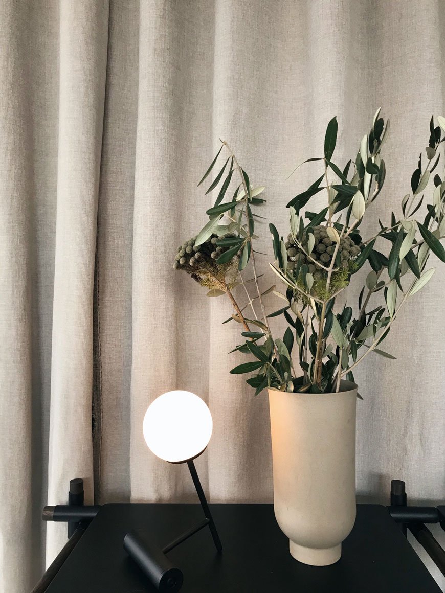
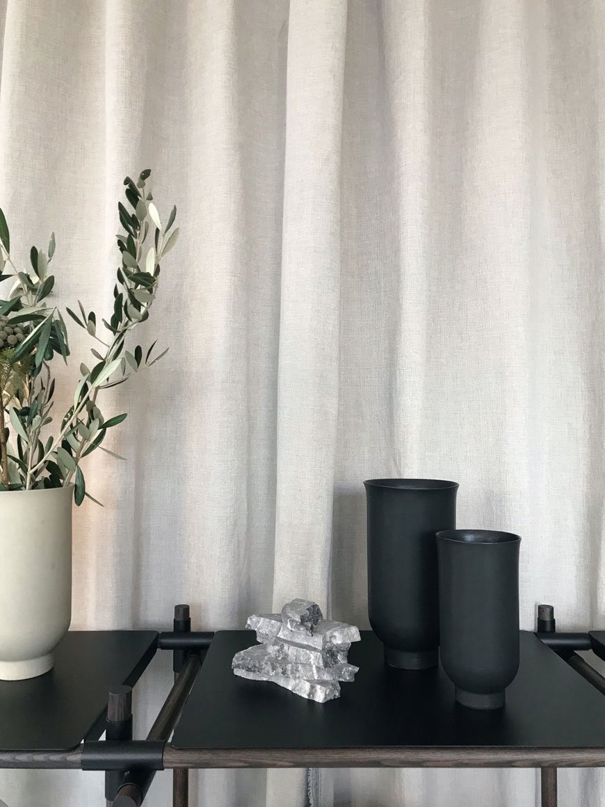 A dining table doubles up as a meeting point for both hosting and working, with black Stick shelving a place for books and inspiring pieces, giving a feeling of connected living, work and play from home. Having worked as a freelancer from our various homes these past ten years, it's a fluid way of living that I'm very familiar with.
It is this very synergy of co-living, co-working and co-designing, which inspired us to form a connected space that blurs the line between home, work and hospitality.
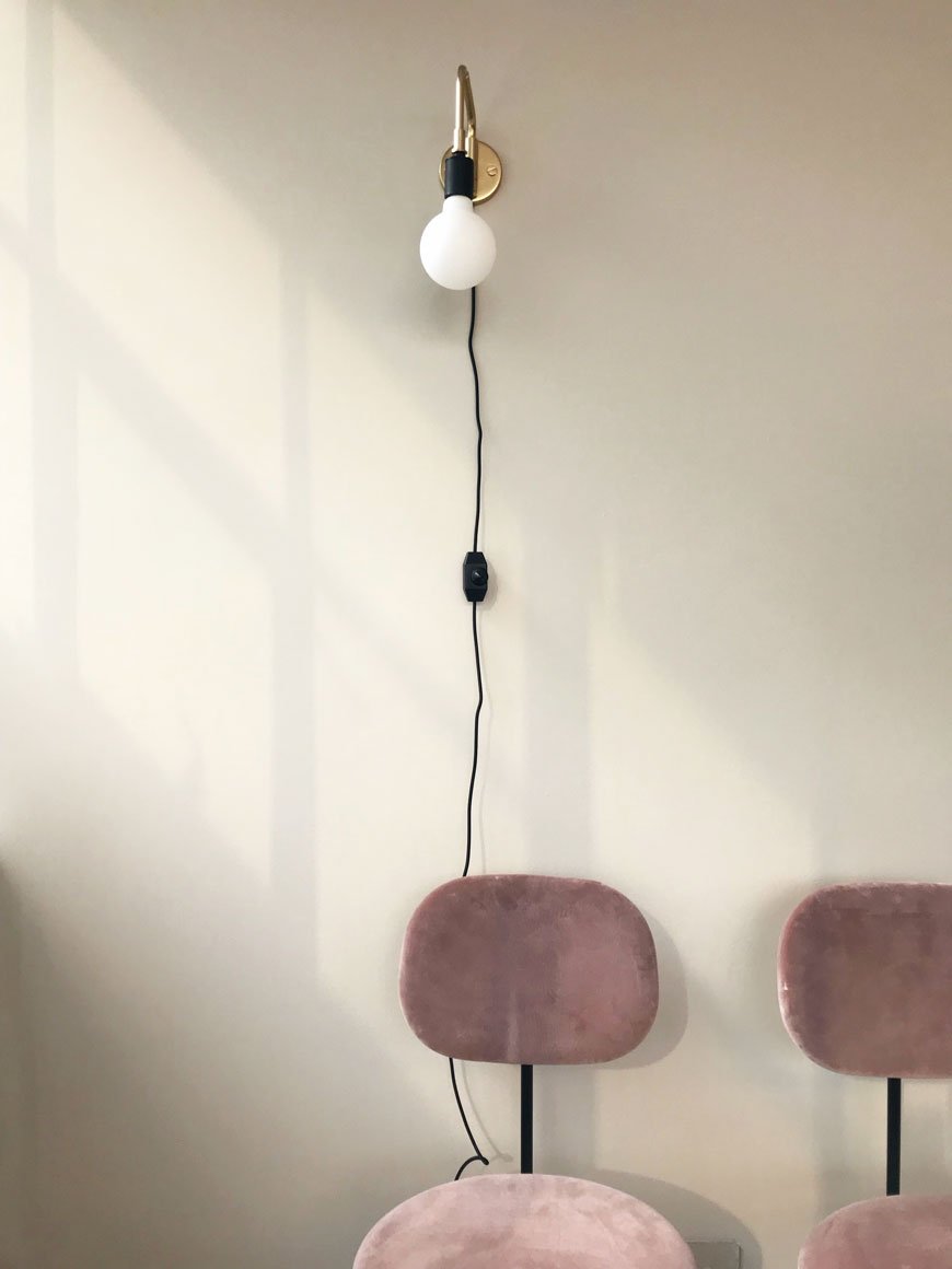
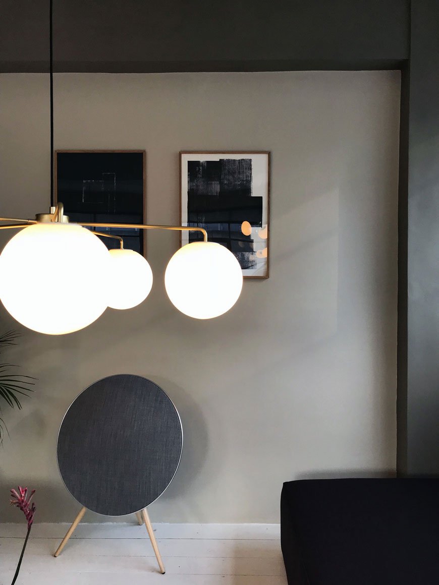 London based designer Tim Rundle and creator of the TR Bulb talked us through his innovative LED light, which can be used in conjunction with any screw pendant socket. Easy to install wherever is most convenient, it takes away the need for fiddly electrics and it's dimmable too.
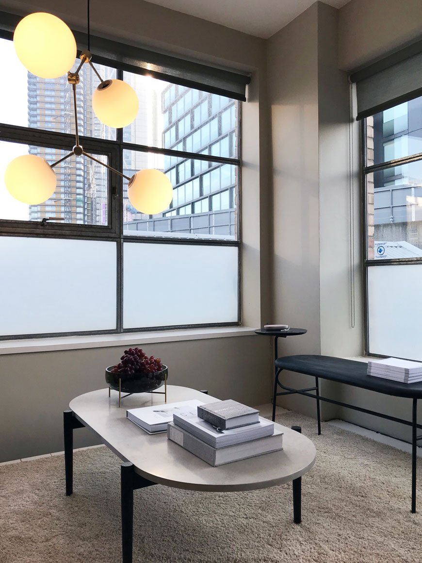
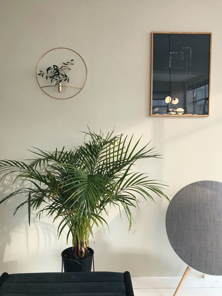
 The interconnecting passage between the living area and bedroom isn't just left as a cold, empty space but instead, a kind of snug awaits. The slim-legged Godot sofa and Norm Architects' new brindle-like Offset chair encourage a quiet moment, interspersed with vibrant house plants. Juxtaposing materials - the smooth gloss of glass and marble against warm wood and wool, show how to add texture and interest to a neutral setting.
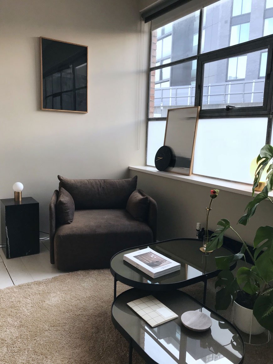
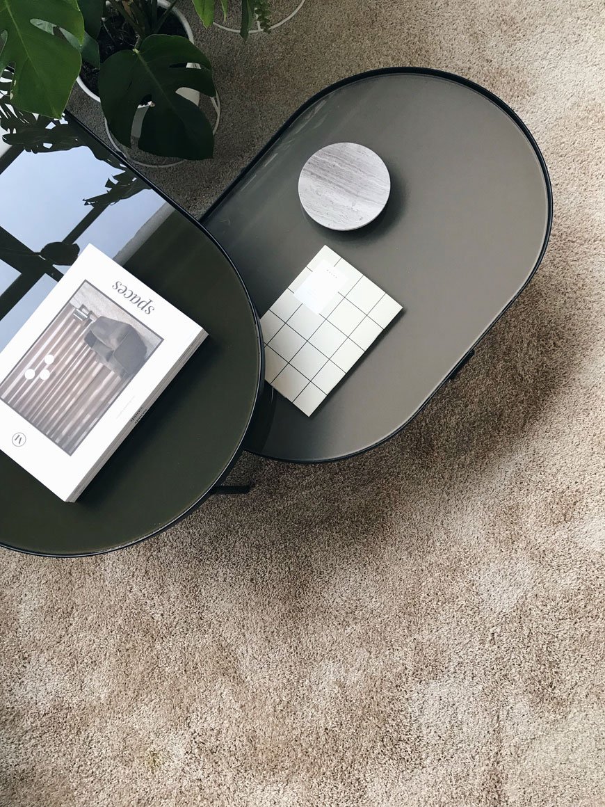
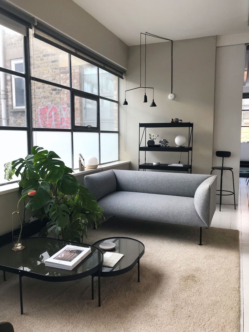 Additional styling reads like a who's who of contemporary Danish design, including state of the art Bang & Olufsen sound systems, abstract art prints from Atelier CPH and bold, graphic stationery by Notem Studio.
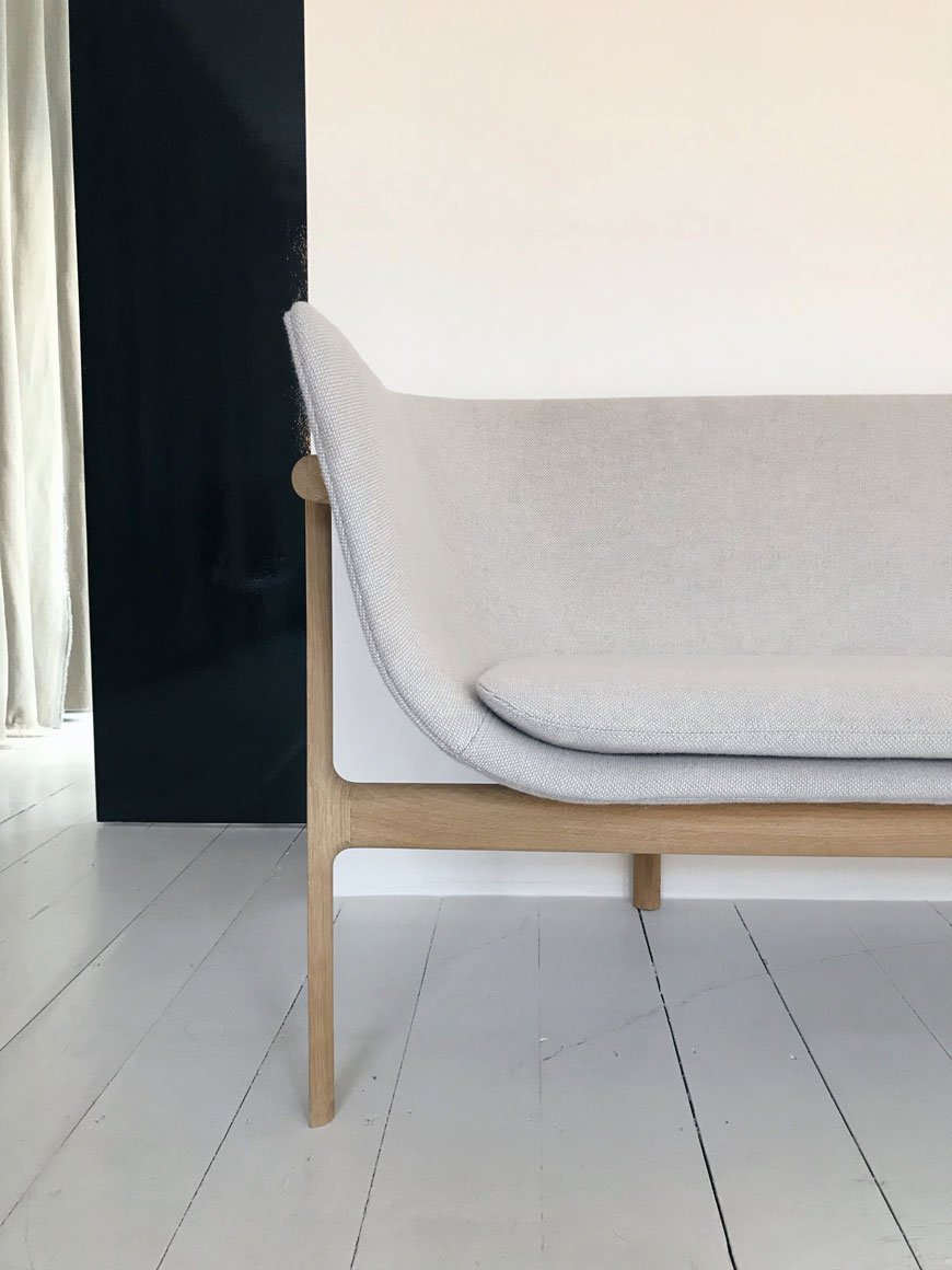
 Into the bedroom and I'm greeted by my most coveted piece of Danish design above all others. Yes, I'm committed to that. The Tailor sofa, designed by Rui Alves who, inspired by his grandfather's tailors studio wanted to show the oak framework of the sofa, with a feminine scoop shell seat. Isn't it perfection? Needless to say, it really is comfortable too.
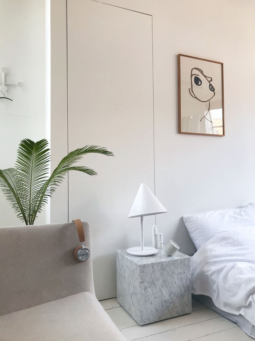 A bedroom for purists, only the very essentials are required here. The marble plinth is an understated bedside table. The stripped back lines of the Norm floor mirror echo the industrial frames of the warehouse windows and the bed sits nonchalantly on the floor in true loft living style.
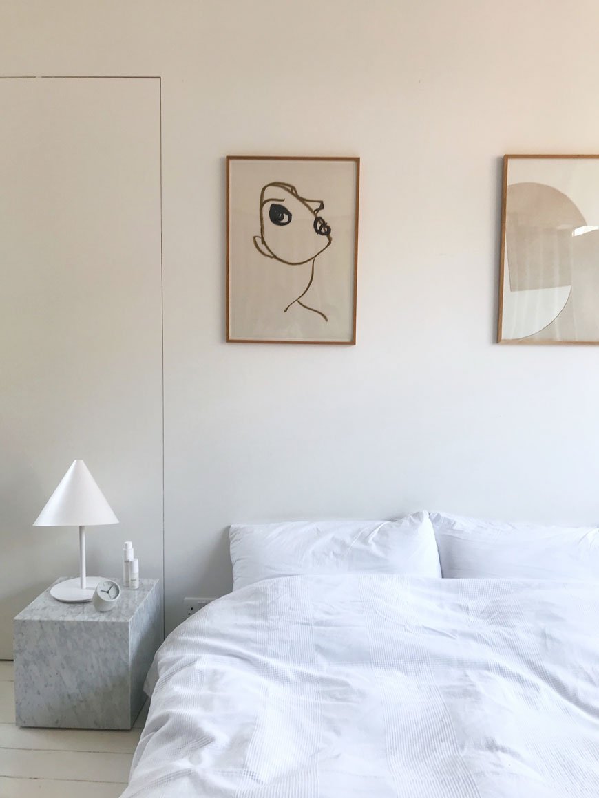

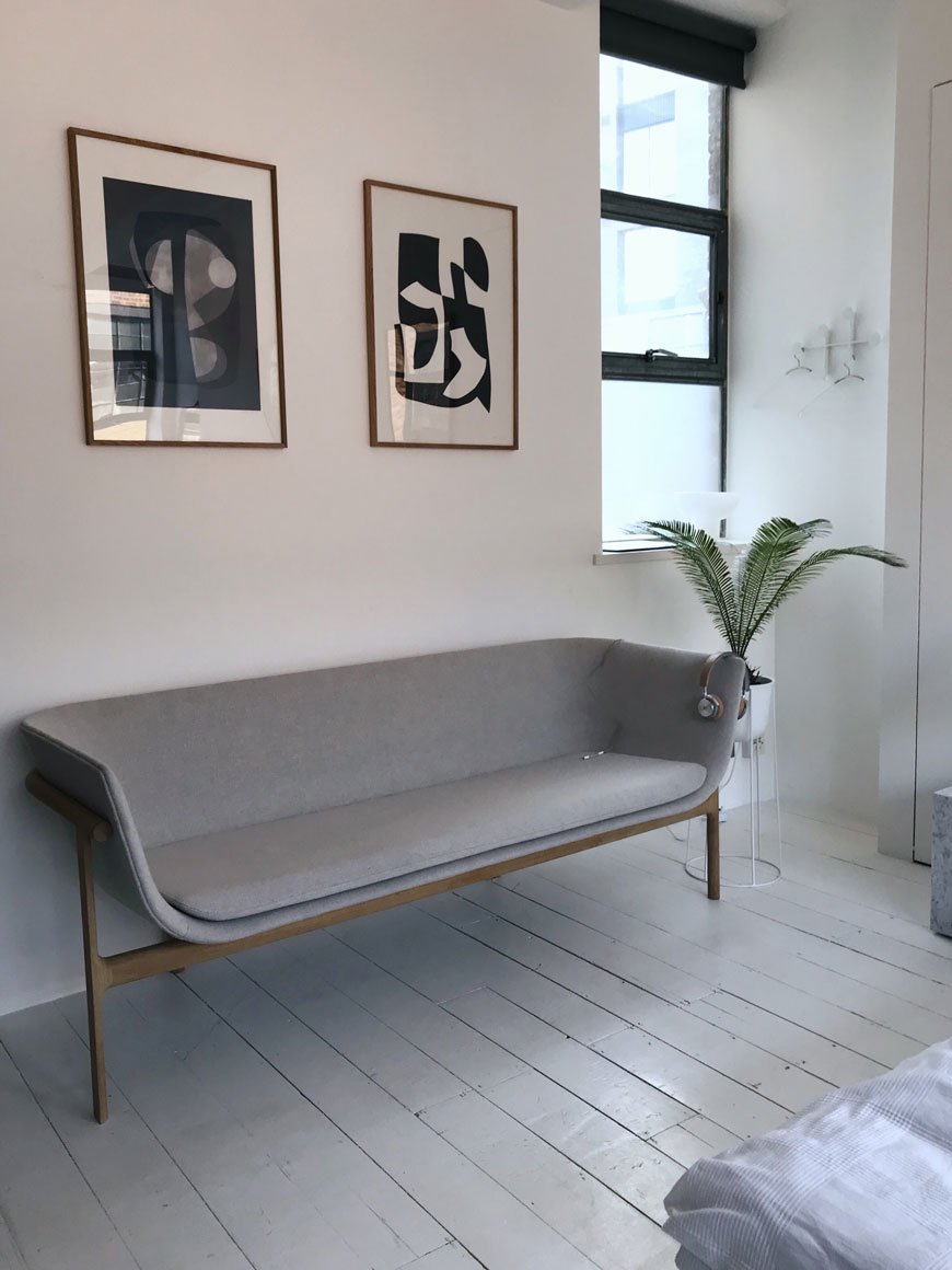 What makes a very personal showroom experience, MENU has nailed the live-in showroom concept. This is how it should be done. You're left to explore, touch and try at will with no stark lighting or rehearsed tours, aside from the occasional visit from Kaspar's dog Frank, who will invite you to fuss him.
Photography © Tiffany Grant-Riley
Architectural Holiday Homes You Can Escape To
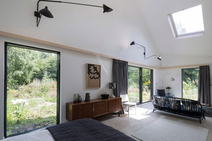 There's no doubt that since the rise in popularity of Airbnb, the home from home holiday experience is more important than ever. We've shown that we want to live like locals, relax in considered spaces, appreciate high-quality design and perhaps even come away with a few ideas for our own homes. It used to be that it was a lengthy task to find anything design-led that was within a certain budget and wasn't a luxury hotel, but now there's a dedicated number who've got you covered, connecting you with architectural holiday homes you can play a grown-up version of house in and pretend you live there.
The Modern House
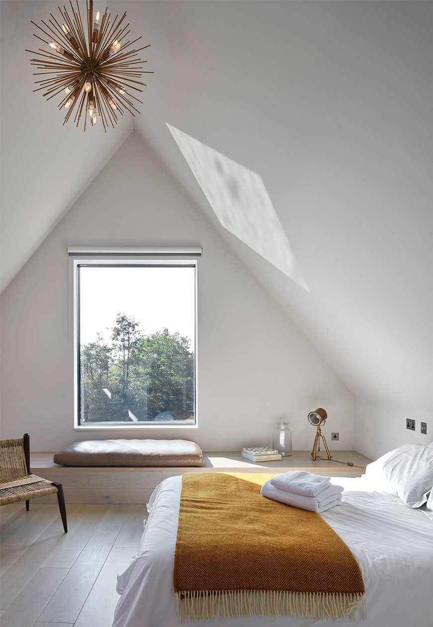 You might already know The Modern House as an estate agency selling some truly exceptional properties, from modernist classics to contemporary builds, but did you know they also have a portfolio of architectural escapes? From European to International homes, this collection of award-winning spaces offer a unique insight into how well considered architecture can change our quality of living. These homes are anything but ordinary, particularly the Backwater eco home, found by a secluded lagoon on the Norfolk Boards. With a real sense of Scandi influence, this RIBA 2016 award winner has a jetty leading straight out on to the water and room for up to eight guests.
Urlaubsarchitektur
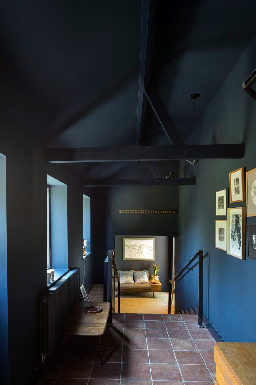
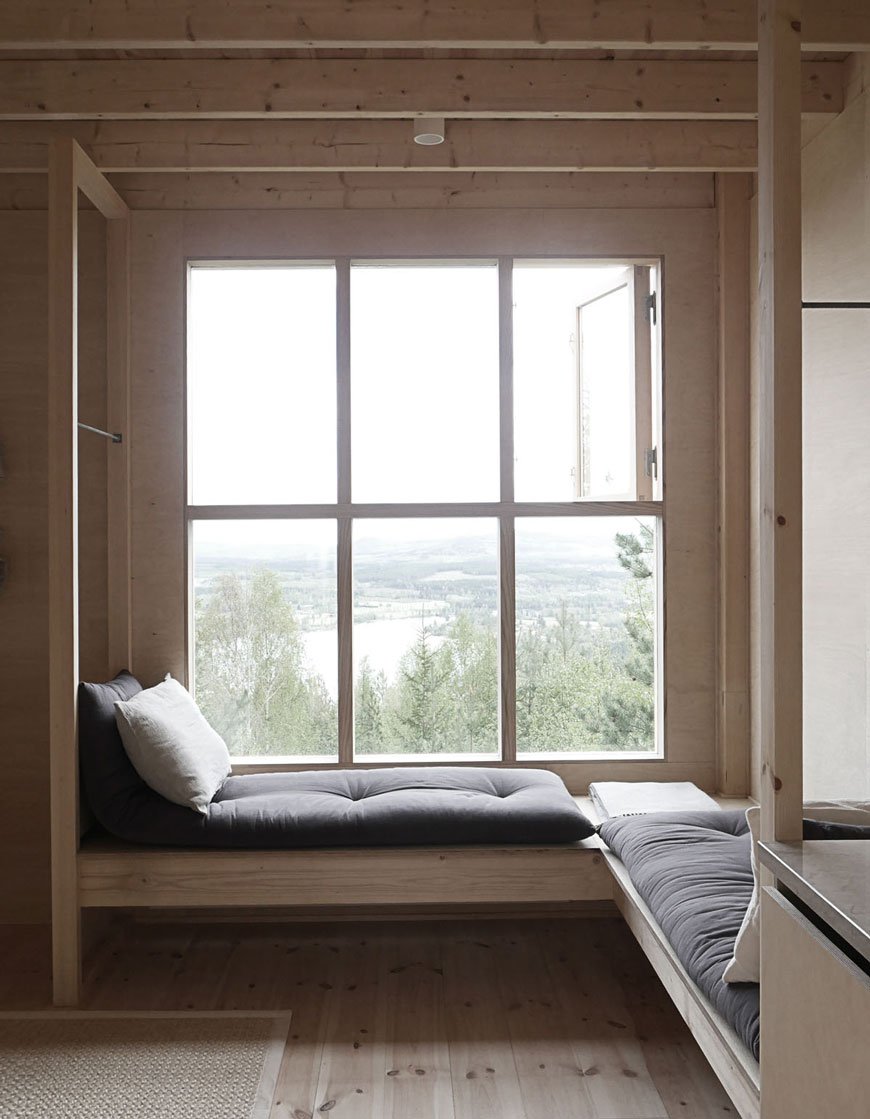 This German-based company founded by Jan Hamer who curates a jaw-dropping collection of private homes, hotels and B&Bs, Urlaubsarchitektur divide European locations up into inspirations depending on what it is you're after. You can find any number of highly designed experiences, ranging from the minimalistic, a break that's cool for kids or even a yoga-centric retreat if that's your bag. Be warned though, as what starts as a quick browse can fast turn into falling down a rabbit hole. Check out their series of Holiday Architecture books for coffee table dreaming and scheming.
Host Unusual
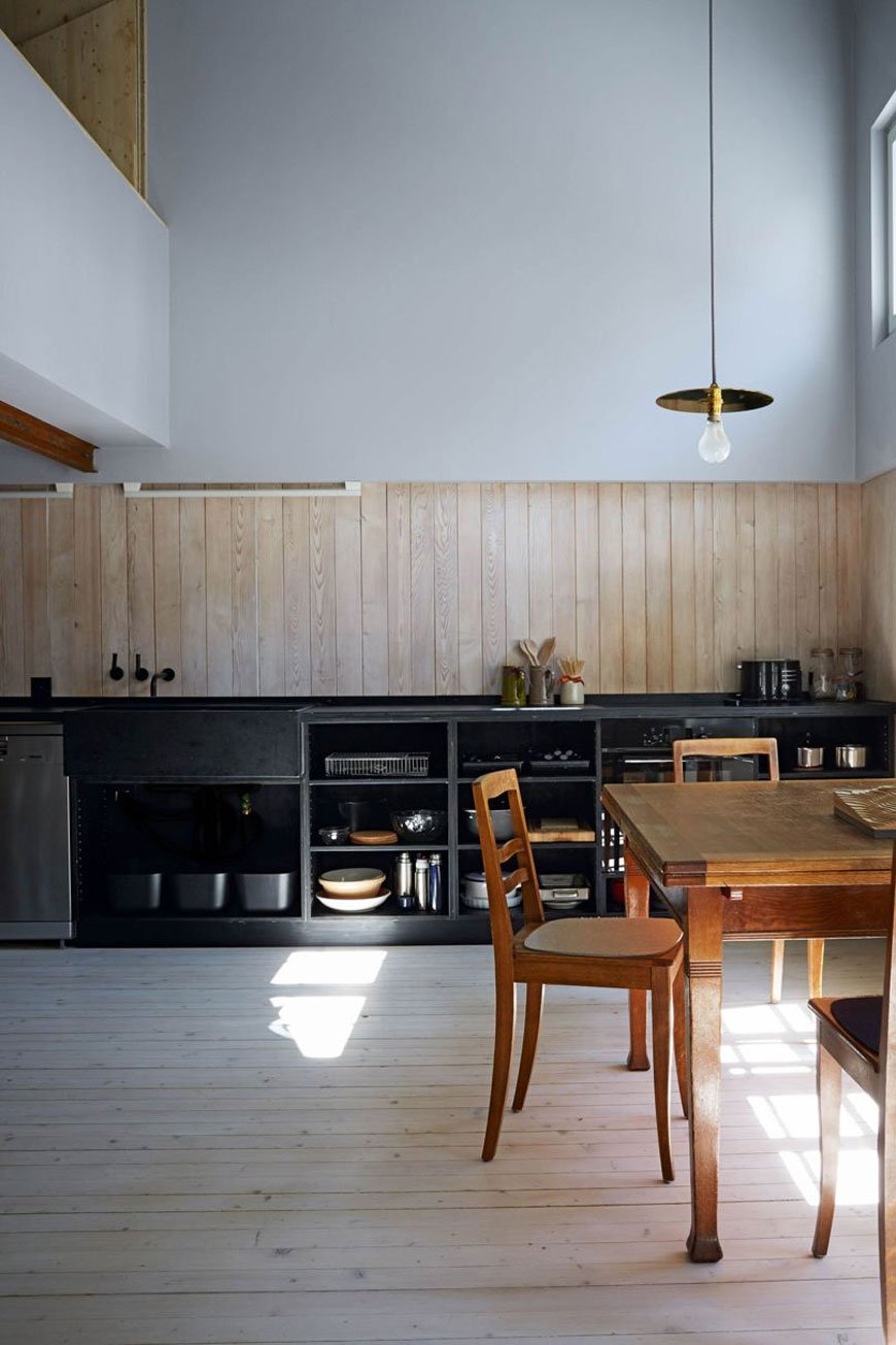
 If you've ever wondered what it might be like to stay in a treehouse or look out onto a beautifully bleak coastal setting in the middle of nowhere, Host Unusual have a strong selection of quirky UK escapes for just that. Staycations are no longer a last resort, blending the best of the British countryside with cutting edge contemporary architecture. A personal favourite is Five Acre Barn in my home county of Suffolk, a mid-century modern inspired country escape; just a few miles from the coastal town of Aldeburgh if you ever wanted to leave this stunning location!
Living Architecture
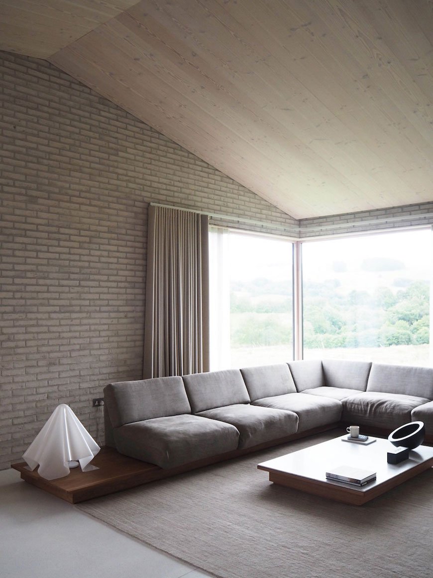
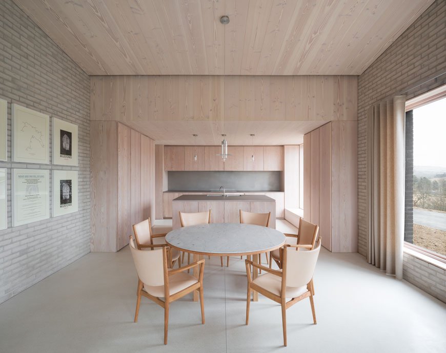 A fully immersive experience of exclusively designed architectural properties, Living Architecture aim to educate and influence discussion about modern architecture and its importance to innovate for future generations. Founded by Alain de Botton in 2006, he set about working with what has become a group of nine stellar architects, including John Pawson, NORD Architecture and Mole Architects to design a series of purpose-built holiday locations in the UK.John Pawson's Life House, nestled in the remote Welsh hills promotes minimalist relaxation in simplistic surroundings. Full-scale windows bring in the rugged landscape and the interiors show the natural appeal of white brick, polished terrazzo and timber lined ceilings. There are separate rooms for reading, listening to music and a contemplation room with a retractable skylight. A less-is-more aesthetic for a pared-back retreat.
DOM Stay and Live
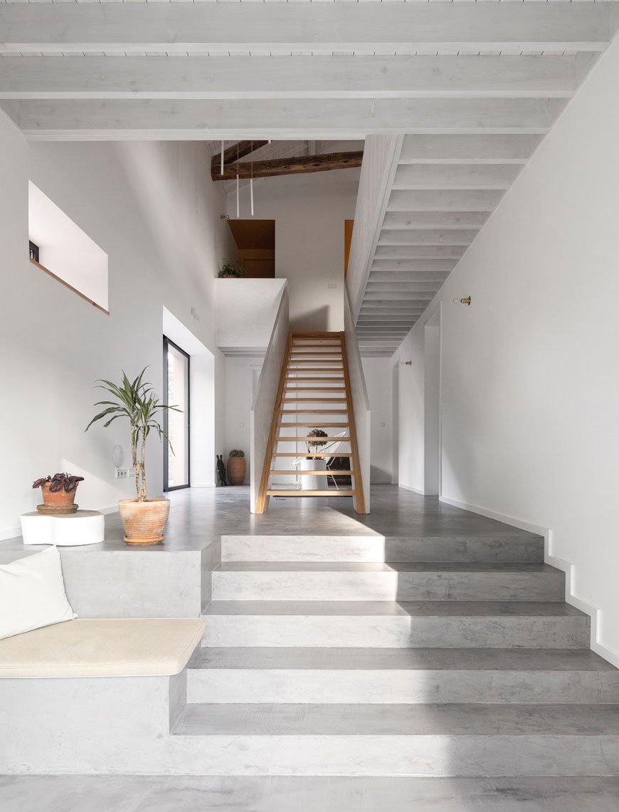 DOM Stay and Live is a relatively new holiday experience, launched by interior architect Marta Nowicka. DOM, meaning home in Polish draws on the trend for designers and architects opening up their homes for others to stay and live in. Marta has collated a hand-picked collection of homes from across the globe including some of Marta's own. There are three categories that DOM divide their experiences into; UK locations, European bolt-holes and locations you can actually live in long-term. I’ll take The Pink House on the Azores islands (pictured) for its mix of contemporary interiors and traditional heritage, once a barn owned by the family for six generations.
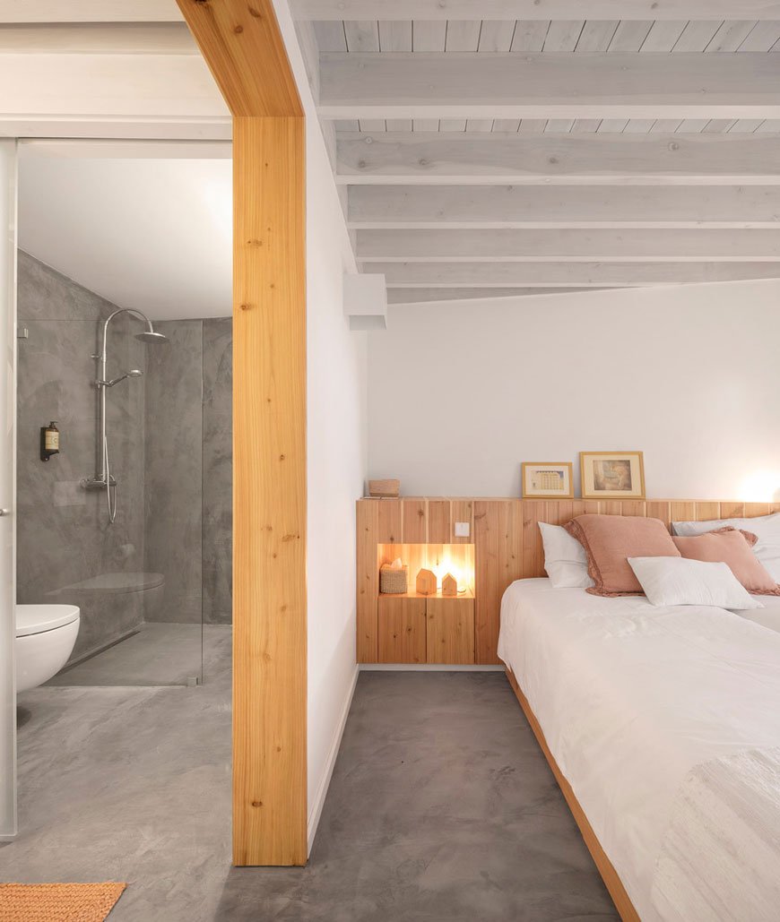 It's worth noting that although some of these organisations manage the properties themselves, the majority are privately owned meaning they put you in direct contact with the owners. Goodness knows where you'd even begin choosing where to stay with so many possibilities - where's next on your passport?
Our Nordic Blue Kitchen Before and After Reveal
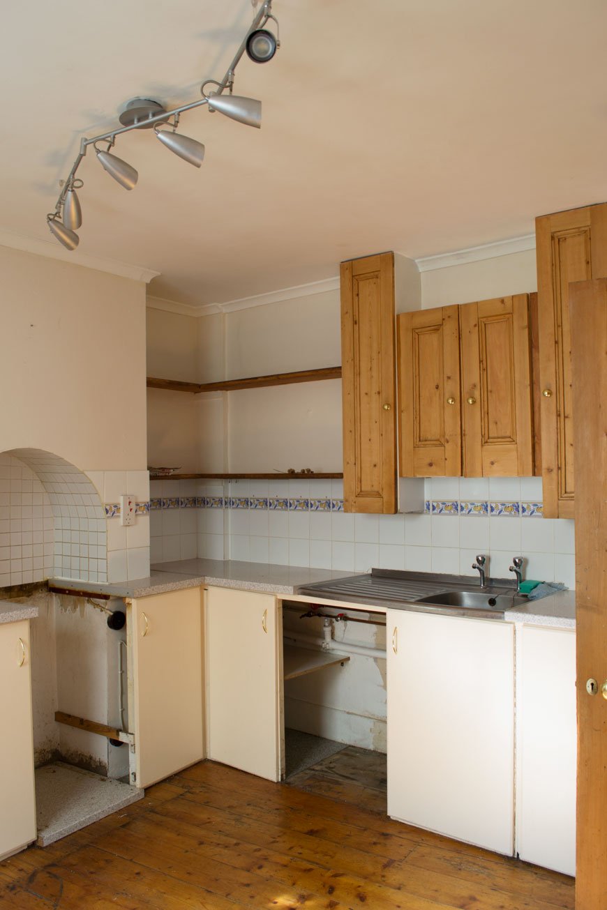 [AD] I never learn. Why is it, that every time I embark on another room project, I think for some reason that it'll take no time at all? Don't get me wrong, I'm not naive, I know that something done well takes all the time it needs, but still. Our blue kitchen refresh was definitely one of those. I mean, look at it. It needed it. Aside from looking like the 90s had well and truly moved in and never left, its mishmash of badly considered DIY meant that it didn't work in any capacity. Ok, so we didn't have epic Grand Designs extensions planned at this moment in time and 90% of the work was cosmetic, but it was still going to be a hard slog.
Here's what we weren't going to change:
• Plastering the walls• Anything structural. So knocking through walls was out.• Cupboard units and worktop. It all had to stay.• Replacing tiles, flooring, sink unit or radiator.Everything else was fair game. If you saw my blue kitchen inspiration post, you'll have got a sense of our plans and how the overall space would eventually look.There's lots to appreciate about this room though. It has plenty of charm in its proportions. One feature I love is the arch in the chimney breast, a nod to where the original stove would've once stood. It makes for a natural focal point. Unfortunately, it also means that due to the way the previous owners built in the cupboards, we could only fit the smallest oven available into it.
The Before
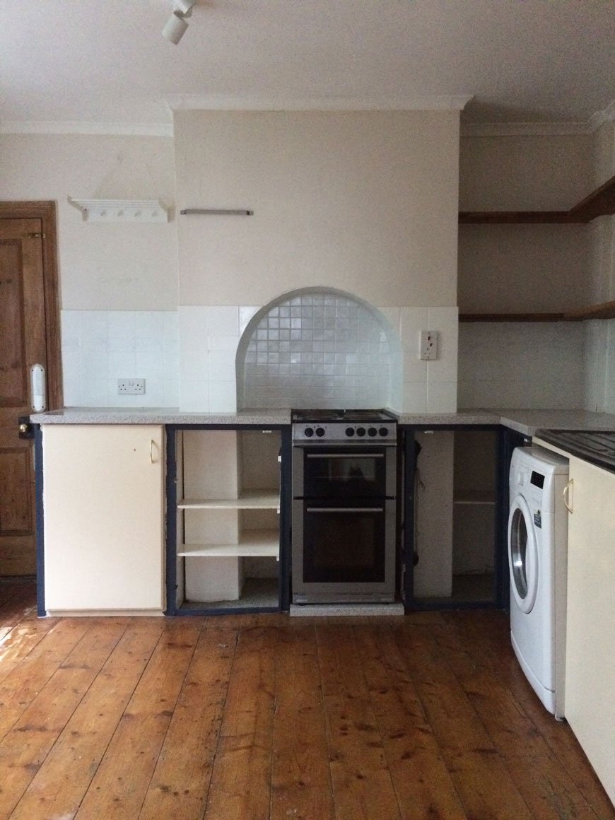 The room is naturally quite dark as the window faces out to a small piece of yard and across to the neighbours. With that in mind, I didn't want to go all out trying to make it look brighter with white paint, only for it to look cold and flat. Instead, I decided to embrace it, bringing in my favourite shade of blue. I wear it all the time and it seems to be a colour we're both naturally drawn to, especially looking at some of the existing pieces we already had in the kitchen.
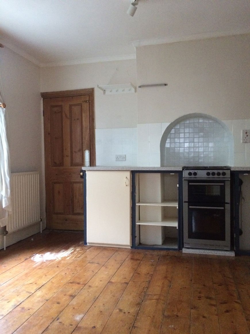 The biggest issue space wise was that although it actually looks spacious, there's very little worktop space for food prep. Cooking has been, up to this point, a literal juggling act. With that in mind, it was important to re-think where certain appliances went, how to use the dead space and free-up some of that worktop. There are also no drawers in the cupboards and the shelves have strange proportions, meaning we needed to make better use of open storage too.
 The floor would also be getting a new finish, with a heavy duty sanding and whitewash stain to lift the light in the room. I couldn't wait to try out OSMO's wax products having heard so many great things about them - and say goodbye to that orange varnish!
The After
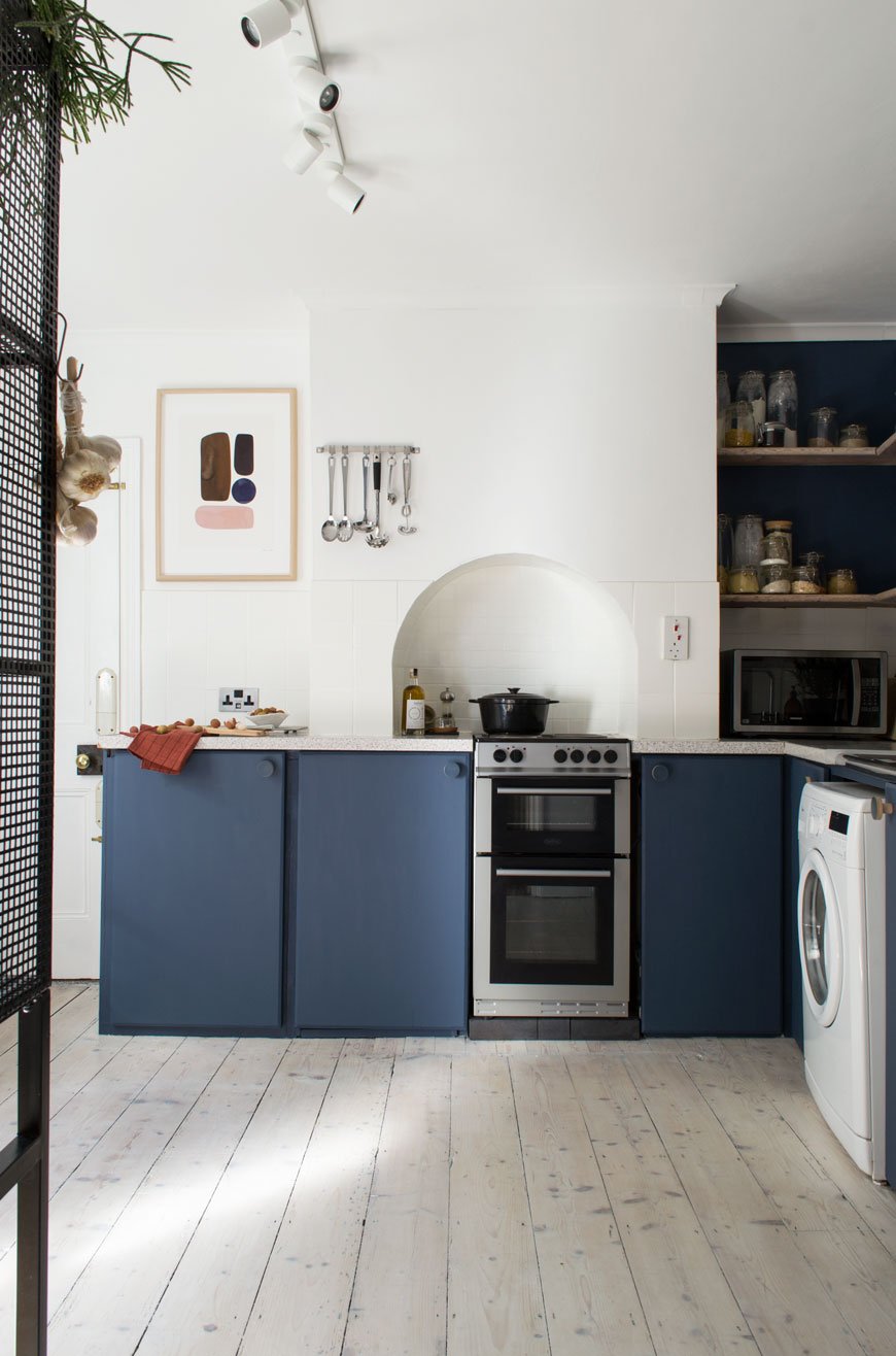 And here we are. It's like a different room, isn't it?The first thing I did was remove the door to pull in as much light from the hallway as possible. It also meant we could easily access the worktop and cupboards usually obscured behind it. One of which is Moesy's food cupboard, which he now camps outside and scratches his claws down all day. Which is nice.
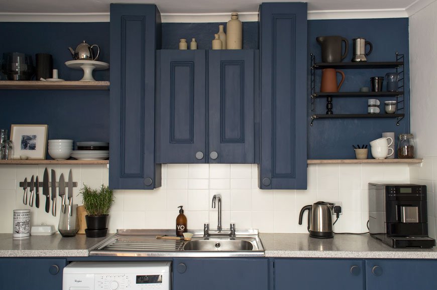 Those very homemade cupboard doors got several coats of Hick's Blue by Little Greene Paint, along with the wall that houses the open shelving. Those somewhat random over-sink cupboards now look less so, thanks to the blue paint which pulls them into the wall. I didn't want them to be a distraction, but now I love to see the details on the fronts which seem to have been repurposed from an old door. I used Flat Oil Eggshell on the cupboards for a matt finish. It took several layers to get them as brush stroke free as possible, thinning the paint a little, laying them flat and using a super soft brush.The light picks up some of the brushwork, but on the whole, it's hard to spot.All the every day essentials we use are always to hand now - on the open shelves, a free-standing wire unit or wall mounted. Every available space has been utilised and the cupboards sorted and clutter-free. I can't tell you how easy it is to cook here now there's free worktop. The microwave moved into the useless space in the corner too and now all available space is used with intention.Did you spot that we changed the taps too? Turns out that few places make contemporary style bridge taps (for converting two tap sinks into one) so choices were limited. Thankfully I found one I liked from Wickes and our brilliant lady plumber Beth (shout out!) who lives around the corner switched them over for us pronto.
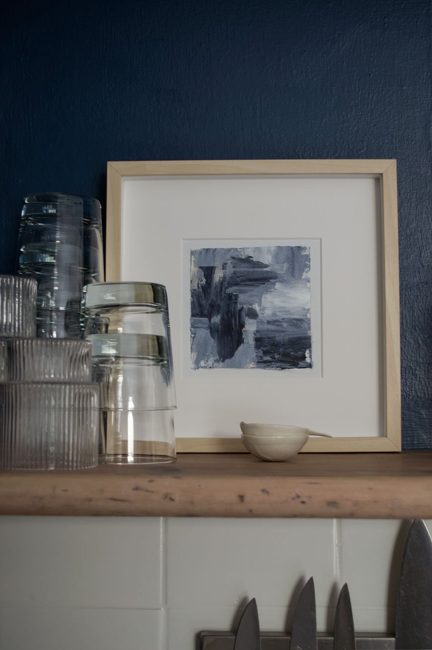
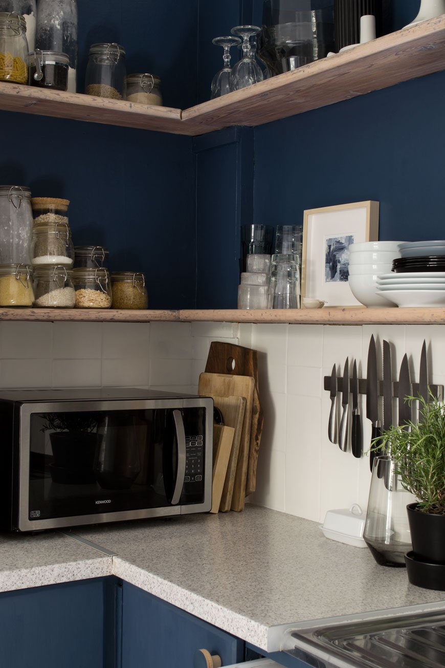
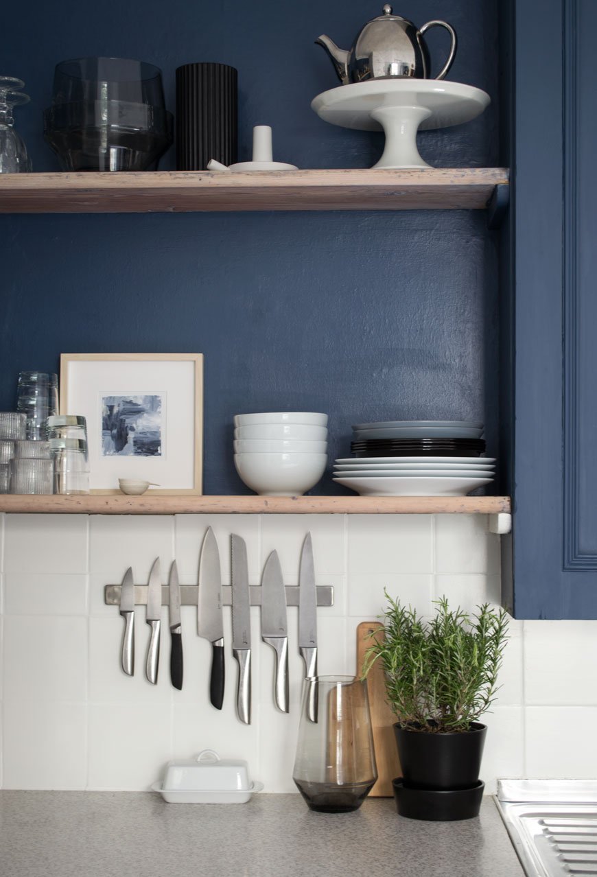
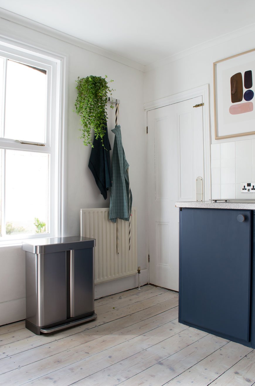
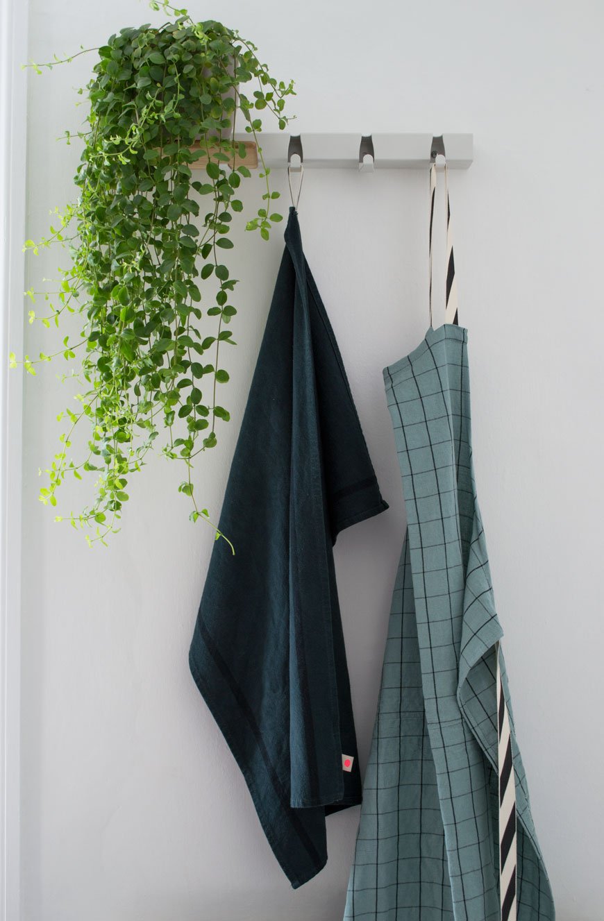 I came across an amazing Dutch design company called Vijf5 (that's five in Dutch) last year at the London Design Festival and their 'Coatrack by the meter' turned out to be the perfect piece to hang linens just behind the kitchen door. It also has an optional oak shelf which slots onto the existing hooks, so you can store mugs or as I've done, a much-loved plant.
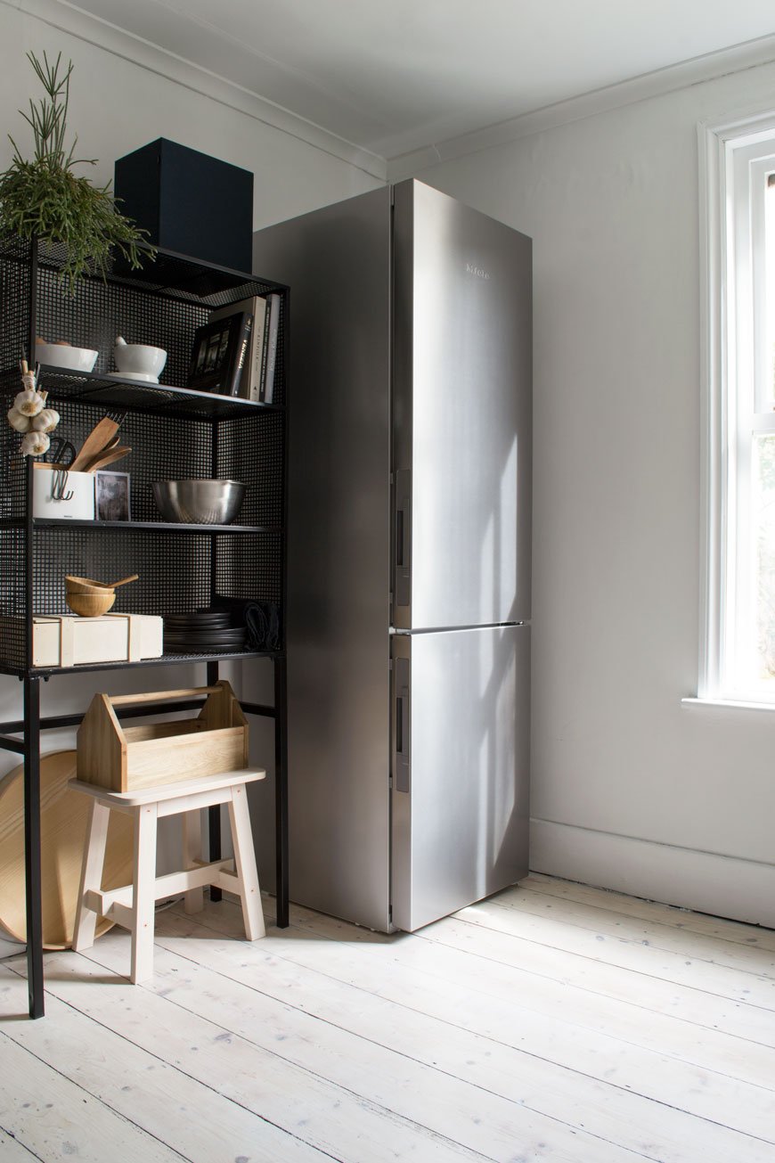
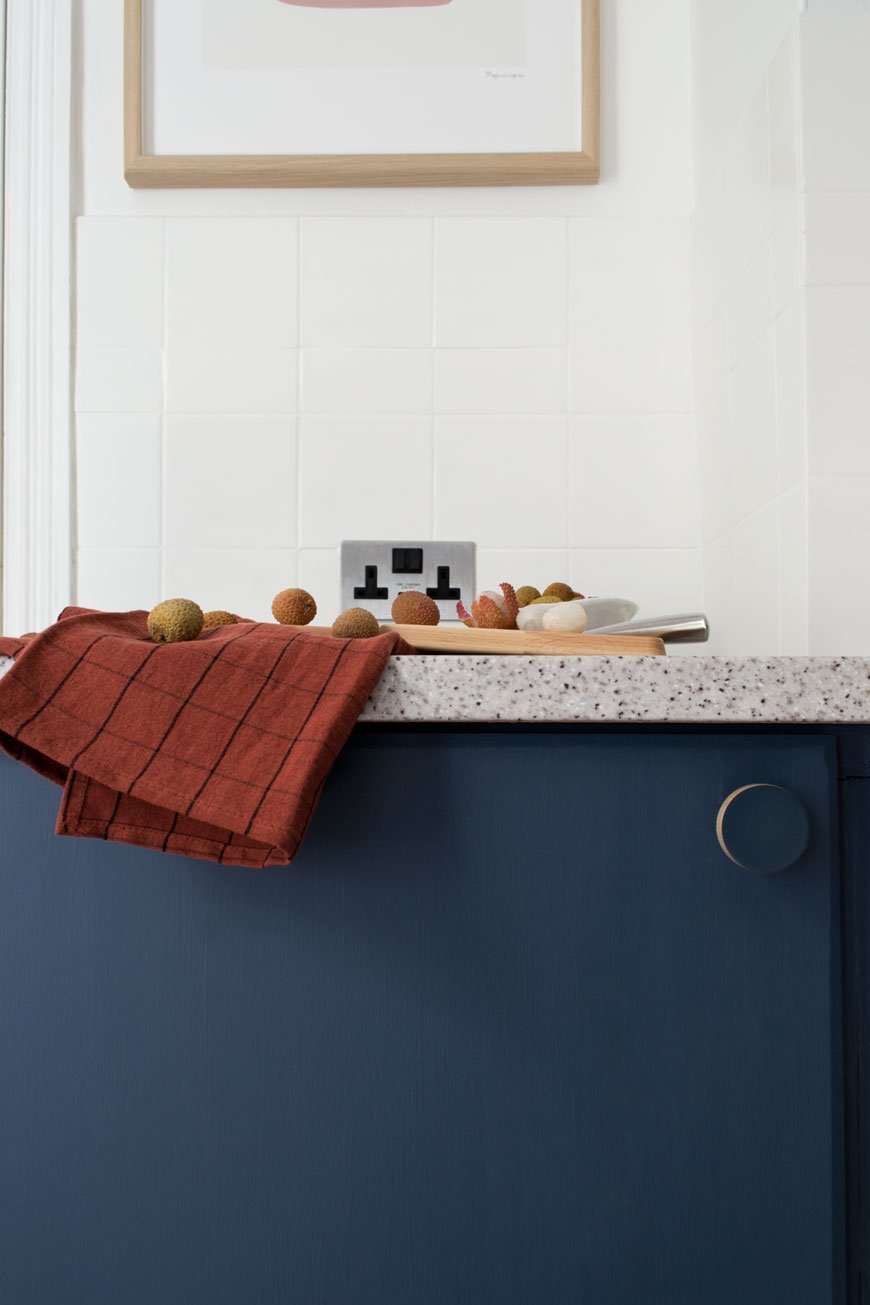 The cupboard handles are a plywood design by Chocolate Creative, the same company who made the door handles in the kids' room. They did an absolutely brilliant job on colour matching them for me, sending three variations to get as close to Hick's Blue as possible. I love the minimal, contemporary lift they give the space with very little effort.The dirty cream walls got an update too with a lick of heritage white, Shirting, from Little Greene Paint, along with the ceiling. An instant lift.Our fifteen year old fridge which was on the fritz got a stainless steel upgrade too. I'm still not used to having so much space and technology at my fingertips, but the fact it takes up less floor space and makes the room look taller is a bonus in itself. The kids can't slam the doors or forget to shut them anymore as it alerts us with a polite beep, and there's literally space for everything. Everything, I tell you.
For Coffee Lovers
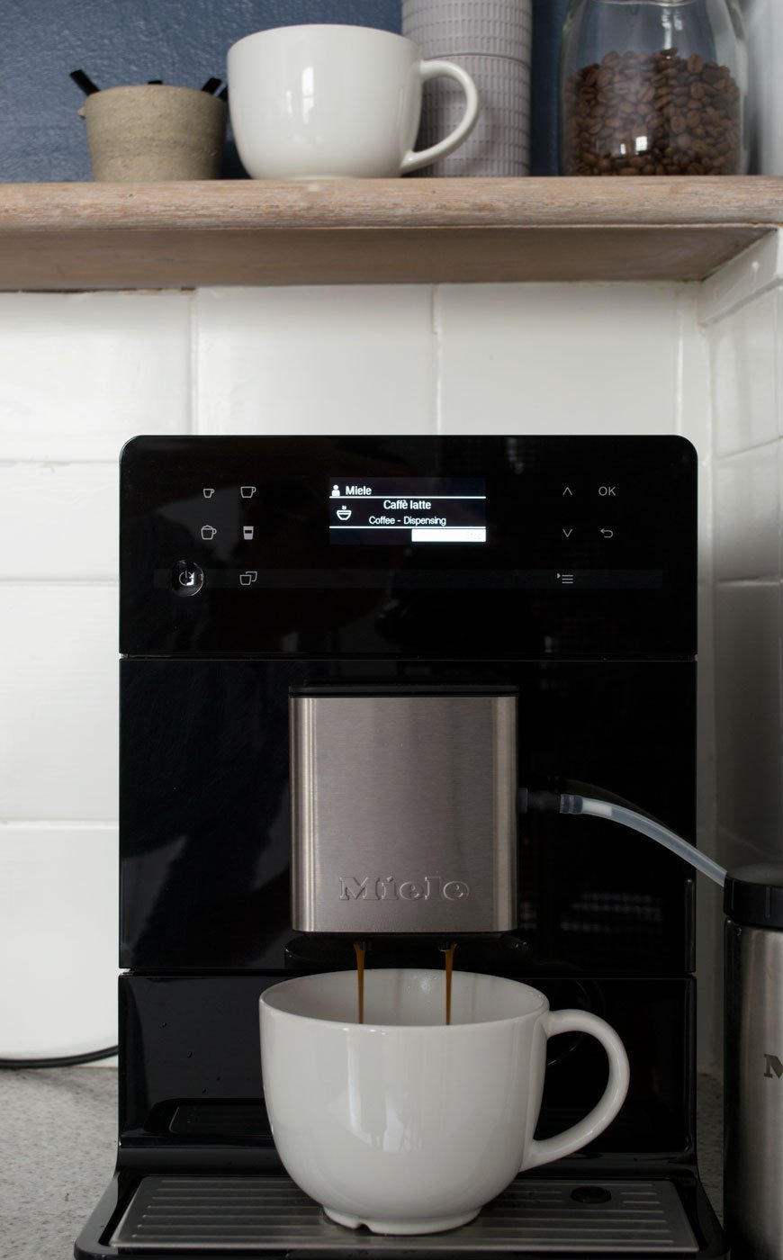
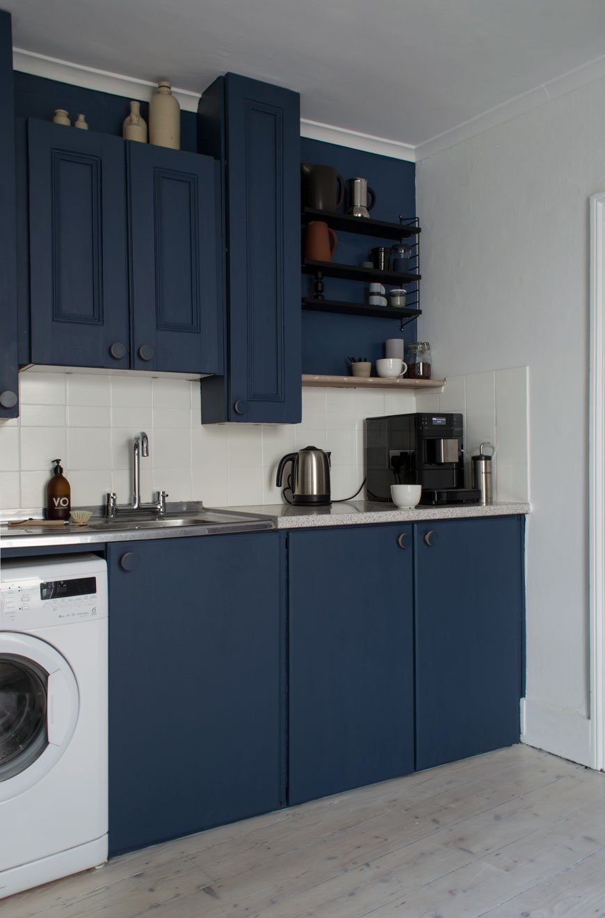 We wanted to make room for a dedicated space to make coffee, seeing as its such an important part of our post-school-run mornings. With everything to hand, from a collection of favourite mugs on the new String Pocket shelves and fresh beans ready for grinding, we upgraded our analogue stove-top to a Rolls-Royce coffee maker. Don't get me wrong, there's always a time and a place for good old-fashioned stove top coffee, but this beauty is game-changing for the time short and hello - hot and frothy milk, should you wish.
 I hope our blue kitchen refresh has demonstrated that small changes can make a huge difference to the feel of a room, whether you decide to paint or upgrade the cupboard fronts, door furniture, walls or appliances. By shifting your perspective away from the things you can't change on to what you can you'll see how much difference they can make. Big change doesn't have to factor in large remodels, so this room is safe. For now...Check out my tips on how to update a tired kitchen on Miele's DerKern. • This post contains brand partnerships. White walls - Shirting Absolute Matt Emulsion, Little Greene Paint.*Blue paint - Hick's Blue in Intelligent Eggshell on the walls and Flat Oil Eggshell on cupboards, Little Greene Paint. *Whitewash floor stain - Wood Wax Finish 3111 White and Poly Oil 3040 White, OSMO UK.*Plywood cupboard handles, Chocolate Creative.Seattle bridge mixer tap, Wickes.Black ash String Pocket shelves, Skandium.*Rhonda black wire rack, Out There Interiors.*Black and stainless steel countertop coffee machine CM 5300, Miele.*Stainless steel fridge-freezer, Miele.*Electrical stainless steel sockets and toggle light switch, Dowsing & Reynolds.White ceiling spots, IKEA.Stainless steel dual compartment recycling bin, Superhuman.Kitchen linens, from the Oscar and Suzette collection, La Cerise Sur Le Gateau.White 'Coatrack by the meter' with oak shelf, designed by Vijf5.
Photography & styling © Tiffany Grant-Riley
Want to see more of our home renovation projects? Follow #TheChathamHouse on Instagram for all updates...
London Restaurant Amber Brings Modern Mediterranean To Aldgate East
 Standing in my kitchen yesterday, paintbrush in hand and checking my email (how's that for multi-tasking?) I opened up a message from British furniture designer Charles Dedman. A new discovery for me, I fell pretty hard for this man's serious skills - boy does he know how to design a chair. He told me he'd just fitted out a new London restaurant with his Turner collection and did I want to see for myself...
 Now, I'm a total sucker for restaurant spaces - it would be impossible for most of us design loving creatures not to be, after all, the space you eat in sets the tone for what you eat. It's all about the ambience, how it compliments the menu, the whole experience. Needless to say, I jumped on this one pretty quickly to bring you a taste of Amber, Aldgate East's new modern Mediterranean restaurant.
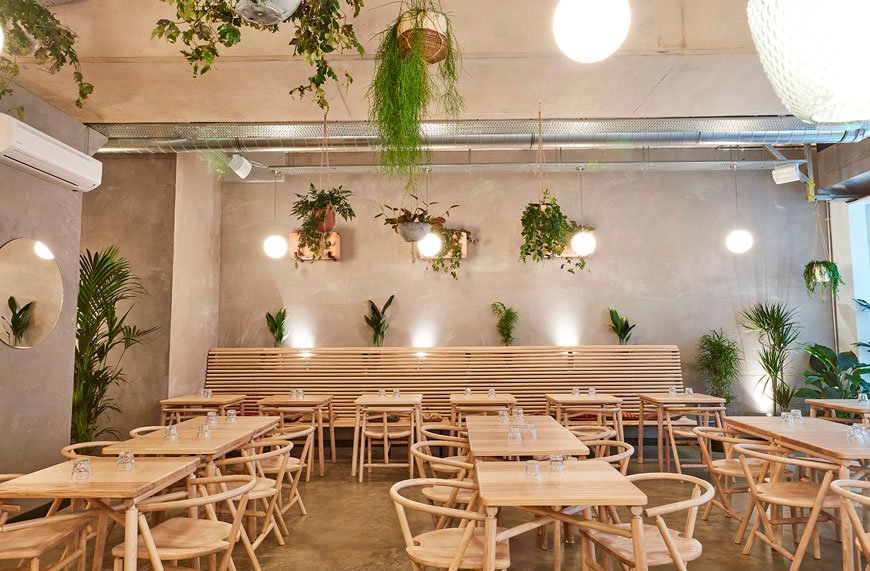
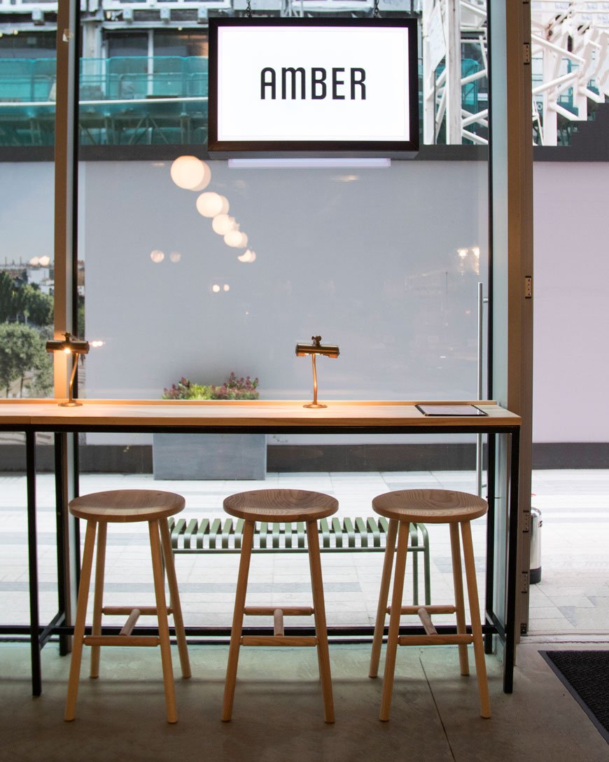
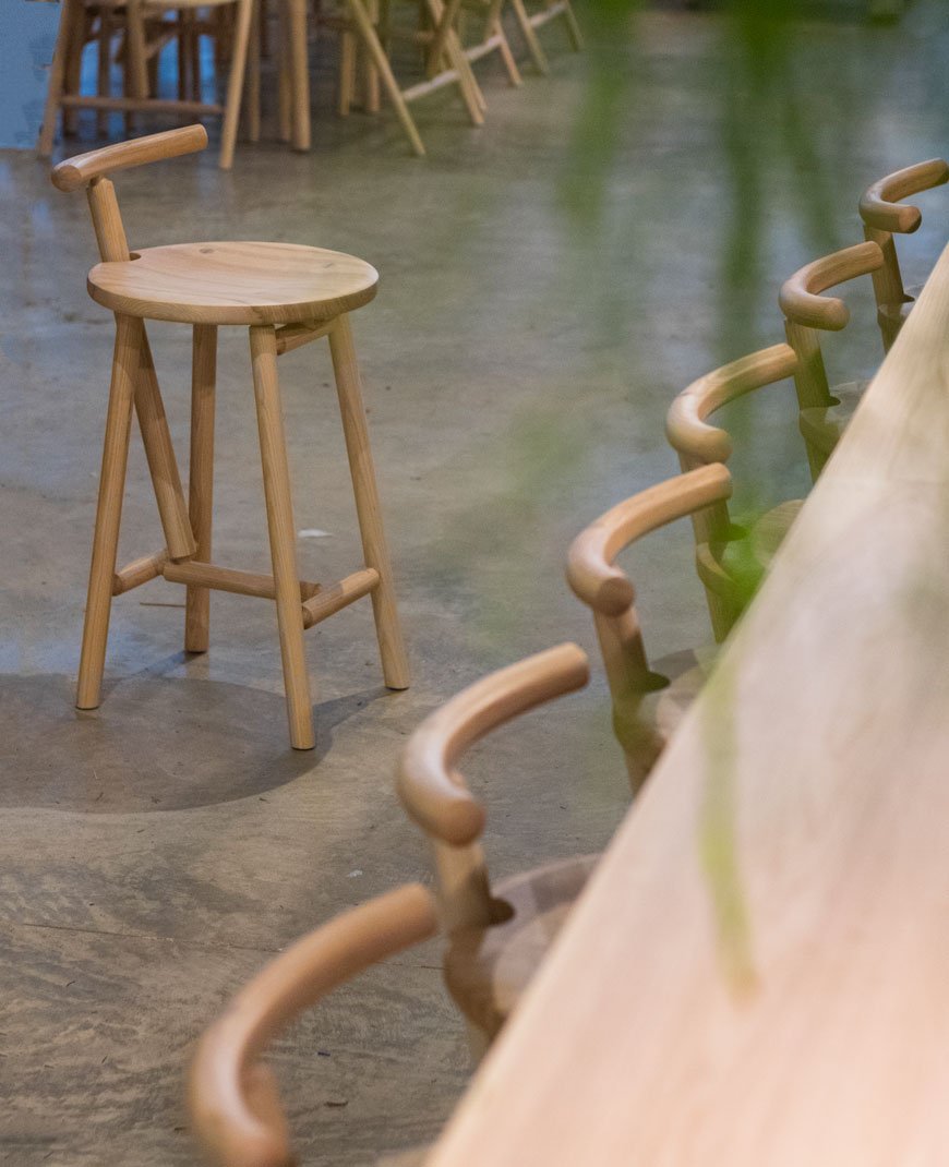
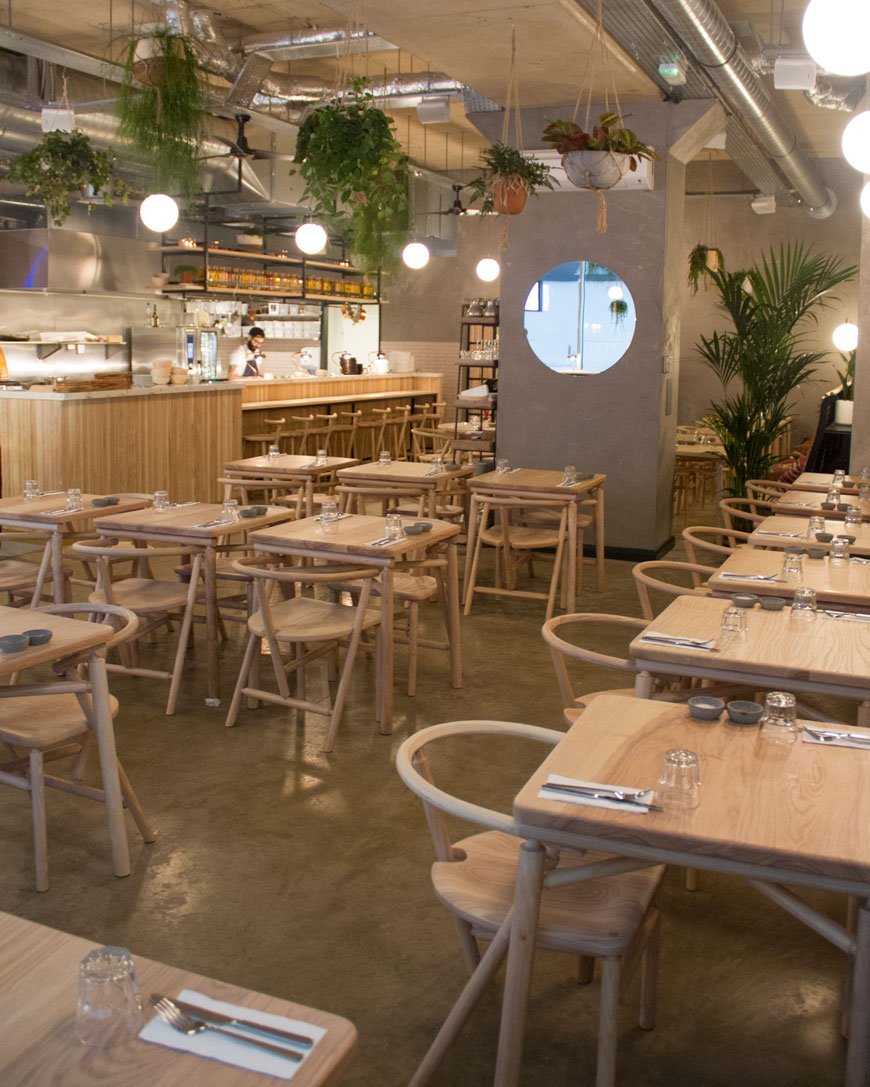 Designed by Hamburg based Solveig Castell, a chance encounter via an Instagram story led to her commisioning Dedman's full complement of his Turner collection. Amber's light and warm aesthetic was inspired by a Midsummer garden. A backdrop of lush planting draws the eye to Dedman's pieces, including the Carver chair, Turner high stools and cafe tables made from olive ash. Two five metre custom banquettes along the back wall create a focal point against plaster pink walls and polished concrete floors.
 There's so much inspiration to take away from this design that can be applied to your own home; from the wall mounted terracotta planters and globe pendant lights to large-scale round mirrors. The blend of raw finishes, basic materials and simple shapes make for a sophisticated feel.
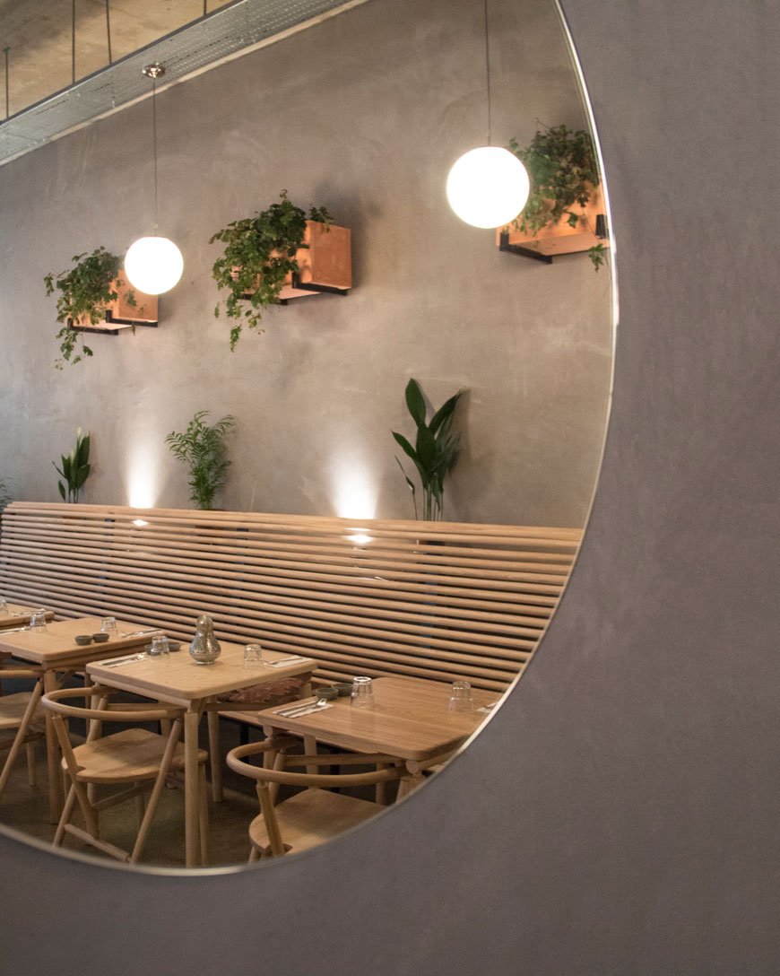
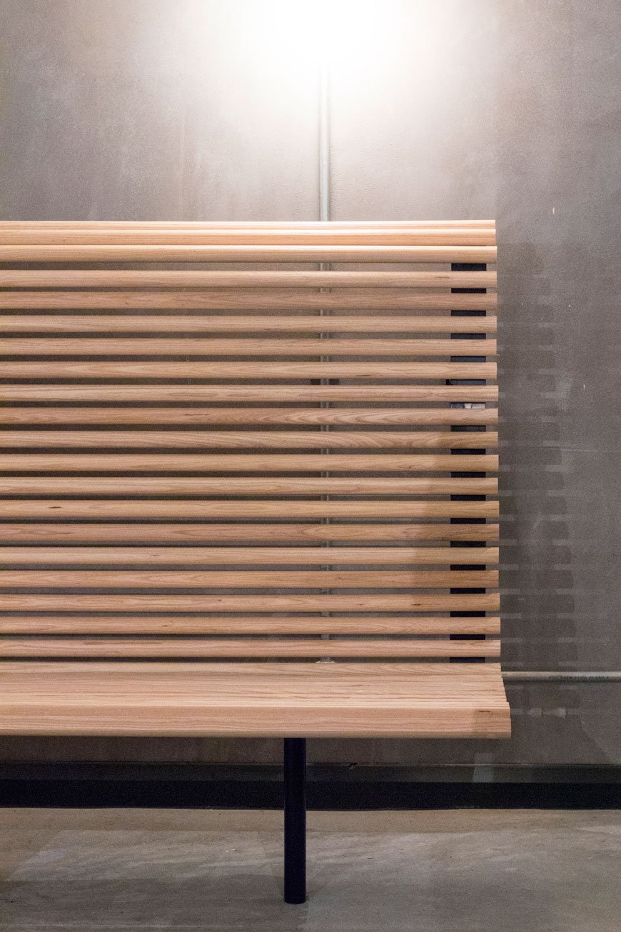 Of course, it's all very well designing a beautiful space, but what about the food? Well, I'm told it takes its name from the ancient Amber trade route, with a modern twist on Moorish cuisine. Founders Murat and Pierre present a menu packed with flavour, from the oven baked Pide, Middle-Eastern breakfasts and group friendly sharing dishes. With Spring on the way, it looks to be the London restaurant in which to while away the afternoon.Amber - Goodman's Fields - 21 Piazza Walk - London E1 8QH
Photography © Jodi Hines
How To Style Wire Shelves In Your Kitchen and 15 Everyday Open Shelf Essentials
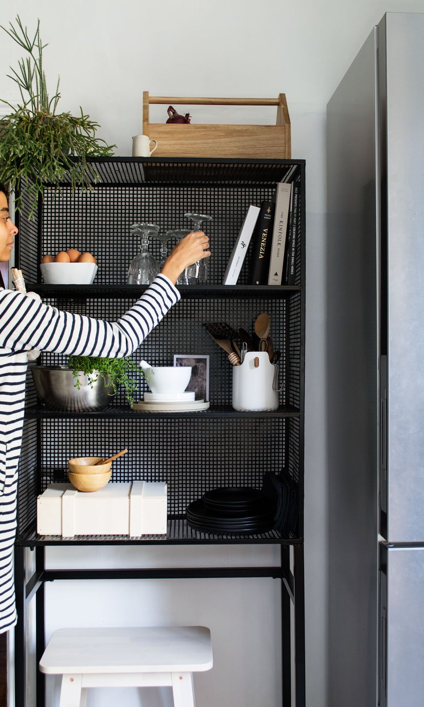 [Sponsored content]. Ok, I promise. This is the LAST post before the big kitchen reveal. For REAL. There have been a few delays, waiting on some furniture and having some hardware changed, now it's ready to go and I really can't wait to show you. It's a different room. But first...If you've got a kitchen with awkward dead space, then this is for you. No matter the size of the kitchen you have, it makes all the difference to utilise every inch you have available. Freestanding units are an ideal option when nothing else will do, particularly if you're renting and want to bring some personality into your kitchen. What's great about them, is that as they have a wire structure and you can still see through to the walls around it, it gives the illusion of space. Which is what you need when it's at a premium.That said, having open wire shelves means that everything you put on it is on display. So how can you style it to look effortless, tidy and still work for you at the same time? I've come up with two ways to achieve open shelf style, using the Rhonda wire display rack from Out There Interiors. The wider of two designs, it fits perfectly into what was an unused space and has helped make our kitchen work harder for us. Here's how...
Look No.1
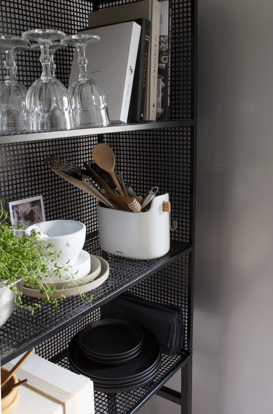
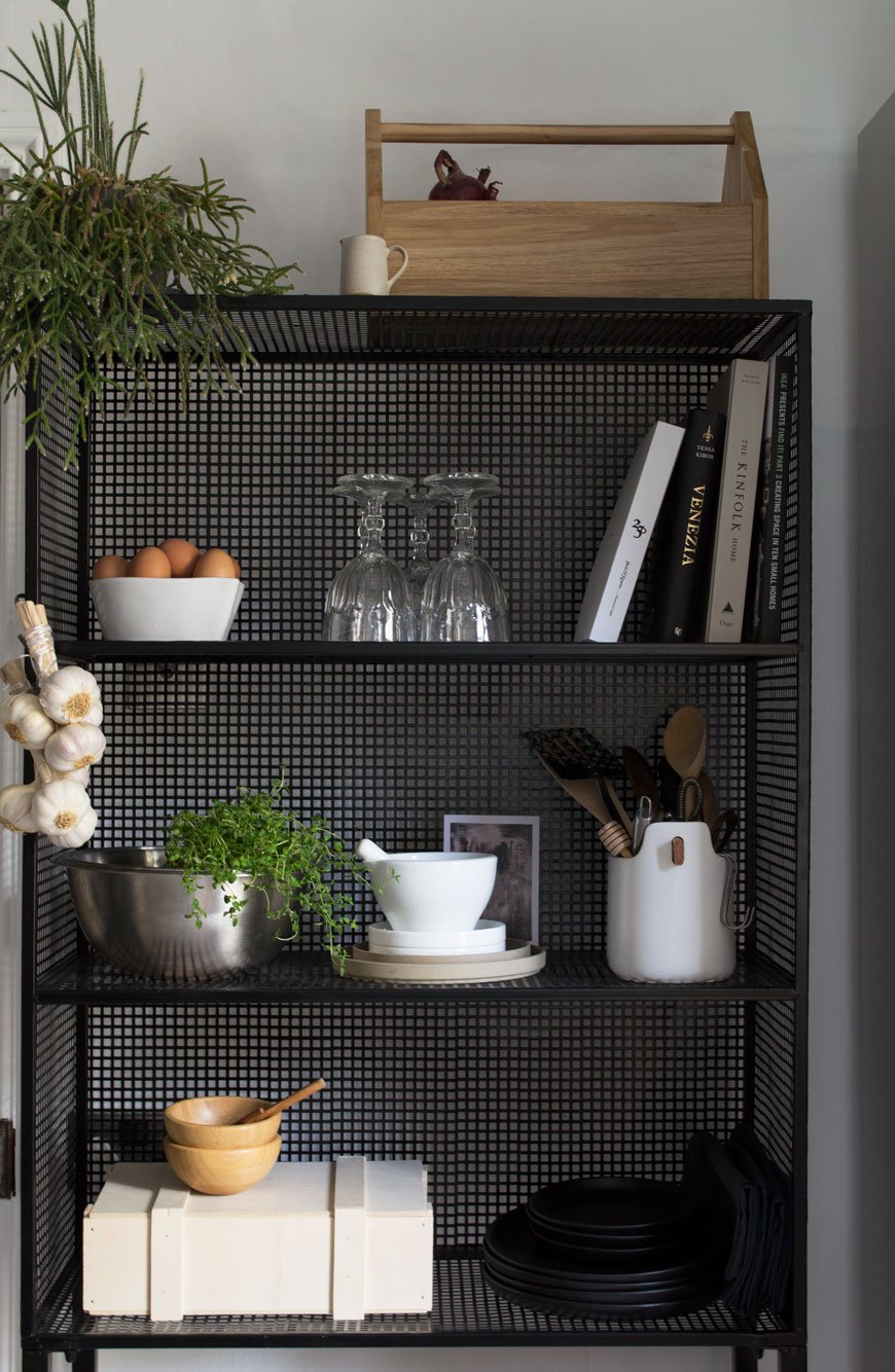 Firstly, cut the crap. By that I mean filter out all the "stuff" you don't use and spend forever climbing over to get to the things that you do. I would advise that you have a good sort out anyway and make sure you have only the items you use every day or every few months. Once you know what your go-to pieces are, you'll rotate them regularly enough that they won't gather dust and you're getting the best out of what you have.• Keep utensils in a large pot like the one I used from Eva Solo (with a nifty carry handle).• Tidy away spices in an easy access box, I reused a Christmas hamper box for mine.• Stack dinner plates. I use plain black or white as any food looks great with a monochrome backdrop to sit on. Napkins can be wedged alongside them or folded on top.• A bottle box can be repurposed for storing vegetables that don't need to be refrigerated, keeping them out of the way on the top shelf.• If your unit has space underneath, use it for a small stool. Not only is it useful for a when you have company in the kitchen but it's always at hand when you need something on a higher shelf.• Rotate your cookbooks, leaving a selection of favourites for quick reference.• Keep a selection of glasses to hand. Having wine or water glasses within easy reach makes all the difference. Just make sure they're in good condition, otherwise, store the least used away. We keep all the bright, plastic kids' plates and cups in a cupboard they can reach so we don't have to look at them!
Look No.2
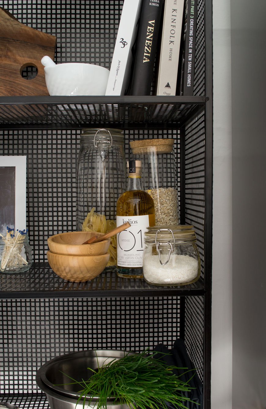
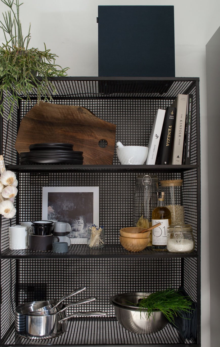 • Create a tea and coffee station with mugs, tea and coffee to hand in simple glass jars. You can also store your cutlery in a large pot or tin to free up drawer space for other less attractive items.• Store smaller appliances such as the toaster, juicer or sound system (as I have here) on the top or bottom levels, freeing up valuable worktop space. Pans and mixing bowls can also find a home here.• Keep your cooking oils and other food essentials close to hand - think salt and pepper, decant oils into glass bottles, jars of cereal for breakfast etc.• Stack your chopping boards but be careful to make sure they lean securely if you're not laying them flat.• If you use fresh herbs frequently in your cooking, this is an ideal place to store them in pots or with a small dish underneath for watering.

Finding Everyday Accessories For Those Open Shelves
Good looking essentials shouldn't cost the earth but they do need to be durable. This carefully curated edit will give you plenty of food for thought. Stick with a muted palette of white or black as a base, mixing in neutral tones, clear glass, wood and stainless steel for a timeless appeal. You're welcome...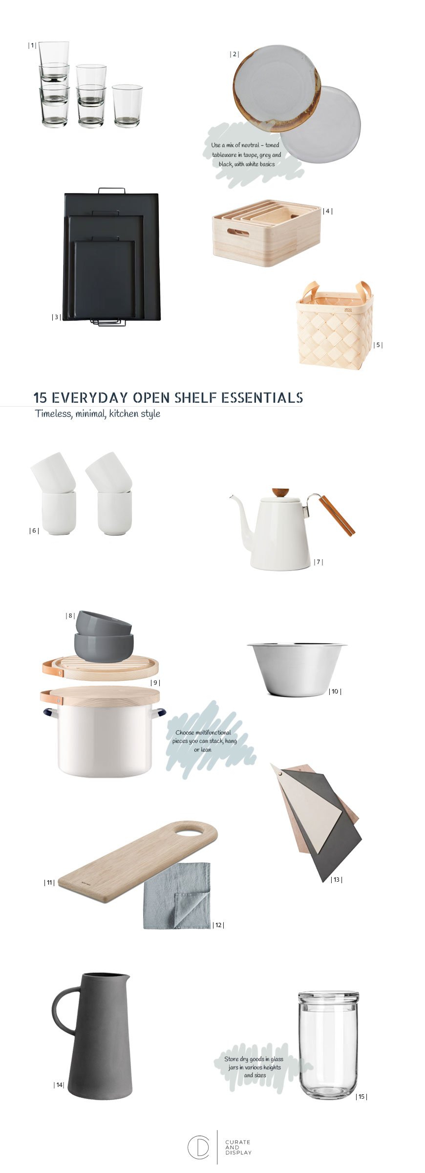
| 1 | Clear glasses, IKEA 365+ | 2 | Elzora and Courbe grey dinner plates, both Habitat | 3 | Freight HHG black steel tray, Trouva | 4 | Save-It wooden boxes, Rig-Tig | 5 | Lastu birch boxes, Verso Design | 6 | White mugs, Made.com | 7 | Hario enamel coffee kettle, Arket | 8 | Dark grey bowls, Granit | 9 | LSA bread bin and bread board, Amara | 10 | Stainless steel mixing bowl, Arket | 11 | Skagerak soft board, Skandium | 12 | Slate blue linen napkin, The Conran Shop | 13 | Chopping boards with ceramic plate, Golden Biscotti | 14 | Grey stoneware jug, H&M | 15 | Glass jar, H&M.
*Written in collaboration with Out There Interiors, who gifted me the wire unit for the purpose of this post. Photography & Styling © Tiffany Grant-Riley
Slow Rituals | A Mindful Approach To Houseplant Care
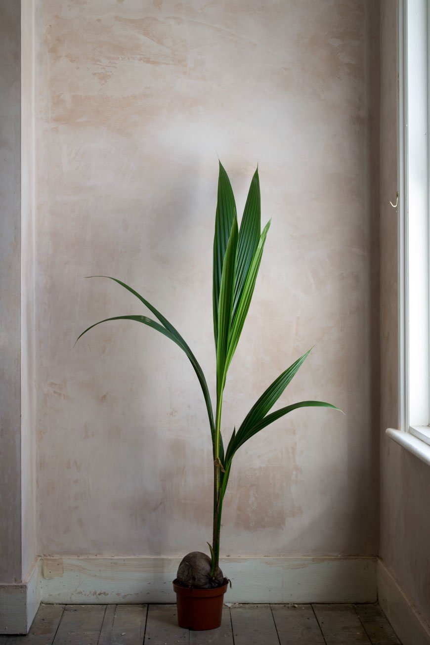 Plants have become an important part of my life these past few years. I wasn't instantly great with them, being used to gardening outside, houseplants were a whole different ballgame. There were a few casualties, and I learnt very quickly what my strengths were (let's say ferns aren't my strong point!) We now have around 50 established plants of various sizes and varieties and they're as much a part of our family as our kids. Well...almost.They anchor me, they are a reminder to look away from the stresses and trials from time to time and check in with them. They give me another focus for my thoughts - is it happy in that corner? does it need misting? Is it time for a bigger pot? Setting aside an hour a week of my time to give our plants attention is my way of slowing down, no matter what life is doing on either side of that pocket of time. And we know that slowing down doesn't just happen, it takes some planning as I detailed in this post, but with a few minutes care here and there during the week, you should start to feel a difference in yourself and see it through your plants.My mindful approach to houseplant care will not only put you on a path to finding time for a regular, slow ritual but should up your plant game in no time.
Checking In
Unless you're a seasoned hothouse orchid expert, most houseplants don't come with a huge list of demands. They're great at communicating and will throw out a few warnings when they're starting to feel unhappy. The best time to do this is the morning - maybe potter about the house with your cuppa. Take a moment to look at the leaves - are they vibrant, plump (if they're a cactus or succulent)? Or are they drying up, maybe changing colour? If it's the latter, it's either a case of over or under watering or the wrong amount of light. Depending on the plant, you'll want to check that it's in the right environment and getting the right amount of water, if not, make those changes.
Pruning
Not something you need to do often, but in the case of a rogue triffid, you might want to prune it back to avoid a take-over. I've just done this with a five-year-old cheese plant and it's perfectly happy, but I'd advise a little research first as not all plants like being trimmed. Be sure to remove any dead leaves to allow for new growth and use a sharp, gardener's knife or scissors for a clean cut. Cutting with anything blunt will encourage disease.
Propagating.
One of the best things about plants is that they give plenty back - literally. Some succulents and cacti produce offspring, attached to the 'parent' which can also be gently removed and propagated. I use a basic compost, mixed with a little sand for succulents and leave them to root, watering very occasionally. Some need to be laid directly onto the soil of the parent plant and left to dry out and grow roots which, once established, can be potted separately.Did you know that you can root some plant stems in just water? I've had some levels of success with a Monstera Deliciosa (cheese plant) and ZZ plant (Zamioculas Zamiflora) by cutting a mature stem at the base and leaving it in water, refreshing it regularly. After several weeks, you should see a root system start to form.
Feeding and Watering
During the winter, houseplants will slow down and go into a semi-hibernation. Don't give them any liquid feed at this time or water them too often. When spring comes around, they'll become active again and start growing which is when you can resume regular waterings with feed. I save our coffee grounds and dilute them as an occasional caffeinated feed for a pick-me-up too. Bear in mind, however, that some plants don't enjoy acidity which the coffee water creates, so keep an eye on the leaves in case they start to yellow.
Potting On
If it looks like your plant is running out of space to grow, it's likely it'll need potting on to a larger vessel. An easy way to tell is if the roots start pushing through the bottom of the pot or look coiled (pot-bound) when you lift it out. Don't attempt to do this until spring when the root system will be active and ready to spread into the new space. Don't be afraid to try living with plants - I meet so many people who say they wish they could be better at keeping them alive. There's really no magic to it, just a small amount of commitment and attention. Adopting a slow ritual in caring for your plants and the benefits they bring in return are so worth it.I'd love to hear about your experiences with houseplants. Have they helped you to switch off and slow down? Or maybe you're looking for a good starter plant and would like some tips?Photography © Tiffany Grant-Riley
Northern's New Nordic Furniture Collection Will Make You Cry
 At this time of year, many brands are gearing up to share their 2018 collections, it's an exciting time for design. New Nordic design brand Northern Lighting has just relaunched their brand now known as Northern, to extend their collection to furniture and accessories and it is to die for. Accuse me of oversharing but quite frankly, I don't give a damn.
 Northern began its journey some twelve years ago as a collective of creatives, producing a contemporary, minimalist lighting. An integral part of its Norwegian roots, Northern is grounded in New Nordic design, combined with traditional craftsmanship and natural materials. Their pieces are elegant with an air of utilitarian luxury and, having long been a fan of their lighting collection, I knew the wait for their homewares would be worth it.
 The bar cart is nothing new in itself, but with the rise in popularity in home entertaining, the cart has seen a revival, with an updated look. Named Loud, this quiet minimalist interpretation in curved, smoked oak features polished laminate doors and steel casters. A multi-functional, everyday conversation piece to do its job quietly in the corner or stand out centre stage.
 I'm always happy to see plant pots taken into consideration - there's always room for a stylish plant or two. These Oasis pots designed by Ann Kristin Einarsen were a highlight of mine at LDF 2016 as part of the 100% Norway showcase. The self-watering pots come in two parts so you can mix and match the matt terracotta tops with a glazed base where the water sits in a reservoir.
 New to the Northern collective is Scottish designer Kyla McCallum whose precise origami-inspired work has turned heads. I was hardly surprised when she told me at a workshop last year that she was soon to be launching a collection here. Her signature style can be seen in the quilted wool Case cushion. The Fold pendant light is crafted from Kvadrat wool, treated with a lamination process allowing it to stay in position. With a slight tilt, it enables you to direct light to one area whilst dimming the other.
 Possibly the desk of my dreams, the Shelter is ticking all the boxes for me. Designed by duo Yonoh, it features a black steel frame with curved mesh back and an oak desktop. Its graphic aesthetic and minimal silhouette streamline the workspace, allowing only for the essentials. Dear Shelter, I love you. Hard.
 Arguably, the stand-out piece, in my opinion, is the Oaki chair. Because look at it. It's been cleverly designed in the way of traditional Japanese work working to hide the joins so it appears seamless. Designed by Stina Aas in oak, all four legs rise up to the back of the chair with the back legs leaning outwards. A future design classic, I have no doubt.
Photography courtesy of Northern, with thanks.
Heal's Window Styling For A Scandinavian Apartment
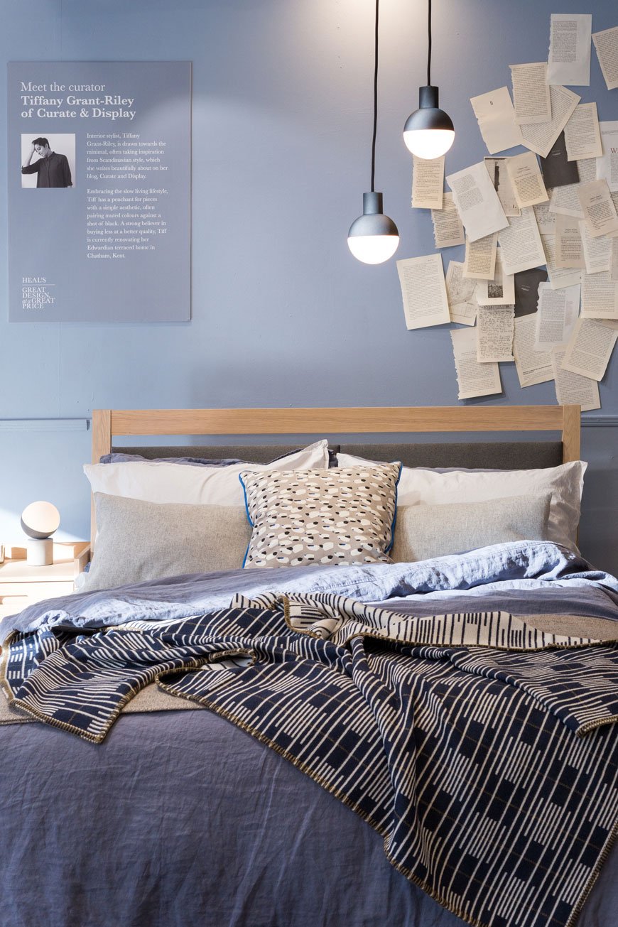 [ Sponsored content] If you follow my Instagram stories, you'll have spotted that I've been working with Heal's again on a new campaign - Great Design at a Great Price. Yes, I know, I've been asked back with window styling sidekick Kate Watson-Smyth, this time to style a window each at the flagship store on Tottenham Court Road store. Pinch me.With Heal's' reputation for championing British designers spanning two centuries, its become a mainstay of our design history. To show the versatility of some of the more well-priced furniture, ideal if you're on a budget, Heal's is currently showcasing a range of affordable accessories to show how to pull together a considered look for your home. Focusing on two collections - Kate with the industrial Brunel range and I the Scandi inspired Morten, we spent the morning raiding the shop floor with abandon. I'm pretty sure the visuals team were relieved when we'd both left so they could undo our trail of destruction!
The Morten Collection And A Scandi Apartment
Designed by RCA design graduate and long-term collaborator John Jenkins, the Morten collection is crafted from whitewashed, solid oak. True to its minimalist, Scandinavian influences, the beauty is in the simplest details. From the elliptical handles of the drawers to the upholstered grey headboard on the bed, each piece has tapered legs, raising the furniture off the ground and giving the illusion of space underneath.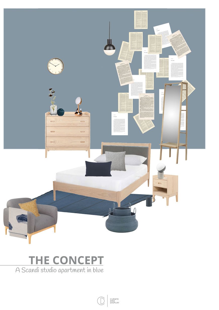 Taking my cue from the Scandi inspired range, I created a space that gave the feel of a studio apartment with the bedroom as the leading visual. With spring on the way (well, nearly) I centred the room around a tonal blue theme, broken up with graphic pattern and touches of mustard yellow.The shade of blue I chose for the walls was similar to what I used in the kids' room and quite frankly can't get enough of, James, by Little Greene paint. It really compliments the whitewashed oak in the Morten furniture and ties in the deeper blues and light greys. It also looks great with the black Fabian pendant lights and smaller concrete table lamp.The Morten armchair and chest of drawers act as a soft partition from the dining area but still gives that feeling of a minimal, open plan space. The new, exclusive addition to the collection is an extendable oak dining table and bench which I paired with the stackable Laclasica chair by Stua.
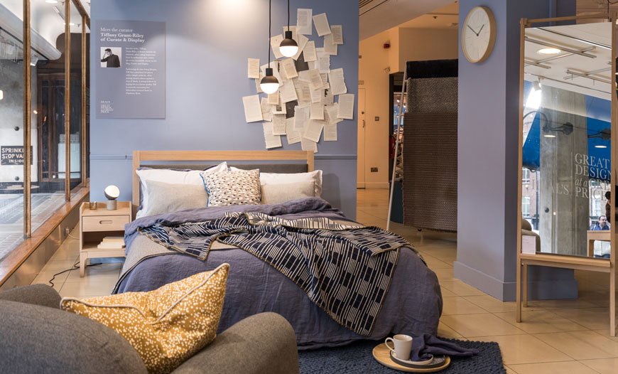
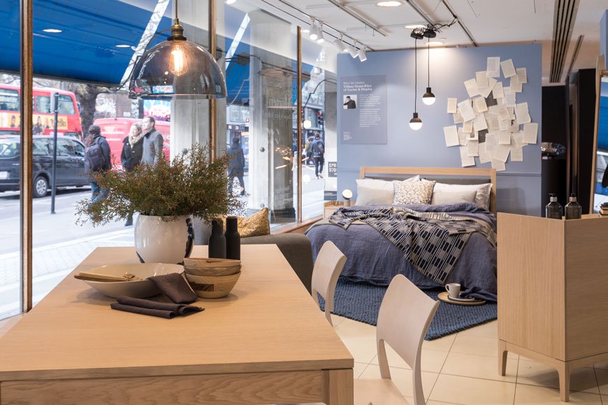
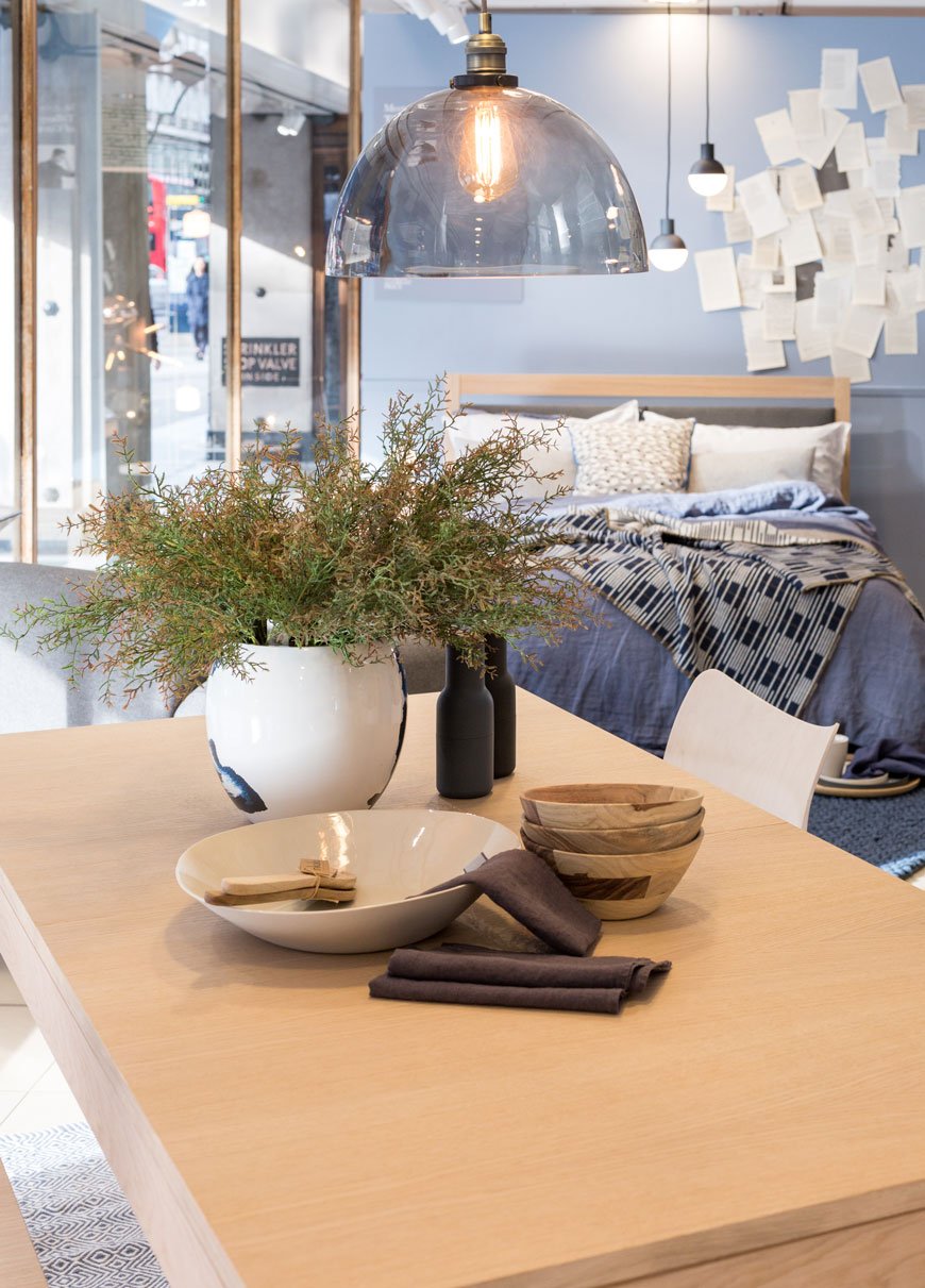

Shop The Look
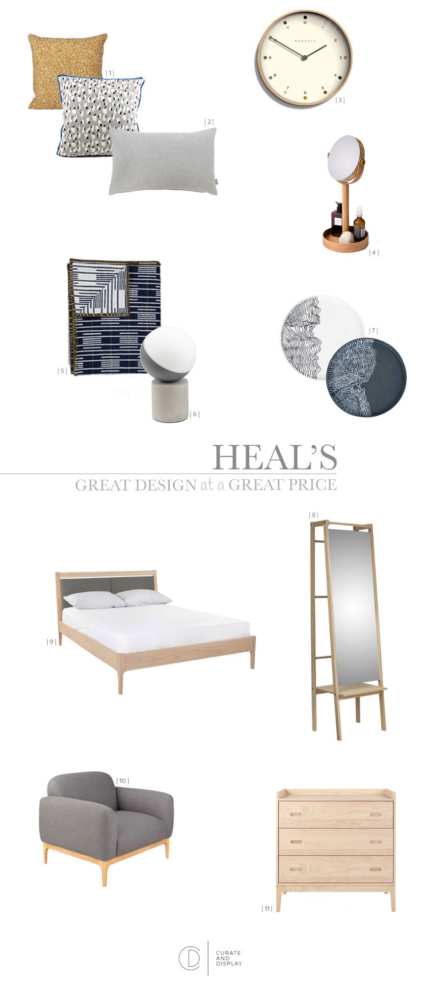
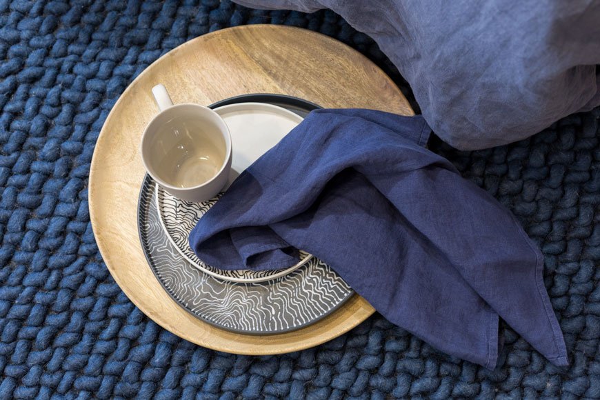
| 1 | Dottery cushion in Curry and Grey Spotted cushion, both Ferm Living | 2 | Grey wool Islington lumbar cushion | 3 | Newgate Pale Dot clock | 4 | Magnify mirror, Wireworks | 5 | Signal blanket, Eleanor Pritchard | 6 | Fabian concrete table lamp | 7 | Estuarine plates, Myer Halliday | 8 | Push floor mirror, Skagerak | 9 | Morten upholstered oak bed | 10 | Morten armchair | 11 | Morten three drawer chest
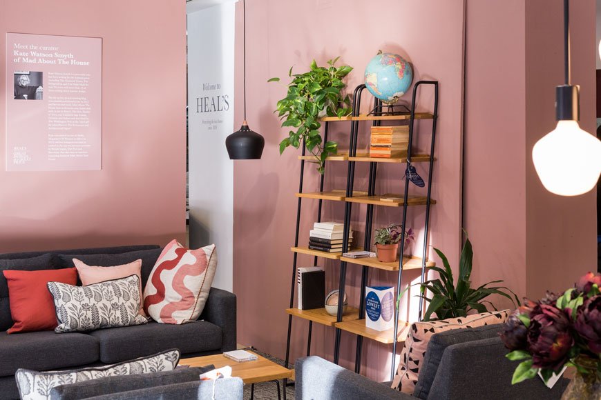
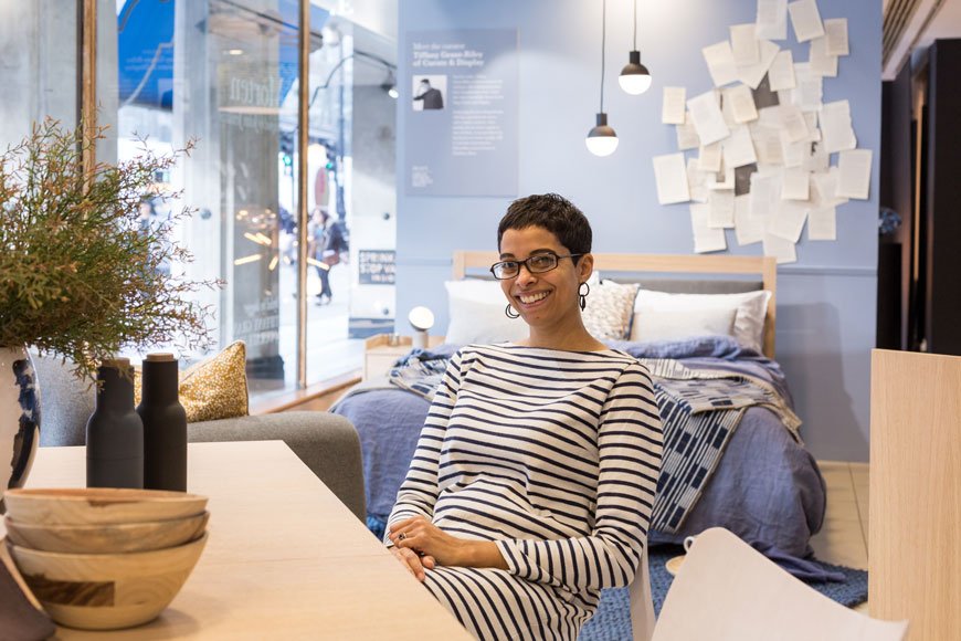 On the other side of the window, Kate's mid-century industrial apartment took on warm tones of terracotta and pink. The Brunel collection, designed by Rob Scarlett is fully adaptable and ideal for small spaces with freestanding, leaning shelving and a modular sofa. Find out more about Kate's process over on her blog, Mad About The House.
 Our windows are in store now until Feb 19th, so do stop by, sit, recline and experience them both.Photography © Victoria Erdelevskaya
Freelance Life On Becoming An Interior Stylist
 I get emails all the time from aspiring stylists and those already working in the industry but looking to get more established, asking if they can assist me and, more importantly, how I got started myself. It can be daunting when you start out, but if you've ever thought about becoming an interior stylist and wondered what it takes, my advice and experiences will go some way to getting you on that path.Being a stylist is far from glamorous, it's a lot of hard work and you need a thick skin, but it's incredibly rewarding to have such a creative job and see your work in print.What's your background and how did you get into styling interiors? Aside from a short stint as a cleaner in a primary school (yes, really!) I've always pursued creative work. I trained at Rose Bruford College and graduated with a BA(Hons) in Stage Management, producing theatre. Although a lot of the role was organisational, it involved sourcing and making props, sometimes supporting the costume department depending on budgets and looking after the cast and crew. No show was the same and that's what I loved about it.From there, I moved into events and wedding planning, all transferable skills but with a much more personal approach. So, I ran my wedding business for five years, styling vintage inspired weddings and supporting couples up to a year in advance of their big day. It was the creative side that I relished the most, the visual aspect, creating an immersive experience for the couple and their guests and seeing their reactions. Towards the end it was all starting to get too much, with my 18-month-old son at home I felt that I wasn't giving him my best and bringing home all of the stresses I was shouldering from my clients was affecting our home life. My gut instinct was telling me that visual work was better suited to me, something with shorter timescales, work without so many emotional ties. And that's when I moved into styling interiors.
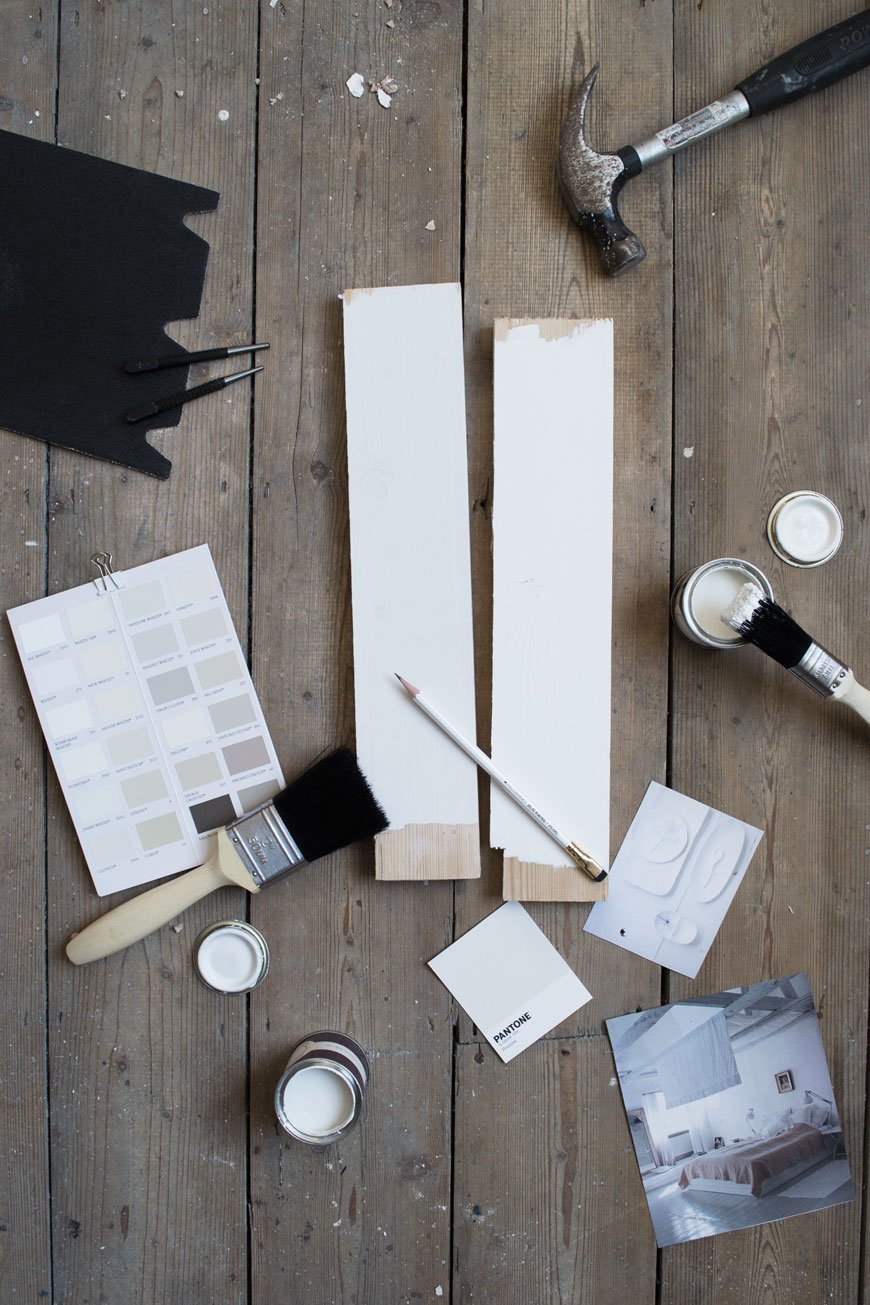 Of course, it wasn't that fast or as simple! My story isn't exactly a conventional one but I'm certainly not the first to make a career change - that in itself is pretty scary when you're on the outside looking in! At the time, stylists were much more in-house at magazines than they are now and I discovered pretty quickly that I had to make my own way in. So, when the opportunities weren't open to me, I made my own door. A cheesy analogy, I know, but I couldn't intern at a magazine with soon to be two small children at home, so immersing myself in that environment took a little more effort. I started practising at home and contacted a few stylists I admired to ask that they add my name to their pool of assistants. After about a year I started assisting on real home features for a couple of well-known magazines, met photographers and writers and things started to open up. At the same time, I took some low-key projects on the side that slowly evolved into bigger commissions...and here I am. I don't consider myself to be exactly where I want to be but hey, it's all about the journey, right?I've been freelancing for ten years now and there's been many a learning curve, but that's a whole other blog post!
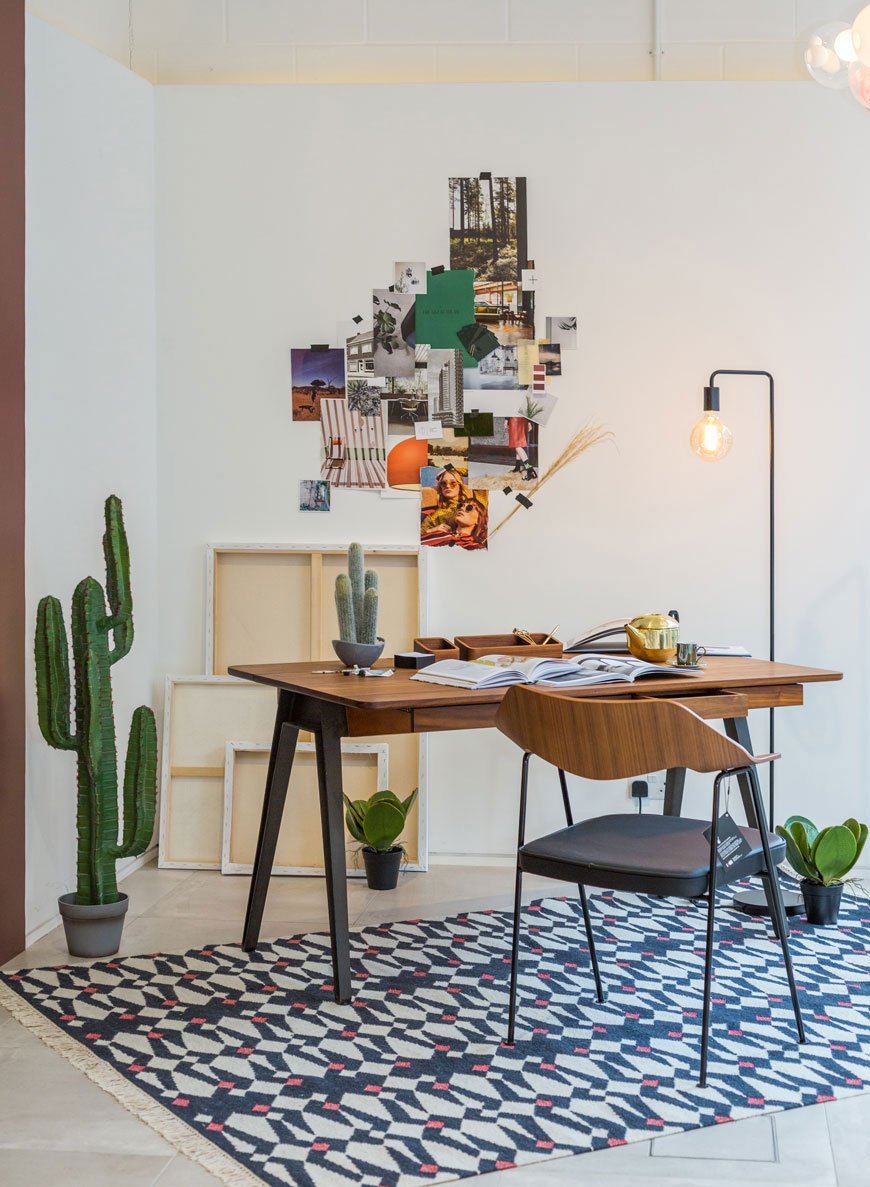 What do you shoot with? Do I need to know my way around photography?Nothing special at all. I bought myself an entry-level DSLR (Nikon D3100) four years ago and taught myself to shoot in manual, how to work with natural light and editing with Photoshop. I'm still using that camera now along with my iPhone out and about, although I'm ready to upgrade my kit - camera technology moves quickly! A tripod is an essential piece of kit too - it'll save you hours in low light and frees up your hands when you need to tweak and adjust objects in the frame.Whilst it's not essential to know everything about photography, it helps to understand the nuts and bolts so when you're on a shoot you can anticipate where and how the photographer will want to shoot. It's also important to understand the rule of thirds when you're setting up a shot and how negative space and layering lay the foundations of an image.What is a test shoot and how can I set up my own?A test shoot is a practice shoot, even the most established stylists work on these. They're a great way to develop your style and experiment with concepts outside of the pressure of commissioned work. You can find space for more creativity at your own pace. Most importantly, you'll build up your portfolio and relationships with photographers and other creatives. I'd recommend finding a photographer's assistant who wants to develop their folio and network - it's a win-win for everyone then. Find an independent maker who would like some shots for their website or promotional material and make that your subject. Or, make it even more simple and shoot a still-life with props from around your home. You don't need to pay out for a studio - clear out a corner at home that receives good, natural light and play around with backdrops.
 How did you develop your style? Where do I start?I think as with any creative journey it's something that evolves with time. Part of it came from working on a variety of shoots and home features, finding what I liked, what I didn't.I'm definitely drawn to minimalist, clean lines, shot head-on or from above for a graphic look (as you'll know if you're a regular here) and I like to use a lot of negative space in my work. Although I love the very masculine style, for some reason my work always comes out a little softer. Maybe that'll change over time?When you begin and don't have a strong identity to your style, it helps to draw inspiration from someone you admire, without copying of course. Be a little technical and analyse what it is about their work that you connect with - is it the composition, the colour palette, an on-going signature style? Pinterest and Instagram are brilliant for inspiration at your fingertips, as well as keeping your eyes open when you're out and about. Oh and magazines - of course.What kind of styling do you prefer e.g editorial, events, commercial?I've done my fair share across the board now and honestly, my favourite kind of styling is the one I can do from home or with a small, independent brand that's developing its own visual story. I also absolutely love visual merchandising. It's a very different approach from photographic/editorial but there's a whole heap of retail psychology that goes with it. Fascinating stuff.Has something ever gone wrong on a shoot? Oh goodness, yes. One time, I smashed a glass prop and it cut the toe of the stylist I was assisting! Sometimes key props don't arrive or things get broken. Sometimes there'll be conflicts of opinion between you and the creative director on set, or the shot you thought was going to work, doesn't. And then there's the wall you hit part way through the shoot when you all feel like you've been looking at it for too long and need fresh eyes. You have to learn to push through that too. That's all part of the job though, to be flexible, to adapt.
 Which stylists inspire you? There's a handful that I always come back to for inspiration, all are very different with their approach. Lotta Agaton's contribution to Scandi design has had a huge impact on the way I look at my work. She uses monochromatic colour palettes (not just black and white) and has really put String shelving on the map again. Dietlind Wolf takes a similar approach to colour and tone but is more food and still-life focused, she has quite a painterly, free-form style. Hannah Franklin sets the standard for British design editorial from simple to elaborate sets, they're theatrical and breath-takingly genius. I also closely follow two French stylists, Aurelie Lecuyer, Benedicte Sartorio. They incorporate nature and natural shape but take it one step further, with muted block colour and a sense of playfulness. Check them out.What makes a good assistant?Make yourself invaluable. The stylist will have heaps on their mind from the get-go, so it's important to anticipate what they'll need and when. Ask how you can best support them at the beginning of the shoot and be organised. Know where everything is, from the props and furniture to the masking tape in the kit. You'll be the one making the tea, doing the lunch run and making sure everything is packed up ready for collection by the courier at the end so the stylist can focus on the nitty-gritty. All in all, don't make yourself another thing for the stylist to manage.
 Can I assist you on your shoots?I rarely use assistants on my shoots as I'm used to working on my own. Much of my work is done here, from home, but on the odd occasion that I do need one I'll put in a request from a pool of assistants. It's worth joining Facebook networking groups like the one listed below to get to know the community and you'll glean some great advice and support too.There is literally SO much more to this topic, like how to establish yourself as a pro stylist once you're more confident, how to organise a shoot on your own etc. but there's plenty here to keep you going. And if you've got more questions, the following resources will have your back...Additional Resources:Inside Stylists - a new online resource, directory and all-around support system for new / wannabe and established stylist.Skillshare - there's a wealth of brilliant online classes in photography and styling here.Interior Stylists Facebook group - where the new Inside Stylists site began, worth joining for networking, picking up assisting job and for advice from professionals.
Cos X The Gentlewoman | Modernist Architectural Tour of London
 Last September I joined COS x The Gentlewoman magazine on the London leg of their 'Glimpses of The Future' architectural tour. Led by architectural historian Joe Kerr, we hopped onboard a 1960s Routemaster and headed to 5 top Modernist locations, all connected through the theme of social housing. My interpretation of the guide is a little more basic as an enthusiastic newbie so you'll have to forgive me, but nevertheless, I hope this will give you a taste of some of London's modernist treasures.
The Boundary Estate | Est 1900, designed by London County Council Architects
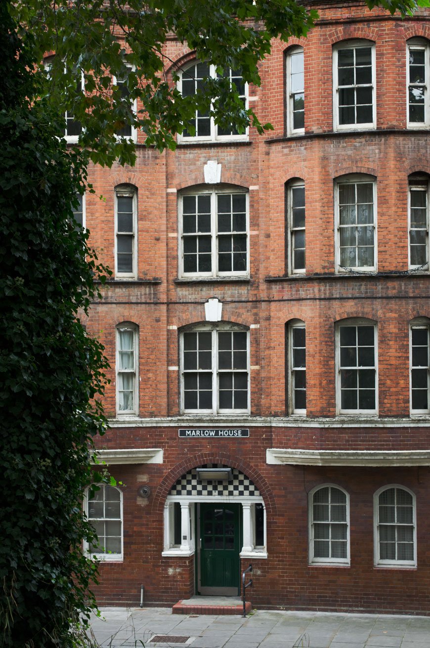
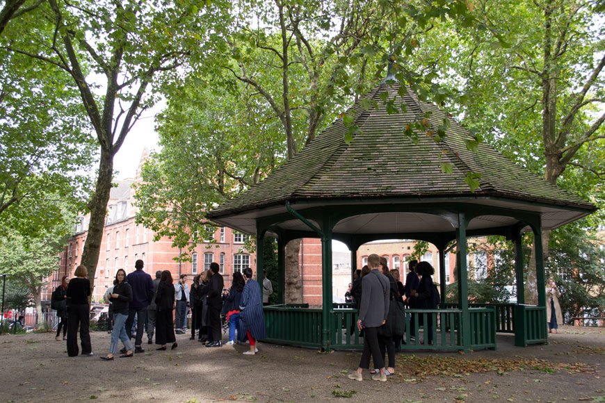
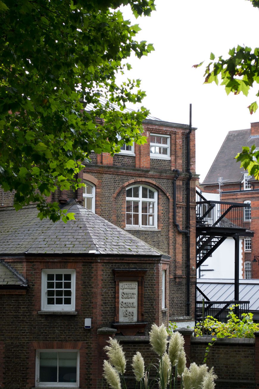 First up, the Boundary Estate, one of the world's oldest municipal housing projects leading to the Arnold Circus at its centre. If you're a Shoreditch regular, then it's likely you're already familiar with it. Prior to its creation, an overcrowded slum stood on this site, home to over 5,000 people living in the most extreme squalor. The majority of these people came from trade backgrounds - shoemakers, silk weavers, dustmen, all of them crammed into these tumbledown buildings.In order to improve the basic living conditions, the LCC committed to building a new estate in 1893 with running water, proper sanitation and better living quarters with most tenements accommodating two to three rooms. Rubble from the surrounding area became the foundations for a Japanese style bandstand which stands at the centre surrounded by seating. From the bandstand, you can see a full 360-degree view of the estate with its grand red brick, tiled walls, large windows and open, green spaces. A world away from its origins. There were shops, a laundry, workshops and two schools available to residents - compared to what stood here before, this was a radical and much sought after place to live.When the finished estate was opened up, however, it wasn't the original tenants who moved back in. They were in fact displaced further into the depths of the East London slums around Dalston and Bethnal Green, giving way to a more affluent worker; policemen, clerks and nurses who could afford the upkeep. It's a familiar story of gentrification, isn't it?

Bevin Court | Est 1954, designed by Berthold Lubetkin.
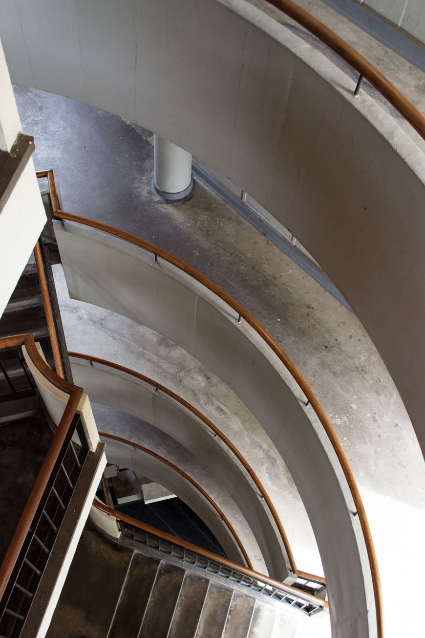
 There's something so very satisfying about the symmetry of our next stop - Bevin Court, a Lubetkin wonder with a controversial backstory. This example of post-war architecture was built on the site of bombed-out Holford Square, once home to Russian revolutionary Vladimir Lenin. The site was briefly home to a memorial dedicated to Lenin and Lubetkin had intended to name the building Lenin Court. In the years to come, however, the memorial was repeatedly vandalised by anti-communists and eventually had to be removed. In an act of defiance, fellow Russian Lubetkin would allegedly have the statue buried under the central staircase. As British and Russian relations worsened and the Cold War intensified, the completed building was renamed Bevin Court in honour of anti-communist foreign secretary Ernest Bevin. You can imagine how Lubetkin felt about that!
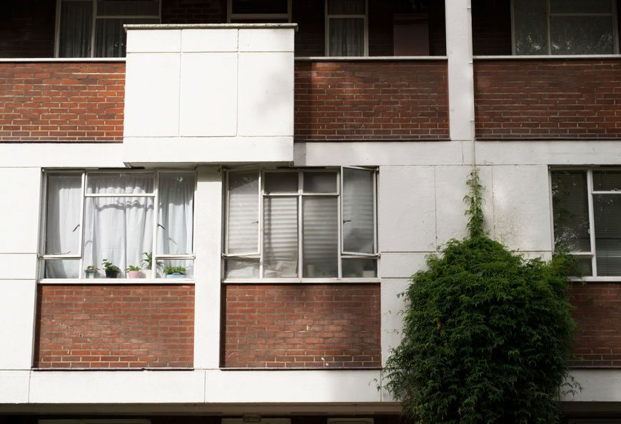
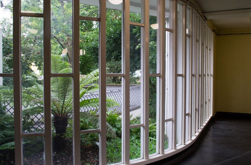
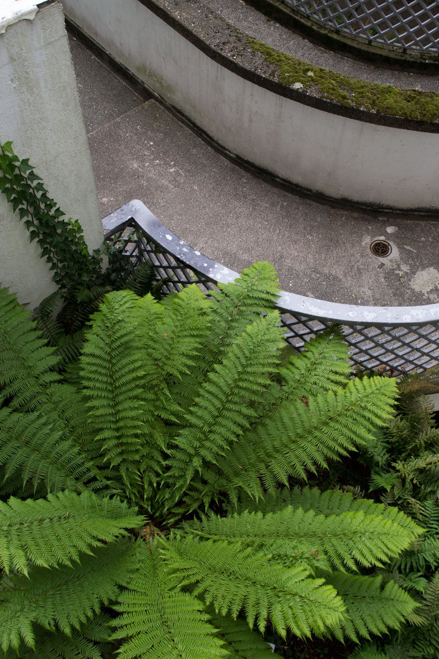
 With austerity in full effect and construction budgets low, Lubetkin and his practice Tecton were forced to strip back amenities and focus solely on the absolute basics. The prefabricated concrete is truly spectacular. In contrast to the straight lines of the exterior, fluid curves make up the central stairwell and hallway spaces, encouraging social interaction. Open to the elements, the large windows offer views across the city and surrounded by well-established trees and planting. Not your average social housing scheme given its time and hardly a surprise that Bevin Court became a Grade II listed building in 1988.
Royal College of Physicians | Est 1964, designed by Denys Lasdun.
 If you ever find yourself wandering the east side of Regent's Park, make an effort to visit the RCP building. Yes, you're actually allowed to look inside this one, though for me the magic of the building is the outside. Not a piece of social housing in the traditional sense, it is a place of work, so that counts. Completed in 1964, the building houses a museum, library and lecture halls as well as a stunning medicinal garden. Visit at the right time of year and you might even spot the massive lemons growing there. As big as your head. Literally.Traditionally housed in classically designed, historic buildings, it was quite the curveball that the RCP commissioned Brutalist architect Sir Denys Lasdun to design their new location. An architect inspired by the work of Le Corbusier, Lasdun spent time at Tecton, Lubetkin's practice as well as with Wells Coates whose Isokon Building was to be our final location on the tour.The intended new site of the RCP was Someries House, a building designed by John Nash but severely damaged during the war. Demolition wasn't completely out of the question at this point, so long as the new building reflected the Regency style of the surrounding terraces. When it came to appointing an architect for the job, the brief was clear - the new location had to look elegant and accommodate the everyday function of the RCP itself.Lasdun was unapologetic in his approach to designing the new building. It would not be in the classical style, yet it would still acknowledge the history of its surroundings which are seen through cleverly placed sight lines out at the terraces from inside the building. Perhaps it was Lasdun's daring, modernist approach that sold the idea to the royal college - after all, the history of medical practice had evolved so much over the past 400 years, it would seem right to represent a new, post-war era for the RCP with its architecture.
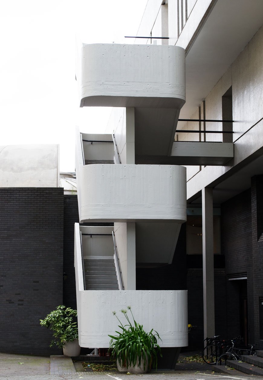
 As you approach the front of the building, you're met by a breathtaking tile clad overhang, which houses the library. Made from reinforced steel concrete, this section is supported by three columns, under which steps lead up to the foyer and on into an open space with a central staircase. Materials used on the exterior are continued inside, including the austere brick and marble-clad walls.A monochrome wonder, Lasdun's design is sympathetic to its surroundings, despite its ground-breaking, modernist appearance. I could wax lyrical about this building until I'm blue in the face, but you can see for yourself what a marvel it is. And Grade 1 listed too.

Alexandra and Ainsworth Estate | Est 1978, designed by Neave Brown.
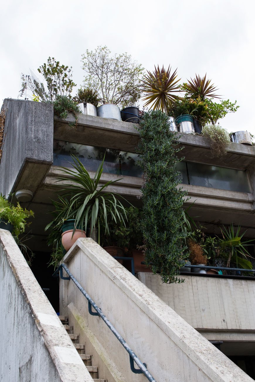
 Not surprisingly my favourite and I think you can guess why (I'll give you a clue - PLANTS). The Alexandra Estate, or Rowley Way as it's commonly known feels like it has its own micro-climate thanks to the ingenious cast concrete structure, designed by Neave Brown. A departure from the more popular high rise, the estate consists of two rows of four-storey blocks facing onto a central street, with higher eight-storey blocks further back. This valley like structure keeps out much of the harsh weather, allowing an array of planting to thrive here. Noise pollution from the railway line behind is kept out as the structure acts as a sound barrier.
 It's definitely an unconventional beauty, drawing you in to explore its social spaces and admire the tropical planting. We had a few strange looks from local residents who stopped and asked what we were up to. They weren't surprised to see us on a tour, though they found it strange that people would visit to admire it. One resident had lived there for over 20 years and raised her four children in a safe and happy environment. Every home is light and spacious for family living with balconies and underground parking facilities. This is how social housing should be - well considered, good quality living, not hastily thrown up to cut corners. I'm looking at you Kensington and Chelsea Council.
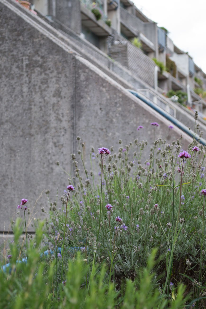 Unfortunately for Brown, this project drew a lot of attention for all the wrong reasons due to the complicated construction methods, becoming one of the most expensive examples of social housing. It wasn't until last year that Brown won the RIBA Royal Gold Medal in recognition of his contribution to architecture. Richly deserved too.

Isokon Building | Est 1934, designed by Wells Coates.
 Last stop on the tour - Wells Coates' masterpiece, the Isokon building. With the September sun highlighting her curved form, we joined resident of the Isokon Penthouse and director of the Isokon Gallery Trust, Magnus Englund.The Lawn Road Flats as they were originally known, were designed by Canadian architect Coates with the young professional in mind. Influenced by Bauhaus design, the building was commissioned by husband and wife Molly and Jack Pritchard, owners of modernist design studio, Isokon. Likened to an ocean liner, a look referenced heavily within 1930s design, the building features 34 flats marketed with all mod-cons. Ideal for those too busy to cook and clean, there were staff quarters, kitchens, a dumbwaiter and the Isobar downstairs for communal gatherings. The height of 30s glamour.Built-in, plywood furniture designed by the Isokon Furniture Company provided a simplistic, straightforward way of living or "equipment for the living of a free life". With an illustrious past, the list of previous residents reads like a dream dinner party, including Agatha Christie, Bauhaus founder Walter Gropius and Marcel Breuer.There is much to delve into within the history of this building - Pritchard's involvement with Isokon and the community of Europe's modernist movers and shakers, how well the building faired over its 80s years. It might be better told through the building itself though, which houses a museum dedicated to the life of the building and the people who brought it into being.Thank you to The Gentlewoman and COS for this wonderful experience. You can follow the Glimpses of the Future architectural tour here (bearing in mind that some residences can't be accessed from the inside).If you fancy getting involved with The Gentlewoman, you can join their club for exclusive events and tours.
Photography © Tiffany Grant-Riley
How To Whitewash Wooden Floors | A Guide
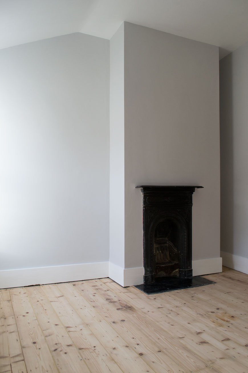 [Sponsored content]. Over the winter months, we've been working hard on project 'strip the floors', most of which were given an orange pine varnish treatment many moons ago. Rob managed to sand his office (pictured) which was previously carpeted and the kitchen in three dusty, sweaty days. Despite the fact the floors are in great condition for their age, I really don't like having dark orange wood everywhere - it makes an already dark house feel darker. I did a fair amount of research into limewashing and whitewashing before jumping into this project, asking for recommendations from interior design friends who have done it before and they all came back with the same brand.So, on a mission to brighten up the house and lift the floors, I've put together a guide on how to whitewash wooden floors in partnership with OSMO, makers of wonderful oils and waxes, elixirs for all kinds of wood treatments. A look synonymous with Scandinavian style, whitewashing creates a contemporary feel, highlighting the natural beauty of the wood grain. The best thing about it is that unlike painting the floor which will show up wear and tear over time, whitewashing is far less high maintenance.Although traditionally done using lime or wood bleach which can be harsh (please don't do that!), tinted wood oils are now a far less complicated option, nourishing and protecting the wood simultaneously. All these oils and waxes are environmentally safe, meaning fewer harsher chemicals and the wood can still breathe underneath. For high traffic areas it stands up well to abuse, is water resistant and is easy to clean. It also works brilliantly on pine flooring and a little goes a very long way.
Spot Check!
Before you get too excited and rush out for tools, please make sure you do a swatch test first. Check what kind of wood floor you have. Pine is generally an all-round winner for this effect with its naturally pale qualities, whereas darker woods will have a completely different result and are sometimes better left alone. If you're desperate to lighten dark wood, I've read about a method called pickling that's worth looking into.Find an inconspicuous corner that you can sand back if you don't like it, purchase a tester of the product and follow my prep and cleaning steps before applying. A small area won't take long. Follow the drying times and then see what you think - has it been well absorbed and have you achieved the desired effect? If so, read on...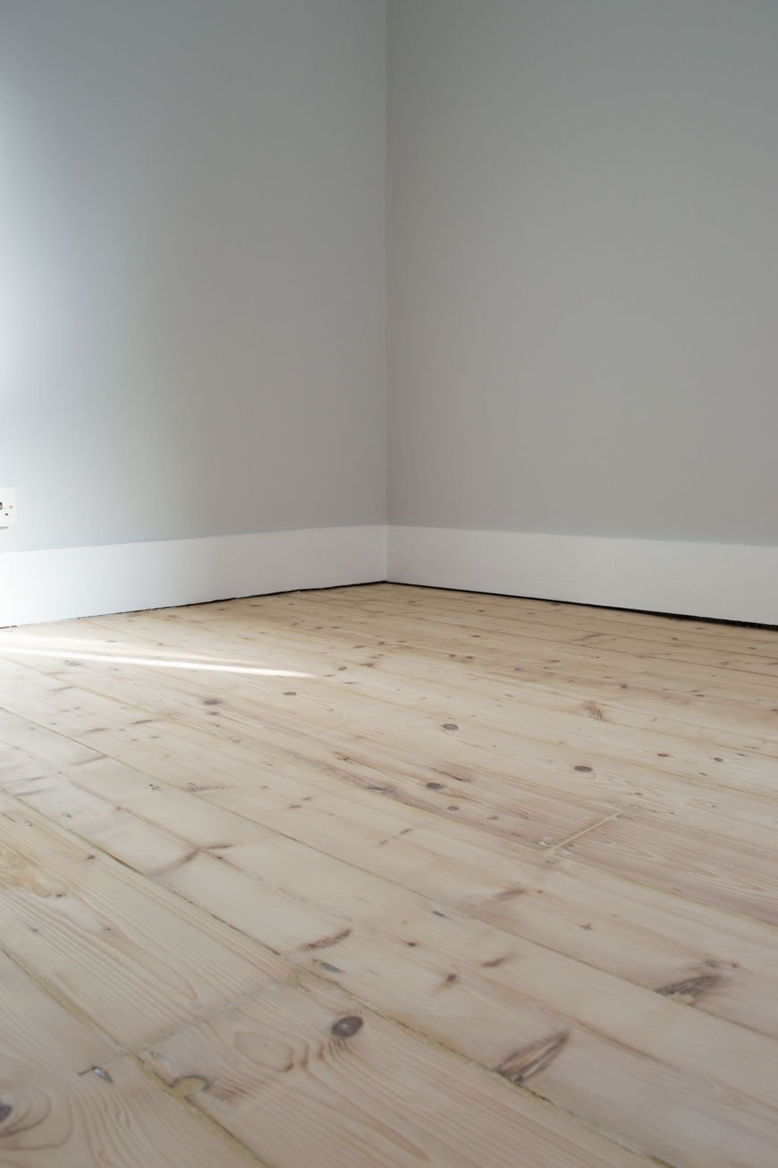 You Will Need:• Vaccum cleaner.• A good floor cleaner / stiff floor brush.• OSMO Wood Wax Finish** in white (code 3111). A 750ml tin will cover approx 20 sqm.• OSMO Polyx-Oil Tint** in white (code 3040).• Soft, lint-free cloths (you can only use these once per application) or a soft, wide paint brush (OSMO also have wide floor brushes).• Painter's pot or tub to pour out the floor oil into.• Gloves to keep your hands clean (it gets everywhere and it's hard to clean off your skin!).• OSMO cleaning solution.**find your nearest stockist here.
Before You Start - Prepare The Floor.
Make sure you've fully prepped the floor before you start staining it. This means removing any previous treatments with a heavy duty sander, repairing loose or broken boards and filling any gaps as Rob has done. You can find a step-by-step guide to sanding floors, including the prep from our previous project in the kids' room. Ignore the knotting step - you'll want to see all of the grain.Next to clean the floor. Vaccum up any dust and debris first - you won't want to be working this into the floor. Wash and dry the floor a couple of times until any marks and dust have lifted.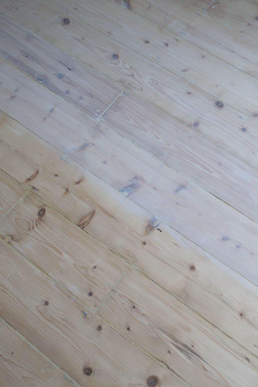
Step One - Applying The Wood Wax Finish
Stick on some protective gloves and decant a little of the Wood Wax Finish into a pot for easier access. Apply the wax oil in a thin coat along the grain with your brush or cloth, working it gently into any knots and cracks. Remember a little goes a long way. Allow twenty minutes soaking in time, then use a clean, lint-free cloth to gently rub away the excess wax oil until you're happy with the tone. You'll need to do the floor in sections so that you have a safe space to kneel while you do this part - otherwise you'll step on it while it's wet. This may mean leaving yourself a small path clear to the door whilst you wait for the rest of the floor to completely dry before you can finish the rest.TOP TIP: Because some floor oils turn yellow over time, OSMO has recommended applying a white oil tint as a top coat after the initial wax finish.
Step Two - Applying The Polyx Oil Tint Top Coat
Once the floor is completely dry, check that you're happy with the tone. If you feel it could be a little whiter, repeat step one. Next to apply the Polyx Oil Tint which will protect your base coat and prevent it from yellowing over time. Decant a little of the oil tint into a pot and do the same as in step one with either a soft brush or clean, lint-free cloth. At this point, you can either coat the entire floor, working your way back towards the door (don't maroon yourself!) and leave it to fully dry, or repeat in section and work off the excess. The Polyx-Oil Tint is a translucent white which will add ever so slightly to the finished colour with a subtle sheen. I didn't bother to remove any excess as I was happy with the finish so I left it to dry after applying a thin coat.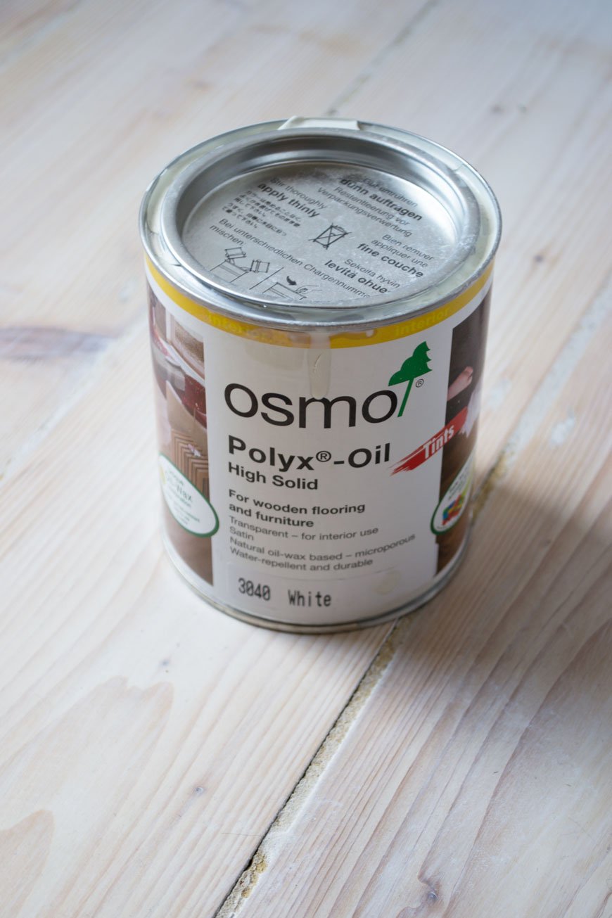 And that's it! Yes, it's pretty hard work - you're going to have to get sweaty for this job, but the finished result is well worth the effort...
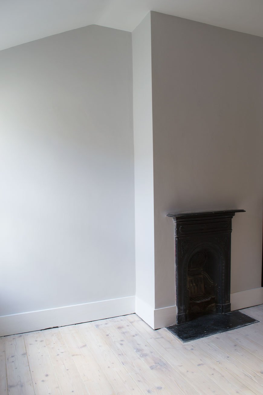 What do you think? Got any questions about whitewashing? Leave a comment below and I'll do my best to help.Can't wait to show you how our kitchen floor turned out and the difference the whitewashing has made to the feel of the room!Written in collaboration with OSMO who have kindly supplied product in exchange for this post.
Photography © Tiffany Grant-Riley
5 Habits For Simpler Slower Family Life
 The first post of 2018 and I'm starting your year the right way, sharing six easy to adopt habits for a simpler, slower pace of family life. Perhaps you're already missing that relaxed holiday bubble and are looking for ways to gain some of that back? Well, the good news is, you can.Let's be real about it though - for all the picturesque perfection that the slow living lifestyle portrays on social media and in the magazines we read; it's not possible to sustain that way of life on a daily basis, especially when there's an infinite amount of plates to spin. If only we could all spend all day lounging in trendy cafes nursing endless, artfully styled lattes or standing at the edge of a snow-topped mountain peak! Yet, with this culture of busyness we perpetuate, it's hardly surprising that we're yearning for a slower, less immediate pace of life. Is it any wonder so many of us struggle with our mental health when a full working calendar is seen as a virtue? And I can hold my hands up and say I was one of those people, who felt that telling anyone who would listen just how busy I was would somehow make me appear more important, more valued. Until that is, I got bored of hearing myself saying it, and others to me. I was stuck in a constant cycle of burn-out and, as a parent living with depression, I realised that I needed to break that cycle for me and my family. I don't want to teach my children that over-work and unhappiness is the norm.In the run-up to Christmas, I thought we might drown in a sea of commitments we'd given ourselves - both of us frantically trying to wrap up work for the year, the kids with their end of term parties and non-uniform days. It felt never-ending and the idea of a pressure-free break completely unattainable. If you're anything like us, living miles away from any close family members to give us both a break from time to time, the moments we do get to slow down are all the more precious. Life is an ebb and flow cycle with busier seasons and pockets of slow. Go with it. Try to carve out a little time each week if not at the end of each day and practice these simple tips we use...
Expect To Plan
It's not what you want to hear, but in order to slow down, you need to carve out the space to do so. Spontaneity takes planning when you're short on time.Gone are the days when we would spend all day in bed binging on episodes of Lost, leisurely grazing amongst the folds of the duvet. And wow do I miss those days...we're lucky to get five minutes to chuck down a coffee before something needs taking care of. It's the day to day stuff that takes up your time - the laundry, homework, remembering that the bathroom is sitting under several weeks of filth. As boring as it is, getting these things done and dusted means they're not on your mind imposing those guilty "I should be" thoughts on you. Be methodical and make a list of the most pressing and important tasks to be done - we use a large chalkboard in the hallway and the control freak in me gets real pleasure from ticking things off. Anything non-essential can wait. We use Saturday as our getting s**t done day leaving Sunday free for whatever we please.
What is this life if, full of care,We have no time to stand and stare.No time to sit beneath the boughsAnd stare as long as sheep or cows.
- 'Leisure', WH Davies.

Find A Project
Choosing a project to work on together is a great way to connect with each other and in turn, helps to shut out external distractions. I'm talking about our phones, the games console - anything that pulls our attention anyway from being present, in the moment. Doing something with your hands is a wonderfully therapeutic too. Use this as an opportunity to teach your children something new. It could be baking, building a Lego castle or working your way through Roald Dahl's collection at bedtime.Last summer, we grew courgettes, tomatoes and sunflowers from seed and my two took it in turns to feed and water the seedlings, monitoring their growth in the mornings. Ok, so they didn't eat any of the courgettes (unless I cleverly disguised them) but I loved seeing how excited they were to watch something they planted grow and bear fruit. The specifics of the project isn't important, it's the spending time together as a family that matters.
Eat Together
One of the most important things you can do as a family is to sit at the table to eat together. Even better if you can involve the kids in cooking a meal, I find mine are more likely to eat it if they've played a part in making it. I'm always so aware of my most-used sentences "we haven't got time" and "we're going to be late" and I don't want them to become ingrained in my children's memories of me, so I use mealtimes to counteract the rushing. Weekday breakfasts are typically a blur in favour of getting the school and nursery run done but dinner is the one time we all stop and talk about our day. At the weekend we make a thing of planning a special breakfast (usually pastries or I make pancakes) and indulge ourselves in a slow morning.
Focus Your Attention
When was the last time you really paid attention to your surroundings? Be mindful of the details around you as you go about your day together. Watch the birds visiting your garden, listen to vinyl instead of the TV. I realise that my two often try to talk to me when I'm distracted with other things, so I make a point to stop what I'm doing from time to time and give them my full attention. If you think about it, what's more annoying than someone not hearing you when you're talking to them?Take cues from your children - they're sticklers for noticing the little things. It might be watching bugs in the garden as my son can spend hours doing. My daughter likes to count the freckles on my face. She calls them "mops" (moles). I love her all the more when she does that.Adopting a daily ritual helps with this too. Mine is to make us a coffee with the stove top percolator after the school run. From grinding down the beans, packing it out, boiling the water and listening for the rush of pressure as it brews into the jug. I take my time, breathe in that fresh smell of coffee and anticipate a quiet ten minutes before starting the day at my desk.
Hold Space
Don't plan for everything. Term time is particularly manic, especially when your children have extra-curricular activities, so in a rare moment when there's nothing happening, don't force it to. Worrying that the kids might find themselves bored is far too easy a trap to fall into; let them be. Don't forget how important it is for children to be bored sometimes - they need to learn to find their own entertainment, to learn to use their imaginations, to create. Leave those pockets of free time open to spontaneity. This, in turn, will open up some space for you to have that coffee, read a few pages of the book you've been trying to finish for months. Time to breeeeeeeeathe.I hope this short guide has inspired you to embrace slow living family life and, if like me you're about to dive into the first term of the year, then I salute you. You've got this.
Photography © Tiffany Grant-Riley, taken on our Christmas Eve 'blow the cobwebs away' walk.
Curate And Display Christmas Gift Edit | Under £300
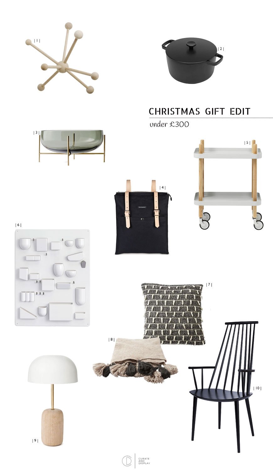 In the last of my Christmas Gift Edit series, I'm sharing coveted designs for under £300. We still have a fair bit to get finished and ready for the big day, hence the reason for the late posting of this guide, but I'll wager there's still a few bits left on your list too! Not surprisingly, I've picked out a monochrome selection of European and British made designs for your home. These are pieces that will stand the test of time and fit seamlessly into your home for many years to come. Let's take a look...| 1 | No gift edit is complete without a little Danish design somewhere. The Poly Coat Rack in oak from Skagerak was inspired by a seed head - a tactile shape and perfect for small spaces too. £179, Skandium.| 2 | What I wouldn't give to come home and find Crane cookware waiting in my kitchen. Aside from the fact that they're black enamel, they're designed in Britain and made from 30% recycled materials. They're 100% recycleable too. Not that you'd ever need to replace it. £145, Clippings.| 3 | Smokey glass and brass Echasse bowl, by Menu. £239, Monologue.| 4 | Smart enough to take with you everywhere, this Marimekko Eppu backbag is a stylish canvas and leather update. £185, Tea and Kate. | 5 | A trolley is a versatile piece to have in the house. Use it to store your drinks, somewhere to put your plants or books or bring it out as extra surface space when you've got friends over. Light grey Block trolley, Normann Copenhagen. £205, Made In Design.| 6 | For the ultra-organized, the Uten.Silo, designed by Dorothee Becker in 1969 is enough to satisfy the neat freak. Perfect storage for the office, kitchen and anywhere that requires pleasing little pockets. £265, Vitra.| 7 | A family with over half a century of loom weaving history, Mourne Textiles are still making beautiful blankets and cushions from the foot of the Mourne mountains in Ireland. Their classic 1956 Shaggy Dog weave cushion is one of my absolute favourites. £185, Mourne Textiles.| 8 | TOAST always make the most sumptuous blankets and this Knitted British wool throw is no exception - look at those tassels! £225. TOAST.| 9 | French design brand Harto are still quite new to these shores, I love their sophisticated mix of wood and brass with satisfying curves. Say hello to the Nina table lamp. £177, Made In Design.| 10 | A 1960s classic now produced by Hay, the J110 chair still holds its own in a more contemporary setting. An ideal seat for the head of the table if you ask me. £219, Nest. So, here it is - my last post of 2017. I hope you've found my Christmas gift edit series a help in some way shape or form. Maybe you've discovered a few new designers or shops?I'll be back in the new year with fresh, new interior inspiration, including the big reveal of our kitchen refresh. I've been slowing chipping away at it for a couple of months now, so I'm ridiculously excited to share the finished project with you!Thank you as always for taking the time to read and enthuse with me. Wishing you a wonderfully slow Christmas break with friends and family and a very Happy New Year. See you soon.Tiff xx
Moody and Minimal Christmas Table Styling
 There is nothing I enjoy more about this time of year than styling our Christmas table. It's the part of the day when I can slow down my efforts in the kitchen and take my time setting the table, lighting the candles and adding finishing touches before we sit down together. When I worked as a wedding and events planner, this part of the process was without doubt my favourite part - finding the right colour palette, choosing the tableware and linens and creating an atmosphere to bring friends and family together to celebrate in style. Although our Christmas table is quite a bit smaller by comparison, it's not any less important.
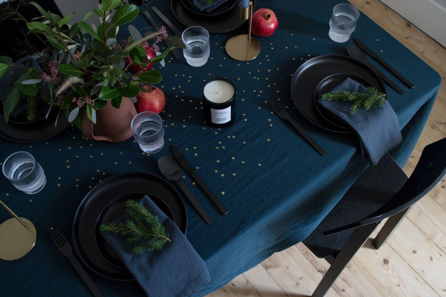 This year, I've been so inspired by all the rich and moody colour ways coming out of the Nordic design scene that I wanted to break away from white and do something different. This look is tonal with deep blue linen, black tableware, touches of earthy terracotta. No Christmas table is complete without seasonal greenery and I've used a mix of seeded eucalyptus from my local florist, off-cuts of fir tree and greenery foraged from my garden. You'd be surprised how much inspiration the hedgerows will give you too if you keep your eyes open, just make sure you're allowed to take what you find.I couldn't resist using the new table linen collection from French brand La Cerise sur le gateau as my starting point. A smattering of gold speckles across the centre of the cloth is a nod to designer Anne Hubert's playful signature style, picking up the warm glow of candlelight. You can get away without ironing it too as it's a linen and cotton mix. I much prefer the relaxed texture of the crinkles, don't you?
 The brass candlesticks are from the new MADE.COM collection which I saw at their supper club earlier in November. I love their simple shape and I've used my favourite Broste Copenhagen tapered candles in a blue-grey.I normally leave wine and champagne glasses on the sideboard for our guests to choose before they sit down, so I'm keeping the table simple with these Ferm Living Ripple glasses for water.Scent is yet another level of attention to detail that I bring to our table. Aside from the fresh smell of eucalyptus, I'm using the heady scent of Smoked Leather by Urban Apothecary. You may have spotted their travel candle in my recent gift guide and this one invokes the memory of lounging in a leather armchair in front of the fire. I'm down with that.
 Black flatware has been on my list of must-haves forever and this Turini set from Habitat adds a bit of chunk to an otherwise delicate setting. The Nordic Kitchen dinner plates make a striking alternative to white and I can't wait to see how the black brings out the pops of colour in the food - I'll be making a smoked salmon carpaccio to start!

My Tips For Styling Your Christmas Table
- Use paper napkins for a quick update. IKEA have an inexhaustible selection and Vitra's Eames Dot is a personal favourite.- Layer up your plates on top of each other. Not only does it save space but it also looks great with a carefully placed napkin tucked inside.- Mood lighting is everything. Use a mix of tall candles, tea lights or battery operated fairy lights woven into your greenery.- Make a runner of greenery down the centre of your table if you don't fancy a larger display. Simply layer sprigs together and hide the ends with interspersed candles or paper decorations.- Mix textures to give your styling depth. For example, linens mixed with polished metal and cut glass to refract the light. Use velvet or string to tie your napkins.- Supermarkets are full of herbs and small potted fir trees if you're stuck for foliage. Try a mix of rosemary and bay for scent and pomegranates, figs and clementines for colour.- Remember to leave space on your table for serving dishes, bottles etc. Less is more from a practical perspective too!Check out my Scandinavian Christmas table from 2015 and find more inspiration on my Pinterest Christmas board.Lina Ardoise Golden Dots Tablecloth* - La Cerise sur le gateauNordic Kitchen black dinner plates* - Eva SoloTurini matt black cutlery* - HabitatFerm Living Ripple glasses* - AmaraVerona brass candlesticks - MADE.COMTerracotta pitcher - Another CountryGrey candles - Broste CopenhagenSmoked Leather scented candle*- Urban Apothecary LondonBerit Mogensen Lopez abstract art print* - The Poster ClubDisclosure: This is a sponsored post - all credits and products involved are listed and marked* and have been gifted to me in exchange for this post.Photography & styling © Tiffany Grant-Riley
Curate and Display Christmas Gift Edit | Under £100
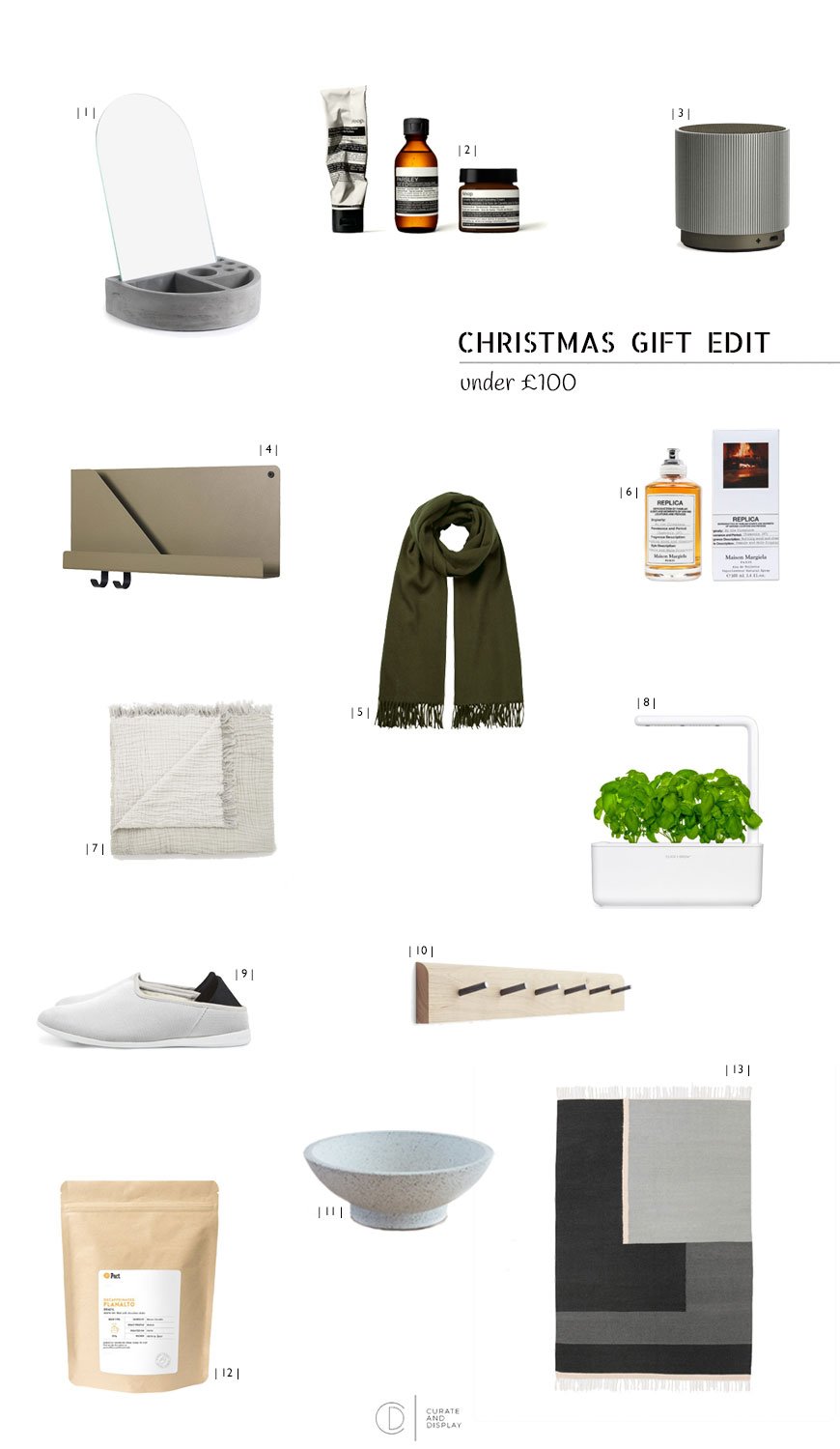 Continuing in my quest to make planning and searching for those special prezzies that little bit easier, my second Christmas gift edit for under £100 should set you on the straight and narrow. I've clearly had self-care in mind for this one, with plenty of long-lasting luxuries to use in the coming year and beyond, because we don't support the throw-away culture here - nuh-uh.| 1 | Conventional jewellery boxes are a little boring, but this fresh take in concrete includes a mirror for dual purpose functionality. £54.95 Korridor Design My Mirror, Moxon London| 2 Treat your skin and indulge in this kit from one of my favourite skincare brands. This moisture replenishment kit for dry skin comes with a cleanser, toner and hydrating face cream. Yes please. £89, Aesop. | 3 | A space-saving piece of minimalist tech, the Fine Speaker by Lexon is a rechargeable gadget you can connect to your phone. Rotate it for volume control and choose from three colours (I loved the grey). Ideal to take with you into the kitchen or bathroom. Just don't get it wet. £50, Heal's.| 4 | I've had my heart set on at least one of these Muuto shelves since their release last year. Made from a single folded sheet of steel, the Folded shelf becomes the perfect spot for storing paperwork over your desk, bathroom essentials or somewhere to hang your clothes. £89.30, Finnish Design Shop.| 5 | An olive green lambswool scarf will add a touch of effortless chic to your outdoor wardrobe and I love this one not only for its snugglesome size but because HUSH work with responsibly sourced materials. That means the wool you're wearing comes from sources who uphold the highest standards of animal welfare. Always find out where you're buying from and support the ones who do it with a conscience. £69, HUSH.| 6 | Unisex perfumes are always a winner in my eyes as you can
 steal share it together - extra value points. Makers of couture fashion and luxury fragrances Maison Margiela call this one 'By The Fireplace', invoking a crisp, winter morning spent in front of a crackling fire. Bliss. £100, Opumo. | 7 | An instant update for the bedroom or sofa, the HAY Crinkle throw has that lovely lived in look with soft tassels. £89, COS.| 8 | For the brown-fingered friend (I'm talking about plant killers you filthy Herbert!) desperate to keep something alive, this could be the answer. The Smart Garden is a pretty epic design inspired by NASA technology which ensures your plant receives the right amount of water, nutrients and light with its very own grow lamp. Plant and go and watch it grow. £95, The Conran Shop. | 9 | I'd like to think that by now you know I'd never recommend anything I haven't used myself and I literally live in these mahabis slippers. They're the most comfortable and practical slippers ever - you can even wear them outside. £89, mahabis.| 10 | Independent store Oggetto produce the most exquisite handcrafted pieces from their workshop in Dorset. The Chesil furniture collection is a particular stand-out, blending contemporary shapes with rustic wood and simplistic style. This four peg steel and oak rail would look right at home in the hallway. £85, Oggetto. | 11 | A beautifully crafted bowl for beauty's sake, made from the newest material on the interiors scene, Jesmonite. £80, Nakomi.| 12 | The gift that keeps on giving - the PACT coffee subscription. Sign up for 12 months with fresh coffee bean or grounds delivered to your door. The coffee is bought in small batches from independent farmers and roasted in Bermondsey. You can even change the flavour and frequency if you fancy. £6.95 per month, PACT Coffee.| 13 | A graphic, grey scale Kelim rug from Danish design brand Ferm Living adds a pop of personality. £99, Future and Found.So tell me - have I hit the mark? Sparked a few ideas? I'll be back later in the week with some Christmas table styling inspiration. Look out for the third and final gift edit for under £300, and here's the first for under £25 in case you missed it.