Minimalist Blue Kitchen Inspiration | Get The Look
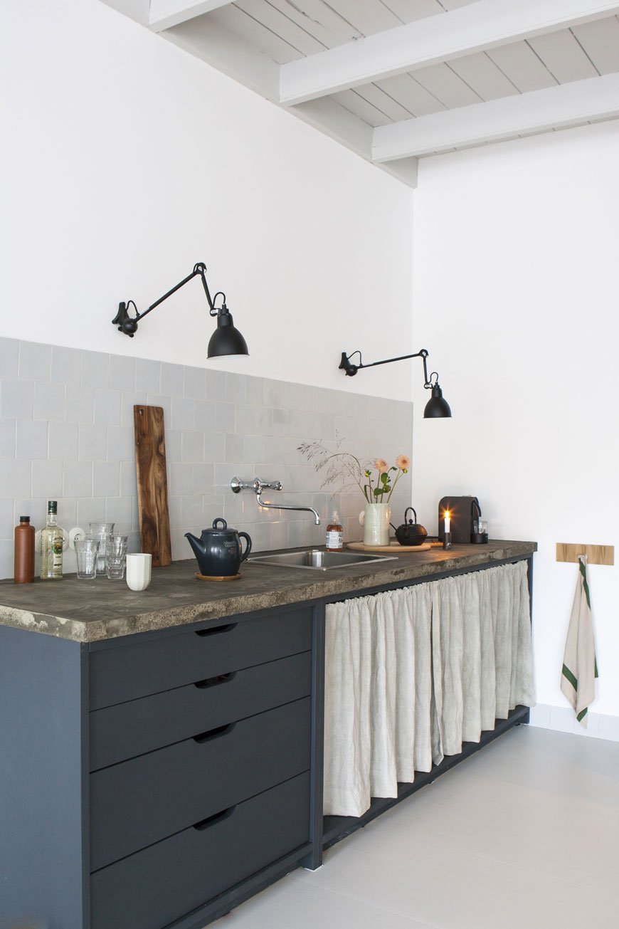 Got any kitchen decorating plans on the horizon for the new year? Because I've got some gorgeously minimal blue kitchen inspiration for your delectation today. Can you guess where I'm going with this? As I'm a glutton for punishment, I decided it was a great idea to embark on a full-blown kitchen project before Christmas. Simply put, I walked in one morning for the onslaught of the usual breakfast rush and decided I couldn't live with it as it was another moment. Big extension plans aside, we'll not be doing anything major with it for a few years and I was just tired of how "vanilla" it was. Cream everywhere. Nothing to connect it. And it was gloomy, not in a moody, atmospheric way, it was just flat and dark.
What's The Plan?
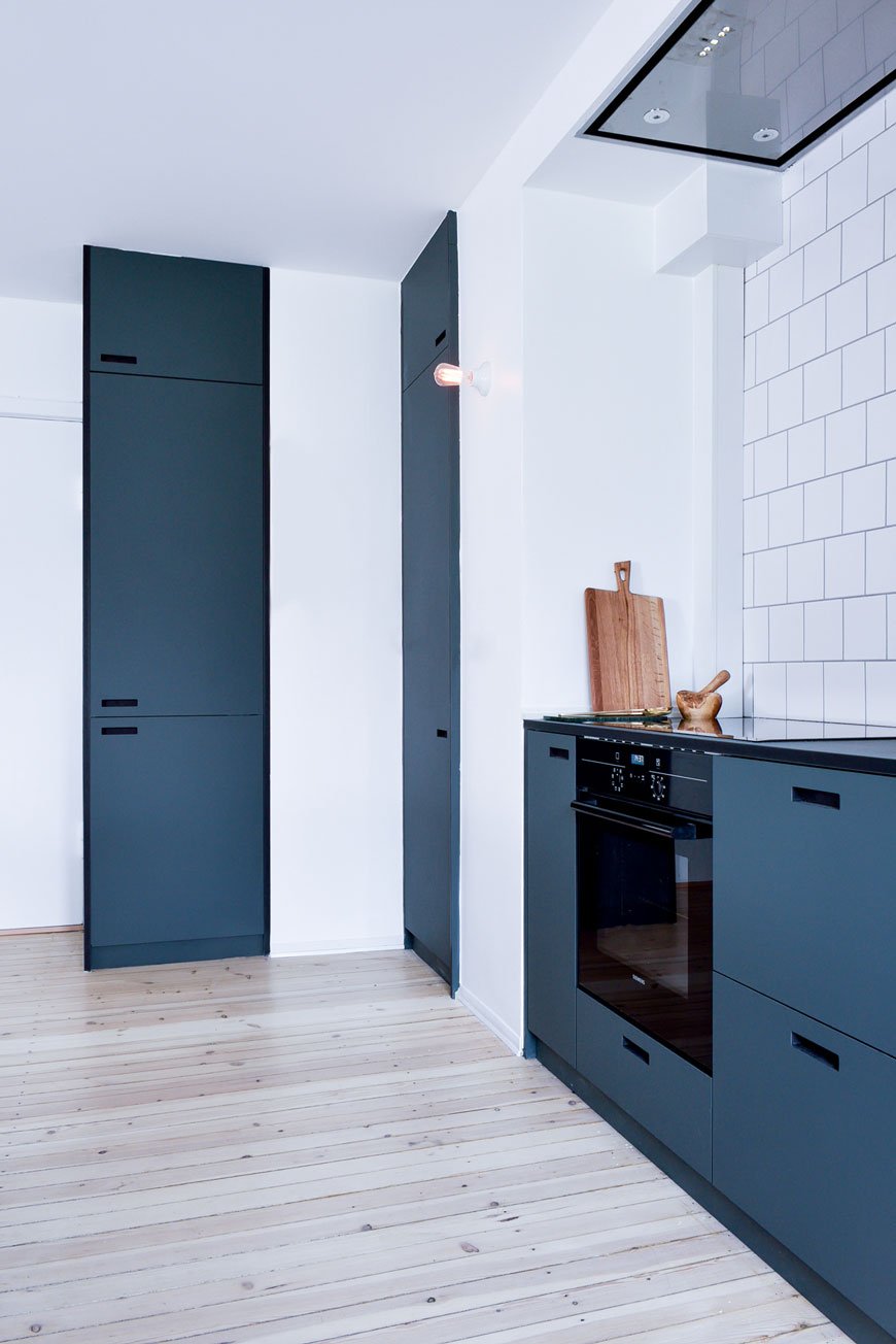
There's little point in us ripping out units, chipping off the tiles and replastering walls when we ultimately plan to knock the room through to the garden, so let's say this is more of a kitchen face-lift than full-on reconstructive surgery. This project is more about the details. We have non-standard DIY units (surprise, surprise) so they're being painted and given new custom handles. The patterned yellow and blue tiles we have running across the middle of our white tiles will be painted out in white tile paint. The bright orange stained floor will be sanded back and limewashed for a brighter feel and to bring out the grain in the wood and the rest of the walls will have a lick of white paint. An epic challenge for a short project, I've been knee-deep in painting, sanding floors (thank you Rob) and planning how best to make the most of the limited worktop space we have. Although my kitchen is relatively small (approx 12m2) I have been heavily pregnant in a galley kitchen with no more than a meter's width to manoeuvre in, so I can tell you now - this is huge in comparison!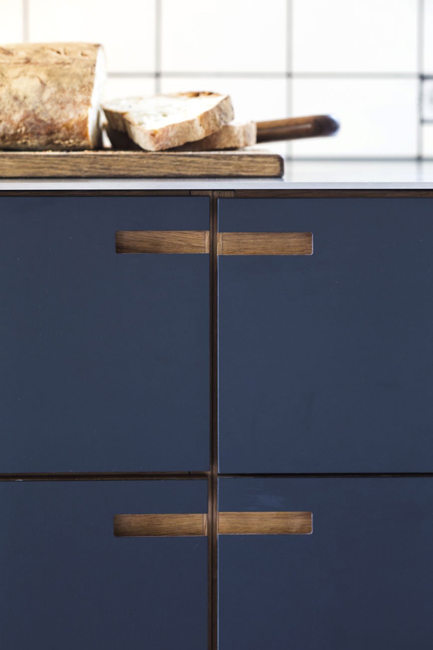 TIP: If you have standard Metod and Faktum IKEA units, certain companies produce beautiful, bespoke fronts for a more considered design. Try these British designers, Reform and &Shufl for more information.Why blue? Well, I wanted to breathe new life into the Edwardian bones of our home, giving our quirky kitchen a contemporary aesthetic. It's soothing, comforting and an all-round perfect colour for a room you spend a lot of time in. I wanted to make use of the low light in the room and really go to town with a deep colour. As we both wear a lot of blue and we've already used a lighter shade of it in the kids' room, having blue kitchen units was a no-brainer. Have you noticed how blue makes wood sing? Whether you prefer dark or light grain, it never fails to look sophisticated against it, whatever shade you pick. We eventually settled on Hick's Blue by Little Greene Paint. It's a beautiful, deep shade that changes with the quality of light throughout the day.
So, how do you make a blue kitchen work for you?
The tone of blue you choose will depend entirely on the light your kitchen gets and how it changes throughout the day. A shade somewhere in the mid to dark tones works well in contemporary spaces, particularly with a touch of grey or black in them. Experiment by painting several options on large pieces of paper (lining paper is great for this) and moving them around throughout the day. If your kitchen is a dark room, don't be afraid to embrace it with a darker blue, but if using it everywhere is too much, I would recommend using it on the units themselves as an instant contemporary update. You can continue the blue across one wall if you want to add extra impact - I'll be doing this behind our open shelving which makes some of the more unsightly units next to it blend in.Choose flush handles for a clean, minimalist aesthetic or look for something in plywood if cutting holes isn't an option. Using white on the walls works well to provide a contrast against the blue, but you can also mix in pale greys as shown in the tiles in the first image. Plaster pink and nude tones will give blue units a warmer feel if you want a softer look.Black taps are all the rage now, but for a timeless appeal, stainless steel is always a winner. Extend from your taps out to your hardware - plugs and sockets in brushed or polished chrome. You can also convert two kitchen taps to one mixer using a bridge tap. Appliances look spot on in chrome too.Got wooden flooring? Get sanding and staining. It's a messy process but I can promise you it's so worth it. Osmo has a brilliant range of floor oils and waxes - I recommend looking at the white and grey tones which will still show the grain once you've treated the planks. Alternatively, look at a good quality laminate in a light shade.Accessorise with a mix of matt black tableware and glass jars for dry goods. Choose graphic print textiles such as tea towels and aprons in lighter blues and warm terracotta for contrast (see my moodboard for examples).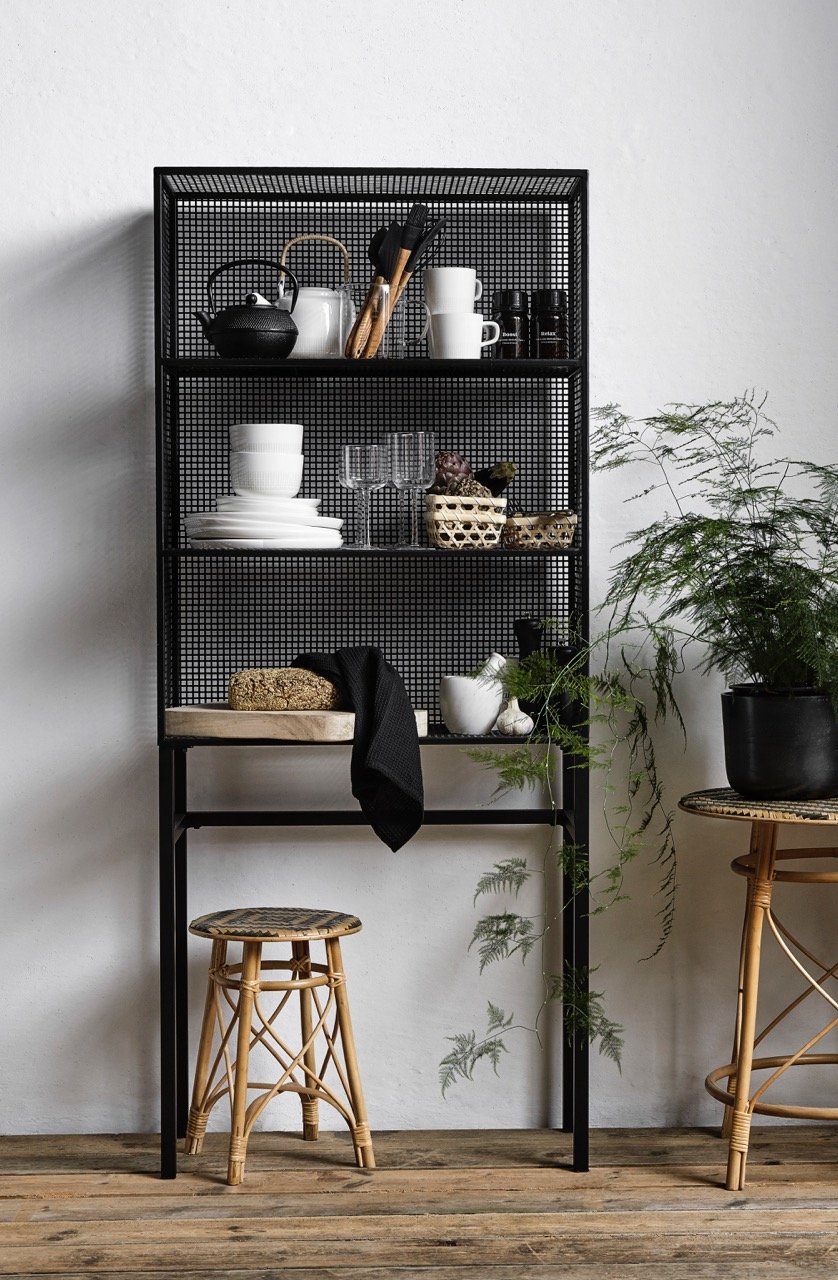 Use a mix of open and closed storage and display the items you use most on the shelves. I'll be using black ash shelving from String and a freestanding black mesh unit with narrow legs to free up some worktop and still retain a feeling of space.TIP: Go through all your cupboards and recycle or donate anything you don't need before you plan your shelving and storage. Clutter free is the golden rule here. Anything you display must be done so intentionally, the idea being that you use these items on a daily basis. Anything else used less can be tidied away in the cupboard.
The Inspiration
Here's how I'm pulling together the design for our blue kitchen. What do you think?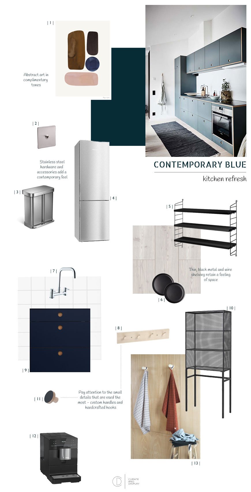
| 1 | 'Balance' by Berit Mogensen Lopez, The Poster Club | 2 | Brushed steel toggle light, Dowsing & Reynolds | 3 | Recycler pedal bin, Simplehuman | 4 | Stainless steel fridgefreezer, Miele | 5 | Black ash String Pocket shelves, Skandium | 6 | Nordic Kitchen black dinner plates, Eva Solo | 7 | Seattle bridge mixer tap, Wickes | 8 | Birch wall rack, Grey September | 9 | Blue BASIS kitchen fronts, Reform | 10 | Black wire display rack, Out There Interiors | 11 | Custom plywood handles, Chocolate Creative | 12 | Countertop coffee machine, Miele | 13 | Oscar grid tea towels, La Cerise sur le gateau Main kitchen image © Reform.
Curate and Display Christmas Gift Edit | Under £25
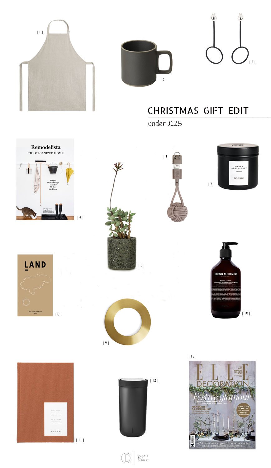 I swear it was only Christmas five minutes ago - was it not?! I've been so distracted by our kitchen refresh (more on that soon) that it's crept up on me. Again. So if like me, you've been caught off-guard by the festive season and need some quick suggestions, my Christmas gift edits should get you out of a spot. Whilst I really don't believe in spending out for the sake of it, I do think that a well-chosen gift will have its place for years to come. With that in mind, I've trawled some of the best independent and high street shops for little minimalist tokens under £25...| 1 | The Scandi brands are slowly taking over the high street, with the meticulously curated ARKET launching on Regents Street earlier this summer. A linen apron never goes out of style and only gets better with wear. ARKET.| 2 | Hasami pottery is a true favourite of mine. Made from a mix of porcelain and clay from the Hasami region in Japan, these mugs are incredibly robust and stackable too. £24.99, Native & Co.| 3 | Oliver Bonas are designing really unusual pieces of minimalist jewellery. These silver and deep navy drop earrings can be worn in a number of ways, together or separately. £18, Oliver Bonas. | 4 | A new publication from the team behind the inspirational interiors site, Remodelista. The Organised Home is a must-have guide for whipping your home into shape and getting the most of the space you have. £13, Wordery.| 5 | An unusual pot for the plant lover, designed and hand-cast by Peckham based studio Conpot from a mix of concrete and Welsh green granite. £20, From The Land.| 6 | Sleek, contemporary charging accessories made with design in mind, this is a Key Cable to take with you everywhere. I love Native Union's less is more attention to detail and the use of retro nylon cable. £18.99, Native Union.| 7 | Hand-poured in the UK, Urban Apothecary's monochrome travel candle is made from natural soy with 35 hours burn time. Try Fig for an indulgent winter scent. £15, Inside Store LDN.| 8 | No Christmas is complete without chocolate, particularly when it comes in a stylish wrapper. LAND is based in Bethnal Green making artisanal chocolate for the connoisseur...or anyone who loves to scoff down a bar. £5.50, LAND.| 9 | A beautiful, solid addition to both the kitchen and table, this multi-functional brass trivet works well for serving straight at the table or as a decorative item. £18, ARKET| 10 | The Grown Alchemist make natural hand washes with botanical ingredients that won't dry out your skin. Gives the sink an upgrade too! £25, Tea And Kate.| 11 | Make it a joy to be organised. There are crisp, new pages waiting to be filled in this weekly planner designed by new Danish studio NOTEM. £18, Nabo.| 12 | For the most devoted tea and coffee lovers, Stelton's To Go Click Flask has a snazzy 360 click lid, so you can drink from any angle. £24.95, Tea And Kate.| 13 | The gift that keeps on giving - an Elle Decoration magazine subscription for the interiors lover for 5 issues, delivered to their door each month.Keep your eyes peeled for my next two Christmas gift edits - under £100 and £300 coming up...
Contemporary Luxe Workspaces | De Beauvoir Block
 When I started freelancing ten years ago, the idea of a coworking office block like De Beauvoir Block was a world away. Over the past decade, the relatively new concept of coworking, hot desking and office design has forced a revolution in the way we interact with our workspaces. As more options become available to roam and work where we choose, we want these spaces to have the ability to inspire us and more importantly, encourage productivity. Last week, I had the pleasure of visiting the beautiful new communal spaces within this industrial warehouse building, designed by Tatjana von Stein and Gayle Noonan of Sella Concept. Familiar with their previous work at the former Clerkenwell London concept store, I was excited to see what dynamic this duo would bring to such a blank canvas.
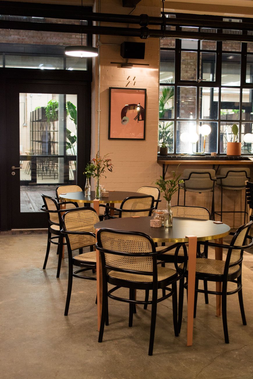
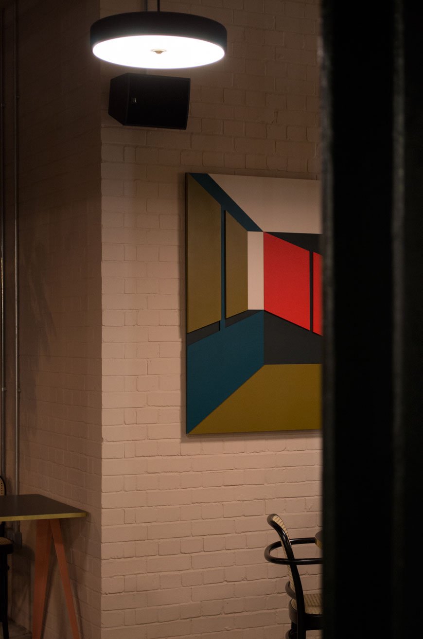
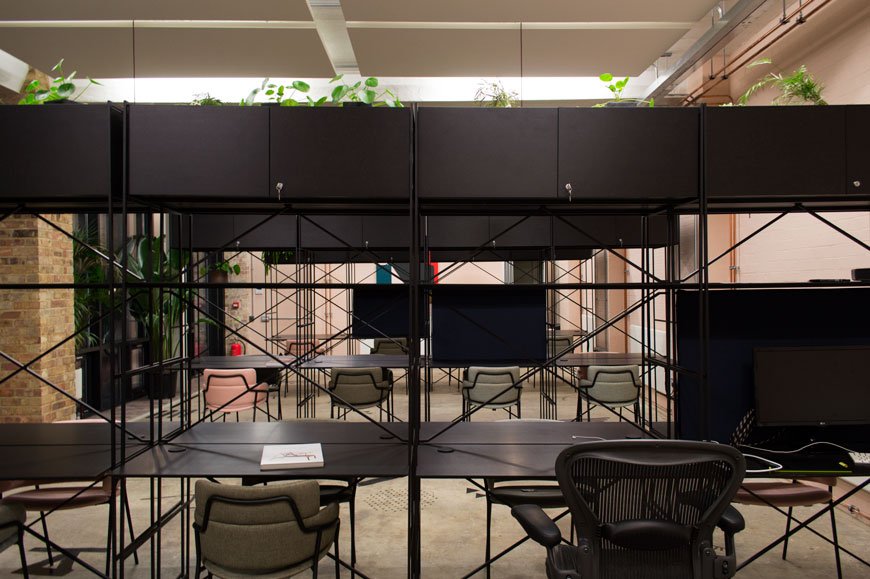 De Beauvoir Block really does feel like a home from home, in fact, I think I'd be hard pushed to get anything done here, distracted by the call of the cosy mid-century style seating nooks and lush, large-scale plants. It turns the traditional constructs of an office space entirely on its head. In contrast to the stark and spacious warehouse structure, the interiors feel more in line with a Palm Springs hotel. The jumping off point for the entire project came from newly plastered walls, so not surprisingly, the rough brick has been softened with a warm and calming pink, a colour carried throughout the communal spaces. Black metal framed furniture stands out against the concrete flooring and architectural wooden works of art by contemporary artist Emily Forgot make a bold salute to the building's heritage.
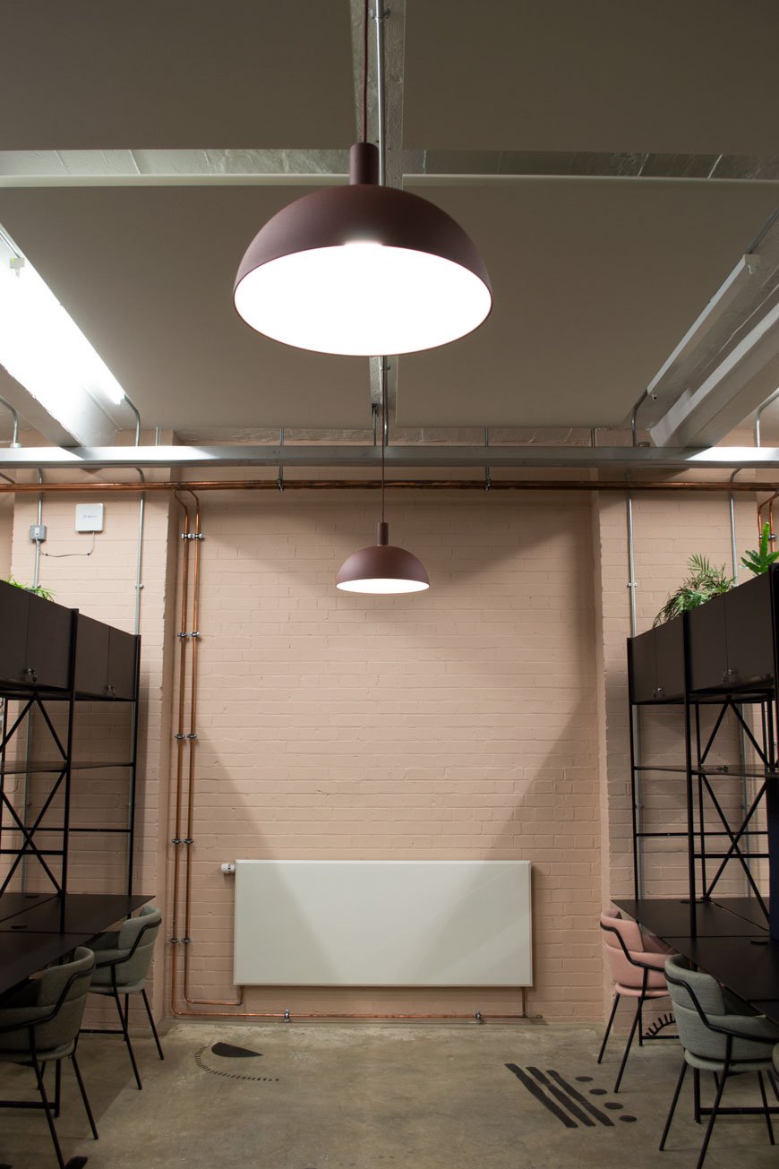
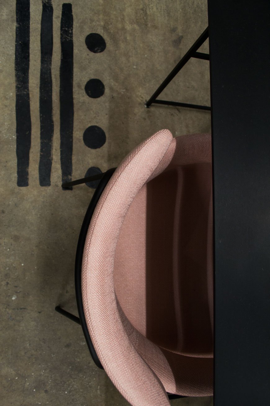
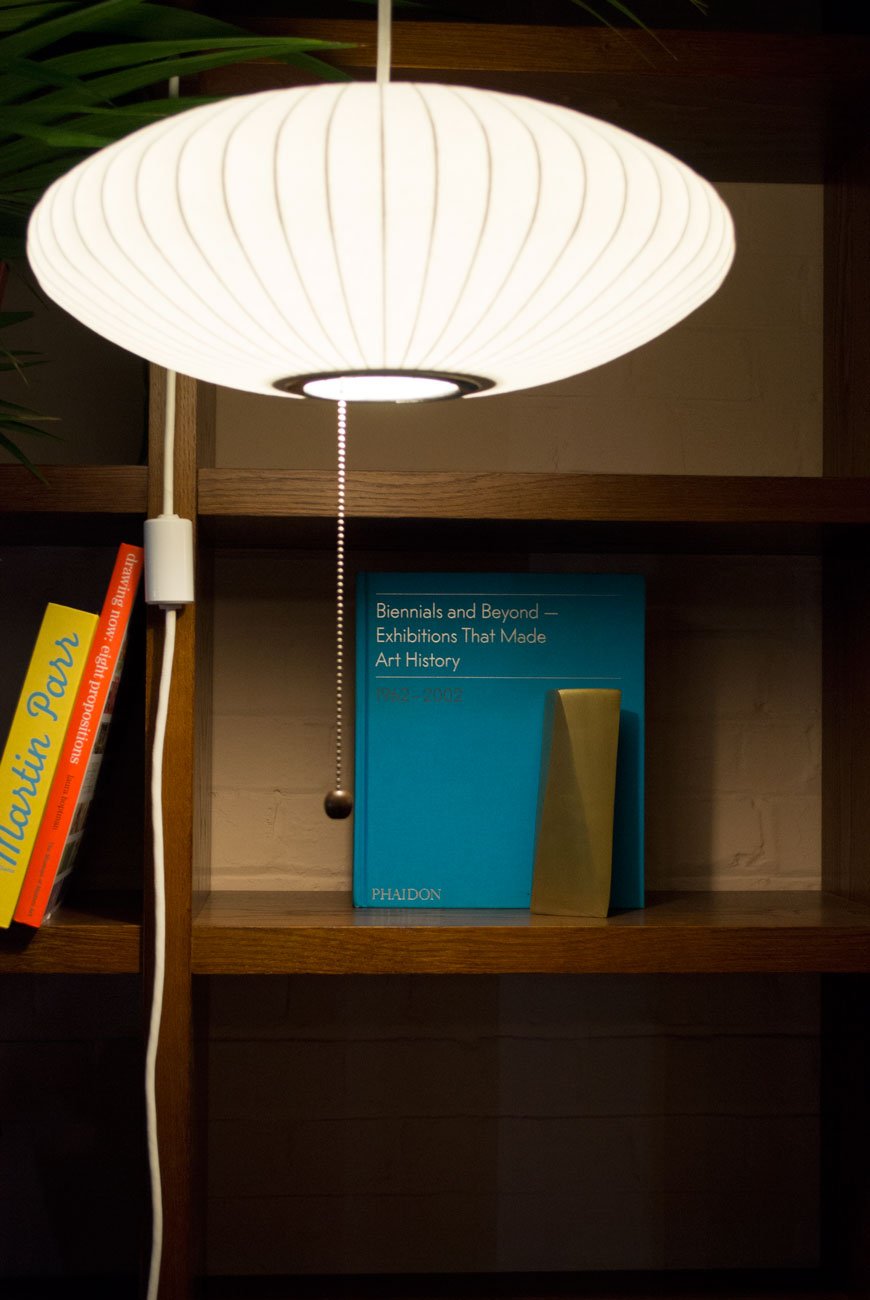
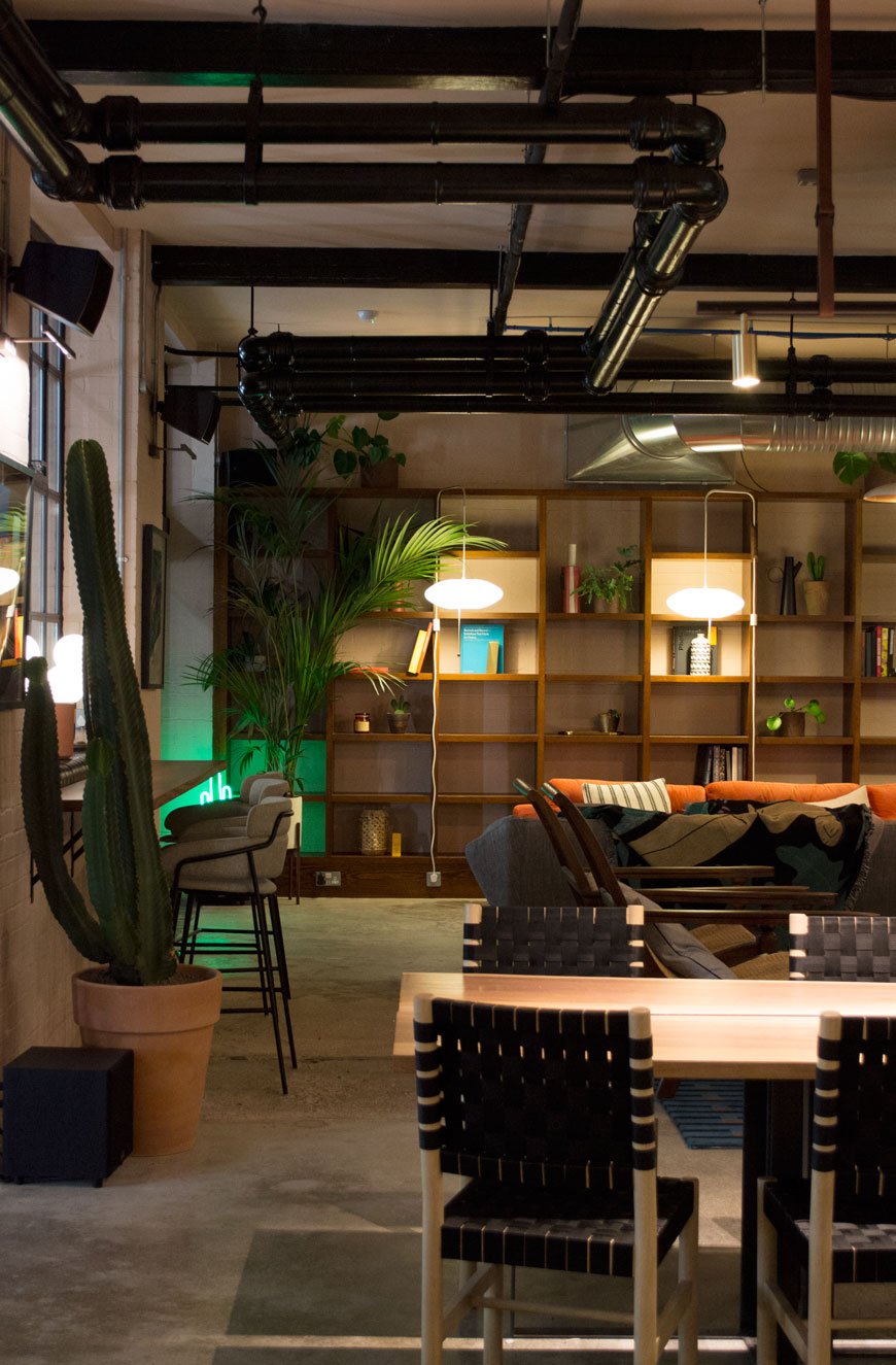 At the heart of the building is the bar area, a centralised space from which to host group meetings, catch up on laptop based work at the bistro-style tables or sink into the deep velvet lounge area for after-hours drinks. Much of the furniture has been custom designed by Sella, including the long plank tables, with additional statement pieces from the likes of Swedish Ninja and George Nelson's classic Bubble Lights.
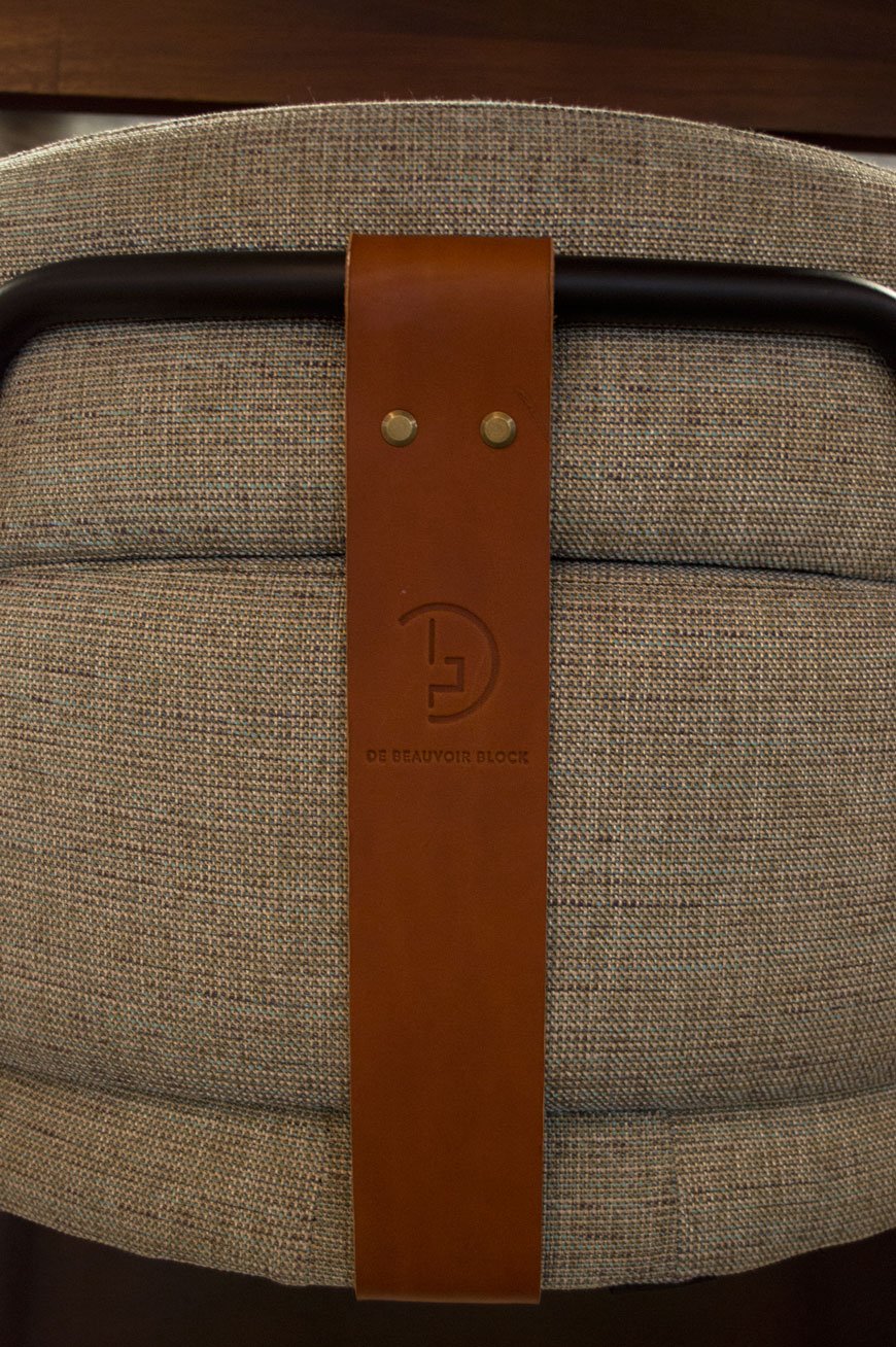
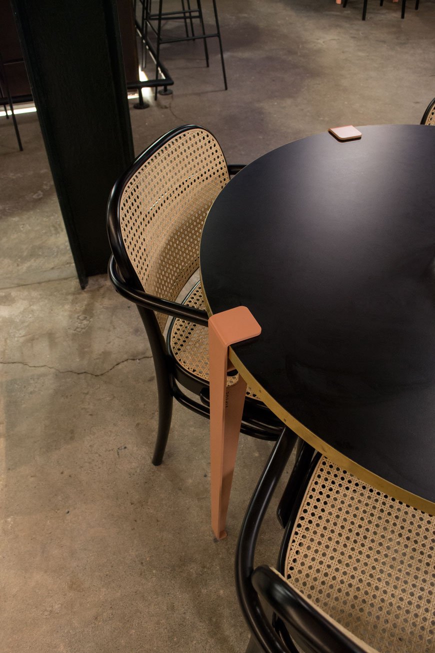 Officially opened in October, the block is now home to over 275 creatives with space still available on a casual or more permanent basis. What I wouldn't give to have such a welcoming workspace to come to for the day. Bet you're thinking about it now, aren't you?
  Photography © Tiffany Grant-Riley
Bedroom Renovations | An Update On The Chatham House
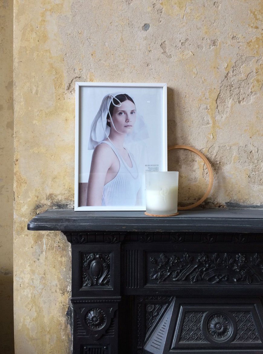 Would you believe it's been an entire year since we moved into The Chatham House? As it's been some time since I last shared any progress of the house, I thought I'd show you what's been happening with our bedroom renovations. Firstly, the one decorating task I absolutely love doing turned into the biggest chore of our lives. Stripping wallpaper. I have no idea what paste the previous owners who put all that lining paper up actually used, but let's just say it was something close to super strength super glue. Wow. No amount of turning the room into a sauna and attacking the walls with super sharp strippers could get it to budge. And you know that where there's wallpaper, there's usually a whole host of blown out plaster? Yep, that. Take a look at what lurked beneath...
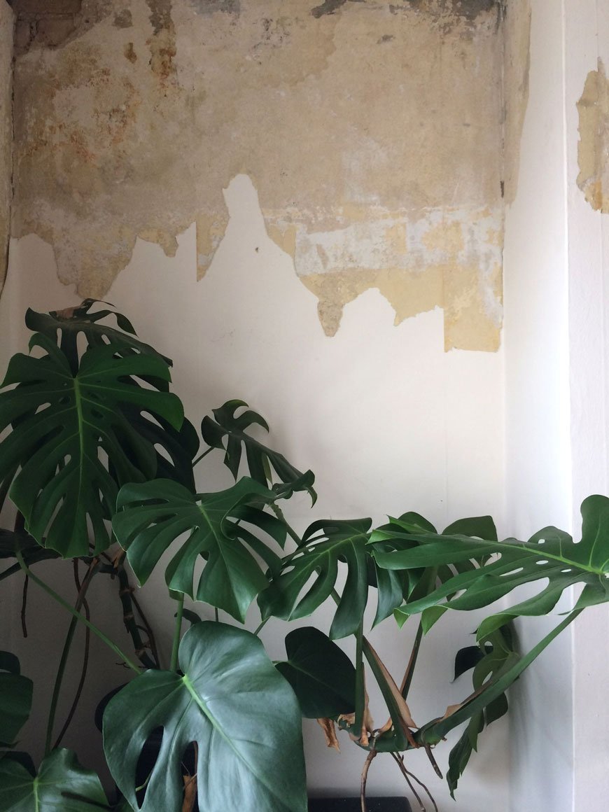
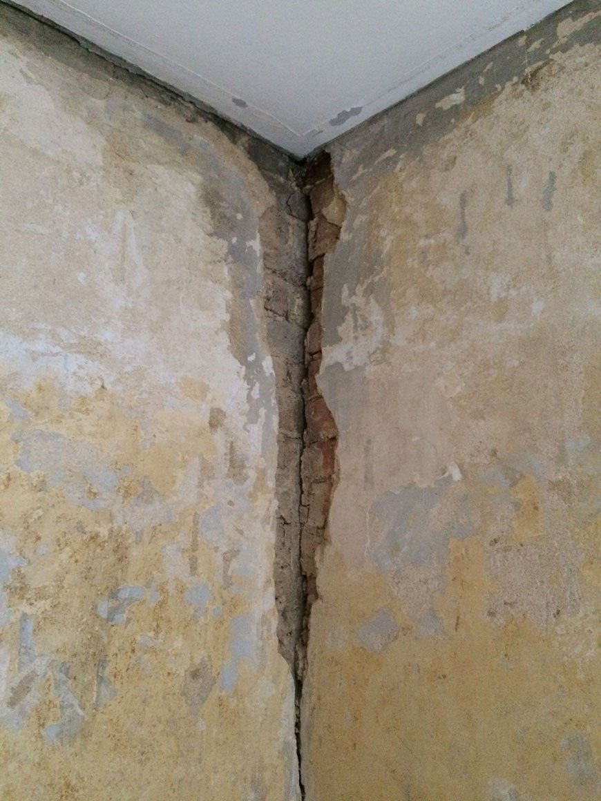 Once we'd knocked out all the blown out plaster, we got a fascinating look into the past - right back to the old brick and timber structure and some of the original horsehair plaster. I really do find that fascinating! Unfortunately, what we weren't quite ready for is the howling gale the lack of plaster between the walls and loft above created during the night as it blew tiny bits of rubble onto the floor.
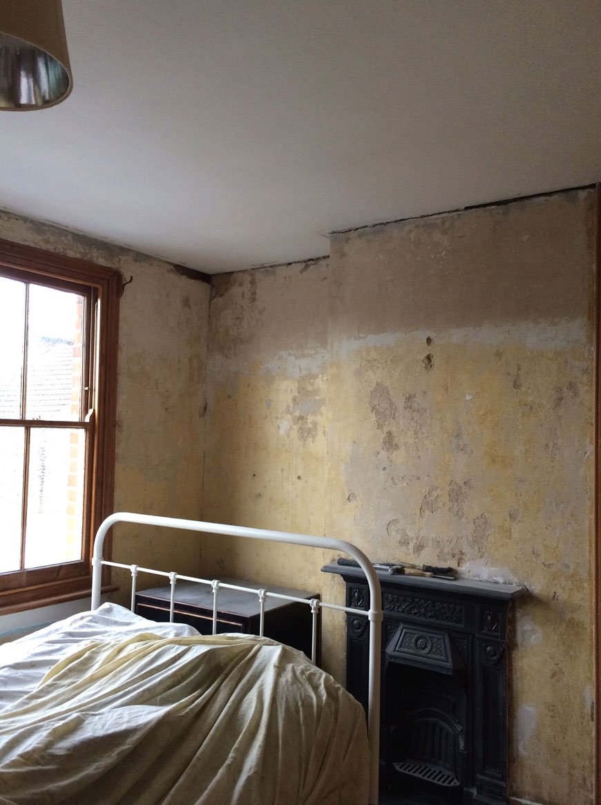
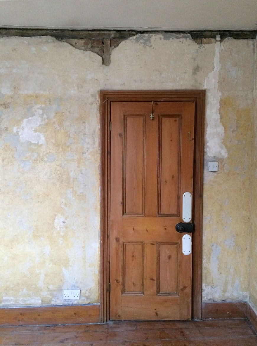 It took the plasterer all of one day to smooth off the walls, seriously impressive. It's a little touch-and-go with parts of the walls where the polystyrene coving was as there are still a few small gaps. He recommended we get more coving. You can imagine what I said to that...
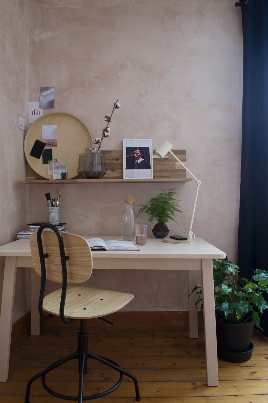 But anyway, this is how its been looking since April - admittedly I used an upcoming collaboration for 91 Magazine's spring issue with IKEA to get the walls done, using that blushing plaster as the perfect backdrop for the project. I turned a corner of our room into a workspace for me and gave the rest of the space an update more fitting to our style. We've really loved keeping the walls bare and honestly, I'm reluctant to pick a permanent colour right now. I change my mind constantly between plaster pink, pale grey and mid-blue. The next task will be to sand back and stain the floors with a light white wash to bring out the grain and I'd like to paint the sash windows to blend with the wall colour. When we eventually get round to choosing. Oh, and I've never painted sashes before - should I get the pros in? What do you think?
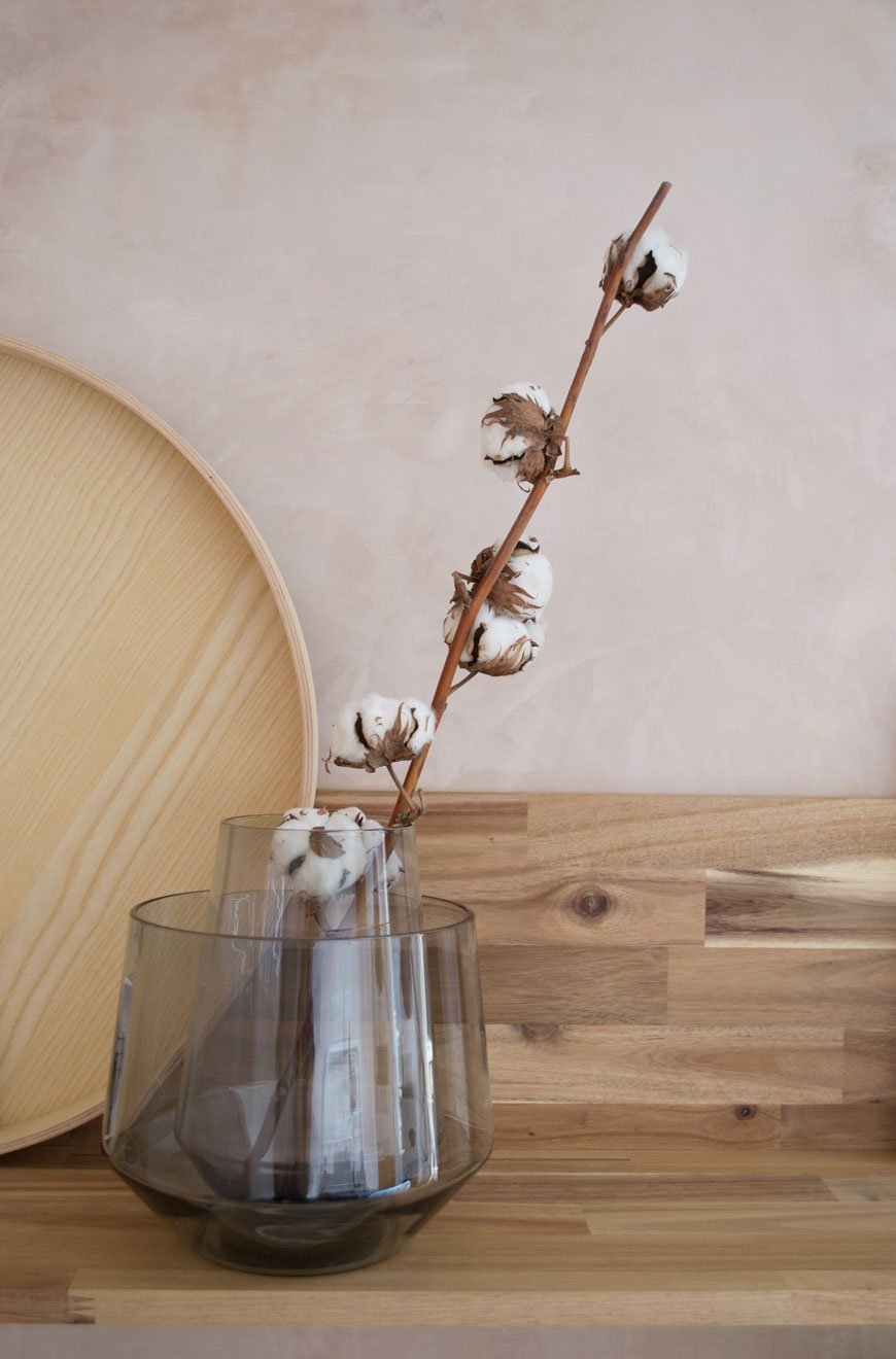
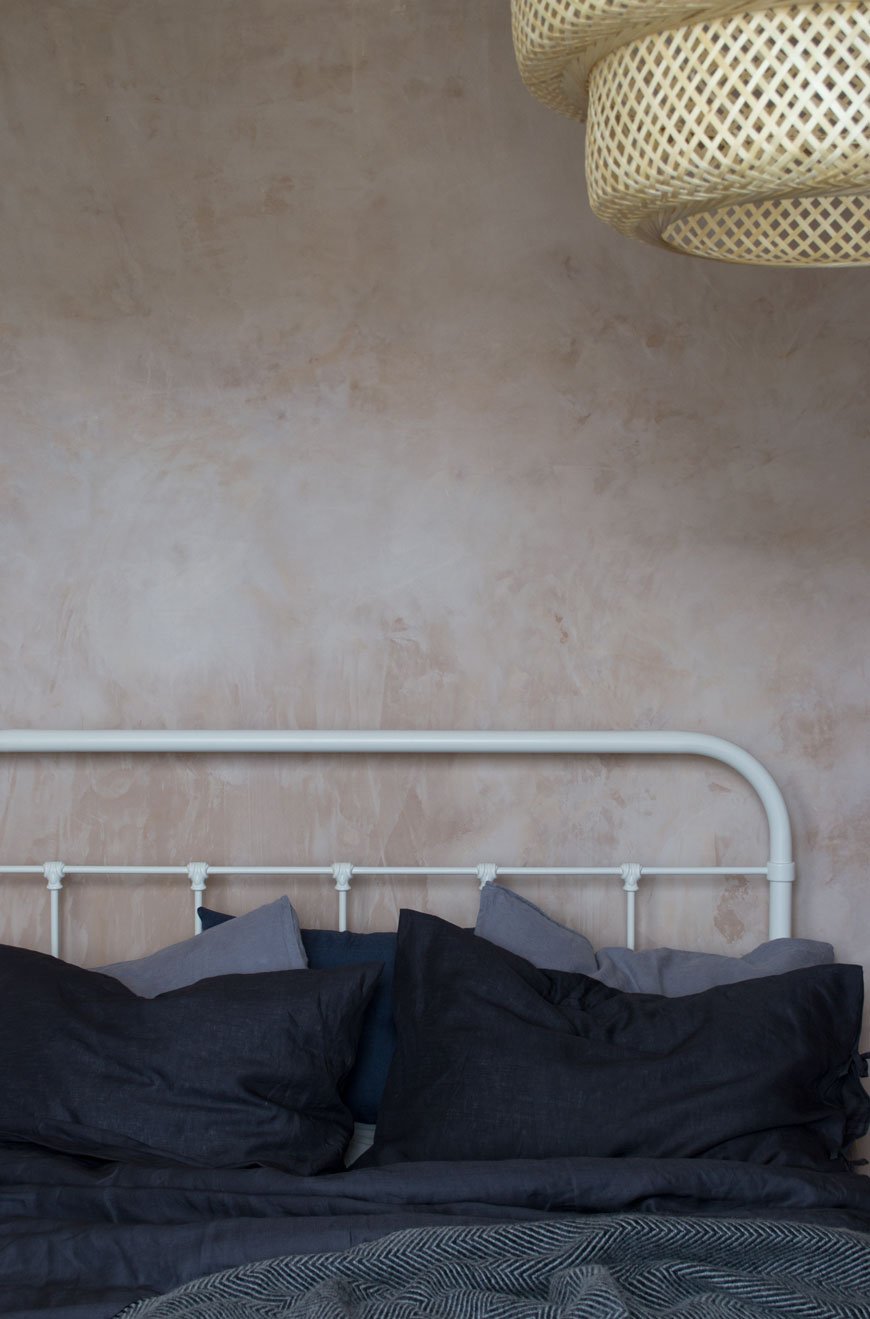

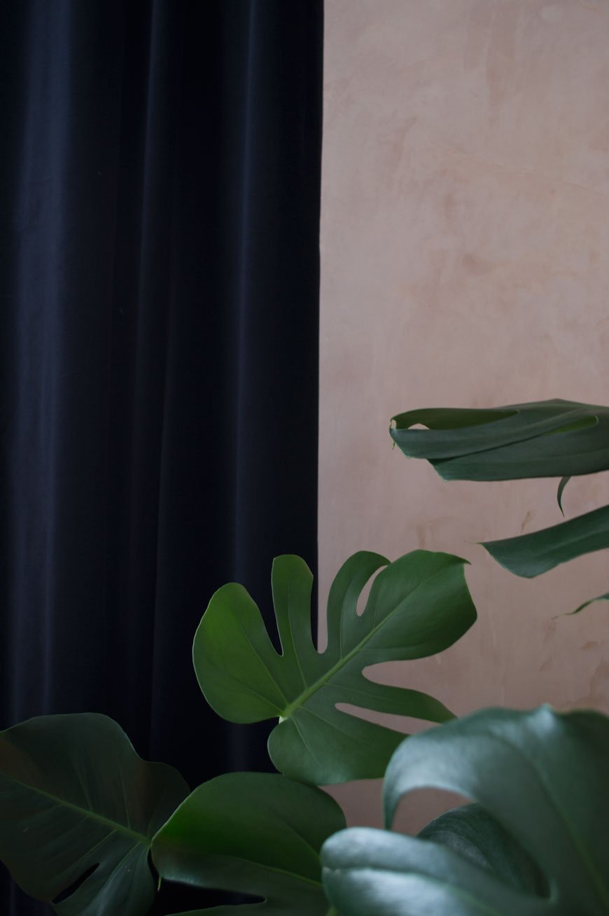
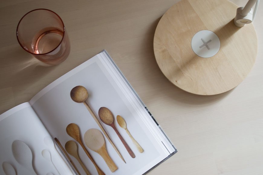
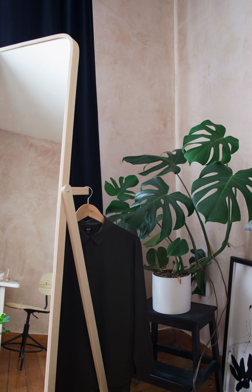 Want to keep up to date on our house renovations? Follow #thechathamhouse on social media and check out The Chatham House Pinterest board for more inspiration...Photography & Styling © Tiffany Grant-Riley
A Guide to Finding And Collecting Minimalist Art Prints
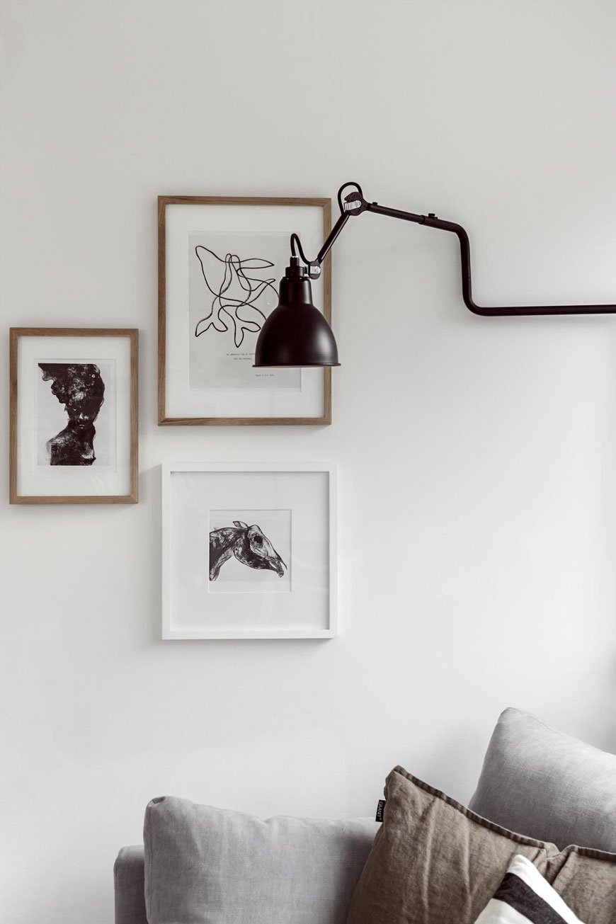 I put together this minimalist art guide for entirely selfish reasons...as well as for you, of course. Even though we still have nothing up on the walls yet and I refuse to until all the plastering and painting is done (could take some time) it hasn't stopped me collecting prints for when we do. So I thought I'd share a few tips on what I've learnt thus far along with some of the best places I've found to buy art online.It can be completely overwhelming trying to find that perfect piece to hang in that blank space you've been staring at for months. And then how should you display it? Alone or in a group? Art is completely subjective of course, so much of the choosing part of this post will be down to your personal taste, but in this instance, I'm focusing on contemporary artists who are creating restful, thought-provoking works in a variety of mediums. For the most part, you can apply these tips to any style of art. Shall we get started?
What's The Purpose?
Consider the purpose of the art you're choosing - are you looking to make a statement with something large scale above the sofa or a small collection to hang in the hallway? How do you want it to make you feel when you look at it? If you prefer to buy prints and then decide where to put them, that's fine, although perhaps a little expensive if your choices don't fit with your space. I prefer to plan for what I need, making room for the occasional impulse buy because buying art is an emotional process too. Sometimes you see it and you've just got to have it!
Consider Scale
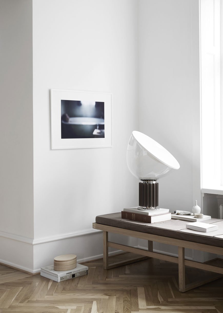
One of the fundamentals of interior design is to understand the importance of scale. Once you've found the right hanging place, think about the size of the space it needs to occupy. You don't want to end up with a piece that completely overwhelms, equally you don't want art that gets lost against large furniture. If you can't find a piece large enough within budget, look for a small grouping (as shown in the top image) to fill it. Make a template of the frame you're using with brown paper and stick it up on the wall to get a sense of the size and location before you buy.
Less Is More
This is my mantra and it helps put me back on track when I'm feeling tempted to add more. But when it comes to minimalist art, the impact is greater in relation to the rest of the room when it's displayed on its own - a stand-alone piece can command a space. It's also worth remembering that a blank wall doesn't have to be filled. It might take a little confidence but I think it makes a bigger statement.
Find A Common Thread
Are you grouping a selection of prints together? Whilst you shouldn't feel obliged to stick to one style, it helps if you choose pieces that share a common thread. For example, it might be that they belong to the same colour family or explore the same subject. Are you drawn to work by the same artist?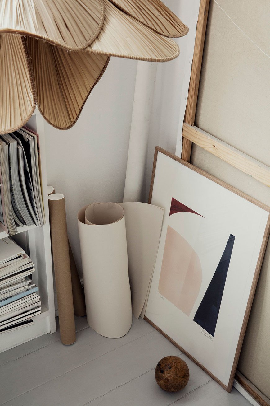
What To Buy
Unless you're looking at this as an exercise in future investments, I wouldn't over think it. Buy what sparks an emotional response in you. Buy what connects with you and your home. Does this piece put you in a good place? Are you a keen fan of architectural photography, or perhaps you prefer the simplicity of line drawings?Artists often make small limited edition runs marked with the print number and signature which makes it all the more exclusive. If you can buy an original, even better. Keep your eyes open when you're out and about too - chances are you'll come across that perfect print when you least expect it.
Where To Buy - London Art Fairs
Contemporary art fairs are a great way to discover new artists and galleries in your area.The Other Art Fair | The Old Truman Brewery, 91 Brick Lane, E1 6QL (selected October dates only)The Affordable Art Fair | Battersea and Hampstead (selected dates only)Frieze London | Regent's Park, (selected October dates only)London Art Fair | Business Design Centre, 52 Upper Street, N1 0QH (selected dates only)Tate Shop | Tate Modern, Bankside, SE1 9TGMoniker Art Fair | The Old Truman Brewery, 91 Brick Lane, E1 6QL (selected October dates only)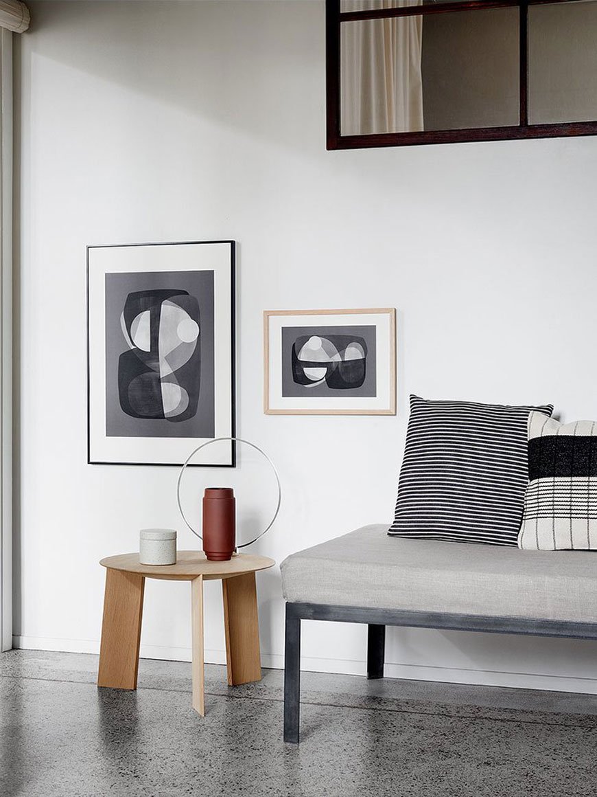
Where To Buy - Online
Of course, it's far easier to discover art online even if it does take out some of the joy of the hunt. Let's face it - I never have the time to visit fairs, so it's not surprising that I have a pretty decent black book of contacts. Here are a few artists to put you on the right path. You're welcome.
FACES: The Face 2, Yourtype Print | Close canvas print, Quibe | BOTANICAL: Spring, Alicia Galer | Leaf art print, Chocolate Creative | ABSTRACT SHAPE: Atelier CPH Pieces poster, Skandium | Form & Line No.2, Samantha Totty | MOVEMENT: Iris Lehnhardt, Minimalist Landscape 3, Juniqe | Emperor print, Penney + Bennett | BODY: Bend Yourself abstract nude, Caroline Walls | Peytil Blues, Nordic Kind | LANDSCAPES: Black Beach photographic print | Coco Lapine Staircase poster, Desenio.
Norrgavel | Sustainable Design Rooted In Nature
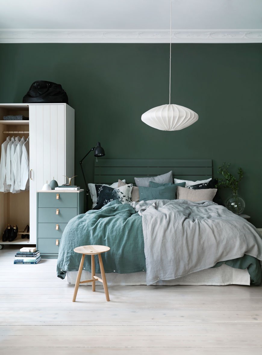
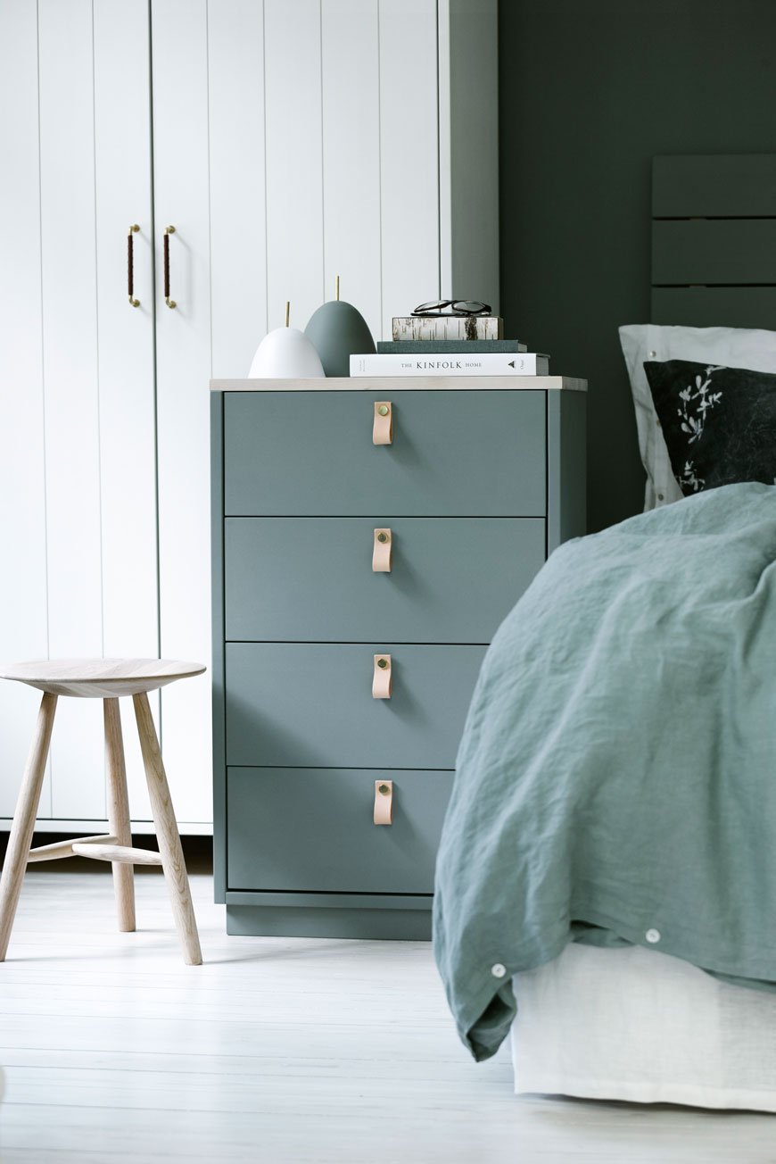
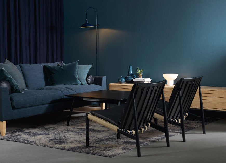 As it's Friday, I thought we could all do with a soothing introduction to the weekend with a collection of restful Swedish furniture. Trust me, you'll have trouble prizing yourself away from these gorgeous rooms...Founded in the early 90s in Sweden by architect and designer Nirvan Richter, Norrgavel is a design brand built on sustainability. Noticing a lack of high quality, well made furniture, he began to create a name synonymous with timeless, functional design, extolling the virtues of locally sourced wood such as birch, beech and oak. As a reaction to mass-produced furniture, Richter set to designing a collection made from renewable, raw materials that could be reused and passed down through the generations, needing only to be reupholstered should the need arise.What I love about Norrgavel's ethos (aside from the obvious) is the honesty behind the furniture. There is no fuss here. Wood is allowed to behave in exactly the way it should, untreated, or instead painted with an egg oil tempera which allows the grain to breathe over time. It's hardly surprising then that they received the acclaimed Nordic Swan Ecolabel as a mark of the brands commitment to the environment. Not really designed to be statement pieces, rather this furniture should easily blend into existing surroundings and look a part of the home without any effort.

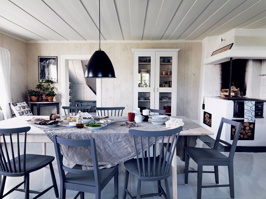
At Norrgavel, we want to create relationships with our customers. Rather than encourage passive consumption, we try to make it easy for customers to be present in the purchasing moment and to have a relationship with the things they choose to surround themselves with – encouraging them, quite simply, to consume less but to give themselves permission to have things of greater quality.Our intention is that a piece of Norrgavel furniture should act as your faithful servant. It should work well and make life simpler. An unobtrusive design that you only notice when using the furniture, but that is then all the more apparent. A chair that really supports the body, a handle designed to help fingers and hands to pull out a drawer. We create our furniture with the intention of it forming a backdrop to life rather than dominating. So we don’t feel that the design has to be amusing or create a sensation.
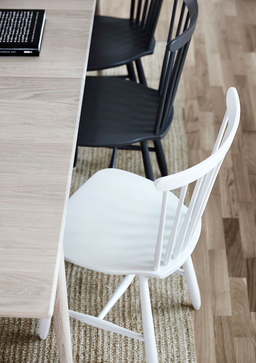
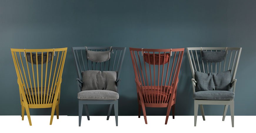
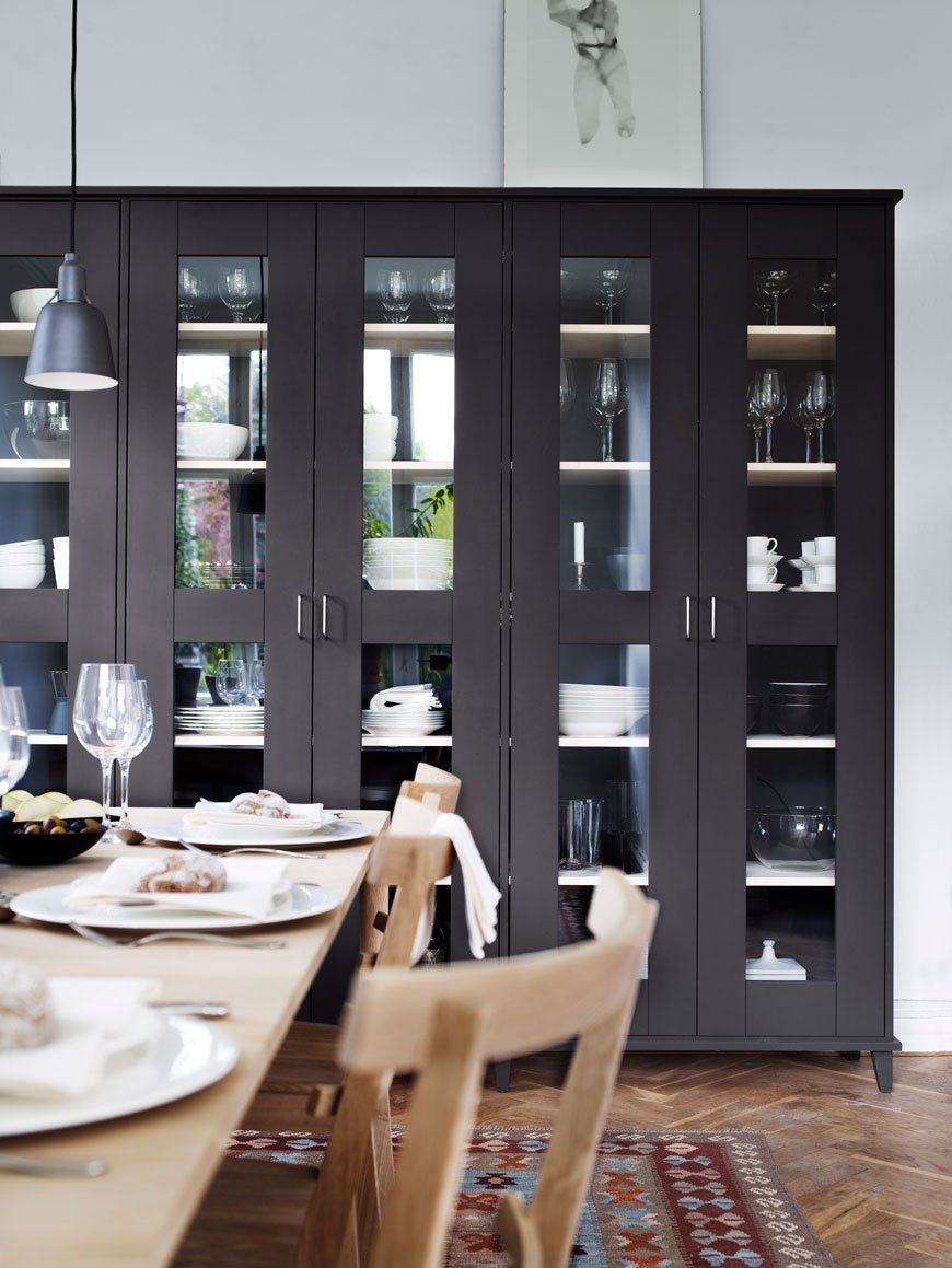
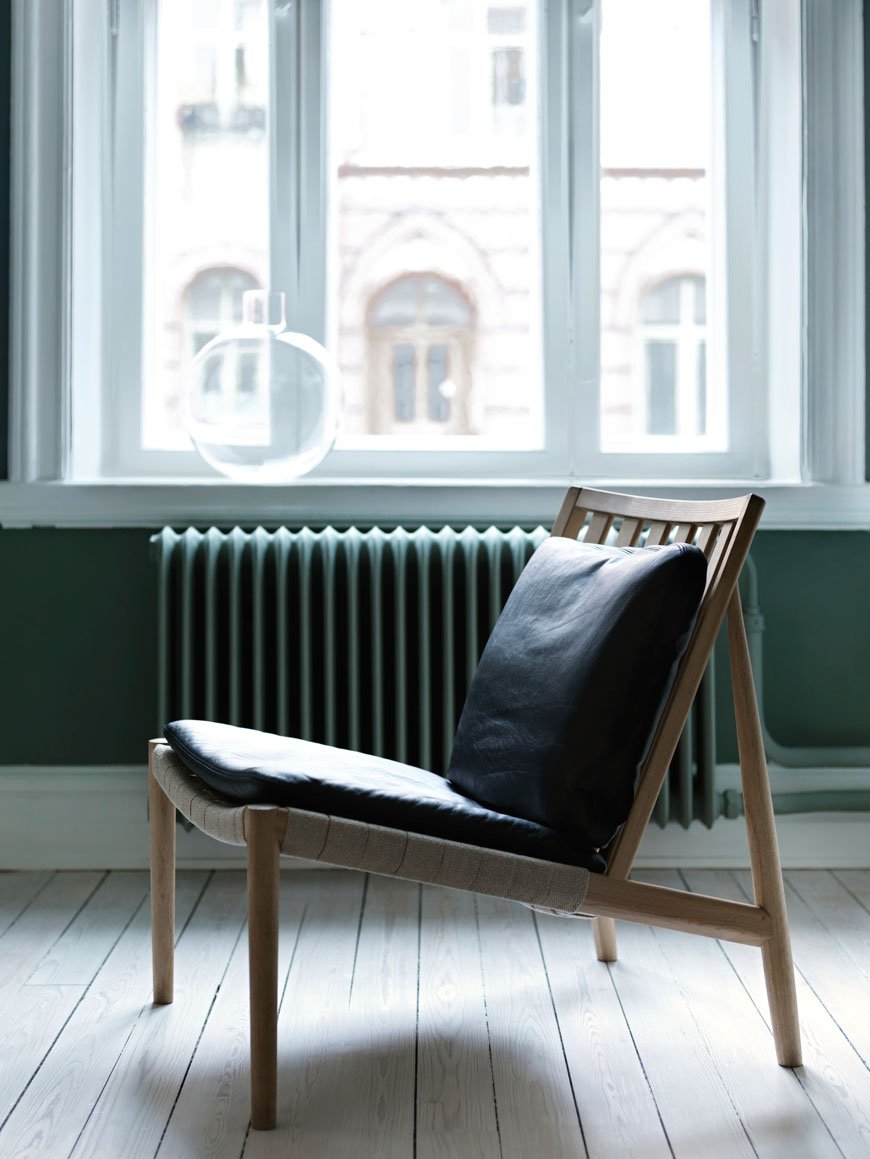
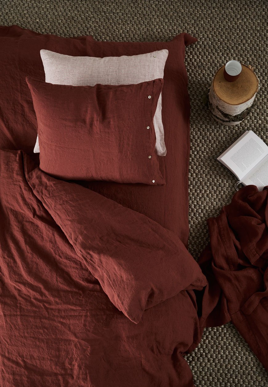
 The Norrgavel collection also extends to home accessories, all of which are organic, including bed linen, rugs and tableware. If sustainable, natural materials are your thing (and they really should be) then take note. So, where to buy? Well, unless you're based in Sweden or Denmark it gets a bit tricky, however, I've done a little digging and you can purchase directly through a mail order. I'll take one of everything...
Photography courtesy of Norrgavel.
Kip Hotel | The Monochrome London Hotel
 If monochrome interiors are your bag, you might want to check out Kip Hotel, Hackney's newest hip, urban location. Last week I did just that with friend and fellow blogger Hege In France so that we could hit the London Design Fair nice and early. The week of the London Design Festival is always a manic one with so much to see!Opened in March 2016 and designed by brothers Mike and Ross Baxter, Kip is a low cost, stylish alternative for travellers wanting to experience design without expense. Whilst travelling up and down to London scouting a location for their new venture, the brothers came up against the problem of the lack of affordable accommodation. As a solution, they ended up building this into the philosophy of the Kip hotel...
Essentially our concept for the hotel was to create well-designed accommodation at an affordable price. We genuinely believe that stylish choices and smart design don't necessarily have to come at a premium price - if you can design out the 'overpriced' bits and focus on improving the end product and staying true to your original ethos and vision.
With 105 rooms available, ranging from bijou Kip cabins, studios, bunk rooms for 'Kip Friends' and a Penthouse, you're right in the heart of Hackney, on the doorstep of Hackney Central station. The decor is super sharp, clean lines with plywood and wire furniture. There are little touches of lush jungle print, large graphic signage and a scrolling Instagram screen that moves with you in the lift. Rates start at £65 for a Kip Cabin (shared bathroom and no window) up to a six bunk Kip For Friends with en-suite and lounge area at £189. Perfect for the odd one nighter in the city for work or play.Our minimal 'Kip Buddy' room came with a small shower en-suite with a sliding barn door, a desk space and TV. The beds are super comfy, underneath each bed is a handy drawer on casters for storage and there are plenty of hooks on the walls with a floor length mirror. There are no frills here, so whilst you can't roll out of bed straight into breakfast, there's plenty of stylish cafes on the doorstep. Coffee and tea is also available 24hrs a day at reception should you fancy a 3am kick.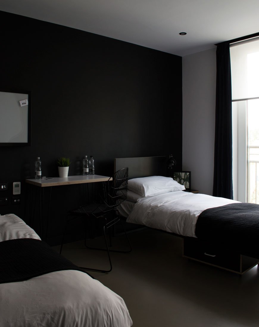
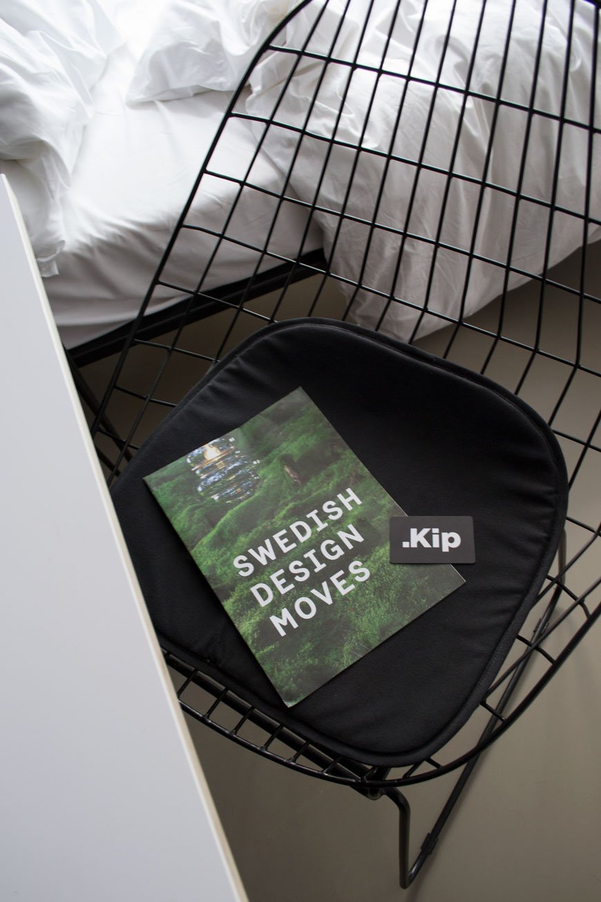
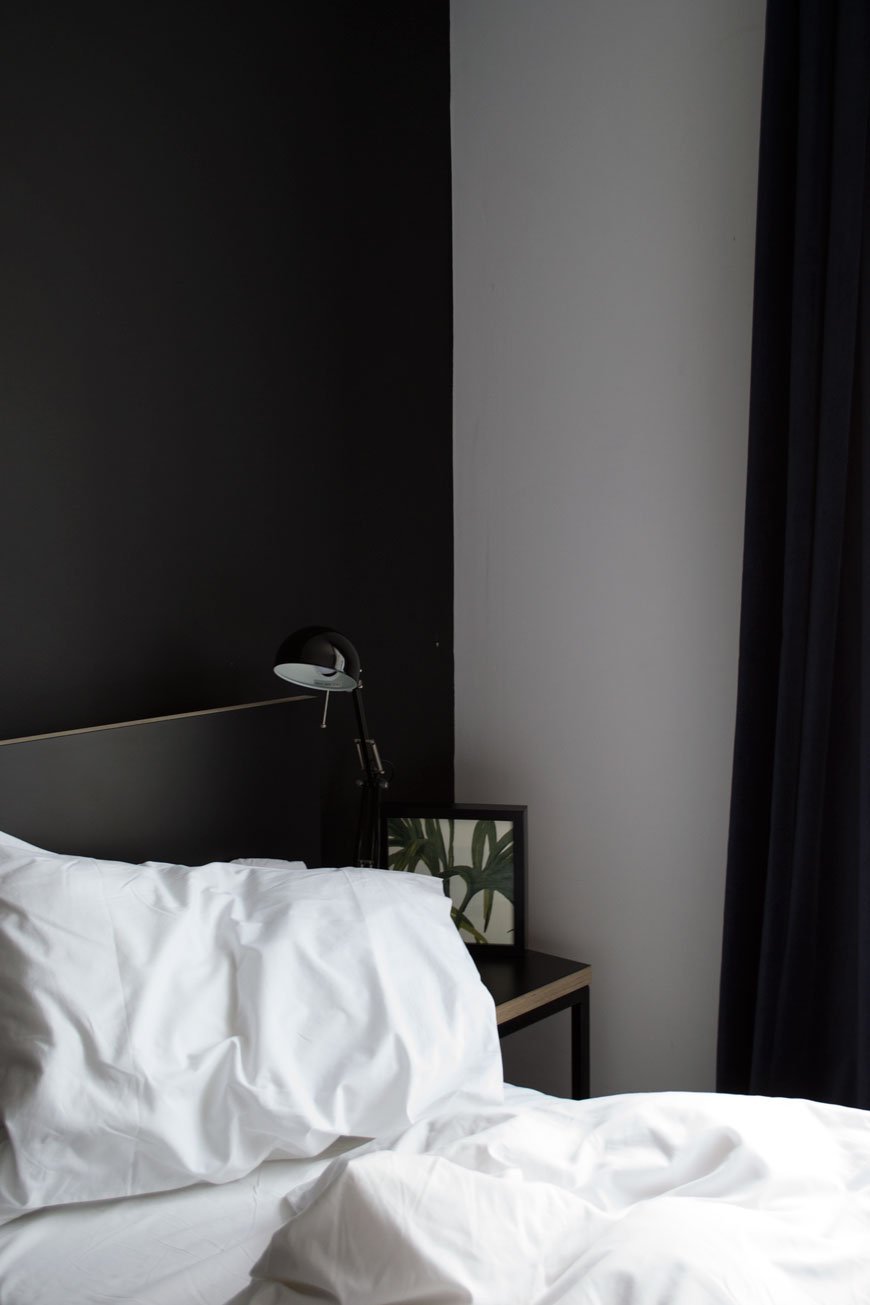
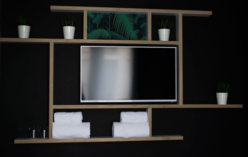
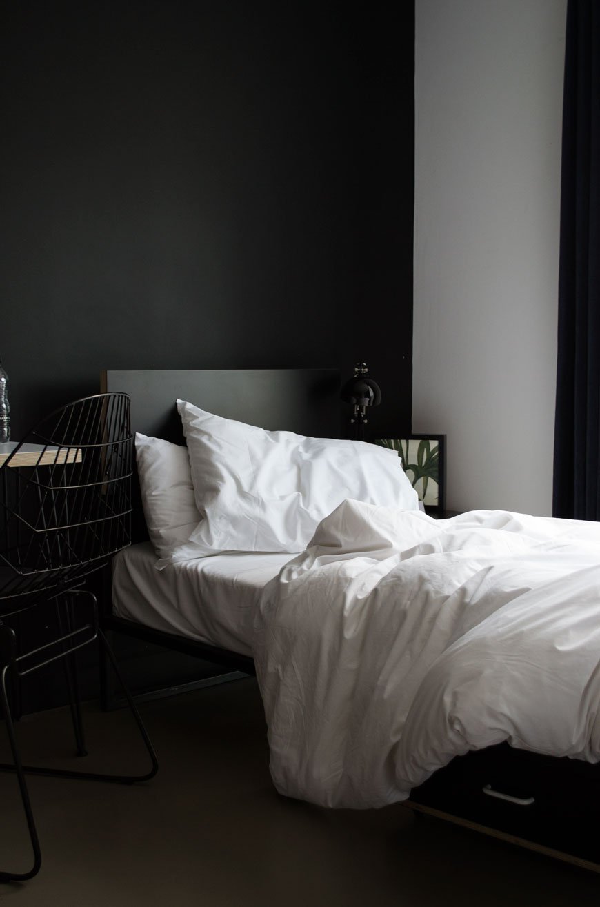
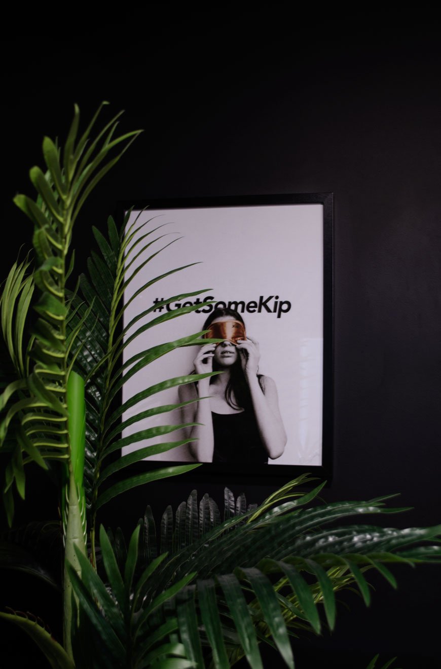 Kip Hotel | 2 Aspland Grove, Hackney, E8 1JW | #getsomekip
Photography © Tiffany Grant-Riley
Ones To Watch | Four British Bespoke Kitchen Designers
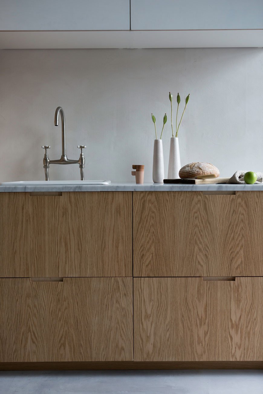 If there's one design trend I've noticed lately, it's been the new wave of bespoke kitchen designers popping up to take our culinary spaces to the next level. Although our kitchen at present is an absolute hot mess of magnolia walls, badly DIY'd cupboards and zero worktop space, I live in hope that there are plenty of solutions available for when we finally get round to giving it that much needed update. Replacing just one or two elements - be it worktops and cupboard fronts, handles or a lick of paint can instantly transform a dull and dreary kitchen into a space worthy of spending time in. Perhaps you're in the same position and considering a kitchen project or maybe you'd just like to drool? Take a look at four bespoke kitchen designers from the UK who are causing a stir...
Custom Fronts
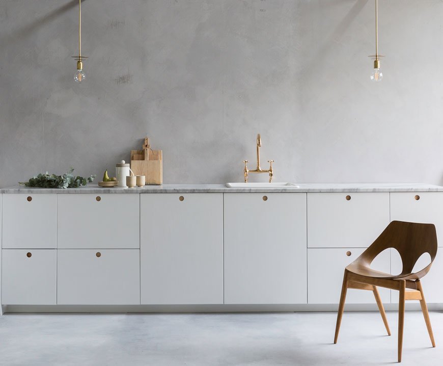 Not all bespoke kitchens involve a top to toe build. Consider mixing off the shelf schemes with custom details, high end with low. Brighton based husband and wife team Custom Fronts, hand craft high quality ply and hardwood cupboard fronts, tops and handles to use with Ikea Metod kitchen units. This is ideal if you had something particular in mind that isn't completely off the shelf and gives your kitchen a keen sense of personal identity. Fronts can also be painted in a beautiful range of colours, so eco friendly that apparently you could eat them if you wanted...though I wouldn't recommend that.
Pluck
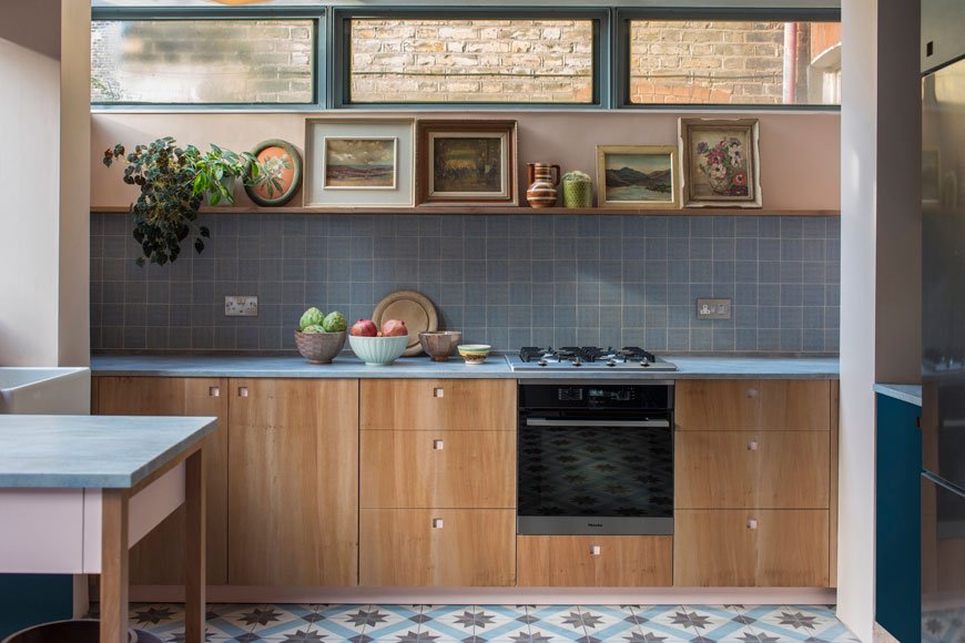
 One of my top picks at Clerkenwell Design Week, these guys make all the right noises for those with a penchant for a mid-century colour palette. Working out of their Brixton based workshop, Pluck's team of five experienced designer-makers have been producing kitchens for commercial and residential projects for ten years. I love the way they work with familiar materials in unusual ways - cork inside the handle pulls, laminate ply, London Plane and Sweet Chestnut. Play with their range of dark grey blues, olive greens, pale pinks and a shot of mustard yellow for something really different.
Lozi Design
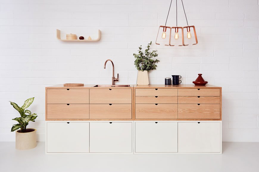 I almost tripped over my own tongue when I saw this kitchen Lozi Design were exhibiting at Clerkenwell. Although not strictly kitchen design as owner Soroush Pourhashemi also makes bespoke furniture from his Dalston workshop, Lozi combines the use of contemporary digital design methods with traditional woodworking techniques. All the materials used are sustainable, including the natural Latvian birch plywood to the non-toxic glues and milk based paints made by recycling excess from dairy farms. You can even visit their workshop for a tour, on the same site as their shop so that you can see the process from design to product first hand.
Kent And London
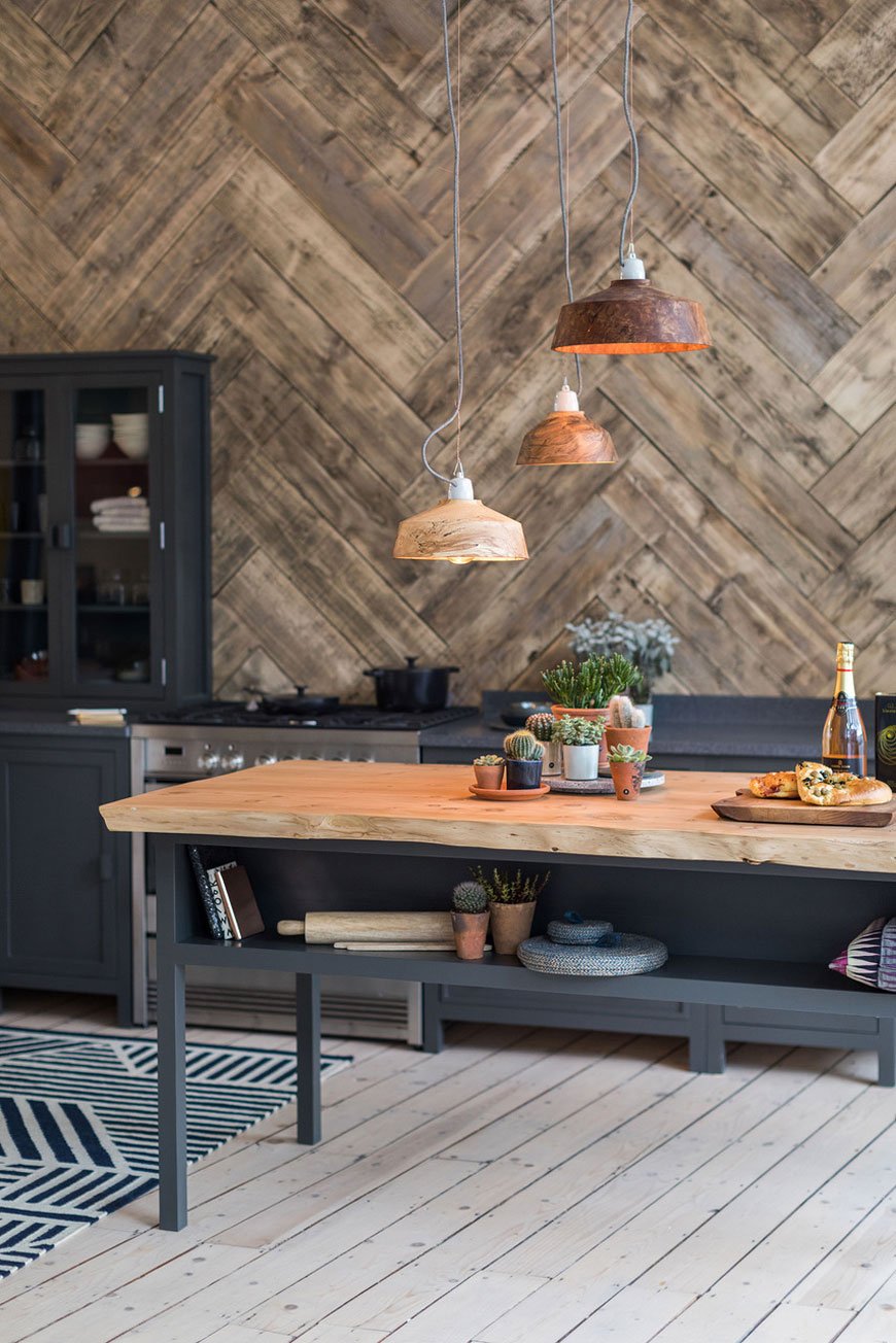 If you saw my recent Shoreditch Design Guide, you'll be familiar with Kent & London's shop which I had the pleasure of visiting. Founder Luke Ellis started building kitchens from his workshop in Whitstable in 2009 but realising he needed a bigger space in London where much of his clients were visiting from, he now splits his time between both locations and the showroom in Shoreditch. Luke's designs take on a more timeless feel, using English hardwoods and oak and contemporary shades of paints, a collection of which will be launching soon.Want more kitchen inspiration? Follow my 'In The Kitchen' Pinterest board for more ideas...
How To Use Colour In A Minimalist Home
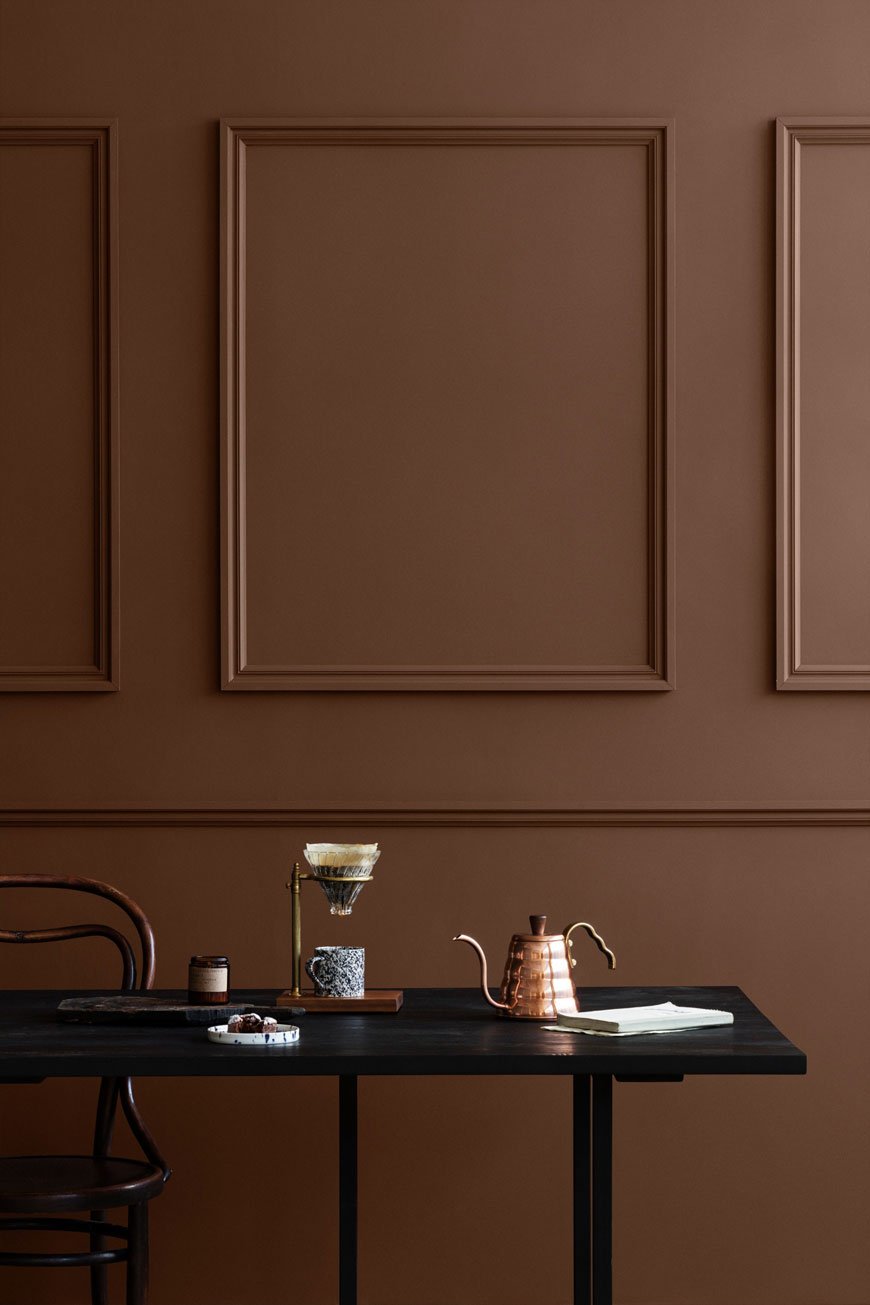 Before we delve into this post, I feel the need to air some grievances, share a bug bear or two. It is this. The common belief that a minimalist home can only be such if it's done so without colour, in black and white. That Scandinavian inspired homes are bland and boring spaces devoid of personality. It's absolutely not true. Perhaps that's an opinion based on the idea that to have a feeling of space, everything must be white? Of course, I'd be the first to put my hand up and say that yes, I still love white walls and if you're someone like me who really can't live with bright colour then it's a no-brainer that you're not going to go all out in your own home, but remember that there's a broad spectrum of muted colour you can play with. The so-called 'New 'Neutrals'. Many contemporary design names are beginning to ring the changes, merging rich colour into their latest collections and I'm all for it.So what if you're keen to make a statement but you're not sure where to start? How do you use colour so that it feels easy on the eye, retaining a feeling of space? My guide to using colour in a minimalist home should give you the confidence to give it a go.
The Fundamentals
Before I let you drool over all this beautiful inspiration, there are a few important points you need to consider.• What will you be using the room for? Are you relaxing? Cooking? Working? The colour you choose will effect the way you feel in the space, so make sure it matches the purpose.• What sort of light does your room get? Depending on which way it faces and how much it gets will determine the tone and brightness of the shade you choose.• Live with your swatches. Once you've found a few colours you like, use as much of the pot as you can on as big a piece of paper you can find. Move it around at different times of the day to see how the light plays with it. Try it with the lighting you have too as it will change in the light of a bulb.• Work with what you have. If you have beautiful floors, what colour can you use that will bring them out? Do you have original features? Consider the furniture you have. Unless you're planning a full on re-model, make sure you choose a colour that compliments all these elements.• Block it out. Colour works best in a minimalist home when it's used in block. By that I mean using the colour across each wall (no feature walls please). It's up to you whether you paint the woodwork and skirting the same shade (I prefer to) but having the confidence to use that one colour across the whole room will have a greater impact on how it feels.• Use colour to frame and emphasise. Any noteworthy features in a room are immediately highlighted when you paint them - it might be coving or an intricate doorway. You can also frame the view into another room using paint - see how this is done below.• Leave the colour off the walls if you don't want to get into an epic painting project. Try introducing the colour through your furniture instead (I'll get on to this later on).
Pink and Blush
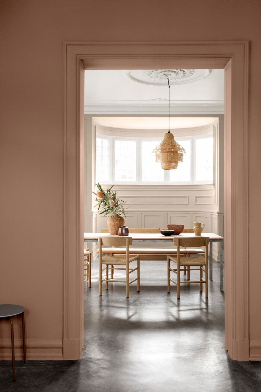 I'm loathe to call this colour range nude...because that's not my nude...but we've seen the colour pink mature in recent years. No longer considered sickly, girly or confined to kids rooms, pink is slowly working its way into our homes as a new neutral. From barely there plaster and blush to the deeper, dustier shades, pink has a calming influence and lends itself to both contemporary and traditional styles. The great thing about pink is that it can never feel too much or too over powering.Pink palettes are ideal for living spaces and bedrooms, anywhere you come to relax and unwind. It has the advantage that it's very happy to sit along side blues, greens, greys and other quiet neutrals too.
Earth, Rust and Terracotta
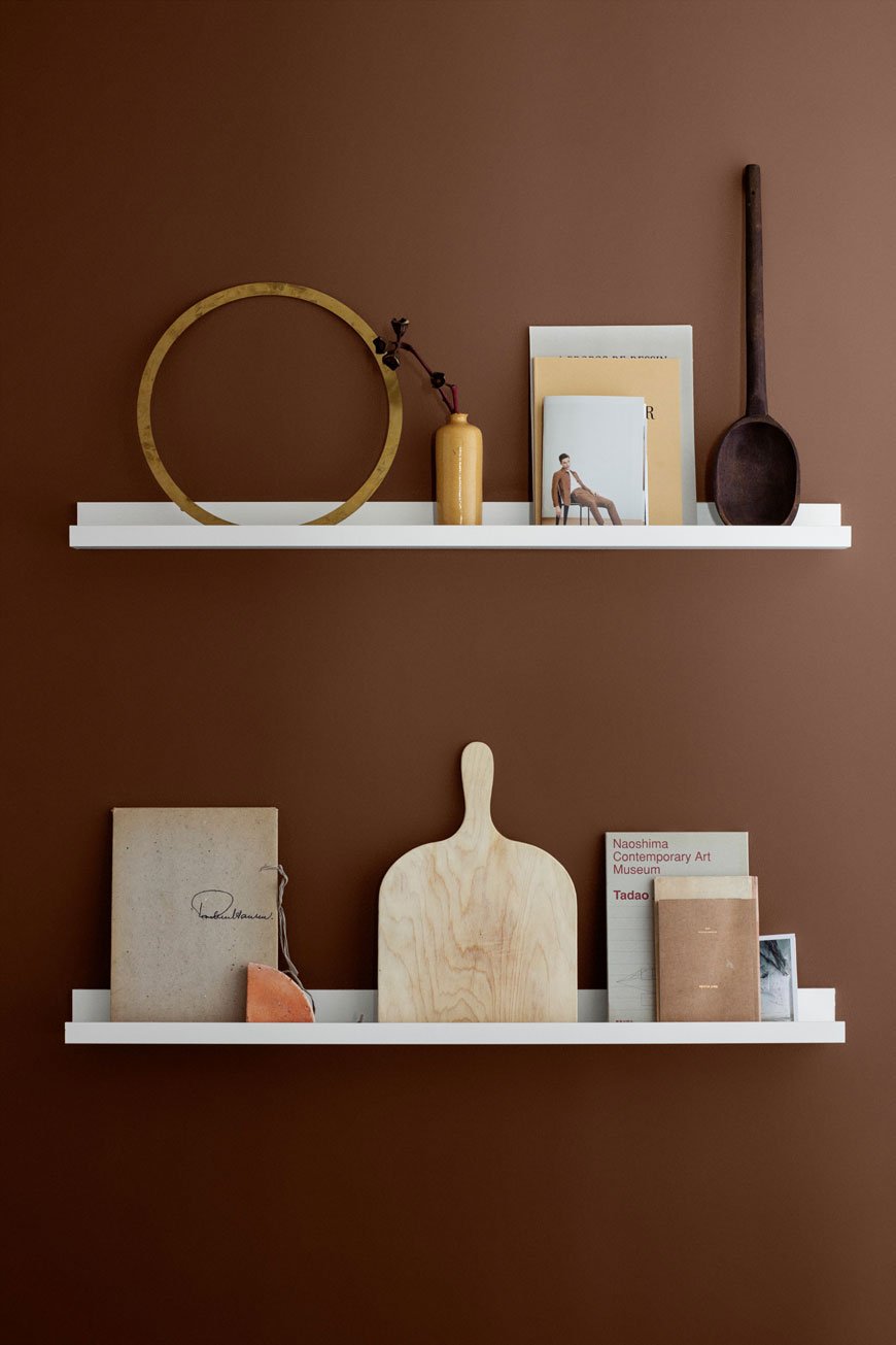
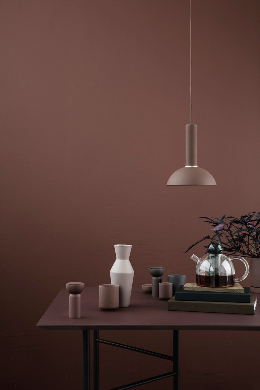 I am completely obsessed with the effect earthy tones have on a space. It's gives a real sense of depth and warmth and looks spot on with pale and black wood. From terracotta, rust and reddish brown, what was once a popular trend in the 80s is back again but without the rustic connotations. It really comes to life against black and darker shades of pink and mauve, dark blues and olive green. Use a flat matte finish on walls and woodwork and pair it with furniture with clean, contemporary lines.
Beige and Greige
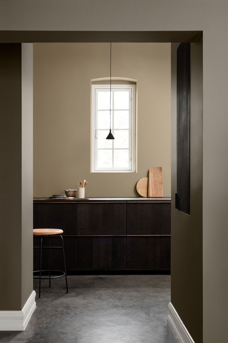 Beige is absolutely not boring. No, no, no. Magnolia? Yes. And if you're going to make everything the same flat shade from floor to ceiling, then yes too. The trick is to give it some contrast as Jotun paint have done (above). Off-set it with dark greys, black and olive green.
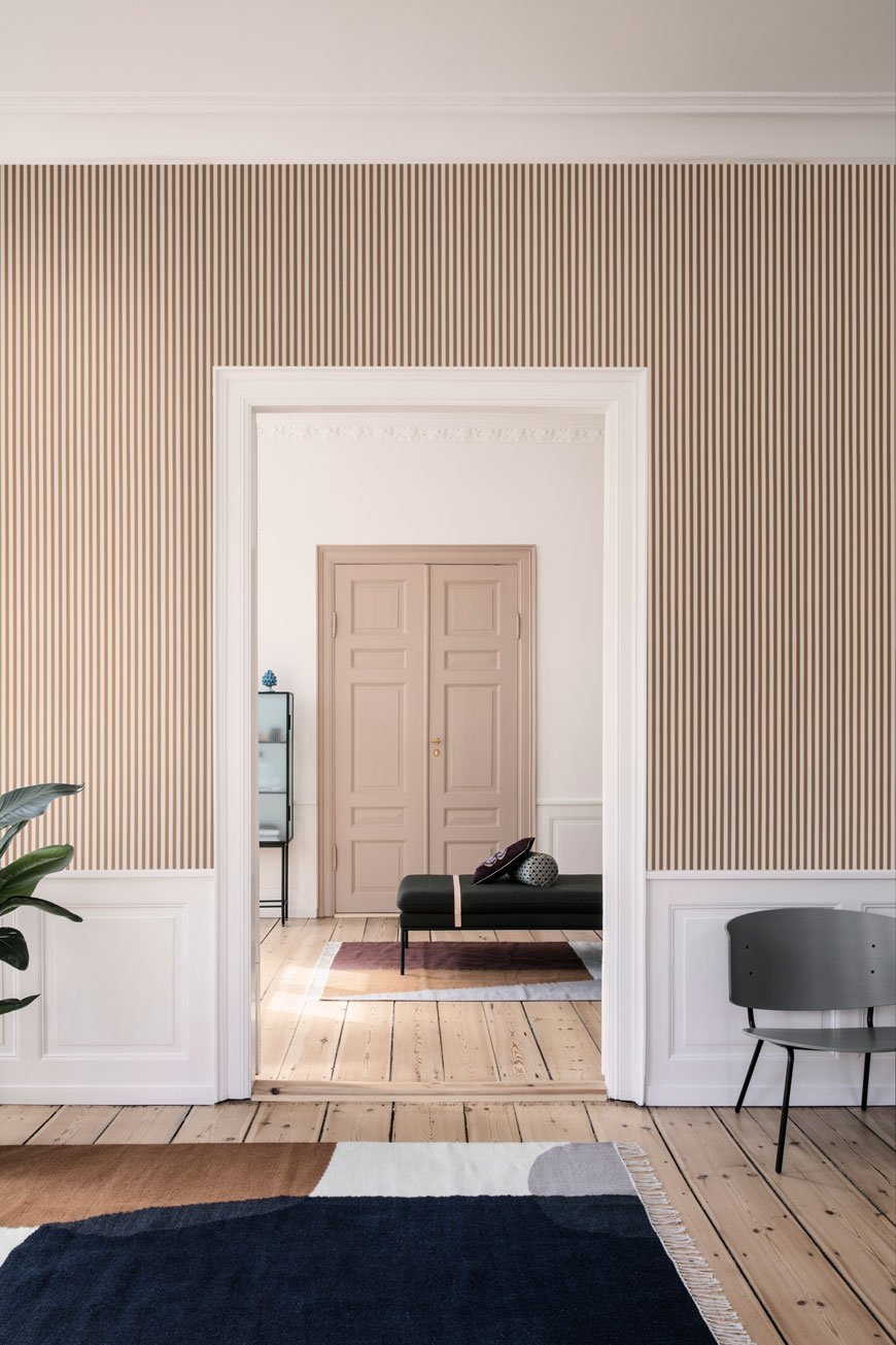 Lighten it up with pale wood and white accessories.To keep it from flattening your space, keep the interest with lots of texture - hand knotted rugs, polished concrete, rough linen, brass. Work in scale - oversized artwork, a patterned wallpaper in a similar tone or large rug with colours that compliment (above).
Palest and Darkest Green
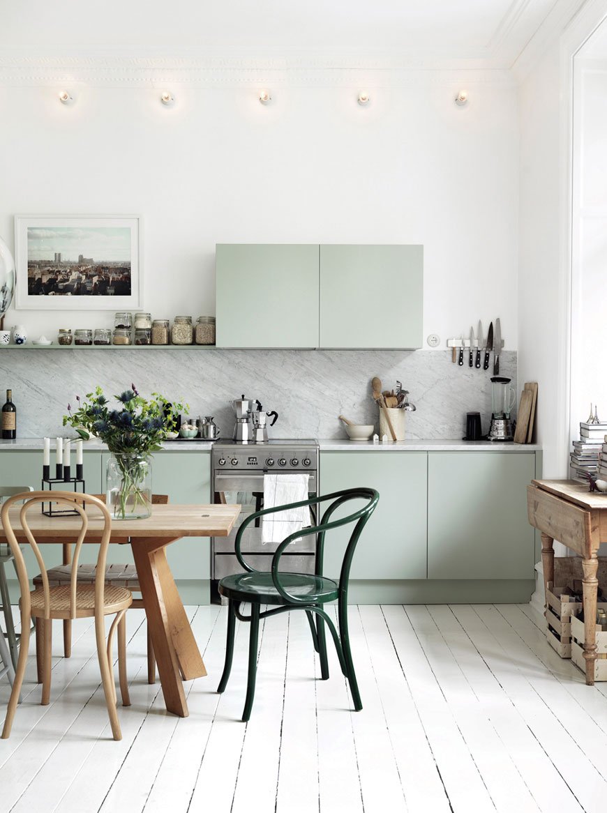 It's not all about dark colour. Lighter accents have their place too and it doesn't have to be on the wall. Adding a subtle mint green to these kitchen units makes the worktop and marble splashback a real focal point in the room. Warm wooden furniture keep the space from feeling too cold and the dark green Thonet chair echoes back to the cabinets.
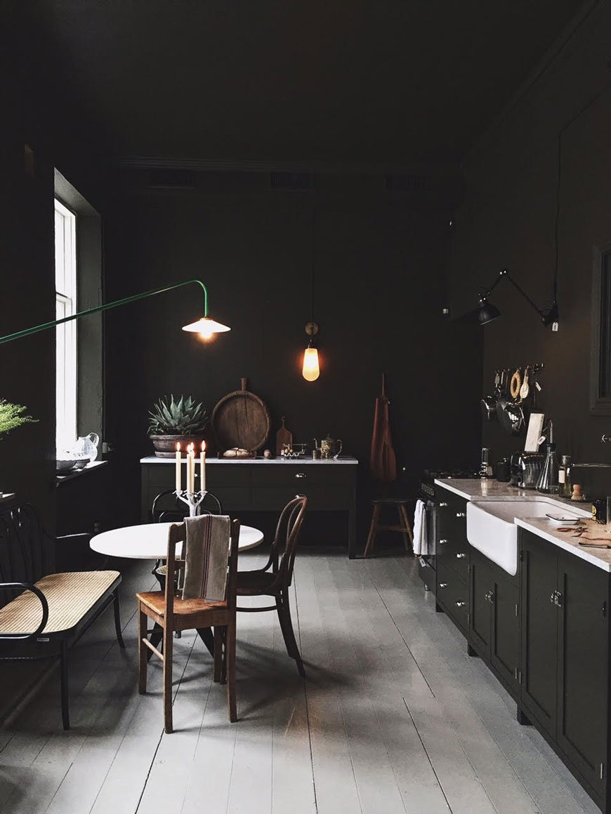 Pure, unadulterated, almost black green. Painting the ceiling isn't for everyone, sure, but this look, for those brave enough to try it, is beyond perfection. I love the way the green looks against the light flooring, how it brings out the marble in the worktops, the butler's sink, the table top. It's a fully immersive, atmospheric space and it works in every way.This beautiful shot taken from the Artilleriet Studio in Gothenburg has inspired my plans for our bathroom. Whilst I've dabbled in dark walls before, it'll be the first time I attempt the all over look in a very dark green. Yet, an old-school relative of mine came to stay and almost recoiled at the black-green swatches on our bathroom wall (it's currently yellow, by the way). "What are you planning to do with that?" she asked. I replied that I planned to paint all four walls and the ceiling with it. "But it'll make it feel dark, it'll make the room feel smaller?!" Well, yes, I want it to feel dark, that's very much the point, but it's wrong to assume a dark colour will automatically make a space feel smaller. And sometimes, the best thing for a dark room, instead of trying to fight it with light paint, is to surrender to the dark side. Trust me.
Moody Blues
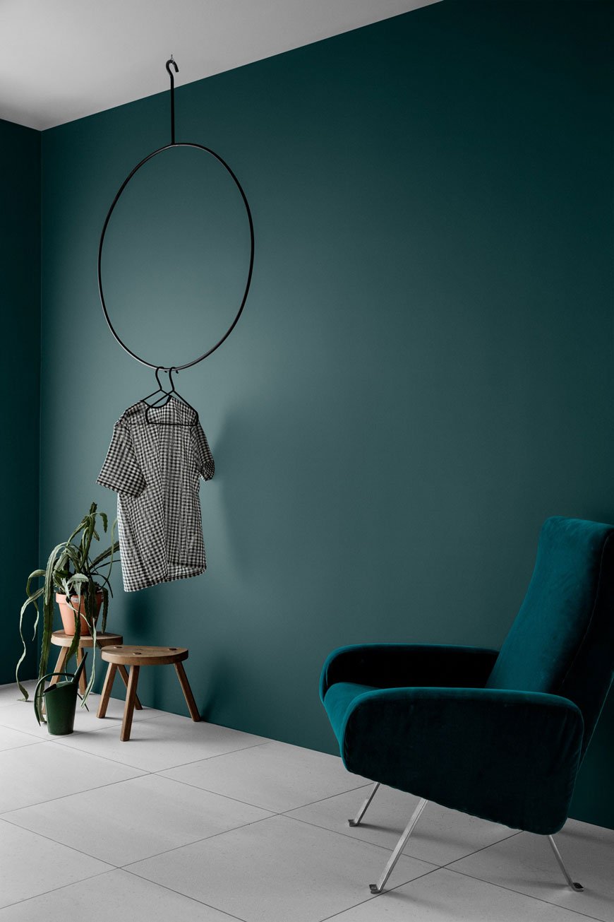 Let's not forget the impact jewel tones can have on a room, particularly inky blues and teal which is definitely having a moment. Stop it from becoming too glam with natural wood or ply, and dark, charcoal grey accents.
Can't Commit To Walls?
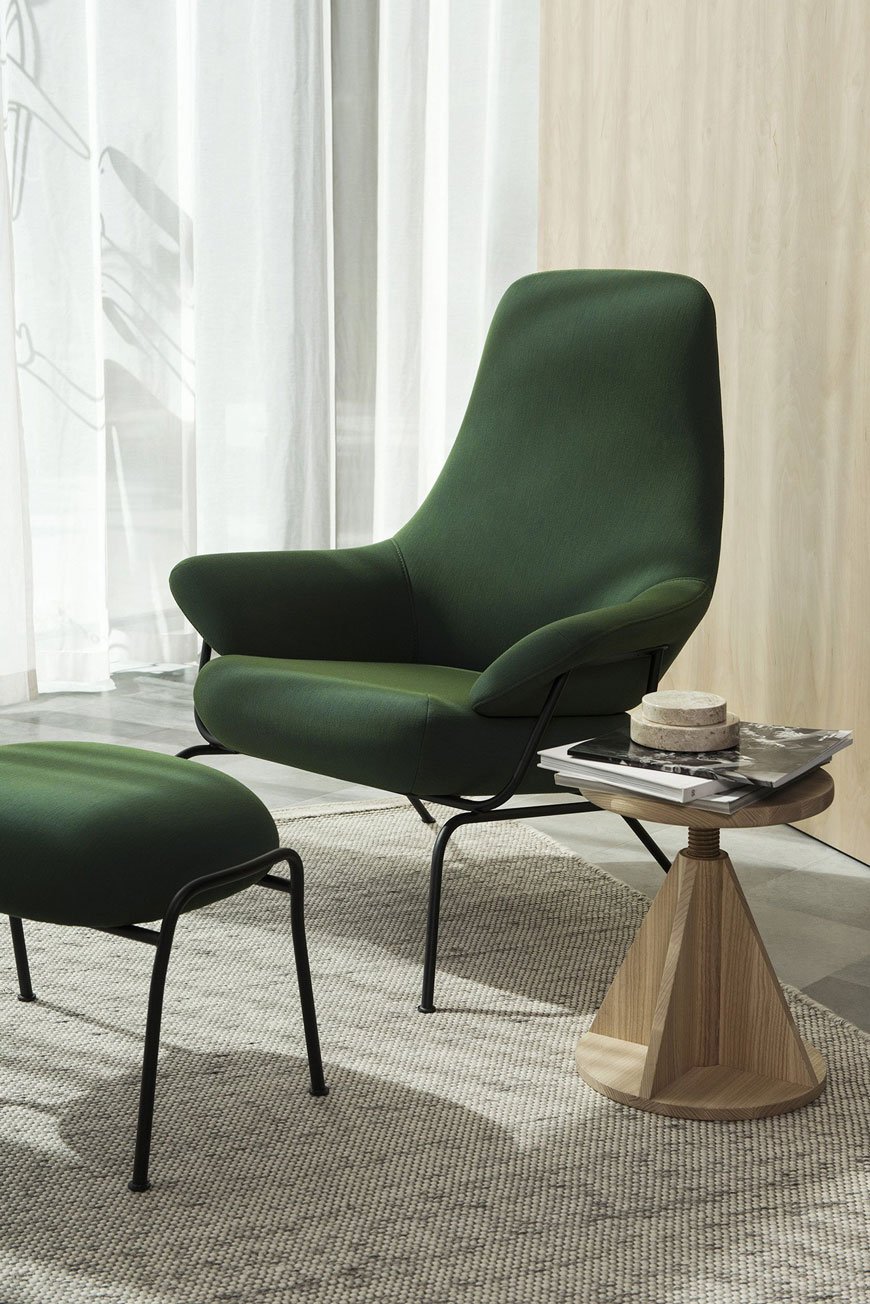 If you're not keen on or unable to paint your walls, plump for a coloured piece of furniture instead. A blank canvas of white always looks striking with a sofa, cupboard or lounge chair in an eye catching shade. It immediately draws your eye, as a feature in its own right. Tie it in with the rest of the room by connecting it with something in the same palette such as a vase or piece of artwork. Alternatively, try a complementary colour. See how I made grey-blue work on the cupboard doors in the kids room.
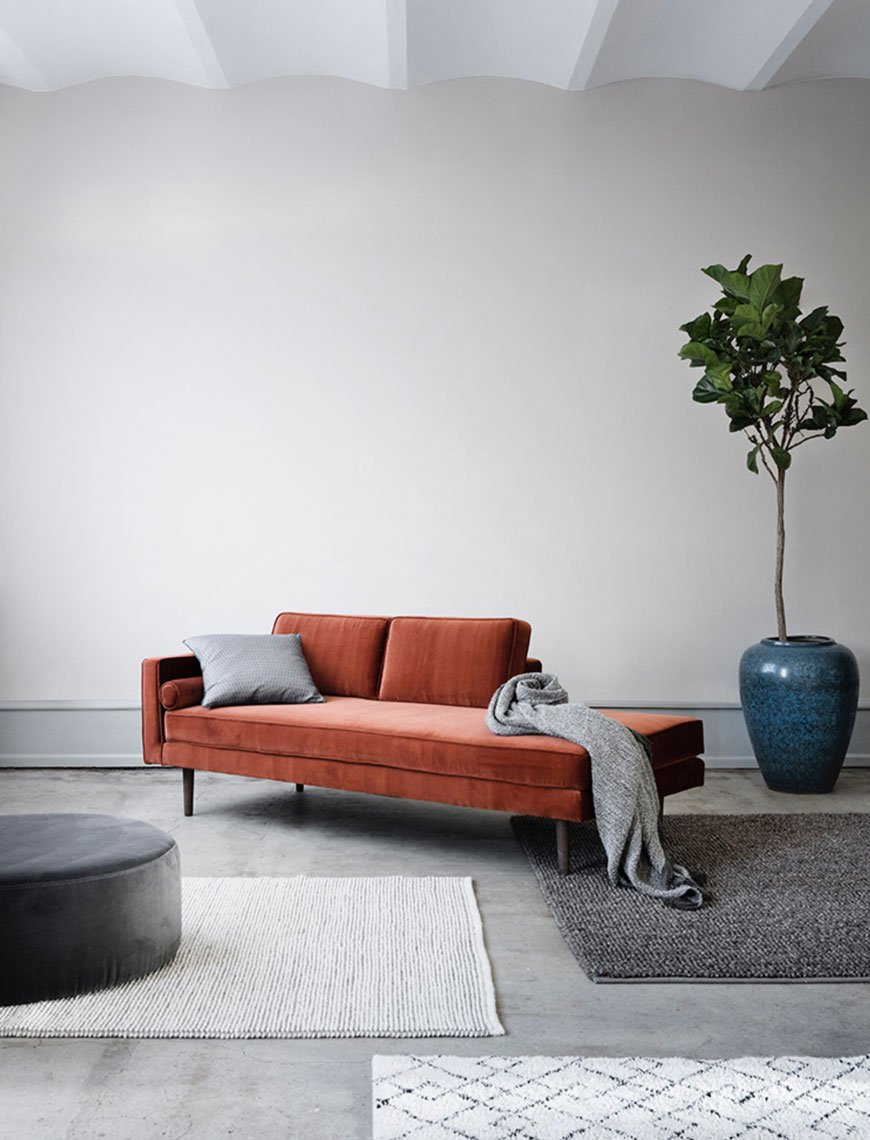 So, have I given you food for thought, maybe even changed your perceptions of Scandi, minimalist homes? And if you're tempted to make some changes in your home, the best piece of advice I can give is this. Paint can be transformative, so if making major purchases on coloured furniture isn't an option, start with some swatches and get out the brushes. Worst case scenario if you don't like the paint you've chosen? Paint over it and think again. What have you got to lose?
Stylish Technology For Living With Urbanears
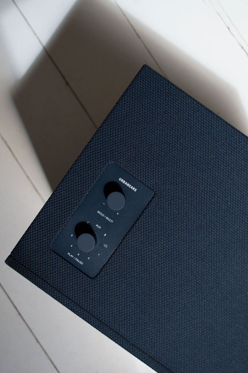 There was a time when huge sound systems were the thing to have, stacked up with the cassette deck, CD, radio and turntable. I can remember my mother's and I can certainly remember the not-so multifunctional surround sound system I invested in at uni. They were awkward things to fit into a space and a nightmare to move and set up somewhere else too.Technology has since chosen to simplify, with new models released as an all in one design. This, the new Baggen speaker from Scandinavian headphone brand Urbanears has moved in with us and has quickly become an indispensable part of our household. Intended for larger rooms and open plan spaces, this 'loud and mighty' speaker packs a punch. And I'm a sucker for the bass, so, sorry neighbours! Designed as Connected Speakers (there's the smaller Stammen model too) you're able to link them up all over your home to play either the same playlist simultaneously or separate channels depending on what you fancy.
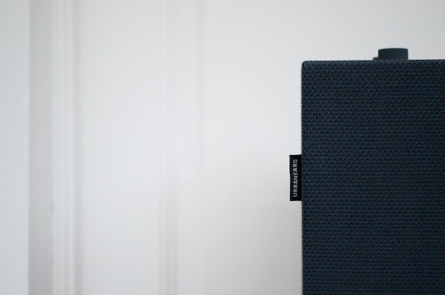 An aesthetically delightful piece of kit, I love the modern-retro look and feel of the fabric wrapped speaker. The control plate is the same colour as the rest of the speaker which makes it feel like a well considered object in its own right; it can blend in with its surroundings or work as a stand alone piece. The fact that it comes in Indigo Blue is a complete bonus - it's a colour I love to wear a lot. That said, it was a toughy to choose between the Plant Green and Concrete Grey, but I could see it working well in both the bright white and moodier areas of our home.The functionality is brilliant. Urbanears have a nifty little app which allows you to control the speaker from your phone, connecting to wi-fi, Bluetooth and Spotify as well as the option to store up to seven favourite playlists or radio stations. If you have an ever increasing vinyl collection like us, you can also hook it up to your turntable.I use it in the kitchen mostly, when there's breakfast and dinner to prepare - for reasons unknown to me, I also need noise to work in, I think it concentrates my thoughts (?!) In the evenings it comes into the sunroom where we hook it up to Netflix via the iPad and watch a movie in the glow of the string lights.I'll take one in every room, please...
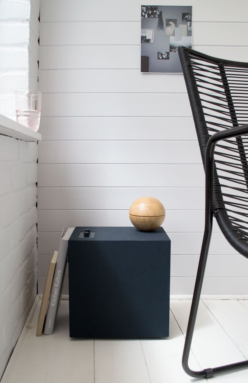 * This post was written in collaboration with Urbanears.
Photography & styling © Tiffany Grant-Riley
Design Lover's Guide To A Weekend In Shoreditch
 Weekend getaways are a rare treat for us, in fact in all our seven years of parenting, we've been away on our own a total of once. Until recently that is, when citizenM invited us to stay for a weekend in Shoreditch.A once bombed out, run down area of the city, Shoreditch now thrives as a vibrant location for artists and creatives. Street art springs up in the most unexpected places and industrial Victorian architecture jostles with the newly built apartment blocks springing up everywhere. It has a reputation for the hip and happening and although it gets some stick for the 21st Century hipster culture, it's an area I very much love to spend time in.Opened only last year and situated in the heart of the uber-creative area of Shoreditch, this hotel is pitched as an affordable, no fuss design hotel to those who want to feel at home amongst iconic designs and ultimate comfort. It is a design lover's dream, no surprise as the hotel interior was built in collaboration with Vitra. And so, because I'm so generous, I thought I'd put together a 24 hour guide to exploring Shoreditch. If you have longer, say a Friday to Monday situation, then lucky you. There's some drool worthy independent homeware boutiques, places to while away a few hours with good food and enough Instagram worthy streets to shoot to your heart's content...
STAY
CITIZENM | 6 HOLYWELL LANE, LONDON, EC2A 3ET
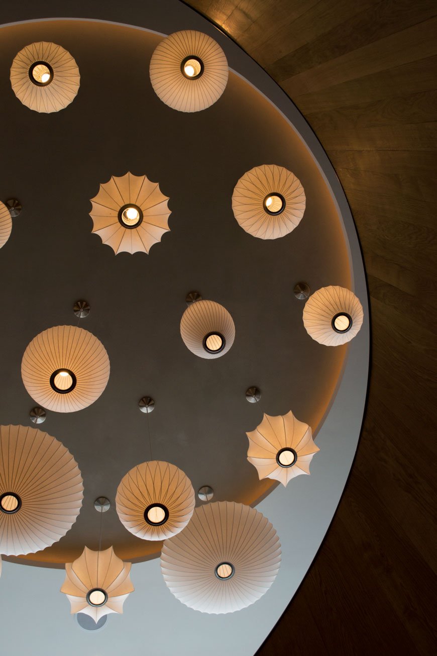
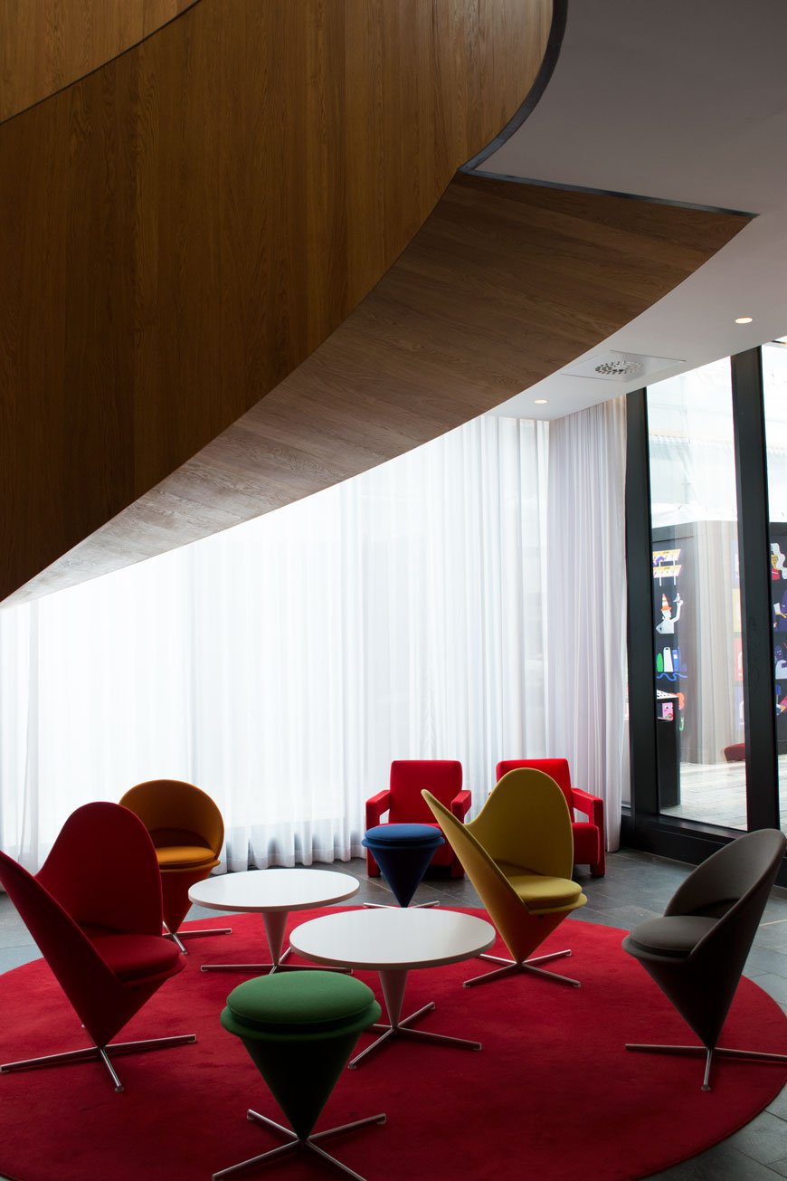 Entering through a mysterious automatic door which leaves you wondering "do I go in this way?" and you're in the lobby, greeted by Verner Panton chairs beneath a sweeping mid-century inspired wooden staircase. Yes. Look up and this is what you'll see...
 If you love a hotel that takes it one step further away from the conventional, then you can trust this Dutch owned chain to do just that. Everything here is hi-tec. Check-in is a refreshing experience where can you do it at your own pace using just a touch screen. Choose the floor and aspect of your room, scan the key card and off you go! Yes, ok, it eliminates the human element of the experience, but depending on what time you're arriving / what state you're in and how much you wish to communicate, it can make a real difference!
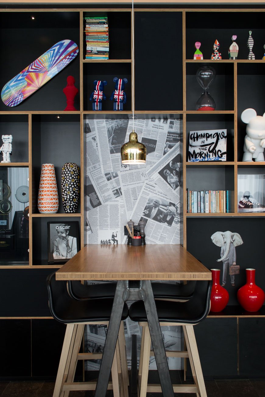
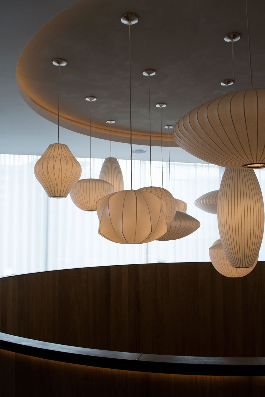 The hotel is aiming for budget friendly with boutique style and with rooms priced at £139 a night, the design is definitely a plus point. It doesn't feel budget. Every detail has been carefully considered here, the way in which quirky, British style has been introduced through modern art, literature and graffiti motifs that define the area. The public areas make you want to stay a while, explore what's on the shelves, listen to a play list at the bar.
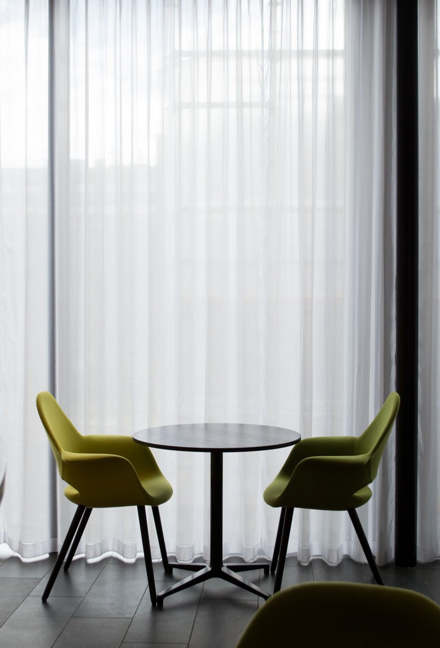
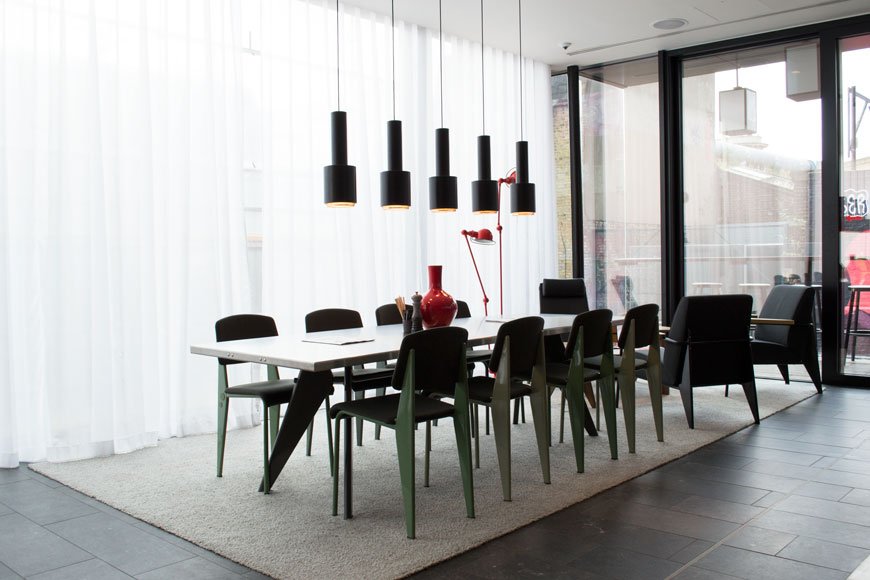 There are slouchy sofas to sink into in the communal living area or well lit tables to sit, plug in and work from. One of my all time favourites, the classic black Eames lounger was out in force in the living space, facing a large flat screen built into a dividing wall of shelves. There are books on fashion, art, music. The emphasis here is in the slowing down. Everything is geared towards effortless relaxation, intentional meandering.
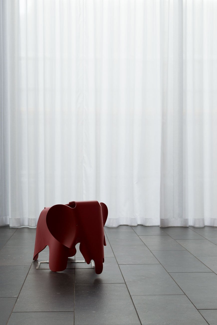 Every room, although pretty compact, comes with a wall to wall window with views across the city. I made sure we picked a higher floor on check-in which had views cross BoxPark and beyond - great to watch come alive at night. The presence of an iPad (or Moodpad) which controlled all the tech in the room was less of a frivolity and more of an "oh my God we need one of these at home!" It controlled the blinds, mood lighting and ambience in the room as well as the TV and some really great movies to get you settled in.
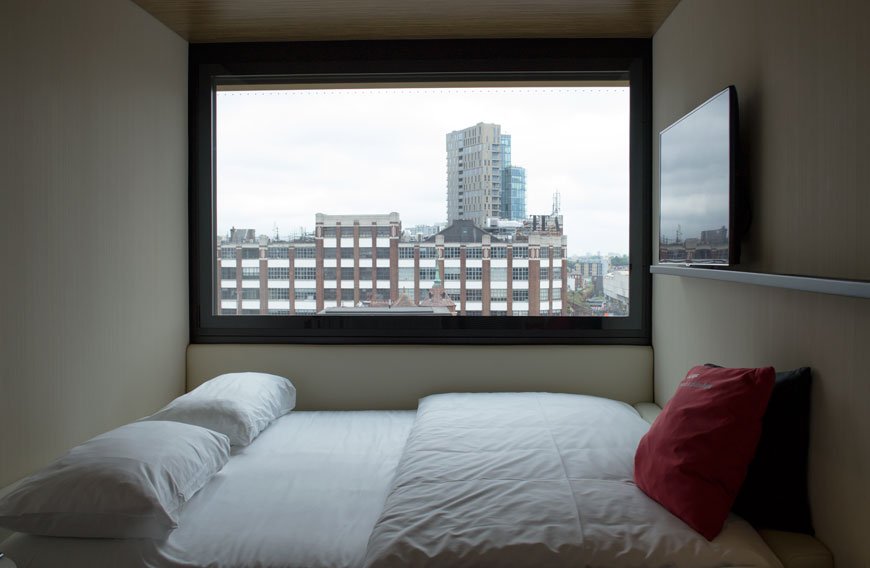
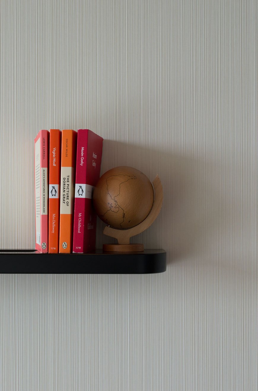
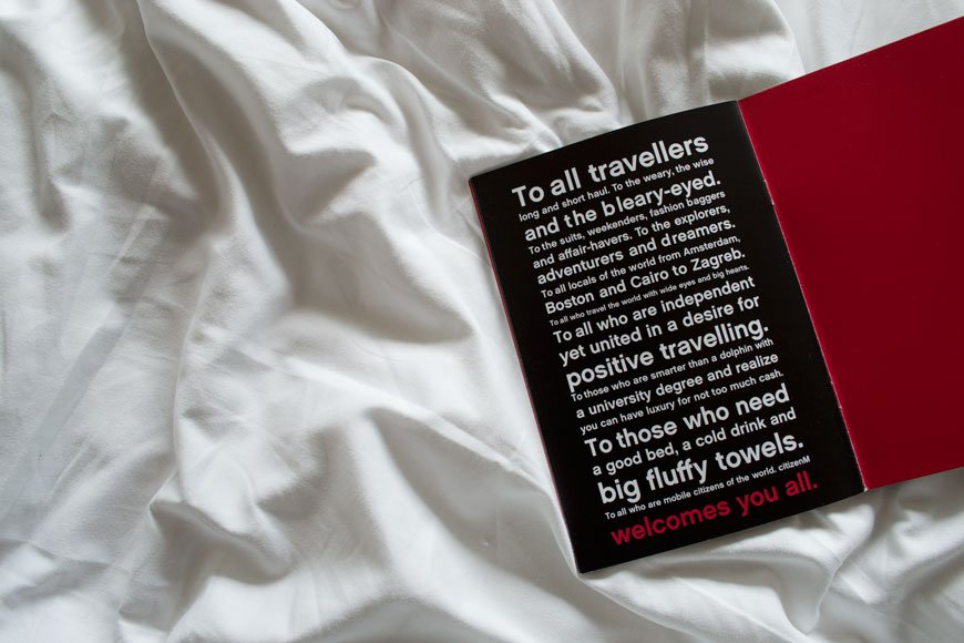
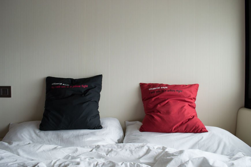 The king sized bed, aside from our own, is the comfiest I've ever slept it. I tell no lies. Not too soft, not too firm, just right. And waking up with the head I had the next day, it's just as well (the Orange Biciclettas at Pizza East are impossible to resist). It was nothing a long, hot rain shower couldn't cure though. That and a long, lazy breakfast downstairs. Now citizenM take their breakfasts very seriously. Every base is covered. You want a full English? No problem. A fresh fruit salad with basil infused syrup? You got it. Whether it's fresh pastries, toast with Newton and Pott organic jams or just a bloody good coffee, it's all there. And you can keep going til lunchtime.
EAT
ANDINA PICANTERIA & PISCO BAR | 1 Redchurch Street, London, E27DJ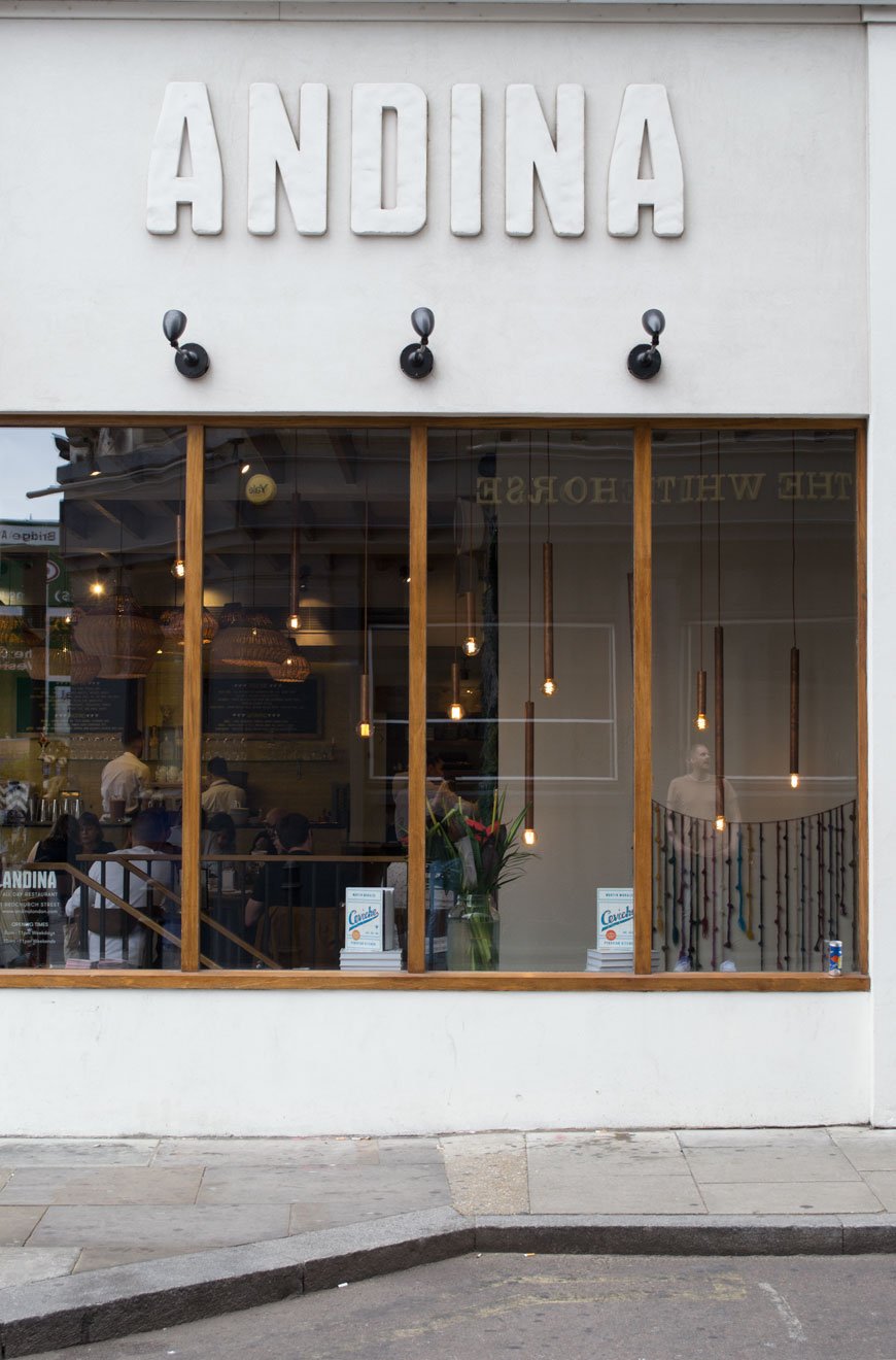 For those looking for a departure from the normal type of fare, Andina is a great start. Immerse yourself in traditional Peruvian street food without too much concern about dietary needs - there are several vegan and gluten free options. Ceviche is popular here, as is the grilled meat and fish. Cocktails are well worth a try and the decor is what you'd expect - a vivd blend of old world Peru with touches of hanging textiles, brightly tiled bar area and modern furniture.ALBION | 2 - 4 Boundary Street, London, E2 7DD
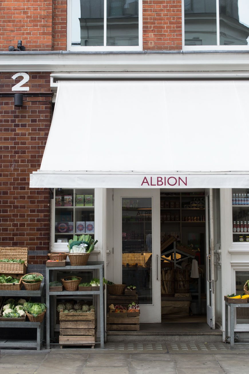 A classic British menu served in a minimal, industrial setting. Stop by for the artisanal bakery and grocery if you're planning on taking a few things home for later, or linger for longer over a relaxed meal. Kids eat free on weekends and holidays here too.FLAT IRON | 77 Curtain Road, London, EC2A 3BS
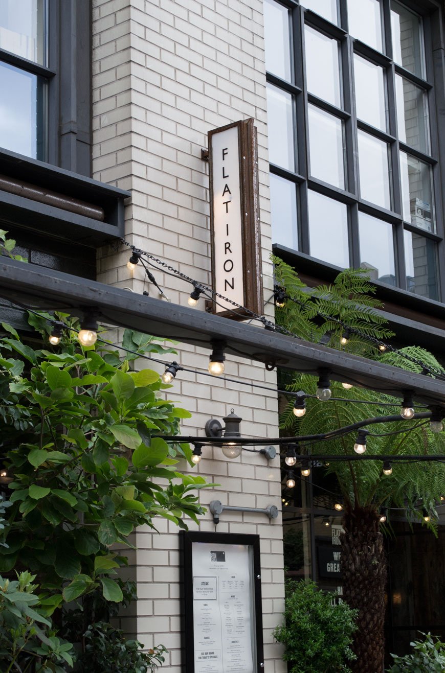 Pretty much does exactly what it says on the tin. Flat Iron is so called because it serves the best flat iron steaks in London. Be prepared for big portions at the very reasonable price of £10. This is steak and chips done well. And the interior and plant filled exterior are on point too.CREAM | 31 New Inn Yard, London, EC2A 3EY
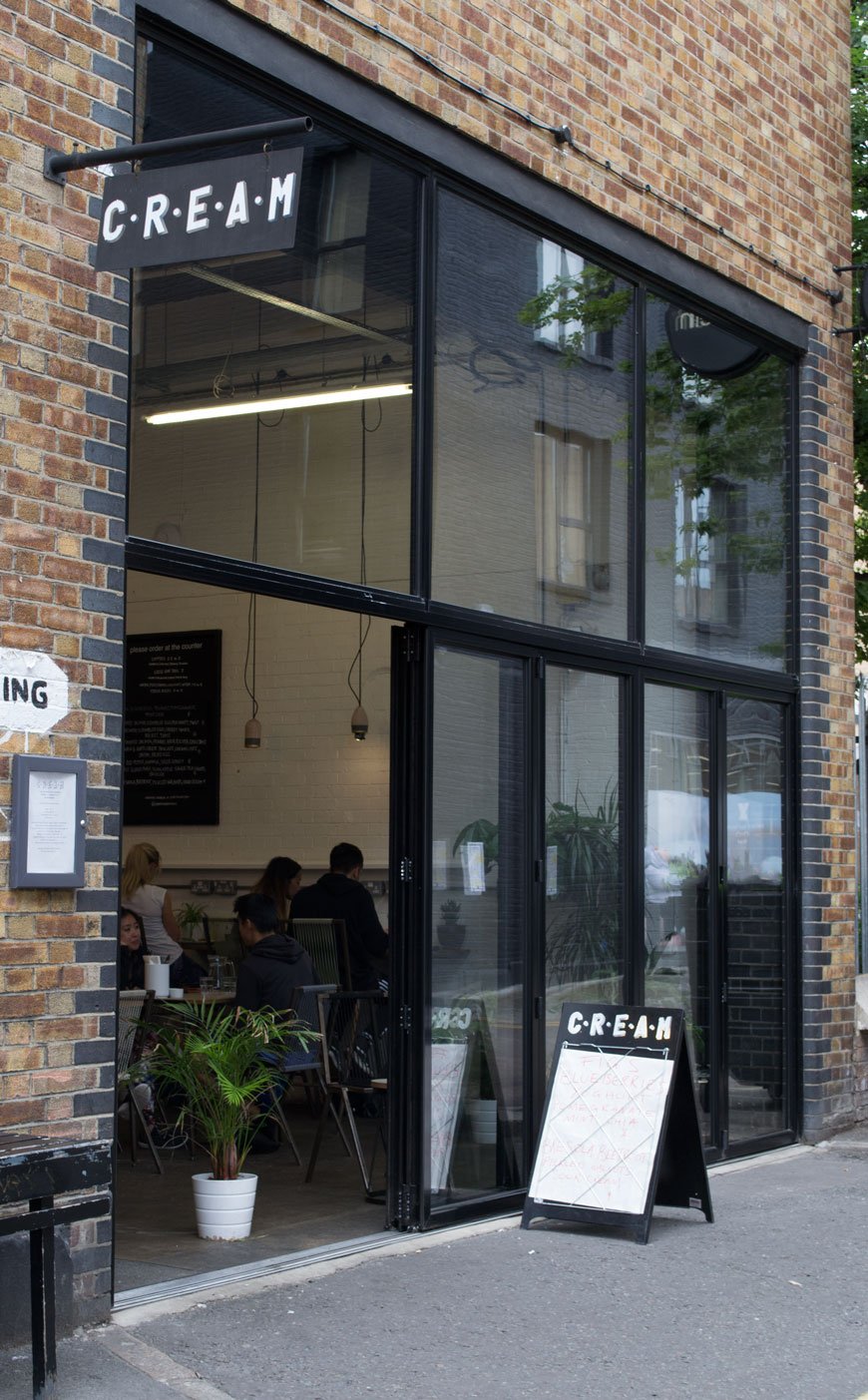
Described as an "ingredient led daytime canteen", Cream offers organic, market fresh dishes from a new menu each day. Alongside small bites and heartier options, the coffee is also great. Of course, it wouldn't be on my list without having something offer in the decor department. The fully opening doors, potted plants in every corner and white brick walls were enough to keep me here for very long time.
SHOP
KENT AND LONDON | 5 Hackney Road, London, E2 7NX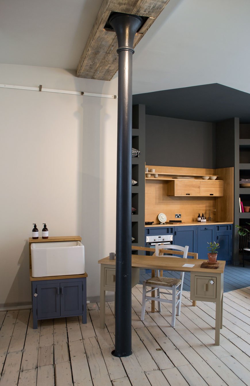 Kent and London is run by craftsman Luke Ellis and Simon Goff, founder of flooring company, Floor_Story. Expect Luke's ridiculously well made kitchens and furniture painted in a palette to die for. I'm reliably informed that these will be released as part of their exclusive paint collection launching imminently. A considered collection of Simon's rugs hang from the walls and downstairs is home to just some of his collection. If he doesn't make it or stock it, they will source it for you, from vintage kelims to designer collaborations. You will also find beautiful cookware such as the incredibly desirable Crane C series pans, rustic ceramics and other kitchen related accoutrements.
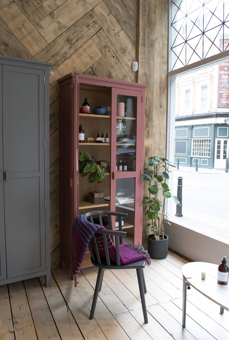 MODERN SOCIETY | 33 Redchurch Street, London, E2 7DJ
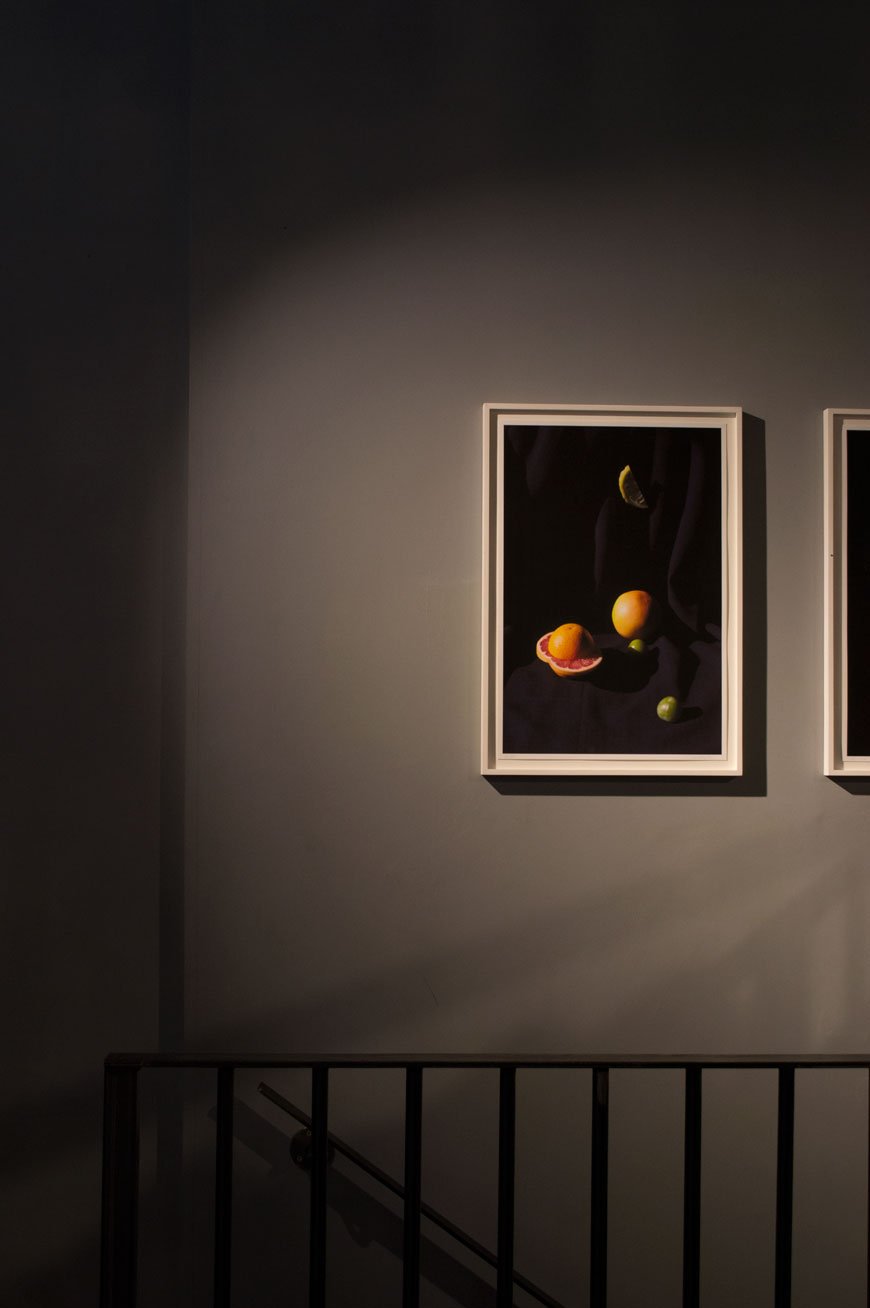
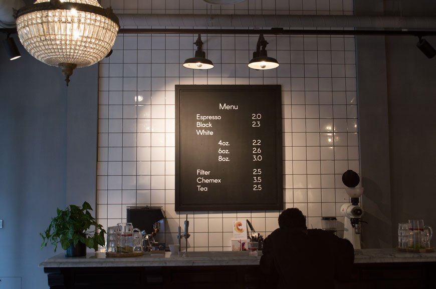 A store on different levels in more ways than one, Modern Society gives you space to breathe. Sit and have a coffee, browse the carefully curated homewares, gifts and clothing or lose yourself in their exhibition space. I was particularly taken with the bold photography displayed on the grey walls by Berlin based artist Sarah Illenberger. They recently launched their own unisex label too, designed with modern simplicity in mind.
 MONOLOGUE | 93 Redchurch Street, London, E2 7DJ
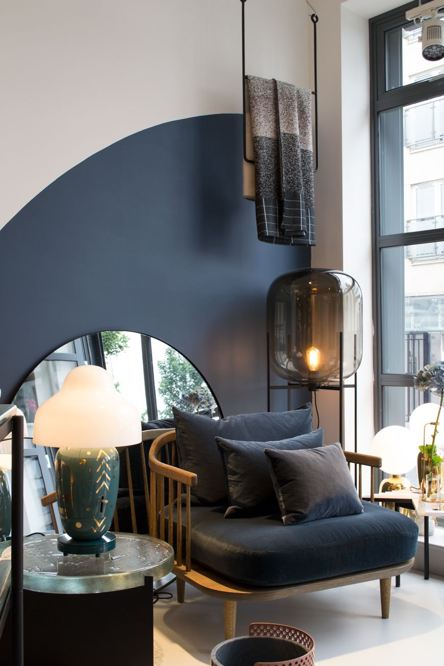 Seeing my favourite chair, the &Tradition 'Fly' sitting in the window of Monologue was enough to get me through the door. If contemporary, Scandi design is your bag then this is a must. Expect to find a fresh and rotating selection of up and coming design in this concept store from the likes of Gubi, Jaime Hayon and HAY.LABOUR AND WAIT | 85 Redchurch Street, London, E2 7DJ
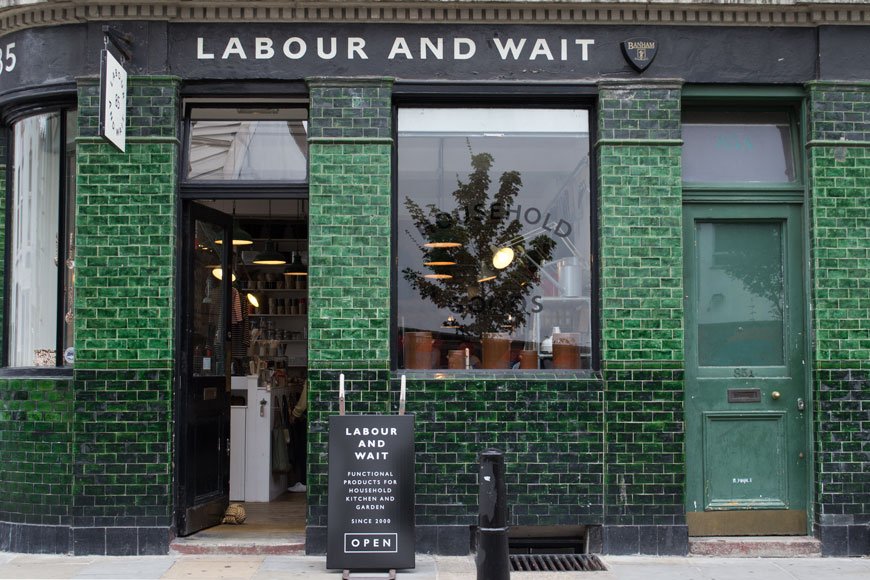 Possibly one of the most instagramed shop fronts in London with its bottle green tiles, Labour and Wait is home to functional, simplistic homewares. Think of well made brushes, linen aprons and gardening tools. You'll also find vintage items here too, pieces that were made to last and stand the test of time.Of course, it's impossible for me to get through everything Shoreditch has to offer over the course of a weekend, it'll take several more to come even close. With that in mind, I've put together a helpful map with a few more suggestions for a great weekend of design.A Design Lover's Guide to a Weekend In Shoreditch
•This post has been written in collaboration with CitizenM Hotels.
Photography © Tiffany Grant-Riley
Heal's British Designers And The Time I Styled A Window
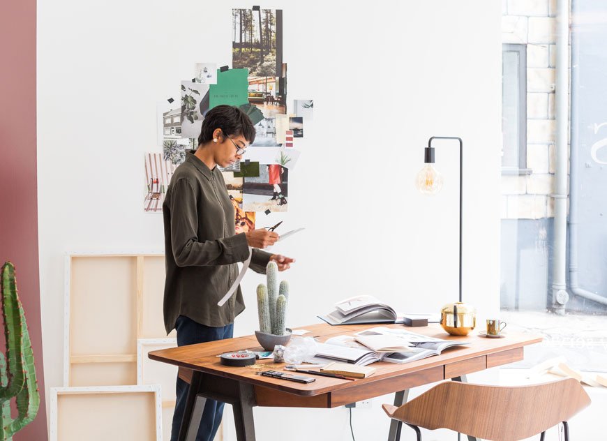 Taking a moment to stop and celebrate certain moments in life isn't something I do often. As my own worst critic and, to quote the Foo Fighters, I'm more of a "done, on to the next one" person. But here it is. I designed and styled a window scheme for Heal's. Now that's a moment! Four years ago when I decided to move into styling for interiors, I had no idea that I'd wind up here. But enough emotional waffle, if you didn't see this post, here's why I was asked in the first place...Over a period of 200 years, Heal's has made a name for itself as an innovative family brand. Elevating new and emerging designers and design movements alike through its Heal's Discovers program, it has long been ahead of its time. This August, the stores are gearing up to celebrate Heal's British Designers, highlighting their talented, influential roster of UK designers. As part of this campaign, I was approached along with journalist and interiors writer Kate Watson-Smyth to curate and style a window at their Queen's store in Westbourne Grove. Our choices were to instil the best of British design Heal's has to offer, injecting our own style into the process.
The Design Process
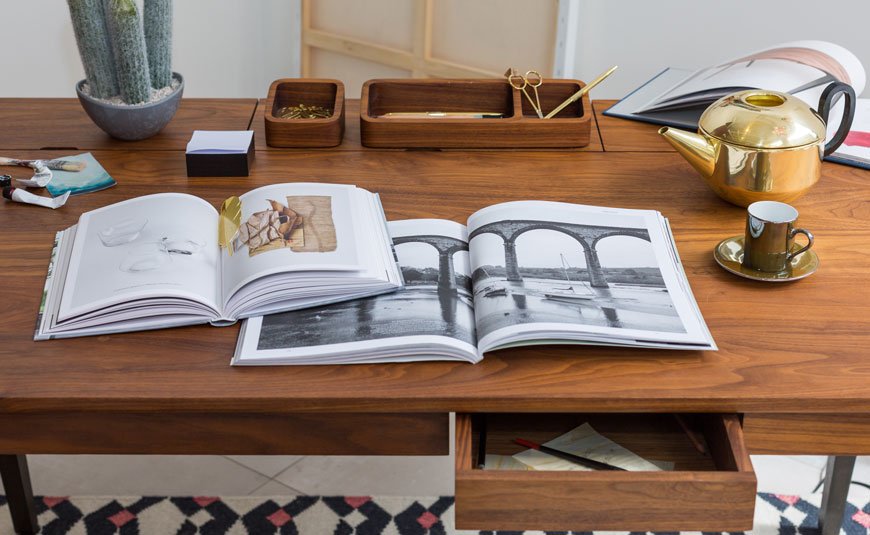
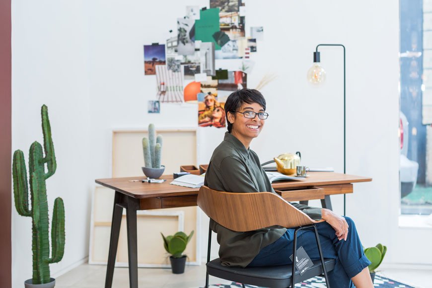
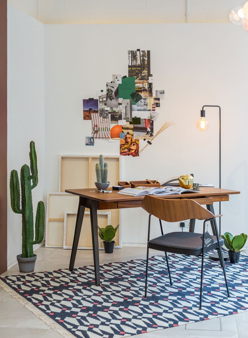
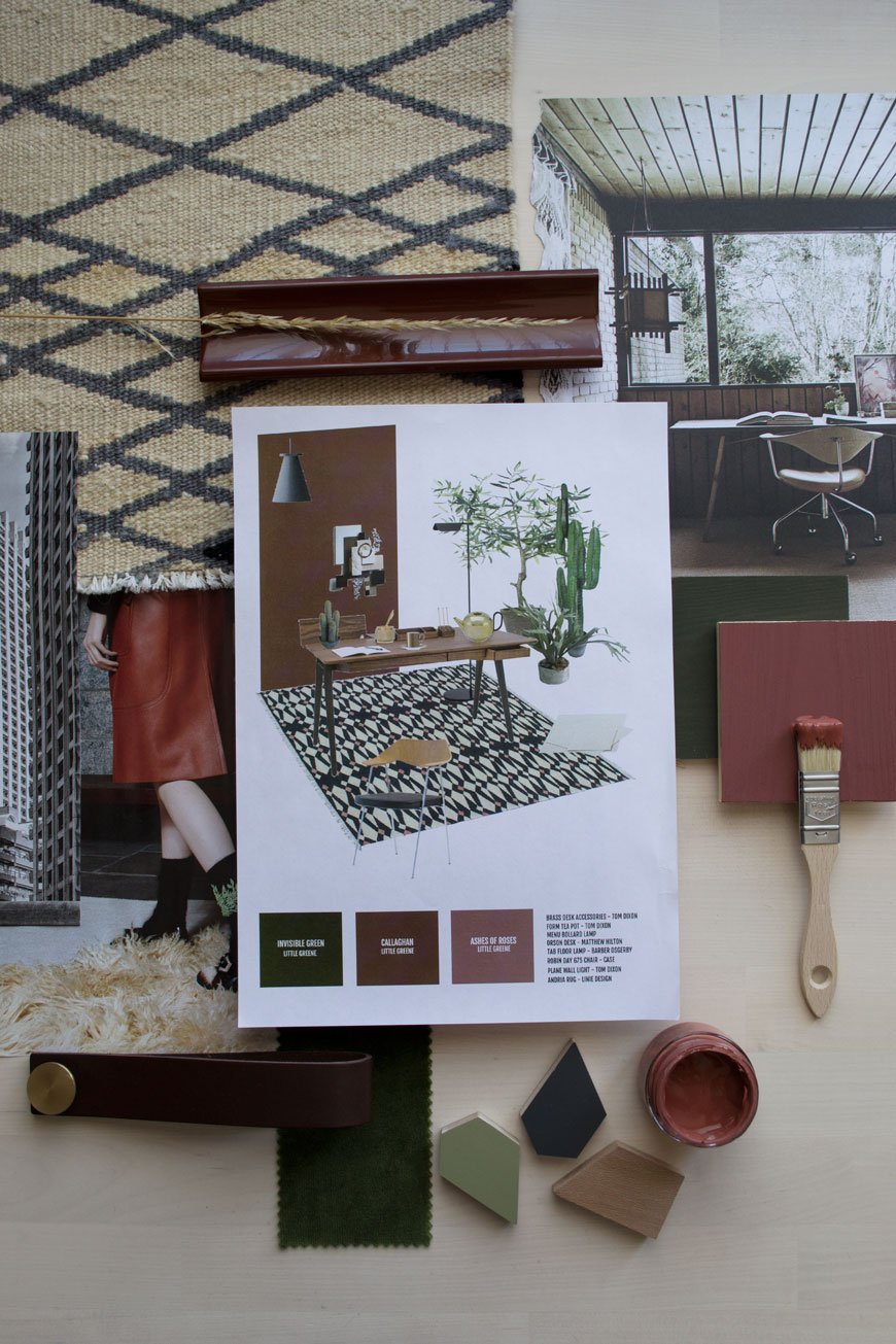 So here's my original concept. I started with the Orson desk by Matthew Hilton as my jumping off point. I was drawn to its shape, a clever mix of Mid-century meets contemporary. It has a beautifully crafted dark walnut top with three compartments, angled drawers at the front and sturdy black cast iron legs. There really couldn't have been a better companion for it than the iconic Robin Day 675 chair, reimagined by Case. This piece was pioneering for its time as Day discovered a new way to mould the chair back with ply in a single curve. And I'm not kidding when I say it's incredibly comfortable too. So a workspace it had to be. I imagined a creative of some sorts working here - maybe a designer, architect, artist?
Supporting Acts
I've been loving working with richer colours of late and I wanted a bit of a departure from my usual pale palette. In keeping with British products, I chose Little Greene paint to bring some life into the space with a deep earthy shade called Callaghan for the main wall and Invisible Green to go on the right. To introduce texture, a flat woven geometric rug with warm copper accents would tie in with the earthy walls. As desk space is key for productivity, I wanted to keep it as clear as possible, so I used the Junction black floor lamp to avoid using a table lamp. It fits well with the contemporary-modern look, don't you think? Of course, no Heal's room set is complete without a little something from one of the most iconic designers of our time. Although he might be better known for his lighting, I chose Tom Dixon brass accessories, using the metallics as a contrast to the darker elements.As much as I wanted to, I couldn't expect the Heal's staff to care for real plants over the next month, so instead I chose the next best thing. Have you seen Abigail Ahern's faux plants? They're really very convincing - this from a plant lover. If you want to check them out rather than take my word for it, head to the Tottenham Court Road store.It's a warm room, still quite minimalist in style with plenty of breathing space and greenery.As you'll see, technical sketches are not my forte, so we asked 3D design pro Anita Brown to create something with a little more finesse.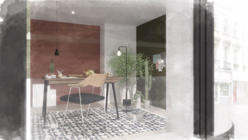
Bringing The Design To Life
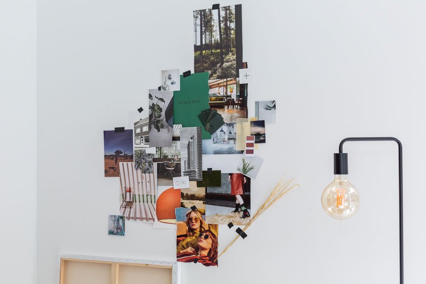
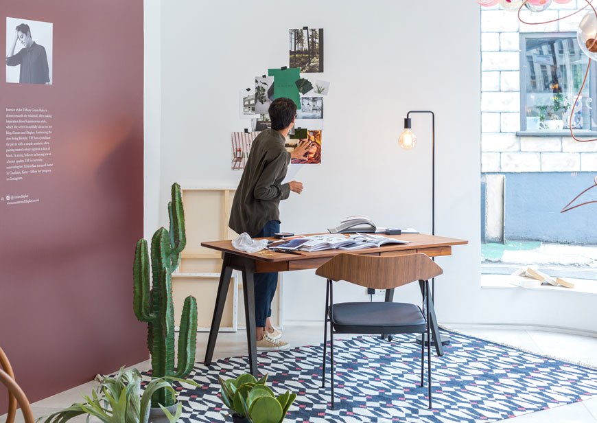 As happens in the process of designing, some things have to adapt to change. You'll see that I wasn't allowed the green wall in the end and with the awkward curve of my window and two large lighting installations to contend with, we needed to find another angle. Actually though, if I'm honest, I think I prefer it. It looks more open and the white wall draws your attention to the moodboard from the other side of the store. I'd happily sit down here to work every day!
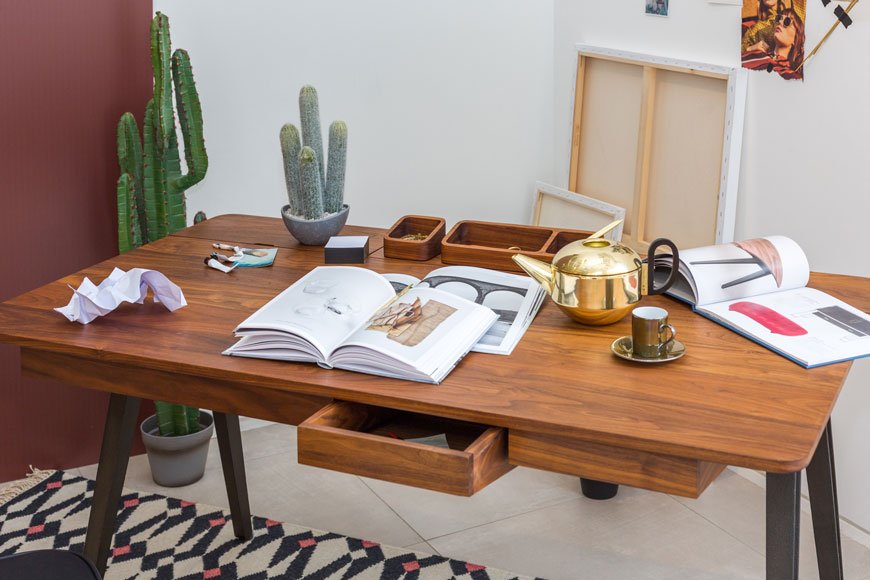
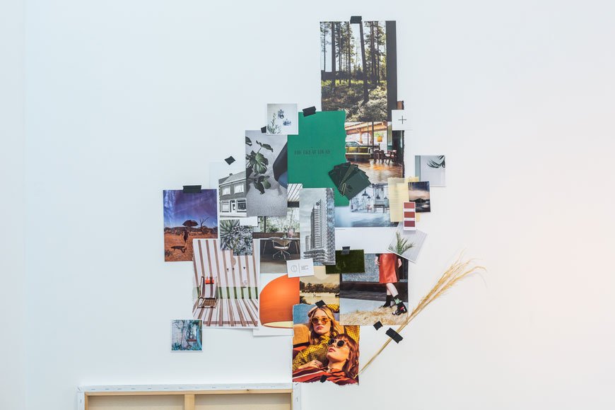
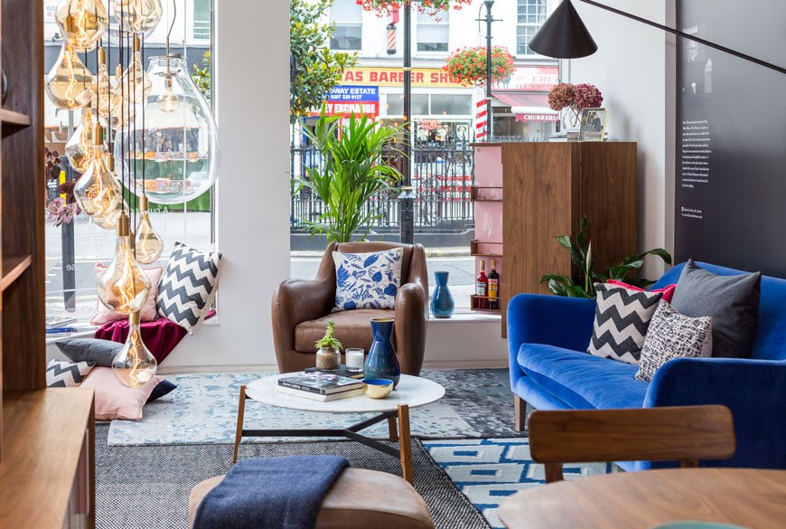
 On the other side of the store, Kate set the scene with rich jewel tones and relaxation. Starting with the blue velvet Russell Pinch Wallis sofa, she ramped up the texture with layered rugs, dark leather and marble. Oh, and you need to check out the amazing pink drinks cabinet she used - see more on her journey here.
 Well, huge thanks to Heal's - it was an absolute honour. You can explore our windows in store until August 31st, so please do stop by and immerse yourself for a while. Let us know if you made it with #HealsBritishDesigners.*This post was written in collaboration with Heal's.
Photography © Victoria Erdelevskaya for Heal's.
The Heal's 100 Design Icons + A Special Collaboration
![]() Wherever you're reading this in the world, if you have an interest in the history of furniture design then chances are you'll know about Heal's. A long established British brand synonymous with innovative, forward thinking design, supporting new talent and in my mind for championing modernism ahead of its time. I don't know about you, but when I think of Heal's, I think of the ways in which it pushes boundaries and respects craftmanship.Back in May, the store opened the Heal's 100 Design Icons exhibition on Tottenham Court Rd in which, as the title suggests, featured 100 of Heal's most revered items of furniture sold over the last century. Charged with the impossible task of choosing them was founding director of Skandium and director of the Isokon Gallery Trust, Magnus Englund.From archived collections to still in production classics and contemporary designs ready to purchase, the exhibition was both a retrospective of a family business spanning 200 years as well as a look at future heirlooms. I've picked out some of my favourite pieces from the collection - an almost impossible task in itself given the line up, all of which are available to purchase now. Have I whetted your appetite now?Heal's British Designers - A CollaborationI'm very proud to be working with Heal's on a project of my own, alongside journalist Kate Watson-Smyth of Mad About The House. On Thursday 27th July we'll each be live styling a window of the store as part of a celebration of Heal's British Designers. Well known for discovering emerging British talent through their program Heal's Discovers, we've both been asked to create a space choosing hero pieces from some of the best designers in the country. Stop by to ask us about our design process, what British design means to us...or just wave through the window!The DetailsDate - Thursday 27th July 2017Time - 8:30 - 15:00Venue - Heal's, The Queen's Building, Westbourne Grove, London, W2 5AA
Wherever you're reading this in the world, if you have an interest in the history of furniture design then chances are you'll know about Heal's. A long established British brand synonymous with innovative, forward thinking design, supporting new talent and in my mind for championing modernism ahead of its time. I don't know about you, but when I think of Heal's, I think of the ways in which it pushes boundaries and respects craftmanship.Back in May, the store opened the Heal's 100 Design Icons exhibition on Tottenham Court Rd in which, as the title suggests, featured 100 of Heal's most revered items of furniture sold over the last century. Charged with the impossible task of choosing them was founding director of Skandium and director of the Isokon Gallery Trust, Magnus Englund.From archived collections to still in production classics and contemporary designs ready to purchase, the exhibition was both a retrospective of a family business spanning 200 years as well as a look at future heirlooms. I've picked out some of my favourite pieces from the collection - an almost impossible task in itself given the line up, all of which are available to purchase now. Have I whetted your appetite now?Heal's British Designers - A CollaborationI'm very proud to be working with Heal's on a project of my own, alongside journalist Kate Watson-Smyth of Mad About The House. On Thursday 27th July we'll each be live styling a window of the store as part of a celebration of Heal's British Designers. Well known for discovering emerging British talent through their program Heal's Discovers, we've both been asked to create a space choosing hero pieces from some of the best designers in the country. Stop by to ask us about our design process, what British design means to us...or just wave through the window!The DetailsDate - Thursday 27th July 2017Time - 8:30 - 15:00Venue - Heal's, The Queen's Building, Westbourne Grove, London, W2 5AA
A New Look Rebrand For Curate And Display
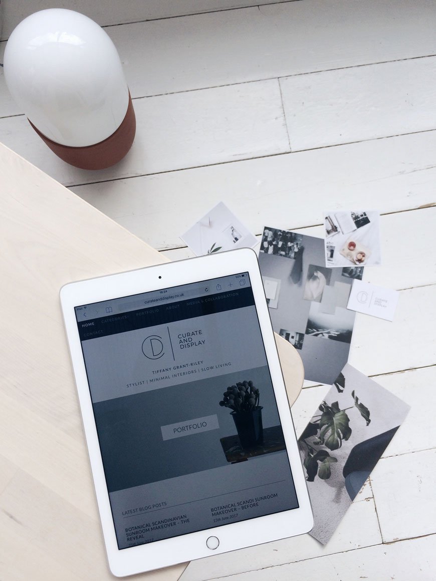 Yes - you are still in the right place, noticed things are a little different here? Don't worry, it's just that we've been working hard behind the scenes on a new look rebrand for Curate And Display. Since I started this little corner of the internet three years ago, much has changed and I felt it was high time this blog reflected that. From what began as a bit of a hobby (and who knew I'd have kept it going this long?!) became another string to my work bow and I love this little community we have here and the wonderful friends I've picked up on the way. I like to think it's looking that bit more mature now, more confident in where it sits in the world. Perhaps that goes for me, too?What's Changed? LOGO - The biggest change has been the logo and strapline. As my partner in design (also known as Annie Kruse, Stylejuicer) knows me so well when it comes to aesthetic, it was a no brainer to ask her to design the new look branding and site - I trust her implicitly. I did a lot of research into other brands I love, what I wanted to convey and used The Brand Stylist's fantastic book as guide to help me get my message across to Annie without driving her crazy. Using keywords as a starting point, Annie landed on the succinct strapline of Stylist - Minimal Interiors - Slow Living. And that's exactly what I do. She nailed it, don't you think?EASY NAVIGATION - From now on you'll see there are five categories displayed on the top menu bar and sidebar navigation so posts will be much easier to find.LARGER IMAGES - This one will take me a little more time to implement as I switch old posts over, but we've gone for slightly larger images which give a far better impact on larger screens. If you're viewing on a tablet or phone, the site is responsive.PORTFOLIO - I've been brave and added some of the images I'm most proud of to my portfolio. All of these have been shot by me as my freelance styling work (the bit I do away from the blog) is not really what I want to share here (not my style and probably not yours either!)SOCIAL BUTTONS - These have been moved underneath my 'About' image to make them easier to find. You'll also find social sharing options underneath at the end of each post too.Before I wrap it up (this is starting to turn into an Oscar's acceptance speech) I need to say a massive thank you to Rob, my long suffering web developer
 who works for free and husband who has worked all hours to get everything up and running for me. Poor guy. If he wasn't so handy with code, he'd have all this free time on his hands...So there we are, a simplified and decluttered space ready and waiting to inspire. What do you think? I'd also love to know if there's anything in particular you'd like to see more of here. I am working on bringing more of my personal life into this space, not something I find very easy as I worry about over-sharing, but I think it's only a good thing to let you in and get to know me a little better. And if you're new here, hello! Feel free to head over here and get the skinny...See you in a bit!xPhoto © Tiffany Grant-Riley
Botanical Scandinavian Sunroom Makeover - The Reveal
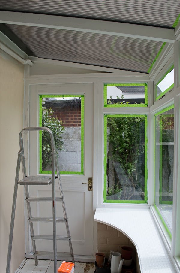 If you saw my last post, you'll know I've been working on a small scale makeover to give our tired little sunroom a refresh. When I started two months ago, I thought it was going to be relatively straight forward - and it was in that for the most part it only involved paint. But painting anything well takes time and preparation. So this is where I've been spending any spare moment of my time of late, come rain or shine, paintbrush in hand with a very clear vision of the finished look in my mind to spur me on. I might as well have moved in here, seeing as the kids always knew where to find me when they discovered I was missing!As this is really only a temporary space (no insulation or heating and windows rotting on the outside) there was little point in re-laying the floor or replacing the windows, so instead I focused on the cosmetics. The biggest challenge was prepping the woodwork, which was not only badly painted in several coats of aged gloss paint, but the wood hadn't been treated properly when the structure went up, so I was often sanding off sticky old wood sap as I broke through the layers with the sander. I gave everything a very brief keying to prep the surface and found a brilliant ultra grip primer, formulated for difficult surfaces and aged paint. It made life so much easier when it came to applying the top coat. You can find all the product information in the source list at the end of the post.
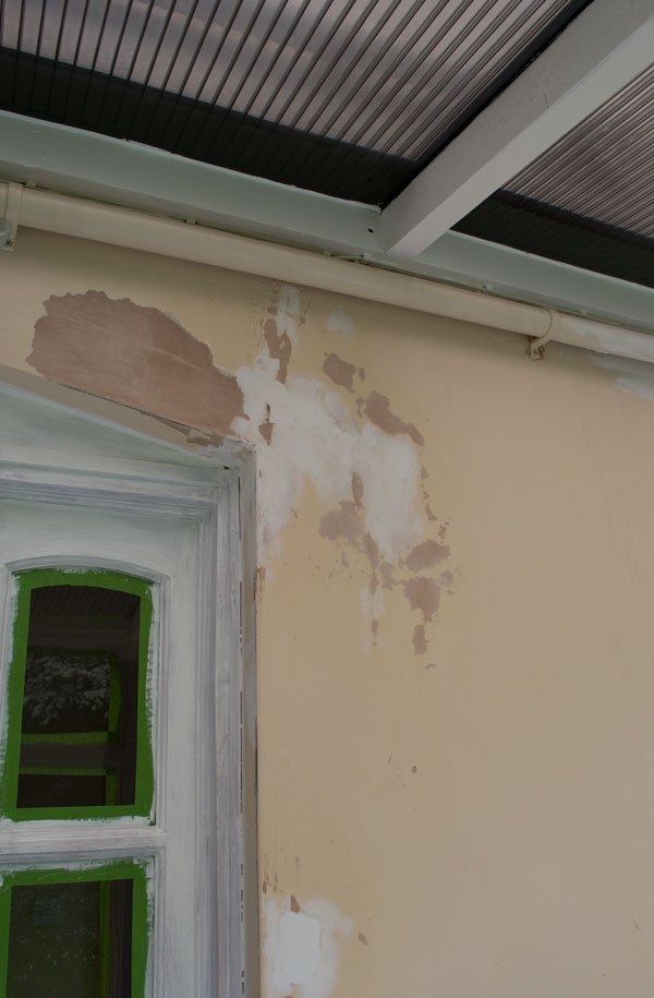 I used masonry paint across all walls to help protect them in the colder months. The old paint had been peeling off in places so I needed something to stand up to all conditions and hopefully avoid it happening again. As it gets a lot of light in here, I chose a white with blue undertones to take the edge off slightly.
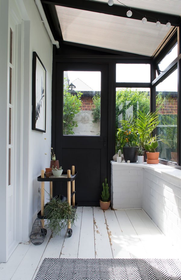 And here it is. Bright, minimal and contemporary, just the way I like it. It feels like the space I've been missing since we moved here and it's so lovely to see everyone drawn to it when we're all at home. Don't the black frames completely transform it? Not quite Crittall windows but it's a great start! Notice how they frame and bring the garden inside? There's space for additional seating - I have a couple of stools which can sit by the windowsill and there's enough floor space for one or two large floor cushions.I wanted to introduce a little warmth into the space, especially as a monochromatic scheme can feel somewhat cold, so I brought out the earthy tones to compliment the lush green planting. From a collection of terracotta pots, a beautiful Ian Mcintyre pitcher, to my newest love discovered at Clerkenwell Design Week - the DUO table lamp, these tones really pull the space together.The pine door was such an eyesore, it pulled the attention away from the garden when we would sit in here, like an orange beacon of misery. It was given a couple of coats of the same white as the walls to blend in with the rest of the space and feels much calmer now. You'll notice I did the door handles and window latches in the same colour to save replacing them all.
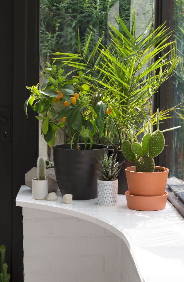
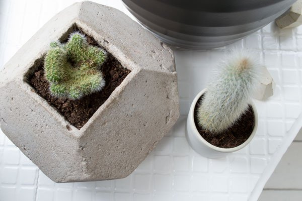


 At this time of year this room has the perfect conditions for heat and light loving plants. I've bought a date palm (pictured next to my citrus tree which was flowering heady scented blooms all spring) and an Areca palm for height at the back of the room. I took the opportunity to repot some of our cacti from the kids room too and I'm completely in love with the fig which comes from Valencia so it's used to sweltering summers and cold winters. I wonder if it'll ever bear fruit? Either way, everything in here will be happy until the colder months come and then I'll bring them into the main house and swap them with others.The black Normann Copenhagen Block trolley has long been a much coveted design, it's such a versatile piece. I can use it for repotting and watering, store blankets over winter or stack it up with magazines. I've already used to it host dinner on whilst I was still painting and it was a nice touch to serve from it.
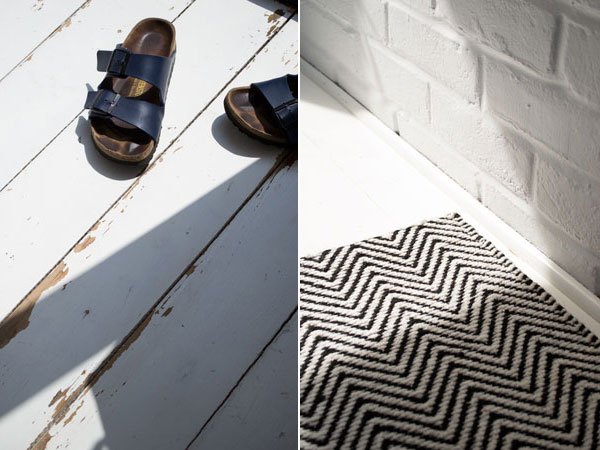
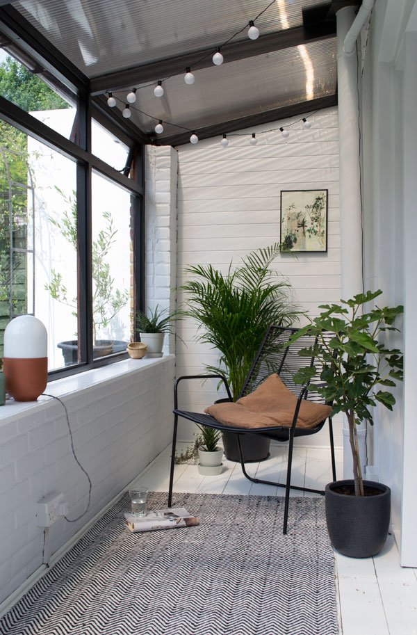 Initially, I'd planned to find an indoor/outdoor rug, but as the dimensions in here are so tricky I landed on the cotton and jute weave Ives rug in a herringbone pattern from Houseology. I love that it brings in a contrasting texture against the rough floor and echos the woven lines in the Lene Bjerre April lounge chair. The thin frame and see-through seat still leaves a feeling of space and it's extremely comfortable to sit back in.Over time I've been collecting botanical art work, and whilst I might eventually move these to the living room where I'd like to include them in a gallery wall, they sit well in this space.


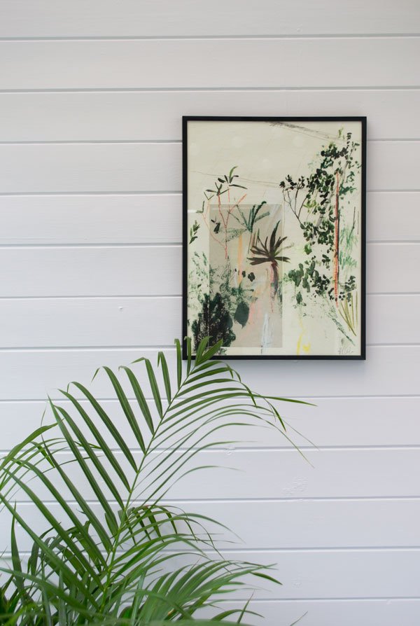

 My next plan will be sourcing blinds for the lower windows as it can feel a little exposed to the houses at the back in the evening. I also want to make sure I can protect the plants from strong sun. Oh. And fill it with a lot more of them, of course.So, what do you think? Maybe I've inspired you to give your garden an update?Source List:Wall paint: 'Sleeping Inn' white masonry paint, Valspar.Wood & metal paint: 'Village Smithy' black paint in premium eggshell, Valspar | 'Sleeping Inn' matt premium eggshell, Valspar.Tile paint:Wood primer: Ultra Grip white primer, Dulux Trade.Herringbone Ives rug: Houseology*.Black Normann Copenhagen Block trolley: Houseology*.Linum jute cushion in rust: Holly's House.Lene Bjerre April lounge chair: Houseology*.Terracotta pitcher: Another Country.Black and white botanical leaf print, Chocolate Creative.Abstract botanical print, Alicia Galer.Terracotta and opaline glass Duo table lamp: Hand & Eye Studio.LED Festoon lights: IKEA.* This post was written in collaboration with Houseology.Styling & Photography © Tiffany Grant-Riley Want to see more of our home renovation projects? Follow #TheChathamHouse on Instagram for all updates...
Botanical Scandi Sunroom Makeover - Before
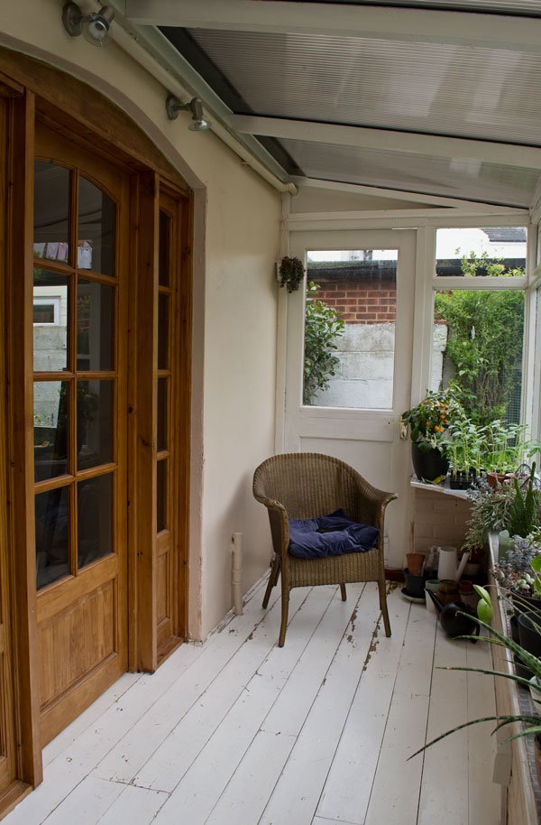 There's all sorts of quirky spaces in this house, one of which is my favourite to spend time in although technically it's not really a proper room. The 'sunroom' as it was called when we bought the house is a borderline dilapidated structure, clearly put up in a hurry. The floor is rotting by the external door, as are the window frames on the outside. Methinks I spy a bodge job! Those things aside, I absolutely love to sit in here, watching the birds flit from the hawthorn tree across to the feeder. I watch the sun sets, thunder storms and listen to heavy rain drumming on the roof as I tend to my family of plants. If we decide to stay long term, we'd like to pull this extension down and rebuild it, knocking through from the kitchen behind, but for now I just want to give it a unified look so that it feels like an easily identifiable space.
Hot, Hot, Hot
As a makeshift room, it's not insulated or heated, meaning sweltering temperatures in summer and freezing cold in winter. I learnt a very big lesson before we officially moved in. Trying to get ahead of the game, I'd started moving some of my plants into here but then had to lock all the doors and windows while the house was left unattended. Needless to say, the high temperatures made only worse by the unseasonably warm October weather and the perspex roof slowly cooked them all to a crisp. Some of those succulents I'd had for over six years! Six years I tell you! Not to let something like that put me off though, I've sinced researched plants that enjoy high heat and lots of light, so for the summer months they'll be in here and in winter I'll switch them out for the plants that love colder climates.
Awkward Space
The sunroom is very narrow and long which rules out having a small sofa or bench inside. As a compromise, I've decided on a combination of lounge chairs, stools and floor cushions which can be changed around and moved depending on who is using the room.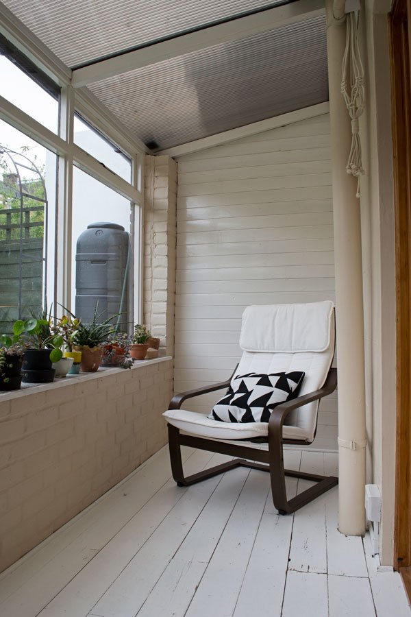
The Inspiration
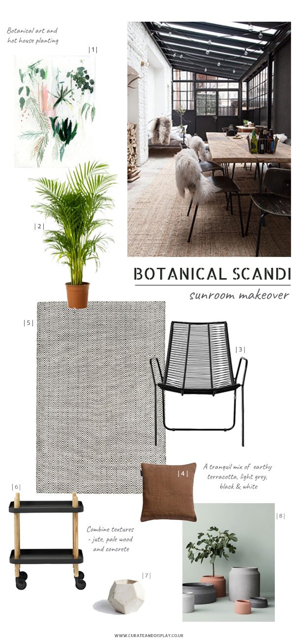
|1| Art print, Alicia Galer |2| Palm |3| Lene Bjerre April lounge chair, Houseology |4| Raw cushion in Rust jute, Holly's House |5| Black & white herringbone Ives rug, Houseology |6| Normann Copenhagen Block Trolley, Houseology |7| Leila concrete planter, Concrete Jungles |8| Terracotta pots, Ferm Living | Image © Wertvoll Fotografie
Ever since I came across this jaw droppingly beautiful garden room on Pinterest (above) belonging to photographer Petra Reger, I've had it in mind to take the best elements from it and apply it to what I have. No, I don't have the structure of those black aluminium framed windows, or space for a dining table, but I have textured brick walls and window frames I can paint. I want the space to feel contemporary, to draw the eye towards and frame the garden outside. I'm going to blend a monochromatic base with terracotta details and layer up on the plants - I never need an excuse to do that!
The Plan
To refresh the ambiguous pink walls I'll be painting them white, but I want to choose a shade with blue undertones so that it's not so glaringly white in full sun - I don't want to be wearing shades in here!The wooden floor will stay as is, the distressed look gives the room character and added texture and I always like to leave part of a room untouched in some way.You might not be able to see from the photos, but the window sill has been laid with a pearlescent blue mosaic tile. I hate it, so I'm going to give it a couple of coats of white tile paint for a better backdrop for the plants to sit on.The orange pine door will also be treated with a coat of fresh white the same shade as the walls to blend with the rest of the space. There's just no excuse for 90s orange pine now people.The two spot lights above the door are pretty awful when you're trying to relax in the evening - you feel on display to the neighbours behind our garden. I'll be using festoon lighting hung across the roof struts for a softer, more intimate light.If you've noticed my absence from the blog in recent weeks it might go some way to explain that - I've been working all the hours I could find to get the room ready to share with you next week. Let me tell you, it's quite the transformation! What do you think of my plan? Do you have a garden project of your own?Want to see more garden inspiration? Check out my In The Garden board on Pinterest and follow #thechathamhouse on social for more of our home renovation updates.
IKEA Room Refresh in NEW 91 Magazine
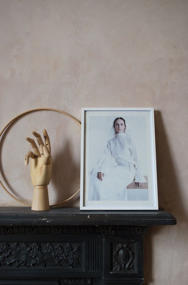 I know, I know - I've been quiet for a while. But there's good reason, I promise. For one, I've been having a ball styling and shooting a feature with IKEA for the latest issue of 91 Magazine. As part of their Room Refresh series, I've used our newly plastered bedroom (don't you just love those beautiful walls??) to show how I've integrated a bedroom workspace using the Norråker table. The magazine is out now and you check out how stylists Clare Piper and Laura Sawyer used the same table in completely different ways. It's yet another gorgeous issue, exploring slow living, independent shops and interior style, a perfect accompaniment to your Saturday morning coffee.WIN - IKEA is also giving you the opportunity to win a £250 gift card when you share your own Room Refresh with Ikea products using #ikearoomrefresh.In the meantime, I'm working on a little house project here to transform our sun room into a more liveable room - look out for the first post next week...
 Pick up a copy of 91 Magazine S/S17 in digital or print directly online or through a local stockist.
Styling & Photography © Tiffany Grant-Riley
DDN Magazine Design Tour at Milan Design Week
When DDN Magazine (that's Design Diffusion) asked if I'd like to join them on an Italian design tour at the Salone del Mobile, it's pretty safe to say it was a no-brainer. I mean, Milan in the spring, at the biggest design festival in the world - you would, wouldn't you?
As a first timer at the Salone, to say it's overwhelming is an understatement - the main hub of the fair is based at Rho Fiera - a colossal exhibition centre with other events spread out across the city. Where to start? Thankfully, the Blog Safari was the perfect introduction and with 14 other interior bloggers, I had the chance to explore a selection of Italian brands and scope out some of the on-going trends for 2017-18.
Arflex
A real stand-out for me was Arflex, drawing me in with giant palm trees (see first image) and beautifully shaped furniture. There was a real 1960s vibe to their collection, drawing inspiration from the era in the softly rounded silhouettes and coloured perspex lighting. Copper was still a feature trend here, as well as mustard yellow, deep blue, grey and soft pink.
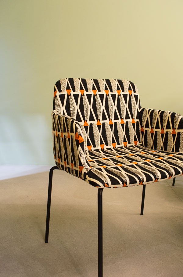
For a textile sucker like me, it didn't take long to make a beeline for the Brianza chair and its bold, graphic upholstery. Expect to see more from Arflex here soon.
Roberto Cavalli
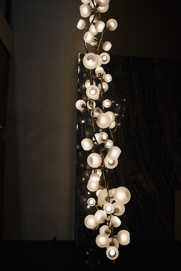
 Where there are plants (and there were so many green installations at the Salone) you will find me. Roberto Cavalli planted the seed in my head to try a cheese plant Kokedama - a stroke of genius, no? My eye was also drawn to the two woven loungers below them and a show-stopping branch of statement lighting.
JCP
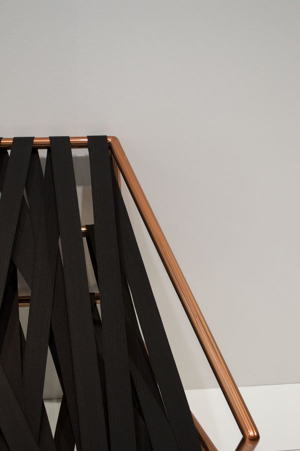
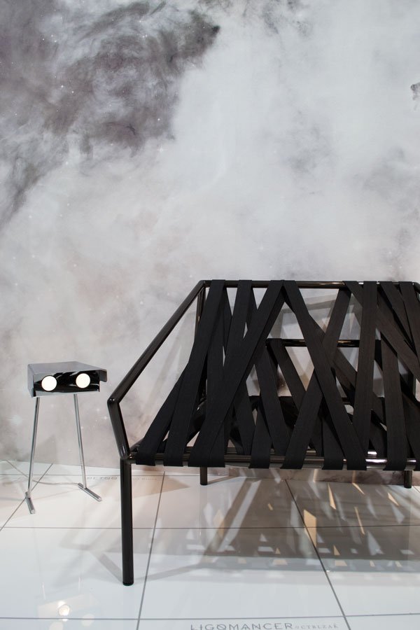 JCP took us into the future whilst looking back to 1960s space travel with their futuristic collection. The idea behind their Ligomancer sofa (above) is that everything normally hidden inside the internal structure of a sofa has been exposed. The frame is wrapped in over 100 metres of elastic band - I sat in it, and actually it was surprisingly comfortable!
Gallotti & Radice
If you're looking for sheer Italian decadence, Gallotti & Radice needs to be your destination. There were so many pieces from this collection that would work in a more minimal setting and I loved the mix of luxurious, tactile materials. These included velvet, brass, handblown glass lighting and dark wood. Plants made the space feel more welcoming, adorning floor to ceiling shelving and large velvet sofas beckoned to be curled up on.
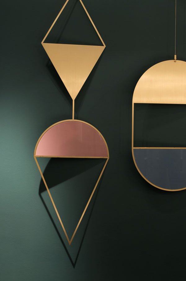
The colour palette here included a winning combination of blush and a slightly more dirty pink, dark greens, black and bronze. All of the luxury but none of the fuss. This wall hanging seemed to be a very popular piece too, inspired by Egyptian symbolism.
Poliform
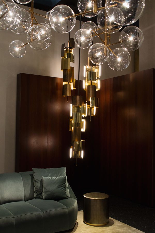
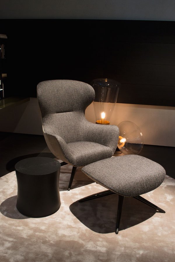
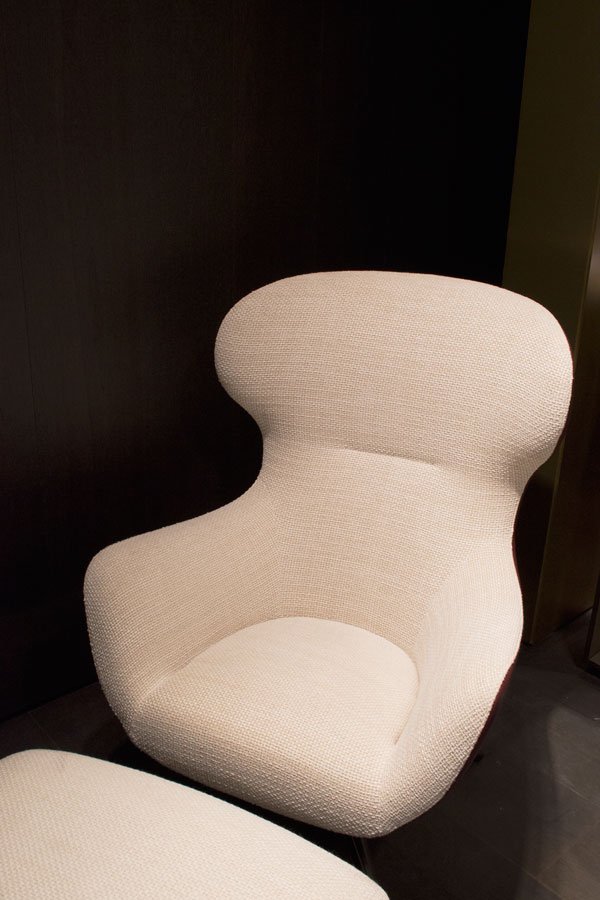
In keeping with the luxe look, Poliform took a more Mid-Century modern direction with emphasis on understated luxury, soft corners and high quality woven upholstery. I was all over this stunning armchair, new for 2017 and designed by Marcel Wanders.
Black elm featured a lot here, with beautiful attention to the detail in the grain. It has been used across the collection, from dressing table to dining table as well as seating.
This woven soft leather bench seat caught my eye (impossible not to touch) and I loved the contrast between the black elm frame and tactile pad.
And thus concludes my whirlwind tour of the Salone - phew! I have the taste for it now, hoping to return next year with a few more days to soak it all up and a packed schedule to explore more of the city. What do you make of my selections - have any of the designs caught your eye?
Thanks also to Gianfranco Ferré Home, Kartell, MDF Italia, Annibale Colombo, Natuzzi and Artemide.
For more from our tour, follow #ddnbloggers on Instagram, organised with thanks by Design Diffusion Magazine.
Photography © Tiffany Grant-Riley
New Nordic Dining Spaces With Muuto
 Although we're some way off from tackling the renovation of our dining room, it hasn't stopped me from obsessing over the furniture, and the design brand that I always come back to for inspiration is Muuto. If you're new to them, allow me spark a life long love affair (sorry, not sorry!) A name on the lips of mosts lovers of contemporary Scandinavian design, they are the epitome of New Nordic style, developing new materials and production methods to produce fresh and relevant pieces for the home. Some of the biggest creatives of our time collaborate with them, including Anderssen & Voll, Mette Duedahl and Cecille Manz, and in this way find innovative ways to present new minimalist design.
Muuto take their name from the Finnish muutos, meaning 'perspective'.
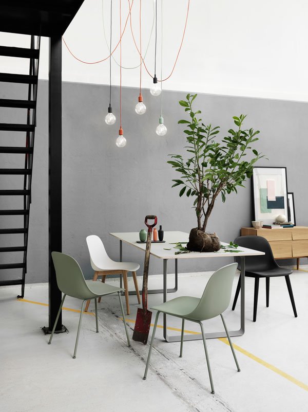 Ever since we bought the house last summer, I've held it in mind that I wanted to find a comfortable balance between the traditional, original bones of the house and contemporary furniture. We have really beautiful floorboards, so I plan to sand back the 90s orange varnish and re-stain them with a pale wash, almost white but not quite. Might regret that one when I'm knee deep in solvent with kids and and cat trying their best to interrupt, I'll let you know how that one goes. The dining room is rather on the shady side, so the more light I can bounce around, the better - Rob does not do dark colours. I tried for dark green walls, really I did. Perhaps a pale grey instead?So I'm going to be starting from scratch as our current table is a reconditioned vintage piece with a surface so sticky that magazines end up staying if you leave them there too long (the varnish is lifting). I love the shape of the 70/70 table (above) where the frame almost disappears into the room, which means the legs don't become a hinderance with all four of us sitting around it. Ultimately, it needs to be something that stands up to the wear and tear of children so anything with a white surface might be out...
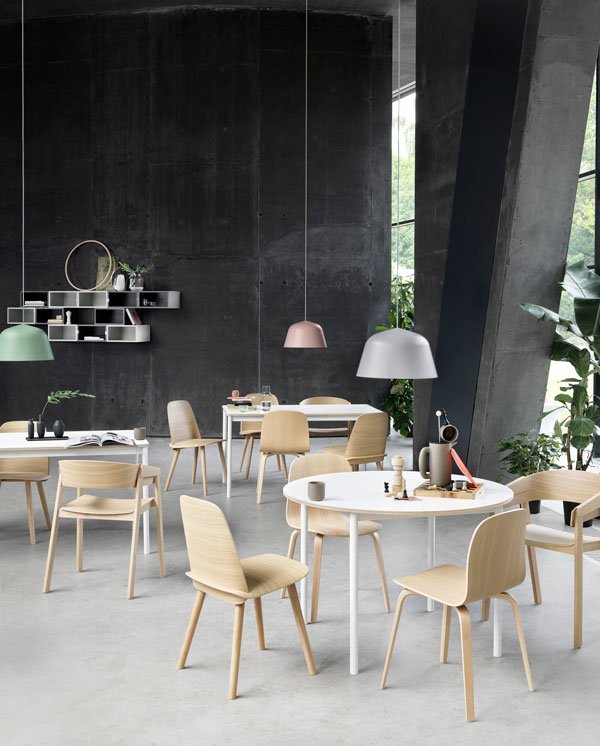 Our current chairs are a black veneer design which were a temporary solution three years ago - it's time for a change. I'm a sucker for the simple qualities of natural wood as seen across their collection in a mix of oak, beech and plywood veneer. Here, the shape is the focus, the colour a bonus. If colour is more your thing though, there's brighter options from soft grey and pink to dusty red and dark green without losing the effect of the grain.
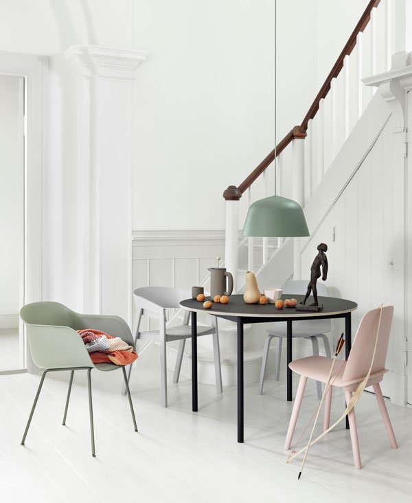 So here's my starting point - using neutral tones and focusing on natural wood, be it in the dining table (this one is in oak, called Split) or in a combination of chairs. I like that there are a couple of designs such as the Visu and Fibre that come with different bases, so that you can switch up the styles for a less matchy-matchy look. I'm still undecided as to whether to choose a single large pendant light or opt for a grouping, but something in black or grey suspended low above the table creates a statement - I'm a particular fan of the 'Unfold', designed by Form Us With Love and made from silicone rubber.
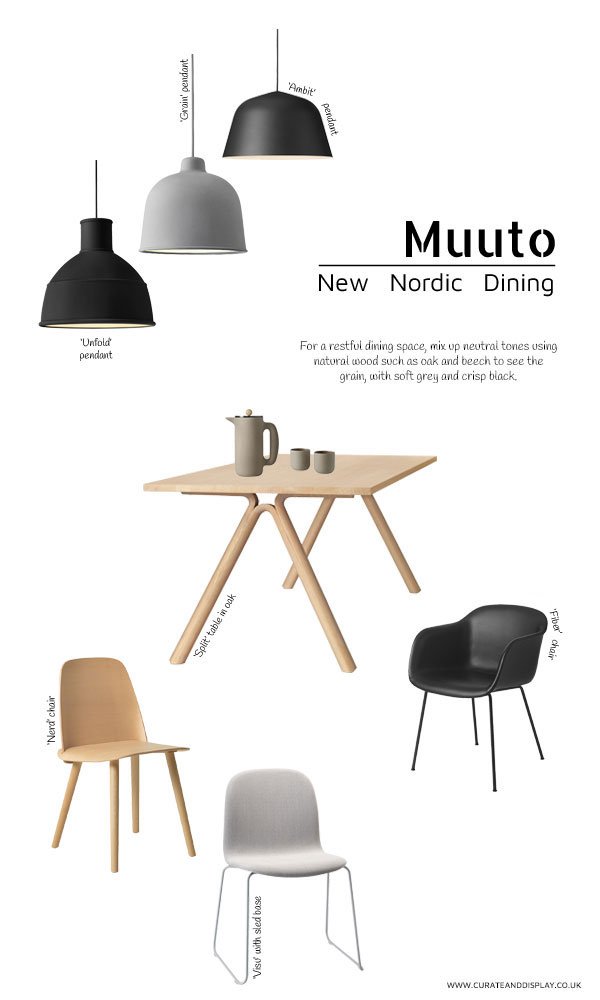
LIGHTING [L to R]: Unfold pendant in black, Grain pendant lamp in grey, Ambit aluminium pendant; TABLE: Split table in oak, PUSH coffee maker, PUSH coffee mugs; CHAIRS [L TO R]: Nerd chair in beech, Visu ash wood grey chair with sled base, black Fiber chair with tube base.
What do you think of my dining room choices? Should I be brave and go for really dark walls? Have Muuto inspired you to refresh your dining space too?
This post is written in collaboration with LOVEThESIGN, the online shopping destination for the best in design, brought to you from Milan.
Photography courtesy of Muuto.
Spanish Design | Expormim Rattan Furniture
 Rattan furniture will always spark childhood memories for me - the smooth, tactile curves and gentle creak as you sit into it. Somewhere in the back of mind there's an old dining set made from it, or maybe it was a lounge chair. Yes, in fact I remember a large round seat my step-father had in the early days of our new family, the four of us would fight over which two got to spend Saturday night movie night in it (because it was that big). So arriving in Moxient just outside of Valencia last July, the penultimate day of our Sunny Days Design Tour and typically the only day it decided to rain, there was something completely comforting about meeting Expormim, makers of rattan furniture since the 1960s.
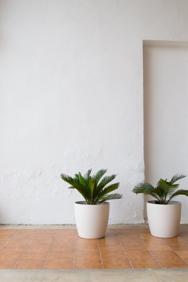 Behind the walls of this unassuming industrial building stood the most breathtaking view of the mountains shrouded in mist, and looking out at it a white washed courtyard, home to some pretty well established palms (how could I not notice those?) and Expormim's showroom and archive.A family business, for the first twenty years of its history Expormim had been the forerunner in rattan furniture, utilising traditional skills and using local Spanish materials which at one time were abundant. With the decline of rattan during the 1990s, the company looked towards new ways to evolve, sourcing the rattan from Indonesia and finding new man made materials to create longer lasting outdoor designs. In working with a much revered team of Spanish designers and architects including Benedette Tagliabue, Mario Ruiz and Mut Design, Expormim has found a way to continue its legacy.
 The rattan has been given an edgier, more contemporary feel which still looks at home in more traditional surroundings, in particular the Frames collection, designed by man of the moment - Jaime Hayon, which includes a coffee table and screen as well a lounge chair.
FRAMES is a happy new chapter to an old story, the tale of old craft and tradition within a new framework of clever design using a joyous new approach to the material.
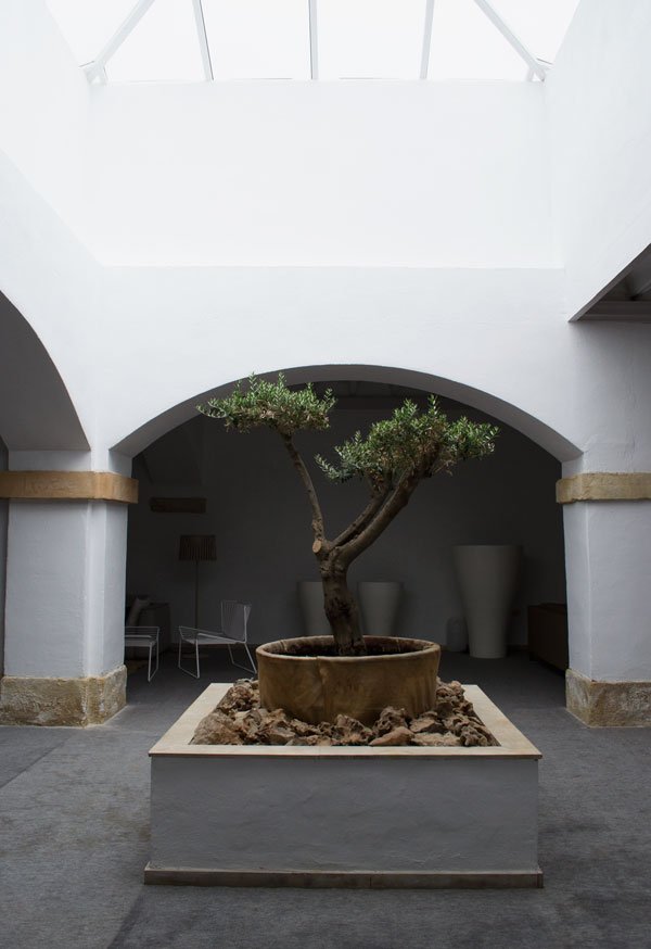
 The more contemporary designs include the 'Plump' modular indoor/outdoor sofa and 'Twin' armchair, a minimalist's dream with a more masculine aesthetic which is upholstered in a polyester mesh. Yes, I would love to lounge in this in my sun room.
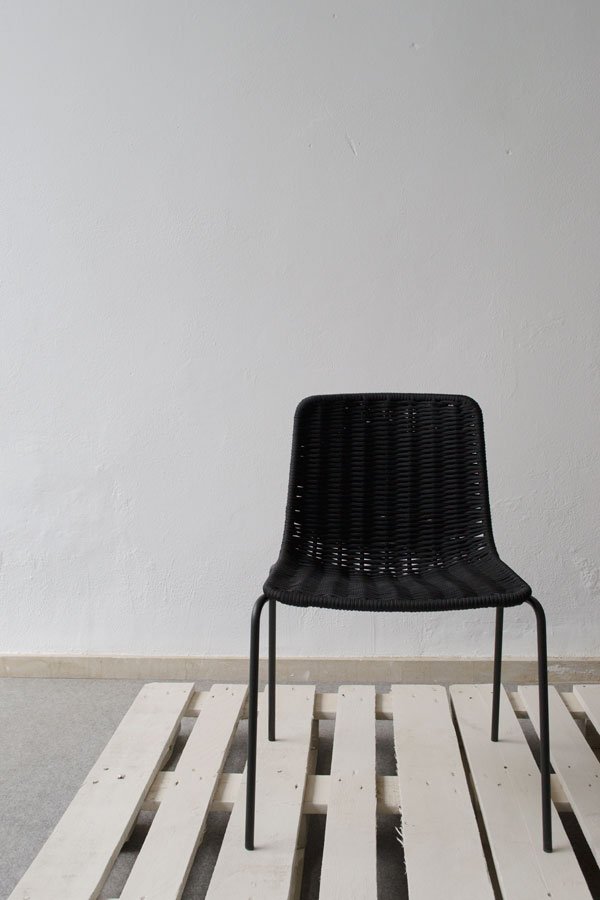 The Lapala chair, designed for outdoor by use has a painted stainless steel frame with woven nautical rope replacing wicker. The simple clean lines and textured seat make a striking silhouette and it was one of my favourite designs of the day.
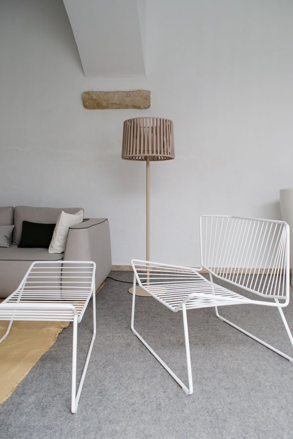 Past the showroom, we're led onto the factory floor, a hive of activity dominated by the smell of sawdust. The rattan is steam moulded into shape by hand inside dedicated steam rooms. In their raw state, the reeds are left to pick up the moisture for a period of time before they become soft enough to manipulate into the soft curves that will become a piece of furniture. Alongside them, metal frames are being woven with polyester rope at lightening speed.
 It's easy to blame progress for the loss of traditional craft, but Expormim have proved that by working with fresh and innovative designers and new materials, the company can continue to produce their iconic furniture well into the next generation.
